#me: i should keep the designs simple to and easy to draw
Explore tagged Tumblr posts
Visit Tumblr Blog
Explore Tumblr blogs with no restrictions, modern design and the best experience.
Last Seen Tumblr Blogs


Fun Fact
130K people were victims of a chain letter scam that affected Tumblr in May 2011.
Text

Danny is learning that there’s always a bigger fish
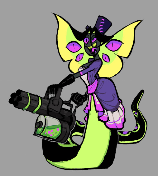
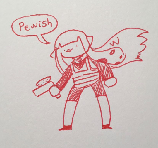
#danny phantom#vlad plasmius#mer AU#surprise I’m switching their mer designs again#consistency? never heard of it#now they’re based on bowfin because i think they look cool#vlad relies on ambushing prey with his large size and counter shading#danny is a walking WARNING sign with his bright patterns#however he doesn’t fully understand that and picks fights with enemies that otherwise would have left him alone#me: i should keep the designs simple to and easy to draw#also me: heehoo polka dots ooohohoh drawing tons of scales ehehehh#oh well it’s worth it i wanted danny to be like a starry night sky#very proud of vlads hand
96 notes
·
View notes
Text
ᑕᕼEᖇᖇIᗷOᗰᗷ ᗩᑎᗪ ᔕIᖇᑭEᑎTIOᑌᔕ ᖇEᗪEᔕIGᑎ
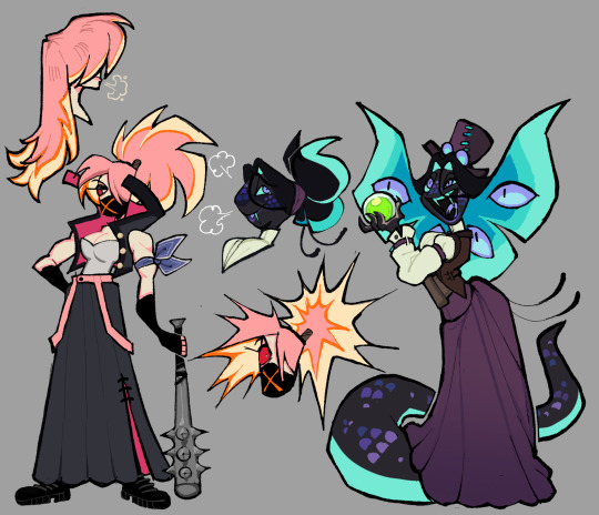
The last two designs for the main cast. With these two done, I can finally work on miscellaneous characters that I've been eyeing the most.
Again, thoughts below the cut:
My issues with their Original designs:
Sir Pentious:
I thought I would only have one thing to say about him (the unnecessary eyes) since he was my favorite in the entire original cast but having taken a closer look at him for this, I saw a lot of things that bothers me.
Too many eyes. specifically the lower half of his body has too many eyes and it seems detrimental to him. It's kind of painful to think about it since I do not think we ever see those eyes close. Is he just slithering on the ground with those exposed eyes? That's got to be irritating at best and damaged at worst as he continuously slithers on them.
There are eyes on the bowtie and the hat? There are already 4 extra eyes on his hood, so why have even more? I get that the original Pentious design was basically a monsterous amalgamation of eyes but the eye thing could have been scrapped altogether.
While his palette was the least red out of the cast (More so composed of yellows), it still blends in with the rest of the reds.
The claws are an unnecessary repeating design trait (Alastor and Vox notably have them too). I don't think it would've been too big of a difference to just keep his fingers fully black.
The stripes on his suit are too thick. It's called pinstripes for a reason.
I don't like how the hat is shaped to fit the head, It's awkward.
not a point, but I just wanted to say how the blue color palette works really well with him in that last episode.
CherriBomb:
She's not that bad of a design (She's sort of bland in my opinion) but it's the little small details about her that makes her so simple and also so complicated at the same time. There are so many batches of freckles scattered everywhere, little explosion lines on her skirt as well as the X on her chest, the tattoos are a jamble of random loops and bombs, and her tattering doesn't have an easy shape to consistently draw.
The thought process for these two:
Mx. Pentious:
Pentious goes by both Sir/Miss/Mx. but uses she/they pronouns.
Minimized the actual amount of eyes on her, I kept it only to her actual eyes and those on her hood.
Gave her a butterfly-shaped hood. It's nothing deep since it stems from the fact the notches in Sir Pentious' hood almost looked like one to my bad eyesight. I decided to play more into that idea.
I read some posts where people talk about how Sir Pentious should have a snout and while I understand why and fully support people giving him one, I really didn't want to add the snout to this design. It drove me crazy since I'm not a big fan of it. I tried a compromise where her head was shaped more like Phineas.
Kept the tophat but removed its eye and mouth. If I remember correctly, Viv took that from one of her co-workers from the pilot. I decided to just have it as a regular tophat.
It doesn't have all the colors, but her design does have the Neptunic flag.
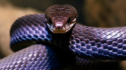
I'm not sure if this even is a real snake but I based Mx. Pentious' design on this:
CherriBomb:
Scraped most of her features in exchange for a sukeban theme. I personally have zero knowledge about the punk scene in Australia.
A majority of the suggestions I received for her rough draft had something to do with the skirt. I elongated it and gave it a slit in which the magenta from the inside is able to pop out.
Thought it would be a cute detail to have her hair explode if she's angry.
----
Apologies this took too long to be posted, Life got in the way as well as the fact I was feeling shitty about Pentious' first draft. Her skin was an awkward and ugly shade of green and seeing some posts critical of Pentious' design got me to think a little bit more about what direction I'd like to move her redesign.
You could see this in the earlier rough sketches but this was how Pentious' first redesign looked like
#vivziepop critical#hazbin hotel critical#hazbin hotel redesign#deadbeat motel mrx. pentious#deadbeat motel cherribomb#deadbeat motel redesign#//I only came back from the dead to post these Neptunic Lesbians on pride month/j //#//Happy pride to everyone btw!!//
331 notes
·
View notes
Note
Can I get gambit x reader with the seven minutes in heaven prompt
Seven minutes in heaven
The X-Mansion was abuzz with energy. It was rare for the team to have a night off from missions, and tonight’s downtime was being spent in the most unexpectedly fun way: a game of "Seven Minutes in Heaven." Laughter filled the common room as everyone drew names from a hat, their faces lighting up with excitement and playful anticipation.
You had been looking forward to the game as a lighthearted distraction from the constant intensity of your superhero life. It was all in good fun, a chance to see a different side of your teammates and maybe share a few laughs.
The hat passed around, and you found yourself sitting next to Gambit. Remy LeBeau, the charming Cajun with a mischievous glint in his eyes, had always been a bit of a mystery. You’d spent plenty of time with him, but tonight felt different—there was a playful tension in the air that you couldn’t quite ignore.
As the game progressed, it was your turn to draw. You reached into the hat, fingers brushing against the scraps of paper inside. With a mix of excitement and nerves, you pulled out a name and unfolded the slip.
“Looks like it’s me and… Remy,” you announced, trying to keep your voice steady despite the flutter of nerves in your stomach.
The room erupted in cheers and playful teasing. Gambit’s eyes met yours, and he flashed that trademark grin of his. “Well, well, well, ain’t that a stroke of luck,” he said, his voice smooth as silk.
You couldn’t help but smile at his easy charm. The rules were simple: seven minutes in a closet, and whatever happened, happened. You and Gambit made your way to the designated closet, your heart racing a little faster with each step. The idea of being alone with him in such an intimate setting was exciting, but also a bit nerve-wracking.
Once inside, you shut the door behind you, the small space dimly lit by a single overhead light. Gambit leaned against the wall, his casual demeanor a stark contrast to the anxious energy you felt. He watched you with a mix of amusement and curiosity, his eyes never leaving yours.
“Ladies first,” he said, giving you a playful bow.
You laughed, feeling the tension ease just a bit. “You’re such a charmer, you know that?”
Gambit’s grin widened. “It’s all part of the package, chérie.”
You took a deep breath, trying to focus on the game rather than the closeness of the space. “So, what do you want to talk about? Or should we just… sit here?”
Gambit took a step closer, his gaze softening. “We could talk, but I got a feelin’ that somethin’ more interestin’ might happen if we just let it be.”
His voice was low, almost a whisper, and it sent a shiver down your spine. You weren’t sure if it was the closeness or the way he looked at you, but you felt a sudden surge of warmth.
You shifted a little, trying to find a more comfortable position in the cramped space. As you did, your hand brushed against his. He didn’t pull away. Instead, his fingers gently intertwined with yours, a touch that was both casual and intimate.
“You know,” he said softly, “I’ve always thought there’s somethin’ special about these moments. When it’s just two people, away from all the noise and chaos.”
You turned to face him, your heart pounding. “And what’s that?”
Gambit’s eyes sparkled as he leaned in closer. “It’s when you really get to know someone. When you find out what they’re really like.”
His words hung in the air between you, charged with a mix of anticipation and something deeper. You could feel the warmth of his breath against your skin, the way his gaze held yours.
Before you could say anything more, Gambit gently cupped your face with his free hand, his thumb brushing softly across your cheek. The gesture was tender, affectionate, and it made your breath catch in your throat.
“I’m glad it’s you in here with me,” he murmured, his voice barely more than a breath.
You didn’t know what to say. Instead, you simply leaned into his touch, letting the warmth of his hand soothe you. The world outside the closet seemed to fade away, leaving just the two of you in that small, intimate space.
For the next few minutes, you talked and laughed softly, the nervousness giving way to a more relaxed, genuine connection. The closeness of the space made everything feel more intense, but in a way that was surprisingly comforting.
When the seven minutes finally came to an end, the door creaked open, and the sound of your teammates’ voices brought you back to reality. Gambit gave you one last, lingering look, a smile playing on his lips as he offered his hand to help you out.
“Time’s up, chérie,” he said, his voice warm and affectionate. “But I reckon we made the most of it.”
You took his hand, stepping out into the room with a smile. The game had been just that—a game. But with Gambit, it had turned into something much more memorable. As the two of you rejoined the group, you couldn’t help but feel a little closer to him, and maybe, just maybe, the feeling was mutual.
#marvel imagine#x men imagine#remy lebeau imagine#remy lebeau x reader#remy lebeau#gambit one shot#gambit x reader#gambit imagine#x men 97
57 notes
·
View notes
Note
what would members of the solosis line with drifblim fathers look like?
Pokemon Crossbreeds: Respiration
Respiration is the name for members of the Solosis line whose fathers were Driffloon/Drifblim. The breed got its name from the process or cellular respiration, which is when Oxygen in cells is used to make sugar. The breed is known for their melancholic personalities and their quietness. They were bred for their higher HP and their ability to learn Acid Armor.


Solosis
Respirative Solosis have a rounder shape and an X on their mouth instead of a diamond shape. The thing on their head becomes cloud shaped instead. These Solosis are quiet, and because of their nature, they've been nicknamed drifters. While they aren't ghost types, there are legends of this breed having spirits trapped in their jelly, waiting for them to get out.
Duosion
Respirative Duosion gain the traits if Drifblim, including sharper limbs, lighter colored underbellies, and lines on their bodies. There is also a 50% chance they can be born with red eyes instead of black, but I'm sticking with showing the black-eyed ones here. They have more oxygen inside of them than standard Duosion, and releasing it is how they are able to move around faster (sometimes it can sound like a fart and it gets old when you're supposed to teach about these things to first graders for a project). They're more active at evening.
Reuniclus
Respirative Reuniclus keep the X and markings of Drifblim, but the air that would float above them is now atop their head. Instead of the usual circles inside of Reuniclus, they gain little hearts that match the ones of Driffloon. The most notable change is their second pair of arms that resemble Drifblim's tentacles. These Solosis use their extra pair of tentacles to aid them in battle and help them with other simple tasks, making them useful service pokemon for paralyzed people. Like they're fathers, they're crepescular and travel in groups.
//My designs can be used by anyone if you credit me! Talking about designs under the cut
Solosis was super easy to draw, but I was confused about coloring. I kept wondering whether purple would be too much or if green wasn't enough. Eventually, I just settled on keeping it green.
Duosion was fun. I already like Drifblim a lot so it was fun making a pokemon crossed with it. Got inspiration from a basketball with the lines, lol. Had mixed opinions on the red eyes but I decided to stick to black when showing drawings though. I have what it looks like with red eyes though if anyone wants it

Reuniclus was the hardest, and I'm using thst lightly bcuz I didn't struggle much. It was more just sitting there and wondering if I should draw the arms downwards or keep them up. Wondered about the ears, but I just decided to move them so the air could fit. Wasn't going to give it hearts, but Driffloon has hearts, and I thought they looked cute, so I left them.
Thanks for reading this far if you did!
#solosis#duosion#rotomblr#pokemon irl#pokeblogging#pokeblog#irl pokemon#pokemon#pokeblr#rotumblr#pkmn irl#pokemon roleplay#irl pkmn#pokemon crossbreeds#crossbreed pokemon#reuniclus#reuniclus crossbreeds
72 notes
·
View notes
Text
How to make a good character reference

First and foremost, a good character reference is one that clearly and concisely tells you about an OC. Not only are they helpful to keep your art or descriptions of them consistent but if someone else will be drawing or writing about them, then a reference is typically a necessity so they can draw the character accurately. I’ll be going into how to make both a good visual and written reference, as well as tips that apply to both of them.
Special thanks to Lotus and Calico for giving some additional perspectives for me to think about, as well as anon for suggesting this topic!
Good Visual References
A reference sheet is a way for artists to easily see a character’s design for drawing them. At its simplest, this can be a simple, full-body illustration with little embellishment but some people will do full turnarounds (front, side and back views) or additional outfits for a character with props and other illustrations for a more artistic reference sheet. Regardless of your approach, your reference should clearly show a character’s basic features and, typically, the clothes they most often wear (whether that is a single outfit or multiple).
Adding notes to the sheet can be very helpful, such as a character’s height, specific facial features or a description of the kind of clothes they wear (like colours, aesthetics, fashion style and clothing preferences). If a character is often seen with a prop or item (such as weapons or mobility aids), then it’s important to also include those in your reference and make a note on the frequency of their use. Finally, if your design has pieces of clothing or props that have specific terminology, it can be helpful to include that terminology so it’s easier for others to search for more references.
Flat Colours vs Shaded/Rendered: I’ve seen some people complain about references that are shaded or rendered as it can often make it hard to colour pick from the reference. This can easily be remedied with a colour palette that is clearly labelled for what colour is used for what part. Using two of my own references as an example, you can see that my reference sheet for Eren doesn’t have any shading, making colour-picking easy. Comparing that to my reference sheet for Vex, the art for him is shaded but this is remedied with a clear colour palette on the left with labels saying what that colour is primarily used for. As a final comparison to a reference sheet that I feel fails in this regard, my sheet for Eris (nudity warning) has several outfits that are fully shaded but do not have a full colour palette outside of their basic features. However, since this character would be drawn in many other different outfits and the sheet was for personal use only, this doesn’t bother me too much.
Complicated designs: For designs with complex elements such as lots of accessories or intricate tattoos, it can be helpful to draw a larger version of these on the reference. This makes it a lot easier to draw them consistently in future as they’ll be clear and you won’t need to spend time zooming in or around your design. Additionally, if you character has a tattoo or very specific fur markings then it can also be helpful to create a transparent version of them. This way, anyone drawing your character can use that transparent version rather than drawing it by hand or, for those that do want to draw it by hand, they again have a very clear design to reference. Also, it can be helpful to have a simplified design for people with art styles that work better with less detail or for animating purposes.
Mannerisms: This is more so for references that will be sent to other artists for commissions, requests, gifts, etc. It can be helpful to have a small section on what a character’s mannerisms or way of holding themselves is like. This gives artists a jumping off point for ideas on poses or character interactions as a blank slate can be hard to come up with ideas for. It’ll also mean that if, for example, you have a shy character then they won’t be mischaracterised in art by being drawn with an overconfident posture. It’s best to use simpler words (such as annoying vs vexatious) as it can become confusing for people for who English is not their first language.
Good Written References
A good written reference can be split into two types.
The first is for describing their appearance, typically used for sending to artists when you don’t have an existing visual reference. For this, it can be helpful to go over the points of what I wrote for a visual reference and just translate that to a written description. Bullet points are the easiest way to do this as it gives artists something quick and easy to reference but it can also be helpful to link to images to give a better idea of what you want.
Pale skin with light freckles.
Lavender hair that gets slightly lighter at the tips and slightly darker at the roots. It is mostly-straight, shoulder-length and covers some of the face. Two small horns poke out of the top of his head.
Grey-blue eyes. Should look sleepy or lidded.
Thin-framed glasses with a simple, silver glasses chain (optional)
Black cassock with a black pellegrina and white collarino/tab collar.
For formal occasions, Vex may wear a purple ferraiolo with black, embroidered trim.
Purple stole with a symmetrical design.
At the bottom of the stole is the Leviathan cross.
Around the chest, there are the five alchemical symbols for fire, air, spirit, earth and water (in order from top to bottom).
Has a rosary with dark, wooden beads and small ivory beads in an alternating pattern that ends with an inverted cross (also known as the St. Peter’s cross).
Wears platform boots with metal toe caps.
Without the boots, Vex comes to 5’3”. The boots make him a lot taller, around 5’6”.
Sometimes wears half-palm gloves made of black leather.
This is the basic written reference that I had for Vex before I drew him a reference sheet. It makes it clear what they look like and any artist working with the description would be able to draw him semi-accurately from this alone. It can be hard to balance the necessary amount of detail with keeping things concise - large paragraphs can be overwhelming and even off-putting to others.
The second type of written reference is a reference specifically used when writing. While a lot of the same principles apply, you’ll often want to go into more detail regarding the character’s mannerisms, way of speech and dynamic with other characters. There are numerous great guides on how to write a good character reference or profile, all using different approaches. Personally, I like to use these five categories for writing a character’s reference.
Basic Details: This includes a basic description of a character, as well as their name and any other surface-level details about them such as age, date of birth, gender and sexuality, basic personality traits, etc. If the setting is fantasy or sci-fi, then I would also include anything that would fall under this category in-universe, such as species or magical alignment. This section is not for digging deep but more to give an overview on the character.
Personality: It can be really easy to boil down a character’s personality to a few simple traits like in the first section. However, characters will often act differently in different scenarios and have specific reasons as to why they act a certain way. How do they act when they’re alone vs when they’re around others, both those they trust and those they do not? Do they mask certain parts of their personality? What fears does the character have and how does that impact how they go through life? These are all things that can heavily influence how a character behaves and talks.
Mannerisms: Here, you’ll want to describe your character’s body language and demeanour such as how they walk and carry themselves, as well as first impressions from strangers. You can also go into any habits a character has, including whether they are aware of those habits and perhaps try to hide or overcome them.
History: A character’s past will usually define a lot of how they conduct themselves in the present. Here, you’ll want to include information on their upbringing, influential moments (or “canon-events”) in their life and their caregivers, if applicable. This can add context to certain behaviours or actions from the character.
Relationships: Finally, go into important relationships for the character. When I say important, I mean write about relationships to characters that are either contextually relevant (such as to the current scene or overall plot/story) or characters that have had a large impact on them. For example, the barista that you character always gets coffee from probably isn’t going to be relevant… unless you’re writing a coffee-shop romance where the barista is likely to be a recurring character. A character’s family that doesn’t appear in the story may not be relevant now… but the way that they influenced the character’s upbringing is relevant when it comes to establishing their backstory and foundational relationships.
General Tips
Non-human/original species: If your character is not human or is an original species, make sure to include any key features that are unique to that species and link to any relevant design documents for them. It’s a lot easier for someone to use your reference than it is to go searching for that information themselves.
What actually makes your reference good? This is hard to answer because what I think is good is probably contradicted by countless other people. Also, some advice for one kind of reference won’t necessarily be helpful for a different kind of reference. A good foundation for a reference will always be what you find helpful.
Keep it concise: Oftentimes, there’s so much information that we hold about an OC in our heads and it can be tempted to include absolutely everything into their reference. But remember that the key purpose of a reference is to make it easy to understand the main points about a character or design. Regardless of if you go further in-depth, always make sure to have a clear overview of them at the very beginning that can be easily referenced.
#oc#oc posting#character development#character reference#sorry this is a little later than planned! the insomnia-hypersomnia-hormonal-seasonal affective disorder was going WILD
41 notes
·
View notes
Text
Welcome back, disney duck's enthusiasts fellas!!! I'm finally back with my actual explanation about...
Why I don't like Gosalyn's Redesign for the Ducktales Reboot:
(Beforehand, I would like to notice that I will touch a very delicate matter latter on in this post. As such, if you're sensitive to discussions about culture and race, this post is probably not for you. I wrote said point with educational purposes in mind)
Now, most reasons are just my personal preferences, and please have in mind that LOVE hate on things I like. It's weird, I know, but I can help myself. Also, I know close to nothing about character desing. Finally: Alex perdóname hermano.
Anyways, reason number one!! : Her new design is not similar enough to her original design.
Most of the characters redesign are just modernized version of what they have been wearing since they were created. Donald wears his typical sailor attire but in black (like in the comics); Gladstone is a modernized version of a dandy; each triplets wears different characteristics of their usual designs; Mrs. B's uniform is now modern and more formal ... you get the point. Every character feels the same but in a different setting.
Now, Gosalyn had a single design, so it should have been easy. She was a read head with pigtails and a purple basketball shirt that I think she wears as a dress. Her redesign does not wear purple as a main color nor a basketball shirt, does not wear pigtails but a ponytail, and for some reason she now has curly hair. Also, though still a redhead, the read is much more subtle, mostly brownish/deep red.
I'm gonna admit that they did succeed in keeping her a tomboy through and through. But here I shall lay out my second problem:
Gosalyn's redesign is quite maximalist.
She wears a lot. And most characters don't wear that much, so she feels out of place. Yes, other characters, like Della and Launchpad, wear full outfits too, I'm aware, but their designs are keeping up with their original design or had more or so a simple color palette to work with. Gosalyn, on the contrary, wears too much color: she is deep red, olive brown, like three shades of green, black, gray, white, and purple. The original design kept her in warm tones and simpler lines.
As I said, I like the redesign do reflect the character personality indeed: she's sporty, so she wears a hoodie. She needs gadgets for her superhero adventures, so she has a backpack. She needs to go undercover, so her colors are muted. It works.
But I also have a third problem here:
She looks older.
The girl is young in dwd, like nine. In the reboot, the main kids are aged up from the 80s show: they are ten in the first season and eventually twelve in the third season, but all the desings are still the same from the moment we firt met them, so they still look and feel ten. Gosalyn does not. She gives me the impression of being like fourteen, as she also has a more mature personality (and I also didn't like that, but whatever).
This does not go well with the reboot because her story is supposed to lead up to her being the daughter of Drake Mallard, who is forty I think in dwd (at least that's the impression it gave me). But in the reboot, Drake is like a millennial, so he is at most in his thirties. The age difference is not quite there. How could they ever become actual father and daughter then? Mentor-protégé, sure. Older sibling protector, maybe. Father and daughter... idk. Would a gen z like to be adopted by a millennial?
Anyways, I don't think they translated that well her overall design for the reboot. When I first saw <Let's Get Dangerous!> I did felt all of these things I'm explaining. "Why does she wear boots? Does she really needs leggings? If under the green hoodie, she wears a purple hoodie that reassemble her original basketball shirt better, then why don’t she just wear that? Was it hard to draw her in pigtails instead?"
The design is pretty, and it works with the aesthetic of the episode, but the overall show. This is not Darkwing Duck Reboot; this is Ducktales Reboot.
Now, all said above is not that deep actually (I told you I like to complain). But there is a greater problem with Gosalyn that I just can't deal with, and I need to share with the world because it actually disappointed me enormously:
Gosalyn is supposed to be a latina now.
... no, she's not.
I'm not sure how to explain this, but latinoamerican is not a race. Each latam country has a different type of racial diversity depending on their history and geography. On the other side, there's this recurrent discussion in latam about how we mustn't consider every latino descendant a latino through and through if they don't participate and/or engage in the culture or social struggles of their respective origin country.
When the ducktales crew announced Gosalyn to be latina, I was... concerned. Mainly because till this day, I dont understand why they can't just say the name of the country the character is supposed to be from. If they don't, then I'm assuming they mean by race, which does not exist in latam for as I explained, latam is full of different races, which mean again they ment Gosalyn to be mixed looking/browned skin. Which didn't make her latina.
Fenton is an ok representation for Ducktales. The mom feels Mexican, their Spanish is quite understandable, there’s participation in the culture, they even gave them a new name: Cabrera (which is not a stereopltycal/overly common surname thanks heavens). It checks out.
Gosalyn does not: She does not speak spanish (and neither portuguese for the matter), she does not get a new surname, does not seem to engage with the cultural identity of any country other than usa (Calisota is canonically in usa). She is not one of us. WHICH WOULD HAVE BEEN FINE!
She could had just have her new look for the reboot and it would had been fine enough as she could pass out as many more non white identities that exist in usa, so using the latino label just feels comercial, which feel frustrating.
Now I shall go and hide for a few more months. xoxo and peace (^3^)/^ ~♡
#gosalyn mallard#ducktales gosalyn#dt17#darkwing duck#they could naver top og gosalyn#character design#representation
26 notes
·
View notes
Text
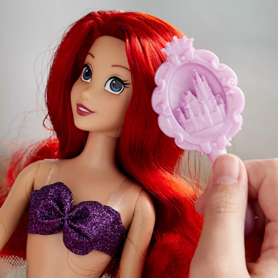
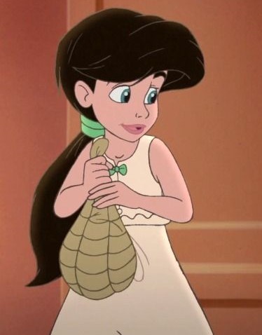
Behind the Scenes: Making Melody
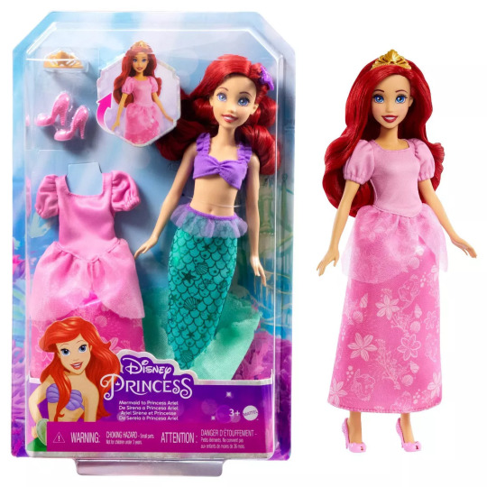
Ah, Melody. The daughter of Ariel and Eric. Ariel, the only princess to have a child (Descendants doesn't count). Since the sequel to The Little Mermaid launched in 2000, I've wanted a Melody doll. To this day I can't believe the Disney Store hasn't made one.
Technically, one was released back in the day. I remember going to Toys R Us to get it, and upon seeing it, put it back on the shelf. Why? Because it looked nothing like my favorite princess's daughter.
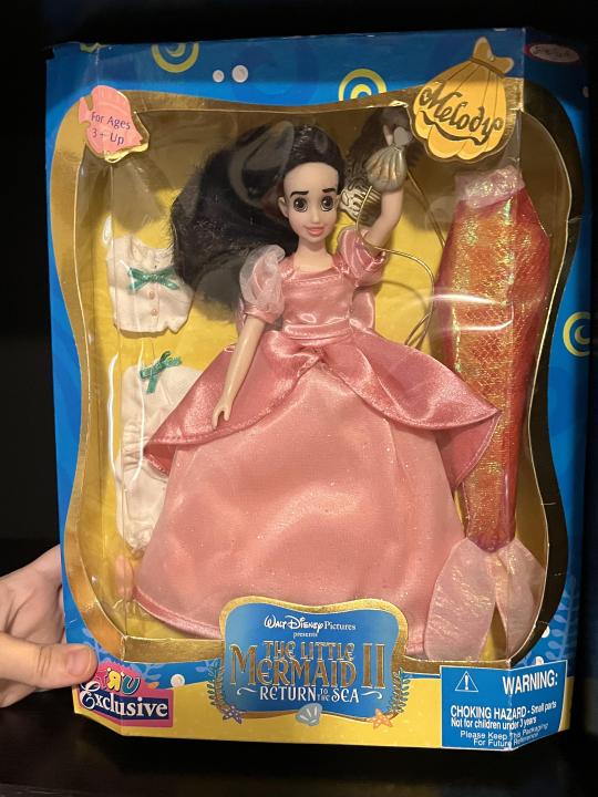
A bit scary, right? Her eyes, for one, are brown and they should be blue or at least greenish-blue. And her face overall just gives me an uneasy vibe. I can't explain it, but she just doesn't look right. Even back then I couldn't fork over the money for her. Now, try to find her on eBay, and I swear she's ranged in price from $400-$800. Definitely out of my price range for a sub-par doll. Yes, I'd like to have the clothes, but no way am I forking over that kind of cash for clothes that I'm sure I can have someone make. And while I've come a long way with customizing and could easy change her eye color, it doesn't change the fact that she looks... off.
And thus began my journey of creating my own Melody doll. Again, Disney Store should really make one. A lot of us fans and collectors want one, and we know they have the ability to make smaller dolls because we've gotten Alice, Wendy, and Tinker Bell. Come on Disney Store...
But when a company fails to provide a doll you desire, you do the logical thing - you make your own!
The first step was determining the best candidate to transform into Melody. Obviously I wanted her to have one of the aforementioned Disney Store bodies designed for smaller characters. It would match the Ariel dolls I have, and I'd been eyeing an outfit made for that exact body (Melody's primary outfit, her bloomers).

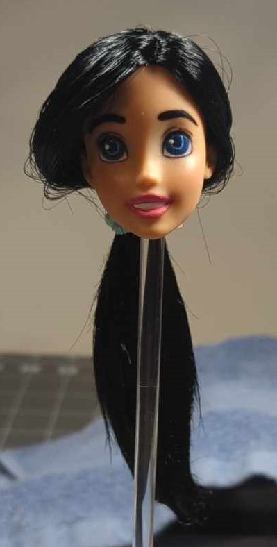
So the body was simple. Next was the face. Obviously either of the three heads that came with the body would have sufficed. Skin tones were a good match to the Ariel dolls I have, so another easy step. The face, though... Melody is often portrayed as having a very large, toothy grin. I've seen people create Melody dolls using Ariel's face, and while that does make total sense, I felt her smile was a bit too "small" for this girl.
If I wanted to keep the original head with the body, Tinkerbell was out because of her pointed ears. That's one thing I can't fix LOL. Sculpting and drawing are definitely out of my area of expertise.
That left Alice and Wendy:
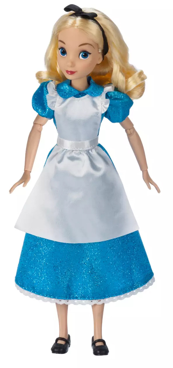
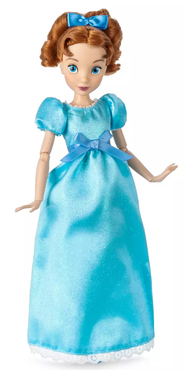
Great candidates, but their smiles definitely aren't right. Melody rarely had a closed mouth smile, if ever, and while I've seen some people customize these dolls into Melody and other characters and add painted teeth, the original issue still exists - the smile isn't big enough.
And yes, Tinkerbell, of course, has the open mouth smile - but the ears!!! Why?!
Another issue with using a Disney Store doll is the head itself. Disney Store doll heads are significantly harder than Mattel and Azone dolls, meaning it takes extra strength/work to reroot them. I could try dyeing the doll hair or using fabric markers on it, but A) that could possibly stain the doll, and B) I've tried fabric markers before and it makes the hair feel like straw.
I was convinced I'd inevitably have to use Wendy or Alice and have someone else reroot her for me, but then I thought of something else. Mattel has reacquired the rights to make Disney Princess dolls. That, of course, includes Ariel. I've made hybrid dolls before (my Inuyasha dolls combine two or three different dolls into one amazing creation), and I remember seeing the princess dolls when Mattel brought them back - particularly Ariel, who had a large toothy smile.
Plus, because she's Mattel, I know how the mechanics work with swapping heads and that the head is a lot softer and easier to work with in terms of rerooting. So I ordered her, but I wasn't yet sure if she'd work. Would her skin tone match either of the Disney Store bodies? What about the head size - would it be too big or small compared to the Disney Store Ariel? And of course, Mattel = pixelated faces... though I'd be repainting the lips anyway for sure because Melody's lips are a more natural pink shade rather than the bright red Ariel has.
Well, luck was on my side - the Ariel head not only matched the skin tone of the smaller bodies (which were also very close to the Disney Store Ariel), it was actually smaller than the original Wendy and Alice heads! I don't know what's up with that, but what a happy accident!
However, there was still another step. I've put Disney Store heads on Barbie bodies before, but not vice versa. And these are smaller bodies. How would it work? The verdict was a bobble head, but some rubber bands around the neck peg took care of that. I think it completely works!
The next step was the rerooting process. I don't know why it's so satisfying to pull all those little plugs out of a doll head, and then poke new hair right into it. :D Of course, before the poking, I had to use acetone to remove the factory paint on the scalp, then paint back over it with black and seal it. This time I was determined not to use too much hair, as in making it too long. When I rerooted my Azone Kagome, I didn't trim the hair until it was completely rooted, and not only did it make a huge mess, it was very wasteful because of how much I had to trim off to get it to the right length. Melody's hair isn't that long (it seems to hit just past her butt I think), so I felt fine cutting each piece I plugged in half. In the end, that proved to be a good decision because I only had to trim a very small amount to even it out and get the look I wanted. Yay!

Once that was done, I gave her a boil wash, allowed the hair to dry overnight, and then added the special glue inside from The Doll Planet Hair (I also got the hair from them). After that dried overnight, it was time to start on the face. I decided to start at the top and work my way down to lower my chances of messing up something that was finished. So I did the eyebrows first. Melody has significantly thicker eyebrows than Ariel, and of course they're black rather than red. Surprisingly enough, I was able to get them thicker and still even... this coming from the person who spent two hours on eyebrows on a different doll. >.<
Next was the eyes. At first I wasn't sure if I should leave them or not, but in the end I decided they needed to be changed. They were way too blue, and they're really supposed to match Ariel's and Eric's. She is their child, after all. Plus, thanks to Mattel, they were also pixelated. BOOOOO!
Many of the scenes in the movie show Melody as having green eyes, so I started there. But then I thought, I better make sure they match Ariel. So I got an Ariel doll out and used her as a guide. Let me tell you, matching that color was insanely difficult. Too green, too bright, too blue, too dark, etc... Then I kept going back and forth because, again, she seems to have green eyes. But then again, they should match Ariel's eyes. Remember, being a perfectionist can be super exhausting.

I finally had what I thought was a good color, so I used that to help shape the eyes. I kept the original white part of the eye and just painted over what was already there, trying to match the Disney Store style (large portion in the darker color, small ring in the lighter color, and then the pupil). But then, after holding it next to Ariel, I was still dissatisfied with the color (way too bright). I kept looking at Ariel, and then I even saw some other custom dolls with blue eyes and some shots of Melody do depict the eyes as being more blue than green (Ariel, too):
So, after literally a week of just trying to get the best color, I finally got it!!! Victory dance!

Last was the lips. Should be simple, right? I like the color of my Barbie self's lips. They're a natural shade of pink, and I have the combo of paints I used to pull that off saved, so I could just replicate that, right? WRONG! I didn't factor in the original factory paint, which serves as a base coat and affects what goes on top of it, plus this doll has a warmer skin tone than Mini Me, so the color turned out to be super bright and very unnatural-looking. So I did a ton of mixing and modifying the paint recipe until finally I was satisfied with the shade. I had to go over the teeth a couple of times too because A) pixels and B) I went over the white a bit with the lipstick.
Once her face was done, I could start styling her hair. Melody just has a simple ponytail with large bangs like her mom. The hardest part was definitely those bangs. They're not straight or flat bangs, but they have kind of a "poof" to them.


The part was a little off - it should have been more to the side and less to the center. However, I was following the original factory root line, so I didn't really pay attention to where it was. That was my fault lol. I took a few strands of hair and held them out of the way as I tied the rest into a ponytail. To give the bangs their ideal effect, I tied that hair back separately with a hair tie I'd bought that resembles Melody's green one. Then I started pulling them out little by little, hoping to achieve the desired look. This was the first result:
Not bad, but I thought I could make it a little better. I noticed some small bald spots around that area in the scalp (oops), so I added some more hair to those areas to make the bangs a little fuller. I re-tied the bang strands (didn't boil wash the second set of hair because I didn't want to risk messing up the paint and I wanted them to stand up somewhat anyway), manipulated the positioning a bit, and came up with this:
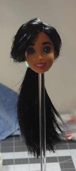
I think that's a little better and gives the desired effect. I may still try to manipulate it some more, but I did put some of my special doll hair spray on it to hold it in place. The ponytail bottom just needed a small curl, and while I tried my curling iron on it, I found it to be better to just curl it by hand and spray it.
The final part was the outfit. I got the outfit from malanedoll on Etsy (she makes gorgeous Disney outfits!) The outfit also came with Melody's symbolic seashell locket.
I know what you're thinking - where the heck is her tail? Well, I can't sew that well (I can make little pillows, relatively decent curtains, and maybe some garden flags, but outfits? Nope lol), and I haven't been able to find a tail that would work with this body in the right color. By next year I might have her tail, but for now, she'll stay in her signature bloomer outfit. That is what she's wearing most of the time, and she did ultimately decide to stay a human in the end. :D
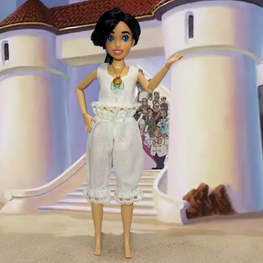
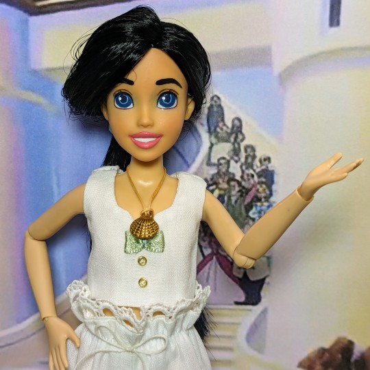
And with that, Melody was complete! Probably not 100% perfect, like most of my creations, but satisfying enough for me! Of course, if Disney Store makes an official Melody doll, I'll buy her - and totally do a comparison LOL. And I do intend to eventually get her that iconic red tail!
Thanks for reading my journey on creating Ariel's daughter! To this day, she's still the only Disney princess to ever become a parent lol.
#my plastic life#doll photography#tenderwolf#one sixth scale#disney#disney store#disney doll#ooak doll#custom doll#ariel#the little mermaid#melody#the little mermaid melody#the little mermaid 2#myfroggystufffanpics#mermaid#mermay#disney princess
58 notes
·
View notes
Note
Could you talk about the designs Viv makes? I don't see many posts talking about this and I wanted some design tips, I intend to post my own cartoon designs (I just don't know when) and I wanted some tips <( ̄︶ ̄)>
Hey hey!! Id love to talk about designs!
I actually answered this entire question and then uh…. Tumblr deleted my draft so let me try to redo all this lmao
Vivzie has a problem with bodytypes I’ve noticed. Almost all of her cast is insanely skinny and the only two “plus-size” characters I can think of are Millie and Mimzy. Meanwhile, Angel Dust, Vox, Stolas, & Alastor are a few very skinny characters I can think of off the top of my head.
For the best example, I’m going to be using Vox for now. Here is my Vox design next to his canon appearance
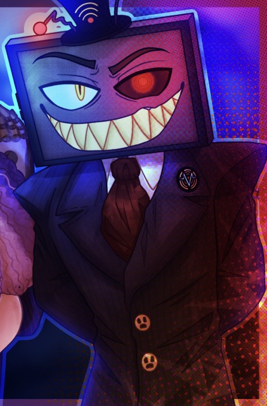
They don’t look too different right? This is still easily identifiable as Vox because his main characteristics are there; stupid little hat, tv head, thats about it.
My design also keeps elements of his suit with the stripes and shoulder pads, though in my design his body is a bit wider and his shoulders + waist make him look more commanding and intimidating while still maintaining a sense of professionalism. As for his canon design, he definitely looks sketchy, but he doesn’t really give me that commanding sense of popularity or authority that I feel an overlord should have, especially one with such a wide range of influence as Vox. His canon design looks top heavy and a little pathetic in that “he was born in a wet cardboard box all alone” way. Don’t get me wrong, a small waist can do wonders for a design, but when your designs start to look like… this
I think you might have a problem.
Now, I know I am nowhere near the best character designer in the world, but I have designed my fair share and I think I have enough experience to flatter myself a little.
This is a very simple design choice to make. Body types are probably some of the most intricate and interesting parts of a person in my opinion, and with a lineup like this where everyone looks more or lest the same from the torso down, it’s kind of a dead and sad looking cast, and not in the intended way.
I’m aware my designs are very detailed and wouldn’t be easy to animate with my style, but it’s very easy to draw extra body types with a style fit for TV.
Gravity Falls is a great example of stylised bodies and also using them to build personality. By looking at these characters you can generally tell what their base personality is probably like right? You can do the same thing to an extent with the Hazbin Cast, but all of their designs get muddled into the other. Can you even tell where half of these people are positioned in this screenshot
It’s so pink and red im going to start seeing green when I look away. There are so many colours, use them!!!! You can still slap a red overlay over it and make it “look like hell” or whatever, but you’re still gonna have more variety.

Here’s my body/fur references for Angel and Husk. They are almost entirely opposite to eachother but you can probably get an idea for how they are based on colour and shape. I recommend studying other TV shows and things like anime or movies to see how body types and colours impact character design, but general things I always think of are, like I’ve said, body type, personality, colour, and silhouette. Silhouette is a bit harder to pin since a character can have a very recognizable silhouette and still not be a good design, but honestly to me as long as you can tell which character is which from silhouette you’re good to go on that front.
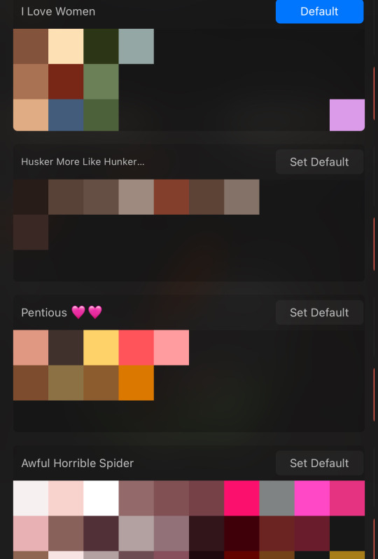
- Generally just don’t reuse the same colour palette over and over (heres some of my hazbin colours)
- Give diversity in shapes when you can and when it benefits the design
- Try to show their personality through their clothes and pose
- Don’t be afraid to add little physical or personality details that other people might not notice, a good design should keep you interested in tiny details like that or surprise you later on
- Pay attention to what would and wouldn’t make sense (ex. A character that doesn’t like modern fashion wearing modern fashion)
Im not the best at explaining all of this but I hope you could grasp even just a tiny bit of an idea from this! At the end of the day as long as you’re having fun and not actively harming people with the designs then you should be good to go
#raimble#hazbin hotel#hazbin critical#hazbin hotel criticism#hazbin hotel critical#anti vivziepop#hazbin hotel rework#hazbin hotel rewrite#hazbin hotel redesign#hazbin redesign#my art
108 notes
·
View notes
Note
HELLO i love your stuff so much!!!!! i don’t know if this question is a bit much to ask but i was wondering if you had any advice on composition? a lot of your pieces are sooo sooo cool composition wise and i was curious to know if you have any tips on that kind of stuff
hi thank you!! I don't know how efficient I can be at giving advice on composition, since it's something that I kind of don't really think about, if that makes sense? Maybe it's because I've been doing this long enough where I don't have to actively think about it and it just sort of comes to be subconsciously. ANYWAYS my biggest tip is think about where you want your viewer to look and focus on. Let some of the details of your piece fall back and blend into the background if it's not important. One thing that I find helpful is to not overload the viewer's eyes and make it easy for the viewer to understand, think about the gestalt design principles. All of the small parts of your piece should be able to work together to make one whole piece. So in a way, how good your composition works depends on other aspects like color and so on, they all work together. Breaking down the composition into simple lines and shapes can help you easier see what you're trying to achieve. Is everything balanced or unbalanced? Are there any leading lines that help the viewer's eyes move around the composition? Are there straight or diagonal lines? Is there a rule of thirds/rule of odds? What is the first thing that pops out when you first see the piece at a glance? What is the mood of the piece? Is the framing or are my lines and shapes helping with the mood or doing the opposite? Symmetry, geometric, and straight lines and shapes are often visually read as calm and stagnant. Diagonal lines can indicate movement or unease, alongside unbalanced shapes. I could keep going on about this etc etc. Think about the principles of design
A tip is that people read from left to right, up to down, and are also often drawn to the center when looking at something at a quick glance so think about that when thinking about placement in compositions. I think another thing that people caught up is the accuracy to the real world, whether it'd be with scale, perspective, or detail. But I say do not get caught up in that! It's OK to distort the world for the sake of your composition if you know how to make it work. Obviously you wanna be able to understand how the real world works before you can break the rules, but don't let the rules define you. It goes back to gestalt, that everything in your piece must work together in unison for it all to work out. That was a lot but I hope that at least some of it is helpful ! ALSO LET ME ADD: look at other artsits for inspiration, no one can claim ownership to a composition/framing and you don't get better without looking towards the masters. I'm not saying to straight up copy artists, but do not be afraid to look at other artists for inspiration and reference. Just enough inspiration where it becomes your own thing and not a copy. And I'm not just referring to drawn art, I mean photographers and cinematographers too. Cinematography often goes unnoticed as an art form but it is and there's a lot of thought put into those compositions, and it can be easier to break down and understand how the composition works if it was taken with a camera depicting the real world rather than a drawing interpretation of the real world
#asks#sorry for the very design-y speech im a design student#but these can be applied to any form of visual arts#i could go on and on about this i love talking about art and design
17 notes
·
View notes
Note
If you don't mind me asking what's the uhh. origin of agent fwee
if i recall correctly i think she technically started as an inside joke of my sister and i saying "agent 3" in like, a silly babyish voice?? but in 2018 (about a month or so before i made 14 crush) i made these little joke doodles of agent 3 during class.
she wasn't at all tied to 14 crush until someone had a silly idea that just. happened to line up almost exactly with fwee as a concept, so i brought her up and showed my followers the art above.

people liked her a lot so i ended up keeping her as part of this semi-canon state where i think she exists in the 14 crush universe but she'd never have a real tangible role in the blog (maybe she wouldve had a cameo at some point if it kept going, who knows)
she got a lot of fanart with different designs attached (since the original drawing of her was just agent 3's octo expansion look with a silly face and red ink) so i decided i should give her her own (rather simple and easy to draw) design in 2019 (lifting the color scheme directly from Strange Klug from puyo puyo lol)
and thats where she's at now! just a silly gal who is either just a weird teenager or an immortal all powerful being or anything in between. up to you.

(her birthday art from 2019, 2020, and 2021 respectively. looks like i missed last year... sorry fwee)
#14 crush#bri talks#sometimes i depicted her with mark the marketer octoling as having a father/daughter or maybe older brother/younger sister type of dynamic#but he was a whole other much later thing lol#she was always the more popular of the two anyway#long post
151 notes
·
View notes
Note
In your opinion, what makes a good spider-variant design? I'm trying to avoid the pitfall of "bunch of normal ass clothes over the suit" I typically see, but also struggling to come up with anything that's clearly a spider-man when you look at it and doesn't confuse with peter parker's spider-man
That's a good question! So good that I'm going to bust out the proper capitalization and everything.
I'll give you a freebie right off the bat, because this is probably going to be a long post: one easy way to distinguish your character from Peter Parker is to draw them with a different body type. That way, even if their costume was similar to Peter's, it would obviously not be him.
Now, before getting into what I think makes a good Spider-Man design, I feel obligated to speak on what makes a good superhero design. Namely: Keep it simple, stupid! The best superhero costumes are pretty easy to draw, probably because they were designed to be drawn a million times by a million different artists. These costumes are simple enough that they can reduced to bands of colour and stay recognizable.

I promise that keeping your design simple will undoubtedly make it better-- or at least more superheroic, because this applies to Spider-Man, too!
Onto making a Spider-Man costume that is recognizably Spider-Man, but clearly not Peter Parker's. Obviously this costume is going to look different than Peter's classic costume, so we could start by figuring out what about that costume we can change. Thankfully, they already stripped Spider-Man down to the essentials in 1984.

Mike Zeck's black costume identifies these necessary elements of Spider-Man's costume:
Those luchador eyes
The front and back spider emblem
Form-fitting tights
The rest of the costume (the segmented colours, the web pattern, etc.) are basically fine for you to ignore or change at your leisure. Okay, maybe not... you could just draw Green Lantern and put a spider on his chest and back, and that probably wouldn't make for a great Spider-Man. But it's a place to start, at least. As long as you're putting serious thought into this costume, though, you should be able to ignore pitfalls like that.
Hey, speaking of thought, I thought I should cover some of those extraneous details Ditko included in his iconic Spider-Man design! Namely the way he chose to segment the reds and blues, he actually put loads of thought into it:
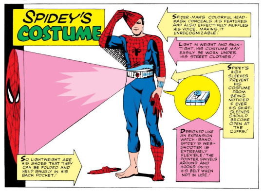
Namely, the high-rise gloves and boots help Peter's costume remain invisible beneath his civvies. I actually think these logistics are important to consider when designing a Spider-Man costume (or really any costume).
Anon mentions the "bunch of normal ass clothes over the suit" trend in spider-design in their ask, which I was happy to see because it means I can talk about something that really bugs me about recent Spider-Man stuff: How does Spider-Man stick to walls through regular shoes? No, seriously? Think about it for a second! When Miles wears Jordans over his Spider-Man costume and tries to stick his feet to a wall, wouldn't his feet just stick to his shoes instead?
Ditko rationalized this by deciding that Spider-Man can stick to walls through thin fabrics, but that rule has basically been forgotten. Despite how I sound, I'm mostly fine with this change (this is a textbook 'rule of cool' case), but these kinds of things are worth thinking about.
In that vein, keep in mind that Spider-Man's superpowers really lend themselves to acrobatics. Your spider-character probably shouldn't be wearing a suit of armour, or something that would greatly restrict their movement or sticking ability. That's why I labelled "Form-fitting tights" as a necessary characteristic of a Spider-Man costume earlier on in this post.
Before I wrap this up, one more thing you can try doing if you're stumped is looking at real life for inspiration. Whether that's going back to the old strongman outfits that gave way to the original superhero costumes, looking at modern day equivalent athletic wear, or even looking at actual fashion (as long as you're not just putting that fashion over the suit), there's bound to be something that could give you ideas.


86 notes
·
View notes
Text


Unfortunately lower visual quality than I wanted be because Tumblr only allows 10 images so I smushed them into three canvases instead of two post. Anyway beta trolls Headcanon and some thoughts below the cut.
Aradia
Aradia is the design I probably have the most experience drawing of the beta trolls purely because of how many zines I’ve drawn her in the last year. I like thinking of her hair similar to Pinkie Pies’ in g4 of mlp, where it’s very curly bouncy in her alive and godtiered forms but straightens out more when she’s ghosting up the place and in Aradia-bot form. I didn’t realize until a recent zine I had been drawing her horns ways too low for comic accuracy but I am a creature of habit so I keep drawing them like that.
Tavros
I’ve grown to love this kid because of my recent reread but I do not like drawing them. Between the Mohawk and the long, straight horns, I don’t care to draw their most important traits so he unfortunately only gets drawn in these group drawings. As for the one ear being pierced, it’s kinda a reference to cow tags but also I think it just fits them.
Sollux
Sollux a pretty easy character to design. I just have to imagine a greasy nerd kid growing up too fast for him to put on weight, add his troll bits and voila. The snake bites are definitely a hold over from the humanstuck I made for him last year but I think it just kinda add to his whole vibe. The undershirt comes from someone who also sits in a hot-ass room most of my days and will wears a second layer so leaving the room won’t feel like stepping out into a frozen wasteland.
Karkat
Karkat for me has always been short and stout guy. Other than that most of his facial features are taken from me, being someone who also over exaggerates their faces and nearly always is squinting a little.
Nepeta
Between all my designs of Nepeta the only thing that ever changes with any consistency is her hair. Like giving her cleft lip scar because I gave it to my fan-descendent of her and it’s cute.
Kanaya
Like two months ago I saw a post on here saying give that girl a nose (in reference to Kanaya) and it was the single most true HC I have ever seen. I also like completely throw out any references I have of her when I draw her hair because I think she should have 1930’s waves and curls. I typically only have to draw the super simple eyes so the only thing I had to change was giving her actual eyes.
Terezi
Got pretty comic accurate but probably would erase some of the chin to imply she’s fat a little better if I wasn’t doing this more rigid style.
Vriska
Also pretty comic accurate with the exception of the snake bites which is probably because I don’t draw her a lot and I don’t think about her much enough looks wise to have any specific head canons.
Equius
Goodness his hair gave me a struggle, kept on looking like a balding metal head until I added the pushed back stuff. Also returned back to drawing pseudo animal ears by giving him horse ears only angle to better fit a humanoid head.
Gamzee
I hate their make-up but every thing else about drawing them is a dream; goat ears, not straight hair, simple horns, silly little guy. What more could I ask for.
Eridan
And I’m almost done but unfortunately this doofus is next and requires the most detailed bust even in canon. Due to drawing them in this year’s 413 countdown I know how I like styling their hair and fins so I basically just chop the hair up since this is suppose to be during comic hcs and then follow their canon and Pesterquest designs with a few added features and boom. I was drawing everyone with the dark grey lips but I forgot for Eridan so I’ll just say they use concealer on their lips.
Feferi
Yippee! Back to ignoring canon and just giving her the biggest eyes on account of her glasses and cute piercings. I originally based her fins off of lion fish fins but they’re definitely more based off of betta ventral fin now.
#homestuck#homestuck fanart#homestuck art#aradia medigo#tavros nitram#sollux captor#karkat vantas#nepeta leijon#kanaya maryam#terezi pyrope#vriska serket#equius zahhak#gamzee makara#eridan ampora#feferi peixes#character design#my art
24 notes
·
View notes
Text
How I make sigils
sigil magic is pretty popular, and there are many ways to do it. this is how i design and use mine!

step 1) numbers
first step is choosing the number of sides the drawing will have, and therefore the centerpiece. today im making an elemental symbol to charge spells. in my tradition we have three elements, so my sigil should be three sided.
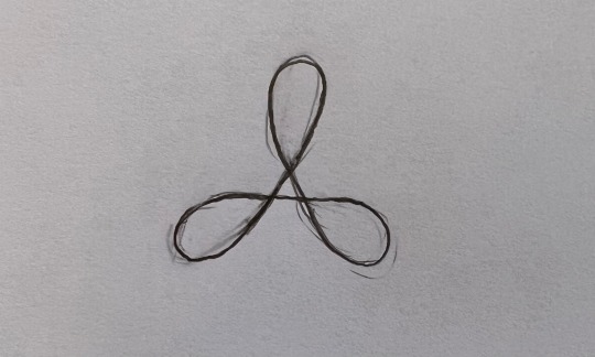
any three sided shape would work for me, but i felt drawn to something like this.
step 2) symbology
next i want to start adding easy symbols to represent the concept my sigil is based on. this means i need to represent land, sea, and sky.

here for sky i added some birds and suns. it's important that the shapes are simple to re-create later.
i keep drawing and try to make the shapes connect to each other in an aesthetically pleasing way.
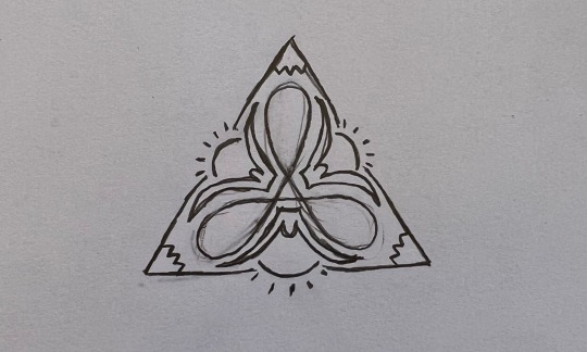
for land i added some mountains, and to connect them i tried to blend the lines in as solar rays.
lastly i need to include the sea.
i put some large waves, also coming out of the suns.
step 3) sealing
now i just want to tie it all together. usually this means adding random squiggles to close off any "open ends" in the drawing. in this sigil there are two big gaps i want to close- right above the sun, and in between the ends of the waves.

my philosophy on this is that i want the energy to be flowing through the sigil continuously, not getting stuck in a gap.
step 4) preserving
finally i edit the photo to high contrast black and white, save it to a folder on my phone, and i can reference and draw the sigil whenever i need.
some other considerations while designing
- should the sigil be symmetrical or not?
- can you picture how energy moves through it?
- does the sigil have a simple enough design to be replicated in the future? should it be simplified?
let me know how this works for you!!!
#paganism#pagan community#paganblr#witchblr#witchcraft#baby pagan#baby witch#baby witch tips#easy spells#sigilwork#sigil magic#sigils
279 notes
·
View notes
Text


Discussing a potential project!
Back in my Steven Universe phase haha! So before we get started with this semi-serious project, there are some things you need to know about the AU first before we proceed further!

Okay so a just before the holidays came up, I started watching Steven Universe again. And as I was watching it, I realized that AU’s of the show also exist too, but most of them only focus on Steven. So I thought to myself:
“Why don’t I just make an AU on a different character instead? A character that’s easy for me to draw and not over exaggerated” so I settled on my favorite character’s: The Rubies!
And if I’m being honest, ‘Eyeball’ seemed like a pretty cool antagonist to me.
Now, how did I come up with the idea to make an Off-Color Ruby? Simple, The Rubies are known to take their responsibilities very seriously in the regular show, despite being fooled once if not twice by the crystal gems, they were still determined to find Jasper. Now…what if we took that concept away? What if we took everything that made a Ruby a ‘solider’ and turned them into an apathetic and carefree outcast who just didn’t give a damn about authority or their responsibilities?


So I started to lazily experiment with these three drawings so I can get a somewhat heads up on what and what not to do when making the official design for the character. Just to be clear I was trying to be sneaky and see if the human aesthetic look would work on a Ruby, to make a long story short: it did not, at least not yet.
So out of the three drawings I chose the one in the middle as inspiration/reference.
But as far as the final design went I was starting to give up, I looked at references, and even inspiration from the original Rubies, but it just wasn't coming out the way I wanted. Then I realized if I put too much thought into something, of course I'm not going to come up with anything on the top of my head. So I did what I should have done in the first place, not overthink it and draw what I FEEL an Off-Color Ruby would look like.
And after 30 minutes to an hour of drawing, I finally did it and came up with this:

Aren't they something...? Now to the fun part, what is this AU about? A simple but obvious concept, an off-color going through a permanent rebellious phase and are of 'need of guidance'
To be more specific, this Ruby didn't emerge in the way Homeworld wanted them to, the complete opposite of what the expectations of a Ruby are supposed to be. Off-Colors were already considered a 'freaks', but their existence proved that theory to be somewhat effective. They were often bored, sassy and rude, treated high ranked gems like their status didn't matter, and overall wasn't fit to be a Ruby soldier in general. Despite giving numerous warnings that they could potentially be shattered, they didn't listen. One day they were assigned to work with two other Rubies to help keep them in line. Now it's the Ruby Trio against the world!!!


(Here's a reference for anybody who wants to make fan art. I even made one for the other two Ruby OC's).
Again this is not a full project where I'm posting a new comic once a week because no one has the energy for that if I'm being honest. This is just something I'm doing for fun but if you have questions for me and or the characters feel free to ask.
#off-color ruby au#ruby au#su au#ruby su au#my blog#OCR au#ruby#new au#dark ocr au#dark the ruby#off-color ruby squad#ruby squad#steven universe fandom
9 notes
·
View notes
Text
Blood & Snow
Pt. I
Directory: {Pt. II} {Pt. III} {Pt. IV} {Pt. V} {Pt. VI} {Pt. VII} {AO3}
Welcome to my @hermithorrorweek fic! I spent a while trying to figure out seven different fic concepts based on the prompt, and kept coming up blank, up until I decided to combine them all and write a single fic, with each prompt being the theme for a different chapter. Blood & Snow is the result, and at the time of posting it is not quite complete, but I'm excited to share it with you nonetheless. I'm hoping to post a chapter once per day, but later chapters may be delayed depending on how long it takes me to get them written. Some of this builds off concepts I played with in some of my earlier Decked Out 2 ficlets, which you can find in my writing tag. TWs for this chapter include: non-consensual body modification*, unreality*, panic attacks
I. GAME MECHANICS
Game design is simple, really.
Well, no, it’s difficult—but the principles behind it are simple. Make it fun. Make it challenging. Make it rewarding.
Decked Out 2 is a game.
To be more precise, it’s a long-running, deck-building, dungeon-crawling game. It’s competitive. It has rewards—bragging rights, for one. Trophies, for another. If you win, you can get crowns, and buy things to make you more powerful, to make the game more fun. You get frost embers, which are used to build the deck, and—
Clank is Decked Out’s central mechanic. Trigger a shrieker, generate clank. Easy as that. Taking your artefact will also generate clank, because it angers the spirits of the dungeon. That’s another important thing about game design: atmosphere. Design. Having something that feels cohesive. So—no, max clank isn’t quite as dangerous as it should be, but very few mobs would work to replace the vex, because, well, they’re not the spirits of the dungeon, and—
Hazard is generated every thirty-seven seconds, roughly. It used to be thirty, but that lined up with card draws, and the sound cues were hard to keep track of. So. Hazard is generated every thirty-seven seconds, roughly. Hazard makes the dungeon more dangerous to traverse, by closing doors, raising pathways, and otherwise making certain routes more dangerous or downright impossible to cross. People underestimate hazard at first, but quickly find out that hazard kills. When clank maxes out, that turns into hazard too, because max clank wasn’t dangerous enough by itself, because the vexes aren’t doing their damn jobs—
There were two older systems that got replaced. Not a lot of people know that. Focus could be built up, would synergise with other cards, but it was just—it wasn’t working. It got reworked. No one would miss it. Delve was a difficulty setting, but it was dumb, just press a button to choose your difficulty, that works way better, and—
Game design is simple, really.
Decked Out is not a game.
Had it ever been a game? In its first iteration, back in season seven, had it hungered the way it does now? Had it slept, slumbering beneath the earth, soaking in blood that would slowly, slowly bring it to life? When the idea had wormed its way into Tango’s head, a sequel—had that been his own thought? Does it matter if it was?
He’d certainly thought it was. Began drafting up plans, re-evaluating what he’d done in the past and putting better spins on them. Decked Out 2 would be huge, would be the biggest project he’d ever worked on, but it wouldn’t take that long. Surely.
…Thirteen months later, Decked Out 2 opened its doors.
Thirteen months. It had started as a hole, as many things do. A hole, a build, a plan, a citadel—Tango had thrown himself into it like he would with any huge project. And at first it had been—it had been a project. A build, a game. A giant hole filled with promise. A castle built in a week. Just Hermitcraft things. The usual.
When had it started? When he’d dug, and dug, for hours and hours upon end? When he’d carved jagged-looking scars into the landscape and dragged the citadel up from them? When he’d started building level one? When he’d begun assembling the redstone? When the ravagers and wardens began to roam its halls? When did Decked Out come alive?
…Had it always been alive?
Okay, better question: when did—
A frozen shard is placed into the barrel. The door lights up, sounds play. The door opens. The hermit—Joe?—begins to take off their armour and items and set up the game. A difficulty button is pressed. A shulker is placed into its slot. The cards begin to filter through the system. A minecart ride, and a pressure plate—
Decked Out turns on.
The Dungeon watches carefully, hungrily. A shrieker triggers. A hazard door closes. The game is running, the game is alive, the game is always alive—
The Dungeon Master floats, untethered, bodiless, watching, speaking, unheard, unseen. His body stands in the dark, empty, eyes sightless and lungs unbreathing. Why would he need to breathe? Dungeons don’t need to breathe, after all. Games don’t need to breathe. And Decked Out isn’t a game, not really, but it still works on principles of game design, and none of those principles require the game to breathe.
So the Dungeon watches, and the Dungeon Master watches, and Joe runs straight into the blood-stained horns of a ravager, and—
And—
Tango tries to blink. To breathe. A hazard door slams open and closed. The wires are crossed, that’s not—he needs to go—an attempt to step forward dispenses a stack of frost embers into the dungeon. They’re not supposed to do that. That’s a bug, he needs to fix—
He needs his hands—
Stone walls aren’t fingers, but they flex all the same, groaning under the strain—
There’s an itching in his legs. Skulk creeps up the walls. This wasn’t supposed to happen. This isn’t—
It’s dark. A warden sniffs. A shrieker howls. Stone becomes sinew becomes skulk becomes shadow becomes smoke becomes a soul. The Dungeon Master wrenches open his sightless eyes, and the Dungeon sees—
(Buildings aren’t meant to have panic attacks. Neither are dungeons. Nor games. But Decked Out is not a game, never really has been, and Tango—)
Joe and Hypno stare in bafflement at the flickering availability metre outside of the dungeon. “Tango, fix your game!” Hypno cries, and—
Ha.
Here’s a better question: when did Tango become Decked Out?
#magpie feather quill#hermitcraft#fanfiction#hermithorrorweek2023#the *s next to the trigger warnings are because those are the closest words i can think of to describe what is happening#but they're like. not totally right?#i think that if you have issues with ncbm or unreality then you should be careful engaging with this chapter#but i wouldn't say that this chapter necessarily contains ncbm or unreality#idk. it's weird.#also i will update the directory links when i post new chapters lmao
55 notes
·
View notes
Text
Spark joy
Hi! I wrote a new short fic. It's the one I shared for this past Six Sentence Sunday.
Enjoy?
Summary:
When Alya and Sabine scold Marinette, she finally cleans up and tidies her room.
…and her heart.
AO3
_____________________________
It all started with her best friend's comment:
"Girl, I have no idea how you plan to find anything in this mess! No wonder you lose and forget everything!"
…Which her mother's scolding seconded:
"Marinette, what's with this mess!? I know it’s summer vacation but you should tidy up your room. C'mon! Clean it up!"
"But-" the girl tried to protest, but was interrupted.
"If you don't, then I'll do it myself. And I'll throw away whatever I feel like. Don't come crying to me if you miss something!"
Marinette knew from the hands on her hips, the annoyed brows and the threatening tone, that she was being serious.
"No, please! Don't throw anything away! I'll do it!"
"Tomorrow is Sunday. I want to see everything clean and tidy by the end of the day!"
"Okay…"
___
They were both right: her room was untidy.
A total mess.
But how was she supposed to tidy up her room? All cupboards, drawers and boxes were already stuffed. Where was she supposed to put all her new staff in these conditions?
A visit to Mylene's house that Saturday afternoon gave her a completely new impression.
Minimalistic. Green. Tidy.
Pretty.
"Wow, Mylene. Your room is so clean and tidy!" Marinette admired it, looking around. "How do you always keep it so nice?"
"Have you ever heard of 'the life-changing magic of tidying up'? Or Marie Kondo?"
Mylene opened her eyes with a new vision of the world.
___
The main idea of Mylene's advice to tidy up her room was easy:
You ask yourself a question about a certain item: "does it spark joy to you?"
If the answer is "yes," it stays, if the answer is "no," it goes away.
Moreover, it is important to take notice of how your body reacts to the object.
Tidying up with this method consists of repeating this process until only items that spark joy remain.
Simple.
Even Marinette should be able to do it.
She decided to try it out.
Back at home, she started with the items on her desk.
The sewing machine, the fabrics, the accessories, the glitter, the buttons, the measuring tape, the scissors… all the sewing tools and supplies- they all sparked joy. They were clearly staying.
Her school books and homework… they didn't spark joy. But those were obligations- responsibilities-, just like her earrings. She couldn't throw them away (even if she secretly wished to sometimes).
Her drawing tools and crafting materials; stickers, washi tapes, patterned paper and sketchbooks… They were all surely staying. So much joy in drawing and designing!
She continued looking around when her little friend approached.
"What about this, Marinette?" Tikki asked, carrying a dusty exotic mask around. "I don't think you need this…"
"No! Don't throw it away, Tikki!" She quickly grabbed it. "I got this from one of grandma Ginna's trips! I have to keep it!"
"Does it spark joy, then?"
"It does! Well, not exactly, but we had a welcome party for her that day, and papa baked a cake that day. It brings back good memories!" She fondly recalled. "The mask stays. And so do all of granny Ginna's souvenirs!"
"What about Ginna's candy…?"
"Oh- Ugh… I thought I had gotten rid of all of them…" she made a disgusted expression. "Definitely doesn't spark joy. We're throwing them. It's not a secret anymore that I don't like them so…"
"That's true," Tikki nodded, throwing the candy inside the trash bin.
Marinette moved to her cupboard next.
"All my clothes obviously stay!"
"Aren't these too small for you, Marinette?" Tikki asked at the sight of child sized outfits.
"They are, but I plan to reuse them for creating new pieces of clothing- giving them a second life. There's that '3R: recycling, reuse and reduce' event that Mylene promotes coming soon. We gotta do what we can to save the planet!"
Tikki nodded with a grin, and proceeded to imitate Marinette's arms in a cross shape pose, ready to say a tv program's motto in unison:
"Little changes are powerful!"
They laughed together as they continued tidying up.
___
"My bed!" Marinette jumped, wiggling her legs. "The cat plushie is obviously staying!" She hummed happily. "And the books and the night light too!" She collected and put them back on the shelf.
"Comfy" Tikki muffled snuggling the long cushion.
Marinette giggled at her cuteness.
“Should I throw my alarm clock away…?” she asked, cheekily. “Marinette, don’t!”
“I’m joking, Tikki!” She laughed at the kwami’s protest.
"Okay, next is-"
Her heart skipped a beat, and suddenly, her mood dropped- body tense and mouth turning into a flat line.
"What's wrong, Marinette?" Tikki asked. But then she looked where Marinette was staring at and she understood.
The cork board… and the photos.
"Oh…"
Adrien's photos had been there for a long time. Since that rainy day when he gave her his umbrella and that thunder struck some months ago- and when she (and her friends, including Tikki) had convinced herself that it had been love at first sight, just because of a nice one-time gesture.
Since then, she had done some crazy things to get Adrien's attention- some on her own and some others encouraged by others- all of them with the same result: a fiasco. Only embarrassment and humiliation from her part.
It was tiring.
Plus the model boy had never paid special attention to her anyway…
Well, except-
The lucky charm Adrien gave her for her birthday.
Right- she hadn't cleaned up that drawer yet…
He did put effort into it, since it was handmade.
For a "friend," he had said.
It was so obvious he didn't feel anything more for her.
The current question was: "Do these photos spark joy?"
She went into deep thought.
"Marinette? What are you thinking?"
"Tikki, I think… I think Adrien's photos do not spark joy"
"What?"
"I can't recall what's good about Adrien anymore, Tikki. All the girls' plans to get closer to him always fail and I get humiliated or embarrassed in front of him and everyone else as a result. People think I’m crazy… Geez- I can't even articulate a single word or talk to him like a normal person at all!" She sighed. "And after the failure with the statue at the wax museum…" that was probably the last straw. Too much. A turning point.
Tikki looked at her in concern.
"I don't know, Tikki. I think loving Adrien doesn't spark joy to me anymore. At all"
"But, Marinette-!" The kwami gasped.
"You've just seen it, Tikki! Whenever I look at these photos, my mood darkens and I get sadder, anxious, uncomfortable-" she took a deep breath. "Yes, both these photos and going after Adrien do not spark joy" she looked at Tikki. "I'm getting rid of the photos"
"Are you sure…?"
"I'm sure"
"What about the lucky charm? Are you going to throw it away, too?"
"I don't know… I think I'll keep it. At least for now? I hate throwing presents and gifts away, honestly. I even keep all of Manon's ugly drawings and stones or sticks she picked up at the park because I'd feel bad for throwing them away! So I'll keep the lucky charm hidden in a drawer as a birthday present from a classmate, nothing more"
"You know what, Marinette?"
"Hm?"
"I think this might be one reason why you're so untidy! You can't throw away the presents you've been given!"
"Tikki!" Marinette pouted at the kwami's laugh before joining her. "I think you're right…" she added, remembering a messy little pottery figure Kim gave her many years ago lying somewhere deep inside a drawer. Was it a dolphin? A snake? A monkey? Perhaps a pigeon…? Why did she even keep it if she had no idea what it was supposed to be?
Yes, Tikki was absolutely right about her incapacity to keep her room tidy…
"Let's get rid of these photos first. I think it's time to tidy my heart as well"
Tikki didn't question her- she could tell that the girl had set her resolve. Supportively, she helped her remove and throw them away.
___
With Adrien's photos gone (except the one with the whole class), Marinette could finally smile while looking at her corkboard.
Photos of her with her best friend, Alya, the girls, her friends and classmates, her family, and-
It took her few seconds to realize the extra spark a certain photo caused her:
Luka
This amazing, patient boy who was always there for her, who had been nothing but respectful and nice towards her and sometimes it even felt like their minds and hearts were completely in sync. A boy who was sweet, caring, that made her laugh and, more importantly, a true friend. Maybe a bit more than that since he… he had confessed his feelings for her some time ago- with the most beautiful words she had ever heard. She blushed at the memory, her heart beating faster.
That alluring revelation had made her happy.
Very happy.
And so, looking at Luka's photo felt like-
Joy.
A great amount of joy.
Fireworks.
He never failed to bring a smile to her face (and redness to her cheeks, too).
"I guess this certain photo does spark joy, then?" Tikki teased her human friend.
"Tikki!" She flustered.
"I guess it stays?"
"Yes, it stays. He absolutely stays" Marinette smiled warmly at his image.
That's right, he had been busy lately and barely met up or talked. She didn't want to interrupt his summer music course but…
She missed him.
Maybe- she could try to give him a call…? Or send him a message?
Yes, that would be nice.
A warm smile spread on her face as she typed.
'Hi Luka'
'I know you're busy with your music course and I hope I'm not disturbing you but I was wondering if you had time to talk…?'
'I mean-!'
'It doesn't have to be now! Just whenever you find the time? If you feel like it?'
Was this okay? What if she'd just disturbed him? She didn't have time to overthink it since a new message arrived on her phone.
'Hello, Marinette'
'You're not disturbing me'
'And for you, I can always make the time'
'What's up? :)'
Gosh- she loved that about him… And his eyes… and his smile..
Wait- don’t get distracted!
Focus, Marinette!
‘I wanted to tell you something,’ she texted.
Luka: ‘Sure. What is it?’
Marinette: ‘You spark joy’
Luka: ‘???’
Luka: ‘I spark joy?’
Marinette: ‘Yes!’
Marinette: ‘A lot of joy!’
Luka: ‘???’
Luka: ‘What’s this about?’
Luka: ‘What am I missing…?’
Luka: ‘I can almost hear you giggling on the other side of the phone’
He wasn't wrong. She was giggling.
This boy lived on the Liberty, a houseboat that was a hundred times untidier and messier than her own room. She didn't expect him to know much about tidying up- even though she knew he and his sister Juleka secretly cleaned when Anarka was out.
Besides, Marinette really couldn't picture the Captain asking herself if all that junk she had around sparked joy- the image alone was very funny in her head.
Luka: ‘So you're really not going to tell me? I'm curious now’
Marinette: ‘Fine, I'll tell you’
Marinette: ‘But only if you agree to go out with me the next day you’re free!’
Gosh-! She did it! She asked him out!
Luka: ‘Sure. I'd love to’
Luka: ‘I'm free on Wednesday’
Marinette: ‘Wednesday it is!’
Luka: ‘Cool :)’
Marinette: ‘It's a date ;) ’
…
There was a long pause.
Did she break him (hopefully)? Was he squealing like she had just briefly done after sending the message? Kicking his feet as she did too, a moment ago? Or maybe he was more the type to yell at the pillow…?
She didn't scare him, did she…?
Her heart was beating fast with anticipation.
And his reply arrived.
It was a short audio with some happy guitar notes.
Luka: ‘Great!’
Luka: ‘I’m looking forward to it! :D ’
She giggled happily as Tikki hugged her.
Marinette: ‘I'll bring macarons!’
Luka: ‘Awesome!’
He sent another audio, this time longer, filled with more happy guitar tunes.
Both of their silly smiles didn’t leave their faces for the rest of the day.
By the evening, her room was clean and tidy to Sabine's surprise and delight.
What Marinette’s mother didn’t know yet was that her heart was also clean and tidy, probably even more than her room. At some point, she should really throw away all these useless presents she still collected… Sooner rather than later, probably.
It still amazed her how, with just the removal of a few photos, her heart felt much happier and lighter, filled with a great amount of joy towards a wonderful blue-haired boy as she excitedly awaited their date on Wednesday.
Little changes were powerful, indeed.
Fin
57 notes
·
View notes