#marketing a brand
Explore tagged Tumblr posts
Visit Tumblr Blog
Explore Tumblr blogs with no restrictions, modern design and the best experience.
Last Seen Tumblr Blogs


Fun Fact
Tumblr Inc. is using 66 technologies for its website.
Text


Just finished the grayscale pass on a new environment concept art piece. Not sure the Evil Crab Market is the best place to buy your seafood...🦀🔪
#mad rupert#concept art#environment concept art#fish market#gamedev#taking a break from one fish market to render a more detailed fish market is very on brand for me
1K notes
·
View notes
Text
Marketing doesn’t have to be overwhelming
We're here to help with all of your brand's digital marketing needs. Often times we play the role of Coach, Motivator and cheerleader: Staying disciplined and motivated can be challenging at times, but with the right strategies and mindset, you can achieve success. Stay focused, keep pushing forward, and believe in yourself and your business. You've got this!
Do you find yourself saying, “Marketing is Overwhelming”? Here are some strategies to help you stay motivated and focused on achieving your business goals: Set Clear and Specific Goals: Write down your marketing goals and be as specific as possible. For example, instead of setting a vague goal like “increase sales,” consider setting a specific goal like “reach out to 10 new potential customers…

View On WordPress
#how to market#how to market my brand#how to market my small business#how to market your brand#how to not get overwhelming with marketing#I don&039;t know how to market myself#marketing a brand#marketing a small business#Marketing Hacks#Marketing is Overwhelming#Marketing Suggestions#Marketing Tips#Marketing Tricks
0 notes
Note
Why are people mad at the barbie promo?
it's not a standard promotional cycle for a film that happens to involve mattel's famous toy. it is a massive brand push to revitalize a product for a new age, and the movie is the commercial. it is not normal to have promotion that includes collaborations with: airbnb, hair tools, many makeup companies, rollerskates, forever21, canned lemonade, ruggable, toothburshes, skincare, shoe lines, gap, pacsun, OPI etc etc etc............... like i'm going to go see the movie! it will in all likelihood be fun and enjoyable. but this rollout is explicitly mattel's first phase in what they hope is a HUGE endeavor to make "cinema" out of every one of their products, as a way to get more people to buy these products. regardless of how the barbie movie turns out, it is not actually good for anyone to have a failing film industry turn to self-cannibalizing commercial products for story. i hope everyone has a good time! i don't give a fuck if you want to buy a hot pink dress and go with your girlfriends and revel in your #womanhood or whatever. but the degree to which mattel has already had input in the actual movie + made people think that their massive push of product is some sort of cool innovative trendy Promotion (while having plans to do this to. 45 other producuts) is like. lol oh boy.
#like who cares no one is going to yell boo at you and rip your fun barbie branded stuff out of your hands#but don't pretend it's like.#cool and new fun marketing for a regular ole movie#if you factor this in with the current state of the Movies.... bruh. el oh el!!!!!!#so like do whatever you want to do but don't act like people critiquing the rollout are like#antifeminist or something for pointing out some#um. troubling details
4K notes
·
View notes
Text


You just know Nikolai buys Price a box of those Behike 54s for Christmas every year and hands it to him like it's nothing, just a small token of his appreciation. International Arms Dealer sugar daddy Nikolai making Captain John Price of Bravo Six fame his sugar baby one £3,500 box of cigars at a time.
#captain john price#cod nikolai#price slamming the sports market brands#and then sitting down to really savour a Cohiba with Nik#expensive whiskey too#nikprice
409 notes
·
View notes
Text
#if you listen to the end you either get a secret message or you'll have wasted your precious time on earth being tricked by a nefarious tag#aren't you excited to see which one it is#it's probably just a trick to make you waste your time#drum up some notes#that's marketing babey#sales#business#charts#KPIs#suits#uhhhhhhh#branding#touch base#logistics#circle around#as per my last email
3K notes
·
View notes
Text
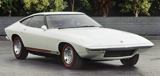
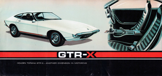


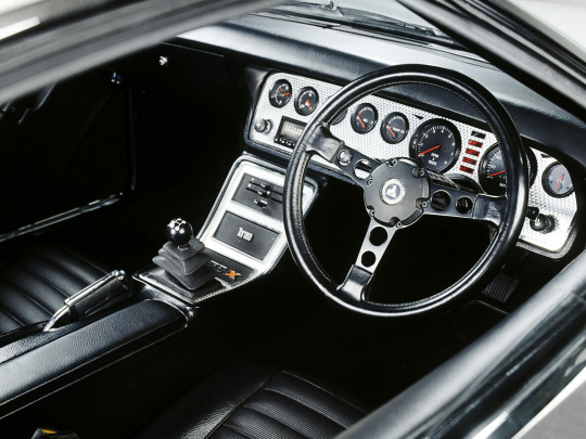
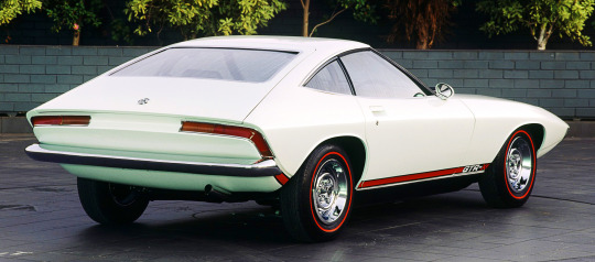
Holden Torana GTR-X, 1970. Created by Holden's Fisherman’s Bend design and engineering department based on the LC Torana with a 160hp triple carburettor version of Holden's 186ci "Red" straight six engine. They used Opel-sourced 4 speed manual gearboxes and differentials. Three prototypes were made with ladder frame chassis (similar in concept to the Chevrolet Corvette) and fibreglass bodywork. The project was meant for series production, brochures were printed (see above) and the car was displayed at the Melbourne Motor Show but the programme was cancelled before production began. One of the prototypes was destroyed in testing, the white car above is in a museum and the 3rd (unfinished) car in in the hands of a collector
#Holden#Holden Torana#Holden Torana GTR-X#prototype#designs study#straight 6#wedge design#1970#General Motors#General Motors Holden#GMH#dead brands#Australian market
405 notes
·
View notes
Text
maybe an unpopular opinion but despite my passion for self development, i honestly dislike most typical 'self development' books and really believe you get a lot more self-expansion out of reading creative non-fiction, essays, philosophy, and literature. engagement with these types of works will expand your intellect and teach you how to grapple with big ideas for yourself, rather than following the rules set out by some girl boss or hustle bro in their glorified marketing pamphlet 'book'.
#i work in marketing and most of those books are vanity projects to market their personal brand...#which is not to say their insights can't be valuable but i take with a huge grain of salt#besides wouldn't you rather learn how to find your own answers?#personal excellence#it girl#it girl energy#that girl#becoming that girl#self improvement#self worth#self care#glow up#level up#self development#lucky girl syndrome#high value mindset#vanilla girl#glow up journey
368 notes
·
View notes
Text
Tools That Will Help You Start Your Business For Free
ChatGPT
Canva
Stan Store
Stripe
Tiktok
Mailchimp
Pinterest
Hubspot
Capcut
Webflow
Unsplash
Google Fonts
Notion
WooCommerce
Convertkit
Calendly
Zapier
Sendinblue
Mozbar
Google Trends
Framer
YouTube
Answer The Public
IFTTT
Buffer
Videoleap
Snaptik
Google Analytics
Keyword.io
Trello
Google Docs
Instagram
Twitter
Hootsuite
Pixabay
Pexels
Wave
Grammerly
Calendly
Xero
Product Hunt
Semrush
PlaceIT
Asana
Loom
Namelix
#resources#marketing tools#seo tools#business tips#start a business#small business#entrepreneurship#entrepreneur#startup#start up#business#make money from home#make money online#marketing#ecommerce#branding#digitalmarketing#business growth
2K notes
·
View notes
Text


chinese fashion by 离奇街地下批发市场
#china#fashion#chinese fashion#i like their brand name which means underground whosale market on surreal street
320 notes
·
View notes
Text
i get such a sense of primal envy when looking at edwin’s clothes up close because god you can just tell his coat is real wool and made to last and not cheap flimsy mass produced garbage and auggagghhhh that was just STANDARD in his time. by no means am i saying i was #borninthewronggeneration because i like having vaccines and household appliances but. man. to have a personally-tailored coat like that that’d last for years and years……. and fabrics of fine thread-dense quality………. if only
#edwin would be so disgusted by shein products can you fucking imagine#i mean he’d be disgusted by most mass produced brand/off-brand clothing but fast fashion shit like that would be the Worst#thank god for the fact that I don’t think anyone in the group would wear that kinda shit. for wildly different reasons#crystal wouldn’t because why the fuck would she. she can afford the most expensive high quality shit on the market. and even if she goes#thrifting you can just tell if something looks/feels like cheap garbage she’d not even touch it#niko’s a fashion icon and constantly changing her outfits BUT she seems like the type who loves repurposing old clothing/re-arranging things#in her wardrobe and making different combinations rather than buying new clothes all the time and wasting perfectly good clothing#plus she wasn’t raised in America and likely did not get normalized to fast fashion#charles doesn’t because. well#you know.#ghost. and whatnot#even so I doubt his parents bought him clothes that often so he’d have to either save up the money to buy stuff he wants (probably thrifted)#or repurpose old clothes in various ways. his coat absolutely looks high quality and I bet he saved up like crazy for it#rambling#edwin#dead boy detectives#edwin payne
199 notes
·
View notes
Text


#clean girl#cleancore#inner peace#peace#vanilla girl#it girl journey#becoming the it girl#early 2000s#pink#fashion#pink aesthetic#branding#it girl#pink core#colebabey888#makeup#dream girl journey#becoming that girl#that girl#making money#earn money online#digital marketing#lifestyle#little bits of life
350 notes
·
View notes
Text
explaining modern brand names to a Victorian
me: so just like. a word, usually.
Victorian: a word related to the product, or-
me: no just a random word
Victorian: huh. because I'd have thought
me: yeah
Victorian: a word related to the product's alleged best qualities
me: no no it's just any word really. the founder might have some reason behind it, but it only makes sense to them most of the time
Victorian: interesting
me:
Victorian:
Victorian: but definitely misspelled right
me: oh EXTREMELY misspelled
#history#marketing#brand names#victorian#a bread company called Bakk'd-Best shaking hands with a tech startup called Wandr or something#there is literally a software company called Salsify. like the root vegetable. please explain this to me#only don't because there is no POSSIBLE way to make that a logical name. for a software company
318 notes
·
View notes
Text

Steve Jobs, Apple's co-founder, didn’t contribute to programming or hardware design. Steve Wozniak, the technical mind behind Apple’s early products, and other employees recognized Wozniak as the inventor and Jobs as the marketing strategist.
#Steve Jobs#Steve Wozniak#Apple#programming#hardware design#marketing#invention#technology history#computer science#entrepreneurship#Brands
86 notes
·
View notes
Text
youtube
115 notes
·
View notes
Text
Thursday, August 3.
vintage ads.
Capitalism: bad. Vintage ads: good.
Or so dictates the paradoxical logic that we have decided for ourselves, and when the question is this awkward, the answer is obvious: to stick our collective heads in the sand and simply enjoy the pretty things. And goodness, they are pretty. The problems with advertising, and its seductive evils, are laid bare by this selection of ads handpicked from the dashboard. The common thread between all of these ads is that they have been produced by corporations whose end goal and very purpose is to convince you (against your better judgment, or circumstances) to spend your money (money which you need) on their products (products which you don't—and possibly can't really afford.)
Similarly demonstrated, however, is the irresistible nostalgic glamour. Perhaps when contemporary advertising tries so hard to be a meme, or be funny, or be quirky and off-beat (or perhaps more simply put, tries too hard) there is a genuine allure in classic adverts that, even now, feel so effortlessly stylish. This effortlessness is also paradoxical because, like the products they often advertise, they are the result of hard work, time, dedication, from those at the peak of their craft. Like these products, they were made for leisurely, long-term use and enjoyment, and not to be so quickly consumed and discarded. What we're really saying, I suppose, is when #advertising is this slick, and pleasing to the eye, we must simply ask that you be quiet, promptly, and accept our money.
And remember, folks, one eye on the pretty ads, the other guarding your piggy banks x
#today on tumblr#vintage ads#vintage advertising#vintage advertisement#advertising#ads#marketing#vintage#70s vintage#capitalism#anti capitalism#the one ring#willpower#branding
547 notes
·
View notes