#manual gradients <3 my love
Explore tagged Tumblr posts
Text
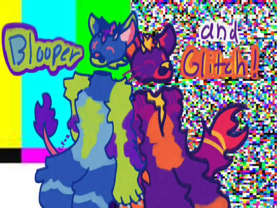
Possible eyestrain (sorry) and dark themes?
It's Glitch and Blooper!!! My two best brother boys. They're both post-death but unfortunately I haven't come up with lore as to why yet. Regardless! They were definitely involved in some type of reality tv show but in a kind of eerie way. Like obviously they're cute but there has to be something creepy going on behind it.
Anyway they're sweet lovely boys. Glitch is a little shorter and rounder. He's the younger brother. Blooper is the older brother. They're cat-cow hybrids as displayed by the horns, tail on Blooper, Glitch's hooves, and the whiskers and tail, and Blooper's paws. They're meant to be digitigrade fursuit style type things because I think that's very cool. I listen to music a lot to help get the creative juices goin so I'll list the songs I was listening to for each of them too.
Also Glitch only has 1 arm in case you didn't notice
Here's Glitch's Reference
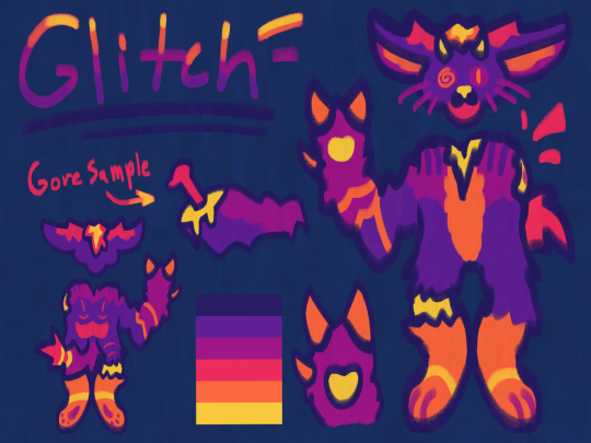
I love his back patterns so much I really need to draw from the back or side more I just haven't come up with any poses like that yet. Perhaps I shall look around for some.
I haven't used set color palettes very much before so I wanted to try it for him. I was listening to the sunset lover animation meme so I was like sure sunset palette and this was the first one pinterest offered. I showed him to one of my friends and he was so transfixed by the colors he didn't even notice that he was missing an arm lol.
But yeah he's got the same ear and general head shape as his brother except that he's got rounder cheeks and thinner sleek feet paws. He also still has both of his eyes still. I noticed on art fight last year that a couple people asked to draw gore of Blooper so I wanted to make it easier for anyone who wanted to in the future with Glitch, especially since he's more roughed up.
Uh yeah unfortunately my Clip Studio Paint files got messed up while I was moving him into Live2d to maybe animate him so I only have the .png version of his reference :( But the animation came out cool. The software is usually for VTubers but it worked for my purposes. It's not done yet though.
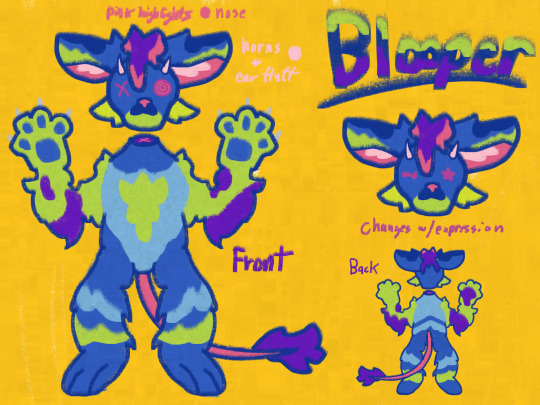
Here's Blooper!! He's more cat like since I hadn't fully solidified the hybrid status in my mind. One of his eyes is missing which is what the X is for and I liked the idea that his eyes would change based on expression like in animation memes. I've always liked that. Also I was listening to Pork Soda by Glass Animals when I made him so he is canonically scared of pineapples like cats are sometimes scared of cucumbers. I'll figure out a real reason later maybe.
I used to work in the awful drawing program, sketches school because it's what my iPad came with. You can't undo and there are only a certain number of colors to choose from. There are also no layers. It was very formative for my art style. I liked the charcoal brush the best and I've loved it since then. Definitely my comfort style now. But that's where the color palette came from. The greens and blues were so specific and saturated, it was what I needed.
I really could have made this 2-3 separate posts.
His patterns were super fun to design too, the back was a challenge but I enjoyed it a lot. I tried to animate him in Alight Motion once and it was awful. Since then I've learned Adobe After Affects so maybe I'll try again. Looking at older, even a few months, makes me really happy cause I can see my progress so clearly even in the reference sheets. (Compare Blooper's ref to the new Cinder one).
As a reminder all my ocs are up for attack on art fight CaytheFox including ones I haven't talked about yet :3 Have a lovely night and stay hydrated folks. Thanks for reading all this if you got here.
#art#oc#oc art#anthro art#artwork#sfw furry#cat#cow#art fight#manual gradients <3 my love#rambling about my ocs#so fun <3
0 notes
Note
Woowww, I LOVE the texture of your art 😍 can I ask how you achieve the many fine lines? Do you do them all by hand or do you have a specific brush? I’d love to hear more about your process in general!
Hello!! Firstly, thank you SO MUCH for your words, they seriously mean so much to me and every time I get a cute little reblog tag or an ask like this, I squeal in excitement !!
As for my brush/process, I would be happy to share! I work on Clip Studio Paint and I seriously love it. It's got so many cool features, and I barely know a third of them. As for brushes, I use one of the stock brushes they have, charcoal, under the pastels category.
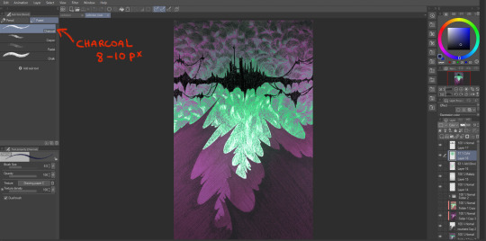
In terms of process for this veiltober lineup, I am doing every line manually, one by one, but I have a couple of things that help me through the pieces.
First, I don't work with color right away. Once I have the sketch done, I will lay down some base values that give a good contrast to the piece. Doing this allows me to focus on the values and not so much on the palette I will use later.
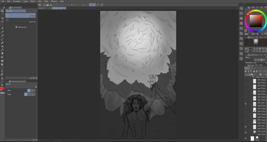
Then, I manually go in and start doing every line. I try to have it follow some sort of flow (for the coulds/smoke/etc) or the planes of the body, face. And I work on the contrasts too, see what works or what doesn't work, what needs to be more hidden or brought out more.
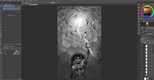
Then I will group all my layers, duplicate that group (to keep the original, in case I wanna change anything), and merge all the layers in the group so as to have one single layer with everything. With that layer, I apply a gradient map and watch my B&W drawing colorize! In CSP, you have to go into Edit > Tonal Correction > Gradient map. I Also make some final adjustments on another layer, like white accents, extra lines or different colors (like Solas' arm here).

It's not that smooth though! Some pieces take a really long time because I'm constantly playing with colors, contrasts and details. Seeing what works, experimenting. There's always a lot of layers and groups in my files because of that xD
Hope that answers your questions :D Once again, ty for asking! It totally brightened my day!! I'll be going back to making the pieces now :3
45 notes
·
View notes
Note
hii i love ur gifs so i have been wondering if u know how to low down the size of a gif without losing its quality?? i hate when i want to post a certain gif and it being 13MB but if i cut it it's ugly 😔😔😔 sorry for my english 😔
hi, thank you 💕 i think i have answered similar questions before in my gif help tag, but i can offer some more (hopefully) helpful tips and things you should consider to help keep your gif under 10mb.
1. crop size & amount of frames
the two go hand-in-hand. big cropped gifs with a large number of frames will result in a big file size. if you're making a 540px wide gif, you're either gonna wanna make the gif shorter in height or use fewer frames. for a square gif, i try to keep it between 50-70 frames, but sometimes i still have to trim it down depending on how bright or colorful the gif is (i'll get to that in the next points).
however, making the gif a shorter height like 350px or 400px might give you a little more room for more frames without having to delete any. i like big gifs if i have a great quality file. 600px tall is as far as i'll go (though it's rare) and in that case, i try to keep it limited to 40-50 frames.
basically:
540px wide gifs = fewer frames or shorter height
268px wide gifs = more frames, more potential
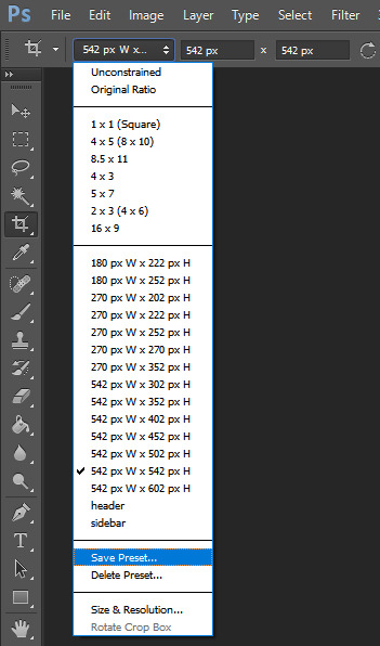
tip: for the sake of convenience, i really recommend making presets of all your go-to crop sizes by selecting "save preset" in the drop down menu next to your chosen dimensions. note that mine are all set two pixels more than i need because some photoshop versions leave a transparent border around gifs. when i use my convert to frames action, it deletes those two extra pixels for me and my gif will have the proper tumblr dimensions before i export.
more tips to get rid of extra frames:
delete frames with camera flashes, you will rarely notice a difference.
always check for duplicate frames.
original footage is slow motion? it's got duplicated frames. delete them.
2. sharpening
your sharpen settings can also increase the file size. here is a great post with examples of when to know when your sharpening is crossing into unchartered territory and how to avoid it. manually adding noise effects can also increase file size, so keep that in mind when you're doing it for aesthetics (i personally love noisy gifs too!).
3. brightening
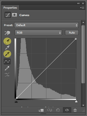
adjustment layers that handle the "light" in a gif such as curves, levels, and exposure can all affect the file size in different ways. darkening the black points using these tools in your gif helps reduce grain as well as the amount of colors in the final product.
curves: use the white and black eye droppers to find the lightest and darkest points in the gif, thus adjusting the white balance of the footage if needed.
levels: move the left and right sliders inward to balance them out even more and bring back more details.
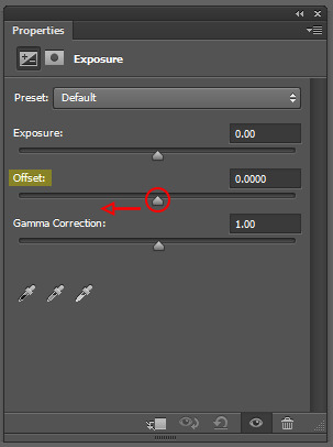
exposure: my favorite trick EVER to lowering the file size if it's over 10mb when i go to save for web is moving the "offset" slider of an exposure layer slightly to the left. it will darken the black points even more and add some contrast to your gif and it can minimize the file size by quite a lot.
3. coloring
you want to be able to save your gif with 256 colors without reducing the number manually in order to get it under 10mb (we've all been there). sometimes you can get away with doing that without losing much of your quality, but it's always ideal to NOT have to do this. selective coloring and color balance are your friends when it comes to enhancing and/or getting rid of tones you don't want. i can't give you a whole course on coloring alone, but i can say that ONCE AGAIN, darkening the blacks under the black tab in selective coloring will help. i usually go up to about +5 or more if i need to. neutralize your reds and yellows for skintones, especially when giffing idols. don't go too overboard with the vibrance if you use it. be conscious of colorwashing. experiment with photo filters or gradient maps if you're aiming for a cooler or warmer look.
i hope this helps, i am not a magician but i do think a lot of these key details help me a lot when my final gif is over 10mb and i need to go back and make adjustments.
19 notes
·
View notes
Note
how do you choose color schemes for your art cos they're always so good, also i looove your horror magical girls <3
<3 receiving this ask made me SO excited i love talking about processes and techniques. anon i hope you enjoy the essay
note: for anyone wondering how i get the different color strokes in my art, that's color jitter! I can answer a different question on that, but it's just a brush setting that changes the color for each stroke. This answers how I choose the base colors :)
GENERAL RULES
I think the first thing to know about my process is that I'm weirdly strict with the colors I use? I see people who color pick and wiggle the color around a bit each time and it's really cool! But my brain doesn't like me doing that, so it makes most of my color palettes a pretty closed ecosystem.
As a overview, I have 3-4 "types" of colors with their own color gradients. Be aware of tone! Don't make the types of colors the same tone. Additional colors are made from combining the types. I use 25-75% opacity for new colors instead of blending them.
This is a good example of the closed ecosystem concept:

My 3 types of color are brown, green, and pink. The circles of colors are the ones I manually picked from the color wheel. The rectangular blocks of color are the new, in-between colors.

Something to note is that my new colors aren't 25% opacity, then 50% opacity, then 75% opacity. I draw a rectangular strip of the base color and draw over it with a 25% opacity brush. Then, I draw over half of that again with the 25% opacity brush. I keep doing this until I'm satisfied with my colors.
This character is a dryad and I wanted to add more interest to the bark skin, so I used the pink for some highlights. The brown and pink are both warm colors and it made the most sense to use them together. This is how it looks without the pink accent:

It ties the brown and pink together pretty nicely, right? I usually do this because I don't really like having two types of colors that are very similar in hue. If I have a pink-red color, then all pink-reds in the piece should be a color from its gradient (or a new color made from it). This makes sure all colors in the piece have a distinct relationship to each other.

(If I'm drawing something that's predominantly one or two hues, the threshold for merging colors is higher)
If that's not the case, then I prefer to manually include a gradient relationship. This particular instance was a little weird, where the brown seems more red than it is. It's actually an orange, but because I never used a medium or light toned variant of the color it just seems red. Changing its hue to pink would be pretty noticeable, so I chose to use the gradient method here.

Here's some other examples with the types explicitly added


and some with just the swatches


As a rule of thumb, there are usually at least 3 types of colors: skin, hair, and clothing base colors. Skin and hair are generally unique, but not always.
CHOOSING GRADIENT/SHADING COLORS
This might change in the future (i want to experiment), but most of the time* when choosing my shading colors I move counterclockwise from lightest to darkest.

I originally started doing this because I use the same color for skin shading as the blush, which was tinted red. In general, this works pretty well because when moving counterclockwise from yellow the average tone of the color decreases. Purple has the darkest tone, so red/blue/purple are often my darkest colors.
*There are exceptions to this, particularly when I'm using green or blue-green. If that's the case, then I do the same thing but clockwise. Purple is still my darkest value.
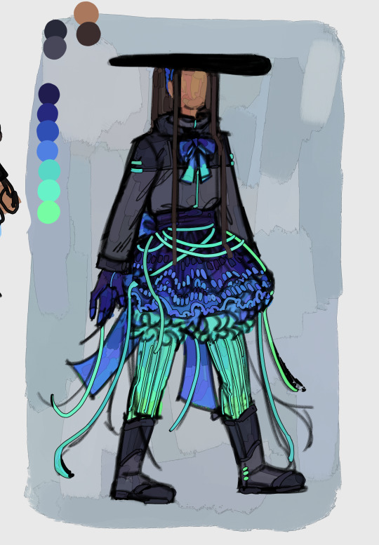
It's a personal preference, but I very rarely use a yellow as the light color in a shading gradient moving towards green. You'll usually see me use yellow and then move towards orange/red OR use a yellowish green and move towards blue/purple. I'm not the biggest fan of yellow-green and use it extremely sparingly. Consequentially, this does pretty distinctly separate my warm and cool colors. It's not intentional lol
HUE RELATIONSHIPS
To be honest, I usually have two types of color schemes: Boldly different colors or similar colors with a bold accent.
If anyone has seem my art then they know i LOVE a good contrasting color scheme. I know there's actual contrasting colors-- yellow-purple, orange-blue, red-green-- but in this context I'll be using "contrasting color" to refer to the actual contrasting color and it's immediate neighbors. For example, red and blue would be contrasting in this context. Red and purple would not.
The reason I want to make this definition is because I think that you can get the same visual impact of actual contrasting colors as long as a color is the opposite mood (warm/cool) AND not next to the base color. Using the same example, red would be a warm color with green as its actual contrasting color. Yellow is also warm, so we can't use that despite it being green's neighbor. Blue works. Purple is red's neighbor, so we can't use that despite it being a cool color.
Here's some examples of color schemes with really prominent contrasting colors:
For purple/orange

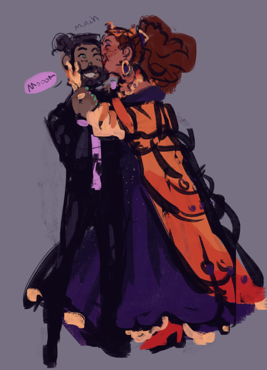
For red/blue

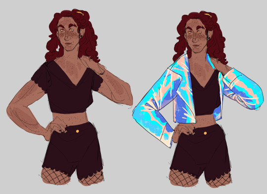

For pink/green
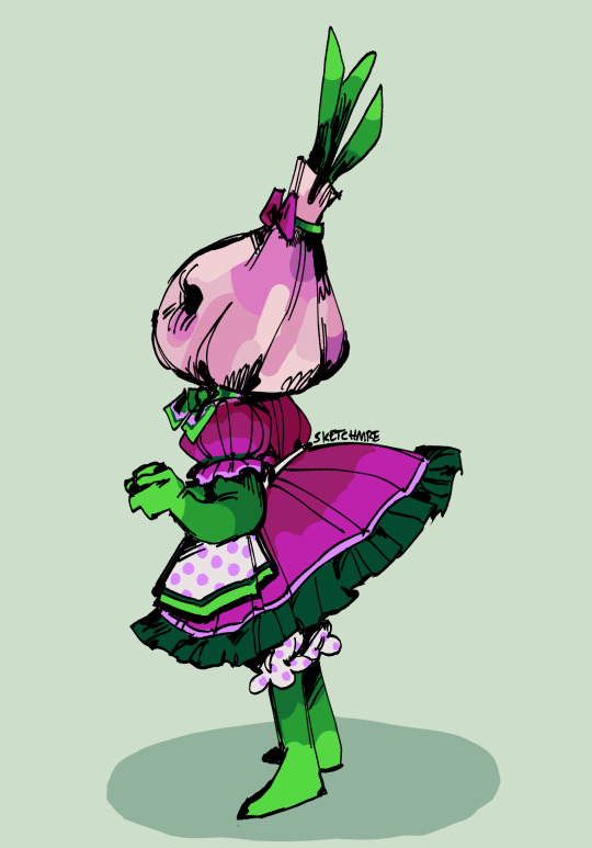

As for the other type of color scheme, it's 2 or 3 neighboring colors and a contrasting color (which is usually very saturated)


In some cases, the "contrasting color" is just a very light grey/white


In both cases, you just need a color that pops from the rest! Because my color palette is so limited, this accent color ends up being used for jewelry, trimmings, embroidery, etc. It helps tie everything together.
FINAL NOTES
I can (and will!) break the rules established here. I experiment, I make the objectively bad decision, I want to try other things. That's art. If you find something here that's interesting, try it out! Make it your own! (maybe tag or dm me, id love to see it)
If anyone has any questions, please let me know! I love answering these and it's really cool knowing someone might take inspiration from this :)
#sketchmre tutorial#sketchmre answers#tutorial#art tutorial#color tutorial#idk how else to tag this lmao
6 notes
·
View notes
Note
Hi!, same anon that asked for the line tut. I appreciate you making the tut and I’ve figured out how to put the colors and everything but I’m getting stuck on the moving part…
More specifically how to set the numbers to make everything move. I know you said 15 to 20 layers so I was trying to set the location by 2’s but I think I’m just confusing myself and making it harder than it needs to be. (I tend to do that lmao.💀)
Whenever you get some time, do you think you could make a quick video? I tend to learn by seeing and then repeating and I think my brain is getting confused with the unseen steps in between. 😭
There’s absolutely no rush, whenever you get the chance! Also if 🍓🍰 isn’t taken can I have it pls? 🥺Love and appreciate you sm!! 🫶🏾

Hey aweee welcome 🍓🍰 nonny ml! yeah people suck lol. tbh they are likely insecure that if other people knew how to do it then they wouldn't need them or use their resources anymore. which is silly because it shows you who is doing this for clout and who is doing this cause they have a genuine passion for it.
Anyway!
15-20 layers would be setting the location by 7, 6, or 5s.
Ah I totally get it tho however for some reason OBS crashes my photoshop when I enter the gradient tool cause i've tried to do another gradient tutorial with gradient text and it kept freezing photoshop.
however since you know after effects there's an easier way in the video timeline of photoshop (or in after effects timeline the principles would be the same). i just know people are more use to frame animation from all the tutorials on tumblr here. you can't go back and forth between the two timelines and i also don't know an eloquent way to explain keyframes other then they are like "bookmarks" so i'm assuming you know what they are/how to use them.
GRADIENT DIVIDERS USING VIDEO TIMELINE:
i started with a 1080 x 100 canvas that you can reduce the canvas size to whatever width you want your div to be later it would just be crazy doing this on a thin af canvas.
in the video timeline this is what you want. a color fill layer and then a single color gradient layer (in the middle of transparency, notice how the upper dopplers are white that means transparency) which you will then rasterize.


2. Now that your gradient layer is rasterized you can start animating it using keyframes. You will use the position keyframe.
notice how the playhead is at the beginning of the timeline and i have used to move tool to move the gradient layer so that only the smallest bit on the left is being seen, that's when you will add the first position keyframe. then you will move the playhead to the end of the clip (to the right) and move the gradient layer to the right as well add the final keyframe.


3. You're done! i was able to take the below with giphy capture tool but it only allows you to capture like a minute lol so i cant do the entire thing with it unfortunately.
*NOTE: im manually moving the playhead back and forth across the timeline thats why the movement speeds are off/choppy and its going in reverse. im just demonstrating how if you are doing it right you should be able to see it move across the timeline without even pressing play.

4. file > export > save for web legacy as gif. (clip the canvas down to the height you want first)
this is the end result (reduced to 2.00f and 3px height):

TIP: if you want to speed up the animation just shorten the length of the animation overall. so move the brackets down to the amount of seconds you want (you can see at the top of the timeline 1.00f, 2.00f, etc, right below that is container like brackets [ ] you move). then you will drag your layer to that new end point (both layers) and you can also click and drag the keyframe to the new endpoint too. its going to default to 5.00f automatically.
hope this helps! its a lot easier if you are comfortable using keyframes. you could even add multiple colors too and have them rotate out or follow right behind each other using key frames. each color would be on its own layer or you can do multi per layer just make sure to use transparency appropriately.
lmk if you have questions!
#🍓🍰 anon#ೃ༝💌⁀�� 𝓀𝒾𝓏𝓏𝒶𝓉мαιℓ#ೃ💌⁀➷𝓀𝒾𝓏𝓏𝒶𝓉αησηѕ#tutorial#divider tutorial#div tutorial#gfx tutorial#✩𝓀𝒾𝓏𝓏𝒶𝓉•𝕘𝕗𝕩#✩𝓀𝒾𝓏𝓏𝒶𝓉•𝔱𝔲𝔱𝔬𝔯𝔦𝔞𝔩𝔰#gradient dividers#dividers
5 notes
·
View notes
Text
[Review] Sega Pocket Arcade: Ecco the Dolphin (1995)
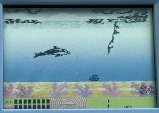
A rare dolphin treat.
A while ago I bought the Sega Pocket Arcade: Ecco the Dolphin from 1994 (pictured on the left, below). Much to my dismay, problems with the unit design caused hardware issues that rendered the game unplayable. Still, it’s a great collector’s item in a unique form factor. However, a much rarer item is the second Ecco the Dolphin handheld from 1995-according to the back of the unit (pictured on the right)-or 1997 going by the packaging. Although Tiger is often credited for the initial “red label” games in this line, their branding is absent from the packaging so Sega of America may have internally developed the first model and manufactured it in the US, but the 1995 blue label model was certainly and proudly developed by the experienced LCD game company Tiger and made in China… and by the way, the hardware did not almost instantly fail on me.
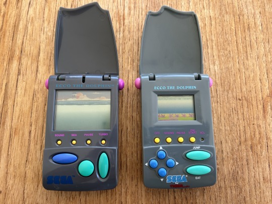
Sega’s initial Pocket Arcade line had a few different case designs, some with slide-out screens. Their clamshell units included Ecco, Columns, and Football. When Tiger took over, all of their line, such as this second Ecco, Nights, and the enticing Panzer Dragoon, used the screen-protecting clamshell design. They also seem to universally use a much smaller inset screen compared to the first lineup, no doubt a cost-saving measure that unfortunately hampers playability somewhat.
Now, observe the two units side by side. Note the differences in screen layout and button distribution. These are in fact two completely separate games with differing design, graphics, and controls. Both have Ecco auto-swimming to the right, avoiding hostile sea life over a number of levels, but each has unique features. The first game has an active sonar mechanic, which can reveal tunnels to swim through (similar to the OG dolphin game, Activision’s Dolphin) and interact with glyphs. It has a speed control mechanic, hazardous seagulls above the waves, and dolphin family members to rescue, not to mention descriptive level write-ups in the manual.
By contrast, this second unit seems simpler, more of a straightforward survival game. But there’s enough depth for an LCD game, with three planes of action and the life/air bars to juggle. Surfacing for air is necessary but sometimes blocked by a jellyfish, and health can be refilled by tapping the Eat button on the lower lane when a fish comes along amongst the coral. There are many hazards on the bottom layer to be wary of, though.
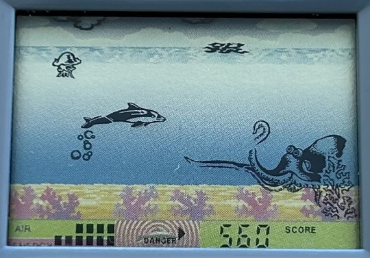
The biggest foe is the octopus who emerges from the right to menace two lanes with tentacular ferocity! Combine this with a jelly up top and you’re in a right pickle. However, a back-dodge can grant temporary sanctuary especially when chained together. More types of sharks appear as the levels progress to threaten each lane, and other, more difficult to identify, creatures add to the dangers of the deep. This game features a passive sonar to help you avoid the larger threats, with a sort of status bar that displays the direction of imminent attacks.
There are six levels in total (compared to the first unit’s seven), with the action speeding up as you advance. Beat level six and you win the game, or so the cardboard insert claims. The pace of gameplay and the intense rate at which your air depletes at this stage meant that I couldn’t manage to clear it. Your number of lives resets to 3 on each stage, so there’s no way to stock up or lasting penalty for taking a few dings. The game also tracks your score, which as far as I could tell just increases naturally as you progress regardless of your actions. It seems a little pointless, especially because it maxes out at 9990 partway through level five!
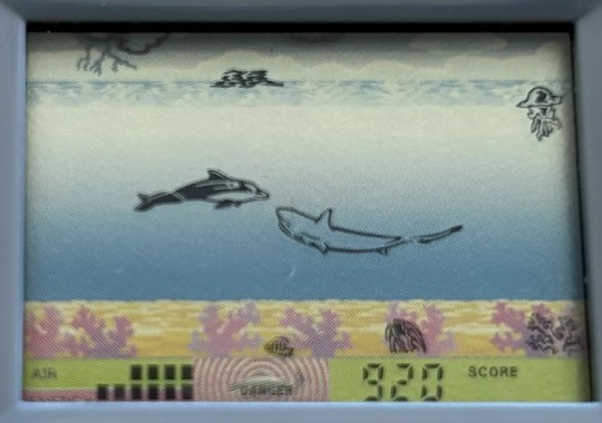
The soundscape is a few mere beeps and dare I say boops governed by your actions, and the majority of the backdrop is just a blue gradient… of course, this means it doesn’t obscure sprites like some other LCD games’ busy backgrounds. Those sprites are lovely, distinctive and detailed. Well, most of them anyway; some of the enemy critters don’t show up well on this tiny screen.
From what I could tell of the first unit, it tries to make each level somewhat distinctive, with an adventure feel as you can start from any stage you’ve unlocked, while this second one is content to just up the speed and add a couple of new enemy types as you advance, making it more of a score-chasing action game. It does have some nice little touches though, like the land edges that border each stage, and the lightning storm in the skies above, while the printed sandy coral layer on the sea floor mitigates the lack of the stunning sky vista the first game had. The two complement each other well, and I feel a lucky collector indeed to now own both, even if the first one is busted and the second has an ever so small screen. I just love dolphin games that much!
6 notes
·
View notes
Note
hii! this is the mac/vanilla anon. may i know how did you make your build/gameplay screenies looks so pretty, vibrant and looks like they have dof? your screenies straight up look like you have reshade on and im so. WOAH<333 sorry if this ask sounds so weird but i play on mac too and my game looks so atrocious HSJFKEJFJ
oh my gOD thank u so much that is the nicest compliment i could ever receive 😭<3 i totally understand the game looking like pure garbage it's tough out there for mac players 💔 here's my
~editing process of a sad mac user~

i use Photopea to edit everything. free and online, what's not to love!
oil paint filter with a radius of 0.8 to 1, lighting off
smart sharpen with a radius of 1.4 (these first two steps don't often do too much but can smooth out the edges of the pixels without having to play with edge smoothing on)
i like a bit of chromatic aberration so i go into channels, select red, and apply a lens correction filter of 3 (go back to regular channel afterwards)
to fake DOF - i use the quick selection tool and mess around with it until the foreground or preferred focus of the image is selected (doesn't have to be totally perfect, often times people won't be looking that close). then inverse the selection and apply lens blur, typically with a radius of 12 to 15 ----- (the selection part can be a real bitch - sometimes there just isn't enough contrast between the foreground and the background for Photopea to understand which specific section ur trying to select. in cases where it rlly refuses to work i've had to go in and use the polygonal lasso select tool and manually trace what i want to be in focus akjsdhfj)
apply photoshop actions to adjust colours - lately pretty much the only one i've been using is wooldawn's warmerfalls sometimes combined with intramoon's bright and saturated
sometimes i will apply a gradient fill layer (often the purple to orange one) and set the blending mode to luminosity, opacity 12 if there's a light source that i want to emphasise a little more. it also just adds a nice softening effect
for funky rainbow effects - look up "rainbow light leak overlay" and download any u like the look of. open and place them on top of ur image, fit them to size, change the blending option to exclusion, lower the opacity to desired outcome. to make the colours of the rainbow *pop* a lil more i like to duplicate the layer and change the blending option to overlay, though u may have to lower the opacity of this layer even more as it darkens the image quite a bit
i add a film dust texture over a lot of my posts! i downloaded a set a while back but i don't remember where from, sorry :( there are a bunch out there if u look it up i'm sure!
and that's about it! it seems like a lot written out but i'm self taught and technologically inept so it's all actually pretty basic when u know where all the buttons are in Photopea heh ;D thanks again for liking my posts!! it means the world u have no idea <3
#sORRY this is so long i had no idea how else to format it otherwise it would just be a mess of a paragraph jfhkjsdfh#answered
30 notes
·
View notes
Text
RPG a Day 21-25
Day 21: Favorite licensed RPG
Free League's Alien RPG, hands down. I can't think of any other licensed games I even play off the top of my head, and the Alien game is very well done. The stress mechanic and 3 act structure go a long way to achieving the feel of the source material.
Day 22: Best secondhand RPG purchase
Not even a purchase but a trade; I swapped a 5e book to @marquisnaberius in exchange for the 2e Unknown Armies core book and the 1e One Shots book. As far as strictly things I've bought, I did get a lot out of my set of core books for D&D 3.5 as a kid despite barely actually playing that particular edition. I was used to 4e and the juxtaposition was interesting. Also, I like the sketchy art style in the PHB.
Day 23: Coolest looking RPG product/book
I'm very partial to games that have a diegetic-ish style, like Monsters and Other Childish Things, the Unknown Armies 3e character sheet, and so on.
I also really like the art and feel of the Mothership scenario Gradient Descent. As far as the coolest art, Over the Edge 2e has some great stuff, though there are many others I could mention. Tales from the Loop is obviously designed around its art to some extent. This is definitely a prompt with a lot of answers.
Day 24: Complex/simple RPG I play
I think D&D 5e is the most complex RPG I feel I fully understand, and I do mean I FULLY understand it. I have half the monster manual and spell lists memorized and can improv anything else I need. It is kind of nice having a system of moderate-to-high complexity at my beck and call. I know there are much more complex systems around, including other editions of D&D, but I don't really want to make the mental investment of learning them. That's not what I enjoy in RPGs these days anyway. If I want crunch I'll play a video game.
As far as the simplest game, Fiasco is basically improv with a little bit of dice prompting for structure. So if you consider improv simple, which I feel is a plausible perspective, then that would count. One page games like Lasers and Feelings and Everyone is John of course also count for this.
Day 25: Unplayed RPG I own
Oh god, so many. I've already mentioned Monsters and Other Childish Things a few times in these prompts. Troika!, Ryuutama, Liminal Horror, Vaesen, The Dee Sanction, Mothership, and Fellowship all also fit this category. And that's to say nothing of all the games I've played once or twice and would love to come back to...
#rpgaday2023#ttrpg#alien#unknown armies#dnd#Monsters and other childish things#Mothership#over the edge#Tales from the Loop#Fiasco#lasers and feelings#everyone is john#troika!#liminal horror#ryuutama#vaesen#the dee sanction#mothership#fellowship
4 notes
·
View notes
Note
love! could you do a lil tut on how to do the gradient font? i love yours so much <3 i would love to put it in the title of my new ig edit. if not that’s okay! or if you feel like it’s too close to your style i respect that 🩷🩷 sending love
hey!! yess of course
i write in rich text format and pretty it up how i want with the bold text, italics and so on
for convenience i always add the title in big, bolded black text in the format i want, so when i switch to html i don’t have to manually type in the <b> <h1> codes
then i use this link to create the proper gradient html!! from there i go back into tumblr on web and switch it over to the html editor
copy the gradient html from the site and insert it between wherever your title is (i usually just put PLACE MARK in all caps so it’s easy to see).
flick over to the preview option to make sure it’s all correct
once it’s done i save the draft and open it again as rich text!! i like having the read more option and large spaces between specific paragraphs, which is easier to customise in rich mode.
i hope this isn’t too complex??? i can definitely make a visual thing bc i can see how this is confusing. i hope it’s ok 🫶🫶🫶
EDIT: ur pfp is mwahhhh 💋
4 notes
·
View notes
Note
hi arianna!! i love your blog, your edits are SO incredible, seriously gorgeous <3 was just wondering if i could ask what blending mode / gradient magic you used for the big text in this giset? (/post/720496321245609984/take-a-swim-in-the-dirty-water-darling-child)
hi lovely! what a sweet thing to say, thank you so much for linking my silly little edits! 🥺 absolutely no problem in sharing what i did but it's nothing special or very different from what i usually do! i always put my text on difference, then double click on it to open the layer style, go to gradient overlay, choose the colors and hit linear light! that usually keeps the colors very vivid and bright, but in this case it also helped that i took good care of having the gifs underneath to look really contrasted! the more the contrast on the scene, the more the text is going to shine through! hope this helped, thank you again for your kind words ♥
ps. also always remember that gradient layers autofill the middle color usually, unless you manually change that as well, so picking two colors that go well together without creating an overbearing transition shade is critical!
1 note
·
View note
Note
how the fuck do you do your shading im so in love with the softness of it
Omg ty I actually have a couple different methods? Depending on the amount of effort I feel like doing
1. “quick” method
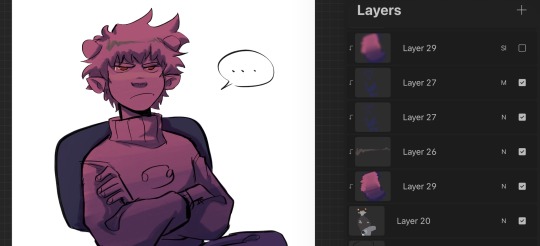
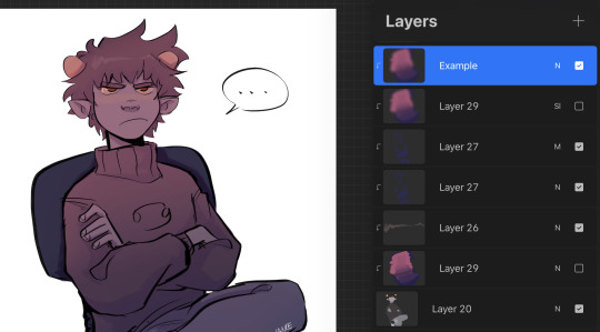
For when I’m not feeling up to rendering and want to do smth quick, I just lay down the flats, use a normal and multiply layer combo for simple shading, and then I make a layer where I paint two colors (pink n purple in this example). And then blend them together w a brush and use Gaussian blur (basically a manual gradient), then I usually set that to overlay or soft light etc. The photos above are before and after I apply Gaussian blur
2. Half (?) rendering
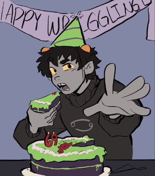
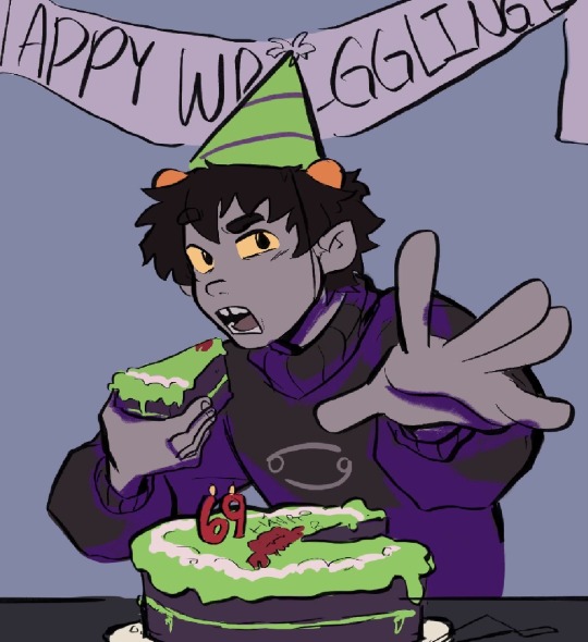
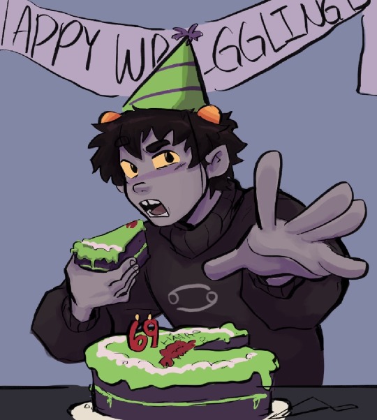
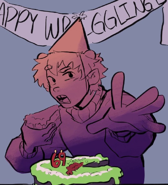
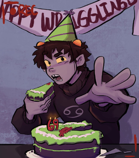
For this one I follow the same steps but instead of simple cell shading, I merge the multiply layer down to the flats and just start adding some more shading before applying the gradient layer again
3. “Painterly”

For ones like this one though, I usually put down flats, throw around some shading and colors using various layer modes, then merge them all into one or two layers and just start painting it as if it were traditional. So for these the gradient layer usually comes into play at the beginning rather than the end
There’s a speed paint for my timkon painting(the hug/second one) if u want to see what that’s like in action
Hope this helps
296 notes
·
View notes
Note
I was wondering if you could do a tutorial on this gifset that you did i really like ittt
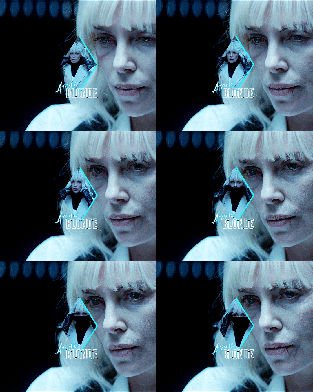
Thank you for sending this in, anon! I’m glad you liked it and wondered how it was made :) Fun fact: the day before you sent this, I had just started working on my next set in that “Select Filmography” series. I hope you like that one too when it’s ready!
I think I should start by saying I’m pretty new to giffing myself and there might be more efficient ways of getting to the same result. However, the point here is to show you the process I went through to make this gifset and hopefully help you understand how to make a similar one.
To follow this tutorial, you will need some version of Photoshop and some giffing knowledge. I know there are multiple ways of making gifs so I’m just letting you know I’m using the timeline and the “Convert for Smart Filters” option (I don’t really know how else to call it).
Now let’s get started!
STEP 1 - CHOOSE THE SCENES
It might sound obvious but, in my opinion, this is the most crucial step. It’s also the one that takes the longest (along with step 7, aka the coloring).
At this stage, you need to have a general idea on how you want your set to look like so you can choose the scenes accordingly. In my case, I knew I needed two types of shots for each movie: one close-up for the main gif and one mid shot for the shape. I also needed to take two other criteria into consideration: the movement (because of the shape) and the lighting (because darker scenes are such a pain to color). Last but not least, I didn’t want the characters to be talking (but that’s just a personal preference).
With all of that in mind, you can start saving a few screenshots of scenes that meet your criteria (or at least some of them). In the end, there won’t be that many to choose from so be prepared to make compromises.
STEP 2 - MAKE A DRAFT
Now that you’ve preselected a few scenes, you can make a first draft. This will help you turn your general idea into something more concrete.
Basically, this is your opportunity to organize your thoughts. What size do you want your gifs to be? What shape are you going to use? On which side do you want the close-ups to be? Do you want all of them to be on the same side or do you want to alternate from one gif to the other? Do the scenes you chose work together (gif-wise but also set-wise)? Are you happy with the way it looks, overall?
By answering all of the questions you might have now, you’ll save yourself a lot of time, trust me. Of course, you can totally skip this step if you already know exactly which scenes you’re going to use and how you’re going to present them together.
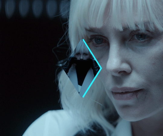
To give you an idea, this is what my draft looked like for Atomic Blonde.
STEP 3 - PREPARE YOUR GIFS
Once you have a clearer view on how you want your set to look like, you can finally start giffing like you usually would (i.e. importing, cropping, resizing, etc.).
It should then look something like this.
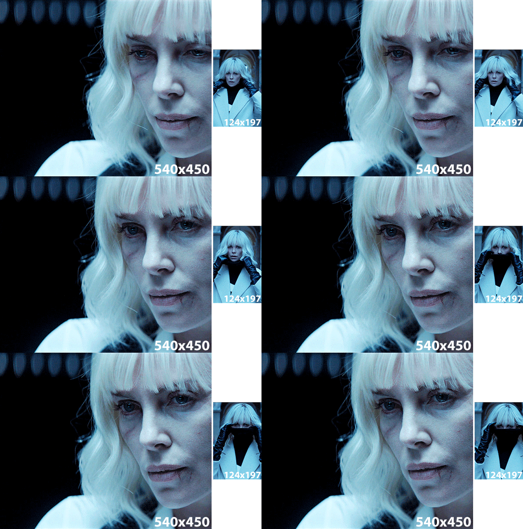
The important thing to mention here is that you want both of your gifs to be the same number of frames (32, in my case).
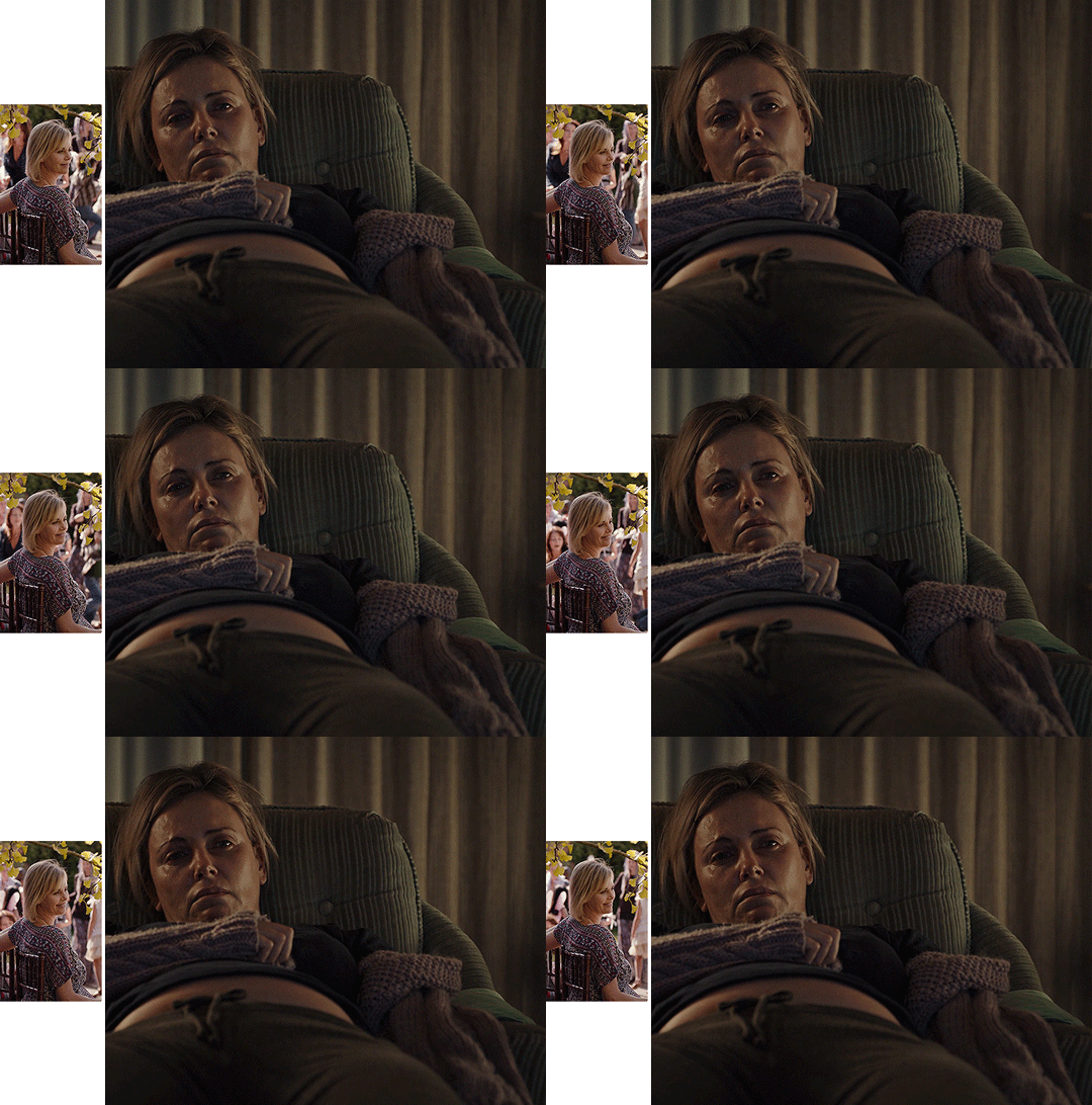
Ideally, you should also aim for the ~same~ coloring (especially for the skin tone, since both gifs will be so close to each other). This bit is particularly difficult when you chose scenes which have opposite lighting (see my two uncolored gifs below). Remember how I insisted on steps 1 and 2? It was to help you avoid this. So my advice would be not to choose these types of contrasted scenes, unless you can’t do otherwise and you’re ready to suffer!
STEP 4 - MAKE YOUR SHAPE
To make your shape, you can click right on the Shape Tool (U) and select the last one, Custom Shape Tool. From the Shape menu appearing on top, you will be able to choose the shape you want from the drop down list and start drawing on your gif.
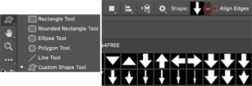
To be more precise with the dimensions, you can manually adapt the length and height from the Shape menu itself. I decided to go with the same ones as my gif.
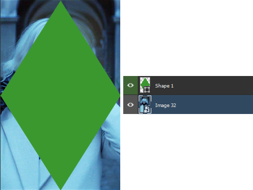
Once your shape is positioned like you want it to be, you can drag and drop the shape layer under your gif. Next, you will have to click right on the gif layer/smart filter and select Create Clipping Mask. The result is as below. Note that if the size of your shape was smaller than your gif, you would still be able to reposition your gif with the Move Tool (V).
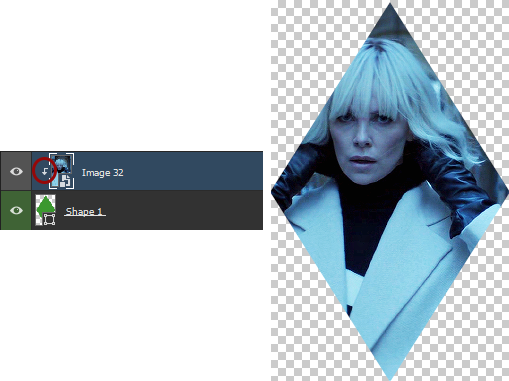
You can now export your shape gif, reopen it in Photoshop and convert it again to the video timeline and to a smart filter. This is where I’m not sure it’s the most efficient way of doing things but it’s the only way I found to keep the coloring of each gif separate. I also find it easier to work with a smart filter.
STEP 5 - COMBINE YOUR GIFS
To add your shape gif to your main gif, you can simply click right on the shape gif you just reopened and select Duplicate Layer. You can then choose the project which contains your main gif to duplicate it in there. Now go to your main gif and reposition your shape gif where you want it to be (how many times did I say gif here?). Finally, you can draw a new shape, using the same dimensions as in step 4, reposition it and choose any color you want from the Shape menu.
Since you will be repeating this process with your following gifs, I suggest you add a few guides so you know exactly where you should place everything to make all of your final gifs look the same.
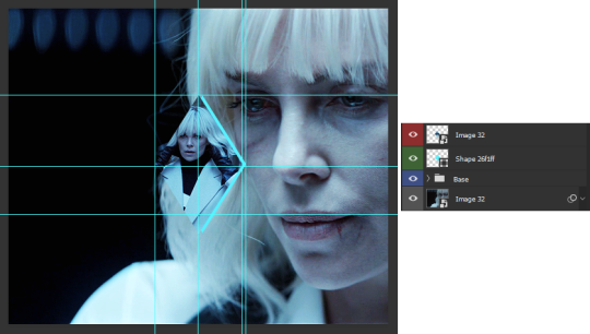
(In case you’re wondering, the “Base” folder contains my adjustment layers/basic coloring for the main gif.)
STEP 6 - ADD THE TITLE
This step is pretty simple: go on the web and type “[name of the movie] title”. Download the png you like most, open it in Photoshop and resize it to a length of about 150-200 pixels. Next, duplicate the layer to your main gif and reposition it. In case you need to resize it again, select the title layer and go to Edit > Free Transform (Ctrl+T).
This is optional but in case you want to change the way it looks, know you can always duplicate the title layer and play with the blending options (see below). The good thing with a png is that you can also add some effects by clicking on the “fx” button.
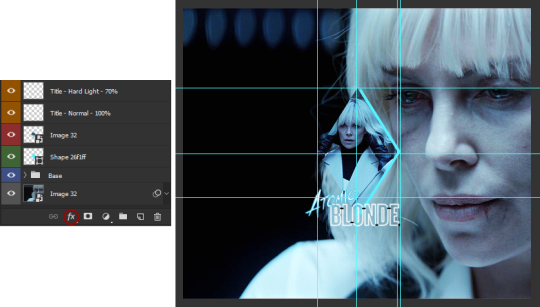
STEP 7 - ADD COLORING (OPTIONAL)
To be honest, I had not planned on coloring my gifs. But I had already spent so much time on them and I was still unhappy with the way they looked. I mean, see how grey-ish they are? Not great...
So the only thing left for me to do was to add some colors. Now, since coloring is worth a tutorial on its own and it already exists, I suggest you read through becca’s mega coloring tutorial (and especially steps 3 & 5). Seriously, shoutout to her for making this incredibly useful tutorial. She is so talented and I love everything she makes!
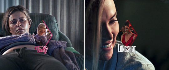
My Atomic Blonde gif barely even needed coloring so I’ll show you what I did for my Tully and The Old Guard gifs.
For the first one, once I had found which colors to use with which blending option and opacity level, I only had to remove the colors from the left side of the gif because there was barely any movement in that scene (phew!). For the second one, on the other hand, I decided to color frame by frame because there was way more movement, in comparison. This is quite a tedious process, which is why you want to limit yourself to a certain amount of frames.
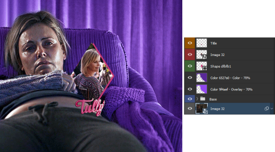
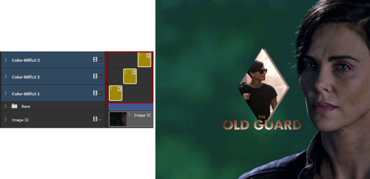
I’ll conclude by saying there are so many things you can do with coloring and what works with one scene might not work with another. So experiment with it: try different colors, play with the blending options and opacity levels, add some gradients and/or gradient maps, etc. Just know it will take some time to get to a somewhat satisfying result!
And that’s it... I hope this tutorial made sense and was somehow helpful. Of course, don’t hesitate if you have any questions! Also, if you do end up making a similar edit, pleeease send me the link or tag me in the replies or something ‘cause I would definitely love to see it!!
#asks#anonymous#tutorials#resources#completeresources#allresources#itsphotoshop#putting all of this process into words took so long i really hope it makes sense#also i can't help but wonder if it was my before/after post which prompted this ask...#gifs#gifs: tutorials
372 notes
·
View notes
Note
hello!! i was looking at your lovely photos and i was wondering what your process was! (like how you chose what to photograph, or how you frame or edit)
your photos are so pretty.... i wanna take pictures like you one day!! :)
Thank you so much! 🥺
Oh what an interesting question! Not sure my answer will be satisfying, though. 😆 But here goes.
I know some photographers who are very picky about what they capture. I'm quite the opposite. I'm an observer by nature, so I walk around looking at EVERYTHING and I take photos of anything that catches my eye. An hour long walk results in at least 200-400 photos.
I'm also a frantic snapper. It's very seldom that I would take just one photo of the object and move ahead. No. I will take a lot of pics from different angles, different focus (if the circumstances allow me and it's not a moving object, like a cat, for example.😸). I've learnt from my mistakes - you think you've taken a great photo, you come home, look at it on a bigger screen and it's completely out of focus. 😆
Framing is something that happens naturally for me. I rarely crop photos in post-processing. I look at the object or scenery through the viewfinder (or display, depends on which camera I'm using) and instantly see what the photo will look like.
Editing is something I do in Photoshop. 90% of the time I edit manually because every photo (or photo set) needs a bit different approach, although I have saved my own psd's and ps actions for lazier days.
The amount of editing also differs. I've posted photos that I haven't edited at all (except for the added watermark). Some have a boosted contrast or like levels of green or something. I love adding matte. Then there are some with completely mixed channels and absolutely unnatural coloring. 🤷♀️
I must add that I shoot both in JPEG and RAW. It takes a lot of space, but the RAW file contains so much more information and that's why sometimes I don't see a need for editing at all.
Here's a little example of different types of editing: 2 different shots of the same plant.
(From left) 1 - original JPEG file; 2 - slight editing (it's mostly just color balance, saturation, a bit of contrast, a blue color fill layer); 3 - gradient layer/matte; 4 - a completely unnatural look that involves a lot of saturation, gradient, boosting up specific colors etc.)

#whew I wrote an entire essay#i hope this answers your question#photography#original photographers#photographers on tumblr#about me
136 notes
·
View notes
Photo


Some progress and detail shots from the Arthur portrait I posted earlier! I painted this in black and white first, then added a gradient map layer for base colors, then added more detailing manually.
My partner said that this piece gave him “Mindhunter vibes”, which was really sweet, since that’s also a show that I love. One can only dream of season 3.
I switched from a Wacom Intuos to a Cintiq 16 last year, and I thought that surely a display tablet would be much easier to work on, but it hasn’t all been smooth sailing. In the process of painting this piece and uploading it, I’ve realized that the display colors on my tablet seem to be a little warmer and brighter than those on my computer. I’ve tried eyeballing the RGB color settings and I think it’s better now, but a more accurate way would be to actually get a colorimeter somehow.
#my art#inception#arthur#making of#maybe my lab has a colorimeter?#appropriating work equipment for your hobbies is totally fine
4 notes
·
View notes
Text
I feel tempted to create color palettes of KinnPorsche scenes for a while now. As someone who often works with maps, I was always fascinated by colors and colors gradient as a way to present information.
There are numbers of amazing blog/post out there already covering about the color theory/meta on the show. So, I won't really explore in that direction. I have been inspired by this instagram account (Color Palette Cinema) for some years and once planned to create my own favorite movie/series color palettes. And then KinnPorsche happened and I feel like this' might be the time to just start trying.
I use an online apps to help generating the colors. And while it generates the range of colors automatically as identified from the image used, the order of the gradient must be readjusted manually (feels like playing 'I Love Hue' here, which I always enjoyed).
For my first attempt, I choose three images from episode 1, all are establishing shots showing the mafia sides:
1. The drop off area/corridor of the Theerapanyakul mansion at the start of the episode.
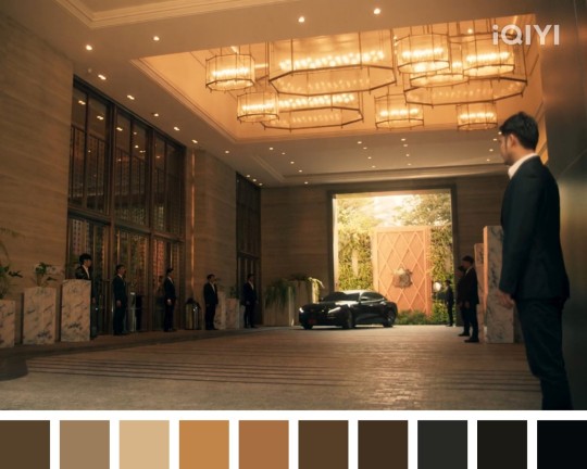
The gold-ish gradient: from the natural lighting outside at the back and the artificial lighting at the corridor to the black suits of the stand-by bodyguards.
2. A quite zoomed-in aerial view of some streets and buildings, showing the context that Kinn was on his way to meet Don.
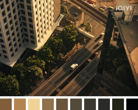
Still gold-ish gradient, I think, but more desaturated, maybe. On this note, I feel like the color tones used in the show are mostly on a more desaturated (or darker) side. I'm not sure, but I had a hard time 'reading' any true colors in almost all their scenes.
3. The outdoor area outside Korn's wings (when Porsche was called there after arriving at the mansion to start the bodyguard job).
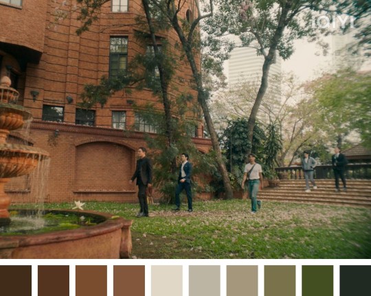
Bricks and trees. It's refreshing to see some green, and that sky lights (with a bit over exposure, maybe), finally seep into the gradient.
Well, this is quite fun. I might do this again for other scenes, or other series/drama. I'll try to pick a more 'colorful' image next time 🖤
1 note
·
View note
Note
i love your environment work a lot :) do you have any tips for people looking to get more into environments/atmosphere/etc?
aww thanks!! alright *cracks knuckles* bear with me here since this’ll probably be quite long :’]
- So first of all, start out simple! There’s no need to push yourself into creating overly complex backgrounds if you’re only just starting out, because those can get overwhelming and demotivate you. Practice basic background elements (both natural and man-made), such as trees, mountains, and buildings.
- Use references!!!!! I cannot stress how important this is. Look at lots and lots of reference images, and practice drawing them too! I like to use Pinterest when searching for “general vibe” reference pictures (like overall ambience and atmosphere) because of their visual search options (and the obvious saving options hahaha), and Google for more specific references such as clothing, furniture, species of trees, etc.
- Photo studies are a wonderful way to practice drawing backgrounds because all of the key elements are already there! (lighting/shadows, composition, perspective, etc). Observe the way that these elements interact with each other! Train your eyes to recognize and separate large blocks of colour, where light sources are and how they influence their environment, and consequently how shadows fall as well. A good way to start a photo study is just to block out general shapes with solid colours, making sure to identify where the brightest and darkest areas are. Here’s a lovely video talking more about photo studies.
- Make sure to establish a good tonal contrast with your colours so your background doesn’t look too washed out or dull. The grayscale to colour process is one method for this, although I don’t use it.
- Add and Multiply layers are your best friend! Add layers for lighting, Multiply layers for shading/shadows. Gradients are fun to play around with, as well!
-A little trick I use when drawing sun rays is to take a dry oil paint brush and draw a line in a yellowish-white colour, then enlarge/rotate to suit the direction of the rays. This would be an Add layer (adjust the opacity how you wish!)
- Perspective! (my abhorred <3) I highly recommend learning how to draw with perspective grids. Here’s a tutorial on how to create one manually, and there are plenty of tutorials online on one, two, and three-point perspective. (Definitely familiarize yourself with one-point perspective first, though. I don’t even know how to draw in two or three-point myself yet :’])
- Also, keep depth in mind. Objects further away from the camera are smaller and less opaque, and you can add a gaussian blur to distant objects if you want!
Once you get the hang of drawing backgrounds, atmosphere tends to come intuitively! Planning out your drawing with an end goal in mind is the best way to achieve a certain mood, but if your drawing doesn’t turn out the exact way you wanted it to, that’s alright as well! You can always start over with the experience you gained from the first version, or accept your result and move on.
But most importantly, just have fun! Play around with colours and learn to love the process. Good luck on your art adventures, anon!
22 notes
·
View notes