#mamajama
Explore tagged Tumblr posts
Text
Also I don't who needs to hear this (everyone - everyone needs to hear this) but I'm fairly sure Jessica Drew's design is inspired by Pam Grier - aka. Foxy Brown
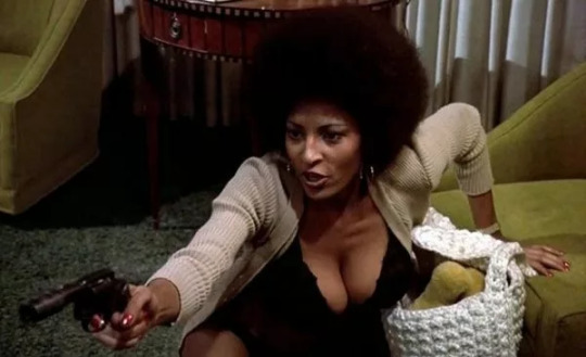

The afro, the tinted shades, the gold hoops - ALL deliberate design choices meant to hark back to iconic black culture and powerful black women from the 70's.
Jessica is meant to be a powerful, respected woman who is unashamedly and unabashedly BLACK - so they pulled directly from women who were (and are) powerful, respected, unashamedly, and unabashedly BLACK.
THEY ATE THEY ATE AND LEFT NO CRUMMBSS
#THATS why Jessica isn't a super warm mammy character#she's supposed to be a 'stone cold fox' - a bad mamajama thats her inspiration#The style is pulled largely from blaxploitation however Pam Grier was The IT girl at the time so it's mainly her#jessica drew#atsv anaylsis#across the spider verse#spiderman#spider man
468 notes
·
View notes
Text
I can’t believe it. Though doctors flip flop on it because it’s so common, it’s generally agreed by people that pcos fits the definition of intersex. Because it literally is increased testosterone in an afab body. All this time I have actually been physically intersex, but just left to wonder why I don’t feel like totally a girl or totally a boy because doctors are scared of the word intersex or smth. Oh well. It feels good to finally know.
#I am INTERSEX!!!#Maybe not outwardly. But hormonally.#I grow a mustache (it’s just skin colored hair). I grow belly hair and toe hair. Like my dad#But I have gigungus mamajamas like my mother before me and a period sent straight from hell. Also caused by the pcos#I have never felt like all of my inherent traits match either one. Whether it’s what I like doing or how I feel or what I look like#Hell even people in public get confused. Hello… siiiiiiir? Oh my god im so sorry-#So it just. Feels nice. To know all along my body literally IS in between#Just like I’ve always felt. Neither one all the time. Both sometimes. I’m me.#lion’s lair
10 notes
·
View notes
Text
I made another book! Tried out the Caterpillar Binding described in one of Keith Smith’s books. It seemed appropriate that a story about people forced to become bug hybrids to survive would have its cover held on by creepy blue centipede thingies.
Unnatural Selection by auburn, 164K words, 747 pages, an SGA/SGU fusion. Actually my second time binding this excellent horror story. The first try was pretty weird too, but this one is much more readable.

More pics and bookbinding talk behind the cut
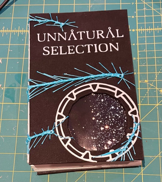
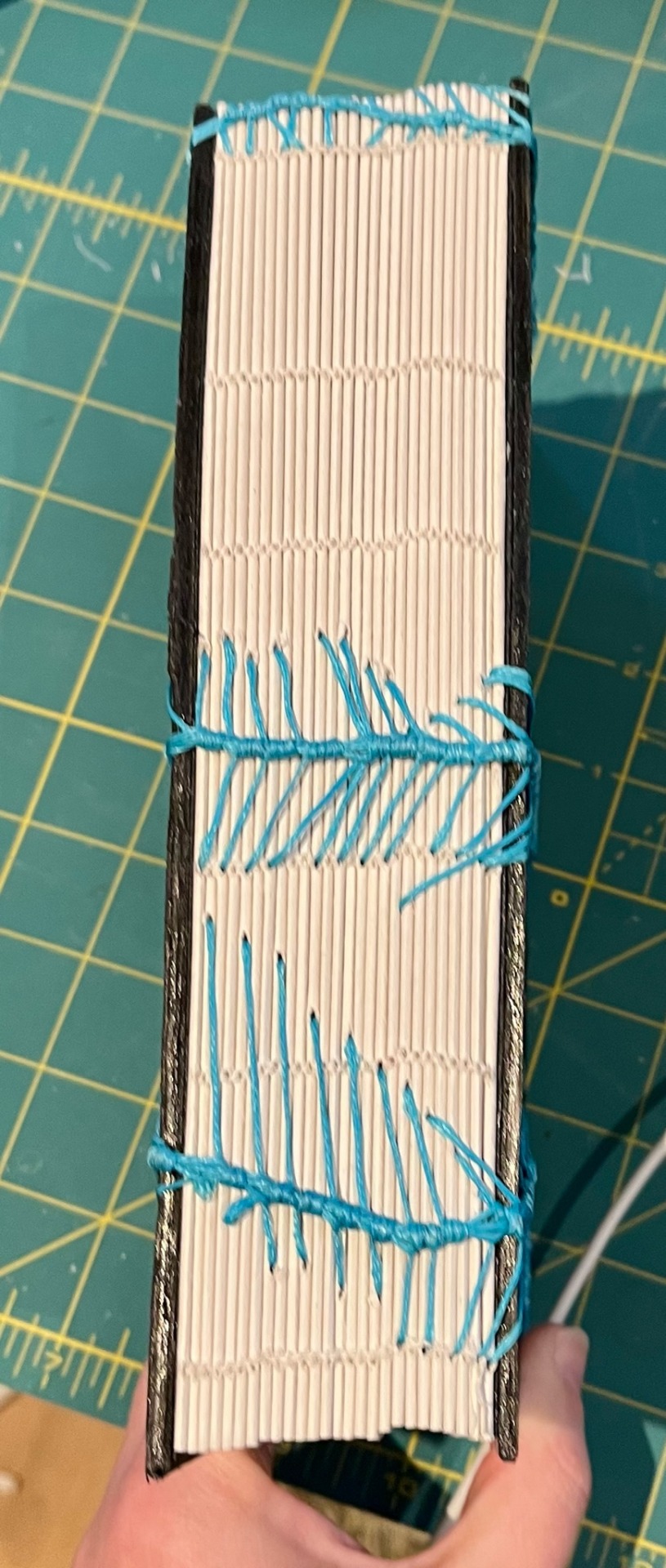


Black bookcloth is just next level. Got some glue on it and it collects lint like woah. Also, because I read that the caterpillar bind is not the most stable and you can see this is a big mamajama, I actually stitched the text block in Coptic stitch in white, then used the caterpillar to attach the covers and decorate the spine.


Best thing about Coptic is how it lies flat when you open it. Gorgeous! Also bragging about keeping the covers lying almost entirely flat, a flaw of caterpillar is they like to pop up. This spent a lot of time under weight at almost every stage. That also helped with minimising swell.
Can’t wait to read it again!
#stargate atlantis#stargate universe#bookbinding#fanbinding#unnatural selection#mcshep#todd the wraith
53 notes
·
View notes
Text
When I walk up in the piece I ain't gotta even speak

I'm a bad mamajama goddammit motherfucker
You ain't gotta like me
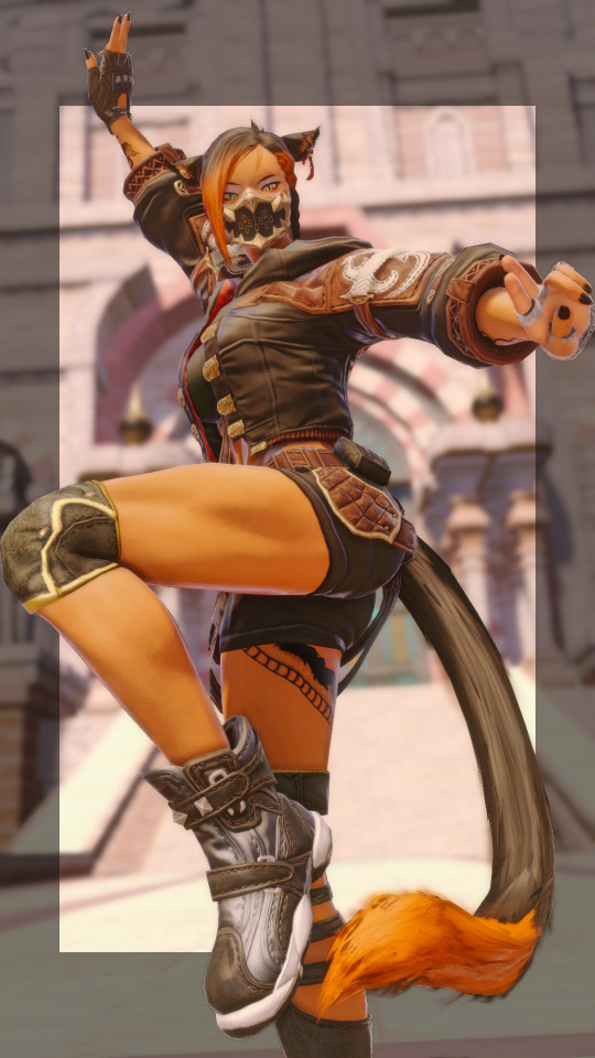
(- Gossip Folks, Missy Elliott )
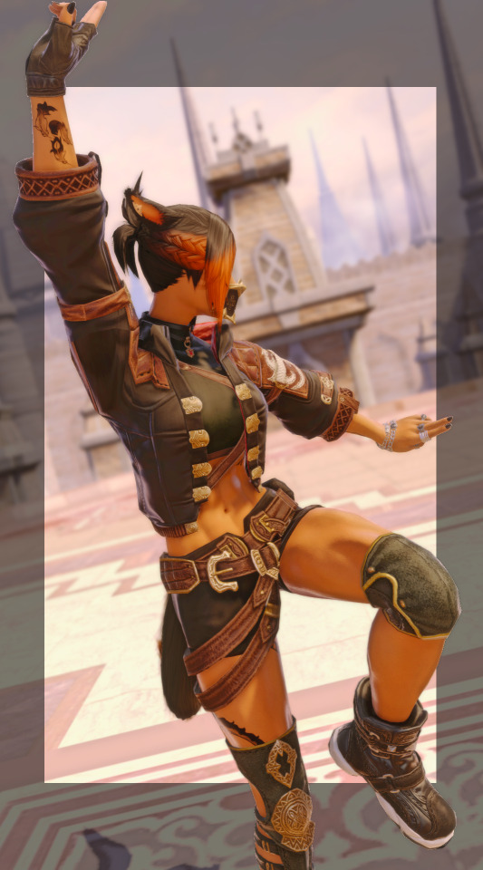
I made myself finally hit max level on monk, and celebrated with the new crafted set, and some pics! The poses are just base monk abilities... with the tail maneuvered a little for a more dynamic shot! Canonically, Jak can be considered both a monk, and a DRK - though I don't think I consider her to have a soul crystal for monk. It's just a combat style - though I've considered having her look deeper into the monk arts as they pertain to chi... and learning to, effectively, chi-block casters in a fight.
#miqo'te#ffxiv#ffxiv rp#gpose#lfrp ffxiv#lfc ffxiv#ffxiv gpose#gposers#ffxiv mnk#mnk#shades of red#diadochos gear#it's been ages since I've done any mnk gposes#way back when I was a baby monk I took some - but it's got whole new abilities now!#my glams#mnk glam
87 notes
·
View notes
Text
more proof of Rachel responding to criticism (but it deserves its own post)
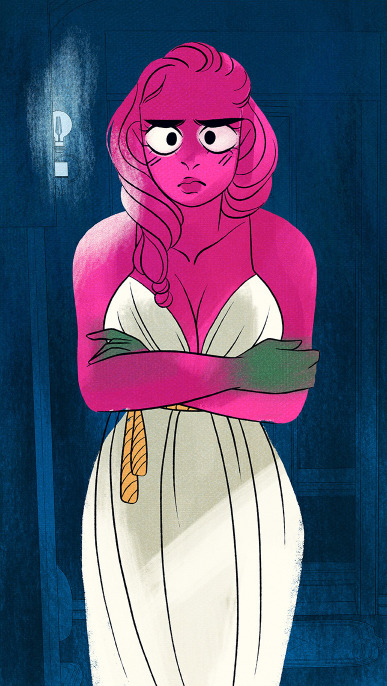
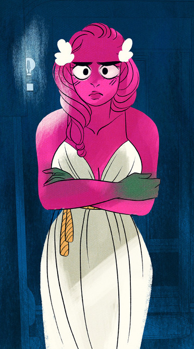
Shoutout to @loreolympusminoredits over on Instagram because they were the one that we saw pointing this out, but Rachel and her team went and edited a panel in the newest free episode right as it became free.
Original:
Edit:
So, a few things about this.
FIRST OF ALL, it's clear beyond a shadow of a doubt now that Rachel is seeing the criticism being made about the S2/3 art and its degradation. A lot of those criticisms include how overly-sexualized Persephone is (because Rachel will take any and all opportunity to draw her mamajama's as the central focal point of the shot even when it doesn't make sense) and how little floral there is compared to S1 despite her being the Goddess of Spring.
THAT BEING SAID, SECOND OF ALL, this edit still feels so incredibly low effort. It doesn't tell me that Rachel genuinely wants to do better, it tells me that she's doing this because Webtoons finally told her to shape up and do it or because the criticism finally got to her head but instead of going "hmm, maybe the points people are making are genuine?" she's going "FINE. IF YOU GUYS ARE GONNA BE DICKS ABOUT IT, I'LL REMOVE HER BOOB LINE. HAPPY NOW????" (no, because the art still looks cheap and rushed, it's still missing color along the left side of her dress/arm ffs, changing little things like her cleavage and adding some white blobs into her hair isn't getting to the spirit of these criticisms - and that's that the whole vibe of the art is gone, there's no personality or oomf that it had back in S1).
THIRD OF ALL, SHE DIDN'T EVEN EDIT OUT THE ORIGINAL PANEL LMAO YOU CAN LITERALLY COMPARE THE OLD VERSION AND THE NEW VERSION RIGHT ON THE COMIC, BECAUSE THE PANEL SHOWED UP AT THE END OF 227 AND IS SHOWN AGAIN IN THE BEGINNING OF 228. BUT SHE ONLY EDITED THE 228 ONE LMAOOO SO NOW IT'S JUST INCONSISTENT 🤣 it's like Rachel thinks she's "winning" for doing the bare minimum but she's creating even more little art inconsistencies and problems. It gives me the impression she only changed the panel because it was about to become free to read and she wants the non-fast-passers to be eluded into thinking she's making 'more effort' when that 'effort' is literally just like, white blobs and the eraser tool and one redrawn line LMAO
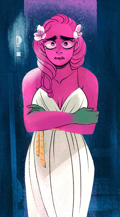
Anyways, all that's to say, Rachel we can see you editing your panels and your efforts to do so are so bare minimum it hurts. You don't need to go back and edit old panels, you need to work on the stuff that's coming out, and that's gonna take a lot more work than just throwing in some blob flowers and erasing Persephone's boobs. You haven't addressed the oversaturated colors that make the characters look like they've been dipped in grease paint, the void backgrounds that make that oversaturation look even WORSE, the lack of watercolor texturing, lack of glow, anatomical problems, overuse of lineart, character model inconsistencies between panels, lack of shape language, and lack of overall visual appeal that's definitely being lost due to an over-reliance on assistants to pull the weight of drawing the comic and lack of proper direction/training to get everyone on the same page.
Go back and read your own comic for once, Rachel. Do some studies on what used to be good about your art. Get your assistants on the same wavelength. Make an actual effort. Because there are currently SHITLOADS of salty unpaid Internet randos online drawing circles around you and understanding your techniques better than you do these days.
And as one of those salty unpaid Internet randos, here you go:
#lore olympus critical#anti lore olympus#lo critical#i said i wasn't gonna make any more LO essays and yet here i am#i'm a failure
158 notes
·
View notes
Text

Perfect cloud - saw this bad mamajama on the way to work today and not only was he AWASH WITH RADIANCE, he was completely blocking the sun so we could look upon his glory unhindered.
Base Score: 10
Showmanship Bonus: +5
Being a Bro Bonus: +1
This cloud gets 16 stars! An all-time Rate This Cloud record!
0 notes
Text
She's a hot little number in her pick-up truck Daddy's sweet money done jacked it up She's a party-all-nighter from South Carolina, a bad mamajama from down in Alabama She's a ragin cajun, a lunatic from Brunswick, juicy Georgia peach With a thick southern drawl, sexy swingin walk, brother she's all
0 notes
Text
Camping trip #1
Last night, my backyard sounded like a horror movie. Some critters were fighting and fighting fiercely. A raccoon, with its chittering, was one of them. We live about three miles from Boston, and raccoons are some of the few animals that thrive around humans, so we have some big mamajamas. As for the raccoon’s opponent, well, that’s where things get strange. If I were at my parents’ house in the…

View On WordPress
0 notes
Text
Sup my various homeslices and bad mamajamas. It’s ya boy, me, back at it again on tumblr dot com.
0 notes
Video
instagram
This season I have the opportunity to shoot a @brazoscustomgunworks , not only is the firearm beautiful it is a smooth operating tool. Video coming soon.... Visit www.BrazosCustom.com for more information about the handgun Click on the linktr.ee in the bio and find out more about us Hat: @m_wtactical Eye Protection: @huntershdgold Shirt: @jm4dimensions @csrashooters @huntershdgold @caetransfers @theguncleanersllc @reddirtshootingsports @red_dirt_usa Holster: @jm4_tactical Lubricant: @theguncleanersllc #mamajama #nice #beautiful #steel #custom #handles #yes #try #WEtrain #getthastrap #getactive #woodland https://www.instagram.com/p/CRhW8cGj9mu/?utm_medium=tumblr
0 notes

