#making really big and super cool improvements on your artstyle and then having to go right back to your old one because of a project
Explore tagged Tumblr posts
Text

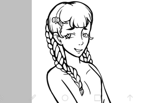
bruh (tag rant)
#making really big and super cool improvements on your artstyle and then having to go right back to your old one because of a project#the most beautiful joker ive ever drawn vs mediocre anime girl#whatever. my art is cute anyway. i shouldnt be too hard on myself#besides theres only 2 left and one is a cat and the other is a middle aged man#so maybe its good that i got better at drawing different faces! :P#theres a silver lining afterall#uuugh but i have to do that really shitty screen tone shading instead of the cool comic book style one#!!!!!!! im crippled by my pure awesomeness!!!! i am king midas!!!#whatever
12 notes
·
View notes
Text
was talking about it the other day but its sad how we are never going to get really big budget games w/ funky artstyles again. like if you look at the majority of big budget releases lately, they are all kind of going for the same thing as far as actual modeling goes- hi fi, super detailed complex models that try to portray as much detail as possible. which is fine for certain games, but it makes me miss the big swings devs used to take.
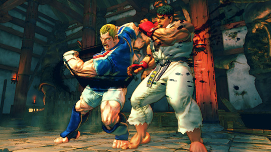
take street fighter 4 for instance- despite being over 10 years old at this point, it still looks REALLY good. great art direction, has a weird painterly look so everything has a cool watercolor style to it, models are expressive, etc. and this was a BIG release, its not some indie game (where most big stylistic swings tend to be made nowadays).
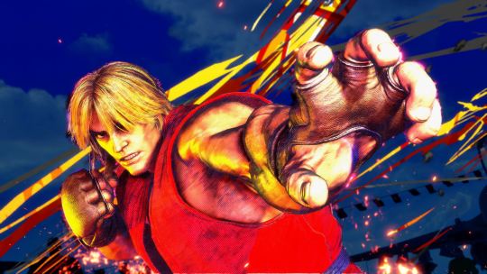
compared to street fighter 6, which is going for photorealism (with strong choices made as far as animation and color goes) it looks dated in the context of graphics generally, but looks WAY better than its contemporaries from the same time period. my fear is that street fighter 6 wont look that great in 10 years time.
side note, its also why street fighter 5 was really only loved by hardcore fans. it does nothing particularly well! its a halfway point between realistic and artistic to the point where it feels like a side-grade rather than an improvement or even its own original idea!

whatever leaps were made in lighting and texture quality are essentially irrelevant here. fucking gross!
the thing is, i dont think this is a deliberate choice that devs are making right now. from what i can tell, recent rendering tech has made it way easier to achieve a handful of lately- hi fi LIGHTING, increased TEXTURE DETAIL and HI POLY COUNTS come to mind. these are cool, but if youre a dev who wants to make a triple A product, you kind of have to use whatever tech is on the table to make a product look cutting edge. none of those encourage taking wild stabs at cool art directions. devs used to use those cool art directions because it was the ONLY OPTION THEY HAD.
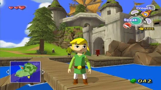
classic case being windwaker right. the gamecube was a huge graphical leap from the n64, where even getting a model to look like something was a challenge. compared to ocarina of time, windwaker looks absolutely fucking incredible. it got a lot of pushback at the time for being too kiddy, but really the strength of its style is a result of doing as much as they possibly could with the platform they were working on. no high poly counts, the shading tech was relatively simple, and the textures (while a huge improvement over the n64!) are still basic compared to what we have today. windwaker still looks impeccable to this day, and even the HD remaster they made which, ahaha, improved WHAT

LIGHTING and TEXTURE DETAIL. but without a real consideration for the original artstyle (or why it even existed... which was the gamecubes limitations) it just looks worse.
in response to this pushback (i think, idk i didnt work at nintendo at the time) they gave twilight princess a way more "realistic" look. but given the rendering restrictions of the time, it still has a fairly robust artstyle
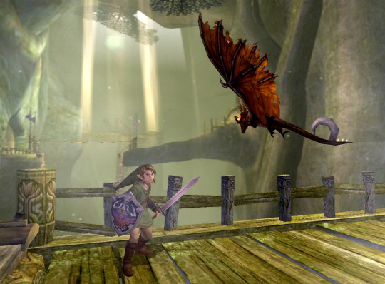
proportions are more realistic obviously, but in order to achieve that realism without the kind of lighting tech we have now the "lighting" is BUILT Into the textures. look at links sword, how it kind of darkens near the hilt, or how the shadow on the keese's wings is just kind of painted in specific areas. i would argue that twilight princess looks a LOT like street fighter 4 in that area-
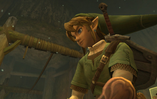
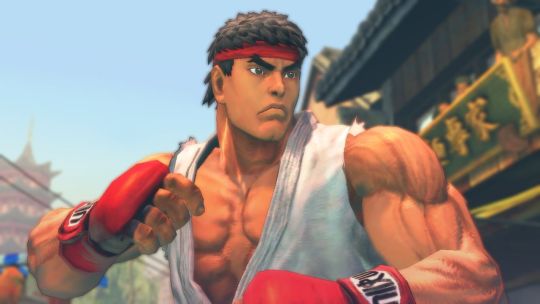
damn! they almost look like theyre from the same game! but twilight princess was celebrated for being "realistic" while sf4 was noted for having a funky watercolor style (thats built into the focus attacks even!). its so so smart, because the devs knew they couldnt go for photorealism (like so many games of the era tried at and completely failed at!) so they went for a mix of cool stylistic decisions that allowed a game to look GOOD in a subjective, artistic way.
Not that games don't try and apply artistic principles now, but its a lot less unique. look at mario odyssey
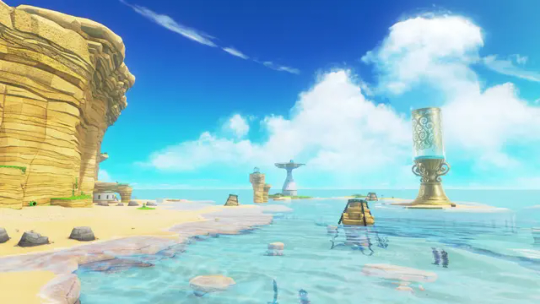
its just a beach. and it looks great, its well rendered, but its just a beach. colors are clearly intentional and very pretty, but it's nothin that special right now, probably will look even less special in 10 years even compared to levels in the same game.
what im curious about is when are we gonna get back to that kind of artstyle meets rendering tech! if ever! current tech makes it so devs are kind of forced to go down the same boring path. look at mortal kombat 1:
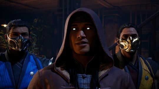
im sure there are some leaps in texture and lighting, but they keep taking shortcuts. all the faces are modeled after REAL peoples faces and they mocap for expressions/conversation, which gives a really boring look to it. the fact that mk11 and mk1 look so similar so many years apart (4 i guess isnt that much but there have been leaps!) is disappointing to me.
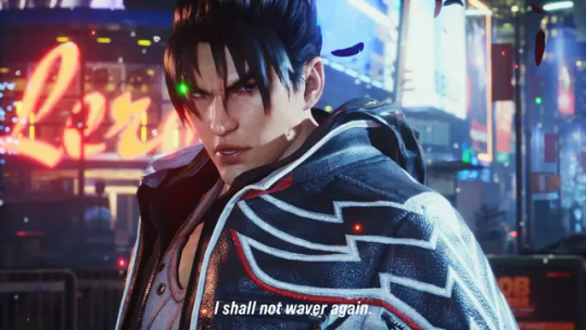
then you have tekken 8, which is like the best looking game ive ever seen. for a while i found it hard to put my finger on why, but my brother said something really smart i feel- they made all of these models by hand. theyre essentially digital statues. they didnt pull actual face models, they just worked on their features until it looked correct. on top of the lighting and texture work, it creates a look not unlike the renders tekken has been using for years. which is convenient for them, because they can finally match the kind of real-time fidelity they've been chasing for like 30 years

hell it looks BETTER than that. so what im trying to say is im hopeful that art direction will catch up with the kind of rendering tricks/strengths we have.
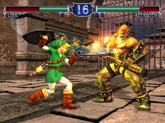
i think tekken 8 feels like how soul calibur 2 probably felt at launch. does a lot of the same things given the time period
i still think hi fi rendering doesnt make for a good looking game, but rather where the focus lies for the player. for tekken it makes sense that they would focus their horsepower on detailed models and stages- youre gonna be lookin at that forever. look at elden ring

texture wise, SUPER low res for 2022. maybe even 2020. but what they do with the horsepower is genius- they focus on scale to translate locations of objectives to a player while also reinforcing the feeling of adventure, on top of extremely strong choices in color and lighting. i hope, going forward, games focus on how they can use this kind of tech to reinforce a games "gameplay mission statement" while keeping strong artistic choices present rather than focusing on being able to wow someone with a couple of screenshots at the cost of BOTH of those things. im just ranting though french press got my ass
133 notes
·
View notes
Note
What mecha shows did you enjoy but would not recommend to people (flawed personal favourites, shows with high entry barrier, etc.)?
Several come to mind.
Blue SPT Layzner: TV run got shitcanned prematurely and has probably the mast slapdash ending of any mecha show save maybe the TV run of Ideon. OVA adaptation opens with rushed compilation of first half of TV series that's dull to watch and not especially coherent on its own before it gets to the altered and much improved ending. Feels like there's no right way to watch it, you have to do both and piece it together in your head. Definitely one to check out after you've seen Takahashi's better work like Votoms and Dougram, though it's infuriating because the series has banger music and mecha design, and the hypothetical ideal version of the plot that you don't have to basically kitbash together in your head is really good.
Dancouga: Production values are amazing in first episodes and then turn to complete dogshit shortly thereafter, like they literally spent their whole budget up front and then had to pay their animators in loose change and leftover fast food. Very strange pacing. However I've always really liked the main protagonist Shinobu Fujiwara whose voice actor honestly carries the show on his back, and I've had a soft spot for Dancouga the mecha itself for a long time - but it doesn't actually show up until half way in. Yet somehow I can't deny the charm of the show despite how slapdash it is thanks to its interesting approach to the super robot formula, and it leads into Requiem for Victims which is the true ending for the TV plot and a followup called God Bless Dancouga, both of which are banger OVAs (and then another kinda shitty one after that but who cares.) Unfortunately they all make no sense without watching the TV run. It's a franchise for hardcore mecha fans only, though IIRC the 2000s sequel Dancouga Nova is basically disconnected and stands on its own, for better or worse. I've yet to watch it.
Tryder G7: 80s super robot show that's kind of like a part slice-of-life anime, honestly ahead of its time in a lot of ways. Would be my go-to recommendation for 80s super robot shows if there was a decent fansub. The one that exists is a Russian translation of the official Italian subs that then got translated into English and it's as disastrous as you might expect. Not only is it incoherent but even as a non-Japanese speaker I can tell it's often inaccurate. Frustrating because I can tell it's a good show that deserves a proper English sub for fans.
Cross Ange: Notorious show by the Gundam Seed creators. The concept and lore of this show is batshit insane, the mecha are cool, the main character turns out to be interesting and likable despite very negative first impressions, however there's no denying that it's buried under a thick vaneer of shallow coombait and it runs itself off the rails with zany plot at points. Honestly better than its reputation suggests but hard to recommend without looking like a pervert.
Shinkon Gattai Godannar: Basically the same thing, coombait super robot series, fun action, not a bad story. At the same time if you've ever seen a gif of absurd breast physics in anime from the 2000s there's a decent chance it's from Godannar. Good show at the end of the day, better than it has a right to be, artstyle is gonna be a big turnoff for many people and I don't necessarily blame them.
Gundam Build Divers Re:Rise: Probably the weirdest of the build series, also IMO the best. Downside: you have to suffer through the profoundly mediocre original Build Divers to get the most out of it and I'm not sure that price is worth it.
Probably more that I could add. Honourable mention has to go Gundam Seed Stargazer because you have to suffer through Gundam Seed Destiny to get to it, but I hear that the new Gundam Seed movie that's also set after Destiny is good so perhaps the cost-to-benefit ratio of suffering through Destiny has changed.
22 notes
·
View notes
Note
for the artist askgame, idk how many youve answered already but 3,4,10,12,21,24 and 35!
hello helloo!! sorry im just answering this now, been pretty busy^^ (also, using this chance to thank u for your support!! i always see u interacting with my stuff here hbasfcyhdb you're a sweetheart😭💕)
Your fav piece/s?
Probably this vergil one! i still love how it looks djddgnds my art peaked here im afraid,,,,,
Piece you wish got more love?
hmm, this is an interesting one!! tbh i dont mind it much but this johnny fanart got waaaaay more attention on instagram!! i mean,,, i have a lot of mk moots there so it makes sense lol (and also just got to 1k followers on IG!! crazy stuff💌)
How do you deal with artblock?
to be honest, once i realize i have artblock i stop drawing for a couple of days. if i keep insisting on drawing i just get more and more frustrated and it makes it worse imo. so i like to spend some time doing my other hobbies!!! (´▽`)
usually i just come back to drawing once i regain motivation or i get a cool idea that i need to sketch so i wont forget. and when that happens, my artblock is usually gone!! so,, i guess i just wait for it to go away? lol not much advice i can give on that sadly :/
Describe your process while drawing!
CHAOTIC. to say the least.
i spend like. half an hour on pinterest beforehand getting inspo & searching for refs and ONLY THEN i can start drawing. i start on SAI1, do the sketch and if i like how it looks, i just clean it up. if it dont, i do 'proper' lineart. after that i start coloring and shading!! this is my fav part tbh. once im done shading i color the lineart so its not completely black. then i open up SAI2 and start doing more rendering, adding overlays & effects. that part is also SO FUN cause it makes everything come together so nicelyy. my art process is a pretty big 'trust the process' till that part lol.
there's ALWAYS music or yt videos playing in the bg, and me taking A LOT of 15 minutes breaks cause that one song is so good and i have to stop drawing and start singing while looking at the spotify lyrics like im hypnotized LMAO
What do you thin you artstyle woukd taste like?
people always say my art looks so tasty and. i kind of agree!! like. smth very sweet. it really depends on the colors i use on the piece but,,, either hard candy, gummies, marshmallows or even syrup i think!!!
What's a compliment about your art that has always stuck with you?
i get super giddy with every compliment i get so i dont think i can remember one in particular??? but istg people always say the funniest, most sweet things ever and it's so nice to hear :3 but if i had to say smth,,, i once had the chance to talk with this one incredibly talented illustrator, and he kept telling me how he thought my stuff looked amazing. and i was like!!! wow!!! you actually like my stuff?? what!!!!
Piece of advice for my younger artist self
i would sit this little girl down and talk to her for hours tbh poor thing was STRUGGLING 😭😭😭
i guess my best advice for her (and for anyone who reads this, too!) is to not be so hard on yourself. art is a skill, and it takes a lot of time to build it up!!!
i used to get SO extremely upset when my stuff didnt look the way i wanted it to and ughhh. took me literal years to find my artstyle too and that didn´t help AT ALL with how frustrated i was feeling. i felt,,, stuck??
but now i look back at my art journey and. wow have i improved!! maybe if that little girl saw the stuff i do today she wouldn´t be so sad about her art :´] not to say i don´t struggle today, i still feel stuck and frustrated often!! but i guess i learned to be kinder to myself. but i still have lots of things to improve about my art!! i wonder when i´ll take another look back and see how much i´ve progressed since today,,,
thank you for the ask!! (´▽`ʃ♡ƪ)
2 notes
·
View notes
Text
593 followers special! + appreciation & shoutouts <3
Hi guys! I’m back. Now, I know it’s been a while since I last posted anything as uni has been kicking my butt, and I was busy with my final sem exams. But now that I’m back, I would like to do something simple to celebrate me reaching 506 followers (596 currently) a while ago, and that is to open a discord server.
Yep, you heard me. I’m having my own discord server! :3 So don’t be shy and come join it if you want. The mods are lovely and so are the users that have joined. The criteria for joining my server is that you have to be 15 or older ! And don’t even try to lie about your age, we can tell from the way you carry yourself.
https://discord.gg/pA9au9S
In addition to celebrating my 5th milestone, I would like to thank these people, which are my lovely friends, fanfic writers and non writers alike, those who are in bold write nsfw/mild nsfw :
To start off, I want to thank these three servers/groups as wholes:
1. Jay and Co.:
@oikawasass -- Jay my spicy cinnamon roll! You are very cool person, periodt. Tbh, I was a little intimidated by you when I first spoke to you in your server. But overtime as I spoke to you more, I can see that you're actually a very lovely and sweet person in your own way. Also, I love how you can be super blunt and say the most hilarious things with a serious tone. You’re self-assured, bold and not afraid to speak your mind, and that is what I admire about you. And thank you, for being there and talking sense into me when I needed it, I appreciate that very much 🥺
And boy oh boy, your writing? *Chef's kiss* the first time when I read one of your works, I fell in love with how easy on the eyes it is. Your writing style is simple yet beautiful. Your choice of words, the imagery and the cohesiveness too! It’s godtier💞, must stan it. I especially love your crack fics/hcs and you whole aesthetic as well. Ma'am, pls spare some of your skills.
@archn my dear cupcake! Honestly, you're the sweetest person I've ever met and you're so so supportive and patient 🥺, plus I love how crackhead you can get when we’re fooling around lmao. Other than that, you’re really easygoing, not only towards me, but to everyone in general. You’re like that cool cousin that everyone looks up to and deserves all the appreciation in the world.
Also, your writing style is gorgeous and you write the characters' personality so spot on! I also love the flow of words sm ahhhj. I especially love your headcanons of the bnha boyos working out with their fem s/o, that idea is really creative!
@mizukuni -- Mizuuu, my beautiful, gorgeous sweet red date! Babe, you have come so far from starting off as a new writing blog not long ago to finally achieving 1k followers! I just wanna say congrats for reaching your 10th milestone and you deserve every one of your followers! You can definitely go further and achieve more milestones. As for your writing style, it is simplistic but beautiful: you don’t use many flowery words to express your writing, yet those simple words you choose bring out what you want to show in your works exactly, and the flow of words is just rly smooth and I stan the cohesiveness 💞. Oh and you have such a cute minimalistic art style that is very pleasant on the eyes! And lately I can see that you’re improving at a quick pace; your drawings are getting more detailed than last time and that’s really amazing! Also, did I mention that I love your blog’s aesthetic as well?
Also, thank you for being there for me when I was feeling down and needed someone to talk to, I cherish that gesture of yours greatly luv 💞As for my first impression of you, I could tell you’re a really chill person and go with the flow easily. Honestly, that helped a lot to buffer my social awkwardness and made me open up to y’all easier. So yeah, I must say a very big thank you once again to you babe 💞
@cherry-pancakes -- Diiii my sweet cherry blossom! You are the cutest person I’ve ever met sjdnjsn. Your antics remind me of a sweet little sister and that is pretty darn adorable. Even though you can be a little bit wild and spontaneous sometimes, that just adds to your charm! Plus, a little wild every once in a while does’t do harm < 3
As for your writing, it has a simple flow but it is easily understood. If writing styles were aesthetics/ sceneries, yours would be a small flowing stream-- small but smooth flowing, simple but not insignificant. Beauty in simplicity describes your works perfectly. Also, did I mention that you have a really adorable artstyle as well? Your art style is relatively simple but it is so so cute 🥺
@chizo --Guava my gummy bear! Babe, even though you are no longer active here, I just want to say a very big thank you. Thank you for giving us so many beautifully written works. Seriously, when I first met you through discord and followed your writing blog ( @izukyu ) I fell in love with your works. Something about your writing is just really special, plus I love the fact that you start sentences with small letters (Caps lock be damned lol). Your writing is a mixture of sophistication and simplicity, yet they compliment each other perfectly when you incorporate them into your works! It is pretty impressive because it is not an easy thing to do.
As for my first impression of you, I can tell you’re genuinely a vv caring and supportive person. You give off motherly vibes as well in a good way! You’re like the cool mom friend of the group who looks after everyone tbh 💝. So yeah, once again I want to say a very very big thank you to you again. Thank you for blessing the writers’ community with your wonderful fics and thank you for being such a good friend, let’s continue to be good friends in the near future!
@sourbkg -- Emmie my blueberry! Babey you are another sweetheart who is caring and so so supportive. I still remembered that time when I felt a little ill and sad and you immediately sent some cat pictures to cheer me up, thank you sm for that love, it helped me a great deal 💕, plus I’m never one to say no to cats and kitties! Also, you know exactly what to say at the right moments! Your easygoing personality makes it easy for other people to open up to you as well.
As for your writing style, it has a simple yet realistic approach. It’s like I can see what is happening in your works like a movie scene and I think that is really cool! Keep up the good work < 3! I really love that one shot with Shoto’s s/o attempting to scare him, it’s so cute ahh! And I love the ending lol, Shoto cracking a joke is golden.
@kozumie -- Kai! Oh man, where do I start. Okay, here we go. When I first met you in the server, I gravitated towards your easygoing, cool and chill vibe. After talking to you more, I can tell that I love the laid-back chill vibe you give off, you’re so awesome!
Also, even though I haven’t read much of your work, I must say I really love the way you write. It’s precise and your vocabulary really helps with imagery, the words you can help the readers easily envision what is going on in your story, and that is really amazing! Keep up the good work! Looking forward to more works from you.
@succu6us-- Anni! Babe, ahh it has been a while since we last spoke too hasn’t it? I missed you along with the others too 🥺 But now that I’m back for the time being, I’m going to be more active. Anni babe, your writing style is minimalistic yet gorgeous. I can tell you’re not a big fan of writing long paragraphs and that’s completely fine! Because if I’m being honest here, I tend to keep things simple and short as well if I can. Yet your simplistic style captures the gist of your works perfectly! did I mention that I love your nsfw works as well
As for my first impression of you, I could tell that you had a very self-assured, confident aura about you, and you still do! But you are not arrogant at all. On the contrary, you’re a humble and supportive soul! I quite envy that self-assurance and air of confidence you have dear, and I can say that I have grown to be a bit more confident in myself by having you around, so you’re a wonderful influence! Let’s continue to keep in touch sweetie.
@mysterypotatoink -- Morgann! Sugarcakes, let me just say that you are the best big sister figure we could ever ask for! You are so sweet, supportive, loving and willing to help us whenever we need it. You are our server’s big sister and guardian 💕💕 You always make us feel loved and warm inside. Personally, whenever we talk to you, it gives off the vibe like a child wrapped up in a safety blanket-- toasty and secured.
You’re so strong and wise, I look up to you a lot and want to learn from you in terms of being the pillar of support. 🥺
@needs-serotonin -- Joanna! Muffin, you’re another one of the sweetest, most supportive people in the server. You’re so honest about what you say in the group and know when to say it at the exact time.
Also Joanna, you give off a really cool vibe! Initially, I was a bit shy and unsure on how to approach you but overtime as I warmed up to you, you’re actually pretty easy to get along with! I would love to get to know you better, let’s talk more dear.
2. Deku protection squad! (Aka dps) :
@suckersuki -- Lei! Sugarplum, you are another one of the sweetest, most supportive people I’ve ever met. You are always there for us when we need it and I love how crackhead you can get hahaha, I still remembered that time when we teased you by shipping you with shinsou hehe. Anyways, back to the original topic of appreciating you, you are a great listener and offer good advice! Also, you’re very easy to talk to and give off a cute vibe!
Did I mention that I love your writing as well? Your style consists of a mixture of comedy and seriousness. Like, your hcs for the tik tok trend and argument scenario for the bnha boys are really funny; on the other hand, your fic with yandere shoto gives off a completely different aura and it sent shivers down my spine. Miss, pls spare some of them writing skills.
@babydabi -- Mei! Gingerbread, you are a another kind, loving and supportive soul that I have the honor of meeting in the dps. You are really easygoing and considerate. You are not afraid to speak up for your friends, but you do it with a careful choice of words and this shows that you’re really considerate.
As for your writing style, it is much like yourself. You know how to choose the best words to express what you want to and you’re cautious doing so. As I can be a little indecisive on deciding my choice of words, I’d love to learn from you!
@bakugoustanaccount — Bri! Dear, tbh I was a little intimidated by your vibe when I first met you, bc you just seemed so cool,,, and I’m awkward and still don’t really know how to socialise well with people. But after interacting with you more, you’re actually pretty chill! Let’s talk more, I’d love to get to know you better.
As for your writing style, it has a certain smooth flowing, poetic aesthetic. I fell in love with it the moment I read your latest fic. The way you phrased everything is just so fitting! Pls teach me your ways miss.
@bnhatrashh -- Izzy! Luv, you give off a similar vibe like bri, so I was also kind of intimidated by you at first. But like bri, I opened up to you more and here we are! Let’s get to know each other better, I’d like to talk to you more often.
And I really love, love your way of writing! Your writing style has a pleasant, smooth homey vibe. It’s very soothing to the eyes and your vocabulary complements it really well!
@cellotonin —cookie! Love, you’re another one of the sweetest and most supportive people in the dps server ahhhh. You’re always ready to support us whenever and I love your vibe! I’d like to get to know you better sweetie.
Also, I love the way you write! it’s so sweet, warm and ahh so pretty 🥺, did I mention that I love your blog’s aesthetic and theme as well? Your style of writing is mellow and gorgeous! I would love to learn some of that from you pls.
@hoekaashi — Ash! Dear, you give off a cool and mature vibe. You’re like the awesome aunt of the dps. When I first spoke to you in the dps, I was like “this person is really cool, I’m kinda scared if I mess up”, but that thought quickly faded as I chatted with you more. You’re not only cool, but also super chill, supportive and easygoing! Let’s talk more, I’d love to know you better.
Also, I really love your way of writing! It has this realistic touch and lets people have the feeling of being in that scenario/situation. Plus, the flow of words are smooth and complements your style! Keep up the good work dear, I look forward to see more works from you in the future.
@xoxo-dede — Dede! Darling, you’re bold, outspoken and really cool. You speak your mind and I like that, also I love your crackhead side. Most of the time, you can say the most hilarious and crackhead things that never fail to crack us up (hahaha, see what I did there? Ok I’ll stop) , you’re a big bouncy ball of energy that we simply can’t get enough of! Oh, and your art style is really cool too!
As for your writing style, it’s simple but has that realistic vibe, like I can see what’s happening clearly through your words and that’s really amazing! Your writing is gorgeous dear.
3. 我的家庭!= my family (tree <3)
@moonlit-xio -- Ara! My sweetpea, love. You are the sweetest, kindest and most understanding sweetheart I have ever met. You are so selfless and loving, making sure that we’re always accounted for and put us before you. You always make sure to give us the attention, love and support. But love, please let us give you back the love and attention too, for you deserve them as much as us. And you’re absolutely adorable!
And did I mention that the headcanons you come up with for us in the server are absolutely 100% beautiful and on point? No? Well, now you know, because they are. Queen ara, your writing is gorgeous, has a poetic touch and deserves more love, your descriptive skills are immaculate! The words you use to express your writings is just immaculate. Also, you’re very musically talented! Your music taste is delectable and refreshing, not to mention that you have the voice of a siren as well. Your singing is lovely, sweetpea.
@sunshhinnee -- Sunni! My darling pudding, love you are literally sunshine (hahaha,get it? Okay, I’ll stop). You’re so bright, positive and always look at the good side of things even if the going starts to get tough. You bring a warm and chaotic good atmosphere to our server, which serves as a nice distraction whenever I had a bad day or feel upset about something.
Also, your art-style is really really cute! I like your shortcut way of drawing expressions and the anatomy of your characters haha. It’s not too detailed but you can tell what their expressions are saying and their poses are clear.
@bumbbo -- Max! Bubblegum, you’re another one of the most adorable people I ever met. You’re really easygoing and chill, but can be chaotic good sometimes, I like how crackhead you can get when Sunni is in on it too, haha. I especially love it when you two send memes and funny tiktoks to the group, I do enjoy them very much! Also, have I mentioned how much of a cutie and sweetheart you are? You’re so caring, giving and strong. Always willing to help out and so patient with us.🥺
Also, you have great taste in music and you’re great at writing too! Have I mentioned how on point your headcanons you wrote for us are? If I haven’t, now you know <3. Oh, and your editing skills are superb too!
@sondering-thoughts -- Aria! Macaron, you’re another one of the sweetest, most understanding, and supportive people in our server. You’re like the server’s mom, living up to your nickname. You always watch out for us and make sure that we are doing well; if we felt down, you never fail to cheer us up by writing comfort headcanons for us and console us with the words we need to hear! Thank you so much, for doing all that for us dear 🥺 Also, the way you fluster us? You’re a pro at it snjssk, you make us blush so easily that it’s unfair 😭😭
And speaking of writing, you sure have a way with words macaron! Your writing has a poetic take in it, which is something I hope to incorporate into my writing style one day.
@what-a-creative-username --Liana! Chocolate chip! My bro to my bromance, the kuroo to my bokuto, the bread to my shinya! Bro, you are another 100% cutie plus sweetie! I love it when you’re being chaotic along with the rest of them and spam the group with memes and chaotic Youtube vines/vids lmao. Also, the aesthetics you made for us are so pretty ahh!
Besides that, you’re also really considerate and willing to lend an ear. I still remember when I was anxious and vented to you and you let me rant. Then you reassured me and comforted me, which both calmed me down successfully. Thank you love, I appreciate that gesture very much 🥺 . I miss your presence very much in the server, hope we’ll get to talk again and raise hell all together soon!
@txmxkis --Linds! Cake pop, dearie you’re another kind, loving and sweet soul I have the fortune of meeting in the server. If Ari is the mother, then you’re the cool aunt who’s always wiling to hype us up! And support us when we feel down or need someone to vent to ofc. You’re really chill, easygoing and so adorable! Even though you can be a lil mischief and fluster us on purpose sometimes, not that I’ll ever admit it Your vibe is rly pretty, and okay...I admit that I like you flustering me...maybe a little bit.
Honourable mentions! :
@cosmicskin --Lily, my dear love. Honestly you’re the sweetest person I first met on tumblr. Back then when you gave me that shout out, I felt happy, shocked in a good way, and honored all at the same time. And yet, you claim that you are not an angel. Sweetie, you are wrong. You are an angel, even if you claim that you are not. And the way you write? Immaculate, your fluff works have a poetic vibe in them and I’m in love with it. Even though you are no longer writing, I still want to say a very big thank you. Thank you for giving us so many beautiful, gorgeous stunning works.
@keigos-dove --Eli my sweet! Dear, you are another lovely soul that I’m really fortunate to meet here. I still remember that time when I asked you to proofread a fic of mine and you did, giving me your honest opinion about it 🥺, so thank you very much for that love! Also, you’re really easygoing and I love the way you carry yourself, you’re not only sweet, but also really cool! I love talking to you and the way you write? Absolutely gorgeous. There’s something about your writing that’s just... so pretty and it tugs at my heartstrings! Keep up the good work, gorgeous!
@seashellsandshores--Emmie dear! Another fellow sweetheart that I have the honor of meeting here. Dearie, you are really chill and easygoing. I like how easy it is to talk to you and rant to you about ons besides bnha lmao, it has been a while but I want to let you know that I enjoy the time I spend with you and hopefully we’ll get to talk again! Also, the fact that you gave me and your fanfic writer friends a shout out on your birthday says that you are not only a sweetheart, but you’re also a really kind and supportive soul 🥺. And boy, your writing? beautiful. Your url complements your writing style perfectly. Your style is simple, but gorgeous and I can easily imagine what is happening in your fics, like I can mentally picture the scene and hear what the characters are saying. Keep up the good work sweetie!
@birds-have-teeth -- Ashi sweetie! Again, I just want to say a very big welcome back. I hope that you have been resting well during your break sweetheart 🥺. Also, I was caught off-guard when you posted that appreciation post! How dare you do that when I was least expecting it >:c, you have no idea how flustered I felt when I read that ahhhh 🥺. You are such a sweet, supportive, easygoing and loving person, I really love talking to you! And the way you write? IT IS STUNNING, BREATH-TAKING MMM PERFECTION. The flow of words and vocabulary are just so in sync! Immaculate! Also, your art style is really awesome too! I look forward to see more works from you and can’t wait to get back on a regular basis of talking to you again💕
@90s-belladonna -- Aixa! Queen, you’re another one of the coolest, most easygoing people I have ever met! I was kind of awkward when i first talked to you in our dms on twitter, but overtime we got closer and could talk about almost anything! I really love love your laid-back chill vibe, let’s talk more lovely, I enjoy talking to you a lot! Also, have I mentioned how delectable your writing is? Even though most of your works that I’ve read are headcanons, i can say that your writing style is sophisticated yet easy on the eyes. The way you write takes my breath away, I look forward to see more works from you! Keep up the good work <3
@pastelgurlie --Kassy dear, you are really dynamic, funny and outspoken.Thank you for approaching me first on wattpad and dming me, you give off a really fun and cheerful vibe that makes you easy to be around with. Initially, I was a little stiff and unsure on how to interact with you, but fortunately you were patient and willing to stick around until I came out of my shell ^-^. Oh, also did I mention how cool your artstyle is? Your style consists of a semi-realistic coupled with elements of anime in it and that’s really awesome! And the way you draw my and Amy’s oc for free? That’s so sweet of you 🥺.
@adelheidvonschicksal -- Adel my love, you’re another sweet supportive babe I have the fortune of meeting here! You’re really chill, laid-back cool and I feel like a fan living the dream of befriending her idol when I talk to you! You are the very first Shoto blog I came across on Tumblr, and when I first read your works, I fell in love with them. And to have you follow me back, ahh I feel so honored 🥺! And as for your writing style, it is immaculate! I read most of your fics, including the nsfw ones (cough) and they have this beautiful, realistic touch. You characterize the characters rly well and it’s like I can picture what is happening in your works in my head! Keep up the good work, senpai 🥺, I look forward to more amazing works from you.
@lavander-cherry--Cheska! Dear, my second writing senpai for shoto. First I want to say it’s good to have you back! it has been a while since we last talked and tbh, I felt a little sad when I saw your announcement about leaving the bnha writing community, still I do respect your decision back then! And now, I feel really happy that you are back writing for this fandom. Your works are superb, dear! Your characterization is on point and your flow of words complements it very well. Also, I like how you are not afraid to speak your mind and how bold you are, let’s talk again soon!
@shoutodoki --Val! Dear, ahhhh you are another sweetheart that I'm so so fortunate to meet here! You're really easygoing and sweet and it's really easy to talk to you. Your vibe is gorgeous and I cannot stress enough on how much I adore your writings! The flow of words throughout your stories, works and headcanons is just so immaculate and aesthetically pleasing! Even though you have deactivated your acc, I just want to say a very big thank you. Thank you for all of your wonderful works that you have written, you have been a really big inspiration to many writers(including me), I’m sure of that.
@random-mha-thoughts -- Rachel! Sweetheart, dear I still remembered the way you first helped me back then, we didn’t know each other at all, and yet you were so willing to stand up for and help me! I’m trully grateful for the help you provided so so much. And thank you, also for sticking by me even after that and being such a kind soul after all this while. Let’s continue to be friends sweetie!
As for your writing, it’s simple and sweet. The way you write brings a mellow feeling that’s very pleasant to the viewers, it brings about a fluffy feeling and is easy on the eyes. Look forward to more works from you! Keep up the good work!
@min-atoo --Minny my sweet! Man, it has been 3 years since we known each other hasn’t it? You’re just the sweetest, super understanding and kindest person ever! I’m really glad to call you one of my closest friends <333. You’re really easy to hang out with and I love the vibe you give off so much! I still remember the moment when we got into a discussion about what todo’s beard color would be on ig lol. It’s really fun hanging out with you, and yoi and chessie ofc. We should get tgt and have a discord grp call sometime!
Oh, and you have the cutest artstyle ever! The pastel colours you use and the chibi aesthetic you have go perfectly together! All of your works are very easy on the eyes and are super cute! Let’s stay in touch bb x
Make sure to show some love to these lovely ppl that I tagged above by giving them a follow! Oh, I also want to show some love to @dee-madwriter , @dimplesum , @heroprose @kingtamakimurder @love-toxin @lovelove-dere , @yandere-daydreams, @trafalgar-temptress @wonderwomanfantasy, @combust-catalyst @talpup @shoutogepi and @bnhabadass ! They are some amazing fanfic authors as well so go follow them if you haven’t already :3
Words cannot express how much I love and appreciate every one of you, both my friends I have tagged in this post and my dear followers. I am very thankful for every one of you, let’s work hard together!
So, what’s next? Since that I am back for now, i will finish off the belated birthday fics I left unfinished for some of my lovely writer friends above, move on to one last request from the last time and finish off some fics of mine. As for when I will re-open requests...they are put on hold until further notice. Oh and I'll be clearing my asks and tags at the same time.
Until then, see y'all soon!
40 notes
·
View notes
Text
Book Review - Summer Summary 2020
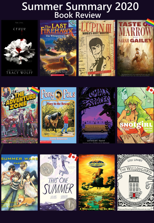
I didn’t get around to doing an individual post for the books I read in June/July/August, so I decided to choose a dozen that I read over the summer... I’d separate the wheat from the chaff for you so to speak. Though like you’re about to find out, that doesn’t necessarily mean they were all good by any means...
Crave
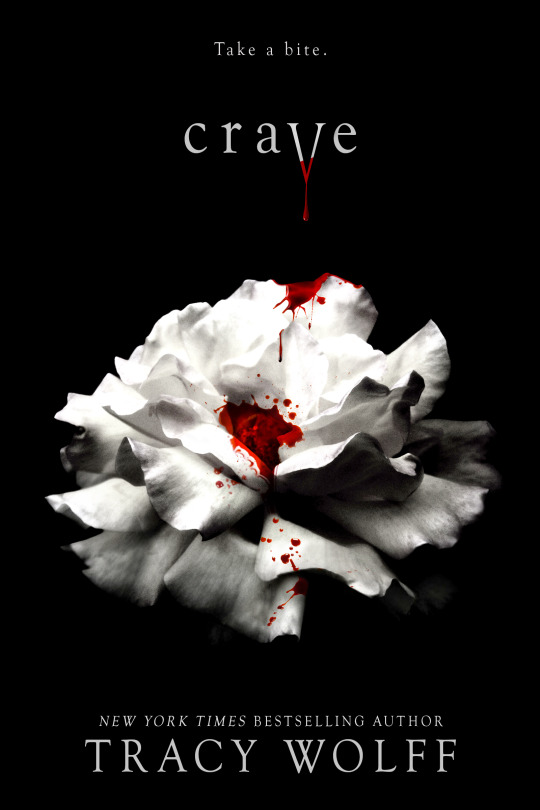
My girlfriend got this for me to “tide me over until Midnight Sun”. Between you and me, I think she was taking the piss. Anyway, Crave is very... standard fare paranormal YA school romance with the added flare of being written by an adult erotica writer, meaning the rhythm and tone of this novel is fucking bonkers. If you want to read the novel without reading the novel, just take Twilight and the entire Vampire Academy series, shove them in a blend, and force down the sludge you get from that. Normal Average Girl Goes To Secret School In Alaska For Vampire, Werewolves and Dragons. That’s this book. It is so big and so so so bad. I finished it out of spite, please don’t do that to yourself. Unless you are really craving (hurr hurr) some top tier trashy paranormal romance, in which case... no judgment.
The Last Firehawk

The Last Firehawk is a Scholastic “Branches” series, written for beginning readers (grade 1-3ish, depending on the child’s reading level). It has short stories, big text, and awesome pictures on every page. Guys. I unironically am adoring this series. It’s simple and is introducing children to a number of classic elements in the fantasy quest genre, but it is so charming. Friends Tag and Skyla discover a firehawk egg, and species that is supposed to have disappeared long ago. When Blaze hatches from it, the three are tasked with going out and finding the magical ember stone which was hidden long ago by the firehawks and which could be used to defeat the evil vulture Thorn and his dark magic... I read the first two books to second graders who ate it up and read the next four books because I personally wanted to continue the series. If you have young readers in your life (or just want a fun kid adventure) then please try these they’re the literary equivalent of nibbling on a chocolate chip cookie.
Lupin III: World’s Most Wanted #3
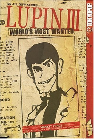
All the kind people that still follow my tumblr and haven’t tried to murder me because of my Lupin obsession are not going to be surprised by this one. I finally read one of the manga for this series and honestly I’m delighted. Somehow even hornier than the show, but hilariously funny. I felt like I was reading a more adult version of Spy Vs Spy. It’s a bunch of short, individual bits/adventures with lots of visual gags and an artstyle that is really different and delightful.
River of Teeth / Taste of Marrow (American Hippo series)
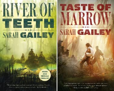
I’ve talked about River of Teeth before, but I finally finished the American Hippo duology and need to sing its praise. This is an alternate history series composed of two novellas that explore the question What would have happened if the States had decided to import hippos as livestock...? Anyways, my pitch for you: queer hippo cowboys. That’s all it took for me to read it. You have a gay gunslinger who loves his hippo to death, a nonbinary explosives-expert / poisoner who is the main love interest, a fat con artist who spoils her hippo and is the only voice of reason in this entire series, and a latina mother-to-be who is the scariest assassin in the entire series and is obviously scheming. The four of them are brought together on a job to deal with the Mississippi’s feral hippo problem.
IT’S A QUEER HIPPO COWBOY HEIST NOVEL GUYS I DON���T KNOW WHY I’M STILL TALKING AND YOU HAVEN’T JUST GONE TO READ THIS YET.
Petals to the Metal (The Adventure Zone series)
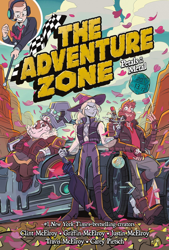
The graphic novel adaptation to the McElroy family’s DND podcast The Adventure Zone. Most of you are probably aware of this? It’s a great adaptation, it hits all the important beats, shows off the characters really well, and still gets lots of good gags in even while condensing entire arcs into single book stories. This one is probably my favourite so far just because Petals to the Metal was one of my favourite arcs in the show... but you can also see how the art has improved and the chaos of the race is fun to see drawn out.
If you like The Adventure Zone but haven’t tried the graphic novels yet -- would recommend! If you’ve always wanted to listen to The Adventure Zone but don’t have time for such a long series or struggle to focus on podcasts then pick up the first book of this series (Here There Be Gerblins) and try reading it! It really is an enjoyable adaptation.
Pony to the Rescue (Pony Pals series)
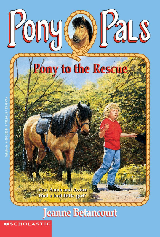
I continued my April/May theme of reading old-school chapter book series to combat Covid Brain Fry, so I picked up a few Pony Pals books. I read these as a kid and always enjoy them -- there’s just something so appealing to a child about having a horse. It gives your child characters a level of independence and ability to explore that you wouldn’t get otherwise. These books definitely read young, but they were nostalgic to revisit.
Small Spaces
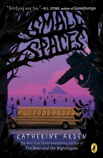
A really cool middle grade horror novel I picked up. Maybe it’s because I live around a lot of corn fields, but farm/scarecrow themed horror absolutely does it for me. One evening, after seeing a woman try to destroy a strange, old book, eleven year old Ollie doesn’t stop to think, instead stealing the book and running. That’s how she becomes wrapped up in the strange, sinister story of a cursed family and creature called the Smiling Man that seems to live out in the foggy fields. While unsettling, Ollie tries to remind herself that it’s just a story... but this becomes more challenging when her school bus breaks down one day out their own set of fields, and a fog is rolling in...
“Avoid large spaces. Stick to small.”
Snot Girl #1 - #2
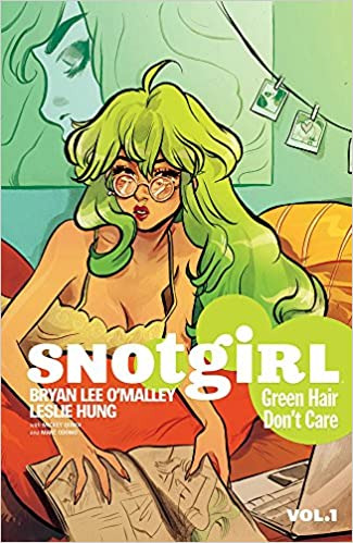
A Canadian graphic novel series by the creator of the Scott Pilgrim series! I love his work so I decided to give Snotgirl a try, even though it’s not generally my genre. I’m glad I did! First book took a while for me to get into, but by the time I hit the second I was really wrapped up in the mystery and character development. Snotgirl is about Lottie, a self-consumed fashion blogger whose biggest struggles are dealing with her allergies, frustration with her fellow-blogger friends, and how entirely her self-esteem is tied to her “beauty” and how people view her. But everything shifts in strange and horrifying ways when Lottie starts taking a new allergy medication, meets a new friend... and then witnesses that girl’s death. Or does she?
Seriously, or does she? I have no idea, I need to read the third book. This book is full of intrigue, complicated relationships, murder (or not?), and a healthy dose of magical realism to keep you guessing. If you like slice-of-life, crime, and abstract reality then this series is world a try. Plus the art is gorgeous.
Summer Wars #1 - #2
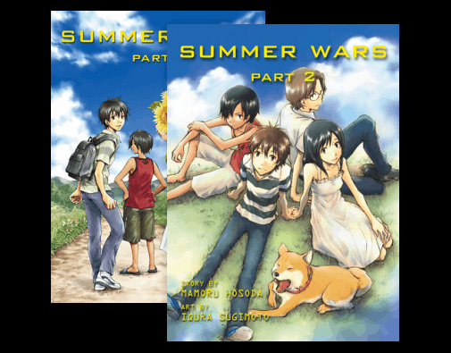
I recently rewatched Summer Wars (still one of my favourite movies) and decided to read the two-book manga adaptation. It was a really neat little adaptation. The creator of the movie gave the writer free range to tweak things to fit better in a manga format, which means some movie elements were allowed to fade into the background, whereas other aspects were fulled into the forefront and fleshed out to a greater degree. It was very cool, it kept the same story but gave you new things to think about which I wasn’t expecting. Reading this as a stand alone works just fine, but honestly if you’ve never watched the movie Summer Wars you should give it a try! It’s a great mix of slice-of-life, sprawling family dynamics that I relate to a little too well, cyber adventures, and fantasy. Super feel good.
This One Summer
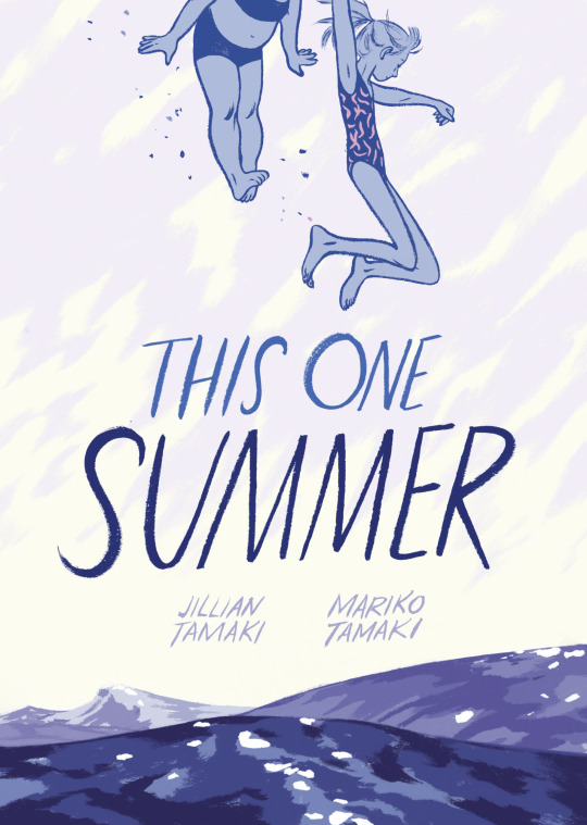
Okay, last graphic novel, I swear. This One Summer was... weird and intense. It’s a coming-of-age Canadian graphic novel that follows a pair of pre-teens who meet up like they do every year at their family’s summer cottages. You see them both in the awkward phases between childhood and growing up to become teenagers, as they’re confronted with things like maturity, friendship, self-esteem, family problems, and sexuality. A beautiful read, but probably the heaviest out of all the books on my list.
Wild Thornberrys Novelization
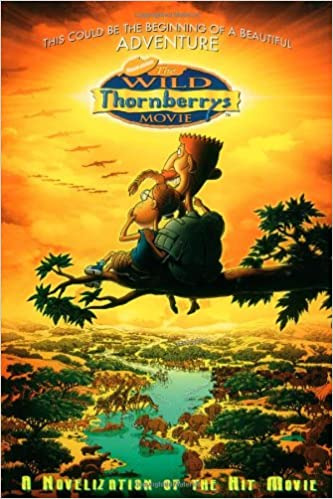
I rewatched The Wild Thornberrys movie with my girlfriend earlier this year, and decided I wanted to hunt down the chapter book novelization because I’m kind of a sucker for novelizations. Honestly, this was about what you would expect from the era. 90s/00s novelizations, especially young novelizations, are generally just a transcript of the movie without much thought or effort put into them to make them anything but. That’s what this was. It was fine, and it really let me revisualize the entire movie, but honestly you’re probably better off just rewatching the movie unless you also really deeply love The Wild Thornberrys.
The Willoughbys
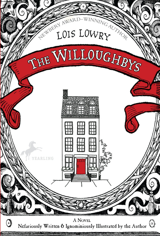
I saw that Netflix had done a funky looking adaptation of The Willoughbys and I decided I needed to read the book first before watching the movie. This was a little bizarre, I’m still not sure how I feel about it. Over all, I think it was a net-positive experience. It’s an obvious satire on classic children’s novels, especially the likes of Mary Poppins (real Mary Poppins, not the Disney version) and while a little heavy-handed, it does a Series of Unfortunate Events vibe that redeems it. The story is about a group of horrible children (The Ruthless Willoughbys) who decide they are sick of their parents and would rather become Worth Orphans... and to do that, they’re going to have to dispose of their inconvenient parents, obviously. Conveniently their parents are also sick of having children and decide to do away with them as well. The Willoughbys sets up three (or four?) different subplots that are gradually woven together through a series of schemes and exploits. It’s definitely more ruthless (hurr hurr) than the Netflix version, which tried to make the children more sympathetic, and in some ways I think that’s a definite point in the novel’s favour. I’m not sure I would go out of my way to recommend it, but it was a fun romp if you want something short and off the wall (and a lot more fleshed out than the Netflix version).
#book review#book reviews#the willoughbys#the wild thornberrys#lupin iii#scott pilgrim#snotgirl#bryan lee o'malley#this one summer#small spaces#pony pals#crave#the last firehawk#river of teeth#taste of marrow#american hippo#summer wars#petals to the metal#taz#novels#manga#graphic novels#children literature#kid lit#chatter
51 notes
·
View notes
Note
คำถาม! [Question!] How do you draw bodies for the characters? I started doing art in 2020 and I've been drawing my OCs to improve my artstyle.
Cool! I'm always happy to see artists improve their styles! Everyone's style is a little different, so I'll share how I do it! Hopefully, it gives you some ideas! :) I hope no one reading is busy, this might take a while.
Well, I start by sketching a circle for the head. Then I work my way down, sketching the neck, shoulders, and chest.
Once I sketch the rest of the torso and hips, I experiment with the arm and leg poses. Sometimes it takes a few tries to get a pose I like.
Once that's done, I go back to the head. For the face, I start with the eyes. I sketch two rough ovals, these will be the pupils. The hard part is the outer eye, which is a big curved shape. That might take a few tries on bad days. Then I add the iris and highlights to the eyes and sketch eyebrows on top.
Next comes the hair! I try to keep it a little different for each character, but some parts stay the same. I prefer to draw characters with bangs or something covering their forehead. I style my own hair the same way.
Boys tend to be tricky because I hate how "real" guys have such similar hairstyles. Might just be me being lesbian, but most of them look the same to me. That's one of the major reasons all the boys I draw have such full and fluffy heads of hair.
Finally, the clothes! For boys, it's hard to find new ways to draw suits every time, but girls can be a lot of fun! I really love drawing poofy dresses and gowns. I'm tempted to start drawing the boys in dresses too! Would people be down for that?
If I decide to draw a background, it will be a light sketch. Nothing super detailed happens there until I use colors.
Once the sketching part is done, it's time for the line art! I make my lines thick, but not too thick. It helps the piece pop! I like to do parts in one stroke, so I tend to work in a certain order from front to back. This usually takes a few tries and minor corrections here and there to get it just right. It might take a while if there are a lot of tiny details.
Then it's time for colors! The paint bucket tool is your best friend, especially if your lines are nice and clean. I enjoy working with bright, bold, and/or pastel colors. Don't be afraid to play around with hues until you get what you love!
The background complexity varies. Sometimes I keep it to a simple pattern or an easy setting. Depends and what I'm drawing.
Then, when I want to take the drawing to the next level, I do shading. I'll give you a little tip. I copy the color layer and make it completely black. Then, I adjust the visibility according to the lighting I want. Then I erase parts of it with a soft brush. The parts I erase depend on the lighting, but I usually keep the edges dark and the center light.
That usually all I do, but if I'm feeling particularly artsy, I play around some more with the lighting. I might add another copied layer, but make it all white. These would be highlights, and sometimes I make them different colors. Again, it all depends on the piece.
At that point, I sign it so people know it's mine, I put my watermark on it so no one steals it, aaaaand I'm done! :) I hope this helps!
5 notes
·
View notes
Text
definition and refinement; in the heart of an artist. | keiji akaashi [headcanons]


❛ 𑁍 pairing: keiji akaashi x female!artist!reader
❛ 𑁍 scenario: in fukoradani academy; in the art club (school studio); in the volleyball court
❛ 𑁍 warning: none because it's a fluff; y'all haven't seen the coffee sachets i consumed
❛ 𑁍 note (i): my head isn't a healthy headspace because the brown coffee + sugar + black sugar i consumed today; y'all better expect like a train is gonna hit you off the rails because i didn't went easy with this one; of course, i tried to keep keiji akaashi in character, so please patient as i am adjusting his personality with my writing style (it’s fun writing new things)
❛ 𑁍 requested by: @schoneelise

🡪 you are one of the school prominent artists not because you're the vice president of the art club (your senpai is a third-year) but because you're presence is always defined no matter where you are.
🡪 did someone saw that cutie in a red berret? yeah, that's you, sketching in one of the notebooks you brought.
🡪 oh, did someone also saw that dolly in a skirt with van gogh's starry night masterpiece? yep, defintely, that's you, admiring your juniors' art in their studio while giving them advice.
🡪 anways, moving on; your senpai, (s/n), is very good friends with kotaro bokuto, the colleyball captain of the fukorodani volleyball club. (s/n) comes to their friend's practice by themselves but one day, you're intrigued with the way they were acting.
🡪 it was as if they were jittery and were kept on their toes. did something happen without your knowledge?
(s/n): they almost had it... they almost had it!
(y/n): ... senpai?
(s/n): if keiji didn't mess it up, he could have-
(y/n): sennpai, are. you. okay???
🡪 your kind concern reconvened your senpai's attention toyou, who almost looked petrified. (s/n) apologized for their erratic behavior and explained the situation.
🡪 long story short: fukorodani would facing off against the schools in tokyo in less than one week, and they don't have enough time to practice the new combo they conjured up.
🡪 you, being the supportive type, decided to come with your senpai. they were more than happy to have you tagging along. besides, it seemed like you needed something to be your next inspiration.
🡪 wow. the tension in the court... is just... wow.
🡪 boy, did the sound of balls bouncing off the floor and walls made you rethink your decision. what if you're going to lose an arm? what if you're going to get a concussion? is the place even safe for behaving people?
(s/n): relax. they know where they're gonna hit.
🡪 you're almost believing your senpai when a ball narrowly missed your head by a hair. a hair... a. hair.
🡪 poor you... you almost dropped your art things on the floor and fainted right after that.
keiji: not that high, bokuto-san. you almostt hurt (s/n)-san.
(s/n): actually... you almost obliterated my vice president, (y/f/n).
🡪 you were, by all means of surprise, a forgiving type of person, so you kindly and simply brushed it off with a shy wave of dismissal and a smile.
(y/n): no, it's fine! in fact, it kinda impressed me that it can go that fast and strong. er, good job!
🡪 let's just say, the volleyball captain became very fond of you at the very instant.
🡪 and his vice captain? he's intrigued, to say the least.
🡪 after one strenous match (that scared you most of the time and had to shift multiple times), they finally had a break. your senpai walked over to kotaro and chatted with him, shooting the breeze as the other players attended to their needs.
🡪 while the game was nearing to an end earlier, you finally moved to the most comfortable spot: almost to the corner, underneath a window. you set your artist's satchel beside you in peace (at last) and made new sketches that were inspired by your new surroundings: the court ceilings, the net from your perspective, the rapid movement of rubber shoes, the accelerated ball and it's awesome momentum.
🡪 you were having your own fun in your own newfound place, and you like the fact you had something new to draw about.
🡪 now, during the ten-minute break, keiji akaashi, the vice captain, noticed that you were gone... well, that was until he saw you sitting by yourself.
🡪 you were sitting cross-legged; your sketchpad on your lap; your mechanical pencil scraping the paper as it draws; your head bending down with your eyes focused on the task at hand.
🡪 keiji walked over to you quietly, making sure his tall presence won't startle you. but since you were so immersed, you didn't even pay any attention to anything else. so, he stood before you, bent over, and looked down at your sketchpad.
keiji: it's really pretty.
🡪 you almost threw your pencil five feet in the air from the sudden, accidental scare.
(y/n): oh, um... thanks... but does it really?
keiji: yeah.
🡪 from then on, you and keiji hang out like good buddies every other time after his practice and after your duties in the art club were done for the day.
🡪 however, on one hand, it would be you who would come by the court and proceed with your habit to sketch the surroundings. but, on the other hand, it would keiji who would finish early and drop by the art club (without announcing his presence because of his frequent visits), watching you work behind your back as you work on an easel or laptop (for digital arts).
🡪 of course, during the times you two would spend the time, keiji would give you meaningful advice on how to make your pieces more attractive and more aesthetic-looking.
🡪 surprisingly, they worked so well! in fact, so well that your (s/n) would tease you about keiji being the better mentor than themselves.
(s/n): i guess (y/n)-chan doesn't need me at all... she had found a better teacher... much worse, he's in the volleyball club. oh, the horror!
(y/n): but you taught me the fundamentals, though... senpai, you're being melodramatic again.
🡪 in case you haven't noticed it yet, you're the type of artist who can quickly adapt to another artstyle without sacrificing your own. you are a fast learner type and that was because you believe improvement knows no speed.
🡪 you always work hard to make your pieces expressive, eloquent, and emotional. with your ardent passion to adapt to functional styles, it's no wonder why you can cope up with keiji's suggestions without thinking about it.
🡪 keiji, in turn, would be surprised. but he would only retain that notion only to himself. he couldn't bear to admit that verbally.
🡪 he's not big on evoking emotions or feelings easily; he prefers to keep a calm, relaxing, and unmoving personality everytime he's around crowds.
🡪 but there was one thing he couldn't do: he couldn't stop his own eyes from expressing from what he truly felt in the inside.
🡪 whenever he saw you drawing something that seemed better than he liked it to be, keiji would give you a nod of his head and simply motioned for you to continue with a wave of his hand. but then you would give him a quick-second glance, and his eyes said, 'it's really amazing. please do more'.
🡪 other times, when you eagerly show him your work, a side of his lips would tug slightly upwards. but it would quickly disappear as it appeared. you didn't fail to spot it, though, and you felt super proud you're able to make keiji elicit an expression of happiness.
🡪 so, one day... your art teacher dropped the bomb: you, art students of the art club, have to draw still-life.
🡪 but not just any still life. no, it had to be still life with the theme, "classically contemporary".
🡪 well... well.. you need to think fast or else your grades will drop to a 'c-' or a 'b+'. and you're a straight 'a+' student in arts, so you can't let this drop-
keiji: what's going on with that head of yours?
🡪 you're hanging out in the court this time, and keiji was on a break (thank heavens; kotaro just made them run twenty-five laps around the gym as 'cool down').
🡪 you explained you thick dilemma and keiji said you shouldn'y overthink it too much because that'll "bench you out until the time is up".
🡪 you took his solemn advice with a grain of salt and thought it through as the second round of practice commenced. before you knew it, you finally made your decision and you're excited to keiji about it.
🡪 but the question is: would he like it?
(y/n): akaa-
keiji: keiji.
(y/n): um, keiji! i finally know what i'm going to do!
keiji: good. can you tell me what it is, then?
(y/n): can you be my model?
🡪 him? akaashi keiji? a model? for someone's project? esepcially that 'someone' was you?
🡪 gosh, he really didn't know how to respond, so he just simply looked at you with the most unreadable face ever. it made you contemplate if you had upset him or something...
(y/n): keiji... um, you know... it's fine if you don't want to my subject. i can just go and ask some of my other friends if they want.
🡪 next day rolled around and you still haven't asked any of your friends yet. that's because you had a hunch they had found their own models and muses in the earliest nick of time.
🡪 sad to be you right now.
🡪 so while the others were working with their newfound partners, you were simply minding your own business by setting the 'still life' background/setting of your work, thinking it might lighten the load while you're still looking for the right person.
(s/n): (y/n).
(y/n): y-yeah? senpai?
(s/n): why is keiji dressed like he's about to revive a shogunate?
🡪 good lord.
🡪 it had to be kotaro's idea.
🡪 it just had to be.
🡪 akaashi-freaking-keiji cannot just waltz inside the art studio dressed in a yukata with a semi-real sword strapped across his waist. no, no, no, no, nope-
🡪 it looked so out of his element, to be honest. like... he wasn't born to wear it because his face conveyed the most unamused expression to ever live. he looked like he was forced to get inside the costume. but how could anyone coerce this serious man to even wear that?
🡪 but you know what?
🡪 he looked really dashing, to be honest.
🡪 really, really dashing.
(s/n): ... this is the art studio, not the drama theater.
keiji: i know. i'm here for (y/n)...
🡪 did. you. hear. that. right?
🡪 or what he just said rendered you deaf?
🡪 anyways, anyways, anyways. here's the breakdown of how the hell akaashi keiji ended up wearing a yukata with the matching sword.
🡪 he admitted to kotaro that you asked him to be your model. kotaro nearly gave him the most memorable slap ever because he lowkey rejected you. as his punishment, kotaro got in contact with one of the drama peeps he's friends with and ordered to his friend the most amazing yukata they have in the closet with matching sword. (so it was definitely his idea; no wonder why akaashi looked slightly pissed). while akaashi thought it was a waste of time and called kotaro out for being impulsive, he also thought... what's the freaking big deal?
🡪 what is he overthinking about? there's nothing to put his mind heavily on the matter. the only thing he's going to do is sit still and look handsome for the artist. is that the hardest job in the world?
🡪 his answer came to him when he sat down on a stool and posed for (y/n): it's not the hardest job at all. besides, he's not always on energizer bunnies and he's barely hyper when he's sitting down. so... i think he's doing a great job~
🡪 (y/n), in turn, is having the best fun of her life.
🡪 she's sketching one of her bosom friend for one her important projects.
🡪 she's taking her sweet, sweet, sweet time sketching keiji on the digital easel and before they both knew it, the draft was done!
🡪 it only took them seven hours, though.
🡪 keiji missed his volleyball practice and it was past their curfews.
🡪 but neither of them mind. while some students really did stay put (wow, the dedication), keiji and (y/n) decided to go home at once.
🡪 but only after keiji changed into his uniform again.
🡪 he cannot be seen in a yukata.
🡪 his dignity relies on his appearance somehow.
🡪 once he's done, both of them walked home since their houses were just walking distances.
(y/n): you actually looked really nice in the yukata, keiji.
keiji: thank you, (y/n). although it was just forced on me.
(y/n): nonetheless, you appeared very dream-like back there.
🡪 something blossomed in keiji's chest. was it deep appreciation for the meaningful compliments? was it earnest regard to how he had behaved and look for your project? whatever it is... he's not going to deny it in any way. but then again, he's not going to say anything about it.
keiji: is that so?
(y/n): gosh, yes! you're a lifesaver back there, you know.
🡪 you spent the night polishing the whole thing and it continued for the rest of the week.
🡪 keiji, being an understanding and considerate type, didn't step in your way except when to remind you about eating lunch and going home earnestly.
keiji: (y/n), eat your lunch first.
keiji: (y/n), brush your hair before sitting down.
keiji: (y/n), time to go home.
keiji: (y/n), rest your eyes.
🡪 one week after your final draft, you passed it to your teacher just in time.
🡪 of course, to compensate to keiji's volunteerism and efforts to keep you alive (barely) last week, you treated to lunch on you.
keiji: i have my own bento, (y/n).
(y/n): but mine has more meat than that,
keiji: ... fine. let me have it, please.
🡪 after a hearty lunch, keiji walked you to the art club. (of course, there was no competition but the grades matter-)
sensei: all of your artworks deserve to be in a museum. but, to be honest, out of the rest, i think (y/n)'s piece deserved a seat right next to da vinci's.
🡪 god bless keiji for being there or else you could have lost all senses then gained a concussion from fainting.
🡪 your still life, turned out, to be the one that stood out the most.
sensei: how did you pull this off, (y/n)? who... who taught you?
🡪 you squinted at your work and noticed the changes you never paid attention to at all. while you retained your own original art style of 'still life', there were some compositions that seemed brand new.
(y/n): keiji-kun taught me.
🡪 you said it with so much pride that keiji actually smiled.
🡪 smiled.
🡪 he smiled the most genuine smile he could ever muster.
🡪 (damn, kotaro is missing in action right now.)
🡪 you got the highest grade among your classmates + your (s/n) congratulated you wholeheartedly. they even said, "you might even be the next president in the art club!"
🡪 you laughed and accepted their compliment.
keiji: maybe next time, you should draw me in a hakama.
🡪 now, should you? only kotaro knows the answer.

❛ 𑁍 note (ii): y’all want actual fanfic of this thing??? dm me/ask me, comment and reblog this, then, so i would know. hope you like this~
#haikyuu#haikyuu x reader#akaashi keiji#keiji akaashi#keiji x reader#akaashi x reader#haeyllasephone req
45 notes
·
View notes
Text
February 12th-February 18th, 2020 Reader Favorites Archive
The archive for the Reader Favorites chat that occurred from February 12th, 2020 to February 18th, 2020. The chat focused on the following question:
When applicable, what about a creator’s art might convince you to check out their comic?
carcarchu
I like a wide range of art styles so it's hard to pinpoint specifics but if an artist is able to draw very attractive looking characters (recognizable character designs, outfits that don't look like they came out of 2004 gap catalogue, characters that can still be recognized even when they change their hair style) then i find that very appealing. beyond that how well an artist can integrate the characters with the actual space they exist in is something i find very important as well. a bunch of floating heads can only carry a series so far. if the artist can make the characters feel like they properly exist in the space i think it can really elevate the series although in practice this is something very difficult to do.
Deo101 [Millennium]
For me, honestly some art styles are very inspiring to me and that will sometimes get me to read just because I want to see the art more and learn from it. Things like textures, colors, character design... It can draw me in just by exciting me as a learning opportunity
chalcara
For me art‘s the hook and story the line. Come for the art, stay for the story, you know?
Funnily I‘m looking less for pretty art and more for good visual story telling. I want the art to show whats going on without having to rely on dialogue.
Cronaj (Whispers of the Past)
I'm honestly very picky about art styles when it comes to comics, and that's a personal issue It has some to do with art styles being attractive to me, but honestly, the most important aspects of a creator's style to me are (1) consistency of style and anatomy, (2) level of completion, and (3) clear communication of what's happening. When it comes to whether or not I check out the comic initially, the main things that come into play with the promotional materials, covers, and/or thumbnails are contrast of the image and cleanness of the rendering. Of course, obviously, my personal tastes play into it. (I tend to like semi-realistic styles, sort of anime-ish but with a twist, or painted styles that may resemble concept art.) But honestly, probably more important than grabbing me initially to begin reading is readership retention. And that's where the 3 qualities I look for come into play: (1) Consistency of style and anatomy: This is probably the most important part for me as a reader. If I can't tell who is who because the characters change appearance from panel to panel, I'm ducking out, because that affects the clarity of storytelling. I also cringe everytime I see a particularly egregious anatomy error. I know what people look like. I see them every day. If I feel pain from looking at an artist's work, I'm not sticking around. (To be fair, everyone makes some kind of anatomy mistakes, but really it's if the anatomy mistakes are really awful to me and aren't as a result of a deliberate style CHOICE. Keyword, C H O I C E.) (2) Level of completion: This really just means that if it looks like the artist rushed through the panels or they were being lazy, I feel like their comic isn't worth my time. I mean, if an artist themselves doesn't care about their work, why should I?(edited)
. (3) Clear communication of what's happening: Once again clarity of storytelling is absolutely essential. If the composition of a large portion of the panels don't clearly show the actions of the characters, I can't follow the story. Aaaaaand as a bonus: Please, please, for the love of all powers that be, please, make your fonts legible. If I can't read the comic without squinting because your text is too tiny or hard to read, I'm not going to try. I have bad eyesight as it is. Take pity on your readers. I'm not going to suffer for your work. I have dropped far too many comics to count because the creator didn't care enough to make sure that the font was legible. And this applies to both desktop view, mobile view, scrolling format, and page to page format. Just.... Make your fonts big and clear.(edited)
sssfrs (JOE IS DEAD)
That's interesting to think about how recognizable characters are when their hair style changes. I might try to use that as a character building exercise
Deo101 [Millennium]
Solid excercise: can you tell them all apart when they're bald and naked?
Cronaj (Whispers of the Past)
OoooooooOOOOOOOOOOHHHH
I
Might partake that challenge
Deo101 [Millennium]
Also it's really fun to draw characters in all sorts of hair and clothes so idk what id do if I couldn't tell them apart when doing that!!! That's like 40% of my art!
Cronaj (Whispers of the Past)
This just convinces me more and more to do AU art
Deo101 [Millennium]
Yeah aus are another 20% of what i draw LOL
Look im drawing the comic most of the time so I wish to partake in non canon things the rest
carcarchu
@sssfrs (JOE IS DEAD) i've read series before where the character gets a hair cut / dyes it and i'm like WHO ARE YOU? IS THIS A NEW CHARACTER?
Deo101 [Millennium]
Oh another good excercise is drawing your Characters in many different styles and seeing if they remain unique when not in yours.
Cronaj (Whispers of the Past)
I want to do all of this
This is stuff I hardly ever have time for
So I am extra attracted to it
Also, there IS a time later in the comic where a certain character's hair gets partially burned off
And then he cuts it pretty short to get rid of the singed edges
And I feel like his hair is like 80% of his character design
So I'm just a little scared about that
Deo101 [Millennium]
Also, @Cronaj (Whispers of the Past) , I am unsure what you mean by "readership retention" with something that makes you interested in a comic, could you explain?(edited)
Cronaj (Whispers of the Past)
By readership retention, I mean aspects of the art that decide whether I'll continue reading past the first few pages
(obviously story comes into play as well, but I won't pretend that the art in the first few pages of a comic don't contribute)
Deo101 [Millennium]
Oh okay, I thought you meant like how many readers have unfollowed or something
Cronaj (Whispers of the Past)
Nah
More like, "oh cool! Your cover and blurb seem interesting. Lemme check out the comic!"
And then after reading the first few pages/chapter:
"ah... Not for me." Or "Nice, I'll keep reading!"
Deo101 [Millennium]
Gotcha
Capitania do Azar
Ohh I don't feel like dissing particular artsyle choices, but I know a few aren't for me. I'm no big fan of ultra realistic, hyper detailed stuff you usually see in super hero comics (other genres pick that style too sometimes and I still don't really appreciate). I particularly like artstyles that are distinct and recognizable, I have a hard time with stuff from different authors that just looks... Like a carbon copy (sometimes, the style being referenced is waaay too obvious and that is always a big no for me) Good use of color is key. Give me some good values too. I want colors to make sense and I am very tired of pink. I also appreciate consistency. If you give me artwork with a more paintery style but then the comic is cellshaded, that might tip me off. But not necessarily (tho I appreciate inner consistency inside the comic itself). Rushed stuff, like mentioned above, is also not a good look, but only insofar as it distracts me from what's happening in the story. Consistency is a very important word here, because I love seeing a common line that is able to take in all the differences that are necessary in character design and backgrounds, but also make me believe that they all could live in the same world.
Oh! And also: if the artstyle involves using lineart, I am really fond of sharp, clear lines with weight variation
sagaholmgaard
I'm curious about what you guys mean with consistency- do you guys not like if an artist's art style changes over the several years it might take to make a finished webcomic? Is it that it peeves you when the backgrounds are done in, say, a painterly style while the characters are done with lineart? Is it when the artists makes ordinary illustration work in a completely different style from their comic pages? (This is genuine curiosity I hope no one's feeling attacked rn ^^)
carcarchu
i personally really like seeing an artist's skills improve and evolve over the many years it takes to draw a series
even at the expense of a more "consistent" final product
sagaholmgaard
Yeah me too, it's one thing i really like about webcomics
chalcara
Can‘t talk about the others, but I get thrown off when one page is sprite comic, the next painterly, third cell-shaded without having a in-story-reasons for those style changes, like flashbacks or pov-changes. But more commonly, the issue’s the classic „comic‘s usually coloured, but oops, this time you only get the pencils because I had no time to update“. If that happens too often and/or doesn‘t get fixed for the archive I just lose investment in the comic.
Art evolution is natural, both in webcomic and published work with a dedicated artist.
Ah, that‘s another source of inconsistency - people switching colourists or even artists around. Once in a while is fine, but if it happens every month or so, I tend to get annoyed by it. It‘s actually why I killed my first webcomic twenty years ago; it was a collaberation and life kept getting in the way forcing me to switch colourists every five pages or so.
carcarchu
oh actually i have read a webcomic where they changed artist's 18 chapters in. i really fell in love with the magical and dark tone of the original artist and was engrossed in the world that they set up. they had a painterly style and it really set the atmosphere of the entire series but then the new artist had a super clean and cutesy art style and the sudden tonal shift really threw me off. in the long run the new artist was actually extremely consistent and better at actually releasing long chapters and very good quality chapters and the writing actually improved too because of it but it was never able to recapture what it was that i really loved about the original art style. also the new artist changed the character designs a little so the heroine was no longer even recognizable as the same person
since it was relatively early in the series i definitely would have preferred if they just got the new artist to actually redraw the first 18 chapters in the new style just so the change wouldnt be so incredibly jarring
chalcara
Any harsh breaks like that will cause some people to break away from the comic, I found. I dumped one of my favourite-for-years comic because the creator got bored by their main character and completely sidelined her in favour of a group of minor characters I had absolutely no interest in.
Didn‘t mean the comic got worse - by all accounts its still beloved by quite a sizable audience - it just wasn‘t for me anymore.
sagaholmgaard
Ahh that I can relate to. I get super attached to the main character and usually have a hard time getting into any spinoffs with the rest of the cast, even if I want to (and im a hypocrite because i also want to make spinoffs for ever side character in my own comic LOL) i guess if the style changed a LOT from page to page that would throw me off too. that feels like the artist is trying to experiment, maybe making sort comedic comic strips would be more acceptable then? Every style would at least be contained to one strip at least
DanitheCarutor
That's... actually a really good question. I don't really go for a specific aesthetic. Sometimes what's going on in the thumbnail attracts me, or it could be the use of color, the style, a character design. I'll check out a comic with just about any art style. I guess maybe if I have an idea of what the creator is going for with their art? Like, the art may have a lot of kinks, but maybe being able to tell what style they're trying to go for makes me want to check out their work? Honestly, I don't have a really strong art bias, as long as the comic is readable I'll go for almost anything. Maybe I won't check something out if the style looks extremely uninspired... like if it were the most generic, based off Japanese cartoons, style ever then I might give it a pass. But even then I do sometimes check it out anyway, so I really don't know! This question is surprisingly hard to answer! To give my last quip about last week's topic, since I don't want to derail the current one. I feel the creator's personal life is no one's business. I understand if they're a legit bad person, but digging into a creator's life to see if they qualify to be supported is... I dunno. This mindset makes me feel that if someone who liked my work ever tried to get to know me, they would be doing it solely to see if I'm good enough for them, which feels really invasive and predatory. I fully understand most people can't just enjoy something, that's how the world is, it just kinda sucks sometimes. The world kind sucks sometimes. Alright! I'm doing with giving my final thoughts on that subject.(edited)
Deo101 [Millennium]
The question is specifically about what draws you to art, rather than what turns you away so if you don't want to rag on any art styles that's not what it was asking for I think! Though yes it's very closely related (and it's not bad to say what you don't like)
Eilidh (Lady Changeling)
I definitely am more likely to read a comic that has a distinctive style - no particular style preferences, really. Interesting use of colour/value is definitely a bonus. But as long as it's engaging and the composition is good/readable, I don't really mind whether the art is "good" or not.
DanitheCarutor
@Deo101 [Millennium] I wasn't trying to rag on anything. I couldn't specify what about someone's art would draw me to their comic, it was easier to the one thing that might not, but I still said that I may be drawn in regardless. Sorry if I came off like a douchebag, totally not my intention. <_<'
Deo101 [Millennium]
No I know, someone earlier said "I don't feel like dissi g particular styles" I'll be honest I was typing my post as you were and so I didn't even read yours til after I said something(edited)
Just kind of a general thing! Feels like it went to what turns us away instead of what draws us in so just kinda a reminder of the op
sagaholmgaard
Readability is definitely important for me to want to continue following a comic, but what about the art that makes me want to read something...? I definitely have a preference toward cartoony styles overall. A solid character design will make me wanna check out a comic. If the main character has a recognizable silhouette and interesting shape language. I also love really bold lineart, especially if it's used to create shadow and contrast. Interesting color schemes too. I think how the background is drawn can really make me want to read something as well. I know BGs aren't people's favorite thing to draw but to me if the setting looks very well though out and designed, that definitely motivates me to check something out. And awe-inspiring sceneries are always hella cool! I read a lot of things outside of my artistic preferences though, but I think these are the things that might make me pick something up based only on the art itself.
keii4ii
I think I tend to find more appeal in certain compositions, which is a more subtle aspect of style. I am a major sucker for evocative use of backshots/ not-showing-the-(whole)-face, for one thing. Compositions that make full use of the three dimensional space around the figure(s) is another (this doesn't necessarily mean putting a lot of stuff around the character; you can have a mostly empty space and still make it feel very 3D).
(I hope both of those things show in my own works... I just love those things soooo much )
Deo101 [Millennium]
Oh I LOVE when a panel like... Cuts a face. Something about it makes me lose my mind every time
DanitheCarutor
@Deo101 [Millennium] Ooh! Lol sorry about that! I was so caught up with off computer stuff that I didn't notice anything else typing while I was. I haven't read the whole conversation yet, but I can see how it would turn to that. "What draws you in" is a hard topic to stay on. At least I imagine it would be since it's hard for me to talk about.
Ah! I admit I really like shots focused on scale, specifically ones were you can feel how tiny the MC is compared to what the camera is focused on. Does that make sense? Like the panel shows this ginormous thing, and it has the MC in it to show how massive it really is. That's awesome when done right.
Deo101 [Millennium]
Tiny little person. Yes. Very good
DanitheCarutor
Tiny people in giant worlds are the best!
keii4ii
I love those too!
DanitheCarutor
Oh, also this isn't a webcomic, but I've been interested in reading Vinland Saga after seeing this page on Twitter.(edited)
Something about extremely hideous expressions on semi-realistic faces jives with me.
FeatherNotes(Krispy)
What draws me in easiest is the design aspect of characters, environment and the webcomic title! It's a bit of a turn off when the title doesn't look polished. That's one of the main draws for me is an intriguingly designed logo with a catchy name that follows through their chosen aesthetic. I've seen many comics that stand apart from the title image they chose and it's a bit jarring to see! Great examples of wonderful execution of these aesthetics are BlackOut City, O'Sarilho, Sink Your HookTeeth and Shadrunners(obvs there are many more) I have to agree with @sagaholmgaard about backgrounds! There are quite a few creators who avoid them and stick to simple colours and gradients that just dont keep me in the comic- though my fave genres include a lot of world building, so BGs in a romance may not be emphasized as much. Lastly, dynamic character design!! I love a wonderfully crafted cast that allows me to read the characters easily no matter what setting or outfit they're in. Also it's really random but i do love an artist who can draw really good shoes?? That is always a draw in for me (edited)
Capitania do Azar
Oh I meant it in the way that if you spend a lot of time experimenting with different styles and techniques, you'll never be good at any of them. Style and approach changing over time is, imo, inevitable and good :) @sagaholmgaard(edited)
@@FeatherNotes(Krispy) I constantly think my logo looks like crap next to other webcomics', so thank you (edited)
DanitheCarutor
Oh god, @FeatherNotes(Krispy). Titles and logos are legit my weakest point, that part of the comic creation process is the worst! I have this cosmic-horror/fantasy comic I've been developing since 2005, and it took me till just last year to come up with a decent title. It'll probably take another 14 years to come up with a passable logo. Lmao!
FeatherNotes(Krispy)
It is really hard! Because that image/logo and name represents the body of work so firmly, its also got to stand strong with what it's representing and stand up to other titles too! Basically, i like to think of something that will help generate top results when i search on google for the title, which to me helps it stand on its own on the web, and sound catchy enough for pitches in person! I don't want to steer the convo away too much from the prompt, but there is definitely more to discuss about titles and their chosen aesthetics
varethane
@DanitheCarutor have you read Golden Kamuy? If you love hilariously hideous expressions in manga, it seems like it may be your jam lol
(it's also set in a specific historical period and contains a lot of really interesting material about the time/place it takes place in)
Also I feel like I have never, even one time in my life, come up with a good title for anything-- both Chirault and Wychwood are placeholder titles that I used just to kinda name the story for myself, which I initially intended to change when something better came along, and then nothing ever did
LadyLazuli (Phantomarine)
I know I'm generally drawn into a comic if it's just... generally a visual feast? And it doesn't even have to be a beautiful feast - just... a feast! A super intriguing artstyle, beautiful or not, is something for my brain to pick apart and enjoy. Detailed backgrounds, intricate costumes, fascinating presentation/layout... all the way to crazy expressions and fun asides, and even some gory or scary bits to make me go EEK. Basically, if I'm reading it, and my hand is twitching with the prospect of drawing fan art, then I'm in for good.
DanitheCarutor
@FeatherNotes(Krispy) Urg that is such a nightmare! And there are only so many different styles you can do for a logo, and so many variations of words, it's like how there aren't any truly original stories anymore. I got lucky with the title for my current comic, it's the most generic thing ever, but fits in a tongue-in-cheek way. @varethane I've never heard of it, but the face compilations I'm seeing are intriguing! Man, I love stupid facial expressions.
Capitania do Azar
@varethane golden kamuy, I see you are a fellow of taste as well
varethane
(I love it so much)
Capitania do Azar
@DanitheCarutor oh idk about the "only so many things you can do with logos", I've seen amazing things in this world, if there's a limit I'm not seeing it
varethane
(I can always tell exactly when I was binging it because there's a big chunk of my phone's photo gallery that's all screencaps of Asirpa making dumb faces)
Capitania do Azar
@varethane guys shooting each other in the woods? I'm always in for that
DanitheCarutor
@Capitania do Azar Lol I guess? I can't see how you can have an infinite number of designs for writing, while still trying to keep it vaguely readable. But I really don't like lettering, so my imagination is hardcore lacking in that department.
Capitania do Azar
Lettering and logo design are their own fields of expertise, it's ok
meek
Hmm I'm similar to a lot of previous responses where I can't pinpoint a specific style or trend of art work that draws me in because the styles of comics I read differ incredibly. That being said, there are some things that I do look for to keep me coming back: 1) Consistency of style/anatomy: unless there's a specific reason for the general art style to change (not including semi-deformed or chibi versions of characters), I appreciate characters staying proportionate or just otherwise consistent throughout the comic. And art evolution isn't something that's at odds with consistency, it can actually help that by making characters more distinct and easier to distinguish from each other. 2) Potential for art evolution: Almost the opposite of the previous point lmao but if I find a new comic and I see the latest page is of a much higher skill level than the first page, I'm immediately hooked. I want to see the journey. And I want to see how far that journey goes, even past the point where the art "gets good". There's at least one comic that I can think of where once it hit the style that it wanted to, the art has stayed consistent for the past several years but so much so it's almost plateaued and become stagnant. It's still good art, by all means! But I want to see it grow and evolve more. 3) Good panel/speech layout: Okay it's not quite art in the same sense but someone else mentioned this above and I think it's important too? There are so many comics I can think of that I couldn't read or I dropped off at a point because reading was a chore, either because of giant or unsightly speech bubbles, tiny or ill-fitting font, a combination of the two, etc. Sure, graphic design and layout is a skillset completely different from pure illustration, but it's one worth knowing because otherwise you could do a disservice to your art and your story.
Cronaj (Whispers of the Past)
@meek Seriously, the text is so important to me, and I consider it a large part of page layout and design
meek
Agreed!! It's something that bothers me with printed comics all the time. I've tried to read so many "classic" graphic novels and I just.. I can't get past the giant text boxes with small font with miniscule kerning and ESPECIALLY if they then add color to it. Please, keep in mind your readers with reading difficulties But to turn this into a positive One of my favorite things that also helps make a comic feel more personal is when the creator turns their handwriting into a font or otherwise have FUN with the speech bubbles
Cronaj (Whispers of the Past)
YES. As someone with bad eyesight, typography is one of my favorite aspects of finishing a comic page.
Deo101 [Millennium]
It also is super important for me with ADHD, reading is hard enough as is! so bubble layout and clarity can really bring the whole thing together and elevate a comic
Eightfish (Puppeteer)
I tried that but got the feedback that my text is hard to read and the way i format my speech bubbles is distracting (: But some people have said they really like it so ¯\_(ツ)_/¯ Though I do think I could have done better with the font. I have good eyesight and bad handwriting do I think i have a much easier time reading weird text than many. Since you guys care so much about text, would you mind taking a quick glance at my comic and telling me how readable it is? It'd be nice getting feedback from random people as opposed to only my readers who felt strongly enough to leave a comment unprompted
meek
Oh man I have this specific panel in mind from some early 2006 Avengers comic of like.. what not to do Basically it was a bright yellow text box with this white/light blue font. It was just. It was a nightmare to read Oh sure!! Definitely send me a link
Cronaj (Whispers of the Past)
Yep! Send me a link too! I'd love to help you out
I also have a good typography book to recommend if you're interested. I can drop it into #art_resources(edited)
Eightfish (Puppeteer)
Here is link: https://www.webtoons.comen/challenge/puppeteer/list?title_no=290620
Thanks for taking the time to give me critique!
Cronaj (Whispers of the Past)
The link's not working, but I can probably find it on Webtoon
Eightfish (Puppeteer)
And I think i dould find a typography book interesting, so yes please do send the link
Sorry, i think the link is missing a slash
Did we both delete the link
Deo101 [Millennium]
did we both delete a
yah
i got it
Eightfish (Puppeteer)
Lol
Deo101 [Millennium]
https://www.webtoons.com/en/challenge/puppeteer/list?title_no=290620
Eightfish (Puppeteer)
Thanks
Cronaj (Whispers of the Past)
I found it
(The font is a bit small on mobile, but the font is fine?)
Eightfish (Puppeteer)
Wait can we move to shop talk?
FeatherNotes(Krispy)
(maybe we can have this discussion on shop talk channel? )
Cronaj (Whispers of the Past)
Sure
FeatherNotes(Krispy)
OH LOL
DanitheCarutor
@Capitania do Azar Oh god, they so are! I envy anyone who enjoys that craft, I'm a lot better than I was, but lettering is still so hard. ;v; At least the fancy stuff is hard, regular speechbubble lettering is easy as long as my hand cooperates.
Cronaj (Whispers of the Past)
There's a book I had to read for a web design course I took, and it is seriously a life saver
It put text in a whole new perspective
DanitheCarutor
I do all my lettering traditionally, but maybe that book would be helpful, I legit hate doing it no matter what medium I use. (sorry for continuing to derail the channel.)
Capitania do Azar
@DanitheCarutor i used a website that converts handwriting to fonts + font forge for tweaks to get personalised fonts
DanitheCarutor
I used to type bubbles out, and I've thought about it for my current comic but I mix up words and letters really bad, and I forget to add words entirely while typing. It wouldn't be so bad if my brain saw the mistakes while rereading everything, although sometimes it takes a couple days or another set of eyes for me to actually see them. When I write the bubbles in with a pen I make a lot less mistakes since it takes more effort to write out each letter, also my brain can keep better track of the ones I do make. I feel like that's an excuse that makes no sense.
Deo101 [Millennium]
no it totally makes sense
snuffysam (Super Galaxy Knights)
I can't say I'm ever especially drawn in by art? Besides the sense of "it looks like a lighthearted action story and I like lighthearted action stories", not much catches my eye. Though, I will drop a comic if I'm put off by the art. Like I can forgive if some things look janky at the start of the comic, but if that jankiness doesn't improve over time, I'll drop the comic. I'll also drop the comic if the character designs are bad (i.e. indistinguishable from each other, or in rare cases just too gross to look at). But again, I can't exactly say "good character designs draw me into the comic" because a lot of comic banners/thumbnails don't really show off full character designs.
chalcara
Varied bodytypes are catnip for me. And I like comics with expressive characters over comics that limit expressiveness to keep the characters pretty.
Eightfish (Puppeteer)
Oh, definitely agree with that second part. Comics where it looks like everyone has had a ton of Botox is a huge pet peeve of mine
Like, eyebrows are not the only part of the face that can move.
Do more
renieplayerone
Yeah i agree with the janky art thought. I think it helps me follow through the jank if i see that the later pages, the artist has shown growth, and i dont want to force anyone into a "gotta redraw it" loop if thats not something they want (of course everyone has their reasons and theyre also valid af) Ill tend to be more forgiving about the jank if i know its someones first webcomic or first comic in general, because you cant learn how to make comics without actually sitting down and making the dang thing. So yeah, the jank can be a double edged sword(edited)
What super draws me in is comics with a great sense of color. While i love anything vibrant, if the softer watercolors are done well, they're chefs kiss. Prime example of that is Stand Still Stay Silent
mariah (rainy day dreams)
I've been thinking about this question all week and I think I finally boiled my answer down to something short, sweet, and to the point. It's gotta be some kind of spooky and some kind of cute I have a pretty broad range of art styles I like and I definitely also read stuff that doesn't fall under those categories, but I think my favorite stories or artists are some blend of those two things. I don't really have a preference between color and greyscale. Like I definitely love a good color feast comic, but if you know how to use your grey tones or even just black and white well it's just as good for me. Maybe that's also just me trying to justify being mostly a greyscale artist to myself TuT
FeatherNotes(Krispy)
@mariah (rainy day dreams) devils candy would def be up your alley then!
mariah (rainy day dreams)
Devil's candy v good
renieplayerone
Devils Candy is amazing
mariah (rainy day dreams)
I love to combination of cute monsters and action also.
DanitheCarutor
@renieplayerone I'm not sure if it fits totally with your preference, but if you're looking for watercolor Lost Honey is gorgeous! https://www.losthoney.com/
mariah (rainy day dreams)
Lost Honey is another great comic great to look at, really interesting world
DanitheCarutor
It's one of my faves! ;v; There is another comic that was half watercolor half digital that I used to love reading (if I remember right pages set in the current time were digital, and backstory stuff was in watercolor.), but it has been discontinued for years now. It was called Toilet Genie/D00R, a comic about a genie who was locked in a public toilet and was awakened by a pug that got thrown out by her owners. It was so pretty, with such an interesting style!
mariah (rainy day dreams)
Oh wow I haven't thought about that comic in 5 years! X'D I didn't read much of it, because I don't think there was much of it available at the time, but yeah, that one was also very pretty (edited)
renieplayerone
Oh those colors are really pretty!!
DanitheCarutor
Right? Lost Honey is total eye candy. @mariah (rainy day dreams) Yeah, it's sad the creator never got to finish it. I think about it every so often since it's one of the extremely rare (semi)watercolor webcomics out there.
Also I'm extra attached to traditional mediums since I work in a traditional medium myself.
mariah (rainy day dreams)
Same. Got that ink wash/watercolor bias.
Eilidh (Lady Changeling)
My current comic is marker shaded but I so want to do something with ink wash after this one...
DanitheCarutor
Yeah, right now I'm working with color pencils since they're cheap but I want to give gouache or acrylic a try for my next project, depending on which story I do.
Kabocha
Hm, the question is... a lil' challenging to answer. I think in a lot of cases, the art isn't necessarily what gets me, but when it does -- Sometimes it's when someone uses a resource I like/made and I can go "OOOH! I know that thing you used!" Screentones are another one that gets my attention pretty quick. Sparkles... And probably effective spot color use. As much as I enjoy many full color webcomics, there are many that get tiring to try to read for one reason or another (usually it's either a font or a saturation issue - too many similarly saturated colors near one another gets tiring to read). Also, soft coloring. Oooh, just... when the art feels like it ought to be printed on those soft-touch covers... Yeah, that gets my attention. ...and watercolor/inkwash, too. ... okay that's a lot of things that grab my attention, but tl;dr: oh hey look at all that cool stuff that people can do!
mariah (rainy day dreams)
That was part of what was so hard for me thinking about this question cuz really, a lot of things get my attention X') and the more I thought about it the more I was like "I like when a comic is like X, but oh also Y is great and I do really enjoy Z as well!" I just ... like so many things. But I think that's better than being really picky. I've meet some folks that are super picky about art and basically only like one style and I'm just like... you're missing out on so many amazing things!
Kabocha
Right? And heck, even in some comics where the style would normally be unappealing (to me), there's just something about the art and the aesthetic that clicks to make it all work together for that project.(edited)
I do think, though, that there's always going to be a special place in my heart for greyscale or screentoned comics. There's just something about art that knows how to effectively make use of shading and contrast to make their work... well, work for me.
kayotics
Art is probably the first thing that draws me in to read a comic. The top, top tier thing that gets me to pay attention to a comic is really strong inks. I love inking, and unusual inking styles. To those who know me, that's probably incredibly unsurprising. I also love really angular styles. Some other stuff I gravitate towards: cartoony styles, expressive faces, and kind of ugly characters. I enjoy seeing characters that might be described as plain or are drawn in a bit of an ugly way. The last thing that draws me in? Hands. If an art style pays attention to hands, then I'm all for it.
mariah (rainy day dreams)
Does a comic have characters with big, crooked, toothy grins? I'm down for the count X'D https://media.tenor.com/images/618576ebcc4f6d2a12438624be77c54f/tenor.gif
varethane
oh hey, did someone mention webcomics done in ink wash/marker?
Chirault was that!
1367 pages of..... ink with greyscale marker..........
FeatherNotes(Krispy)
honestly blows me away that you toned it traditionally like, all of GJS is inked trad, but to ink AND tone in marker is just.....damn
sssfrs (JOE IS DEAD)
I love ugly characters
RebelVampire
When it comes to art, I'd say there are about four factors that will draw me in. First, readability. Can I visually follow wtf is going on in the comic? I have no interest in the visuals if I can't understand what action characters are taking. So the first point is always for if that is true. Second, character distinguishability. Can I tell one character from another? I am notoriously bad even in real life at being able to tell people apart, so when reading for fun, it's super important to me that I don't have to put a lot of effort into telling characters apart (exceptions for identical twins, of course). Third, personal appeal. Do I think the art is pretty or cute? Like, obviously this is subjective so I can't really put into words why I'd find one style appealing and the other not. But ya know, I like stuff I think is pretty to look at. Fourth, backgrounds. If a creator puts a lot of effort into their background scenery, I'm very sold on it. I love beautiful backgrounds, and the effort put into them give me an overall better impression of the comic as a whole. Since it takes some real passion to take care with backgrounds. All this being said, I'm not much of a stickler for art. If a comic is well-written enough, they can fail all these points and I'll still read it. This is just a list of what aspects have to be in the art for it to draw me in.
Eightfish (Puppeteer)
My points are pretty much the same as Rebel's, with the addition of a few things: I adore comics with dramatic facial expressions and consistently excellent anatomy. Also, if the art style is unique? If I feel like I've never seen someone draw that way before? That's ++. So good. I've read comics where I thought the art was good but the story was mediocre, but I've never read a comic where the art met all my points (and Rebel's), where it made me go, "holy fuck," audibly, and then had the story disappoint. Comics where the art made me go "holy fuck" audibly: Excecutioner's Academy: The art is so pointy and colorful and detailed and weird. It's full of personality and life and so are the characters. Warning: hiatus comic ): https://tapas.io/series/Ex-Ac Ava's Demon: You guys know about Ava's Demon, right? With original music and animations ending every chapter, this might be the most effortful comic I've ever seen. https://www.avasdemon.com/pages.php#2611 Sfeer Theory: Everyone looks so different from each other, it's fantastic. Some characters are not conventionally beautiful, yet they're still so appealing. And backgrounds! And a thought-out and unique magic system! https://sfeertheory.com/comic/01-00/ Electric Bones: Backgrounds! Banter! http://electricbonescomic.com/index.php/comic/page-001/ I also loved Prague Race, but unfortunately it was cancelled ):
If anyone else has recommendations for comics with amazing art, I'd love to hear them!
Cap’n Lee (Flowerlark Studios)
For me, it just has to be an art style I like to attract my attention. I generally like realistic art, stylised art, or pretty much any style that hasn’t been done to death (like generic anime art; much as I love manga, I’m really tired of the over-saturation of bland and soulless anime-inspired art). Pretty much anything unique and well executed will grab my attention. I especially like greyscale and limited palettes.(edited)
And just to clarify, I do like anime-style art when it has expression and/or skill behind it; just not when it looks generic and manufactured. Overall, though, it’s the writing that’s ultimately the most important thing to me in a comic, so I’ll enjoy comics for their writing even if I’m not a fan of the art.
#ctparchive#comics#webcomics#indie comics#comic chat#comic discussion#comic tea party#ctp#reader favorites
1 note
·
View note
Photo
I always tell my friends that they’re capable of anything they put their mind into. But, personally, I should know my limits and act accordingly. And considering how INCREDIBLY long it took me to finish this piece for such a poor result (despite the fact that I was just trying to replicate official art, so I had all the help in the world), well, I would say this was my limit. But, hey, you’ll never know until you try, and all practice is good practice.
That aside, hello! For today’s post, I decided to revisit the concept I started this blog with and work on a bigger illustration. It’s probably my least popular kind of post, but trying to mimic KH’s artstyle is kind of a blast regardless of the result or the struggle.
With Max’s and Kageno’s out of the way, it was about time I worked on Handa’s, since, you know, he’s my favourite character and all. I can be biased here, right?
So, it might be a good time to talk about HanRoku’s reasons to be.
Well, well, well. This is coming at the beginning of April when my last post was on January, and even that was just to celebrate the fact that, somehow, over a hundred people have decided to follow this blog. I’m not even going to pretend I’m way too busy to work on stuff--it’s just been a fantastic combination of things that made me want to... stop. I hit a big wall where the ideas I had were being a tad too difficult to pull off in a satisfying way (I swear to God, Kidou, your hair is impossible to work with), and I was either not in the mood to do anything or more focused on other and, at the time, more fun endeavours. I was super passionate about my graduation thesis, for example--and that went rather well, thankfully.
But, boy, I loved Kingdom Hearts 3. No bad mood or task was going to keep me from sinking hours into that game somewhat regularly. Playing it filled me with immense joy, and seeing Roxas again after so long brought me to tears. It made me think a lot about finally finishing (or trying to finish) this big piece... and it caught me very rusty, which led to hours, hours, hours, HOURS of work for what I have already described as a disappointing result. I mean, it’s not the worst I have ever drawn, but... well. It could definitely be much better, and I’m rather tempted to rework it in the future. I hadn’t touched my tablet in ages and it shows. Nor my pencils. Just my brushes, but that was just to paint doggos and Life Is Strange-inspired landscapes.
And the best part is that the illustration ISN’T EVEN COMPLETE because the rest would actually be a spoiler for a fic of mine called Zero. If you check the official art I linked above, you’ll see that what my illustration shows as a black area is actually filled by a completely separate illustration. I know what I want there, but, as I said, it’d spoil the story, so, yeah. Talk about a work in progress. I hope I can finish it all one day...
Anyway, enough pointless ranting! Thanks for putting up with me. To reward someone who has made it this far without getting tired of me, I’m giving away a Steam copy of Batman: Arkham Origins, along with all of its DLC. If you want it, please shoot me a non-anonymous message~ There is absolutely no need to follow me nor reblog/like this post, although it’d obviously be greatly appreciated. The first to ask for it will get it. And, please, don’t follow me for future giveaways--I doubt there will be any. Now, let’s talk about HanRoku. That’s what you clicked on that "read more" button for.
The beginnings of HanRoku are ancient at this point. We’re talking 2012 or 2013, and that’s INSANE. For how long have I been struggling with this project?! Goodness gracious. Anyway, at the time, Chrono Stone was hitting all of the right notes for me. Time travel? Check. People that transform to become more powerful? Check. Fusions, because I've watched too much DBZ for me to not love that? Check. And one day, for reasons that have been lost to time, but probably have a lot to do with the aforementioned fic, I realised something. Zero was supposed to be a story about how Roxas mingles with Someoka, Handa, Aki and mostly Endou, but then it hit me: Roxas and Handa are actually... extremely similar.
To those who have never played Kingdom Hearts, PLEASE GO PLAY KINGDOM HEARTS. And to those who couldn’t care less about what I recommend them to do, KH is a story that, under a deceiving cover full of Disney characters and confusing plot points, makes a deep and rather interesting point about what the true nature of the soul is--even if they insist on calling it “heart” instead. What is a soul? What is it for? Who, or what, has a soul--and why? Is the soul linked to the mind or to the body? Is it even possible to have a body and not have a soul? Is the soul something you’re born with or something you can/must acquire over time? What makes it grow, and what is true strength of soul? You know, for a game where you hit cute Hot Topic monsters with an oversized key, that’s pretty darn cool.
I talked more about this way back when, but I’ll give you a brief summary of the main reason why Handa and Roxas are such a perfect match: they are both people looking for their place in a world that actively acts against their very existence. They have no purpose and are simply tools for other people to shine and/or achieve their goals. That is obviously not a good, fulfilling life.
But, well, after all these years of ruminating and thinking (and crying) about HanRoku, there has to be a bit more to it than just that, right?
Obviously (and even more obviously after Kingdom Hearts 3), Roxas is very strong. Very strong. What he lacks in existence, he makes up for in raw power. For someone like Handa, who is so overlooked due to being okay at everything but not great at anything, this is massive. Even if Roxas doesn’t make him stellar at everything, he doesn’t need to. He still gives Handa enough power to become an extremely invaluable asset in the field and a force to be reckoned with--especially early on, since Handa is the first original Raimon player to get a miximax and all. I’ll talk more about HanRoku’s powers in the future.
But the usefulness in the field is only the first part, and even that is debatable due to the post I linked to earlier and the fact that, well, he sure will be special and super strong when no one else can mixitrans, but he won’t be once the whole team can do so. I mean, let’s count: Endou, Gouenji, Someoka, Max, Kageno, Megane, Tamano... That’s 7 people, when there are only 11 players on the field at a time. Handa would only be at an advantage over 3 people. (And if you’re going to tell me that he’s still the only midfielder with a miximax, thus making him special on his own, that’s a perfectly valid point and you should congratulate yourself for having such a keen eye.)
What really shines about HanRoku, though, is how mutually symbiotic their relationship is. Even if their struggles are so similar at heart, the reasons why those struggles exist are not.
Handa’s problems come from not being good enough at anything to be really... indispensable. Sure, he can do pretty much any job at any given point and be adequate enough at it, but he’s never the first option. He has no place of his own in the team; not one thing only he is capable of doing. And that leads to all kinds of problems of self-worth and trying to find a purpose. He will leave Raimon and no one will remember he was even there.
Roxas is completely essential to Organization XIII, but he’s been reduced to a killing machine that they are trying to replace with a better and more obedient one, thus taking away from him the only reason to be he ever knew and making him question his very existence. Once Org XIII disposes of him, no one will miss him--and that’s made even worse by a certain plot point: Nobodies disappear from the memory of everyone who ever met them once they are defeated/killed.
Of course, Roxas would help Handa immensely, as stated earlier. That’s kind of the point of this whole ordeal. But here’s the catch: Handa would help Roxas too. By leaving a part of himself inside Handa (that sounds extremely wrong, but please bear with me), he knows he will never be truly forgotten no matter what happens to him, and his life will ultimately have a purpose: to help a friend in need find his own worth. But let’s not forget that Roxas has only been alive for less than a year, while Handa has been struggling with his demons for over a decade without ever giving up. Despite having the world against him (or, at the very least, definitely not on his side), Handa is still going at it, trying his best, fighting for what he believes in, dealing courageously with the fact that he’s just an ordinary boy in a world of amazing people in order to help them achieve their ultimate goals. At a time when Roxas felt like his existence was worthless, meeting Handa, a boy who challenges his own self to find an identity that may not even exist, is truly inspiring. His selflessness, his love towards his friends and his neverending efforts to be better give Roxas a reason to stand up to the norm and fight for what he believes is right: in this case, to save his few and treasured friends.
Handa and Roxas find in each other a mirror that, for the first time in their lives, shows them in a new light that gives them hope for the future. They learn from each other, complement each other, improve each other, inspire each other, share a deep bond of friendship and trust, feel stronger and braver when they are together, and make a fantastic team. A team of throwaways, a team of tools, a team made of convenient replacements that will one day become obsolete. But a team that, however, is much greater than the sum of its overlooked parts, and will achieve incredible things when they eventually figure out just how unique and special they both are.
Talking about HanRoku makes me very emotional and it’s difficult to convey my feelings about them when I’m choking on my own tears, but I hope you can all understand why I love these two so very much. And if you can’t... well, feel free to ask me any questions you may have! I’d love to find new ways to describe why these two are so precious to me.
#Inazuma Eleven#original raimon#Handa Shinichi#illustration#reasons behind the miximax#inazuma eleven go#inazuma eleven ares#Inazuma Eleven Ares no Tenbin#info#miximax#mixi max
11 notes
·
View notes
Text
Words About Games - Unreal Tournament 3 (Epic Games, 2007)
Unreal Tournament 3 is nothing short of an utter embarrassment, incompetent at nearly every level, and a gross misunderstanding of a playerbase that was, at the time, nearly a decade old. I wish I could just leave it at that, but this is the first game I ever felt wronged by.
This was a franchise killer. UT3 flopped so hard that it took fans desperate for any sign of a new game ten years to make Epic even consider adding a new entry to the series, and even then it is, as of time of writing, on indefinite hiatus so the handful of developers assigned to it can make more Fortnite dances. But that comes later. Unreal Tournament 3 comes first.
The Unreal series was hardly a stranger to hard knocks. Return to Na Pali was a dull-at-best expansion pack while the much-maligned Unreal 2 missed the point entirely and has since slipped into laughable obscurity, and even the original Unreal Championship on Xbox had to be redeemed with a well-received followup. I played neither of those, by the way, it's just my understanding that the first one was bad and the second was good.
So what made UT3 the last chance? What about it was bad enough to kill the franchise that had gone toe-to-toe with Quake and lived to tell the tale? The real question is what the hell Epic was thinking.
Unreal Tournament 3 lacks a great many things. At launch, it boasted a meager six gamemodes, and even then only by virtue of splitting 1v1 deathmatch maps off of Deathmatch and into a new category called Duel. So, our gametypes are: Deathmatch, Team Deathmatch, Duel, Capture the Flag, Vehicle CTF, and Warfare. That's it. No Bombing Run, no Mutant, no Invasion, no Domination (double or otherwise), and yet again, for some ungodly reason, no Assault.
I feel like I've done this before. What else did UT3 leave out? Facing Worlds! Yep, it's out again, and this time without a replacement. That's right, no Face 4 to make up for it. A new Curse map, a staple of the series since the original Unreal multiplayer, is also missing. Most of the character factions introduced in UT2003 and 2004 are gone, like the Nightmares, the Robots, the Juggernauts, the Mercenaries, the Gen Mo’kai, the Egyptians, and the Skaarj. You know, the Skaarj, literally the most important faction to the series at large. They're gone. Xan Kriegor, the Big Bad of every Tournament since 1999, the final champ who uses an AI setting above Godlike, who has his own spaceship where the ultimate match is duked out 1v1 in a truly brutal and awesome deathmatch? Gone.
But that's not the worst of it. Sure, they stripped out almost everything they'd spent so much time building up throughout character and map descriptions for three games, but even that wasn't enough. There has to be something else they could take away to really strip the game of its identity. The Flak Cannon? No, too easy. The Shock Rifle? Almost. Malcolm, the veteran of all the in-universe Tournaments and arguably the (human) mascot of the series? I'll do you one better.
They took away the Tournament.
They took away the Tournament.
They took away.
The Tournament.
Unreal Tournament 3 has no Tournament.
What do we have instead, in Unreal Tournament 3, if not a Tournament? Calling it Gears of War 1.5 is a good place to start.
Unreal Tournament never really had a defining artstyle to call its own, but it was still recognizable. UT99 had its harsh shadows and pockets of bright light on largely cool-colored maps, a very neo-industrial/tech vibe with a smattering of ancient temples thrown in there to call back to Unreal. UT2003 and 4 turned their tech maps into something a bit shinier overall, left a bit of industrial grunge in, had their fun with future space techno Egypt, and splashed a bit of East Asian architecture in one or two maps for good measure. Colors were bright, each map had an identifiable pallette, and it's hard to confuse one for the other.
UT3 came out after Gears of War, which means it looked like this:




Not helping matters is the new direction character design was taken, which basically boils down to taking Gears character out of their usual armor and putting them in UT styled suits. Malcolm’s there and he's put on about 200 pounds of muscle.
Man, just look at all those graphics. And it's a good thing there are so many, because otherwise how would we know what we're looking at when the dramatic cutscenes play?
Because since we have no Tournament in our Unreal Tournament game, we of course have to have a very dramatic story about a Krall invasion and this guy named Ronin’s quest to get revenge.
Let's unpack that.
The Krall invaded. The Krall, the mercenary/slave race kept on retainer by the Skaarj, are the primary antagonists, but not the Skaarj themselves. Ronin, an entirely new character made for this game, is the primary focus when actual series (human) mascot Malcolm is right there. And the whole thing is a heroic revenge story, not a Tournament.
I hate this game.
So UT3 forces a series of ladder matches across all of three gametypes into a narrative nobody asked for. If it had had anything to with the series’ history, it probably could have been acceptable, but it doesn't mean anything as it is. Matches are now short gameplay segments in between an overproduced narrative about revenge and retribution, and they're given wholly unnecessary context. Deathmatch is no longer literal bloodsport to entertain the masses but a gritty, brutal battle of attrition until one side wears down the other side’s respawner charges. Capture the Flag isn't a game, it's you taking a daring and gritty shot at capturing your ugly, inhuman enemy’s Field LAttice Generator to turn off their respawner. Warfare/Onslaught isn't a fun territory control match, it's a gritty and unrelentingly brutal comment on how war is hell, as you capture territory to destroy the Core that powers your gritty enemy’s respawner.
Do you get it. Respawners. Real war. Not a game anymore. No fun allowed.
Sigh.
This game came out when I was late into highschool, and was one of the first games I was super excited about. Back then I didn't actually play all that many games, tending instead to stick to a smallish library of my favorites. So when UT3 was announced, originally as Unreal Tournament 2007, I was hyped. It would be one of the first games on the brand-new Unreal Engine 3, and the handful of prerelease screenshots kept my attention for months with their unparalleled lighting and detail. Blurbs about the changes they were making excited me, talking about how they were putting a bit more speed back into the game to win over the holdouts who thought UT2004 was too slow. An entirely new roster of vehicles was going to sit alongside the existing ones, and a whole host of changes was coming to merge the best of UT99 with UT2004.
That's what they promised. What was actually delivered was an anemic blend of half-baked executions. People don't like double jumping and think UT2004 is too floaty, others like double jumping and think UT99 is missing critical movement options? UT3 keeps double jumping but makes the total jump height of both equal to a single jump in UT99, removes wall and air dodging, and adds a noticeable recovery delay after dodging from the ground. Cool, great.
People didn't like the weapon balance changes and replacements? Toss out the Assault Rifle, bring back the Enforcer, but make it just as inaccurate as the AR! Make the spread on the Flak Cannon’s primary tighter, but have its alt fire shell fall off even faster than UT99’s!
That's not to say all of the changes were bad. Believe it or not, Unreal Tournament 3 actually does have a handful of things I really like, which makes their presence in an overall worse game all the more painful. Vehicle physics are greatly improved, the new vehicles are amazing, Adrenaline is gone, the Rocket Launcher has its grenades back, a lot of the new weapon designs are superb, powerups are back on the map, you get a hoverboard on Warfare and VCtF maps, and I'm all out of nice things to say.
The game, visually, is a mess (see above). A new graphics engine means new effects to play with, but those effects here are bloom and more bloom. Players get lost in overstuffed scenery because the artstyle inherited from Gears of War is red on brown on gray. A more grounded overall concept strips a lot of identity from returning maps, taking them from space or exotic locales and putting them in a generic futuristic cityscape.
That's a small complaint, and totally worth dismissing, but it shows a certain lack of respect to the history of the series, to me. These are maps that have been iconic as a whole that have been repurposed to show off how many pixels can be crammed into a skybox. When Facing Worlds was eventually re-added in UT3’s first and only content update, it was transplanted from two opposing towers on an asteroid spinning above Earth and just set in the mountains somewhere in China.
If you're looking at it from a pure gameplay perspective then there's nothing wrong with the change. But it's just part of an inherent ignorance as to what players wanted from this game. We didn't want a weird storyline where we watch Epic mush per-pixel lit action figures into each other before graciously being allowed to capture the enemy’s Field Lattice Generator three times, we wanted to mush those action figures together ourselves as we climbed higher up the ladder towards facing the Tournament champion. We wanted to thunder across whatever alien landscapes the map designer thought up that day and add another piece to the expansive puzzle of the Unreal universe, not spend two-thirds of the game puttering around China or the generic scifi city.
Also, in going back to get those above screenshots, I discovered something I’d entirely forgotten: there are no map descriptions. The strongest part of that good old fashioned world building is just gone. No more short tales of a skyscraper built by a hubris-devoured crazy person, no more small insights into the shipping lines around this or that outpost, no more glimpses at all into the world beyond the game. For them to suddenly make such a big deal about the story, Epic sure didn’t care about anything beyond their cutscenes.
But I guess I'm getting ahead of myself. What else is in UT3?
Not a whole lot. With a lack of gamemodes came a lack of maps, though I suppose 41 maps was still more than you could expect at the time. The bonus pack that turned UT3 into the “Black Edition” (I have no idea) added 19 more and did, as previously mentioned, re-add Facing Worlds. Mutators are also lacking, with a fair chunk appearing just as basic gameplay tweaks - no hoverboard, no Orb (we'll talk about the stupid Orb), no powerups, the Arena mainstay, no Translocator (just a game setting in all previous titles), friendly fire (also a previous game setting), game speed adjustments (yep, was a setting before), and your basic Instagib/big head/super berserk mutators like you always get.
Gone are fun things like quad jump, vampire, big wheels, slow motion corpses, all the “other UT” mutators (UT Classic and UT 2003 Style if you recall), and vehicle arena. Remember, no fun allowed.
And I sure do wish there was fun allowed, because some things almost are. Warfare is the star here, or at least it should have been. Imagine: a map five times as large as the largest Onslaught map, still joined by paths of dozens of capture nodes linked together to create distinct fronts, laced in between guided objectives reminiscent of Assault scenarios. Completing these objectives grants you unique bonuses on your path to the enemy Core, if you can make it past the army of players and vehicles ahead…
That's what Warfare was billed as, but that's not what Warfare ended up being. What did it turn out as? Literally Onslaught again, but with an Orb now.
The Orb is a game-breakingly frustrating mechanic. Here's how it goes: the Orb spawns at a node you control. Someone can pick up the Orb and carry it around, shooting a giant pillar of light into the sky wherever they go. The Orb will instantly destroy and capture any enemy node it's brought to, and will be destroyed in doing so. The player carrying the Orb can't use any vehicle except their personal hoverboard.
The Orb either wins games outright or does stone nothing. See, both teams get an Orb, so what happens most of the time is that one guy uses the Orb to capture a node, then the other Orb is used to take it back. It's not like you can use it to get a sneaky capture, because of the giant pillar of light shooting into the sky and an icon on the minimap. The Orb is stupid, and proper control of the map makes sure that absolutely nothing comes from its presence. So good work Epic, you added another layer to a gamemode you already stripped back to exactly what we'd gotten before, and all that comes of it is absolutely nothing.
The new vehicles are cool though. Everything from UT2004 makes a comeback with a tweaked design, and new Necris vehicles are added as well. They're usually just an analog of an existing vehicle except with wiggly scifi tentacles, so you get a single-person hoverthingy and a VTOL jet with lasers and missiles, but they really outdid themselves with some of the other ones. Filling the spot of the main battle tank for the new vehicles is a giant War of the Worlds style tripod that can clamber over most obstacles and terrain. The light attack jeep spot is a laser-toting mini-walker that can retract its tendrils and roll around as a ball, squishing people on its merry way. Like I said, not all bad. Oh, but only one team gets them, and not all maps support their inclusion. So only mostly bad.
But they are all that's left of a much larger gamemode that had more and more stripped from it until they were left with literally just Onslaught but with the Orb.
And the bad things just kept coming, this time in regards to the music. New composers were brought in again, in the form of Jesper Kyd and Rom DiPrisco, and they make a total mess of the place. There are a good number of “remixes” present on the soundtrack, but where the musical genius Kevin Reipl took GoDown and made Hyperblast Redux, whichever of the duo made the UT3 remix of GoDown just added some modulation and a breakbeat. Or maybe the classic Foregone Destruction, where the UT3 version just adds some modulation and a breakbeat. Mechanism Eight? Modulation and a breakbeat. Skyward Fire? Modulation and a breakbeat. The classic Unreal Tournament theme itself? Modulation and a breakbeat. The instantly recognizable stage music for UT2004’s Torlan, SDG-ONS1? Surprisingly, a mold-breaker here: no modulation, only an added breakbeat. And someone wailing over it. I get that it's supposed to have a vaguely Middle Eastern or whatever sort of vibe, ‘cause the original did and Torlan itself was set in a dusty oasis sort of thing, but they changed the setting for UT3 to be more temperate so I really have no idea.
My point is that the music in UT3 sucks. Even past the embarrassing quality of the remixes, none of the original compositions are memorable. There's no energy, there's nothing that plays to the idea of the game, and there's no bombast. The music probably has its fans out there, but I'm about as far from one of them as you can get.
I’m also about as far from a fan of the game itself as you can get. When this came out, I was mainly confused as to how it could be so bad. It’s not like it was the first time I ever didn’t like a videogame, but for Unreal Tournament of all things to turn out so bad, I just didn’t really know what I was experiencing. UT3 was so bad that within a month I was looking up tutorials on how to use UT2004’s editor. A year or so later Epic put UT3 on Steam and added a content pack that turned it into Unreal Tournament 3: Black Edition (I still don’t know), but that added so little that it barely made a difference. Two new gamemodes that just amounted to new types of Deathmatch, a handful of maps, and that was it.
People made their own maps, sure, and I’m sure if I looked now I could find mods that make it a more bearable experience. But at the same time, I’m not really sure. Because see, UT3 didn’t just release on PC this time around, it also came out on PS3 and the Xbox 360. Epic wanted to bring the award-winning modding scene to those platforms as well, which means the entire process of modding and the number of things that could be modded was cut way down to adhere to guidelines from both companies as well as the much more limited space available on the console’s hard drives. I only ever looked into mods back around when the Black Edition dropped, and the most popular mods I remember from back then is just adding a Master Chief character model.
To say that Unreal Tournament 3 was a disappointment is perhaps the biggest understatement of this entire essay. I’m not going to rant on about how it was a betrayal of brand integrity or something, because I’m not entirely that naive, but the failure of this game to do as much right as its predecessors or even impress on any great scale meant a lot for the arena shooter genre. Id Software had bowed out and wouldn’t reappear with Rage until years later. Halo was wrapping up its trilogy to critical acclaim. Call of Duty was rapidly changing the face of shooters with Call of Duty 4. Fallout 3 was near, Bioshock had come out a year or so prior, and Gears of War 2 would cement Epic’s new direction.
There was no redeeming followup to Unreal Tournament 3. Nothing came out to add Assault or Domination or Bombing Run back in. It came out, bellyflopped, and Epic let it sit in the lovingly-rendered mud full of bloom and speculars that it landed in.
In the decade-plus since then, the face of shooters has changed again and again. CoD4 ushered in an unrelenting push towards modern-day settings, a small subset of shooters with RPG elements grew larger, Bungie made more Halo games and then Destiny, a whole indie subgenre popped up to try to let us relive the days of Doom and Quake, then a fantastic new Doom came out, and now everyone has a battle royale. Even Epic.
A few years ago on the official Unreal Tournament forums on Epic’s website, a group of fans formed a plan to make their own Unreal Tournament entry under a different name. Work started, schedules were made, and it caught Epic’s attention as so many remake projects do. But rather than end with a Cease & Desist like just about every other one out there, a few people from Epic expressed surprise that there was such a massive push and actually pledged their own support to the project. Unreal Tournament 4 was suddenly an official project.
It was a strange relationship, of course - Epic’s people gave it a place in their launcher and let it use their official servers, they signed off on all major updates and made everything nice and official, but the weapon, map, and character design was going to be on the community. We can get into the ethics of that some other time, but the point was this: Before all that long, there was a playable Unreal Tournament 4. Maps were using placeholder art and geometry, most of the weapons were just the UT3 models, there was one character model, and all you could play was Deathmatch, but it was coming along. And it did come along. The Enforcer, Link Gun, Flak Cannon, Rocket Launcher, and Sniper Rifle were all finalized and modeled, a few maps were finished entirely and look gorgeous (and play really well!), and more character models were added.
And then Fortnite got big.
Fortnite, a weird little Orcs Must Die-alike with building and survival elements, wasn’t much of a big name until Epic added a battle royale mode of their own, not too long after Playerunknown’s Battlegrounds swept across the Steam Early Access scene. What that meant for the UT4 project is that the handful of official Epic people who were getting paid to curate this giant mod endeavor were suddenly reassigned to work on something a little more immediate, namely Fortnite.
The long and short of it is that Epic killed Unreal Tournament twice in a row. There are still arena shooters out there. Toxikk is basically just UT2004 deathmatch with a shiny coat of paint (I played a bit, it’s okay but lacks a lot in comparison); Quake Champions is a perfectly fine hero shooter with a lot of balance problems and way too few maps, plus it’s Quake which means all the problems I have remain; Tribes: Ascend came and went just as fast as players in it moved thanks to a suddenly overaggressive monetization model; and lately I guess Dusk has its multiplayer which I hear is pretty healthy.
The arena shooter isn’t dead; no genre really can be, and I have firsthand experience with how much work can be done to keep individual games alive, but it’s certainly not a popular choice these days. If so much has happened to the shooter genre at large since Wolfenstein 3D came out, that much and more can happen again. More people are playing videogames than ever, technology marches onward, and maybe one day someone in the right position with the right resources will create something that finally puts the public eye back on the most classic of multiplayer shooters.
But until then, the decade of languishing that arena shooters have been the subject of is entirely Epic Games’ fault.
#unreal#unreal tournament#fortnite#epic games#epic#words about games#video games#review#unreal retrospective
5 notes
·
View notes
Text
Don’t mind me, just have had a lot of thoughts on the new Pokemon game so imma write them down. There’s been a lot of posts and videos on what people wanna see or don’t wanna see in the new game too and I wanna give my own two cents to no one in particular.
So first of all graphics. I hear a lot of shit on that. Personally I don’t really have all that many expectations? Like yeah it’s gonna be a Switch game, the quality could possibly be better than we’ve seen. But also did people look over that ‘game footage not final’? Things may still improve and be further optimized. More than that, I love the artstyle atleast? Everything looks so colorful and vibrant and alive and goooood ;w; It sure got my attention. I can’t wait to see all the new areas on my big tv <3
Pokemon popping up and roaming vs random encounters: On one hand I love how lively everything looks with pokemon showing up in the overworld, on the other hand I love the random encounters? I personally liked hunting down specific pokemon, not knowing what I would encounter. I feel like this is also more fun when you’re doing a Nuzlocke; You can’t ‘cheat’ and select a pokemon from those that are currently roaming with random encounters. Aside from that, people mentioned that the roaming aspect made areas look more vacant instead because a lot of open space is needed for bigger pokemon roaming. And finally, it makes the surprise way more fun if a shiny shows up in a random encounter, instead of roaming between the rest of the ‘mon?
Pokemon following you/walking with you: PLS PLS PLS bring this back and expand on it, for all pokemon. Also the option to select which partymember you want to walk with. That was one thing that bummed me out in HeartGold/SoulSilver. If I wanted to walk with my fave, I also needed to have it in the front of the party and throw it out in battle, even in areas where it was at a disadvantage due to type or level. And sometimes I had a pokemon in front for the sake of progression but I didnt necessarily want to walk with it, but there was no option to turn walking off in HG/SS. I believe they did add these options in Let’s Go Pikachu/Eevee, but I havent played these games so I don’t know for sure what the options are. I kinda also want to have the option to pick whether I will walk with a ride pokemon or actually ride it? Like, it was hella cool that you could ride arcanine, persian, haunter or snorlax, etc. But what if I wanted it to just follow me? :/ What I also want back is the national dex once you completed the main story. Let most of the pokemon which first appear be gen 8, and after you beat the main game, pokemon from other generations show up more and you can catch new pokemon that were previously unavailable. I hated how in SuMo, I couldnt see a pokemon’s national dex number, and couldnt get any data on it if it wasnt native to Alola.
Also this is gonna sound surprising coming from a shiny hunter, but I want the shiny charm to be a reward for filling the entire national dex again (minus mythicals/events), and make the shiny rate 1/8192 again instead of 1/4091. As much as I love my shinies, I kinda feel like they’re becoming a really common thing and way too easy to obtain? I do like there being methods to find shinies easier, such as Masuda breeding, chain-fishing, SOS-chaining, etc, but make it atleast a little bit harder than it currently is, to make all that effort worth it.
Compatibility with pokebank/the 3DS titles!! I want to transfer all my precious bbies I caught over the years to come join me in the next adventure. That would make it even more awesome if walking pokemon also returns; I can walk with my faves then, not just the pokemon available in Sword/Shield. Also Cloud compatibility. I know Nintendo is afraid of people abusing Cloud to edit save files and I can see them not adding cloud for Pokemon to prevent peeps from somehow cloning or editing pokemons, but on the other hand... Right now, I have ALL my rare, valuable pokemon stored on a Ultra Sun cartridge. Every super rare shiny legendary I spent MONTHS on to encounter, every event pokemon from events that will never happen again, and every pokemon that has nostalgic value to me. If that game cartridge breaks, they’re all gone. If Cloud storage would be a thing for pokemon, I’d have a lot less anxiety about gathering all my babies on a single game with the risk of losing ALL OF THEM. Besides, I pay for online service and cloud, and thusfar havent been able to use the feature for my games :/
And definitely compatibility with pro controller. I really do not like the feel of the joycons, nor the pokeball plus, especially not after playing for a few hours, so I’m really hoping we’ll be able to use the pro controller. Considering we seem to be getting the old battle system back instead of Let’s Go’s, I don’t see why they shouldn’t add pro controller compatibility. Besides, I spent a lot of money on this thing, lemme use it >:v
Customization. The new trainers look absolutely adorable, but being able to make your trainer fit your style more is still great and makes things more personal. On one hand I’d love even more options for customization than in SuMo, on the other hand I fear I will never even get anywhere cause I’ll be spending hours mixing and matching outfits :’D I am not at all fashionable irl, but my characters in games have to look tip top. Most importantly, I want gender-neutral stuff!! As in, the option to wear clothes or hairstyles regardless of the gender you picked at the beginning. Give me a girl and the female pronouns, but the option to get the haircut that the boys get and that flannel he wears. For example.
Minigames! Not everyone is a fan of them, but personally I love things like Contests, PokeAthlon, the Underground, Missions in the Festival Plaza, etc. Especially multiplayer stuff. Give me other stuff to do besides battling. And on that note give me fun multiplayer features; besides trading and battling! The feature where you can call for another trainer in Let’s Go seemed fun to me. Being able to connect with other players and joining them in your game to do stuff together. Like how you can invite people to your town in Animal Crossing, go to the island and take on island challenges from Tortimer.
Story-wise, it would be great to have a big long story, also post-game, which doesn’t end too soon, but with the option to skip cutscenes if you so please, and more importantly, have the freedom to also explore. In Sun/Moon, you were constantly forced to go to a very specific location, everything else was blocked, and you had a cutscene every new area. Like, it was all very linear. I love the older games in that regard, where there is a story, but you figure out yourself how to progress without NPCs constantly telling you where to go and what to do. I always have this issue where after I’m done with the story, I’m kind of... lost on what to do next, so personally I love a long story to keep me busy. Give me a serious threat for the antagonists. Team Skull was lovely and I enjoyed their antics, but I want to feel like I’m saving the Galar region or even bigger, rather than just stomping on some bullies, PETA (Plasma) or fashion disasters (Flare). Also gimme an asshole rival. Lately we’ve had a bunch of precious bbies who must be protected, now bring back a rival who deserves an asswhooping and had it coming. :v As for the new gyms with gym masters instead of leaders, I have no opinion yet. I like the good ol’ themed gyms, I liked the trials. The arena thing looks pretty neat thusfar, but there’s not enough info yet for me to have much of an opinion now. I heard a rumor that this game will also have missions you can do to earn rewards & brownie points, and that would be really cool. I always really love missions in RPGs. I’m just hoping that there will be like, a combination of one-time missions AND daily missions so you don’t run out of things to do eventually after completing a whole list.
I’m also hoping that any potential mythical pokemon will come in the form of missions. The whole serial codes giveaways suck. Just entering a code for some random delivery man to appear in the pokemon center, just casually handing you a super rare mythical pokemon like it’s nothing is just bs. Give me new story, sidequests or missions DLC for a mythical pokemon instead. Like Celebi in Crystal + HG/SS, Mew in Emerald, Shaymin and Darkrai in Platinum, and then expand the missions even more. Pokemon Ranger actually did this really well; you had to go on a mission involving the pokemon before you got it.
Finally, maybe a difficulty setting. People always complain that the games are too easy and that you have to use self-imposed rules such as Nuzlockes to make it remotely challenging. Maybe add a normal or easy mode for young kids just getting into the games, including tutorials such as the trainer school so they can get used to how everything works. Make a harder setting for veterans who like the games to have some challenge but are still in it for the story, and a Very Hard/Ultimate mode for competitive players who know every in and out of the game and are looking for a challenge where you really have to balance your team out and know what you’re doing to progress, and for people who can’t care less about the story elements of the games.
3 notes
·
View notes
Note
when you were first getting into art, what and how did you draw? (like did you just doodle ur masterpieces on pieces of paper and posted-notes or did you have a proper sketchbook) how did you find motivation? bc ive been trying to draw but I always get unmotivated and stop while still wanting to get better just by doing nothing.
REALLY LONG, LOTS OF ADVICES FOR ARTISTS :
TL;DR ; skip to the HOW TO ACTUALLY FUCKING DRAW part bc i have a megaton of shit to say lol + The MOTIVATION part
mmh… I’ll get into details with this one tbh bc it’s a long ass process ahah :
I live by the sea ; when i was youung i used to draw TONS of boat, but like, dollhouse boats, you could see the insides and stuff ; i loved to add tiny details and stuff, and imbricate everything together !
around 8 or 9 yo, i went to the public library with school and discovered the wonderful world of mangas ! I basically… Copy pasted an entire Mermaid Melody tome x)
For about 2 years i alternated between reading mangas and trying to copy them ! Then i just kept drawing in the margins of my schoolwork for about… 5 years ! I have a Fuck Ton of sketchbooks of that time, it was… The start. Lol. Never say it’s bad because it’s never bad, just not there yet !!
Around my 13 yo, i went every saturday, for two years, under a bookstore ; there was a cave, and drawing classes ; that teacher was mean and harsh and stuff, but like… Not really. He would take away my eraser for the class, force me to use pencil, to draw something else (bulky boys instead of magical girls).
I’ve learned a lot, more in terms of How To LEARN to draw than to draw itself, but i still progressed a LOT !!
Then i kept drawing by myself for a year and i really worked hard on it ; about hours a day, trying watercolors and stuff ; i have a real problem with colors in traditionnal art, but i’m much better with lines (i should scan some RAD stuff i made in the weekend, yall ive never done anything this good i stg i dont know why i always forget im so much better on paper)
This gets us to my sweet 16 ; i have to year of advance, bc i got ‘’’promoted’’’ idk how to say it ; anyways, i entered my (current) animation school for the first year at 16; vERY IMPRESSIVE AND TERRIFYING.
And i learned. A fuckmegaton. Of shit there.
Now i’m going for my third year there and i can make photorealistic marmora blades and cyberkpunk decors if i want to and that’s rad, but here is
HOW TO ACTUALLY FUCKING DRAW :
I have one HYPER important advice, and i’m keeping it to heart since i’m like, 11 : Have. Sketchbooks. Please !!! It’s very important. Here’s why :
You keep everything with you in one place. You have 1 sketchbook, it’s basically easy to take every where (a A5, or A4 are pretty easy to carry, i have like, 12 of those, and around 8 of A3)
You keep track of what you’ve done. It’s super important, bc first you can cry of laughter at your old stuff bc its cute but not so good, and second, you can just be like ‘holy mama’ and see how much you’ve improved
It’s very important to be organized. I WORK in art, and trust me, if there’s something that i’ve learned this year through tears and missing files and bugs : Be. Impeccable. Now if it’s for fun, go a little loose, and just have a folder for art on your computer, and a sketchbook, no need to stress, but the better you try to keep a record of where is what, the better you’ll see whats wrong
Notebooks are friends !! You can draw, write, glue stuff, make notes, lists, everything !!! I have my life in those. It’s more important to me than any of my phones.
Be proud of it. Like, not everything, duh ! But try to tell yourself than it’s like a RPG ; even if it’s only 2 xp here and there, one day you’ll beat level 40, and that’s super important : art is. Fuckin. Long.
I cant stress it enough. It’s soooo long !!! SO LONG !! it’s years. It’s like karate and fishing and ANYTHING. To be good at it, it takes time, but it WILL COME if you keep trying. There’s no secret passage.
You’re gonna me it, believe in me who believes in you.
Use. References.
Coming from a little shit who’s got a really good visual memory, that can sound like bs, but i stg everything is always AT LEAST twice as good if you’ve used a visual support.
I’m not saying COPY EVRYTHING (even though thats a good training) I’m saying, if you really want to do that asian tiger, please have at least two or three pictures of it nearby. Take photos of your hands, and stuff !
Make it harder.
No eraser.
Paint.
I draw all my backgrounds on my sketchbook with INDIAN INK; no returns, no refunds.
Ink, Ink, INK !! Don’t allow mistakes.
And if you make mistakes :
New page, restart
It’s okay
It’s for you
I once started back again a whole EXAM bc it was bad, i got one of my best grades
You’ll improve and be more assured if you know you just have to DO IT. Trust me. It’s VISIBLE; if you can erase, you fidget and hesitate and ‘’kbeujebez hahhaaa idkkidsd’’ ; stop ; do it, and if you don’t like it ? Try again, there’s no time limit
Draw as large as you can
There’s no interesting story here, it just helps. Bigger movement of the hand, more place for details, breathing lines
Thin lineart helps
Thinner. Make it even thinner
Break the rules, but not the ones that structure your art
Big lineart ? Why not
Unfinished lines, vaporeous colors ? Pretty
Cubism is actually based on extensive and intense practice of classical art, it’s not wibbly wooblly ; the anatomy is more correct than you think
Structure and composition are important, but so is movement and life ; choose your fighter ; mine is fluidity and fun, i’m like, a rogue/archer in drawing. Some people are dwarf fighter. That’s amazing and great.
Don’t be afraid to do nothing
Pages and pages of my sketchbooks are actually just lance facing right and smiling, you know…
Sometimes it just doesnt work : two ways :
Take a break, Kiki’s delivery service style
Keep trying, break your art until it obeys and comes back
Take breaks. Breath.
Don’t compare. I do it, it doesn’t help at all. You’ll make it ; and if you compare, keep in mind that everyone’s different
I’m not gonna lie, it’s NOT easy, it’s even hard
But I really, really think it’s worth it
MOTIVATION :
My main bitch
I’m always pumped for art because i can LITTERALLY NOT do anything else ; i love reading and writing and stuff but at the end of the day i just want !!! to draw !!!! aaaaaa-
Fall in love with it, and with the possibilities ; i have stories to tell, tell me yours ! Do your best, one day it WILL work
Actual advices :
I have an inspiration blog where i just reblogs stuff i like to draw them later
Find a picture, copy it. Do it again. Change the characters (i have 2 ocs and Lance and Keith as default characters) in the pic.
Like an artstyle ? Break it to its very core, analyse it, copy it, redo it, trace it and ABSORB it. Don’t copy/past, LEARN from your heroes.
Do what you like. I have 86578 pieces of voltron, this is not a coincidence. I have ENDLESS ideas for this show, wtf.
Try new things. Buy indian ink im begging you. It’s so cool.
Have a game with yourself, or a challenge. STICK TO IT.
Study. When you’re bored, usually it’s because you’re stagnating. Make it harder or do hands until you cry.
Love your backgrounds; make backgrounds, study trees, and tokyo streets, and venice’s bridges. Decor is just as cool as characters, if not more
Mess a little with everything. My roomate more than one found me stained from head to toes trying to DO STUFF
Draw outfits. Draw what you want but can’t afford
MAKE YOUR LIFE A COMIC. Remember those sketchbooks ? Make a comic a week/month/every full moon, whatever, and draw your life (mine’s the roomates au lol)
Prompts blogs are cool too
Make fanart of a fic you liked ; you have the characters and the pose already, you just have to illustrate ; double bonus, you probably will make a writer’s day, if not year !
That little movie that plays when you listen to your favorite song ? DRAW IT
Your favorite scene in your favorite movie ? Redraw each shot. On post it. Plus it looks awesome afterwards to have the infamous TREX scene of Jurassic Parks in post it
Get bored. That’s inevitable. Dance, scream, get back to it. Walk, draw everything you see.
Make a paper google map street view : Take a walk : every 50 meters, draw what is in front of you.
Snapchats your friends. Draw their snapchats when they answer
Draw maps. Invent places. Invent bikes, and hovercrafts, and monsters. Make your everyday inventory. Make your life a video game, and do the concept arts of it.
FETCH your inspiration. I have approx. 20 artbooks, full of drawings and concept arts of my fave movies/games ; take what you like and add it to the story you have since you’re 8. We all have one.
Ask for it ; your sis, your mom, me even ! If you dont have ideas, someone will have them.
WELL i’m gonna stop there, even though i got like, 9864567 more to say, but with this you should be fine ! Anon, i’m rooting for you ! we all start somewhere, just hold on!!!!
#Anon you'll do it !!!!!!!!!!#asked#artist advice#art#i put my heart in this omg#it's 1.5 K WORDS#wtf#but yeah#you just gotta do shit and mess around
91 notes
·
View notes
Text
Star Renegades Offers A Stellar Take On The Indie Rogue-lite Genre
July 22, 2020 9:00 AM EST
Star Renegades is entering the saturated market of pixel-art indie rogue-lites, although its depth and string of interesting systems should be enough to make it strong enough against its competitors.
Pixel art has been undergoing somewhat of a renaissance within the indie scene for the last few years now. Massive Damage, Inc.’s upcoming game Star Renegades is part of this resurgence. It takes its own spin on the artstyle and gears it towards an interesting sci-fi setting, looking very good while doing so.
I had the opportunity to go hands-on with the first couple of missions in Star Renegades and from what I played, it’s an interesting rogue-lite strategy RPG full of varied systems, quirky characters, and slightly inconsistent dialogue.
youtube
The early moments of the game set you up for a big revenge story, crossing multiple realities in order to exact vengeance on invading forces. The game quickly, however, seems to forget about the story in favor of witty dialogue exchanges between characters and its interesting gameplay loop, which isn’t necessarily a bad thing. Strategy games aren’t always known for the best stories, so I’m hoping this continues throughout and is just supplementary to the gameplay.
The core gameplay of Star Renegades is split into two parts, exploring and battling, with each section littered with various systems. You enter your scenario on a randomly generated map that has rebellion forces scattered throughout who are trying to impede you from completing your goal.

The missions I played in this build weren’t particularly creative or different from anything else I’ve played within the strategy genre, but what did differentiate Star Renegades from its counterparts was the battle system.
When you encounter foes, you enter (with quite a long jarring delay at points) what the game calls a “deterministic combat system.” Everything within battle takes place on a timeline displayed at the top of the screen. The timeline is completely transparent, showing you how and when the giant robot enemies plan to attack, allowing you to then strategically plan your turn. Some of your attacks hit harder but will fall further down the timeline leaving you open, while others are quicker but are likely to deal less damage. Sometimes, it’s also just best to not attack at all.
The combat in Star Renegades is extremely tactical and is all about being opportunistic and having a solid but adaptable plan.
The most basic, but effective method I found was simply to attack before the enemies could attack me, which in doing so led to landing critical hits. By attacking first you could also stagger and then break the enemies, with each attack pushing the adversary further down the timeline. This lets you knock them off it and stop them from attacking this turn. The combat in Star Renegades is extremely tactical and is all about being opportunistic and having a solid but adaptable plan.
Like most RPG battles, Star Renegades has strengths, weaknesses, and immunities system incorporated into it. This adds yet another layer of depth to combat. Yes, your light attack will be quicker and allow you to hit first, but it will deal significantly less damage to your enemy and might, therefore, be counterproductive to your overall strategy. Battles also have combo attacks, which are stronger moves that take place between two of your party members whose relationships have been leveled up by the campfire (I’ll touch on this later).

Not only are the battles incredibly deep system-wise, but they also look and sound great too. The attack animations are nice and the sound design is fantastic with each move or enemy death sounding slightly different to the last – it’s really damn cool.
While the battle system is unique (at least as far as any game I’ve played) some of Star Renegades’ other features are borrowed or at least heavily influenced by other games. The opposing rebellion forces have “adversaries” – enemies that are unique and get promoted, evolve, and grow whenever they defeat you. It’s very much like the nemesis system from the Middle Earth: Shadow of Mordor/War games. It’s a system which when first released I (as well as many in the industry) thought would become much more commonplace within games. However, this seems like one of the first instances I’ve seen of it outside of its originating series, and most importantly, it has been implemented well.
Depending on what you are tackling you may also have to camp partway through or at the end of a mission. This is a system that, to me at least, feels reminiscent of camping within Darkest Dungeon. This time though you use cards to determine your actions. When you set up camp you have a predetermined amount of action points which allows you to play cards and use up these points to benefit your party. Cards range from healing and armor repairing to relationship building. The relationship-building cards help boost the affinity between two party members which in turn helps improve the aforementioned combos in battle. I’m not sure of the necessity of it being cards rather than character-based skills, but it’s not a huge gripe.
Other influences within the game are slightly more referential but are welcome nonetheless, with small nods to Super Smash Bros. and Star Wars creeping in. Most importantly of all, you can pet the dog in Star Renegades.
There are a couple of further systems in Star Renegades based around leveling up. The main system is simple and sees you earning DNA after every battle and then investing that into leveling up your party members. Secondary to that, when you return to base, you can spend your research points, earned by beating or damaging enemies, on new heroes, upgrades to existing heroes, and perks for your party.
Star Renegades states that there will be 13 different classes at launch. While the game itself is deep and varied, I didn’t particularly see that in the classes I got to use. Visually and personality-wise, each one is unique but I didn’t see a huge difference in play style. I’m willing at this point, based on how many systems this game has, to chalk it up to the fact my party members were all level one and at the beginning of the game, and the more they level up the more they’ll evolve and differentiate themselves. The differing personalities added some light relief and fun dialogue in what is otherwise a thematically dark game, although, at times, the conversations could feel quite contrived.
Overall, what I got to play of Star Renegades showed a deep and complex strategy RPG with some genuinely interesting gameplay systems integrated throughout. The systems and gameplay loop should be strong enough to support what I feel is, at least at this early stage, a slightly lukewarm and unoriginal story. The two missions I played have done more than enough to intrigue me and have definitely made me want to see how the game evolves before it comes out on PC and consoles later this year. It’s certainly one to keep an eye out for.
July 22, 2020 9:00 AM EST
from EnterGamingXP https://entergamingxp.com/2020/07/star-renegades-offers-a-stellar-take-on-the-indie-rogue-lite-genre/?utm_source=rss&utm_medium=rss&utm_campaign=star-renegades-offers-a-stellar-take-on-the-indie-rogue-lite-genre
0 notes
Text
Steam/PC: The Charming Empire Review

He’s a cutie <3
Final Grade: D+/C- TL;DR: Not great. OST was very mediocre. A little above average visuals. Storytelling was terrible. Voice Acting (VA) was the only saving grace for this game. UI is terrible/no improvement from the mobile version. Characters were great but development was non-existent in many of the routes. Couldn’t stomach the game to play through everyone’s Good ending…I just did Happy Endings which were still just mediocre ends.
Route Order I followed: Yoshimine, Togawa, Tanba, Sera, Soshi.
Route Order I recommend: Yoshimine, Tanba, Sera, Togawa, Soshi Though it honestly doesn’t matter since none of the storylines are that closely related anyways….I’d say Soshi for the beginning or end since his has the most “answers” in it. His route is pretty painful to save for last though….
Here are the route reviews: Ratings for the routes in this game will be actually higher than expected. I'm not saying these are "good" routes but the overall game is pretty kusoge (shit-game) so I'm rating them based on the low standards the overall game has set already. That being said, if you're use to fully fleshed out otome games, which I'm spoiled with...since I tend to play console based ones and not mobile based games, this game is pretty garbage. However, if you just want some light fluffy writing with tolerable visuals and a simple UI, this game is perfect. I originally played this game cause Tsuda Kenjiro VAs onii-chan... but holy shit after the first route I wasn't sure if I could make it through all the routes.
Luckily all the routes are pretty short....thank god. I didn't bother with the Normal ends cause the lackluster CGs with the shitty auto mode really made me want to kill myself while playing. Without further ado.. Here are the individual route reviews. Each written after completing the Good end.
Yoshimine 6/10
Angry Tsundere Shota >_> Uhhh def not my type. So I chose this to be my first route cause I saw the character pictures and this looked like no.1 not my type I tend to play the routes I don't think I'll like first then end with the best. He's an okay tsun-shota type. He def has some cute moments but it was really hard to get into his character since the kusoge didnt really give him good character development His idle sprite also looks really awkward too so that didn't help. Overall his VA really made up for the shitty character writing he had and semi brought his character to life. Oh yeah... the plot "twist" at the end...was so obvious.... holy shit.

Wtf is this idle..... something looks off....
Togawa 7/10
Okay... from what I see so far... this game is mainly a setup for the Soshi route at the end... I'm kinda okay with this. This route was sweet due to the bachelor being such a sweet cinnamon roll. Luckily his sprite wasn't as awkward to look at. His CGs were pretty weak as well. I think there was like 1 good CG. Augghh this kusoge with the shitty character development. I'm glad this character had some "history" with the MC though that made the lack of character development better. There were some interesting translation differences IDK were meant to be in there like switching black tea to just Earl Grey tea.
Tanba 8/10
So I really like Tanba Toki's design and the fact that his VA is also Prompto from FFXV's VA is even better.The VA suits him really well and his character development is on point. There was some questionable OST choices for certain scenes... there was "happy" music when you were helping the rebels... like whhaatt? THEN THE MAIN THING THAT MADE ME UPSET. NO CG FOR THE CONFESSION PART HOLY SHIT IM SO PISSED. THIS GAME IS KUSOGE WTH D: Then after the confession scene theres an awkward Kiss CG which look sssoooo weirrdd >_>
Overall though, this is my favorite route so far. He had the best writing so far. I think the fact that the MC doesn't get to be with him all the time really helps. There was def. slight character development written in for both the MC and Tanba. The trend of setting up for Soshi is still very prominent in this route...anddd still no connection to any other characters expect for Soshi. I really hope Soshi's route is good to make up for all the rest of these mediocre to shitty routes. (Spoiler…it didn’t) Sera's route next.
Sera 7/10
Alright, I'd be lying if I was going to say that I didn't enjoy this route. ITS STILL A TERRIBLE FUCKING ROUTE. Writing is very mediocre and storyline/development is downright garbage. BUT I fucking love Sera's character trope. Stoic quiet big guy who's actually a fucking cinnamon roll inside. He also holds the knight card as in he must protecc. Seriously, if he had glasses he would be perfect for me. HOWEVER, the VAing in the beginning was a little forced. I think Takuya (the VA) was trying to force himself to have a deeper voice at times and it didn't sound good. Then there was the sprite of Sera... wtf is this hand shit going on his idle sprite?!??

Besides that shitty idle hand...I love his character design. A LOT of the scenes (including the ending) were not satisfying at all....they could've done so much more with his scenes. The sewing scene pissed me off the most....WTF IS THAT "he said thanks" end scene. The best part of this route is that Kagamitsu Togawa actually exists in this and Yoshimine Kei is hinted at...finaaaalllly other characters being shown. I'm also glad of Soshi's end in this route compared to others. Lots of good but lots of bad in this route.... Soshi for last bois.
Soshi 6/10
I'm. so. sad. I was super hyped for this last route cause there Soshi was the only route that was hinted at in ALL the other routes. This route was a whole lot of disappointment though :( In fact... Togawa was kinda the only saving grace of this route. Arrgggh I tried so hard to like this route I really did but the story telling was soooo bad. I mean after playing the other routes you kinda are just waiting for the "twist" that was shown before...so the precursor to it is literally like WHY?! WHY YOU GOTTA BE LIKE THAT SOSHI KUN?!Also there was some fucking weird ass development or something messed up in the translation.... WHERE THE FUCK DID THE TEA PART COME FROM!? DID I MISS SOMETHING!?!?!AS IN (Spoiler alert)
WHY THE FUCK DID SHE TRY TO KILL HIM?! I'm sorry this is the only major spoiler I had to mention cause I was so confused when it happened. Then the writing got even weirder when the "Happy end" scene played where she literally started to call him "Onii-chan" and she's been calling him Soshi the whole time.... even Soji at some point IDK why....top of that...why the fuck was Soshi allowed to do what he was allowed to do at the end like no you were still the ruler howwww?....This route was just full of weird plot holes and shit that just didn't make sense. Since the route was very shitty to begin with the CGs were equally lackluster. Boring scenes got boring CGs except for the last CG but by then I was just so sad and done with the game. Tsuda Kenjiro's VAing talents were wasted on this kusoge and kuso-chara.
The Pros:
Artstyle/Character Designs- I really enjoyed a lot of the Character Designs. In fact it was the VAing and Character designs that made me eventually pick up this game. The art is vibrant is really nice to look at. Sadly some of the CGs weren’t the best of quality and some sprites could be improved. However, overall the art is very pleasant and well suited for the time period it is set in.
OST- OST was decent too. For a mobile game that ported to PC. I was decently surprised that even after trudging through so many routes the OST didn’t get annoying or repetitive. Granted there were some questionable timing on when to play certain tracks but the songs themselves were still pretty good.
VAing- So many good voice actors involved in this game. Tsuda Kenjiro is literally my favorite VA and they had the voice of Prompto too? Man good shit. The VAing did not disappoint. They def. made the game 100x better. If this game didn’t have VAing I would’ve been so sad and I don’t think I could’ve played through it all.
The Cons:
UI/UI Functionality- My BIGGEST GRIPE about this game. I get it shitty story/development, budget art, etc. BUT WHEN YOU CANT EVEN GET YOUR UI TO FUNCTION/LOOK GOOD?! COME ON! The UI is directly a port from the mobile game so it looks clunky and jenky. Not only that Auto doesn’t work as auto normally does in otoges. It acts more of a skip button which was SO FRUSTRATING. I sometimes multitask when I play otome games like check my phone/send messages to people, so I love having it on auto especially with VAing. Additionally I don’t know if it was only a bug on my game but my settings would NEVER save when I would start a new route… holy that pissed me off.
Development of Characters- Do I even have to touch on this? There was little to no development of the bachelors at all… Most of their characters were just thrown together and you were to just nod your head at some of their “developments” as in they would say “I’m partially a cat” and your character would go “Oh cool”. End of story sequence. I wanted to just punch the screen sometimes…
Tasteless CGS- Artstyle==cool. CGs==terrible. The CGs were at really weird timing and sometimes I wished there was a certain CG at a certain time but there wasn’t. I don’t know if its because there wasn’t enough memory to put in CGs for the mobile release or what not, but regardless the game did not have CGs at good times. Leading the CGs to be at awkward moments, except for the “core” CGS aka the “meeting” CGs and the “ending” CGs.
Main Character- She’s weak willed and not a fun character to follow. She just takes things as is, except maybe in Tanba’s route. I hated “being” her… I wanted to make choices at times when the games doesn’t give you a choice.
Bottom Line:
This game is just pretty garbage. I just want to move on my life and pretend that Tsuda Kenjiro wasn’t VAing in this game. If you’re thinking of buying this game..buy it on sale…like 50% or more sale or some shit. The routes are short and not fun to play through. There are def. better choices of otome games out there for PC. Of course not a lot of them are voiced by cool Japanese voice actors but this one is pretty shitty you might as well pass. I would highly recommend Nightshade on Steam or if you’re looking for something more comedy-esque and risqué… Fashioning Little Miss Lonesome. For good artstyle I’ve heard good things about OZ-Mafia too. Or just save your money up for a PSTV for those sweet sweet PSVITA games. ;)
1 note
·
View note
Text
Top 25 Anime Movies
Similar to the way I made my top 50 anime series list, I am going to list my top 25 anime films. This was another extremely tough list to make and several really solid films didn’t make the list. Several highly regarded anime films I have still yet to see (Your Name, Marnie, Princess Kaguya, Steins;Gate movIe, etc), so I will only be listing ones that I have seen personally. I am also holding off on anime films dubbed in the past year due to recency bias. (in the easiest way to explain possible [Boy and the Beast and Only Yesterday for example]...) I promise I will try to limit the amount of Studio Ghibli films to an extent to give a little more variety... On that note, let’s get this list under way.
25. Dragon Ball Z: Broly - The Legendary Super Saiyan (1993)
I have watched the many DBZ movies many times, and admittedly most of them are mediocre to somewhat awful. A few stand out, but none of them stand out more than Broly - The Legendary Super Saiyan. The movie feature the title character Broly, who is by far the most interesting DBZ movie villain. Besides the solid villain, this movie features some of the best fights in the franchise alongside the series’ signature comedy and fun. (Dubbed by Funimation)
24. Tokyo Godfathers (2003)
So, what happens when a homeless gambler, a runaway, and a trans woman find a baby in a dumpster on Christmas? Well, one of the most down to earth and light-hearted of the great Satoshi Kon’s films. (will talk about him more later...) Tokyo Godfathers deals with some tough source material and has a nice twist ending. The comedy is also played up well from the main trio of unlikely heroes. While my least favorite of Kon’s four films, it’s still a really fun watch particularly during the Christmas season. (can’t seem to find an official dub of this one unfortunately)
23. Psycho-Pass: The Movie (2015)
The two season series I like to refer to as Se7en meets Minority Report released a movie in 2015. As one would expect from as great of a series as Psycho Pass, the movie delivers on most fronts. While the movie doesn’t bring all that much new to the table, it’s better than the second season of the show and is highly entertaining throughout. The bodies still explode when shot and the looming sense of “Big Brother” remains from the series. A reunion between two characters from the first season was the highlight for me personally. (dubbed by Funimation)
22. Redline (2009)
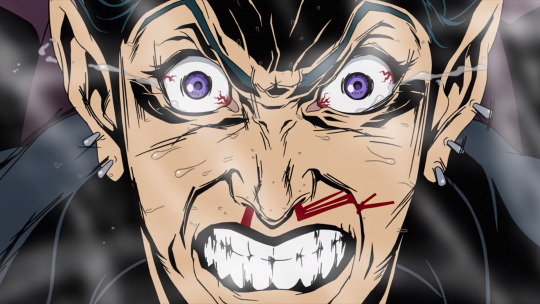
Let me get this out of the way first. Redline’s story has a lot to be desired. A LOT. However, the thing that makes Redline such an enjoyable watch is the incredibly unique and exhilarating artstyle and animation. Madhouse always has great animation work on all of their movies and shows (so good Madhouse was used in Kill Bill’s animated segment), but this could honestly be one of their finest works. The expressions of the characters, the violent racing of the many unique racecars (the focus of the film), and the nosebleed effects are stunning. Even if you don’t like racing or think the plot is lacking, Redline is worth a watch to marvel at its art. It’s pretty damn entertaining too.(dubbed by Manga Entertainment)
21. The Cat Returns (2002)
While not the deepest of all Studio Ghibli films, The Cat Returns is by far the funniest, at least in my opinion. At only 75 minutes in length, the tale of Haru, a clumsy high school girl, rescuing a cat prince is an underrated gem from the studio. The Baron, who first appears in Whisper of the Heart, appears here in a much bigger role, masterfully voiced by Cary Elwes. The film never takes itself too seriously, but it’s a blast the entire run time. Give this one a try if you’re in the mood for a quick, quirky anime film. (dubbed by Disney)
20. Millenium Actress (2001)
Ah, another fine work by Satoshi Kon. Millenium Actress is the story of the life of a now elderly actress who searched her entire life for a man she fell in love with at an early age. While the story has been done before, the aspect of Kon’s second film that makes it so great is the narrative and the way the story is told. Chiyoko, the main character, is being interviewed for a documentary on her life by a super fan and his less energetic cameraman. The interviewer and cameraman begin to actually appear in her flashbacks as characters in her many points in life, and it makes a really cool perspective. Not the fastest paced film, but Millenium Actress is definitely worth a watch. (dubbed by Bandai)
19. Summer Wars (2009)
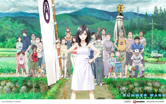
Mamorou Hosoda’s name is another you are going to hear a lot the rest of this list. Summer Wars begins innocently enough with a girl making a guy pretend he is her fiance in order to please her family and mainly her grandmother. On top of this plotline is the criminal activity occurring inside an advanced social network named OZ, which the male lead happens to be a part-time employee of. After a malicious user begins to take over the network’s world and begins to leak into the real world and things begin to unravel with the family, everyone must overcome their differences and defeat the enemy. Hosoda’s film is entertaining, a nice family-building film, and looks great on top of it. On a final note, I’m really happy to see Funimation have the chance to dub a high quality film like this. Michael Sinterniklaas and Brina Palencia are both great as usual. (dubbed by Funimation)
18. My Neighbor Totoro (1986)
My Neighbor Totoro is an adorable film. That’s all there is to it. Totoro is the mascot of Studio Ghibli and maybe even Japanese animation for a reason. The film itself is very simple and bit odd, but that does not make it any less likable.There are just many fun set pieces put together including the famous umbrella scene, the climax scene with Catbus, and the sense of imagination and adventure you only feel as a child rolled in one.Of note, the newer dub by Disney is much improved and has solid early work by the Fanning sisters. (dubbed by Disney)
17. Cowboy Bebop: The Movie (2001)
Those familiar to the anime world most likely know of how good the series Cowboy Bebop is. Those who have not seen the series yet should do themselves a big favor and give it a watch. The Movie is almost as good as the series itself. It gets a little more talkie than it should at times, but otherwise Bebop: The Movie is a solid addition to the great space western tale of the Spike Spiegel and the Bebop crew. The best part of Bebop: The Movie (other than the stellar jazz score) is that it feels like a reunion. We thought there was nowhere else to go with the lovable cast of the series, but then this movie appeared and brought all of them back for one last hurrah. Oh, and the dub is still fantastic. Bang. (dubbed by Sunrise)
16. Kiki’s Delivery Service (1999)
Kiki’s Delivery Service was a huge hit when it was released in Japanese theaters in 1989. There is no wonder why. Studio Ghibli delivers another simple, but enjoyable tale of a clumsy, young witch named Kiki. I find Kiki to be one of the most likable Ghibli leads due to her great determination to accomplish something yet feeling like she’s not good at anything. Some nice set pieces and being thoroughly entertaining throughout makes Kiki enjoyable for any age. On a final note Phil Hartman turns in his final performance in an animated film as Jiji the cat. As one would guess, he’s great. (dubbed by Disney)
15. Porco Rosso (1992)
Similar to The Cat Returns, Porco Rosso is one of the less deep Studio Ghibli entries. But man, is it a fun one. Porco Rosso follows the adventures of an anthropomorphic pig nicknamed Porco, a former Italian military pilot, on his zany quest to fight an overconfident, but very talented Texan pilot named Donald. The main two characters, Porco and Donald, alongside good supporting characters are some of the most fun in any Ghibli’s film. This is aided by some great dub performances, specifically from Michael Keaton as Porco, Cary Elwes (again!) as Donald, and Brad Garrett as an unsuccessful pirate rival. Watch this one for some fun and the pig puns. There’s a ton. (dubbed by Disney)
14. Wolf Children (2012)
Wolf Children is one of the slower films on this list, but that does not make it any less good. Directed by Hosoda, same guy who did Summer Wars, Wolf Children is the most mature of his films that I have seen. While the initial subject matter of a woman having children with a werewolf (wolf form) sound a little strange and questionable, the rest of the film is full of heart as Hana raises her werewolf children on her own without any help. Through the highs and the lows, Hana grows and so do her children. As one can expect, the character development is really good here and helps lead up to a very satisfying, yet bittersweet ending. This movie may be a feels trip, but I highly recommend it. Funimation does another nice job here with one of my favorite performances from Colleen Clinkenbeard ever. (dubbed by Funimation)
13. Whisper of the Heart (1995)
Here I present what I feel to be the most underrated Studio Ghibli film to date. Whisper of the Heart was directed by Yoshifumi Kondo, which means this movie was the first hit from the Studio not directed by Miyasaki or Takahata. Sadly, this was the only film Kondo was able to direct for the Studio due to his unfortunate death only a couple years later. Kondo’s gem contains the least fantasy elements of the Studio’s films, yet it has one of the most taut, well-told stories of the group. WotH is a coming of age story with a focus on romance between a girl and the boy who checked out library books before her. Don’t miss this one like many people have. (dubbed by Disney)
12. Princess Mononoke (1997)
The placement of Princess Mononoke on this list may be controversial to many. (possibly because of the length...) However, that does not mean that I don’t love this film. Mononoke is a much darker and bloodier entry than most Miyasaki films, which I like for a change of pace honestly. The fantasy elements are strong in this entry and the characters are stalwart as well. Every character in the movie has different motivations and it makes for a compelling story. Everyone, good and evil, wants something for a different reason and the resulting clashes make a compelling watch. (dubbed by Disney)
11. Madoka Magic Movie 1: Beginnings (2012)
Don’t judge a book by its cover: the movie. Beginnings is a movie that covers the first seven to eight episodes of the wonderful twelve episode anime series. To those unfamiliar with Madoka Magic, this is no Sailor Moon. It’s kind of like the combination of Sailor Moon and Neon Genesis Evangelion, which makes for quite a different kind of magical girl series. One not for the faint of heart... What makes this film so good is the way each girl develops as a character and the way that each slowly unravel as worse and worse events keep happening. This is a great summary movie and a good alternative to those who prefer watching movies over series, even if the series is only twelve episodes. (dubbed by evil over-pricing Aniplex)
10. Ghost in the Shell (1995)
When Ghost in the Shell only finishes in tenth on a list, you know there is going to be true quality in your top ten. Ghost in the Shell is a cyberpunk/sci-fi classic that deserves the praise it gets. The Major is an absolute badass, the villain is pretty cool, and there are many memorable action scenes and mind-bending scenes. GitS is one the smartest sci-fi movie I have seen overall due to its exploration into what it is to be human. Why is this classic not higher? No clear reason. Maybe it is because I like the GitS: Stand Alone Complex series better than the film (one I notably forgot on my top 50 series list). Still fantastic nonetheless. (dubbed by Manga Entertainment)
9. The Girl Who Leapt Through Time (2006)
Hosoda’s first film is my personal favorite of the three appearing on this list. The Girl Who Leapt Through Time is a nice blend of the slice of life genre with sci-fi. When a normal, clumsy teenage girl in Japan discovers she can “time leap” backwards, she uses it in many fun and manipulative ways. As with most time traveling series and movies, this usually does not end well for the main character doing the time leaping. What makes Hosoda’s film so enjoyable is how likable the characters, particularly Makoto, are and how well the story is constructed. That is rare for a time travel story. Overall, this is one anime film I’d recommend for almost anybody. (dubbed by Bandai and owned by Funimaiton)
8. Howl’s Moving Castle (2005)
Howl’s Moving Castle is probably my first or second favorite movie released in the dreadful movie year of 2005. I’ll probably make another list one day to talk more about that. Anyway, here’s one of the more divisive Miyasaki films. Some think it’s amongst his finest while others put it near the bottom. Personally, I think it’s one of his best. The main character, Sophie, is trying to break a curse put on her by an evil witch that turned her into an old woman. She believes a young sorcerer named Howl may have the fix for her. While curses are a very common plot device in Ghibli films I think the execution in HMC is excellent. Not quite as excellent as Christian Bale voicing Howl’s giant bird form in his Batman voice, but it’s a close second. (dubbed by Disney)
7. Evangelion 2.22: You Can (Not) Advance (2009)
While every film up to this point have been really solid works, here is where we hit the top tier. I went through these seven and rearranged them several times and am still not sure if they are in the right order. Oh well. Here’s a fantastic film and sequel to start with. Evangelion is a sequel to the first Evangelion “rebuild” movie that retells the story of the story of Neon Genesis Evangelion. The first entry was great, but the sequel was a huge step up. What makes 2.22 so great is it fixed big issues from the original series and made the (f’d up) cast more developed and likable. (besides Shinji’s dad. He’s still an asshole) The art and animation is also beautiful. Watch this on blu-ray if you possibly can. (dubbed by Funimaiton)
6. Spirited Away (2001)
Not my number one, huh? Spirited Away is an anime film masterpiece. The ending being a little loose is the only thing I think holds it back a bit, but it did so much for anime in the United States that I can forgive it for that flaw. From the memorable characters and scenes, Spirited Away is magical. I cannot say much more that has not been said a million times, so I just end by telling you to watch this if you have not. (dubbed by Disney)
5. Parika (2006)
I would be lying if I did not say Satoshi Kon’s final film is one of the strangest I’ve ever seen in any medium. That being said, it is absolutely terrific. Paprika tells the pre-Inception story of entering dreams and the madness that lies within some minds. From its thrilling opening sequence to its explosive conclusion Paprika can be described as nothing less than a thrill ride. I struggle to talk about this one much without spoiling the entire film, so just do yourself a favor and watch it. Just don’t do it before bed like I did, or you’ll have really weird dreams. (dubbed by Manga Entertainment)
4. The Disappearance of Haruhi Suzumiya (2011)
The Melancholy of Haruhi Suzumiya is a classic, zany anime series that established slice of life character archetypes for a decade after its release. However, not everybody is as big on it as I am. Whether it is the mostly comedic feel, the Endless Eight arc (seriously, it sucks), or annoyance at Haruhi or Mikuru, most people see it as an imperfect series. However, I don’t hesitate to say The Disappearance of Haruhi Suzumiya is as closest as you can get to a perfect anime series film. The film takes a more serious tone and uses it to develop Kyon, the main character, and Yuki, one of the more underdeveloped characters from the series. What results is a “It’s a Wonderful Life” type film combined with the best portions of the twenty-eight episode series. This film doesn’t feel at all like 160 minutes. It looks gorgeous too. Unfortunately, you have to watch the series to watch this gem. (dubbed by money-grubbing Aniplex) [NOT CURRENTLY AVAILABLE ON DVD OR BLU RAY!!!!!]
3. Akira (1989)
KANEDA!!!!!!! I do not think I have to say much here either. Akira’s reputation is so good even outside of the anime realm that I don’t think I have to say much. The animation to this day is stunning, the writing has inspired sci-fi/cyberpunk films to this day, and it’s one of Quentin Tarantino’s favorites. Just talking about it makes me want to go watch it again. Do yourself a favor and do the same. (dubbed by Geneon (RIP)/Funimation)
2. Laputa: Castle in the Sky (1986)
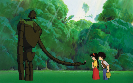
I have always loved Castle in the Sky. I just didn’t realize how much until recently. Castle in the Sky is the perfect blend of action, Studio Ghibli fantasy, and memorable peaceful scenes. Laputa’s plot is simple. A girl with a special ability and a boy who helps her race against a group of pirates and the military to find the fabled Castle in the Sky, which is supposedly filled with treasure. The pacing will please children and adults and only a heartless person could not find at least a couple of the characters likable. The main villain, Muska, is one of the most evil PG level villains I have seen in any cartoon movies. He’s voiced perfectly by the always terrific Mark Hamill, who sounds a lot like the Joker at times here... In conclusion, Castle in the Sky is a terrific fantasy film and a Ghibli masterpiece. (dubbed by Disney)
1. Perfect Blue (1998)
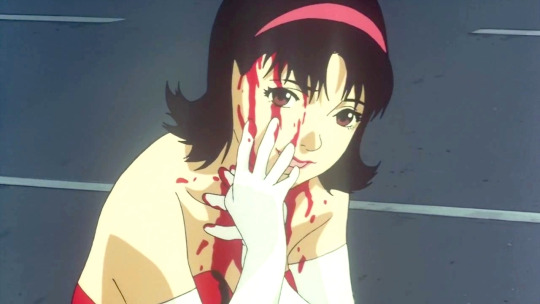
Now, this was my toughest decision of the entire year so far. No joke. After thinking about what would be my number one anime film for several hours, this one kept popping up near the top. The reason may be how inspirational this film is to my own writing. Maybe it’s the similarity to one of my favorite live action films of the last decade, Black Swan. Maybe it’s just a damn good film. Perfect Blue mashes the horror, mystery, psychological genres, and anime into a blender and produces a masterpiece. From the creepy stalker character (possibly the creepiest looking character ever drawn), to the lightpole dancing/hopping scene, to all of the actual murder scenes, Mima’s spiral into insanity is a journey unlike most others in film. Satoshi Kon directed this film and it shows. Perfect Blue encapsulates his use of gore, overall weirdness, nudity, and other elements for what I believe to be his best work. Like Madoka Magic and Paprika, this film is not for the faint of heart. Just a warning. If you think you can watch Perfect Blue, do it. You won’t regret it.(dubbed by Manga Entertainment) [NOT CURRENTLY AVAILABLE ON DVD OR BLU RAY!!!!!]
2 notes
·
View notes