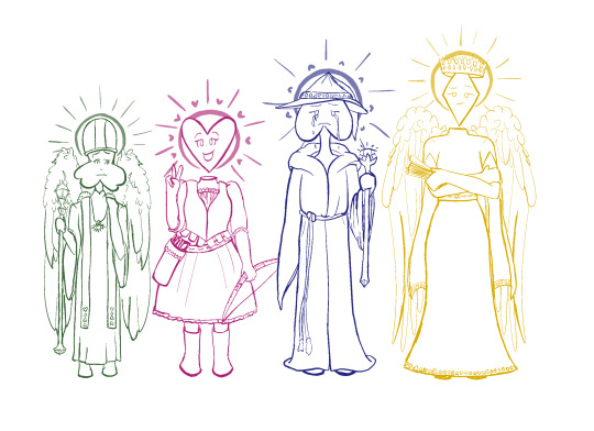
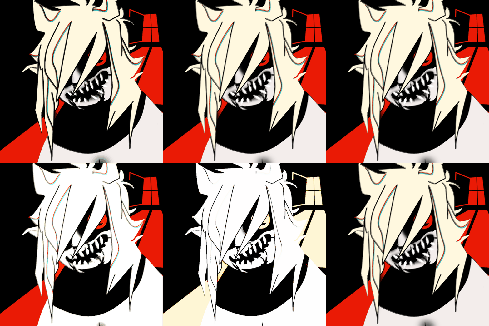
#making examples for my new mini commission style
Explore tagged Tumblr posts
Text

#.png#justicedoodles#furry art#colored sketch#oc: Toffee#making examples for my new mini commission style
70 notes
·
View notes
Text
So you want to turn your one-off book into a series…
As a writer who decided only after publishing book 1 of a trilogy, to then make it a 4 book saga, here are my thoughts on series planning, or at least the insomnia-driven process I went through to reach this decision:
Firstly—I prefer to write multi-book stories with the structure like Lord of the Rings over something like Harry Potter. As in, it’s one long story with various hurdles to overcome split into multiple books, instead of each book being much more self-contained, with a reliable time skip, like years of schooling.
With that in mind, the very first thought I have is this: What are the new threats going to be? I don’t think about my heroes or any subplots or new characters. Priority one is my antagonistic forces: Do I have enough to each carry their own book?
A hero is only as compelling as their conflict, after all.
In my sci-fi WIP, I had 6 main characters and five books planned, and I based it off the structure of the OG Teen Titans cartoon—Everybody gets their own season and while not every episode is about them, the main threat is theirs first, with the rest of the team backing them up. The threat was always a twofer, both an external threat and an internal conflict that they had to overcome in their book. For example I had a character who “lead” book 2, and the external threat was Bad Guys from a different team member’s war, dragging her home into it. The internal threat was her “suffer in silence” tendency and extreme self-reliance, which becomes too much for her to handle when her powerhouse teammate is out of commission physically and unable to help her emotionally.
ENNS doesn’t have an ensemble cast and was not meant to. In this style, if it’s one long story, I’d need three major incidents in books 1-3 that all led up to a final conflict in book 4, all building off each other. I needed essentially two whole “Helms Deeps” for books 2 and 3. Not just in terms of story but literal conflict, as I write high fantasy and not having a big climactic battle for a whole book would flop. But now I need two of them, and I struggle with action scenes.
And without spoiling myself, I have them vaguely defined. For me, at least, so long as I have my little compass pointing toward my “North” of “this is the thing that every major scene should be dealing with in some capacity” it doesn’t matter what path I take to get there, I’ll figure it out. Heavily outlining only ever leaves me with plenty of outline but no book.
For me, once I have my main threat, I then have my main theme. Example for ENNS being that book 1’s main theme/question was “What makes a monster?”
Have yet to narrow it down and split the original 3 themes now into 4, but one I intend on exploring is “Can vampires change?”
Doing this, having your big picture at least in a foggy idea, helps with cohesion across multiple books, and within the same story. If you keep your theme in the back of your mind and relate as many character arcs and mini conflicts back to it as possible, it’ll really start to look like you know what you’re doing.
Otherwise you end up with a bunch of loose ends and dangling plot threads that get abandoned, or characters that feel out of place as their arc has nothing to do with the rest of the story, it’s just here because they had to do something to participate.
So if you want to see now book 1 of 4, check out Eternal Night of the Northern Sky on Amazon.
#writing#writeblr#writing a book#writing advice#writing resources#writing tools#writing tips#sequels#outlining
11 notes
·
View notes
Text
Custom Notebook Commissions Open
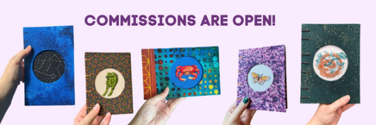
One of my non-TTRPG selves is a bookbinder with Amethyst Alchemist, my partner's sustainable bookbinding and embroidery business, and we are currently open for commissions from now until December 3!
These are handmade, custom notebooks from recycled and new archival quality materials, and they make perfect holiday gifts.
The commission form is here.
Slots are limited to ensure pre-holiday delivery in the continental United States—all commissions will be shipped on or before December 18 to meet the USPS Priority Mail deadline.
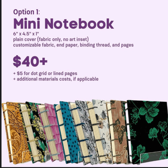

Text version and more details below the cut:
Commission Options
Option 1: Mini Notebook
A plain mini notebook without art embedded in the cover starts at $40.
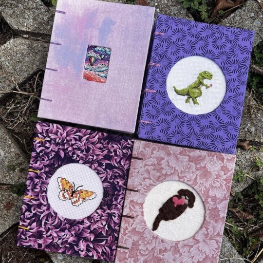
Option 2: Designed Notebook
A designed notebook with art in the cover starts at $125.
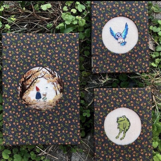
Art embeds include embroidery, cross stitch, and felt appliqué—we work with you on art style and fabric selection and provide a sketch of the art embed before starting work.
Both options include a choice of over 200 fabrics, white watercolor endpaper, and a binding thread of your choice.

Pricing Information
Beyond the base price, cost increases are based on:
Dot grid or lined pages instead of blank (+$5)
Cost of additional materials required (e.g. fabric purchase, waxing custom thread, custom endpapers, custom interior paper like watercolor or aged)
Time to make the art embed

Payment
Payment is made with a 50 percent deposit up front, 50 percent on completion. Do not until we've confirmed we can take your commission and we’ve discussed and agreed on pricing—we send invoices! Books are shipped upon receipt of second payment.
You can check out the Amethyst Alchemist Instagram for more examples. We're excited to work with you to design the exact book you (or a loved one) are looking for! Again, commissions close at 11:59pm EST on December 3rd and won’t reopen until 2024, so reach out now!
#bookbinding#embroidery#crafting#would appreciate reblogs on this one!#liz does the embroidery and felting and i do the cross stitch#also not saying this will work for you but she did make me a notebook and we're dating now#so idk maybe giving your crush a really sexy custom notebook will also work for you
28 notes
·
View notes
Text
Im opening up commissions and general purchase stuff. Both for my sewing and for 2d art.
I'll get info sheets made and stuff, but for now I have a list of what everything is, and have tried to provide photos for most stuff.
Here is my portfolio website as well.
http://sleepydesigns.co/
Dm me if you're interested, and we can discuss. I'll remake this post when i get better assets made. I'll take payment on paypal or cashapp. I also have venmo.
Here's a list of some of the stuff i make
Sewing
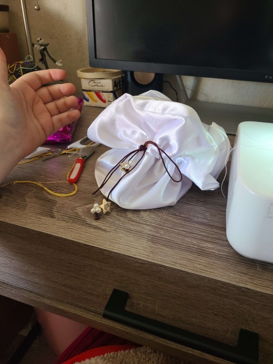
I make custom dice bags, those are 12-16 depending on the fabric and any add-ons. (Example: mine is embroidered, another has pearls and buttons on it) embroidery can be done but will cost more.
Scrunchies/hair ties. Most of them are cotton, but i make velvet and silk ones. Cotton is 3, velvet and silk are 4. You get a dollar off if you buy 2.
Customizable stuffed animals. You can pick the color, pattern, whatever. on these dolls, and they are made to order. The animals i have are a large dinosaur, large dragon, turtle, rabbit, dragon, and elephant. ( i think thats everything.) These all come with the date it was completed on its paw, so you know how old your new friend is.
Bumblebees!! These are little 7$ plushies that can sit on your desk or sleep with you, each one has a unique patten on its wing. It also comes with the date it was completed, so you know how old your new friend is.
Custom humanoid dolls. This can be from a photo of you or a loved one. Or you can send me art of your character. These are incredibly complex, detailed dolls, and i will work closely with you to make the doll. It's a long process that takes me several hours. As a result, these are at least $200. I only take one or two commissions for these a month at the moment.
I can take other commissions but we will have to discuss that.


Stickers
Potions. Each potion is completely unique. Each painted by me using India Inks. These paper stickers are in 3 different sizes. Small is 3, medium is 4, and large is 5. You can tell me what color you want, and if its not available in the size you want, i can likely make it.
Holographic spider's hat shop. This is a large vinyl Holographic sticker of a jumping spider wearing a water droplet hat, selling other tiny things for others to wear as hats. This sticker is $4. If i have any in may, there's mini paper ones for $2
Milkshake pride stickers. These are paper stickers meant to be semi-subtle pride flags. I have the following flags, and can add more. Lesbian, omni, bi, ace and aro, demisexual, demiromantic, pan, rainbow, nonbinary, trans, and intersex. These are $2 each. I also have a tiny sticker set of all of them for the same price.
Fairy. This fairy sticker is a paper sticker of a fairy holding a mushroom as an umbrella. It is $2
Frog with a tophat. This is a paper sticker of a cute little frog with a tophat. He's rather dapper. $2
Fox leaping. This is a paper sticker of a red fox. It is also $2
Red mushroom this paper sticker will not be remade, i have a few left. It's a cartoony red mushroom in some grass. It's $1.50
? Block i dont think i can really say what brand this is based on. It's a paper sticker. $1.50

Art commissions
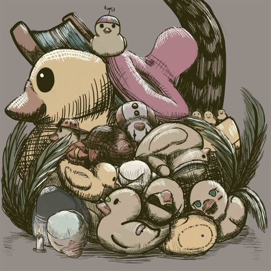
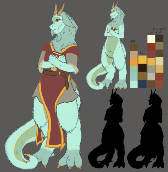
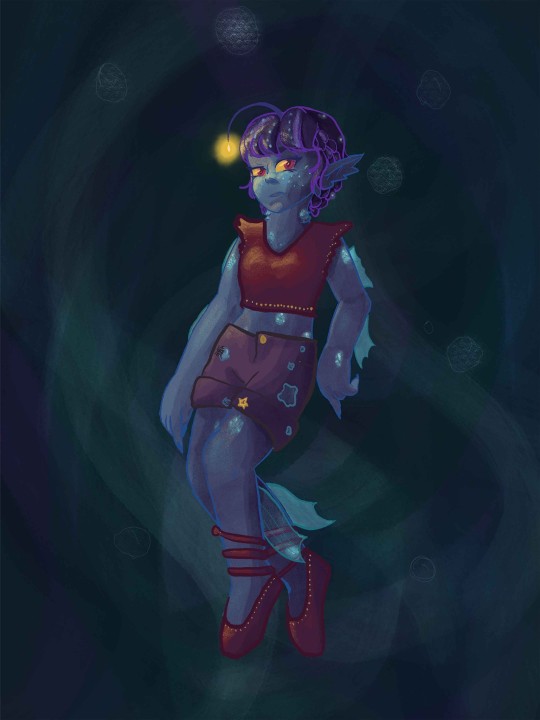
It is probably worth mentioning that i have a BFA, so that does affect my pricing slightly (on my illustrative work)
I am flexible in style, and can do a fair number of stylized things. No realism.
$20 for a base sketch
$30 for basic shading
$45 for full shading/the works
Each character after that will be half the price.
A background will be $5-10 depending on how detailed it is. By default you get a plain background


#forest talks#my art#commission#art commisions#commission info#commission is open#my work#forests art
41 notes
·
View notes
Text
Commissions - 2023 Rates
As I warned last year, I'm bumping rates up a smidge again. Two out of the three styles offered are going up a bit, but one is staying the same. I'm hoping to add a new style or two to the list of options soon. I just need to figure out the specifics. (Hint: more traditional options!)
More examples can be found on my website. There are a lot of dog examples, but I am happy to draw any species of animal.
“Sketch” portraits are completed in watercolor pencil or ink on 9” x 12” bristol, depending on which medium will best capture your pet. I work from photos, the higher quality, the better. If your photos are from a professional photographer, PLEASE make sure I have permission to reference the image. I can also combine the right photos to make something new. Quickest turn around time. $150 plus $10 shipping.
I will add under this style that at in-person dog events I will offer limited spots for 6" x 9" portraits that cost $60. They are exclusive to in-person events and to anyone that has purchased another mini portrait at a show. They look very similar to the "sketch" portraits.

Digital/Traditional Blend portraits start with a traditional drawing, which is then finished with additional details on the computer. I will send you the digital file so images can then be printed in any size or on any surface you would like. This option offers a lot of flexibility with regards to style and number of pets per image. Photo reference is necessary. I’m happy to send the original drawing if it stands well on its own. Starts at $350 and increases with complexity (likely around $50 per additional subject). Add $10 shipping if you want the original.

Cynocephalus Style Portraits Is your dog a character? Are you looking for a unique interpretation of your pet? This fun option is named after the mythical condition of having a dog’s head, called “cynocephaly.” With “cyno" meaning “dog,” and “cephaly" meaning “head.” I need multiple views of your dog in photos for this style portrait so I can make sure markings and likeness are accurate. Pieces are typically a single shade of ink on 6x9 illustration board. Size can be adjusted for multiple pets. Starts at $175 + $10 shipping

I am also open to drawing original characters and fantasy creatures, but may have to adjust pricing slightly to accommodate the additional time needed on the conceptual side.
Message me if you’re interested in a commission. If you have any questions, I’m happy to answer them.
30 notes
·
View notes
Text
🌸 8-8it Artistries Newspost - (11/15/22) 🌸
Previous Newsposts; 🌸 (10/18) (October Newspost + 2022 Summarization) https://8-8itartistries.tumblr.com/post/698432208545906688/8-8it-artistries-newspost-10182022 🌸 (10/22) (Queue) https://twitter.com/8_8itArtistries/status/1583973054103064576 If you haven’t already, I highly recommend reading the above posts. Below I will be summarizing the work I’ve done and events relevant to my fursuit business that have happened since my last newspost. TWs may be applicable for the post below, they will be in the tags.
Hello! Much has happened since the October update so I’m happy to announce this newspost won’t be nearly as long as the first one. Hopefully that’ll keep consistent throughout the coming months. Newspoints will be seperated with cherry blossom emojis. 🌸 As of October 22nd, I have put together my commission queues and have a sum of around 22 commissions to complete in the coming year. I will soon be organizing a Trello to keep all of these commissions and their respective information organized. I have a huge to-do list regarding 8-8itArtistries and I’m very excited to complete these tasks. My previous setbacks are still effecting me, and I’m still fairly monetarily short when it comes to supplies I need for fursuits. I also have little to no space to work in my parent’s house where I currently reside. I plan to go on SSD and move out to try and remedy this as it’s significantly effecting my productivity. I love making fursuits and I love delivering them to my commissioners; I’ve had a wonderful experience with this business so far and i wouldn’t want to stop it prematurely or let people down. Please let me know if you have questions or concerns about your commission as I want you (and me) to be 100% satisfied with the product that comes to your door. Many of my commissions have been placed over a year ago at this point, and I am very apologetic about the delay. I’m doing the best I can to catch up with the excess of work I signed myself up for. 🌸 My getfursu.it page has been updated in correspondence to 2022, as all of my information on there was as of 2021. 🌸 Digital art commissions will be raised by around 50% once again to accomodate more of a living wage and support of my fursuit commissions. 🌸 I’ve been struggling quite a lot mentally, and attempted suicide on the night of November 2nd. I’ve been taking it easy since and just today started working again. 🌸 And probably the most exciting update by far, I have updated and made a uniform paw pattern! This will help me exponentially in completing commissions, and I am quite excited! I will be heading to the library to print out my pieces tomorrow.
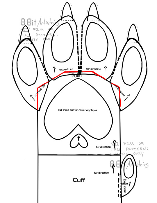
Above is the digital mockup of my new paw pattern, to be used as an example of what my new paws will look like. They will not be dissimilar to my previous pattern (example below) however they will be more clean and orderly, and have been adjusted to fit most measurements. I believe the improvement between the two can be seen, as the first pattern/paws i made are highly experimental.
My goal with my fursuits is to replicate my furry art style, if not more detailed, currently they resemble a mix between toony and kemono styles, but once i accomplish matching my fursuit style to my art style they will be more kemono. The above paw belongs to my first commissioner Mothstick and is a part of the Dreamcatcher mini-partial. I have yet to finish the gift pawset and ship them out, so that’s on my immediate to-do list for sewing, along with my non-fursuit tactile commissions. 🌸 (Edit 8:09 PM 11/15/22) Several changes have been made to my carrd, as well as my twitter. Socials associated with 8-8itArtistries specifically have been edited to match thematically, as such;


“Contact” button on my carrd has been edited to start an email correspondence instead of a google form, as I completely forgot that my forms existed. More edits to my carrd are due in the near future. I believe this is all I have to say for now. Again if you have any questions or comments, my ask box is open. Thank you so much! 💙🌸
#8-8it Artistries#8-8it#8-8itarts#news post#blog#tw: sui mention#tw: suicide#tw: sui attempt#i believe thats all the tws that may apply#the mentions are very brief
2 notes
·
View notes
Text
Opening Commissions!
hiya! i'm jess, welcome to my page!
have a cup of tea while you're here. ☕
this is the first time i've ever done commissions so it's new to me.
i am a uk-based, digital artist.
i'm under 18 so i don't have a ton of experience and i can't use paypal yet.
instead, any payment would be nice to receive in giftcards/cheap subscriptions/gifted games (ie. can work it out based on the price).
what do i draw?

some other examples!


a couple of the examples are a little outdated as I no longer use lineart 95% of the time.
i draw oc's (eg. you have a dnd character you want to get an idea of appearance for)
i draw stylised sketches of real people (eg. you want a picture of you and your friend drawn in my style)
i draw weapons, reference sheets and mini fantasy landscapes.
i can draw full body/half body but I'm MUCH less comfortable with it, so I don't have official pricing for it: if you're interested in that, we can work out prices in DMs but i'd rather not do full body especially.
i DO NOT draw nsfw. don't even try.
i DO NOT draw gore. once again, don't even try.
my terms!
please do not repost, alter or use my art in any way that may profit you. i understand this is basically common sense but i should say it anyway.
please do not harass me for work, or because i'm sixteen. i'm literally just doing this for fun. i have the right to reject work for any reason.
currency can either be paid upfront or after the sketch phase, depending on the customer's choice (and whether you are commissioning a sketch lol). please do not send me payment until I've agreed to do the work.
unfortunately, gift cards/subscriptions/etc. are non-refundable so please make sure you can afford the art, and 100% want it before you pay for it. i will not take any abuse.
the art takes between a couple days and a couple weeks to finish, but this can be shorter or longer depending on whether i'm ill or if school is getting busy, etc. so please be patient and respect my time. i'm only human.
once the work is done, I'll send you the full-resolution image as a png, but you are welcome to ask for it in another form (other than physical)
my prices are roughly based on an hourly wage (£5/hour) so if there are any last-minute changes i may ask you to provide additional payment depending on how long it would take to fix.
i retain all copyrights over the commissioned artwork and reserve the right to post it online or use it in my portfolio.
my commissions are open as of when i post this info, so feel free to dm me!! hope to hear from you guys :D <3
11 notes
·
View notes
Text
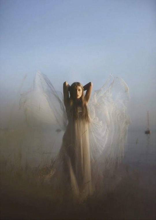
DIAL 111: HOW TO WORK WITH YOUR SPIRIT GUIDES
BY: RUBY WARRINGTON ·
Do you know how to work with your spirit guides? Ruby Warrington gets a lesson in life’s celestial helpers from spirit-guide-whisperer Rebecca Campbell…
There follows a lesson in how to work with your spirit guides by Rebecca Campbell. Read more at Thenuminous.net
Inviting them into your dreams is one way to work with your spirit guides…
It happens fairly often among my Numinous circles that somebody will casually drop into the conversation that they’ve been working with their “spirit guides.” At which point I’ll nod and be like, “that’s rad, dude” – because, conceptually, I’m totally down with the idea that there are benevolent Universal forces working on our behalf all the time, and that we get to choose how and when we interact with them. That’s called “creating your own reality,” right?
But then I meet Rebecca Campbell, an Aussie author, mystic, coach, and co-founder of The Spirited Project, who insists that our guides are actually more like real entities – angels, I guess – who are just kind of hanging out, polishing their wings, until we call them into action. Learn to work with them, and they can offer assistance in every area of life – in fact; “no request is too big or too small, too specific or too broad,” she says.
It’s a pretty out there idea, even for me. And I (obviously) embrace a LOT of out there ideas. But I LOVE the concept (I’m already picturing my guides like a kind of spiritual Spice Girls, with the dance routines and everything), and so I asked Rebecca for the full low down. Here’s what she had to say…
Your guides – kind of like spiritual Spice Girls?
So does every individual on the planet have their own spirit guides?
Yep, everyone has their very own team of spirit guides who are completely devoted to their growth. I like to think of them as a group of amazing cosmic beings who have our back no matter what. But because of free will, in order to receive their support, first we need to ask. Asking is super simple (like, you can do it right now).
For general guidance:
“Hey spirit guides…I am open to receiving your loving guidance in all areas of my life. Thank you, and so it is.”
For more specific guidance:
“Hey spirit guides…I am open to receiving your guidance surrounding (insert specific request here). Thank you for guiding and supporting me.”
The thing about spirit guides is that they’re always there – we just don’t notice them. When you’re devastated by a terrible break up, they’re there. When you’re looking for a spot to park your car, they’re there. If you’re trying to make a difficult decision, they’re there. They’re by your side right now. What do you want their help with right now? Go on, ask them right now!
Okay, but first I need to know how they actually do their work?
Our spirit guides work with us through signs, people, nature, synchronistic events and our intuitive senses (inner seeing, inner knowing, inner hearing and inner feeling).
So the best way to start working with your spirit guides is to ask them for a sign. When I first started working with my guides I asked them to send me a light peach feather to prove to me that they were really there. Within half an hour I had received two peach feathers, which was pretty amazing – and what I needed to open my mind and heart up to noticing the support they could offer me. (nb: I tried this last night by asking for a blue crystal – nothing yet. I’ll keep you posted. Update: two hours later I was working out and found a mini crustal on the studio floor – but it was mauve. Close!)
The more you work with your spirit guides, the stronger the connection gets. It’s just like working out – you can’t expect to have a six-pack like J-Lo if you only do one sit up.
Okay, so is there one team of spirit guides working for us all, or are they individual for each person?
Everyone has their own team of spirit guides, which are assigned just to them. We are born with spirit guides and also recruit them as we go about our life.
I find that most people have around six spirit guides in their “inner circle.” These are the guides who are completely unique to us. Some spirit guides have had lifetimes here on earth (often appearing as “people” e.g. an American Indian teacher, a Tibetan monk, an inspirational business leader etc.) – while others may just appear as beings of light.
I believe that our purpose on Earth is twofold:
1. Evolve as a soul (learning, growing and raising our vibration)
2. Be the light (light up the world by following what lights us up)
Our spirit guides are assigned to us to help us do both these things. The more we allow and receive their guidance and support, the easier our path becomes.
Accept their support, and move forward more smoothly on your journey
I like the idea of us being “assigned” out guides at birth – how does this happen?
Your soul recruits your spirit guides based on your unique soul calling and the path you are here to walk. Your guides are perfectly suited to your highest calling, and waiting to guide you as much or as little as you wish. No matter what you’re facing, their presence means you always have the support around you to make it through.
I believe that we are born with one main guide (also known as a Guardian Angel) who stays with us throughout our lives – and by the age of 18-25 most people have recruited their spirit guide “posse.”
We can recruit more guides as needed though. For example, while writing my book Light Is The New Black I recruited two light beings and a new teacher guide to help me – in exactly the same way as I used to call on famous ad men to help me present my creative ideas in a way that would most resonate with the client when I worked in advertising.
What if I’m still having a hard time getting my head around the concept…
What holds most people back from developing a relationship with their spirit guides is their need for hard core visual “proof” that they exist. For a long time, I was waiting for my spirit guides to ring my doorbell and chat to me over a bottle of vino (clearly that never happened).
I wanted to know their hair color, their favorite movies and where they grew up. But the moment I Iet go of any need for them to appear in a certain way and just opened myself up to the possibility and trusted, the more my relationship with my guides grew and the more evidence of their presence I received in other ways.
Everyone’s experience with their spirit guides is personal, and because they work in the subtle realms, it takes practice to sense them. We are all six sensory beings, but we need to work our intuitive muscles each day to strengthen our intuitive connection with them.
Most people experience their guides through their predominant intuitive sense: Clairvoyant (clear seeing), Clairaudient (clear hearing), Clairsentient (clear feeling) and Claircognizant (clear knowing).
Can you give us some tips to start working with them on a regular basis then?
1. Start asking them for guidance…right now
2. Thank them for guiding you – they love a bit of positive reinforcement!
3. Ask them to send you a sign (e.g. a feather, a butterfly, elephants…whatever you fancy)
4. Keep a little notebook by your bed, and jot down any experience you might have had with them and any signs you spotted throughout the day. The more your book fills up, the more you will notice their support
5. Before you go to sleep ask your spirit guides to come to you in your dreams. The moment you wake up, note down any experiences you may have had with them
“She’s behind you…” Your spirit guides have always got your back
I’m almost convinced – can you share any amazing experiences you’ve had working with your guides?
These days I speak to my spirit guides every day – but my favorite story of working with my guides happened earlier this year, when I handed in my book proposal to Hay House (twice) but hadn’t heard anything.
One of my spirit guides is a woman (spirit) named Charlotte. Charlotte appears as a terribly English high society lady from the 1920’s who wears big dresses, hats and gloves. A gifted gossip, with her fingers in all the most influential pies, Charlotte is here to help me get my message out there and the name spoken about in the right circles. Knowing that getting some publicity might increase my chances of being published, I called on Charlotte for help and then surrendered it.
That same day I was connected with a journalist – and one week later she was commissioned to write a story, “Like a Prayer”, for the UK’s Sunday Times Style Mag (which also happened to feature the who’s who of Hay House authors, as well as The Numinous).Two weeks later, I got the phone call from Hay House offering me a deal!
When I went into Hay House to meet the team for the first time, the Publicity Officer mentioned that she’d seen the Sunday Times article and asked who my publicist was. Without thinking I responded “my spirit guide Charlotte!” Now, I’ve sat around a lot of boardroom tables in my life, but that was the first one that I was able to casually drop the name of one of my spirit guides and credit them for their work. I love it!
Ruby Warrington
RUBY WARRINGTON
MY MANTRA: Believing is Healing. MY MISSION: To help create a world where everybody gets to feel whole. // MY STYLE: Rock 'n' roll yogi fashionista. 99% recycled and vintage. // MY SIGN: Aries Sun, Sagittarius Rising, Cancer Moon. // MY HEALING: Time with friends, time alone, time offline, getting Sober Curious, and being f*cking real with myself!
Rachel's Heart
#child of wild#higher self#love self#self love#spiritualpath#nature#spiritualawakening#spiritual development#spirituality
22 notes
·
View notes
Note
Have you noticed the latest edition of Charlie Bowater can only draw one (1) face? She did The Princess Will Save You and Cast In Firelight both YA Fantasy set to be released this year. And they are how you say... the same fucking cover
Ah yes so you saw the same tweet I did
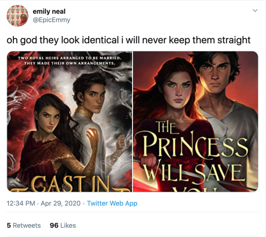
I know I literally just posted that we cannot outlaw book covers from looking like each other, but ! Oof!
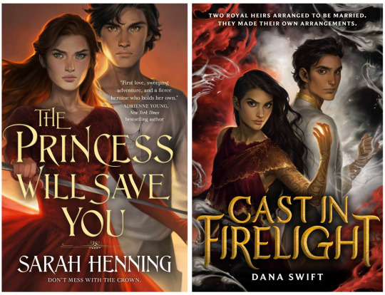
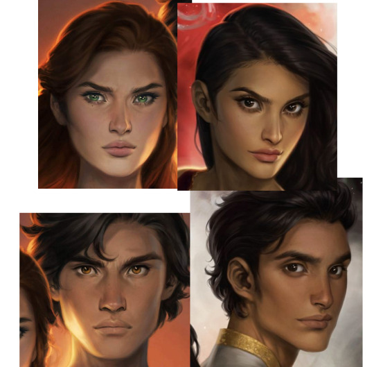
The only thing that softens the blow here is that Charlie has improved at representing nonwhite features such that characters look like POC rather than tan white people, although,, that bar was low. Anybody remember the ACOTAR coloring book.
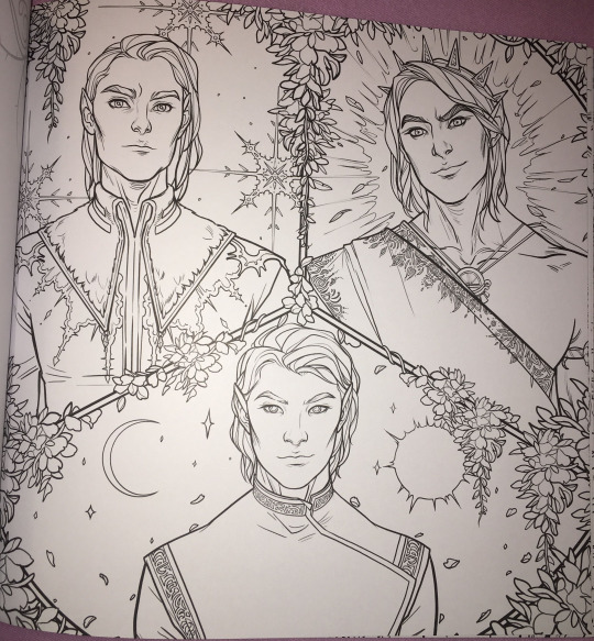
(Would you have guessed that 2/3 of these people are nonwhite? Or even that they’re supposed to be three different men? I guess all the men in Prythian have the same haircut?)
But that minor victory is mostly lost in the quagmires of the fact that Charlie’s style is to give everyone instagram face:
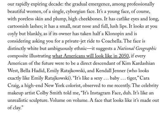
I wouldn’t even call this “Sameface” necessarily: that implies limitation, that an artist is only capable of drawing a single facial structure competently. Bowater is incredibly technically talented, she just chooses to give everyone catlike fae eyes and the cheekbones of a starving nymph. (My previous post on this here.)
But I don’t really blame her for that, or for these hilariously identical, nearly devoid of personality covers. Artists are allowed to do whatever they want. Artists who make art for covers are being art directed by designers and marketing teams who bear responsibility for how the finished pieces turn out.
No, this is our fault, as a community and an industry and..... society, kind of, for valuing character portraits that are “pretty” (“pretty” being an extremely loaded, culturally subjective concept) over art that actually Says Something About The Story. Bowater’s style happens to dovetail perfectly with what we currently collectively find pretty, and so we’ve put her art on a pedestal at the cost of everything else art can or should do for our stories.
And this is understandable: in contemporary western culture, pretty is a value unto itself. Seeing our characters portrayed as pretty denotes them as special, as smart, as powerful. It’s almost impossible to de-program ourselves from that reaction. There are approximately five kajillion studies on how beautiful people are at personal and professional advantages; how they’re perceived to be happier, healthier, more successful, and how those perceptions can translate into realities. (Nevermind how thinness and whiteness enter that equation, see above note about “pretty”.) I would love to see more “average” or weird- looking characters abound (and be accurately visually represented) in the YA/ Genre lit sphere, but for now... everyone is pretty.
Which sometimes means everyone is pretty boring.
But that’s just the specific, "What’s the deal with Bowater’s success in book circles and her style and all the sameiness” part of this equation. What if we backed up and asked: why character art at all? Beyond a question of “pretty”-ness (and general obvious Artistic Quality), why do we gravitate towards it, what's the purpose of it, how does it fall flat in a general sense, and how can it be utilized more effectively?
This is something I think about all the time. I follow writers on social media (because..... I am a writer on social media, regrettably), and we have an enormous collective boner for character art. “Getting fanart [of the characters]” is one of the achievement pinnacles constantly cited when people get or want to get published. Commissioning character art is something we reward ourselves with, or save up for (WHICH IS GOOD AND CORRECT. FREE ART IS GREAT BUT DO NOT SOLICIT IT. PAY YOUR ARTISTS). And like???? Same????? We love our stories because we’re invested in our characters. Most humans, even prose writers, are visual creatures to some extent, and no matter how happy we are with our text-based art, it’s exciting to see our creations exist in that form. So we turn that art into promo material and we advocate for it on our covers-- because it’s so meaningful to us! It goes with the story perfectly!! Look at my dumb beautiful children!!!!!
But on an emotional level, it’s hard to grasp that it only means something to us. Particularly when you take into account the aforementioned vast landscape of beautiful visual blandness of many characters (in the YA/ genre lit sphere, that’s pretty much all I’m ever talking about), character art can be like baby photos. If you know the baby, if that baby is your new niece or your friend’s kid, if you’ve held them and their parent texts you updates when they do cute shit, you’re probably excited to see that baby photo. But unless it’s exceptionally cute, a random stranger’s baby photo isn’t likely to invoke an emotional reaction other than “this is why I don’t get on facebook.”
Seeing art of characters they don’t know might intrigue a reader, but especially if the characters or art are unremarkable-looking, it’s doing a hell of a lot more for the people who already have an emotional attachment to that character than anybody else. And that’s fine. Art for a small, invested audience is incredibly rewarding. But like the parent who cannot see why you don’t think their baby is THE MOST BEAUTIFUL BABY IN THE WORLD???? I think we have trouble divesting our emotional reaction to character art from its actual marketing value, which.... is often pretty minimal. This is my hill to die on #143:
Character portraits, even beautiful ones, are meaningless as a marketing tool without additional context or imagery.
I love character art! I’m not saying it should not exist or that it’s worthless! Even art that appeals to only the one single person who made it has value and the right to exist. And part of this conversation is how important for POC to see themselves on covers, whether illustrations or stock imagery, particularly in YA/kidlit. I’m not saying character portrait covers are “bad”.
I am saying that I have seen dozens and dozens of sets of character art for characters who look interchangeable, and it has never driven me to preorder a book. (Also one character portrait for a high-profile 2019 debut that was clearly just a painting of Amanda Seyfriend. You know the one. There’s nothing wrong with faceclaims but lmfao, girl,,,,)
I’m sure that’s not true for everyone! I am incredibly picky about art. It’s my job. There’s nothing wrong with your card deck of cell-shaded boys of ambiguous age and ethnicity who all have the same button nose and smirk if it Sparks Joy for you.
But if your goal is not only to delight yourself, but to sell books, it’s in your best interest to remember that art, like writing, is a form of communication. The publishing industry runs on pitches: querys, blurbs, proposals, self-promo tweets. What if we applied that logic to our visuals? How can we utilize our character design and art to communicate as much about our stories as possible, in the most enticing way?
Social media has already driven the embrace of this concept in a very general sense. Authors are now supposed to have ~ aesthetics. “Picspams” or graphics, modular collages that function as mini moodboards, are commonplace. But the labor intensity and relative scarcity of character art visible in bookish circles, even on covers, means that application of marketing sensibility to it is less intuitive than throwing together a pinterest board.
Since we were talking about it earlier, WICKED SAINTS, as a case study of a recent “successful” fantasy YA debut, arguably owed a lot of its early social media momentum to fanart.
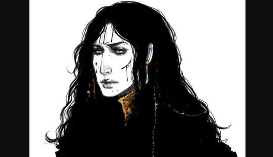
(Early fanart by @warickaart)
The most frequently drawn character, Malachiasz, has long hair, claws, and distinctive face tattoos. WS has a strong aesthetic in general, but those features clearly marked his fanart as him in a way even someone unfamiliar with the book could clearly track across different styles. Different interpretations of his tattoos from different artists even became a point of interest.
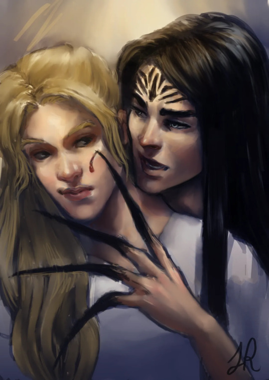
(Art by Jaria Rambaran, also super early days of WS Being A Thing)
Aside from distinctiveness, it's a clear visual representation of his history as a cult member, his monstrous powers, and the story’s dark, medieval tone. The above image is also a great example of character interaction, something missing from straightforward portraits, that communicates a dynamic. Character dynamics draw people into stories: enemies-to-lovers, friends-to-lovers, childhood rivals, platonic life partners, love triangles, devoted siblings, exes who still carry the flame-- there’s a reason we codify these into tropes, and integrate that language and shared knowledge into our marketing. For another example in that vein, I really love this art by @MabyMin, commissioned by Gina Chen:
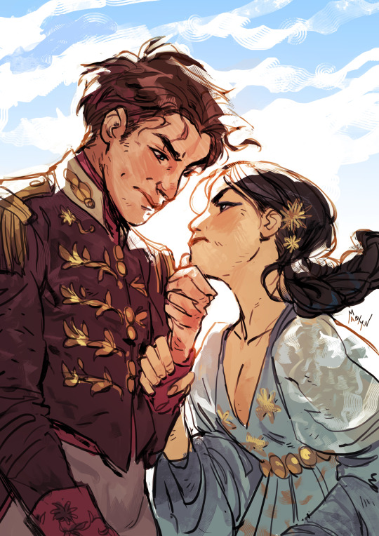
The wrist grip! The fancy outfits! These are two nobles who hate each other and want to bone and I am sold.
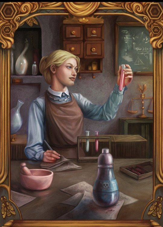
In terms of true portraits, the best recent example I can think of is the set @NicoleDeal did for Roshani Chokshi’s GILDED WOLVES (I believe as a preorder incentive of some kind?):
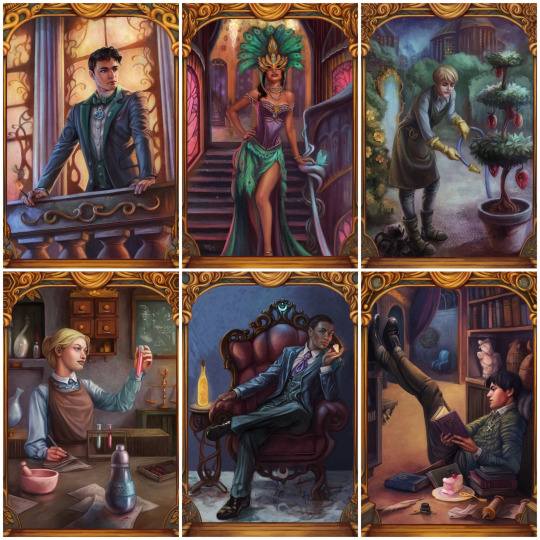
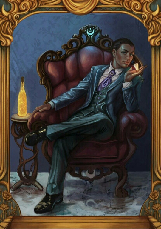
They showcase settings, props, and poses that all communicate the characters’ interests, skills, and personality, as well as the glamorous, elaborate aesthetic of the overall story. Even elements in the gold borders change, alluding to other plot points and symbology.
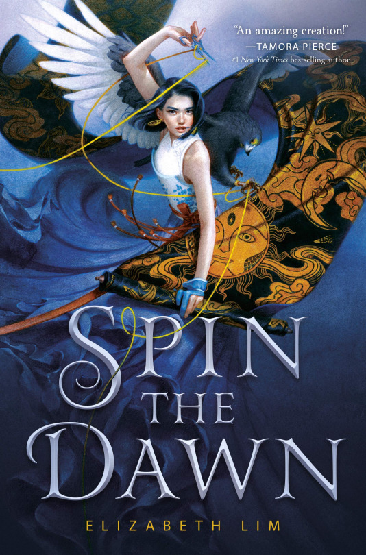
For painterly accuracy in character portraits on covers, I love SPIN THE DAWN. The heroine looks like a beautiful badass, yes, but the thoughtful, detailed rendering of every element, soft textures, and dynamic, fluid composition form a really cohesive, stunning illustration that presents an intriguing collection of story elements.
The devil isn’t always in the details, though: stark, moody, highly stylized or graphic art with an emphasis on textural contrast and bold color and shape rather than representational accuracy can communicate a lot (emotionally and tonally) while pretty much foregoing realism.
The new Lunar Chronicles covers are actually the best examples I found of this (Trying to stay within the realm of existing bookish art rather than branch into All Art Of Human Figures Forever):
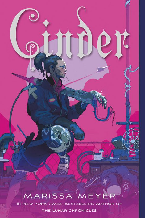
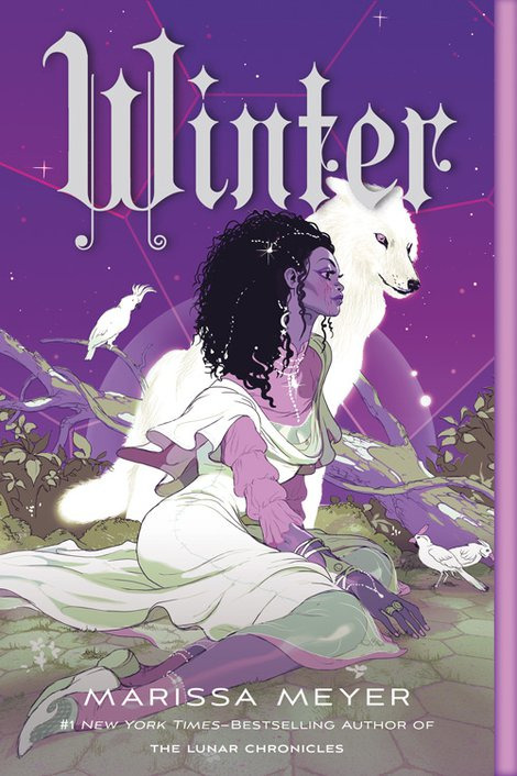
Taking cues from styles more typical of the comics and video game industries. (Games and comics, as visual mediums, are sources of incredible character art and I highly recommend following artists in those industries if you want to See More Cool Art On Your Timeline.)
TL;DR: Character art and design, as a marketing tool (even an incidental one) should be as unique to your story and your characters as possible, and tell us about the story in ways that make us want to read it. I tried to give examples because there are so many ways to do this, and so many different kinds of art, and I could give many more! But I’m bored now. So to circle all the way back:

These are not just bad because they look like each other, although that is embarrassing and illuminating. These are bad covers (although,,,,, PRINCESS is the far worse offender, at least FIRELIGHT suggests a thoughtful cultural analogue) because a desire for Pretty Character Art overrode the basic cover function to tell us about the story. We get no sense of who these people are, what their relationships are, what these books are about beyond the most general genre, or why we might care. The expressions are vague, the characters generic-looking, the compositions uninteresting and the colors failing to be indicative of anything in particular.
They’re somebody else’s baby pictures.
(And yes, that’s the CRUEL PRINCE font on PRINCESS. I better not have to do a roundup post but it’s on thin fucking ice.)
329 notes
·
View notes
Link
This year marks Harold “Hal” Rogers’s twenty-first consecutive electoral victory in Kentucky’s Fifth Congressional District, making him the second-longest-serving Republican in Congress. He rode into office on the wave of the Reagan Revolution in 1980, and the governing style he’s employed in the Fifth District—which covers the rural, mountainous, Appalachian region of southeastern Kentucky—can mostly be described as Reaganite: pro–War on Drugs, pro–prison expansion, anti-regulation of extractive industries, and pro-family. The congressman has had to improvise a little over the years in response to changes in the economy and political system, but he’s well-positioned to do so: as a former Chairman of the House Appropriations Committee, the elite “College of Cardinals” that manages the government’s budget, and the ranking member of the House Appropriations Subcommittee on State and Foreign Operations, he’s one of the most powerful men in Washington. Rogers has extraordinary discretion over where and how the government exercises power domestically and overseas, especially within the border regions; he can coerce other lawmakers to support his policies by withholding funding; and, crucially, he can funnel tons of “pork” back to his home district.
If you were to mention that to the average American, however, you’d probably be met with confusion. Hal who? Most people, when they think of powerful politicians from Kentucky, think of Senate Majority Leader Mitch McConnell, who over the last decade or so has singlehandedly reshaped how Congress functions, and has all but ensured the prioritization of corporate interests within the federal judiciary. So you’re telling me there’s another powerful congressman from Kentucky who has control over virtually every aspect of my life? That is indeed what I’m telling you, my friend, and it’s no coincidence that both of these men come from the mostly rural state of Kentucky.
How did Kentucky come to mean so much at the national level? McConnell’s story isn’t that compelling. He is deeply unpopular statewide, but every six years he hyper-focuses on a handful of places in the state—Paducah, the Cincinnati suburbs in Northern Kentucky, the rural counties around Louisville (his hometown), and the rural counties in southern Kentucky—and makes enough empty promises and assurances to carry him to victory. He then launders his success as a success story for all of Kentucky, claiming that it allows the state to punch above its weight at the national level against states like New York and California. His voters eat this up, and McConnell plays off of it to increasingly cringe results (see: “Cocaine Mitch.”) At the end of the day it’s a pretty standard story of electioneering, manipulation, and voter suppression; Kentucky consistently ranks among the bottom ten states in terms of “electoral integrity.”
But whereas McConnell is motivated by the long-term viability of corporate domination of the United States, Hal Rogers is motivated by the long-term viability of corporate and personal domination of southeastern Kentucky. Make no mistake that this benighted region—long one of the poorest in the country—is Rogers’s personal dominion, his fiefdom. The fact that his name is on just about everything you see should be enough evidence to support this claim. To enter and exit the region you have to travel on the Hal Rogers Parkway, which used to be the Daniel Boone Parkway until Rogers renamed it after itself. Want to take your family on a weekend getaway vacation? You can check out the Hal Rogers Family Entertainment Center in Williamsburg, which contains a wave pool, water slides, and a mini-golf course. Or perhaps you’re addicted to drugs? Rogers has just the thing for you: the Hal Rogers Appalachian Recovery Center, which has outposts all across the region.
This last “amenity” that Rogers so graciously offers—drug rehabilitation centers—is rich with irony. In 2003 he created a program known as Operation UNITE (Unlawful Narcotics Investigations, Treatment and Education). UNITE is a brilliant form of rural social control. It ruthlessly enforces drug abstention through the traditional methods of law enforcement—undercover policing, kicking down doors—and, at the same time, encourages community members to snitch on fellow community members who they suspect of being involved in drug activities. The result is that no one trusts anyone: everyone is a suspect, all of the time. UNITE is the sort of program that engenders alienation, making it less likely that people will mount meaningful political challenges against the region’s political institutions, such as Rogers himself.
But Rogers’s UNITE program is even more ingenious than that. It sweeps you up in raids and undercover stings, and then sends you to treatment (likely in a building with Rogers’s name plastered on it), and then uses you as an example to the rest of the community about the harms of drug abuse. You will become a poster child, an educator, a warning from the future: Do not become me; I was lucky enough to make it out alive, and even then it was only through the help and compassion of good old Hal Rogers. In other words, Hal giveth and Hal taketh away. He is simultaneously good cop and bad cop, or, if you’re feeling biblical, the Old Testament God of Vengeance and Wrath and New Testament God of Redemption and Forgiveness. If you’re a drug user in southeastern Kentucky, you will eventually come under his all-seeing eye.
Of course, if you do not make it to (and through) the rehabilitation stage, you can go to prison, in which Rogers is also deeply invested. When southeastern Kentucky’s coal economy started going south in the 1980s and ’90s due to mechanization caused by an increase in strip mining (facilitated by Rogers’s loosening of environmental regulations), Rogers became the biggest advocate for prison expansion in the region. During his career he’s brought no less than three federal prisons to his district, and he’s currently working on bringing a fourth, to Letcher County, right on the border of Kentucky and Virginia. Either in jail or on the anti-drug education circuit, your story will eventually be used for Hal Rogers’s personal glorification.
This does not mean that all power is consolidated within the person of Rogers, however. The intricate system that’s slowly grown to facilitate the expansion of drug courts, rehabilitation centers, jails that counties rely on for revenue, and prisons is its own network of feudal control and peonage. Hang around outside any county courthouse in eastern Kentucky for long enough and you’ll see, like I have, people begging judges to sign off on this or that paper granting them this or that level of re-entry into their community (previously restricted as a result of being caught with this or that drug). Or hang around outside any drug counseling office long enough and you’ll hear, like I have, people casually discussing which local judges are the strictest and which are the most lenient. A lot of people’s lives are tied up in a system that is ruled mostly by whimsy and fiat.
If and when Rogers ever kicks the bucket—and this will have to be the way he leaves office, because he will likely never be defeated at the ballot box—all this will have been his legacy. Not just the buildings and highways and rehabilitative centers with his name on them. Not just the prisons and the beefed-up law enforcement agencies. Not just the ominous office building in Somerset, known colloquially as the “Taj Ma-Hal,” which houses a number of nonprofits with boring names like “Center for Rural Development” that Rogers helped create in order to vacuum up federal grant money from agencies like the Appalachian Regional Commission. It’s all these things, but it’s also something bigger: the remaking of rural political economy. Rogers’s model has been exported across the United States.
As the nation’s rural regions experienced deindustrialization, out-migration, drug-assisted suicide, or a combination of all the above over the last three or four decades, rural elites had to figure out a way to maintain control over their constituents. Many of them turned to Rogers’s example. For example, when Rogers launched UNITE in 2003, John Walters, then the White House drug czar, said that it would “serve as a model for the rest of the nation.” It doesn’t go by the name “UNITE” in every community, but if you go anywhere in rural America and listen long enough, you’ll hear the voices of people who are trapped within similar systems of manipulation, coercion, and foreclosure on the future. And you’ll also see, lording over them, the names and faces of men who have carved out their own kingdoms, which from the outside seem impervious to pressure from below. But that’s the thing about power: it doesn’t last forever, and it can always be beaten. It’s up to us to figure out how to do it.
50 notes
·
View notes
Note
hi Anya! what have you learned from writing Scout? any advice? 💙
Hi! This is such a good question. I’m not sure I’ve really stepped far away enough from the actual writing of Scout to have specific learnings about my writing or style. Hopefully, after the entire thing is out there, I can get a better perspective on how to improve.
I do, though, have thoughts about actually publishing work for the first time. This got really long, so I’m putting it under a cut in case anyone is interested in this (fairly niche) set of learnings.
If you find any of this helpful, or are thinking of publishing work, or want me to expand more – please feel free to reach out!! This has been such a unique experience 💚
Coding: This has been my biggest technical new skill in some time, and I actually learned that I really like it! I wish I had started out using SugarCube for Twine, but maybe next time. In terms of advice: Trial and error at first. Try not to get frustrated off the bat. It’s a steep learning curve. Keep your variables organized! I’m going to tout this advice, but probably still not take it – oops.
Deadlines and expectations: This has been somewhat of a hard lesson for me to learn, because I know what it feels like to have to wait for a game you’re just so excited about and I don’t like letting people down, but sometimes (like right now) I need a break. I still like my 2-3 week regular schedule, but maybe next time I’ll make some sort of calendar that incorporates longer breaks after a certain number of chapters for an energy reboot.
Charging $ for a game: I’m still not decided on this. Scout will stay free and always be free, even on completion, but I’m more talking about the next game. I think realistically, with the learnings I’ve had from Scout and maybe some art commissions, I could put together a project that would thrive at a low cost. But...I kind of like not being tied to a price. Scout is something that I write for the joy of writing it and, not sure if this is relatable but, making a profit off of something sometimes takes the joy out of it. And I’m not sure I want to be beholden to people who have paid for something mid-game writing. I don’t know about this one yet.
Concrit on Tumblr and itch.io: This is less bout itch.io and more about Tumblr (itch.io seems less personal for some reason) but I was so much worse at receiving constructive criticism than I thought I would be! Hopefully not in my actual responses, but it definitely stings more than I expected it to. It’s such a vulnerable position to put something out there that you’ve worked hard on and there are definitely some...etiquette issues occasionally with things like this. Scout seems to really inspire strong emotions (majority positive, but sometimes negative) and I’m not sure I was prepared for how much direct feedback I would receive so early on.
So – practical ways to deal with this if you’re publishing something. For me, at least for some time before responding, I let myself have a mini pity party. I accept that ouch, that comment makes me feel vulnerable, and I let myself be disappointed a bit. Take some deep breaths, and come back with a clearer head. In terms of the actual content, I feel like I have to sort through what I am willing to keep from that concrit vs. what I am not going to keep. Not every piece of feedback has equal merit, and not every piece is do-able. Which parts are relevant and actionable, and which parts are not?
Scout as an example
What I am going to keep from my concrit thus far: More attention on the balance between interactive elements and the story. Constantly checking and re-checking for unintentional non-inclusive elements playing as the MC. Hard coding of common names.
What I am not going to keep: At a certain point, I am unwilling to sacrifice story for interactive game elements as desired. The story takes precedence over variety of action/responses of a “blank” MC. Still trying to strike that balance, but want to keep the integrity of my writing.
50 notes
·
View notes
Text
Accepting Art Commissions!
Hey!! I'm currently going through the process of applying to new jobs! In the meanwhile, especially since I'll have more free time, I'd like to open my commissions up!
My main blog is @chainsawgirlfriend btw, and you can contact me there as well!
Here are some examples, and rates <3
Busts!

Simple, chibi style flat color - $5 (I have found these are perfect for tierlists, and have been using these for both this purpose, and icons! As such, character's names can be added to the bottom!)
Complex characters, flat color - $10
Complex characters, flat shading and color - $15
Complex characters, dynamic shading and coloring - $20
Waist Up!
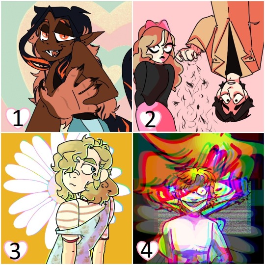
Complex characters, flat color - $30
Complex characters, flat color and shading - $35 (@sugarcoatedsadism's character's, Katrin and Avery!)
Complex characters, dynamic color and shading - $40
Crazy shit - you want crazy shit? We got crazy shit! Things that fall outside of the usual artistic process and will require extra time to render, such as major glitch effects, any larger scale particle effects for magic/ethereal glowing, etc. will add $5 :)
Full Body!

Simple, chibi style flat color - $25
Complex characters, flat color - $45
Complex characters, flat color and shading - $50
Complex characters, dynamic color and shading - $60
Additions
Adding an additional character to a piece will increase, typically by adding the same value for each character. For example, if you want a full body, flat color of two characters, that will be $90, but if you wanted 3, it would be $135. If, for some reason, you want two chibi icons staring at each other, it would be $10, as opposed to $5 for one :)
Simple backgrounds run for an additional $5, but complex backgrounds will add $10. If you want me to illustrate a room or location behind the characters, we can discuss that! Having a simple color background if free ofc. You can request a transparent version along with any character commissions btw, also free of charge :)
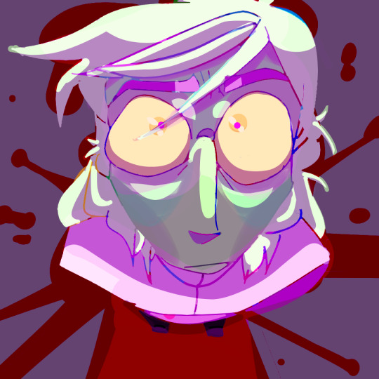
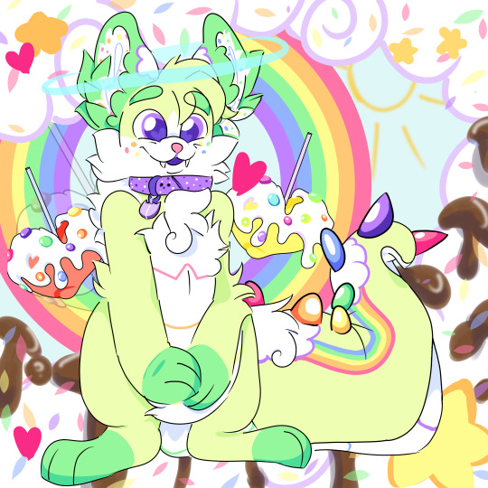
Simple (blood stains, shadows) on the left, Complex (ice cream mountains, rainbows, doodle sky, etc.) on the right :)
Will's and Wont's :)
Will Do: OCs, fandom OCs, canon characters, fursonas, light gore, mild NSFW content.
Won't Do: Pedophilic or bigoted content (sadly have to disclaim that), extremely complex characters (intensive armor, mecha, etc. simply because I cannot do them justice, and as such cannot morally take your money to do so.)
Will Gladly Discuss: Real people, animals (pets, ferals, mythical creatures, or OCs! I just need to make sure they fall under my capabilities, as to not rip you off), gore, NSFW content, sequences, mini comics
If it does not appear on this list ^^^ feel free to ask! I'm new to this, and sadly don't know all the bases I need to cover yet!
I also offer GIFs, comics, and sequences for comission! Examples and prices can be seen below! Trigger warning for flashing lights on some of the gifs, for those with epilepsy or photosensitivity - You have been warned!
Additional Offers!


Simple Gifs - Depending on the level of complexity, and which of the three styles of character commission you want, I'd have to make an estimate, but I can give you examples based on these!
Flashing, bust style of a character with fairly simple shading - $30 :)
Complex half body glitch gif, with flat shading, two characters present, and extensive effects - $75
Color changing full body, with fairly extensive effects, and dynamic shading - $65
I am also open to...
Discussing doing a short comic for you (2-6 panels max) charging by the panel and the level of complexity of each!
Sequences, like werewolf/monster transformations, character interactions, etc. Similarly priced as above, and also require some discussion of expectations beforehand!
Here are so sketchy examples, that I haven't converted to digital form yet! (Click for full view, since one is vertical, and one is horizontal!)
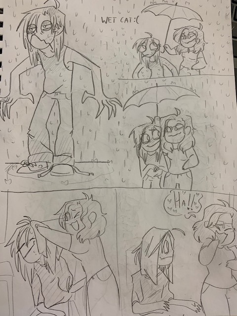

Rates were achieved via my state's AVG minimum wage ($10.30)/by hour spent on each kind of art :) and then adjusted if I thought it sounded ridiculous.
#commission#drawing commisions#gif commissions#commissions open#anthro art#fursona commissions#my art
3 notes
·
View notes
Text
New York Times: The Dollhouses of Instagram
'Instagram-inspired enthusiasts are making their interior-design dreams real — only 12 times smaller.

(Image: Trisha Krauss)
By Ronda Kaysen, March 13, 2020
'The kitchen that Jessica Coffee designed checked all the trendy boxes: white Shaker cabinets, a subway-tile backsplash, wide oak-plank floors and an open-concept floor plan, with views into the living room’s shiplap walls. The photographs she posted on her Instagram page evoked enthusiastic comments from followers, who gushed about high-end details like the water filler above the stove.
The only drawback? Ms. Coffee, 40, can’t actually serve a meal in her kitchen, at least not a real one, because the room, like the rest of the house, is built to a 1:12 scale — that 36-inch chef’s stove is actually three inches long. It’s in a dollhouse that sits in the real-life master bedroom of her home in Walla Walla, Wash., which looks nothing like her amazing tiny one.
“People are always like, ‘Ooh! I would like to see your real house.’ No you wouldn’t. I live in a house that is barely 1,000 square feet with three kids and a Great Dane,” said Ms. Coffee, who sells her miniature designs and posts online tutorials at Jessica Cloe Miniatures. “My dollhouse square footage is much better than my actual square footage.”
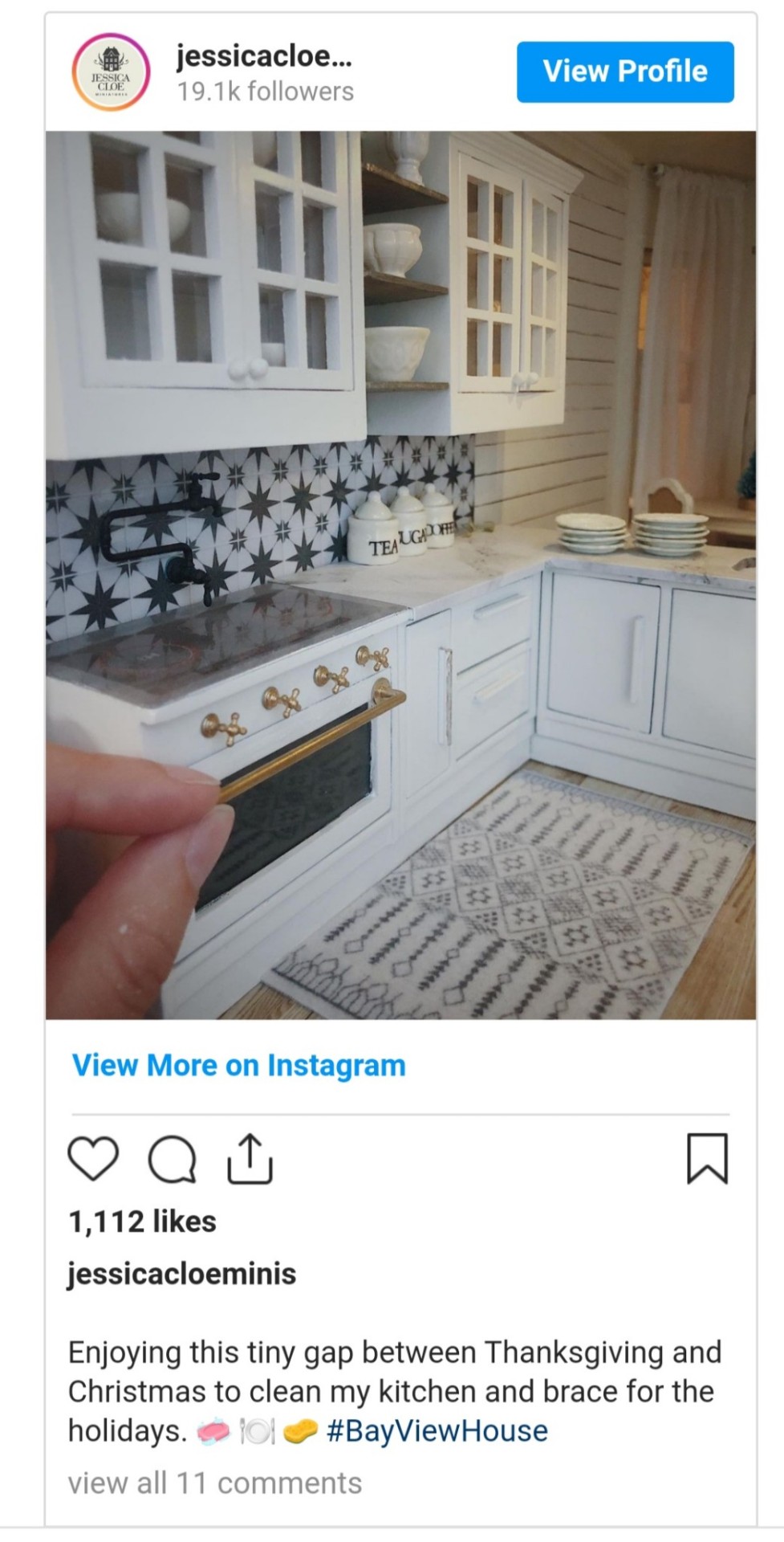
'Ms. Coffee is among a growing community of artisans who have turned the craft of dollhouse making into an exercise in aspirational home design on an itty-bitty scale, with their tiny rooms and furnishings displayed on well-curated Instagram accounts with glossy photographs and videos set to music reminiscent of “The Fixer Upper” on HGTV. Scroll too quickly, or miss the photograph with a human-scale hand surreally poking into the scene, and a viewer might confuse the image for a real-life one, the type of image that leaves you feeling equally amazed by and envious of the enormous kitchen island with a soapstone countertop.
These dollhouse makers and collectors say we’ve entered a miniature Renaissance. Call it a Mini-Aissance. “We’re living in it now,” said Kate Esme Ünver, who curates miniatures on her Instagram page Dailymini, and is the author of the 2019 book “The Book of Mini: Inside the Big World of Tiny Things.”
Social media has turned what was once a niche hobby into a decidedly trendy and increasingly profitable business, making it easier for artisans to find each other and potential customers online. The Instagram hashtag #dollhouse has 1.65 million posts and #miniature has almost 4.3 million, a mix of posts from people making miniatures and those sharing what they’ve found. Victorian-era lace and antique armoires are being scrapped for midcentury modern chairs, fiddle-leaf fig plants and sputnik chandeliers. House Beautiful took notice and commissioned 11 interior designers to reimagine a Victorian dollhouse in their own style, auctioning the decidedly contemporary finished products at the New York Design Center on Feb. 27.
In the past six months, searches on Etsy for 1:12 scale furniture were up 39 percent and searches for dollhouse rugs and miniature items were up 20 percent from the same period a year ago. A search on the site for dollhouses yields 237,000 results. “It’s certainly a trend that’s rising,” said Dayna Isom Johnson, an Etsy trend expert. The popular items — miniature succulents, bath salts, word art — point to an interest from the grown-ups, not their children. “Maybe there are very sophisticated 10-year-olds out there who want a midcentury sofa, but I assume these are adults who want to take this on as a new hobby.”
Chris Toledo, 34, who showcases his diminutive creations on the Instagram account I Build Small Things, has watched his business soar in the past two years thanks to social media. He now sells his dollhouses, designed in a nod to the 1920s architecture of Los Angeles, where he lives, for $150,000 to $200,000 apiece.
“Before, miniatures were only publicized through miniature magazines,” he said. “Social media put it in everybody’s face.” His homes feature intricately detailed rooms, like a kitchen with a subway-tile backsplash and a schoolhouse pendant light that would look real if it weren’t for the life-size head of garlic positioned in the middle of the room.

'While some artisans specialize in furnishings and décor, Mr. Toledo focuses on the architecture, selling complete dollhouses as well as individual rooms — like a bathroom in a shadow box — for as much as $20,000. He designs the rooms by hand, milling moldings and using miniature tools, like a table saw the size of a shoe box, for carpentry work.
The advent of 3-D printers has opened the door for people without such advanced woodworking skills, too — to the disappointment of traditional dollhouse makers, who view such technology as taboo. Ms. Coffee of Walla Walla, for example, uses a 3-D printer to make smaller objects, like decorative pumpkins, which she sells for $5. She makes other items, such as throw pillows, using everyday materials and tools like glue, fabric, tweezers and quilt batting.
A year into her craft, Ms. Coffee now sells enough printable herringbone floors and cowhide rugs on her website to turn a profit, although still not enough to give up her day job as a graphic designer. She also uses the dollhouses to work out design challenges in the real-life houses that she and her husband renovate and flip. If she’s not sure about a floor color or a pattern for a rug, she can try it out on a tiny scale for a few dollars. Her actual home has the same rustic wide-plank flooring as her dollhouses.
While miniatures have long had their enthusiasts, this new generation of dollhouse makers is turning to idealized contemporary homes at a time when the real-life version is increasingly out of reach for many Americans. High real estate prices and stagnating wages make it difficult for many homeowners to consider a $100,000 kitchen with a farmhouse sink and a Wolf stove. But you could have a very little one — or three of them, and fill them with teensy espresso makers, cheese boards and bottles of Dom Pérignon. Like the idea of a barn door, but don’t actually have a place to install one? Tuck it into the dollhouse attic, and if it grows tiresome, refurnish the entire room with rattan chairs, a shag rug and a soft pink palette.

'Kwandaa Roberts, an OB-GYN in Philadelphia, says she has found a following on her Instagram account, Tiny House Calls, among millennial women who pine for a prettier house. “They don’t have any money and a lot of them can’t afford to buy houses and they’re living at home with their parents or in a tiny apartment with roommates and they can’t do design and all the things that they want to do,” she said. “But like me, they can get a lot of their creative energy out on a dollhouse.”
Dr. Roberts, 47, a single mother of two, started her hobby two years ago when she bought a dollhouse at Target. She intended to give it to her daughter, now 5, but instead found that it filled a creative longing she had to be an interior designer. She painted it, added wallpaper, and details like a brass soaking tub and a kitchen with a waterfall countertop. She made furniture by hand with supplies she bought at Michaels. “I’ve always loved interior design, had a huge passion for it, and may have gone into it as a career had I known that was a thing,” she said. But when she was growing up, “there was no HGTV. Home Depot sold lumber; it was not what it is today.”
In her tiny houses, Dr. Roberts has found an outlet, and an opportunity to reveal her projects on videos and photos she shares with her 47,000 followers. “I don’t have to redo my house,” she said. Instead, “I can have 10,000 kitchens and they will be fantastic.”...'
#dollshouse miniatures#dollshouse#doll house miniatures#dolls house#miniatures#miniature worlds#dollshouseminiatures#miniature#dollhouseminiatures#doll's house#new york times#instagram#chris toledo#Jessica coffee#kate esme ünver#jessica cloe#kwandaa Roberts#tiny house calls#house beautiful#interior design#1:12 scale#1/12th scale#long post#long reads
8 notes
·
View notes
Text
Hello and Welcome!
Over the past month or two I have gained a number of new followers so i thought id reintroduce myself and my main focus on this blog, my pokemon dnd project. So keep reading if you want to know what will be the bulk of this blogs posts!
Hi! My name is Yeesha Stone and i love to write and sculpt as well as work with others to make wonderful things. For the past few years I have been working on making DnD 5e race sheets for every Pokemon (example bellow).


(artist: @nitroxdraws)
I write all the text on the pages and find different artists to draw the pictures and end up with a wonderful collection of race sheets filled with art of all styles.
I also have recently started working on subclasses that fit well in the pokemon universe such as warlock subclass based around pacts made with UB.


(artist: twitter.com/Trustyalt)
I also have made unique character sheets to help keep all your pokemon dnd information sorted.


On top of making content to help incorporate pokmon into dnd I also sculpt minis of the pokemon dressed up as different dnd classes and have even started to looking into creating characters for commissions.

If you want to know more you can visit my website (dndpkmn.com) where you can see all the currently made race sheets as well as read up on the rules of how to play.
If you have any questions about anything just ask! I even have a Pokemon dnd discord that you can join to create or join your own Pokemon dnd games. (link at the bottom of the home page on my website)
#pokemon#dnd#Dungeons and Dragons#pokemon dnd#dnd pkmn#pkmn#yeeshastone#yeesha stone#clay#mini#art#pokemon dungeons and dragons#pkmn dnd#5e
13 notes
·
View notes
Text
Todoroki Shouto
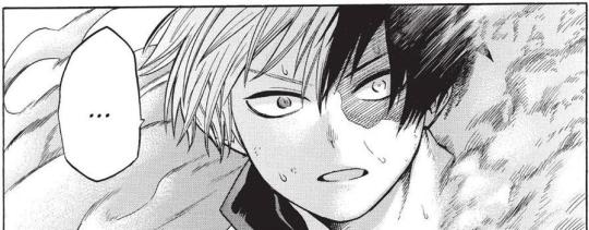
I felt like doing a character meme!
Favorite thing about him:
Is it cheating to say everything? It is? Okay… I love how he’s painfully kind while also painfully bad with people. I love how he swore not to use his fire half, and he took that oath so seriously that he felt pulling Midoriya aside to apologize and explain (in depth) was necessary. I love that his hand trembled when he went to see his mom—especially that he was so afraid of being like Endeavor, he couldn’t bear to show his face to her for years in case she mistook him again. I love how he learns from his mistakes, whether it’s combat-related like blocking his field of vision against Stain or emotional like realizing how his spiteful focus on Endeavor has blinded him to the needs of people around him. I love how he doesn’t feel the need to posture and act like he has the answers: he can openly admit he doesn’t know and that he needs to reflect more to find the right path for him. I love how rude he is. I love how he unquestionably leapt to Midoriya and Iida’s aid in Hosu. I love his fight against Midoriya.
Least favorite thing about him:
Hmm…most of my problems are with Horikoshi, not Todoroki. I like that Todoroki’s reaction to Endeavor vs the nomu was complex, that he was afraid for Endeavor, cares about him, and is ambivalent about the idea of Endeavor’s “redemption,” but I wish his love for his dad had more of a foundation—from what Horikoshi shows us, I have no idea why he cares about Endeavor other than a vague, dissatisfying “he’s my dad” feeling. Why are Todoroki’s feelings more complicated than flawless loathing? What’s the basis for his ambivalent affection towards Endeavor? I wish I knew more.
Okay, for about Todoroki specifically in-universe…I guess I wish he would talk a little more. He seems like he struggles with finding a middle ground between saying nearly nothing and oversharing.
Favorite line:
That’s a nasty scar you got there *SLUUURP* and are you All Might’s lovechild. I also loved it when Todoroki glared dramatically at Endeavor and then failed hard at introducing himself to the kids.
…And I love the line where Bakugo stridently claims no, he will not tell stupid Deku his brand-new, top-secret hero name, and Todoroki cluelessly asks, “Could you tell me, then?”
BROTP:
Midoriya, Bakugo, Yaoyorozu, Iida—I think those relationships really speak for themselves <3
This fic made me love Todoroki and Kaminari, please give me Todoroki working on his sense of humor and he asks Kaminari for help, only to repeatedly and ignorantly roast Kaminari while attempting to learn.
Also, Asui and Todoroki are really underrated; I feel like they’d have understated but interesting chemistry. They’re both exceptionally blunt, and unlike some of the others, Asui is perceptive+grounded enough to notice how awkward and uncertain Todoroki is (instead of the coolest, handsomest boy in class image). I’d LOVE to see them talk about their siblings, since Asui is the oldest and she takes care of her mini frog siblings, and Todoroki is the baby of the family who’s trying to figure out his relationships with Fuyumi and Natsuo (and eventually, Dabi). Oh, and Asui has more respect for authority than Todoroki does, so also seeing them clash over that would be interesting.
Or! Maybe Todoroki finally, accidentally catches Hagakure in one of his area ice moves and feels really bad about it, so Hagakure teaches him to watch out for her by making a game out of sneaking up on him. She also exercises some teenage flirtation in his direction and he has no idea.
Or imagine Jirou trying to figure out if Todoroki has feelings for Momo and accidentally becoming friends as she susses him out and realizes he’s an irredeemable dork instead of ice prince badass. She’s appalled he doesn’t know much about music!
OTP Rarepairs:
Todoroki/everyone basically, so it’s more interesting to talk about my todo rarepairs than run of the mill ships.
Todoroki/Shinsou is cute…they both enter class 1-a with the attitude “I’m not here to make friends” and get hit with a match versus Midoriya in the Sports Festival—oops! They both became heroes partly from antagonistic spite, to defy Endeavor / the stereotype of brainwashing, which throw long shadows over who they fear they could become, and despite being on the quiet side they’re both pretty dramatic. Idk much about Shinsou’s backstory, but he definitely has a bit of a depressed, wary aura about him together with his fiercely idealistic, “I will never be like that” attitude, a combination that would resonate with Todoroki.
Probably at first Shinsou would be pretty cold to Todoroki, since even after being accepted into class 1-a he’d have some lingering resentment for those who are naturally blessed and admission was a slam dunk, and, in an effort to prove himself against the quietest of the strongest students, he’d make it his mission to provoke+brainwash Todoroki. Despite himself, Shinsou gets attached as he tries to figure Todoroki out, and he realizes the sorts of obstacles this “naturally blessed, slam-dunk admission” student had to overcome to get here.
In short, I’m a sucker for it ok, brotp or otp i’m down, but also in this case the romantic element of seeing themselves in each other gets to me bad.
Second rarepair, Todoroki/Hawks—hear me out ok!! These two would have the funny elements of Hawks/Endeavor but without Endeavor’s grossness. Even after he makes pro, Todoroki admires Hawks as the number two hero whose playful, casual MO is radically different from his own, more solemn style, and Hawks delights in being obnoxious and pokes fun at the straightforward, a bit dense Todoroki every opportunity he gets. Todoroki recognizes Hawks’s playful demeanor and knows he’s joking, but…being a dork…he doesn’t know what to say, so he just responds with total seriousness. Hawks is perceptive enough to know Todoroki noticed the joke, and Hawks’s awareness of that transforms Todoroki’s awkwardness into a dry, deadpan sarcasm, and the two of them can actually, like…have banter.
Working with Hawks semi-regularly, Todoroki has to rise to the challenge of meeting Hawks’s quips with enough insight and empathy to intuit the bleaker truths behind Hawks’s facade as this guy who doesn’t want to work too hard. Todoroki grew up as Endeavor’s tool, Hawks grew up as the hero commission’s tool; Todoroki responded with defiance, Hawks responded with salty compliance; Todoroki prioritizes his personal moral compass over the law/government, Hawks prioritizes the government over both his moral compass and the law; and Todoroki admires All Might, whom Hawks professes not to be so fond of, while Hawks admires Endeavor, knows Dabi, and all the obvious issues that brings up—so I think these two have tons of common ground to build a rapport and also clash with each other in ways that would be interesting for their development. For example, Todoroki can tell Hawks it’s your power and encourage him to take hold of his own destiny instead of being used, and Hawks can help Todoroki work on the shortage of social acuity he inherited from Endeavor.
I love the brotp but the otp has such comedic potential fused with such tragic potential, like by taking hold of his fate Hawks makes some choices Todoroki can’t forgive, and by helping Todoroki learn to connect to people Hawks opens him up for a world of pain when things go south, I can’t resist.
NOTP:
As long as the execution is good, I’m good. A ship that I hate in one person’s hands, I might love in another’s.
Random headcanon:
Todoroki is the #1 cockblocker in Class A. Nobody kills romantic tension like Todoroki wandering in, oblivious to what he’s just interrupted.
Also, Fuyumi gave him The Talk.
Unpopular opinion:
Hmm…not sure how unpopular this is, but while Todoroki understands that Endeavor abused Rei, but I don’t think he understands that Endeavor abused him too. Clearly Todoroki understands that it was bad, but now he’s one of the best students in one of the best high schools in the country instead of on a psych ward (Rei) or in the ground (Touya), so he doesn’t realize just how bad it was. Sort of a, “I was strong enough to take it, so it wasn’t really bad, not like how he was to my mom.”
Also, I love tododeku and I love dadzawa, but I’m frustrated by the number of fanfics that portray Todoroki as meek and crushed under Endeavor’s boot, in need of rescue.
Okay, one last one, because I’m not sure how unpopular any of these actually are. I think Todoroki is actually pretty anxious to fit in with his peers? Like he seems pretty aloof and doing his own thing, but I think it’s more due to uncertainty over what to do than because he’s that naturally withdrawn.
Song I associate with him:
Unbreakable by Miracle, Ember by Katherine McNamara, and Brave by Riley Pearce come to mind.
Favorite picture of him:
OKAY HERE ARE A FEW
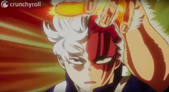
VS Midoriya – Todoorki’s whole awakening, self-actualization sequence is beautifully, beautifully animated. I love the flashes to black and white and the graceful, profound arc of Todoroki raising his left hand.
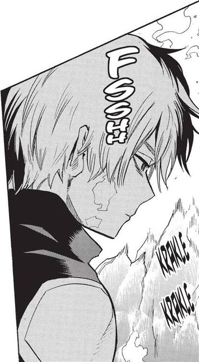
Ch43 – His haunted expression when he extinguishes his fire, forfeiting to Bakugo.

Ch63 – He looks so sweetly earnest when he realizes he screwed up by disregarding Yaoyorozu’s opinion, and he immediately takes action to fix it.

Ch112 – His badass expression when he and Inasa wordlessly team up.
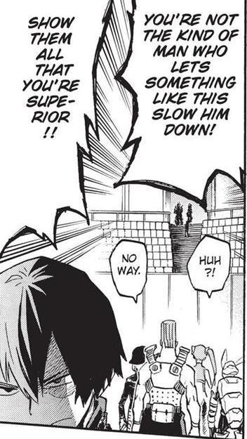
Ch164 – His sour, cross expression when Endeavor embarrasses him.
I had to make some painful choices on which scenes to leave out, but I think five is enough.
I’ve also done these questions for Bakugo, Uraraka, Endeavor, Amajiki, Sir Nighteye, and Shinsou!
#todoroki shouto#shoto todoroki#bnha#nerd mumbling#todoroki#text#ask meme#todoshin#todohawks#kaminari#asui#hagakure#jirou#shinsou#hawks
75 notes
·
View notes
Text
Writer Notes: The Wicked + the Divine 43
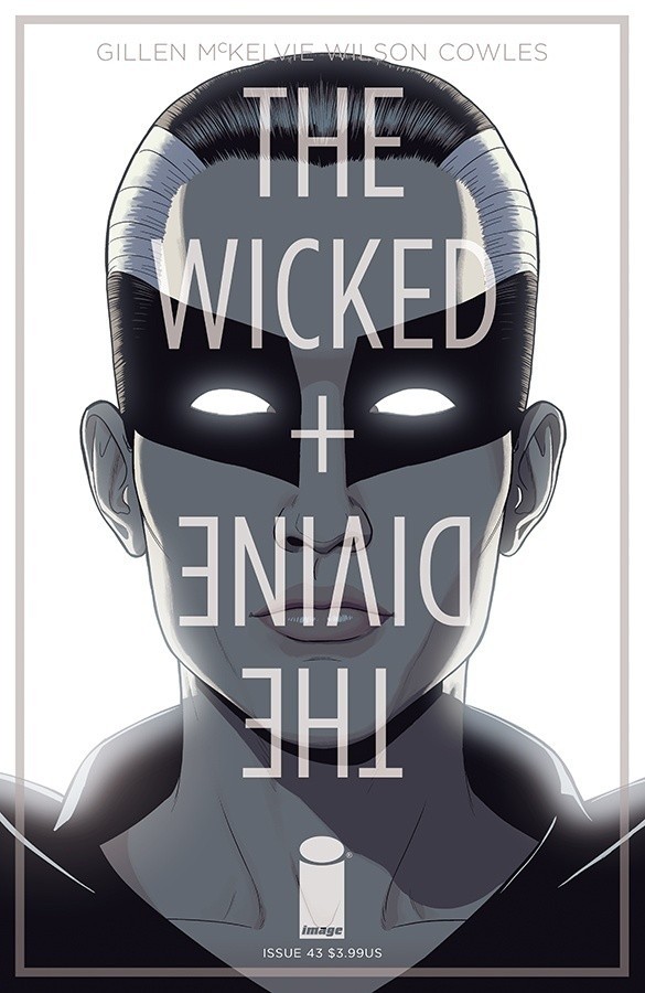
Spoilers, obv.
Issue 44 comes out tomorrow at the time of writing. As I’m on the west coast of the USA, it will be just after midnight GMT by the time they’re online. So abstractly, this is the first time ever which we come out when the next issue is out. Abstractly. I’d say the day counts as where I am, and doesn’t Comixology come out a little later? We’ll see.
It’s also been so long that I almost wrote notes for issue 44. This is a weird goodbye, this period.
Anyway – Issue 43, wherein we finish explaining all the big stuff we’re going to explain.
I mean, there’s more in issue 44 and 45, but it’s all details, with the denouncement really being based around the characters’ response to this issue. They know the truth. Now what are they going to do about it?
That was the main note I gave in the script to the team – if there’s any really big questions you are confused about, now is the time to say, as this is the best clarification it’ll get. As such, we worked on it a lot to nail what we wanted to say – and what we didn’t. Sometimes this meant actually simplifying a little to avoid repeating huge amounts of stuff and leaving people even more confused. More often it involves sliding in a little nod to something someone would be thinking about.
It’s an interesting issue, I think. It’s where we show a lot of our hand.
It also involved a lot of crunching.
Jamie/Matt Cover
Cassandra finally gets her head cover. Normally a cover relates to a key beat, which isn’t true here – except in the widest possible sense that it’s where Cassandra gets to say I Told You So to everyone, including herself.
Jason Latour Cover One of the fun things about commissioning these covers is getting to see a creator’s process close up. Jason’s process on this was amazingly never-ending – he was always tweaking, and trying things and moving in a different direction. Where he ended was stunning – very him, and very WicDiv too. I remember us and the Jasons semi-jokingly about swapping books for an issue – they do WicDiv for an issue and we do Southern Bastards. This cover absolutely makes me wonder how amazing that hypothetical issue would have looked.
(Our story would have been about a Taylor-Swift-esque-singer/songwriter-before-she-got-big in the town. And probably murder, as it’s Southern Bastards, right?)
IFC
That “Life goes on” still creeps me out.
1-2
Opening vignette that lets us establish what Minerva’s plan is now, as well as re-establish Beth and her crew, and actually let us define their current position, and even give their codenames, which have existed in the Bible document since issue 1, I believe.
(Oddly, calling people “Boss” is one of my verbal ticks. It seemed fun to give it to Beth here.)
As such, Minerva immediately HiveMinding them when they’ve just stated their agency is plain harsh. Jamie’s large panel on page 2 sells it incredibly well – the statues, Minerva walking away from us – it’s all so casual.
It’s also the running theme of the issue – what Mini has been doing all these years. This is just a particularly direct example of it.
Three panels on second page to try and stress the seriousness of what this is (Space = Meaning, remember). Of course, as the issue shows, this isn’t the real part of the issue – but you have to at least believe this is a real gambit. And it is – I mean, it’d be awful if Mini pulled it off. But in people’s guts they’d realise this isn’t how WicDiv goes, right?
Minor glorious Matt Wilson note – the crackle of green in panel 3 is wonderful. Give that guy another Eisner. He deserves a hat trick.
3
Show time in the showbiz and the “time to show you everything” sense.
4
Establishing the stakes and situation for the heroes. There’s a draft of the issue I wrote which is a couple more pages long, which would have pulled this out a little more. In the end, we decided it worked better shorter – I’ll tell you why when I get there, and we could use the space elsewhere.
Key thing is showing some response to Cam’s actions at the end of last issue – it’s important to know that they haven’t just walked away, right?
In the first panel, the “identify who is speaking” is a tricky one. The “say the character’s name” is a little brutal move, and I avoid it. We’re not that book. Dio is easy – and Lucifer, bless her, is immediately identifiable by her idiom. Her line also reminds people of what she’s like, which sets up the last page.
Laura’s captions here again, doing a lot of the heavy lifting.
It says so much about this issue that the last two panels are only a half page total. These are big rock and roll images, presented in a tiny space. Jamie’s composition makes it land really well, selling the drama.
Page 5
It says even more that we did all this in a page.
Tara’s move in the original version was basically a page, but looking at it structurally it actually left it even more underwhelmed – a fight kicked off, and then heroes were losing, and then Tara does this cool thing, and they’re winning, before immediately the hive mind kicks in and they’re losing again. This does not sell the joy of Giant Woman.
This works better, not least for sheer audaciousness. I used to have a thing about tableau based storytelling – the idea that you can create a large image which people can explore and juxtapose it with a few captions to create a larger conceptual space. This is very much that.
“People treating people like meat” reminds me for the second time when re-reading this issue of the line from Pratchett: “Sin is treating people like things.” The first time was the puppets bit. I’d agree with Pratchett, clearly.
In the original draft of the script I had a line “You want more? Go re-read Rising Action” which is a bit too cute, so I lost it. It’s not really the sort of thing WicDiv does, anyway.
Yes, Giant Woman is a Steven Universe nod. Putting aside that image of Giant Tara kicking ass which has been in my head forever, there’s so much to love in the image – to pick a small part, how about the Norns blasting in triplicate? We rarely see them act like this.
You can also trace via the colouring which of Beth’s crew have duplicated which God’s powers.
Page 6
There’s been a lot about people copying people’s powers in WicDiv, and trying to find out what someone can and can’t do, and then using it against them. This switches it up. The thing about being creative instead of a straight plagiarist that creative people make up new shit. That’s kind of the point of them.
Once more, Matt showing the dance of the colouring between the Woden green (haunting the series like a ghost now) and the joy of Dio is (er) a joy.
Page 7
Another Matt moment – we step out of the club, and we drop to greys, before building the energy up.
I’m not quite sure how long Robin has wanted to punch Beth for. Or how long I planned to do it, even. I can imagine Robin thinking of this a lot though – she’s the one who takes a long time to snap.
There’s a dual structure here too – there’s two main compare-and-contrast bands in WicDiv. Beth’s and Cass’…
Page 8
And this is a very different kind of band break up.
The problem here is different – I want to give much more space. First draft it seemed that they got talked into it really easily. But it’s all the space we had so what to do? Once more, captions. Silent panel with captions can be timeless, and gives room for our minds to populate it. It’s been so long I can no longer remember if the fact the two almost-silent characters are shouting, but we’re not allowed to hear, because it’s private seems relevant.
Page 9-10
Hard cut made easier with the caption. Captions are great. Trust captions.
The shot of Mini at the edge, just looking back with space either side is great. Just the isolation of it.
The “try to sing” on the page turn seems a meaningful reveal. Can she?
No she can’t. This is another very old beat in the founding documents – it’s hinted at on page 9. Mini says that she gave it up – and she said the same in issue 9. I’m not sure I believe her. When planning it I realised that some people would take it as a comment on Work for hire – don’t get stuck keeping a story alive forever, as it will eventually atrophy your talent. It wasn’t planned, but I’d be fine with it as a reading. When Chrissy read it, she took it as “Don’t get stuck in art management.” which works too. Readings are fun.
Anyway – a performance. That the big thing in the issue is a performance rather than a fight is very much WicDiv turning towards its core concept as we head towards the final straight. Of course we’d do this.
Yeah, Matt and Jamie, killing it on the final panel of the second page – the Persephone-esque tentacles made something else, because she is something else now. The numinous expression of Minerva. Amazing.
Page 11
The borders in this sequence harking back to the Persephone performance in issue 18.
I may actually try to tweak this sequence in the trade and have a different execution of “When I was 14” and all the rest, to work a little more like a LOC CAP rather than a speech. We couldn’t make it work given the time before deadline. That’s the odd thing about our extended issues – just because it’s taking longer doesn’t mean we have more time to do tasks, right? Some things are only possible when the whole thing is together. It works, I think, but part of me wants to push it harder.
Anyway – these two. I loved writing them though. I said it back in the other flashbacks, but how the two of them dance is a delight. Hell, doing them across a lifetime is a delight.
Okay – I’m going to give you a name for Ananke’s sister. It’s the one I used in my notes. It’s no more her name than “Ananke” is really Ananke’s.
It’s Demeter. Ask me about it another time.
Page 12
The “god” in panel 2 is a Proto Norn.
This primal gathering brings to mind issue 9 as well.
Demeter’s expression in the penultimate panel? Love it.
Page 13
The captions are Laura’s style, but changed colouring. That Laura is helping Minerva performs means it comes across in her voice, was our thinking.
Captions are once more useful though – trying to get something that is evocative, but also clear was the battle.
(The Colours here!)
She-in-Thirds is a name-behind-the-name. The Maiden/Mother/Child archetype – the one which Ananke subverted in a few pages time.
Page 14
I find myself thinking whether the return to a close-to-eight panel for much of this is meaningful. This is kind of Bronze Age Phonogram.
Reading this I wish I had capitalised The Rebel – it’s another archetype. Proto-Lucifer. I’ll tweak for the trade.
I forget when the metaphor for a song for the “godhood” in WicDiv came to me, but it feels like the right one. It’s how songs often feel to me.
Page 15
If you go back to issue 34, you’ll see some of the details of this plan are different to the plan that Ananke has put into play there. In fact, the deal that she strikes in issue 34 is akin to what she wants here. It’s mainly for clarity – the reader needs to be reminded of what’s actually going on, as they won’t necessarily remember the details from way back then. I figure this is the plan she wanted to do, then found something else when Demeter wasn’t into it, before swooping around to something closer.
Page 16
“After all my friends were dead” gives a little flex in the timeline.
I do like Ananke’s hat.
“The Great River” being the Nile, and the pantheon we saw back in issue 36.
In terms of lists of things in this issue I was looking forward to write, the first meeting between Ananke and Minerva was certainly one of them. I tried to get something of the oddness here. Jamie and Matt manage to get the mood of issue 34 again too – I really do like this bronze-age western vibe. There’s a project I keep on thinking about doing, and it has some of that too it. Hmm.
Yes, page width panel of character delivering a line remains a key WicDiv tool. There’s so much I love here – the touch from Ananke, whose PoV we’re in. Minerva speaking to herself, speaking to us, etc.
That the knife is just sentimental is a minor beat I’m very fond of.
Page 17
Once more, Captions, as Laura makes sure we all Get It.
One of the debates in WicDiv fandom has always been whether the gods are picked by Ananke (i.e. Anyone could be a god) or whether they’re actually people with a gifts. Of course, the answer is that it’s both.
The thing I least like about WicDiv’s mythology is that the 12 people are people with this gift, for obvious “Ugh Chosen Ones” reasons. There’s some things that mitigate that a little, I hope, and not least that it’s clearly transferable to wherever you are in life. The core of it is “if you find yourself with a gift, be careful with it and use it responsibly.” It’s a book about the power, privilege, dangers and seductions of being an artist and all that. It’s only when writing that sentence do I realise how tired I am. This has been a busy week. Excuse me if the writing is looser than usual.
Anyway, I’m probably over-worrying. If X-men is fine, we probably are too.
So – end of the page is a download of some of the explanations of stuff folk will inevitably be going “Wait – what?”
And then Tara steps up.
When you’re writing a large group scene, with limited space, there’s choices you make of who speaks and who doesn’t. Who’s going to have the strongest counter-argument to something? Who’s going to have the biggest reaction? Them. They’re the one who carries the scene.
Which is Tara. Perhaps you could make an argument for Baal, but Baal is reeling through all these issues – plus if you choose one or the other, you tie-breaker would be who hasn’t had spotlight.
Page 18-21
And the counter is equally inevitably Cassandra (who is also in the process of beating herself up). Being Cass, she puts it harshly. Clearly, this is going to get a response from Tara.. and Cass opens up herself and makes herself vulnerable. Which is a hell of a thing for her, right?
I’ll stop this – I’m just walking through the emotional flow, but I love these two women here.
Which segues into the last formalist style thing of the issue. Once again, we have a space = meaning problem. This is clearly the most important sequence of the issue, but we have so few pages. We turn to one of the core WicDiv moves of black panels in a six panel grid, and loading them up with text. Suddenly we have a sense of ritual, a lot of dialogue produced in a stylistic way and most of all a whole extra page (hence an extra page of weight).
It’s also a complete showcase for Matt. The last godly panel of them is them at their most Godly, this final little iconic burst. A confession, and it’s gone.
I cried when I got the colours for this. I forget which one it was – there’s just some wonderful Jamie expressions in there as well.
Choosing the confessions was definitely tricky. We have space, but too much is too much. Some of them I kept simple, and others needed a little space to explain. The ordering was also one of those processes where you feel out the character, and think how they’d speak. Dio would clearly jump in, then Inanna, then Mimir trying to just piece it together, and all leading to Baal.
I did try and write a Baal caption, but any words were just too small.
And then, of course…
Page 22
You’ve probably seen me talking about year 4 as Solving The Equation. Yes, we knew lots of the key things, but there’s lots of elements of the execution were worked, and rethought and discovered. I may be able to talk a little more about this in the last issue’s notes.
This was a big one. I was chewing over the synopsis and thinking… a battle against Ananke/Minerva is a little underwhelming after everything, right? At this point in the story, Minerva is a busted flush. In reality, Laura (and Demeter) won the intellectual battle against Minerva in Mothering Invention. She’s already beat her. It nagged at me. There was something else.
Then there was the other thing – I knew that Lucifer was going to get her body back, but I wasn’t entirely sure what she’d do when she had it.
The two came together: of course, the final confrontation isn’t between Laura and Minerva. It’s with Lucifer, the person who brought Laura into the world, the person who brought us all into the world. The girl who wanted to be on stage, no matter the cost. That’s the final battle.
And best of all, I had no idea what would happen.
Well – not quite, but suddenly a whole lot of things was up in the air.
Page 23
Song reference, obv. Always connected to something in my head in my early career. If I do writer notes for the playlist, I may actually tell you.
Oh – some people wondered whether all the skulls meant everyone was dead. No – it’s just there’s no god in the slot. I’m not that kind of shithead.
Anyway – issue is out tomorrow. Or maybe today, depending on where you are. It ends the story, with 45 being an epilogue with a somewhat different tone. Clearly, it’s a huge issue, so be a little careful with your tweeting. The last cover is especially a big spoiler.
<!-- @page { margin: 2cm } P { margin-bottom: 0.21cm } -->
Thanks for your patience and thanks for reading.
117 notes
·
View notes