#love the textures and colors and composition
Explore tagged Tumblr posts
Visit Tumblr Blog
Explore Tumblr blogs with no restrictions, modern design and the best experience.
Last Seen Tumblr Blogs


Fun Fact
69% of Tumblr users are millennials.
Note
Hi hello!!! I want to say I LOVE your fearlnette au its so good!!! I been binge reading it. I’m amazed how much character and detail and emotions depth there is!!! I simply adore the artwork, the colors??? The background symbolism, the hidden hod eyes and alya’s fox ears??? AMAZING 10/10.
I’m super curious on how you make the comics, like how long it takes and what program you use. What made you decide to have each panel or centric scene have certain colors? Was it a style choice or something else? I love the way you wrote marinette and Felix, they are such good characters and I love them. Adrien and kugami and good too!!
Also what are your thoughts on the canon show? How does canon influence or change your au?
thank u for all the lovely compliments! I'll start from the top
how long it takes to draw: -takes about a day to frame everything / rough composition / rough dialogue -another day for lineart - if I'm lucky, sometimes it can take two -another day for rendering everything -I usually spend my weekends working on the update between working fulltime at my irl job. each technical "update"/"scene" is anywhere between 50 and 80 frames long, posted in full on patreon, and they're cut up by sections to post on tumblr due to tumblr's 30 panel limit
what program: I use csp. i used to use photoshop but she's dead to me now
why the colors: I like gradient maps a lot and they're a good tool to manipulate the mood in a subtle way, or hint at things. they're also really pretty when using a style that heavily relies on contrast and texture, which ended up being the main bread and butter of feralnette
thoughts on the canon show: if I didn't at least have a kernel of affection for the OG I wouldn't be working on this au, but I will admit binging the shit out of the series during quarantine put it somewhere permanent inside me. as a whole it could use some polishing, or at least some sense of self. idk how to explain it, the series suffers from "a little bit of everything" and cant seem to figure out what it wants to be, which leaves it meandering on the genre board and that can make the characters' motivations and arcs lacking as a result.
how does uodating canon influence your au: for feralnette, it kinda doesn't. the comic takes place a bit after season 3 so everything that's established is established. for my other aus, it can add some crispy lore or step on its own toes and make me flinch like im dancing at a gala with an impertinent partner
276 notes
·
View notes
Text
^^^^THIS
THANKS FOR PUTTING IT INTO WORDS 💙
Dead crow
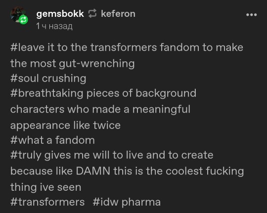
#guess tumblr reads my mind#BECAUSE I WAS THINKING ABOUT THIS EXACT MOMENT A LOT FOR THE PAST 3 DAYS#absolutely beautiful and gut-wrenching work#love the textures and colors and composition#tw robogore#tw blood#transformers#pharma#also#comparing him to a crow is a very cool idea
2K notes
·
View notes
Text
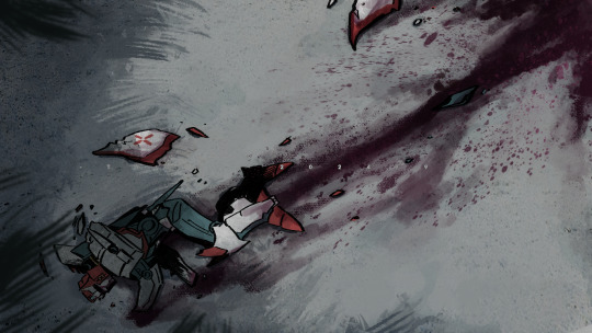
Illustration of Julius Mode from Castlevania: Aria of Sorrow and Castlevania: Dawn of Sorrow soundtrack.
#I love the color choice and composition of this piece#also how Arikado's coat and Julius' vest have the authentic leather texture#ayami kojima you're making me DROOL#and the red tendrils wrapping around Soma is another lovely detail#the eclipse in the background...cherry on top#oh how i love this#akumajou dracula#aria of sorrow#dawn of sorrow#julius mode#soma cruz#julius belmont#genya arikado#yoko belnades
287 notes
·
View notes
Text
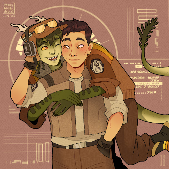
My bff @rexscanonwife commissioned @reallyhardydraws to draw my version of Gar and Malta from Smuggler's Run!
They look so good ; w ; I've been staring at this for like two days, no cap
What an age we live in where we can just pay people online to draw us some excellent art of characters we want to look at 😌😌
#reallyhardydraws#star wars#ohnaka transport solutions#Gar Faven#Malta Lan#Smuggler's Run#seriously if youve never commissioned reallyhardydraws go do that at your earliest convenience#spend your money on their art#love the textures and colors and composition ; A ;
95 notes
·
View notes
Text
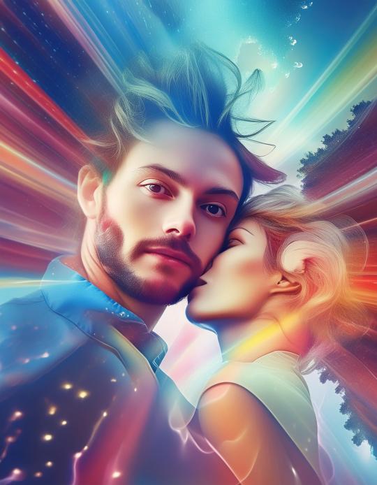
#art#my photos#ai art#artwork#inspiration#my art#artists on tumblr#fantasy#nature#arbre#lovers#romantic#intimacy#love language#desire#passion#couple#ai artwork#ai generated#ai#ai girl#digitalart#color photography#colors#colorful#texture#composition#colours#tumblr art#photographers on tumblr
10 notes
·
View notes
Text
mild disdain for watercolor bc everyone and their mother defaults to it and everyone sees my watercolor work and asks me why i dont default to it for assignments bc id get better grades on execution but i dont want to bc i dont like it and it doesnt fit anything i wanna make
#i think this is why i default to acrylic#the thing i love about watercolor is the challenge it gives me in terms of thought process and composition#it forces u to use vagueness to communicate a lack of importance#forces you to think out every brush stroke and your tonal range and plan the contrast to serve ur comp#its very very valuable and i think it does wonders for me learning and thinking out composition. same with ink#visually it is nothing that i want though#vibrant color. strong opacity. blocky geometric shapes to build up forms. texturing on the canvas. the ease of glazing and effects#theoretically i should use gouache but i just dont care to try rn and i dont have any anyway#i HAVE acrylic and i know how to use it#it just kind of sucks for precise work bc its great for general stuff but i cant just like#draw in the face rly quick like i would with watercolor. it feels more like i have to render and mold it and its time consuming#the gamer speaks uwu
3 notes
·
View notes
Note
I say this in the most loving way possible, how the fuck can you write the most expressive and magical tags ever?? How do you have the mental energy to form words? 50% I can only say "nice post op". You inspire me to spread positivity to everyone but I literally can't be this positive and kind all the time. Just want to send you love and know that I appreciate you <3
HKJGH AW RED!! :'] <3 it does take a lot of energy, i understand :'0 i keep a lot of cool art in my tumblr drafts. the art stays in there until i have energy to type all my thoughts out. a lot of things stay stuck in there… i try to make sure art from my friends get out soon though :0 don't feel bad if you can't type a lot!! anything you can manage is okay! no one can be positive and kind all the time, and that's normal! just do what you can. i promise it's enough. (<- these are things i need to remind myself too <3)
a lot of it is literally just me needing to scream hkjfh, i have a lot of thoughts and i love sharing them always. i love rambling, can you tell? (<- joke) also i have a lot of love to give and i love artists and their creations. like WOW someone made a thing!! and they wanted to share it with the world!! AND I GET TO SEE IT!!! i GOTTA tell them i enjoy it!!!!!
it's also my empathy acting up because im also an artist!! and he's like "hey!! you love people writing nice tags on *your* art!! imagine if you were this artist, wouldn't you be happy to see someone tagging it with nice things? :)!" and im like yeah!! if this makes me happy, i should make other people happy too :3
ANYWAY I APPRECIATE YOU TOO RED YOU'RE DEAR TO ME!! SENDING LOVE BACK!!!! <33
#my conceptualization and my empathy handshake WE GOTTA COMPLIMENT ALL THE ARTISTS IMMEDIATELY!!!#i used to take art classes and we were taught how to do art critiques? so i use a lot of that terminology too but only the compliments part#i don't remember much from those anymore but you'll see a lot of my tags talk about ''wow i love the warm colors you used here!''#''the poses are so dynamic!'' ''what an interesting composition!'' ''really good use of texture!'' <- it's basically habit now#talk about what you notice! talk about details you like! talk about how it made you feel! (<- did you laugh? smile? cry?)#truly sometimes i just write ''this made me feel indescribable emotions'' and thats cool too hkjhg <33 also uh. scream a lot?? :']#''WAAAAUHGKJH!!!'' <- very common in my tags hgkjh <3 i know it's hard a lot of the times though!! words are DIFFICULT... we try our best!!#it helps when its a character i know too lmao you'll see me YELL SO MUCH about a post with volition in it bro i will not shut up jhkjdh <3#or when theres a lot of things happening in a scene to comment on! like if theres a lot of characters or its a comic!#THAT'S MORE THINGS TO COMPLIMENT BABEY!! B) i just like supporting artists. we're all creating such cool things to show to each other :]!!#my whole fuckin goal on earth is to be kind and silly and loving and earnest so!! im trying my best hkjhg <3#volta transmissions#esprit: Red
3 notes
·
View notes
Text
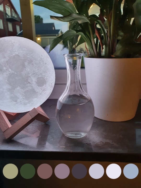
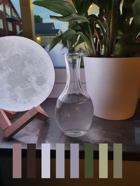
^^^ credit to this 💙gorgeous💙 pic from @moonlovingvampire for driving me back to the palettes because i love everything about it (including the moon lamp *eyes it enviously*)
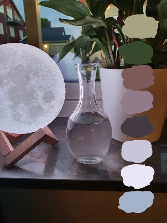
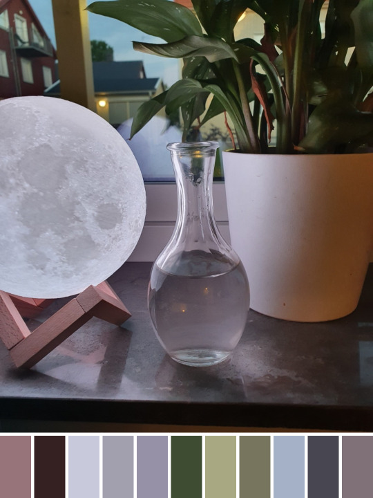
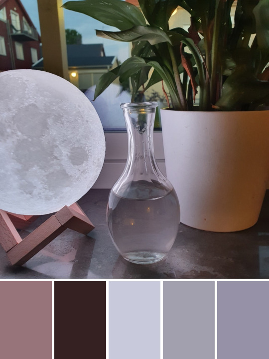

under the cut, the original suggested colors -
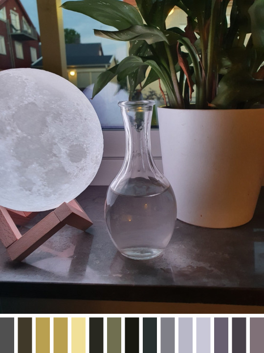
i know it looks for "accent" shades but COME ON
all those soft subtle organic hues and it grabs ... black, and the yellow of the one light in the background? for sure they are contrasts i guess
when i see a glowing moon at twilight it definitely evokes images of ... bees??? warning signs? crime scene tape? lol
#palettes#too good to just admire passively thank you for this it's stunning#like moon sky greenery wood water stone (it think that's granite or similar) and *light*#just everything visually - but also mentally emotionally - satisying to look at#fantastic composition as well - you are so right to be proud#god i love how the moon lamp looks - i keep almost getting one for myself but other things take precedence :/#your plant looks healthy too - all of mine are either going gangbusters with little input from me or like deathly unhappy#the colors are just SO GOOD#however i will mention again how gray is just the weirdest fucking thing in digital shading#like look here: every shade of gray just glows and has subtle hues hidden in it#but when you pull out the individual shades they are SO flat and boring unless you are very careful and picky#like select the wrong area and instead of the depth and luminosity you get like ... minecraft brick or 8-bit videogame 'castle'#just the strangest thing - and it throws all the other colors off bc it looks so artificial#i guess in nature nothing is ever really a flat gray so in the human eye it hits the uncanny valley easily#and the only other time you see unrelieved flat gray is like the painted walls of institutions or whatever#for sure there are lovely soft grays but somehow without the benefit of like ... textural variation on here it's a tough selection#there's your useless observation for the day hah#seriously though thank you again for the photo - it triggered a part of my brain i haven't really been using lately
9 notes
·
View notes
Text
back to school shopping sucks when you're autistic
#the one brand that has notebooks i vibe with doesnt have them in orange :(#and i need my notebooks to match the subject color or ill explode#no composition books no paper covers no weird texture pages#and they all have to be from the same brand#im gonna lose it#also i have to predict whether im gonna even need a notebook for a specific class#some teachers give notebooks? some make you only use composition books?#how am i supposed to live laugh love in these conditions
4 notes
·
View notes
Note
I like your new pfp! When I saw you changed it I assumed it’d be Jughead
HELP no i just changed it to be some harrowhark nonagesimus art that i like bc i've not been as into jason todd 😭 maybe one day i'll make it jughead lol. u should check out @pygmypouter, my icon is from this piece and they've made a lot of other really cool and beautiful locked tomb art
#im in love with their style and the colors and textures and composition is sooo stunning#but can jughead jones do THIS? (lobotomizes myself to forget the memory of the woman who was my best and only friend and companion since#birth so that i don't absorb her soul into my own because she killed herself so id ascend to godhood) i'll answer that he can't.#alex talks
4 notes
·
View notes
Text
So apparently I'm not allowed to use the good printer for personal projects, but that didn't stop me. Both Hami and I are enjoying the result 😊💕
Again thank you so much, can't wait to get distracted by this wonderful work of art every time I sit down at my computer 💕
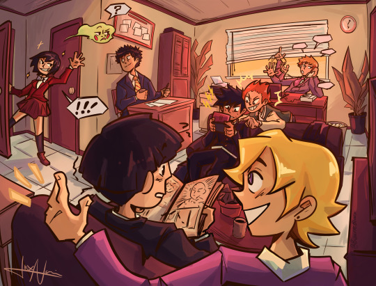
Here’s my part for the mp100 secret spirit! For @elo-h
I combined the prompts “spirits and such having a day at the office” and “the kids hanging out.” It was so much fun to draw
Thank you for hosting this, @mp100secretspirit
#still so obessed!!!#like the skill and effort you put into this is just amazing! and that you managed to pull it of in just one day!!!! just wow!#you drew a whole scene! with a fully rendered background and everything!#i love how lived in the space looks#i love the motion of the characters#like reigen's hands and tome's hair and how squished dimple is#i love serizawas sweet gentle smile I'd do anything to preserve that smile forever#i adore the fact that mob is reading one punch!#and how intense ritsu and sho are!!#there is just so much life and emotion in this piece and it warms my heart#and like the technical aspect is top notch too#the composition is stellar!!!#i adore the colors and how well they work together i love that I can tell which time of day it by the light the room is bathed in#the finer details too!!#like the contrast between the sharp lineart and the textured coloring is just 😘👌#i especially enjoy the highlight on tome's sock and how it fades out with the texture of the brush#the same with sho's sleeve#it's just perfect and I shall treasure it forever#thank you again from the bottom of my heart 💕
585 notes
·
View notes
Text
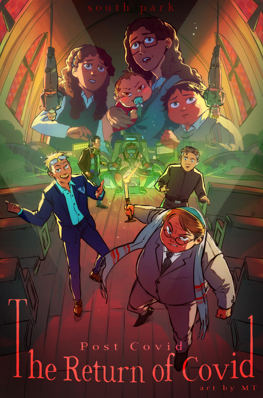
THE RETURN OF COVID Horror/thriller movie style!! I don't think I could find enough words to express how much I love doing those posters............ For this one, I felt like the cast of "antagonists" of the movie would make for a pretty awesome composition and mood, and paired with the church setting I think I got something pretty interesting, haha. More below!
As it happens, a fandom friend asked if I could maybe some day record my process, and therefore I did! (and went the extra mile adding goofy horror songs to it...) Check it out if you're interested :)
youtube
I've detailed it in the YT vid description as well, but my process is rather straightforward. I tend to be a "lazy person" in that I like to, ideally, spend the least time possible on anything, and so far this process is how I've best achieved that while still managing some rather complex pieces. I like to be extremely rough with my sketches and prioritize dynamism and composition, and I usually take my time repositioning the characters until I'm satisfied before I go any further. I don't have the best mental visualization so I usually try to have a very rough idea of what I want before I directly jump to sketching and mostly ideate there. The lineart is very straightforward as well. I come back later to adjust line thickness here and there but otherwise I just "trust my brush". The fake fisheye perspective is entirely wrong and made up so I needed some custom perspective lines to know roughly how to position the background elements.
I do come back with composition guides after I'm done with the lineart, just to check how the illustration is doing. I prefer not to use them at first because it tends to "constrain" me a bit too much, and I like to remain very free as to maintain a feeling of spontaneity, which is why I will only fix the composition afterwards (when I do). Coloring is then fairly streamlined, with background colors/atmosphere guiding the overall color scheme followed by character coloring and additional details. The most fun part comes with the post-processing, where I go wild with additional fog and light shaft layers to add depth to the entire thing. I use a bunch of additional tone curve layers to adjust the colors and make it more uniform, as well as one blurred, flattened copy of the illustration with strengthened contrasts, in overlay mode, to add some vibrance, and a noise layer for texture. That's it! Thanks for watching, for those interested :))
#south park#sp post covid#eric cartman#butters stotch#yentl cartman#scott malkinson#clyde donovan#sp kevin stoley#tweek tweak#craig tucker#moisha cartman#menorah cartman#hackelm cartman#Youtube
872 notes
·
View notes
Text
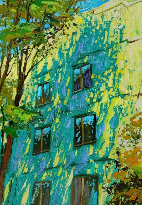
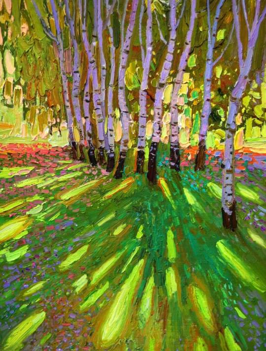
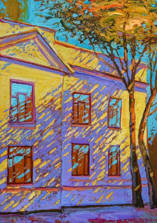
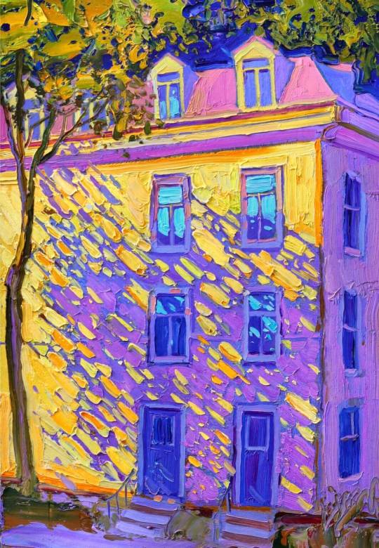
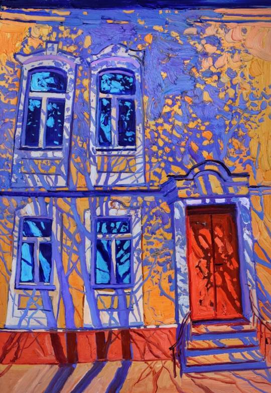
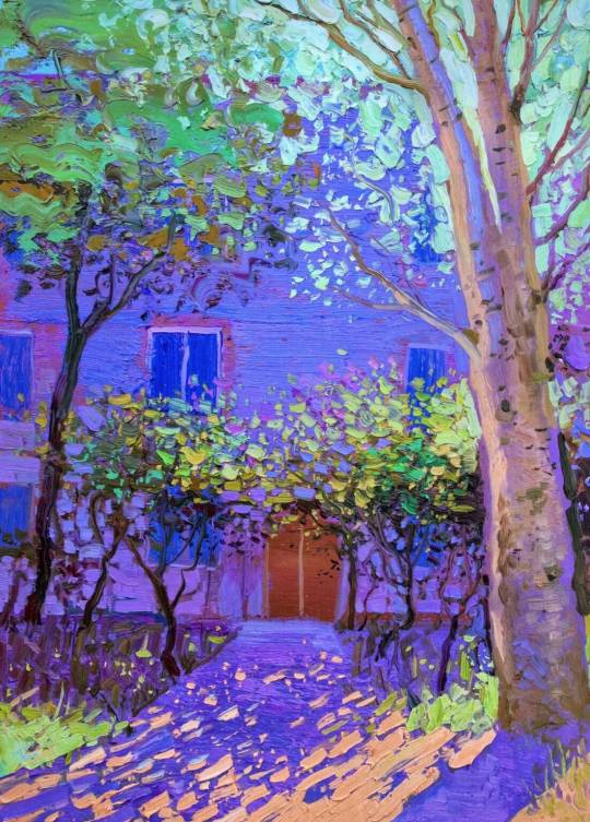
“Shadow and light are the most stable and perfect tools of creation: they unite colors, shapes, and dimensions,” says Moldovan artist Sergiu Ciochină, adding that “shadows move us through diversity, enhancing our perception, while light fills us with the joy of discovery.” In saturated hues, he captures dappled sunlight as it filters through the trees and the rich tones of the golden hour as it casts deep bluish-purple shade onto the sides of houses.
Taking cues from the Impressionists, Ciochină focuses on the nuances of light and its ability to reveal outlines and forms. He works in thick, impasto oil paint on board, emphasizing the shapes of windows, doors, and stoops and transforming otherwise ordinary buildings into compositions glowing with the patterns of foliage, architectural angles, and the texture of brushstrokes. “The symbiosis I create between nature and architecture is intended to evoke a love for space,” he says.
on Sergiu Ciochină
#i love the way he paints light#art#art moodboard#art details#art curator#oil painting#impressionism#impressionist art#contemporary art#traditional art#moodboard#aesthetic#sunlight#light academia#moldovan artist#french artist#yellow#nature#naturecore#artblr
891 notes
·
View notes
Text

art vs artist 2024 ✨ can't believe we're here!
i've been thinking about this year a little bit these past few days, with the holidays being under special circumstances for me. the past month passed quickly but very gently, which I'm grateful for all things considered. i think it's now safe to say that after some reflecting 2024 was one of - if not the - best year of my life. I've never experienced such a whirlwind of gratifying experiences in the span of twelve months: i met so many new and nice people, had my first con experiences in amazing settings and my first job opportunities in a field i wanted an experience in for a long time, traveled the world somehow, got 10x more attached to my characters than i already was - and I'm quitting the year with just as many projects as i did when i entered it. granted, new problems came up and still persist, but with every year that passes i get one step to catching up with the anxiety and fears that hold me back, and it's that one step that each time allows me to surpass fear and welcome something new. every leap of faith partially led to the beautiful things i experienced throughout the year like a ripple effect (partially). it's gratifying and humbling in equal measure. so cool!!
art wise, i'm a lot more satisfied with the direction my art is taking than i used to be in the past two years. i came up with brush settings that shifted my line dynamic and i discovered a new rendering technique i really enjoy that allows me to balance time-efficient with textured together. i think my art has been getting a lot more expressive and while sometimes it makes me feel like I'm straying away from a more sanitized, thought through illustrative style, maybe it's worth it for the feelings to be conveyed the way i want them to. i haven't gotten to a point where i'm experimenting with my shapes, compositions and palettes in a way that shakes up my habits in a good way, but I'll get there.
I've also come to realize while making the meme that i actually have very few finalized personal works to show this year! i made most of my personal work posts on a time rush (they usually were made for specific days). I've been working on a set of drawings that required some tweaking and a few days to sketch properly, but the result is worth it, I'm so proud of them!! i wanted to get them out before the NY but it convinced me that rendering had to take its time as well, i don't always want to rush things nowadays. being on a time limit and taking all the time necessary are both good drawing exercises nonetheless.
lots of rambling, but i had lots of thoughts. I'm so grateful that some people are still in my life as we inch toward the new year. to my moulin squad, to my tol staw, to all the new friends i made this year, to my kitty, to my family. i love you like the world. and of course, to all the people who follow my work from up close or from afar, thank you so much. to know i bring a bit of inspiration, thought and color into your day has a lot more worth to me than you can imagine. thank you for manifesting your interest and your support whenever you do!! 🙏
i hope you all have safe and healthy holidays 💛 drive safely and tell your loved ones you love them. my thoughts are with Ukraine and the people of Palestine.
#art vs artist#art v artist#art vs artist 2024#artvsartist2024#french art#french artwork#french illustrator#french illustration#myeart#art summary#2024 art summary
196 notes
·
View notes
Text
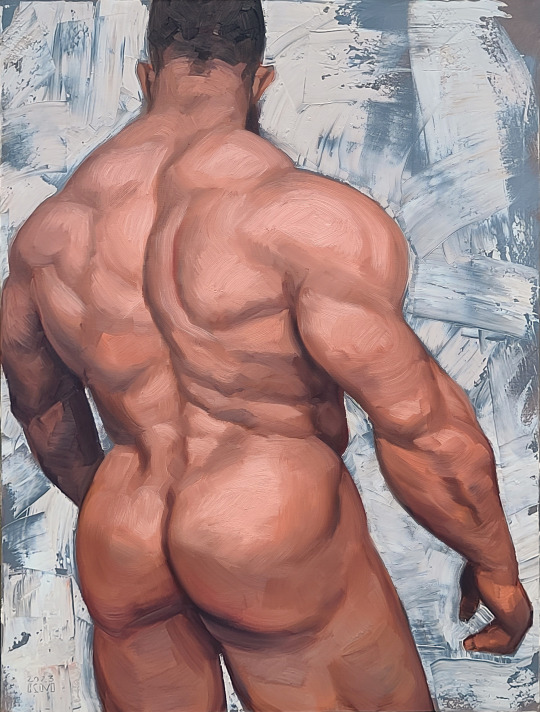
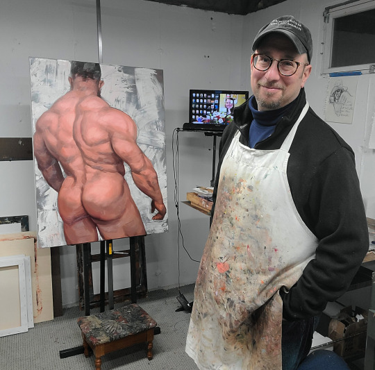
Why Kenney Mencher’s Champion is Great Gay Art 🌈🎨
Looking for a bold, statement-making piece that screams confidence and celebrates the power of queer masculinity? Look no further than Kenney Mencher’s Champion. At 30 x 40 inches and priced at $2,200, this oil-on-stretched-canvas masterpiece is a knockout—literally. Check it out here.
The medium, oil on canvas, gives Champion a luscious, tactile texture that captures every detail in the subject’s pose and expression. The thick, rich brushstrokes create a powerful sense of movement, as though this figure is about to leap off the canvas. The color palette is saturated and intense, with bold reds, earthy browns, and deep blues that convey strength and vitality. The chiaroscuro shading creates dramatic contrasts, emphasizing the athletic build and conveying a sense of depth and emotion. This isn’t just a painting—it’s a celebration of confidence and individuality, perfectly encapsulated in an unapologetically queer lens.
Style, Symbolism, and Why It’s Perfect for Your Space
Mencher’s style is naturalistic yet slightly stylized, capturing both the physical power and emotional depth of the subject. The lines are strong and deliberate, emphasizing the muscular form, while the asymmetrical composition keeps the eye engaged. The subject exudes confidence, with a hint of vulnerability, making it a perfect representation of modern queer masculinity.
This painting fits seamlessly into any gay man’s home, whether you’re rocking a sleek modern aesthetic or a cozy, bear-inspired den. Champion is more than art—it’s a reflection of queer strength, pride, and community. It celebrates body positivity, individuality, and the beauty of being unapologetically yourself.
Kenney Mencher: Master of Queer Storytelling
Kenney Mencher’s work stands out for its ability to tell deeply personal, queer-centered stories through classical techniques and bold, contemporary themes. Champion is no exception, showcasing his skill at blending realism with modern sensibilities to create art that resonates with LGBTQ+ audiences. Whether you’re a collector or just someone who loves bold, meaningful art, Champion is a must-have for your walls.
So, what are you waiting for? Add Champion to your collection and let it bring strength, pride, and a little bit of Mencher magic to your space. 🏋️♂️✨
#KenneyMencher#QueerArt#GayArt#PrideArt#ChampionPainting#LGBTQArt#MasculineArt#ModernArt#ArtCollectors#StatementPiece#OilPainting#GalleryWallGoals#QueerStrength#BuyArtOnline#PrideAndPower
97 notes
·
View notes
Text
the thing with "rendering" and "polishing" and "cleaning up" your art is that the human brain actually loves it when there's some ambiguity in an image to use its pattern recognition on. years, decades, centuries of artists joking and complaining about how the sketch looked better than the finished thing, all because the sketch had that sweet unpolished ambiguity.
"rendering" is a tempting thing to chase because it is very easy to identify and quantify, including and especially for people who don't know all that much about art. "realism" in visual art is a metric that people grasp pretty much instinctively. you can tell the amount of detail something is rendered in regardless of if you can tell whether rendering this amount of detail meaningfully contributed to the work.
and i think the relative commercial popularity of "realistic" "clean" "polished" styles is because statistically a lot of people just don't engage with art all that often or intently, so their looking-at-art skills aren't developed enough to see how and why something more stylized or abstracted or indeed "unfinished" would be interesting or impressive. the amount and realism of the details rendered is easier to identify and quantify than the composition and color use and movement and so on. this is why we keep being presented with video games with ultra HD textures and hyperadvanced ray tracing and so on that look like shit, too. these are visual qualities that have numbers attached in a way that "style" does not.
that other post mentioning that specifically fanartists seem to often fall into this trap of exchanging a dynamic loose style for a stiff and polished one is, i think, because these fanartists are hobbyists, amateurs if you will, who at some point stop further developing their ability to look at art, and thereby their ability to quantify their own progress as an artist. technical skill is the easiest measure of quality, and if you don't develop an eye for the more abstract aspects of art, you won't be able to see your skill or lack thereof at employing those aspects. if your primary engagement with visual arts is looking at images of the guy from the show, then you don't necessarily /need/ a better eye for art to get your enjoyment, but without it you won't become better at making art either.
also, you can talk about "making weirder art" all you want, but that "weird" art is inherently in conversation with "normal" art by virtue of being called weird. what does it mean for art to be "weird"? if "normal" art is this type of technically skilled but visually uninteresting art, does that mean "weird" art is technically unskilled? there exist plenty of painstakingly rendered surrealist works. does it mean that any art that is visually engaging is "weird"? extremely traditional schools of art, the kind of classics that most anyone can agree are "real" art, the baseline of what should be considered art, are classics for a reason. what are you really saying when you call art "weird"?
thinking about all of this is, of course, a surefire way to become a pretentious elitist.
82 notes
·
View notes