#love the costume design in this show so much
Explore tagged Tumblr posts
Text
✧.*100 follower celebration type thing*.✧
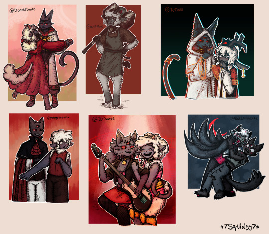
So, to celebrate 100 followers on tumblr, I decided to draw some fanart for people. This community is so sweet. Every one of these artists has inspired me in some way.
I'm really sorry for those I haven't made art for. I may make a part 2 one day for those I missed. Who knows.
This was a really nice way to try out different art styles while mixing them with my own.
Apologies for all the link later on. Want to explain the creative process a bit for those interested cause I put way too much effort into it to not mention.
Close ups below cut:
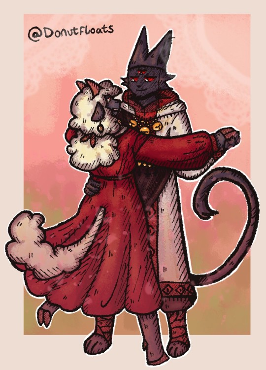
@donutfloats
Your arts so cute and soft, I love it. You have a great way of just expressing love through your art.
I was inspired by 2 of your pieces for this, the main one being the 3rd image for this post. The lambs dress is so pretty, I just knew I wanted to draw it flowy and dancing, and the second image I used is this post for the rendering style.
✧.*-----------------------------------------------------------------------*.✧
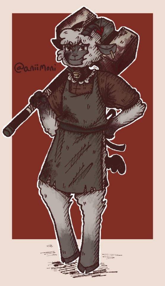
@aniimoni
I really like your artstyle. The monochrome colours are delightful, as with the way you do lineart. while making this, I was thinking this is the perfect style to meld with mine.
I was inspired a lot by the axe and hammer drawings in this post. As a hammer lover, I decided to combine the 2 together.
✧.*-----------------------------------------------------------------------*.✧
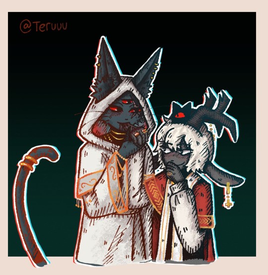
@teruuu
Something about your style is mischevios. Your rendering and lineart are just wonderful as well. You have a very distinctive style that matches mine quite well, i think.
I feel compulsion of the flesh Lamb and Narinder would give each other kisses on the hand but take a bite at the same time. They freaky like that. Based my rendering around this post and the previous draw you character here, I did. These are fun designs to draw.
✧.*-----------------------------------------------------------------------*.✧
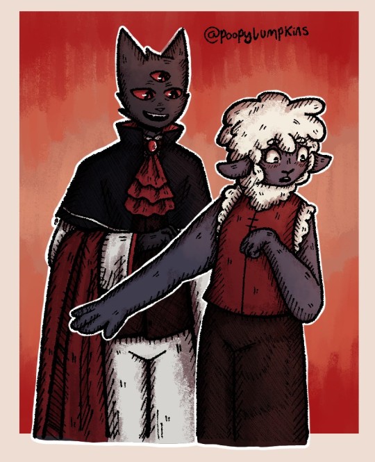
@poopylumpkins
I really like your vampire au something about it really spoke to me as a afab non-binary.
Lamb deserves to wear their own clothes and something about narinder helping with their makeup convinces me he'll help out.
if you're curious, i colour picked the background and shading from this post
✧.*-----------------------------------------------------------------------*.✧
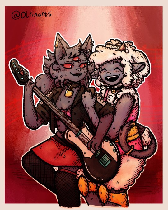
@olrinarts
This was a really fun style to draw. Something about how you draw these 2 is delightful. Love yuri narinder's eyes in particular.
Rock god yuri. What more can I say these are really good designs. Showed them to my friend, and they loved them.
Decided to have them dueting, while Narinder can't sing lamb can always pick up that role.
Used this post for the background and shading colours, and this is a kinda basis for the pose.
✧.*-----------------------------------------------------------------------*.✧
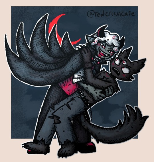
@redcrowncafe
Really love you fic and art. I like to see the fic brought to reality through all the comics and art, which has a very pleasing look to the eye.
I have never struggled so much with an art style, fun challenge, but very different to my own.
Wanted to draw their Halloween costumes from this post. Lambert would definitely get too into the vampire costume and bite Nari at some point probably.
✧.*-----------------------------------------------------------------------*.✧

@joffyworld
Just wanna say thank you so much for the reblogs and kind words. It gives me a lot of confidence in my work and is a genuine brightness in my day.
I wasn't sure what to draw you, so I thought I'd just show you a pic of my new one who waits figurine, that arrived recently. Its a little weird, I think an earlier design but cool none the less.
✧.*-----------------------------------------------------------------------*.✧
221 notes
·
View notes
Text
Fabric highlights: Microsuede


I get a lot of questions about material choices, so I thought it would be cool to do little overviews of my favorite materials! (since to be honest, i pretty much just rotate between 3-4 fabric types haha)
Starting with microsuede, my all time favorite and most used material choice. Microsuede is a faux suede made from lots of tiny polyester microfibers split and combined together. its similar in feel to natural suede but distinctly different in its overall fabric drape. It can sometimes have stretch, but usually its a non-stretch fabric. (also not to be confused with microfiber!! mircofiber fabric is similar but its much softer, its the material that cleaning wipes for glasses/screens are used of.)


Some of the advantages of microsuede is its a thick, sturdy fabric. Personally I find it a very friendly fabric due to its thickness and body. Its a great choice if you want something to have some heft to it and structural support. It presses well and can hold folds like the dickens. Its both easy to work with and easy to make a garment that looks nice out of imo. It comes in all kinds of weights from apparel to upholstery. I've personally never used heavy duty, true upholstery weight microsuede so I cant speak much to that, I tend to use microsuedes intended for apparel.

Another great advantage of microsuede is it has an inherent, mottled texture. this is great for making simpler, color blocked designs still have visual interest.


It also takes to adhesives well due to the fuzzier texture, meaning the glues can grisp with more surface area (you just might have to press it in a bit, its still a poly fabric so its not the easiest thing to get hot glue to stick to but by god it can be done).


But microsuede is not a one-size-fits-all fabric. One, the stiffness it has can be a downside if you want a more flowy drape, it would rather fold and crease than flow. Two, its a pain to paint or use HTV on, the fuzzy texture is a downside here. Three, It can also show needle holes if you have to seam rip depending on what you used. You can use a universal needle on microsuede dependings on the weight (I usually do). But its still a thick fabric so be sure not to use too thin of a needle, i also have luck using medium pressure and a walking foot. but all the same ive lost many a needle to microsuede via snapping.
Another thing is personally i find that due to its texture, it looks more homespun and rugged, as such I would hesitate to use it if i wanted a costume to look more regal or formal (i still used it on thistle though lol so its all about the particular use-case)
I source my microsuedes from Big Z primarily (like literally 90% of the time) but I also use fabric wholesale direct, and jo anns, who despite their markups does have some very nice quality suedes, i love their stretch suedes in particular.
I love microsuede. its probably my favorite fabric to use and I will even change my plans on a costume just to use it!
73 notes
·
View notes
Text
I wanted to talk about the Black Parade uniforms and it kind of turned into an entire essay. My ideas on the intention behind each costume and their cohesion as a group really evolved over the course of writing this, and I think it brought into focus a lot of things I knew subconsciously but hadn't articulated. I also noticed a lot of details I had never seen before. This has futher convinced me that 1) costume design and what you can say with it is really fascinating and 2) this is S-tier costume design of all time. And it's really long so I'm putting the rest under the cut.
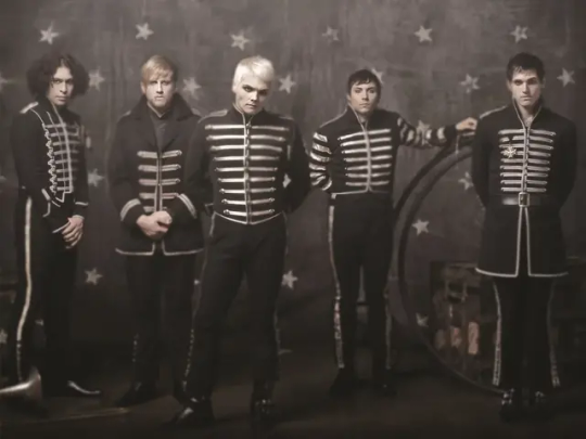
What I would have loved is a Weezer-style picture of the five of them standing side by side, full bodies visible, but unfortunately that doesn't seem to exist. They're either covering each other up, or posed in such a way that details aren't visible or cut is hard to compare, so I'll have to provide a variety of visuals. This weirdly blurry poster is the closest thing I could find to a Weezer picture, so take them in as a group and refer back as necessary. I want to start by saying, obviously, that they look amazing both individually and as a set. "Dark marching band of death" is a really fun concept that is very well executed. But this isn't their first time doing a look as a group - think back to Revenge for a minute, when they really started to think about their costuming as a band. Gerard has talked about how then, they were kind of closing ranks against the vitriol coming their way. They needed to feel like a team, a gang, and dressed like one. I think some of this mentality has carried over into the Black Parade uniforms - they're less defensive, (there's no bulletproof vests), but in taking on new, nameless identities they have removed themselves as individuals from the equation, which is protective in its own way. What's left are stage personas, and the more you look the more you see that these were designed by someone who is very familiar with the history of the band and how each member presents themselves on stage. It's absolutely genius costume design, because when everyone is in uniform, the little differences are more noticable and tell you so much about the intention behind each variation.
Before we really start, I have to confess that I have no history in costuming or even a lot of familiarity with marching or military bands. I can only say I find costuming interesting, so I've read a little about it, and I went to high school in America and almost all my friends were in marching band. Someone who is more educated in these things could probably give more specific insights and have a better vocabulary to talk about it, but do not underestimate me. I am deeply obsessed with MCR and got A's in English, so let's find some meaning in symbolism! But please remember that with all art, there is no one interpretation. And remember going forward that these costumes were designed by Colleen Atwood, based on sketches she was given by Gerard, so there's no telling what elements were brought in by her and what elements Gerard had planned originally. If anyone has sources on that, PLEASE let me know because I'm very curious about the design process.
Also, I'll be using the uniforms as they appear in the WTTBP video as the standard, with acknowledgements toward variations seen in posters and the FLW video. It's worth noting that in many live performances they wore different, less unique jackets, and often forewent the pants for black jeans. This is almost certainly because they were easier to perform in and they didn't want to subject the originals to the sweat and rowdiness of regular shows. Ok, here we go! Here are some pics to refer back to throughout.
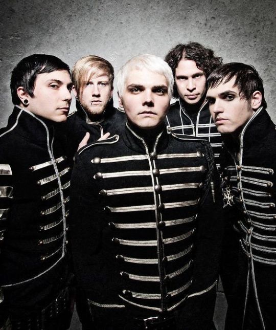
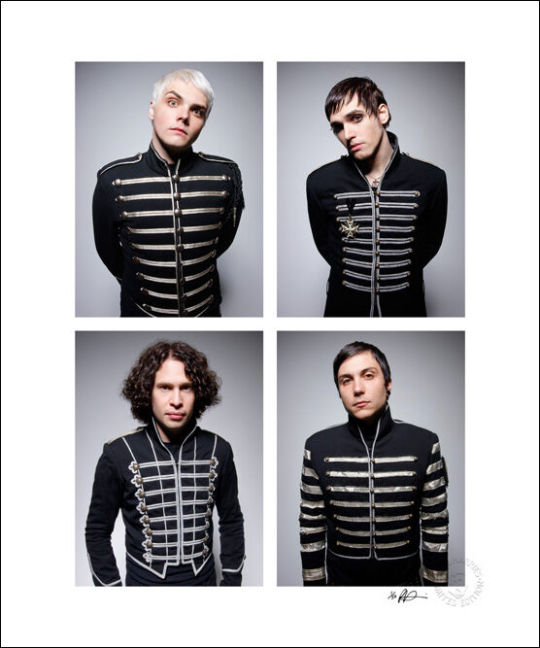
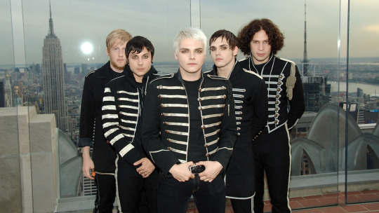
Starting with the band as a whole, I want to point out two things: first, marching bands evolved from military bands. The individual costumes vary in how "military" they look, but you can definitely see the influence when you look at them as a set. I imagine they leaned into that a bit because of the military elements on the record - the suggestion in Mama that the patient was a soldier, maybe even a war criminal. We also know they've done military aesthetics before, in The Ghost of You music video, and that the band was formed in response to 9/11. Suffice to say, the military is on the mind, and this is a continuation of that.
They also look a bit like skeletons. Obviously they would occasionally do the face paint, but the uniforms themselves suggest a ribcage with the horizontal silver lines, and at some angles the stripes on the pants also really contribute to the image. I know most people have already realized this, but I wanted to point it out explicitly because it took me an embarassingly long time to see it.
Alright, I'm gonna talk about them individually now, going from my personal least to most favorite. Taste aside, they're all individually really interesting.
5. Bob
(I can't find another good Bob picture, just scroll up to the blurry one)
It's not just because I don't like Bob, I genuinely like this one much less than all the others. It might be because it's less tailored - the others look much sharper, he looks almost rumpled in comparison. The lose fit might be because as a drummer, he needed better range of movement, but I'm not a drummer so I don't know. The cut of his jacket looks kind of naval to me, which is interesting. His stripes are also very minimal compared to the others. Overall, his looks the least like it's part of a set. I don't necessarily think they meant to set him apart, but maybe they did, considering he's the only non-original member (I'm counting Frank as an original member) and the only one not from New Jersey (which, I only point out because they ALWAYS point that out to people who mention they're a Jersey band. We're from Jersey, Bob is from Chicago.) Maybe it was a subconscious thing, or maybe as the drummer his costume was designed to make the most of what would be visible sitting and partially obscured by the drum kit. It does have a very dramatic collar. That's probably also part of the reason they gave him a more distinctive haircut for this - I'm not gonna talk about hair much, but it's worth mentioning. Overall, I don't have a ton to say about Bob because I don't think of him much (sorry, but not really).
4. Frank
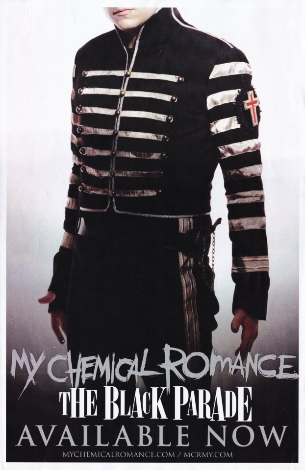
Frank's is really interesting. His is the least traditional-looking, which is why it's here in the ranking, but I like it and I think there's a good reason for that. Those stripes on the sleeve are a really strong look, and the material of the silver has kind of a tarnished/dappled look you can see better in other photos. I've seen people say it's a subtle camo pattern, but I'm honestly not sure - I think he's supposed to look a little less new and shiny. The blockiness of it widens him and gives him a lot of presence that might be lost if he was dressed more like the others, and it compliments his performance style well. That's particularly important in the WTTBP video - on that float, he simply doesn't have room to be as wild and energetic as his standard performance was at the time, so this uniform helps him stand out and draw attention to what thrashing he is able to do. As far as bucking tradition, he also is the only one without shoulder tabs (those little loops). There's something funny about that - those tabs are meant to hold loops and eupalletes that would signify rank, placement, or achievement, which apparently you could not give to Frank if you tried. I think this lack of traditionality is reflective of Frank's more punk sensibilities, having come up in the Jersey scene. His playing style evolved over time as he and Ray influenced each other, but at the start he was very much their punk guitarist and coming up in that scene continued to influence how he conducted himself as a musician. I think this uniform marks him as a non-conformist even within the group.
He also has that patch with a red cross on the sleeve, the only bit of color on any of them. I don't know what to make of that, maybe it's just for the Catholic vibes.
Honestly, Frank's feels the most like what people would expect from an "emo" marching band uniform. Especially considering the poster, where he's found a hole to stick his thumb through. I don't think he's wearing it in the video, but in that poster he has this belt with some kind of weapon?? Maybe?? We get it, he's a dangerous little man.
3. Mikey
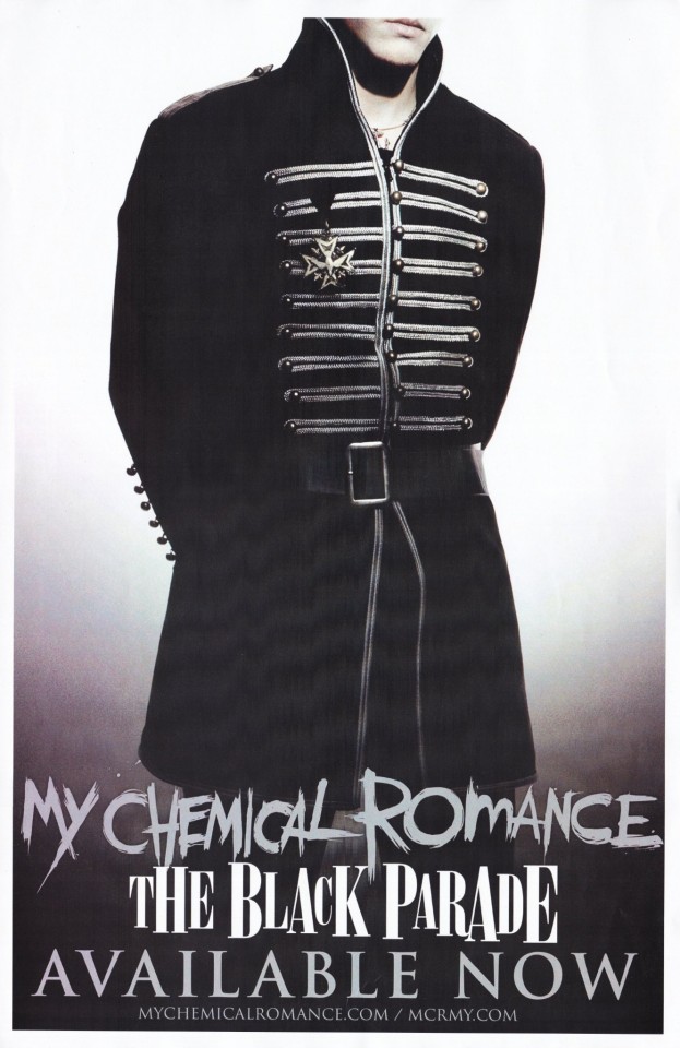
Mikey's uniform is by far the most military - it's not just the medal, it's also the cut of the jacket. And he's the only one with a fun little belt, which helps keep the silhouette look nice and tailored even though the jacket flares a little at the waist. We all know the medal is a reference to his death in The Ghost of You video (there's no way they didn't know we would make that connection) and it wouldn't surprise me if the rest of his uniform looks more military because it was built around that idea. But also consider Mikey's stage presence at the time - due to his discomfort on stage, he used to be really stoic, standing in the back, getting the job done with little showmanship. I think that presentation lends itself well to a classic military figure. Mikey is also pretty thin, and the long jacket and it's strong, solid construction keeps him from looking too Victorian-orphan waifish (especially with how pale they all are), and more like a dead soldier boy.
Additionally, Mikey's costume leaning so hard into the military side helps them look more military as a group. It keeps the association in your mind when you look at the others. Also, he's wearing a little necklace here, which I've never noticed before, is he wearing that in the videos?? I think it's an anchor, which is fun considering he died on a beach.
2. Gerard
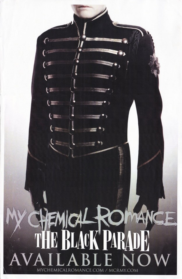
Yes, Gerard's is #2 in my ranking. I'm sorry, I might have a slight bias knocking it down from #1. But maybe not, let me defend myself when I get there. Anyway, Gerard's is the most classically marching band, which makes sense considering he's the frontperson. In fact, he has one of those braided loops on his shoulder we talked about earlier, demonstrating.....something, it seems to vary a lot, but we're probably meant to think leadership. He's not wearing it the WTTBP video, but it's there in Famous Last Words. He also has that fancy little star thing on the shoulder, which definitely seems to suggest rank. Otherwise, his uniform is very basic. He's the template that the others' uniforms are variations of. And it's a great look! He's also got nice big buttons compared to the others, three whole rows of them, which is a nice touch to make it look a liiiiittle more feminine. Because, of course, the back of the jacket is corseted, in a genious stroke of gender that puts the entire outfit in a new context. I think this is a good example of how Gerard likes to play with androgony by balancing masc and femme elements. The cut of his jacket makes his shoulders look wide and his waist narrow, but not so narrow it looks terribly feminine (just a little, taken on its own). A lot of this is achieved by the piping - notice how on Bob, Mikey, and Frank, the top row of piping (I might be using that word wrong but let's go with it. I'm talking about the silver stuff across the chest) is pretty much the same length as the bottom row? On Gerard, they start out wide way up on his shoulders and get progressively narrower at the waist. It's still a mostly masculine silhouette, but then you have the counter balance of the big buttons and his little white pixie cut, both of which lean just a little further toward femme than masc. It's an androgynous look that leans toward masc as a whole, until he turns around and, boom, corseted back. Showstopping. He also had those black leather gloves that give some nice formality, and maybe a touch of impersonality. They make it so that when he's in full uniform, the only skin you can see is that of his face. They're like an edgier version of the usual plain white marching band gloves.
1. Ray
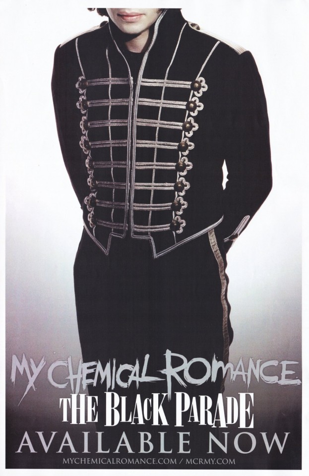
Going purely by aesthetics, Ray's is my favorite. It's the fancy one, most obviously distinct by the flourishes around the buttons on his jacket. He Mikey are the only ones with pure silver shoulder loops, and Ray has more silver piping on his jacket than the others. In some pictures he's wearing this really ornate knotted tassle thing? You can see it in one of the group pictures above. He isn't wearing it in any of the videos, which makes sense as it could be really annoying while playing. The cut of his jacket at the bottom also looks formal to me, but I'm not sure why. Overall, the ornanamentation could be a reflection of his playing style - the same caveat here applies to Frank, in that they influenced each other through their parnership as guitarists, (and Ray has a lot of influences from different genres), but at the start he was their metal guitarist, and the guitars in metal are often complicated and showy. And he's their soloist, they need to show him off a little.
Additionally, the construction here is giving him an absolutely wild silohette. Like Gerard, the piping on his jacket gets progressively narrower to suggest a smaller waist, but without the really long stripes at the top to make the shoulders look broader. Those vertical lines across the front add to the effect because they're curved inward - which is interesting, because everyone else's uniforms are composed of entirely straight lines and sharp angles. And his jacket is cut REALLY high on the side. I can't tell if Ray's pants are more high-waisted than the others, or if it just looks that way because of the cut of the jacket. You see the stripe of the pants go all the way up his hip, and since he's already tall with long legs, it really accentuates that. It's hard to tell, but I think his pants are even a little more form-fitting than the others. The other day I saw people commenting on a gif of Ray in the WTTBP video about how they never noticed how long his legs are - this is why!
We talk about how part of what makes Ray such a compelling performer is how he moves, and I think this costume was designed to compliment fluid motion. The tailoring and curves of the piping avoid making him look too rigid or blocky, as a marching band uniform could easily do, and the high cut of the jacket lets the line of his legs continue uninterrupted. Honestly, this is a favorite look for Raygirls (gender neutral) for a reason - I think they knew exactly what they were doing putting him in a pretty, well-tailored uniform that accentuates his movement. (Caveat here that I'm a Raygirl (gn) so I'm definitely biased, and they all look great in their uniforms, but I do think Ray's is.....uniquely flattering, and I don't think it was an accident).
Conclusions
So now that we've talked about all of them, I think we have some interesting contrasts to make. Gerard and Mikey both have very classic looks, but Gerard's is more marching band and Mikey's is more military. Mikey and Bob both have very military looks, but Mikey's has a much more solid construction. Gerard and Ray are both on the marching band side of the spectrum, but Gerard's is classic while Ray's is ornate. My favorite contrast is between the guitarists - Frank's is blocky and rigid and tarnished, Ray's is curved and fluid and shiny.
The interplay between similarity and contrast is what makes this so compelling as a group costume - just by looking you can tell who's the leader, who's the tragic figure, who's the outcast, who's the rebel, who's being spotlit.
In closing, thank you Colleen Atwood and Gerard Way for designing these and the rest of the band for wearing them, I will never get tired of looking at them.
#mcr#my chemical romance#the black parade#will probably come back and edit in more pics im out of time rn#gerard way#ray toro#frank iero#mikey way#bob bryar#i guess#see how many times i can misspell silohette#to some extent idk if anyone reads this cause its nice to have my thoughts organized but also if im nerdy enough to write it surely#some people will be nerdy enough to want to read it#*idc not idk
25 notes
·
View notes
Text
Can we talk about how in the show Lestat and Armand are framed as narrative foils. Armand and Lestat who are both so aggressively theater kids, but Lestat who acts, who draws in the attention and holds it, and Armand who directs, who shapes and manipulates the narrative. Armand and Lestat's obsession with Louis and his love and frustration with his melancholy over Lestat and Claudia respectively. Who both felt second in his heart. Who fear loneliness above all else. Lestat taking what he wants to excess - no impulse control, and Armand letting things happen to him and trying to manipulate situations to get what he wants but never taking it. Armand, who even in the end, so much more powerful, never physically imposes himself on Louis. Armand who seeks complete control in subtle insidious ways. Lestat who seeks control in the physical. Armand and Lestat brought into vampire life in horrifying ways tangled up with SA. Armand who still talks about his maker with reverence, Lestat who hates his maker. Armand who pours all of himself into his partner, willing to shape himself into what they desire but ultimately needing control to feel safe. Lestat who pours all of his love into his partner but unwilling to change himself and ultimately cedes control in moments to maintain the relationship. Armand who clings to his breaking apart relationship for 77 YEARs, Lestat who let Louis go. Lestat and Armand who watch Claudia die, but one as a father and one as a murderer. Lestat and Armand so intense in their love but Lestat so painfully external and Armand so painfully internal as characters. Both constantly acting and putting on a face. Lestat as Mozart and Armand as Salieri (in the flashback scene!). Armand who loves routine and structure and repetion, Lestat who craves change and excitement. The calling cards are echos, who learned from who. Armand teaching Lestat the vampire gifts, Lestat teaching Armand a new way to live. on and on....
#I'm tired of ship content#Give me complex narrative foil content!! give me the haunting and doomed by the narrative content! Give me the analysis of the fucking prop#and sets and amazing costume design#there is so much in this show and no one is talking about it!!!#They are so two sides of the same coin coded#autism vs adhd coded#my toxic wives whom i love#lestat de lioncourt#lestat#armand#the vampire armand#amc iwtv#iwtv#armand iwtv
2K notes
·
View notes
Text
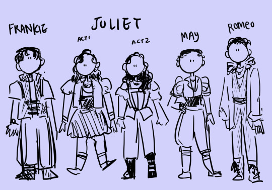
some very very quick costume shorthands!
#&juliet#had the absolute luck of watching this live the other night and it was. truly amazing!!! aaah#rough character designs for the younger leads (excluding like the Grown adult duos..) because?? idk#this is how it always starts. once the character designs start getting simplified like this that's when it all begins#which is hmmm timing but i really can't shut up about this musical it was so so fun. absolute vibes and energy#made me laugh and cry and was such an Experience. i adore them all but may specifically made me sob at some parts dfjkldfh#lots of thoughts! but one of the favs is how they wrote it so the existing songs and actions fit so well.#like in a rhyming bit they had frankie accept a drink and then the song was like ''drink in hand'' and i was all !!!!!!#also maybe it's local censorship? but there wasn't the kisses.. they replaced it w kissing hands and then holding hands#which is like a cute nod to the ''hand to hand holy palmers kiss' or smth but also maybe two guys doing that would not have made it past :/#oh my god i. the way rnj parallels the shakespeare duo... whdskjfhgh. may + not being a Girl kdjhgf. frankie and may. aaagh.#angelique being so so badass. i . the speech about Gender by anne and the Proposal by angelique both made the whole theatre cheer love that#also rotating stage lives in my mind rent free i ADORE the set holy moly.. also also the actors were so good. also the Projections.#also the music and costumes and special effects and aerial moments. and the ensemble. and the choreo#also the cast is so talented. and pretty. and the whole confidence part vs the vulnerability of some bits... whshjfgjkl. hhh#im just listing stuff now but it was so vibes. what an experience ever. it's also shot me directly into 14-years-old again so#spent the morning alone vibing to the soundtrack intensely... i just... sometimes things hold special places in your heart idk!!!#i don't know what to do with these designs though... like the show is such a lovely Spectacle but also idk where to branch out by myself no#there's so much to Absorb again and again. i get the feeling any true work from this i would do in a form of an animatic though.. oops#tldr? 1. &juliet very good just as itself 2. we have History 3. i got to see it live which always propels me into bonkers over musicals!#so so rough but i needed to get smth out and . whatever. an art blog is an art blog. back to hiatus now i think#<reminder to myself: this is essentially an artchive.. there's no quality control if you don't want it! have fun!! ily>
67 notes
·
View notes
Text
Pool boy at the vampire mansion
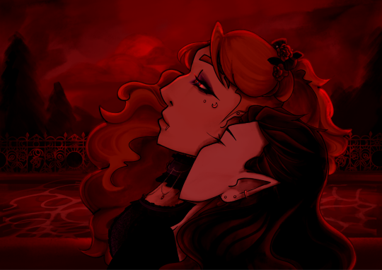
#>:) hehe#please talk to me about my costume fence design#i need someone to acknowledge my fence symbolism#my art#my artwork#jrwi#fanart#jrwi fanart#jrwi riptide#jrwi show#jay ferin#jrwi jay#jrwi anastasia#bloodshot#jrwi shipping#i am actually in love with them#they mean so much to me#Anastasia grim and jay ferin you will always be famous#custom*#jrwi bloodshot
92 notes
·
View notes
Note
💀😡
starting off strong!
💀 least favorite lord in black and why 😡 least favorite character from npmd and why
based off design... pokey. he is so swagless please i need to give him cool pants please please why doesn't he have shiny pants and a feather boa he deserves one give him heels you cowards
as for npmd (characters who have a speaking role): brenda. hearing her talk the first time made my soul float out of my body. i didn't recognize it as bryce; i thought they genuinely got a teenager to be brenda. it just took me off guard how real she was. compared to everyone else matching their stereotype, brenda acts like. a regular teenager
#there is so much hate in your heart anon...where is your whimsy#i wouldve put both brenda and stacy for npmd but the prompt said one character#and brenda is definitely the one that unlocked more core memories. if that makes sense#and dont get me wrong! i love brenda and pokey!! with all my heart and soul#definitely an ask#i was gonna doodle when answering these but i feel like this is a little too negative for a doodle#also the pokey design slander is specifically towards the way i draw him not anyone else (especially not the costume design in the actual#show. the costumes are really good)#i just really need to see him in heels. i feel like he would wear heathers-style heels#<- and by see i mean draw#i havent drawn him in heels yet because of the canon compliant voice in the back of my head#whatever. i'll make my own design one day and he gets to have heels then. AND a feather boa#making me pick between the LiB was evil. how can you choose#and like yeah brenda is one of the “mean girl cheerleaders” but also teenagers just talk like that#like brenda could be a real actual person and i wouldnt bat an eye#i could keep talking but it would go in circles so the bottom line is:#i love both pokey and brenda. this is a cruel question
51 notes
·
View notes
Text
I have a big google doc thing where I keep track of media and stuff (putting everything in loosely ranked categories), which is mostly just for my own reference so I know what tv shows I've already seen before, etc. and I never really look back through it, typically just a quick "okay, watched two movie in the past 8 months, need to quickly slap them somewhere in the lists. okay. done. save document. exit". But today I was actually reading through some of the old notes and there are like... MULTIPLE places where my comment is basically "It would have been good if it were about elves" or "I wish there was a fantasy show made in this same style" or "It's well made, but I just keep thinking about how I would like it more if everyone was an elf or was in old 1700s costumes" or etc like...... lol.... Most biased media ranking system on earth blatantly made by someone with an extremely hyperspecific range of narrow interests. It'd be like if a food reviewer only had 5 foods they actually liked, so they'd just go to a pizza place and be like "eh, the pizza was okay, but I just think it would be better if it was cereal instead. :/ ...2 out of 10"
#Which.. I mean... I am allowed to be biased because literally it's just for my own personal reference (or occasionall#y to send to friends or something if we're discussing the topic) so like.. nowhere am I saying 'I am the god of perfect taste and these#rankings are objectively the absolute truth and everyone should have my same opinion' or anything#BUT still.. it's funny to me sometimes#'Succession would be 100x better if it had the same cast/character quirks and shaky camera style and#acting choices/weird dialogue and general concept etc. EXCEPT it takes place within an elven noble family or something#managing the family business and everyone is in fantasy costumes now'' like.....okay...... but it's NOT that way..soo... thats not the show#''I like the acting style/general tone of Fleabag but i don't care for any of the characters or any of the subject matter and I wish it was#set in the 1800s and had vampires and was about magic instead'' okay..... again... you are making up an entirely new show in that case lol#OR my other beloved typical complaint ''The concept is good but theres too much plot and action and not enough people just sitting#around doing nothing and exposition dumping world and character lore'' ''this needs more goofy sideplots and filler episodes''#''this Drama was too dramatic I think it should be more lighthearted & people need to sit around doing nothing just being weird more often'#''the Action Movie was ok except for the action scenes - which I skipped through all of- but I liked the costumes and worldbuilding'' etc.#ERM sorry your plot has too much plot. also elves have to be included somehow. bye#BUT SERIOUSLY!!!!!! I literally genuinely believe that any show I like (or even dislike) could ALWAYS be improved greatly by#putting people in fantasy or historical costume/setting/etc... why the FUNK would I want to see bland jeans and cars and cell phones#when I could see elaborate velvet cloaks and fantastical landscapes and interior design and innovative takes on historical or#magical technology or etc. etc. etc. I LIVE in the modern day. I see it all the time!!! BORING! stinky!! boo!!!#ANYWAY... another social divide for me.. People love to bond by discussing media. which is hard when I'm like#'I literally will not watch something at all unless it fits into one of these 10 extremely specific categories which are all i care about i#the entire world''.. I say this and yet I still dislike most fantasy or historical things I've watched lol. ok TWO main criteria then!!#it must 1. be in a different world or time period. 2. be goofy silly. Nothing ever has BOTH. It's always overly serious boring drama action#fantasy/history stuff OR it's comedic lighthearted but with modern day characters... WHY.. anguish and woe and so on..#ANYWAY jhjnk... at least I can make that divide. Some people seem to project their own personal preferences and get really emotionally#defensive if you say you didn't like something - as if the fact that they DO like it is some Objective Truth or something rather than just#opinion/preference based. I can still easily say ''this is well made/well written/acted/good in a technical sense/has a lot of#points of appeal that most people would be drawn to/etc'' and admit that it's a GOOD show probably. I just PERSONALLY think its#bad because my tastes are very narrow. Some things ARE actually made badly but. things are not bad INHERENTLY just bc they dont suit ME lol#Better to recognize/accept whats odd about you and be peacefully aware of it than just being mad at everyone all the time for not fully#agreeing with you even when you're the one with the Weird opinion in that case lol.. I am right though :3 but.. lol... still. i get it
25 notes
·
View notes
Text
I'm going to say something potentially controversial yet brave
I hate Kara's civilian outfit, it's so. bad. When she had that cute pink sweater on I got excited bc I genuinely thought that was going to be her outfit next season but then she changed back :(
#my adventures with superman#my adventures with superman spoilers#I know her design is based on a dbz character but please. designers literally every other character in this show has cute outfits.....#let my girl live.........#that being said I love her supergirl costume the scarf cape is so fun#I love that her and clark have stupid matching shoulder pads now#anyway. any and all fanart I draw of her she's going to be wearing that sweater because I hate her canon outfit so much
16 notes
·
View notes
Text


I haven't posted on here for a while now uhhhh
*throws All Might art at you*
#all smite#all might#my hero academia#mha#my hero academia fanart#all might fanart#all smite fanart#fanart#my art :0#i love his villain costume design so much omfg#hes so cool#i totally didnt stay up all night just to binge watch the entire show#roleshift au#roleshift
11 notes
·
View notes
Text
I'm two episodes into the new ATLA show and I literally love it oh my gosh skjdfhakdsf
I'm really not the biggest fan of season 1 of the original show so this is honestly a massive step up for me I'm incredibly impressed
M. Night Shyamalan better be taking some serious frickin notes here like this is how you adapt a show hooooly cow
Some slight spoilers in the tags beware sdfdsf (also since I'm only on episode three please don't spoil aahh-)
#they made aang so much more likeable what!!#he is full of whimsy and joy and happiness and is actually adorable instead of being painfully immature and difficult to watch!!#katara and sokka still have fantastic banter and they're still cracking jokes and not taking themselves too seriously!!#suki still kicks major butt without being annoying and she's still incredibly cool!! (and frickin gorgeous holy crap)#kyoshi is awesome!!#appa and momo look so frickin good i cried!!#GYATSO SCREENTIME!!!!!!!!!!!!!!!!!!!!!!#THE BENDING!! THE COSTUME DESIGN!! THE ENVIRONMENTS!!!!! I AM SO PROUD#this is literally everything i wanted in this show i am so frickin happy they are doing such a good job#if they don't make a season 2 i will sob violently i need MOAAARRRR. i need toph in 4k ultra hd I NEEDDDD IT#don't even get me started on the casting. oh my word#gosh i freaking love this show i am so so so so so so happy#everyone on twitter is complaining as usual but HECK them all they need to shut their frickin mouths#they all went into the show expecting to despise it but heck them i frickin love it#avatar the last airbender#avatar netflix
11 notes
·
View notes
Text
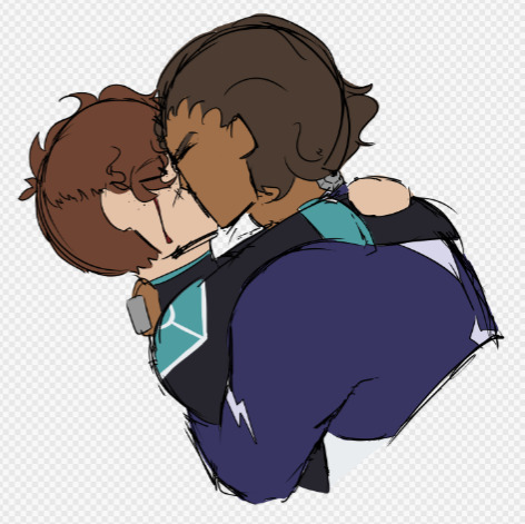
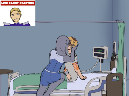
So proud to finally introduce cyrus becker, supposed-to-be throwaway sidestep that unfortunately did Not stay throwaway and has instead invaded my brain permanently

Look at him. Cutthroat. Vicious. Efficient. My most ruthless sidestep and unafraid to kill, and with absolutely NO attachments to any of the rangers
anyway heres him kissing three different rangers on entirely seperate occasions, chronologically ordered

#ignore how the hands are literal rectangles in the ortega drawing#unfortunately#hands are the bane of my existence#on that same note#you could put a gun to my head and tell me to design a costume and i would sooner spit on you than do so#so the fact i attempted to for cyrus really shows how much i love this man#im so conflicted about cyrus' canon ending man#at first i was sure it would be puppetcrash#but then i found out you could make a romanced herald watch argent kiss a revealed sidestep#AND that a revealed cyrus ended up with herald as his nemesis#and suddenly i wasnt so sure#oh cyrus#i love making you eat shit#the question is will i let it stew or blow it all over in retri#edit: i was so busy dumping about cyrus i forgot to actually tag this#fhr#sidestep#cyrus becker#herald#ortega#lady argent#flystep#chargestep#argentstep#she illness on my mental till i draw
30 notes
·
View notes
Text


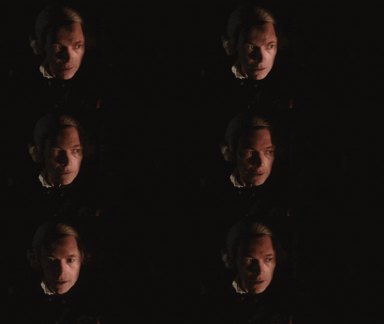


Ace's TURИ for Burn Rewatch: Eternity How Long
#there's so many good moments this episode but i had to go with this one#love love love when he's sneaking#burn gorman#major hewlett#edmund hewlett#edmund my dearest 🔭#my beloved starboy 🌌#he's such an ass in this one; my yankee heart wants to throttle him ♡#turn#turn washington's spies#amc turn#my gifs#man i need a tag for burn now fuck#the burn collection#another brown eyed boy ruining my life#h a n d s#love all the slow panning in this series for pretty much everyone ♡#like hell YES show off the costume and prop designs!!!!#so tempted to do a gifset for each character per episode but atm I'm here for one guy and one guy alone#(simcoe would totally be next though jfc samuel your face is fucking art)#shut up ace
11 notes
·
View notes
Text
I dig the idea of Lawrence Fishburne as Regis but I’m not loving the costume design as is often the case w the LA Witcher ngl
#like. cd projekt red poured so much love into character design only for Netflix to to give us…. THIS??#why don’t these shows let cosplayers make their costumes#they always do a way better job#the witcher#netflix
2 notes
·
View notes
Text
Ranking (bullying) LD Curtain's season 2 fashion choices
Because even if the show seems to have forgiven him, I sure haven’t.
DISCLAIMER: This is in NO WAY criticizing the costume designers of this show- it couldn’t be farther from that. They’ve done an amazing job with every single piece in the show, and all of these fit Curtain’s personality and aesthetic perfectly. This is just me mocking the in-universe fashion choices that the character makes, because he needs to be bullied more. All lighthearted, all in good fun.
Disclaimer #2: I know literally nothing about fashion, please don’t attack me.
Okay, from least heinous to most heinous, here we go!
First up:
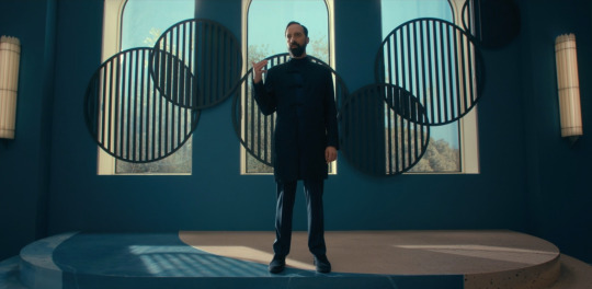
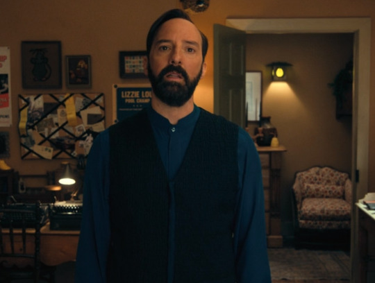
As much as it pains me to admit this. I actually. Really like this one. (”And if you told me I would never say something like that, well, I would never say something like that, but here we are.”) I think the silhouette is interesting, and all of the pieces come together well. Plus, in some of the tighter shots you can see that the fabric texture and detailing is really cool:
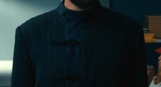
The leaves as clasps and that crinkly texture kind of really slap, and I really love the way the collar sort of wraps into the placket.
8 / 10
Interview outfit:
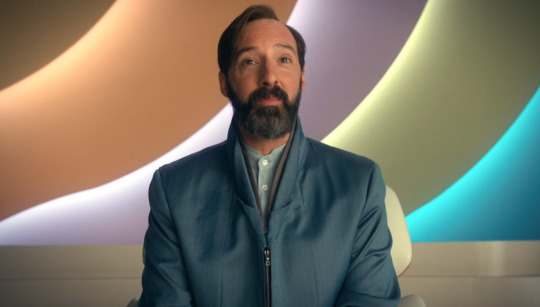
Wow, look! Another one that doesn't inspire immediate feelings of rage! We're doing so well.
This one isn't as visually interesting as the first outfit, but I do sort of like it. The collar folds create kind of a cool shape, and the grey accents under the top is a nice little contrast. I don't know how I feel about the zipper right below the collar, it's kind of a weird choice and might look better if it wasn't so visible, but I'll let it slide for this one since we have a much more heinous zipper situation coming up later.
I like the contrasting shades of blue with the button up shirt, and the lavender shirt he wears under it later in the episode, and the fact that part of the collar can kind of fold down to make a different shape.
6 / 10
Clown sleeves:
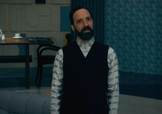
So the sleeves on this one are. kind of a lot. But they gain a couple of points for being the only thing in this outfit that really pops. They're sort of weird, but I can see the appeal of them standing out against the black vest, and being a pretty nice contrast that draws the eye.
5 / 10
Meh:
Time for the part of the post where I include 6 outfits that I just kind of don't have strong opinions on, mainly because they feel like pretty standard, decent outfits with no real reason to bat an eye at them.
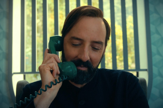


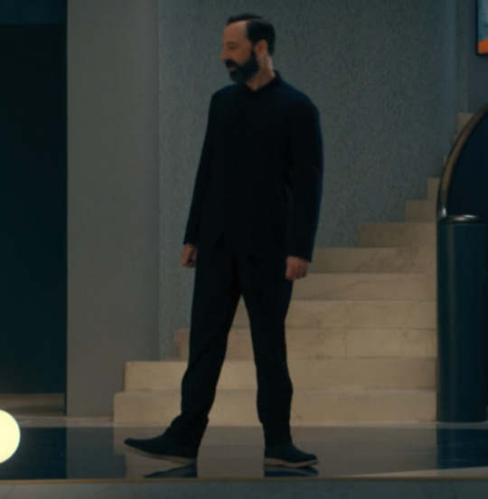

The last image is saved on my computer as "are those your pajamas?" but. acceptable.
sure / 10
Dancy dance:

🧍♂️
I don't have much to say about this one other than, for some reason, the visual of him wearing tennis shoes makes me viscerally uncomfortable.
🤡 / 10
Elizabeth Holmes Chic:

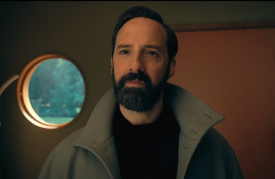
He looks like a kid playing dress-up in their dad's giant overcoat, except someone let him go outside looking like this. I know oversized clothing items can be fashionable but here he's like drowning in it.
And then when he takes the coat off:

This maybe wouldn’t be a terrible outfit, it’s just so goddamn pretentious. He seems like he's trying to look like Steve Jobs, but ended up looking more like Elizabeth Holmes.
about to start another pyramid scheme / 10
Vacation dad (derogatory):
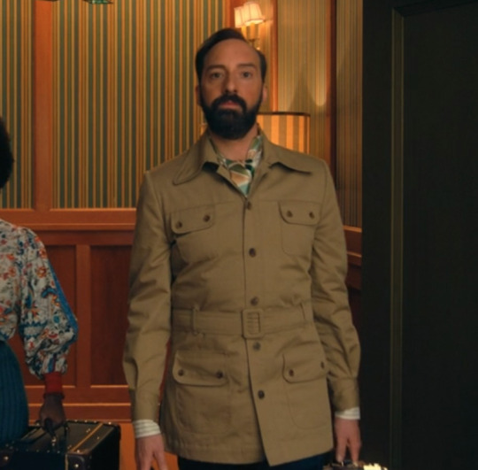
On someone else I might like this outfit, but on him it just looks so dumb. He looks like he's about to go skydiving with how much he's buttoned up. Better watch out or he could get carried away and spend 20 minutes unstrapping and unbuttoning it to reveal his fun little vacation shirt underneath! It's somehow stupidly formal and stupidly casual at the same time, and I just think it's a very silly little outfit. He's joining the army as penance for his fashion crimes. If you ask very very nicely he might tell you what's in his four huge, weirdly-placed pockets.
what's in the pockets / 10
And now.
We've arrived. We're finally here. The last one. The moment we've all been waiting for.
The worst of the worst:
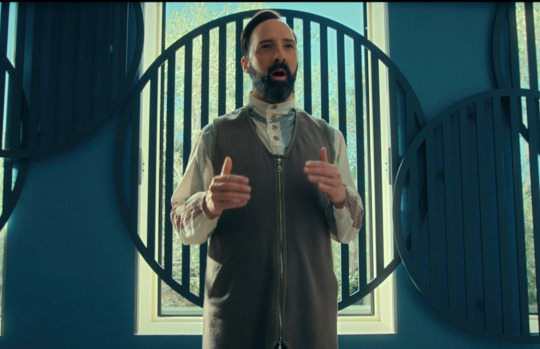
I'll be honest, I don't really know where to start this one. There are too many things to choose from. Do I start with the weird asymmetrical pattern on the sleeves, with the red and blue stripes that aren't even made up of the same type of pattern?
Or maybe the fact that the buttons (and the piece of fabric they're attached to) ends too high above the neckline of the top layer?
Or we could talk about the fact that the top layer looks like one of those smocks you'd wear to get an x-ray at the dentist, made in a fabric that must have been rescued from the back of a fabric store after 50 years of not being bought.
I think by far the worst part is the length:

The fact that those strange little smock flaps go almost a foot past the zipper, halfway down to his knees. It swallows like 2/3rds of his body in this horrible block of grey fabric, and this man has the audacity to carry himself like it’s fashionable, instead of an assault on the senses.
I want to set it on fire. I want to burn him along with it. I want to gently take his tailor aside and ask if Curtain held him at knife point and made him design this monstrosity. TEAR IT TO PIECES, GET IT OUT OF MY SIGHT, TURN IT INTO SCRAPS FOR SQ'S ART PROJECTS.
Anyway.
This outfit is such a menace to this world that I thought everyone should get a chance to tear it to shreds, so presenting, the communal roast:
“GROSS. SHUN.” -@mvshortcut
"prison chic. dentist x-ray chic. ugly." -@mysteriouseggsbenedict
“the terrible zip up vest that just keeps on going fucked a potato sack” -@bi-demon-ium
“runway model for the most pretentious fashion designer who ever lived” - @sqenthusiast
“Trying to be casual but also Better Than You. The definition of 'you really thought you did something there'” -@echo-delta
“Child with one of those books where you can draw clothes over top the shape of a person” -@mysteriouseggsbenedict
“Mr Curtain sir I don’t feel very happy looking at this. I think it’s a little counterproductive.” -@mvshortcut
Truly horrendous.
borrowing constance's acid to destroy the outfit and then clean the eyes of anyone who wants to forget they saw this monstrosity / 10
Thank you so much for coming on this journey with me, and as always, send the x-ray bib to hell.
#the mysterious benedict society#mbs disney#mbs#mysterious benedict society#ld curtain#this post has been in the works for a WHILE so I hope people enjoy it#we don't need to talk about how long it took me#this post really just devolves as it goes on#a portrait of me losing my mind#i could also scream about how much i love the costume design of other characters on this show#but this was the funnier option#on any other characters i would be complimenting them for their bold fashion choices (except for maybe the last one)#ledroptha curtain
46 notes
·
View notes
Photo

Léo Morin on his rich corpo bullshit eyes wide shut lookin bastard
#he shows up to get dirt on other rich people#idk#i love him so much god dammit#masquerade#character design#character art#costume design#fashion design#my art
115 notes
·
View notes