#logography
Explore tagged Tumblr posts
Visit Tumblr Blog
Explore Tumblr blogs with no restrictions, modern design and the best experience.
Last Seen Tumblr Blogs


Fun Fact
Post activity is at the highest at 4:00 pm EDT; notes peak at 10:00 pm EDT.
Text
Lexember (December 7th)
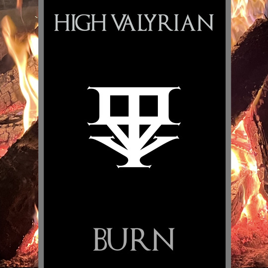
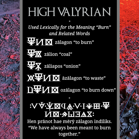
Today's Valyrian glyph is zālagon "to burn". The glyph is a fire underneath something that's being cooked. Looks like a cinder block, but it's probably just a thing. I don't remember what originally it was in the first drawing, but it's definitely a thing. Not a cinder block. Despite the fact that it really looks like a cinder block.
#conlang#language#hbo#game of thrones#high valyrian#valyrian#orthography#got#hotd#house of the dragon#neography#conscript#logography#asoiaf#lexember
162 notes
·
View notes
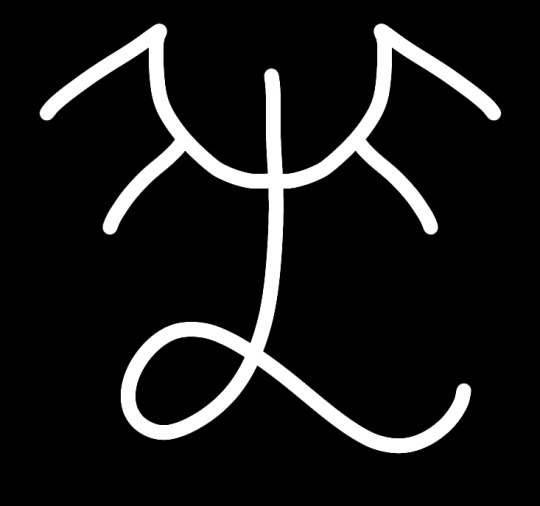
Text
Ñėñāot tlārr ñārr ōbamarėu rriwėubėu. Rrāz tlwē lāe myāen wimīuři tlibīerr, o tlāz ñās mōwa īxio rrōddėu wëiėlo.
"Our language was given to us by the gods. This is what separates us from the animals that live by our feet, as they can not speak as we do."
/ɲæˈɲáɔ̯̀t ˈt͡ɬár ˈɲár ˈɔ́.ba.ma.ɾæu̯ rɪˈwæu̯.bæu̯/
language-ABS.[TOP] all-DAT 1SG-DAT god-ABL HES.3-give-PFV.PV
/ˈráz ˈt͡ɬʷɛ́ ˈláɛ̯̀ ˈmʲáɛ̯̀n wɪˈmɪ́ù̯.ɻʷɪ t͡ɬɪˈbɪ́ɛ̯̀r ɔ ˈt͡ɬáz ˈɲás ˈmɔ́.wa ˈɪ́.ʝɪɔ̯ ˈrɔ́.d͡zæu̯ ˈwǽì̯.æ.lɔ/
animal-ABS[TOP] person-GEN same speak-IPFV.PV.INF NPST.3-SBJV-IPFV.PV=NEG because this-ERG[TOP] all-ABS 1SG-ABS hoof-ADE live-IPFV.PV.PCP animal-ABL NPST.3-split-IPFV.AV
#conlang#constructed language#conscript#constructed script#artlang#artistic language#orthography#neography#logography#syllabary#ancestral
17 notes
·
View notes
Text
Making an unreadable book (Amaranscript)

9 notes
·
View notes
Text

A sample of what the Asamic script used for my conlang (Asamvuk) looks like now.
I post it mostly for the aesthetics, BUT:
as you can see, some characters are more complex than others. for example the 2nd one is a single syllable ("ḋa" /d͡ʐa/ – animal)
then there are the complex characters, made up of two to four base (simple, single syllable) characters. characters 4-6 are made up of two base characters (the 6th is "ma" (about) + "sọŀ" (meeting) = "masọŀ" /masʲɔw/ – conference)
characters 1 and 3 are made up of three base characters.
the 3rd one means "wild animal" (one that specifically lives in a forest). the first two characters are both "sạ" /sʲa/ – plant. together they mean "forest". BUT the third one is "ḋa" /d͡ʐa/ – animal. together they give us "sạsạḋa" /sʲa.sʲa.d͡ʐa/ – wild animal.
simple. the Asamic script might have many many thousands of characters in total, but you can read most of them knowing only.....a couple thousand!
one word = one character
90% of the time you stack the characters from top to bottom, left to right. but there are exceptions, where the characters have a more original structure, like:
• a 2:1 size ratio (characters size) instead of the standard 1:1. 2:1 is used for example for making adverbs: the character turning the adjective into an adverb has no reason to be as big as the adjective itself!
• in characters made up of 3 base characters, one (usually the first one) might be half the size of the entire character instead of 1/3. also to show its the most important part of it.
• characters made up of 4 base characters are practically always standard in structure.
#conscript#constructed script#conlanging#constructed language#conlang#world building#worldbuilding#logography#logographic#logographic script#asamvuk#asamic
19 notes
·
View notes
Text
if you don't know the meaning of these words just choose what feels right
8 notes
·
View notes
Text
here's a test for a ligature-based logogram! the first is "my" and the second is "ttat"
for convenience, I am using the same syllables as Jjuin, but jjuin doesn't have a logography
im happy that my plan worked
it was more of a test to see whether or not abusing ligatures like that could work, and how to use the built-in drawing functions of fontforge
the design of the glyphs themselves is..... fine. TTAT is a little slanted (but im okay with the shape), and MY looks a little too much like そ (and MY also doesn't represent a "person" very well either)
i quite like the style of blocky, thick lines like that. I may use it for my next latin typeface
now I have to fix the latin non-combined letters because they look. bad (I didn't put any effort on them) (they are not the focus of the project)
im using fontforge for these
im having an issue with fontforge that when I have multiple separate shapes that overlap, sometimes they combine smoothly, and sometimes they invert each other (I hope that makes sense) (as in, the parts of the two shapes that are overlapping are blank, while the rest is shaded in properly)
if anyone has advice on how to fix this or any criticism/ advice / etc on my glyphs, I'd love to hear it, as I'm new to this lol
7 notes
·
View notes
Text
I have started ANOTHER conlang aughhhh😭
Word for today:

kòp (IPA: ko:b˩)
n.
physical object, physical thing
This character uses the root word, kò [ko:˩] which means "be", and an affix (the horizontal line at the top) that makes it a physical noun.
Note: EVERY word in this language has an affix or suffix attached to it. The root words themselves are considered meaningless in formal conversation, but is used in informal coversations to represent their base concepts.
The origin of the root character "kò" actually comes from the shape of an extremely common marsh dwelling bird, which are considered messengers of the gods sent to survey the land. If you squint you might (?) be able to see the bird with its little puffed out belly!!!
For the sound it makes, (kò) it comes from the mating call of the bird.
#language#script#conlang#worldbuilding#logography#logographic#neography#constructed language#conscript#pictography
17 notes
·
View notes
Text
3 notes
·
View notes
Text
Can we just classify English spelling as a logography at this point these individual components barely represent any phonetic sound nowadays
2 notes
·
View notes
Text
instagram
2 notes
·
View notes
Note
Random question:
So a while back I read something where someone was talking about how if English spelling were reformed so every sound had a unique symbol that we’d lose the “visual alliteration” of Cape Cod.
I cannot figure out what that means. Are those /k/ sounds not both [k]? The only difference I’ve been able to notice is a feeling of the airstream moving outward in “Cape” and inward in “Cod”, but I can’t tell if that’s due to vowel influence or what.
Let's back up. The "someone" who was talking about this was either (a) wrong, (b) uncooperatively pedantic, or (c) imagining a very specific, non-alphabetic spelling reform of English (e.g. spelling English with logographic or syllabic glyphs).
Assuming (b), the only way that English spelling could be reformed such that the C's in Cape Cod would be different is if the spelling reforming was as sensitive as a narrow IPA transcription. If that was the case, then there are some transcriptions of English that would transcribe the first as [kʰʲ] and the second as [kʰ]. This level is detail is phonologically important for some languages. English is not one of these. A sensible spelling reform would spell those the same, whether C (because all instances of [k] become C) or K (because all instances of [k] become K). A nonsensical spelling reform would actually spell aspirated and unaspirated voiceless stops different, but even then, these two would be the same, as they're both aspirated.
The airstream is the same for both (egressive). What you're feeling, I expect, is the very slight movement in tongue position as the initial [k], which is palatalized, moves backward to an unpalatalized position. The reason you feel this is the tongue doesn't have to do anything in between the onset of the first word and the onset of the second. The tongue gets in position for [e], and in this position you can pronounce [k] well enough, then with [p], your tongue doesn't have to do anything; the lips take care of it. This means your tongue body can remain in place. For "Cod", it moves back as the tongue prepares to pronounce [ɑ] (or whatever back vowel you have there). Notice also that the tongue body has to go down, the tongue tip retracting slightly to pronounce [ɑ]. That's all part of it.
Now, assuming (c), yeah, that's indeed going to happen. Consider Japanese katakana. This is how "Cape Cod" is spelled: ケープコッド /keːpu koddo/. The relevant characters—the ones that begin each syllable—are ケ /ke/ and コ /ko/. And, yeah, they're different, so you do lose the visual alliteration. However, what you lose in visual similarity you gain in economy. To write /ka, ke, ki, ko, ku/ in an alphabet you need 6 different letter forms and 10 total glyphs. To write the same thing in katakana you need 5 different letter forms and 5 total glyphs. Consider an old style text message, which had a hard character count. A syllabary allows you to fit more letters in than an alphabet because each character encodes more information. When it comes to sheer character count, then, the Japanese writing system is much more efficient when it comes to writing Japanese than the English Romanization is.
Of course, that's for Japanese. For English it doesn't make as much sense because of our overabundance of consonant clusters. Typing lava in an alphabet takes 4 characters; in a syllabary, it takes 2. Typing straps, though, requires 6 characters in an alphabet and 5 in a syllabary. That doesn't save you a lot space—and a syllabary like Japanese's throws in extra vowels that have to be there, even if they're not pronounced, destroying its efficiency by, essentially, adding extra noise to the signal. Returning to straps, you have 6 characters, and all elements are vocalized. In katakana, you'd have to do ストラプス /sutorapusu/. You save a character with ラ /ra/, but then you have a whole bunch of vowels you have to remember not to pronounce.
Long story short, if you were going to reform the English spelling system, I don't think a syllabary (or even an abugida) makes sense, and a logography would be quite a thing to drop on the unsuspecting populace, even if it would be more equitable. This is why I guessed that what you overheard wasn't (c) and was likely (b).
Anyway, that's my 2¢. Hope it helps.
#language#linguistics#orthography#spelling#English#Japanese#syllabary#logography#alphabet#spelling reform
71 notes
·
View notes
Text

Niñřī Ñōw ė Nė mëilaw tlėñërėu ñāw āo rrīwijīñej ërarr, pīren përwañan cīrrelabao ořalwa rrīwirāoc.
Tlė wėñë përwan ořolwirrė īxřilāl tlāomabėulaw wėñë ñālwarėu mëilaw lāe tlibērr ēmyabao ārr rrīwiñëbarr.
Pōi Niñřī Ñōw tlārr mëilozrrė rrīw��rāe ēo, mëilaw rrāe rrīwimīubėu ořalwa përwan wėñās tlëubao cīrrel rrīwiñëlan; pōi Niñřēs Ñūzot wēmwabao ñė rriwëeral.
Nė pīrer rriwëjal, pōi ořolworo përwan wīmwio īriloo rriwëixřilōbbaol.
Pārr, Niñřēs Ñūzot Nė mëilaw wėñërėu ñāw pāz rrīwiñëbėlo.
"The North Wind and the Sun were disputing which was the stronger, when a traveler came along wrapped in a warm cloak.
They agreed that the one who first succeeded in making the traveler take his cloak off should be considered stronger than the other.
Then the North Wind blew as hard as he could, but the more he blew the more closely did the traveler fold his cloak around him; and at last the North Wind gave up the attempt.
Then the Sun shined out warmly, and immediately the traveler took off his cloak.
And so the North Wind was obliged to confess that the Sun was the stronger of the two."
north-ABS wind-ABS.[TOP] and sun-ABS.[TOP] fear-IPFV.AV.PCP each.other-ABL be-IPFV.PV.PCP who-GEN HES.3-argue-IPFV.PV when-DAT warm-PERL cloak-PERL wrap-PFV.PV.PCP traveller-ABS.[TOP] HES.3-come-IPFV.PV | all-ABS 3S.ABS.[TOP] cloak-ABS traveler-DAT remove-IPFV.AV.INF win-PFV.AV.PCP 3S.ABS others-ABL fear-IPFV.AV.PCP as consider-IPFV.PV.INF DES-PFV.PV.PCP this-DAT HES.3-agree-IPFV.PV | and.then north-ABS wind-ABS.[TOP] all-DAT force-DAT HES.3-blow-IPFV.PV but fear-IPFV.AV.PCP blow-IPFV.PV.INF HES.3-SBJV-PFV.PV traveller-ADE.[TOP] cloak-ABS 3S.ERG close-PFV.PV.PCP wrap-IPFV.PV.INF HES.3-MIR-IPFV.LOCV | and.then north-ERG wind-ERG[TOP] stop-PFV.PV.PCP try-IPFV.PV.INF HES.3-lose-IPFV.AV| sun-ABS.[TOP] warm-DAT HES.3-shine-IPFV.PV and.then traveller-ERG.[TOP] cloak-ABS wait-IPFV.PV.PCP without HES.3-remove-PFV.AV | that-DAT north-ERG wind-ERG.[TOP] sun-ABS fear-IPFV.AV.PCP 3S-ABL be-IPFV.PV.PCP that-ABS HES.3-admit-IPFV.AV |
#conlang#constructed language#conscript#constructed script#artlang#artistic language#orthography#neography#logography#syllabary#ancestral
7 notes
·
View notes
Text
Cursive/Calligraphy in my W.I.P logography, this is a full sentence

6 notes
·
View notes
Photo

Random Celtic Logo
Honestly not quite sure what this is, was just *really* trying to push some inspiration out of myself today and ended up with this.
Posted using PostyBirb
0 notes
Text
This is our logograph for dragon and draconic
A Symbol for Draconic
With the help and input of Otherconnect discord community, I have drafted up a symbol for draconic.

SVG file format for the framed version https://github.com/yumeryuu/Tumblr-Uploads/blob/main/Draconic%20Symbol%20Vector%20(Framed).svg SVG file format for the frameless version https://github.com/yumeryuu/Tumblr-Uploads/blob/main/Draconic%20Symbol%20Vector.svg
What is draconic?
An umbrella term that encompasses all individuals with a dragon or dragon-like identity or who hold a personal connection to something dragon.
It is to represent the fluidity and abstract that is draconity. To answer the question, “what is a dragon?” The answer is the below quote, as referenced by Orion Scribner(@frameacloud)’s username.
“It is no more possible to find the definitive dragon than it would be to frame a cloud formation. - Judy Allen & Jeanne Griffiths, The Book of the Dragon”
The simple fact is that--you can’t define a dragon. [1][2]
Following that thought, this symbol is also in reference to “dragons are fish.” [3][4][5]
Reference [1] Rene. “What Dragons Are.” Otherkin.Net, www.otherkin.net/2016/09/what-dragons-are/. Accessed 20 Mar. 2025. [2] Rene. “Dragon Definitions.” Otherkin.Net, www.otherkin.net/2016/09/dragon-definitions/. Accessed 20 Mar. 2025. [3] thestuffedalligator. https://www.tumblr.com/thestuffedalligator/684699200342147072/dragons-are-basically-fish-when-you-get-down-to [4] JazzyCatty509. "Dragons are fish." Reddit. 21 May, 2022. https://www.reddit.com/r/CuratedTumblr/comments/uurrfb/dragons_are_fish/. Accessed 20 Mar. 2025. [5] ZacSpeaksGiant. "Dragons are basically fish - World Heritage Posts." Youtube. 23 Jan, 2025. https://youtu.be/nEGB_cdBXEk?si=bCiVZ2XLjMoedpGa. Accessed 20 Mar. 2025.
With the ideas behind the symbolism in mind, let’s talk about symbols.

The swooping line that makes up the whole creature is exactly that, a fish. The head shape is in direct reference to how fish are drawn in simple way, or symbolically. The two additional stripes right after the cheek is to represent the gill, but they can also be interpreted as part of the mane, spikes, or any dragon feature alongside the top strokes. The head adornment can be seen as the mane, quill, crest, spine, or any number of draconic features. One can even separate the longest one from the rest and denote that as a horn.
What’s the dot? Drawing inspiration from the Draconic Pride Flag, I picked out the one element that is the smallest of detail but holds the most significance to me—the dot. To me, that is the “draconic essence”.
Its abstract form and length showcase how many times dragons have long bodies or tails, but also call forth the legend of koi fish climbing up the waterfall to ascend to draconity. [6]
Finally, the long stroke is to connect to become clouds. The stylization is inspired by the Japanese and Chinese styles of cloud patterns.
The frame can easily be opt out, and simply be whatever “canvas” you put this symbol on.
Voxel[7] also has come up with a way to type out this symbol, <*Ƨ~ You can copy-paste the reverse S from the Wikipedia article[8]. @knifedog-machina has also proposed an alternate version, <*2~
Additional External Reference [6] "The Legend of the Koi Fish." Next Day Koi. 24 Mar, 2014. https://nextdaykoi.com/koi-fish-facts/the-legend-of-the-koi-fish/. Accessed 20 Mar. 2025. [7] Voxel [dot] gay (https://voxel.gay/) [8] Wikipedia contributors. “Ƨ.” Wikipedia, 27 Feb. 2025, en.wikipedia.org/wiki/%C6%A7.
92 notes
·
View notes
Text
elvish and dwarvish should have logographies in addition to syllabaries or alphabets
#dwarvish palaces and temples and mausoleums should be covered in glyphs recording histories#elves should complex lexographic calligraphy#I feel like the gnomish language is too complex and by necessity too modular to keep a logography in practical common use#but I don't really know enough about languages to assert that very strongly#the big problem with this for me is that I do like using tengwar for elvish but#Professor Alphabets developed that from his own linguistic expertise and without 'evolved from lexographs' in mind 🤔#like even if you assert 'well tengwar was Invented whole cloth by like An Elf or a cadre of elvish scholars'#you'd still generally assume they'd start with familiar writing symbolism as starting points for what sound should look like what 🤔#and like. not that I was gonna actually sit here and invent Elvish Hanzi myself#but the very concept of trying to extrapolate backwards a logography out of an already existing alphabet and not the other way around is 😰#ANYWAY. I have no idea what brought this on lmao#it's not even useful/ relevant to me personally lmaooo I don't DM and I don't play any dwarves or elves#imagine that learning the full vocabulary of Traditional Elvish writing is one of the marks of adulthood#maybe the simplified/ alphabetic script was created to communicate with others since writing in traditional elvish is so complex to learn#worldbuilding
4 notes
·
View notes