#logo design with golden ratio
Text
Pigeon logo - creative process ♡
Need a logo for your business? PM us!
#pigeon#birds#dove#flying#proportions#golden ratio#logo#illustration#artists on tumblr#business#creative#identity#graphic design#canada#toronto#ontario
69 notes
·
View notes
Text

Crab Logo and golden ratio grid. What do you think about this one?
#logo#logo design#logotype#business logo#logo inspiration#creative logo#graphic design#logo designer#design#brand#branding#identity#visual identity#art direction#creative#artwork#graphic designer#logos#dainogo#golden ratio#crab logo#golden ratio logo
29 notes
·
View notes
Text
Title: Premium Professional Logo Design Services in Mumbai|Ideal Logo Designer
Description: Elevate your brand with top-tier professional logo design services in Mumbai. At Ideal Logo Designer, we specialize in crafting unique, memorable logos that perfectly capture your brand's essence. Whether you're a startup or an established business, our creative team delivers high-quality designs that set you apart in the market. Let us help you create a lasting impression with a logo that truly represents your brand. Contact us today.
#logo designer in Mumbai#Logo Design Company in Mumbai#Logo Design agency in Mumbai#best logo designer in Mumbai#professional logo design services in Mumbai#business logo design in Mumbai#Golden Ratio Logo design in Mumbai
0 notes
Text
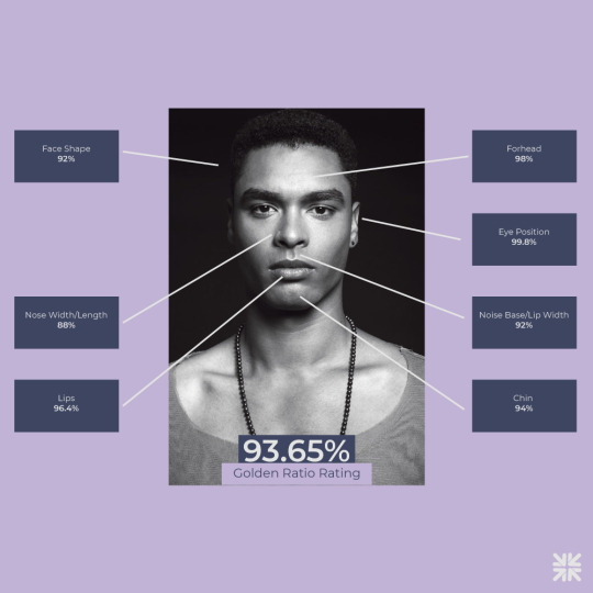

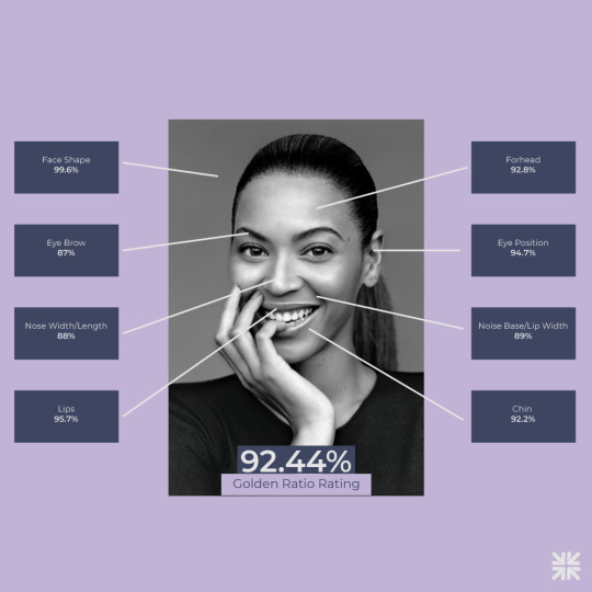

The enduring allure of the Golden Ratio!
Celebrated by artists across centuries, this proportion is revered for its perceived perfection in symmetry and harmony. Learn how icons such as Zendaya, Beyoncé, and Bella Hadid embody this timeless ratio in their facial features.
Explore the profound impact of the Golden Ratio on design and logo aesthetics in our insightful article: https://freelogocreator.com/blog/golden-ratio-in-logo-design
#logo design#golden ratio#logo#branding#zendaya#beyonce#bella hadid#Rege Jean#golden ratio in logos#divine proportion#symmetry#graphic design
0 notes
Text
A supreme entity was here long before religion was ever thought of.
These are all scenes in nature that developed because of the Golden Ratio that is part of the very fabric of our earth.
It's mathematics actually, expressed in nature algebraically, so Yeah, most people don't have a clue as to what it is, but the Greeks did, they called it 'phi',........ and I know, most people are gonna think "So what's Phi, and is there a Peach Phi?"
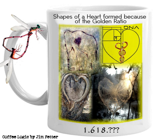
If ya ever seen a dragonfly mate, you'd see they form a heart-shape. If you look closely, a deer footprint is in the shape of a heart. A strawberry is one of nature's most familiar heart shapes.
Nautilus shells and the human body are two of the most prominent examples of the Golden Ratio we see everyday.
What's the Golden Ratio in nature, basically it's 1.618., anything that the sum of all it's parts is equal to 1.618. is Phi, and Phi is the Golden Ratio.
This Golden Ratio can be seen from the microscale to the macroscale, and right through to biological systems and inanimate objects. The Golden Ratio doesn't account for every structure or pattern in the universe, because many are man made and not natural, but the Golden Ratio is certainly a major player in existence game!
So what the heck does the shape of a Heart have to do with anything anyway?
Earth’s valentines can be found all over, from Spain to the Solomon Islands.
Ya see,... Since ancient times, certain mathematical figures and symbols (the heart) had been the focus of substantial interest around the globe probably due to their obscure and esoteric messages associated with basic and fundamental questions of physical existence,............ not to mention the hearts emotional symbology in every culture on earth, and all meaning basically the same thing,......... which when we think about it is quite remarkable knowing all the different languages, cultures, and the fact many cultures didn't even know about the others for thousands of years, and yet The Heart symbol had the same meaning??? Food for thought at the least i would say......... I mean religion can't even say that about itself, and the heart symbol predates any known religion for thousands of years,.......... we got cave paintings by neanderthals 65,000 years ago, not even totally human beings yet drawing hearts on cave walls.
The Golden ratio and 'Fibonacci Cascade’ are both associated with branching patterns of coronary arteries, DNA and natures design of intricate patterns, all within that 1.618. parameters.
If you believe in a supreme being it's got to be 1.618. eventuality!
This ratio has served mankind in three ways: it provides beauty, function, and reveals how wise, good, and powerful the Creator is.
Sounds like most religious scriptures and doctrines messages to me.
Here's something to chew on,.... in birth human greater uterine length, width and AP diameter is an average of 1.618.
Then,..... Mean length/width ratio In the human heart, vertical and transverse dimensions of a heart attack are 1.618. until heart failure.
So we are born into this world at 1.618. and we die at 1.618.
Just a coincidence?!?!?!?
I think not, but keep believing in that man made God.....
The Earth's biggest example of the golden ratio (or golden mean) is found in Giza Egypt,...... ya can't miss it, it's where the Grand Pyramids are built,.... one of the Seven Wonders of the world, the Egyptian Great Pyramids constructed in 2580-2560 BC, the Golden Ratio can be found in the slant height of pyramid to half the base dimension,........... How did the Egyptians know to build the pyramids at that 1.618. natural golden ratio making the pyramids seem like a natural structure, like a plant is?!?!?
Like the pyramids were a living structure???
The Golden Ratio is one of the most common mathematical ratios in nature. We see this ratio everywhere from majestic landscapes like the Pyramids of Giza and the Mona Lisa to modern-day logos such as Pepsi and Twitter, now called "X", .... "X" also being an irrational number, which is the solution to the quadratic equation X2, and still part of the Golden Ratio.
Some may think this whole Golden Ratio thing is a mystical or spiritual, and even a religious thing, it's not,........ it's science, because our consciousness still resides in our brain, heartfelt that it may well be, it's a process of cognitive thinking, because the heart can't think, and only feels what the brain tells it.
Let me put it this way,.... if there were no golden ratio, there would be no earth and no human beings walking on it......... The Golden Ratio is in the fabric of our stardust being, before and after our humanitarian experience.
One last factoid for the religious out there,..... The cross, .... the upper three segments of a cross are the same length, if you divide the horizontal arm in half you get 1.618.
Imagine that, way before there were human beings walking on earth to create their own god, the golden ratio already did it for them.....
2 notes
·
View notes
Text
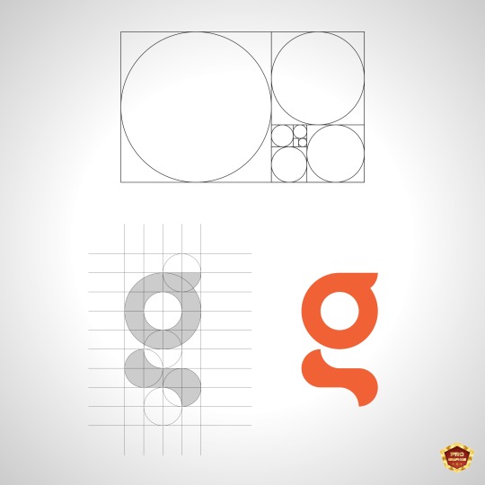
"Harmony in Design: Using the Golden Ratio for Logo Balance"
You Just Imagine, We'll Enhance It!
#logo#logodesign#logodesigner#business#businesslogo#businesslogodesign#businessideas#businessbrand#brand#branding#brandlogo#logobrand#graphic#graphics#graphicsdesign#graphicsdesigner#design#designer#designing#designlogo#letterlogo#letterlogodesign#letterbrand#professionallogodesign#minimallogo#minimalist#minimalistlogo#minimalistlogodesign#trend#trending
3 notes
·
View notes
Text
Razão Áurea
A Razão Áurea, frequentemente denotada pela letra grega \(\phi\) (phi), é uma proporção matemática comumente encontrada na natureza, na arte, na arquitetura e no design. Ela é aproximadamente igual a 1,618 e possui propriedades únicas que fascinam matemáticos, artistas e arquitetos há séculos.
O que é a Razão Áurea?
Matematicamente, a Razão Áurea ocorre quando uma linha é dividida em duas partes, \(a\) e \(b\), de forma que a razão entre a linha inteira e a parte maior seja igual à razão entre a parte maior e a parte menor:
\[
\frac{a+b}{a} = \frac{a}{b} = \phi \approx 1,618
\]
Essa relação também pode ser expressa como:
\[
\phi = \frac{1 + \sqrt{5}}{2} \approx 1,618
\]
Principais Usos da Razão Áurea
1. Arte e Design:
- A Razão Áurea é frequentemente usada para criar composições visualmente agradáveis. Artistas como Leonardo da Vinci supostamente a utilizaram em obras como a "Mona Lisa" e "A Última Ceia".
- No design gráfico, a Razão Áurea é aplicada nas proporções de layout, no design de logotipos e na tipografia para alcançar equilíbrio e harmonia.
2. Arquitetura:
- A Razão Áurea tem sido usada na arquitetura para projetar edifícios que agradam aos olhos. Exemplos famosos incluem o Parthenon em Atenas e as proporções de muitas estruturas da era renascentista.
- Ela pode ser vista no design de cômodos, janelas, portas e até mesmo de edifícios inteiros.
3. Natureza:
- A Razão Áurea aparece em vários fenômenos naturais, como na disposição das folhas, no ramificação das árvores, nos padrões espirais de conchas e até mesmo nas proporções do corpo humano. Por exemplo, a relação entre os comprimentos das diferentes partes do braço humano ou o padrão das pétalas das flores frequentemente seguem a Razão Áurea.
4. Matemática:
- A Razão Áurea está intimamente relacionada à sequência de Fibonacci, onde a razão entre números sucessivos de Fibonacci se aproxima de \(\phi\) à medida que os números aumentam.
- Ela é usada em várias áreas da matemática, incluindo geometria e teoria dos números.
5. Finanças:
- Nas finanças, a Razão Áurea é aplicada na análise técnica, particularmente nos níveis de retração de Fibonacci. Esses níveis são usados para prever possíveis pontos de suporte e resistência nos movimentos dos preços das ações.
6. Fotografia:
- Fotógrafos usam a Razão Áurea para enquadrar e compor suas fotos. A regra dos terços, uma forma mais simples da Razão Áurea, é frequentemente aplicada para dividir uma imagem em seções equilibradas.
Em resumo, a Razão Áurea é valorizada por seu apelo natural e equilíbrio, tornando-se uma ferramenta poderosa em várias disciplinas. Sua presença tanto na natureza quanto em estruturas criadas pelo homem continua a inspirar e guiar os princípios de design.
---
Golden Ratio
The Golden Ratio, often denoted by the Greek letter \(\phi\) (phi), is a mathematical ratio commonly found in nature, art, architecture, and design. It is approximately equal to 1.618 and has unique properties that have fascinated mathematicians, artists, and architects for centuries.
What is the Golden Ratio?
Mathematically, the Golden Ratio occurs when a line is divided into two parts, \(a\) and \(b\), such that the ratio of the whole line to the longer part is the same as the ratio of the longer part to the shorter part:
\[
\frac{a+b}{a} = \frac{a}{b} = \phi \approx 1.618
\]
This relationship can also be expressed as:
\[
\phi = \frac{1 + \sqrt{5}}{2} \approx 1.618
\]
Main Uses of the Golden Ratio
1. Art and Design:
- The Golden Ratio is often used to create aesthetically pleasing compositions. Artists like Leonardo da Vinci are believed to have used it in works such as the "Mona Lisa" and "The Last Supper."
- In graphic design, the Golden Ratio is applied to layout proportions, logo design, and typography to achieve balance and harmony.
2. Architecture:
- The Golden Ratio has been used in architecture to design buildings that are pleasing to the eye. Famous examples include the Parthenon in Athens and the proportions of many Renaissance-era structures.
- It can be seen in the design of rooms, windows, doors, and even entire buildings.
3. Nature:
- The Golden Ratio appears in various natural phenomena, such as the arrangement of leaves, the branching of trees, the spiral patterns of shells, and even the proportions of the human body. For example, the ratio between the lengths of different parts of the human arm or the pattern of flower petals often align with the Golden Ratio.
4. Mathematics:
- The Golden Ratio is closely related to the Fibonacci sequence, where the ratio of successive Fibonacci numbers approximates \(\phi\) as the numbers increase.
- It is used in various areas of mathematics, including geometry and number theory.
5. Finance:
- In finance, the Golden Ratio is applied in technical analysis, particularly in Fibonacci retracement levels. These levels are used to predict potential support and resistance points in stock price movements.
6. Photography:
- Photographers use the Golden Ratio to frame and compose their shots. The rule of thirds, a simpler form of the Golden Ratio, is often applied to divide an image into balanced sections.
Overall, the Golden Ratio is valued for its natural appeal and balance, making it a powerful tool across various disciplines. Its presence in both nature and human-made structures continues to inspire and guide design principles.
0 notes
Text
Week 4 ( Composition & Layout)
The class was refreshed on our knowledge in Composition and layout. We were thought on the few important compositions for design which are the rule of thirds, the golden ratio, focal point, scale and hierarchy, balancing, and white spacing. These are key elements in design to communicate and emphasize the Key message/subject.
Within this week, we also had consultation for our logo design progress. We did hand drawn sketches of our ideas for the logo and tried different elements to make it stand out.
Attached are a few key guidelines to understand the concept of composition and layout better. There is also a link to help everyone learn more on how composition works and how we as designers use it to our advantage!
youtube


1 note
·
View note
Text
Week 4: Composition & Layout
4/10/2023
De Jia Xuan / 19112523
COM3024 Advanced Graphic Communication / BA (Hons) in Advertising and Branding

For Week 4, we were introduced to the basics of composition, the Rule of Thirds, and the Golden Ratio.
Lecture
The basics of composition include:
Focal point: When contrast is created within a design to highlight or draw attention to important information. A tip when creating a focal point is this: simplicity is key.
Scale and hierarchy: To create a sequence/arrangement where the audience's attention will be drawn to certain aspects.
Balance the elements
White space: Helps to create balance as well.

Image taken from Matt Artz
As for the Rule of Thirds, we watched a video about it.
youtube
As usual, here are a few points to note:
Use natural leading lines, diagonals, and framing to lead the audience's attention to the picture's subject.
Find a contrast between the subject and background.
Fill the frame.
Place the dominant eye in the centre of the picture.
Create patterns and repetition, and find ways to interrupt the pattern to spark interest.
The Golden Ratio

Image taken from Purpose Studios
Used to create natural and organic compositions, and is commonly found in nature.
Useful in determining dimensions of the layout. To apply it, set dimensions to 1:1.618.
Tutorial
Mr Fauzi looked over each of our progress for the personal logo design.


My progress, including Inspiration / References, Ideation and Hand drawn sketches.
While Mr Fauzi believed that number 1 and 10 had potential, we ultimately decided to go with the first logo due to its legibility and versatility. He suggested adding my name in readable text right above the "X" so the audience would be able to understand what the logo was all about.
The next steps in the assignment would be:
Refine the logo through digital and vector sketches,
Create the vector logo in colour and in black & white, and
Apply the logo to a CV.
0 notes
Text

In this week's reading on the Golden Section as well as single-column, multi-column, and modular grids. I was very interested in the concept of the golden ratio, a formula that has been used in Western art for over 2,000 years. I was shocked and interested when I heard this, I had always thought the golden ratio was a more relatively modern formula, I had no idea that it dated back that far.
I remember my high school, The Fine Arts Center, had their logo be the golden ratio shell shape. I always thought I was a really interesting logo for an art and architecture school but I hadn't ever fully thought about why they would have chosen to have that shape be their logo. I had also never really considered applying the golden ratio in grid layouts, and hope to include them in future designs. I personally really enjoy modular grids and the examples given in the textbook like the spread on pages 196-197 designed by Emil Ruder. I think the modular grid has such a clean and organized layout that I find very pleasing to the eye and especially enjoy pictures.
This week we worked on and completed our grid project for project 2 in which we were tasked to use found text from books and magazines to find dark, light, and medium reading in the text and arrange them in a grid pattern like the ones we read about in last weeks reading. I chose to do a modular, a column, and an experimental grid. Overall I wasn't super happy with my modular and I think my column turned more experimental but I really enjoyed playing around with the experimental design and liked how that one turned out. The foam board was a bit of a struggle for me as I had to go to multiple stores to finally find foam board however never having cut foam board before I gave it my best shot however I do think I could improve.
0 notes
Text

Eagle logo - design process ☆☆☆
Need a unique logo? PM us for details! 💌
#eagle#birds#american eagle#flacon#logo#design#illustration#flying#artists on tumblr#grids#art process#ai#digital art#proportions#golden ratio#australia#sydney
41 notes
·
View notes
Text

Fish Logo with golden ratio grid - Animal Logo.
I've just uploaded a collection of 11 animal logos and grids - You can check them out on Behance, and if you like them, please don't forget to let me know.
Let's connect: [email protected]
#fish logo#animal logo#golden ratio#golden ratio logo#identy#design#inspiration#creative design#logomark#logo logotype#brand logos#designer art work#logo#modern logofolio#graphic logo designer#business logo logo#graphic portfolio#logo logo#brand#designer#creative
23 notes
·
View notes
Text
Title: Leading Logo Design Agency in Pune - Professional Services
Description: Looking for the best logo designer in Pune? Ideal Logo Designer offers top-notch professional logo design services. From Golden Ratio logos to business branding, our expert team creates impactful designs. Trusted across India, we ensure your brand stands out. Contact us today for exceptional logo design services.
#logo design agency in pune#logo designer in Pune#logo designer near me#best logo designer in pune#professional logo design services in pune#business logo design in Pune#Logo Designer Company in pune#Golden Ratio Logo design in pune#leading logo design company in Pune
0 notes
Text
Title: Exploring the Essence of Design Aesthetics: Form, Function, and Beauty
Introduction
Design aesthetics is an integral aspect of our daily lives, shaping our preferences and influencing the products, spaces, and experiences we encounter. It's a complex and multifaceted concept that transcends the realm of mere appearances, encompassing form, function, and beauty. In this article, we delve into the world of design aesthetics, exploring its significance, principles, and how it impacts various aspects of our lives.
Understanding Design Aesthetics
Design aesthetics refers to the visual, sensory, and emotional aspects of a design that evoke an individual's perception of beauty and appeal. It's not limited to the realm of art or fashion but extends to architecture, product design, web design, interior decoration, and even the layout of cities. A well-thought-out design can inspire emotions, tell stories, and enhance usability.
The Significance of Design Aesthetics
1. Emotional Impact: Aesthetically pleasing designs have the power to evoke emotions. For example, a cozy, well-designed home can create feelings of comfort and security, while a sleek and minimalist smartphone can invoke a sense of sophistication and modernity.
2. Functionality: Good design aesthetics is not solely about appearances; it also influences functionality. A well-designed chair not only looks great but also offers comfort and ergonomics. When aesthetics and functionality are in harmony, it leads to a better user experience.
3. Brand Identity: Aesthetics play a crucial role in defining a brand's identity. Think of iconic logos like Apple's bitten apple or the swoosh of Nike. These designs not only look good but also convey a brand's values and personality.
Principles of Design Aesthetics
1. Simplicity: The principle of simplicity, often associated with minimalism, emphasizes the elimination of unnecessary elements to achieve a clean and uncluttered look. This can enhance user comprehension and appreciation.
2. Balance: Balance in design creates visual stability. It can be achieved through symmetrical or asymmetrical arrangements of elements, depending on the desired effect.
3. Contrast: Contrast helps in drawing attention and creating visual interest. It involves juxtaposing elements with noticeable differences in color, size, shape, or texture.
4. Proportion and Scale: Correct proportions and scale ensure that elements within a design are harmonious and visually appealing. For instance, in architecture, the Golden Ratio is often used to achieve pleasing proportions.
5. Harmony: Harmony in design brings all elements together, creating a sense of unity and coherence. It can be achieved through color schemes, typography choices, and consistent styling.
Applications of Design Aesthetics
1. Architecture: Iconic buildings like the Sydney Opera House or the Burj Khalifa exemplify how architecture can be a fusion of form and function, creating striking visual landmarks.
2. Product Design: Companies like Apple have elevated product design to an art form, where aesthetics are carefully considered alongside functionality to create devices that are both beautiful and practical.
3. Web Design: Effective web design involves making websites visually appealing and user-friendly. It requires selecting the right color schemes, typography, and layout to convey information effectively.
4. Fashion: Fashion designers create clothing and accessories that not only serve utilitarian purposes but also reflect cultural trends and individual expression.
5. Interior Design: Interior designers transform spaces into visually pleasing and functional environments, considering factors like lighting, furniture, and color schemes.
Conclusion
Design aesthetics is more than just a matter of personal preference; it's a fundamental aspect of how we interact with the world around us. It affects our emotions, our perceptions, and our choices. Whether it's a building, a product, or a website, the principles of design aesthetics are constantly at play, shaping our experiences and influencing our decisions. Embracing the essence of design aesthetics allows us to create a world that is not only functional but also beautiful and meaningful.
1 note
·
View note
Text
How to Design Microsoft New Edge Logo | Illustrator Tutorial

As we all know Microsoft has released its new chromium based browser Edge with a brand new Logo. In this tutorial you will see how to design the Edge Logo using Golden Ratio method in Adobe Illustrator. The creative use of Ellipse Tool, Shape Builder Tool and Freeform Gradient Type Tool can make great logo designs in Adobe Illustrator.
I am sure, you will be amazed to watch this. Below you can also download the source vector file of the Edge Logo in AI, EPS and SVG formats. Enjoy creative designing!! Grab this now and feel free to use and share it. Also don’t forget to check out our design shop for more great resources. Subscribe to our YouTube Channel to get more amazing stuffs and useful information.
Watch Now
#vector#design#adobe illustrator#creative#illustrator tutorial#tutorial#microsoft edge#logo design tutorial#adobe illustrator tutorial#logo design#microsoft edge logo
0 notes
Last Seen Blogs