#lita talarico
Explore tagged Tumblr posts
Text
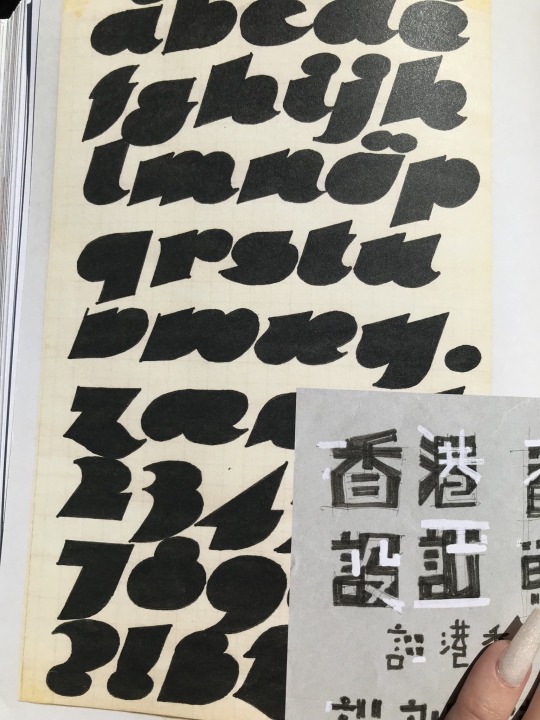
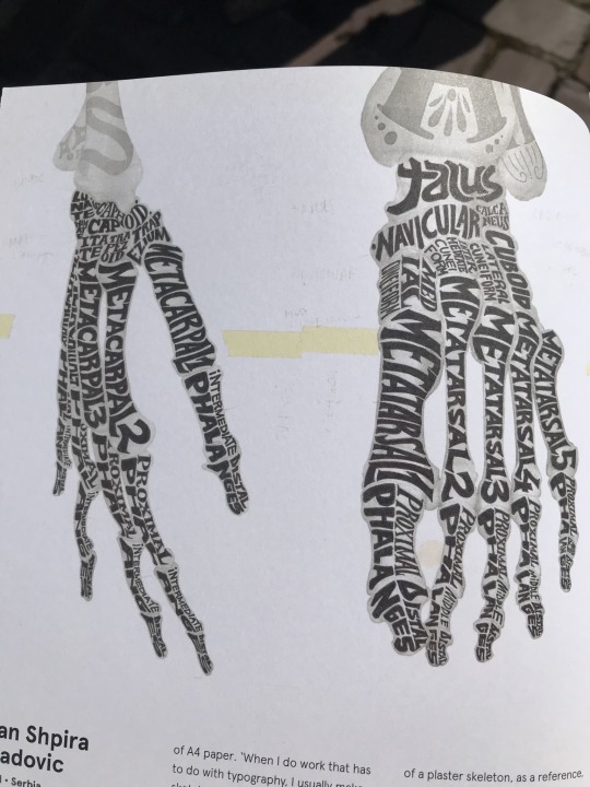
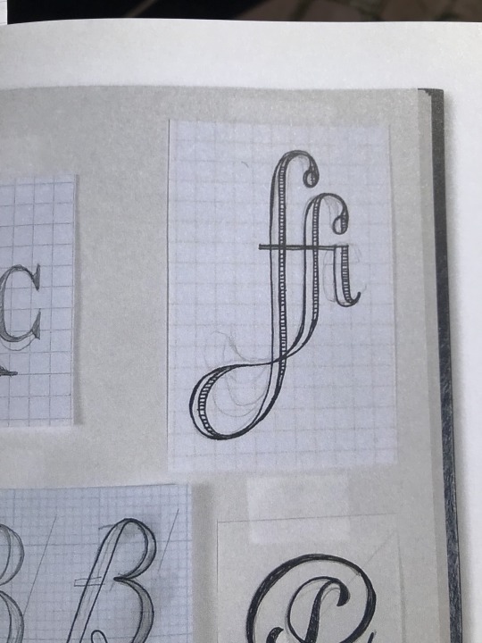
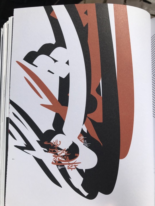
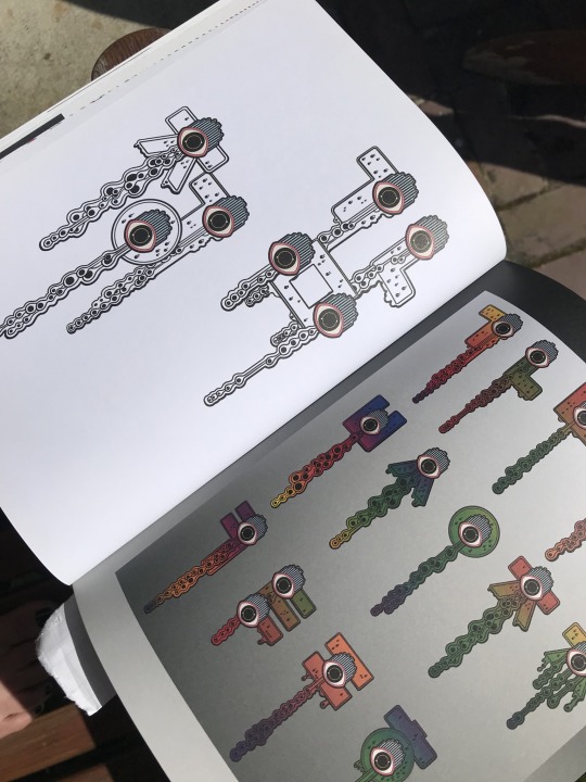
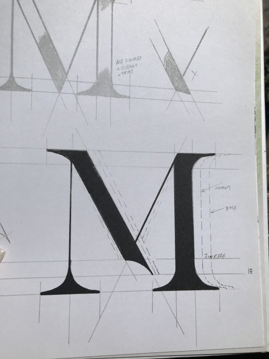
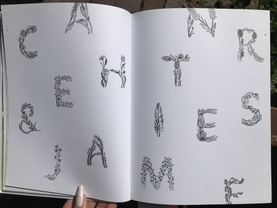
artists: various, all personal sketchbook pages featured in Free Hand (Heller & Talarico)
1 note
·
View note
Photo
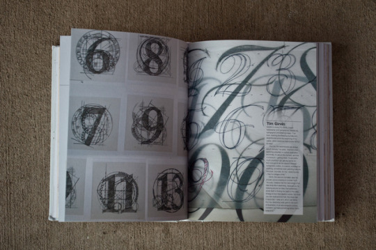
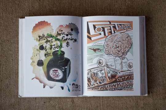
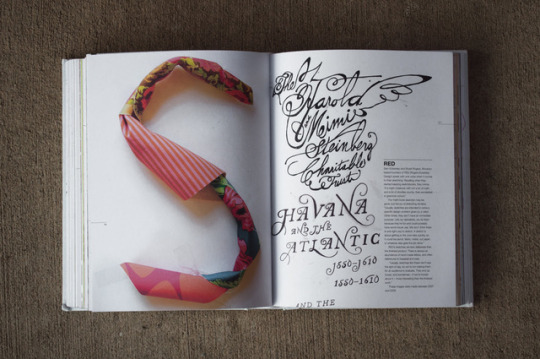
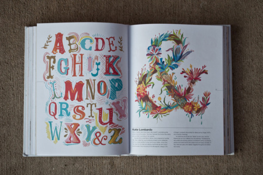
I hopped onto the website Type Theory and was immediately greeted with exceptional typography sketches and journaling’s. This grabbed my attention because through my Typography class we are assigned to fill a sketchbook with inventive and creative expressions of type so we can become familiar with fonts. Here was something I could relate to.
Type Theory is a “journal of contemporary typography featuring news, views, reviews and interviews.” Ty Wilkins, a graphic designer, founded the type blog in 2009 and features the type journals of any individual’s work that catches his eye. The home page has type news listed as well as a featured blog post by Mandy Collins. She posted several pictures of Steven Hellar and Lita Talarico’s Typography Sketchbook which is a collection of creative type drawings illustrated by hundreds of individual graphic designers. Each page is filled with colorful images and brief paragraphs about their creative process. The sketchbook is designed to inspire artists and designers all over to create type designs with creative twists, styles, and techniques, expressing their philosophy through art and design.
#Type Theory#typography#sketchbook#type#GraphicDesign#art#design#typeblog#Ty Wilkins#Steven Hellar#Lita Talarico
5 notes
·
View notes
Text
ACE AIR: ELLIOT SALAZAR & ISABEL CASTILLO GUIJARRO
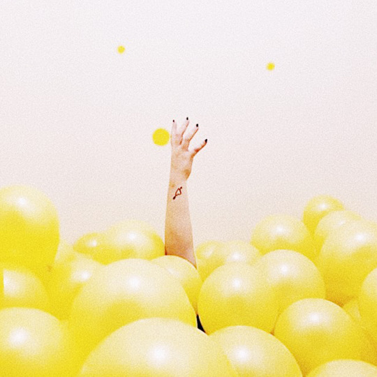
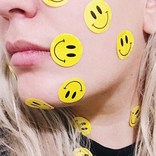
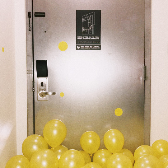
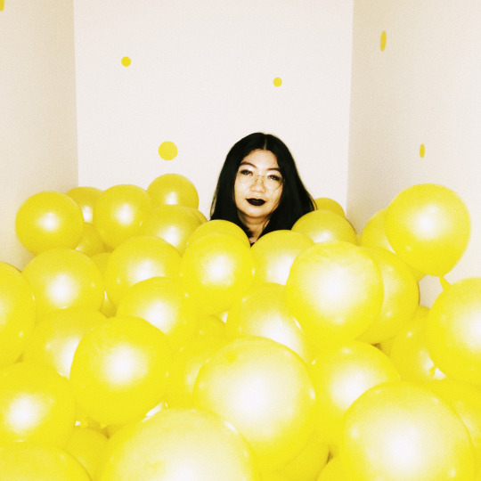

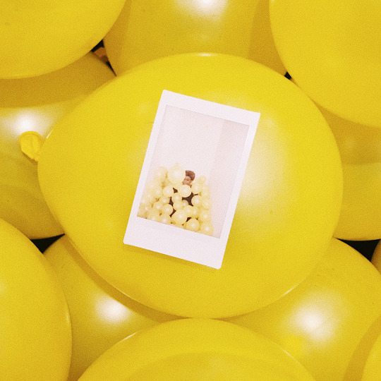

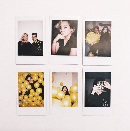
Program: Ace AIR Location: Ace Hotel New York Date of Stay: 10.28.18 Artist: Elliot Salazar & Isabel Castillo Guijarro
During their evening at Ace Hotel New York, artists Isabel Castillo Guijarro and Elliot Salazar “wanted to create an experience, not just art.” They brought in a few friends, blew up more than a few yellow balloons and called the resulting interactive piece untitled 11. Isabel explains:
Inspired by three of the most influential living artist of our time — Martin Creed, Yayoi Kusama and James Turrell — untitled room 11 is an homage to their art. From the balloons completely covering the floor, to the Kusama-like dots on the wall and the lights in the bathroom. The room became the art itself.
Elliot Salazar is a Senior Designer at Refinery29, where he oversees design for social media. Originally from Texas, he studied Design at Texas Tech University and later received his MFA in Design from the School of Visuals Art’s Designer as Author & Entrepreneur Program, co-chaired by Lita Talarico and Steve Heller. Most recently he joined the AIGA NY Board of Directors.
Isabel Castillo Guijarro is a New York-based Art Director, Designer and Illustrator from Madrid. She studied Advertising in Dubai, prior to spending a summer at Central Saint Martins in London and later graduating from Parsons School of Design. Her work has been featured in Forbes, Print Magazine and Eyeondesign. She often takes photos on Instagram, doesn't believe in mediocrity and likes making murals but loves to travel above everything else.
This October, our Artists in Residence are curated by Refinery29, the award-winning women-focused digital media company with a global audience footprint of 550 million. Their mission is to be a catalyst for women to feel, see and claim their power by providing optimistic and diverse creativity, storytelling and points of view. They deliver style and substance to an audience that’s highly engaged across a variety of devices and destinations, from the original video and editorial features, to live experiences and social storytelling.
#aceair#newyork#ace hotel nyc#acehotel#air#artistsinresidence#salazar#castillo guijarro#balloons#room#experience#homage#yes
7 notes
·
View notes
Text
ARTS102 - Blog 7 - Aiden E
I haven’t been able to dedicate as much time as I would’ve liked to these past 2 weeks for ARTS102. That’s because I have been practicing dancing for an upcoming competition, and it has a put lot weight on me to perform well. With that out of the way, what I have worked on has been starting Project 6: Process Journal, where I have to make a booklet compiled of all my past projects in this class. I find this interesting, as it really puts how well one has been keeping up, not only with the projects, but taking screenshots, etc. of work in progress to see how that certain project has come together. For mine I have made a mood board as well as take notes into how other designers design their books with layout being the main focus. And, the last thing I have made progress with so far, has been putting what I learned about earlier, and starting to design the layout of my Process Journal, with Project 1 being the first.
As for the textbook readings, I found great interest in the designer: Lita Talarico. She seems to have great approach when it comes to teaching new students who want or who are already in art, but don’t know how to apply their artwork and creativity and pushing it into the market. Talarico is one of the cofounders to an art program based in New York City, under the SVA. The program itself is called: MFA. It requires whoever takes the course to push for 2 whole years in the field of art, just getting taught what they need to know and then applying and putting themselves out on the market. What is so interesting with how Talarico approaches keeping the new students, with the current art direction, is that Talarico and her team learns from the new students in terms of art and art tools.


0 notes
Text
Weeks 11 & 12


These past two weeks have felt a little slower, but I feel good about the final project of the class. I have learned more than I expected about not only graphic design, but myself as well. I am currently in four art classes and one art history, this semester creatively being my most rigorous semester of college so far. My professors and instructors inspire me and challenge me every class session, which is why I feel more and. more confident about my artwork and my abilities. This week we went to the library to look at graphic design books, and I believe it's what I needed. While in class I stepped out to go check out books for drawing and a book on Millet (learned about in art history). While sitting in class I saw a typography book that instantly made me start drawing ideas. Our reading this week had a page or two that stuck out to me and I felt like applied to me and what I am thinking about now. Soon graduate school will be knocking on my door, and realistically it's time to think about it and form some sort of direction. When I got to page 311 and they were asking questions about students and M.F.A's to Lita Talarico. As soon as I began reading I felt like I was getting confirmation. Her explaining what you potentially are going to do in the M.F.A. program is where my mindset is in general, and gets me even more excited about what I can do in the future.
1 note
·
View note
Text
Weeks 11 and 12 Blog Post

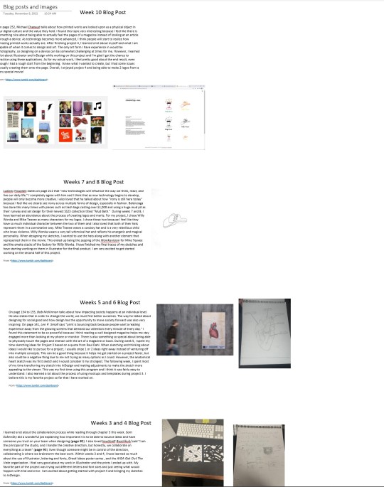
On page 313, Lita Talarico is asked 'How do you teach students to stay current?" and she responds by saying "We don’t have to teach them, they teach us." I found her response to this question very interesting because in our current society, there is so much knowledge that can be found on the internet and many students have more experience with technology than their professors. Our teachers they are able to help use see and achieve our goals when combining our knowledge with theirs and I find that really important. For week 11, I really enjoyed created project 5 which focused on the elements of syntax and semantics. For my project, I used 4 different types of furniture specifically chairs and broke them down into smaller categories. This was probably one of my favorite projects because I enjoy searching for images and having the creative control to chose images of my taste. Another thing I learned while creating project 5 was how to use tools in InDesign such as paragraph styles and how important it is to create space between text. Currently (week 12,) I'm working on my final project and have gathered all of my blog posts text and images into one document to create the backbone of my project.
1 note
·
View note
Text
Type inspiration
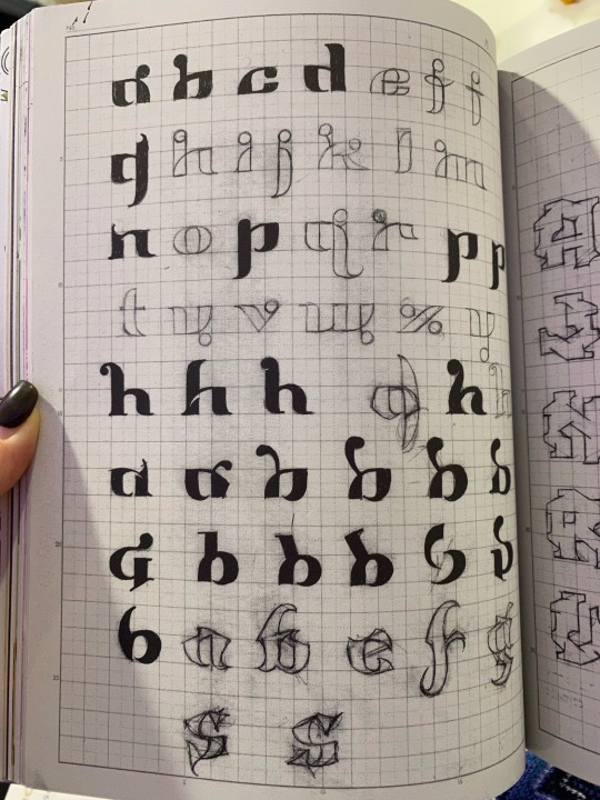
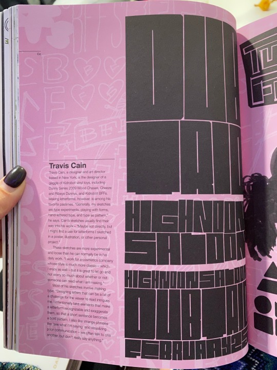
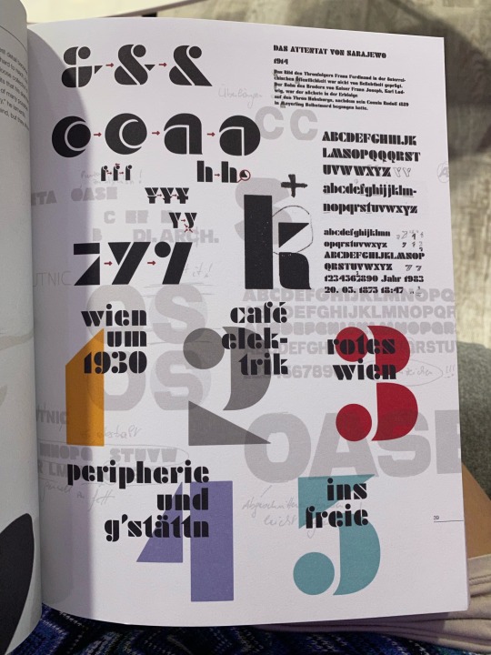
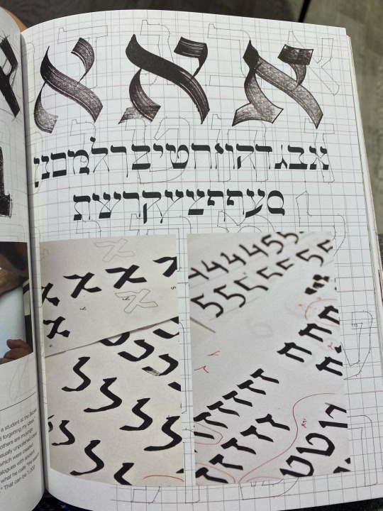
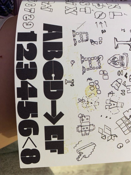
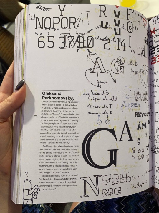
Typography Sketchbooks by Steven Heller and Lita Talarico
This book showed me what goes on behind the scenes of the work of type designers. I was able to see not only the process of their work, but also read about their ideas and views on creating various letterforms.
Speaking of the letter shapes themselves, I am really impressed by the quality of these artists' initial sketches and the consistency of the characters created. I really enjoyed Oded Ezer's work and his calligraphic experimentation, which represents an almost classical and antique style.
0 notes
Photo
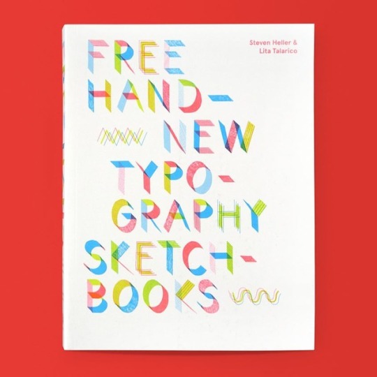
Free Hand: New Typography Sketchbooks / Available at www.draw-down.com / In Free Hand: New Typography Sketchbooks, Steven Heller, respected #graphicdesign commentator, and Lita Talarico, #design educator, offer glimpses inside the personal #sketchbooks of more than 70 designers and #typographers—including Philippe Apeloig, #EdBeguiat, Hoefler & Co., Henrik Kubel, Toshi Omagari, and Francesco Zorzi. Featuring a wealth of sketches, precision drawings, and computer-generated artwork, as well as a range of styles, concepts, languages, and alphabets, Free Hand illustrates the idiosyncratic creative processes behind the design of typefaces, logos, and word-images. A valuable resource for anyone who engages creatively with #type—whether by hand or on a screen—this rich compendium emphasizes the power of #typography in the digital age, while celebrating designers who continue to innovate in their practice of this time-honored craft.
19 notes
·
View notes
Photo
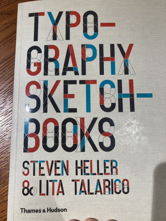
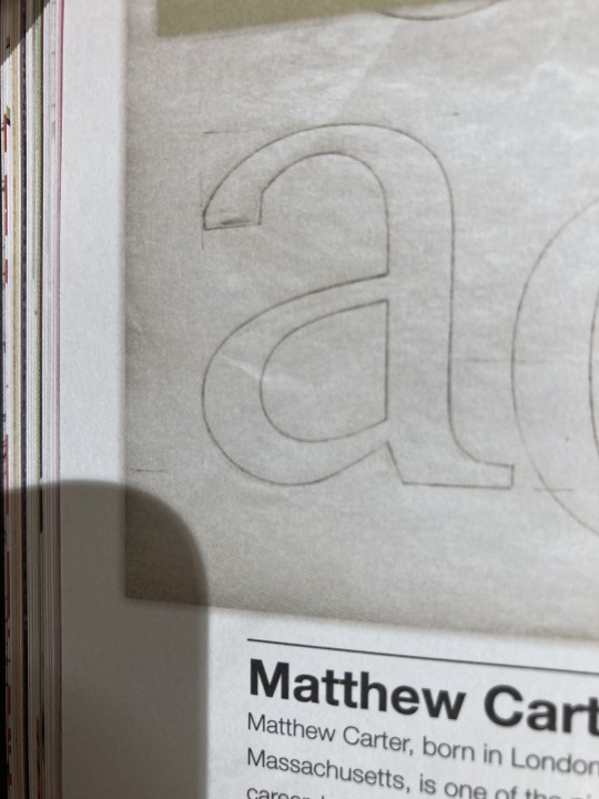
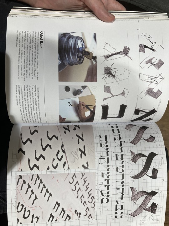
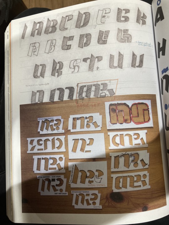
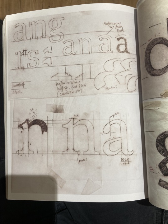
Typography Sketchbooks - Steven Heller & Lita Talarico
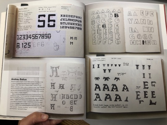
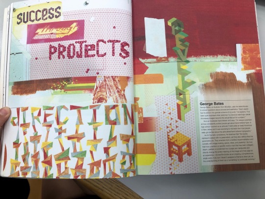
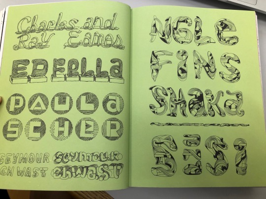
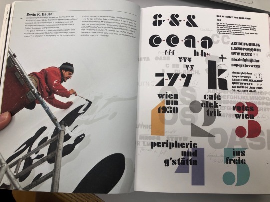
As I was in Waterstones looking at design books I came across this, which is very relevant to the current project, through out the book created by Steven Heller & Lita Talarico we get to see a look into a range of different designers type sketchbooks.
Taking a look at the range of different type designs of san serif, serif and display types is really inspiring.
I took some pictures of the pages that I liked the most. I really liked the look of the modular typeface that was created only using a small collection of shapes and I would've liked to create one like this but its too late in the project currently, if I end up choosing to design a typeface in the future then I think that that route could be fun.
I wished I could've purchased this book.
0 notes
Text
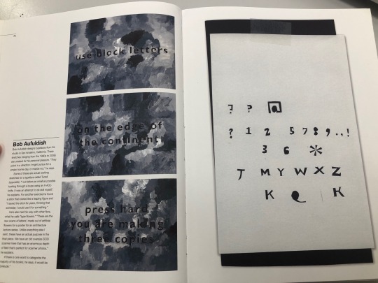
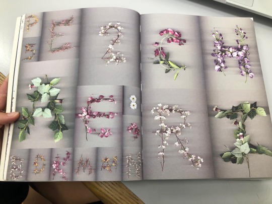
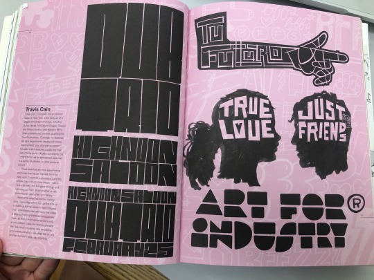
Friday 21st October 2022 - Typography Sketchbook
Looking at the book typography sketchbooks created by Steven Heller & Lita Talarico, it features the sketchbooks of multiple typographers showing ideation, sketches and processes of creating a typeface. It’s been a great source of inspiration, and has generated ideas of focusing on shapes and the use of negative and positive space to generate a typeface.
0 notes
Photo
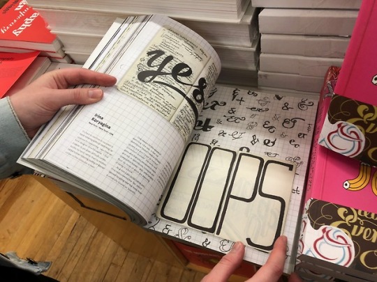
Freehand: New Typography Sketchbooks, by Steven Heller and Lita Talarico, featuring sketches by Irina Koryagina. Published by Thames&Hudson, 2018
#strand#book#Typography#irinakoryagina#sketchbook#lettering#bookstore#stevenheller#litatalarico#contribution#advocacy#community#New Typography Sketchbooks#book contribution
3 notes
·
View notes
Text
ARTS102 Readings and Reflection
Reading 6: Chapter 16-19 (pg.292-327)
Chapter 18 approaches the aspects of graphic design that rely on the computerized programming of different systems. These developments are very mathematical and strategic in nature. Frieder Nake discusses the relationships between modern designers and technology- specifically how generative design can be used interchangeably with manual arrangements. Programmer and designer Mark Webster similarly talks about said relationship and the ways in which comprehending programming methods can enhance a designer’s own work. Chapter 19 discusses the different levels of education one can choose from for the graphic design field and how longer stints of schooling can be of greater benefit to gaining the necessary skills for a future job. It describes positive qualities found in a graduate school program, such as faculty, quality programs, distanced learning options, business preparation, and work ethic. Lita Talarico, an experienced educator in the graphic design field, describes how today’s education benefits those who choose to pursue it and how it can set one up for a successful career if executed correctly. David Carroll is another educator and professor currently focusing in surveillance design. He speaks on how his students handle this specific field of study that extensively utilizes programming, as well as the ethical questions that come with it. These interviews offer the reader insight into the many different directions a student can take when it comes to the graphic design field, whether it be computer programming or analog design of layouts.
Reflection
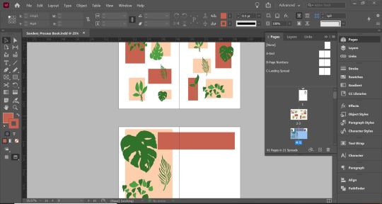
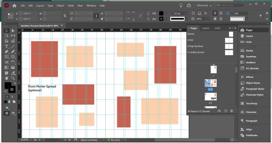
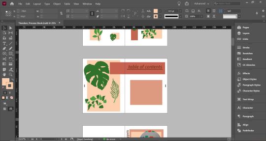
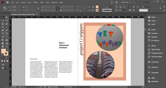
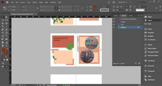
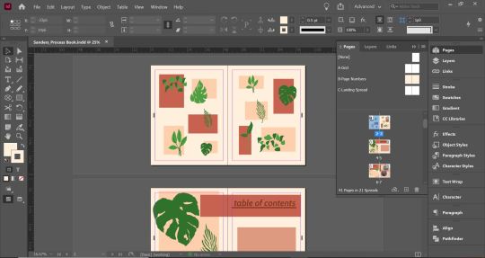
This week brought on our final project of this course- a Process Book containing every project completed over the semester. The project combines all our gained skills with components like program setups, master pages, typography, formatting, and vectors. Initially, I felt slightly overwhelmed at the prospects of designing an entire book. I found myself unsure of where to start. However, once I finally dove in and tackled the front matter first, my ideas began to flow much easier through experimentation. A color palette I felt particularly attached to was one using different shades of orange and cream, along with green accents. I incorporated this into the front matter by creating scattered rectangle and square shapes across the spread. Working in illustrator, I formulated decorative vector images of plants that I placed in an offset pattern atop the shapes. This was intended to be a sort of loose and freeform pattern that could be still be visually satisfying to the viewer. I utilized a similar design for the table of contents spread as well. The left page is a simple rectangle that goes slightly past the margins at the top with enlarged plant vectors sitting atop it. The other rectangle that holds the table of contents text overlaps from the right page into the left to seemingly connect the two. To blend with the other two, the statement of intent and project introduction spread that follows are a similar format. I elected to place preview images of the Snippets project in circular frames for now, but will likely change this idea to be less plain. I also began to navigate the concept of master pages with one that assigns page numbers to the spreads, as well as one that sets the background color. All these elements are subject to change, as much of the design placed down were the results of initial experimentation, and I aim to push myself and expand upon the ideas I have worked up so far.
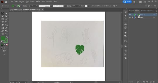
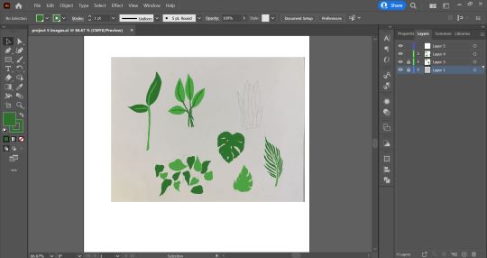
0 notes
Text
Week 4 - Innovations in Typography
08/11/21
Sawdust (sawdust.com)
After looking through the website known as Sawdust I saw a myriad of engaging and visually concise pieces of typographic design.


Poster for music artist Gryffin with supporting acts by Shallou and GhostDragon. (Client: Another Planet Entertainment)
Above is one project from Sawdust—it is rather hard to decipher if you are viewing it for the first time, but on careful inspection, you can actually make out that it to be read vertically from the top. The word reads Gryffin as prefaced underneath the design itself. The use of black and white allows it to really stick out from the crowd. In fact, I don't think it is that much of a stretch to believe that the design itself is actually based on that of a Griffin's head (Griffin being a creature of mythical origin).
While looking through the book Typography Sketchbooks by Steven Heller and Lita Talarico, I noticed a page detailing a specific Dutch typographic artist by the name of Donald Beekman. One page of his sketchbook (on the right) bears a strong resemblance to the work which was published on Sawdust. It looks as if it could be a very early conceptual piece that would go on to be the final design on Sawdust. This is really interesting to me as it seems as though two different artists could come to such a similar result within their own different surroundings and circumstances. Supposedly, according to Beekman's notes, this could be a sketch dating back to the 1990s. Gryffin, the poster who this was made to promote, debuted in 2016.
17/11/21
George Film Poster Experiment Based on the Above Work

Above is a piece of design I just mocked up in Illustrator which is based on the typeface at the top of the post on the left found on the Sawdust website made for an article for WIRED, US. Initially, I just wanted to create my name in a typeface inspired by the piece of design, which I did. I played around with a couple of rectangles whicih I distorted by rounding the edges. I think I actually managed to make a legible form of my name using this method, while making it look quite stylised.
I ended up getting somewhat carried away and ended up making a mock film poster, complete with the production staff (conststing only of me) and some other things you might find scattered about on a film poster. Unfortunately the film is bad and has been described as such by George Smith, creator of George at the top.
0 notes
Photo
Behold a series of Design Book Recommendations!
Great for beginners, aspiring graphic designers and those looking to expand their knowledge in the design industry.
youtube
3 books to teach yourself graphic design | Charlie Lewis
Books mentioned:
Know Your Onions - Graphic Design: How to Think Like a Creative, Act like a Businessman and Design Like a God – Drew de Soto
It's Not How Good You Are, It's How Good You Want to Be: The world's best selling book – Paul Arden
How to become a Graphic Designer without going to Design School – Karen Cheng (blog post)
youtube
Graphic Design Books! | PaolaKassa
Books mentioned:
Graphic Design: The New Basics – Ellen Lupton & Jennifer Cole Phillips
Thinking with Type – Ellen Lupton
Design Elements: A Graphic Style Manual – Timothy Samara
Stop Stealing Sheep & Find out how Type Works – Erik Spiekermann
youtube
Top Recomended Books for Graphic Designers | Sophie Mel
Books mentioned:
Typography – Steven Heller and Lita Talarico Work for Money
Design for Love – David Airey
Sketchbooks – Richard Brereton
How to be a Graphic Designer without losing your soul – Adrian Shaughnessy
Just My Type – Simon Garfield
Know your Onions (Graphic Design) – Drew De Soto
youtube
Top 10 Best Books for Graphic Designers | Roberto Blake
Books mentioned:
Book of Ideas: A Journal of Creative Direction and Graphic Design – Radim Malinic
Steal Like an Artist: 10 Things Nobody Told You About Being Creative – Austin Kleon
Show Your Work! – Austin Kleon
Just My Type: A Book About Fonts – Simon Garfield
Logo: The Reference Guide to Symbols and Logotypes (Mini) – Michael Evamy
Symbol (Mini) Paperback – Steven Bateman & Angus Hyland
The Designer's Guide To Marketing And Pricing: How To Win Clients And What To Charge Them Paperback – Ilise Benun & Peleg Top
Graphic Design School: The Principles and Practice of Graphic Design 5th Edition – David Dabner, Sandra Stewart & Eric Zempol
Layers: The Complete Guide to Photoshop's Most Powerful Feature 2nd Edition – Matt Kloskowski
Art Direction Explained, At Last! – Steven Heller & Veronique Vienne
Extra: https://kit.com/robertoblake/graphic-design-books
#graphic design#design#book#recommendations#annistudio#amazon#studyblrmasterposts#designblr#designspo#mine#myblog
151 notes
·
View notes
Photo
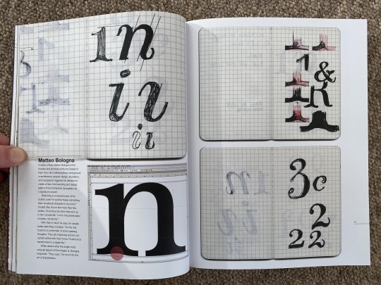
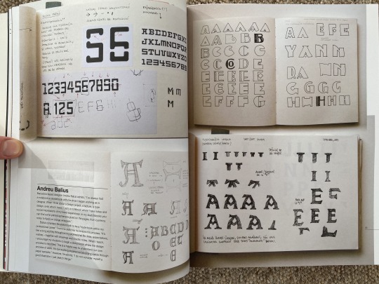
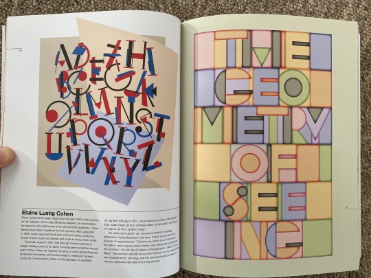
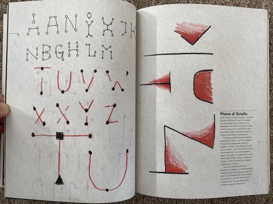
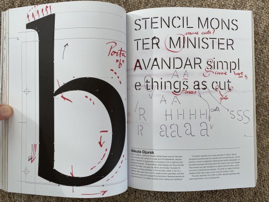
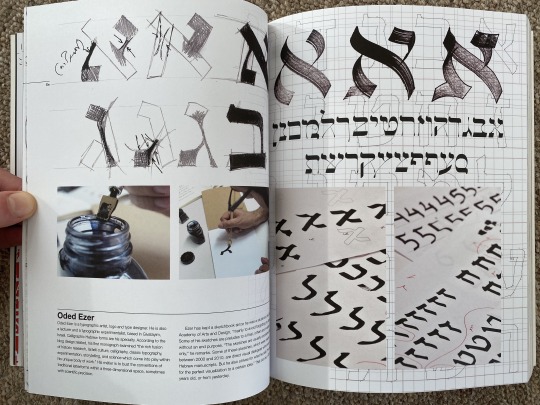
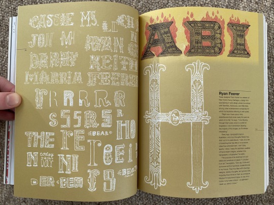
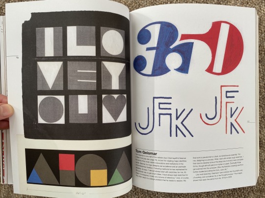
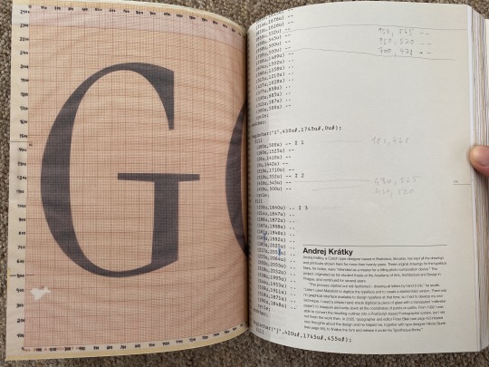
Typography Sketchbooks (Steven Heller, Lita Talarico) 2011
This book has been really useful to see the process many designers go through when designing a typeface. Whilst many use mathematics to create beautiful alignment, what’s clear is that this isn’t an essential component of type design and that effective letterforms can come about through many methods.
0 notes
Text
Translate and Transform: Typography sketchbooks
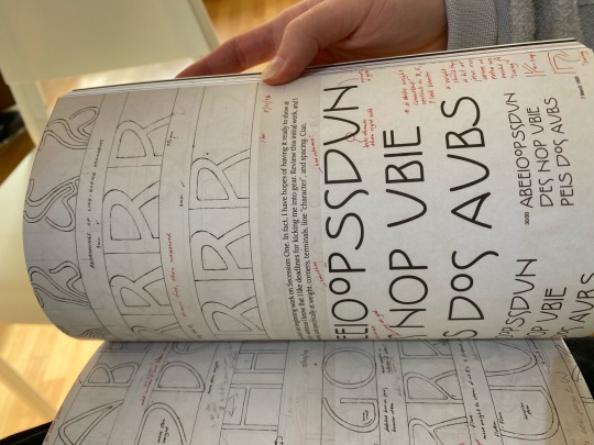
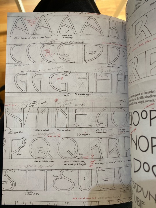
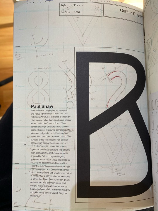
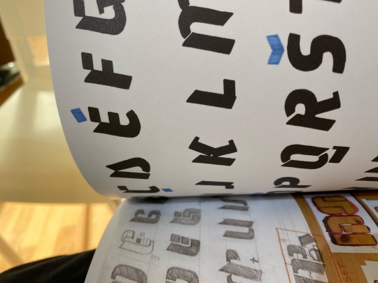
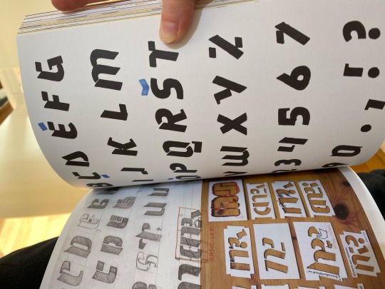
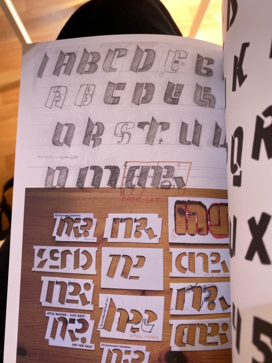
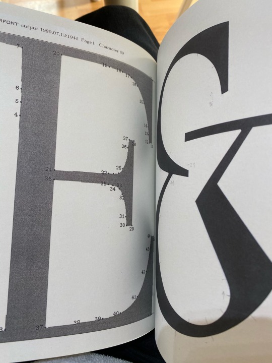
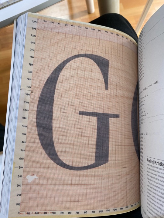
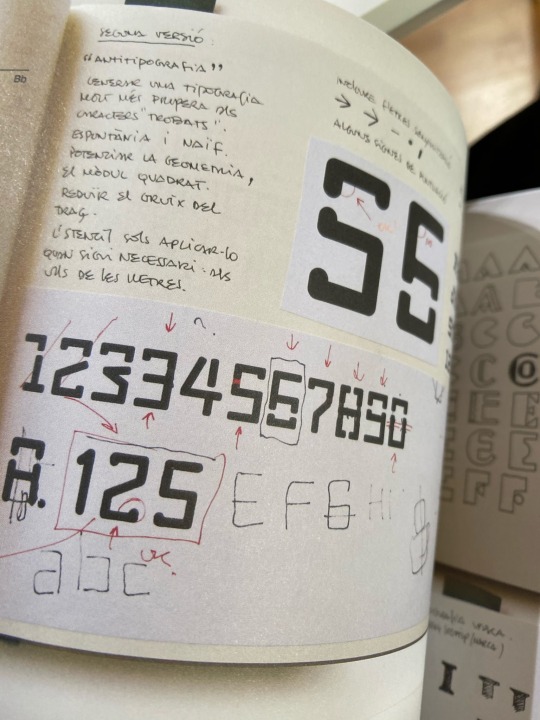
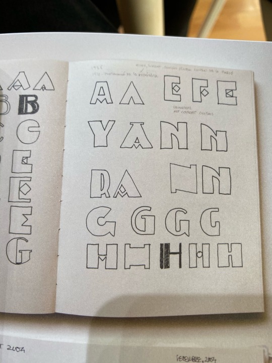
Book by Steven Heller and Lita Talarico. This book was really helpful to me as it helped me see how others go about sketching out type ideas. I used it as a more visual tool rather than reading the information. It showed me just how creative type can be but also how important grids are.
Below are some photos I took of pages that interested me most:
0 notes