Photo


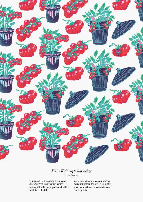
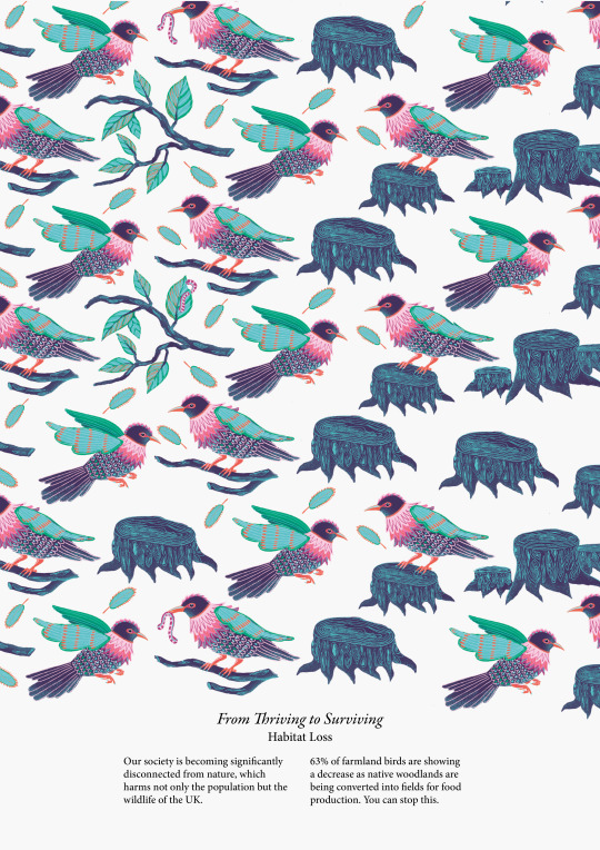
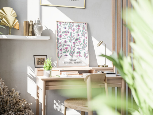
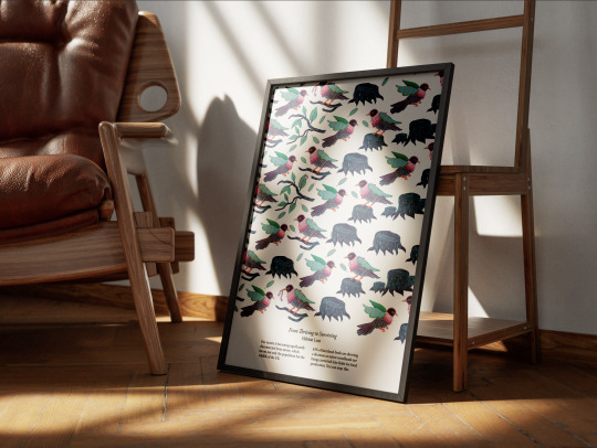
Posters
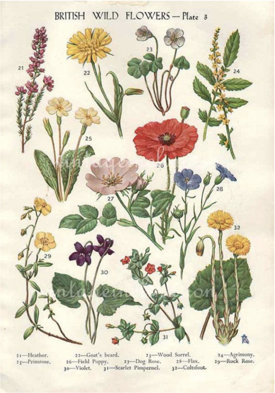
I took my inspiration from botanical books and neat text underneath illustrations. This approach allowed me to celebrate my illustrations to their full potential whilst also providing customers with information. This style is also not only visually pleasing but creates associations between the books featuring endangered or extinct species.
0 notes
Photo
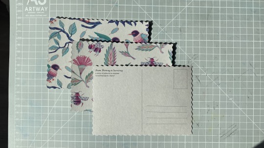
Postcards
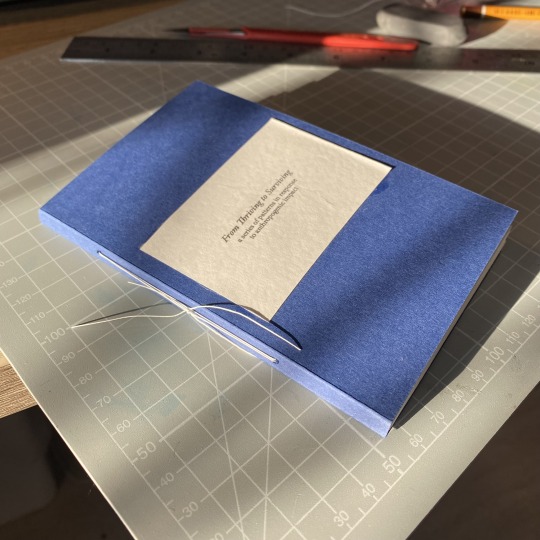
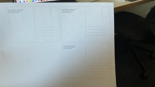
I used a wavy cutting blade to replicate the look of vintage postcards and almost remind the viewer of stamps that reveal certain topics. I am quite sad about the misspelling in the word “Thriving”, as I have a sticky i on my keyboard. I would have fixed the issue but I only had one sheet of this thick paper.
0 notes
Photo
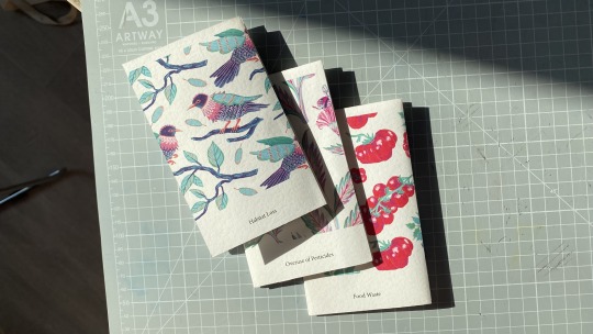
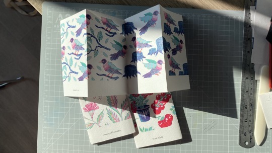



Sample Book
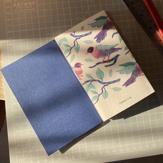
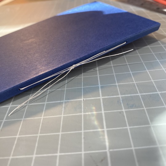
This is a finished look of the sample book that gradually unveils the transitions within the patterns. I am very pleased with the look of it and I think it portrays the meaning and idea of my project in the best form.
0 notes
Photo
Postcards
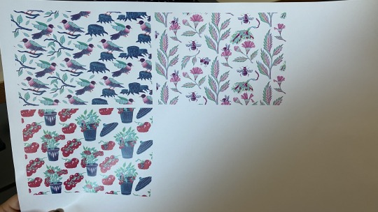
Another physical element I wanted to submit was these postcard designs. This would be another way of donating money to save the environment while being a visually aesthetic postcard that people can put on a wall as a decoration or send it to their friends/family.
0 notes
Photo


Sample Book
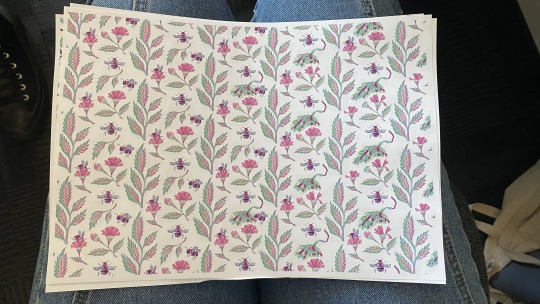
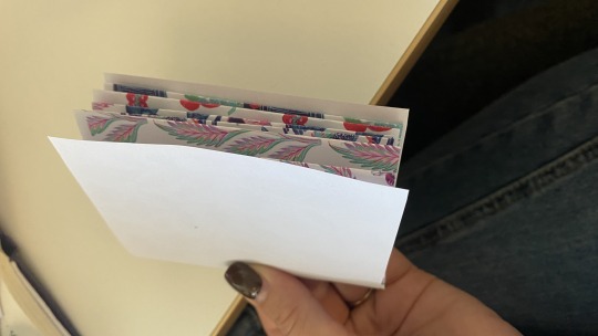
Here is a sample book prototype. I test printed my patterns, cut them into long stripes and folded them to see how I can possibly bind them. I thought of doing a single fold bind and attaching it to the cover by making holes in it and using the ends of the thread to tie a knot.
0 notes
Photo

Advertising the concept
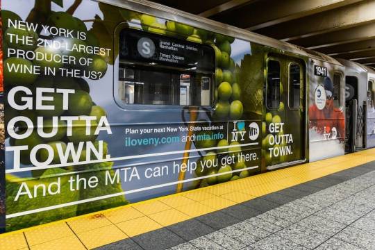
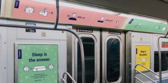
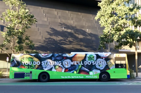
These places could be a great way of promoting my project to a larger audience. I got interested in underground advertising as people spend a lot of time being on escalators or waiting for their train to come. I also though of placing my design in the train itself, as people spend even more time on it and if they aren't on the phone they are looking around and reading all the adverts.
0 notes
Photo



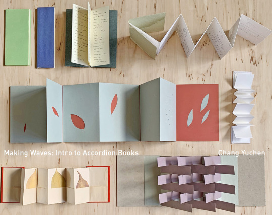
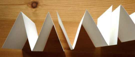
Journals
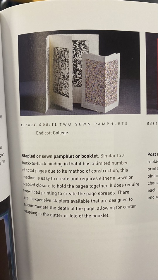
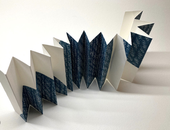
I also came across these binding methods when I was searching for poster designs in the library. They gave me some ideas for how I can demonstrate my patterns in a physical manner. I started thinking about accordion books and how it could be a great solution for my wide frame designs.
1 note
·
View note
Photo


Poster Designs
I went to the library after my tutorial to see how creatives manage text and image on posters. I particularly liked these ones as they balance text and additional elements really well. I at some point during my development started thinking that everything on poster designs should be centered in order to look like a poster but these proved me wrong. It is not really about the alignment of elements, proficiency increases when the composition is thought through and each element has its own role and meaning.
0 notes
Text
1 to 1 tutorial
I wanted to get extra advice on how I should present my patterns for my hand in and what form it should be in. I knew that pitch style presentation was one of my options but I wanted to discuss other alternatives.
Feedback:
- creating a deck (problem, insight, solution)
- make my presentation more about my work, don't focus too much on the problem and solution, it can be just on one slide
- in the future make this physical, for example, prints on bags
- make sure I zoom in on my patterns to show the detail and make those transitions visible
- if I do mock ups, demonstrate a still image on a phone and attach an animation to it separately
- I can show my project on the Rewinding Britain ig account
- Instagram story add, portrait that moves across to show the transition
- consider printing a specimen sheet
- check in with learning outcomes, make sure my designs are informed by the audience
- look at pattern books, how do patterns appear alongside text?
- tell a visual in my story, a step by step of how the situation with nature has developed
0 notes
Photo


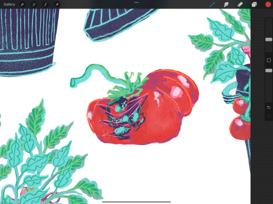
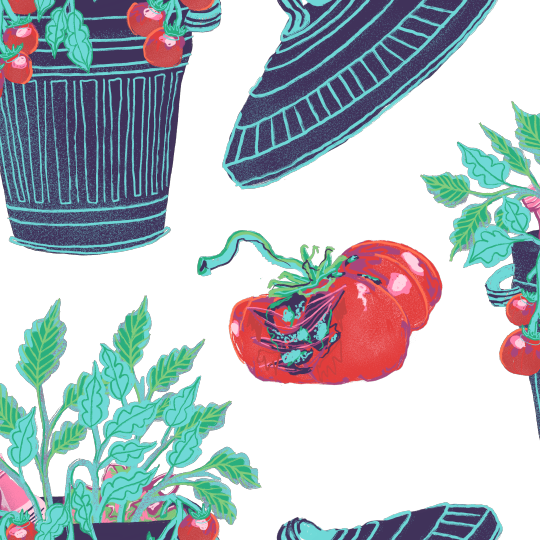
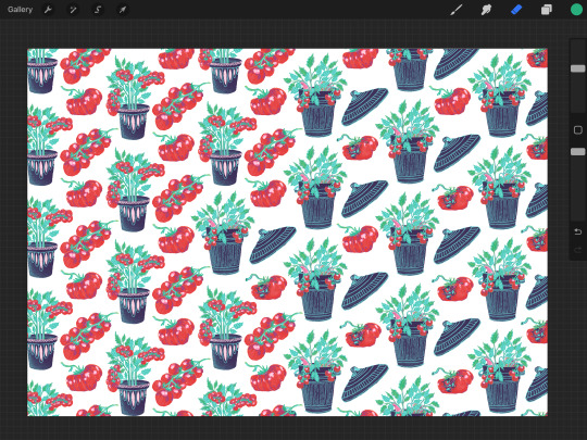

Pattern development
Here is a step-by-step process of how I illustrated the transition in this tomato pattern. I started by changing the initial pot design to a bin. However, I noticed that it still looked like a pot rather than a bin, so I decided to add some rubbish to the background to make the message clearer. Next, I replaced the tomatoes with the bin lid, positioning it in the same location as the previous element. Lastly, I kept the single tomato design for consistency, but I added some mould and imperfections to further emphasise the meaning of this piece.
#viscom#viscomyear2#cvl#cvlproject#cvlbriefproject#briefprojectillustration#briefproject#briefprojectdevelopment
0 notes
Photo
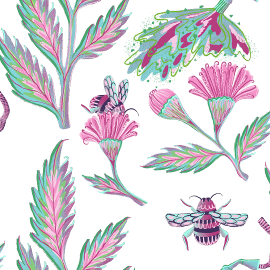
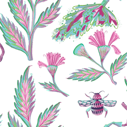
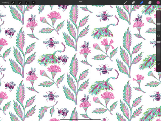
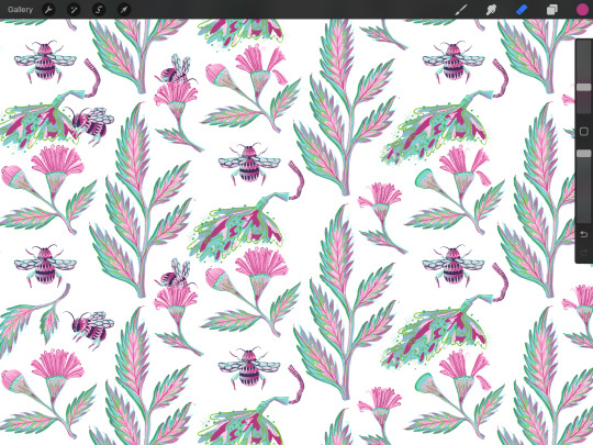

Pattern transition
I created 3 tile elements that I then placed onto a bigger canvas to create a full half drop pattern. The area that is sprayed gets wider towards the right, as more negative space appears due to the removal of bees.
I also demonstrated how flower petals are falling off as they also get affected by pesticides and the loss of their pollinators.
0 notes
Photo
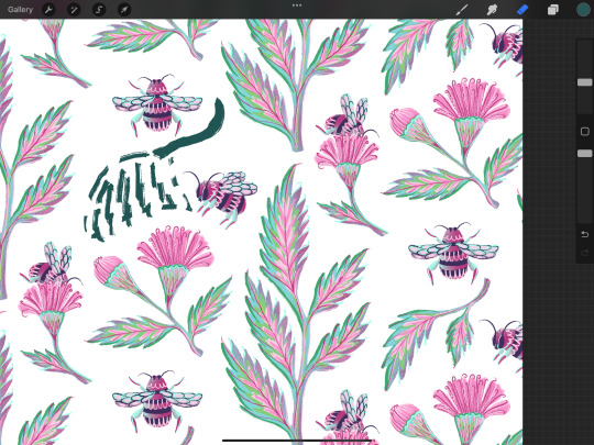
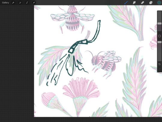

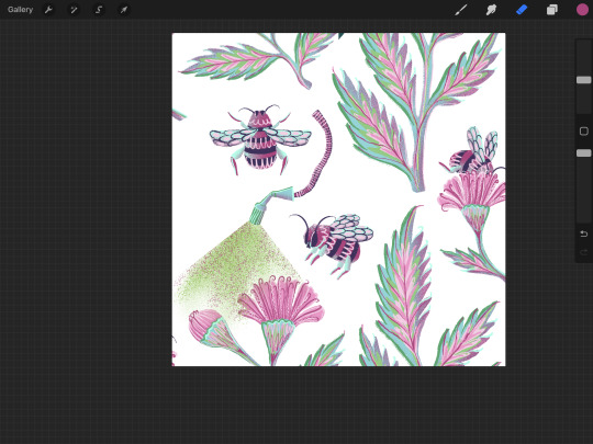


Leaf pattern development
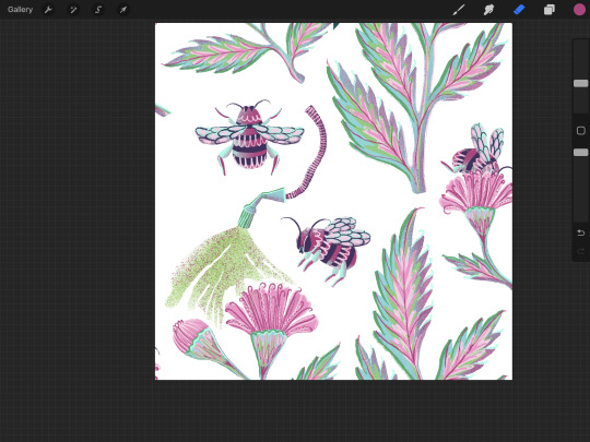
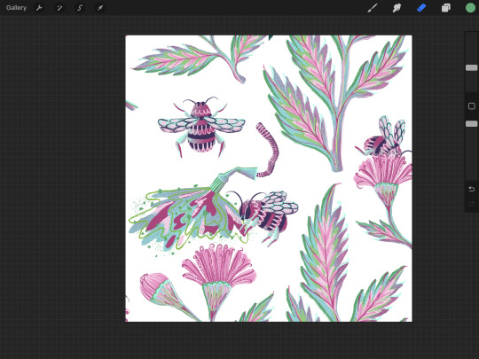
In order to smoothly replace one of the pattern elements with a sprayer, I looked at the leaf shapes and focused on finding singular ones. The double leaf element seemed like a suitable choice, especially since it was positioned above the flowers, which added more significance to the representation of pesticides being sprayed on both the flowers and the bee.
Initially, I experimented with a dotted brush, but I soon realised that it disrupted the consistency of my pattern and made the absence of the leaf elements more noticeable. As a result, I ended up using the same brush and colours that I had used for the leaf elements, which enhanced the overall coherency.
0 notes
Photo


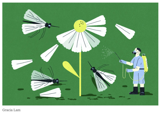
Why bumble bees decline and what they eat
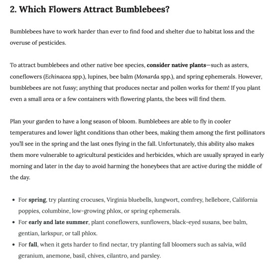
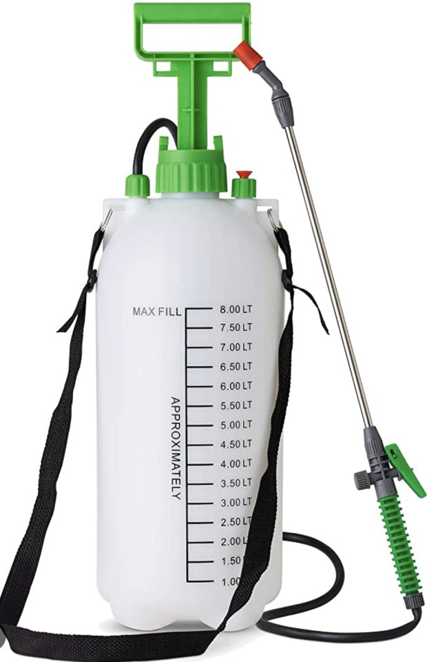
The main cause of bumble bee decline is habitat loss and the excessive use of pesticides. When wild flowers are removed, pollinators are deprived of nectar, which results in bumble bee decrease. To visually convey the reasons behind bee endangerment and the extinction of numerous flowers and plants, I aim to incorporate elements depicting the spraying of toxins.
During my research, I explored various artworks that depict destructive human activities and the lack of concern for our wildlife. I used these pieces as inspiration and looked at how creative individuals advocate for the environment. Among these works, I particularly enjoyed the piece by Gracia Lam, which effectively portrays the disconnection of humans and nature. It emphasises the vulnerability of nature and highlights the barriers people built up between themselves and the natural world. The artwork conveys a powerful message of forgetting our existence is a part of a unified whole. By getting rid of other vital members of this system, we harm ourselves in the long run.
0 notes
Photo

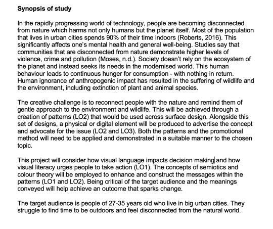
Changing the Learning Agreement
As I made slight changes to the form of my project, it was necessary to update the Learning Agreement accordingly. I only edited two elements in the synopsis of study. Firstly, I revisited the initial task, which was to design a set of patterns for interior design, and changed it to surface design since my current focus is on creating patterns for reusable bags. Secondly, in the third paragraph, I initially mentioned exploring the links between visual language and mental health. Mental health didn't become the main subject of my exploration and, therefore, I decided to instead focus on how visual language impacts decision making. The aim is to motivate individuals to think about the state of our planet and take action to protect wildlife.
0 notes
Video
tumblr
Tomato illustration process
0 notes
Photo
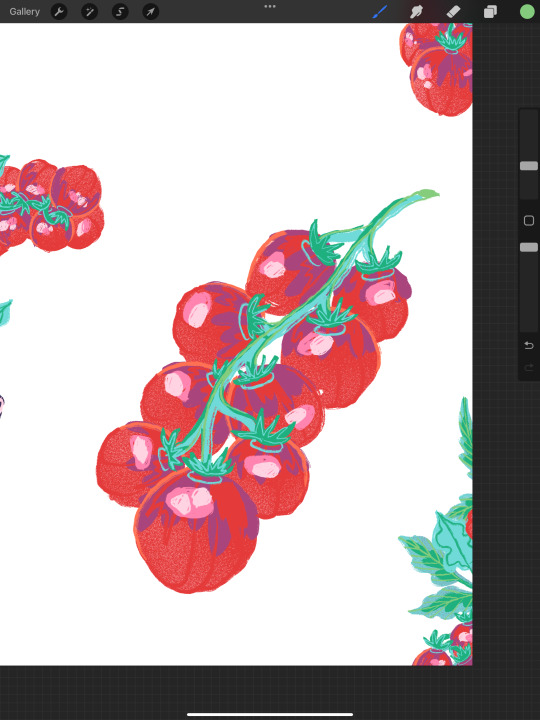


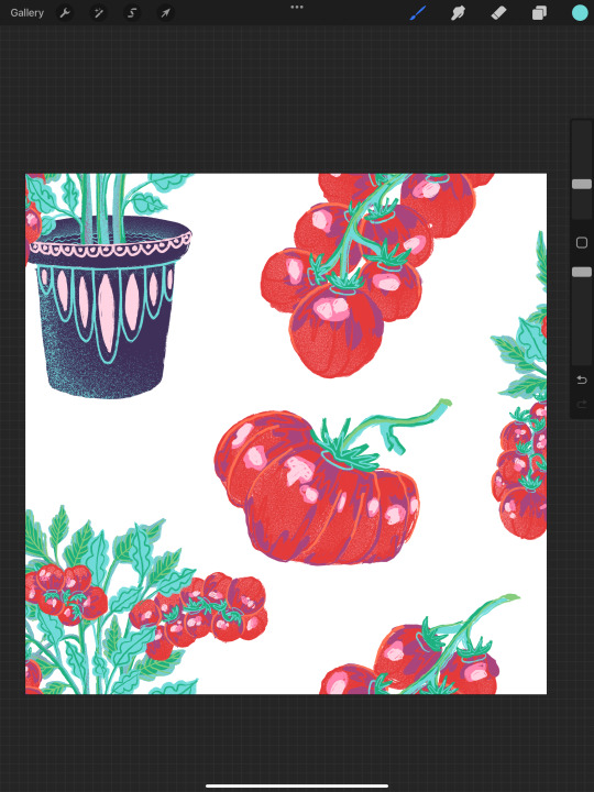

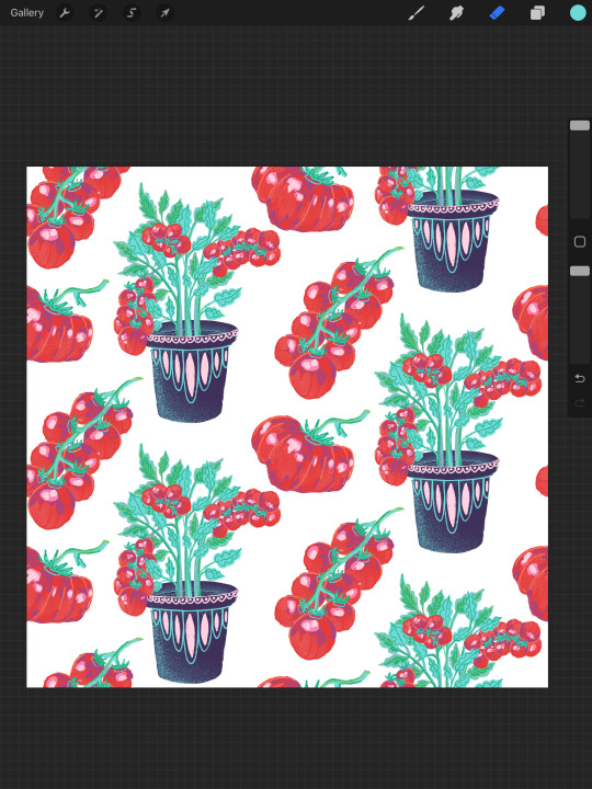
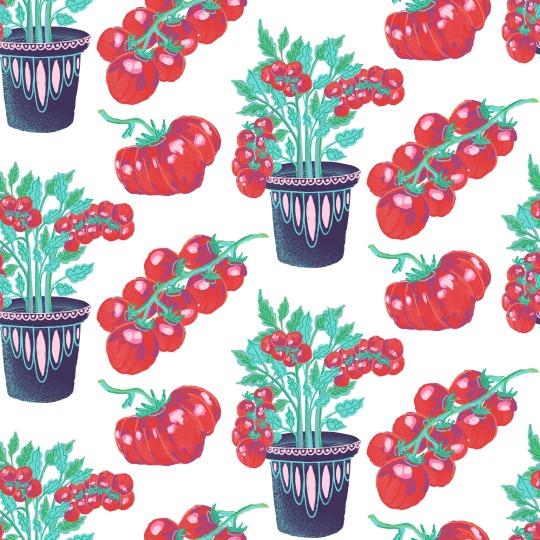
Tomato illustration Development
After finishing drawing tomatoes in a plant pot I moved onto adding additional elements, I illustrated some tomatoes to make sure it is easy to spot them in a smaller scale. When I was happy with the quality and detail of my illustrations, I moved onto creating a pattern put pf them and noticed how there is a lot of negative space and some of the gaps were uneven, so I fixed that by changing some sizes and flipping some elements.
0 notes
Photo


Tomato Illustration
My idea with this illustration is to draw tomatoes in plant pots and change them to bins towards the right. This would convey the message of how vegetables and fruits are almost being grown to get binned, which happens due to how careless and fussy we are with food that doesn't meet our standards.
My chosen colour palette contains colours of the previous illustrations which makes my set look coherent and consistent.
0 notes