#briefprojectillustration
Explore tagged Tumblr posts
Photo



Pattern development
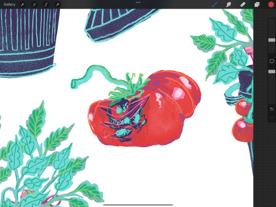
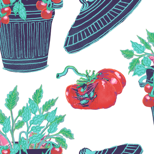
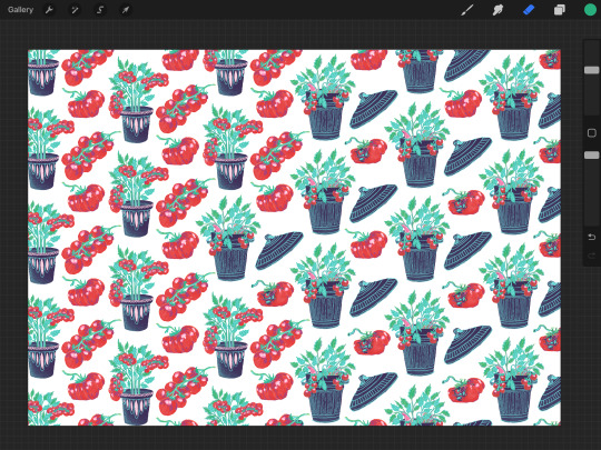
Here is a step-by-step process of how I illustrated the transition in this tomato pattern. I started by changing the initial pot design to a bin. However, I noticed that it still looked like a pot rather than a bin, so I decided to add some rubbish to the background to make the message clearer. Next, I replaced the tomatoes with the bin lid, positioning it in the same location as the previous element. Lastly, I kept the single tomato design for consistency, but I added some mould and imperfections to further emphasise the meaning of this piece.
#viscom#viscomyear2#cvl#cvlproject#cvlbriefproject#briefprojectillustration#briefproject#briefprojectdevelopment
0 notes
Photo
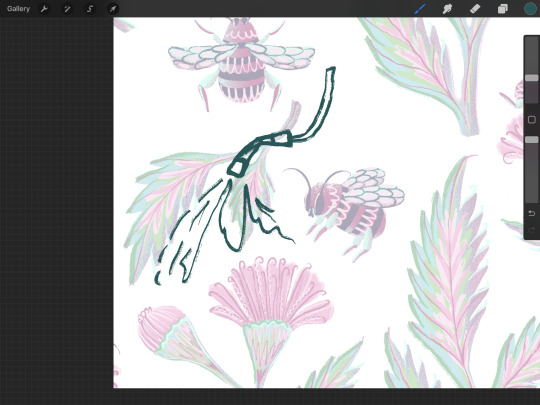

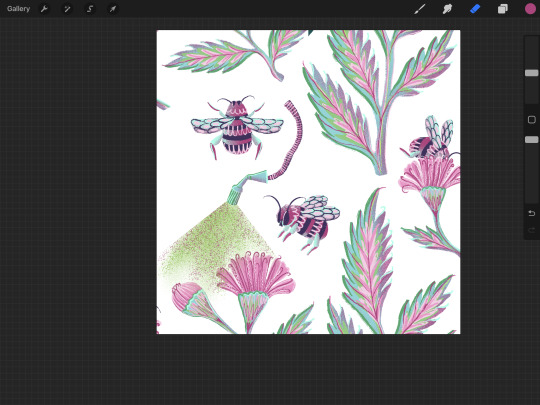
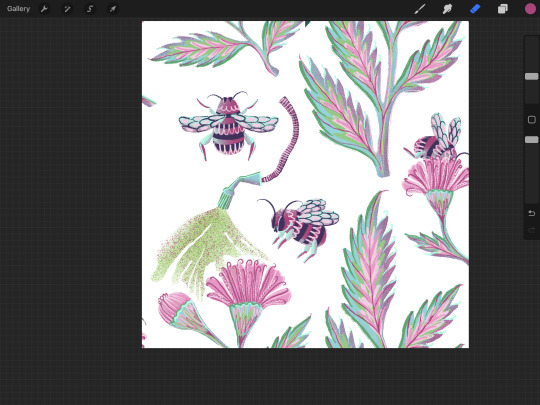


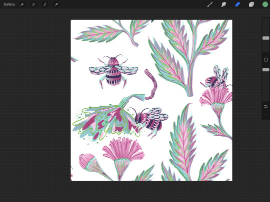
Leaf pattern development
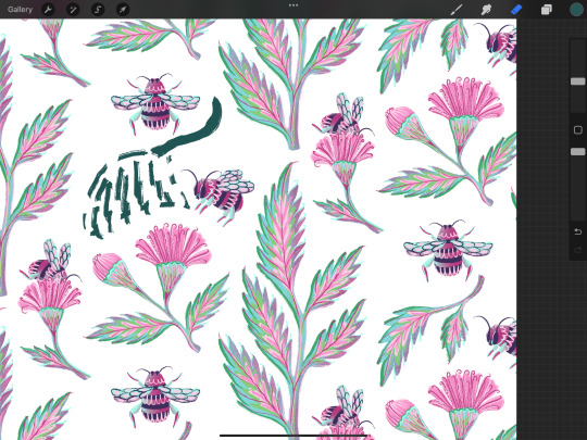
In order to smoothly replace one of the pattern elements with a sprayer, I looked at the leaf shapes and focused on finding singular ones. The double leaf element seemed like a suitable choice, especially since it was positioned above the flowers, which added more significance to the representation of pesticides being sprayed on both the flowers and the bee.
Initially, I experimented with a dotted brush, but I soon realised that it disrupted the consistency of my pattern and made the absence of the leaf elements more noticeable. As a result, I ended up using the same brush and colours that I had used for the leaf elements, which enhanced the overall coherency.
0 notes
Photo
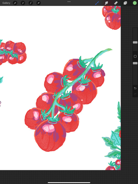


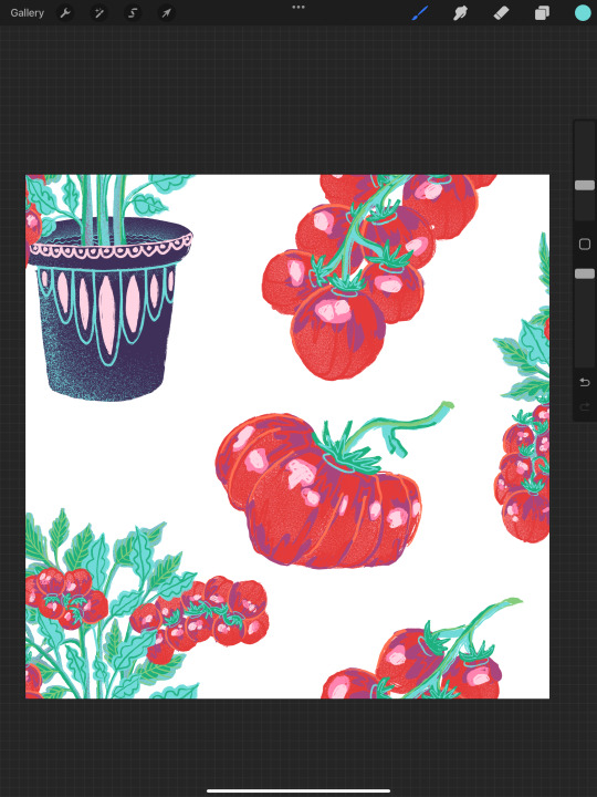

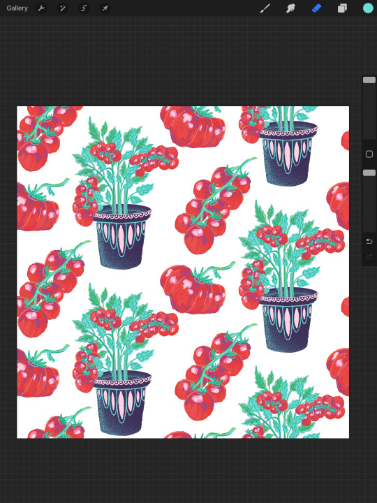
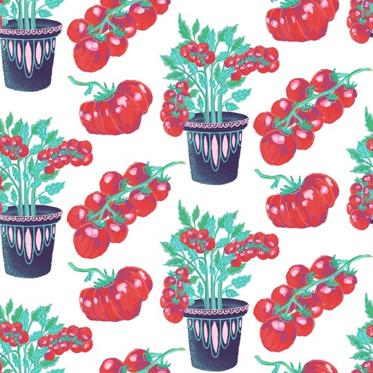
Tomato illustration Development
After finishing drawing tomatoes in a plant pot I moved onto adding additional elements, I illustrated some tomatoes to make sure it is easy to spot them in a smaller scale. When I was happy with the quality and detail of my illustrations, I moved onto creating a pattern put pf them and noticed how there is a lot of negative space and some of the gaps were uneven, so I fixed that by changing some sizes and flipping some elements.
0 notes
Photo


Tomato Illustration
My idea with this illustration is to draw tomatoes in plant pots and change them to bins towards the right. This would convey the message of how vegetables and fruits are almost being grown to get binned, which happens due to how careless and fussy we are with food that doesn't meet our standards.
My chosen colour palette contains colours of the previous illustrations which makes my set look coherent and consistent.
0 notes
Video
tumblr
Illustrating bumble bees
0 notes
Photo


Leaf Illustration development
In my previous research I discovered that pollinators depend on the amount of flowers on the fields, and when weed and other “useless” plants are being removed, bumble bees, for example, start decreasing. With this pattern I want to demonstrate how these two depend on each other by using the same transition method I used in my previous bird pattern.
0 notes
Photo


Developing the second pattern
After finishing my first pattern I started thinking about how I can deepen the meaning of the flower pattern I previously created. In my research I found out that chemicals use to grow plants repels pollinators, therefore I decided to add endangered bumble bees to my illustration to demonstrate the issue.
I struggled to find the right colour palette, as this extra element made me expand my colour palette due to the black and yellow colours on the insect. I think I will revisit this illustration later, as I am a little bit stuck now.
0 notes
Photo


Completing the frame
When I flipped certain sections of my pattern to fill in empty spaces, I was left with a big gap in the middle. I decided to add a twig because another bird would be extra on this piece.
#viscom#viscomyear2#cvl#cvlproject#cvlbriefproject#briefproject#briefprojectillustration#briefprojectpattern
0 notes
Photo


Starling pattern
Here is the process of illustrating starling bird and finding a colour palette that replicates colours on its feathers and also matches the tones on my previous pattern. I went through a few changes, ensuring the abstract style I am using still involves shapes and marks that can be seen on a starling.
#viscom#viscomyear2#cvl#cvlproject#cvlbriefproject#briefproject#briefprojectillustration#briefprojectpattern
0 notes
Photo


Adding elements
After finishing illustrating the leaf element I moved onto adding flower shapes of endangered plants. I used the visual from my previous inspiration. In order to keep it in a similar folk motif I stylised the flower shapes and buds in a similar colour order and line work. I then started flipping certain sections of my artwork to fill in empty spaces and prepare my piece for the half drop pattern creation checking with the tutorial I previously watched.
#viscom#viscomyear2#cvl#cvlproject#cvlbriefproject#briefproject#briefprojectillustration#briefprojectpattern
0 notes
Photo


After watching previously mentioned tutorials, I decided to draw my leaf design in Procreate. Taking inspiration from the plant I spotted in New Forest, I chose colours that are believed to improve mental health (greens and blues, as well as light pinks).
I started off using a smooth round brush, but it made the illustration look fake and unnatural. Since I wanted to capture an organic feel, I switched to a rough pencil-like pen, which added texture and a unique touch to the artwork. However, it still seemed a bit flat, so I began playing around with different shading techniques to give it more depth and a realistic feel.
0 notes
Photo


Drawing with brush markers
After my walk I looked back at the images I had taken and started playing with colour. I wanted to represent true colours of plants in combination with contrasting tones to highlight key shapes and uniqueness of each form.
0 notes