#New Typography Sketchbooks
Explore tagged Tumblr posts
Text
Made a valentine's greeting card for uni!

I know, I know, it's too early to post anything Valentine's day related but I just want to talk about it now. It's been ages since I've been active online so to break my pattern of inactivity. I'll talk about some assignments since admittedly, the majority of the art work I've been making has all been for Uni.
We have a course on History of Visual Design and we reached the part on art on print and greeting cards were briefly mentioned during one of the discussions. Our Instructor gave us the assignment to make our greeting card for any upcoming Holiday and I chose valentines!
On the majority of my artworks I start doing thumbnails of the illustrations I have planned on my sketchbook. It's better for me since It’s quick and I can do it in any free time I can have. I don't own an ipad and I use a pen tablet and laptop to do my digital art so planning with a sketchbook is more convenient when I’m out and about. Also it’s a great excuse to fill up my sketchbook.

When I searched up references on Valentine’s day cards on pinterest, the majority of them featured romantic puns. I thought It was hilarious and followed it. The image above are all puns a stumbled on that I wanted to draw about or I find personally funny. I settled on a match pun because I wanted to draw a matchbox. I thought that a matchbox was a good idea to add more detail for the card since matchboxes have designs on them.
Here are the thumbnail sketches when i decided on the matchbox based pun:

I wanted a frilly border of the card and the pun would be on the matchbox with a person in the center. So with my design ready I was ready to open my laptop and start to draw this digitally.
Unfortunately I hadn't even started sketching yet on the laptop when I stumbled upon my first issue. The entire time I was sketching out ideas on my sketchbook the design I planned for was for a vertical card. So when I was adjusting the canvas to make a new canvas on my art program I decided to reread the instructions to see what the image size should be and it turns out the size is 3 x 7 inches or a 3.5:2.5 ratio which is a horizontal format. So I scrapped my thumbnail sketches but kept the same motif and elements and worked with what I have to do.
I was inspired to make a retro-looking greeting card since all the Valentine cards I've seen were all old ones and I wanted to keep it that way. To make it look old-ish I added a grainy paper texture on the base then started drawing the person I wanted to put on the matchbox right away. Since that was the more complex element for the card. Since the Card would be a matchbox pun I thought it’ll be fun to make the person to be a girl as a flame or have fire as her hair.

I ended up scrapping it unfortunately since I thought the girl would not blend with the background very well and I wanted to stick with something simple. To keep things simple I want to limit the Card into an only red and cream color palette. I decided to skip drawing first since I was discouraged on the scrapped attempt and I have sorted out the new layout for a horizontal card.

I doodled something quick on the corner and figured that’ll be the layout. I started to work on the typography since it'll be the major element for the card. I scrolled through the fonts available in FireAlpaca (art program that I use) and settled for the font ‘ Algerian ‘ since it matches the motif I want to go for.
I rearranged the placement that I wanted on the doodle until I was satisfied. After I was settled with the font turned to finally drawing the matchbox. I decided that the matchbox will be front front-facing since I wanted it to be quick and simple. But when I was close to finishing drawing the matchbox I thought it was too plain and simple. Not only that, the “will you be my valentine?” felt like clutter.

I unfortunately don't have past screenshots of what I did so here’s a doodle of what it used to be. To fix it, I decided to put the matchbox on a slight angle and Deleted the “will you be my valentine?” at the bottom instead and put it into the matchbox as a nice detail. The entire phrase couldn’t fit of course for it to be easily readable so I added a floating banner transparent png on the matchbox and put the phrase there.
Things were working out and I started feeling confident so I drew the girl at the center of the matchbox. This time I just want it to be a simple linework of a portrait of a blushing girl and call it enough. At this point I was doing finishing touches such as adding the matches to the matchbox and rearranging the words another time, this time on the “ Let’s strike a match!” because it felt awkward where it was sitting.

I wanted to make the font size bigger for the “Let's strike a match phrase” but it was too big. To solve it I just got rid of the “up” in “let’s strike up” to leave up space and flipped the matchbox facing the other direction for more additional space.
FINALLY I was satisfied with it! I made the font bigger and that’s it! I was satisfied enough to send it to my instructor. Wish me luck on the grading!

If you have any constructive criticism please please I’ll be happy to hear it!
#valentines day#happy valentines#greeting cards#holiday#university#college#school#artists on tumblr#digital art#digital artist#digital drawing#drawing#This post is actually an assignment too lol but hope you guys liked it!
2 notes
·
View notes
Text
2D CLASS. FINAL ASSIGNMENT - BOOK & ALBUM COVER - (WEEK 5) 6/3/2024
Good Morning students, you have made it to final part of the semester.
We will have a virtual meet at 9:30 am. Please try to enter the chat ten minutes before.
This morning we will go over the last instructions to submit the Final Assignments for the semester.
In addition to completing the Final, students will also use this final week to resubmit works you feel need to have a grade revision.
Please use your time wisely.
The Final Critique will be on Monday 6/10/24 at 9:30 am.
Next week on Tuesday students will submit a Curated Portfolio following guidelines stated in a post I will add to the class blog on Monday.
The final assignment consists of CREATING TWO WORKS OF ART ON TWO CANVAS BOARDS.
Students will choose their favorite of the following to create this final assignment:
1) A favorite book. 2) A favorite music band.
BOTH ASSIGNMENTS WILL REQUIRE THE following materials:
2 CANVAS BOARD
16 x 20 (book) & 15 x15 (album)
(one for each project)
Acrylic paints & Brushes
A) BOOK COVER
Imagine that an agent is hiring you to create a book cover. How would you approach this project?
What imagery can you create that can engage an audience to buy the book?
If you were hired to launch Alice in Wonderland for a new generation what imagery would you create to attract readers of the 21st century.
During class this morning, start brainstorming ideas.
Think about the imagery you would use, as well about typography.
What lettering would best suit your concept.
How large or small should they be.
Do some preliminary drawings in your sketchbook .
Once you have zeroed in on your idea , begin the project.
Once you decide on an idea, begin working on the book cover.
B) ALBUM COVER
Choose a favorite band.
Decide on the imagery to create an Album cover.
In the spirit of 70’s Album Art you will create your own original idea.
Research different ideas regarding Album art of the 70′s.
Create a few sketches and ideas in your sketchbook.
Once you have decided on a specific band, you will create a poster style Album Cover.
Final important points for this assignment:
You are free at the end of the semester, to use any style for this assignment.
That means you can express your idea in any of the following styles below:
Representational imagery Abstract Non-Objective
You are creating a work of art with a specific purpose and function.
You need to think about incorporating typography (lettering) accurately .
Language can not be an eye sore.
Words in this assignment need to complement the artwork not compete or win over the design.
At this point in the semester think about what you have learned.
Use that knowledge to create two amazing art works.
This is will be your FINAL Assignment.
All work with an artist statement is due at noon on SUNDAY, JUNE. 9th, 2024 by 5pm.
The Artist Statement is a self reflection on your art process.
What book and album did you choose and why?
How did you approach the project.
Finally close your statement by commenting how you feel about the outcome your project both the book and album cover.
This is a college level writing assignment.
NOTE: Please keep in mind that I need time to collect the work and create a Critique Blog for Monday's class.
Due date is non negotiable.
Here are examples from previous semesters:

A)

B)

C)

D)
ALBUM COVER

A)

B)

C)
DUE DATE FOR ASSIGNMENTS:
WORK SUBMITTED TO YOUR TUMBLR PORTFOLIO BY SUNDAY JUNE 9TH 2024 @ 5PM / ARTWORK AND ARTIST STATEMENT.
2 notes
·
View notes
Text
2 Posters - Refinement + Final for Formative


"F I N A L" for now


Rationale: The state of the mental health care system in New Zealand is dire. People face many obstacles to getting the help they need, having to fight for lacking facilities and services. Accordingly, I aimed to convey feelings of disorder and frustration with my diptych. I made the letterforms fragmented and geometric, so that the composition is reminiscent of shattered glass. Negative space also gives the impression of an incomplete, broken system, with variation in type size suggesting haphazardness, and the bold font provoking a sense of urgency. The quotes are from Hiran Thabrew, a mental health specialist in New Zealand.
Introduction (v3)
My name is Neena Contreras and I have always been a creative, expressive person. As a visual artist, I am meticulous, versatile and curious. I try out every medium I can, such as linocut, painting, and jewellery-making. I also tend to hoard miscellaneous materials because everything has potential !
I like that communication designers have something to say. I love words and the way that intentional design choices can amplify the power that words hold. I have a passion for illustration, and I enjoy experimenting with typography and texture. I’m fond of impressionism, and I appreciate anything emotive or thought-provoking. My experience in design includes taking Design and Visual Communication, Photography, and Art Design in highschool. I have also done digital commissions and volunteer design for my local community.
I’m indecisive and conciseness escapes me, so I’m working on knowing when less is more and when more is more depending on the context. I want to use my sketchbook regularly, master watercolour, participate in Zinefest, create animatics, and make it all the way through Inktober. Some dream design opportunities would be book covers and merch. Currently, I’m navigating show design for a theatre club and contributing to the AUTSA’s Debate Magazine.
3 notes
·
View notes
Text
continuing HAND & EYE - research...?
(please don't mind me labelling things weird or incorrectly - this was a few months ago now💀)
i had the PLEASUREEEE of visiting the Beyond The Streets exhibit at the Saatichi Gallery at the same time this project was happening, so i treated it as some primary research ygm 😁😁😁
as a casual graffiti liker, this exhibit was SO eye opening in all the styles and influences present in it, as well as seeing its position in counterculture circles; its overlap with hip hop, punk and skater culture. made me wanna get out there and start tagging so bad 🛌🏾
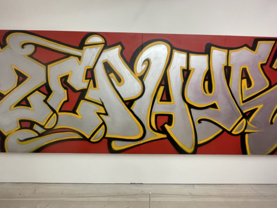
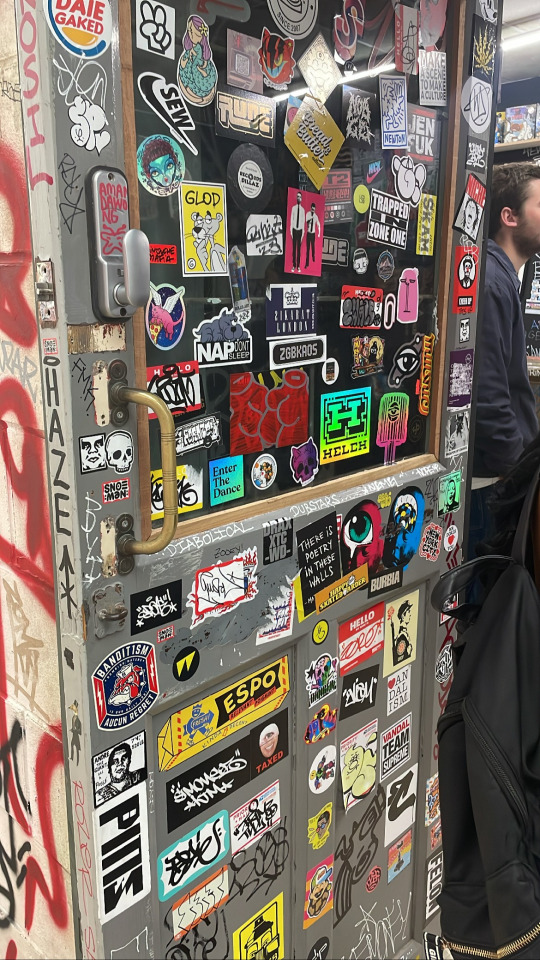
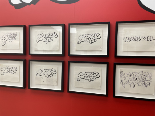
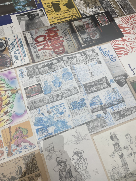
continuing more graffiti based research independently, i took a look at the book Subway Art by Martha Cooper and Henry Chalfant. this book takes kind of a deep dive into street graffiti from 70's and 80's New York, highlighting the diversity of the style itself.
because of the nature of graffiti (being in places artists see as ideal, while most authorities don't think "vandalism" should be seen anywhere) the scenes in the book, as well as it being in New York, are all very industrial with a lot of space, but also nowhere extremely important.
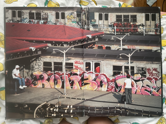
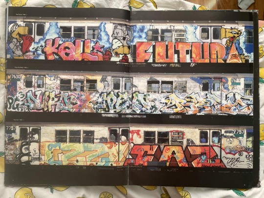
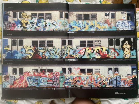
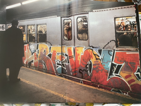
train graffiti go crazyyyyyyyy so this definitely impacted my outcome! my independent work (as in sketchbook stuff) is heavily graffiti influenced so i was very happy to take this style into the project.
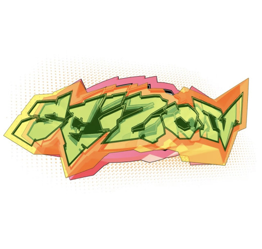
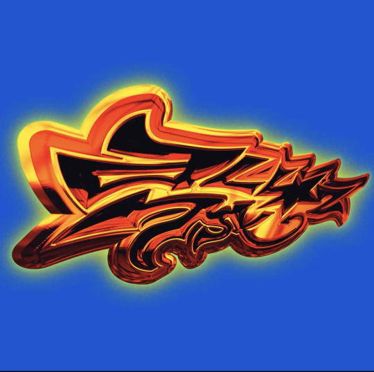
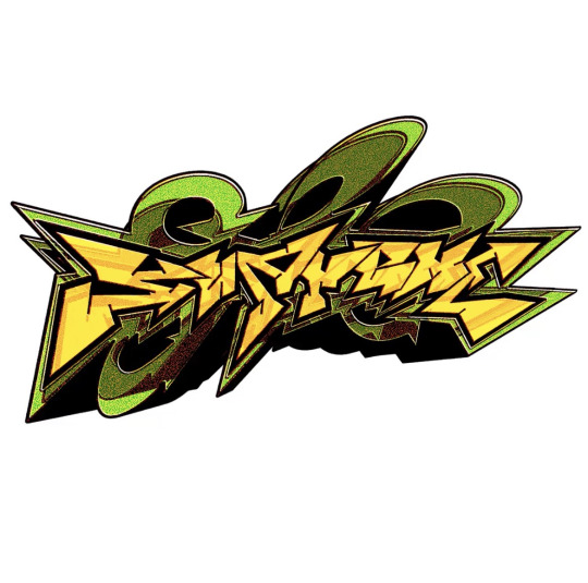
ART BY ROJAS @/IHATECIGS ON TWITTER
to further my research, i looked at typography by rojas on twt!! i LOVEEEEE their use of shape and colour so bad!!
2 notes
·
View notes
Text
How do you generate and evaluate new ideas?
Personally, it depends on what sort of work I am doing. In terms of graphic design, I start with research. I delve into all the different areas that are relevant to the topic, create mood boards, mind maps. From here it progresses into development.
I start off with simple, designs and concepts, to get designs down on the pages and ideas flowing. The first idea does not need to be perfect. It needs time to grow as I discover what does and doesn’t work.
For personal artwork, I spend time developing traits, discovering what style I like. There is less focus on producing as many ideas as possible, and more of just exploring, trying new things and drawing what I fancy. If I decided I wanted to sell any of these designs then I would use the approach I stated earlier, coming up with different layout options etc.
In terms of evaluation, I note the areas I do and do not like and what I want to include in further designs.
How are you influenced by others work?
My style is always influenced by others work. Over the years I have picked up different traits that I have liked in artists/designers’ work.
Recently I have been influenced by an individual’s artistic study I saw on YouTube. He filled a sketchbook by only drawing in a blue pen. I have never considered drawing like this and have always struggled to fill a book. It has encouraged me to draw regardless, no matter the subject, no matter what the final thing looks like. I am currently completing a black and orange study.
What are your inspirational sources?
I am inspired by a lot of different things and look to different areas.
Debut Art – Through this site I find a artists and designers all with wildly different styles. This is often the starting block for a brief and creating artists studies and mood boards.
Artbooks – I like to collect things, one of those collections are art books (often about other things I collect). When I am stuck for ideas or a spark of inspiration, I will look through them. These include “The Gorillaz art book”, “Spider-man into the spiderverse: the art of the movie”, “The art of Horizon Zero Dawn” and “Anime Architecture”. They are often good inspiration for layouts.
Social Media – I am not overly active on social media, but sometimes they can be a true spark of inspiration. I do not actively search these sites, but when they I am influenced by something I see on them its pure coincidence.
What are your methods of work?
Throughout my degree I have discovered I am more visual in my research. I like mood boards and mind maps, with simple and to the point evaluations and analysis. The reason for this is that it is easier for me to refer to my research, I do not need to skim large pieces of text to find the bit I need.
In a professional scenario you have far less time for research, so have a quick but well understood research is important.
How do you evaluate them?
When I am evaluating, I like to break it down into categories, layout, colour, texture, typography, description etc. From there I then explore the pros and cons of each section. This allows me to narrow down what elements I want to take forward into development and what I want to avoid.
3 notes
·
View notes
Text

New York gallery Superhouse opens 'Why Shouldn’t I Have Fun All Day?' today (6 February 2025), a solo exhibition marking 30 years since the passing of pioneering graphic designer and artist Dan Friedman. Staged in collaboration with the artist’s estate, the show offers an intimate look at his artistic and domestic world, recreating the vivid, experimental environment of his apartment – an ever-evolving work of art in itself. In the gallery space, works are set against Day-Glo-painted walls, the same colours Friedman used, interspersed with his personal effects. The exhibition brings together pieces from his own collection as well as those of close friends and family, capturing the spirit of a designer who rejected convention in favour of play, provocation, and a radical rethinking of modernism. The show recreates the vivid, experimental environment of Friedman's Greenwich Village apartment, shown here, where he lived from the late 1970s until his death in 1995 (Image credit: Photography by Tim Street-Porter) In the late 1970s, Friedman was a corporate design executive and Yale professor living in a one-bedroom high-rise apartment overlooking Washington Square Park. By day, he worked at the design consultancy Pentagram, producing precise but often humourless posters, letterheads, and logos for corporate clients such as Citibank and Williwear. But he was growing restless. 'I began to live a double life – out at night, meeting non-designers, artists,' he later recalled. 'I realised I was having more fun working at night in this other world, this other side of New York City. I thought, "Why shouldn’t I have fun all day?"' ‘I created an extreme caricature of the beautiful modern American home to bring into question our notion of what is a beautiful modern American home’ Dan Friedman At home, his apartment became an outlet for his pent-up creativity – a kind of three-dimensional sketchbook where he experimented with shape, volume, and colour. Every surface – walls, ceilings, even appliances – became a canvas for his work. Found objects were transformed into extravagant Day-Glo furniture and lighting, painted in fluorescent hues, as he challenged conventional notions of good design. 'I created an extreme caricature of the beautiful modern American home to bring into question our notion of what is a beautiful modern American home,' he explained. Staged in collaboration with the artist’s estate, the exhibition brings together pieces from his own collection as well as those of close friends and family (Image credit: Photography by Matthew Gordon) Disillusioned with corporate design, he left to devote himself fully to making three-dimensional objects – works rich in complexity and symbolism, shaped by the chaotic, media-saturated, and culturally diverse world of lower Manhattan. During this highly productive period, which lasted until his death in 1995, Friedman became a central figure in the Lower East Side art scene. He formed close friendships and creative exchanges with contemporaries such as Keith Haring, Kenny Scharf, and Willi Smith. As the pioneer of American Radical Modernism, his New Wave typography – an energetic, experimental style – drew from punk and postmodern language theory. Works are set against Day-Glo painted walls, the same colours Friedman used, interspersed with his personal effects (Image credit: Photography by Matthew Gordon) ‘Why Shouldn’t I Have Fun All Day?' brings this radical spirit into focus and shows how his approach is still relevant today, perhaps more than ever. Displayed works include 'Basic Screen' (1981), Friedman’s first folding screen and an early reflection of his embrace of the graffiti-covered urban landscape. (He would go on to create numerous screens on casters – his 'movable walls' – to reflect shifting moods, objects, and seasons.) Also featured is 'Wicky Wacky Table' (1981), a dining table with a grass skirt and a classical dentil cornice, a playful nod to Friedman’s love of kitsch and pastiche. Another highlight is 'A Fallen Sky in a 'Regal Landscape' (1985), a neon-coloured assemblage of city detritus that once held pride of place in his home. It stands as a critique of American consumerism’s wastefulness. Friedman believed designers and artists should work with passion and responsibility, using culture, diversity and fantasy to try and shape a better society (Image credit: Photography by Matthew Gordon) 'I have used my home to push modernist principles of structure and coherency to their wildest extreme,' Friedman wrote the year before his death in Radical Modernism (Yale University Press), his 12–point treatise for life and work – essential reading for all creatives. 'I create elegant mutations, radiating with intense colour and complexity, in a world that has deconstructed into a goofy ritualistic playground for daily life.' Receive our daily digest of inspiration, escapism and design stories from around the world direct to your inbox. 'Why Shouldn’t I Have Fun All Day?' runs from 6 February to 22 March 2025, at Superhouse, 120 Walker Street, 6R, New York, NY 10013 📅 Published on: 2025-02-06 07:31:00 🖋️ Author: - An expert in architectural innovation and design trends. For more inspiring articles and insights, explore our Article Archive. Note: This article was reviewed and edited by the ArchUp editorial team to ensure accuracy and quality. Read the full article
0 notes
Text
Finding Creativity in Everyday Life
As someone who loves design and animation, I’ve realized that inspiration can come from anywhere. Whether it's the colors of a sunset, the typography on a billboard, or the way shadows fall in a well-lit room, there’s always something to spark creativity. Recently, I started keeping a small sketchbook where I jot down random ideas or quick doodles. It helps me stay in a creative mindset and generates new concepts for my 3D projects. If you're ever feeling stuck, I highly recommend stepping away from the screen and looking at the world around you—it might surprise you.

0 notes
Text
(ARTS345) Project #3 Reflection & Chapter 6 of EDITORIAL DESIGN: DIGITAL AND PRINT by Cath Caldwell & Yolanda Zappaterra
Week Thirteen
Chapter 6 of Editorial Design: Digital and Print by Cath Caldwell & Yolanda Zappaterra
In preparation for the final project in this course, this week's textbook chapter focuses on the essential design skills required for editorial design. To summarize, these skills include but are not limited to, mastering objective visualization, skillful page preparation, understanding typography and its principles, adapting production skills to new software, maintaining consistency in design, and effectively managing the time and cost of a project. While these are numerous skills, many have already been covered in previous chapters of the textbook and have been utilized throughout past and present typography and design courses. Although I may not fully master these skills just yet, this chapter serves as a helpful overview of the necessary skills needed in the field of editorial design.
To start, mastering objective visualization involves selecting, rejecting, arranging, and emphasizing essential elements to design a cohesive layout for an entire publication. This process can include using tools like sketchbooks to help visualize and create a layout before bringing it to life digitally. It's crucial to be able to visualize ideas on paper before translating them into a computer format. In addition to visualization, effective page preparation and grid structure are essential, as they control the flow and pacing of the publication, much like a blueprint in architectural design. For this upcoming project, we will use column grids to create two spreads dedicated to an artist or designer. Being able to visualize how the information will be arranged, free from the distractions of a computer screen, is a vital skill that I am working to develop as I research this project.
Choosing the type of publication is a crucial step that greatly affects the reader's experience. Thoughtful typographic choices can significantly enhance or lower the quality of a publication. Typography encompasses everything from headlines to body text to pull quotes, and the length of this text is essential to consider in editorial design. In the context of this project, there will be a significant amount of text required according to the rubric. It will be my responsibility to arrange this text in a way that highlights the artist's personality and adds interest to the editorial. Images also play a vital role and must be taken into account to set the mood and maintain balance in the publication. Including too many images can make the layout feel cluttered, while too few images can render the editorial unappealing to readers. Understanding how typography and imagery must work together to complement each other is crucial for the success of any editorial design.
When it comes to production, most of today's editorials are designed using software like InDesign. However, there is a larger team involved that reviews and oversees the editorial before it is published. The composition of this team can vary based on the specific editorial project. Typically, the designer and production editor are primarily responsible for the production process and must collaborate closely to implement any necessary revisions or changes. Regarding printing and color management, producing printing proofs is crucial to ensure that what is being viewed is accurate in terms of scale and color balance. Computer screens can often be misleading, especially concerning color reproduction and text size. These are just a few important considerations as I continue to research and design my editorial for the final project in the visual and verbal design course.
0 notes
Text
ARTS 245 Blog 4 (9/27)
Reading:
I was not really into this week's reading, I just didn't find it interesting or useful right now or to the new project that we were given. It felt just like an overview of text, how text changes throughout the years, and what designers do with text. How some books defined the purpose of typography is interesting, is it to enhance readability or help readers to avoid reading? The picture that shows a monk climbing up a page from a 13th century book to replace an incorrect line of text with a correct one in the bottom is creative and funny way to correct sentences back then, in my opinion. I also did not know how important spaces are, if spaces was not introduce during Ancient Greece, today sentences would be incoherent. There nothing else in the reading that I found interesting, there was something about text is better at describing a concept than an image, because text can be translated and be understood, which an image can't be translated universally.
Progress:
The progress for this week is that I finished the gray reading project, it was kind of fun to do. Last weekend, I drew thumbnails and brainstorm in my sketchbook of some grids that I would do for this project. I made sure that I could easily measure and cut my type, so I made all my dimensions in whole inch or half of an inch, and have even gutters so I am not dealing with fractions of an inch. I only printed out my cuts of magazines and newspaper on Monday, so I spend the evening of Monday of cutting my printed paper and doing my first two squares and gluing it on the white cardstock. I did my column grid and my experimental grid on Monday since there will be less piece to deal with and gluing down. Problems I have is that one of the margins of the column grid is not 0.5 inch I think and the diagonal gutter was not straight in the experiment grid as I mismeasured the pieces for it. Tuesday, I glued down my two white cardstock to the black Crescent cardstock, and then cut them. Unfortunately the black Crescent cardstock was hard to cut as the paper was layer thick, also with the fact that x-acto blade was dull. So after I struggled to cut the first square, I changed out my dull blade with another one, but it still was pretty difficult to cut the second one. Wednesday, I did my modular grid, and I think its perfect as all of the dimension are correct. I glue downed the grid onto the black Crescent paper and struggled to cut it again. I did gain some cut from pressing down on the back end of blade, that I didn't think would be sharp, to cut down the Crescent paper. I feel very good about my modular grid, and feel okay about my experimental and column grid.


0 notes
Note
🥊❤️🍎 for Cobalt
🥊 -What do they love to do? What do they hate to do?
I feel like I'm unsure if I can answer this question, since it's kind of his entire character arc to explore what he really wants to do with his life; even I'm not sure what his "Point B" is yet.
A more simplistic answer though; he enjoys doing typography in his sketchbooks, video games, collecting blades... but he hates specifically going to the airport. This is more of an item than an activity he hates doing, but he also hates rain. Rain and airports are sensory hell for him, poor guy 😭😭
❤️ - What is one of your OC’s best memories?
Once again I'm not sure if I can name anything specific due to spoilers (I want to do SUL as a cartoon someday, after all) but I think his favorite memories come from that brief period of time where he's officially dating Rina but before he starts getting worn down from his new tournament fighting career. It'd be the one era of his life where he feels on top of the world, getting the girl of his dreams and a career people can only dream of.
🍎 - What is the OC’s relationship w/their parents like?
Honestly, Cobalt has the healthiest relationship with their parents in comparison to the rest of the Paladins 😭😭
He started off as an "odd" baby, having the power of two entire souls within him; also blatant autism. His parents really wanted to make the best life for him since he's incredibly emotionally sensitive and gets overwhelmed by his own powers when he's a kid who barely has control over them!
I imagine in modern day he's moved out of his parents' place solely from getting lots of $$$ from his tournament fighting career, but his parents are always checking in on him, especially after his multiple near-fatal injuries.
1 note
·
View note
Text
3/29/24
When reading chapter 10 it was interesting to see how the case studies are able to combine different concepts of typography and mix them into one image that takes more than one glance to actually understand its full meaning. When looking at the case study for the New Year's poster it was interesting to see how many elements alone were used to showcase the sky from the star alignments to pictures of clouds and how the combination of religious symbols was also included. I was fascinated by Malinosk’s work where the combination of simplicity and boldness could captivate the attention of the people walking by. Were a lot could be said with a little.
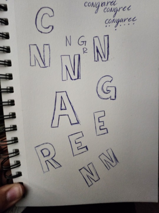
This week has been interesting. I am currently sick and I blame my sister for it so I've had very little energy but I've been able to make great progress. When presenting my poster in class I felt iffy about the way I had drawn the grass, so I have gone in and redid it and changed the color of the letters for National Park. In order to create the letters, I had done an initial sketch in my sketchbook and had traced them over in illustrator, I'm glad about the way they look on my poster and have added the A I had missed in my poster presentation. I wasn't able to go to the National Park again due to the heavy rain on Wednesday, but I have audio of the storm outside that I will incorporate through the second half of the assignment. Now since I've captured the audio, I want to see what it would look like if I took my Stillwater background and create droplets of supposed rain as it enters the Congaree wetland. Currently for my final project booklet I have created a layout that I am not so happy about since it follows the first booklet, I made this template so I'm planning on redoing it all and seeing if I can come up with something better.
0 notes
Text
From Amateur to Expert: How to Achieve Pro-Level Graphic Designs in No Time
Graphic design is an assertive communication, marketing, and expression tool in the modern world. With the rise of social media, digital marketing, and online businesses, the demand for high-quality graphic design has never been higher. While many people are drawn to graphic design, transitioning from an amateur to a professional level can seem daunting. However, with the right approach and techniques, anyone can elevate their graphic design skills to a pro level in no time.
Understanding the Fundamentals:
Before diving into advanced techniques, it's crucial to have a solid understanding of the fundamentals of graphic design. This includes typography, color theory, layout, and composition concepts. Take the time to study these principles and experiment with different techniques to develop a strong foundation.
Mastering Design Software:
Proficiency in design software is essential for creating professional-level graphic designs. Adobe Creative Suite, including Photoshop, Illustrator, and InDesign, is an industry-standard software professional use worldwide. Invest time learning these programs' ins and outs through online tutorials, courses, and practice exercises. Familiarity with keyboard shortcuts and advanced features can significantly speed up your workflow and improve efficiency.
Embracing Creativity:
While technical skills are essential, creativity sets great graphic designers apart. Be bold, think outside the box, and experiment with unconventional ideas. Keep a sketchbook or digital journal to jot down concepts and brainstorm design solutions. Surround yourself with inspiration from various sources, including art, nature, architecture, and pop culture.
Developing a Signature Style:
Establishing a signature style can help you stand out in a competitive industry. Experiment with different design elements, such as color palettes, typography choices, and illustration styles, to develop a unique aesthetic that reflects your personality and creative vision. Consistency in style across your portfolio will help potential clients or employers recognize your work and build trust in your abilities.
Understanding Your Audience:
Effective graphic design is more than just creating visually appealing images—it's about communicating a message to a specific audience. Take the time to research and understand your target audience, including their demographics, interests, and preferences. Tailor your designs to resonate with your audience and evoke the desired emotions or responses.
Incorporating Feedback:
Feedback is a valuable tool for growth and improvement as a graphic designer. Seek constructive criticism from peers, mentors, or online communities to gain fresh perspectives on your work. Be open to feedback and willing to make revisions based on suggestions. Remember that constructive criticism does not reflect your worth as a designer but is an opportunity to refine your skills and produce better work.
Practicing Consistently:
Like any skill, graphic design requires consistent practice to master. Set aside dedicated time each day or week to work on design projects, whether personal or professional. Challenge yourself with new techniques and projects outside your comfort zone to continue learning and growing as a designer. The more you practice, the more confident and proficient you will become in creating pro-level graphic designs.
Building a Strong Portfolio:
A portfolio is your professional showcase and is essential for attracting clients or landing job opportunities. Curate a selection of your best work that highlights your skills, creativity, and versatility as a designer. Include a variety of projects, such as logos, branding, print materials, web design, and social media graphics, to demonstrate your range of abilities. Update your portfolio regularly with new projects and remove outdated or weaker pieces to keep it fresh and impactful.
Networking and Collaboration:
Networking is critical to success in the graphic design industry. Attend industry events, workshops, and conferences to connect with fellow designers, potential clients, and employers. Join online communities and social media groups to share your work, seek advice, and collaborate on projects with other creatives. Building a solid network can lead to valuable opportunities, referrals, and collaborations that can help advance your career.
Continuing Education:
Graphic design constantly evolves, with new trends, technologies, and techniques emerging regularly. Stay updated with industry developments by reading design blogs, following design influencers on social media, and attending workshops or webinars. Consider pursuing advanced training or certifications to deepen your knowledge and skills in specific areas of graphic design, such as motion graphics, UX/UI design, or 3D modeling.
Transitioning from an amateur to a pro-level graphic designer requires dedication, creativity, and continuous learning. By mastering the fundamentals, honing your technical skills, embracing creativity, and seeking feedback, you can elevate your design abilities to compete in the competitive world of graphic design. Remember to stay curious, practice consistently, and build a strong network within the design community to achieve success in your graphic design career. With perseverance and passion, you can turn your passion for design into a rewarding and fulfilling profession.
0 notes
Text


The Manifesto workshop has added a whole new element to my 2D art. We focused on risograph zines for the first day. The professor started us off with asking a few questions about our projects and the direction we’d like to take it in. I wanted to have a tone that was interesting, dark and a bit funny.
My first thumbnails were creative and stayed on theme, but I didn’t find them to match the tone I was going for. I might revisit them, but I decided to keep pushing the idea of risograph for a more innovative approach that suited my style.

I had the idea to make a comic panel! It combined the text and typography element of zines with composition and illustrations. It also helped break down the composition into something I could understand better, as I have more experience with comics.
I experimented with a few compositions and went through my sketchbook for a topic that matched the theme. I ended up using the Fairy Mantis concept art as my comic panel.


Risograph detects the change in value of the drawing and puts it in monochrome, so I sketched my panel in yellow so the machine wouldn’t pick it up.
I focused on the lining and values of the panel, but I wish I had thought of fonts when doing the dialogue bubbles. I’ll redo that next week.


I only used highlights on the Mantis, so she’d stand out from the dark blue background.
When the printing began, I came across a problem- the pencil was too light to be picked up by the machine and the highlights weren’t aligned with the piece.


I think to make sure the values stand out next time, I’ll take a picture and put it into monochrome. To test how it looks before it goes into the machine. I’ll also tape down the highlight layer.

5 notes
·
View notes
Text
Week 6 breakdown:
Monday:
InDesign Workshop
tutorial with Chris: he told me to keep going and encouraged me in my projects. We both agree that the poetry book that was supposed to be side project is taking more time and space than initially planned. I think that I would have developed the magazine further if I wasn’t spending this much time on the poetry book but as long as the magazine is complete with all the sections I initially planned I’m ok with spending more time on the poetry book.
I finished the underdrawings for 3 comics and they are ready to be inked
Tuesday:
Rest day. I’m a lot more tired lately, I think I have been pushing myself too hard (and winter isn’t helping)
Wednesday:
Research into typography and graphic design. I am struggling to find resources on typography that are not always about the same basic principles.
I watched some Elliot Ulm videos which made me want to do some quick posters just to try new things. I ended up making a series of illustrations with little characters saying things (more or less interesting). I liked making them and how they look together so I’m going to keep exploring that, maybe make screenprints of them.
Thursday:
Art history research day. I went to the library and looked for sources for my essay on 1860s periodicals. I found 3 sources and I started writing the introduction of the essay.
Friday:
Printmaking day: I photocopied the designs for the linocuts from my sketchbook and used red iron oxide (?) powder to trace them onto the lino. All 10 designs are cut and ready to be printed in the folios. I printed two of them. After I am done printing them all, I will start with the letterpress part of the book.
I had a tutorial with Flora who really enjoyed my project and encouraged me to keep working on it.
Goals for next week:
Ink the comics that are ready
Do the back cover comic underdrawing
Do Graphic design and layout for the ‘how to finish a painting’ article
Be halfway through art history essay
Print more linocuts
1 note
·
View note
Text
Reflection and Progress Blog Post (Week 5)
The recent textbook pages discussed important typography concepts like kerning, tracking, line spacing, and alignment. These concepts involve adjusting space and alignment to make text more visually pleasing and clear, and they boil down to two main goals:
1. Finding the right balance between negative and positive spaces in letterforms, and
2. Purposefully rotating text for the desired visual effect, while maintaining readability and balance.
When I was sketching, I started to implement the former of these two general concepts by trying to balance negative and positive spaces. I did this by focusing on adjusting any protruding parts of letterforms (positive space) and occasionally replacing them altogether. I also fixed tight gaps (negative space) by widening or closing them until it looked intentional. To be honest, at first, my sketching felt a bit aimless, but once I found this approach, it became more organized.
As for the concepts of rotated text and vertical alignment, I don’t think I’ll include completely vertical alignment in my final letterform, but I plan to at least use rotated letterforms to build it. They provide a lot of interesting shapes, and I wish I’d created more sketches that utilized alignments beyond horizontal/vertical. Unfortunately, I was sleep deprived while working, which meant that it wasn’t until much later on in the sketching process that I realized I could rotate my sketchbook. I was feeling stuck until I discovered this crazy new concept, gave me a fresh perspective to work with for the last few sketches.
As I move on to digitizing and vectorizing my designs, I hope to apply these typographic principles more efficiently and with better craftsmanship.

Selected Sans Serif Font— Futura (Above)

Selected Serif Font— Baskerville (Above)
0 notes
Text
W8 - Activities
Task 1: Categories
TOOLS IN MY CREATIVE PRACTICES - Things I use to create
Crochet Hooks
Hands
SLR
Point-and-Shoot
Yarn
EARLY INSPIRATIONS FOR DESIGN AND CREATIVITY - Initial exposures
Archie Comic
Get Your Shit Together
Vase
Poem Tag
TESTING - Different mediums and methods
Trinket Tray
Sketchbook
Domino
Dried Flowers
SETTING THE SCENE - My environment
Apple
Earphones
Tea Bag
Laptop Sleeve
PERSONAL IDENTITY ITEMS - Things that make me me
Humpty Dumpty Necklace
Rings
Never Let Me Go
Task 2: Typology
What do your current categories tell you about the elements contained in them?
I think there is an aura of sentimentality within my items. For example, my category about inspirations is not just general inspirations, but rather my very first exposures to design from when I was younger. Also, my personal items are each special in their own way.
What underpins your categorisations? Are the elements grouped by a key characteristic, material or medium – or something else? e.g. typography, fluid type, poster design, etc?
I created my categories based on how I came up with my objects - with the idea of creating a toolkit. What are the literal tools and materials I need to make design? What are the things that allow me to be creative? Etc...
What do you these categories tell you about your selection methods, influences and biases?
I tend to want to choose items that look random and unassociated to each other at first glance. However there are always connections, for example several of my items are linked to a time where I was living in Canada before I moved to NZ.
What might these categories tell you about you as an individual, and your design practice?
I design with my family in mind. Everything I know is because of how I was raised, and the kinds of cultures that informed my family life. These things trickle into everything I create.
When seen together, what story do these elements and their categorisation tell an audience?
At first glance, the elements look random. Once reading the descriptions, however, it is clear that there are several deep connections between objects, and how some an only exist with the others. People also say that intentionally making something look random is one of the hardest things to do, so that must say something about how these objects came together in the first place...
Task 3: Overall approach
Does your re-examination of typologies and approaches to classification suggest changes? Do all the elements fit in one category? Should they? Is this coherent or is it limiting?
I believe I have done well in categorising my elements. As I was sorting them, each decision came quickly, and if it didn't, I made a new category that consecutive items also naturally fit into.
Does a category need be added? Or removed?
5 categories might be a lot, so I might revisit this in the near future. However, it is working fine for now (why fix something that isn't broken?).
Are there blind spots in your selection, editing or approach?
The only element I am worried does not clearly fit into its category is Dried Flowers into Testing. Although I have a rationale behind it, it may not be interpreted correctly by a viewer.
Task 4: Graphic system
Is the graphic system coherent? Overall, would it make sense to someone with no knowledge of you, your design work and chosen elements?
Is it effective?
Is it efficient?
Is it clear, concise and compelling?
Is it the most appropriate design solution for your selected elements, and categories or classifications systems? What other graphic systems could you research and experiment with?
Does it speak to your preferences and strengths as a designer?
Does it take a unique approach to the assignment reflective of you as an individual?
Yes. I have incorporated my ideas about 'versions' and 'collections', which have led me to the design decision to remove the literal items from my poster, and replace them with 20 similar crocheted shapes that better communicate the idea of a cohesive collection working together to represent one concept or philosophy. This is pushing the boundaries of the brief, but I believe my rationale is strong enough to back this decision up.
How does it create appropriate connections with relevant creative communities?
0 notes