#lion tutorials
Explore tagged Tumblr posts
Note
Would you please post a tutorial on how to make your anime gifs B&W after resizing and sharpening?
of course! thank you for asking so nicely😌
So this is my gif, cropped and sharpened, and then I've done a Curves layer on it. This is optional ofc, but I like how it looks with the curves layer vs without.

There are at least two ways that I know of to do B&W gifs.
The easiest way is to do a Black and White adjustment layer. This layer will break down each color for you and you can adjust the color itself if you wanted to make certain colors darker or lighter.
The second way, which is also super easy, is to open a Hue/Saturation layer and take the Saturation all the way down.


B&W via Hue/Sat, with Curves and without. It's not a huge difference, but I like strong black colors.

B&W via Black and White, with Curves and without.

B&W via H/S and Black and White, with Curves. As you can see with this, there's basically no difference, one is just more customizable than the other. Personally, I usually use the H/S method.

If you have any other questions feel free to ask!
6 notes
·
View notes
Text
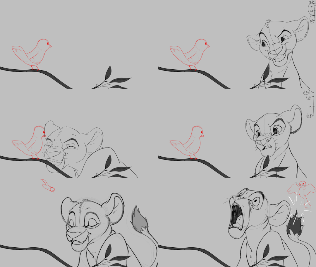


'ello folks, my Cleanup tutorial is finally done and out! hope you find it useful
#Animation#Tutorial#Advice#Lesson#The Lion King#simba#animation#Disney#character design#how to#2D#traditional animation#frame by frame#Adobe#Photoshop#Animate#Flash#After Effects#Premiere#Video#Film#Drawing#Tips#Gestures#cleanup#lines#krita#toon boom#procreate#tvpaint
1K notes
·
View notes
Text
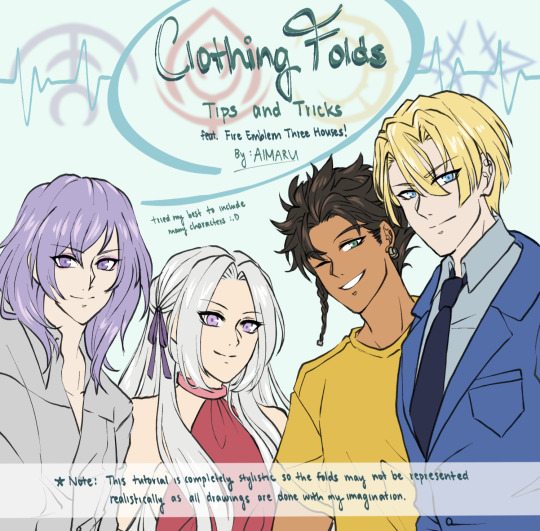
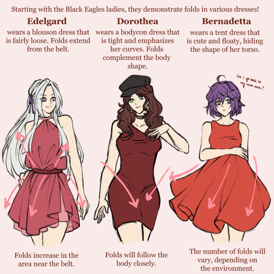
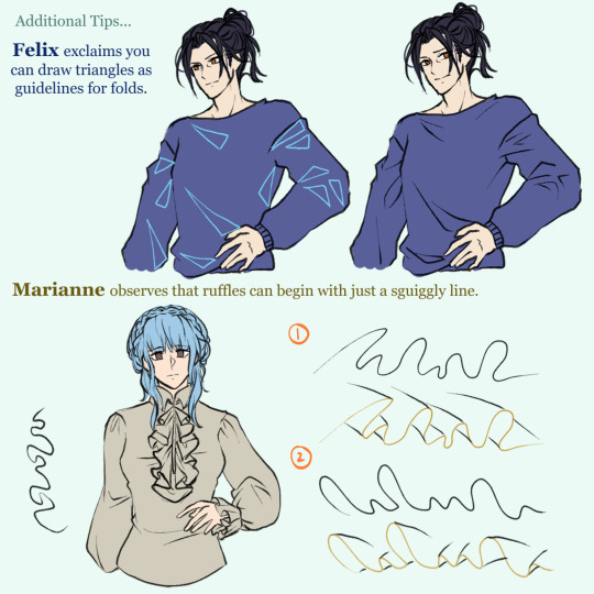
This was an art tip compilation I made in 2020 using many FE3H characters. It's terrible (to me at least lol) and not realistically correct, but I think it's still very funny so I'm sharing it 😂 Maybe I'll remake it with my current style and knowledge someday 😆
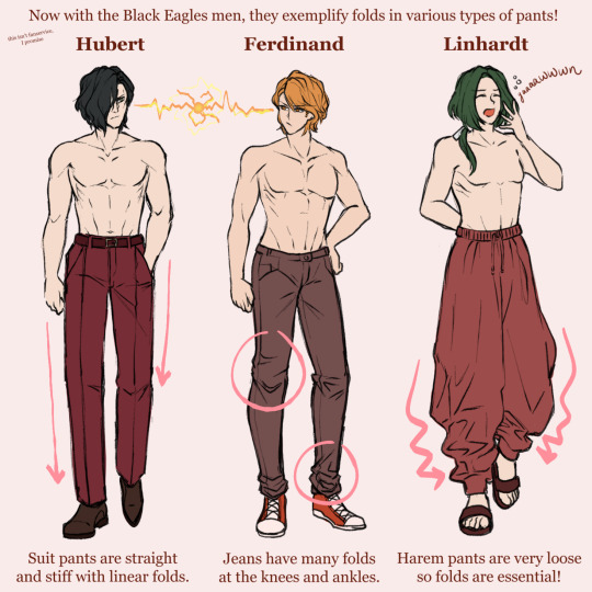

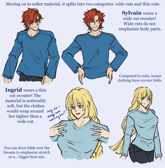
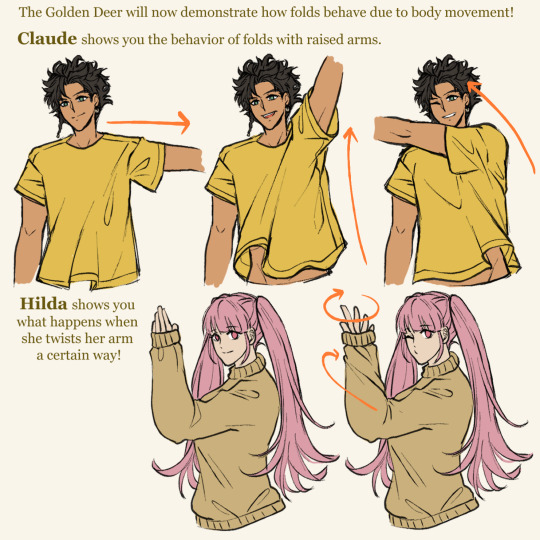
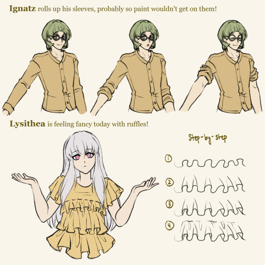


#calamari inari#my art#fire emblem three houses#fire emblem warriors#fire emblem warriors three hopes#art tips#art tutorial#black eagles#blue lions#golden deer#ashen wolves#edelgard von hresvelg#dimitri alexandre blaiddyd#claude von riegan#yuri leclerc
887 notes
·
View notes
Note
isn't it crazy how they canonically designed tiifu, zuri, and kiburi with eyeshadow? made me think of them working with makeup in a human au tbh but what are your thoughts?
It’s a VERY creative design choice and I like it. It really suits Tifu and Zuri’s characters and it just looks good on Kiburi! They all TOTALLY know how to use makeup in a human au, though it’s always surprising to hear tips from Kiburi lmao.
In my personal HS au where they’re all humans, Kiburi learns how to do it from makeup tutorials and uses it to help Ucheshi put it on when there’s a special event (ex: the prom or homecoming). He enjoys it so much he tries on a little bit of eyeliner himself
#thanks for the ask!#aaaaaa now i’m imagining kiburi doing ucheshi’s makeup like a good brother#he likes to feel pretty :)#no but tifu and zuri TOTALLY have a youtube channel where they do makeup tutorials#they wanna go to cosmotology school#human au#the lion guard
16 notes
·
View notes
Text
The tutorial to put your fursona on your tamagotchi is finally out!✨
Do you want more customization tutorials? 🐭
Watch it here:
youtube
#furry#fursona#cute#lion#shark#art#hybrid#knockout#fursuit#fursuit maker#tamagotchi#custom#hacking#tamasma#custom content#english patch#fandom#modding#pixel art#aseprite#cartoon#tutorial#diy#kawaii#Youtube
6 notes
·
View notes
Text


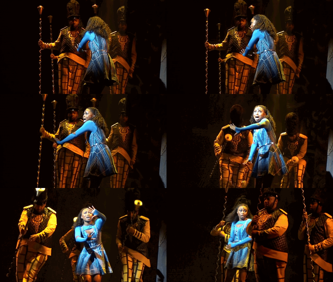
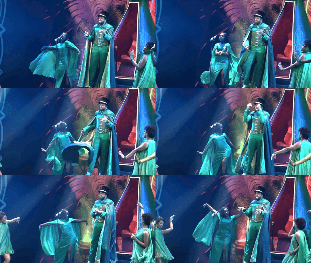
Can't wait 'til the tour gets going again so I can "ease on down the road"!
The Wiz May 2024 Second Broadway Revival -$9.50
Cast: Nichelle Lewis (Dorothy), Avery Wilson (Scarecrow), Phillip Johnson Richardson (Tinman), Kyle Ramar Freeman (Lion), Wayne Brady (The Wiz), Melody A. Betts (Aunt Em/Evillene), Judith Franklin (u/s Glinda), Allyson Kaye Daniel (Addaperle), Lauryn Adams (s/w The Wiz's Backup Singer), Christina Jones (The Wiz's Backup Singer), Kolby Kindle (Gatekeeper #1), Anthony Murphy (Lord High Underling), Mariah Lyttle (s/w Gatekeeper #2/Duke Low Underling), Polanco Jones Jr. (Emerald City Announcer), Keenan D Washington (Earl Underling), Maya Bowles (Ensemble), Shayla Caldwell (Ensemble), Jay Copeland (Ensemble), Collin Hayward (Ensemble), Amber Jackson (Ensemble), Olivia Jackson (Ensemble), Kareem Marsh (Ensemble), Dustin Praylow (s/w Ensemble), Timothy Wilson (s/w Ensemble)
Notes: MP4 format. Filmed from right orchestra. Mix of wide shots and zooms. Some obstruction at the bottom and on the left due to heads in front of me. Everyone, especially Nichelle has seemed to get much more comfy being on a Broadway stage. I think a better overall shot than during previews. NFS forever except through master and NFT through June 24, 2029.
Screenshots: https://flic.kr/s/aHBqjBsvXG
#i filmed this#musicals#musical bootlegs#musical gifs#theatreedit#broadway#slime tutorial#the wiz#broadway revival#cowardly lion#tin man#scarecrow#dorothy gale#wayne brady#oz#silver slippers#yellow brick road
4 notes
·
View notes
Text
Are you a fan of wild cats as much as I am? Learn how to draw them in my series of tutorial videos!
#tutorial#how to draw#how to paint#wild cats#big cats#cats#cheetahs#lions#tigers#snow leopards#art#drawing
7 notes
·
View notes
Text
And making the ba-loons it's your boy Shak. I have a bac-chelor's degree. I studied chemistry. But yeah, this one was pretty easy and I meant to get it out last week but I couldn't since my Internet was down and I had to get all my shit fixed then
#lion#balloon lion#how to#how to lion#how I do it#tutorial#balloon#balloon art#balloon animals#balloons
3 notes
·
View notes
Text
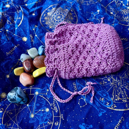
a crystal bag i made to hold a gift 💜 this was made using lion brand truboo bamboo yarn + this pattern on youtube!
12 notes
·
View notes
Text
Going into Audacity, wish me godspeed 🫡
#it's a podcast editing software if you don't know#seems pretty straightforward after watching some tutorials#lion marks are go!
3 notes
·
View notes
Text

Drew this from an art tutorial on youtube. It was an attempt. Over all I think I've done well considering I have a migraine and haven't drawn anything in months. https://youtu.be/g_etj1bWVVw?si=W0DaHFsoZDRATE7g
1 note
·
View note
Video
youtube
How to Design a Movie Poster in Photoshop | photoshop tutorial | zubtech
#youtube#speed art#lion#lion atteck#poster#poster design#photoshop tutorial#editing#makeing#how to make poster#movie poster#movie poster in photoshop#how to make poster in photoshop#lion king
1 note
·
View note
Text
Primarchs and if they use makeup
Mortarion - No. Just... no.
Fulgrim - Could do makeup-tutorials for a living, he's that good.
Angron - Does warpaint count?
Magnus - The best eyeliner you'll ever see plus eyeshadow.
Perturabo - No but Calliphone taught him how to help her with hers.
Alpharius - Uses makeup to disguise themselves.
Lorgar - Aims to use makeup in a god-honoring way.
Horus - No but he's a big fan of it, especially lipstick and lipgloss.
Konrad - Paints his lips with the blood of his victims.
Sanguinius - Just a little, some gold flecks on his cheeks and such.
Corvus - Swears that he doesn't but he does.
Ferrus - Surprisingly good at it due to watching Fulgrim.
Rogal - He barely even knows what an eyeliner is.
Vulkan - Does the soot and ash from his forge count?
Lion - Genuinely thought some people just looked like that.
Leman - Warpaint all the way. Would eat lipstick.
Jaghatai - Both makeup and warpaint. Uses winged eyeliner.
Roboute - His mom taught him well. Doesn't use his skills though.
#warhammer 40k#konrad curze#lion el'jonson#sanguinius#perturabo#fulgrim#vulkan#angron#corvus corax#alpharius omegon#rogal dorn#horus lupercal#lorgar aurelian#jaghatai khan#leman russ#roboute guilliman#ferrus manus#mortarion#magnus
290 notes
·
View notes
Text
*pulls out ring from pocket* MARRY ME😭😭😭😭😭💍💍💍💍💍💍💍
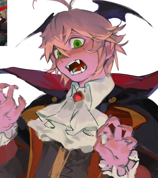
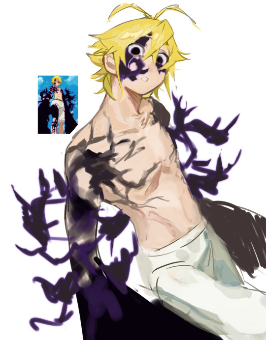


hhaha
#I NEE THAT ART STYLE#WHY THE FUCK IS THIS SO GOOD 😭😭😭😭😭😭😭#nanatsu no taizai#the seven deadly sins#meliodas#elizabeth liones#Tutorial plz#HJHDJHBDSKCBHBAEDCGYUKEQDGCKJYGEADKCVYAW#AHHHHHHHHHHHHHHHHHHHHHHHHHHHHHHHHHHH
490 notes
·
View notes
Note
Dude were you the one who made that tutorial on mythical beasts that was like... mixing vs taping? I dont remember the exact wording but it was like, mixing two creatures and making something that feels natural vs just gluing two creatures togheter and calling it a day.
Ive been looking for it since forever but I cannot find it 😭
That's me! The technique I coined is Splice vs Blend.
Blend mixes traits and colors into a chunky smoothie and assembles a believable creature. Splice is what you call taping. Where you grab whole body parts of animals and stick them together with clear seams or just bare gradients. A griffin with bird claws for front legs and lion paws for back is an example of splicing.
Check out my creature design masterpost, or just the splice vs blend tag
After that, feel free to browse all my tutorials in the art tips tag!
362 notes
·
View notes
Text
If the primarchs had social media
Lion: There is nothing on his accounts. Not even a profile-picture. Someone is still logging into them every so often. Fulgrim: On all the plattforms. Primarely family-blogger: look at my perfect kids, my perfect spaceship, my perfect partner, my perfect healthy breakfest, my perfect make-up. OnlyFans-account on the side. Get‘s into controversies all the time. Perty: Angry rants. Has spent to much time on Twitter. Old man yells at cloud type of stuff. Jagh: And this is how we‘ll break the speed-limit today! Talks about bikes, how to mod them, drives them around very fast, ect. Occasional horse-pictures. Leman: Puppies! Just cute dog-pictures and -videos, of every canine he encounters in the galaxy Rogal: He isn‘t very good at social media. Sometimes posts bad selfies or pictures of his building projects. Completly ignores all of Pertys hate-comments Konrad: He writes fanfic. Edgy, dark, not very good fanfic. The protag is a clear self-insert and Mary Sue and brings justice to all the settings he puts them in. A ton of spelling errors. The plot barely holds together. He is very proud of it. Sang: He has official accounts with pretty pictures of him everywhere, but he has some private accounts that are just like his art and sometimes cute family pictures. Also why can I see Sang having a Vtuber-persona he livestreams with so people don‘t recognize him? Ferrus: Appears on Fulgrims accounts fairly often. Maybe does some gaming-content on the side Angron: Everything is very sporadic and when it‘s there it‘s pretty angry. Surprisingly talks a lot about issues with his disabilities and that he needs way more help than he get‘s and also all his trauma. Struggles a lot with typing and forming sentences, so it can be hard to understand at times. Roboute: A channel with tutorials for stuff like running a planet or putting on armour. If people ask him to explain something he can just send them a link. Morty: Not very active, sometimes pictures of some funky plants and little texts about them. Magnus: Video-essays. He dissappers for months and then returns with a four-hour-video (minimum) about the most random topic. Hugely popular. Horus: Look at my sexy abs! Look at my huge bicep! Soft-porn-pictures of him and his sons. Probally also had OnlyFans. Lorgar: Social media is great for preaching! So he does that! Deletes all his accounts after monarchia. Vulkan: Food! He loves trying out new recipes from diffrentc cultures! At the start of every recipe is a pagelong story, which people actually read Corvus: Also writes Fanfic. Very, very good fanfic if a bit edgy at times. Kind of has a rivalery with Konrad. Also runs a very active blog, about both writing and justice, with occasional bits about guerilla-warfare Alpharius Omegon: Just the worst trolls. Dozens if not hundreds of sockpuppet accounts. They are having a good time.
#warhammer 40k#primarch#silly headcanons#lion el'jonson#fulgrim#perturabo#jaghatai khan#leman russ#rogal dorn#konrad curze#sanguinius#ferrus manus#angron#roboute guilliman#mortarion#magnus the red#horus lupercal#lorgar aurelian#vulkan#corvus corax#alpharius#omegon
1K notes
·
View notes