#like who is the target audience for THESE SHADES from THIS COMPANY
Explore tagged Tumblr posts
Visit Tumblr Blog
Explore Tumblr blogs with no restrictions, modern design and the best experience.
Last Seen Tumblr Blogs


Fun Fact
In 2020, 44% of users from Denmark used Tumblr daily.
Text
Shadows of the Past
Chapter 25: Hunting Ground
Summary: After a year of blissful cohabitation, Astarion disappears without a trace, leaving behind a heartfelt letter explaining his departure. Determined to find him, you traverse Faerûn in search of your lost love, only to realize that some absences are meant to be permanent.
Returning to Waterdeep, you find solace in the company of Gale as you come to terms with Astarion's absence. But just as you begin to heal, Astarion reappears, begging for a second chance at love.
The question looms: can you forgive his abandonment and trust him once more? As you grapple with your emotions and trauma, a sinister force lurks in the shadows, targeting you for unknown reasons.
With danger closing in, you must navigate the treacherous waters of trust, love, and betrayal to uncover the truth behind the mysterious entity's motives. Will you be able to reunite with Astarion while facing the demons of your past? Can you unravel the secrets that threaten your very existence?
Setting: Post End-Game. Mostly canon compliant.
Word Count: 5.8K
Content: Explicit 18+ - intended for mature audiences.
Warnings: [Additional tags will be added, but expect mature content / read at your own risk.]
Spoilers. Mentions of in-game missable content. Violence. Sexual Assault [Implied/attempted sexual assault: Chapter 7]. Past Trauma. Murder. Death. Longing. Sexual themes. Smut. Blood drinking. Angst. Innuendos. High use of sarcasm. Completely fabricated camp interactions. Panic attacks. Anxiety.

The tavern is a grim affair, smelling of stale beer and sweat. Shadows cling to the corners, like oil slicks that refuse to be cleaned away, and the sputtering lanterns hanging from crooked beams seem too exhausted to illuminate the room properly.
The clientele is a mixed assortment of rogues, mercenaries, and people who look as though they have more secrets than morals. A large half-orc with a patchy beard glares at anyone who comes too close, while a wiry elf in a tattered cloak palms a dagger. Even the bartender, a grizzled man with a missing ear, watches with a hawkish stare, his hands never far from the club he has leaning behind the bar.
Astarion leans in close, his eyes shrewd with awareness. “We should split up and cover more ground. It will be easier to catch anything useful if we are not one conspicuous trio.”
Shadowheart nods, her attention already sweeping over the tavern’s interior. “Stay within sight of each other,” she adds, her voice a shade sterner than usual.
You swallow down the knot of anxiety that forms at the thought of leaving Astarion’s side. It’s irrational, you know, given how well he can take care of himself. He could charm half the room and slice his way through the other half if he needed to. Still, the idea makes your fingers twitch with a half-formed desire to grab onto him.
You nod, plastering on a smile that feels far too tight. “Be careful,” you murmur to Astarion, who gives you a wink and a roguish grin.
He slips away into the crowd, moving like silk through the mass of bodies, and Shadowheart gives you an understanding look before heading off. Taking a breath, you step forward and fall into character. A charming yet dangerously mysterious smile slides across your lips, the kind that hints at secrets and makes people wonder whether you’re a friend or a threat.
Your focus drifts across the room, and you catalogue the patrons. Rough-looking sailors huddle over dice games. A pair of cloaked figures whisper harshly at a table near the back. A barmaid moves between tables, her eyes hollow and far away, as if she’s detached from the filth of her surroundings.
This place is a den of treachery, but it’s nothing you can’t handle. You know how to play the game, how to be what people in these places expect to see: a pretty face with the potential for ruin lurking just beneath.
A part of you remains on high alert, aware of where Astarion and Shadowheart are, keeping track of the distance between you. Stay focused, you think. Still, you keep one eye on Astarion, his silver hair catching the tavern’s oily light like moonbeams tangled in cobwebs.
He’s joined a game of cards, settling in with the kind of disarming ease that only he can manage. Shadowheart, meanwhile, glides around the edges of the room like a shadow given form. Her wolfish focus is sharp and attentive, missing nothing as she prowls the perimeter.
You take a deep breath, shedding the last of your tension, and begin your hunt with a simple trick: proximity.
You drift close to a group of rough-looking mercenaries boasting about their latest job and make sure they notice you. The trick is to be almost approachable, to seem just out of reach. You toss your hair, and the men’s curiosity sharpens, like wolves sniffing at the edge of the woods.
It isn’t long before one of them breaks away from the pack, sidling up to you with a swagger that tells you he thinks he’s in control of this encounter.
“May I buy you a drink?” he offers, leering in a way that would send shivers of disgust down your spine if you weren’t so practiced at this.
Instead, you tilt your head, considering him, and then let your smile widen just a fraction. “I was about to buy one myself, but I suppose it would be terribly rude to refuse.”
He grins, and you know you’ve hooked him. As he calls for a drink, you let the conversation flow, asking just enough questions to keep him talking. He’s eager to impress, telling you about some recent job escorting a merchant’s caravan, and you listen with feigned interest, nodding at all the right moments.
You slip away at the first chance of escape with a whispered, “Don’t be a stranger,” that leaves him grinning like a fool.
You move on to another cluster of patrons, this time a pair of traders whispering about how business has been suffering. Here, you adopt a different approach: you act the part of a fellow merchant, commiserating with their struggles and sprinkling in enough business jargon to earn their trust. You don’t push too hard, but you nudge the conversation toward anything unusual they’ve heard. They don’t have much to offer.
You glide between groups like a dancer changing partners. Each conversation is a delicate performance, a balance of charm and subtle prying. With a group of dockworkers, you switch to playful teasing, laughing at their ribald jokes and pretending to be scandalized, all the while coaxing out tales of trouble on the docks.
When a more serious crowd catches your eye—hard-eyed mercenaries with their hands never straying far from their blades—you adjust your act once again. Your smile becomes cooler, more challenging, and you weave your words with a thread of danger. They size you up, but when you don’t flinch under their scrutiny, they let you into their circle.
Here, you hear something more concrete: talk of graves being disturbed in strange ways.
It’s not much, but it’s a lead.
You’re nodding along, making the appropriate sympathetic noises as the woman in front of you drones on. Her voice is as grating as boots crunching over shards of broken glass, and you’re only half-listening, the other half of your attention firmly fixed on Astarion.
His laughter—smooth, melodic—floats across the crowd, drawing more attention than a moth-eaten tavern like this deserves. Even now, even here, he’s a beacon. The men and women at his table seem magnetized, drawn to his every gesture.
It’s maddening.
One of them, a rugged brute with arms like tree trunks, leans too close. His hand brushes against Astarion’s shoulder, lingering, and that familiar spark of jealousy ignites in your chest. It coils tight, a snake slithering through your ribcage, and you can’t help the way your gaze sharpens.
It’s absurd, really, the way everyone fawns over him, how they orbit his beauty like planets held captive by a star. Women, men—it never seems to matter; everyone’s drawn in, and you get it. Gods, do you get it, but still, it irks you.
The woman says something that makes your ears perk up, something about people disappearing from the lower districts, especially from a house of healing where the down-and-outs seem to be swept away like detritus in a storm. You refocus, flashing a smile that makes her puff up with importance, but you’re still watching Astarion, your peripheral vision locked onto that table.
You know Astarion can handle himself; you know he’s as dangerous as the blade he keeps concealed in his boot, but that knowledge does nothing to calm the roiling heat in your gut. The man is talking too loudly, clearly inebriated, and when his hand drops lower to rest on Astarion’s knee, you feel your fingers curl into fists.
Astarion throws his head back and laughs, and it’s a sound like sunlight breaking through storm clouds—deliberate, meant to disarm and entice. The minutes creep by, and your patience wears thinner than an old piece of parchment. Your attempts at charming conversation yield no further leads. The whispers and rumours all swirl around the same topics: the city’s underbelly swallowing the unfortunate whole.
Astarion’s game of cards continues, round after round, and he’s building up quite the impressive stack of coin. The gamblers around him are varying degrees of drunk and frustrated, their brows furrowed in disbelief at how thoroughly they’re being played.
Then, there’s the drunken ass—his hands have grown bolder, the touches escalating from lingering grazes to something more presumptuous. That ember of jealousy roars into a bonfire, and you resist the urge to stride over there and burn the oaf to ash.
Astarion remains poised, every move calculated to avoid the touch without looking like he’s avoiding it. His hands perform little flourishes, as if he’s merely emphasizing his amusement at the game, knocking away a grasp with an airy gesture. The ease with which he handles it should reassure you, but instead, it needles at your already raw nerves.
The man laughs, and he reaches out again. This time, he aims lower, his intentions crystal clear. Your vision blurs at the edges with the intensity of your fury, and you dig your nails into your palms to keep from marching over there and making a scene—or worse, letting the magic that hums under your skin break free and turn this entire bar into a funeral pyre.
Shadowheart’s presence is a calming anchor in your peripheral vision, but even she seems tense, her dark eyes darting between Astarion and you. She’s noticed your simmering anger, the way you haven’t moved from your spot in far too long. You press your lips into a thin line, silently willing Astarion to end the game, to finish this charade before your composure snaps like a brittle twig underfoot.
You exhale slowly, reminding yourself that your anger won’t help him. If you intervene, it’ll only draw more attention, but gods, it’s hard.

Gale’s manor looms, a great silhouette of stone and ivy under a sky washed with the fading indigo of retreating night. The air clings to a chill, fog curling in wisps around the base of the steps like restless phantoms. Astarion barely notices. He drifts, an apparition himself, anchored to the world only by the occasional murmur of Kamena’s voice.
His thoughts drift, unmoored, back to that tavern and to every awful, visceral memory it unearthed. His body is present, but his mind has been dragged back into places where hands claimed, used, and discarded. He swears he still feels it—phantom touches pricking along his skin, invisible fingers pawing at him, groping at his waist, his arms, wherever they could stake a claim.
He closes his eyes, but that only intensifies the memory: coarse fingers seizing his chin, breath hot and acrid against his ear, murmurs of desire that were nothing more than knives.
How is it that even with Cazador rotting in some forgotten pit, he remains haunted, every soft whisper of the past ready to drag him back to that hell? A deep shame burns through his chest. He’s stronger now, isn’t he? He should be past this.
But the hands don’t stop, and the breath doesn’t fade, and all he can do is stand there, fighting a war inside his head against ghosts who have never truly let him go.
“Hey,” Kamena’s voice is soft, a flickering candle in the dark, coaxing him back. “Astarion?”
He forces himself to focus, but it’s like trying to pull free of tar. He blinks, realizing he’s still standing in the manor’s foyer, Shadowheart long gone.
“Astarion?” Kamena tries again, worry threading through her words. “Where are you?”
He swallows, finding his voice and hating how fragile it sounds. “I’m… here,” he answers. “Sorry, darling. Lost in thought. Nothing to worry about.”
Kamena knows him too well, sees through every crack and flaw he tries to hide. Her eyes search his face, reading the pain he can’t disguise. “Come on. Let’s get you upstairs.”
She turns, using her body to guide him toward the staircase, never touching him directly. Instead, she hovers close, her movements careful and deliberate, a hand gesturing to show him the way, an arm raised slightly to ensure he follows.
Astarion’s steps feel heavy, each one an effort as they ascend. He clings to her presence, attention trained forward, focusing on the sway of her movements, on the quiet grace that surrounds her.
As soon as the door clicks closed, Kamena’s fingers snap, and flames spring to life in the fireplace. She moves without hesitation, heading straight for the tub in the corner.
He stands, feeling unanchored, like a ghost in his own skin. His gaze darts to the flickering fire, but the warmth doesn’t touch him, doesn’t sink into the cold that’s burrowed beneath his bones. He walks aimlessly, every step a vain attempt to shake free from the invisible hands still clawing at him.
His eyes catch on the glint of his dagger lying on the side table. He grabs it, the cool steel settling into his hand with a familiar weight. He runs his fingers along the blade’s edge, feeling the whetted sharpness. He doesn’t notice the pressure building, the way his fingertips push into the edge of the blade, carving shallow lines into his skin.
Kamena’s voice floats through the haze, soft and steady, like an angel whispering down from the heavens. “Astarion. Give me the dagger, please.”
Her words tug at the deepest parts of him, the ones not quite lost in the tide of memories. He blinks, startled, as though waking from a dream. Astarion’s gaze drops to his hand, where thin, crimson lines well up across his fingertips. Blood beads and drips, painting streaks down his skin, but he feels oddly detached from the pain.
Kamena steps closer, her hand lifting instinctively as though to take his, but she catches herself. Her fingers hover in the space between them, trembling slightly, so close he can feel the warmth radiating from her skin.
“You’re safe. You’re here, in our room. No one can hurt you. I’m here, and I’ve got you.”
Astarion’s fingers curl tighter around the hilt, the dagger feeling heavier with every passing second. Reluctantly, he extends his hand, the movement jagged, unnatural, as if his body is at odds with the instinct to surrender it.
Kamena’s hand reaches out and takes the dagger from him. He feels the absence of the blade in his hand like the absence of a limb.
"The bath is ready,” Kamena gestures toward the steaming tub.
Astarion shifts slightly, forcing his mind to settle as her voice touches him. "Are you trying to insinuate that I smell?"
Kamena hums, a small, amused sound, but she holds his gaze for a long beat, her smile there but tempered. "I’m not saying you smell, but the bath’s there if you want it."
She backs away slightly, giving him space, and in that moment, her gentleness, her patience, is almost more than he can bear.
He presses his fingertips together, the slick of his blood smearing beneath his thumb. The shallow cuts on his skin knit together as if nothing happened. It always heals—mending, sealing, returning to its cold, perfect stillness. A parody of life. Beneath the flesh, the raw, aching wounds of his soul remain open. Festering.
Why is it that his body—a cadaver dressed in silken skin—can stitch itself whole, while his spirit remains in tatters? Why does he carry these invisible gashes, these scars that pulse and throb? A single careless word, a fleeting glance, and the old wounds gape wide, spilling anguish like blood from a reopened vein.
He stares at the red streaks on his fingers, as if the answer lies there, hidden in the crimson swirl. But it doesn’t. It never does. His blood is lifeless, a mimicry of vitality. His soul, if it still exists, is no better. He feels trapped in this silent torment, a scream that no one can hear.
The healing is a cruel joke. His body pretends at recovery, as though that will make him whole, as though that will stitch together the fractured pieces of himself, but it’s a lie.
The promise of warmth, of something alive against his skin rather than that damnable ghost of touch, pulls him toward the tub. Without a word, he moves toward it, feeling the weight of his body dragging. His fingers trail the edge of the tub for a moment before he undresses, his clothes slipping from his body in careless movements. There’s no care, no thought—just the need to shed what feels too tight, too heavy.
Kamena watches him from the corner of her eye as she grabs a cloth and begins wiping the blood from his blade with meticulous care.
Astarion breathes out slowly, his chest tightening for a moment as he lowers himself into the warm water. He closes his eyes, letting the heat settle in his muscles, the soft splash of water against his skin distracting him. It feels different tonight, the comfort almost too much for his fractured mind to hold onto.
He’s lost in the warmth when he hears the soft swish of satin. Kamena’s presence fills the room, and for a brief moment, Astarion allows himself to simply look at her.
She’s wearing satin shorts and a tank top. Her hair, like a cascade of silk, tumbles over her shoulders before she tucks it behind her pointed ear with the grace of someone who doesn’t even need to think about it.
Kamena moves toward his discarded clothes, and without a word, she begins folding them. Her movements are careful and precise, as if she’s the one tidying up the remnants of his life, making order of the chaos. Each fold is deliberate, a small act of care, and it unsettles him in the best way possible.
His mouth opens before his brain catches up. “You’re stunning, Kamena.”
She pauses, and there’s no teasing smile on her lips, no quick retort. Instead, she simply sits down beside the tub. “Are you okay?”
Astarion stiffens slightly, the question landing like a blow he didn’t expect, and he tries to hide behind the banter that has always been his shield. “Why wouldn’t I be? I’m absolutely fine. In fact, I’m positively glowing, as you can see.” His lips twitch, but the effort feels hollow, like something dying before it can be fully born.
Her eyes narrow slightly, her fingers unconsciously tracing the edge of the towel she’s holding. “Astarion… I saw what happened at the tavern.”
Astarion feels like a raw nerve exposed to the world. He wants to pull away, deflect, but he can’t. She sees through him, and he’s not sure if he hates it or needs it more than he can admit.
“Ah, that,” he starts, attempting once again to cover the tremor that has snuck into his voice. “It’s nothing. Just a bit of fawning. I’m used to it. Attention like that is... quite familiar, really. You know how it is. People just can’t resist.”
"I don’t think it’s nothing."
Her words sink in like a stone in water. He doesn’t want to show her how much it hurts—how close it is to the old scars, the ones that never really fade, the ones that still feel raw under his skin.
“I am fine,” he insists a little too forcefully, as if trying to convince himself. “I’m always fine. It is nothing.”
Kamena only nods, her eyes never leaving his. There’s no judgment there, no impatience. Just quiet understanding. She’s not asking for his confession. She’s waiting for him to offer it, in his own time.
Her fingertips skim the surface of the water, sending ripples across the stillness. Each movement is fluid and gentle, and Astarion watches her, the rhythm offering a strange kind of peace.
He realizes it then, like a sudden crack in the ice beneath his feet. He’s running too.
His chest tightens, something sharp and jagged biting at the edges of his ribs. Fuck. He’s been pretending, hiding, letting her think he’s fine when all he’s doing is locking himself behind walls she’s never meant to scale.
How could I be so foolish?
His voice is soft when he finally speaks, almost a whisper, like the words are fragile. “I have not felt like that in a long time,” he says, his gaze focused on the water. He clenches his fists, the memory still too fresh, too vivid. “That man at the tavern, he... he made me feel like I was nothing. Just a piece of meat, something to devour. I remember how it felt to be a toy, a tool, a thing that others could use as they pleased.”
He lets out a shaky breath. “That man wasn’t the first. He won’t be the last. All it takes is one touch, one moment of weakness, and I’m right back there. In their hands."
Kamena shifts closer to the tub, her hands resting lightly on the edge, though she doesn’t touch him.
Not yet. Not until he’s ready.
"I know what it’s like," she says, “to feel like you’re stuck, like every move you make could sink you deeper, and you have no idea if you can ever get back up to breathe."
The weight of her words hits Astarion harder than he expects. He can feel it—the echoes of the same fear, the same suffocating hesitation that creeps into his bones whenever he dares to move forward.
He knows she's talking about herself, the careful way she keeps herself distanced. It’s like she’s always half-reached, but never fully here. Her pain, her quiet self-protection—it’s all the same undercurrent that he’s been fighting for years, and it makes him ache in a way he can't quite explain.
Her fingers move over the water again, delicate, almost reluctant. There's a tremor in the motion, like the last fragile thread of a dream slipping away.
Without thinking, Astarion stretches out his hand, a slow, deliberate movement, and he touches her fingers. She freezes, her breath catching in her throat, but then her fingers curl around his.
There’s no grand gesture, no sudden shift. Just two souls, existing in the same fragile space.
The House of Healing stands like a crumbling tooth at the edge of the city, its façade streaked with grime and despair. The wooden shutters hang unevenly on rusted hinges. The smell hits you first—a rank cocktail of sweat, sickness, and something sour that clings to the back of your throat. It’s a place meant for those who have nothing left: no coin, no hope, no other options.
Inside, beds, if you can call them that, line the walls in uneven rows. Most are little more than pallets of straw covered in thin, stained sheets. Patients lie there like abandoned dolls, their faces hollow, their skin sallow. A woman coughs into a rag, the sound wet and deep, while another murmurs feverishly, her voice breaking into fractured words no one listens to.
The healers move through the room like wraiths, their robes smeared with grime and their expressions blank. They look as unwell as the people they tend to.
One of them, a man with a crooked nose and hands trembling from overwork, dabs at a patient’s brow with a damp cloth, his movements slow and mechanical. Another stands over a woman whose breaths come in rattling gasps, muttering a prayer under her breath as if words alone could stave off death.
Gale looks at the scene, more troubled than disgusted. His lips press into a thin line as he steps forward, his boots scuffing against the warped wooden floor. “No one deserves this,” he says quietly, almost to himself. His gaze drifts to a child curled on one of the pallets, his tiny frame too still, too pale. "Not even the poorest soul."
A healer shuffles past you, her face lined like old parchment, her steps dragging. You catch a glimpse of her hands, fingers gnarled and reddened, shaking as she tries to tie a bandage. She doesn’t look at you, doesn’t even seem to register your presence.
It’s easy to see how someone could disappear here, swallowed by the chaos and neglect. No one would question an empty bed, assuming death had taken its toll again.
Hecat steps closer to you. “So, where do we start?”
“Fan out,” you instruct.
Each step carries you further from the relative order of the main ward. You pass a cracked window, the glass fogged with grime. Outside, the faint sound of the city’s bustle feels worlds away, muffled as if even the streets refuse to acknowledge this place.
You move through the rows of creaking cots, where patients lie motionless or thrash weakly against stained sheets. You kneel by a frail woman whose limbs seem to have withered away like autumn leaves clinging to a branch. Her skin is sallow, her lips cracked, and when you ask her name, her response is little more than a garbled whisper. A sound that isn’t a sound.
“Can you hear me?” you ask louder.
Her head rolls to the side, but her vacant stare continues past you, into some abyss you cannot fathom.
Across the room, Gale’s deep voice carries briefly before faltering. You glance over to see him standing with a man whose head lolls forward, drool pooling at the corner of his slack mouth. Gale straightens, shaking his head at Hecat, who crouches beside another and mutters under her breath. Frustration twists her features, and her shoulders tense like a bowstring about to snap.
Rusted syringes are discarded like broken quills that have long since lost their ink. Dirty rags lie slumped in buckets of water so thick with grime it has the viscosity of tar, and the smell is indescribable—like rot left to fester under the sun.
You spot a healer briskly passing by, their robes torn and smudged. They move with single-minded focus, carrying a tray of empty vials that rattle softly with every step. You reach out, catching their arm.
“Wait,” you say firmly. “What’s happening here?”
The healer doesn’t stop. Doesn’t even acknowledge you. They try to keep moving forward. Even as you hold them in place, their worn shoes slide against the floor with each useless step. You shake them vigorously, hoping for any response, but get none.
“Answer me!” you demand.
Heat flares at your palms as you channel the Weave, not enough to hurt but enough that any normal person would instinctively recoil. The healer doesn’t flinch. Doesn’t even blink. Their face remains eerily blank, their eyes as lifeless as the patients’ around you.
Your grip loosens, and they slip away again, disappearing into the haze of the ward. You glance at Hecat and Gale, who have stopped their own efforts to look at you. Gale’s brow furrows, his lips pressed thin. Hecat’s mouth twists, her sharp eyes darting between you and the retreating healer.
The world tilts on its axis as you pivot sharply. A wave of nausea crashes over you, and your stomach churns violently. Your knees weaken, and it feels as though the floor rushes up to meet you. The blood drains from your face, and your mouth floods with bitter saliva as you stagger forward. Before you can collapse, Hecat’s strong hands grip your shoulders, steadying you.
“What’s wrong?” she asks, but you can’t answer, your throat tightening as bile rises.
You double over and retch, the sound harsh and raw in the oppressive silence of the ward. Gale is at your side almost instantly, pressing a neatly folded handkerchief into your trembling hands. You wipe your mouth, head pounding with every unsteady heartbeat.
You wrench yourself free of Hecat’s hold, her concerned protest fading into the background, purpose driving you past the fog of illness and fear. Your gaze fixes on one of the patients, and you fall to your knees beside them, ignoring the wet squelch of the filthy floor beneath you. Your fingers work quickly, brushing aside the layers of grime-encrusted cloth covering their neck, searching for something—anything.
“Hey!” Gale calls from behind you, his voice sharp with confusion. “What are you doing?”
You don’t answer. You can’t stop. The thought, the terrible possibility, grips you like a vice. You check their neck, their wrists, their arms—your movements frantic now. Your breath catches as you fling back the sheet covering their lower body, exposing legs marred with a lattice of puncture wounds. Fangs, puncturing flesh over and over like an unholy feast.
“They’re enthralled,” you whisper, the words trembling from your lips with grim finality.
The three of you stare in collective horror at the grim tableau before you. Hecat’s jaw tightens, her sharp eyes narrowing, while Gale looks like he’s just been punched in the gut, his complexion pale and ashen.
“This isn’t a house of healing,” you continue, your voice hollow, almost breaking. “It’s a hunting ground.”
You see it now, in every detail—the desperate state of the patients, the apathetic healers who seem to be little more than empty vessels, the pervasive wrongness that saturates this place like a curse.
“They’re feeding on them,” you say, your gaze fixed on the patient’s legs, the bite marks overlapping in a grotesque pattern. “Draining them. Using them. Until there’s nothing left.”
“And then?” Hecat asks, though by the tremor in her voice, she already knows the answer.
You swallow hard, forcing yourself to meet her eyes. “Then, they’re turned.”
The truth weighs on you like a stone, each piece falling into place to form a picture too terrible to look at.
This isn’t just a tragedy—it’s a factory. A grotesque assembly line, churning out victims and killers in equal measure.
Gale stammers, his words tripping over one another in his urgency, his hands gesturing wildly as if pulling answers from the air. “We can’t just leave them like this. There has to be something we can do!”
You, however, are unmoved. Perhaps it’s cynicism. Perhaps it’s realism. Or perhaps the hollowness within you simply cannot stretch wide enough to encompass this many broken souls. You glance from one bed to another, your gaze sweeping over the withered faces, the slack jaws, the glassy stares that don’t even track your movement. Each figure is a ghost tethered to a failing shell, far beyond any salvation you could offer.
You shake your head, the motion small but resolute. “There’s nothing we can do,” you say flatly.
Gale reels back as if you’ve struck him. “Nothing?” he echoes, aghast. “You won’t even try?”
You meet his eyes, and they burn with the kind of indignation that only comes from belief in a better world—a belief you no longer share.
“Look at them.” You gesture sharply to the room around you. “Do you think they can be saved? Their bodies are ruined. Their minds are gone. They’re not even living, Gale. They’re... leftovers.”
His face contorts, a mix of anger and heartbreak warring in his expression. “How can you say that? They’re people, not scraps on a plate!”
You exhale sharply, the sound carrying more weariness than frustration. “People, once. Now? They’re feeding troughs. Thralls. Whatever they were, it’s gone.”
Hecat steps forward, her arms crossed, her expression unreadable. “She’s right. Even if you pour magic into them, it won’t undo what’s been done. They’re too far gone.”
Gale doesn’t back down. “We don’t know that!” His voice rises, ringing through the grim stillness. “We owe it to them to try. To do something.”
You glance at Gale and Hecat, your voice sharp and decisive. "We should leave. Take a few days to regroup and plan, and then come back when it’s dark."
Gale narrows his eyes, his frustration still simmering beneath the surface. "And why, exactly, should we wait?"
“Because this place isn’t for the living. It’s a hunting ground. Come nightfall, the ones we’re after will return to feed, and we’ll be waiting for them."
Hecat smirks faintly, her arms crossing as she leans against the grimy wall. "Using their own trap against them. Clever. A little cruel, but clever."
Gale shakes his head, disapproval radiating from him like a chill. "And in the meantime, what happens to these people? You just leave them here, like bait in a snare?"
You fix him with a cold stare, your voice unwavering. "That’s exactly what they are, Gale. Bait. Better to use it than to let it rot."
Gale’s anger flares, his voice trembling with outrage. “Bait? That’s what they are to you? These are people.” His words lash out like a whip, sharp enough to sting. He takes a step closer, his face set in a righteous fury you once might have admired. “How can you stand here, look at this suffering, and decide their best use is as tools for your goals?”
You hold his gaze, unflinching, unrepentant. “Do you think I want this? Do you think I enjoy it? The only way to help them is to rid Waterdeep of the parasite feeding on them, and using what’s left of these people is the fastest way.”
His eyes widen, disbelief flooding his expression. “What’s left of them?” he spits. “You’ve already written them off, haven’t you? You’ve decided their lives are worth nothing, so why not throw them into the fire?”
You scoff, your voice rising. “You’re godsdamned right I have. Look around, Gale. What do you see? I see empty husks barely clinging to what could generously be called life. I see people who won’t thank us for whatever salvation you think you can offer. I see us wasting time on them when the real enemy is out there, thriving.”
Gale’s hands curl into fists, trembling at his sides. “You sound no better than the monsters we’re hunting.”
That lands like a punch, but you refuse to let it show. Instead, you take a step forward, closing the distance between you, your voice a growl. “And what would you have me do, then? Heal them? Bring them all back from the brink with a wave of my hand? The best thing I could do for them is—” Your voice breaks, sharp and bitter. “Burn it all to the fucking ground.”
The words are barely out before the heat ignites in you, surging like a storm unbound. Flames curl over your skin, licking up your arms and dancing along your hair. They flicker gold and crimson, light that bends and writhes like living poetry. The air around you crackles, the smell of burning ozone sharp in your nose.
Gale steps back, his eyes widening as the heat pushes against him. “This isn’t justice,” he says, his voice quieter but no less intense. “This is rage. Destruction.”
You laugh bitterly. “Don’t preach to me about justice. Justice won’t bring back the dead or save the next victim. Rage? Destruction? They get results.” The fire swirls higher, casting shadows that twist and shift across the room. “So tell me, Gale—what do you want to do? Save them? Heal them? You can’t even get them to open their eyes!”
Your words echo in the space, your flames their only answer. They reflect off the grimy walls, painting the room in molten light that only underscores the decay. Gale stands frozen, torn between his ideals and the grim truth of your argument. Somewhere, you think you hear Hecat chuckle, low and bitter, but you don’t look at her.
You don’t need her approval.
You don’t need Gale’s either.
All you need is an end to this madness—an end that might, just might, begin with flame.
Thank you to all those who read/like/comment/follow/reblog/etc. I'm forever thankful for the support. I love reading your comments ❤️
Chapters Master List - Shadows of the Past
AO3: Crossposted
If you're interested, I also write fanfic for Ascended Astarion x Spawn Tav - Fangs and Fractured Hearts
Small Notes:
Hi guys! It's been WAY too long. I'm really sorry. Work is crazy for the holiday months, and I've been told I may lose my job, so... it's been rough. Except spotty updates until at least the end of January (either work calms down or I get let go 🤣)
#astarion x tav#astarion x you#bg3 astarion#astarion x reader#astarion#astarion romance#astarion x mc#astarion smut#astarion ancunin#baldurs gate astarion#pallidmoon#shadows of the past#astarion x oc#astarion bg3#astarion baldurs gate#astarion spawn
40 notes
·
View notes
Text
Hazbin Hotel Synopsis
Salutations! My name is Jade and I have to make a blog for my Composition class. When given a free range of topics, I decided to write about Hazbin Hotel. Mainly character information, headcannons, theories. You know, that kinda stuff. I realized for my professor to care about any of this stuff, she probably needs to know about the show. And I highly doubt she already does. So! let's get into a basic rundown of the show, in mostly my own words. Obviously, spoilers ahead. On October 28th, 2019, YouTube channel "Vivziepop" uploaded a video named "HAZBIN HOTEL (PILOT)." The video soon blew up, and got praise and backlash for the idea of the show. It got a lot of criticism for being an animated musical, since those are mainly geared towards children. However, Hazbin hotel is a show with a target audience of 18+ (weird to think I was like 15 when this came out.) With many dark themes including commentary on the toxicity of the porn industry, this show is obviously not meant for children.
Despite the backlash, it obviously did something right, because in early 2020, before the second episode could come out, A24, an American independent film company, decided to take the concept and make a whole series out of it. Four years later, on January 19th, 2024, the show's first series was released on Amazon Prime. The show follows the Princess of Hell, Charlie Morningstar. She is a very energetic demon who believes the sinners in hell deserve a second chance. She builds a hotel and basically gets laughed at by everyone. But after getting back to it after an interview about said hotel, there's a knock on the door. We then meet one of my favorite characters, Alastor. Alastor is known as the "radio demon." He offers to help Charlie with the hotel. Charlie says yes and that's kinda the end of the pilot.
Alastor then enlists the help of Husk, a cat-like demon who runs the bar, and Niffty, a small cyclops who does the cleaning. It is immediately evident that Alastor is a powerful demon. He is known as an "overlord," and is feared by many, having the ability to control basically anyone, along with summoning help for any number of things.
As the show goes on we find out that redemption is basically impossible. The angels literally laugh in Charlie's face when she suggests it. Adam, the first human soul in Heaven and angel, lets it out that his army "exterminates' sinners and demons like once a year (which later gets changed to 6 months and then 1 month.) This upsets Emily, a Seraphim who shares the views of Charlie. Emily and Charlie say that:
If Hell is forever, then Heaven must be a lie (Emily!)
If angels can do whatever, and remain in the sky
The rules are shades of gray when you don't do as you say
When you make the wretched suffer just to kill them again.
Adam then says he will see them in 1 month instead of 6. (this is apparently because of a major timeskip, but I feel like it wasn't really explained like that in the show. it really just reads that Adam keeps moving up the date cause he's a prick that wants to kill all the demons.) Charlie decides to take things into her own hands and finds someone who knows how to Kill the Angels. So, what does she do? She gets her own army, her own weapons, and the guts to kill, and proceeds to kill literally any angel she can. Alastor gets injured and is unable to fight off Adam, which ends up fine because Niffty kills him. The scene is actually hilarious because Niffty is described as “10 pounds soaking wet,” by Angel Dust. So this tiny demon who was given a knife and told “stab any angel you see,” kills what is essentially the hardest angel to even touch. That's like the president dying from a mosquito bite.
That’s not even mentioning Sir Pentious, who originally tries to kill Adam. After Alastor is killed, Sir Pentious decides to go after Adam himself. Pentious is one of the most cowardly characters in the whole show. He is so scared to confess to a girl at some point, that upon her questioning why he bought her a drink, he says “Because i bought everyone drinks!” when he hadn’t but then he does because everyone hears him. He does that like 2 more times and the situation repeats himself, even when the drinks turn into sex. He is too cowardly to admit to liking her that he has sex with a stranger instead of just confessing. But I digress, because he redeems himself by going after Adam. He resolves. He confesses to his crush. He kisses her. And then Adam kills him like, almost immediately. Despite Pentious being a coward, he isn’t weak in any sense of the word. He is a skilled inventor with many war machines that could have killed Adam. Adam just kinda snapped and suddenly Pentious and his minions and his blimp are dead. But Niffty, a masochistic, child-like cyclopes kills Adam. I love Niffty, but how does that work?
It fine though, because Sir Pentious ends up in Heaven. His sacrifice for his friends proves enough that after he dies, he ends up in Heaven in front of Sera and Emily, the Seraphim. Thats the end. The last thing we see of the main plot is confused faces and a less dark version of Sir Pentious.
#hazbin hotel#charlie morningstar#angel dust#sir pentious#hazbin angel dust#hazbin charlie#hazbin alastor
26 notes
·
View notes
Note
Gonna tinhat in your asks just because
I feel like it really WAS supposed to be a hiatus. They stepped away from the gaming channel and joint content bc Dan had a lot of projects he wanted to work on (the more serious content like big, the YouTube show, maybe even the solo tour) just to stretch his creative limbs and bc they needed to sort out the house/move, and uploading through all of that would be stressful. They were probably thinking 2-3 years tops. And then the world blew up and half of Dan's plans blew up with it
I feel like this return is GENUINE, like they've wanted to do it and just haven't been able to yet because Dan wasn't done with his stuff
i see that you have good points. it was very convenient to not have a gaming channel when they ended up living in a filming apartment with 0 space. but Dan constantly saying (through Phil sometimes) that he doesn't want to make that type of content anymore and doesn't want the gaming channel to return... it was very telling. only Phil was saying "maybe" because he was the only one actually wanting and needing it. that "maybe" was saved in case everything else went down. like a safety blanket that they always could pull out. which they did.
i understand Dan wanting a hiatus of sorts. he was burnt out. 2018 was a crazy year! it's just.. the vibes we started getting right after were very final. "Dan doesn't want it" was a final statement. and maybe he didn't want it because of other projects. he basically killed DanandPhil brand at some point, it was very apparent that he wanted to get out of that label. that he wanted a name outside a very successful duo they built throughout almost a decade. and it was fucking hard for him, you know. i understand that. the 1st project was ruined by youtube and covid. the company that he gave 10 years of his life let him down. it's a rough fucking start for a name building.
i'm simplifying a lot here, bear with me :))
i think the wad tour opened Dan's eyes a little bit. and i will take it as a win in the end of the day. it was starting very well and promising. the concept and 1st promo materials were well done. but then everything started wobbling and neither Dan nor his team was ready to deal with problems fast enough. and in contrary to how fuckups didn't really make a difference during ii NOW they made a difference. Dan couldn't make a name between 2019 and 2022, so he started going back and forth with his content. sometimes it wasn't clear who was the main target for videos, announcements and promos. i still don't know who initially was the target audience for his book. it can't be us! we know everything he wrote there. but marketing was so non-existent, it's scary how it could flop if he didn't have an audience based on DanandPhil™. his tour had somewhat of an audience also only because of the branding he was so determined to escape. although, there was a moment when he tried to advertise it for a wider audience, wasn't it? especially in the UK, where they had actual posters in the cities outside the venues. i remember having questions about why marketing shifted throughout the tour (while the script stayed the same! loser). i can't say that dystopia daily even had a target audience in mind rfbhfjekeeo
what i'm trying to say is, something changed in Dan's mind. there was a series of events that made him realise that coming back to dnpgames wasn't actually a bad idea. the European leg of his tour was the biggest mess i've ever seen. the fact that Dan explicitly threw shade on people he worked with only confirmed how bad things were. the search for a new management team, constant postponing of wad dvd, Phil's recycling content, and god knows what else �� maybe it made him realise that a familiar content on a channel that everyone loves so much and will give views (and money) is what's best right now. new projects are always a risk. dnpgames isn't. and he still can work on something alongside. especially if he finally has new managers who will fight for his interests and property communicate with people they happened to work with. (allegedly. we don't know if he actually got new representatives).
if he actually had a 2-3 years plan (even 5 years plan, idc), the communicative language should have been different. but the only vibe i was getting from him right till yesterday was "i don't what to do what y'all are suggesting. period." and then he is talking about hope on twitter?! bro, as if it wasn't in your hands all this time 😭 i love him and i wish him all the best, and i'm rooting for his career more than for my own. but damn, does he not make it easy 😂
P.S. if turns out i'm wrong, forget i ever said anything. Thanos your memory out <3
16 notes
·
View notes
Note
sorry this might be long, but literally I'm korean and I saw stays calling the backlash from other kpop stans and locals xenophobia and shading txt by saying "skz don't have to make themselves more westernized and will proudly preform a korean song" when the reason why everyone thought it was bad was because it's too extreme and not something they're used to... hell I watched it live and even I didn't expect it to sound like that and I'm used to kpop noise music. bts and bp performed korean songs at western award shows and gained tons of new fans, so it's not xenophobia or cause it's in korean it's bc of how the song sounds. if kpop fans were caught by surprise, then imagine people that have never listened to the genre. it already didn't have a good rep but people are just gonna stray away from it even more now and overall it just wasn't a good impression. I also saw stays saying "skz don't want/need western validation" when that's complete bs. they wouldn't attend the award show or mainly market themselves in the west with 12am friday releases and say they want to chart on billboard if they didn't. their entire fanbase is 90% in the west and they're not as known in korea by the general public like the other groups in their company. for example, their focus and target audience has always been in the west unlike itzy who specifically target south korea and do well there. I remember sneakers being played almost everywhere when I went to visit family in korea last summer and it being a top 4 hit on all kcharts despite western fans saying "they fell off" when you guys were never their target audience to begin with. lastly, stays wouldn't be mass voting for them to win those big awards if they really felt like the western validation didn't matter 😅 but then again bgs always have more western fans than they do korean, ggs have and will always dominate korea and that's all bc of the general public. 🤷🏻♀️
SPEAK 🗣️ ON 🗣️ IT 🗣️ ANON!
Nah but fr Stray Kids performing at an American award show is enough proof they want to make it into the western market. And I feel that groups like IVE, NEWJEANS, ZB1 and more that are popular in Korea is due to their sound. Their sound is more "general public friendly" rather then Stray Kids and they will obviously be more popular in Korea. And kpop stans were hating on it before the locals found out about it too..
3 notes
·
View notes
Text
bet.
Really, it would have been comical if it wasn't so sad. Christine had been blessed with all of the features that fairy tale princesses were made of: pale, delicate skin; a slim waist; fine, blonde hair and piercing blue eyes. On paper, she should have been at the top of the high school food chain — the denizens of Garden Hills High School were exactly the type of people to base social status on those kinds of superficial details. And yet, here she was, sitting at a table by herself in the far back corner of the cafeteria where the trash cans were, trying in vain to wipe the tomato sauce out of her hair with a zero-ply cafeteria napkin, nothing but herself and The Complete Works of Edgar Allen Poe for company. Oh, and Earl. But Earl was a loner by choice, and he did not make exceptions — certainly not for Christine. The problem was that although Christine had all of the right features, she had them in all of the wrong ways. Her skin was the sort of pale you'd find on a corpse, veins showing through starkly even in places where it was entirely abnormal to see them. There were visible veins in her wrists, of course, but they extended all the way up her forearms, spiderwebbing into her biceps like the anatomical model in the biology lab. Her jugular stood out like a bruise on her neck, and sometimes she swore she saw it pulse faintly. All throughout her body, from her head to her shoulders to her knees to her toes, her vascular system was mapped out across her skin in a way that was entire unnatural to see on a living, breathing human. She had given up on finding any sort of makeup in her skin color years ago, and had in fact entirely dismissed the idea of ever breathing any sort of life into her appearance. She was skinny, but in the emaciated way, where her pants hung off her hips like a clothes hanger. Her face was so gaunt her classmates had volunteered her for the part of Yorick when they were reading Hamlet aloud in class. Her joints were thicker than her limbs, and her fingers were so knobbly they looked like they belonged on an arthritic 90-year-old rather than a high school senior. People threw sheets over her with hollers of "rest in peace" and submitted fake obituaries for her to the local newspaper. Her hair was a shade of blonde that was closer to white, and it was dry and hay-like in a way that would have looked more appropriate on a 2,000-year-old mummy. And sure, her eyes were a pale, pathetic blue, but people would sooner have described them as piercing for the cataract in her left eye that left her pupil nearly entirely white than for the color of her irises. This was all complemented nicely by her wardrobe. It's hard to find something half-decent to wear when the target audience for your clothing size is pre-teens — or, rather, those pre-teens' parents. And so it was that a good three-quarters of Christine's wardrobe looked like it belonged in the '90s, because anything was better than a bright pink t-shirt that said "Believe" in sparkly purple cursive. Between that and her literally ghostly countenance, she wouldn't have blamed anyone for mistaking her for a bona fide zombie. She knew she was disconcerting to look at. That did not, however, excuse the people who definitely knew she wasn't a zombie for pretending otherwise just because they got a kick out of ruining her day. And maybe she didn't help her own case, what with the obsession with death and horror and all that. But frankly, it wasn't her responsibility to make it easier for others to not be assholes. And anyway, isn't it only natural to be interested in the culture of your people?
the "i'm not pretty like the other girls because i'm pale and skinny" female protagonist trope is something i loathe more than almost anything else in the world but i'd be more willing to forgive it if the author was brave enough to commit to it. if your "unattractive" female protagonist is a snow-white waif then i'd better see you emphasising how nauseatingly corpselike she looks. how people shudder when her maggot-flesh fingers touch their bare skin because they're expecting her to be cold and damp. how her birdlike bones and dainty waist are contemptible rather than desirable. maybe even have her develop a degree of beauty by gaining some weight and colour for a change. put down the necromancer barbie template and show me a proper little freak.
#the joke at the end fell flat#but i can't be bothered to fix it#don't judge me i wrote this in like#30 minutes#which seems like a lot of time but this is kind of long#and i can't be bothered to revise it#i don't think i've ever written a pick-me#but i feel like a stereotypical fictional high school is the quintessential pick-me setting#in hindsight i think i named her christine because of the phantom of the opera#this was just supposed to be a funny little joke response#it got way out of hand#anyway#writing#original#no plot#writing practice
32K notes
·
View notes
Text
The Rise of Beauty Bloggers: Shaping Trends and Influencing the Industry
In today’s digital age, beauty bloggers have become some of the most powerful influencers in the beauty industry. From makeup tutorials and product reviews to skincare tips and beauty hacks, these content creators shape trends, educate audiences, and influence purchasing decisions worldwide. The rise of social media and platforms like YouTube, Instagram, and TikTok has given beauty bloggers a space to share their expertise and passion with millions of followers.
The Evolution of Beauty Blogging
Beauty blogging has evolved significantly over the past two decades. In the early 2000s, beauty enthusiasts shared their tips and product reviews through personal blogs and YouTube videos. Over time, the industry expanded as social media platforms provided new ways to connect with audiences. Instagram and TikTok revolutionized the way beauty bloggers engage with their followers, making content more visual and interactive.
Today, beauty bloggers are no longer just hobbyists—they are entrepreneurs, brand ambassadors, and even founders of their own beauty lines. Some of the most successful beauty bloggers have collaborated with global brands, launched their own makeup or skincare products, and built empires based on their expertise and influence.
Why Beauty Bloggers Are So Influential
The success of beauty bloggers lies in their authenticity and relatability. Unlike traditional advertisements, which can feel overly polished and scripted, beauty bloggers offer honest reviews and real-life demonstrations of products. Followers trust their recommendations because they see them as genuine and unbiased.
Additionally, beauty bloggers create personalized content that caters to different audiences. Whether it’s a budget-friendly drugstore makeup tutorial, an in-depth skincare routine, or a bold, artistic look, there is a beauty blogger for every niche. This diversity has made beauty content more inclusive and accessible to people of all backgrounds, skin types, and beauty preferences.

The Impact of Beauty Bloggers on the Industry
Beauty bloggers have transformed the way brands market their products. Instead of relying solely on traditional advertising, companies now collaborate with influencers to reach their target audiences. Many beauty brands send PR packages to bloggers, hoping for a feature in a YouTube review or an Instagram post. This type of word-of-mouth marketing has proven to be highly effective in driving sales and brand awareness.
Some beauty bloggers have even played a role in holding brands accountable. If a product fails to deliver on its promises or lacks inclusivity, beauty bloggers are quick to call it out, prompting brands to improve their formulations and shade ranges. This has led to a more transparent and customer-focused beauty industry.
The Future of Beauty Blogging
As technology continues to evolve, so does beauty blogging. Augmented reality (AR) makeup filters, AI-driven beauty recommendations, and interactive live-streaming tutorials are just a few innovations shaping the industry’s future. Beauty bloggers who adapt to these changes and embrace new platforms will continue to thrive.
In conclusion, beauty bloggers have become key players in the beauty industry, influencing trends, shaping consumer preferences, and fostering a more inclusive and diverse beauty community. Their impact is undeniable, and as digital platforms evolve, their influence will only continue to grow. For more details visit our website: www.glamstudiosuites.com
#Beauty Studios#Beauty Influencers#Beauty Bloggers#Beauty Studios for Rent#The Real Housewives of New Jersey#Rachel Fuda#John Fuda#Melissa Gorga#Joe Gorga#RHONJ#Real Housewives of New Jersey
0 notes
Text
This is kind of an interesting turn for me, regarding Disney's 2025 movie slate.
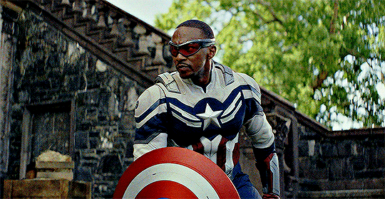
It seems obvious that a fourth CAPTAIN AMERICA movie, especially one that follows up on THE FALCON AND THE WINTER SOLDIER, was guaranteed to be one of Disney's big hits this year.
Tracking has it making about $95m-ish for the 4-day opening (as it's opening the weekend before President's Day), and now we actually know what this thing's budget is... $180m... Below the $200m that Disney usually blows on their big budget movies. After a year or so of "scoopers" and random bloggers insisting that the strikes and reshoots ballooned this on-the-ground political spy thriller-inspired actioner's budget. That it tested poorly multiple times or whatever. (Lots of beloved movies probably did, too. Depends on the audience you get on that day, I guess!) I think I mentioned that in a post last year, too. Shouldn't have fallen for that myself honestly, I probably only meant it glibly, simply because I'm used to MCU movies being Frankensteined in post and reshoots driving up the budgets.
Anyways, BRAVE NEW WORLD cost $180m to make, so it shouldn't have a hard time making that back. It's more on the WINTER SOLDIER level than it is an AVENGERS level, for sure. Literally, this is the first CAPTAIN AMERICA standalone movie to not have a ton of Avengers members in it since WINTER SOLDIER, all the way back in 2014. 2016's CAPTAIN AMERICA: CIVIL WAR is often called "AVENGERS 2.5" or an "AVENGERS movie", not "CAPTAIN AMERICA 3". So, yeah, the only really BIG-scale thing happening in this is Red Hulk. The movie would have to be terrible to audiences to flop, with that kind of opening.
Disney apparently needs a big budget movie like this to now make 3x its opening, not so much 2.5x. $540m would be the target here, the only Cap movie to miss it was THE FIRST AVENGER. A Phase One MCU entry introducing that series' version of Steve Rogers, no less. WINTER SOLDIER made more than $700m+ worldwide, so this probably won't have too much of a hard time. I predict it'll make less than WINTER SOLDIER, but still enough to cover its costs. I'm sure Disney wants it to be huge, since SNOW WHITE doesn't look to repeat the success of MOANA 2 and MUFASA.
Also, given that this is a CAPTAIN AMERICA movie and it looks a little more political than usual (if the DC setting didn't give it away), and our current Captain America is black. I'm sure that's already rankled some folks out there. Hell, we even have a president character that morphs into a raging monster not too far a shade removed from orange that our Cap ends up having to fight... I wonder what its possible success will say to the larger company, who are trying their damnedest to be politically neutral as of now.
Not that the previous CAPTAIN AMERICA movies really swung in any particular direction, most MCU movies are centrist to me anyways, though I guess they could be read as anything. WINTER SOLDIER and CIVIL WAR don't necessarily single out a current American political party or ideology, per se, more some conflict that directly affects the superheroes coming from the vague "the government". I imagine BRAVE NEW WORLD will be no different, but if they somehow get in an idea that pisses off the right crowd? I'd consider that a funny win.
Tracking can also be unreliable... That is, if the film is seen early on and the word gets out that it's very unsatisfactory. Think JOKER: FOLIE A DEUX, whose tracking went from around the 80s to... A $37m opening weekend. BRAVE NEW WORLD would have to turn out like FOLIE A DEUX, or THE MARVELS, in order to miss the mark. So, we shall see... But yeah, a new CAPTAIN AMERICA movie is Disney's first release of the year. I'm curious to see if it's a pick-me-up or another clunker for them.
1 note
·
View note
Text
Beginner’s Guide to Professional Web Development
In today’s digital world, having a strong online presence is key for any business. Whether you’re just starting or want to revamp your site, working with a web design company can bring your vision to life. For many business owners, web development in Melbourne can feel tough and unclear. In this guide, we will walk you through each step so you can approach a web company with clear expectations.

Why Professional Web Development Matters?
Start by seeing why expert web development and SEO services in Melbourne are key. A smart, sleek site can:
Earn trust and loyalty from users
Lift your brand’s reach online
Refine user paths to keep them on
Raise search rank, letting more users find you
Boost sales by turning clicks into buys
With so much riding on this, pick a web help team skilled in both tech and style to craft a site that suits your work.
1. Initial Consultation and Discovery Phase
Web development in Melbourne starts with a consultation. You will meet with your team to discuss your goals, objectives, and website vision. In this phase, you’ll share your preferences, like design style, features, and functions. This is also when developers collect key details to guide the project.
What happens during the discovery phase:
Business Goals: What do you want your site to do? More traffic? Sales online? Lead generation?
Target Audience: Who do you want to reach? Knowing your audience helps create a user-friendly design.
Competitor Analysis: The team may review competitor sites. This helps you understand what works in your field.
Budget and Timeline: Set a clear budget and timeline. This ensures everyone is aligned on the project.
At this stage, talk is key. Be ready to share your needs clearly. This sets the tone for the whole project.
2. Planning and Strategy
Once the discovery phase ends, the team will map out your website. This is when the web development in Melbourne begins to take shape. The planning stage includes:
Site Architecture: The team will define the site’s layout, menu, pages, and content flow.
Wireframes: Wireframes are blueprints for your site. They show the layout of each page without design details. They help plan how your content fits.
Content Strategy: Content is key to any website. This stage decides the types of content needed (text, images, videos, etc.) and how to organise it.
The planning phase is key to building a site that works well and looks great. The clearer the plan, the easier the next steps will be.
3. Design and Development
With a plan set, the design and build phase starts. This is where your site takes shape to look great. You’ll work with a designer to make sure your web development in Melbourne fits your brand and appeals to your users.
Design Process:
Visual Design: The designer will craft drafts or image models of your site. These will show shades, fonts, and art.
User Interface (UI) Design: This step works on an easy-to-use page plan. It boosts how users feel when they use your site.
Feedback Loop: You will view and test the drafts. You can give input to match your idea.
Development Process:
Front-End Development: The front-end is the part users see and use. This step turns the draft into a live site with HTML, CSS, and scripts.
Back-End Development: The back-end is the tech side of your site. It runs files, tools, and all active parts shown to users.
A skilled web team must know both front-end and back-end. This keeps your site sleek, fast, and simple to use.
4. Testing and Quality Assurance
Before your site goes live, it faces strict checks. This step during web development in Melbourne ensures that all works well and that the user flow stays smooth. Tests often check:
Forms and Links: Ensuring all links, forms, and clicks work.
Browsers: Make sure the site runs fine on Chrome, Edge, and others.
Mobile Use: Testing how well the site fits phones and tabs.
Speed: Checking load times and site pace for smooth use.
Fixing Issues: Clearing bugs or errors to get it live.
This stage is key to a solid launch.
5. Launch and Post-Launch Support
After web development in Melbourne, the team ensures to test the site. After which it’s set to launch. The team will send the site to your live domain and check that all works well. This is a big step, yet it’s not the close of the task.
Post-launch work has these steps:
SEO Optimisation: Make sure the site stays search engine smart by fixing tags, titles, and pics.
Training: The team will show you how to use the CMS if you need to edit the site.
Ongoing Care: Fixes, updates, and checks keep your site in top shape.
Most web design firms give post-launch help to fix any issues that show up once the site goes live.
6. Marketing and Enhancements
Once your site is live, you need to promote it. A good site works if people find it. SEO, social media, and content marketing can help bring traffic and turn visitors into customers.
Some firms also offer site upgrades, like adding features, using third-party tools, or growing the site’s functions as your business grows.
Key Considerations for Choosing the Right Web Development Company
Picking the best team for web development in Melbourne is key to the success of your plan. Here are key points to note:
Experience and Portfolio: Find a firm with a great record of building sites for firms like yours.
Client Reviews: Read posts and speak to past users to check the firm’s trust and service.
Clear Process: Be sure the firm has a neat, clear plan for tasks and chats.
Skill in Tech: Ensure the firm knows the tools and sites that fit your needs (e.g., WordPress, Shopify, custom builds).
Post-Launch Help: Make sure they give post-launch aid and can add tools in time to come.
Concluding Words
Web development in Melbourne and globally is a complex task. With the right team, it can boost your online presence. This will help your business grow. From the first chat to support after launch, every step is key. Each phase ensures your site is useful, eye-catching, and easy to use. When you know the process and set clear goals, you can work well with a web development company. This will bring your business online.
Want a website designed for your business? Contact Make My Website to learn how we can help. We build sites that look great and drive results. Our team is ready to help you bring your vision to life.
0 notes
Text
How to Reflect Your Brand in Your Vancouver Office Design
Your office is more than just a place where work happens; it's a physical representation of your brand. In Vancouver, a city known for its dynamic business environment and innovative spirit, the design of your office can play a significant role in shaping how your brand is perceived by employees, clients, and visitors. This blog will guide you through the process of reflecting your brand in your Vancouver office design, highlighting key strategies and insights to create a space that truly embodies your company’s identity. Whether you're planning a redesign or setting up a new office, understanding the importance of commercial interior design in Vancouver can help you create an office space that aligns with your brand and business goals.
Understanding the Importance of Brand in Office Design
Your brand is the essence of your company—it's what sets you apart from competitors and communicates your values, culture, and mission to the world. Office design is a powerful tool for bringing your brand to life in a tangible way. When done right, it can:
Reinforce Brand Identity: Every element of your office, from the color scheme to the furniture, can reflect your brand’s personality and values. A well-designed office makes it clear what your company stands for and what it’s all about, even before a conversation starts.
Enhance Employee Engagement: Employees who work in an environment that reflects their company’s brand are more likely to feel connected to the company’s mission and values. This connection can boost morale, foster loyalty, and increase productivity.
Create a Memorable Client Experience: First impressions are lasting, and the design of your office plays a crucial role in shaping how clients and visitors perceive your brand. A thoughtfully designed space can leave a positive, lasting impression and help build stronger relationships with clients.
Key Strategies to Reflect Your Brand in Your Office Design
Start with Your Brand Identity
Before diving into the design process, it’s essential to have a clear understanding of your brand identity. Ask yourself the following questions:
What are our brand’s core values?
What emotions do we want our brand to evoke?
Who is our target audience, and what do they value?
How do we want to be perceived in the market?
Once you have clear answers to these questions, you can begin to translate your brand identity into physical elements in your office design. For example, if your brand values innovation and creativity, your office should feature open, collaborative spaces with bold colors and modern furnishings. If your brand emphasizes professionalism and reliability, a more classic and sophisticated design with muted colors and traditional furniture might be appropriate.
Choose a Color Palette that Reflects Your Brand
Color is one of the most powerful tools in office design for conveying your brand’s personality. The colors you choose for your office should align with your brand’s color palette and evoke the desired emotions. Here’s how to use color effectively:
Bold and Vibrant Colors: If your brand is energetic and forward-thinking, consider incorporating bold colors like red, orange, or bright green. These colors can stimulate creativity and excitement.
Neutral and Calm Colors: For brands that value professionalism and calmness, a neutral palette with shades of gray, beige, and white can create a serene and focused environment.
Natural and Earthy Tones: If sustainability and connection to nature are part of your brand, consider using earthy tones like browns, greens, and blues. These colors can create a soothing and grounded atmosphere.
Incorporate Your Brand’s Visual Elements
Incorporating your brand’s logo, typography, and other visual elements into your office design is a straightforward way to make your brand visible throughout the space. Here are a few ideas:
Logo Placement: Display your company logo prominently in reception areas, conference rooms, and other high-traffic areas. This not only reinforces brand identity but also leaves a strong impression on visitors.
Custom Signage: Use custom signage and wall art that features your brand’s typography and messaging. This can include motivational quotes that align with your brand’s mission or wall murals that tell your brand’s story.
Branded Furniture and Accessories: Consider using furniture and accessories that reflect your brand’s style. For example, custom-designed chairs with your logo or branded office supplies can subtly reinforce your brand identity.

Design Spaces that Reflect Your Company Culture
Your office layout and design should reflect and support your company culture. Here’s how to do it:
Open and Collaborative Spaces: If your company culture values collaboration and teamwork, design open spaces with flexible workstations, communal tables, and breakout areas where employees can easily connect and share ideas.
Private and Focused Areas: For companies that prioritize individual focus and concentration, design spaces with private offices, quiet rooms, and secluded workstations that allow for deep work.
Comfortable and Relaxing Zones: If your brand emphasizes work-life balance and employee well-being, create comfortable lounge areas, wellness rooms, or even a game room where employees can unwind and recharge.
Reflect Local Vancouver Influences
Incorporating elements of Vancouver’s unique culture and environment into your office design can create a sense of place and connect your brand to the local community. Consider these ideas:
Natural Elements: Vancouver is known for its stunning natural landscapes, so bring the outdoors in with natural materials like wood, stone, and plants. Biophilic design, which incorporates nature into the built environment, can enhance well-being and productivity.
Local Art and Culture: Showcase local art, photography, or cultural artifacts that reflect Vancouver’s diverse and vibrant community. This not only adds a unique touch to your office but also supports local artists and cultural initiatives.
Sustainable Design: Sustainability is a core value for many Vancouver businesses. Incorporate eco-friendly materials, energy-efficient lighting, and sustainable practices into your office design to reflect your commitment to environmental responsibility.
Ensure Consistency Across All Spaces
Consistency is key when reflecting your brand in your office design. Every area of your office, from the reception to the restrooms, should carry the same brand message and aesthetic. Here’s how to achieve consistency:
Unified Color Scheme: Maintain a consistent color scheme throughout the office. This doesn’t mean every room needs to be the same color, but the palette should be cohesive and reflective of your brand.
Cohesive Furniture and Decor: Choose furniture and decor that match your brand’s style and are consistent across all spaces. This includes everything from desks and chairs to lighting fixtures and artwork.
Branded Touchpoints: Ensure that all touchpoints, such as business cards, signage, and even employee uniforms, are aligned with your office design and brand identity.
Work with a Professional Commercial Interior Designer
Reflecting your brand in your office design requires careful planning and a deep understanding of both design principles and your brand’s identity. Working with a professional commercial interior designer in Vancouver can help you achieve your vision. These experts can:
Translate Your Brand into Design: A professional designer will take the time to understand your brand and translate it into a cohesive and visually appealing office design.
Maximize Space and Functionality: Designers can help you make the most of your space, ensuring that it not only looks great but also functions effectively for your team’s needs.
Incorporate Local Trends and Standards: With their knowledge of local design trends and building standards, a Vancouver-based designer can ensure your office design is both stylish and compliant.
Conclusion
Reflecting your brand in your Vancouver office design is a powerful way to create a space that resonates with employees, clients, and visitors alike. By carefully considering elements like color, layout, and visual branding, you can create an office that not only looks great but also communicates your brand’s values and identity. Whether you’re a startup looking to make a bold statement or an established company aiming to reinforce your brand, investing in thoughtful office design is key to achieving your goals. With the expertise of a commercial interior designer in Vancouver, you can bring your brand to life in a way that inspires and engages everyone who walks through your doors.
0 notes
Text
A Comprehensive Guide to Choosing the Right Baby-G Watch for You
In the realm of wristwatches, few brands have successfully achieved an ideal equilibrium of style, durability, and functionality as effectively as Casio’s Baby-G series. Introduced in 1994 as a companion to the robust G-Shock line, Baby-G watches have since established their own unique identity, attracting a diverse audience with their youthful aesthetics, vibrant color palettes, and remarkable resilience. Whether you are an active person in search of a dependable timepiece that can match your dynamic lifestyle or an individual who simply values a fashionable accessory with a hint of toughness, Baby-G watches present a distinctive combination of style and practicality that is difficult to surpass.
One of the most attractive features of Baby-G watches is their unique design. While they inherit the sturdy characteristics of the G-Shock, Baby-G watches possess a more playful and feminine flair, making them a favored option among young women and teenagers. The design philosophy of Baby-G revolves around merging durability with contemporary aesthetics. These watches come in an extensive array of colors, ranging from vibrant neon shades to gentle pastels, enabling wearers to showcase their individuality and personal taste. The designs frequently feature bold, striking elements such as oversized dials, digital displays, and colorful highlights that create a notable impression on the wrist.
In addition to being aesthetically pleasing, Baby-G watches are made to endure the demands of an active lifestyle. Baby-G watches are shock-resistant, much like their G-Shock predecessors, which makes them perfect for everyday use, sports, and outdoor activities. Because of their ability to both absorb and deflect force, the watch will continue to work even after being dropped, bumped, and otherwise physically abused. Furthermore, Baby-G watches are perfect for swimming, snorkelling, and other water-related activities because they are water-resistant, with several versions having resistance up to 100 meters. Because of their resilience, Baby-G watches are a dependable choice for today's busy woman. They can withstand any challenge life throws at them.
Another important aspect that distinguishes Baby-G watches is their functionality. The watches are unquestionably fashionable, but they also have a tonne of useful capabilities that elevate them above mere fashion accessories. Numerous Baby-G models have numerous features, such as a calendar, stopwatch, alarms, global time, and countdown timer, which make them practical instruments for organising everyday tasks. The illumination on the digital screens makes them easier to view even in dimly lit environments. In order to sync the watch with smartphones for extra functions like phone notifications and automated time updates, several models additionally have Bluetooth connectivity. For individuals who require a watch that can do everything, Baby-G watches are the perfect option because of their stylish design and high level of functionality.
The attractiveness of Baby-G watches to a variety of age groups is one of their distinctive features. Although they are frequently marketed to younger ladies, a wider audience has come to love them because of their adaptability and durability. There is a Baby-G watch for everyone thanks to the broad range of designs, whether you like a sporty appearance, a more sophisticated design, or something in between. In addition, the watches are very robust, so you may wear them for years without worrying about them losing their style or functionality. For everyone searching for a fashionable and useful watch, Baby-G watches are an excellent investment because of their extended lifespan and reasonable pricing.
Casio has been adding new models to the Baby-G range in recent years, addressing the changing demands and tastes of its target market. This involves working with well-known companies and musicians, releasing products in limited quantities, and utilising cutting-edge materials and technology. Because of these developments, Baby-G watches are guaranteed to be popular and current in the rapidly evolving fields of technology and fashion. Baby-G has been able to hold onto its position as a leader in the watch market by adapting while adhering to its key ideals of style and durability.
Baby-G watches are more than simply timepieces; they're declarations of tenacity, style, and usefulness. Baby-G has a watch for everyone, whether you're an athlete, a fashionista, or just someone who enjoys a high-quality watch. These watches are ideal for individuals who lead busy lifestyles but don't want to sacrifice style because to their distinctive designs, sturdy construction, and practical features. Because of this, Baby-G watches have grown to be a popular accessory among many, demonstrating that you can have both style and functionality.
Explore the ideal fusion of fashion and robustness with Baby-G watches, presently offered at Al Wifaq. Baby-G watches have fashionable, bright designs, water resistant, and shock resistance, catering to the modern woman who leads an active lifestyle. These trendy timepieces are made to endure daily wear and tear, whether you're heading to the gym or going out for a laid-back day. Baby-G watches from Al Wifaq are the perfect accessory for people who appreciate both fashion and function because they come in a variety of colours and features to suit every taste and occasion.
0 notes
Text
Website Design Services with Latest Methods

If you had not known, it's vital to know that there are some psychological effects that uncovers each color and comes as helpful when the website designers design a website. To them, the psychology behind each color counts a great deal. Needless to say, the human senses usually gets excited for lot many stuffs. One of the effective ways of exciting somebody is likely to happen by projection of color on the walls of the room. It's a proven fact by the scientists that a person who stays inside a red room has greater health issues than a person who resides in blue colored room. As we all know that red symbolizes sorted level of excitement that affects as to how you react to it. Major top-notch brands are extravagantly in favor of lighter colors like blue that stands a good example of relief to the eyes. Auto SEO Service Delhi, Real Estate SEO Consultant India, Resort SEO Services and SEO services India
Colors make a huge difference to a website design. The importance of colors is something that ca not be realized by a layman. A website in green may appear as good as it would in blue. But, color is one thing that brings a big difference to how your audience perceives you. The website design services bears the importance of colors in mind and tries express something unique to the audience. How colors stimulates human senses? The website designers at major website design company, India, favors colors that excite people and appeals to their senses on instant basis. It's true that colors stimulates senses and increase makes a person feel warm and tranquil. However, red simply is one of those few colors that excites you. However, there are certain shades of red in general that looks appealing on a website. Dark red irritates the eyes and does not leave a way too good impression on the mind of the visitors. This is perhaps one of the main reasons why major designers choose colors in a subtle way so that it does not hit hard on eyes of the visitors.
Although red affects your eyes, it's a vital preference of major city people. People who tend to be under the effect of gambling are highly attracted under red lighting condition rather than under blue. It's perhaps one of the main reasons as to major cities such as Las Vegas use red lights in ample. Color usually affects one's performance and makes people feel quicker, however, blue makes you think more even before you act. Mixing Colors Works, The website development services, often mix colors in a website to make it look more appealing. By mixing some complementary colors, the designers bring alive the emotions that are hidden behind each of these colors. However, such mixing should not happen often but occasionally. If it's overdone, then it's likely to place a bad effect on the eyes of the visitors. For instance, a website that is colored in black in the background with pink colored text hits the eye bad.
Best Colors For Websites, The best website design company in India picks up just the right colors to suit the business demands of the client. To pick up colors for websites, you would simply want to pick up your favorite colors and turn them into layout. The designers at most of these agencies can figure out the target audience and see what sort of colors would work well on them. However, it's also pretty unlikely to choose colors that would fit the choice of every visitor. Therefore, it's vital that you give more importance to colors that targets the right audience. As per research, most website visitors do not usually come back to a website simply because of the colors chosen for the site. One of the main things that people generally focus on is the color, however, with multiple colors, you fail to see the dominant factor, which perhaps means considering a redesign. With a blue shade of colors, you are likely to get positive response from the visitors. To excite the audience, you can use colors like orange and red. A moderate color scheme of green and white can also be used for a somewhat fresh and glamorous look.
#Website Design#web development#web developing company#web developers#website development#web design
0 notes
Text
Reflective Blog (CMNS201)
For the sake of this assignment, I went back to my Media Audience blog post and the critique I got in my evaluation. As it was early in the course and I was focused on making progress, I overlooked the deeper meaning in what I was writing as it pertained to the course. As per the tutor’s thoughts, I was missing the importance of my role as a prosumer in media. A prosumer is someone who can act as a consumer, producer and distributor of media rather than taking a position as being “passive receptacles of media” (Klein, 2017). I spend a fair share of time as an audience to film and feel very passionately about it, which drives me to write about my thoughts through apps like Letterboxd. I take the time to write my reviews, reference external influences of my thoughts, and promote the films that I believe people should see and enjoy. As a consumer, I pay for a subscription to this app that allows me aesthetic benefits and ad removal for my experience with the app and can imply a bit of prestige for other users who look through my account (Savage, 2014). Letterboxd then has my money to improve user experience and pay staff, but the data they collect from myself and all users is free to them and increases their profit as well.
A concern I outline in my blog post is the impact of targeted media and advertisements online that can lead to an echo chamber of ideologies and impact mental health as well. I focused on the internet in expressing my concern for audiences, but this extends further to traditional media and examples of media convergence as well. Gasher et al., (2016) touch on the anomaly of cultural products and how audiences are exposed to cultural products and hidden advertisements because those with a vested interest can control things like what is advertised, and the costs associated with them. This is important to my previous argument because similar to how people experience curated online, people have always chosen what shows, movies, newspapers and more that they invest their time into. For example, if someone is tuning into the same show each week, whether broadcasted or through streaming, they could be influenced by the intentions of those with vested interests over time. It sheds light on the importance of diverse programming and voices in media, to break up the penetration of single influences and ideologies.
This ties into the important topic how media is regulated with the audience in mind, whether that be traditional media or new media. In a Canadian context, the CRTC has struggled at length with improving legislation as technology and media have rapidly evolved (Shtern & Blake, 2014). Not everyone agrees that the CRTC is always necessary in holding power over broadcasting and telecommunications, but that overlooks the impact of allowing media concentration (specifically vertical integration) to dominate the market more than it already does (Shtern & Blake, 2014). Despite the intervention of regulatory bodies, there are still many issues such as the “lack of ownership diversity, leading to a situation in which four major companies exercise considerable control over Canada’s broadcast and telecom systems” (Shtern & Blake, 2014, p. 94). This means that audience members have to exercise more critical thinking and consideration of the media they consume, but also that platforms online that allow diverse voices are more important than ever.
References:
Gasher, M., Skinner, D., Lorimer, R. (2016). Mass communication in a digital age. In Mass communication in Canada (8th ed.) (pp. 336–361). Don Mills, ON: Oxford University Press.
Klein, R. (2017). CMNS 201. Introduction to Communication Studies. Study Guide. Edmonton: Athabasca University.
Savage, P. (2014). Audiences are key. In L. R. Shade (Ed.). Mediascapes: New patterns in Canadian communication (4th ed.), (pp. 127–149). Toronto, ON: Nelson Education
Shtern, J., Blake, S. (2014). Power and politics at the CRTC: The recent past and uncertain future of Canada’s communications regulator. In L. R. Shade (Ed.). Mediascapes: New patterns in Canadian communication (4th ed.), (pp. 84–106). Toronto, ON: Nelson Education.
0 notes
Text
Effective Product Branding Tips In 2023

Among thousands of competitors offering the exact thing as your brand, product branding is the thing that makes you stand out.
With the power of a good logo, packaging, design, imagery, and brand message, your product can get people to stop and notice.
All that said, we know it’s not as easy as it may seem. A lot goes into building a product brand, and marketing is among the most critical factors that generate successful branding.
To help you out, we’ll discuss the best product branding tips to get your company going in 2023!
Effective Product Branding Tips For 2023
Make An Eye-Catching Brand Logo
An effective product and package design can only be achieved if you focus on the critical elements of your brand identity.
‘Dark and mysterious’ or ‘colorful and quirky’- your visual choices determine what customers will connect to your product design.
Here are some factors to consider when designing your brand logo:
Color Palette
When choosing the color palette for your logo, it’s crucial to incorporate shades that reflect your vision, products, and target market.
Font
Fonts typically evoke emotions; they can show your brand’s best side if chosen correctly. Choose a text style to help consumers connect your logo to your brand.
Graphics
When it comes to buyers, people do judge their product by its cover! If your graphic game is off, there’s a high chance that your product may go unnoticed on the shelves.
Have A Clear Vision
You may have a clear idea about what your brand identity is and what your goals are. But product branding requires you to take it further by encapsulating your brand vision in your product.
With this in mind, starting your product branding process with a clear vision is essential.
Here are some key questions to answer to have a deeper understanding of your brand’s vision:
What message are we trying to imply?
What does our market need right now?
How can my product stand out from competing items in the market?
By answering these questions, you will have a clearer idea of your marketing strategy.
Identify Your Target Audience
Your product branding’s success hinges on clearly understanding who your target audience is and how to reach them.
By knowing your audience, you can target those willing to pay for your products – this is an effective and affordable way to generate business in 2023.
Take SEO Seriously
Search Engine Optimization is a great way to trailblaze your product branding.
You can use keywords, backlinking, and other SEO strategies to reach potential customers even though they aren’t actively following you on social media.
However, SEO isn’t only about reaching new customers.
It’s also about the technical aspects of your brand’s website, including loading speed and user interface-friendliness.
Always Be On-Brand
Consistency in product branding is about how all your products represent a consistent brand message.
Your goal with a consistent brand image is to ensure that your products, including your package labeling structure, are recognizable.
No matter what color you tweak according to the theme of a variant, your logo is the key to product branding.
Take famous brands like Coca-Cola and Starbucks, for example.
Coca-Cola has trademarked its “Coca-Cola Red” color, logo typography, and glass bottle shape.
On the other hand, Starbucks has revised its logo throughout the years, but two things remain consistent – its green color palette and siren graphic design.
On top of your packaging and brand logo, it’s also essential to remain consistent whenever you engage with your target audience. Make sure to bring consistency to your company website and social media accounts.
Don’t Be Afraid To Use Humor
Nowadays, consumers respond well to humorous brands compared to serious ones because they cut through the tension and appear more approachable.
Now, more than ever, consumers are drawn to relatable brands.
They are more likely to support brands living in the same world and experiencing the same stuff, so using humor and satire is an intelligent way to build that connection with your audience.
Use Social Media To Your Advantage
In 2023, social media will be unstoppable – it will be the most powerful tool to market your brand, increase sales, generate leads, and separate your company from competitors.
Therefore, regularly posting on Facebook, Twitter, Instagram, and other social media platforms is essential.
1 note
·
View note
Text

this makes me want to kill…. …………….. “never-boring”………………
#ah yes. limecrime. famous for their nude/pink/red lipsticks#come on#who do they think theyre even marketing to#like who is the target audience for THESE SHADES from THIS COMPANY#??????#god. black moon is like the only semi-major alt makeup brand left. i hate this industry so much
4 notes
·
View notes
Text

Title: Daimyo Bane
Inspired by: this work of art
For: Bounty Hunter Week 2022. Based on the theme: “Fan creations involving divergent AU's - E.G, Modern AU, Old West, Regency AU, ect “
Word count: 1.9K +
Summary: An alternate universe / AU where Cad Bane is the Daimyo of Tatooine, guarding his hoard of treasure and credits like a dragon while the people suffer and Boba Fett has come to save the day. Or, an alternate ending / retelling of the BOBF duel between Bane and Fett.
Warnings: Blood, gore, death.
Note: I wrote this in a hurry so as not to miss the deadline, sorry for the lack of editing!
---
The sound of creaking dusky leather echoed throughout the antechamber of the palace, cutting the eerie silence in twain like the oscillation of a well-honed vibroknife. Cad Bane leaned against the armrest of his throne upon its dais, his lanky body stretched over to one side. Lithe digits adorned in cutoff gloves plucked a chewed-up toothpick from his lips, the brim of the Daimyo’s wide bolero hat shading his cruel, tempestuous eyes. They were red - like the fresh human blood that had spilt upon the sand strewn floor. Tatooine was his territory.
Beneath his outstretched legs, no Rancor lied in wait. Cad Bane was judge, jury, and executioner of his self-sanctioned subjects. He was an unforgiving lord, his adept hand brandishing punishments that rivaled even the darkest, most sinister acts of retribution that Jabba had himself administered.
In his left grip, one LL-30 BlasTech pistol smoldered; a single shot was all it took. Superheated plasma possessed of an explosive quality imparted kinetic and thermal force to his unlucky target; it released rapidly - extensive damage to the surrounding tissues and organs was the result.
There would be no gold, no credits added to the hoard beneath him where the Hutt’s pet used to dine on sentients, the Duros ever vigilant, protective, and untrusting of any petitioners who came to knock. If they were not there to pay him tribute, what good were their meager lives? This one had made the mistake of thinking Cad Bane merciful.
Thieves hounded him in the night, stealing his precious vaporators; his hard-earned moisture. When asked what recompense he had in mind he spoke of being destitute; he had nothing to offer him; taxes were already too high.
It was a sin that could not be so easily forgiven. Cad Bane was the victim here; this man had failed him. To waste his time, to expect something for free? It was ludicrous, and he would serve as an example to those he so callously presided.
His court was another story; he kept the company of mercenaries, women; dancers, slaves and jesters. In addition, there were service-droids, ones programmed for protocol, chefs, tailors, musicians, bartenders - a plethora of varied subordinates. Todo 360 remained as his familiar, his right-hand “man,” dictating to him the behind the scenes. Rumors, lies, uprisings. He was there when Cad Bane couldn’t be.
He earned his reward in the form of oil; baths noted to be luxurious. He was pristine, shiny, and somewhat perky – he was leading his best life under the fickle Daimyo.
Another man came to stand before him. This one was a bounty hunter – he could be trusted, as he had pledged his loyalty, though Cad knew it was to a degree.
Jobs were scarce on the desert planet – Cad had made sure of that. Anyone who wanted to earn their keep; their credits, would have to go through him.
He was a Zabrak of pale coloration, horns extruding from his head. His tattoos were black and intricate, and he wore an outfit of Gundark leather. “Master Bane, pardon my intrusion, but I have news.”
Todo 360 spoke up first, his little arms waving frantically in the air around him, spinning circles as he hemmed and hawed. “How dare you expect an audience with Bane without an appointment! People have been shot for less than this! Why, if it were up to me, you would be-”
“Todo…” Cad Bane’s sonorous voice rang out in the otherwise quiet hall, the slow drawl with which he addressed his droid adding a quality of criticism as he scolded and berated him without so much as another word.
The droid felt chastised; he zipped his nonexistent lips. He came down off his high horse and waited patiently for his reprimand, no matter what form it took.
“Wha’d Ah tell ye about speakin’ fer me?” Cad unceremoniously castoff his toothpick with a flick of his reedy wrist, no other motions made as the Zabrak watched this exchange with an open mouth.
“That if I did it again you would ionize my vocabulator and have it replaced with the vocoder of a Gonk droid, thus trapping my intelligent mind with the inability to convey coherent thought and effectually torturing me.”
Two spindly fingers snapped together activating a pair of green Gamorrean guards. They righted to attention, following their master’s unspoken orders.
They had been given electrostaffs; one shocked Todo as he begged Cad to reconsider, though the Duros watched on with glee, a faint hint of a smile spread out across his haggard countenance.
The other brute lifted the little droid’s now lifeless body and dragged him off, Daimyo Bane finally shifting his attention to the Zabrak on one knee before him. His neck craned upward laggardly, revealing an icy gaze though crimson, alight with an insatiable, voracious lust for power and laced with an air of dominance.
“Sspit it out,” Bane seethed.
The hunter faltered; he tarried, stock still; stationary - a short length of time passed before he regained his traction and was able to verbalize. “The one named Boba Fett walks the streets of Mos Eisley. He has called you a coward – nothing short of a brigand, a ruffian, and that you are unfit to lead the people of Tatooine.”
The metaphor “don’t shoot the messenger” did not apply in this scenario, as Cad Bane did him in on that very spot. He hadn’t moved a muscle save for his trigger finger; the blaster still loosely bridled within his hand.
The Zabrak fell as Cad Bane stood. Those who filled his chambers averted or downcast their eyes. He replaced his Persuader; traipsed forward, his crooked teeth exposed with a snarl to communicate his current mood.
The Duros adjusted his lengthy duster over his no-fight holster; tweaked and repositioned his armored hat across that accursed metal plate. He had a score to settle; Cad Bane was no coward, and Boba Fett would meet his Maker on this day.
---
Durasteel-toed boots crunched sand and gravel, Bane’s gangly form approaching from the Dune Sea of Tatooine. The heat of the noonday suns distorted and contorted the very nitrogen and oxygen of this planet’s atmosphere, producing a stifling aftereffect that made it hard to breathe.
It was just so blazing hot out - even for a cold-blooded creature who had trouble regulating his body’s own internal temperature. Luckily, Bane was fitted with breathing tubes and an apparatus that aided him in any and all climates, this one being no exception. His broad hat served another purpose; one used in shielding his precision vision - the amount of light reflecting off the granules at his feet was almost overwhelming.
Bystanders either fled, or corralled closer in the near to empty streets. There was a storm coming; one that would rain laser bolts, Cortosis ore, green blood, or red. Boba’s beskar armor shielded the human male beneath, his expression hidden conveniently by his Mandalorian style helmet; his father’s, his dark eyes studying the brooding figure looming in the distance; the reason for his visit.
“So, you’ve finally shown yourself, old man,” Boba taunted him, one hand resting upon his weapon’s hilt. He had a quickdraw that rivaled his former mentor, though they had a draw all those years ago.
“If it isn’t lil’ Boba Fett. Heard ye were callin’ me out. ‘Ere te help dhose in need, are ye? Just like old times… Ye always were … weak,” the Duros hissed through gritted teeth. His own hands idled at his hips, fingers itching, desiring to end the bounty hunter’s life.
“You and I have different concepts of weakness, Bane. To me, it is weakness to succumb to greed and not protect those who look to you for leadership, oh mighty Daimyo.” Fett’s words were laced with sarcasm, knowing to jape at Cad Bane’s expense was a death sentence for most, though Boba had the means to take him out if it were his lucky day.
“And ye think ye cahn do one betta, do ye? Yer just as cold-blooded as me, Fett … sso sself-righteous… yer nothin’ but a hypocrite. Doesn’ matta what side ye picked, yer still a killer, Boba – ye comin’ te kill me, afta’ all.”
Bane’s upper lip rose to curl above his fangs, egging the clone on.
“The end justifies the means.”
Boba pulled his blaster, but Bane was too quick for him. A sole LL-30 had been withdrawn from the holsters at his hips. Cad took his shot; it bounced off Boba’s armor, though Boba’s rang clear and true and struck Cad in his chest.
The Duros was knocked back; he fell, though the armorweave below his tunic had protected him. He played dead for a moment, the younger man striding forward across the sand. Boba stood above him, unsure, skeptical of his quick demise. He raised his blaster for another shot when Cad sprang forward and wrested it from his hand.
“Didn’t know ye were sso gullible,” the Daimyo growled.
Boba was left open as Bane administered a shock from his contact stunners. The jolt of electricity had Fett on his knees. The surrounding crowds were gaping, cheering, crying, or hiding out of sight. No one would voice aloud their opinions, but they hoped Boba would win the fight.
Cad Bane took the time to gloat, rising to his feet. He snatched the jostled hunter’s helmet off his head and glared down at him, a snarl issuing forth from the hollows of his throat, his voice husky and peppered with condescension.
“Let dhis be yer final lesson, Boba. Look out fer yerself. Anything else’s weakness.”
Bane made the motions to pull his trigger but was sorely interrupted by projectiles launching at this close range. Boba had released the weapons hidden in his own forearm gauntlets, the tiny blades embedding themselves in Cad Bane’s guts.
The hunter teetered; lost his balance, he stumbled but raised his gun again. Boba had recovered, kicked his LL-30 out and away from him as he moved to remove the second from its holster, green blood oozing out and down his clothing.
Fett tackled him, driving him into the sandy earth. He gathered Bane’s own blaster from his loosened grip, then activated his jetpack thruster. He rebounded off his old mentor, then faced him once again.
Unarmed, the Duros appeared pathetic. His hat had been knocked off. He was bleeding profusely from his many open wounds, yet he still had the nerve.
“Always knew ye were a killer.” He raised his arm to send a stream of fire. Boba dodged, rolled, and killed Cad Bane with his own blaster. The plasma shot tore through his already weakened armorweave, the Duros’ ruby eyes going dark as he gasped for one last breath of air.
Boba Fett threw the LL-30 on the ground. He frowned down at the now lifeless body of the Daimyo. In another life, perhaps they would have been friends, partners, but Bane’s lust for power had corrupted him and he had been left beyond redemption, just another crime lord who deserved to be stripped of his station and his title.
“Maybe so,” he spoke after the fact, “but only because you forced my hand.”
Boba bent forward, closed Bane’s eyelids with the draw of his gloved fingers. He left him with two credits; something to pay the ferryman so his soul wouldn’t have to wander; the rest of his would be redistributed to the masses. Fett would make things right; the Daimyo’s cruel rule was at its end.
#Cad Bane#Bountyhunterweek2022#Duros#Daimyo Bane#Boba Fett#BOBF#AU#Star Wars#Bounty Hunters#Fanfic#My writing
45 notes
·
View notes
Text
attractiveness and morality - or how people think with their metaphorical dicks instead of their brains
people are fucking horny over the villain characters in bleach, i mean specifically the male ones because as we know the female villains are nonexistent lol. but it’s not hard to see how attractive the male characters are even though i just refuse to acknowledge men unless i have too.
however, there is an issue with how we perceive the characters based on how attractive they actually are, more along the lines of how people will excuse any offensive behavior based on physical attractiveness
the convicts oops i mean examples
there are a few examples i can name like popular male villains that people lose their shit over.
aizen is the big one, where despite the crimes he has committed, such as emotional manipulation, attempting to wipe out a whole town, murders, and hollowfying his colleagues and getting away with it. yet, he is sympathized, especially over Tousen who tends to be more villainized by the fandom or at least held in a less favorable regard.
Gin is in the same boat, with the emotional manipulation and general emotional harm inflicted on multiple people but is sympathizes because uwu he loves rangiku even though he did cause her harm, simply because he betrayed her and hurt her friends and colleagues.
Ulquiorra is another very notable one, since he also has that whole manipulation thing although not as blatant as aizen. he did kidnap a minor and abuse her (isolating her, threatens her and her friends, and it is used to control her/keep her in captivity).
Grimmjow is another example, and its especially notable because he’s just very very violent. And he never apologizes or feels remorse for it, despite generally terrorizing Ichigo and co.
Nn*itra is especially reprehensible, he is overtly sexist, as most of his violent acts are targeted at women and uh. actively saying he hates women. creepy (implied sexual) behavior towards a minor as well.
Szayel as well, he has no regard for his minions, and then theres whatever he did to nemu what the fuck that was so fucked what the fuck.
notably, these men are also wildly popular among the fandom. they will have the most fanart, most discussion, most fics i guess.
why do horny fucks sympathize with them
people empathize with people they see as attractive, and i mean conventional attractiveness. note how none of this empathy extends to people who do not fall in the category as attractive (often pale side eyes) hunk/twink. does zommari get that attention? yammy? why are they not held to the same standard as say szayel/gin or grimmjow. yammy is also angry and prone to violence, much like grimmjow.
what sets them apart is that they are not deemed sexually attractive so therefore, their flaws become easier to ignore and they arent sympathized as much. of course, kubo probably did inadvertently create this problem, seeing as theres a discrepancy in creating a complex character. another example of this is the comparison between byakuya and omaeda. of course, they are obviously different characters, byakuya has more development and screentime. however they are similar in that they are wealthy, in high positions of power, and look down on people they deem inferior for a variety of reasons. byakuya, however, is conventionally attractive and also has screentime. that being said there is an underlying issue of fatphobia as well in reducing omaeda to a comic relief character.
people empathize with attractive people or at least favor them. “People more strongly desire to form or maintain bonds with physically attractive partners relative to unattractive partners—an attractiveness-based affiliation effect (Path B). In turn, through projection, attractive partners are perceived to possess attributes that are compatible with these goals, which largely center on their reciprocation of interest in establishing or maintaining close relationships (Path C).” this is indicated by the halo effect, “the tendency for positive impressions of a person, company, brand or product in one area to positively influence one's opinion or feelings in other areas“ which also applies to beauty and how attractiveness impacts how one recognizes a person. for example, an attractive person will often be associated with positive traits such as compassion, intelligence, and other desirable traits. it could be things like how appearing well groomed heightens others perception of you, how you will appear responsible and capable.
and this does extend to the villains. aizen is viewed as a tragic villain who fights for injustice or something like that. gin is a tragic antihero i think that did everything for his true love tm. ulquiorra is a tragic villain who does not understand love. grimmjow is grimmjow. nn*itra is somehow tragic with an inferiority complex lmao take that fucking L bug boyyy loser. and szayel... exists. see how fanon interprets these characters despite none of them having any remorse for what they have done. the fandom leaps to provide a justification or rational for their actions no matter how abhorrent they are. yammy and zommari are still held as villains, yet they are not sympathized with in the slightest nor are beloved to that extent. compare the sexualization of these men and the amount of sympathy garnered from the fandom.
why this matters
its no secret that in online spaces especially, offenders are romanticized or at least sympathized. take the true crime community for example, in which case male serial killers were romanticized despite the atrocities they have committed. and this is linked to the “bad boy” trope that is prevalent in romance novels, where a troubled or dangerous man seems like a desirable partner despite stalking their love interest among other crimes. of course, this also gets a bad rep from wattpad ya books and just ya books in general.
there are examples of this trope. i have vaguely alluded to edward from twilight. there is also the cause of that white guy from 50 shades of gray, which is most known for romanticizing abuse but the audience cannot help but be allured by his white guyness or something/ there is the netflix film “you” where a man stalks a women but it is seen as romantic and people find themselves attracted to joe despite his violence. literally this type of behavior:
there’s ted bundy film and how people raved about how hot he was despite him being an absolute monster and having real victims whos family have to live with the fact that people find their family member’s killer hot. it is this in its absolute extreme, where people are fully aware of their crimes but still find sympathy or attraction towards a criminal. in this case it is the gradual romanticization of violence that may creep up. i cannot assuredly claim that there is a strong correlation between finding villains attractive and romanticizing violence but there can be some indication of this.
and this view of how attractiveness can bleed into criminal court. of course, there are other factors such as gender, sexuality, age of judges and the inherent corruption within the legal system. here is a list of studies about this topic because christ i am not copy and pasting all of that go read it yourself. but the main takeway is that in mock jurors and other public opinion, the more attractive defendants accused of crimes have less severe sentences or even less sentences (however this is not seen as frequently in judges). it shows that there is a level of sympathy, leniency, or more compassion towards attractive people.
Conclusion
the point being made here is that attractiveness affects how one sees a person. yes, it is possible to find villains attractive, however the bias of physical attractiveness and actual character can potentially be dangerous if left unchecked. this is not exactly a call to action or a psa because a) i am fully aware that this fandom is horny to the point of brainrot and that it is incurable and b) this is just an analysis on behavior in the fandom. and i am aware that the studies are cishet in nature and are not indicative of the fandom as a whole seeing as there are a fair amount of lgbt people in this fandom. that being said, my point still stands.
#hi everyone its me blaze zanguntsu back at it again with a whole essay#ramble tag#dare i tag this in the bleach tag#bleach#i am going to invite so much discourse onto my blog with this wont i
62 notes
·
View notes