#like my big ugly watermark?
Explore tagged Tumblr posts
Text


Don't ever forget. Wherever you go…
Commission Info | Support My Work
#Orion's Art#Kingdom Hearts#Riku#Sora#Kairi#hello#like my big ugly watermark?#ha... ha ha.......ha...#figured I should actually upload this#I have so little free time lately#taking breaks by standing on the back step#looking out at spring rushing by#the chocolate daisies are blooming#the dandelions...#even these drawings are work hahaha#I try to have a new piece for my patrons every month#so I guess its thanks to them that I post at all#I couldn't come up with a caption in the end#so I chose something quickly while drafting this post#hmmm what else#i guess that's it for now
1K notes
·
View notes
Text
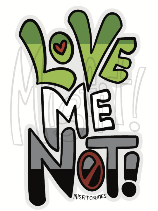
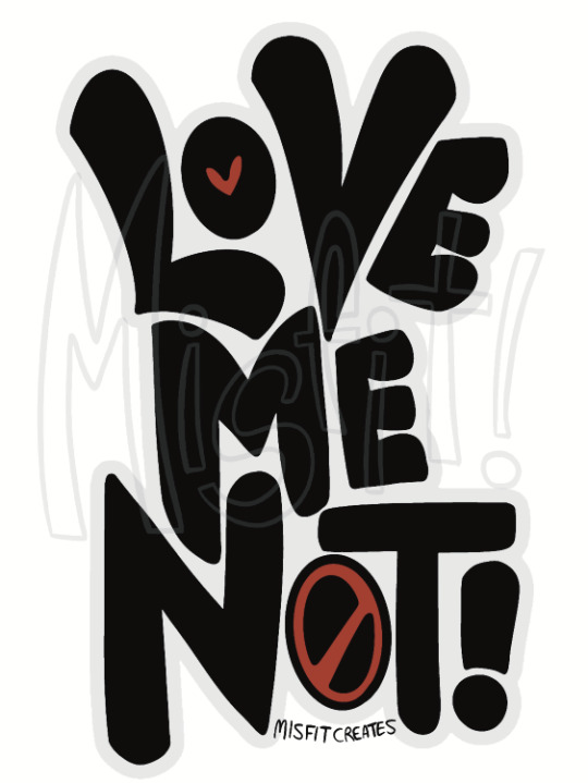
Hey so.... hypothetically, if I made stickers and maybe other stuff of this design (but higher quality and without my big ugly watermarks on 'em, of course) would anyone be into that? Sound off if you like the concept. I could also make variants with different aro-spec flags (and ace-spec, aroace-spec, aplatonic, etc) if there was enough demand, but seeing as I would be selling the stuff as a super-duper small business, there's no guarantee that I could do too many variants, at least not right away...
(Also, I'm going to start putting IDs on my art!)
(Image Description: two digital art pieces of text reading "Love Me Not!" in all caps. Both images have the middle of the O in "Love" depicted as a red love heart, and the entire O in "Not" as a red strike-through or universal "no" symbol. The first image has the main text in the colours of the aromantic flag - two shades of green, and white, grey, and black - and the second image has the text in solid black. The images are signed "Misfit Creates" and have a watermark reading "Misfit!" overlaid on them. End ID.)
#art stuff#artists on tumblr#aromantic#aro#aromanticism#aspec#a-spec#aro-spec#arospec#queer#queer artist#lgbtq artist#small artist#artists of tumblr#LGBTQ#lgbtqia#lgbtq+#my art#please rb if you like the idea! I have exactly 7 followers#so I can't reach the wider aro community without help haha
295 notes
·
View notes
Text

Dogrui that i made for a friend of my friend on twitter!
i post it because i don't like not to post nothing for you all in a big lapse of time, it feels bad. But please, don't use like an icon or something, like i said, is a gift for someone
And i don't want to add a big watermark, it looks ugly, maybe
17 notes
·
View notes
Text
GUIDESTUCK
Guidestuck. This is, apparently, one of the most popular fanadventures OF ALL TIME, like, for a significant runtime of the website. It’s another AU, but this time, it truly is a “Homestuck but different,” in that it is doing the same plot beats as Homestuck but what if the main characters were different. In this case, what if the sprites that the kids end up prototyping (the first time) are swapped with their associated kid? Or to put it another way, what would Bec be like if he was a regular human guy?
I think the reason why this AU, out of all AUs, was fondly remembered (alongside another AU we’ll get to) is like. It’s a way to create a new story out of Homestuck’s DNA, and it’s executed well. Like, if previously your best AUs you could get were like. Be the Low Blooded Sea Dweller, which feels like an Ask Blog, what if I gave you an actual story that’s different enough for it to be exciting reading and learning all the twists and turns of, but was familiar enough to feel comfortable reading? You would probably really like that story, is what I’m getting at, especially in 2012. And that story? Is Guidestuck.
The most intriguing parts of the comic, at least to me, were the parts where we get some TROLL CHICANERY. But hey! They’re all different as well! Yes, in accordance with the laws of extrapolation, the sprites for the trolls have all been swapped with the trolls themselves, which of course means that their CUSTODIANS/LUSII are the characters replacing the trolls. Which is honestly a kind of cool concept somehow to me? Mainly because the Lusii were background characters in the original comic, but were given some characterization throughout, so it is interesting to me in concept.
In practice…these characters are probably not going to be setting the world on fire. I’m just not that interested in what’s going on, to be honest, currently? The most interesting thing, as I said above, is the troll characters, and it kind of feels like the comic also agrees with me in that retrospect? Also, rearing it’s ugly head yet again, is broken links and broken games, which does not help matters much. And then the dreaded PHOTOBUCKET logo appears, which is the first time it’s happened in my journey so far, but boy howdy. Does that watermark really take you out of any sort of action that can happen on screen.
The problem I think with Homestuck AUs is that. It’s always going to be compared to the actual Homestuck comic itself. Which is, in my opinion, a VERY tough act to follow. You kind of need to know what you’re doing at like, a fundamental base level. This does, but it doesn’t have anything else besides that.
The thing is, the longer I keep reading this comic, the more I start to see some of the moves that other webcomics will take from this. Like, this comic (and Nightfall, come to think of it) is reminding me of so many other “big name” webcomics. Which makes sense, since this was, technically, the first big name webcomic to show up. The emphasis on having as many characters in the beginning, the exploration of tragic backstories for the characters, the overall composition and flow of it…I don’t know if this actually makes sense, but honestly, these are just my overall notes on it, so I guess it doesn’t have to make sense?
Anyways. That’s my thoughts. As the first “big name” MSPFA, I kind of get why one could become attached to it, but I myself did not become attached to this story. Oh well, maybe I’ll have better luck when it comes to it’s revamp that we’ll get to later down the line……..
8 notes
·
View notes
Note
what are the signifiers of a yapdollar vs prognoz video? there don't seem to be username watermarks so it's hard for me to tell. my best guess is that yapdollars are more intentionally timed? and prognoz is just One Big Script Read? but im not sure
yapdollar tends to quote memes/pop culture, force mistranslations (think "engrish" i know it's chinese and that's an ugly word but i don't know how else to phrase it, like caveman speak rather than actual google translate nonsense) and yapdollar videos almost always do the 'xiaohogshu' the same with him shouting it and flying off. yapdollar also tends to drop the n-word every so often (we don't know if they're black, one can hopefully assume, it's just a notable difference)
prognoz's videos lack consistency, can be longform, and tend to feel a lot more like incoherent rambling. also, fiveish is just one aspect of the ai/deepfake stuff he makes, whereas yapdollar seems to be all fiveish.
5 notes
·
View notes
Text
Thank you to @aparticularbandit for finding that post about hardware acceleration being the cause of the screen-blackening when screencapping directly off streaming sites like Netflix or Crunchyroll.
The shady piracy site I get my screencaps from hasn't updated in a couple of days. Not sure if on vacation or if The Feds, y'know.
I generally watch things on my TV on the official streaming service, then pull my screencaps off the piracy site for convenience. But I had to go through the rigamarole of finding out what our Crunchyroll and Netflix passwords we set like three years ago are so I could get logged in on my computer.
Which wouldn't be an option if the screen-blackening was still a problem!
So, thanks, Bandit. You're the reason this week's Dragon Ball Daima and Ranma 1/2 liveblogs (the latter of which I'm working on now) neither have shitty low-quality subtitles that are just the dub transcribed and encoded over the raw footage, nor a big ugly piracy site watermark in the corner of every image.
5 notes
·
View notes
Note
Hello! It's been quite a while hasn't it? I've been very busy with a lot of stressful nonsense going on in my personal life 😔 but! Things are slightly better now, at least! I forgot to get back to you after you replied to me about Coffee Prince, so I'd just like to say that I loved your analysis, I think it was spot on! I completely agree that Eunchan is more relaxed around Hankyul. That poor gal carries the weight of the world around her shoulders every day because she's providing for her family and tends to put other's needs before her own. But with Hankyul, she's more cheeky and selfish. Since he's such an asshole(affectionate) she can let her guard down around him and not worry so much. But Hansung is just so gosh darn nice that it's intimidating. Yoon Eunhye is a phenomenal actress because you can see the difference in how she acts around them in her whole body. She's soft-spoken around Hansung, her shoulders sag to make herself smaller and she keeps messing with her hair. But she's such a fun little rascal around Hankyul. She physically takes up more space and is often loud. Which I also think says a lot about how society demands so much from women in ways you can see just from how they carry themselves. Also! It's nice to see that you're a big fan of Jeong-Nyeon too! They sell physical copies of the manhwa online, and I can't wait to get one! I saw that you were asking for eng translations, and I couldn't attest to how accurate the translation is since I'm nowhere near fluent, but I've been reading the translated version on VyManga. And WOW, isn't the drama adaptation such a spectacle to behold? High budget GL media is devastatingly not that common, so the fact that this exists at all is amazing! I personally would've wanted the role of Moon Okgyeong to go to Jeong Hyein though. She has the look and physicality for it. All she would've needed is some time to bulk up at the gym beforehand, and she would've been perfect!
hello! it's been a while since i got one of ur very long messages lol.
omg it's been so long since the coffee prince discussion already i never finished that rewatch but it was rly fun!
yes i love jeong nyeon! i was reading the english translation on that site too but they only have up until chapter 33 😭 i've been reading the rest in korean on some other site but there's almost unbearably huge ugly watermarks everywhere so the text is hard to read sometimes and the pictures aren't as pretty 😭😭😭
the drama is fantastic! absolutely the highest budget drama with such an overtly lesbian original work that it's adapted from, the all star cast the quality of performance the designs r all so good! i feel like i would want the overall aesthetic to look a little more vintage cuz the lighting and styling is a little too modern. but the manhwa also has that bright quality to it so i don't mind that much.
ah of course prince of my heart jeong hyein... see tho she and jung eunchae have the same problem where they have rly good faces but they're way too skinny to have the princely silhouette. but at least jung eunchae has the perfect height compared to the other actresses and of course those cheekbones. hyejin's face is a little cute and modern for like the historical prince look (she's more of a fairytale prince) and eunchae's facial structure is of the gods.
2 notes
·
View notes
Text
Guys, do you ever feel second-hand embarrassment looking at your old posts like....
I STILL HATE THE FACT I PUT A BIG FAT UGLY WATERMARK ON MY TRADITIONAL ART THAT DOESNT EVEN LOOK STEALING WORTHY LIKE UGHHHHSHHSHSHSSVBS
....I just had to let that out. Have a good day/night, lol

4 notes
·
View notes
Text
Do not repost or use my art, period.
I recently found a bunch of my art posts being reposted. Some of them mentioned directly that they got it from tumblr.
Please understand that even with credit I DO NOT allow reposts unless I have given explicit permission.
To combat this, starting from now on I will have a big and ugly watermark on all of my art posts. I don’t like it but I also don’t like users who don’t read my FAQ and illustration usage.
When in doubt read my FAQ, if you still have questions message me. But don’t assume it’s okay.
Thanks for understanding.
6 notes
·
View notes
Note
i think you and every other gif creator should slap on big ugly watermarks on gifs for a week just to show the twitter thieves what they're going to force the creators into doing by reposting content with no credit. its so annoying.
tried it. reaaally didn't like it. didn't make a difference either (ppl told me they saw my watermark on twitter but still without credit lolol) BUT. after years of therapists and friends recommending it i finally started to try meditation (partly) bc of this which is good ig!!
3 notes
·
View notes
Text
Satanic Santa Big Nick Energy SVG - Ugly Christmas SVG PNG, Cricut File
Satanic Santa Big Nick Energy SVG, Ugly Christmas SVG PNG EPS DXF PDF, Cricut File, Instant Download File, Cricut File Silhouette Art, Logo Design, Designs For Shirts. ♥ Welcome to SVG OCEAN DESIGNS Store! ♥ ► PLEASE NOTE: – Since this item is digital, no physical product will be sent to you. – Your files will be ready to download immediately after your purchase. Once payment has been completed, SVG Ocean Designs will send you an email letting you know your File is ready for Download. You may also check your Order/Purchase History on SVG Ocean Designs website and it should be available for download there as well. – Please make sure you have the right software required and knowledge to use this graphic before making your purchase. – Due to monitor differences and your printer settings, the actual colors of your printed product may vary slightly. – Due to the digital nature of this listing, there are “no refunds or exchanges”. – If you have a specific Design you would like made, just message me! I will be more than glad to create a Custom Oder for you. ► YOU RECEIVE: This listing includes a zip file with the following formats: – SVG File (check your software to confirm it is compatible with your machine): Includes wording in both white and black (SVG only). Other files are black wording. – PNG File: PNG High Resolution 300 dpi Clipart (transparent background – resize smaller and slightly larger without loss of quality). – DXF: high resolution, perfect for print and many more. – EPS: high resolution, perfect for print, Design and many more. ► USAGE: – Can be used with Cricut Design Space, Silhouette Cameo, Silhouette Studio, Adobe Illustrator, ...and any other software or machines that work with SVG/PNG files. Please make sDisney Father's Dayure your machine and software are compatible before purchasing. – You can edit, resize and change colors in any vector or cutting software like Inkscape, Adobe illustrator, Cricut design space, etc. SVG cut files are perfect for all your DIY projects or handmade businDisney Father's Dayess Product. You can use them for T-shirts, scrapbooks, wall vinyls, stickers, invitations cards, web and more!!! Perfect for T-shirts, iron-ons, mugs, printables, card making, scrapbooking, etc. ►TERMS OF USE: – NO refunds on digital products. Please contact me if you experience any problems with the purchase. – Watermark and wood background won’t be shown in the downloaded files. – Please DO NOT resell, distribute, share, copy, or reproduce my designs. – Customer service and satisfaction is our top priority. If you have any questions before placing orders, please contact with us via email "[email protected]". – New products and latest trends =>> Click Here . Thank you so much for visiting our store! SVG OCEAN DESIGNS Read the full article
0 notes
Text
What if you:
Wanted to make a short video about your fun voiceover
But Filmora said:
Pay us, or we're covering a large chunk of your screen with an ugly watermark!
Like, I was gonna be ok with that, but it's just too big for me to realistically share with the RW community. (Though I already sent over a video with that watermark for a college assignment, but I doubt I lost points for that, cus this ain't really my fault)
I'm tired, so I'll find a way to deal with that thing tomorrow. I just don't get why they couldn't set that thing to a reasonable size like Flipaclip did (or at least not make signing up a requirement for exporting videos... so we could go and sail the high seas :D)
0 notes
Text
diary117
1/8-9/2024
monday - tuesday
i know why i was so tired yesterday, now.
i am sick once again, my whole body hurts and my nose is hard to breathe through and stuff, i feel like i'm always about to have a nosebleed, my throat hurts too. i love to live. i am so glad annoying cokeheads got me sick.
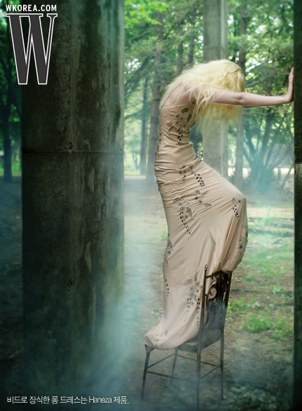
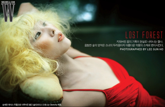
anyway today i was looking at old scans of fashion mags from south korea/china (probably hong kong i'd guess but no one specified) and japan (inescapable). i'll post some of my fav pics:


spur - japan - i like this last one because it gives me a fun idea for cover art, not the image itself, though it helps w/ pose ideas or whatever, but little watermark someone put up onto it. i think i need to do that w/ the photo i take of myself for the album art, have that there in pixelated text.


harper's bazaar - china


fhm - china - this one's super weird, the last image especially, hard to tell exactly what they were reaching for, the strangeness/relative uncanniness of these photos / defamiliarization of a magazine's approach to sex sells and whatever turning so genuinely weird and offputting feels artistically useful. it's so wholly gaudy and disorienting. weird stuff.


w - south korea
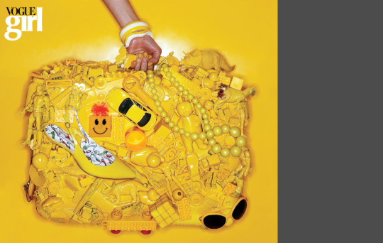
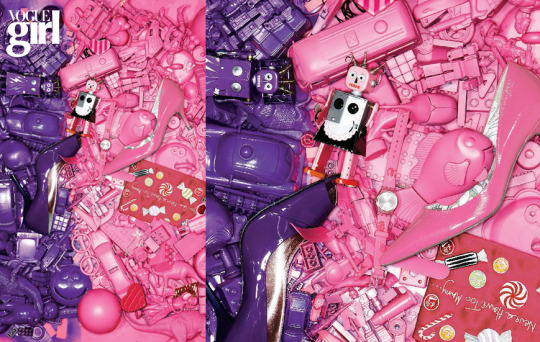


vogue girl - south korea - the scans of this mag are all super crazy, honestly, i didn't expect these all to be so interesting and good.
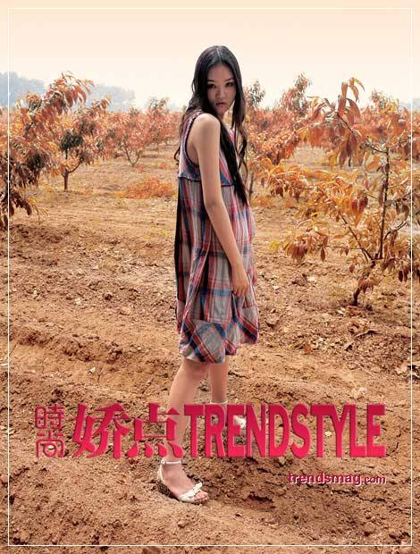
cosmopolitan - china - i can't tell if this one's text is part of the image or not but it's maybe my favorite part, how it's so ugly beside everything, the really strange gradient, too.


fruits - japan - i didn't realize this one continued through to 2007, really crazy, you only ever see the y2k stuff get passed around really. these outfits are super cute but like that one spur scan w/ the user's watermark, the watermarks here of this website are really interesting to me, i think i also want to stick some weird watermark onto the picture i take, i don't know what i'll call the fake site or whatever but i kind of want it to maybe be something ridiculous/violent in another language. i'd also probably do it in like 128x128 and upscale the text, and instead of having it be something white w/ lowered opacity, i'd try to index it so it's dithered white pixels, instead of smeary transparent text, and then upscale that.
the watermarking stuff is interesting, it's interesting that these scans of magazines that people used to create a sense of self/consume/receive what they ought to be / do are then turned into a kind of capital, at least when it's a website, to get people to refer back to the site/increase traffic, likely get people to pay money to not have to see the watermarks. it's a fun thing to play at, to me, the accumulation of basically trash information, the trading of images and their valuation. scans of magazines online are kind of like trading cards, it seems like, there's stuff uploaded on archive.org but not as much as anyone would hope, at least with this niche stuff. and there too, the safeguarding of images from being stolen, is sometimes present. i know they keep vogue locked up on there, same with a lot of books, you can't rip books out easily, i mean sometimes people do, but i don't try to do that really.

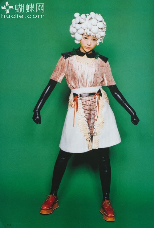

so en magazine - japan - another example of the watermarks on 2 of the 3 pics, this is what i'm imagining i'll try to approximate the above methods and stuff. also i really love how so en seems to really go in on a kind of fucked up revival of the 60s, the above range from like 07 to 2013.
re: music today, i did 2 tracks, i wanted to do more but i was getting hit like a truck by illness in the middle of the day. i think they've both turned out pretty good, maybe both need a little help w/ getting the kicks louder, but idk, my ears are maybe a bit messed up when trying to do that kinda thing. but i have to proceed. tomorrow i think i'll have to take care of this really tiny thing w/ a song, to get it right, and then maybe 2 other tracks. i am eventually gonna have to get back to my big problem track (really there are 2) but maybe by then i'll have a way better idea what i'm doing.
i am so sick, there's more i wanted to say, though. i read this pretty, frustrating, i guess, comic, tonight. someone posted it saying something like "this says a lot about being trans in north america" or whatever, and it mostly doesn't but it's interesting i guess to read something like that and think about why/how i feel alienated from ever being able to say anything stable about my own identity/gender. the frustration mostly though comes from this sense that everything's too perfect, the relations between characters are too neat and the things they know are too easy, almost, at one point a character looks at kiwifarms, and it's like, is this kind of person, because the comic is kind of working in types, the sort to so easily know about that. like, i dunno, it feels too easy, it seems like something find out about, when they're in the middle of the kind of thing that character was in the midst of, which would have been more interesting. but overall idk, there's a certain way of interfacing w/ oneself/other present in the comic, the sort of types it runs through, and stuff, it creates distance, even though i can sit there and be like, oh i know this type of person, i've met someone like that, or even just, i've seen this kind of thing from a distance. it's valuable to reflect on, because i try writing in similar directions sometimes maybe, i don't want to rely on types totally, i get why a comic would, in prose fiction it's better to get away from that but there's just stuff like that. really what i'm reflecting on, in my inability to say anything stable about myself, like, i can't say: i'm a girl, i'm a boy, i'm a man (speaking honestly, man is what i never want to be, i don't think i ever say i am one), i'm a woman (i don't really know what being one means, maybe, i'd need someone to tell me (and this throws up the whole issue of why girl/boy, that feels weird to me, i'm 25, i'm something else (but what, and like, i dunno))), without ever having to contradict it right after, i just want to be what i am without what feels like interference, but 'cis' is an interference too, i'm not cis, i know that, there's nothing else to know i think. anyway, because of that, when i write characters, the ones i'm writing as/using my personal life for, i can't really gender them, they can't gender themselves, they just are, no matter what, people stick things to them and they all let it linger, or they're troubling themselves over if they pass or not but that's something internal and particular. anyway, i guess there's a thought, where by never really saying anything outright, is that a cowardice, where i let the idea of normalcy/being normal creep in, i don't think so, i don't think i'm normal, or i don't think ultimately i help things be normal with my presence. i dunno though. i kind of hate the "some men are just feminine and are actually super normal" thing, not because it's untrue, but to say there's no complication there, and also that this isn't just a cope or whatever, is frustrating. it's frustrating because people are at once alienated from being 'trans' (a broad thing that can mean all sorts of things really) and wanting to still be seen as cis so people don't think you're weird. it's not something i hate the people that feel that way for, i hate the world that makes that desirable.
anyway, i dunno. it's basically all complex and fucked up. sometimes i think of myself in percentages but putting it to text feels like a commitment, i don't ever want to be committed to performing some percentage of gender. i really just want gender to disappear as a thing, but i also, obviously, really want to look a certain way, be seen a certain way, because of stuff that happened to me as a kid and stuff i saw and whatever, it's like necessary, i have to. no one has a gun to my head except i feel like one shows up when i'm ugly. i'm on a tightrope, i was put there, it's not my fault, a lot of people are on it too, like everybody is, it's terrible.
i think if tiqqun were writing currently on the young girl, they might be compelled to speak on trans stuff, but i think all they might say ultimately is that basically every human on earth is on hrt. they would be right. although that makes it sound like i think hrt is bad or something. or maybe not. i think hrt is good and i think about trying it sometimes, or not trying, i'd have to commit, that seems less scary than the percentages though because i could still really be whatever/nothing/everything. everyone's on hrt but they receive it via socially enforced norms/reality stamping down on you, you will conform to standards and so on and whatever. sometimes i think gender euphoria is really a negative thing, in ways, if you think about cis men and their gender euphoria, where they might get it from, being hard laborers or beating women, basically suffering and then throwing it around, things become more frightening. i experience euphoria when people stare at my ass and i want to kill them but i also want people to stare. when my gf is transfixed by me, it's really nice, but it's also scary, why do i want to be totally inert and just looked at. it makes me wretch but i can't help it, really. i need attention all the time. i'm writing about how fucked up my insides are, i'm so histrionic.
that's one thing on my mind. the other really is how much i hate being sick and how i am like a sick and withering whateverrrr. my head hurts distantly, in a threeway sort of thing, different points of penetration along my brain and stuff.
so, i should like, sleep, probably.
so:
byebye!!!!!!!!!!!!!!!!!!!!!!!!!!!!!!!!!!
1 note
·
View note
Text
I think the hardest parts of making a speedpaint are:
Remembering to record
Finding a good fucking editing software
Picking music
#a shut up#I've found an editor i like actually. it just costs nearly 80 fucking dollars to get the full version#and not have the big ass ugly watermark covering my fucking video#also whenever i make a speedpaint i never start recording until I'm like a 5th of the way done drawing#either because i forgot or realize to late that what I'm drawing is speedpaint worthy#tis annoying
2 notes
·
View notes
Photo


I made some pride charms for myself Q 7 Q
My camera couldn’t pick up on the colours very well especially on the ace and genderfluid ones, but I assure you they look really cute in real life!
Don’t use or repost my art without permission. Absolutely do NOT use for commercial purposes.
#pride flag#genderfluid#asexual#transgender#the design works better for stickers but I still like the charms too#I am in fact genderfluid and not trans#but I adore trans colours and intend(ed) to send the trans one to my actual trans friend#except I promptlY KILLED IT#BECAUSE GUESS WHO LEARNED THE HARD WAY THAT SEALING THESE CHARMS WITH CLEAR NAIL POLISH#ONLY WORKS WHEN YOU DREW ON THE PLASTIC WITH COLOURED PENCIL?#FUCKING M E#IT COMPLETELY MELTED IT#DON'T ASK ME HOW OR WHY#I'm so sad#I mean I fully intend to make another one in the future but still#the big big sad#also sorry for the ugly ass watermark on everything#but if there's one thing I learned#then it's to make sure jerks and companies can't easily steal your designs :/#nanarts
291 notes
·
View notes

