#like it as is. i wanted to have more going composition wise. hopefully its not hard to read whats going on in it
Explore tagged Tumblr posts
Text
TW FOR VIOLENCE!!!


mock ragamaster scenes/ comic panels to experiment with and for promotion purposes! all to.. varying degrees of quality LOL. these were mainly to try working my hand at scene composition and character dynamics while also messing around with methods of greyscale coloring and rendering.
these are likely NOT actual scenes in ragamaster but rough estimates of what they could be. think of it like concept art!
okay but take THIS one with a VERY LIGHT GRAIN OF SALT.
(tw for violence again)

im just going to reiterated that this one in particular is NOT CANNON. until further notice at least.
i actually made this kind of by accident because i KNEW i wanted to draw some kind of confrontation between jax and pomni, but i just ended up getting something way more extreme than i indented and ended up really liking it. not necessarily story-wise but i'm IN LOVE WITH THE POSES I DID. REALLY PROUD OF THAT.
i was actually really hesitant about showing this one in particular because i was scared that people are going to jump into conclusions about jax's character. but i think if i state the fact that its not cannon hopefully people will listen.
anyways here's a version of the 1st shot without any text bubbles!

interpet these all as you will! like i said, while i have most of the main idea's for Ragamaster coming together, im still working on the finer details. this is part of that lol. enjoy!
#ragamaster#ragamaster au#tadc ragamaster#ragamaster! au#tadc#tadc au#the amazing digital circus#tadc fanart#ragamaster rosalyn#ragamaster gangle#ragamaster jax#ragamaster zooble#ragamaster pomni#tadc ragatha#ragatha#tadc pomni#pomni#tadc gangle#gangle#tadc jax#jax#tadc zooble#zooble#caine#tadc caine#my art
129 notes
·
View notes
Note
hi!! i just wanted to say your work has been such an inspiration to me for such a long time. the colors, the composition, the storytelling, everything is so beautiful. i’m actually also really interested in going into visdev and comic arts, but the school i am currently attending does not actually offer such related courses. seeing that you were in a similar position in the past, if its not too much of a bother, i was wondering if you had any advice on how to self-learn the skills needed in those industries and build a portfolio! tysmm!
Hi Anon!! That is so kind of you to say, truly! I deeply appreciate it <3.
I have actually been thinking about your question for a couple days now because I wanted to answer it the best way I could.
I think it's difficult for me to give advice on this because I started working 10 years ago and it was a completely different landscape then, both in terms of what the industry and social media were like! So I wanted to be truthful and preface this with a warning that what worked for me at the time might not be replicable now >.<.
I think something that will hopefully be more accessible to you now than it was for me at the time will be online courses and tutorials. I would say for visdev (I am not knowledgeable enough about comics to talk about them, so I hope that's okay) what you generally need to learn about are: color, light, perspective, composition. If you have disposable income, there might be paying classes that you could enroll in. From memory, Nacho Molina's, Yuhki Demers', Kat Tsai's and Ty Carter's have been lauded. Learning blender seems to be a really useful skill these days. Most of my friends working in visdev have taught themselves blender in the past few years!
Re: portfolio advice I might parrot the same age-old advice but studios will want to see how you approach tasks they might give you. visdev isn't just about pretty paintings, I'd say that's actually 10% of the job. The rest of it is designing environments, props, doing lots of callout sheets for other departments. So include props, show that you're thinking of a project in context. Something I did myself and tell other people to do is to either make up a story and treat it like a movie (what would this location look like? what choices would I make to convey the emotional beat of this moment, color and shape wise?), or use an existing one to do the same (do try not to pick one that has already been adapted or done a lot by other artists).
That's mostly what I did, and I also learned on the job which unfortunately doesn't seem to be the case for juniors anymore...
I also want to acknowledge that I got to where I am right now with a combination of hard work, but also and mostly luck and slowly building a network of peers (both online and offline). I was lucky enough to share my art online and have people resonate with it, which led to building genuine friendships which I'm incredibly thankful for. I wish the same to you and I hope my rambling helps, if even a little bit!
28 notes
·
View notes
Note
scrambles … hi, what is your thought process when planning out designs / drawings if you have a specific one
Helloo!
Both have general processes!
Drawings wise just depends on if I want to make a new piece or not. If I do, usually I make a symmetry tool and make some kind of a box in the middle! Take this WIP for instance:
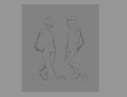
Which is a scrapped composition for my "We're Gonna Win" piece! I still liked it, so I moved it to a new canvas and made the inner box a little bit bigger than what it is for my CCCC album works!
Though a lot of these canvases get left at the wayside. Unfortunately. But my point still stands! Compositions I will usually draw anywhere from 1 to upwards of 5 thumbnails for. Most of the time though, that is only if I have a specific idea in my head.
I've got a lot of "mass doodle" canvases where I've just drawn a host and assortment of things, some of which I've blown-up on a canvas and drawn over to make a full piece of work!
As for designs,, sort of? I like to put a lot of symbolism and meaning into them where I can, otherwise its pure unfiltered self indulgence. Lots of the time with HMS aus I've asked myself "what haven't I done yet?" and gone from there. Thus giving me white haired Heart, Mind, and Soul in different varying aus (Good Day, Syncopation, Lacuna).
I also like to use colors that are going to look nice with one another, and for clothing I'll occasionally peruse Pinterest for ideas.
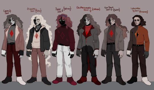
Good example I suppose is my Soul Line-up, of which I intended to do a Mind and Heart version, I just.. haven't had the focus for it (Plus there are souls I could probably add to this by now. oops!)
For Soul, though, I like to keep the red and the grey, then add in black and white where I see fit. I also generally try to consider the personality of the character when giving them a design.
Purpose isn't going to have many accessories, he's based more in being useful and fulfilling their point in being Whole than he is looking like someone at all. Versus, Calliope (Eleutheromania)! Who desperately wants to individualize himself and feel in control. What gives you more control than a goofy suit with a tailcoat? Or, Pluto (Lacuna), who wears items of his long since dead Mind and Heart to remember them by. He is so so cozy but also soo sentimentally sad.
Just things like that, which I think make sure the character is evident in their clothing, hairstyle, expressions and so on.
Hopefully that is well explained! But thank you for asking o7
#asks#I didnt want to make this 200000000 words long so I tried to condense down my thoughts#voidthoughts
20 notes
·
View notes
Text


finale
#mob psycho 100#mp100 spoilers#shigeo kageyama#my art#first one is from january. sketched it quickly and planned to redew/finish it once the final arc starts airing but i couldnt really make it#look good so i started sketching different ideas last month and settled on the second one here. its technically a sketch/wip too but i#like it as is. i wanted to have more going composition wise. hopefully its not hard to read whats going on in it
233 notes
·
View notes
Text
hey, you! yes, you! listen up. since the demon bros (minus satan) were angels, does that mean that their true demon form is different than other demons' true demon forms?
because hear me out. we have never seen any of their truest forms – or, the non humanoid to some extent, demon forms – so it could be anything, right? and while i adore the idea that they look like their familiars when completely turned, i can't help but think that maybe they look a bit more,,, angelic? in a sense?
according to the bible (and the very much needed "fear not" from every angel ever), true angel forms are terrifying. absolutely monstrous in a sense, they make humans still in their spots, run, look away. they make you want to not look, because looks don't matter. it's the message they bear that is of importance (and whatever the fuck else they represent, i never cared enough to look into the old testament).
demons, on the other hand – they're supposed to be the exact opposite, right? true demon form must, by its association to true angelic form and the relationship of angels and demons as a whole, make you want to look at the being in front of you with everything you have left in you. i mean, it's canon that demons practice seductive speech and aren't against seducing humans into pretty much anything, so demon forms must be analogous to the needs and practices of a demon, right? so, they make you want to look, no matter how monstrous they are, right?
kinda like a moth to the flame. right?
the brothers, however, already had a true form – they had their angelic form as former angels and residents of the celestial realm! then, when they fell, did it go away? or did it merge with their true demon form they acquired upon their fall?
i say it's the latter. and not because of anything else other than the fact that this is my internal world of fictional demon men and i will imagine it as i please, but for the sake of proving my point, i will now (hopefully) convince you that I'm right!
let's take lucifer for exaple:
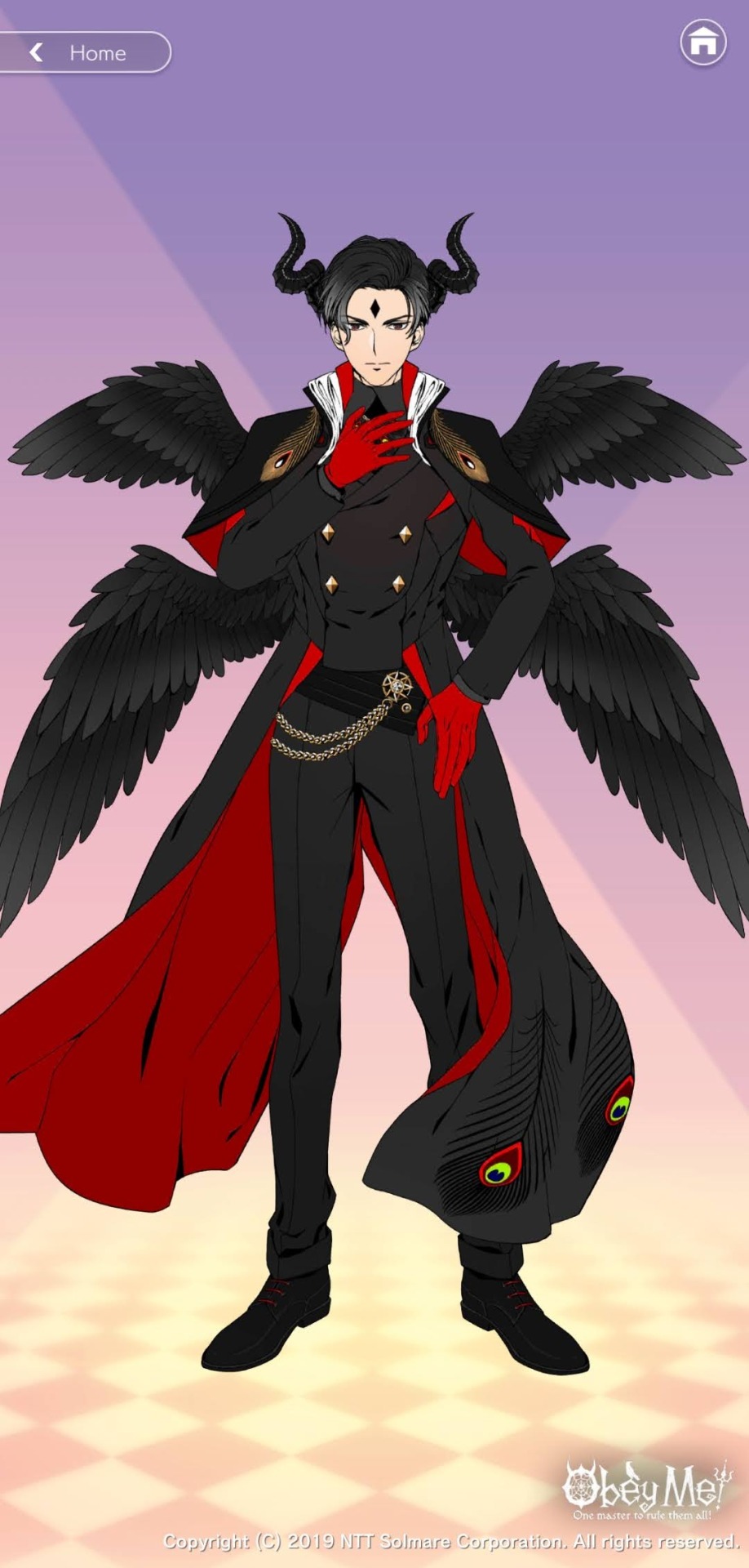
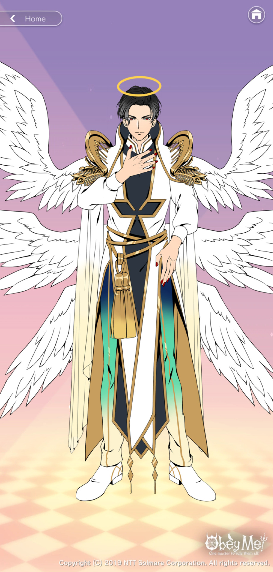
creds for the images to the obey me wiki
starting from his head, we can see that his halo has been replaced by horns; expected, boring, cliche – NEXT! his collar is the same, turtleneck with some extravagant outer jacket (cape??) collar around it. now that's what I'm talking about! his shoulders are accessorised by golden feathers in both forms, and his wings are the same, just smaller (and i think it's clarified why somewhere in the game but i won't say anything just in case i made that up too). he has something gold and loosely hanging on his right hip in both pictures while his jacket (cape??) remains long and flowy.
and you'll probably say "well, user rustytrident, that's just one brother off the bunch. you haven't proven shit" and i will reply "I'm too lazy to go into every brother, but I'll delve into asmo just for you" and send you a flying kiss.
why asmo, you may ask? well, because asmo is the avatar of lust. if anything, his form would be the most different one appearance wise, since the beauty standards must be very different between realms; on the one up above, you need to wear more. show your part in the kingdom of the skies, the reign of god, united with your brothers and sisters in every way. on the one down below, you're nothing but damned. you need to show your individual colours, what exactly you are because that shows your heritage and position, and that saves your ass from death, on most occasions.
so here is asmo:

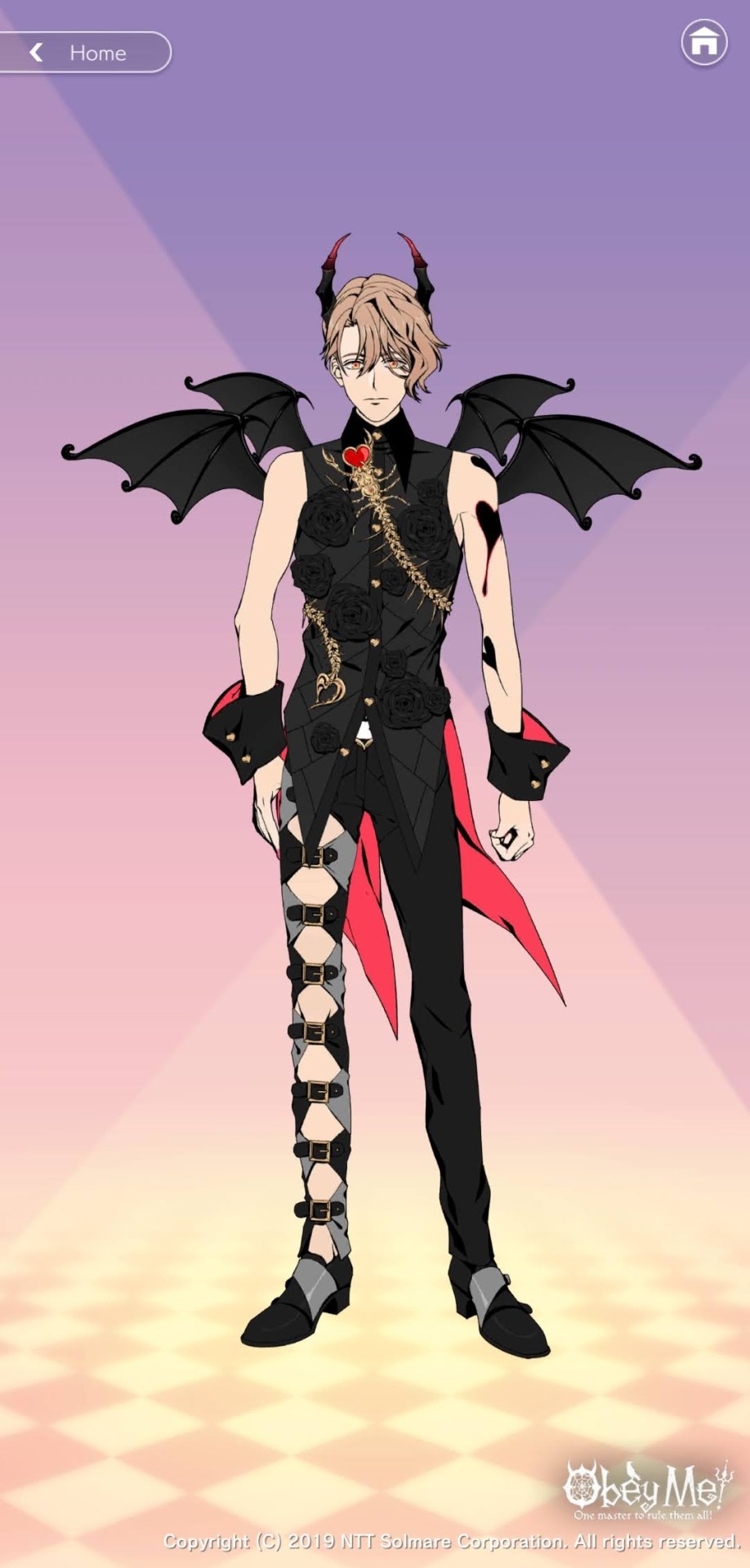
creds for the images go, again, to the obey me wiki
he's completely different, right? absolutely changed, his big, full of movement outfit replaced by skin tight clothes with completely different textures and compositions. and if you thought that, you're absolutely right. only, i can't read. so this sign can't stop me.
again, horns and halo blah blah we get it. collar is the same. turtle neck, again, with the cut off shoulders on both outfits. the little gold thing he has wrapping around him in his angel outfit has transformed into a symbol of his familiars – both starting from the right shoulder and going down to his waist. his wrists have accessories on them and he has tried to retain some of the movement in his demon form by mimicking the tail of a scorpion. would it be me reaching if i said that the gold thing around his left leg on the first image (what even IS that) has been replaced by the little belt strap pant leg thing on his right leg in the second pic? probably. but i said it anyway :)).
so where did that lead us? why are we even here? in the rare case that anything i just told you counts as "evidence", it wouldn't prove anything, anyway. you can believe what you want, and i will do the same, and we will continue our lives following the same principles we have been following for years, so why are we both here, right now?
well, dear friend, wise people often say it is not the destination that matters, but the journey and the friendships you form during it. you listened to me ramble about demon men in a video game, and i, in return, kept you company on your lonesome travels. i think that's the start of a wonderful friendship, don't you think?
as my gift to you before i leave, i will, if you allow me to, conclude my thoughts. true demon form, in the brothers' case, must bear some sort of similarity to their true angel form. i don't believe it's some sexier, leather-ier, skin tight-ier version of true angel, but rather the combination of what was and what would be. if they were humans that got turned into demons then yes, this theory wouldn't work out, but the pure psychedelia their true angel form carries with it is enough to stain their true demon form's allure.
so, when the demon bros get angry, upset, when they release themselves from the chains of the homo sapien and allow the form of the pure power that flows inside them to take over – would anyone be able to handle it? unless you, yourself, are extremely powerful, chances are that no, you wouldn't be able to.
and it's not because they would strike you down, thus ending your existence once and for all that you would die, oh no. it's because your being, no matter your nature or the realm you come from, wouldn't be able to handle the sight before you. two voices will be screaming inside you: one asking to run back and the other to run forward – until you're perfectly still, unmoving, simply looking at the creature standing in front of you. it's their pure nature that would end you, just their existence and nothing else. the voices in your head will only stop when your heart gives out, and, trust me, it would do so very soon.
the only one who doesn't have that element about him is satan. isn't it ironic, how the avatar of the most violent sin's true demon form looks like nothing short of the safest haven you've seen (compared to his brothers, always)? it's no coincidence that his familiars are unicorns. ever wondered why?
huuu, that was a lot, huh? you doing alright? I'm done talking, so you can continue your journey, don't you worry. if you have any questions or want to come back and convince me otherwise, i would love to have you again. till then, i will await for another visit of yours, with a cup of tea. what do you say?
be careful on your travels, and good luck.
#obey me#obey me shall we date#lucifer obey me#mammon obey me#obey me leviathan#satan obey me#obey me asmodeus#beelzebub obey me#belphegor obey me#sing me a song // the song of our glory
158 notes
·
View notes
Photo
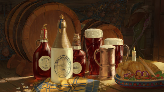
My contribution for the Autumn Season of @tgtw-project with the Trostenwald dark ales!
There's a few CR C2 easter eggs peppered all over the piece, can you spot them? 😀
Notes about my process for this are under the cut!
I've been learning a bit about how to make my process more manageable and helpful to me, so I thought I should share! This post isn't so much a walkthrough as it is just some general ideas and techniques that work for me. Hopefully some of it gives you ideas for your own workflow too or an insight into how I approach things.
So lets start off with getting the prompt for Trostenwald ale (part of Critical Role Campaign 2 setting lore) while working on a fan project. The first thing I did was go on wiki and read up on Trostenwald in more detail to figure out what vibe and props should go into the piece. I'm mostly looking for "what" and "why" to build a scene around.
After doing so I came up with a rough mental checklist of things I wanted in the piece: barrels (because beer is a common produce), a fish and grains based dish (also a common produce), bottles representing the three named breweries (it is directly linked to the prompt) and a warm golden hour-like atmosphere (to convey the cozy tavern vibe I was aiming for).
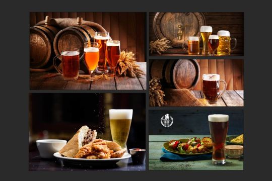
Before I started on a sketch I looked at images of beer ads to get a sense of how they arrange things composition-wise and what are common props.
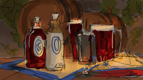
As I made a rough sketch I was largely concerned with the color palette and light, and some general shapes and elements of the composition, like the barrels framing some of the bottles and foam of the drinks creating a fun pattern that guides the eye to the palest bottle. I wasn't concerned with details or prop design, just getting my idea down quickly while using all the ideas I got from my beer ad research. Note that I forgot to add a third bottle for the last brewery that we know of by name from the show. Whoops.
After having the sketch down, I realized I had no idea what kind of shadows this type of lighting would cast or what angle would be best to show the scene, so I mocked it up in Blender. This was the first time I fully did it and it helped so much with lighting and perspective! Cycles render takes a bit to render but all the reflections and shadows it shows are very handy for realistic lighting.
3D is such a great tool and it can truly help tackling complex lighting scenarios and unusual perspectives. It's okay to not know everything; that is what reference is there for!
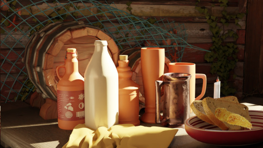
The Sketchfab plugin was insanely helpful in this because I could just import models other people made and adjust them - as someone who doesn't know how to model and texture things from scratch effectively yet that saved me so much time because I only had to nudge things around. I arranged everything as close to my original sketch as possible and rotated the camera to find the best angle. During this I realized some things (like the barrels) would work better composition-wise in a different position so I just moved them until I got something I liked. The tankard was rotated as well because the shape its handle was creating in the sketch was overly confusing and made the eye focus on it too much.
(and I also remembered that there should be three bottles rather than two!)
With the 3D model there to guide me and my collection of refs ever expanding, I made a much tighter sketch. I even traced some parts of the render with slight adjustments because I was content with where they were. There is actual item design now and lighting is more firmly defined. I finally added in the third bottle and figured if Trostenwald is also known for fishing to include some fishing net decor in there.
This is where the idea of adding some easter eggs as clutter started to form. I knew I needed more stuff in there to make it feel less staged and adding something fun seemed, well, fun. Spaces in real life are rarely perfectly orderly, there is always some clutter or things are at odd angles. In pieces like this finding balance between clutter and readable composition is something that can make it work as a piece and sell the atmosphere!

(yes, I forgot to add foam in the tankard...)
After this majority of planning is done and there is pretty much some 10% of work left to do but time-wise this step takes the longest because there is a lot of fine work to do. Rendering is where a good piece can become a fantastic piece if important things are touched up properly and less important ones are touched up just enough that they do not seem "unfinished".
I have very mixed feelings about rendering because on one hand I enjoy capturing very fine detail of various materials but on the other, a lot of the time it feels like you are making very little progress and you're working on the piece for hours on end. It does end up worth it in the end, though!
During this stage I made some small changes like finally adding foam to the tankard, and flipping the candle so it points the eye into the piece rather than out, along with a lot of detail work. I also finally tackled designing the beer labels. Graphic design is absolutely not my area of expertise but it was a fun challenge.

And some 15 hours later we end up with this! I'm sure that would've been a much lower number if I could've worked on the piece more consistently but instead all progress was stretched over several weeks so I often struggled with getting back into the swing of it and wasted a lot of time.
I'm fairly happy with how it turned out and it made me really push texture work, but one thing I realized I should definitely improve on is where I put detail and how much of it. Quite a ways into painting the background I realized it had a ton of visual information and was competing a lot with the focal points (the bottles and glasses), and then when I reduced the contrast a lot of the detail I spent hours working on got lost - wasted. I easily could've been looser and avoided the entire issue to begin with. Finishing this piece provided me with a roadmap to further improvement and I don't think I would've spotted my weakness if I haven't completed the work on this.
A note that I didn't know where to put - through the entire painting process I kept adding more references because there are always things that I need more visual info on and know that I won't do my best off the top of my head. No matter how many times I draw something, I only retain 20% of the actual information and need refs to get it right.
By the end of it, I ended up with a reference board that looked something like this. I often keep several images for items or materials that are important so I can spot as many features of it as possible.
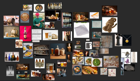
If someone got this far and is still reading, here is some technical info: I probably spent around 25 hours working on this piece, not counting putting together a Blender scene. That one probably took another 8 because I'm still very slow at using the program. I did all of my painting with Wacom Intuos graphics tablet, in Clip Studio Paint, with 2 custom brushes.
75 notes
·
View notes
Text
This took a little longer than anticipated, but hopefully it brings some cheer this weekend for everyone!
Please enjoy this lovely, and very relatable interview with Imai~
音楽と人- PHY vol.15 February 2020 Personal Interview with Imai Hisashi Text by Ishii Eriko Translation by Lola
First off, how did you find the five "THE DAY IN QUESTION" performances you did throughout the country at the end of the year?
I think they went well. It felt good to do them.
I got to see the Tokyo show. It felt a little strange to me too, maybe because it wasn't at Budoukan.
Because it was our first time playing there, so we had no way of knowing how things will sound. And you know I don't wear an ear monitor either.
What? You don't?
The two guitarists, me and Hide, neither of us had one. So I did wonder how the sound would be. Because the thing is while I'm super used to how things sound in Budoukan when it comes to a venue, I was also looking forward to performing in Yoyogi even if I was a little nervous about it too. But you know once I was actually there doing it, I wasn't worried about it at all.
Was there a specific reason you refused to wear an ear monitor? Is it because it feels more natural without it when it comes to syncing the sound?
No, I've just . . . . . .never ended up wearing one *smiles*. Because I'm thinking about the songs you know, and if I wear it, then I can't get a good sense of the mood all around me. And then sometimes there's these clicks in your ear . . . . . .and that just annoys me I guess.
Hahahaha! But aside from that, are you saying it's more important for you to feel the vibe of the show than to balance the sound with the band?
Yeah. Well look, I'll do it this way for as long as I can. I'm sure soon enough the point will come . . . . . . when I'll have to use one though.
Even if up till now you thought it was better not to *smiles*.
Well like for the Makuhari "Locus Solus" shows I ended up not wearing an ear monitor even though I was about to right before it started. So I ended up playing by intuition alone.
By intuition alone. And you still ended up in sync.
Well, I did ask everyone if they thought I was off. They had a few things to tell me about that *wry smile*.
I had the impression that the set lists for "THE DAY IN QUESTION" and "Locus Solus" contrast one another.
Ah, yes, I think so too. But it's not like we aimed to do that specifically. Because it's not like we ever have a specific concept in mind for "THE DAY IN QUESTION". Other than let's make it fun since it's an end of the year show.
Like, "Let's get together for the end of the year!"
Right. So that's why there are times when the theme for it seems a bit lighter. But I'd say overall it goes in a very dark direction while still leaning towards something upbeat. Like, whatever happens, it'll be alright.
OK. So let's get into talking about work. You've been working on songs since summer of last year?
Yeah. Well, that's pretty early for me. It's not like I've been steadily preparing things way in advance, it's more that I've taken the steps necessary to start working.
Imai-san, are you saying thinking about working is enough to get you to start working? Or is it that time doesn't matter for you because you always have ideas planned out?
I don't always have stuff planned. To a large extent it's more the whims of the moment, so once in awhile I'll jot down a couple of notes in my work office to work from later.
Well, as you will be working on things perhaps you could tell me what sort of theme you have in mind this time? Or give a hint?
Hm . . . . . . I don't really have any in mind but once I get started, I'm sure something will come to me. I mostly just fumble through while I'm working until something jumps out at me, and that's what ends up being used. Something that feels like it veers from the norm. Or more precisely, something that goes against the rules is what I enjoy. That's the kind of image that comes to mind for me. But even now, I haven't really been able to put it into words.
When you say something that deviates from the norm, isn't that basically what BUCK-TICK has always been about?
Yes, exactly. Because in the end that's what's always swirling about in my mind, so it's better if that's what I put into words. But it's like . . . . . . if I try to talk about this feeling in a specific way then it's like, "Um, I guess it's not really a concept I can put into words." *smiles* By making it into an album, in some respects this makes it different yet again. I would say that's the point that makes it interesting for me.
So you're heading in a different direction yet again from "No. 0".
Yeah. I think it's because I just want to do something interesting. Like we have two guitarists, then there's the vocals, the drums, and the bass. With that composition, I can't really make something fun with it because there's a tendency to go in a heavy direction, sound-wise. I'd like to try a different band sound. Whether I can or not, I don't know yet since I'm still in the midst of fumbling my way through it.
It sounds to me like it's still the case that no one knows what your band's style is exactly, wouldn't you say?
Yeah. I mean that's kinda the cool thing about it still, and I'd say it would be impossible for me to find it interesting otherwise.
It's what keeps you passionate about it. When it comes to the band itself, even now though you've been around a long time, there's no way you could say that you guys are just, "doing the same old thing as before".
Right, exactly. I feel like that's also what makes a cool thing cool to begin with, usually. But at the same time, I can't only adhere to that because that's like putting the cart before the horse a bit you know, so in the end I'm just flailing and wondering what I'm doing *smiles*. That's my current status. I'm like hm, maybe I'll go in a more electro direction, maybe I won't put in a guitar sound at all. I'm still not sure at all about any of it.
For "Datenshi", you used a rock'n'roll sound that was bass-centric.
Ah. Well, that's just because that's how the first riff turned out somehow.
Just how it turned out *smiles*.
It's not like I thought, "This is such a cool riff," when I started working on it you know, it's just super simple. Riffs like that are pretty typical really.
Certainly, you can hear how it comes off as a parody by moments. It feels like something by T-REX.
Yes. Because that's sort of the typical representation of a super simple rock riff. I'm really glad I used it. From there I made it a touch more pop, but more extreme, I made it sharp, and noisy, and I wanted it to have that image of being restless.
It's also another way to represent deviation isn't it. As you said, it's incredibly extreme, but you know I did wonder, Imai-san, if maybe you were trying to be like The Ramones?
No . . . . . . I'd say it's like my band Lucy, and the two albums I put out with them. After all, when I had started working on those albums, I put in all sorts of different sounds until I got something with a more simple rockin' vibe, so I had already begun to establish that sort of sound back then. I figured it would be fun to explore that completely. But it's also good if I don't only do that sort of thing.
It seems that way with SCHAFT too. You were limited by it being industrial. Did you think there was absolutely no way you could do that with BUCK-TICK?
Yeah. I couldn't've. If we're talking a purely authentic rockin' or industrial album, then no, I definitely couldn't do that with them.
You couldn't do it in the typical sense *smiles*. It's certainly an incredible thing, to do a single genre and follow through faithfully, but I'm guessing you're not really interested in doing that anymore?
Nah. . . . . . . . . . . . well, it's more that I haven't really thought about it.
Hahaha.
Back then I had a surge of interest to do it, that's all. I think that's why I was able to do it honestly. So you know when we all gather to talk about stuff before recording? It's never like, "This time the concept will be this, and this, and that." Because every time, we're just like, here, we did this.
Oh, you're talking about when you have a meeting at Victor Studios?
Yes. We meet up to talk, we hand over our demo if we've got one ready at that time for them to listen to, and then afterwards we go out to eat . . . . . . . and that's when we get into a deep conversation *smiles*.
Yuuta-san told me that your demo was rather rough, Imai-san.
Recently, yes. Because of the kind of song, it's got a four beat dance rhythm with pretty much nothing but bass at its centre. I said something like, "You know how you don't need words for a song to touch you emotionally?"
So you're leaving it up to the other members to convey that.
Yeah. I think it's not really a good song until it does that. Until it reaches that point where you've done everything you can with all of your might without ever giving up, and then you realize that yes, see, you can do it, you already have.
What happened to make BUCK-TICK become like this? It's a fairly recent thing, isn't it?
It is. But it's been since "Kedamonotachi no Yoru", and then it influenced the most recent single too. Previously, I'd say we were just making stuff that was rather trivial but, even though I made it, putting that stuff out wasn't really . . . . . .that interesting. Like there was a moment when I realized that it might be better if I don't only do the things I like all the time, and it might be more interesting if I don't. Because of that when Yuuta told me, "Well, what do you think of this?" I said, "You know, it's not really my thing but yeah, go for it."
Did he need you to say those few words? *smiles* But you know I think if you didn't have that realization, you wouldn't really be able to be in a band you know. Like there are people who think they can do everything by themselves even if they're a part of a band.
I doubt they'd be able to do it *smiles*. Even for me recently, I've really thought about what other people have to offer. When I started working on the demo, I do it all on the computer at first, but even I'm debating every minute thing in my head, and I just end up like, "This isn't completely inspiring, it's crap." Honestly, even before, no matter what I create that's how I've felt, but gradually, I came to realize that you know, it might be better if I chill out a bit. So now for instance when Anii changes up a phrase in a song, I'll say, "Oh, you know that's not bad, it might be better that way actually."
The vocals change the demo immensely as well, don't they?
They do, yes. Because Sakurai-san takes my crappy English that I sing at first, and changes it into Japanese. So of course with that the mood changes, and with the way Sakurai-san picks up on the notes as a vocalist he's able to say, "Ah, you know, I think this would be better here." Because that's the thing right, a demo tape is just that, a demo, and if you only stick to the demo, then you'll never be able to surpass it. I think it's better if they don't just copy what I did, because it's by altering it and removing bits that eventually great things come about.
This is another way of breaking from the norm too. This might sound like a silly question but, why is it that you hate rules and following a set path so much, Imai-san?
Well, it's not that I hate them. I'd say it's more that I like going beyond them. I do think there are times when doing something by the rules deliberately can be interesting too. I guess I just think that it's by trying to do things that rules end up being ignored.
Maybe that's the real thrill of it for you. You might think saying you're a pioneer is an exaggeration but, would you say it feels like none of you have found that thing you're looking for yet?
Yeah, that's a part of it.
Or would you say that it's more that you hate following a fixed format, and you want to break free of that?
Ah. . . . . . .well, I think it's simpler than that actually. I just want to create good things, incredible things. But like you just said, there is a certain feeling of being a pioneer within that like when I wonder, "Is this brilliant enough?" I mean I'm being kinda vague but, I've always thought like that.
OK.
Because that's how it works for me in practice I guess. From the start, I'm working to discover something in it, and when I do, it's like, "Yes, this is it!" But it's not like it's something that I've made up myself, it's more that it was there from the start, and I was just able to stumble onto it by chance. Sometimes that's just how it goes I guess.
So you don't make it up in your head?
Oh, of course some songs are what I've made up. Somehow I end up polishing whatever's swirling around in my head. But that's not how it is when I feel like I've really found something, those times it really is more that I just discovered it by chance.
It's what keeps the five of you going.
It is. Of course there's also the part of me that wants to put things out there, but I think, that's everyone who creates right, it's what makes you a creator. I think everyone who considers themselves an artist has that feeling. And I think if you let negative feelings win, then you end up wanting to quit you know? Like, "Bleh, this is too much work, I don't wanna." At least that's how I always end up feeling when I'm working on music and lyrics.
What do you mean by "everyone"?
It's just what I think. Like the other members, and Sakurai-san. Everyone who creates. I mean, we don't just churn things out automatically.
Even Yuuta-san, and Anii-san? Even though they don't write music?
Yeah. Like for those two, before they put something out first they have to listen to it, then they have to go into the studio and practice. So in order for them to get to the point where they can play the drums, and the bass for a song, they also have to play around with the phrases, and that's a form of creation. I think that's why we keep creating. I doubt it'd be the same if we had different members.
It's because it's you five that it works like this.
Yeah. Exactly.
It's absolutely incredible to me that you all have the will to create even now. When I heard that you guys would take a bit of a rest after the "Locus Solus" shows, I thought for a moment maybe you'd work on alternate projects, like maybe you would do another Lucy album.
Oh, that hadn't even crossed my mind. But I mean I wasn't really thinking of it as a break in that sense either.
Oh, really? But I thought you had done something to make you feel refreshed?
No . . . . . not really. Nothing specifically.
At least doing nothing meant finding that simple riff in "Datenshi", so now you won't have to pursue that kind of darkness and heaviness anymore right? Better to let that go.
Ah, yeah. I'd say so. Like without that it wouldn't be rock, I'd really say it was pop. It kind of has that pop song feeling to me, even the words have Sakurai-san's style of brightness to them, that's why I thought it would be good to put them in.
Speaking of Sakurai-san, he seemed pretty depressed last year.
Ah. Yeah, well . . . . . .that's because he was keeping quiet about some things for a super long time you know. So we just . . . . . . let him stew.
OK *smiles*. I guess that's why there's such intensity in certain lines in the song, like the "Ah ha" part.
Yes. Exactly.
I'd say "Luna Park" could be considered pop too so is that a hint of what is to come in the next album?
It is. Yes. I think it's going to be really incredible.
32 notes
·
View notes
Text
31 Days of Wayhaven, Day 23
Prompt: Decay Rating: G Words: 1,496 Characters: Cameron Buchanan, Nate Sewell Summary: Two research specialists in their natural habitat comparing technology. Note: Takes place a few months or so before Book 1. Special appearance of @asaucyginger‘s Fiona just because.
For the @31daysofwayhaven event.
The Facility Archives was a vast expanse of knowledge. It may not have the aesthetics of a well-stocked library, but the colder metal shelving held large amounts of books and the long tables were excellent for spreading out. The cooler temperatures maintained the integrity of older books, but it did mean that sweaters were a necessity.
It was a good thing that Cam had plenty of thick, woolen sweaters to choose from when he decided to go on a research dive.
The table he had set himself up at was also occupied by one of his favorite fellow researchers. Nate Sewell was a longtime friend of his and the two of them often bounced ideas off the other when it came to different avenues of searching. The man was pleasant to be around and was an ideal research partner: even sprawled out, his books and notes were always kept neatly to his side of the table and he didn’t distract with unnecessary conversation.
Cam’s thoughts went to Unit Zulu. He wasn’t entirely sure if Agent Fiona even counted as a Research Specialist, he’d seen her moves in the training room and thought she was better suited as a Combat Specialist instead, but she was not keen on keeping her material or herself to one side of the table. She had a fixation with his hair, her fingers always finding ways to play with the thick brown strands, and she tended to lapse into a sultry Irish brogue. It was close enough to the Scots-Gaelic he spoke for him to know that she always gave him an open invitation to her bed, but he’d always politely declined. Fellow agent or not, she was Fae and it never was a good idea to be impolite to the Gentry, even when they were your co-workers. There were some things that you just didn’t want to bring HR into if you could help it.
“What are you looking for today?” Nate asked, the nib of his pen scratching faintly against the notebook he’d brought with him. It was a leatherbound book, the pages thick and cream colored, which told Cam it was probably expensive. It made the beaten up pocket sized black and white speckled composition book he kept most of his immediate notes on and the blue ballpoint pen with the missing cap look sad in comparison.
Cam looked up from his laptop. There’s where he kept the bulk of his notes, his notepad only for when he was at the stacks and he didn’t want a thought to escape between where he was and his makeshift study headquarters. He and technology worked virtually seamlessly together: he mostly had Nicky to thank for that, seeing as his friend was always on the cutting edge of any new thing. He snorted: Nicky had been one of those people who had camped out for over two days to get the latest iPhone one time. He’d been furious when he came back, phone triumphantly held in his hand, to find that the rest of his team was already updating their contact lists on the very same model. He hadn’t known that the Agency had already scored the upgraded phones and had one set aside for him to use.
“Just some random things, mostly about bog spirits in Florida and Louisiana. I’m trying to see if there’s any connection between them and the ones over the water in other countries.”
“Interesting, I know there’s a book over on the fourth row, over in that section,” Nate pointed over to a section of bookshelves to the left of their table and squinted, as if attempting to recall the exact position from memory. “Possibly the second shelf, maybe the third. Green cover, so I’d wear gloves in case it possibly starts to leach arsenic.”
“Thanks, I appreciate it. I’m still in the note-making stages of research, but I thought it would be best to start here, to let the books inspire me.”
Nate smiled and went back to his reading. A curious look told him that he was looking at human physiology and something about genetic mutation. “Working on that bloodwork case?” Cam asked.
He nodded. “It’s just so strange. I have no idea what a vampire would want with a human holding a mutation to their blood.” He ran his hand through his hair. “The last victim had enough blood left in their body for the science team to extract and sample, but I thought that maybe doing some of my own research would come up with an angle outside of the box, so to speak.”
Cam started to type. Luckily, the Agency spared no expense and the internet was incredibly fast, even so far underground as they were. “You may want to try looking at some non-supernatural reports. If you want, I can work up a list of papers that have been done on the study of genetics and how certain mutations affect how organisms interact with their environment.”
“Oh! I hadn’t thought of that route.” Nate scratched at his chin. “It would make sense, seeing that beings evolve to overcome difficulties in their environment...hmm.” Nate made a few notes in his notebook. “Thank you for the idea, Cameron, but I wouldn’t want to drag you away from your own work.”
Cam grinned. “Actually, this is mostly an excuse to hunker down. Nicky decided that it would be a good idea to have a…” he searched for a word. “Fling with one of the admin secretaries and it turned messy. Like hunt him down and make him suffer messy.”
Nate winced. “It’s a good thing that he can’t technically die,” he joked.
“Yeah. I think she’d be happy killing him and then calling it even when he wakes back up, but still.” Cam shook his head. “I really wish he would pick his dalliances better, especially when it comes to supernatural women.” Part of Cam had a thought that Nicky chose the people he slept with on purpose, hoping that one of them would finally kill him for good and that he’d be able to rest in peace. He wasn’t immune to the fact that Nicky put himself into danger the most out of everyone in the team and had a fatalistic viewpoint when it came to death and dying. It was a morose thought, and one that he’d brought up to his friend before. Over the years, he learned that it was best if he left the subject alone.
“But back to your research,” he said, shaking his head and pulling out his phone. “Give me a few and I can send the list to you. A couple are behind paywalls, but I’ve got yearly subscriptions to a few places and a few connections to get behind the ones I don’t, so just let me know which ones interest you.”
Nate looked up from his book and smiled. “Thank you, I really appreciate the help.” He gave a glance towards Cam’s laptop. “You know, I prefer more…”
Cam grinned as he typed. “Archaic?”
Nate rolled his eyes. “Personal methods of research, but I do have to admit, having information at your fingertips like this does cut down on time.”
“I could show you how to do this, you know. I’m pretty sure IT has a spare laptop they can assign you.”
He shuddered. “No, I have one, it’s…” he took a breath. “Let’s just say that technology and I don’t mix.”
Nicky’s words came to mind. Those of us who resist change are bound to decay with time, my friend. Besides, it’s fun to look back and see all the changes we’ve adapted to over the years, no? Cam wisely kept those comments to himself. “Well, the offer still stands. If you ever need something looked up quickly, just let me know.” He jumped as his phone began to vibrate at the table. Picking it up, he saw that Winona had texted him.
Nicky’s dead again. Help me collect his dumb, horny ass from Hallway D-4. He owes me a drink when he wakes up from having his head thrown down the hall. Ew.
“Well, I’ve got to go,” he sighed, putting his laptop away in the bag he’d brought with him. Luckily he hadn’t gotten around to pulling books out yet, but he slid his notebook back in its usual spot in his back jean pocket and the pen in an unused pocket of his laptop bag. “Hopefully Helen will call things even now that she got her hands on Nicky and we can get back to business.”
“Good luck. Give my sympathies to the cleaning staff.”
Cam waved as he left, shouldering his bag and wondering about how big a mess someone could make of a dead man without a working circulatory system.
Then he sighed. As Nicky’s Commanding Agent, this was going to be one hell of an accident report he was going to have to write up.
7 notes
·
View notes
Note
Hi! It's me again sorry I just love ur blog so much please don't slice my body in 26 pts.😂 Jk! qwq any Headcanons for La squadra with an Aspiring mangaka S/O? Like she really REALLY Love to make a comic so much? (Take note she's not sassy as Rohan lmao)
ur lucky none of my knives are sharp. (lmao jk jk I’m so happy you like my dumb blog aaaaa)
Risotto
Intrigued but hesitant. Hopefully you don’t plan on incorporating his likeness into your manga at all. He’d be antsy about a character inspired by him, even if it bore no resemblance to the real thing at all.
He has a habit of throwing himself into his own work, so he doesn’t often ask you to take breaks or remind you about things like food and sleep. More or less leaves you alone if he sees you’re really deep into your work.
Enjoys working on his own stuff in the same room as you. There’s something to be said about enjoying each other’s company in silence.
Really likes looking over your shoulder as you draw. He was never artistic so watching how rough sketches become inked panels is fascinating to him.
Gifts you fancy pens often, even if they aren’t the best practicality wise. He would be thankful if you gave him specific names and thicknesses you liked.
Prosciutto
He’s another one that doesn’t drag you out to take breaks, but unlike Risotto he’d at least bring you coffee. He’d like to sit with you too, instead of leaving you be.
If he sees you’re becoming exceptionally tired Prosciutto would kindly (and firmly) suggest that the two of you retire for the night.
If you ask him for his opinion on something he’ll be honest with you. Prosciutto doesn’t sugarcoat his words, but he does make sure to reiterate that he’s proud of your work no matter what.
Great at pep talks and surprisingly good at brainstorming ideas with you too if you find yourself stuck on how to advance the plot.
Of a similar mind to Risotto when it comes to ‘cameos’ in the manga. But if he sees a character wearing something that looks suspiciously like Grateful Dead’s eyes he’d be flattered.
Pesci
He’s a nice middle ground between Prosciutto and Fromaggio in terms of getting you to take a break. He’s not as annoying as Fromaggio is but more insistent than Prosciutto.
Pesci is already a fan of anime and manga. He’s read enough manga to know a bit about panel composition and the general process of writing one and if you ask he’d hesitantly offer up what he thinks are good suggestions.
He doesn’t want his opinions to get in the way with your creative process so he’d be hesitant about sharing unless you assured him you really wanted him to.
Would never ask you to draw him in your manga, or pester you for art but if you drew him in the background of a page he’d be incredibly flustered and happy.
If you get fustrated and throw away a page he’ll take it out of the trash and keep it.
Fromaggio
Please make him the star of your manga, he won’t stop pestering you about it.
Also please draw him in your style, he will pester you about that too.
Don’t tell him how the plot is going to go, he’ll spoil it somehow.
He gets antsy if you work for too long, especially if he’s just come back from a job and he hasn’t seen you in a while. He’s gone enough for his work anyway, why would he want to spend his limited free time in silence watching you draw when you two could be doing something fun?
Despite his habit of trying to pull you from your work, he’s actually very supportive of this. He’d help you mail off copies of your work to publishing companies and is the first to suggest a massive party when one of them inevitably offers to publish your work.
If he catches wind of people talking shit on line he can and will make a throwaway account and debate them.
Illuso
watching you work from the mirror world because he prefers to do everything from the mirror world. If you invite him in though, he won’t decline.
Not too familiar with the process of manga writing but enjoys watching it anyway. He’s pretty low maintenance so he doesn’t mind passing the time with only the sound of your pens and pencils breaking up the silence.
Takes note of the type of pens you like to use and what they’re primarily used for (shading, line work, blocking, detail, etc) and those will sometimes appear on your desk.
Likes listening to you talk about your work, the fire in your eyes is endearing to him.
He’s not an artist himself but if you ask him for an opinion on something he’ll give it to you no holds barred.
Never realized how much of a technical aspect there was to manga writing and finds himself fascinated by all the little things you might not notice when reading like text formatting and panel composition.
Melone
another one that wants to be in your manga
while he certainly has a preference for certain genre if you write something outside of his typical favorites he’d be happy to read it anyway.
spitballs character concepts and power ideas with you for funsies.
Enjoys hanging over your shoulders to watch you work even if it gets in the way.
Would 100% cosplay the main character of your manga and make it weird by hitting on you the whole time.
Would also make it weird by asking you to draw what you think your kid together would look like.
Genuinely treasures any art you give him though. He frames it and keeps it in a place he can see every day.
Would get misty eyed if you made a character inspired by his older sister and gave her a happy family.
Might want to write a children’s book with you one day. He’d supply the text while you drew the pictures. But he wouldn’t mention it until after you finished your manga. Doesn’t want to distract you from your primary focus.
Ghiaccio
He’s kind of like a built in editor which is either really great or awful depending on how well you take Ghiaccio level ‘critique��� because while he might love you, that doesn’t mean he’s going to go easy on you.
Ghiaccio is more a stickler for writing rather than the art or panel composition of your manga. If you’re going to let him read it while its still unfinished you’re going to have to be careful which idioms or turn of phrase you use.
He’s supportive though, and while it might not be possible to cut him off once he’s started picking apart an idiom you used that he took issue with at least he apologizes later about it.
One of the ones who makes sure you take a break weather you want to or not.
Enjoys the quiet moments together where you’re working on your manga and he’s reading in the same room and you two are just spending time together like that.
Surprise him one day with a ‘candid’ drawing of him reading with you and he’ll be a mess.
#risotto nero#prosciutto#pesci#melone#illuso#fromaggio#ghiaccio#jjba writing blog#jjba headcanons#vento aureo#jjba part 5#jojo kimyou na bouken#JoJo's Bizarre Adventure#la squadra#la squadra hcs#im not dead#just suffering because school#and back problems rip
42 notes
·
View notes
Text
Writing in Comic+Illustration
“A picture is worth a thousand words.” I have to admit that’s a pretty cliche starter, but it does help define what writing means in the art community.
One way to define “writing” is to call it a genre.
Genre 101
Before I continue, I want to make sure that you understand what I mean by genre. When I talk about genre I am simply referring to various forms something comes in. For music its different sounds like the genre of jazz or pop. In writing, a genre is a book or a shopping list. Hopefully that clears things up!
When I first began researching various writing genres in the art community I was confused because I thought I was looking for actual written texts like a research paper. Yes, there are the conventional forms of written genre within the art community like a blog, but turns out a genre in the art community simply refers to the art we create!
“I thought art didn’t have writing?”
Comics, manga, anime, ads, posters- those are all forms of genre in the art world. If you are still confused then just think about the different forms that you often see art as.
In our community, the purpose of these different genres vary between the mediums.
Some are for insiders (people who are artists themselves) some genres cater towards outsiders (people who are not artists, but consume and enjoy art).
As an artist, our main focus is to entertain others with the works of art we create. Because the nature of our job focuses on pleasing others, most genres of art are created to be consumed by outsiders.
To illustrate that let’s compare two different kinds of art projects.
Genre 1: Comic Book
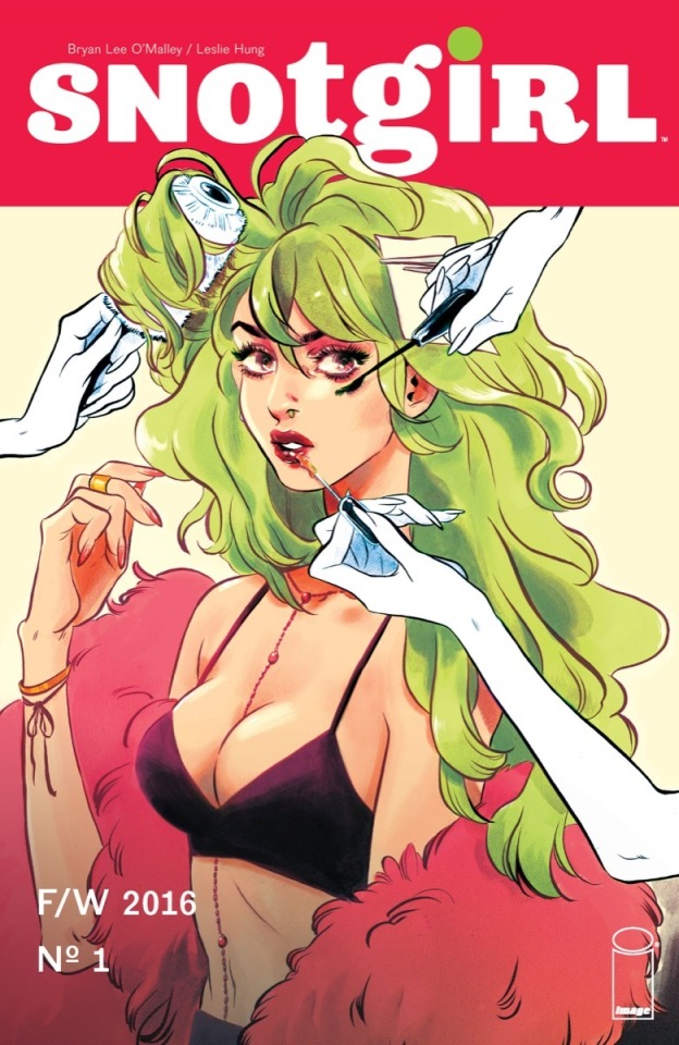
SnotGirl by Bryan Lee O’Mallley/Leslie Hung
Who is it for?
Comic books come in various styles and not just what people typically think like the Marvel comics.
A comic book is written in order to entertain an outsider of the art community. That is not to say that artists do not enjoy comics as well, in fact I’ve included one of my favorites as the example!
Sometimes comics are a single page with multiple panels, and they can span multiple pages and volumes. Snot girl, for example, is currently on its 14th issue!
A comic is a very commonly produced genre. Typically, someone who writes a comic has multiple reasons to do so. Most of the artists have their own story to tell. They have created their own characters, their own world, and have a vision or lesson they want others to see as well.
What’s so special about it?
What’s great about a comic is that there is no right way to do it. Comic artists are tasked with balancing multiple parts of their project. They have to consider:
- the organization of the dialogue
-how they are going to lay out the images/ what geometric shapes the panels will be
-inclusion of sound effects
Don’t forget the art itself! The creator has to make sure they are:
- cohesive
-complete and dynamic illustrations
- they do not clash with the already established panel placement
-establish the tone and mood through colors and lighting
When Less = More
Comic books have the daunting task of developing their writing through narration and dialogue. Write too much and the reading becomes heavy and write too little and the author risks confusion.
Imagine condensing an entire essay into dialogue between characters with limited narration. Writing in comics is an art in-and-of itself.
While the writer of a comic and also be the artist, this isn’t a set rule. Sometimes the author and the illustrator are two separate people or teams!
SnotGirl as a comic book case study:
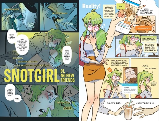
Volume 1, SnotGirl
Analyzing structure
The left page is split into three rectangles and the right page is broken down into multiple squares beside a near full body illustration of the main character, Lottie.
Lottie lives her life as an Instagram model and fashion influencer. The left page introduces us to the real Lottie, a side of her that is disgusting and unkept, snot drizzling out of her nose constantly. The right page shows her in public maintaining an idealized and aesthetic persona.
if you break a page into three sections that means more art needs to go into a single panel. In the middle rectangle her whole body is shown and the bottom panel is largely zoomed into her face. It’s nearly claustrophobic, showing Lottie’s overwhelming insecurities and having the reader up-close to a side of Lottie she wishes to ignore.
On the left page, the dialogue reads as frantic, narcissistic, Lottie is trying to convince herself that she doesn’t feel ugly and that she’s more superior than others.
On the right the multiple squares include more dialogue, space around Lottie, and more zoomed-out compositions (For example, you can see Lottie all the way down to her chest at least four times).
The squares reflect Lottie’s insecurities but they are the problems of her perfect persona: boy troubles, getting coffee, and Instagram profiles. There’s more writing on this page to reflect her more superficial ravings.
Analyzing illustration
Art wise, on the left the colors are grey, dark green or blue, and more cool-toned. In color theory cool tones portray sadder, more serious moods.
The right page which is vibrant and warm-toned, which is supposed to be energetic. If I were to ask you, you might be more attracted to the right side and its happier atmosphere.
These two pages illustrate how color, composition, and organization differ widely to emphasize how the artist wants the reader to feel and understand about the story.
Sounds complicated doesn’t it? The genre of comic books may be common, but it takes a lot of working, planning, and dedication.
Genre #2: Video Game Illustration
Illustration in game

illustration in full

Art by ZAVIR
Aren’t games 3D though?
I know that when most people think about video games the models and backgrounds are in 3-D. Think of Red Dead Redemption 2. While most mainstream games are produced that way, there are still many games who use illustrations like PC click-and-point games, mobile games, and other games use illustration for character sprites. The example I’ve included is from my favorite mobile rhythm game, Cytus II.
For those who don’t play Cytus II, the game revolves around different in-universe musicians who have different songs which the player taps the beat to. For each playable song there is an illustration. (Here’s a link to the hardest song in the game! “Floor is Lava”)
What’s the point of the art?
Most video game illustrators work in backgrounds or character sprites. The illustrations can be single items as well, clarifying items that a character may have picked up in game.
However, to stay relevant to my example I will mainly focus on the aspects of this particular video game illustration.
Cytus II as a case study:
The illustrations in Cytus 2 are meant to:
create further diversity between the different songs
provide the song with a visual outside of the beatmap
By providing the song Extinguisher by Lixound with artwork, it’s not only visually pleasing but adds memorability to the song. People who are fans of the game can now draw fanart of the song.
Differences from comics
there is very little text.
The story or context has to be told by the artist in composition, character pose, and other artistic choices like lighting or colors.
Particularly in Cytus 2, the story the artist tries to tell is set by the sound and “vibe” of the song.
“Extinguisher”, an EDM song, has fast beats and dubstep like qualities as well as a robotic vocal track. It’s chaotic and fast, which could explain why the artist interpreted explosions and a figure that looks like an anarchist.
Why Different Genres Exist: Comics vs Video Game Art
Imagine if a comic was told through dialogue-less illustrations and imagine if video games had backgrounds and illustrations that were formatted like comics.
Visual chaos would ensue. Clashing dialogue, images, colors, and a lack of clarity for what the viewer should be focusing on.
Thank goodness for the different genres of illustration, huh?
1 note
·
View note
Photo
Making an environment in One Week - Part 1
I decided to make a whole environment piece in one week. So yeah!
WHAT THIS IS: Practice and an experiment. This was just a personal test to see what I could achieve and share my experience. WHAT THIS IS NOT: Healthy and practical. Healthy for reasons you will read bellow (at least for me), and practical because rushing things doesn't make you better. Even though there was some discovery here for myself, I didn't learn any new techniques, didn't learn from critiques, etc. I dont recommend to do this as a constant art practice. Its not smart if you are planning to grow in your craft.
That said!
Its been both a challenge, and a great time. It was definitely a big learning experience for me, and I am not very happy with the results but I decided to share it because I got something out of it, and hopefully some of you will as well.
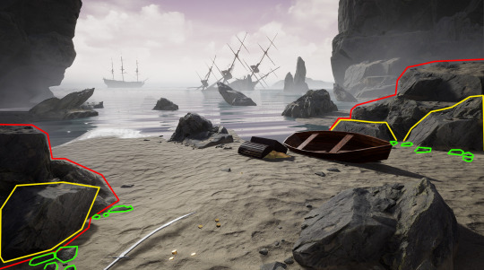
The main challenge was to conceptualize and go from blockout to final in 1 week. Basically, going from here...
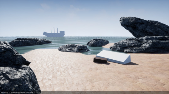
...to here...
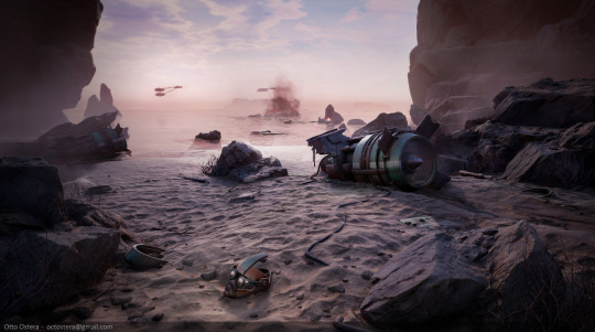
...in one week.
The result is running realtime in UE4. I used Blender, ZBrush, Topogun2, the Substance suite and Photoshop.
DAY 1. Starting out...
This was, heads out, the hardest part. The whole piece took me around 45 hours. 4 hours after work from Monday to Friday and at least 12 hours on each day of that weekend. Needless to say, at the end of that week I was completely exhausted. MVP of the week was my girlfriend who decided to take care of my chores the whole week while I worked!
Looking at the empty canvas is always scary.

And of course this time it was no exception. It added an extra layer of pressure knowing that every minute I spent looking at it and clicking around, would take valuable minutes away from my busy week.
I had to figure out SO MANY THINGS.
When tackling down an environment, there are many things I usually keep in mind. You have composition, theme, storyline, execution method, end platform, etc. And in this crazy jungle of thoughts that usually strikes me when starting to build a piece, I can get lost really quickly and begin walking in circles.
First I had to CHOOSE A PLATFORM. Unreal, of course. Moving on!
Then I had to FIGURE OUT THE MAIN THEME, on which I'm going to build my scene. So I almost instantly thought: pirates. I LOVE pirates. I mean, who doesn't? And with Uncharted 4 still to this day in my veins and one of the latest Magic The Gatheringset ever-present in my head (go Ixalan bois!), I had all the inspiration I needed. I had found my theme. And I set it in stone, for I would never allow myself to lose time changing it. That was not an option...
And of course, I ended up changing it.
Now, I need to THINK OF THE STORY. It was going to be amazing! I wanted to have a small boat in the sand with a treasure on it. And in the back, a huge ship shooting at it. As if the pirate stole the treasure and was getting away! He got to shore, but the ship was too damn close, so he had to take away whatever we could in his hands leaving most of it behind.
Cool, I liked it. It was no Dark Souls environment art storytelling, but it kinda worked!
So then I jumped to the next and one of the most crucial of steps: GATHERING REFERENCE AND BUILDING A MOODBOARD.

I think I got rid of most of my pirate-related reference, but here you kinda see what I was aiming for terrain wise. I had to cut a lot of it, but the feeling was there. This step is almost crucial, and it is really important not to underestimate reference. Spend 1-2 days looking for it. Always keep it open while working, and never stop looking for new pictures!
All this took me a good couple of hours. Perhaps 3 (tight time frame after all). So I HAD to move on to the engine now. No time to waste.
Next, I started with my main BLOCKOUT. This is definitely the most important part of it all. Here is where you should spend the most time when making environment art. The blockout is going to dictate the overcome of your whole piece. Don't think in details, details sucks, details are for murlocks. Nail your main shapes and composition FIRST. You will definitely tweak things around, but having your composition, shapes, balance, and flow of the piece in place in the beginning, is not only going to allow you to work more effectively, but it will also keep you inspired and moving forward.
So I did. This is the first blockout of this piece ever.
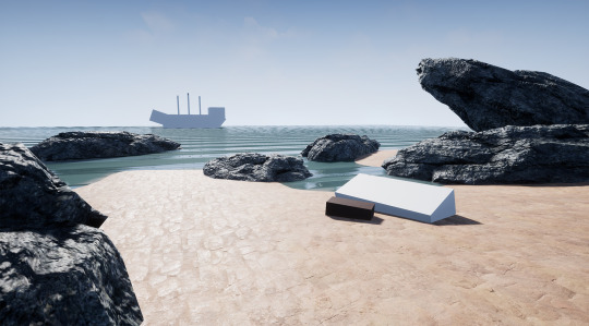
I started out with the simplest of compositions. I can go quite crazy trying things out at this stage but, not to my surprise, I hadn't much time to spare. So a simple rule of thirds, which I personally dislike (here is why), will do for now. I knew that I was going to keep a simple 3 point composition, and 2 counterbalancing points will do the trick for now.
Also, at this points rocks, water and sand texture were taken from the UE4 library.
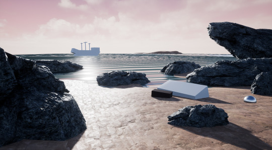
I moved on then to BLOCKING OUT LIGHTING. As everything in this stage, it was very simple. Just used a basic skysphere (default to UE4) and tweaked the values a bit. I knew for a fact I wanted to keep working on both the mood and the clouds. But no time for that right now.
The goals of my first day were to have the whole blockout done. At this point it was almost 10 pm and I wasnt ready. And I wasnt going to bed until I had at least a very basic sand texture there.
So I made it.
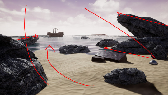
And since its really awful, I figured I might aswell explain what was I shooting for composition wise. The framing was going to be natural vs man-made. Rock vs water. So the big rocks on the fore and the middle ground where doing that for me. At the same time, I was throwing all the flow lines I could to make the ship pop up.
And that was it. 11 pm. Time to eat something, go to bed, and go to work the next day. I could have stayed up all night. But I knew better.
DAY 2. Sand and rocks
Day 2 started out nicely. I almost ran home to get my hands on this! I was confident that I was going to pull it off. All was great!
I jumped right away to Substance Designer. I knew (and had been thinking all day) that I wanted to have the sand in as soon as possible. So I jumped directly to my next step BLOCKING OUT TEXTURES. Not everyone works this way, but I found out that having a solid blockout of your textures helps you to see the bigger picture. In an interesting scene, not only color but also roughness take a big part in making it look unique and appealing to the eye. And having your materials blocked out will get you early to a point where you can start tweaking lighting, composition and even propping to get the most out of your scene.
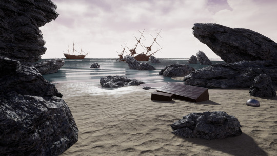
This screenshot is 2 hours in on the second day. I kept moving rocks trying to improve the composition, and all this new perspective came from my new sand material being applied to the terrain. I built a simple blend shader and vertex painted some roughness variation in where the land met the sea.
Also grabbed this super high poly ship from somewhere on the internet and used it very quickly to try to pull my vision a bit forward. All assets were created by me in their entirety, but blocking out a ship just for the blockout's sake would take me a whole day, and I was already starting to get scared from the scope of this scene. At this point I didn't think I was going to pull it off, and grabbing these ships helped me realize that my original vision simply wasn't going to happen. They were a lot of work, so I had to improvise something on the fly.
Much like in game development, the cool parts get cut. Ships were out, and I spent a whole hour trying to think what to do to replace them. And the clock kept ticking.

So I kept working on the composition. A 3 point composition would do it. A simple offset of focal points kept in flow by the terrain and contrast. Not too fancy, but would do the trick if done correctly.

Then I thought I might as well move on to the next thing: CREATING KEY PROPS. So I decided to get started with the rocks. I sculpted these godforsaken monstruosities and quickly decimated and textured them.
Here is a quick tip for you all: DONT RUSH THINGS. Because when you do, you end up losing time. They looked like crap. And I knew that. And hated the fact that I had to redo them. That didn't only make me lose time, but also severely affected my morale. Tackle things smartly, and give every piece of the puzzle the time it requires, because if one single piece is off, everything will look unfinished or just wrong.
Then added some fog and, just like that, the day was over. What a waste.
DAY 3. Rocking rocks.
Day 3 started at 7pm. I had to get to work with the rocks right away. So I did.
I looked for a lot of references and got to it. I ended up finding some killer ref on it, that was exactly what I needed. In the end, and after pretty much all day, I was happy with what I got. The sharp edges broke nicely with the smoothness of the scene. It almost felt like I was achieving a gradient between the smoothness of the water, the semi-rough surface of the sand and the sharpness of the rocks. I quite liked that. There was even a cool story element to it.
It also had to be reusable, so I sculpted it 360 degrees, since it was going to be rotated like crazy. I knew they weren't perfect since there was barely any small detail on them, but I would come back to them later.
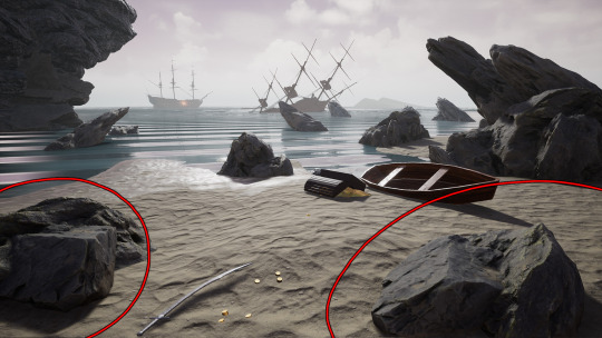
I also kept developing the blend shader a bit. And used it on the rocks as a test, painting some sand on top of them.
DAY 4. Propping, mesh scatter and sand!
Getting back to it on the fourth day had me excited! I knew what I wanted to do with the rocks, so I started creating bigger variations and some backdrop ones. Once I had them, I kept working on the composition and framing of the whole piece. Also created some sharp ones to add at the distance, as some reference I found showed.

So at this point, halfway there, I had my composition kind of there, my secondary props almost done, my main textures half done, and I was still experimenting with lighting. Damn.
When propping, it's always good to keep micro-compositions in mind. There is a lot to talk about on this topic, and I plan to do it in the future in more detail, but as of now this should do. Every big shapes should be grounded, accompanied by medium and smaller bodies. And this is what you can see I did here. Breaking the rotation of assets and having other smaller props around them, blend big assets and terrain together smoothly, almost like in a gradient.
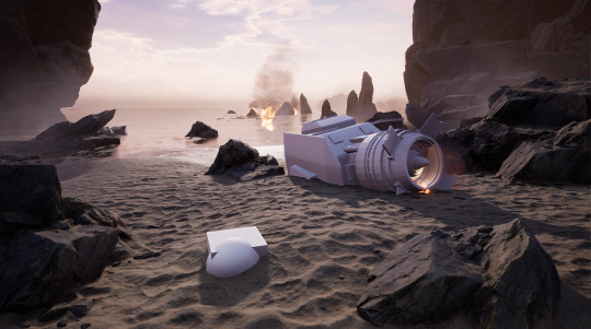
And then it clicked. I decided to take a huge U turn. Pirates wasn't an option anymore since the ships were too expensive to make. So I decided to turn into scifi. Star Wars more specifically. For some reason I just got a bit of a scifi vibe out of it. Decided to follow my gut.
First big change was lighting. Before I was aiming for something really moody and gray. Tons of fog, low visibility and and sad/uncomfortable mood. Changed it into a mostly clear sky at dusk.

DAY 5. Prop making
Getting back to it on the fourth day had me excited! I knew
My first idea was to recreate the crash from Star Wars Jedi Knight Jedi Academy on the planet of Blenjeel (the one where the sand worm tries to get you). So I thought it could be a really nice remaster piece to make! Story was figured out and all.
So I used some UE primitives to build the basic shapes of what I was going to go for in both focal points. It was going to be the fallen ship and one of the ships parts you need to retrieve in the mission.

But as I started looking for reference, what I could find was really limited. the game is really old and there is barely any art for the level. I found a single piece of concept art in one of many Star Wars wikis and started blocking it out from it.
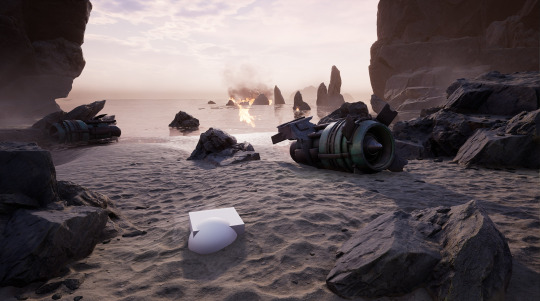
My plan was to execute the main asset that day, so I quickly jumped into it. And as I started modelling one of the turbines of the ship (you can see it in the next image), it resembled something I was really fond of. So, again, a new sporadic change in the design...
Pod racers! I LOVE pod racing. Who doesn't?
And like that, day over!
DAY 6. Of grounding and helmets
First day of the weekend. My intention was to finish everything today. Wanted to have all props figured out, all dressing done, all painting in place, etc. The last day had to be just post processing and super small details in the scene. Lots of things happened on day 6.
The new prop was simpler and more easily recognizable. And, most importantly, I liked it! It would be now the remaining of a crashed pod. The races (as depicted both in the movie and the game) were pretty brutal, and so I figured I could try to show that.
Here is the asset.
After that I quickly jumped into grounding the asset better and adding smaller detail. Added some dragging marks for the turbine, wires, random parts of the broken pod scattered everywhere.
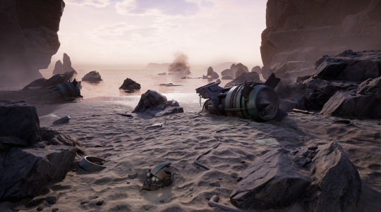
DAY 7. Final tweaks and presentation
Final day upon us!
I started the day early adding the third focal point to the scene. Backdrop pods racing at the distance. This wasn't only the third piece of the 3 point composition, but also a big storytelling element. This guy had some tough luck, but the race still keeps on going!
Also started to play heavily with a post process volume and some nice LUT tweaking.

Then did a final pass on everything. Added some more scatter, tweaked lighting, added some fake bouncing lights and tweaked the reflections. Then made some quick dead vegetation and added it around some rocks. The final composition was rather simple, but here is a breakdown of my mental process. It doesn't really matter which of the 3 focal points to see first, all of them are connected creating a circle flow between them.
In blue, you can see the helmet connecting with the turbine thru the wire in the sand, creating an arrow directly pointing back and forth. Framed by the rocks in the foreground, the helmet creates a strong contrasty focal point that is very likely to attract most attention at first glance.
In red, the turbine. The trail behind it serves a single purpose: its guiding the viewers sight towards the next focal point in the rotation. Also the same positioning of the turbine works as an arrow pointing left. Perspective and placement work together here for this end.
In green, the pod creates an attention spot simply because of contrast. And so it completes the circle. All shapes around are meant to both point towards it and guide the viewer back to the helmet.
General positioning on the scene and during the dressing had purpose. Playing with empty spaces vs populated ones, contrast and color helps, and here the sand areas and sea create clear paths to traverse. and the central, uninteresting, piece (in orange) creates the perfect shape to accentuate direction and a pivot for the whole image.

And so I was done! 8pm on Sunday. Crazy week! Was absolutely exhausted and had a real bad time trying to concentrate next Monday morning. But I managed to pull it off to the best of my ability in the given time, and the result was rather acceptable.
Many lessons learned on this. Not going to bore you with all the details of my own realizations, but I tought it would be nice to share the crafty side of them.
Im not doing this again any time soon. Even though I look back and can be proud of having finished a piece in this small amount of time, the gain wasn't really worth it. Things I would improve if would have had more time are:
Pods could have improved with some motion blur (didn't have the time to figure out how to make it happen in UE).
Smoke looks still and inorganic.
Rocks could be better grounded, with sand buildups on the sides.
Backdrop rocks are way too simple.
More color variation would have taken this to a much nicer place. I played it safe with complimentary colors.
Assets could use some more time.
And I think I could keep going on forever. Even though my eyes are still a bit used to seeing it constantly.
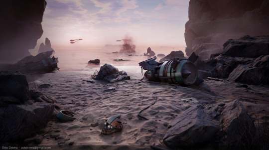
Thanks a lot for reading! Sadly I had to cut a bunch of it due to text characters limit, but I think this sums it up well enough.
Please leave any questions you may have, happy to answer them! Also any ideas and C&C on the piece is absolutely encouraged.
Thanks again, and till next time!
Otto
2 notes
·
View notes
Text
What Is The Best Software To Edit Photos On Mac

Sweet memories fade with time, but when captured in images, they stay with you forever. If you are fond of taking pictures, you must have a collection of hundreds and thousands of photos. Capturing moments is fun but organizing them can be an arduous task. However, if you have a photo management app for your Mac, things could get a lot easier. To know about some of them, read on!
Best Photo Management Softwar for Mac
Organizing photos can be fun when you have a third party app on your Mac. We have listed some of the best photo management apps for Mac.
1. CyberLink PhotoDirector 365
Cyberlink PhotoDirector 365 is a photo management tool that not only helps you to organize your photos in a neat manner but also provides advanced editing tools. Let’s take a look at the features of the CyberLink PhotoDirector 365:
To manage your photos, you can categorize them with keyword tags, star ratings, smart collections, color coding, and flags.
The software can automatically arrange your photos on the basis of on composition, frame, time or date or you can manually organize them by simply dragging and dropping.
You can share both digital and hard copy photos with your friends. Moreover, you can create slideshows and upload them to YouTube.
May 30, 2019 There are many options to consider when looking for the best automatic photo enhancing software, but according to us, these are the top names to come forward: 1. Format – Software download Available Platforms – Windows & MAC. As with other examples of best photo software, Luminar makes use of AI technology. Apple’s Photos app is included for free on all recently released Macs. It does a good job at organizing your photos, but its collection of photo enhancement tools leaves much to be desired. Hopefully, our selection of the best free programs for photo editing on Mac will help you choose the right app to suit all your creative needs.
Also Read:5 Best Duplicate Photo Finder and Cleaner Tools
2. Adobe Photoshop Elements 15
Adobe Photoshop Elements 15 is a simpler and efficient way of managing your photos on Mac.
Functionality wise, I don't think we'll doing any models that are too intense so I'm not giving up that much productivity on the.But we might be doing some Argus in school so I'd have to get the Windows function on Mac and it'd be so annoying. I had a Macbook Air since after undergrad until now (been 4 years) but it was damaged so I need a new machine. What do you guys think? Real estate peeps,I heading to grad school in a few months and can't decide between a PC or a Mac. Financial modeling software for mac.
Let’s take a look at the features of the Adobe Photoshop Elements 15:
With Auto Curate feature, your photos are organized according to the image quality, faces, subjects, Smart Tags and more which makes searching for images easier.
The software suggests you use Smart tags to your photos so that you can find the photos easily later on.
It also allows you to fix multiple photos at a time.
3. AfterShot Pro 2
AfterShot Pro 2 helps you in organizing and viewing all your photo collection in one place making it one of the best photo Management apps for Mac. Let’s check out all the features of AfterShot Pro 2:
You can edit and make other changes to one or many photos at once with powerful batch processing controls.
The powerful search tools, star ratings, and other tools help you quickly find photos no matter what is the size of your photo collections.
You can easily compare, filter and select your best photos from n number of similar looking photos
Also Read:10 Best Duplicate File Finder And Cleaner Apps
4. Unbound
One of the best photo management apps for Mac, Unbound helps you efficiently manage your photos according to your needs. Let’s take a look at the features of the Unbound:
You can use albums to categorize your photos. With instant search, you can locate any album within a few clicks.
The app can play slideshows, display EXIF information and can also use GPS location data to display photos on a map.
Unbound can sync your albums to your iPhone, iPad or other Macs with the help of Dropbox. So that you can upload and organize your photos from any of the devices.
What Is The Best Software To Edit Photos On Mac Computer
5. Phase One MediaPro1
Phase One MediaPro1 is a good choice if you love to keep your photo collection organized and managed. Let’s go through the features of the Phase One MediaPro1:
It allows you to handle photos in batch whether it is editing or renaming.
The app allows you to convert your RAW format images to JPEG or PNG, BMP and more to make it easy to share it across.
It has an auto-sort feature which uses metadata annotations to sort photos.
What Is The Best Software To Edit Photos On Mac Software
Also Read:How to Find and Remove Duplicate Photos on Mac
So, these are some of the best photo management software for Mac which you can use. Try them and let us know which worked for you.
What Do You Think? 1 Responses
Great photography bad print quality? Here is your solution. It is ideal for amateur photography be it printing selfies or the pictures of your dog. It will help professionals get an edge in their exhibitions and showcases. The main advantage is the comprehensive tools like image configurations, enabling high-quality printing and reduction of hue intensity and much more. These software will always keep you in the game. Here are some of the best software to use.
Related:
Arc Soft- Print Multiple photos
An interface focused on ease of usage allowing custom layouts and configurations like passport, wallet size and other standard print sizes at hand. It has basic photo enhancements like wrinkle or pores remover, brightness-contrast-sharpness, etc. This freeware is compatible with both Mac OS and Windows OS.
A new, modern design makes it even easier to capture and share personal notes, family moments, classroom lectures, and more. Voice Memos turns your iPhone, iPad, or Apple Watch into a portable audio recorder. Voice memom app for mac. Editing tools like trim, insert, and replace let you fine-tune your recordings.
What Is The Best Photo Editing Software For Macbook Pro
Easyboost Photo Print
This software enables you to print photos in various sizes and uses multiple layouts. It has easily customizable templates, advanced colour controls to correct exposure mistakes and smart feature which recognise the corrections needed in a photo to enhance it. It has a simple user-friendly interface. Compatible with windows 8, 7, XP and Vista.
Photo Lightning
Photolightning has an easy access interface which enables you to get your photos on paper from the camera within 5 minutes and a unique print preview feature which guarantees perfect prints every time, this features helps reduction of paper normally wasted in trials. A powerful yet simple photo editor with great specs.
Pics Print
A software to create perfect albums and scrapbooks. It has an inbuilt wizard which enables you to create your own posters, contact sheets, greeting cards and so on. A great focus is on efficiency, control and quality with professional output and uncomplicated interface. It is compatible with windows XP, Vista, 7,8 and 8.1.
Other Platforms
Many software are often system based or system specialized, which can get the best out of a software example, like the quality of visuals, the user interface and thus the resulting quality of the software. Here are some options of best platform based voice editing software for windows and Mac.
PhotoCool- Windows
This software allows you to do colour correction, watermark your photos, has many options regarding photo retrieval from digital cameras and scanners, all operations are drag and drop based, it can enhance & and edit, paper saving utility, create layouts and batch print a whole folder of photos.
Photo Print Pilot-Mac
Mac OS naturally enhances and colour corrects the raw to a digital input. It is home based printing specialized and allows you to select multiple photos from different folders and print them in the desired format depending on how you arrange them and specify the size you need. This software supports BMP, GIF, JPEG, PNG and TIFF graphic formats.
Qimage Ultimate – The Most Popular Software
The most popular software here has the best photo printing software reviews. It is the most advanced photo printing software and has a legacy of decades of experience and innovation. It is uncompromising when it comes to quality control, has a powerful interface crafted with diligence. It offers everything including raw photo tools and highly efficient colour treatment. Supports all professional camera outputs.
What is Photo Printing Software ?
Photo Editing On Mac
A software which helps enhance the quality of the photographs and has multiple tools and effects to create images at the highest quality. Crafted with efficiency, quality control and an interface to ease out all the problems faced in unguided photo printing which leads to wastage of paper because of innumerable trials to perfection. It enables you to print your photos the way you want in whichever layout and size you need them and make you job a whole lot easier. You can also see Photo Mixing Software
Some excellent software to guide you to your path of success is professional photography with these printing specialized software. With the plethora of tools and facilities offered, be it a professional, amateur or a youth trying to pave their way to a successful career, these software will definitely help you reach where you aspire to be.
Related Posts

0 notes
Text
Entry 01 (04/01/2020): Beginnings!
Introduction:
Hi there!! Welcome to what is hopefully the start of something cool! It genuinely feels daunting to be taking the first steps in this project, whatever this may turn out to be.
And it may turn out to be nothing at all! But a big part of why I’m doing this is to push out my comfort zone and try something new, and even if this doesn’t end up going anywhere, I’ll be happy that I tried, and hey, hopefully I’ll have learned some new skills and made something cool on the way! :D
There’s gonna be a lot of rambling explanation for the rest of this post so I apologise in advance, but I hope I explain who I am, and my plans for this project, as best as I can!
--------
Who are you, and how did you get in here!?
My name is Ben Moss (he/they), I’m a Bri’ish musician, actor and performer with an unexplainable obsession for dubstep and things that go vroom.
(Photo credit - Phyllida Joyce Hickish 2020 / @phyllidahickish on Instagram)
I’m currently studying creative music technology at university, with the aim of becoming a film/TV/game/VR composer (and maybe sound designer)! I’m also a massive fan of electronic music, audiovisual performances, virtual reality experiences, all that kind of stuff!
--------
Why does this project exist?
I’ve had it pretty clear in my mind at this point that I really want to do film/TV/game composition professionally: if I can help bring out a director’s message or intentions for a piece of work with the music that I make, and help create immersion into the world and characters they’ve made, then that’s what I’m here for, and I love doing it!
I so badly want to be part of a team that helps make and tell awesome stories that can educate and inspire as well as entertain, that immerse people in incredible new worlds and help people find themselves, or feel seen, or just make you feel good for a little while! Watching the behind the scenes development of films and TV shows I love just blows my mind and inspires me so much, and I’d love to be part of projects like that one day!
However, when it comes to personal music I make for myself, I’ve always felt slightly lost: I find it really hard to make my own music and see it through to the end because I don’t know why I’m making it or who/what for yet. The non-professional music I’ve made so far has been remakes of work I love, tributes to artists I love, or just playing around with different styles and improv-ing a little bit!
This has led to big problems though: making music is the only way to make better music, but being a massive perfectionist, and also massively afraid of failure and disappointing others, I’ve always stalled myself on progressing on anything that isn’t work, telling myself that I’m wasting time by not working. Combine this with the fact that I’ve always had the view that as long as people are impressed with the work I do, or as long as it fits the criteria or mark scheme, then I’m ok, regardless of whether I feel like what I made was bad or I could’ve done better.
I know I have a LOT to improve on in pretty much every area of music, but I’m not going to make progress on this skill (or ANY of the loads of skills I really want to learn how to do) by mentally blocking myself and convincing myself that making my own projects, either ones with a serious intention (hopefully like this one) or just musically goofing around for fun, aren’t worth it, because if I want to make good music/work for other people that BOTH I AND THEY feel proud of and happy with, I need to develop my skills away from assignments, or I’ll go nowhere.
I’ve only recently learned thanks to a short time of therapy that “because it makes me happy” IS a valid reason to do or make something. So I want to have some fun trying new and scary things to me -
Trying to create a story of my own.
Possibly learning to create some visuals, either as storyboards, or perhaps going into animation, or 3D modelling and animation?? Maybe virtual reality might come into it? I have no idea!
To make music that I’m happy with!
To develop and work on my existing skillset, and have a go at some new ones.
To accept that I’m going to make stuff that won’t work, and that’s ok and a natural part of the creative process, and not something to be afraid or ashamed of. Hell, this whole project might not work, and that’s also fine!! I just hope that I (and anyone else who might work on this) have some fun and get some valuable experiences from it! :D
--------
What is this project?

On October 6th 2014, a scientific study titled ‘AWARE - AWAreness during REsuscitation’ was published online, documenting the mental experiences of people who had suffered cardiac arrest and were successfully resuscitated. The study examined 2060 patients from fifteen hospitals across the United States, United Kingdom and Austria across a four-year timespan, 140 of whom were able to take part in structured interviews.
“46% had memories with 7 major cognitive themes: fear; animals/plants; bright light; violence/persecution; deja-vu; family; recalling events post-CA (cardiac arrest) and 9% had NDEs (near-death experiences), while 2% described awareness with explicit recall of 'seeing' and 'hearing' actual events related to their resuscitation. One had a verifiable period of conscious awareness during which time cerebral function was not expected. CA survivors commonly experience a broad range of cognitive themes, with 2% exhibiting full awareness.
This supports other recent studies that have indicated consciousness may be present despite clinically undetectable consciousness.” - https://www.resuscitationjournal.com/article/S0300-9572(14)00739-4/fulltext
Since then, more studies have taken place in the same field, panels have been held by some of the world’s leading scientists on the subject, and the field is still being very actively researched. The aim of these studies have been to try and draw conclusions on how resuscitation can be improved, to progress towards a higher success rate of resuscitation with little to no long-term consequences to the brain’s cognitive functions.
This project, however, intends to focus on another set of findings that this and subsequent studies revealed - there is a short period of consciousness after clinical death.
Whether the length is 20-30 seconds, as early studies suggested, or perhaps longer as is now being investigated, this seems to be something that we will all experience one day when we die. Depending on the person, these experiences may massively vary.
What might these final moments of consciousness be like?
--------
Current Plan (working idea):
The project will show the post-death conscious moments of around 7-8 characters, each with their own experiences. These will be presented in completely different ways format-wise depending on each character’s life, culture, interests and experiences! (Could be presented in virtual reality, a cartoon, a visual novel, a musical EP or album, an audio drama/podcast, whatever best represents each character!)
Some may have known or met each other, some may have had barely any association with the others, but though these different experiences, which may shed light on different life experiences, mentalities, cultures, and experiences of final consciousness, each story or experience is linked in some way, however small, which may tell another story of its own!
The characters who’s consciousness we are viewing/experiencing will all definitely die (i.e. we aren’t being told the story from the perspective of someone who has been resuscitated and is relaying the story to us. This doesn’t inhibit a story being told in the past tense/first person as a narrative device though!!)
This project won’t focus on the concept of an afterlife or resuscitation, this just deals with our very final conscious moments! (This does not rule out religion as something to be shown, for example, if one of the characters is of a certain faith!)
This project will NEVER become a bandwagon for trying to ‘disprove’ or bash religions and faiths of ANY kind. The day that happens is the day this project ends.
The name ‘Phoenixia’ (and its general black-and-white branding/logo/aesthetic) is very much a temporary working title - I’ve had it as a producing alias for a while, but it’s never had meaning attached to it. I have a couple of other ideas for working titles which more strongly link to the themes of the project which I’ll share in a later entry! (Because right now my research notes are a m e s s)
There’s a LOT of different opinions on how long consciousness actually lasts after clinical death - 20-30 seconds, three minutes, a couple of hours, all these are lengths of time associated with it. Some scientists have stated that as the brain is shutting down our consciousness ‘increases’ - in terms of representation within the project and lengths of time, it may result in a longer perceived experience? For example, 20-30 seconds of consciousness may be represented as 20-30 minutes of audio/video? (”The precise point beyond which the brain is no longer "living", a threshold which remains unidentified, is perhaps less definite than has been historically assumed.” -Persinger, Michael A., et al. "When Is the Brain Dead? Living-Like Electrophysiological Responses and Photon Emissions from Applications of Neurotransmitters in Fixed Post-Mortem Human Brains." PLoS ONE, vol. 11, no. 12, 2016, p. e0167231. Gale OneFile: Health and Medicine.)
--------
Conclusion:
And that’s it for the first entry!! I hope that wasn’t too much rambling!
The next month or so is going to be SUPER hectic for me due to university deadlines and working on this as much as possible, but I’ll do my best to keep regular updates!
0 notes
Photo
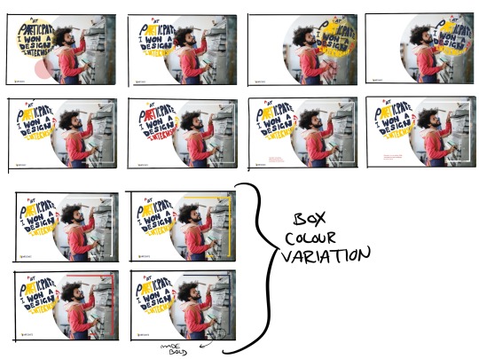


quote poster developments:
after the rough poster mock ups, I knew I liked this photo - as it showed someone involved in making something - what I want to put across to my audience - that you can come and create, use the equipment at ‘participate’ like this man is. Though, I flipped the image - as I thought the writing/quote would work better on the Left - as you read from left to right!
rough plan of composition - on iPad. Very useful - tried opacity circles behind the writing - to help stand out more, reflect the logo, but this looked too busy and didn't add anything to the design. also looked at colour variations - but the red was too harsh - he is wearing red, so it would’ve been too much to have bright red writing as well. decided I really liked the quote being in the shape of the circle in the logo - cohesive with logo and with leaflet I made!
putting things in indesign - made better/more refined quote bubble type - hand drawn by me! -to reflect hand rendered theme of, anyone can create in this gallery - also similar/fits with my other lino branding work from earlier - This developed type (from first image mock ups) was neater and put more emphasis, size wise, on the words I wanted to accentuate more - name of gallery and ‘internship’.
liked red box best from first image - so used it here, also added a small circle - similar to logo, so I could add a description of gallery in! overall, didn't like the red text box but liked the line - references box layout of logo! But the circle text box, although made white writing more readable, made poster too busy and chaotic - fighting for where to look.
so, tried changing opacity of red text box - did nothing, looked worse - out of place.
tried an oval shape - lessen extent of red circle space but that didn't work either - although another shape reference to my logo, it was still just too much going on.
got rid of the shape behind the white writing - much cleaner look - moved to the left, so was to the end - mirroring the logo on left. Look so much better, cleaner - but I did have to edit the image - ‘burn’ tool in photoshop, behind where the white writing lies - to make It more readable! - I tried the other colours there form my logo colour scheme, but they had worse readability, so white for the text it was! also aded in social media tags - makes poster more believable and will allow for audience members to look up gallery if they are interested after looking at my poster! but, wasn't sure that placing it under the logo did anything good - too congested in left bottom corner.
final poster - overall, pleased I finally got somewhere with this! now have branding that can be put out all over the city, along side my gallery brand identity stuff I made earlier! this will, hopefully, encourage people to participate in my scheme - by seeing what others have gotten out from it! minimal, but fun and colourful design - hopefully enticing people in! hand rendered type - fits with idea of anyone can participate - you don’t have to have fancy skills! and also reflects the and rendered, lino designs of my brand identity stuff previously made! I don’t think it matters that this is digital hand rendered (compared to my lino stuff, analogue hand made) - this is branding for the wider world, in the city - so digital is clearer, easier - commercial! where as, my logo and leaflet can work as lino style as its for the branding of the actual gallery - more niche and fun, down with the scheme idea! (hand rendered type inspired by Women's Fund and blocked out white inspired by Nalanda )
now: I think I want to make another poster, similar reference style to this - but portrait - so I can have this as a billboard, and a portrait poster. getting my scheme out there in two different ways - bigger billboards, maybe for busy roads, and more everyday/walking seen posters!
sourced imagery: Photo by Andrea Piacquadio from Pexels
0 notes
Text
Fifth shoot/review and influence
Below are two contact sheets which show a continued theme of capturing marks, rustiness and rip/tears around my house. Focusing on the conditions of these subjects.
I’m still planning on producing more shoots, but I am starting to gather a set of images that I am thinking about submitting for this module. There are currently 6 images at the moment that I particularly like from these past two shoots. For this shoot I re-shot two subjects that I photographed on my previous shoot. The re-shot images from the contact sheets above, are, 7233, 7383 and 7392. The reasons as to why I chose to re-shoot these particular subjects were as follows, the radiator image (7233) because the images from the previous shoot had a distracting shadow caused by my flash. My flash was positioned too close to the radiator. I corrected this mistake by adjusting my flash to a vertical position so it was further away from the radiator, but still lighting the subject with the light from the flash bouncing of the door but not creating any shadows.
For the rip/tear on the ceiling images, (7383 and 7392) I re-shot this subject because I wanted to get even closer to the rip/tear as I felt I was shooting from too far away during my previous shoot. The images from the previous shoot were slightly dark as well which is another factor as to why I chose to re-shoot this subject. Both the radiator and the rip/tear in the ceiling are key to this project as well, in terms of revealing the neglected, worn away nature of both of them which is the main reason why I had an urge to better and improve on my previous images. Even though re-shooting the same subjects doesn't necessarily mean your going to improve on your previous images, but in this case, I believe I have improved on the previous images.
As I was finding new details to shoot, once I found these new details I evaluated the surroundings. In terms of figuring out how I can produce an interesting image by including these specific details and still revealing my message to the viewer at the same time. What I mean by this is, the composition, for example, image 7552 shows a slight tear. I originally looked at this tear and thought that there was not a lot I could do with it, in terms of potential, but I evaluated some options in terms of different positions I could shoot from, and what surrounding details I could include to make the image even more interesting. Which is when I decided to include parts of the above wardrobe doors.
As the tear was near enough centred between both doors, I thought it would perfect to position myself and my camera inline with the small space between both doors and shoot from there. Making sure the tear was centred to make it instantly the focal point in the image and include the symmetry of both wardrobe doors above. This is why I chose to zoom out slightly, when I zoomed close to the tear the images looked very dull and basic, but when I included additional elements the image came to life in my opinion. Creating more depth in the image but still maintaining the message.
I used the same camera settings as my previous shoot, using apertures between f/5.0 - f/6.3, shutter speed of 1/200 and iso 100. I used manual mode, with auto focus but for most images I chose a specific AF point to make sure the main subject was in focus. My main priority. I kept these same settings as last time because they seemed to work perfectly during my previous shoot. I also used a flash for this entire shoot, using a variety of positions, I was more experimental with flash during this shoot than my previous shoot. My most successful position for the flash was positioning it vertically. So whatever position I was taking an image, the light from the flash was still bouncing of a wall or a door to light the subject without creating shadows.
The shutter speeds with the flash that I was using were between 1/8 and 1/128, but my most successful shutter speeds were when I used 1/16 and 1/32, they were just right, not too bright and not too dark, depending on how much natural light was coming from the windows in each room. I kept my camera’s iso to 100 as the natural light helped lighten the subject just right, as lowering the shutter speed on my flash caused the images to be brighter than I intended which made the natural light very helpful during this shoot.
A criticism of myself during this shoot is that I struggled with focusing. I kept switching between auto focus and manual focus but couldn’t seem to keep the entire image in focus. I had my position, the camera and flash position and settings in perfect order, but what let me down and became time consuming was my focusing. My main priority was to keep the main subject in focus which is why I chose to use specific AF points which did work to my advantage afterwards. But focusing was a frustrating problem during this shoot. Maybe I was trying to zoom in too close to certain subjects and my camera struggled with it, if I can’t get the entire image in focus I tend to just use a specific AF point instead which sometimes improves things, hopefully I can improve on this issue in my next shoot.
The reasons as to why these subjects around my house interest me is because they reveal and are areas which have to a certain extent, been neglected and are currently being neglected. The tears, marks and rustiness, they all have their own story in terms of how their condition has deteriorated over a period of time. These subjects interest me because they make me think how long have they been neglected for? Representing a neglected past, and in this case, present neglect. Before this shoot, I already knew what the conditions of some of these subjects were, but there were some where I hadn’t noticed up until this shoot and my previous shoot. Maybe it’s because I try to avoid spotting areas of neglect, maybe I only want to gaze at pristine subjects, or, because I haven’t looked as in-depth like this before when looking for subjects like these.
These are also subjects which we are probably all guilty, me included, of not acknowledging or try not to focus on because of their conditions. But they are interesting because they present questions. Why are they neglected? How long have they been neglected for? Why do we leave these subjects to deteriorate? When or will they be attended to for improvements? I’m also fascinated by these subjects because they present and reveal a sense of sadness. Their subjects which have been forgotten about and have been left to deteriorate, in terms of their condition. Their distinct marks and faded colours represent their past and are pivotal to their story of neglect which draws me to them, these marks all have a meaning.
Below are my most successful (edited) images from this shoot. For this shoot, composition was key. In terms of including, symmetry, centering the main subject, space and placement of the subjects. As the focus of these images are, tears, rustiness and neglect, they can seem quite basic, which is why I’ve focused more on composition, to create more appealing images with additional interest.
Influence
I have been a huge admirer of photographer Natalie Christensen’s work, so before this shoot I had a look at some of her projects just to give me more ideas in terms of focusing on composition, fine tuning it. How I could be more creative with positioning certain subjects and still produce interesting images with a neglected subject as the focal point. Her clever uses of empty space was the driving factor for my shoot, in terms of her stripping away the surroundings and focusing on one or two subjects, including colour, shapes and patterns and still making the image intriguing to the viewer. Her empty uses of space and shapes were the main factors which I tried to implement in my images. In terms of me thinking more carefully, position wise, of the main subject and its surroundings, or lack of, and trying not to include unnecessary things in the images which don’t add anything to the story that I am trying to reveal.
Below is an image from one of her projects called New Mexico Deconstructed. The idea behind this image and the rest of the images in this project came from the fact that, “These photographs express my desire to know something deeper about my environment through the process of decontextualizing the architectural landscape of the American southwest. Through the use of color, light and shadow I am exploring the essential geometry of New Mexico.” In a sense, Christensen is sort of celebrating the unique looking architecture in Santa Fe to an extent, where this project was produced in New Mexico, avoiding the typical architectural shots that we see everyday. Christensen's images are intriguing because they include areas and empty spaces that are rarely photographed, a change that is refreshing to see, a new aspect of architectural photography.
The emptiness in Christensen’s image makes me the viewer, think and focus more, in terms of what the image contains, looking at the shapes, patterns, colours and composition, the placement of each subject. “Bright colors and straight lines are actually rare in Santa Fe, as the strict zoning in the city requires that all buildings be no more than 3 stories and they are mostly some version of a brown adobe mud color. The traditional architectural style of Santa Fe has been photographed countless times. I started to explore parts of Santa Fe that would offer something different. I found that office buildings and apartment complexes on the edge of the city offered some interesting lines and color, especially in the mid-morning and early afternoon.”
This is exactly what I admire, these images can seem dull and boring by some people, but Christensen has decided to move away from the typical shots and discovered new and fascinating ways to shoot architectural details by using very little in front of her.

(Natalie Christensen, New Mexico Deconstructed)
Taking images of negative spaces is one of the hardest things to do as a photographer, but this challenges you to focus more on your surroundings, what you have in front of you, questioning yourself, how can I make an image out of this negative space and make it interesting? These are the reasons as to why I’m drawn to images like Christensen's. It makes you a better photographer, using little at your disposal, but being as creative as possible with what you have to work with. “I am very drawn to negative space. I think I have a deep attraction for geometry as well, and so this combined with negative space and a tight composition conveys a meditative experience. The images are simple, but I hope that they also invite the viewer to contemplate something deeper.”
Christensen’s images don’t necessarily get me contemplating about them or evoke something deeper, the only thing that springs to mind for me, is that the images represent and convey the sense of emptiness. But I do acknowledge and understand what drew her to these spaces. For example, the shapes and the different coloured walls of parts of buildings to work with to create visually appealing and different images that we are rarely accustomed to in an architectural sense.
Christensen expands on why she is attracted to negative spaces. “I am attracted to unattractive environments for several reasons. First, I think it is more challenging to shoot in a place that is unattractive on the surface. I am much more interested in a banal scene than a beautiful landscape. I have spent much of my professional life exploring the idea of the shadow side of the personality. The dark side that we ignore, deny, avoid. When I go behind a shopping center or a blighted out abandoned commercial space it feels very similar to me. What am I going to find there? What will be revealed? In those hidden places can be the gold.”
I completely agree with Christensen’s statement and especially this quote, that “it is more challenging to shoot in a place that is unattractive.” This is definitely true, this is the main reason why this shoot and my previous shoot have excited me, I’m thinking more about composition, looking in-depth regarding my surroundings. I feel like I express my photographic creativeness when a challenge like this occurs. I become a better photographer, in terms of the range of techniques that I use and think of, thinking outside the box.
I also love creating images that split opinion, in terms of including negative spaces, placing certain subjects that are different to what a lot of photographers wouldn’t necessarily do or agree with. I like to be different and separate myself and my photographic work from other photographers, so I’m creating new and fresh images that aren’t similar or copying other photographers work that I have previously looked at. What interest’s me is the opportunity to create and produce my own take on a scene, my own signature style.
Another thing she mentions is, when talking about unfamiliar spaces, going “behind a shopping center or a blighted out abandoned commercial space.” This is true, because a lot of photographers don’t explore other areas of a particular building, in this case a shopping center. This is why we see near enough the same images of a particular building, or landmark building, seeing a different area of that building would be refreshing, but we don’t see it enough in my opinion. The same shots of the same thing over and over again.
I myself have been guilty of this, particularly in this current project when focusing on closed down businesses in earlier shoots. I have only explored behind one business. I’ve taken typical shots of the shopfronts, but haven’t explored around the shops, to give a new insight for the viewer. In terms of exploring what shops look like from the back or side, just a refreshing take, something different, something that the public don’t see or explore for themselves. For example, maybe a particular shop is completely different from the back, the design or different features from the front, that’s interesting to see because we rarely see instances like this, and that is what Christensen's point is, exploring areas of buildings that to a lot of people are unattractive. But to Christensen, are exciting possibilities and “in those hidden places can be the gold,” which is true if you come from a photographic background.
Going back to Christensen’s image, the image is perfectly straight which means she has taken her time to position the image, you can tell by looking at the two lines on the far left hand side of the image. The image contains minor symmetry as well, the top wall and the the floor are near enough exactly the same length. There is not a lot to look at in this image but there are quite a lot of smart techniques that Christensen has used and included, in terms of symmetry, shapes, patterns, colour, position of her subject and the position of herself and her camera. Also using sunlight to brighten the colours of each section and to allow the introduction of shadows from the streetlights.
There are a few minor changes that I would personally make to Christensen’s image. First would be to centre both street lights as much as possible, I think that they are wasted by being over to the right. If Christensen positioned herself over to the right by a few steps, the street lights would become more authoritative, instantly be seen and locked onto by the viewers. Or maybe even cropping out one of the street lights, the street light on the left maybe, although the two of them make for a balanced and even image and I personally don’t agree with manipulating/tampering with an image. I prefer an image to be as genuine as possible.
They are the main focal points of this image and centering them would make more sense, they look a bit lost. But then again, if Christensen moved over to the right, the lines on the left hand side wouldn’t be included, and as I have previously mentioned, those lines confirm to the viewer that this image is perfectly straight, and they do add extra detail to the image, although one could argue that the lines are unnecessary to include.
I also think that the light in the image is too bright, it’s slightly distracting. Adjusting her camera settings, depending on her iso setting or shutter speed setting, making the light darker in my opinion would allow for a image that would be more easy to gaze at. Lastly is the black ground part, I’ve previously mentioned that the ground part and the top brown part of the wall act as symmetry, but now, part of me considers including the ground to be unnecessary. Because the colour black isn’t as intriguing as the blue or the brown, it’s a tricky one because there are arguments for and against including or removing the ground in this image. Overall, I would say keeping the ground is the right decision, only just, because it allows for interesting symmetry with the brown top part of the building.
0 notes