#like all the colours are wonky
Explore tagged Tumblr posts
Text
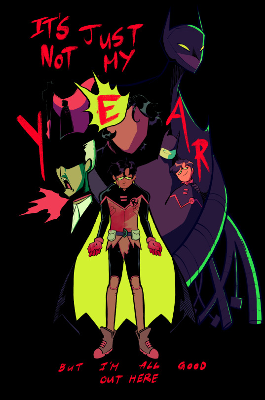
♫ I do what I want/Crying in the bleachers and I said it was fun/I don't need anything from anyone ♫
(ID in Alt) you guys ever think about your own posts and get upset?? Anyway Damian Wayne I love you I'm so sorry your life is like that
#dc comics#dc#damian wayne#dc robin#batman and robin#alfred pennyworth#dick grayson#bruce wayne#lyrics are ofc from American Teenager by ethel cain#the lyrics are a bit too specific to specifically be a damian song and the verses talk about like. christian church and substance abuse#but thag chorus???? ohhhh baby#its also stephcore btw. to me at least#ANYWAY this took. forever and i did while feeling sick/off in the run up to my period so frankly it's a miracle it got finished at all#but yknow for now im fairly happy w this one. played around w the colours and challenged myself to really put my all into the linework#there's some details here n there that r wrong (failsafes design is. all kinds of wonky) but like. who give a shit#anyway my brain and hands are on vacation for the next few days <3#btw the blood on damians hands is a reference to the upcoming B&R cover (for 11 or 12 i think?) where damians-#-beating the living daylights out of bane. B&R has mostly been chill n slow so far but these issues...ohhh i am SEATED#uhh anyway yeah <3#OH WAIT#mine#< haha. art tag i always forget
1K notes
·
View notes
Text
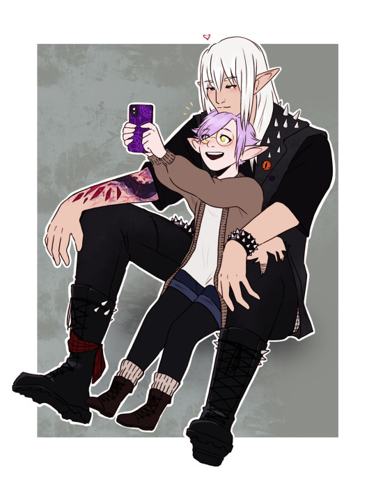
Say 🧀
pose ref
#ffxiv#Ninira Nira#Estinien Varlineau#Wolstinien#estinien x wol#Bookshop AU#Nini feels wonky still... I tried to get her more her size but I had to settle for a middle ground#Estinien was gonna be way too big and not reach her head at all lmao#I saw a diff pose by this person going around and was gonna do it but saw the selfie one in their media tab#and was like ACTUALLY BETTER#Perfect Bookshop au pose#one day I'll design Estinien's tattoo properly I saw for the 1000th time#and give Nini a new outfit... but I like the cardigan shorts leggings... cute...#me making estinien punk and colouring all his black clothes like who decided this (me)#I'm lov them#art: mine
99 notes
·
View notes
Text

Bojan collage! including rhinestones, stitching and gold star stickers.
mixed media collages are cool
#bojan cvjetićanin#joker out fanart#joker out#also my printer began to die so the colours are wonky lol#weirdly hard to find images of the guys that would work for this idea in my head#anyway hopefully you guys like it#yeah i printed all this out and cut it out by hand cause I'm stupid lol#also some things from like magazines and stuff too
59 notes
·
View notes
Text
Some baby dani for the dash <3 ref
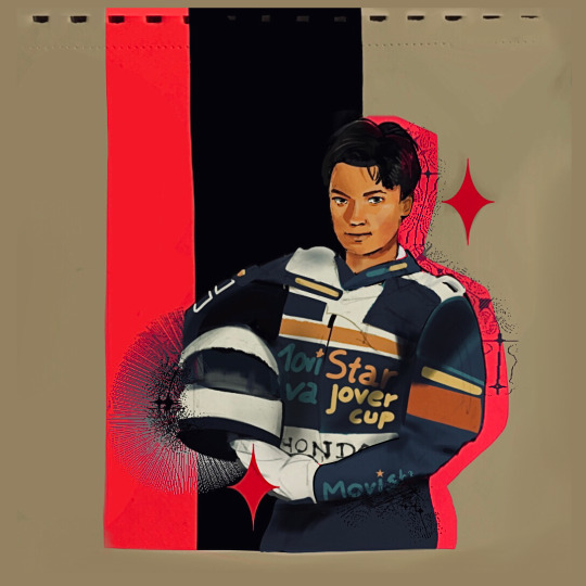
#my sister said that that’s girl dani actually. so that’s on the list to draw now#anyways this is part of a larger page who knows if I’ll ever finish the whole thing 😭#click for better quality etc etc#motogp#dani pedrosa#my art#but yeah I wanted to try out not focusing on realism in terms of the rendering and all lol#colours are a bit wonky but whatever all for fun 😌#we don’t need to look like the reference I made him look older accidentally lmao
39 notes
·
View notes
Text


something something guys who think of the backs of the girls they love


and girls who pinch the cheeks of the guys they love
#funny coincidences and all that~~~~~~~~~~#especially since both of the guys are associated with the colour green i m e a n—#i just really love how hw isnt afraid to have the guys fawn over and dote on their gfs#unlike many other love stories yk?#seeing the guys shower their lovers with affection is the best part!!!!!!#who needs emotionally repressed male leads when you can have affectionate hw male leads#even ‘cool’ and ‘mature’-ish guys like yu and kodai (to a degree) are super loving towards their respective gfs#and now!!!! we get to see nagisa: a cool-ish and mature (compared to like lxl) adore hiyori!!!!!#…oh. wait. i think i get why there kinda feels like there’s an narrative disconnect between nghy#hiyo is more of an idol series character (despite not being an idol) yet her romance with nagisa seems to be more on the love series side#so the way the two series are intertwining *now* after all these years of being somewhat of separate entities#(despite overlapping characters like the sanbaka + arisa and hina + sena) may feel a little wonky#juri is different bc she has p much nothing to do with the idols. she’s just in it for the vibes#but for someone like hiyori who’s super involved in the idol side to suddenly be introduced to the ‘love’ side of things…#especially since her retconned romance was with another idol… and all that old pre-nagisa novel stuff with yujiro…#idk i think the nghy romance could’ve been handled better had it not been for the [redacted] anime#…wait i think i realised something else. it could be a coincidence but!!!!! wait a sec#the dude from gamushara
14 notes
·
View notes
Text


(I am still in love with you, can't admit it yet)
#throws this out into the wild n then immediately goes to bed#top 20 edizzy songs of all time (there are so many edizzy songs out there)#this came up on my shuffle and i just. had to make a stupid little edit. it makes me think about them every single time#see also: 'Im not ready to see you this happy'#(the song is 'good arms vs bad arms' by frightened rabbit if you dont wanna click the link!)#nyxtalks#ofmd#our flag means death#izzy hands#israel hands#stede bonnet#edward teach#(in spirit. he may not be pictured in this post but his presence is undeniable)#edizzy#blackhands#edit#i tried messing around w the colours n lighting etc for this one! i am not sure i really succeeded but it is important to mess around#and see what things do#hopefully its not awful. also on other monitors ghbfjkd#colours lose all meaning pretty quick i find. like yeah this looks great! (hides filter) oh no. its all wonky#skin colour is so hard to keep right i found. n these images are Not lighted for it either#but it was fun! feel free 2 think its bad though thats fair#gotta start somewhere!
18 notes
·
View notes
Text
Some Stephanies from my sketchbook


Second one is an outfit from this drawing meme, if you feel like sending me a character for any others, my inbox is usually open.
[ID: A drawing of Stephanie Brown in her Spoiler costume. She has her arms crossed and is leaning against the wall behind her casually.
A second drawing of Stephanie Brown in all purple casual clothes. She is wearing a headband, tube top, mesh undershirt, jeans, & boots and has a few piercings in her ear. Her hands are in her pockets as she talks happily to someone to her left.]
#drew the second one w/ out a reference so i feel like it turned out a little wonky but i just wanted to do some outfit drawing not all that#i dont normally bother posting non-digital art cause it doesn't come across as well but when its coloured i want to share sdjkd#stephanie brown#spoiler#dc comics#dc fanart#fan art#my art#batfam#batfamily
20 notes
·
View notes
Note
w ww hat about seth.., that or maybe furroughs even
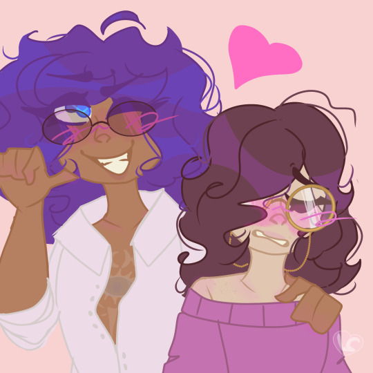
SORRY FOR THE DELAYYYYY :wails:
I’m not really familiar with their dynamic so I hope this suits your liking!! :3
#I drew them in casual clothes bcuz I’m not drawing all that /lh#Also the context behind this is Yakou is like boasting abt their relationship and Seth is embarrassed#Idk it’s just what came out#The colours are wonky but fuck it we ball#rain code#master detective archives: rain code#raincode#mda:rc#mdarc#seth burroughs#yakou furio#furroughs#raincode fanart#my art#artists on tumblr#digital art#i have no idea how to draw two characters interacting :(
22 notes
·
View notes
Text
my parents bought me some new scrumptious pens so ofc i had to draw some fish

reference image below the cut

#i was like 'ok lets rawdog this no crosshatching' and it HURT#i love crosshatching so fucking mych#anywho#they look super wonky and ugly and odd but idrc they still look like fish and thats all that matters#and the pens r super nice#like#if u press super light it is very light#so good#tbh best pens ive used so good#i did some trout drawings with the pens before but i coloured them in so i didmt think id add them to the post#anyways#sardines#fish#fishblr#fishposting#fish art#fish drawing#my artwork#i hate posting my art but its ok cuz fish
2 notes
·
View notes
Text
we're slowly decorating our room and the other day we got a bunch of paint swatches and cut them up and stuck them to the closet door to make a patchwork of colour, and then we'd also ordered prints of a bunch of our photos and stuck those on the walls today, and I found an old calender and cut out an image from that and found some postcards with illustrations of birds on them and put those on the walls too and I really like the vibe of it. it feels kinda like putting things we enjoy in a scrapbook
#personal#thoughts#🍬 post#happy posting#the interesting thing about this is that the decorating was prompted by us not wanting to feel like we're losing our mind in winter#because the lack of colour really gets to us so we were like ''okay we need to put more stuff on the walls''#and it's kind of forced us to figure out what kind of decor we actually like and what kind of vibe we want#and it turns out we really like just kind of treating the walls like a scrapbook and sticky taping a bunch of fun stuff on there#there's posters and stickers and postcards and photos and they're all kinda wonky and it's fun
2 notes
·
View notes
Text
For some reason, this round of meds (same dose and everything as last time) is making me have very violent Realisations and Remembering Things moments. And by that I mean the Thing I Forgot and/or the Realisations show up with a bat and see how hard they can make my brain hit the wall. So anyway.
YOU GUYS REMEMBER SPIKE THE WETFLOOR BOT??? YOU GUYS REMEMBER HER??? THE FIRST FAZBEAR ANIMATRONIC TO BE BORN FROM LOVE INSTEAD OF PAIN??? YOU REMEMBER HER???
CAUSE I JUST DID
#SPPIIIIKKKEEEEEE I MISS YOOOUUUU#I love spike. spike the wet floor bot is my favourite. I miss her I should bring her back somehow#the first animatronic to gain sentience and awareness out of LOVE and CARE#I miss her we need to bring her back. I never made a visual design but I definitely posted some descriptions of her pretty sure#a wet floor bot... a little wonky and a little off colour. holes in it's damaged and dented casing patched up with scrap#never the same colour. always different#stickers and magnets and a lil bit of spray paint. part of an ear missing and crooked#has one of roxy's spiked bracelets around her neck with a keyring dangling from it like a tag...#she picked her own name and pronouns... doesn't really understand what they are and what they mean but she wants them#in one AU she was Roxy's little distraction. something to work on and repair while the others search the rubble of the plex for-#their friends. In another Roxy repaired her for fun unknowingly after Vanny had used her as a test subject for the virus#in another one post-ruin roxy and cassie were searching the plex for an easy animatronic for roxy to repair so cassie's dad could-#test what she'd learned about repairing them from him and found a salvageable wet floor bot#that they then wrapped in tarp and put in a shopping trolley to take her straight home and get to work on her much to the-#confusion of literally everyone as they barrel down the halls of flats with an unidentified tarp blob in a stolen shopping trolley#<- that one's Meteors AU btw. Roxy got turned into a Real Boy by the Meteor and is now living with Cassie as her adopted sister#this is just the kind of shit these two get up to all the time and no one knows who's meant to be the braincell between them because well#they keep taking turns on who the older sibling is. they keep changing it. the eldest sibling is based entirely on the situation lmao#who's bright idea was it to steal a wet floor bot? WHO KNOWS!! Cassie said 'pick an animatronic!' so they did that's all there is to it!#cassie's dad just. head in hands. as he realises. the fucking wet floor sign on wheels is sentient now.#why. why and how. terrified of the wrath of Fazbear if they find out. while she's just. trundling about.#wheels on carpet floor style. struggling but getting there. happy beeps as she pushes a ball around on the floor. living her best life.#sfdsfdsfs I fucking LOVE Spike okay I miss her I need to bring her back somehow#I could give her to mangle or sprocket in robot hell but I'm not doing much with that right now#sdhfdfsfs Chica's recipe zine starring Spike!! and every image of her is just confusion#'see? even Spike likes bananas!' Chica says as she puts one on the floor so Spike can very happily run it over.#dfsdfsds love Spike. Spike enrichment is now running random foods over because she can. and also the wheels off a toy monster truck#so she can be an ALL TERRAIN wet floor bot. make them gecko wheels like DJ's hands and she's got everyone beat lmao#she can be DJ's Uppies Buddy!!#lmao Spike I'm so sorry I've left you in the dark for so long I'm bringing you back. beloved guy of all time
4 notes
·
View notes
Text
what do we think..

Edit: changed the one line that was really bugging me
#the lines are a bit wonky oof... and i merged all of the layers like an idiot#bagel's art#bagel's ocs#sort of??#i'm happy with this though#and yes the notes are character colours (orange is unit colour)
4 notes
·
View notes
Text
all right but i can't be the only one who decides what horse i'm gonna buy by looking at their butts right
#like that perspective IS WHAT I MAKE MY DECISIONS OFF OF#all the horses are pretty I'm gonna enjoy taking photos of them#but will i enjoy staring at their butts for hours at a time while racing/running around the map?#*both in terms of colouring and animations#if the back legs look wonky from behind in the full gallop I am not getting that horse#if the pattern looks weird from behind I am not getting that horse#tail bad? not getting that horse#z talks#sso#ssoblr
20 notes
·
View notes
Text
*randomly watch some youtube video about drawing*
*get inspiration to draw*
*open drawing app*
*remembers I can’t draw*
*:/*
#okay look#I can draw one thing#girls with neutral expressions from the chest up facing either forward or 2/3 or 3/4#(not sideways though :/)#I will admit that I’ve gotten pretty damn good at that even if the proportions still tend to be wonky#but drawing literally anything else?#usually I just shamelessly trace over a reference picture. not even try to copy it by eye bc I’m awful at replication#straight up trace over and mess around with the details in some places#AND BEFORE ANYONE COMES AT ME I MEAN POSE WISE I DON’T TRACE ANYTHING ELSE#I’m also not too bad at colouring but my shading needs a ton of work#so.. yeah. by all standards I can’t really draw#I also can’t draw facial expressions or poses or backgrounds or objects or interactions#or anything really#is it any wonder 90% of my procreate gallery is stuff I never finished..#I know this is all my fault because I never practice what I want to get good at#I never do studies or draw smth over and over again to get better or anything#if I can’t draw something I delete the canvas and give up. end of story#ughhhhhhh. why am I like this#why am I physically incapable of putting in any effort whatsoever#and I dare call myself an artist#I don’t deserve that title
0 notes
Text
Kind of terryfying how you need 7+ pencil shades for one humble tiddy
#picking colours#there is an app that tells you which pencils you have to mix to get the exact shade lifted from uploaded picture#but it's good as a suggestion at best because 1) you usually don't own all shades produced ever#2) trying to follow program's readings 1:1 gives rather wonky dull effect actually. a bit like tracing photos does.
1 note
·
View note
Text
So y'all have seen the Williams F1 Logo before, yeah?
well get ready, becaues I am about to ruin your day!
where does one even begin with this. i am sorry in advance. -just a poor learning graphic design student, who simply tried to enjoy their saturday evening
The Logo
For anyone that doesn't know, here's the Williams F1 Logo. Entirely unedited, copied straight from Wikipedia:

Now like many fans, I actually quite enjoy this logo. I like the modern, sharp edges of it and it's simple yet intriguiging design. It's memorable, while also easily recognizable as a W. I also really enjoy the colour choice (this, however, is entirely a personal preference.)
(entire rant under the cut. please keep reading this took years off my life span.)
How did we even get here?
Let's start at the beginning. How did we even get here? Well I, a poor poor learning graphic designer, was watching this lovely video from Mr. V's Garage about bad F1 Logo's over the past 35 or so seasons. Very interesting, I can only recommend it (but you don't need to watch the video to understand this post)!
Now, to cleanse the palette at the end of the video, Mr. V included a top 10 GOOD logos from this time span, it was very kind of him.
On P4 of this "Good List," Mr. V placed the current Williams F1 Logo, as pictured above. At first I vaguely agreed with this, believing that he probably simply hadn't noticed one of the things that's been bothering me about that Logo since the first time I saw it up close.
The first sign of Trouble
So, what is this mystery issue, you might ask?
It's simple really. You don't necessarily notice it at a first glance, but something about that logo seems off. Taking a second longer, you may notice it yourself.
No, I mean it, take a minute and go look at the logo. It looks wonky as hell, doesn't it?
Well I can tell you the first thing that I personally noticed. The arms of the W aren't in line with the bottom half, see:

(Graphic by @girlrussell who was so kind to let me use it, as it is way prettier than the one I made)
It's a crooked W. There is no good explanation for this. The rest of the font is perfectly fine, geometrical shapes.

Anyway, the good person that I am I went to point this out to my partner ( @leftneb ) who proceeded to inform me that he, infact, was not aware about this and was, quote, "never going to unsee that."
Now, the good FRIEND that I am, I, of course, proceeded to rush into our broader F1 friendgroup to make them suffer for eternity.
What's the logical next step to take? Of course, fix the logo in Adobe Photoshop, you know, as a joke.
(Disclaimer at this point, I am not necessarily the biggest fan of Williams Management Team. I enjoy ALL their drivers this season. I do NOT enjoy James Vowels. Be warned.)(Also I am aware that he probably did not have an influence on the logo)
Trying to fix it. Oh god, I was so innocent back then
Trying to fix the logo in Photoshop is the worst mistake I could've made. THE worst path to take. I could've just giggled about making my friends suffer (which I succeeded in, by the way) and moved on. Instead I ruined a perfectly good Saturday evening, and for what? I don't know anymore.
Anyway, how was I gonna go about fixing the logo in the simplest way possible? Simplest way I could come up with: slap the thing in Photoshop and put two, mirrored boxes at each side to make the sides line up. Small issue, how do I make the thing actually even? Fix: line them up at the intersecting point with the bottom tips of the W.
Here's the result:

Hey, anyone care to explain to me why in THE LORDS NAME the arms are different sized? I mean, surely they weren't before. Surely, certainly, I must've messed up.
I double, I tripple checked. I made sure everything was lined up and made sense. But no.
It just couldn't be. Something was uneven in this logo, something even deeper. Something I could not have predicted when first taking a closer look. It was at this point I realized I had messed up. What rabbit hole had I stumbled across? Certainly, it couldn't get much worse.
And that's when I noticed.

(pictured above; my genuine reaction)
There's MORE? (oh god, the top isn't lined up)

I couldn't believe my eyes. This is the PINNACLE of the sport, and THIS was the logo of one of the competing teams? I mean, yeah, we have a Visa Cash App RB or a Kick Sauber or even a MoneyGram Haas which are all terrible logos, but at least they're CLEAN. (this has not been checked. If anyone wishes to ruin a nice Saturday evening, feel free to check them and tell me how wrong I was in the previous statement!)
But you can see that there is no end in sight for this post. I'm sure you're as scared as I was at this point. By now we were sitting in VC, discussing the horribleness of this logo. I had long informed my irl's about this, who take said design classes with me. And it was one of them who pointed out the next thing that had been bothering me, but I had not been able to put a finger on up to this point.
thE DISTANCE, HOW DID THEY FUCK IT?

I'm afraid I have to confirm your fears.
Yes, those lines are the same length. According to Photoshop, they're on the same level as well, so no flunking with angles.
The gaps of the arms to the main W are not the same. They're differently sized gaps.
It was clear to us, this logo is inherintely flawed. They're subtle issues, but once you pay attention you start to notice things. It all looks slightly wonky and off centre. And eventually, you get paranoid, and start comparing other angles and sizes. And you will keep finding things. This has ruined my life.
HOOOOOW

Honestly, I don't even know what to say. Yes, yes sadly those lines, too, are the same length. Just copied over from one side to the other and layed over on the same height. I admit, they're not layed over perfectly. I was honestly holding back tears at this point. But the point still stands, you can clearly see a difference in width.
Honestly, the only way I can explain it is that at some point there was a mess up of distance or proportions and whoever was designing the logo couldn't pin it down and tried to restore the visual balance by making manual adjustments. And in all honesty? They kinda did a good job, if that's what's happened. I mean, you notice the crookedness of the arms, and then maybe the difference in height, but the rest you probably will not notice if you don't spend too much time staring at it. (like some of us) And even those issues clearly aren't noticeable to the vast majority, considering I had to go point it out to a group chat for my friends at least to notice.
what the fuck is THAT?
Now, the thing about doing this investigative work of prooving a team you dislike is worse in more aspects than you previously thought, is that you do a lot of zooming in. And zooming in means you might notice bits that yours eyes simply overlooked before, because they were too small.

Here you can witness the top of the middle point, that, for whatever reason, really wants to touch the top border of the Logo. I'm relatively certain that's the highest few pixel in the entire graphic, considering earlier chapter "There's MORE?" I have no idea why it looks like that or why they thought it was necessary for it to not end in a clean point.

I just actually have no idea how to even describe what is going on on the top of the left arm. That left hand side, again, touches the side and is therefore the most-left-pixel in the graphic. I, once again, have no idea the purpose of this. However the RIGHT hand side also makes no sense, as it is the most prominent corner in the whole logo. There's pointed corners, and rounded OF corners, but nothing that is trying to form it's own colony in a distant land that hopefully isn't this god awful logo. I hope that blob gets away. I really do. You go king.
i'm loosing my mind
Anyway, the only reason I could come UP with those weird "reachy-outy-bits" was to establish the dimensions of the logo? But if that was the case, I don't understand why they managed to keep all the other potentially border touching corners clean?


Like, look. Those are clean, sharp corners with some clearance off the borders. I have no clue why they managed it here but not with the others.
guys. please.
Backtrackig a little bit, going back to the positioning of the arms.

Do I need to mention that those lines are both the same length and the same (mirrored) angle? I really hope I don't, because I don't think I could be making this shit up. Like, once you roughly know what you need to look for it just kinda becomes easy to find.
As said before, I genuinely do think that most of these issues happened in a chain-reaction. For example, the distances between the main part and the W wouldn't be as noticeable (and they do get noticeable once you start looking at it) if the angle wasn't fucked. And guess what, there's more fucked angles here! Which ALSO influence this specific area of the logo!
this is just embarrasing for you.

something something same line copied over and mirrored etc etc
It's not as visible but the angles defintely don't line up here as well. As mentioned before, these issues for the most part all influence each other. It doesn't really excuse the issues, in my opinion as a designer, because a big company like this shouldn't have these sort of issues in their logo.
So let's review;
to sum it up,

i cannot even BEGIN to explain to you how big of a fucking JOKE this FUCKING logo is. because, i thought to myself, to round the post out, hey, why not show ALL the issues i pointed out in one picture? that would round it out quite nicely, wouldn't it?
Yeah well, this logo sent STRAIGHT FROM HELL just could NOT let me rest. I had only done the lines visualizing the crooked arms in PAINT up until this point, i.e. I had only pulled both up individually. To make a nice "rounding out" picture I still had to add them into PHOTOSHOP. so i did. i pulled up the line. i mirrored the line.
THE ANGLE IS FUCKING DIFFERENT
none. and i mean NONE of my friends had noticed this before. i need you to understand that we looked at this thing with FIVE pair of eyes, and NONE of us noticed that until i thought to myself "Oh I still need to add these specific lines to have ALL the issues I pointed out in my SILLY TUMBLR POST in ONE image" and i get THAT FUCKING SURPRISE
I was PLANNING to round the post out with a statement on how obviously this isn't a serious post. Here, I even had it all written out already because I accidentally started writing it in the last paragraph:
Of course, this is nitpicking, and it's not that serious. I'm aware of that. AS MENTIONED most of these would not be noticeable if we hadn't gone specifically looking for them.
yeah, well, fuck that. i just spent two hours seething about this logo. i'm ending the post on this instead.

#i am ENRAGED#i managed to actually calm down about it#yk. just typing away#and then i just try to ROUND OUT THE POST#for fucks sake#anyway i know i'm posting this at an hourrendous hour#if you read all the way. reblog? maybe#pretty please#williams f1#williams formula 1#williams racing#formula 1#f1#also apologies for any spelling mistakes i do NOT have the nerve to go back and proofread this
923 notes
·
View notes