#lighting and skin colouring tutorials
Explore tagged Tumblr posts
Visit Tumblr Blog
Explore Tumblr blogs with no restrictions, modern design and the best experience.
Last Seen Tumblr Blogs


Fun Fact
If you dial 1-866-584-6757, you can leave an audio post for your followers.
Text
Sponsored
word count; 742 – gn!reader who likes makeup

“Sugarpill… what is this?” Kenma mumbled as he opened another PR package. This one was a bright pink box, on the smaller side. He scrunched his nose as he opened it, finding a little flyer and something square with a pixelated cat on the front. “Fun size… eyeshadow palette?” he read off the label and looked up as the chat suddenly went crazy.
kozuluvr: omg its makeup
kenkenspudding: will we finally get beauty guru kodzuken?
raginggamergirl: I dont even use makeup n I want this palette
Kenma hummed under his breath, shrugging his shoulders. “I don’t know why they would send me this,” he said honestly, twisting and turning the palette in his hands before opening it and showing the bright colours to the livestream, also doing his best to read off the names, which were all gaming related.
urfavkuroo: makeup tutorial for your next follower special?
He looked down at the palette, seemingly studying it. “The names are cool.”

When you came home from work, you kicked your shoes off and sighed loudly as you strolled into the kitchen. You knew Kenma was playing on livestream, so you picked up two juice boxes from the fridge and went to his office.
“Hey, baby,” you cooed, waving at the camera as you stepped up beside Kenma and pressed a kiss to his cheek. You two announced your relationship a long time ago, and after getting through the short period of intense hate comments, most of his fans seemed to get over it. They realised that you were kind of awesome.
“Hi, how was work?” Kenma asked, taking the juice box from you with a small thanks after pausing the game.
“Same old, same old.” You glanced at the screen and then back to him. “And yours?” you asked back with a teasing tone. “Looks tough.” Kenma scoffed and pinched your thigh, making you giggle. He ignored your question in favour of leaning across his desk to pick up the pink package.
“Look what I got in my sponsored mail,” was all he said, handing it to you and watching for your reaction with a small smile on his face. He really likes it when you get home.
People started posting suggested makeup looks with his name on Twitter and you even responded to a couple of them from your account, agreeing with what would suit him and what would not.
That’s why you two agreed that you would do the makeup on him, announcing on Kodzuken’s channels that if they got him to his next follower milestone, they would get a makeup special.
And what do you know, Kenma got a follower boost from all the posts his fans made about him and the palette.
You happily helped him set up to film in your living room, so you could sit cross-legged and face each other on the couch where the lighting was a bit nicer. In preparation, you cleaned your eyeshadow brushes and put Kenma’s hair in a nicer bun so the camera could properly catch whatever you did.
He raised a brow as you held up the eyeshadow palette to the camera and put your hand behind it, explaining the product. “What are you even doing?” he asked you, pointer finger drawing stars on your knee while he watched you affectionately.
“This is what us beauty gurus do,” you said in a jokingly posh voice, also telling him “You wouldn’t understand.”
“This is my channel, you know,” he teased, using his other hand to tap your cheek. If he focused more on you, he didn’t think too much about how much more exposed he was to his viewers in a video like this compared to what he was used to.
“Shh, I’m talking to my devoted followers,” you said before laughing, picking up the next colour on a new brush and putting a quick kiss on his lips before you continued with the makeup. “We’re all Kodzuken fans here.”
Kenma knew some people expected him to act annoyed, but he also knew there was no way to hide how much he loved your soft touches and the concentrated look on your face as your brushes ticked his skin to give him a (supposedly trendy) “rainbow blush”.
There were even more mentions of him online after the video was posted. Now the fans shared screenshots and video clips of him and his partner, discussing how adorable you were together. Couple goals.
masterlist
#haikyu#haikyuu#haikyu x reader#hq x reader#haikyuu x reader#fanfiction#hq#haikyuu x you#haikyuu fluff#haikyu fluff#kenma fluff#kozume kenma#kenma#kenma x reader#hq kenma#kodzuken
832 notes
·
View notes
Text
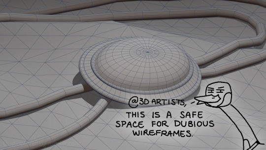
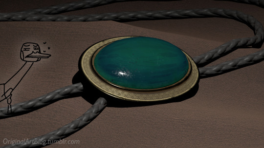
"Nawy what do you MEAN quick-ish 3D render it's got scratches and everything and I thought this was real for a minute!!"
Well, first, thank you very much that was the intention ❤, and second, you see, all speed is relative, and between finding my references, modeling, texturing and lighting, on top of having to learn how to make convincing gems, it still took me quite a few hours. I, however, cut corners everywhere for speed, and I wouldn't put this piece in a portfolio in its current state.
But! for the curious, I thought I could do a simple breakdown of how the witchcraft happens, without using too much specialized language to make it more accessible. In short,

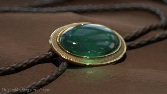
In this case, I’m talking about a 3D model that was textured (colours and stuff) and then lit (lights on!) to make a pretty final picture. The objective is not to make a tutorial, but to put in simple terms what a 3D artist does to make something go from this, to that:

(people curious and/or trying to see if this interests them welcome)
I'm skipping the 3D modeling part altogether, since it isn't where most of the magic happens here. Just know that to be able to add colour and stuff on a 3D object, you have to go through the process or "unwrapping" it, which is like doing those foldable cubes in reverse
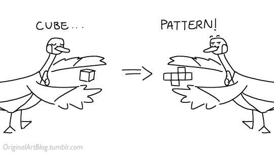
and then we can draw on it!!
Now, the good stuff:
Surfaces (metal, plastic, fabric, wood, skin, etc.) have different looks that make you able to differentiate them on sight. To make something look realistic, you have to try to replicate real life into the 3D world (duh.)
The software developers took care of the hard part (math and coding), so as artists we can play with the parameters available to make something pretty. What those parameters are depend on which "recipe" we're using. One of the most common "recipes" for realistic results is called PBR: Physically Based Rendering, named that way because it's trying to replicate real-life light physics. In this case, the 4 basic parameters are called albedo, roughness, metalness, and normal.
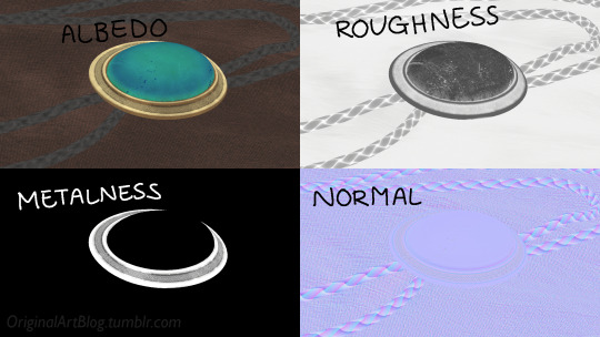
Albedo is the base colour of the surface (easy stuff). Roughness is to determine if a surface is rough or shiny. Metalness is to say if something is made out of metal or not. The normal is there to add all those tiny details you don't want to or can't sculpt on your 3D model (engravings, fabric bumps, etc.)
The roughness and metalness are black and white images because the information you're giving to the software is black = no and white = yes. It's easier to understand in the metalness image, where everything that is NOT a metal is black, and everything that IS a metal is white.
The normal is a bit more complex, but in short, it uses the colours green and red to know what is up/down or left/right, and will help the software fake relief on top of the model. You don't make it by hand; it's computer-generated from other stuff I'm not getting into.

With the technical stuff out of the way, we can actually use these. There are specialized softwares that will let you preview the results of each parameter in real time, so you can see what you're doing easily. This is what I have.
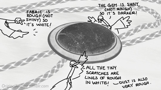
That software comes with some types of surfaces that are already set up, like the fabric in my piece, which was already 85% good for me straight out of the box. Then, it's up to me to use the tools available to decide how shiny a surface is, if there's dust or scratches and where, what colours things are, if there's metal parts, etc. That's where you can see a 3D artist's skills.
And finally, you bring it all together into a specialized software that can render 3D stuff and use those images on the corresponsing parameters, and then light the scene.
Because it all comes down to this: the light! For something realistic, light is vital to get right. You can pour your heart and soul into those tiny scratches, but if you don't light the scene correctly, well...
So we carefully light the scene to get some nice highlights to make the textures look good and highlight our subject (it's basically a photography studio inside a computer)
And then we add some camera effects...

and voilà! pretty picture!!
... and if you somehow did notice something different with the bolo tie from my last post, I did find out while taking all these screenshots that I messed up my initial renders in a way that made everything darker than it was supposed to be and that's why my gold looked so muddy...

I hope this was interesting and that you learned a thing or two!
#welcome to nawy's 3d school for complete beginners#nawy's 3d#technically not art but... you know...
364 notes
·
View notes
Text
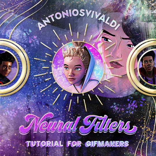


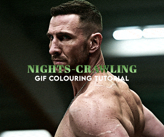
Neural Filters Tutorial for Gifmakers by @antoniosvivaldi
Hi everyone! In light of my blog’s 10th birthday, I’m delighted to reveal my highly anticipated gifmaking tutorial using Neural Filters - a very powerful collection of filters that really broadened my scope in gifmaking over the past 12 months.
Before I get into this tutorial, I want to thank @laurabenanti, @maines , @cobbbvanth, and @cal-kestis for their unconditional support over the course of my journey of investigating the Neural Filters & their valuable inputs on the rendering performance!
In this tutorial, I will outline what the Photoshop Neural Filters do and how I use them in my workflow - multiple examples will be provided for better clarity. Finally, I will talk about some known performance issues with the filters & some feasible workarounds.
Tutorial Structure:
Meet the Neural Filters: What they are and what they do
Why I use Neural Filters? How I use Neural Filters in my giffing workflow
Getting started: The giffing workflow in a nutshell and installing the Neural Filters
Applying Neural Filters onto your gif: Making use of the Neural Filters settings; with multiple examples
Testing your system: recommended if you’re using Neural Filters for the first time
Rendering performance: Common Neural Filters performance issues & workarounds
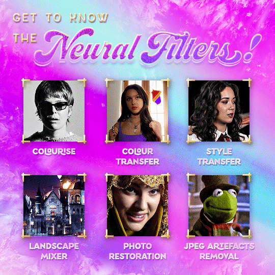
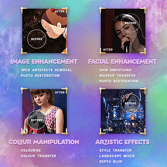
For quick reference, here are the examples that I will show in this tutorial:
Example 1: Image Enhancement | improving the image quality of gifs prepared from highly compressed video files
Example 2: Facial Enhancement | enhancing an individual's facial features
Example 3: Colour Manipulation | colourising B&W gifs for a colourful gifset
Example 4: Artistic effects | transforming landscapes & adding artistic effects onto your gifs
Example 5: Putting it all together | my usual giffing workflow using Neural Filters
What you need & need to know:
Software: Photoshop 2021 or later (recommended: 2023 or later)*
Hardware: 8GB of RAM; having a supported GPU is highly recommended*
Difficulty: Advanced (requires a lot of patience); knowledge in gifmaking and using video timeline assumed
Key concepts: Smart Layer / Smart Filters
Benchmarking your system: Neural Filters test files**
Supplementary materials: Tutorial Resources / Detailed findings on rendering gifs with Neural Filters + known issues***
*I primarily gif on an M2 Max MacBook Pro that's running Photoshop 2024, but I also have experiences gifmaking on few other Mac models from 2012 ~ 2023.
**Using Neural Filters can be resource intensive, so it’s helpful to run the test files yourself. I’ll outline some known performance issues with Neural Filters and workarounds later in the tutorial.
***This supplementary page contains additional Neural Filters benchmark tests and instructions, as well as more information on the rendering performance (for Apple Silicon-based devices) when subject to heavy Neural Filters gifmaking workflows
Tutorial under the cut. Like / Reblog this post if you find this tutorial helpful. Linking this post as an inspo link will also be greatly appreciated!
1. Meet the Neural Filters!
Neural Filters are powered by Adobe's machine learning engine known as Adobe Sensei. It is a non-destructive method to help streamline workflows that would've been difficult and/or tedious to do manually.
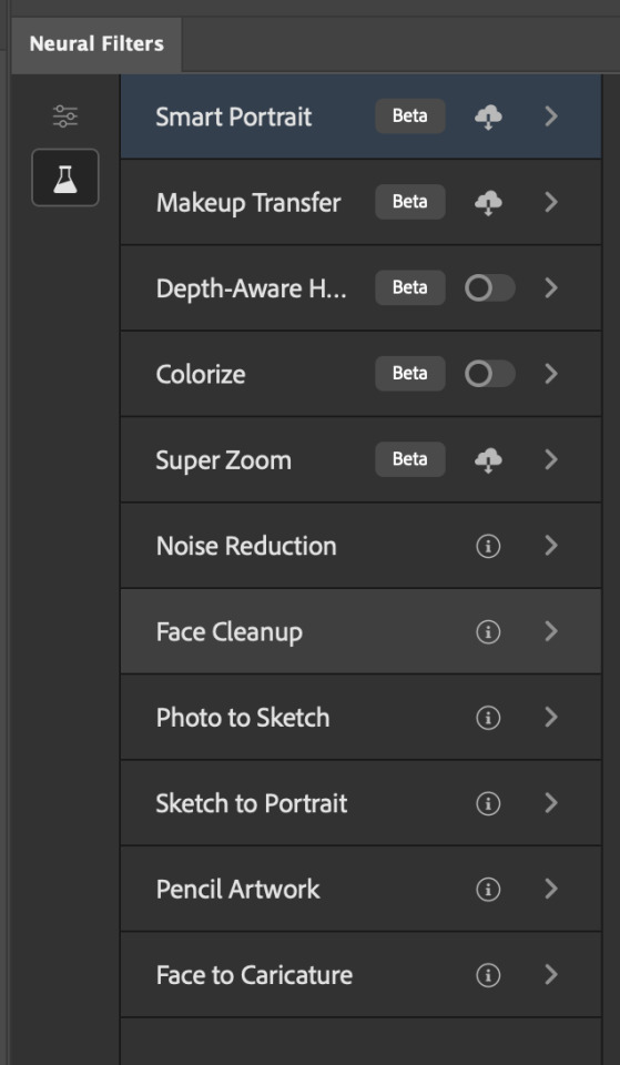
Here are the Neural Filters available in Photoshop 2024:
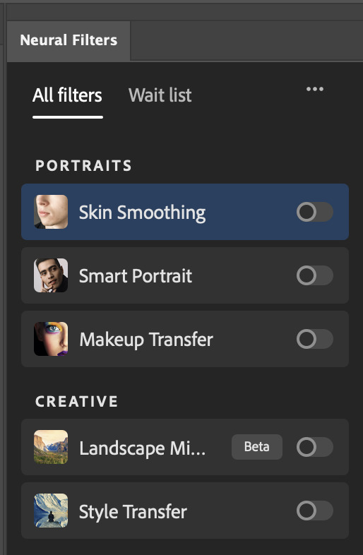

Skin Smoothing: Removes blemishes on the skin
Smart Portrait: This a cloud-based filter that allows you to change the mood, facial age, hair, etc using the sliders+
Makeup Transfer: Applies the makeup (from a reference image) to the eyes & mouth area of your image
Landscape Mixer: Transforms the landscape of your image (e.g. seasons & time of the day, etc), based on the landscape features of a reference image
Style Transfer: Applies artistic styles e.g. texturings (from a reference image) onto your image
Harmonisation: Applies the colour balance of your image based on the lighting of the background image+
Colour Transfer: Applies the colour scheme (of a reference image) onto your image
Colourise: Adds colours onto a B&W image
Super Zoom: Zoom / crop an image without losing resolution+
Depth Blur: Blurs the background of the image
JPEG Artefacts Removal: Removes artefacts caused by JPEG compression
Photo Restoration: Enhances image quality & facial details
+These three filters aren't used in my giffing workflow. The cloud-based nature of Smart Portrait leads to disjointed looking frames. For Harmonisation, applying this on a gif causes Neural Filter timeout error. Finally, Super Zoom does not currently support output as a Smart Filter
If you're running Photoshop 2021 or earlier version of Photoshop 2022, you will see a smaller selection of Neural Filters:

Things to be aware of:
You can apply up to six Neural Filters at the same time
Filters where you can use your own reference images: Makeup Transfer (portraits only), Landscape Mixer, Style Transfer (not available in Photoshop 2021), and Colour Transfer
Later iterations of Photoshop 2023 & newer: The first three default presets for Landscape Mixer and Colour Transfer are currently broken.
2. Why I use Neural Filters?
Here are my four main Neural Filters use cases in my gifmaking process. In each use case I'll list out the filters that I use:
Enhancing Image Quality:
Common wisdom is to find the highest quality video to gif from for a media release & avoid YouTube whenever possible. However for smaller / niche media (e.g. new & upcoming musical artists), prepping gifs from highly compressed YouTube videos is inevitable.
So how do I get around with this? I have found Neural Filters pretty handy when it comes to both correcting issues from video compression & enhancing details in gifs prepared from these highly compressed video files.
Filters used: JPEG Artefacts Removal / Photo Restoration
Facial Enhancement:
When I prepare gifs from highly compressed videos, something I like to do is to enhance the facial features. This is again useful when I make gifsets from compressed videos & want to fill up my final panel with a close-up shot.
Filters used: Skin Smoothing / Makeup Transfer / Photo Restoration (Facial Enhancement slider)
Colour Manipulation:
Neural Filters is a powerful way to do advanced colour manipulation - whether I want to quickly transform the colour scheme of a gif or transform a B&W clip into something colourful.
Filters used: Colourise / Colour Transfer
Artistic Effects:
This is one of my favourite things to do with Neural Filters! I enjoy using the filters to create artistic effects by feeding textures that I've downloaded as reference images. I also enjoy using these filters to transform the overall the atmosphere of my composite gifs. The gifsets where I've leveraged Neural Filters for artistic effects could be found under this tag on usergif.
Filters used: Landscape Mixer / Style Transfer / Depth Blur
How I use Neural Filters over different stages of my gifmaking workflow:
I want to outline how I use different Neural Filters throughout my gifmaking process. This can be roughly divided into two stages:
Stage I: Enhancement and/or Colourising | Takes place early in my gifmaking process. I process a large amount of component gifs by applying Neural Filters for enhancement purposes and adding some base colourings.++
Stage II: Artistic Effects & more Colour Manipulation | Takes place when I'm assembling my component gifs in the big PSD / PSB composition file that will be my final gif panel.
I will walk through this in more detail later in the tutorial.
++I personally like to keep the size of the component gifs in their original resolution (a mixture of 1080p & 4K), to get best possible results from the Neural Filters and have more flexibility later on in my workflow. I resize & sharpen these gifs after they're placed into my final PSD composition files in Tumblr dimensions.
3. Getting started
The essence is to output Neural Filters as a Smart Filter on the smart object when working with the Video Timeline interface. Your workflow will contain the following steps:
Prepare your gif
In the frame animation interface, set the frame delay to 0.03s and convert your gif to the Video Timeline
In the Video Timeline interface, go to Filter > Neural Filters and output to a Smart Filter
Flatten or render your gif (either approach is fine). To flatten your gif, play the "flatten" action from the gif prep action pack. To render your gif as a .mov file, go to File > Export > Render Video & use the following settings.

Setting up:
o.) To get started, prepare your gifs the usual way - whether you screencap or clip videos. You should see your prepared gif in the frame animation interface as follows:

Note: As mentioned earlier, I keep the gifs in their original resolution right now because working with a larger dimension document allows more flexibility later on in my workflow. I have also found that I get higher quality results working with more pixels. I eventually do my final sharpening & resizing when I fit all of my component gifs to a main PSD composition file (that's of Tumblr dimension).
i.) To use Smart Filters, convert your gif to a Smart Video Layer.
As an aside, I like to work with everything in 0.03s until I finish everything (then correct the frame delay to 0.05s when I upload my panels onto Tumblr).
For convenience, I use my own action pack to first set the frame delay to 0.03s (highlighted in yellow) and then convert to timeline (highlighted in red) to access the Video Timeline interface. To play an action, press the play button highlighted in green.

Once you've converted this gif to a Smart Video Layer, you'll see the Video Timeline interface as follows:

ii.) Select your gif (now as a Smart Layer) and go to Filter > Neural Filters
Installing Neural Filters:
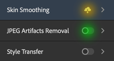
Install the individual Neural Filters that you want to use. If the filter isn't installed, it will show a cloud symbol (highlighted in yellow). If the filter is already installed, it will show a toggle button (highlighted in green)
When you toggle this button, the Neural Filters preview window will look like this (where the toggle button next to the filter that you use turns blue)

4. Using Neural Filters
Once you have installed the Neural Filters that you want to use in your gif, you can toggle on a filter and play around with the sliders until you're satisfied. Here I'll walkthrough multiple concrete examples of how I use Neural Filters in my giffing process.
Example 1: Image enhancement | sample gifset
This is my typical Stage I Neural Filters gifmaking workflow. When giffing older or more niche media releases, my main concern is the video compression that leads to a lot of artefacts in the screencapped / video clipped gifs.
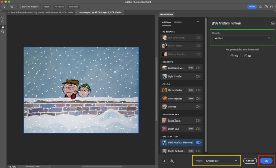
To fix the artefacts from compression, I go to Filter > Neural Filters, and toggle JPEG Artefacts Removal filter. Then I choose the strength of the filter (boxed in green), output this as a Smart Filter (boxed in yellow), and press OK (boxed in red).
Note: The filter has to be fully processed before you could press the OK button!
After applying the Neural Filters, you'll see "Neural Filters" under the Smart Filters property of the smart layer

Flatten / render your gif
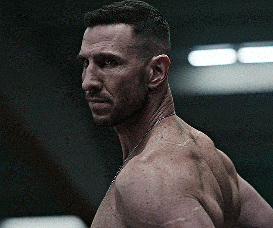
Example 2: Facial enhancement | sample gifset
This is my routine use case during my Stage I Neural Filters gifmaking workflow. For musical artists (e.g. Maisie Peters), YouTube is often the only place where I'm able to find some videos to prepare gifs from. However even the highest resolution video available on YouTube is highly compressed.
Go to Filter > Neural Filters and toggle on Photo Restoration. If Photoshop recognises faces in the image, there will be a "Facial Enhancement" slider under the filter settings.

Play around with the Photo Enhancement & Facial Enhancement sliders. You can also expand the "Adjustment" menu make additional adjustments e.g. remove noises and reducing different types of artefacts.

Once you're happy with the results, press OK and then flatten / render your gif.
Example 3: Colour Manipulation | sample gifset
Want to make a colourful gifset but the source video is in B&W? This is where Colourise from Neural Filters comes in handy! This same colourising approach is also very helpful for colouring poor-lit scenes as detailed in this tutorial.
Here's a B&W gif that we want to colourise:

Highly recommended: add some adjustment layers onto the B&W gif to improve the contrast & depth. This will give you higher quality results when you colourise your gif.
Go to Filter > Neural Filters and toggle on Colourise.
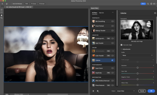
Make sure "Auto colour image" is enabled.
Play around with further adjustments e.g. colour balance, until you're satisfied then press OK.
Important: When you colourise a gif, you need to double check that the resulting skin tone is accurate to real life. I personally go to Google Images and search up photoshoots of the individual / character that I'm giffing for quick reference.
Add additional adjustment layers until you're happy with the colouring of the skin tone.
Once you're happy with the additional adjustments, flatten / render your gif. And voila!

Note: For Colour Manipulation, I use Colourise in my Stage I workflow and Colour Transfer in my Stage II workflow to do other types of colour manipulations (e.g. transforming the colour scheme of the component gifs)
Example 4: Artistic Effects | sample gifset
This is where I use Neural Filters for the bulk of my Stage II workflow: the most enjoyable stage in my editing process!
Normally I would be working with my big composition files with multiple component gifs inside it. To begin the fun, drag a component gif (in PSD file) to the main PSD composition file.
Resize this gif in the composition file until you're happy with the placement

Duplicate this gif. Sharpen the bottom layer (highlighted in yellow), and then select the top layer (highlighted in green) & go to Filter > Neural Filters

I like to use Style Transfer and Landscape Mixer to create artistic effects from Neural Filters. In this particular example, I've chosen Landscape Mixer
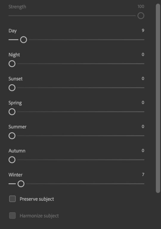
Select a preset or feed a custom image to the filter (here I chose a texture that I've on my computer)
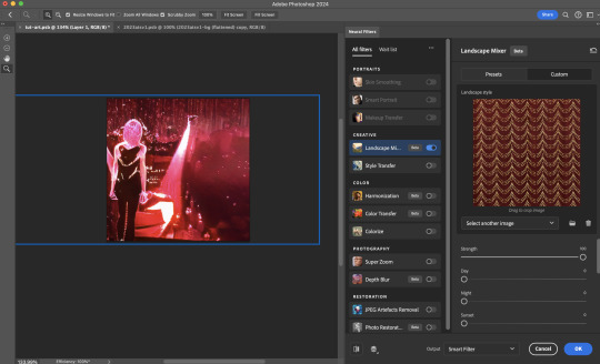
Play around with the different sliders e.g. time of the day / seasons
Important: uncheck "Harmonise Subject" & "Preserve Subject" - these two settings are known to cause performance issues when you render a multiframe smart object (e.g. for a gif)
Once you're happy with the artistic effect, press OK
To ensure you preserve the actual subject you want to gif (bc Preserve Subject is unchecked), add a layer mask onto the top layer (with Neural Filters) and mask out the facial region. You might need to play around with the Layer Mask Position keyframes or Rotoscope your subject in the process.
After you're happy with the masking, flatten / render this composition file and voila!

Example 5: Putting it all together | sample gifset
Let's recap on the Neural Filters gifmaking workflow and where Stage I and Stage II fit in my gifmaking process:
i. Preparing & enhancing the component gifs
Prepare all component gifs and convert them to smart layers
Stage I: Add base colourings & apply Photo Restoration / JPEG Artefacts Removal to enhance the gif's image quality
Flatten all of these component gifs and convert them back to Smart Video Layers (this process can take a lot of time)
Some of these enhanced gifs will be Rotoscoped so this is done before adding the gifs to the big PSD composition file
ii. Setting up the big PSD composition file
Make a separate PSD composition file (Ctrl / Cmmd + N) that's of Tumblr dimension (e.g. 540px in width)
Drag all of the component gifs used into this PSD composition file
Enable Video Timeline and trim the work area
In the composition file, resize / move the component gifs until you're happy with the placement & sharpen these gifs if you haven't already done so
Duplicate the layers that you want to use Neural Filters on
iii. Working with Neural Filters in the PSD composition file
Stage II: Neural Filters to create artistic effects / more colour manipulations!
Mask the smart layers with Neural Filters to both preserve the subject and avoid colouring issues from the filters
Flatten / render the PSD composition file: the more component gifs in your composition file, the longer the exporting will take. (I prefer to render the composition file into a .mov clip to prevent overriding a file that I've spent effort putting together.)
Note: In some of my layout gifsets (where I've heavily used Neural Filters in Stage II), the rendering time for the panel took more than 20 minutes. This is one of the rare instances where I was maxing out my computer's memory.
Useful things to take note of:
Important: If you're using Neural Filters for Colour Manipulation or Artistic Effects, you need to take a lot of care ensuring that the skin tone of nonwhite characters / individuals is accurately coloured
Use the Facial Enhancement slider from Photo Restoration in moderation, if you max out the slider value you risk oversharpening your gif later on in your gifmaking workflow
You will get higher quality results from Neural Filters by working with larger image dimensions: This gives Neural Filters more pixels to work with. You also get better quality results by feeding higher resolution reference images to the Neural Filters.
Makeup Transfer is more stable when the person / character has minimal motion in your gif
You might get unexpected results from Landscape Mixer if you feed a reference image that don't feature a distinctive landscape. This is not always a bad thing: for instance, I have used this texture as a reference image for Landscape Mixer, to create the shimmery effects as seen in this gifset
5. Testing your system
If this is the first time you're applying Neural Filters directly onto a gif, it will be helpful to test out your system yourself. This will help:
Gauge the expected rendering time that you'll need to wait for your gif to export, given specific Neural Filters that you've used
Identify potential performance issues when you render the gif: this is important and will determine whether you will need to fully playback your gif before flattening / rendering the file.
Understand how your system's resources are being utilised: Inputs from Windows PC users & Mac users alike are welcome!
About the Neural Filters test files:
Contains six distinct files, each using different Neural Filters
Two sizes of test files: one copy in full HD (1080p) and another copy downsized to 540px
One folder containing the flattened / rendered test files
How to use the Neural Filters test files:
What you need:
Photoshop 2022 or newer (recommended: 2023 or later)
Install the following Neural Filters: Landscape Mixer / Style Transfer / Colour Transfer / Colourise / Photo Restoration / Depth Blur
Recommended for some Apple Silicon-based MacBook Pro models: Enable High Power Mode
How to use the test files:
For optimal performance, close all background apps
Open a test file
Flatten the test file into frames (load this action pack & play the “flatten” action)
Take note of the time it takes until you’re directed to the frame animation interface
Compare the rendered frames to the expected results in this folder: check that all of the frames look the same. If they don't, you will need to fully playback the test file in full before flattening the file.†
Re-run the test file without the Neural Filters and take note of how long it takes before you're directed to the frame animation interface
Recommended: Take note of how your system is utilised during the rendering process (more info here for MacOS users)
†This is a performance issue known as flickering that I will discuss in the next section. If you come across this, you'll have to playback a gif where you've used Neural Filters (on the video timeline) in full, prior to flattening / rendering it.
Factors that could affect the rendering performance / time (more info):
The number of frames, dimension, and colour bit depth of your gif
If you use Neural Filters with facial recognition features, the rendering time will be affected by the number of characters / individuals in your gif
Most resource intensive filters (powered by largest machine learning models): Landscape Mixer / Photo Restoration (with Facial Enhancement) / and JPEG Artefacts Removal
Least resource intensive filters (smallest machine learning models): Colour Transfer / Colourise
The number of Neural Filters that you apply at once / The number of component gifs with Neural Filters in your PSD file
Your system: system memory, the GPU, and the architecture of the system's CPU+++
+++ Rendering a gif with Neural Filters demands a lot of system memory & GPU horsepower. Rendering will be faster & more reliable on newer computers, as these systems have CPU & GPU with more modern instruction sets that are geared towards machine learning-based tasks.
Additionally, the unified memory architecture of Apple Silicon M-series chips are found to be quite efficient at processing Neural Filters.
6. Performance issues & workarounds
Common Performance issues:
I will discuss several common issues related to rendering or exporting a multi-frame smart object (e.g. your composite gif) that uses Neural Filters below. This is commonly caused by insufficient system memory and/or the GPU.
Flickering frames: in the flattened / rendered file, Neural Filters aren't applied to some of the frames+-+
Scrambled frames: the frames in the flattened / rendered file isn't in order
Neural Filters exceeded the timeout limit error: this is normally a software related issue
Long export / rendering time: long rendering time is expected in heavy workflows
Laggy Photoshop / system interface: having to wait quite a long time to preview the next frame on the timeline
Issues with Landscape Mixer: Using the filter gives ill-defined defined results (Common in older systems)--
Workarounds:
Workarounds that could reduce unreliable rendering performance & long rendering time:
Close other apps running in the background
Work with smaller colour bit depth (i.e. 8-bit rather than 16-bit)
Downsize your gif before converting to the video timeline-+-
Try to keep the number of frames as low as possible
Avoid stacking multiple Neural Filters at once. Try applying & rendering the filters that you want one by one
Specific workarounds for specific issues:
How to resolve flickering frames: If you come across flickering, you will need to playback your gif on the video timeline in full to find the frames where the filter isn't applied. You will need to select all of the frames to allow Photoshop to reprocess these, before you render your gif.+-+
What to do if you come across Neural Filters timeout error? This is caused by several incompatible Neural Filters e.g. Harmonisation (both the filter itself and as a setting in Landscape Mixer), Scratch Reduction in Photo Restoration, and trying to stack multiple Neural Filters with facial recognition features.
If the timeout error is caused by stacking multiple filters, a feasible workaround is to apply the Neural Filters that you want to use one by one over multiple rendering sessions, rather all of them in one go.
+-+This is a very common issue for Apple Silicon-based Macs. Flickering happens when a gif with Neural Filters is rendered without being previously played back in the timeline.
This issue is likely related to the memory bandwidth & the GPU cores of the chips, because not all Apple Silicon-based Macs exhibit this behaviour (i.e. devices equipped with Max / Ultra M-series chips are mostly unaffected).
-- As mentioned in the supplementary page, Landscape Mixer requires a lot of GPU horsepower to be fully rendered. For older systems (pre-2017 builds), there are no workarounds other than to avoid using this filter.
-+- For smaller dimensions, the size of the machine learning models powering the filters play an outsized role in the rendering time (i.e. marginal reduction in rendering time when downsizing 1080p file to Tumblr dimensions). If you use filters powered by larger models e.g. Landscape Mixer and Photo Restoration, you will need to be very patient when exporting your gif.
7. More useful resources on using Neural Filters
Creating animations with Neural Filters effects | Max Novak
Using Neural Filters to colour correct by @edteachs
I hope this is helpful! If you have any questions or need any help related to the tutorial, feel free to send me an ask 💖
#photoshop tutorial#gif tutorial#dearindies#usernik#useryoshi#usershreyu#userisaiah#userroza#userrobin#userraffa#usercats#userriel#useralien#userjoeys#usertj#alielook#swearphil#*#my resources#my tutorials
509 notes
·
View notes
Note
How do you shade/render your drawings?? It looks so nice!
thank you!!
i'll make a proper tutorial one day but right now there's not much to say since i'm always changing how i do things. mostly i use a hard circle brush for skin/clothes and one of my lineart brushes for hair. i don't do a lot of actual rendering, just one multiply layer on top of flat colour and then details on top of the lineart. the lighting is normally just a hard light layer coloured with an airbrush.
when i finish a drawing, i sharpen the png a few times to crisp up the edges which makes it look a lot more refined than it is.
tl:dr: i cheat, quite a lot.
#ramble#bg3#i actually liked the sketch for this a lot more#my best advice is take your time with your lineart because then you don't have to try as hard with the shading#also use references for clothes!!!!!!!!! fabric is very hard
474 notes
·
View notes
Note
Heyyy, I really love your works, can I request a Soobin x Reader who crochets? I crochet so I would reallyyyyy appreciate it 😭 Up to you to make it NSFW or SFW
tysm i really appreciate it !!🥹 <3 i love when people compliment my works it gives me sm motivation to write more 🫶🏼
also happy birthday soob this is in honour of your bday <3
warnings: nsfw, fem!reader, reader wears crocheted lingerie, dollification kink, nicknames (binnie, baby), lmk if i missed any !
soobin loved the fact that his girlfriend crocheted. he didn’t really even have to go buy socks, hats, scarves, etc. he almost felt a bit bad cause whenever you gave him things you had crocheted for him, he never gave anything back.
so, a couple weeks before his birthday, he started learning how to crochet a little something for you. and him. he knew he was the one supposed to be getting gifts but imagining you wearing what he was learning to crochet for you was about to be his gift.
when he finally finished the project he started, it was a day before his birthday. he honestly couldn’t wait to give it to you the next day, and see you all dolled up in it.
—
the day of his birthday, you both spent lots of time having dinner at his favourite restaurant and just mainly spending time together. when the time became close to midnight, he knew it was time to give you his gift.
‘i made you a little something by the way’ he spoke, making your eyebrows furrow in confusion. it was his birthday. why would he make you something? your eyes light up a little as he handed you a box, sitting down next to you on your bed. you were confused to say the least, but you decide to take off the lid anyway.
the sight in front of you made your eyes light up more and your cheeks flush a bit, a smile appearing on your face as you picked up the cute lingerie set your boyfriend had crocheted for you.
‘did you seriously make this all by yourself, binnie?’ you ask, looking at the cute design. it was a pretty baby pink, with darker pink coloured bows on the straps. it was absolutely adorable to you.
‘well.. i watched a couple tutorials..’ soobin said sheepishly, smiling at your cute face. you let out a small giggle and lean in to hug him, still holding the crocheted lingerie set as you kiss his cheek. ‘you’re adorable’ you murmur softly, pressing multiple kisses to his cheek and jaw.
‘i know. now go try it ooon.. i wanna see how it looks on you..’ he whined, smiling and hugging you back. you quickly got up, heading to your bathroom that was connected to your bedroom and quickly changing into the lingerie set. it was the perfect fit, and it looked so cute on you too.
after a few moments, you come back out to show him. he looked back up at you, his eyes lighting up at how good the set looked on you. his eyes ran over your curves, his lips turning into a satisfied grin, motioning for you to come closer. you giggle lightly, moving closer so you were in between his legs, his hands running over your sides and chest. ‘you look so good baby..’ he mumbled softly, almost mesmerized at how you looked.
‘you think so?’ you smile, your hand moving down to play with his soft hair as he leaned in and kissed your breast, squeezing and groping the plush skin before he reaches behind you, already untying the straps of the top.
‘i know so..’
#txt x reader#txt moa#txt#txt smut#txt hard hours#soobin x reader#soobin smut#soobin hard thoughts#soobin hard hours#soobin#soobie boobie#txt hard thoughts
81 notes
·
View notes
Note
hi !! if you'd be up for a tutorial, how do you make your colours so vibrant? how do you choose them on the colour wheel?
honest to god i really want to explain how it works in my head but im not sure. might be easier to explain if you have more specific questions.
but i will try with some things i can remember atm:
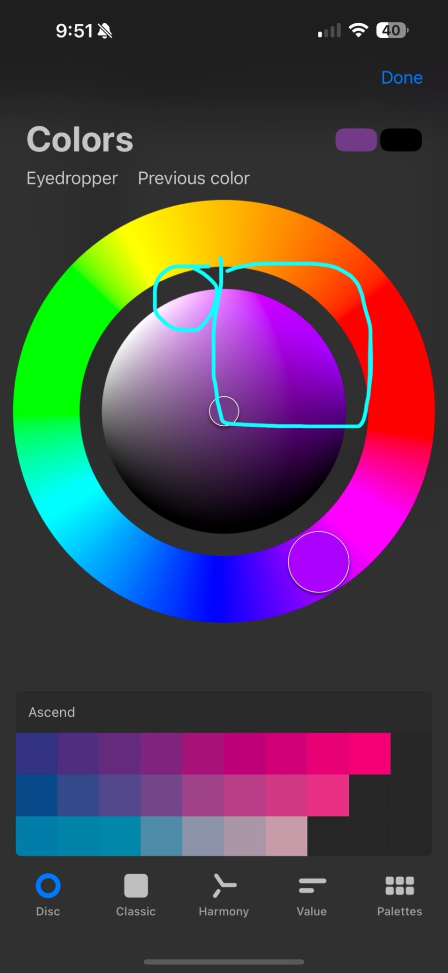
i try to stay in this area when i want really colorful pieces. but be careful, because you can accidentally make really mono-toned (?) pieces and the colors will look muddled, make sure to have a good amount of darks and lights
also mix colors. like for gradients, instead of going from blue to green, in the middle put a little bit of teal. digital apps are not good at pleasing gradients nor mixing. manually apply these things


1->2
when i color pick something from a photo, and it ends up grayer than i expect or want, i will shift the color to the right. keep it on the same level it’s at, but now there’s slightly more color.
for highlights, like really bright ones, i find that white never looks as good as you’d think- i use really like purples/yellows/pinks for this. ex:
if you can see it lol
also shifting blacks and greys and whites to really close but colored shades helps. the gray and black i used for gnfs shirt if i remember is more blue and purple, white can become blue/green/pink (my favs)
for skin i always start with a gradient. i make the hands, feet, forehead/cheeks more warm toned and neck, arms, legs more cool toned.
also colorful lineart is very fun. don’t shy away from it
hope this helps slightly
28 notes
·
View notes
Text
rough art tips to learn and then break at your leisure.
the distance between your eyes is roughly one eye. the corners of your mouth dont extend past the middle of each eye. ears are roughly in the middle of the tip of the nose and the eyebrow. the eyes are in the very centre of the head. the neck is just a Little slimmer than the width of the head (varies with fat distribution, but fat tends to build up under the chin). hair is easier to draw when you plot out the hairline and then where it parts. leaving appropriate distance on the side of the face (cheekbone area and back to ear) contributes to making characters look more realistic/hot as hell. i dont know specific tips for that so use reference. an amazing reference/study site is lineofaction.com . if you think of the face in planes it makes it easier to construct (look up tutorials). if you draw a spiral like a tornado it can help you figure out awkward perspective for extended limbs (look up foreshortening coil technique). tangent lines are when two lines intersect and cause visual confusion (when it looks like a line that defines an arm is part of the line that defines a building, for example) and avoiding them makes your art way easier to comprehend. quick trick to good composition: choose a focal point (where you want your viewer to focus), detail that area the most, and make sure various elements of the piece are pointing to that focal point. you can use colours to contrast hue, saturation, and brightness and make certain elements of your drawing stand out. drawing in greyscale can help you figure out values. using black in a piece isn't illegal but you should know what you're doing when you do use it- it desaturates a piece and if used as a shading colour can desaturate and dull whatever youre shading too. if you use almost-black lineart and then add black to darken the very darkest areas it will do a lot to add some nice depth. the tip of your thumb ends just above the start of your index finger- your thumb also has two knuckles and all your other fingers have three. if you see an artist doing something you like (the way they draw noses or eyes or hair or anything else) you can try to copy that and see if you want to incorporate it in your style <- this is ENCOURAGED and how a lot of us learned and developed our styles. there are ways to add wrinkles to faces and bodies without making the character look a million years old, you just have to keep experimenting with it. The smile wrinkles around your muzzle dont connect to your mouth or to your nose; there should be a small space in between smile or nose and the wrinkle line. eyes when viewed in profile are like < aka a little triangle shape. think of the pupil like a disk and apply foreshortening to it (it looks like a line when seen from the side instead of a full round dot). subtle gradients can add a LOT to a piece. texture can also add a LOT. look up Tommy Arnold's work (his murderbot pieces are some of my FAVOURITE) and zoom in. find those random little circles he added and try to figure out why he added them there. light bounces. there's lots of way light bounces. sometimes it even spreads through the skin. i do not know these light tricks yet but i want you to know that they exist. draw a circle to indicate hand placement, draw a straight line between that circle and the shoulder, and then (normally at a right angle) draw a straight line on top of that line to find the placement of the elbow. elbows are normally placed Just above the hip when standing and your arm is at rest. there are no bad colour combos if you're brave enough about it, just fuck with the saturation and brightness until it works. keep playing. try new things. add your own tips to this post if you want or even expand on some ive mentioned here. good luck go ham etc
#look at this post#the sum of almost all of my art knowledge#all that i can remember rn anyway lmaooo#shit i didn't mention the tips for backgrounds that i know#eh that's environment most of this deals with character work anyway#i learned most of this from tutorials and kind artists who like to talk about their work#i would not know NEARLY as much about creative shit as i do if it weren't for the people who were willing to talk about their skills#and their tricks and their observations. id be nothing without them i dont remember most of them but i am so so grateful for that kindness#so ig here ill spread that a little further#if you have any questions go ahead and ask i am a NERD about art okay i do not know everything but i am always willing to talk about what i#do know#art tips#one of the most important things for you to do as an experienced or beginner artist tho#is to PLAY#experiment#figure out what's fun and what looks nice and what looks nice faster and just. whatever the fuck you want to learn#it is SUCH a joy
284 notes
·
View notes
Text
Had issues with layout in the ask post so here's the rest!
However 1 artist comes to mind for now and that's Murata Yusuke; I'm rereading Eyeshield21 (again lol) and each time his art makes me go "wah so damn good".


From colours, to how dynamic and alive pieces can feel, to lighting/shading, to textures, etc. Lot of the pieces also have this feel of mundanity in it which I really like, and I also how at time I feel like I'm there as well. I love the mixture of realism in lighting/shading (and at times anatomy) with the manga/comic style!
The last image also was a bit of an inspo for my latest Luffy art!
As for tutorial, I might elaborate in another post at some point (cus it's quite a broad thing to go about). Like I've mentioned before, I'm soaking up things along the way! Which includes things like colour theory, lighting/shading, composition, etc. But I personally don't recommend forced research/practice; art needs to be fun after all, take things at a time but it might be nice to try something new with each piece, however how subtle.
I can recommend Saito Naoki's YT channel! I watch his 'whimsical correction' videos during lunch at times haha - Each 'correction' (more like professional advice) has a certain goal/theme which can be improved upon, which can be story wise, appeal, anatomy, etc.
--
Anyway, some advice I have for now are kinda my 'cheats' will follow now! [Disclaimer: these are things that work for me and are by no means the 'correct' way of doing things. So if I say things like "avoid this", it's something I personally do.]
My strength lies I think mostly in my lighting/shading at this moment!


My flats aren't bad or anything, but I feel like it really comes alive after shading. And the first thing to do is to establish where the light source is. Try to avoid 'pillow shading', work in bigger shapes and don't be afraid to do so. Working digitally, I can recommend to take a big brush and just put it very roughly on your character. You have the means with digital art to easily erase parts that are too much and to refine shapes afterwards.
One cheat is bouncing light.
(This was a Multiply mode layer set back to Normal mode for sake of visibility.)


You gotta have a bit of understanding of volume of where to apply it, but it's light that's been reflected by e.g. the ground back up again. This little variation in shading can add a lot. Note that it's better to go from the OG shading colour and sliding it on the colour wheel (hue) to be either warmer or cooler and then sliding in the square/triangle (saturation and value).
More examples of bouncing lights:


It depends how intense the light is reflected; the more, the harsher the contrast is compared to the OG shading colour.
Second cheat is 'light terminator' and 'substance scatter', not sure if it's really the correct terms but oh well.


This reddish tone (again on the Multiply shading layer) is kinda the border line from light to shade. It's reddish on skin (if you have red blood haha) but you apply it on other things with other colours too!


Make sure you don't overdo it and put it everywhere, also note if you use harsh or blended brush strokes, maybe even both for variation! Try it out and see what works best for you!
--
That's it for now; this took more time out of me than planned 💀 you better appreciate this anon! /jk
My main motto regarding art is "fck around and find out". This mindset also helps with keeping art fun!
#hopefully it wasn't too overwhelming lol#this became kinda lengthy after all#with 'cheat' I meant something quite easily achieved to add an extra oomph to your art btw#ask kawaii
56 notes
·
View notes
Note
may I inquire what you do to achieve the (iconic) colours on your pieces 👉👈 I'm specifically thinking about the blue/greenish shine characters tend to have mostly on their skin, which I assume you get with like a saturation or lighter colour layer. honestly just curious how you get your lighting to look the way it does because it FUCKS, as does everything about your art every time tbh 🫶
Hi! Happy to hear you like it so much! It’s honestly not anything super special I’m doing with the coloring. But I made a little tutorial for you and for everyone who was curious about it. My choice of color always varies from every drawing but I used the last Landoscar art to show you an example! I roughly base it on color theory but sometimes you just have to trial and error to see what fits and what not. (You kind of just get a feeling for it eventually)

The fun thing about colors is that people always associate it with something. If I want to create something intimate and romantic I use red. If I want to do something happy and uplifting I’ll chose a warm orange. You can definitely use that for you advantage and go bold with it. The Gax snake drawing is only green because I wanted to represent the bitterness between them! So obviously I went for a venomous green hue.
The key is to always think about what vibe you want to create and use that as a guideline! Have fun trying out for yourself and don’t shy away from just testing out the whole color wheel until something fits! Sometimes it’s a bit of a cat and mouse play until I find the perfect hue!
30 notes
·
View notes
Text
Tips For Painting Chiss Eyes and Scars
I said I'd do this, so here I am. It's not as long a post as the skin tutorial (link here), but it is long, so I'll shove it under a 'read more' button.
There's a poster at the end with text and pictures for easy reference later. It's pretty rough looking but it gets the job done.
Content warning for scars. That section is directly below the eye section and starts with the example image.
Chiss Eyes:
- Eyelids are thin and will have the most red glow showing through. - Eyelashes will most likely reflect some of that red light. - If you're going for a colour absorption accurate/legends accurate look for the eyes, wherever the red light hits will be black/dark blue (I'd go dark dark blue just to avoid flattening the shadow but do what you like tbh) because blue absorbs red light. Though because their blood is red, I do think that there would still be a bit of a faint glow on the eyelids. Just not necessarily on the inside of the nose's bridge. That bit would probably be quite a bit darker because the eyeglow isn't actually passing through the skin there, it's just hitting it. - If you want to make a Chiss' line of sight subtly obvious, concentrating glow where you want the iris to be (see above picture) works quite well. If your art style has a focus more on lines than this example, picking a colour slightly brighter than the glow you're using also works well.
Chiss Scars:

- Same as painting/drawing human scars, just blue. - New scar tissue is shiny, older scar tissue can still be shiny, just not as shiny. - Look at scar references and try and translate that to Chiss colours. - Scars can be lumpy and bumpy as well, so keep that in mind when adding lighting if you want the scar to stand out or not. - I usually use light blue for old but not too old scars, then darken as wanted. - For anything more complex than a slash scar, like blaster wounds etc, I would look at references for those on a human and translate to a Chiss colour palette.
The examples I've given are (from right to left): - Fresh wound - New scar tissue - Older scar tissue - Old scar - Stretch marks. - Small/not as deep
Poster/reference for later
(It's pretty much this whole post in image form).

Hope this is helpful :3
#chiss#chiss art#chiss ascendancy#star wars chiss#thrawn#ar'alani#hydro's art#chiss painting tutorial#art help#art ref#star wars art#star wars#admiral ar'alani#grand admiral thrawn
57 notes
·
View notes
Text
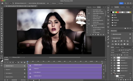
A gif colouring tutorial! (requested by the lovely, @ncutisgatwas). I keep my colourings super simple and easy to follow! So I'm happy to show what I do to achieve it!
I always start really simple with CURVES, I always select auto for this because I never like to artificially brighten the gif because sometimes it's too much?

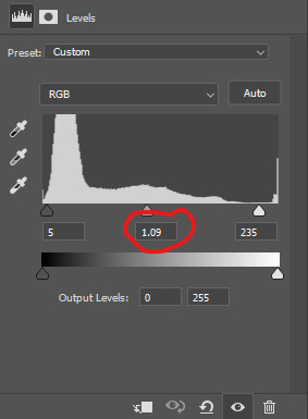
So far, with just that our gif looks kinda plain but brighter,
Next, is LEVELS. I use the same for every single gif I make, the only thing I ever change (say the gif is in broad daylight etc) in the middle one, I either have it at 0.90 or 1.09. 0.90 for when the gif needs to be darker and 1.09 for when the gif needs to be brighter!
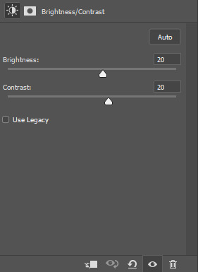
Same for our next step which is, BRIGHTNESS/CONTRAST. Again, I rarely ever change these, I never turn it brighter than 20 (you'll see why later), but if it's a lighter scene I usually have brightness on 10 instead of 20 same for contrast.
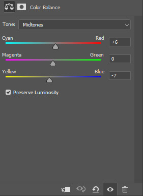
Next, COLOUR BALANCE. Now, I rarely use this (in other words if you gif doesn't need it you can skip this step because I usually do with all my other sets!) but if your gif does call for this, these are the main settings I use for more blue tone gif sets. Below you can see the difference, it brings back more of his skin tone and vibrance to the gif without actually adding vibrance.
after the colour balance:

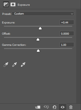
Now, EXPOSURE. For this one, I literally eyeball it. I drag it until I think it's a good brightness! if you have a gif like this where the subject goes from side on to front on always make sure you scroll and check when they're turned (it can wash them out once they face the light source!)
Now for SELECTIVE COLOUR, like the other step I do this for every gif same settings. I always use these RED settings because I find it protects the true skin tone without giving it a too over the top red/yellow colour. It's also perfect if you're giffing POC actors!


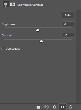
I add another BRIGHTNESS/CONTRAST layer but this is mainly because I think the gif is a bit washed out without the darker bits standing out more! (THIS IS COMPLETELY OPTIONAL!)
And finally, once more COLOUR BALANCE. I simply felt it still looked a little too washed out for his skin tone and the colours in the room!

And that's our gif done!!
I use these same settings for every gif minus the colour balance. Always make sure to adjust the CURVES and EXPOSURE! If you have any more questions, my ask/dms are always open!
#text post#usersavana#userzo#userlolo#userhugh#usercallie#userlosthaven#tuserhan#tusertha#userelio#usersnat#userpfeiffer#mine#**
110 notes
·
View notes
Note
hey balu, do you know how to recolor skin / how a coloring psd works for that? like for a character that's pale and not the shade they should be ( cough cough natlan ) asking bc I want to that but idk how
Hiya, anon! I can explain how I personally do it, but here's a huuuuuuge disclaimer: I'm colourblind, so I heavily rely on colour wheel pointers. Throughout this tutorial, you'll see me constantly comparing where the pointer is and trying to use my somewhat limited knowledge of colour theory. I'm sure other creators have other ways to do this that are much simpler and/or more effective; you should look for and check out other tutorials here on Tumblr, YouTube, or Twitter!
Due to the limited previews of images on Tumblr, you can also open the images on new tabs to see more details.
For religious and political reasons, I will not use a Natlan character as an example. Instead, I'll use Candace (also from Genshin Impact) as our muse. Specifically, I will use her character card art image, which can be found on the Genshin Impact fandom wiki. The image quality is not so great, so that's why we'll see some bleeding pixels here and there. Dealing with those is another tutorial altogether. Also, if you meant an absolutely pale character (with littler to no melanin), that would be another tutorial, too. So, I'll be sticking with these examples and explanations here! This can give you a starting point.
In this tutorial, we will go from this before (left) to this after (right):

Also, I'd like to point out that these steps are for this specific picture/character. Though the same logic can be applied to other characters and images, it's imperative to remember, especially when you're starting your editing adventures, that there is no fool-proof and 100% universal PSD. I'm just explaining the logic behind how a colouring PSD works and some of my mental processes behind it.
Please consider reblogging, liking this post, and/or supporting me on ko-fi if this helped you! That way, I can keep bringing you tutorials like this faster and more effectively. ~
Now, let's begin!

First, we must notice that skin colours (even paler ones) are shade variations of yellows and reds. If we check the hex code colour/colour pointer on the colour wheel, we will see that Candace's skin colour is at the intersection between red and yellow, and is on the lighter/less saturated part.

Here, I am deepening/saturating the blues of her clothes by creating a Hue/Saturation layer, changing from Master > Blues and adjusting the Hue and Saturation values. Colour theory basics: opposing colours on the colour wheels will give a more significant idea of contrast; the bluer colours will appear colder, and the warmer colours will appear hotter and, therefore, more saturated.

In this second step, I am creating a Selective Colour layer, focusing on the Reds. I want this to be highly reddish for now, so I'm lowering the Cyans to the minimum values I can. Notice how the colour wheel pointers went down, meaning we are in a redder, more saturated and more precise zone. The darker the skin, the redder its colours will be in pictures.

Thirdly, I am now creating a Colour Balance layer. Since I want to adjust the warmer colours (e.g., Reds), I am adding more reds, magentas, and yellows.

The exact process I did for Candace's clothes, I'll do for her accessories. Her accessories blended too much with her skin tone (hex code-wise and I imagine that for the normal eye, too). So, to make the yellows on her accessories pop and be more different from her skin, I created yet another Hue/Saturation layer and changed from Master > Yellows, altering the Hues, Saturation and Lightness values.

Now that we have the image's primary colours (blues, reds, yellows) separated, it is time to deepen/saturate the reds. So here, I made another Selective Colour layer, also focusing on the Reds. Notice that now I'm also increasing the Cyan values. Why? Because Cyans make the reds look darker, and I want exactly that. So everything will increase in value.

To further deepen these colours, I created a Curves Layer and tweaked each RGB curve. I made the blues lighter; meanwhile, the greens and reds went darker. Again, colour theory! Notice on the colour wheel that her skin is extremely red and saturated. This is precisely what I want. Why? Well...

... Because now, by using a Selective Colour layer again, I can make her skin magentaish. Pure magentas are rare in pictures, even fantasy/2D characters. Generally, you will find variations of purples, pinks or reds, but magentas are more difficult to find. Therefore, they're easier to work with/edit. Even if the character had magenta colours, we could've isolated them beforehand, too. This step guarantees that my PSD will solely focus on her skin tone, basically.

Our final step is to create another Hue/Saturation layer and change the setting from Master > Magentas. We will decrease the Saturation and Lightness values and slide the Hue bar to the right. And now, check the colour wheel: it's a beautiful dark brown! It's popping a lot against the yellows and blues. ~
This is where we started vs where we finished!
So there you have it! A speedy but hopefully informative tutorial on how colouring PSD works and how you can quickly love your characters a bit more when doing edits and graphics for them!
Again, please consider reblogging, liking this post, and/or supporting me on ko-fi if this helped you! That way, I can keep bringing you tutorials like this faster and more effectively. ~
If you have any questions, please let me know!
#♡: tutorials! *#gfx tutorial#graphics tutorial#graphic tutorial#gfxs tutorial#resources#rolep#ps tutorial#ps tutorials#photoshop#photoshop tutorial#photoshop resources
33 notes
·
View notes
Note
Hi! Can I ask if you edit the screenshots of your sims a lot or do you just use certain skins or skin details that give your sims' faces more definition? Just wondering because my sims look really smooth and "flat" despite using tons of skin details and I'd love to know if there's a way to make them look better in game :)
hii :) i don't edit my screenshots, i only use gshade, i'm too lazy to do much beyond cropping and adding text. my gshade preset is in my downloads but it doesn't do much other than sharpen & brighten the colours a bit.
lighting is really important. if you're talking about my sim portrait & closeup pics. if there is too much light in the room, it washes out the features and makes everything look flat. you could try playing with fewer lights and being strategic about the placement in relation to your sim. you can also adjust the light's brightness to "dim" by pressing shift and clicking on the light in buy mode. dim light will be softer, more diffused. you don't want "too much" light on your sim because then there will be no more shadows and no definition.
more lighting discussion/tutorial here
using a skin with more realistic detail definitely helps. some skins that are too maxis match, they lack realistic shading so (in my opinion), as someone who prefers realism, they don't look defined enough in closeup pictures because the texture is just too plain. these days i mostly use my own skins because they give me just the right mix of realism & cartoon.
using a HQ mod helps a little bit too. i have my texture size at 2k, so all the skin details and makeup show up very well in pictures.
finally i would suggest, don't forget the 3D aspect of your sim. if you want your sim's cheekbones to look really defined in all lighting situations, it's better to sculpt that with sliders instead of relying on a strong application of makeup. sometimes you have to use more extreme slider values, exaggerate the features a little bit, for it to look right in live mode and on camera.
32 notes
·
View notes
Note
Hi hi um you helped me with one of my drawings on the criticism club, tysmmmmmm for that, I've fixed it a lot but I'm not done colouring so I won't be posting it yet :) your advice was insanely helpful, because I realised the arm wouldn't be there,and a BUNCH of other things
I was just exploring your posts and OMG HOW YOU RENDER SKIN AND HAIR IS SOO PRETTY AND GORGEOUS OMG!!! AND I LOVE THAT ONE DRAWING OF AN EYE U MADE AHH!
Sooo while i was looking at my fav post of yours, I was reading the description and you were talking about the new blend brush in magma! So, I'm assuming you use magma? I've been using it for like, half a year, but im not a pro at digital art so I don't really know what all the layer settings and whatever are. I did watch a video but it was a bit confusing. I know about like opacity and whatnot but I'm still a bit confused on mainly the layer settings. Also, I can't find any tutorials on magma apart from blending :(
I was wondering if U could maybe explain a bit, just the basics like multiply and add and most of the layer settings a begginer would use :) I'm sort of stepping out of my comfort zone because I don't usually bother with colouring and stuff. Any tips U recommend for magma would also help tons! Omg I just realised that this is kind of a stupid request because you probably have to explain a lot... Sorry!
idk how to end this ┐( ∵ )┌
ok ok this will be a long post!!

i made this graphic a long time ago for my friend @mythology-lover, this is using all layer blend modes with the colour bright orange, so you can see what each one does. most of them are self explanatory, I hope. there is no "add" in magma, but colour dodge is similar. I'll go over how to use the blend modes below!
not sure if you want to know how to use the blend modes to render stuff but i'll show you anyway lol

this was a drawing i posted, and i actually detailed my step by step process for my friend again, but I use multiply or darken for shading, its the best way to shade and personally I use dark red for shading but this can change based on lighting. obv I also lower the opacity cuz I don't want bright red. my tip for using multiply is to use a colour more saturated/brighter than you think you would use, cuz multiply ends up darkening the colour anyway.
i recommend using blend modes for shading because they have some "transparency" to them, if you put on shading in a block colour with no blend mode it'll just cover up things you already drew like blush or makeup. i also just create more multiply layers to build up darker and darker shadows.
also, when it comes to more dramatic lighting, ill just put a multiply layer over the WHOLE drawing since in real life in a dark scene there will be a shadow over everything including darker shadows for the actual details. after I add the multiply layer (this one is blue because its supposed to be a nighttime scene and the sky is dark blue) I just erase parts where light is hitting the object

(this isnt well done because im making this quickly)
and when it comes to lighting i like to use overlay, it creates this really nice saturated glowy effect. you can use colour dodge too but it creates these weird artifacts of pixels that are a completely different colour, at least for me

with overlay

also maybe you already know this, but the little square icon next to the opacity bar is alpha lock its useful if you don't wanna have to make a whole layer and clip it to the layer underneath
also... my BEST advice for magma has got to be to use filters, they save my life, and I frequently use them when my colours arent looking too good. and I specifically LOVE using the "curves" option when you click filters.
they let you control how bright the drawing is, and specifically the amount of each colour (red, green, and blue) in your drawing

here i reduced blue, increased red, and reduced yellow, plus reduced contrast and increased saturation plus made it a bit brighter. looks a lot better in my opinion, filters can really save a drawing lol
random tips: use lasso selection its basically necessary! if the paint bucket/fill tool isn't working that great, increase tolerance and turn on anti-alias, you can also try using the smart option. although I gotta say generally I don't use fill tool as it only really works if you have very clean, sharp, and connected lines. usually what I'll do instead to save time on colouring is make a layer below the lineart, and then make the target layer "above," and then fill it, then fill in the gaps manually. i also recommend using the full mode layout option, unless you have a small screen then it's most optimal, because then you can see all the tools and options.
i also use this layout thing, idk what its called, and have each one be a different brush with different settings (for me, one will be a soft brush with hardness and density lowered, another a hard round (default) brush, another a textured lineart brush, a brush for stars, freckles, or other scattered dots where I just turn up spacing, scattering and jitter for size variation)

also... make sure you flip your canvas to catch your mistakes, you wont notice them until you see it from a different perspective, and the flip canvas button is up top

its this one
this is for colouring, but periodically go to "view" and click "show in greyscale" so you can see the contrast between your colours. if everything's the same shade or similar shade of grey, you need to make some parts darker or lighter to make them stand out
ngl i think that's it, unless there's something else you need to know. just realised I've been using magma for like 4 years at this point, time really flies by. hope I helped!
9 notes
·
View notes
Text
art journal: Neve
Final image here: hey Trouble
Keeping notes as I try to refine my digital artwork process. This is my first full colour piece this year with proper steps :)
I'm not a professional artist; whatever I've learnt is from books, online tutorials and lots of trial and error. (This is the start of my second year of drawing regularly as a hobbyist.) The general artwork steps are: Construction > Line art > Shading > Colour
1. Assemble the ref board: I'm drawing from this reference photo for the pose. My board has this along with screenshots of Neve and official face sculpts.
2. I start out by sketching on my Android tablet with the reference board open on a larger monitor.
The anatomy sketch helps me figure out where the torso and limbs go under the clothes. I find it helps to keep the arms/hands and head on separate layers so you can resize and scale them after you're done.
3. Draw the clothes over the sketched figure, taking into account how different materials hang off the frame. (The shoulders of the suit jacket are padded and the wool is stiff, in contrast to the dress shirt that wrinkles more easily. Her arms press against the drape of the sides.)
Not pictured: work up to a full values test then decide your lines are too messy.
Then I go over it all again on a new layer to get my lineart very neat.
4. Next, block out the clothes, skin and hair on different layers with flat colours. (Couldn't resist and did her nails too). On a clipping mask, I add shadows in a very desaturated purple. This is helpful for figuring out overall images values without colour first.
5. I move the file into Photoshop on my laptop, select and fill the colours for my flats and adjust the shadows.
Colour is a brand new topic I'm tackling in 2025, so I'm learning as I go, but here's an excellent tutorial I've been following.
I add additional post-processing by playing with the blending modes of different layers and parts. (This is the most fun part!) For example, I move all the finer detail lines (nose bridge, collarbones, hand joints etc) to a separate layer set to "Overlay" so the base colours can peek through.
6. For the layout, I decided to zoom in more on Neve and adjust how much of the canvas she takes up. I add a simple graphic element to the background, as well as green highlights and bounce light for interest.
Check the levels one last time and make adjustments as needed to avoid extreme areas of pure white and black.
Then she's done!
Total time: about 12 hours over 3 days.
10 notes
·
View notes
Note
hi :) i hope it's okay to ask, i love your colorings especially on your the bear gifs, would you consider making a tutorial for how you colour the kitchen scenes in the show, like the scenes that have a lot of white in the background and are quite bright? i find them really hard to color without making everyone's skin look muddy and i'd love to know how you make yours look so good. no worries if not though!

hellooo! sure, here's a quick tutorial on bright scenes :)
i would recommend checking out my general coloring tutorial here where i talk more in depth about my process as i'm just gonna go through it briefly here. here's my gif right after sharpening:

it's a pretty bright scene with lots of white and it can be tricky to color it properly and not make the skintones washed out. i like my gifs to be crispy and have a lot of contrast, so here's what works best for me:
i always start with layers and curves, they're the most helpful guide for me when it comes to working with literally any scene ever. i explained how i do it in my previous tutorial, so you can check it out, but i basically pick the brightest and darkest parts of the scene with the pipette tool which helps to neutralize the overpowering color if there is one and just makes the scene more natural (e.g. if it's too yellow, it will automatically tone down the yellow). in this case, the scene has a little bit of a blue tint, so it reduces the appearance of the overall blue tone (i really hope it makes sense lol). i usually set the opacity to around 50-30%. here's the result of just two layers: levels and curves:

it's a subtle change but it deepens the shadows and it's always so much easier for me to color after i do this step, so i never skip it lol.
next up, i use a gradient map to bring out the shadows even more just because i think it looks better (especially on the bear scenes, i noticed! or any 4k footage tbh). so i just add a gradient map layer, black to white, set it to soft light and set the fill to 10%:


and since this makes the gif just a little bit darker, sometimes i want to bring back the brightness a little bit because i looove contrast! here are my exposure layer settings:

and here's what we've got:

looking pretty good but sydney's skintone is looking a little bit too orange at this point and we don't want that! there are some wonderful tutorials how not to orange wash poc and i highly recommend checking a couple of them out to see which method works best for you, but i personally like using selective color and toning down the warmth of reds and yellows in the scene. for example, these are my settings for the red color, the opacity of this layer is set to 23%:

i do a similar thing with yellow, just messing around with the settings and seeing what looks best.
and then i add some additional layers like color balance and hue/saturation to bring it all together and that's it!

i put this together pretty quickly but hopefully i was able to help out! let me know if you have any questions, i'd be more than happy to help/ recommend something :)
23 notes
·
View notes