#light industry
Explore tagged Tumblr posts
Text
The fact that we don't put up lights for every holiday is preposterous! The lights Industry is falling behind, we could totally sell thanksgiving lights! Give me my turkey shaped lights! Or my fish shaped lights for April fool's day! And I know exactly how to make them! You just put glass in the fish mold, then put the light in it and voila! They don't even need to make new lights! They can just reuse the ones that they already have!!!
And when people stop buying them (presumably because everyone already has one) they can just make new shapes and colors! Where is my shamrock for Saint Patricks Day?! Or my heart lights for Valentine's Day?!!
I rest my case. The light industry needs me.
2 notes
·
View notes
Text
ready to share this video with the world
3 notes
·
View notes
Photo

Artistic Bird-Shaped Canopy Bed Follow Research.Lighting on Tumblr
#vintage#midcentury#retro#modern#design#product design#home#decor#decoration#home decor#home design#interiors#interior design#living room#bedroom#kitchen#buildings#architecture#furniture#furniture design#industrial design#minimalism#minimal#living rooms#lighting design#lights#bathroom#contemporary
10K notes
·
View notes
Link
#adroit market research#industrial smart meters market#industrial smart meters#heavy industry#light industry
0 notes
Text
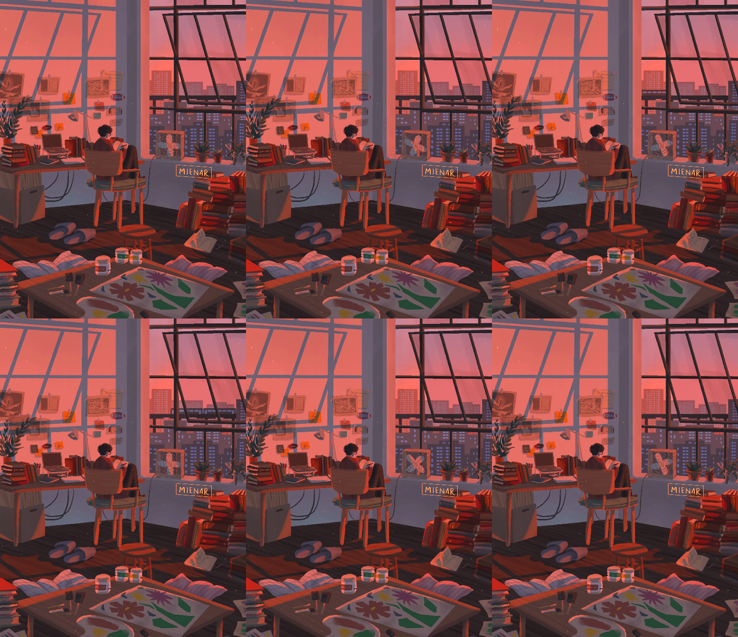
at the artist's loft
instagram | shop | commission info
#artists on tumblr#illustration#animated illustration#animation#backgrounds#scenery#animated gifs#plants#loft#workspace#industrial loft#myillust#hi everyonee! just wanted to share this artwork that i've made just fresh from the oven!#i really just felt like drawing some loft windows + its shadows on the wall + a specific peach-pink kinda sunlight lighting so here it is!#making this to be an artist loft was completely self-indulgent tho!#i had a bittersweet time filling the room up with clutter as if it's my own room huuuu living in a loft is a dream of mine - one day!#anywayss! i hope you'll like this and i hope you'll have a lovely day/night ahead! :D
4K notes
·
View notes
Photo
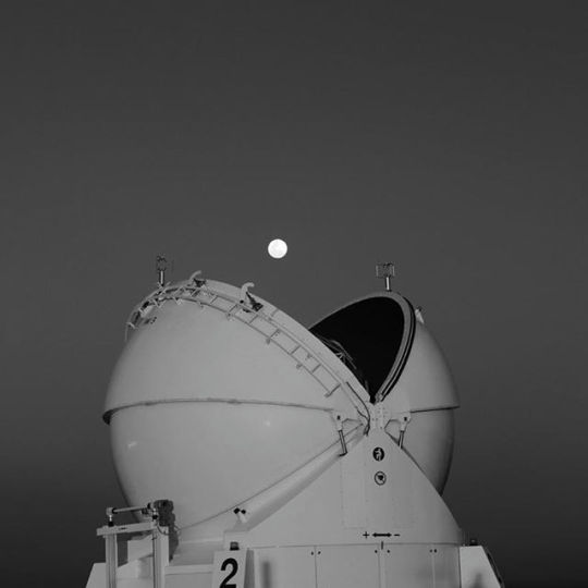
Moon Aligns with Observatory Dome Follow Souda on Tumblr
#Inspiration#Inspiring#dream#surreal#modern#design#product design#home#decor#decoration#home decor#home design#interiors#interior design#living room#bedroom#kitchen#buildings#architecture#furniture#furniture design#industrial design#minimalism#minimal#living rooms#lighting design#lights#bathroom
4K notes
·
View notes
Text
The reissue series continues! Light Industry X Jon Brooks (titled on streaming services as LIxJB to comply with the robot algorithms) features my acoustic trio Light Industry (Sean O'Connor on tenor sax and Andrew Furlong on bass) collaborating with singer/guitarist Jon Brooks.
The EP features two medleys, one of my songs morphs into one of Jon's. We were trying to achieve a melding of the freewheeling improvising of Light Industry and Jon's very carefully and masterfully crafted songs. I think we most definitely took a good bite out of it, but COVID 19 had others plans for this venture. This album was recorded late in 2019 and released in early 2020...
Light Industry X Jon Brooks
Jon Brooks: acoustic guitar, vocal
Chris Cawthray: drums
Andrew Furlong: acoustic bass
Sean O'Connor: tenor saxophone
recorded by G. Mark Weston at Annette Studios, Toronto CANADA
mixed by Lucio Menegon at Kingtone, Joshua Tree USA
artwork by Chris Cawthray
Catacombs (Cawthray) > Cage Fighter (Brooks)
Lowered Expectations (Cawthray) > Ballad Of A Bullet (Brooks)


0 notes
Link
#adroit market research#industrial smart meters market#industrial smart meters#heavy industry#light industry
0 notes
Text

हमने अपनी नयी वेबसाइट रिटेलर्स के लिए लांच कर दी है. अब आप सीधे हमसे संपर्क कर सकते है. (We have launched our new website for retailers. Now you can contact us directly.)
To know more about our products and to buy our products you can visit our website which is mentioned below!!
0 notes
Text
by 邂逅
#china#douyin#fun#year of dragon#tw: flashing lights#can't imagine how people would have reacted if it happened in the pre-industrial era
2K notes
·
View notes
Text
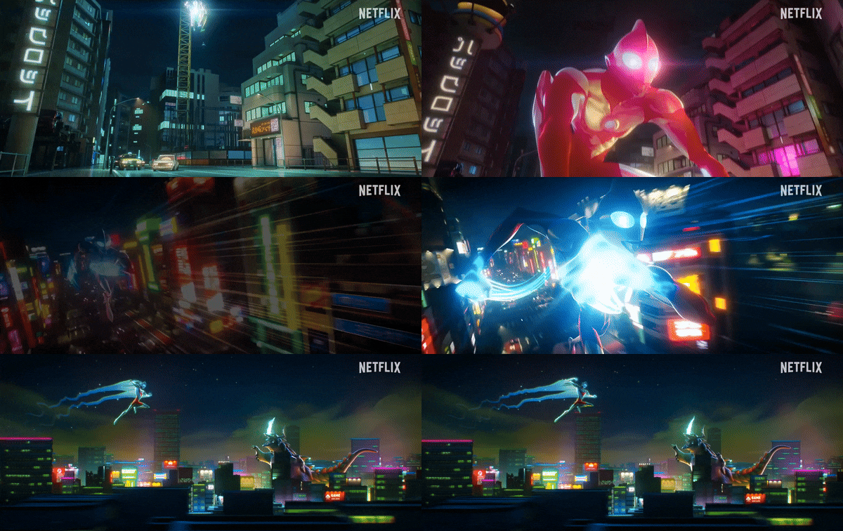
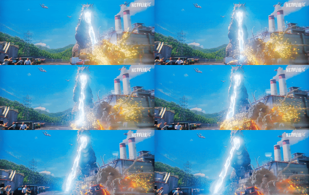
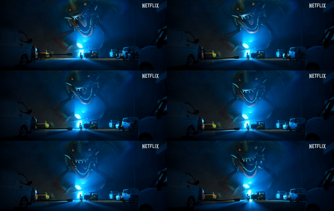
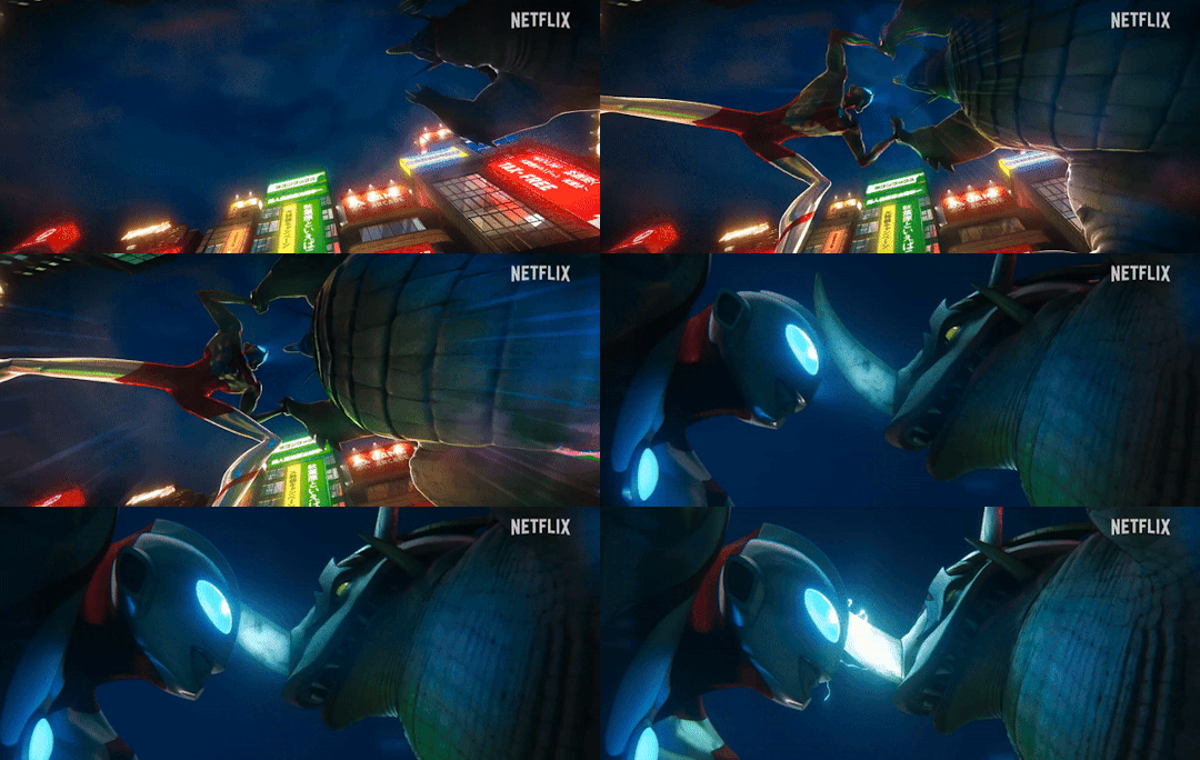
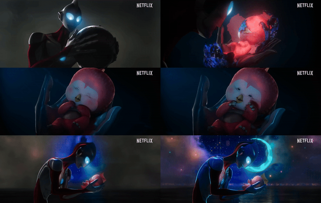
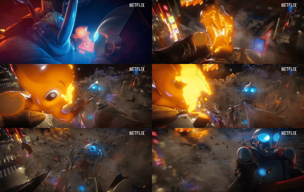


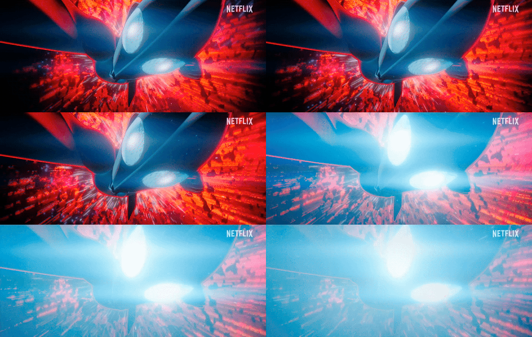

ULTRAMAN: RISING
Trailer GIFs!
#ultraman#kaiju#tokusatsu#anime#netflix#gif#gifs#neronga#bemular#gigantron#mecha gigantron#emi#ultraman rising#ultraman: rising#cute#LETS GOOOOOOO#NERONGAAAAAAAA#ken sato#industrial light and magic#animation#tsuburaya productions
1K notes
·
View notes
Text


Maison de Verre, Paris - Bernard Bijvoet & Pierre Chareau
#Bernard Bijvoet & Pierre Chareau#architecture#design#building#modern architecture#interiors#minimal#house#house design#modern#modernist#classic#timeless#modernist architecture#glass block#glass wall#stairs#industrial#book shelves#living room#piano#paris#beautiful architecture#cool architecture#beautiful houses#urban#courtyard#light#steel#architecture blog
662 notes
·
View notes
Link
By application of the Industrial Smart Meters Market the heavy industry is expected to generate the fastest growth at nearly 3% CAGR over the forecast...
#adroit market research#industrial smart meters market#industrial smart meters#heavy industry#light industry
0 notes
Link
The increasing need for reducing the operational costs in industries arising from energy consumption is expected to propel the demand for industrial smart meters.
#adroit market research#industrial smart meters market#industrial smart meters#heavy industry#light industry
0 notes
Text
I think 90% of my gripes with how modern anime looks comes down to flat color design/palettes.
Non-cohesive, washed-out color palettes can destroy lineart quality. I see this all the time when comparing an anime's lineart/layout to its colored/post-processed final product and it's heartbreaking. Compare this pre-color vs. final frame from Dungeon Meshi's OP.
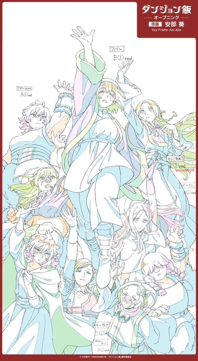
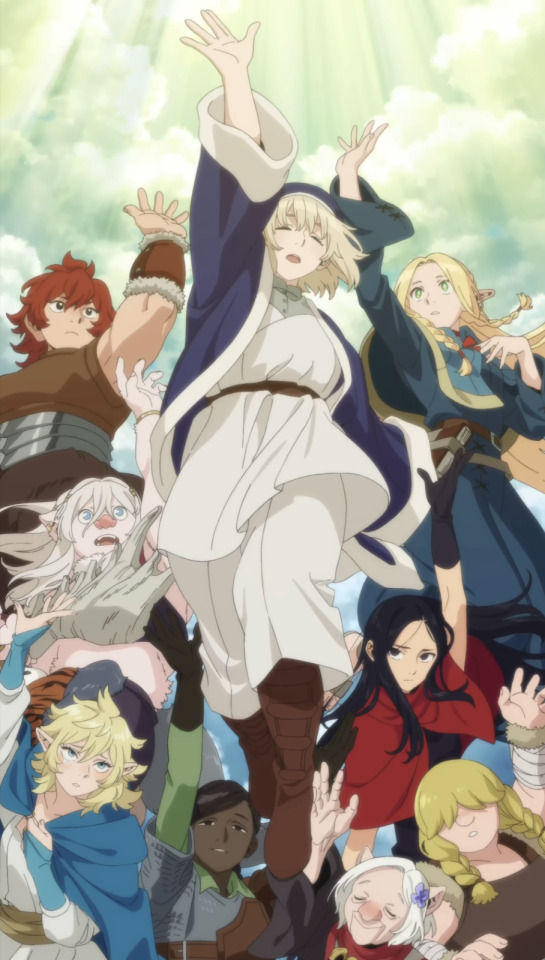
So much sharpness and detail and weight gets washed out and flattened by 'meh' color design. I LOVE the flow and thickness and shadows in the fabrics on the left. The white against pastel really brings it out. Check out all the detail in their hair, the highlights in Rin's, the different hues to denote hair color, the blue tint in the clothes' shadows, and how all of that just gets... lost. It works, but it's not particularly good and does a disservice to the line-artist.
I'm using Dungeon Meshi as an example not because it's bad, I'm just especially disappointed because this is Studio Trigger we're talking about. The character animation is fantastic, but the color design is usually much more exciting. We're not seeing Trigger at their full potential, so I'm focusing on them.
Here's a very quick and messy color correct. Not meant to be taken seriously, just to provide comparison to see why colors can feel "washed out." Top is edit, bottom is original.
You can really see how desaturated and "white fluorescent lighting" the original color palettes are.
[Remember: the easiest way to make your colors more lively is to choose a warm or cool tint. From there, you can play around with bringing out complementary colors for a cohesive palette (I warmed Marcille's skintone and hair but made sure to bring out her deep blue clothes). Avoid using too many blend mode layers; hand-picking colors will really help you build your innate color sense and find a color style. Try using saturated colors in unexpected places! If you're coloring a night scene, try using deep blues or greens or magentas. You see these deep colors used all the time in older anime because they couldn't rely on a lightness scale to make colors darker, they had to use darker paints with specific hues. Don't overthink it, simpler is better!]
#not art#dungeon meshi#rant#i'm someone who can get obsessive over colors in my own art#will stare at the screen adjusting hues/saturation for hours#luckily i've gotten faster at color picking#but yeah modern anime's color design is saddening to me. the general trend leans towards white/grey desaturated palettes#simply because they're easier to pick digitally#this is not the colorists fault mind you. the anime industry's problems are also labor problems. artists are severely underpaid#and overworked. colorists literally aren't paid enough to do their best#there isn't a “creative drought” in the anime industry. this trend is widespread across studios purely BECAUSE it's not up to individuals#until work conditions improve anime will unfortunately continue to miss its fullest potential visually#don't even GET ME STARTED ON THE USE OF POST-PROCESSING FILTERS AND LIGHTING IN ANIME THOUGH#SOMEONE HOLD ME BACK. I HATE LENS FLARES I HATE GRADIENT SHADING I HATE CHROMATIC ABBERATION AND BLUR
2K notes
·
View notes
Text

Power cluster
1K notes
·
View notes