#just wanted to try a lineless style
Explore tagged Tumblr posts
Text

🌺Plant Girls!🌺
#my art#pokémon#pokemon#trial captain mallow#mallow#mallow pokemon#tsareena#pokemon sun and moon#pokémon sm#just wanted to try a lineless style
9 notes
·
View notes
Text
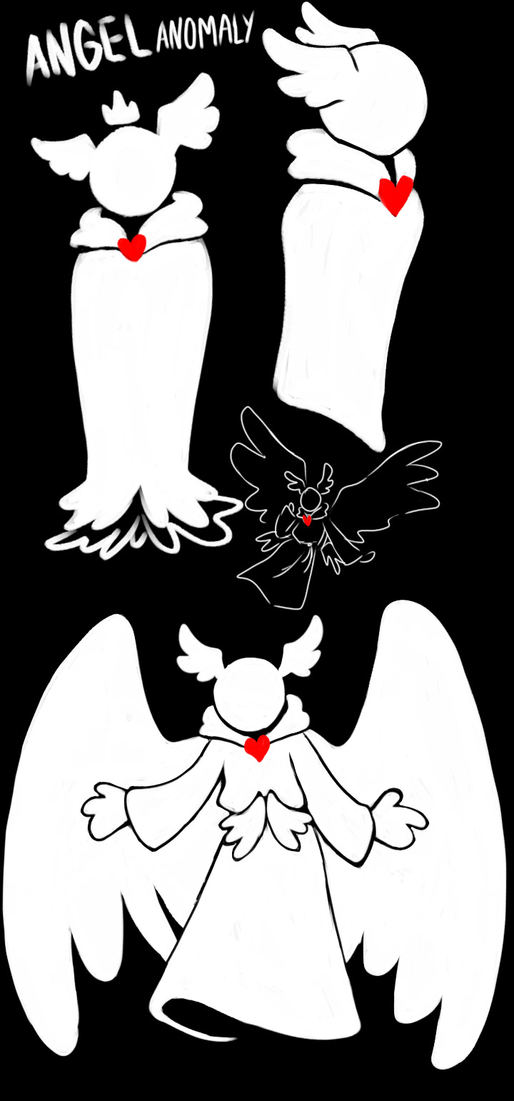
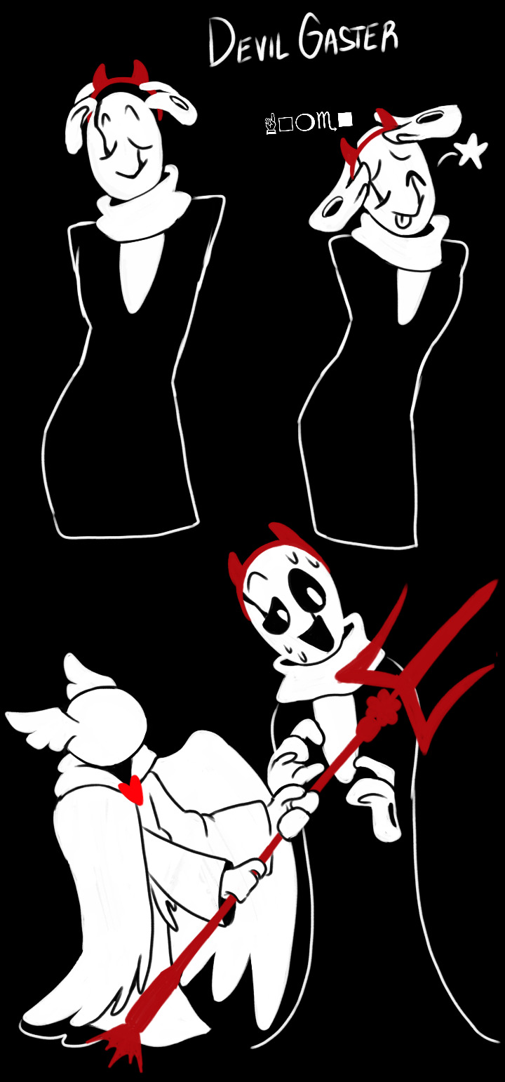
If the game keeps calling us Angel why not go with it ya know
Gaster is the devil for uhh obvious reasons (looks at his association of 666 and darkness, his faustian deal with Spamton etc etc)
Here comes sansnomaly


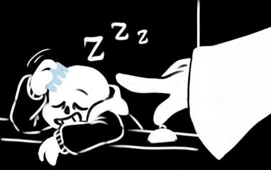


#junie art post#deltarune#angel!anomaly#sansnomaly#wd gaster#gaster deltarune#sans deltarune#wingdings gaster#HAHAHHAHAHAH#you have no idea how much i wanted to draw angel anomaly#went crazy trying to design em right#still not completely satisfied but they look fine in this black and white lineless style thing#thats right gaster is using kris' devil headband for silly reasons (being the devil)#their design is based off that snow angel in Rudy's room... faceless.... creepy#and the wings of the middle door in PLAYERtowns castle#thats theorized to contain the castles fountain#6 WINGSSS WHO WOULDNT WANT MORE WINGS#ok enjoy im planning a lil more ideas about how this can go#baaically sans just moved in and the angel that the town worships is in love with him#good luck sansy#sans x reader#sans x self insert#deltarune sans
390 notes
·
View notes
Text
agh!!!!
#i always get so picky about detail right before I launch a project to the public#knowing DAMMMMMN well I will be really carefree about details later on#thats how it always goes for me#gotta make sure the initial impression is exactly how i want it#then i just let that carry me forever lol#and it usually works out just fine. but i still drive myself crazy before the first hours#feeling weird about it not being in a lineless style but i think it's for the best#because it takes so much longer when it's lineless#trying to learn to be less highstrung about perfecting my art and just letting it look how it ends up#you'll all get it. it'll be fine#morning rant sorry. probably obvious but im working on something to launch here soon. maybe today even#if i don't have anything else to do today + i can satisfy my picky mind in time
34 notes
·
View notes
Text
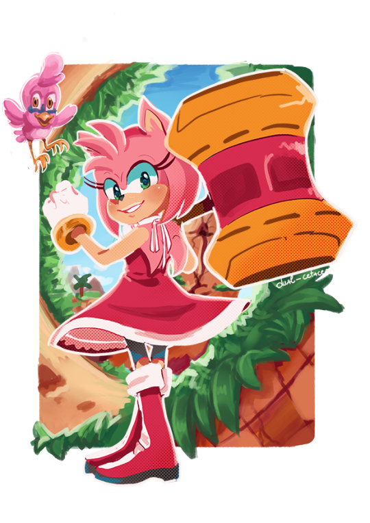
This is the full Amy Rose render I made for the cover of my new fic, No place like home. Instead of just making what I needed for the background, I made a full render of the characters in case I needed to change composition or positions. It worked out well, but naturally, the renders took more time to complete. But the outcome is lovely, so I don't mind. (It also made me check if the poses I used were accurate or not.)
Amy was the first character render I made for the background, which is why she is on the rougher end. If there was one thing I would redo, I would give her a more energetic pose. But I've learned to be satisfied with my art, so eh. Her pose is inspired by the Parasol Lady class trainer from the Pokemon Gen 5 games.
Thought just posting the render might be boring, so I painted the background to relax today. I only spent 2 to 3 hours on it, but I'm satisfied. (I was thinking of cake while I was painting the close-up of the dirt ♪(´▽`))
#amy rose#sonic#sth#birdie#sonic prime#lineless art#sonic fanart#sth fanart#sonic the hedgehog fanart#cell shading#this was also an exercise in cel shading#first attempt that I actually like after years of trying the shading style#not sure what's up with Sundays making me go on a painting spree but I'm not complaining#the irony of me hating making backgrounds back in the day and now finding joy in them is not lost on me#I also just really wanted to use a loop-de-loop as a framing device#no place like home (sonic fic)
41 notes
·
View notes
Text
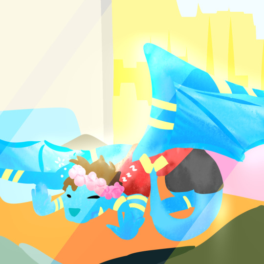
Reptiles have the right idea, the sun feels so nice
#I wanted to doodle this so badly#My new bedroom has a sun-facing window and I laid down in there earlier to sunbathe and oh my stars#i was so drowsy afterwords#I highly recommend it#Also I'm not terribly happy with this artwork but also my drawings don't have to be perfect :]#I just wanted to mess around with a lineless style again#I'm trying to draw more often because otherwise my old high school art teacher is going to bully me /joking#not a poll#qsmp#poll the egg#Captain's egg OCs
21 notes
·
View notes
Text

me wh. me when i. me when i draw an oc for a game i don’t even play.
this is ravi, yes he’s named after ravio, yes he’s purple, yes i made the size matters hat a beanie what are you donna do about it
#my art#my oc#webfishing#webfishing oc#wanted to try a lineless style#and had a lot of fun#he’s fat and trans and just here to fish and chill#i lobe him very much#ravi
7 notes
·
View notes
Text

Whatever
#pokémon#pmd#pokémon mystery dungeon#skitty#riolu#mace the riolu#suzy the skitty#god i've been working on this one for ages#and yes i know i've done this pose with suzy already i swear this was less of a physical practice and more of a stylistic one#cause i really wanted to conquer the lineless style and i think i have a better grasp at it after this piece#i've been chipping at this for like 2 months and just barely finished it last night#i'm still in a bit of a drained mood when it comes to writing and drawing but i want to flesh these two out publicly soon with something#so maybe i'll try and make a simple comic and post that sometime or something#either that or actually do more with a.g. and sora cause i really need to with them...
5 notes
·
View notes
Photo

drew a princess for no reason
#my art#original art#kind of?#i styled her using pieces from shining nikki (dress up game)#ive been surprising myself lately you know?!#in my teens id be like no way will i ever do a lineless art style!!! its sooo hard!!!!#and then look at me now LOL#i realized i just didnt understand it#but now after trying it out learning and practicing i find i kind of love it more than doing lineart style!!#i dont know why but the process of sketch > lines > flat color > shading etc just kills me inside#i prefer sketch > shading > render and finish#i also cant stand separating every single part into a layer and having to scroll to it when i want to shade it#and having to perfectly color within the lines it drives me nuts#so lately ive just been drawing mostly everything on 1 layer and said screw perfection i'll just make messy my style then LOL#the point is lineless seems to suit my preferences better than i thought and maybe i'll try this out even more in future art :)#who reads this im just talking to myself
25 notes
·
View notes
Text
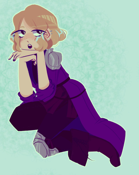
❀❀❀
#oc tag#fe131000#lineless#message in a bottle#this was something else i just kind of wanted to be done with ahahaha this was a sketch from 2021 i recently redid entirely#im still trying to figure things out with my art and experimenting and all that;; it's hard#i'm getting content with my Style experimentation right now but not really the techniques i use....#anyways. this is violet but i just call them bastard (affectionately#this is how i look with they/he in my bio etc etc
9 notes
·
View notes
Text
Updated Tattoo want list
- Mars Rover (wrist)
- Crom Cruach Ouroborous (other wrist. Secret of kells style)
- The Aten (sleeve style, same arm as rover)
- Laika puppy [+ Sputnik?] (back?)
- Pale Blue Dot (ankle)
#can you tell I like space#i don't know if it's obvious#tempted to get a satellite too but I have very specific ideas on where I want things#might try those inkbox custom ones so I can test out some areas for them tbh#the undecided area ones anyways#if I do Laika i want her on my back but if I add Sputnik I'm not sure if I still want it on the back yk?#also I don't want hyper realistic tattoos#they're just not appealing to me tbh#i need like#weird al Yankovic style stuff that could be in one of his music videos yk#like the dare to be stupid MV#now I'm rambling#ah well#anyways I've been looking for a tattoo artist that's affordable though I will be saving up for the sleeve because I want it in the style of#the tomb paintings and getting that style right is REALLY important to me#also the secret of kells one#i think I want the secret of kells one lineless and just with color but I'd have to consult#the rover is actually already designed by one of my friends! i want that to be my first one tbh#also I'm tempted to get colored ink and do the pale blue dot one on my own#or at the same time as another tattoo because it's so stupid fuckin simple
2 notes
·
View notes
Text
i want a lineless style but i hate attention to detail.........................
#i think if i wanted my style to look like anything#probably nathalie foudraine#so scrumptious#but#practicing is hard and i rarely have time to draw with how much i work#so for now i just stick with what im used to#which is just messy colored sketches#oh well#i dont have many followers atm anyways so i still got time to improve#i might try lineless for this one drawing i am doing of mangey currently#we'll see if i like it or scrap it#kotek speaks
5 notes
·
View notes
Text
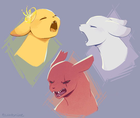
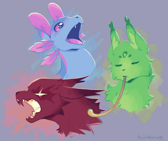
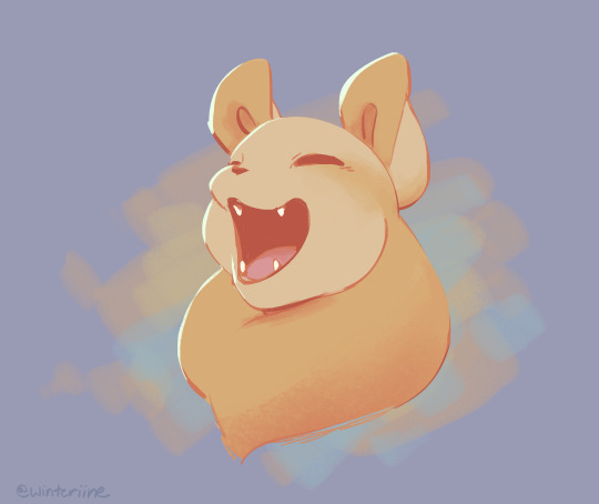
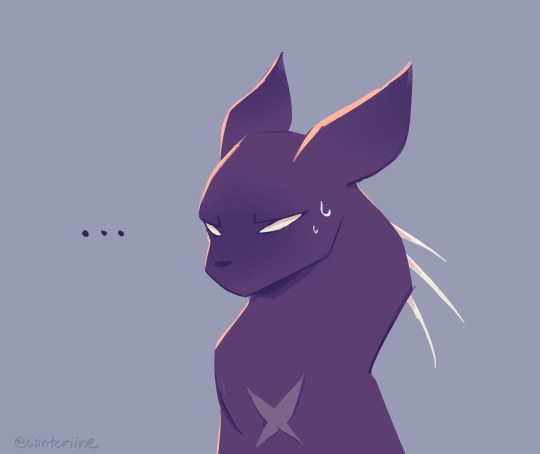
"waaaaaaaaaaaaaaaaaaaaa"
wanted to practice drawing scug mouths! as well as try out a more lineless style; i like how it looks but it's kind of tedious to do when i just wanna get ideas out there LMAO
anyways, scug mouths! i think they probably vary greatly amongst members of the species, but mostly have four prominent canines. more aggressive/carnivorous scugs may have additional sharp teeth and larger jaws for mauling and tearing into prey. conversely, herbivorous scugs (saint) may have blunter teeth and do not need a wide gape.
spearmaster. well. is spearmaster. :')
#rain world#rain world fanart#rain world art#rain world slugcat#slugcat#rain world downpour#the artificer#the saint#the rivulet#the spearmaster#the gourmand#the hunter#the monk#the survivor#winteriine#wintercat96
2K notes
·
View notes
Text
FULL ILLUSTRATION COMMISSIONS OPEN


questions about possible pricing, any of the boundaries or if i can draw something that isnt mentioned are more than welcomed, my inbox is open with anon enabled and my dms are open aswell!
you can contact me through tumblr dms or discord to either request a commision or just ask any questions in private!
(discord name is "wadds")
drawings you commission may not be used for merch,nfts or any other comercial means unless some form of compensation is added to the price of the commission. otherwhise theyre meant exclusibly for personal use (EX: phone wallpaper, to print for your own room, icons, fic covers, or character references)
payment through mercado pago would not be done with us dolars and prices would be adjusted to still make sense in that case (en pesos argentinos, pueden esperar un descuento de hasta mas la mitad)
FAQ:
difference between a closeup and a PFP?
a closeup is a zoomed in drawing where any composition, posing or extra elements are present, they can go from half the torso up Generally. while pfps are centered solely on a characters face and have no background beyond simple patterns, elements like "character holding something" could also be present and they dont add to the total
when exactly does the background start costing extra?
rough guidelines are written above in the picture, but I tend to be pretty lenient on them. if you ask for a drawing with a simple background (ie, Not payed) and I later ask if I want to add any details to it they will not add to the cost and you do not need to worry.
how long will this take?
depends on the drawing but it shouldn't take more than a couple of days once I've started working on it, that being said if there are commissioners in from of you in the line it could take longer for me to get to it. but I always try to get every commission done I'm at least one week
why is mercado pago argentina only?
mercado pago doesn't accept international transactions sadly and I am argentinian
can we negotiate the prices?
I consider my prices to be very low to begin with so no. however if you are from a country with a very high dollar price I might CONSIDER it cus I'm nice and all.
what does "obvious fetish content" mean?
it refers to drawings that might not include sex directly but alude directly to an sexual fetish or scenario, ie a girl being restricted by tentacles or someone being gagged and tied while naked. if your fetish is like, feet or smt then it's fine.
what does "predatory pairings" mean?
a pairing where the power imbalance is the main drawn for it. think teacher student relationships, cop / prisoner or similar dinamics. I'm simply not comfortable with it so I won't draw them.
why no background with the clean línes style?
i don't like how my backgrounds look without rendering and don't feel comfortable charging for them in that state
why no profile pic with Ms paint lineless?
the canvas size on those are pretty small and the style doesn't allow much detail, I don't think it'll look too good simply
301 notes
·
View notes
Text

[Click for better quality]
Ok yay I'm back from my vacation yipeeeeeee. I started this drawing of Keiki before I left and I was half considering just giving up on it.... until I did a short study of facial planes and then got motivated to work on this again! I'm glad I didn't give up on it though, as I'm actually really happy with this one!
Artist's Notes;
So as I mentioned in my last post about Touhou 17, I wanted to finish this by the game's five year anniversary but with how progress was going I didn't want to rush this so I decided to take a long break from it. Mainly because of the face. For a while now I was kind of feeling like I was stagnating with my drawings, not really in the clothing but in the bodies. There was something about the way I was rendering them that I just wasn't happy with, and after talking with someone else about this issue, I realized that the reason I felt this way was because the faces were too flat and didn't match the rest of the drawing and that I needed to find a way to make the rendering of the face feel consistent with everything else. So after doing a short study of the plains of the face (I used this 3D head model from art station as a reference for my short study, please go give this person some love as they are a lifesaver) I went back into this drawing and applied what I learned here. It was only after that that I finally became motivated to finish the piece, and while it started off as just a simple character sketch like Saki and Yachie's were, the moment I added in Keiki's little fire dragon I knew I had gotten in too deep and now here we are with a full on background. OK it's not super crazy or anything, but it gets the job done and it's better than there just being an empty void behind her. It's rare moments like this when I use brushes other than the Clip Studio Default Charcoal Brush and use the Clip Studio Default Paint Brushes as well (god bless the oil paint and dry gouache clip studio brushes, they were amazing). I don't know why but painting fire has always been really fun for me, there's something oddly satisfying about it y'know? I do think that another reason for this problem was because I was drawing faces like I would in my more sketchy style that didn't mesh well with my lineless style, so I'm glad I've started remedying that.
After adding in the fire dragon I had an idea to kinda make it feel like splash art in the way the composition works... probably because I have been playing Reverse 1999 again and it has taken over my brain. I do feel like Keiki's tools get a little lost in the composition, and I didn't fully render the metal parts of them mainly because I didn't feel like they needed it, but that's just something for me to improve on later down the line.
If you guys are wondering where I went for my vacation, I went to New York and got to go to the MET and the Museum of Natural History. In both places I found Kofun period stuff and I was so happy to see it you have no idea. I remember one of the Haniwa I saw had some neat face paint under the eyes that I tried to replicate with the makeup under Keiki's eyes in my drawing, though I think I'll gave to figure out how to draw makeup on characters because this reads more like blush to me than anything. While drawing this I also looked up some references of Kofun period jewelry and really liked the stuff I found, which also meant that now she has proper Kofun earrings instead of earrings shaped like Kofun tombs. I put some of the things I referenced with a closeup of Keiki's face as well down below. I made her outfit more reminiscent of the outfit I gave her at the beginning of the year with the buttons and all, though I do want to try and draw her in some more period accurate clothing like the Haniwa I took a picture of at the Museum of Natural History. I wish I could find a way to make her handercheif look better though as I wish I made it a little bit bigger, though I think I'm saying this because I've looked at this drawing for too long lmao. Once again something to work on for when I next draw her. Also want to get better at rendering hair, as some details (like the little strands in front of her ears) kinda got unreadable due to the similarities in colour lol.

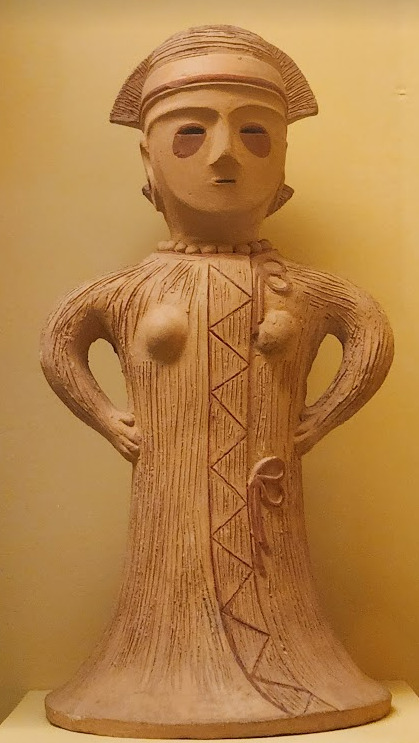


Now you may have also noticed the little cracks I added onto Keiki's face, and that's because I have fallen in love with the idea of Keiki's body being made from ceramic and that she crafted her body herself. While they aren't very visible I also tried to add some doll joints to her body, which is an idea I played around with in the past but never went to far with. I also want to get better at rendering cracks in ceramic, porcelain, etc, as I'm not sure how those read in the drawing. I also have a headcanon where the cracks in Keiki's face show up because of heightened emotions, and while Keiki is aware of this and does her best to make sure her face doesn't break off.... she will still end up with at least a few cracks during any given day, and she can often forget to repair her own body quite frequently so Mayumi has to remind her quite a lot. Mayumi even taught herself some basic sculpting techniques to help repair parts of her body that are so badly damaged to the point where Keiki can't repair them herself, i.e. if both her arms broke off, Mayumi would put them back together for her so Keiki can at least have something to repair herself with rather than nothing. I also like to imagine that if Keiki created her own body, if you took a look at Keiki from the beginning of her life she would look completely different compared to now.
BTW If you guys are wondering what a very very angry Keiki looks like....ok in order for this to make sense have any of you read volume 11 of Land of The Lustrous? Am I bringing back some memories for those of you that have? Ok good, glad we all got that mental image brewing in our minds, I'll probably draw a version of Keiki that is somewhat inspired by that one day as it's an idea I've had for a little while now. And to those who haven't gotten to that volume yet and are confused.... don't worry about it, just keep reading :)
#touhou project#art#fanart#touhou fanart#touhou 17#keiki haniyasushin#wily beast and weakest creature#touhou#東方project#own art
194 notes
·
View notes
Text
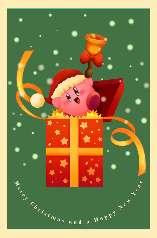
Merry Christmas and a Happy New Year!!!
Fun fact, in making this image it was surprisingly my most easiest yet visually pleasing work. I've always viewed at as a graph like this
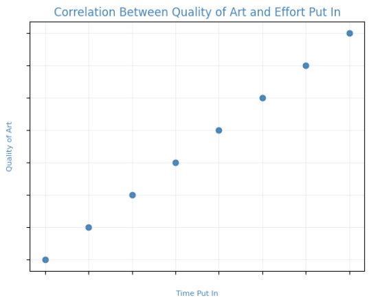
Of course, that isn't true! It's more like this
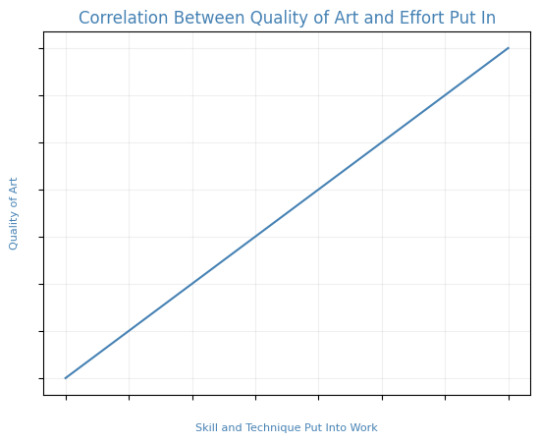
That is to say, I believe this illustration allowed me to focus on the efficient fundamentals I built!

Everything here was rendered with only three brushes. All of them the default brushes that come with CSP. Which includes Pastel, Airbrush, and Mechanical Pencil. Because it was a lineless style, that means I could be a lot more forgiving of mistakes here and there. Something doesn't look right? All I gotta do is add a little more with the GPen to the shape. Or can I just draw an outline in the color I want and fill it in with the bucket tool with a area scaling of 0.10! I have to practice more with lineless styles, it is fun! Rendering was a breeze too.
Which was a simple process of:
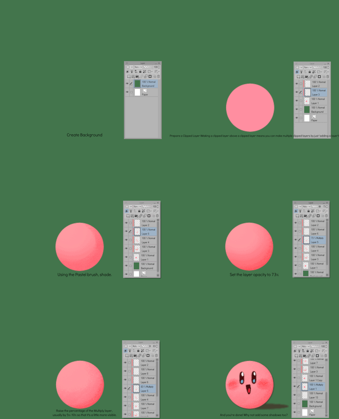
Create shape > Shade with Airbrush > Highlight with Airbrush > Shade with Pastel > Multiply Shading > Lower Multiply Layer Opacity > Overlay with Textured Fill > Move Textured Fill Layer > Finished!
It's a few steps, but once you get into the groove, it becomes very efficient. I'm sure there's ways I could shave off a few layers, like combining the Airbrush process into two layers instead of one but ehhh sometimes I do it, sometimes I don't. Usually, the bigger the shape the more likely I'll use more layers and the smaller the shape the less likely I'll use more layers! Of course, this process isn't a concrete ruling. Sometimes, I'll use more layers for extra things like the bell required more layers for rendering the shininess of metal! Anyways, I would like to believe I did a decent job at recreating the feel, the vibe, and or general look of an old Christmas Card that's more retro in nature. With a focus on simple shapes, a lineless rendering style, and using textured brushes to render, I think I got it down packed. I used a tiny bit of Chromatic Aberration to give it a little bit of a visual pop, and brighten up the colors. It's subtle, but it works.
Oh, and here's something cool! To get a more embossed Christmas Card feel, I used a new tool that came with Clip Studio Paint!
N O R M A L M A P !
Cool, right? I use a pirated copy of Clip Studio Paint 3.0 and it comes with a tool that allows you to create normal maps from illustrations. Which, from what Google tells me: "A normal map is a texture mapping technique used to add surface details to 3D models without altering their geometry" ...Neat!
Anyways, here's what it looks like
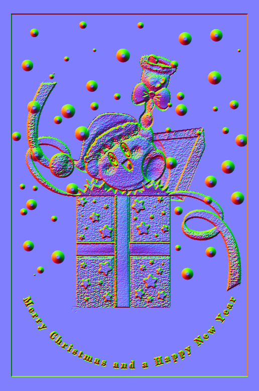
Freaky, right?
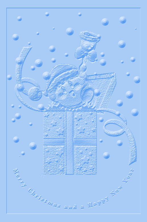
It looks like an embossed letter when you set a layer color to it too!
Anyways, I overlayed it on top of the finished illustration, set it to multiply and set the layer color to a warm yellow and it gives it not only texture but a sense of depth too! It's super cool, if you digitally paint you should try it!

With Normal Map Overlay Effect

Without Normal Map Overlay Effect
It's subtle but it's there.
Anyways, that's enough blathering from me! Merry Christmas everyone! I'll be answering some asks this week, so stay tuned!!!
56 notes
·
View notes
Text

strider dynamics
this hussie shit is hard lol i see a lot of fanart in modern day homestuck fandom that try to emulate hussie’s old style (problem sleuty and whistles etc stuff as well) with his line weight and construction ala @meatmanuel and @deacblues and @toreodere and they got it nailed and i REALLY want to try that too
the funny thing is i could emulate his later homestuck lineless style really well for act omega


but it doesnt have the same charm as old huss and im a bit out of my depth here. its hard but doesnt seem impossible just like a learning curve..i probably could get better with study and practice
#dave strider#my art#homestuck#tried a hussie esque thing with line weight idk#its not hard so much as …. new? like i probably could get better with practice
542 notes
·
View notes