#just look at the cool colored lineart okay? okay :)
Explore tagged Tumblr posts
Text

3/10/2024
i love lovestruck Marle, i just feel we were a bit robbed of a real Marle alt. i mean she just put on an apron. she deserves better
#daily siblings#puyo puyo#ignore how weird the color of the suit is. i still don't understand color theory#just look at the cool colored lineart okay? okay :)#extra tags bc im super proud of this actually#marle puyo puyo#puyo puyo tetris 2#puyo puyo fanart
18 notes
·
View notes
Text
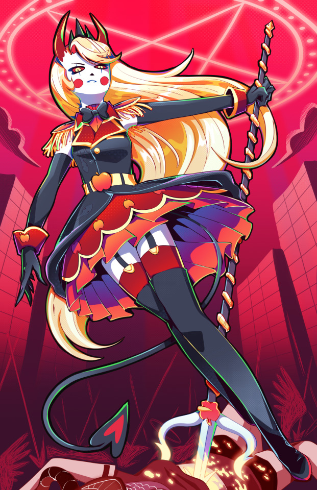
Holy SHIT am I proud of this. It took a day and a HALF to work on it. I really just wanted to draw a cool badass picture of Charlie in a cute dress, and somehow I ended up with my best piece I think I've ever done!!
To see the process, click the 'read more' below!
Otherwise:
Main blog over here
My Etsy Shop!
Originally, I wanted it to look more like a royal portrait, a good excuse to draw a pretty dress.
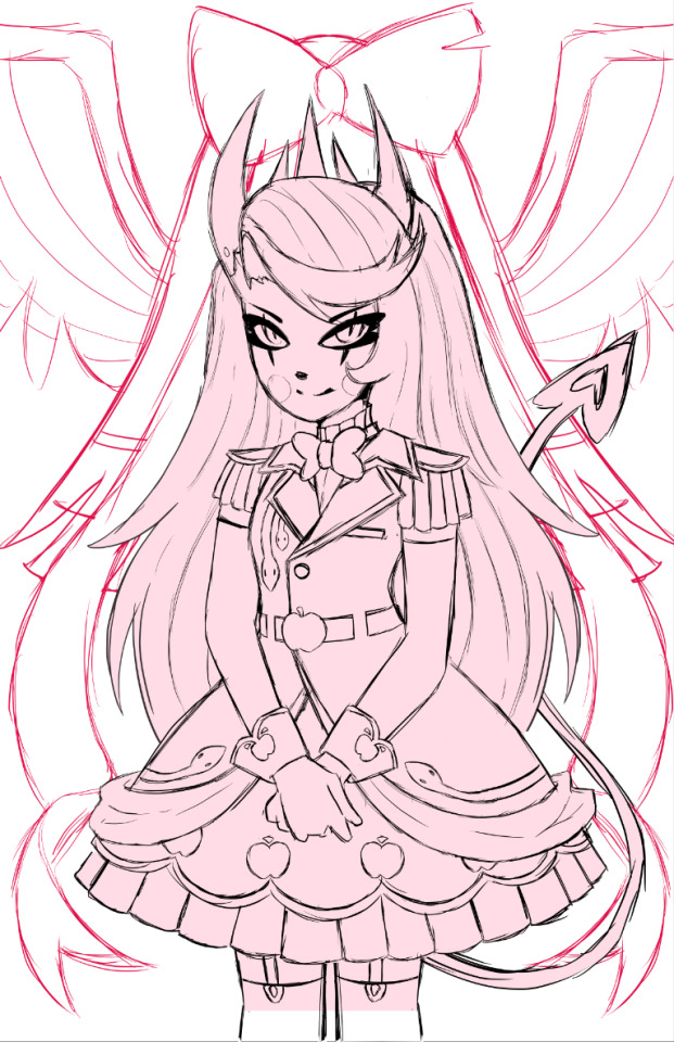
I adored the dress design, but it was an extremely flat image, so despite taking like. 5 hours to design it and work on it, I rethought my plan, switching to a far more dynamic pose.
I also made sure to add tons of flow lines, both from her hair, to her tail, to help bring the eye all around the canvas.
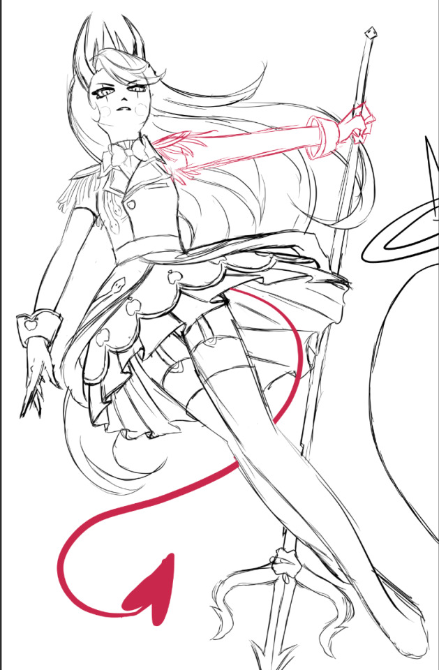
I did a billion sketches, but this is what I ended up on! Originally I had her right arm holding the pitch fork behind her back, but it just never looked right. I also took a risk and did a facial angle that has always been extremely hard to get right, and somehow I managed to make it look nice!
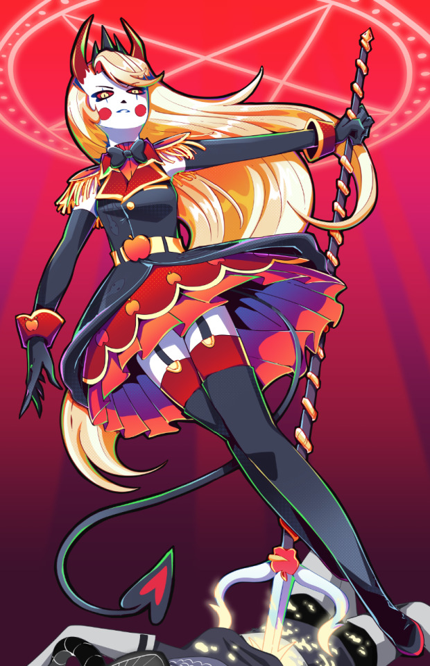
After adding the lineart, colors and all of that, I knew quickly I didn't want the angel to stick out as much as she did. I wanted her to fall into the background instead, since she was just on the border and I didn't want any attention really taken from Charlie. So I changed her shade to red, and from there I added more of the background details!
Okay I did leave some inbetween screenshots out but it's past my bedtime. I hope this was fun to look at, at least!
Final product once more!

#charlie morningstar#artists on tumblr#hazbin hotel#hazbin hotel fanart#hazbin hotel season 1#hazbin#vivziepop#cqart
1K notes
·
View notes
Note
Hello :D
I have been following you for the last year or so (a few days after I got my Tumblr lmao) and I absolutely love your art!
I have been wanting to study your art style for a while but don't really know where to start,,,
Could you please show me a small portion of your art process, if it isn't too much trouble of course. Thank you and have a nice day!
hello. oh my god. this took forever to find.
im sorry it took 2 WHOLE FUCKING MONTHS for me to respond to this but i wanted to put it off until i felt happy with my art process again, so here it is
my fall 2024 rendering tutorial!
(this will be very very long)

FLATS AND WHATEVER YOU WANNA DO WITH LINES GIRL. then make sure to recolor the lineart to better match your base. trust me it helps, bold dark lines are Not your best friend when rendering. wait for that post-rendering
i start off with a doodle or a sketch, and then filling it in with flats and other details such as blush

FIGURE OUT YOUR LIGHT SOURCE. FIGURE IT OUT GIRL YOU CAN DO IT you can make it as simple as possible, make it as big as possible, dont even THINK about the details.........just make it really fucking big so you at least know where the shadows and the light goes THEN add smaller shading details LISTEN TO ME. LISTEN TO ME OKAY!!!!!!!!
my key point with this is for you to learn lighting fundamentals.
it's SOOO ANNOYING but alas......they are all correct. it helps a lot.
one thing i also really want to point out is that i like creating a big shadow shape first before fixing up the little details (such as folds and whatever) because it helps me focus on the way the lighting actually works instead of tunnel vision-ing into making the shading make sense on the clothing.

contact shadows (i dont remember if thats what theyre called okay) theyre fucking ugly because im not actually thinking sorry 💔
okay so basically:
contact shadows (if that's what they're called) are the spots in shading and lighting where light will NEVER hit.
shadows are still influenced by the colors and lights around it (it's why a blue shadow and a yellow shadow feel completely different, despite both being shadows) so it's not always COMPLETELY dark.
BUT! there are small points in shadows where light never hits, and they're almost always super dark or pitch black.
it's hard to explain shadow and light so briefly for a tutorial, but you'll notice it when watching fundamental studies and when trying it out for yourself


YES i unclipped the multiply layer YES its ugly and terrifying but it makes coloring the multiply layer easier okay the colors merged w multiply so now it looks cool and has depth overlaying colors that actually make sense
so basically what i did was color the multiply layer that i used to shade the overall drawing
adding a band of red/orange/yellow around where the light hits, and blue where the shadows get big and wide, gives it a fake ambient occlusion effect in the way that a person would get if they stood under the sun with a clear blue sky
the colors don't have to make sense, especially because i never draw backgrounds, but coloring the shadows really help it give a sense of depth and extra subtle detail and effect that just helps make the painting look nicer
around the end, i also put in colors (in an overlay layer with a low opacity brush) that actually make sense in context of the drawing, which is the lit cigarette and the yellow eyelights
mostly because none of the colors were making sense and i needed to actually make use of the lighting that DOES exist in the drawing lol

adding a muddy golden yellow pin light layer (opacity turned down to like 40-50%) to make the light colors less ugly lol
i SWEAR by the fucking pin light layer style. it's so useful and so so underrated.
i used an almost brown-ish gold color on stop of all the layers, and with the pin light layer, it helped make the bright (almost blue-ish) white colors more warm and more yellow. it just helps make things more warm (something i prefer)
i could probably show what it looks like without adjusting the layer opacity to truly show off what i mean (like in the coming section) but i sadly forgot to do that lol


make a layer on top of your drawing with this color in these ranges YES the drawing is fully merged NO don't be afraid, the base was fucking ugly anyway 💔 make this layer into an exclude/exclusion layer style TRUST turn down your exclusion layer opacity from a range of 10% to 40% literally until you're happy with the contrast and the way the color over the drawing. use your eyeballs. i know you can do it im so proud of you
this is pretty self-explanatory instruction-wise, so i'll go into why i do this instead
i really like art that seems like it has low contrast, with almost mid-gray shading and lines. i don't personally use dark and bold lines and shading, unless i find it necessary for the tone of the piece, so using this method helps lower the contrast of the art and make it look "pleasantly muddy" in the way that it's easier and softer on the eyes.
the inverted blue color also helps makes things warmer!
the exclusion layer style is still a bit of a mystery to me but i really like the effect it gives, even if i don't completely get how it works lol
if you want an alternative method to this, and if you have access to it (because i primarily use sai and sai only),
i absolutely encourage you to play around and experiment with gradient maps.
there are so many out there you can make yourself or even get from others that just give the painting an extra amount of depth and color variation. they're SO fun.
personally, if sai2 gets a gradient map update, it's over for y'all it will literally be so over no one will be able to stop me


then i merged everything and actually adjusted the contrast back up because it was looking too muddy for me 💔 but the color adjustments are still there so all hope is not lost here's a comparison of the adjusted contrast in black and white (adjusted on the left) (newly merged layer without adjusting the contrast on the right)
as you can see, i actually turned the contrast back up (despite talking all about how i liked things with less contrast lol)
i wanted to demonstrate that doing adjustments should be done in moderation, and is why i adjust layer opacity often when making color effects
you are free to play around with colors to help your style, but don't lose your initial idea and colors along the way.
you still need to trust your own colors and intuition!
along with that, i just want to say that it's completely okay to change your mind mid-painting, and it's okay to make somewhat drastic changes.
don't be afraid to change things you don't like or change your mind about certain aspects way later on
that's basically the whole thing of this!!! don't be scared!!!

now im gonna hold your hand when i say this..........but you need to learn how to render by yourself. it seems like i can teach you but i literally can't, because rendering is different on every piece and depending on how clean your base is. i have to render A LOT because of how fucking ugly my sketches are LMAO to simplify it, think of it as obsessively cleaning up every detail you can see, but with a color picker and a clean, hard edged brush. if you have shit lineart, you don't have to redraw it cleanly over and over, just paint over it. that's basically what rendering is
THIS especially is where you need to be brave and stop being scared.
like i said, i can't teach you how to render, and it's something you have to discover yourself because rendering is something that will always be personal to every single piece you make. the way you render on every piece is different.
on one piece, you will barely need to render, and on another, rendering is more than half of your ENTIRE process.
don't be afraid to paint over your old art.
rendering is a process that's both very perfectionist yet also very careless.
find your balance and just go for it.

and then that's it……..u did it………..now yuo know how to paint and render. it's literally just layering shading and lighting knowledge until you think it makes sense and looks okay lol additional note: since i render in only one layer (you don't HAVE to do this, but it'll be harder for you…), i also made slight adjustments with the transform (and liquify, if you have it) tool to make things more proportionate. (i drew the head too big lol)

if you compare the finished piece to the final unrendered base, you can see that a LOT changed, including a bit of subtle proportion adjustment.
particularly, the sleeves changed A LOT (because i really didn't like them)
but it's also over all cleaner and more coherent, instead of having haphazard colors and shading just thrown about.
rendering is when you finally use all 100% of your brain to finalize and figure out where the shading should go, where to clean up your lines, where to ERASE or ADD BACK in lines, and make sure all your colors look coherent.
it's not as intimidating as it seems, i only use a hard edged brush with a little bit of color mixing and my color picker.
it's like dragging and dropping colors to cover up mistakes, it's really quite fun when you get used to it
i wish i could explain it clearer but it's hard to describe without visuals!
i hope this helped, and i hope all my yapping isn't annoying (art as a special interest beloved)
have fun studying and trying to render in my art style!
#long post#art tutorial#rendering tutorial#art help#art tips#tutorial#kia doodles shit#artxstic-scr1bbles#tutoriel
181 notes
·
View notes
Text
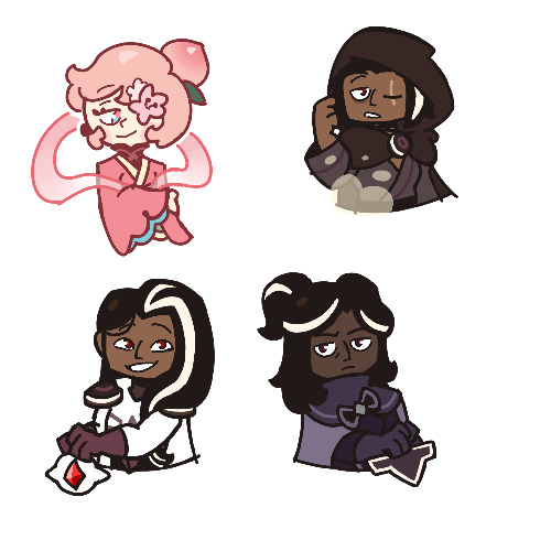
…Okay, you may end up seeing these drawings yet again on a later date
I finished the page, which was small at 500x500 px, but I wanted to make the page bigger. I did that, and I drew one new thing, but now I don’t know what else to draw on there. So for now, I figured I might as well post the original full page right now
Yeah, sorry for the laziness
This is the other sketch I finished on there, for those curious
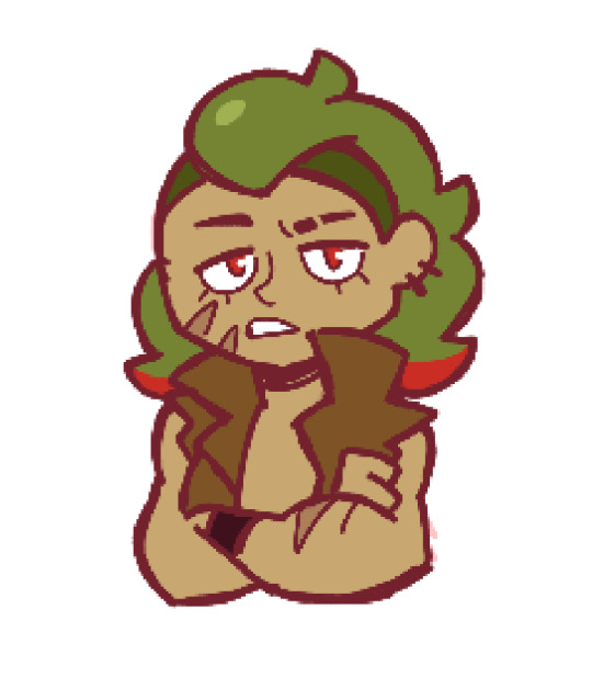
Anyways, so yeah, this new style practice I’m trying
The original page I tried these out on is this, which also isn’t full, but I thought trying it out with actual characters instead of just random poses and shapes would be better, so I switched over to Cookie Run characters
The method is still a work in progress when it comes to all the shapes and the red sketch layer
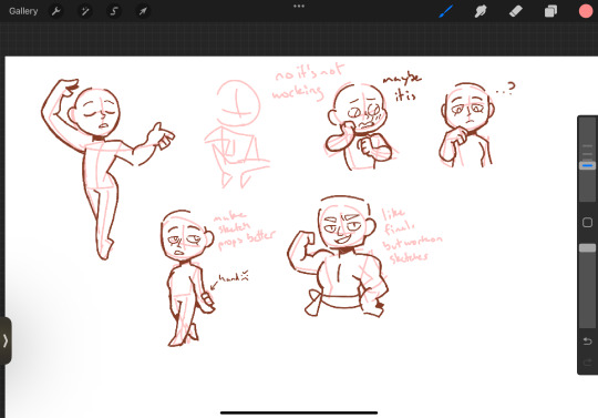
I suppose what I should do now is try drawing a bunch of different Cookies that have different body shapes, so that I have practice with that. As well as maybe attempt some full body ones
I suppose you can suggest some if you want, considering I don’t know who to draw other than like, Hollyberry or Avocado, since I should try drawing large but not buff characters here. But I should also probably draw more skinny, and also chubby
But on to what I actually drew
So I already talked about Peach Blossom and the top Dark Choco drawing prior, so no real need to elaborate
The Dark Choco and Dark Cacao one was me drawing them in their younger forms to see how they compare. Not for any sort of study thing, but just in a symbolic sort of way. Since they’re so similar looking
I think I had a lot more fun with Choco, especially his hair. I remember Cacao being mostly annoying for his weird cloak thing that I don’t understand
The hand pose was ass though. I knew the general idea of what I wanted, that being them with their hands over their swords, but I was struggling to figure out how to draw the hands. Not to mention I had to change the pose from the red sketch because the swords were further down than I put them. I still don’t think I did the pose exactly correct, but screw it, it’s good enough
I’m also noticing that Choco looks way lighter in skin tone compared to Cacao. Like yeah, I know he’s normally slightly lighter, but it’s far more noticeable here. I’m pretty sure it’s because I used Dark Choco’s ToA colors here (bc they work better with my black lineart), which are slightly lighter, as well as just that Dark Choco is wearing much lighter colors while Dark Cacao’s are relatively darker. So maybe it just makes them contrast more
I liked drawing them, but I also did basically do the same body type 3 in a row, so I should probably draw different characters
Anyways, let’s talk about that extra sketch
So for those who likely don’t remember, that there is an OC of mine called Prickly Pear Cookie
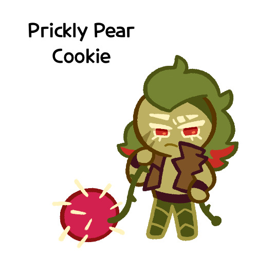
I made her entirely on a whim one day, and she doesn’t really have any character or story, just vibes, but I really like her design and wanted to draw it again
I probably should give her some sort of bra though. The shirtless chest looks cool but in my opinion sounds really uncomfortable without at least that
I did originally draw her with the green skin, but it looked weird so I shifted it to more of a yellow so it looks more human
Honestly I really like how she turned out
But yeah, I think that’s about it for now. Just wanted to show this
#I need to tweak and perfect it more#but it’s turning out relatively nice#I just need to stop falling back on old drawing habits#I need to relearn hands a new way#I have a reference that I found later on so I might use that#anyways#cookie run#dark choco cookie#dark cacao cookie#peach blossom cookie#art stuff#art style#cookie run oc#prickly pear cookie#my art
161 notes
·
View notes
Text

it was suggested I post this to the tags as well >:D
fuck it ima tag @transcendence-au as well because tbh I'm very proud of my silly little animation
some me being a nerd under the cut!
okay so this all started when I read the original post this was inspired by and though 'wouldn't it be silly to add some art to this 3 year old post?' but then I decided to animate it for funsies!
and gosh I sure do love animating!
So I got the base sketch and then got into the lineart animation for each component!
i don't have the sketches/wips saved at all sense this wasn't really a project and it took less than a day to complete. but here's a peak at the timeline
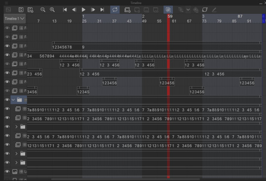
I animate entirely in my ususal drawing software: clip studio paint. It's just what's easiest for me.

all of these layers outside that folder are just the sparkles! after I finished I added some sparkles for fun! there's a lot of them because it involved a lot of copy and pasting sparkle layers
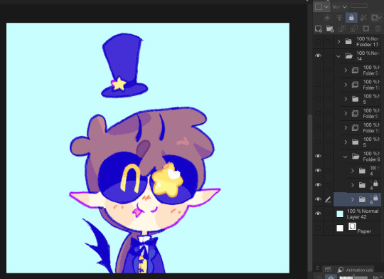
the bottom folders here are the wings body and facial expression! for everything like the wings arms and flags I was able to just copy paste, reverse, and then align the timing correctly in the timeline
one thing unique about this animation is that the lineart and colors are in separate layers! I tend to do line and colors on the same layer but this time I was using a brush that doesn't have the same lack of anti-aliasing and sense it's a small animation I wasn't as worried about keeping a minimum of layers like usual.
also the movement of the body is only 4 frames! and one one of those is just the hat shifting position
initially I wasn't going to have the second facial expression but when I got stuck on animating the flags I added the second facial expression while taking a break.
the arm animation is just 8 frames! honestly the only tricky part in this is the flags, everything else was pretty simple, which made it super fun to work on because I got both a challenge and mindless therapeutic drawing out of it.
NOW THE FLAGS there was 3 throw away attempts before I got it: you see the thing that made this tricky is finding the balance between believability and visual appeal. a big part of animation is creating the illusion of physics, this is the 'believability' part, I need these to look like flags that are moving and made of flat fabric, HOWEVER if I animate these one-to-one with realistic physics: it won't look good! I can't apply wind to the whole drawing because then the hair would have to react, and wind goes one way, and I wan't the flags to be pointing opposite directions. so without wind the flags would be laying down flat, but that won't look good at all! and furthermore realistic physics would have the flag not being all nice and front facing most of the time. so the trick here was figuring out how much physics to apply to make it look believable, while still making it look good.
one trick I did to help me animate the flags is I actually made a plan rectangle flag as a guide so that the general mass/volume of the flag would stay consistent, this is something i highly recommend when animating! like having a circle guide along a characters head to keep their height and proportions consistent.
after I finally found the balance with the flag lineart coloring wasn't too hard! sense I just had to follow the lines, and THANK GOODNESS the trans and aroace flag have the same number of stripes: saving me time!
and then it all comes together to make a satisfying perfectly looping bundle of cuteness >:DDD I feel like the tau fandom doesn't have as many artists with particularly cartoony/chibi art styles so I've gotta play my part in spreading the joy-whimsy-adorable-sillys >:D
anyway! hope you get to see a cool beetle today :D
#kyukyudraws#animation#alcor the dreambender#tau#transcendence au#the transcendence au#gravity falls
105 notes
·
View notes
Text
Okay so last night I was having an "art style panic"? I guess you could call it that? But I was feeling really bad, so i started drawing other peoples art styles and picking points and peaces out of it!
I did this last night when I was really tired and i used a pen so the drawings may not be how i usually do my drawings haha
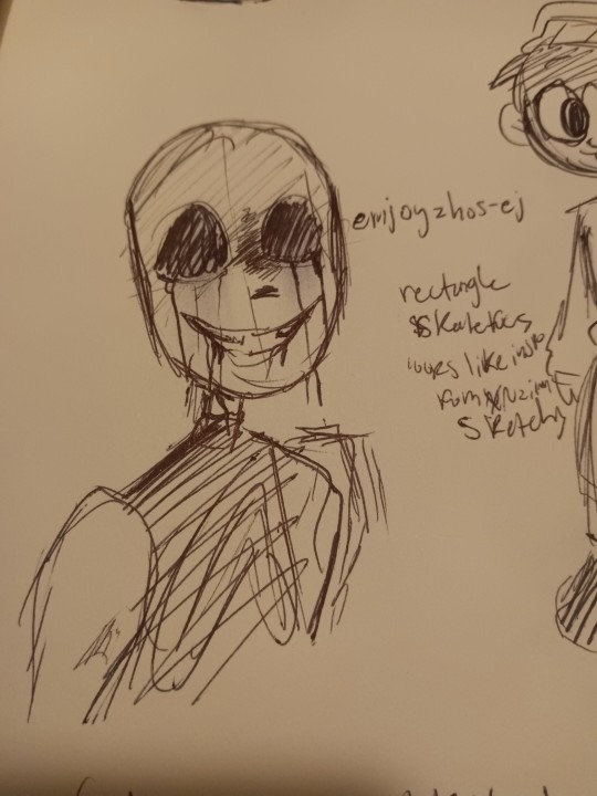
Ok so first up we have @emjoyzhos-ej !! I recently just found your account but you have a very cool style!!
•Your skull shape is very unique, very rectangle
•your lines are very sketchy (most people I follow have this trait in their art..)
•when you color it looks like you mayy have rook inspiration from itsxroxannex? Idk i wrote that down, maybe it's not true but I guess i thought that last night
But I love your style! Your art is so cool and I had fun trying to replicate it!
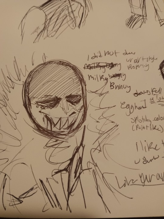
Next we have @milkybnnuy ! Omg so I really like you!! Your art is sooo good
•You draw a lot of fell, so i made the drawing of killer like how you made that one fell killer drawing
•when you color you have a very paintly-style and that's cool!!
•your skull shape reminds me of an egg (i guess thats why i said "egg head" last night)
Up in the top I wrote "I did not replicate your art properly enough," and that's true! Your art is so unique and different from what i usually drew so i had a hard time replicating it! But nonetheless, i had a fun time trying and hope you ain't disappointed lol
Btw- I really like the way you draw your fuzz on hoods!! So satisfying to look at!
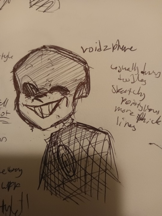
And now we go onto @voidzphere !
I've followed you for a while, and you're cool to be around and I like when you post! Though i had a hard time finding the art hidden around, I still was able to replicate it (luckily i chose to draw killer for this haha)
•so I see that you usually draw/post doodles, unless i just didn't scroll down far enough haha (plz tell me if you have drawn something big i wanna see)
•I noticed you have more pointy and thicker lines
•you have a certain way you draw your Skulls, I can't really put a shape or object here to describe it
Even though I couldn't find more drawings, I still tried! I hope you like it, friend, cause u cool
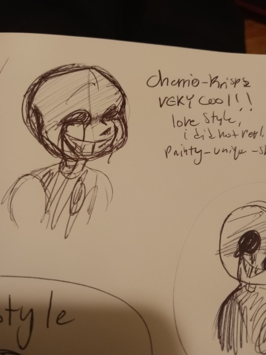
Here is @cherrio-krispz ! I just started following you last night, like seriously I had to search you up just now to figure out who you were cuz I forgot, but when i saw your art I immediately recognized you
•you have a very recognizable style!
•again, i did not replicate well.
•very painty-like when color
•sketchy lines, seems like you don't do line art?
•I like ur skulls, they look like skulls
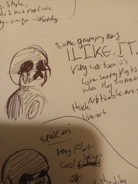
OMG I'VE BEEN WAITING TO TALK ABOUT YOU. YOU. YOUUU. @somegrumpynerd OMG YOUUUUUU. I REALLY LIKE YOUR ARTTT.
•I LIKE IT
•very cartoonish
• noticable art style
•thick lineart
I LOVE seeing posts when they come out!!! They're really really cool and make me feel so happy when I see them! Keep going because you're so cool!
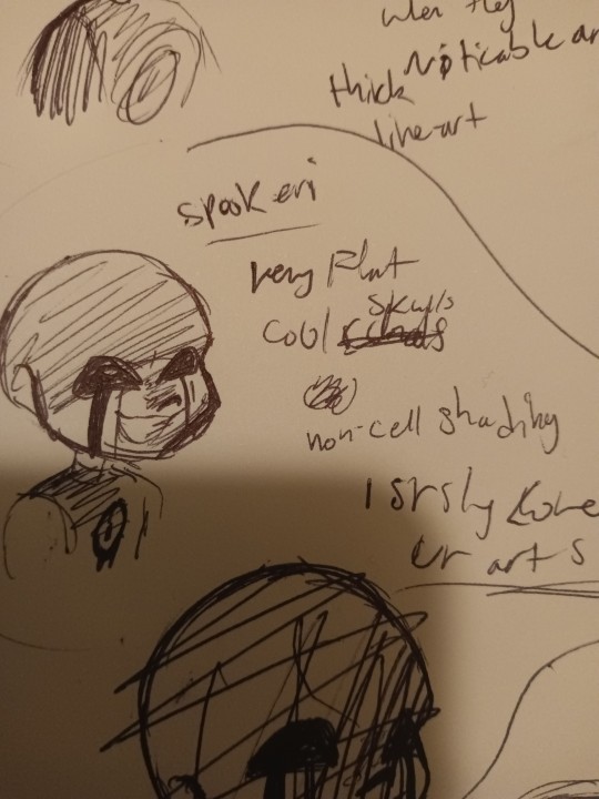
@spookeri haiiii
You're here tooo
i like ur art :)))))) a LOT . Same as the last guy, I get very excited when you post. Your DTIYS were fun, and yeye... Yeah
•Very flat colors
•flat lines
•cool looking skulls
•you have an "air-brush" shading style (i guess you could call it), which isn't a bad thing! Do what you want to do! But maybe try out cell-shading? Idk you don't have to, but idk i feel like cell-shading fits your art style
Also if you look in the bottom you can see a scratched out drawing, that was my first attempt haha
You can see it in the drawing below

@wyllaztopia !! I like your art :)) you have a very noticeable style and when you post I get excited as well!
•clean lines
•you make skulls longer than how other people make their skulls in this last
•I liked replicating it
Idk what else to say ... Its just all really cool!!
And last but not the worst
My art style!
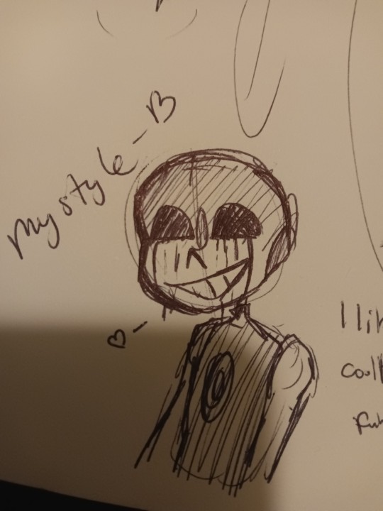
My art style is
•cool
•easy to draw
•and funny lookin'
What did i learn from this whole thing i did? That everyone has a unique style, that even if they try to change it it still stays theirs and it's still unique
I also found out that everyone, small artists and big artists, has flaws! It's comforting to know that everyone has flaws so I know I'm just learning and getting better everyday
Another thing I got from this is that everyone's styles are always changing and warping. But thats fine! Because everyone's moving and changing, and the worlds always moving and changing!
So, don't be so hard on yourself if you're struggling to draw or find an art style, how you draw is unique to you and you'll like it one day
Just keep drawing everyday and you'll get there.
I suggest doing this challenge, on paper or digital, wether you color it or not, or post ot or not!
It's great to try out.
228 notes
·
View notes
Text

A gift for the woman likers, behold, futch milf Phoenix Wright in a fun dress
Artists commentary (and a gay little surprise) under the cut

Alt colors (bg and earring), okay so first off, I applied some aspects from my Phoenix!Phoenix AU, including the design of the peacock feather featuring a magatama. Also the scorch marks on her chest is a reference to the AU, where when Phoenix is injured and their blood is ignited (either through death or cheating death) it leaves behind dark marks for a while. Also, I thought it looked cool.

I just stole the sprite and played with it to match up my design for fem!Edgeworth, I just thought she looked cute sitting on her wife’s shoulder. Also since this is a merging of AUs, Edgeworth gets little fangs bc she’s a little vampire. She is drinking blood out of her tea cup.

I did not try very hard but I am proud of the hair looking pretty seamless all things considered. Also there’s lipstick and bloodstains on the cup. I thought about that.

Slight close up with more noticeable lip scarring

Edgeworthless 😔
Uhhh clothing design, the wings are obvious but the cape/sleeves are Trucy and Lamiroir inspired. Sorry Thalassa, Trucy’s new mom gets your whole astrology aesthetic now. Also I like to give the Wrights stars as their celestial theme to go with Apollo’s sun and Athena’s moon.
She wears her magatama like a Fey, which will feel much more important when I get her fic out… it’s almost 20k words long and I still have several scenes to go through.
Also fun fact, I tried to do the scale/feather pattern by hand and got halfway through before remembering that I was using a simple grid pattern and could easily just copy the layers and move them around instead. So uh… whoops.
This was the first time I used my sketching pencil for a majority of the lineart and I think it’s pretty cool, though it’s not like anyone can tell lol.
#phoenix wright#fem!phoenix wright#Phoenix!Phoenix AU#ace attorney#wrightworth#narumitsu#narumistu yuri#naruhodo ryuichi#my art#artists on tumblr#fanart#art#my artwork#phoenix wright ace attorney
70 notes
·
View notes
Note
Not ship chart related but I think your art is so pretty!! Do you have any tips? Especially with coloring if it’s okay <] (/nf)
waah thank you very much! i'll try and explain but here’s my colouring-specific tips, or at least how i choose my colours !! <3
unless for stylistic reasons (e.g. greyscale drawing), i personally avoid pure black, greys and white for colouring. go and choose off-colours instead! for lineart, black is okay but i always go for an actual colour anyways heheh. for the background colour of your canvas, sometimes an actual colour (rather than white or grey) may help you pick your palette to be more harmonised!
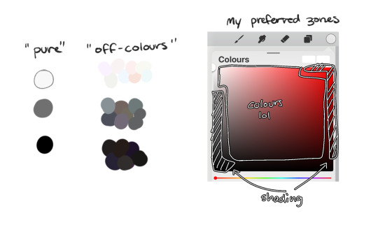
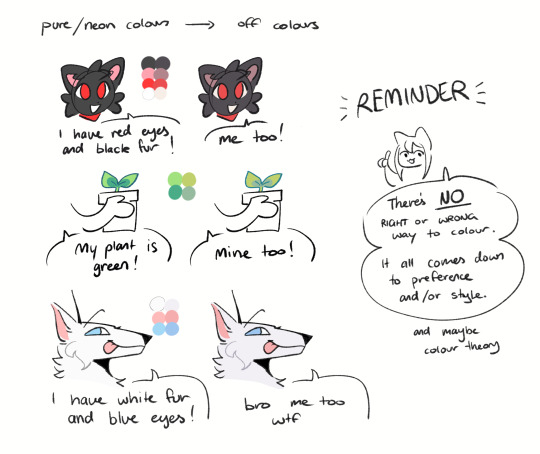
following this, i also don't like using pure/neon for colours, unless it's for a certain aesthetic or artstyle (e.g. the character has a "toxic/radioactive" aesthetic; the character is a scenedog (or similiar); or highlights). see below for examples! they may be subtle but sometimes the subtly can make the difference you are looking for... if you're looking for a natural look. if you're aiming for the bright/old 2000's artstyle, then pure/neons may be your friend!
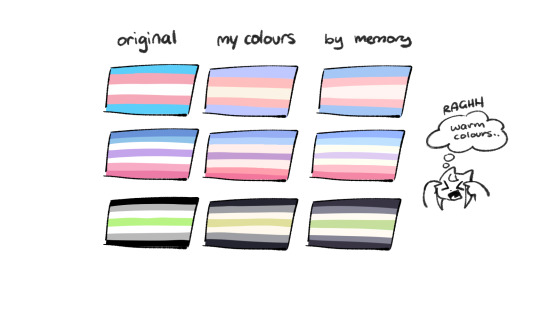
when i'm casually drawing characters (oc or not), i rarely colour-pick from the reference image. i find that when you're "forced to make the palette", it can come out more pleasing to your style/atmosphere of the drawing! it’s more personalised that way... like yea, that’s my favourite versions of those colours! i'm not saying that my colours are better though, only that "hey that's me! in those colours!!" you can have the reference image on the side or go by memory. here’s me doing this with pride flags:
nowadays, when drawing the spooky month characters—who have simple designs god bless—i can just imagine their reference and adjust the colours in my head lol example: if i know that Lila's colour palette is purple, and that her winter sweater is coloured lighter than her hair, then i can just go ahead and pick whatever shade i want following that rule!
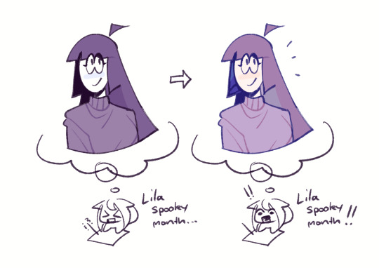
(of course, always double check with the actual reference for physical design inaccuracies and skin tone if it applies. my advice above is just for general hair/clothing colours! …because yknow you don't want to accidentally whitewash a character's skin in the name of aesthetics lol. if you’re unsure and want to be on the careful side, please do colour pick the skin at least !!)
moving on... gradient maps and certain blending modes (like exclusion, luminosity and darken) can be a game changer too. for normal drawings (e.g. drawings with no environment), i use darken the most because it changes a few colours rather than the entire piece... (the percentages are opacity levels!)

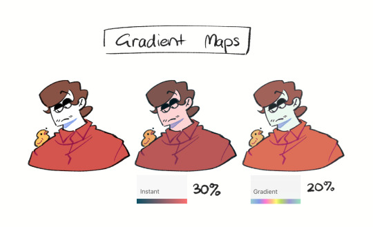
oh and as a really basic shading tip without using blending modes: sometimes, you just gotta go for grey. shading a warmer colour? use grey to make a cool tone. shading a cool colour? use grey to make a warm tone. not all the time (because you don’t wanna make your shading seem muddy), just sometimes…
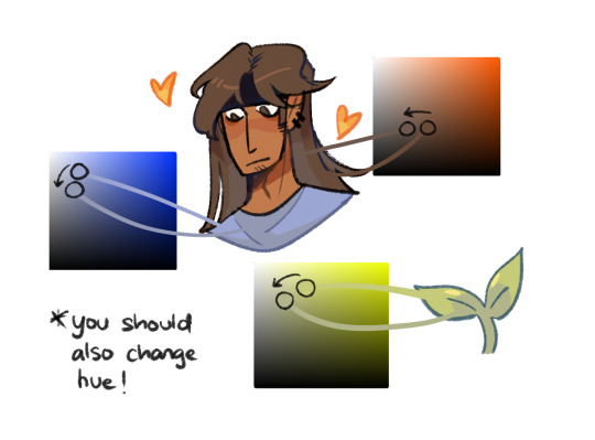
and that's that! there's always exceptions to rules and often times, your headshot doodle ends up as one big experimental mess (in a fun way, hopefully)!
this is how i choose my colours though most of the time, it is just me going “good enough”
i think we're pretty similar on how we like warm colours! i enjoy going the simple/lazy route and avoid blend modes but then again, shading is a whole different thing…
hope this helps in any way !! <:3 !!! <3
#if anyone wants to ask for specific tips i’m happy to share!#if i have any lol#[ the askbox mourns ]#[ the art of mourning ]#[ mourn's mourns ]#anyways yea i kinda do just imagine the spooky month characters with a light orange multiply layer and then try to replicate it irl#my personal/lazy rule is that if it looks good faraway its good enough AHAHA#spooky month lila#spooky month jaune#spooky month rick#spooky month aaron#spooky month#“actuallyyy the 'black cat' is actually dark grey—” SHHHHHH SHUT SHUT IT. SHUTUT !!!!! i need u to see the lineart /silly#[ mourn's resources ]
95 notes
·
View notes
Text
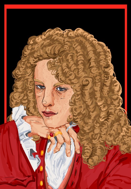
Prince Jenson of Somerset
+ process & lore
Yayyyyy omg finally have drawn portraits of the four main characters!!!! I'll show the process of Jenson's first and then them all four together. Though it's a shame the Seb/Fernando ones are older, I think it's hopefully obvious how much I've improved since November?
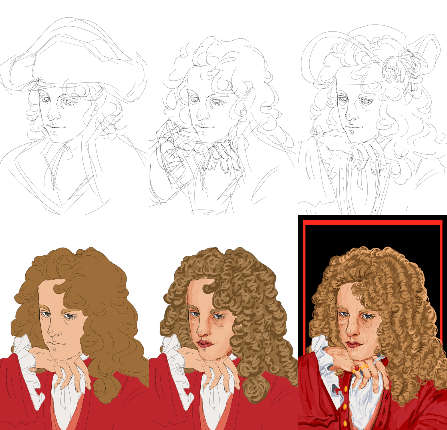
Look at him in all his handsome, princely glory 🥹 It's funny, I'm always happy with the second sketch and initial lineart, and then I start coloring it and I absolutely hate it, and it takes a significant amount of time into the painting for me to like it again. And then I reach a certain point and I'm in love with it again. Ugh though I gotta say, I love drawing the curls, it's just so 18th century, but at the same point, man I always will love my original lineart for the hair the best ah. Also yes I absolutely had to give him a big ass hat with feathers, he really is that kinda guy to me. I originally drew a bicorne and then realized that those don't really exist until basically almost a century later oops, so tricorne it is!!
Okay now omg look at them all together 🥹
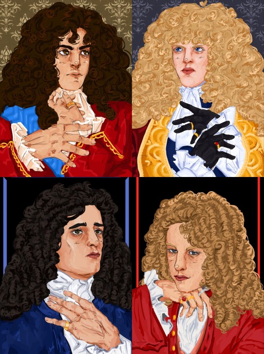
Haha wow I have improved a lot! Just like the Seb/Fernando ones, Mark and Jense's were meant to be put together. I think there's a lot of inherent characterization in their poses that highlight the difference between them. Mark is looking up, very wistful, looking up to greater people, greater things. Jenson's head is tilted down, almost looking at the viewer, he is very satisfied with his role and revels in it, he's here to slay!
Okay, yes, lore, characterization, sorry that it is so far down on the post!!
Jense would probably be the fan favorite if this AU was an actual book or show or something. He's the guy you randomly find while browsing Wikipedia and you're like, woah this guy is so cool??? Unlike Sebmarknando, he doesn't really have the same level of angst, he's kinda just chilling. He's a bit harder to write a lore post about, because he's basically that character who is always magically around the corner, ready to witness some crazy thing and just breeze past it.
He is less linked to Seb than people like Mark and Fernando, because he's basically just his personal minister of transportation(read: horse fucker), so he avoids a lot of the relationship complications and drama, but that isn't to say he's completely uninvolved. He really likes Seb, and loves to hang around with him and serve him, but he's not as beholden to him. He's who everyone goes to air their grievances or to get away from the others, and he's very happy with this role. He's generally willing to play any side in an argument, but does tend to have a pretty big soft spot for Seb overall(Seb also gives him cuteness aggression, and he wants to bite him. Especially when Seb puffs himself up and acts super bratty when he gets offended at not being seen as a proper ruler.)
He's royalty from other kingdom, but pledged his loyalty to Seb's kingdom when he was quite young and has served him(his father first) ever since. He started off somewhat low in the military, rose to a pretty high rank, was a renowed war hero, and then ended up retiring pretty early to tend to Seb's horses. That's an oversimplification, but yeah. He liked the military life, was very good at it, but decided he had done enough, and wanted to be involved in more direct service, albeit more laid back. As I mentioned in Mark's post, Mark *really* doesn't understand his choice to do this, because if Mark had been in Jense's position, he can't ever imagine being able to let all that go and living the quiet life.
He is the palace whore, everyone has been with him honestly. It'll be like, some man walks into his bedroom, only to see Jenson in bed with his wife, but instead of being angry, he's like "wow you couldn't even wait for me??" He's just very carefree, and happy to just slut around and tend to Seb's horses.
I think he definitely still advises Seb, and would go to battle if truly need be, but generally seems to be living in a different world than the weird psychosexual homoerotic political drama that the others seem to be living in. But as I said, it's not like he doesn't contribute to it! He loves to goad Fernando, and constantly plays devil's advocate in "debates" between Fernando and Seb. He's also obviously the one that keep "accidentally" locking them in rooms and forgetting where the key is.
Sorry if this isn't very explanatory, I hope it gives a general idea to the type of character he is???? As always, let me know if you have any questions! I kinda struggled on what to write here because I'm finishing this at almost 8 am 😭 so I'm not sure if it's great or not. But basically you need to know: horse fucker who is generally breezy and carefree but also can be a bit of a menace to society every once in a while.
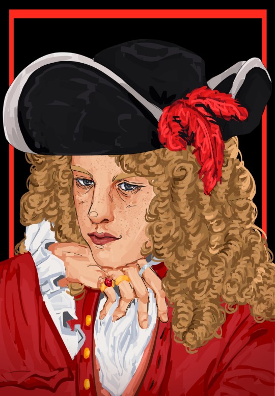
#YAYAAAAAAA PRETTY HAPPY WITH THIS ONE!!!!#lmfao tho not 100% sure about the lore notes because i wrote this at like 8 am#hope its understandable 😭 and that you love jense as much I do#hes probably the funniest character in the AU#and like if it wasn't centered on seb/nando he would be the favorite#hes just often there as my kinda reaction character#tho both he and Mark are reaction characters but on opposite sides of the scale and they play off each other#jenson walks into a room where sebnando are psychosexually glaring at each other from across the room#and hes like hmmm how can i make this worse#and mark is the type to walk into the room. see whats going on. and briskly walk away#so jense absolutely loves to tease him w this kinda thing and just make any situation 100x worse(aka funnier)#well funnier for him probably not the other people involved#but its okay bcs they love him. hes jense!!! who wouldn't love him!! hes our favorite guy!! our jense!!!#I just love to imagine he gets all the sides of the gossip and is like hmm yes yes interesting#but doesnt use it for scheming or evil but rather just to tease and be annoying and make everyone blush :)#okay well anyways wow im not really discussing the art itslef sorry!!!@#I think he looks so handsome pretty in this 🥺#hes pretty difficult to draw but i think it came together when i gave him freckles tbh#i hope he gives off carefree but seductive but laidback prince 🙏🙏#f1#formula 1#jenson button#catie.art.#boy king au#*not sure about his title officially yet. i mean hes from somerset but yeah idk its okay
55 notes
·
View notes
Text

I have no idea how he got there in this fight but like he's here now yeah
Hey @floofanflurr here's your dtiys, it just poped into my head when I woke up one day (like 2 days ago) and like yeah why not
Also below this is the art, stripped (okay, by that I mean I turn off some layer, like the color, or the lineart, because it looks cool)

This is just the one without the beam, so you can see more of him, I can't draw this guy without reference... which is probably normal actually

This, lineless, looks pretty cool in my opinion (the one drawing it so maybe I'm biased, but like look. These always looks more abstract... it's pretty cool, except Flowey who looks exactly the same)

Samee thing with beam because it also looks cool

Colorless! Linearts are fun, a bit bland but honestly I just like drawing lines
But there is a problem I just noticed when I'm posting
...
-The uppermost art, I forgot to turn on the glow layer, the part in front of the bones and Papyrus and Frisk. Eh I can just re-export it
-...I accidentally shift Omega Flowey's line upwards when I took the last picture for lineart, somehow, so the attempt looked like this

...At least it's pretty cool?
Anyway uh, at the end I redraw the upper part of him that got deleted that's like 7 pixels thick, that's what's up there right now. so guess the thing about these under here being the uppermost one stripped of layers is a lie.
...
...Oh well, I'm not doing the whole thing again, it's not that different anyway, probably. If you want the true original lineart you can look at the one without the beam, though you probably won't see much up there due to the black background.
#Protective Papyrus DTIYS#Undertale#Frisk#Papyrus#Flowey#Omega Flowey#utdr#undertale fanart#undertale art#my art#not reblogs#notreblogs#I just realized I forgot several things#Frisk's shoe is the same color as the background so you can't see it#I also forgot to color the corner of Flowey's tv you should be able to see so you also can't see that#eh good enough honestly
15 notes
·
View notes
Note
Big fan elor elor elor how did u start ur art journey and any tips you'd wanna share
heheh hey callous, ive been drawing since elementary school and the best advice that i would say is learning how to study art styles. not just copying what you see or referencing, like really looking at their messy sketches, line art, coloring styles, trying to identify how they made certain effects with what they had (digital or otherwise)
I took AP art senior year of HS and we had an assignment where we had to pick a professional artist, study their art style, create a piece that was inspired by their work, then write a small paragraph on what specifically they do in their art (warm and cool colors, contrasting, brushes, etc.) and honestly it was one of the most helpful exercises ive done.

an example of how my style breakdowns go (SORRY @sunnydayaoe I REALLY LIKE YOUR ART SO I DID A MINI ANALYSIS IN MY OWN TIME</3)
i got a bunch of their work, focused on what exactly made it so unique (i.e saturated colors, colored lineart where the light hits, texture, etc.) then tested how i would get an effect like they do (with the limited brush choices they have on flipaclip lmao)
but yeah! thats texting, experimenting, and analysis with kappa.
i did something similar in middle and elementary school where i would check out comic books that had styles i liked and copy it. how they drew eyes, clothes, poses, expressions, etc. (examples being babysitters club and legends of zita lmao) The class I took simply showed a more through? way to do this?
also just getting comfortable with restarting, redrawing, and making bad and experimental art. stuff's allowed to look ugly sometimes. you're learning. art is supposed to be fun, its okay to take a break from a piece for a bit.
16 notes
·
View notes
Note
I LOVE YOIR DRAWING. I WANT TO MARRU IT.
On a serious note, I really do love it! Everytime you post with a drawing I unconciously zoom in on every part, trying to analyze it. How do you make everyone look so handsome???
If it's allowed, would it be okay for me to ask on your drawing process? And I guessed your pen was the su cream on csp or at least something pencil like. And maybe you color with something similar to the round brush from procreate..? High chance I'm wrong though!
Again, sorry if the ask is too personal! It's okay if you don't want to answer, I just want you to know that your drawing is VERY cool!
Aww, you're too nice! Don't worry about it's not personal at all. Thank you for the kind words <3 It flatters me that you take your time to appreciate the details of my drawings :3 My drawing process it's really simple actually (bc I'm lazy lol). I usually don't... make lineart? I just use the sketch as my lineart lol, even in big, detailed drawings, I like the messy lines better. Next time if i have a step-by-step process I'll share it for sure! You were pretty close with your guesses actually, i use Clip Studio Paint and my lineart brush is this one:
Sadly, my coloring brushes have been deleted from the store since i downloaded them so I don't think I can share them with you, but you can just find any watercolor textured brush and that'll be fine! Hope this helps you hehe, thank you for asking so kindly! Have a great day <3
65 notes
·
View notes
Note
Fuck- I forgot to add the following question to the last one SLWNWKWBS
But uhm,,, I was just wondering how you do your sketch progress if I may ask?
I always find it interesting To see how artists do their sketches and put down the shapes to archive their wonderful artworks! (And I feel one can learn a lot from seeing the progress :0)
-💜🐈
OHH WELL, WHAT A QUESTION... 💕
i don't think i do it much differently than any other artist really... especially in more RECENT years when i've leaned more into more of a " traditional artist process " rather than just being the most insane person & drawing from nothing,
because i used to do that. no sketch, no skeleton, no regard for anatomy, no pillow, no NOTHING & let me tell you. i'm better mentally for changing that
( no nothing on the left vs used a presketch / skeleton / structure on the right )
okay maybe you can't tell because these were drawn years apart anyway BUT BELIEVE ME ONE OF THESE TOOK MORE PRE SETUP THAN THE OTHER & IT'S NOT THE ONE ON THE LEFT
hi everyone who's been with me since 2018
ANYWAY. THE CURRENT DAY PROCESS;
STEP 1 ) the " beta sketch "
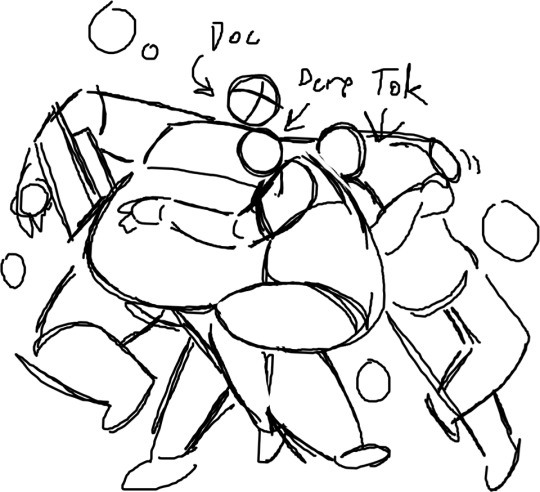
my clients will Especially recognize this term & these shapes;
SEE HOW THIS LOOKS LIKE A LOT OF BULLSHIT NOTHINGNESS? i usually start with This Nonsense to get a good feel of the pose / situation i'm working with / to give a poor client working with me some idea of where i want to go with their request;
this is the starting phase to put an idea in everyone's heads but everything is plenty subject to change;
NOW, STEP 2 ) uhhhhh beta sketch part 2. thumbnailing maybe
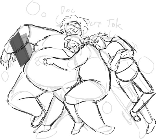
NOW i start shaping the ball of clay i've birthed a little more, NOW i start taking anatomy, structure, the final positions & expressions into account according to how i or a client may want them;
this is the stage JUST before linework so the majority of changes are usually done Here. this is still obviously way messy but Much more coherent ( at least to people who are me ) & what i imagine professionals deliver to their clients first as to save time. i however have plenty of that & will harass you with every passing second
STEP 3 ) linework !!!
HOWEVER clean or messy it may be, this is the lineart stage! the second to last course! this is where the BIG SHIT goes down & everything falls into place; everything's WAY cleaned up, the picture is Almost done, & well- you get the idea,
STEP 4 ) heueheuhsijhruigrjhdihirednguerhgiudf DONE

this is where the final colors & details & SHADING & WHATEVER needs to be incorporated comes into play, OF WHICH INVOLVES LIKE 3 ADDITIONAL PROCESSES but i consider this just One Big Step considering it's all relative to me & i don't even stop to BREATHE once i hit this stage
& THEN WE END UP WITH THE FINISHED PRODUCT! just like that!
of course, it maybe takes a bit LESS depending on the seriousness / level of detail necessary for each piece, maybe i feel more than confident to skip right to the lineart & cook, BUT THIS is USUALLY how the process goes!
& i'm sure there's someone out there who probably laughs at me & thinks they can do better or quicker or sexier & TO THAT I SAY
ok cool
MAY THIS HAVE BEEN AN ENTERTAINING & / OR INTERESTING READ FOR YOU! because god knows i have as much trouble explaining this as any marvelous thing i do
THANK YOU FOR YOUR CURIOSITY!
#anonymous#inbox#FEATURING A TRADE WITH MY LOVELY FRIEND ORCA#OF WHICH I ACTUALLY DOCUMENTED COHERENTLY#so that i may share with thee#ENJOY#I AM FUCKING NUTS
15 notes
·
View notes
Note
I have a general art-related question, if that's okay. I admire how _quickly_ you seem to be able to produce art -- whenever someone sends you a character-based ask, you seem to always answer it with a nice little picture (not just a scribble or something) with lineart and often colouring too! Do you have any advice for acquiring art stamina like that? I used to enjoy drawing, but got burnt out on it because every piece felt like so much WORK and it drained the enjoyment for me. I absolutely could not match the output you do!
Thanks for the compliment, lensman! Your drawings are equally cool too! I'm engrossed in the textures especially. And yes, sometimes I’m even amazed by the many asks I’m able to answer in a single week. Usually, I answer them within 3 days, in rare occasions, it may take me 2 weeks or so to answer them.
As for insights, there you go.
#1: Practice is the key. To not get art block, you need to be constantly practicing, like doing scribbles on your sketchbook when you have time. It can be anything, from basic shapes to “whatever you can spy with your little eye”. Also, improve your speed while doing it, and limit your time to finish an acceptable rough draft, so you won’t lose the motivation to finish the entire drawing.
#2: Mastery. READ THE MANUAL AND INSTRUCTION of whatever platform you are using to make art, and master the tools, so you won’t drag on too long on a single project. Personally, I use a mixture of Procreate and ibisPaint X to make art and comics. And the skills don’t come for free, you need to constantly learn new features in order to keep up the pace and limit the time you spend on each project. Honestly, I think I spend more time on Youtube, Pinterest, and Instagram scavenging art tips and resources than doing other things with them. The result is rather rewarding, the knowledge I gained about the color wheel, anatomy, and platform features like multiply and overlay are really helpful.
#3: Reference. I always have available anatomy or art references on my side, usually from Pinterest, so I don’t need to waste time speculating what the result would look like. I also collect references I’m interested in whenever I have time, so I’m well prepared whenever I want to start a new project.
If you want to check it out, this is the cover I made for Foley’s playlist, which I finished within 3 hours.
#4: Motivation. You need to truly enjoy the process of producing art in order to not get an art block. I think I never get a single art block period so far. Why? It’s the only way I get to relieve my anxiety. College can be really harsh sometimes, I have a really small social circle, and on top of that I need to deal with stress which most of my peers don’t even need to worry about, like managing an apartment, doing accounting on my own, taking care of electric bills, and more. What’s worse is that people can be massive suckers sometimes, and I just turned 18 a few months ago. I know I can’t just throw a tantrum or jump off a building whenever I feel stressed, so I just move on and focus my attention on doing better in art. If people want to insult me, I just insult them back with my talent.
Also, I mentioned this in my reblog to your Skibidi Toilet anniversary post. My parents don’t approve of me doing art like this, because it’s “unrealistic” and basically “useless”, I just want some space where I can express my creativity. Ironically, defiance can be a motivation sometimes.
Plus, I just purely enjoy the feeling of sitting in my room, listening to my favorite playlist, and sipping on a cup of hazelnut matcha, while doing art. And I always, ALWAYS appreciate people putting comments in their reblogs, it’s like an accomplishment, and it shows that people really check out my content and READ IT, instead of “wow, cool art”.
If I don't feel like doing art, I'll just go for a 5 miles run instead. Physical health is still important : }
23 notes
·
View notes
Text
Art of Ash wearing some premier headphones :v

Yeah I know, I made him look like an angsty emo teen again. Want to know a fun fact? Those aren't even his headphones! They belong to some other character on the fic I'm working on, so his design here is also based on it (DW, I'm planning on making a reference sheet eventually). Here's a crappy comic I drew of him taking them from Pikachu because of some petty argument going on between two of the characters:

I tried to make it (not the comic, obviously) look a little gritty/grungey, like lost footage, not just because it looks cool, but also because that's the general feeling I get while writing the fic. That and Down In It by NIN was playing, and honestly that song reminds me of Ash's situation in the fic, and if you've seen the MV for it, you can tell that I was inspired by it (the backstory to the MV itself is pretty funny too, XD). I was also inspired by Tomorrow Comes Today by Gorillaz. I'm still expirimenting with digi art, but I do like the lineart process (though tedious when you're drawing with just your finger on a tiny phone screen), and I really enjoyed adding the background on there! It's a pic I took while visiting Chicagoland, here it is, unedited:

I don't live anywhere near an area like this, so (unfortunately) I doubt that I'll have hyperealistic backgrounds like this one again. Such a shame, I really like the style...
Anyways, here are some variations of the piece because I love messing around with Ibis's editing features:

^This one has the original colors that I was working with

^This one is mostly unedited (except for the background if you really want to count it...)

^Lineart! Yeah, I know, there's a small error near his eyebrows, but working with pretty dark colors, I hardly noticed it.
Okay, I'm going to log off for tonight, hope you enjoy!
#anipoke#pokemon#ash ketchum#fanart#anime fanart#fanfiction art#pokemon fanart#digital art#ibispaintx#SP Renegade#ryo stuff#my art!#Spotify
17 notes
·
View notes
Note
omg wait are you okay with spam likes/rbs? i know some artists aren't and i just spam rbed a bunch of your art cuz it's really pretty,, super sorry if you find it annoying!! :(
ps the way you do colors is amazing, all your art looks very aesthetically pleasing!
Spam likes/rbs greatly fuel my ego you’re cool 😎
On that note though, I do read the nice reblog comments people leave (thank you 🥹)
And thanks!! It’s all about the stylish colors!! I wish I could rock multicolored lineart irl…
30 notes
·
View notes