#just another example of me making art that looks small but it's hard to give up beloved 3:4 ratio
Explore tagged Tumblr posts
Note
any art tips about writing funny scenarios? i feel like i understand drawing but ive been in a total writing rut, especially when it comes to comedy :/
I think the main thing to consider is What Is The Punchline.
Something I see often in beginner joke-writing is having too much after the punchline. You don't need to have character A dunk on character B, and then have characters C, D, & E all reacting to it. UNLESS the reaction is the punchline. Remember how funny vines were? A lot of that came from them being only 6 seconds, and often cut off at the end. The Abruptness can absolutely add to the timing.
The other main thing is that comedy = contrast. Yesterday was April Fool's Day, and something I was seeing a lot of people do (myself included) was make some kind of "announcement", and then say some variation of "haha sike!" The thing is, this only works if your audience could have realistically expected you to make that kind of announcement in the first place. If an artist who has been staunchly and vocally against AI art posts an AI image, then... that's not really a joke? Your followers will be confused, not only because you're acting out-of-character about an issue that's politically charged, but also because you're still using AI art.
My own version of this joke was to redraw an old comic, which is something I love doing! I love revisiting old media I used to like, and I love redrawing art to track my improvement. My followers (hopefully) know this about me. The twist was that the comic I redrew was voltron, specifically klance, because I have the experience to know this would give a lot of people a lot of whiplash. Even after almost 9 years, just simply seeing the characters was enough to send people careening into a weird spiral of nostalgia and fear for my sanity, because of how controversial the show and its fanbase had become. But since most of the controversy was because of extremely-online drama, it was ultimately harmless (and people that are genuinely still into the show got some new art for it teehee!) I'm going to use a recent comic I did as a another example.
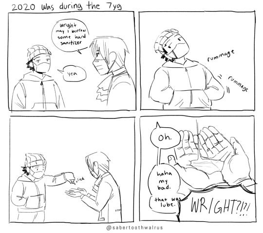
^ this is a comic about Ace Attorney, but honestly you don't really need to know anything about Ace Attorney except that "7yg" is a shorthand the fandom used for "7 year gap".
Panel 1: Setting the expectation. it's during the pandemic, so it's normal for people to have hand sanitizer on them. A precedence has been established.
Panel 2: Additional Context. Phoenix rummages through his pockets, which tells the audience he has a lot of stuff in them, and that he's identifying objects more by touch than by sight.
Panel 3: Anticipation
Panel 4: The punchline! Oops, it was lube! Small bottles of lube DO look & feel very similar to bottles of hand sanitizer, but people-- especially during a global pandemic-- do not typically carry small bottles of lube on them. Personally, I think Phoenix Wright could be the kind of person to have lube on him (for any number of sexual or non-sexual reasons), but the audience doesn't necessarily need to know that about him. Part of the joke is the nonchalance in his reaction; all you need to know is that Phoenix himself is not that surprised or embarrassed about having lube with him, or about having just dispensed some of it into his friend's hands.
Comedy is hard to explain!! It's also not very funny to explain. It really takes a lot of practice, and everyone has different tastes in humor/context/expectations anyway, so you're never going to make everyone laugh. Knowing your audience will definitely help.
376 notes
·
View notes
Text
AN ARTIST'S GUIDE TO HANDS
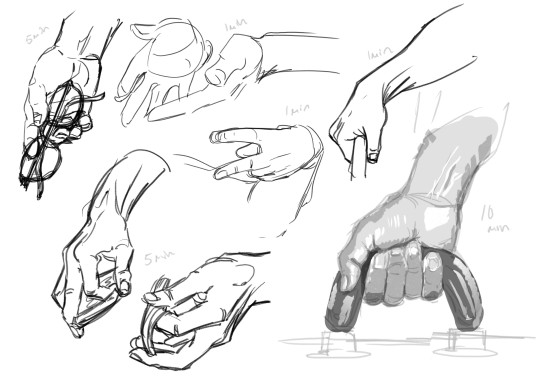
No, sorry it's actually not an artist's guide to drawing hands. Those are just warmup studies (which I'll talk about in this post.)
This is a guide to Your Hands and how to take care of them when making art.
No one ever sits down and teaches artists how to take care of their hands. They didn’t even teach me this while I was in art college. This is just what I've learned myself through years of pain and scouring the internet for advice.
This is going to be a long one and geared towards illustrative traditional/digital/pen/pencil artists specifically, but artists of other mediums and crafts should take care of their hands too! Well, we all should take care of our bodies in general, but this is about hands.
(advice is below the read more)
First off I'm not a professional or anyone with actual medical advice. I'm just some guy with chronic hand pain who makes art. This advice is free for you to use or discard.
WARMUPS!
Ever sit down in the morning to draw and wonder why your art is so stiff and looks so much worse than what you were drawing last night? It's because you didn't warm up!
You know how for physical sports they all warmup and do stretches before getting into the actual sport. To prevent injuries and all that? Yeah, it's good to do that for art too.
One way to warmup is to just draw lines. Try to keep them as straight as you can. Going up and down and diagonal. Draw squares. Big squares. Small squares. Circles! You are warming up, keep it loose and relaxed! Basically just scribble away.

(examples. I usually keep going until there is no paper white left. This can double as practice for drawing straight lines without a ruler, which is a great skill to have when freehand city drawing.)
Before hopping right into drawing people you can try doing some quick gesture drawings. Line of Action has timed sessions with a large variety of clothed or nude models. I usually do the 30 min class as it has a nice balance of short and long timed poses. The point isn't to draw nice art, but to warm up. Try to get the basic form down, not the details. I find that doing a full class session can really help my drawings feel more loose and grounded in reality for the rest of the day.
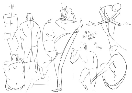
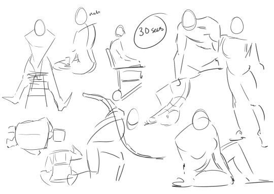
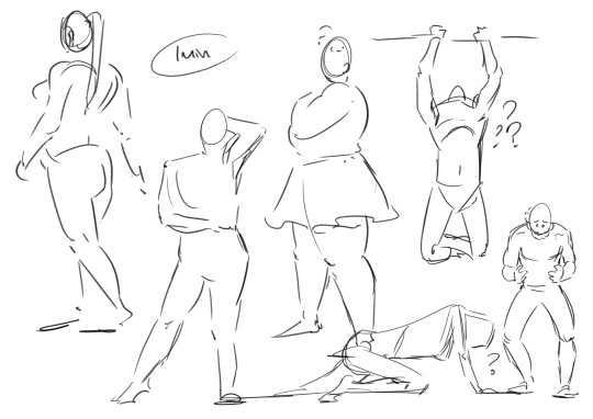
Some examples I found in my folders. I suggest looking into what a line of action (not the site) is and giving it a try with some of the studies!
COOLDOWNS!
For sports it's to return your body back to your everyday baseline after a workout.
Example; you are working on a big project! A masterpiece! It's detailed and cool! You have been focusing on this for hours and drawing so intensely. But you need to stop working for the day.
A cooldown is for winding down out of the go go go mindset. Put away the big project and do a couple small doodles and sketches. You are relaxing your hand and letting it stretch out. Keep the sketches loose. Let the art happen slowly. Don't polish anything, that can happen another day. Just ease yourself out of drawing.
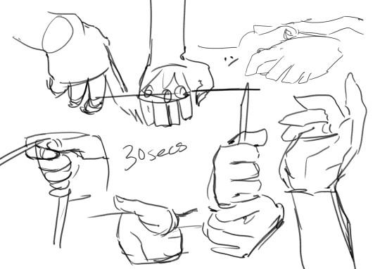
...
Cool! Now we get into the meat of this thing.
HAND PAIN
How to avoid it and how to manage it if you already have it.
I love you artists and creatives, I am begging you to please take care of your most important creative tools. I really don't want this to sound like scare tactics like "oooh you better do this or blah blah!" Nope. I just had to learn all this the hard way and I'm extremely passionate about it.
Take this advice or don’t ╮(゚~゚;)╭ I can't tell you what to do, I'm not your dad
Adjustments and Small Solutions
If you are feeling physical discomfort while drawing there are many different solutions to try! Here are some suggestions that may or may not work for you.
Hold your pencil more loosely. Stop gripping that thang so tightly!!! Relax that hand! They make these… squishy pen grip things... I think they are called Adaptive Pencil Grips or Adaptive Writing/Drawing Aids? They stop your hand from being all cramped up by making your drawing tool wider. It's going to take a bit of time to adjust to drawing with it, but it's worth it for those who hold pencils too tightly.
Don't press as heavily. For traditional art, if you find yourself pressing really hard to get darker lines try moving to a softer pencil. Most standard pencils are HB, the B pencils have softer graphite. Experiment until you find the right one for you. For Digital, adjust your pressure settings so you don't have to press as hard to get thicker lines. You should not be pressing so hard all the time, it wears out both your hand and your tablet! It takes a bit of time to adapt to pencil or pressure changes. Try doing some unimportant sketches, they don't have to be good. You are just training your hand and mind to adjust using less pressure.
Draw with your arm and not your wrist! It's small repetitive motions that cause the most strain. You probably hear this one a lot, what does it even mean? It means moving your arm with the motions of your line, and trying not to make too many tiny movements with your just your fingers or wrist. This one is hard! It takes time and conscious thought to change the habit. Tips? Work bigger. Zoom in more. Use bigger sheets of paper.


(Motions exaggerated for a clearer example)
Change the angle of your drawing surface. They make angled tablet holders, angled desks, angled desktop raisers. Experiment, find and angle that is comfortable and the one that causes the least pain. (It's also good to make sure you don't have to hold your head at an uncomfortable angle when drawing. Staring straight down or hunching over a paper flat on the table can cause pain!)
Compression Glove? Wrist brace/tensioners? Some folks use them and I've been thinking of getting one for years now. I can't give advice on this one, because I don't have experience with it. Look into it if you want!
Managing Pain
First things first.
IF YOUR HANDS START TO HURT WHILE YOU ARE DRAWING. STOP! Put the pencil/pen/paintbrush/whatever down. The art will still be there for you to continue tomorrow.
I know from experience that it's extremely hard to pull away when you are hyper focused on an art piece. It's hard to remember all sorts of basic needs like food or bathroom when hyper focused. But you Need to stop when you feel that pain. (Preferably even before the pain…)
Take Breaks! Let your hands rest when you can. Just like a machine, if you don't schedule maintenance, the machine will schedule maintenance for you. Often that means having to wait a few days for it to return to functional. Best to take a day off from heavy usage or take an occasional 30 min break throughout the day to let your hands rest.
Stretching is important! Full body stretches are good; your arms, shoulders, neck, and spine are all connected, but I'm specifically talking about HAND and wrist stretching. There are a lot of stretches and massages for carpal tunnel and arthritis out there. I find they work for hand pain in general. Move into and out of each stretch slowly. Do not push a stretch if it hurts!! Be gentle!!
I am not a qualified professional and I will not be giving out specific stretches (that is beyond my personal comfort level). There are other artists out there who have made helpful stretching info-graphics which are cool, but I will not be because i don't want to be responsible for someone accidentally hurting themself. Ask your doctor for stretches & advice or look some up on your own.
Don't feel bad about forgetting to stretch frequently! Of course it is good to do it regularly and frequently, but I would be a hypocrite if I said that I remember to stretch daily. Setting timers for stop and stretch sessions can work for some people, but also doing stretches whenever you remember is fine! If you are sitting on the toilet you can idly do some hand stretches. On the bus? Laying in bed? At the beach? Do a couple stretches! Even just once a week is better than… nonce a week.
Using Cold or Heat to treat pain. If you really overdid it, put your hands in some cold water or wrap a cloth around an ice pack and apply it to your hand. Cold works best for me, but warmth works for others. This is just pain reduction and reducing inflammation from overuse! This is not a permanent solution.
If your hand hurts a lot! Frequently! Talk to your doctor? Idk mine has never given real advice. Just gently poked my hand and told me there isn't much to be done about it :/ but there are really good doctors out there who will care and give helpful advice!
Again. IF IT HURTS TO CONTINUE DRAWING. STOP DRAWING! This is not a "no pain no gain" type situation. Drawing so much that you hurt yourself isn't noble, it's just… limiting yourself. You only get one set of hands. These things are very handy to have.
Other Advice
Things I couldn't figure out how to fit into the earlier sections.
Your other hand can't handle the strain! Lets say you hurt your drawing hand... the other hand is right there free to use for art. Right? Wrong. Your other hand can't keep up with the demand, it hasn't been trained to the same extent as your dominant hand, it does not have the built up muscle. If you want to use that hand for drawing you are going to have to use it s l o w l y and train it bit by bit over a long period of time. When I tore a tendon in my right hand I decided to just keep drawing with my left and I got Really Good at it. It only took like two months before my left hand hurt too much to move. Then I had 0 functioning hands to pull up my pants. Not fun!!
People who draw on phones. That is extremely impressive! I'm amazed by the things people can create on such a small space. But phone artists are the ones I see most frequently mentioning hand pain. please please please make sure you are taking breaks. Would a stylus work instead of using a finger?
Outside of Drawing. Sometimes it's things outside of drawing that are causing the pain. For me there are multiple sources, but I also have tiny baby hands. Holding a phone too long causes pain. The handheld mode for my Switch causes A Lot of pain. The way my hand rests while typing on my laptop hurts! Playing tense videogames for too long hurts! Find the source of your pain and make some changes. The same things will apply to most; take regular breaks, do some stretches, and find soft things to prop up or rest your arms on.
Change your Artstyle. This one is more of a last resort. You might have to change your art style if you are getting sharp pains every time you draw. I loved drawing tight clean lines and many small fancy details, but drawing like that left me in so much pain at the end of the day. In 2023 I had to take the better part of year off from illustrations just to learn how to sketch and draw more loosely. I had to learn how to be gentle. To stop gripping my pencil so tightly. Learn! Adapt! You might discover a new style that you love even more!
A lot of this stuff gets more complicated in a work setting where you have to draw fast and long in order to get paid. Things like reducing your workload can help, but that can be... financially rough. But outside of that, it’s ok to be a slow artist. Going full steam and hurting yourself is not worth it.
Aaaaaanyway, thats all folks. Today's rant brought to you by me! The guy with chronic hand pain who always forgets to stretch! The guy who got frustrated with a sketch yesterday and decided to push to keep drawing for just one more hour! The guy who woke up this morning and had to spend 2 hours massaging and stretching their hands. The guy who probably shouldn't have typed all of this out because ooww ow ouch

If your hands do hurt, it's going to be ok! You don't need to be a speed demon who draws all the time. It's ok to take your time and take frequent breaks. You are going to do great things! Just be gentle with yourself...
#art advice#carpal tunnel#hand pain#last tips!#don't punch people... use your elbows or smthn. your hands are too precious to wreck punching a jerk#if you are an artist and enjoy longboarding wear wrist guards. lifesaver fr#i hope this thing is readable. it's long and my eyes are tired#also i am an artist not a writer... forgive my grammar
1K notes
·
View notes
Text
It's also like super fucking infuriating to see people continue to argue that generative AI is the best way for disabled and/or poor people to make art because like, you know what helps make art more accessible? Giving poor and disabled people money.
Like take me for instance, I'm disabled. I get severe migraines and intense leg/back pain if I sit at my computer for too long, my hEDS makes holding pens and pencils hard, my ADHD makes it hard for me to start certain tasks and/or stop them before I potentially hurt myself, my neck also hurts if I look down too much, my dyslexia AND my ADHD both make it difficult to keep track of a story as I write and use correct spelling and grammar, plus, I need to prioritize taking care of myself and going to appointments and keeping my house clean and that takes up a lot of my free time. All of these things make creating the kind of art I want to create difficult if not occasionally impossible.
So what do you think would solve my problems better? Giving me money so that I can have a drawing tablet and desk chair that won't hurt my neck or back, another tablet + pen and a lap table and comfortable body pillows for drawing in bed, easier transportation to my doctors appointments, effective treatment for my chronic pain and migraines, the ability hire someone to help me keep my house clean, a spelling/grammar checker that isn't complete ass, and a therapist and psychatrist who can help me manage my ADHD better?
Or an AI program that takes my input and spits out a drawing or story made of stolen content glued together that, in the case of the art, I cannot meaningfully edit without starting over, which also destroys the environment in the process?
Seems pretty obvious to me. I don't need AI, I need help to manage the things that are actually stopping me from being able to write and draw.
Or take my mom. She's had severe rhumatoid arthritis since she was a small child, her hands are deformed and she relies on her wheelchair to get around. She doesn't need AI to help her paint, she needs special paint brushes she can actually hold, a table her wheelchair will fit at, and someone to help her with personal hygiene/keep her house clean/take her to doctors appointments so she actually has free time to paint.
Does that poor kid growing up in public housing with parents who are too poor to afford art classes or supplies or to send them to college really need a computer program to draw for them, or do they need support to help them take those classes, buy drawing supplies, and money so they can go to college.
Blind people can paint, deaf musicians exist, people with missing limbs find all sorts of ways to make art, people with parkinson's paint with typewriters, my mother can't hold a normal paintbrush and she makes some of the most beautiful watercolor paintings I've ever seen, Van Gogh had bipolar disorder and only sold like one painting when he was alive, I mean for real how many different artists have you heard of who's biographies start with them being born into poverty?
This is not meant to be inspiration porn, these people are just ones who were able to find ways to make art despite their struggles. They shouldn't have had to struggle at all, but god imagine how many more artisrs and writers we could have had if none of them had to overcome those struggles. It breaks my heart to think of all the wonderful art that never got to exist because no one helped the people who could have made it actually have the time, money, support, and safety they needed to make it. AI would not have saved them because making art isn't the problem, being disadvantaged is the problem. Living in a world that refuses to make room for you is the problem. Being fucking poor is the problem. Humans have always found ways to make art despite huge barriers, the solution isn't a computer that makes art for them, it's SUPPORT AND MONEY SO THEY CAN OVERCOME THOSE BARRIERS AND MAKE THEIR OWN ART.
As a last example: I love watching dancing and I would love to be able to dance, but I'm terrible at it(I got kicked off a dance team for not being able to learn the dance at all despite spending weeks on it, idk my brain wasn't made for dancing) and my disabled body makes it more pain than pleasure if not actively dangerous, anyway. Having a robot dressed to look like me dance next to me while I get to watch would not make me feel like I'm getting to dance. It would actually be extremely fucking demoralizing and frustrating. I would hate that!!
Having an AI spit out a painting or book would not make me feel like I got to paint or write a book. It's a fucking anamatronic doll running on stolen ideas and it will never be the same as getting to actually expirience the joy of creating art first hand. AI is not the solution. Helping people who need it is the solution. And I am CONSTANTLY pissed to think about all the time and money that goes into these fucking AI programs that would be better spent helping disabled and poor people get the help they need so they can make art themselves, all while the people running the nightmare plagiarism pollution machines pretend that their horrible inventions exist to help people like me.
189 notes
·
View notes
Text
Why the Arcane fandom sucks, an essay.
There is no way to enjoy anything in this fandom I feel, and frankly as someone who isn’t a shipper in any fandom I find it suffocating that the jayvik discourse snuffs everything else out. I also find it disgusting how everyone bullies the non-shippers or OC shippers/self shippers in this fandom I’ve notice. I have also noticed a fair bit of misogyny as well, whether it’s from people who are against Mel and Jayce or Sky and Viktor, or people invading the Jayce x reader and Viktor x reader (especially the fem!reader) tags with jayvik ship material. It’s exhausting if I’m honest. I also hate how the fandom uses any shred of media interviews to basically “go see see look you’re wrong,” to anyone who just wants to enjoy the original media in the way they want to and share it with others. Regarding the post production statements from cast and crew, my personal opinion is that they often try to give relatively (key word relatively) open ended statements while also giving the statement that would be most popular. You forget these people are PR trained. Now I think it’s perfectly fine if the cast and crew think it should be one way or another and I believe it’s still left just open ended enough for everyone to enjoy things how they want. I think I just get frustrated that people are a bit too stupid to see that people will always give the most PR popular answer (except the main writer apparently who I love how his statement is always like yeahhhhh anyways shut up, but everyone else’s statements are law? Idk kinda weird.)
I just think I’m very disappointed that my favorite show is slowly becoming something I hate because of the fanbase and I feel like I and other women are not allowed to enjoy it or our comfort characters unless they shut up and agree. And honestly I am disappointed that people on either side demand answers or for things to be official rather than letting everyone be happy. It’s called headcanon for a reason.
As someone who is ND and has hyper fixations it is hard to cope with this and it’s frankly frustrating and sort of embarrassing I get in such a tizzy that I feel like I can’t just go on IG or even Pinterest and enjoy just Viktor art without it behind shipping art. And I think it’s also ridiculous that I feel like I have to explain that no, it’s not me hating two men being shipped, frankly I think some of the art is adorable, is the fact I’ll put not interested in IG and I’ll get 20 more posts, or on posts that are like Sky x Viktor there will always be some jayvik shipper screeching there. At the end of the day it’s just annoying that no one is allowed to enjoy the same show we all love in a different way and are practically forced out of the internet spaces. I don’t even go on IG anymore because it was making me sort of upset, and tumblr is on thin ice but at least I can filter tags here. (But sometimes I would like a cheeky poly fic so I don’t really filter HAHA.) What I mean to say is that the rabid shippers are pushing BNHA levels, and what I mean by that is how feral they are and if you disagree they double down and sort of terrorize the rest of the fandom which frankly I don’t think is that small of a sect. (Those the disgusting and problematic stuff is not remotely on the same scale. The worst is misogyny and at times racism.)
Fandom and specifically fanfic has always been very fem coded in my experience and it makes me feel queasy that the fanbase for my favorite show actively seems to hate women. For example there was something on tiktok or IG about an artist drawing a racist depiction of Cait and then vitkor beautifully, or the fact shippers are racist towards Mel and Sky. I see SQUAT about time bomb or CaitVi, hell even Vander and Silco! I guess the crux of it is, a little diversity would be nice, character analyses that don’t revolve around sexuality or shipping, theory’s or expansions upon characters that sort of got back burnered like Sky or other councilors or more about the sort of rebellion and why Silco and Vander had a falling out. Writing critique on the show even considering that second season was so rushed imo!
Just let the women be in the fanbase bro. I don’t care that y’all are shipping two men, great, so you shouldn’t care what I and other women are doing too! You should be like cool we love the same show!
I am curious how women/fems/or just anyone burnt out from fandom and shipping feels and copes with this. Saying cope feels sort of cringe and like it’s causing me a mental breakdown, it’s more so the “bro please let me enjoy my favorite thing too,” feeling. We should make our own community with in the fandom so we can enjoy things as well with other people too. It’s okay and it makes me want to finally share my own writings I just don’t know where to start since I’ve been a lurker for 10+ years.
Love,
A Dying Chemist
#viktor x reader#shipping#jayvik#viktor arcane#arcane viktor#arcane#arcane jayce#misoginy#Fandoms suck#let people enjoy things#let people ship what they want#let people live#be kind#fem!reader#viktor x fem!reader#viktor x female reader#The Chemist’s Quandaries
39 notes
·
View notes
Note
hiii! I absolutely adore the work you do with your art. I wanted to ask if you had any tips when it came to drawing faces/expressions? the expressions you do are so pleasing to look at.
Really sorry for answering this one super late; I was, for the most part, trying to decide if I wanted to draw something to convey what I mean or just type it out. I'm going with the former! >:P (Before you read, I want to preface that I am not the best at explaining things so if things sound too obtuse, I apologize! And ofc, some of these tips are a matter of preference! You do what you feel is best! :>)

Head angles and expressions go hand in hand with each other. A good angle with the right expression goes a long way in selling the mood that you want.
A massive help for me in this area is referenceangle.com! It's somewhat limited since it only draws from whatever database it uses. BUT, it's helpful to me to be able to visually see what a face at a specific angle will look like before simplifying it to key points for my style.
Now the lettered points in the img above: A - You can divide the head in two parts: the chin/mouth and the eyes/forehead. You can make the middle point being the tip of the nose. B - Keeping where the middle of the face is can help guide you to what features to adjust if something doesn't look right> C - In side profiles/near-side profiles, I draw the eyelash slightly jutting out which happens irl; I think it adds to the 3D-ness of the look. :> D - This one's a big tip, going back what I said about angles and expressions. Expressions alone can give you the visual info you need to know on how the character is feeling but head angles and body can send the message home twofold.
An example being that a character looking down on you can give a dominant, almost condescending vibe while a character looking up at you gives off a small, maybe sheepish feeling. A character looking straight ahead at you with a determined look demands your attention in a cool way! But at the same angle, with a lax, smiling look, the character can look creepy, almost unnerving. E - Often, when I draw characters looking up, I don't draw out the line between the head and neck and that's because I trust that the viewer knows that the chin didn't magically disappear, it's just not prominent enough to jut out for a hard line. Lines can do a lot to inform the audience about the shape of something!

EXTRA TIP BC IF IT CAN HELP ME, MAYBE IT CAN HELP YOU: ✨CANVAS FLIPPING✨
You drew a face you kinda like but it feels off? Flip the canvas and you might be able to see clearly areas where you can adjust it! There's a couple ways to do it: manually flipping every few adjustments you make when fixing the face OR like me, you can open another window of the canvas you're working on and having side by side with where you're working. I work with CSP so it updates in real time, allowing me to see how my changes are looking both ways.
#bonsi talks#HOOO finally decided to answer this#I debated on whether I had really anything to impart but I thought I should give it a shot anyway#sorry again for answering this so late :.)
46 notes
·
View notes
Text
What a Crowd!
@rtv-puzzlevision-studios
The art department
Yes yes yes!!! The vote was leading them right to the Art Department!! Tail spinning around like a ceiling fan, it was a good thing he was mostly invisible so he didn't smack anyone with it.... Looking over the crowd make their way towards the decorative stairs, Loyboo giggled to themsleves
'It'd be funny to push someone over the edge of those things haha!!'
Boos lived off mischief after all!! Their innocent little shy demeanor was only a fraction of what this little creature did. However... Their behavior stayed in tact, dont need to cause Mr.St.... damnit- RTV trouble on this big day, itd be rude to push someone over the edge no matter how pushable some of these people looked
A literal child with brown hair skipping along with the crowd and yet looking so bold
@entityarts
Some cat like fellow with a floating head and top hat, it just made the creature wonder if he would pop apart like a lego set and crumble onto the floor if he was ever so slightly nudged.
@mrtophat518
A dra.... A DRAGON!!
@fenicearts420
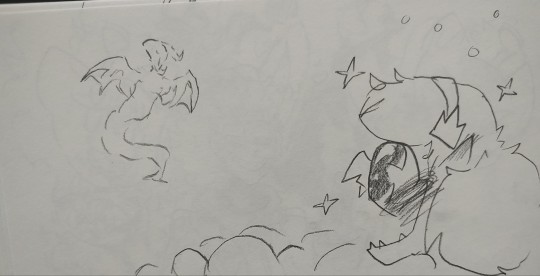
A real dragon!! Coooooool!!!! Haha! The only dragons he had ever seen were Bowser and the Koopalings. They were dragon-esc but not like this!! One with wings!! Truly magnificent...
She did a quick, very messy sketch of the human figure which the beast shapeshifted into next... Maybe... She should try and talk to people.... Make some friends, actually have fun! Like uh... He was told to try and do X,D
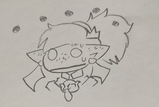
But that would mean going up to people and interrupting their conversations to try and involve himself... which was unfortunate because there were people he wanted to talk to!!
This odd floating creature with clawed feet and hands going around with a cackle, their suit was super cool and their eyes were wicked! Who doesn't love swirly crazy eyes? Loyboo wanted to approach but that person seemed busy already
@grinnames
There was another person with a TV head! There seemed to be multiple actually ..... But the one to catch Loyboos attention was this bright pink one that displayed glasses on their screen. They were adorable looking! Sure they looked puntable like a lot of the other guests here but Loyboo wanted to talk to them too.... However couldnt bring himself to approach, what if all TV heads had mind control powers that activated when you looked at them? Loyboo dipped his head and continued following the crowd
@kuromipuzzles2000
As they entered the Art Department... The boo found himself next to another fidgeting mess of a person, a mask upon their face. White hair with red highlights, fidgeting hands.
The boo tilt his head 'another boo? ... No... I dont feel energy coming off them other than their overwhelming anxiety. Me too buddy. Its exciting yet terrifying isnt it?'
He thought to himself a small giggle escaping him as he decided to stay near this individual
" so uh.... Art.... It's pretty cool right ? "
@pat-n-atty (dont feel obligated to reply uwu)
He looked back to the crowd ahead and realized how much of the tour he zoned out of! SHIT-
“The Art Department is responsible for all the designs you see around the studio from merchandise to websites although the latter with the help of the Social Media Department! In general we always work closely together with other departments. For example also with the Film Department when it comes to ads!”, Colores now continued, raising a finger. “Among other things we also take care of the fanmail.”
Loyboo locked in and paid attention the best he could, it was still hard even with how ungodly pretty RTV and this new woman were......,,,,,, damn... He missed the ladies name, it'll pop up again right?
“Ah, of course! My bad, I got sidetracked…”, Colores meanwhile answered sheepishly, before moving on to a second table where stacks of plushies were piled up. “Well, I mentioned before that our department is responsible for the merch designs, so I thought: Hey, why not give something to you guys?”
Wait huh? They're going to get a plushie!!! tail whipping at 1million miles per hour again, he already had a bunch of merch that he'd bought on his own but these things were still rather pricey sometimes! Especially for a Boo who couldn't keep a job,,, ah ha- which plushie was she missing from her collection... Just 1 plushie..... He mulled over it for a little while ending up falling behind once again... But he decided on a Saiko plushie! Rare, limited time, and another hard headed hero type for Loyboo to play dolls around with and have her RTV plushie defeat in plushie wars >:]
Gaze back at the crowd... Ah... They were already leaving? But he still had so many questions...
Where did the inspiration come from? Or... What was his original inspiration before he became famous and what are his future artistic goals? Without spoiling the movies of course! How did the department work? What happened in here during the creative process?
Writing down each question in his sketchbook since the tour was currently on its way out of the department... Maybe he could ask the man himself later.... Doubt it.....
Maybe...
He could stay a little bit and ask.... What was it.... He heard her name
Coloers? Colores? Colouers?
God he was bad with names :,)
Maybe Loyboo could ask her questions. She seemed approachable
Looking at one of the guards... He doubted that would slide unless his entire group wanted to also stay and ask questions....
But he wasnt about to ask.... So he simply ducked his head with a sigh and held tight to his sketchbook, catching up to the group once more. Another vote?
Uhm..... The Film Studio he supposed
Maybe they could ask some real questions this time
#mr puzzles#smg4 mr puzzles#mr. puzzles#smg4 au#rtv puzzles#rtvtour25#traditional art#writing#loyboo#boo sona#awkward little fucko
25 notes
·
View notes
Text
Evolution of Homestuck’s Art Style, Pages 1-1550

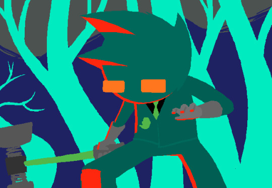
[page 1, 1434]
Since Act 4 began, I’ve been blown away by the visual difference between this and the earlier comic – there’s been a big shift in style, and huge increase in the use of color. So, re-reading and just looking at the art style, here’s an overview of the changes so far.
[a short one – 2.8k words below the cut + some very beautiful panels. I was limited to 30 images in a post, so would recommend looking up page references for the ones tumblr wouldn't let me include <3]

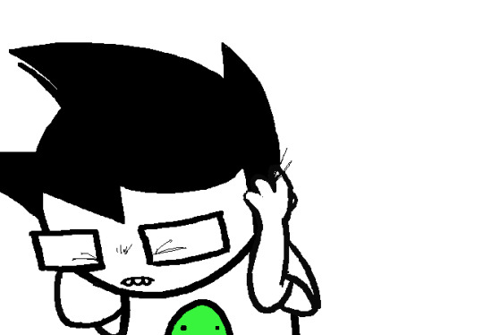
[page 4, 16]
Act 1 mostly uses sprite art and clean, tidy images; the white background is the dominant color in most panels. Where John is drawn freehand, he’s drawn as close to his sprite as possible, with a thick black outline and blocky shapes. This is often done to give him a more complex pose or facial expression than a sprite would allow (for example, p.16). John’s house is relatively tidy, filled with discrete items that it’s easy to move around and manipulate to create new panels – these are mostly either imported photographs rendered in black and white, or line drawings similar to John’s sprite. Occasional items are drawn in color – some due to their importance (Sburb logos) but some due more to common sense (blood capsules).
John’s captchalogue and strife systems are colored overlays on panels that are still mostly black and white. Full color panels show up when John (or Rose) uses a computer, showing their desktop background, or when John looks or goes outside and observes his neighborhood. Here, his near monochrome, thick-lined sprite stands out against the lineless background (the car and mailbox help soften this for now).

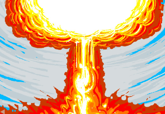
[page 195, 246]
Over the next few acts, Homestuck will develop an art style typified by its lack of outlines and straights, abundance of curves and swirls, use of patterned blocks of solid color to create light and depth effects, and emphasis on motion. Act 1 has the earliest steps towards this – my favorite is page 195, where John looks through his telescope and sees the meteor heading towards him. These styles of sky, clouds, wind, and small animated elements that don’t dominate the panel are all still common techniques in Act 4. The final shot of the meteor cloud in the End of Act 1 flash animation (p.246) – which is almost entirely full color outdoors shots – is another great example.
Act 1 is definitely not dull or colorless, and there's a real charm to its style, but it is overall functional. Panels are designed to give information, show the results of commands, and communicate a change of state from the previous panel – it’s unlikely someone would look at them just for aesthetic value. Act 1 has the closest to an ‘adventure game’ look, as lots of John’s items look like they should be clicked on for more information, and rooms are often rendered in an isometric style. In a narrative comic, this also makes John feel boxed in and stifled by the imposing walls and lack of color. His world is stark, monotonous, and cut-and-paste, somewhere he has been placed instead of somewhere he naturally belongs.


[page 312, 363]
Act 2 stays primarily monochrome, but panels are busier on average. Dave’s room (p.312) has so much going on in comparison to John’s (p.4) that in a video game, it’d be hard to know what to click on first. John’s room has become much busier now that it’s been looted and smeared by imps, which makes it harder to keep the art consistent between different panels and angles. Like John and Rose, Dave’s computer, house exterior, and inventory systems are shown in color. Dave’s living room is monochrome but has a fair amount of color through his brothers’ puppets, while John’s now has imps in harlequin outfits, build grist, and Nannasprite.
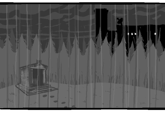
Rose is unique among the kids for never being placed on a white background. When she’s first introduced, her room is shown in pale gray to indicate that it’s getting dark in her house. This color is unobtrusive, close to white, and doesn’t feel like it makes the panels more complex. As a wildfire creeps closer, the sky around Rose tints red – a slight burgundy on page 398, and a more dangerous wine red on page 985. The mausoleum is also gray, with a soft lineless background unlike other indoor spaces. Rose is the first beta kid to leave her house entirely and go to a secondary location, heading down to the Skaianet Laboratory on page 840 – a much more visually complex area in which she’s shown against a green background until she goes back to the fire. If there’s any examples of her in a white space, I missed them!
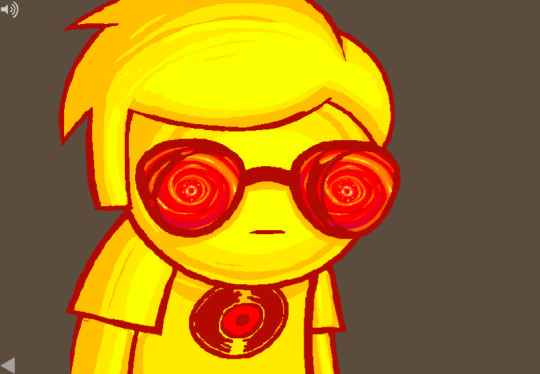

[page 444, 665]
The kids are still drawn close to their sprite style, with occasional variation. Dave’s sprite is shaded in red and yellow on page 444 to represent the ‘sick heat’ he’s trapped in, and he’s shown in red silhouette as he steps onto the roof on page 665. In ‘WV: Ascend’ (p.757), every frame is full color and more detailed than most previous panels, and the kids’ and guardians’ sprites stand out as the only cut and pasted element. The landscapes are changing faster than the characters, which creates a feeling of unfamiliarity and their struggle to keep up with their new circumstances.

[page 248, 558]
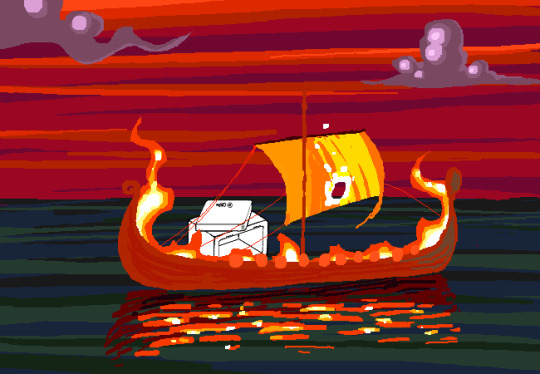
The Wayward Vagabond’s panels immediately look different from the kids’. Page 248 is easily the most complex still image up to that point, with the greatest color diversity (four shades in the sky, one in the city, and I think as many as eight in the sand). It’s very different from the blocky blue sky at John’s house. WV has a sprite too, but his is full color, meaning that when he’s drawn freehand he’s drawn without an outline. This makes him feel ‘part’ of the background instead of pasted on top of it, merged with his landscape while the kids are at odds with theirs. The 100-page Wayward Vagabond point of view section is the first extended sequence of full color panels, but by this point they’ve shown up enough that it doesn’t feel jarring.
Act 2 has the first panel where the art itself blows me away. Page 558, with its fiery boat sailing into the sunset, goes harder than any panel that’s come before it entirely in service of the Vaulthalla pun.


[page 760, 840]
Act 3 introduces Jade in the typical sprite style and monochrome interior, but she appears in her windowed garden atrium, so at least half of her first panel is in full color. The exterior of her house is more colorful and prominent than any kid before her, with various colors of clouds and plants; the same is true of her computer, which surrounds her in three-dimensional spinning colors instead of being a two-dimensional screen. Jade’s room is the biggest and messiest yet, as in just two acts the comic is already feeling limited by its ‘character stuck in a room’ format.
[page 225, 986]
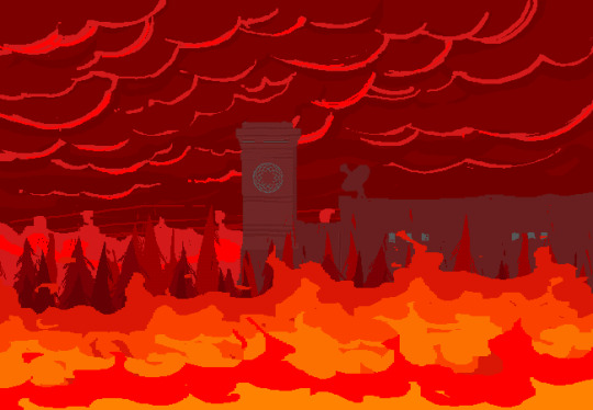
This act shows the art style in transition, with even more color and complexity introduced into what are technically indoor panels of the kids, and more excuses found to draw in the softer, lineless style. On page 840, the tunnel Rose walks through is sketched like a sky, when an act earlier it might have been made of simpler, blockier shapes. Page 986 shows a very similar view to page 225, and the new version isn't necessarily more complex but it is more Homestuck, with increased texture and definition in the clouds and a fire moving through layered lines of color.
Just like in Act 2, ‘Years in the future…’ pages lead the charge with the changing art style. Pages 924, 1005 and 1035 provide lush post-apocalyptic landscapes with a beauty that isn’t seen on present-day Earth – even Jade’s island on page 1080, clearly designed to be visually interesting, doesn’t have quite the liveliness and definition of the post-apocalyptic pages (in my opinion).


[page 1051, 1147]
Act 3 also introduces the aesthetic vertical page. Previously, vertical pages are used occasionally for their aspect ratio, showing a book or the entirety of John’s house. Page 1051’s art isn’t giving information or showing a changed state, but stands out as an impressive visual and a pause for breath in between panels that do give information. Page 1147 is similar, and I believe it’s also the first time a beta kid is drawn in the lineless style (with detail to their form, not just a silhouette). This page comes right before the end of act flash, showing the final form the art has now achieved.
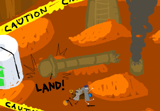

[page
Besides the monochrome sprite art associated with the kids’ houses and the lineless style associated with the outdoors, Act 3 introduces a couple more styles. One is the scribble style, first introduced with WV’s Can Town fantasies and murals, and then scattered throughout Jade and the exiles’ scenes in Act 3. Some panels in this style are explicitly intended to be drawn or imagined by an in-universe character, while other times they represent a strong emotion or sudden interruption.
The other new style is the color-adjusted jpeg, seen in Prospit (p.1029) and the dark kingdom (p.886), where the background is composed of externally-sourced images that have been manipulated and recolored. The over-saturation of a single color makes the location recognizable without need for its own distinctive art style – Prospit is entirely gold or yellow, the dark kingdom is entirely purple, and the Felt’s mansion is entirely green.
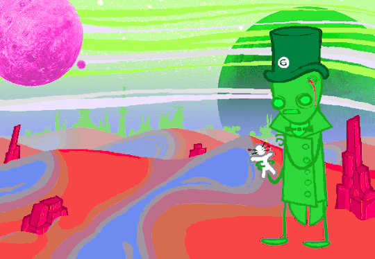

[page 1236, 1337]
The Intermission is made almost exclusively in this style, which adds a lot of detail to backgrounds while sacrificing some distinctiveness. While sprite art is used, the sprites themselves are entirely black or green, so they complement their environment the same way John complements his Act 1 house. By using images of a mansion’s interior as panel backgrounds, the Intermission is arguably more ‘realistic-looking’ than the representational art and medieval castles of the Acts, which ties into its grittier and more grounded tone.
With its goal of a fast production pace in advance of a more complex Act 4, there aren’t many artistic standout pages in the Intermission. A rare exception are the pre-city wasteland panels, such as page 1236, which blend the jpeg technique (for the stars and planets) with a lineless alien landscape of pleasantly rolling dunes. Pages 1188 and 1337 also blend these styles, but this is the extent of the lineless panels until Slick enters the safe.
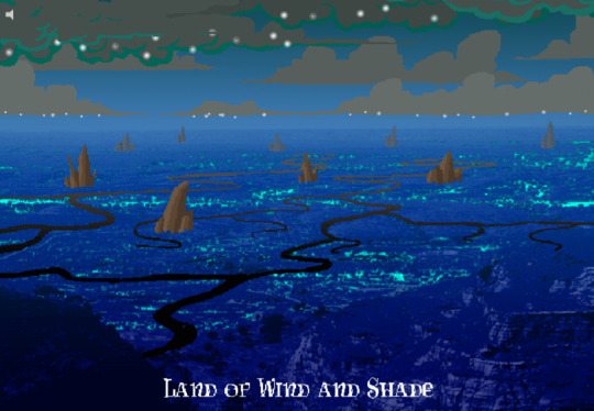
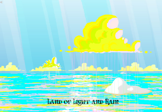
[page 1358, 1407]
Act 4 introduces the Land of Wind and Shade (LOWAS) and the Land of Light and Rain (LOLAR), two planets with distinct designs in the lineless style where John and Rose’s scenes now exclusively take place. Both are stunning – LOWAS is mostly dark blue with gray clouds, and a focus on bioluminescence through its mushrooms and fireflies, while LOLAR is mostly white landmasses amid a sea of pastel blue, pink and yellow. Since Act 1, Homestuck has taken care to set its animated pages primarily outside the kids’ houses, with the notable exception of page 253’s walkaround. This is likely because color makes flash pages more interesting to watch and easier to interpret – but character or plot developments have still been the focus. Page 1407, which introduces LOLAR, is the first flash with a primarily aesthetic function.
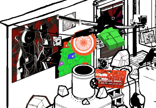

[page 1446, 1457]
In Act 4, panels that might have been standouts in previous acts are now commonplace, such as John answering messages on page 1391-2. Use of brown and yellow keeps the exiles’ pages visually distinct from John and Rose’s, but they’re no longer a clear upgrade. This helps the comic skip back and forth between John, Rose and the exiles without a narrative transition, as the art change is less jarring. Pages that take place in Dave’s monochrome room are now the outliers, while Rose and John’s sprites (and Dad’s car) really feel like relics of previous acts. Even with John’s new full-color suit and Rose’s land including a lot of white, their stark lines and lack of shading don’t merge well with their landscapes and always become the focal point when these sprites are used.
As such, there’s more examples of John and Rose in a lineless style, which feels long overdue and catches them up with changes that have already happened. Fully lineless panels tend to be very well composed with clear artistic intent; easy to interpret and pleasing to look at. They often represent movement even when not animated, so work well for transitioning to or away from a character. Sprite panels, on the other hand, have much lazier composition. Messes don’t get cleaned up, and panels show irrelevant objects often half-inside the panel and half-outside, so even when they’re communicating clearly they’re often less pleasant to look at – I find this true of AR’s introduction in Act 3 (p.1100-1111) and all the Dave and Jade scenes in Act 4. Page 1446, for example, features the first prototyping of Dave’s sprite, but it’s hard to focus on the crow-sword’s move through the room with so much else in the way (in contrast with page 185, where the harlequin doll is clearly in focus for its prototyping).


[page 39, 1523]
As a final comparison to illustrate this change, let’s look at page 39 side by side with page 1523. In both cases, a character is typing in Pesterchum. The reader has already seen the kid’s location and nearby possessions, so the images do nothing more than illustrate that the character is on their computer, while the meat of the page is in the Pesterlog.
On page 39, this is situated between two John panels where he takes different actions (assigns Hammerkind and captchalogues a book), so page 39’s image feels necessary to the sequence. On page 1523, this is immediately followed up by another image of Rose, still on her computer, and one that feels far more dynamic. Rose gets a facial expression and sitting position that give her some character, the close-up shot feels intimate for an important conversation, and the background is still present through the ocean behind Rose and the shading from her umbrella. So while there’s nothing wrong with page 1523 (which does successfully re-establish Rose after some pages away from her) or with the sprite style in general, the upgrades to other areas of the art do make the sprite pages feel weaker by comparison.
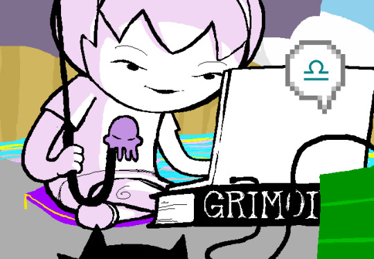
[page 1524]
Whether intended or otherwise, the kids’ houses being the only monochrome, heavily outlined spaces while all other locations are full color and mostly lineless, is really evocative of the comic’s title. The first full-color panel is John’s desktop on page 24 featuring the Slimer background he made himself, and later his computer becomes a gateway to the Medium where he can access a whole world of color designed just for him. In contrast to being ‘stuck’ in defined dimensions and copied images, the kids are entering a world of beauty, motion and art for its own sake. The exiles’ panels introducing the lineless style and the kids’ following reflects the exiles guiding the kids into the Medium and towards their eventual quests. LOWAS and LOLAR’s fantastical designs add a sense of magic to the story, bringing it away from games and technology and towards more esoteric, unknowable forces. Their unique designs compared to the kids’ similar-styled houses recalls Rose and gallowsCalibrator’s mentions of Sburb’s ‘flexible mythological framework’ (p.440) or ‘HYP3R FL3XIBL3 MYTHOLOGY’ (p.1524), which apparently extends to the level of art style.
Personally, I think the swirling, lineless art style Homestuck has developed is very pretty, but does take away the ‘point and click game’ feeling of Act 1. It’s interesting that the art style develops alongside the reader-command format – Act 1 is almost entirely reader commands, while Acts 2 and 3 mix reader commands with author-driven exile commands and ==> pages, and Act 4 has already seen the reader suggestion boxes close for good. I think the question of ‘is Homestuck a game?’ is still relevant, but needs a different answer in Act 4 compared to Act 1. The level design of LOWAS, LOLAR, Prospit and the dark kingdom is excellent, but they’re for running around and fighting, not standing still and clicking. The genre has changed, and the characters’ roles in the game are being reconfigured alongside the players’ and narrators’ roles.
So, how will Homestuck’s art develop from here? My guess is that there will be a decrease in GIFs and an increase in still images, as the new style is likely harder to animate and better at conveying motion without animation. Act 4 is setting up to bring Dave and Jade into the Medium as quickly as possible, at which point there will be five planets (including post-apocalyptic Earth) each with their own distinctive designs. Once this happens, there will be no need for scenes inside the kids’ houses, and the comic will be able to eliminate the kids’ sprites altogether (or at least re-design them with more color and fewer stark lines, more similar to the trolls’, exiles’ or Felt members’ sprites). Dave and Jade’s sprites being prototyped may further affect the Medium, perhaps affecting the light and dark kingdoms as planets as well as just their agents. Finally, I think there will be a focus on how the kids’ actions physically change the landscape of their planets, as this has already been the case with their modifications to their houses.
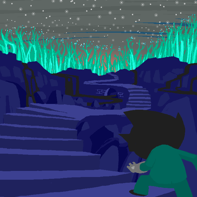
[page 1395]
#homestuck#analysis#i like to look at it! it's a beautiful comic there's a whole bunch of panels id get framed for my wall#if i had money or a house!#act 3 also doesn't have a super defined identity so thinking abt it as a transitional act for the art is cool to me#also wish id thought a lil more abt facial expressions and emotions and how they are represented in sprites#but im trying to keep posts short and simple and not let them get away from me. so. i will stop here <3#chrono
22 notes
·
View notes
Note
Hello 👋
Swallowing my nerves at last to send you an ask! I was just wondering, what inspires your designs? Are their inspirations in stuff like movies or games? Or just things you come up with yourself?
i .. honestly its kinda hard to tell, sometimes i just randomly think of something, like some detail, or color combination and try to incorporate that into a design somehow; it can come from anywhere, like the color scheme of a pithaya/dragonfruit is something i have been wanting to make a design with for ages but havent come up with anything good in all those years ;O;
im a very easily fascinated by color, espeically in nature, like sometimes i just stop and stare at something like i froze in time bc i just woooooooooooooah color! i probably look like a weirdo doing that though
its really hard to pinpoint anything specifically, the most is probably .. other artists? i guess? which always makes me nervous bc my memory is shit in most areas of life and i worry myself to pieces whether i unintentionally "stole" an idea and just dont remember and think it was my own, it goes further that sometimes i see something that makes me want to draw a similar concept but dont bc i dont want to 'steal' even if that couldnt be further from my intention (have been accused of that before ..)
that said for my ocs specifically .. most are rather old and have just kinda evolved out of their awkward first iterations (shargons first iteration was a hauro-howl- copy that was really just some human covered in feathers .. another oc was once a hellboy copy but in green- havent drawn nor redeisgn them in ages lol), the biggest inspirations for them is a mix of animals, bonus if you dont see them often- im a big shark, whale and sea creatures in general nerd so i tend to take from them as a priority but always trying to be less directly animal and mostly just .. features that work together
Eadrya is one of the newer OCs- i started to write but then looked at my folders and oh they are from 2017 .., i even made a design timeline for them how much they, and my art, have changed back in 2020, so thats also way outdated now lol (they apparently started as a whale .. thing? its like a pokemon evolution lol)
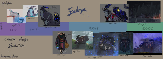
this is them now (i like this sketch still, though shargons design is now also outdated lmao)
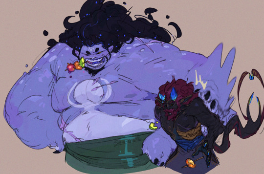
this ones from early 2023 so also outdated now but you get the point
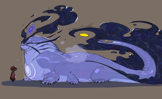
for demons i try to be a bit more wild on shapes and colors while still adhering to the rules of how they work (humanoid form, demon form, animalistic, one element each and more or less made to fit that, 4 arms is very common, look to be bost scary and wild but also something that would make you stop in tracks and stare in awe and fear if you crossed paths)
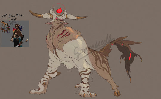
often times designs just kinda .. happen, i have maybe the idea ok i wanna make something with a white and red pattern also moose or those big horned cows are cool and kinda scary so maybe sth akin to that (though this one is technically a redesign too- its also pretty much entirely different)
for non demons but still non human i go for a much more restrained design, mainly inspired directly by an animal and giving the color scheme a good spin, plus adding unconventional body shapes, like ki'ita is also a good example, her old idea was just orca anthro pirate and just by making the white green instead in her most recent redesign already adds that little spin to it
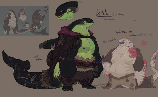
that can have its pitfalls though, as i often fall into the big arm small head small legs scheme over and over xD
alot of it is trial and error, deciding on the colors can take me hours bc im always searching for my little rule of having one contrast color that shows up in very few places to draw attention to it (like with Eadrya its those bright yellow eyes and thingy at their tail)
and that is all about myy own ocs, when its fandom stuff it works kinda similar though, either in the connections i wanna draw or just thinking it further- like how deities in destiny work also just kinda .. happened like an ever derailing train
like for demise i was at first really just im gonna give him horns bc horns are cool and he got those on the starting mural in the game- so how his hair work? well maybe it isnt hair actually and just unbound energy, im making him a deity too and fit hylias design to his so, yeah, then so how does it work, ok he gotta have a skeleton still, but what if his entire actual body is made up of pure magical energy with its core in the ribcage? with the core in the ribcage >:3c and the scales you see are just like cooled down lava as an armor bc his thing is fire and earth !! the normal blood? is a thin layer of skin imiated from mortals to keep the scales together and flexible so if he ACTUALLY gets hurt hed bleed magic that looks more like lava and any normal blood you see is just the armor- so why does he have a skeleton still instead of being just energy? maybe its gotta be bound to something OH and what if all of the deities started as mortals like a mirror to the trio later on and the gods cannot have direct influence to the worlds so they needed a right hand that is neither god nor mortal but both by killing a mortal by whatever their element will be (demise burned, hylia drowned etc) and their skeleton and spirit is kept but put into a body of magic- OH what if their spirit core is like almost piloting their bodies like a mech in a way bc if youd look close youd see that every strand of magic is actual a hand of their spirit so it makes it more weird and other bc hed be able to reach out with thousands of burning claws of all shapes and sizes like the beheaded forest god at the end of mononoke- SO if hed lose and arm or something all those strands would untangle and rearrange his bones back together-OH MY GOD the whole armor idea works so well for ghirahims dark armor so what if demise had two swords once and lost one and since has forged an armor similar to his own for ghirahim out fo fear of losing him t---
and that all is a process that happens over several weeks and months not rarely while i am drawing something mindlessly and suddendly *have a thought* and omg that makes so much sense-
so "what" inspires my designs? an ever derailing train of thought about making cool thick monsters that arent the evil thing to get rid of for once? cool color schemes? idk it just kinda happens??
#ganondoodles answers#dont think this was the point of the ask#maybe i shouldnt actually try to answer any questions bc im inherently bad at ... having an answer#i havent even gotten into the anatomy of demons in my oc stuff#yes they ... they got organs#i dont know why id need to think about how and what and their arrangmeent#but i ssure did#I DIDNT EVEN GET INTO HOW DEMONS WORK-#wasnt the ask#my brain is an unstoppable train that never lets me rest#writing soem stuff out like that really makes me realize just how MUCH THERE IS#no wonder i got not space left for any actually important information#like i couldnt tell you my phone number i have had for years but i sure could draw an anatomical study of a demon oc lol#this took me an hour to write.#why am i like this
68 notes
·
View notes
Note
*crawling into your inbox* Smiles do you have any drawing tips? Everything I’ve drawn recently I’ve just not liked at all and I’m strugglin ;-;
-Sky Floor
Yes! I can try to help!
First things first, there’s a YouTuber named Excaliblader who gives AMAZING art tips. He focuses a lot on anatomy but he also talks about sketches, art motivation, and art styles. His tips are super simple and so easy to understand but also incredibly helpful. He’s an nsfw artist so the examples he uses are a little suggestive but they’re not explicit, but he knows what he’s doing and he’s helped me a lot with anatomy.
As for tips from me, experiment! And when I say experiment I mean push yourself to the edge. Draw things you KNOW will suck. Draw with your left hand, play with different face shapes, experiment with crayons, anything to try something new that you can expect to look bad, if that makes sense. The reason why a lot of my art has different brushes and things is because if I do the same thing over and over again I start to hate it. I need something new to do with drawings. And when you find something that you ENJOY doing (like a certain style, a new brush, etc.) you’ll get so motivated to do stuff with it! This may also help you unlock new skills with art because you’re pushing yourself outside your usual domain and discovering new things. Let’s say your characters have the same face, so you decide to experiment with different facial features. You can start small with downward turned eyes, round eyes, or triangle shaped eyes, just anything to make the eyes distinct. Or you can start with noses. Small button noses, long straight noses, bumpy noses, wide noses, all of that. Soon you’ll be able to draw all kinds of features confidently if you keep at it. But that’s just an example. Also drawing old people, people with extreme features, or just copying an art style can help. You’ll never improve if you do the same thing over and over again. You’ll be good at that one thing! And you may improve with some things in there, but if you want to do more, you’ll just have to do it.
Something I always say is to look at all kinds of tutorials on how people draw and experiment with those. Some draw their faces with a T shape, others add a lot of guidelines. See which one works for you. There’s no right way to draw; if it’s quick and efficient for YOU then it works!
And another thing, art isn’t easy. When you’re drawing, it’s hard to tell how much progress you’re making because from your perspective, you can’t see the road you travel on. If you’re feeling unmotivated and feeling bad about your art, turn around and look at the progress you made. Redraw old art and see how much you improved. Comparison is the thief of joy if you compare yourself to others, but if you compare yourself to your past self, it’ll make a world of difference. You’ll be able to see how far you’ve come. You’ll be able to see the things you were able to achieve and improve upon by actively redrawing something old and comparing it. That’s something that helps me a LOT when I’m feeling bad about my art. I cant tell you how motivating it is!
One more thing that really helps is tracing! Now, tracing someone’s art work and then posting it and claiming it as your own is bad. Obviously. But tracing actually helps your brain know WHERE things are supposed to go. Your hand is able to figure it out as you do it! Tracing real life photos help a LOT with anatomy, and if the artists allows it, tracing good art to help you learn is good! Again, don’t post it as your own. But it’s a great way to learn! It’s best if you trace a photo, and then use that trace as a reference photo, cuz you’re learning how to use a reference in two different ways!
Idk how to help with your issue specifically (I’m at work so I can’t sit down and draw something alas) but these things help me when I’m struggling! And even then I barely know what I’m doing XD
#asks#BEEG answer but I hope it’s helpful!#good Luck Peggy :)#your art is really cute so I think you’ll be fine!#you’re probably on the brink of unlocking a new skill or ‘level’ lol
15 notes
·
View notes
Text
So, I’ve been heeming and hawing on how I want to write this, and I may end up changing a few things or my wording over time as my thoughts and opinions on it change. Fair warning, this post is a bit ramble-y lololol
Appearance for Loong!Reader in my fics-
Now I want to start off first by clarifying that I will always keep Reader’s appearance somewhat vague in my writings. This is because if I add too much to an appearance or even personality for a reader/self-insert, then it makes it more difficult for readers themselves to connect with the writing and place themselves into the story (arguably the whole point of reader-insert fics). So I will be giving a general description of what I imagine Loong!Reader looks like when I write, but I won’t be going into descriptions of what reader’s human form looks like, because I believe that should be left up to interpretation for fic readers to insert themselves into the story.
Honestly, Lotus (my nickname for Loong!Reader), is a self-insert/OC that I want to purposely leave vague so others can insert themselves into her role. Certain aspects of her appearance (notably her dragon and anthro forms) will have certain descriptions because I want to enunciate her dragon features and how inhuman she actually is, but I will always try my best to leave some room for interpretation for you all to join in on the fun! That is why this post will not include traits for her human form.
Another note however - While a majority of my fics with Wukong (including ones with Loong!Reader) will follow this line of thinking, I do write first and foremost for myself and what I would like to read in a fic with Wukong. This means there will be fics and writing choices that are completely self-indulgent for myself and may not be to everyone’s taste. An example: I am a thicker/chubbier girly, so some fics will have an emphasis on such a trait (and I will add giant dragon titties if I’m in a smutty mood. I don’t care that they’re reptiles and don’t have/need mammary glands, I have big titties and I want to smother Wukong’s face into them while he pounds me. Made up biology of a fictional species will not stand in my way). This does not mean that I refuse to write other traits though! I am always happy to get requests and fic ideas and I will write for specific traits if mentioned, but this does not mean I will do so every time. I write what makes me happy or interests me, this is something I do in my free time to relax and have fun.
Now with all that boring stuff out of the way, on to the descriptions!
Lotus is a Loong dragon through and through! This means the typical traits are applied to her. Long scaled body, no wings, fur lining the head and a tuft of fluff at the end of the tail, antlers and long wiggly whiskers on her snout! I call her Lotus because the general theme around her is, what else, lotus flowers and water lilies! I have always loved these types of flowers because of their symbolism and resilience in the world. Lotus specifically is inspired by the Sacred Lotus (also known as the Indian Lotus).

The way these flowers are incorporated into her design is through color scheme and small details. I took a lot of inspiration for these ideas from traditional Loong art, and most specifically from the Black Myth Wukong series. The way they bring Loong dragons to life is just…*chefs kiss*.

(I especially took inspiration from Chen Loong in the painted world. For…reasons. Very specific reasons.)


An example of these details I’m talking about: On Loong dragons, the jaw line typically has either fins or hard protruding scales that have fur/hair growing under them and out towards the neck. For Lotus, I imagine them to be hard protruding scales/bone that have an elegant curve to them resembling a lotus petal. Her fur/hair itself is very fluffy and voluminous, puffing out and curving like the petals as well, and feels incredibly silky to the touch. Her antlers are still pointed and can do damage, but they do have more elegant branches that almost resemble the long roots of a plant. (I’ve honestly debated the fun idea of having actual flowers grow from the antlers, but I haven’t committed to it. Maybe for a one-off fic idea? Who knows.)
Her color scheme is a soft white body, with a darker - nearly black - underbelly. As the black leaves the belly scales it blends into the white for a soft gray ombre. On her extremities she has hints of soft pink, specifically the pink you see on the Sacred Lotus itself, or the shade from light pink peaches (for obvious reasons tied to our darling monkey-).
This pink is found on things like the tips of her claws, a light dusting in places where a blush would show like the cheeks and throat, the tip of her tail, etc. Now I probably won’t ever mention her eye color in a fic because I tend to flip-flop on it. We could go with a yellow/gold to refer to the yellow inner center of the Sacred Lotus, or we could go with a deep vivid green resembling the leaves and pads that the flower grows with. I like both honestly.
Now I do imagine, and will be writing more, about Lotus taking on a more anthropomorphized form at some points - this form is very much inspired by Black Myth Wukong, I absolutely adore how they made Chen Loong take on a slightly more human appearance for ease of access but kept all of his amazing dragon qualities on display. The curving long neck, the stance of his body and his tail constantly flicking and sawing behind him-


Lotus looks extremely similar to Chen Loong when in this form. She has her own color scheme and flower related details of course, but when I write that she “shifts into a smaller form” I am imagining something like what Chen Loong looks like.
I do also have ideas for future fics where Lotus goes into ultimate survivor mode and needs to unleash her powers and kick ass, and I do have some ideas for it, but nothing concrete enough to actually add to here yet. Thanks for sticking through all my rambling to the end, hopefully this gives a more clear picture of what I imagine when I'm writing my fics, without alienating y’all too much.
#Loong!Reader#My Writing#Monkey fun#Sun Wukong X Reader#Monkey King X Reader#Chen Loong#Black Myth Wukong#I uh...went a little long on my descriptions and thoughts lololol#sorry everyone!
9 notes
·
View notes
Note
any advice 4 when u want to keep drawing 2 improve but u cant get over perfectionism ? like when u just dont care how its gonna turn out, if its bad its bad yknow?
ahh yes lowkey ive struggled with this a lot. not as much now as in the past tho, and honestly its beecuz ive developed a more neutral view on myself/my art in general. its going to take time to get to this state of mind, so dont be too hard on yourself when you find yourself falling into bad habits.
advice under the cut (kind of long winded) ⬇️⬇️⬇️
the first thing ive done to overcome perfectionism is focus less on details and more about overall shape and form. when i sketch im trying to get roughly what i want, and i limit the strokes i do in certain parts of my sketch to like 1-3 depending on what im drawing (im ngl i also am very impatient and have created a workflow that makes it so i am able to start and finish pieces as fast as possible LOLOLOL. shrugs. i just like drawing fast).
a good example would be this thing i just drew:
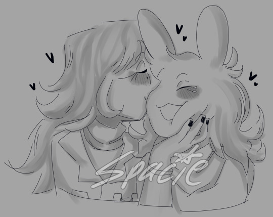
in all of my sketches i tend to use as few strokes as possible and just get the basic idea down. good for not overly focusing on teeny tiny details and worrying about them later (i also use the same technique for lineart, but just end up connecting the lines. thats another tip i have, if you like your sketches more than your fully lined pieces, just line the same way you sketch! or you could also use your sketch as your lineart :P)
another tip i have is to draw from references, and once again, focus mostly on shape/form/the big picture of your subject before going into details (do you know how many planes there are on the human face....i still dont know howta draw faces properly but im not mad at myself anymore about it, i just open up a reference and try to learn). i also recommend having a drawing session where the goal is to draw awfully. draw something you want to draw, but that you're not sure if you'll draw it right, and draw it. dont try to correct it, acknowledge that what you made isnt perfect, and then draw something else. you're learning! of course its not gonna be perfect. but inevitably, you're going to get frustrated. just remember if its something you really want to go back to, you will be able to revisit it in the future. feel your anger and frustration, but do your best to not direct it inward.
small side tangent about shading- I AM SO SHIT AT SHADING SKFHSAFDJHS. people dont tend to notice (surprising), since ig my shading style is considered "beautiful" or something, but if you looked at it on a technical level, there are mistakes everywhere. i havent really tried to improve it. i dont really care most of the time b/c i just like shading for fun. and especially when im shading my sketches, i already have it in my mind that its not supposed to be perfect. its a sketch. this is where im supposed to make all of my mistakes. once i start making my way to the final product is when i start worrying more about if i did the lighting correctly (even then ik im not good at it im not trying to be a god im just trying to draw things that make me happy).
additionally, i really rec u dont try and fudge a sketch until its better if you're deep in a Perfectionist moment. keep the old sketch and start over on a new sketch taking bits and pieces you liked from the original, and improving on those that you dont (shitty thumbnails are also good if you have a vague idea in mind but need ta figure out howta place subjects in your scene). honestly drawing the same thing/idea over and over gets me a better understanding of my subject each time, so naturally each iteration looks better. it doesnt take me that long to sketch tho, so if sketching takes you forever (sometimes if sketching takes you forever its b/c you're a perfectionist skjfskdjf) just think about how much time you're willing to spend on something. remember☝️ its okay to give up/take a break on something and try again later. sometimes you just needta stop looking at your art and like. look at a tree or something lmfao.
i will also say that im not looking to go into a career in art, im more of a hobbyist. ik school environments dont exactly.....help with perfectionism lol. there are certain expectations put on people who go into the art field that are inescapable. if this is the case for you, i still think what ive discussed before can help you, but i also think that you may need to lean more on the mental tips i have also provided below.
alright! mental health tips in regard to art:
so, i have c-ptsd, and with that comes a lot of self image issues that ive had to work on. my feelings about myself extended to the way i felt about my art. it was shit, it was awful, i cant draw like this other person can so why bother, if its not perfect i shouldnt draw at all, etc. and honestly, something thats helped is affirmations. my affirmations are c-ptsd related, but ive noticed a shift in the way i view myself, and by extent, my art since ive started repeating them to myself daily. and honestly, i think a requirement of overcoming perfectionism is telling yourself that your art doesnt hafta be perfect, A LOT. LOL. LIKE YOU ACTUALLY HAFTA ACTIVELY TELL YOURSELF YOU'RE NOT AWFUL LMAOOOO. its funny, we dont think much about how we naturally are self critical about ourselves, and we dont realize that we are basically repeating negative affirmations about ourselves over and over and thats why we're not improving (mentally).
even when you're not drawing, i think it would benefit some people to have some kind of notification on their phone to remind them to tell themselves that their art doesnt hafta be perfect daily/however often you feel you might need it. and then with that affirmation, practice Shitty Drawing. one of the best tips ive ever gotten for this was from one of my friends monnie. get out your sketchbook or some printer paper, take out a shitty pen, and DRAW. and then any mistakes you make are permanent and you cant just endlessly try and fix them. it forces you ta sit with this uncomfortable feeling that something you made isnt perfect. eventually your brain will realize that when your art isnt perfect, you can still draw and you're ALLOWED to continue to draw even if what you make isnt spectacular. if you dont want to repeat an affirmation daily, try to remember to at least repeat it before you sit down to draw. something along the lines of "my art doesnt hafta be perfect in order for me to want to draw. im allowed to draw even if its not perfect" or something else. it depends on what you most struggle with in regards to your perfectionism. im ngl its probably going to feel cringe at first, but i promise you, it really works if you put it into practice longterm.
shoot for neutrality instead of positivity first. let me tell you thats where i am now and its so much less exhausting drawing lmfaooo. i make something that looks like shit and im just like. i dont fucking careee i dont give a fuccckkkkk
those are my tips :] i hope this was helpful!
#spacie spoinks#art tips#kind of?#art advice#i would have added more art but i dont have my art saved on this device KSHFSKJDFH#i copy and pasted my art above from my tumblr post 💀💀💀💀💀💀#anyway#have a great day anon!!
10 notes
·
View notes
Text
Trembling Essence:💙Quality of life changes + choice progress + backgrounds💙

Hi and welcome new followers! :]
This week focused on quality of life changes with the story based on your choices at the start of the game. There was some art practicing again but I managed to get stuff done!
In my previous game development posts I kept talking about making parallax effects in the game! Here's an example of what it'll look like! I learned a lot and had so much fun doing this. :]
Here's some quality life changes for certain effects in the game:
When I initially added an effect for losing HP it was suppose to light up the edges of your screen. Sometimes it can be hard to see if there's another effect happening on the screen so I went back and gave a small hue effect every time you lose HP instead of it only occurring on the edges of the screen. I don't have an example of this only because I have to go through the entire game to fix it, maybe next week I'll have it all done! :,]
Before:

After:

If the player(Y/N) is feeling very cold a icy effect will be shown around the screen to indicate this. I really loved the original way it looked but the new backgrounds can make it very hard to see now. To fix this I added a touch of white frost around the center of the screen so it'll be more noticeable. I also optimized this image so it takes up less space in the game! :]
Choice progress:

I have been going through and writing out what happens with each choice you make.
Without giving spoilers for this ending I want there to be a variety on what happens when you make a choice but I don't want there to be too much branching for this one in particular. It's pretty straightforward. When it comes to the dialog I found out a way to combine sentences together in a way that makes the pacing flow better. It's a little hard to visualize but when you get to the next statement sometimes it'll stay in the same line instead of dragging the dialog out. I also managed to catch a very early bug that caused the screen to go black if you skipped through the dialog, I am very happy I caught this versus finding this problem later into the game. :,,]

Almost half way there! I redid a few more backgrounds and added some animations to them. Since this game development post is getting very long I'll show more of them next week. :D
Q&A / Ask box is open:
If you have any questions about Trembling Essence/Noah feel free to ask here or on itch.io please. This makes it easier for me to see and answer accordingly! I would really like to hear from you guys!
I appreciate the asks I got recently these past couple of days! I'm trying to get to them when I can including the ones I remember that got deleted. I just need time to answer since I like to respond with doodles/drawings as practice. :]
I think that's everything I have to say right now, thank you guys very much for all of the positive support, I appreciate it! :,,]
#te updates#male yandere#visual novel#dating sim#yandere#itch.io#horror game#vn#anime drawing#digital art#yandere vn#indiedev#game development#otome#indie games#digital drawing#gamedev#interactive fiction#artists on tumblr#art
20 notes
·
View notes
Note
So, uh, just reread "chapter"all it takes is one bad day" and does Twice have pure white pupils and irises like AFO supposedly does? Like, I haven't seen any clear official art of his eyes, but in the one back cover of him they look like they're pure white?

At this point I'm just going to have to make an entire essay on how we should be reading Japanese media with an understanding of cultural and class markers. No, Jin does not have the same eyes or similar eyes to AFO. Yes, there's connections with Jin and AFO but that's another topic. 1. AFO's eye color hasn't been really confirmed aside from that one WSJ cover that implies they can be clear and white. 2. That's not what the "something about my eyes rubs people the wrong way" means. This is what I mean about the cultural context being missing from most of us Western-readers and how we just don't get reading the manga with no guide to explain small details to us. I also wish Jin was just popular so I don't feel like I'm the only one in the fandom yammering about the ridiculous amount of depth he has as a character and in his storyline. First off, Jin's eyes are sunken in, his features abnormally "chiseled" and rough for an anime character. By the time we meet him he looks like he's had a hard life but we also find out in flashbacks he always kind of looked like that.
He's unkempt - stubbled, has the sunken eyes and dark eyebags the villains are generally drawn with. He smokes, drinks, wears a wife beater, has no eyebrows, and used to ride a motorcycle. All these things are a red flag. This is where "you really need to be familiar with Japanese media before you read BNHA" comes in, Jin, while drawing from several different Western comic characters (John Constantine, Deadpool, Rorschach), is also neatly fitting into the yanki and bosuzoku (sorta) trope. Or Japanese delinquents. What throws people "off" is the lack of eyebrows. Yanki are traditionally portrayed with no eyebrows. This link here explains that at sight a delinquent can be identified with shaved eyebrows. This is why so many villainous or rough characters are eyebrowless. It's like the Japanese equivalent of giving villains twirly mustaches and goatees - something about the imagery of that already implies villain in our minds, whereas the lack of eyebrows implies delinquent/criminal in the Japanese cultural imagination (in modern day settings. Heian-era eyebrow-lessness is a different story/class marker).

He's also blonde, or "chapatsu" which is also another "Delinquent" trope in Japan - many delinquents in the 70s-90s bleached their hair to this yellow or orange color (hence "cha" which obviously means tea/chai). Japanese schools are infamously awful at allowing for self-expression to the point where naturally brown-haired students can be forced to dye their hair, and chapatsu hair was a marker of a rebellious/delinquent student. Twice isn't the only one who Horikoshi uses this trope for. Tomura, for example, really had the "up to no good" look early on even if I think he's more of a homebody.
You know who else?
Huh, interesting, given Takami's a murderous professional career thief alcoholic. Wait a minute, wasn't Jin was one of the greatest Japanese thieves until his accident, I wonder exactly what Horikoshi meant by making Thief Takami have a similarly unkempt appearance, rough rugged facial features, and barely any brows? Wait -
Something to understand is that we've gotten information from Yoco Akiyama in TUM about how the main manga's design process works and apparently the facial feature consistency is really important for the artists. Thus the fact Keigo's parents were designed with: 1. Rough, sunken features (Thief & Jin) 2. Unkempt facial fair (Thief & JIn) 3. Deep eyebags (Jin & Tomie) 4. Similarly disordered filthy homes (Takami fam & Jin) 5. Beer Bottles lying around everywhere (Takami fam & Jin) 6. Small, beady eyes with little pupils (Takami Fam & Jin) 7. Grey-Blue Eyes (Tomie & Jin) 8. Clear mental instability (Tomie & Jin) Was absolutely intentional. For all that we see Keigo's parents, Horikoshi knowingly designed them to resemble Jin. Again, Jin was Keigo's villain to save. Keigo was Jin's hero. Keigo failed because we needed a character to fail to save "their villain". Both Keigo and Jin have clear working-class background and criminal class markers. These things tie them together, these marginalized identifications make their relationship something that should have worked. If we want an in-universe reason for Keigo's focus on Jin, it's absolutely true he likely (subconciously) saw his parents superficially reflected in Jin, and decided to "save" him because he was unable to save his parents. Of course, that was not only presumptuous, it was also wrong because Jin is not a stand-in for Keigo's parents (and unlike them is a decent person). Anyway, yeah, no Jin's design/looks made him look like a "thug" to people in his community. That's why he had issues and that's what his comment meant. People's biases about people who look like Twice made him just get...away less. If someone "looks like a thug" you will try to make connections that justify that bias. That's why things like his motorcycle accident hurt him so much. He was uneducated, likely a middle-school dropout, fired from a job, had a record and had "bad vibes". Who'd hire him? Can you understand why Jin was doomed into having to survive as a criminal? Society decided he was meant to fail years before he did fail. So much of BNHA is about people falling into traps of pre-determined outcomes. Jin's tragically so.
#why am i always yelling about Jin and his design on here#bnha twice#bubaigawara jin#jin bubaigawara#mha twice#thief takami#ukai tomie#lov#league of villains#bnha#my hero academia#mha#my meta#asks#meta
124 notes
·
View notes
Note
Hi, your art is stunning. May I ask what program you use to draw digitally, and if you have any tips on how to get the forms and colors as incredibly accurate as you do?
Aw, thank you! I still feel like very much an amateur at this; my first digital painting of this type was this one, a month ago, and I don't really know what I'm doing, so take my advice with a grain of salt.
I use Clip Studio Paint currently, though an older version from when it was a one-time purchase instead of a subscription. (Why is everything subscriptions these days.) In the past, I've used Krita, which was free, but I haven't used it for this kind of painting per se.
For these paintings I've been using the default "Dense watercolor" brush for laying out blobs of color and the "Transparent watercolor" brush for subtler shading and smoothing. I expect these are not the ideal tools for this or anything, just sort of the brushes I've gotten most used to working with in coloring in CSP, which I stumbled into kind of randomly while messing around.
To get the forms right: something I started doing for my Good, the Bad and the Ugly kick early when I'd started on that in September was to do a rough sketch with the screenshot on the canvas at the same size and every now and then drag the sketch layer over the screenshot to check myself off - see if I'd made some feature too small or positioned it weirdly, etc. This felt a little like cheating but it did also just kind of help give me a better sense for it and for the ways in which my initial eyeballing tends to be off so I can adjust for it, and then once I had the very rough sketch of where everything is, I could detail freehand on a second sketch layer from there which feels a lot less like cheating.
However, for the last three paintings I did, instead of doing that I have been using a trick I saw my dad using when doing traditional oil painting, namely using a grid: enable the grid option in the CSP view settings, line the reference up with the grid, and then focus on each individual 'tile' of the grid. While working on this latest one, my canvas looked like this, for example:

So when sketching and while working on it from there, I could look at the individual square on the grid that I was working on and try to match it to that individual bit of the reference, which is a lot easier than trying to eyeball the whole thing at once.
As you may be able to tell, the colors don't feel super accurate to me when I'm working on it and actually looking at the screenshot beside it; it's all a little off and less detailed, but then it looks a lot nicer once you crop the reference out of the canvas. For this one I actually experimented with using the color picker tool to pick out some of the extremes of the colors I worked with for each given area - some of the brightest highlights on the face, a nice midtone, some of the deepest shadow - but this isn't all that helpful because film grain means the overall impression of the color is different, and there are a lot of nuances. Something I did do, also for some of the previous paintings where I specifically didn't use the color picker as a challenge to myself, is try painting a brush stroke on top of the area in the screenshot whose color I'm trying to replicate and keep adjusting until it feels like it just about blends in. But even then color is very hard. There are so many subtle nuances and shades and it's hard to adjust the exact shade of some color I've already put down other than by just painting over it again and then redoing the details - unless, of course, I just put another layer on top and set it to Hue or something. I did that a little with the barbed wire around his neck on this one, to make it less blue after I'd first put it down.
Buuuut mainly I think the key to making these sorts of things look good, as far as I've felt, is just to be willing to spend a whole lot of time noodling on them. There's always more you can do with it to make it better.
I found the checking myself off by dragging the sketch on top of the screenshot trick very helpful, even if it does feel like cheating, just by virtue of the fact it makes the outcome look better, which makes me less likely to ultimately go "ugh, this isn't right" and just want to stop working on it and move on. And that's very helpful, at least to me.
Finally there's the general just draw a lot, etc. I have been posting art daily on this blog since the beginning of 2016, and it's been a slow journey of my very intermittent efforts at human portraits getting slightly, slightly, slightly better each time. Just these feel like a pretty massive level up in the space of a couple of months, though, and I think that's largely just because I got obsessed enough with a movie to want to spend the time to draw one million cowboys instead of doodling Pokémon, and also allowed myself to use whatever neat tricks would help me make them come out well enough to stay motivated on it.
7 notes
·
View notes
Text

Hello everyone, it's me again. Today I wanted to give you a small update on how my situation and development of the great dead bird desert is going.

First of all thanks for liking my recent work. It gave me a bump in motevation. And that's gonna be an important word later on, keep that in your minds. Anyways, let's get to the recent stuff I did for the great dead bird desert shall we? First off all the Canyon is going to get a big update. I am trying to figure out Axiom to see how it can form organic material. Here's my first finished result for the canyon's revamp below.

Again I am trying to figure that stuff out so I might not be a pro. The science express also got a massive overhaul for its interior design, leaning more into the science-y feel of the concept art for trainwreck of science.


The left shows the old versions of how the carts used to look like. The right side shows the newer, overhauled versions. Back to the map itself.

The reddest deadest desert is actually nearing its end- Nope, still going. Can I be honest with you? Like really be honest? So I havent been so clear about how progress went now was I? In all honesty THERE WAS NO PROGRESS like look at those renders down there, that is the ENTIRE map, no cuts, no nothing the entire thing.

if im honest, I feel ashamed for the slow progress that I've been making. Its a real buzzkill. Rant Incoming. Scroll down for information and more screenshots. Though, there is a reason why progress wasnt really that good. You see where that "important word" comes in? Yes thats right, the word called motevation, you see where I'm going with this, right? Recently I've noticed that I am not happy with this whole minecraft map thing since it's just a loop of "build this, release it on pmc, next project" I honestly dont even know when this whole thing started im just frustrated and unmotivated and the worst part is it's been bleeding into my personal live as well. Because It honestly feels like a meaningless loop, making something and then just going on and on. I know that's how some things go and all but I'd like to feel some sort of accomplishment for the "hard work" that I do, but nope it's just another moment where I say, 'thats done with, next thing' and honestly the projects I've been working on during TGDBD havent given me the same feeling either. For example heres a map I've been building


its a small fnaf themed map, it took a lot of time to make, you'd think that I should feel some sort of 'good' feeling when looking at it, but the only thing I am reminded of is how frustrating it was working with chisle and bits!
Let me give you another example this time from TGDBD The Original version of DBS


even now when I look at this it makes me puke at the though of that god damn lag that kept terrorising me while I made this, it was unbarable! I decided to stop building and revamp it later on because the performance was so LOW and dont get me started on that god damn piece of glass that says 'Dead Bird Studio' on it this thing still haunts me to this day!! You see where I am going with this? No? Well what I'm trying to tell you is these mods just make it harder and harder to work on this map. You might be suggesting 'why not remove the mods if they are such a pain?' well problem is they are sort of the backbone of the map. Since a few parts of the map rely on these mods otherwhise It'll break and I really really wanted players to drive the Conductors train (and it was ofc for myself to enjoy) but instead of coming to enjoy this map, I came to hate it. I dont want to hate it, but these past negative experiences are just overweighting the positive experiences I had. Not to mention I am in my last year of Highschool which is, of course, the most demanding year! So that also didn't give me enough time to work on this map. ------------------------------------------------------------------------------ Do you understand where I am coming from now? Good! Because I have made the executive decision to Cancel this map! I'm sorry if this made anyone sad if you even cared for this project that is.


I know that whole rant up there wasnt the most professional but I honestly feel ashamed for not getting much done with the time I actually had.
Anyways, files for this map wont get given out, maybe on high demand but thats unlikely.
Thanks for all the support. ~T.L.
7 notes
·
View notes
Note
TELL ME ABOUT WHAT YOU SEE IN SQ!! i wanna hear what you think about him and how you interpret his character any why! what are your favorite things about him?
have fun!!!!
THANK YOU VERY MUCH FOR THE ASK STAR!!!
Okay so, I’m going to only talk about Show SQ here because he’s who I’m most familiar with (I don’t remember much about book SQ sorry 😭).
Anyways, I really like the show version of SQ because I feel I can really relate to him with a lot of things. But first I’m going to talk about why I like him as a character.
I didn’t care much for SQ when I first began the show, but when I rewatched I began to think more and more about him and I’ve grown to really like his character. The fact that he’s an artist is one of the main things that I enjoy about him because I also am an artist! I also like the fact that in the show he loves nature, as that is also a good character quality for me. He’s also very soft spoken, but he speaks up when he finds out Reynie was lying to him, and I really liked that about him. That he was willing to stand his ground and confront Reynie instead of just staying silent like he is when his father lectures him.
An odd thing that I’ve noticed about him that’s also added to my liking of him is that his appearance kind of reminds me of a deer. He has these very big doe eyes with these long eyelashes that give him this sort of transfixed expression that he has a lot of the time. Like a deer in headlights kind of look. He is also extremely thin which adds to my idea of him looking like a deer since they have very slim bodies. Also I feel the fact that he’s soft spoken might add to that thought since deer are very quiet animals and are spooked by the softest of noises. Another thing that I think adds to my view is the scene where SQ is getting lectured by his father and he just stands there silently staring. It’s like when deer are scared and they freeze up for a moment. This comparison of SQ and deer is kinda why I like drawing him so much, I like getting to draw nature and SQ reminds me so much of nature and animals, so he’s very fun to draw. His eyes are the best part since I get to detail them a lot because of his eyelashes.
I also think sometimes he reminds me of a bird too. Birds have big black eyes and SQ shares that appearance with them. I drew a comparison between SQ and a Bluejay because I wanted to see if they had similar eyes or if I was just crazy.
Another thing I like is when he talks about finding out the names of birds and their careers, it’s a small glance into his mind and It just makes me wonder what’s going on inside his head. Like I just wish I could read a whole book about his thoughts and why he thinks them because I think it’s just so interesting. I wanna know how he began seeing the birds names and careers and I want to know if he sees names and careers for other animals on the island. I like to think about characters like that because they seem very mysterious to me and it gives me a lot of time too really just ponder about their lives and beliefs and the causes of those beliefs.
Moving on, how I relate to SQ! here are the most basic examples, He and I both enjoy making art, and we’re both nature lovers. But, to speak more deeply of how I relate to him, I’d have to start with his first appearance in episode 3. The scene when Reynie compliments SQ’s drawing and SQ asks him “Are you joking?” It makes me wonder why SQ’s immediate thought was that Reynie was making fun of him. It makes me assume that SQ has been made fun of for his art before, causing him to become insecure about it and giving him the thought that Reynie’s compliment wasn’t sincere. This is something I struggle with too. Sometimes I worry too much whenever things don’t look right in my drawings or paintings that I don’t believe it when others compliment my art, and it’s hard for me to truly feel proud of an art piece.
Another thing in this scene. When SQ is birdwatching and says “I just look at them for a while, and it becomes very clear what their names are. Sometimes their careers too!” And Reynie Responds with “Birds have careers.?”. This scene is the one I really can relate with the most. It’s clear that SQ views birds and other parts of nature in a different way than Reynie. You can see that in how Reynie looks confused during the scene after SQ says that line. You can also see how interested SQ is in about the birds by how he’s dreamily staring outside the window, as if he’s almost in his own little world. I’ve been in a similar position many times, I’ll be pondering about the ways of nature and about the differences and similarities between wild animals and humans, and I’ll tell a friend about it in hopes they can understand what’s going on inside my head, but they just don’t seem to get it. And this is what really just what makes me relate with SQ, the idea of telling somebody about the little world going on inside my head in hopes that they’ll see it how I do, and them just not understanding what I was trying to say is something that I struggle with a lot.
This next opinion is inspired a bit off of the fanfic SOS by Bods. It’s kinda in the show but I was mostly given this idea that SQ yearns for freedom. The fact that he’s been on the island his entire life and has no idea of what it’s like off the island, and the fact that his father is controlling is what really sets this idea in. SQ is very fascinated with birds, and birds are commonly used as a symbol of freedom, which is something SQ doesn’t have, which could explain his deep fascination with them. He yearns to be free like the birds he draws. I can also kind of relate with this yearning of freedom because I have really bad anxiety and its hard for me to really express myself because I’m so afraid of what others think. That’s why I can kind of resonate with SQ since he also wants to be free.
Here’s a more positive reason as to why I relate to him because the last one was a little sad. Multiple times in the series we can see SQ admiring nature, or talking about admiring nature. I really like this about him because I don’t find many people nowadays who like to stop and listen to the sounds of the earth. I really like that about SQ because I, myself like to sometimes just stop and listen to the outdoors. He also just looks so content and happy whenever he talks about admiring nature and it just makes me so happy to see him happy.
Honestly, I just think SQ is a really wonderful and deep character. He just means a lot to me and I think he’s very interesting to make art of since he doesn’t have features that I’m used to drawing. I’m still grieving that he wasn’t in season 2.
Thank you for giving me this amazing ask Star!! I would love getting more asks from you in the future if you’d consider!!❤️❤️
#tmbs#the mysterious benedict society#mysterious benedict society#tmbs disney#sq pedalian#tmbs fandom
5 notes
·
View notes