#just a little but i also wanted to draw relatively realistically
Explore tagged Tumblr posts
Visit Tumblr Blog
Explore Tumblr blogs with no restrictions, modern design and the best experience.
Last Seen Tumblr Blogs


Fun Fact
In Q3 of 2020, 31% of US users access the Tumblr app daily.
Text
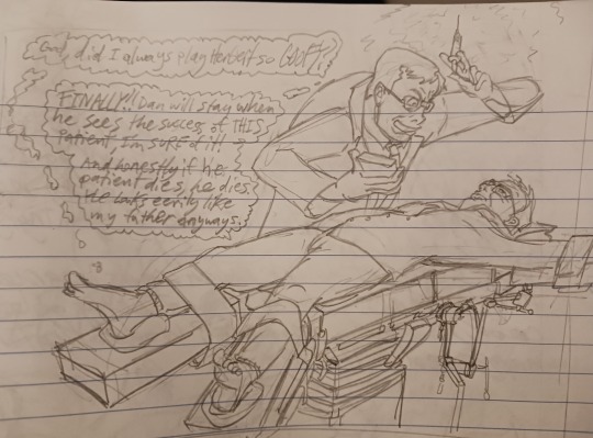
This is Herbert West about to experiment on Jeffrey Combs. The concept originally came from @heliojip on here. He hasn't released his image yet though.
I had begun jokingly brainstorming how Jeffrey Combs would react if he was transported into the Reanimator universe and met Herbert. I think he'd escape with his knowledge of how horror movies work and how to act if you wanna be the survivor, and then go eat some keebler fudge magic middles (discontinued). Then Herbert would find him and Jeffrey would have to make up a reason why they look so similar, and he'd tell him that he was his REAL biological dad; the sperm donor to his actually adoptive father. Anyways if you want more of this headcanon tell me, it was fun
#herbert west#jeffrey combs#tell me if i should tag this in any specific way#reanimator#re-animator#tell me your ideas for how theyd interact too if you want#but a contingency in my mind is that jeffrey acts very normal. its a good contrast to herbert and a way to avoid making this weird#unless its already weird. write to me your thoughts!#i used 4 ref images to get this right. im glad i put in the effort#the surgical table doesnt fully follow the ref image but whatever. i still think it looks really good#i shouldve timed myself!! i usually do darn.#i am MOST proud of their faces/facial expressions/likenesses#herb still looks like herb even tho i exaggerated his mouth and nose#just a little but i also wanted to draw relatively realistically#its kinda fun#you have more lines to make a person look like themselves#and of course i love drawing weird perspectives#i also like the lines of the way i drew their hair. especially jeffrey's#dunno how to elaborate on that tho#tell me exactly your thoughts. critique is welcome
46 notes
·
View notes
Note
I'm not sure if this counts as a request for 'Shrimpy Chronicles', but do you have any headcanons regarding Coral and Pearl or the triplets (Poppy, Moss, Lumiro) as grown ups/teens? I can only imagine how some of them might be troublemakers like their Dad(s)
Bonus if Shrimp Yuu is wailing because her babies are growing up like: "Why would you leave me!?"

See I think it would be funnier if one of the Dads was wailing, the obvious answer would be Azul but like Floyd wailing and wrapping himself and his tail around his kiddos is a way funnier image to me.
I have a few ideas for the kids, part of me wants to make them just like Jade and Floyd, but realistically they wouldn't be the exact type of menaces their fathers were.
As teens, both of them are relatively straight forward and socialites. Compared to the (adult) twins, they're not fairly intimidating, so they're very easy to approach or be approached by. This is partially because they appear a lot more human thanks to Shrimpy Yuu's genetics. But it's also because the Leech family is lowkey training them for a...different part of the family business, one that requires them to be charismatic and to blend in with the crowd.
Unfortunately, that last one is a bit hard as, despite them being rather sociable, are also quick to gossip and even start fights if it entertains them. Coral especially likes to whisper into other's ears and make little 'suggestions' to people, rile them up so to speak, and watches in glee as she and Pearl bet on who will win the fight she causes. Pearl is just very curious (or impulsive), so she tends to get into all sorts of situations just to see what will happen if she touches that big red button that says 'DO NOT TOUCH'. Anything that happens after is totally not her fault! They shouldn't have made that button soooooo touchable!
Unlike Jade and Floyd, who enjoy personal space and doing their own thing (and even often fought as kids for annoying each other), Coral and Pearl are attached at the hip. If one likes one hobby, the other will find herself doing a similar, if not the same hobby just to hang around her. It's quite funny to see growing up, as neither particularly realizes it when one picks up drawing, the other does painting. One starts baking, the other starts cooking.
The funniest is when both try to do the same thing, but in each other's space. Once, Pearl took up reading horror novels and Coral started hovering over her shoulder to see what her sister was up to. After about 10 minutes, Coral as completely splayed over the top of the chair, cheek pressed against Pearl's as they both read the book together. They're very fond of each other, though they have their squabbles (usually over food, they both are gluttons).
The triplets I haven't thoughts as much about so I don't have much to share about them...ask again later lol
#mochi asks#twst#twisted wonderland#jade leech#floyd leech#twisted wonderland x reader#twst x reader#jade leech x reader#floyd leech x reader#azul ashengrotto x reader#azul ashengrotto#jade/azul#floyd/azul#twst oc#twisted wonderland oc#shrimpy chronicles
111 notes
·
View notes
Text
Avatar Rant: Snowy Region Na'vi
Am I the only one who doesn't like the fanon snow navi designs? Specifically this (I used shitty AI images I found off of pinterest to illustrate the point and to avoid using actual artwork from people 🩷):
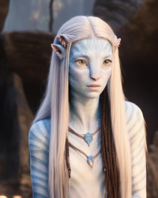
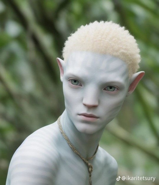
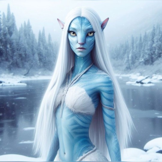
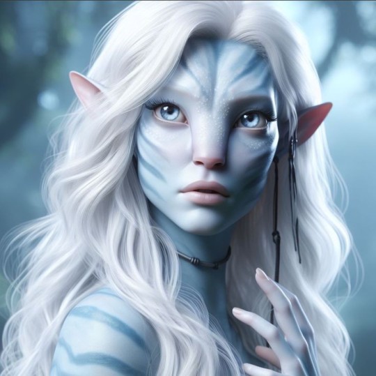
(Before I continue my God these are creepy 😭 AI genuinely cannot create Na'vi without them looking uncanny, disturbing and far too human)
I can understand why people choose the more predictable design philosophy – blonde hair, blue eyes, pale/white skin, pretty two pieces – because that's relatively how this sort of lifestyle has been portrayed to us in the media. Every movie or show set in a snowy region always features mostly eastern European characters, so naturally people decide that their snow na'vi must resemble eastern European people to a degree, and this bothers me.
Not because they look like white people (though that is like 25% why ngl) but because it just isn't realistic? Na'vi may be inspired by humans but they are still a different species living on a harsh and deadly planet that humans can't survive in, na'vi winter and snow would be excruciatingly difficult for them, and they would need to adapt to it.
I just don't see how they would be so thin and petite and pale, people say to blend in, but why? Only a handful of animals in arctic regions are actually white to blend in (polar bears, arctic foxes etc.) so wouldn't it make more sense to base them off of arctic animals from the ice age? Back then, animals were bigger, bulkier, with thicker skin and hair all over to protect themselves from the crippling cold – with that in mind, wouldn't snow na'vi be bigger than average na'vi, and bulkier too? Unlike regular na'vi, it would make sense that the snow ones actually have body hair all over, maybe even fur if you want to take it that far.
And if you're basing them off of INDIGENOUS people, then appearance, features and fashion wise, wouldn't it make more sense to base them off of the actual Inuit people of the arctic instead of Elsa from frozen 😭
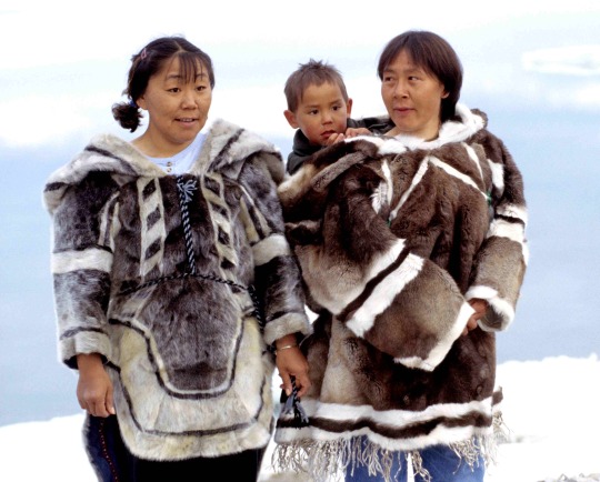

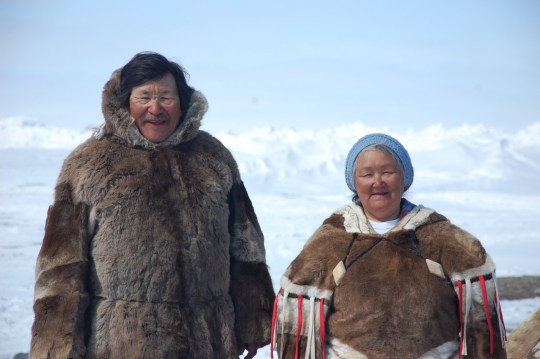
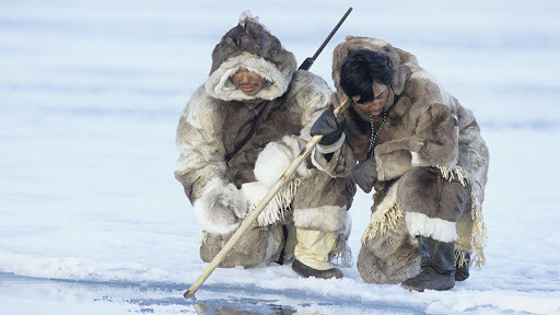
Because realistically why would they wear flowey dresses and two pieces in weather that is probably 80% worse than any winter humanity has ever faced... especially since na'vi are all inspired by different non-white/european indigenous communities, and yes... non-white/European indigenous people do in fact live in cold, snowy, arctic regions...
To add a little bit of pseudo-psychology to it, it may be done in an attempt from white avatar fans for the most part to feel closer to the na'vi by adding a white adjacent sub-species, as the closer to europeans the na'vi look, the more they see themselves within the na'vi. However, that is purely speculation lol.
Also, I do NOT think you are racist or anti-indigenous or anything of the sort if your headcanon for snow na'vi looks anything like the examples! You're allowed to draw and design what you want, and just because tumblr user princess-nobody doesn't like it, doesn't mean it's bad.
TLDR: Fanon snow na'vi don't make sense and confuse me lol. Imo snow na'vi would be big and bulky behemoths that are covered in thick body hair and wear large, figure covering warm clothing, not skinny little russian girls in ballet outfits LMAOOOO.
#long post#avatar#avatar: the way of water#avatar the way of water#atwow#lo'ak#tsireya#aonung#neteyam#rotxo#tuktirey#neytiri#jake sully#ronal#tonowari#snow na'vi#na'vi#na'vi oc#na'vi avatar#na'vi character#Nobody's Avatar Analysis
340 notes
·
View notes
Text

BAMIRGA 'BAM' BARBORAS (he/him)
Minotaur Warlock - Pact of the Undead
A self-proclaimed Beast of Few Words. Summoner of Skulls. Enjoyer of fine wines and relaxed company. Calling him "Big Beef" would probably be insensitive.
D&D OCs - Redesigns 2025 - Set 3 #13
UNDER THE CUT: old 2024 design & notes
Waow
Anyways these designs are pretty similar, I mostly just changed up Bam's accessories and a little bit of his anatomy (one less finger per hand to make minotaur hands more hoof-like). Also I gave him a staff, and a little bone dog as a companion! Though granted that Bam is over 7 ft tall, his dog (I think I might name him Dmitri) would be the height of an adult human, so not exactly a 'little guy'. I also went for a softer green this time around for accents, in keeping with his relatively dark color palette. He is a necromancer, after all.
Also regarding the Bone Dog, I wanted it to look like it was compiled from a bunch of different bones from different sources, but still cohesive enough that it looked like a real-ish skeleton. And in the process, I made an artistic self-discovery that I didn't expect: I like drawing skeletons if I'm not going for realistic proportions. I like making jank-ass skeletons - it's fun!
#oc:bamirga#minotaur#warlock#anthro#dnd minotaur#minotaur oc#dnd warlock#dnd anthro#necromancer#my art#my oc#dnd art#dnd character#dnd character art#dnd character design#dnd oc#dnd oc art#dungeons and dragons#character design#my oc art#oc#original character#oc art
21 notes
·
View notes
Text
I’m gonna talk some more because I really want to talk Psychonauts instead of doing meaningful work.
Why is it always when I’m not crunched for time that I can’t think of ideas? I find myself setting arbitrary time constraints for myself and instead of being productive with them I’m just panicking over whether or not I can complete a relatively simple task WELL in a time limit I set for myself.
And now, while you’re piecing together how the hell task-based anxiety relates to Psychonauts, I throw Compton Boole at you like a bowling ball.

STRIKE! Or, Spare? I don’t bowl often.
We all have a little Compton Boole in our heads, I think. Someone who lightly taps your cheek whenever you’re having a rest and reminds you that there are better things you could be doing with your time. Some people can just manage their little Compton better than others.
No shame in it, it’s not like you can control crippling anxiety. That’s your chemical imbalance and therefore your business. I was just putting myself on the spot because it’s more ✨ethically responsible✨.
Given that anxiety is primarily a fear disorder, it’s unsurprising that most studies on it are run on animal models —which is elaborated on in a 2009 research paper on neuro-circuitry of fear and stress disorders by Drs. Shin and Liberzon. Obviously, much more has been discovered since, seeing as sixteen years is a long time for developments. Regardless, this is about the rats.
The main difference between rodents (and most animals) and humans is that humans have a tendency to have fear responses to things that aren’t clear, unconditioned stimuli— as well as phenomena such as anticipatory anxiety, which is evidence (one piece of many) that animal models aren’t all that accurate in human study.
In other words: humans react anxiously to stimuli that (and I am not attempting to reduce the impact of anxiety, because it is very real) does not exist.
Here I raise you the Compton Boole-shaped bowling ball that I just threw at you.
Any of this sound familiar?
Compton is anxious, and we see that from the get-go. The way he speaks has a quavering quality to it, his voice seems to crack every other sentence. We learn what he’s anxious about, and it’s quite literally all in his head, and self-imposed on top of it.
Ram It Down is a prime example of setting oneself up to be anxious, even unwittingly. Compton has put himself in an environment that is:
1.) “Broadcasted, Timed, and Judged”, as it’s on TV. This is an environment in which judgment is not only expected, but encouraged. Tell me you haven’t watched a competitive cooking show and not judged a contestant for one thing or another. It’s not even a conscious effort, half the time. We even go so far as to face off against the entity: judgment. Not to mention the Actual Cooking Show Judges that are present and consistently heckling us. It’s clear that Compton fears judgment— he says it himself!
Also— the time limits. Nothing bad happens when you don’t complete the dish within the time limit. You can take your time, it’s fine. Again, with the arbitrary time limits he sets for himself when the task isn’t actually requiring a time crunch.
2.) The goats. In some contexts, goats mean creativity, and drawing back to Hinduism— the transformative powers of fire. Both of which seem to fit with Compton’s love of cooking.
However, there’s also the negative meanings. The obvious— relating to or of the Devil… though we don’t particularly see any religious references in the game or in Compton specifically. Another negative meaning that I feel has more prevalence is the concept of the scapegoat, in which a goat is burdened with sins and outcasted… perhaps, to a psycho-isolation chamber.
But a more likely and probable cause for the goats is that goats are rumored to eat anything, even things that are realistically inedible. While this isn’t necessarily true— I have experience with goats that prove that they’re rather picky— it’s still a way for Compton to put himself down, or perhaps give himself some hope. ‘They’ll eat anything’ in a positive connotation vs. ‘They’ll eat anything’ bemoaning his situation.
3.) It’s taking a lot of the joy out of something he finds comfort in; cooking! Cooking is —from what I researched, at least. Correct me if I’m wrong— the less precise of the culinary arts, focusing more on flavor than the chemical reactions necessary to make baking work. Cooking shows and baking shows, at least to me, seem like they bring a lot of joy to the art, where I get to see how people from different backgrounds and contexts get creative with their food.
But not everyone wants to be on television. Not everyone wants to cook outside of their home kitchen, with the tools and ingredients they’re familiar with. Not everyone wants to be put on the spot, have their methods and ideas harshly judged by people you don’t know, and to seem so small in comparison to some hot-shot public chef’s giant ego… in a literal sense, for Compton.
All in all, this guy set himself up for anxiety and stress without even thinking of it. He’s coming in expecting failure, and some meddling kid goes and proves to him that he’s significantly more competent than he thinks, and that his friends love him dearly (and all blame themselves for their group’s collective shortcoming. Except Otto. Because Otto’s well adjusted).
Which means that if you feel too anxious to function, sometimes all it takes is a little help from someone you hardly know, and trusting them to help you work through it :]!
I don’t know when this turned into life advice, because I’m not a qualified therapist. I’m just a college kid who likes to write about psychology and see all of the cool studies that people have run solely in the interest of helping their loved ones and people around them. I feel like Compton Boole is a love letter from the Psychonauts Devs that reads: ‘if he can do it, so can you.’ I feel like the whole game echoes that in almost every aspect.
That got surprisingly deep. I have no important exams this week, so I’m getting anxious over nothing until I have something substantial to worry about. But for now? We can let ourselves relax. I implore whoever is reading this, also, to go relax.
#oil rig rants#god i love this game#psychonauts 2#psychonauts#compton boole#I’m surprised I didn’t mention Cassie at all in this!#I LOVE Cassie!!!#she’ll get her own post#maybe#again#well of ideas#it isn’t well-ing#I also think it’s rather interesting that they chose cooking for someone like compton. like in hindsight it’s totally fitting but#you don’t get the impression he’s a chef until you talk to him more#I guess it’s just his way of showing that he cares. what’s more caring than a home-cooked meal?#I researched rodent testing in fear based disorders for this and yet I couldn’t be arsed to look up bowling terminology
20 notes
·
View notes
Note
I love your art style! How did you develop it?
hello! this is very kind, thank you <3
i'm someone who gets pretty bad art block if i don't change art styles semi-regularly, so i end up with a new style for every situation -- though i think i still have kind of a 'base style' that bleeds through.


drawing for vip is the first time i've been in deep on a piece of media where the characters have canonical faces; i've been in the podcast/book/oc zone for basically my whole life, and on top of that i've spent the last couple of years not really drawing humans at all (it was all domestic cats all the time in my brain for a hot second). so uhh. yeah. it took some work to get myself in a place where i felt good about making art for this fandom. luckily, i've also been in a realism phase for going on a year, so it was just a question of finding a way to bridge the gap between, like..,.. portraiture and meme comics. easy, right?
for vip, i had two primary objectives for what i wanted the style to accomplish:
i wanted a style that's relatively fast. i'm prone to intense detail work, which means i have a tendency to slip into styles that require a big time commitment, but for this fandom i'm more interested in conveying ideas and jokes than spending hours embellishing one image. (i'm backsliding further on this by the day)
i wanted something that fits the energy of vip, in some way or another. what i settled on is a slightly 'comic book' look -- based in realistic shapes and proportions, but with exaggerated shadows, bright colors, and dark, thick lines. the scratchiness adds to this i think?
it took a lot of playing to get settled in with drawing people, let alone stylizing them; i did some studies of vic's face to get back in the groove (most of these are posted in my art tag), as well as some studies of other peoples' human styles to try and pick up some little tricks and details, and to ease me back into the shapes involved.
the thing that ended up being the key for me was. uhhh. taking away my access to pen pressure. it's just been me and the most basic brush tool on the planet. i'm honestly thriving. something about it makes me feel so uninhibited.

hell yeah baby
. i haven't gone to art school can you tell (everyone can tell)
anyway --
my current process is basically:
get a bunch of reference images, especially for the face
sketch with the goal of vague likeness (though now that i'm getting more comfortable i sometimes like to sketch without references and then only use refs as i'm lining, to force a little more flexibility/stylization while not drifting too far away from the actual faces involved)
make the sketch smaller . we love a tiny canvas. now throw a lining layer at it with an eye for the places of deepest shadow, and, loosely, the directionality of the materials involved. now throw more lines in there. (i've always loved crosshatching, but it's been a while since i've really used it outside my sketchbook/digital sketch layers)
flat colors because i have no time for shading. except the skin. the skin can have some cell shading. i Guess.
run away really fast so the backgrounds can't find us. hide. hide. hide.


in terms of style development, i do think that a decent portion of my vip style does come from the bleed-in of my most "natural" style -- which might be what the question was about? i think as i've gotten more comfortable in this process and i've come to understand better the Look that i'm aiming for, i've started letting more of my old ways come through. which also means . more detail and more timesink. curses. i have once again played myself.
uhhhhh and my natural style i developed through a hell of a lot of ballpoint pen sketches, Drawing Fur, studies of art nouveau shapework, still lifes of plants, human portraiture, gesture drawings, studies of various animals, all that nonsense. i think it comes through most strongly in the way i draw hair. i can and will make everyone more fluffy than they are in real life and that's a Promise.
i'm.. not sure exactly what this question was Looking for, but i hope this addressed it in some way!
11 notes
·
View notes
Note
I think SVSSS as a 2D cartoon would be the best moving medium for it imo.
I mean, personally, yeah, that's how I'd enjoy seeing it as well! My ideal slightly pretentiously artsy SVSSS screen adaptation would probably look only a little more detailed than linograph prints (2D or shaded 3D?) (someone hit me up in like two weeks to draw an example of what I mean, if I don't remember on my own, I don't have access to art stuff right now), very stylized and vibrantly colorful, because that's one of the art styles that I particularly enjoy.
I'm not a personally a fan of the 3D SVSSS show because I find the characters a little too doll-like and same-facey for my tastes? It's fine! It works! It's serviceable! It's just all, backgrounds included, a little... safe? I tend to like over-the-top bright colors and intricate details and impractically weird shapes and yet also coherent world production design in my fantasy, which is a lot to demand of any production, perhaps especially with animation productions, which are always squeezed for time and money.
(EDIT: I know the SVSSS show was under heavy constraints and the results are impressive considering their resources; it doesn't change the fact that I just don't like the art style and nevertheless find the results underwhelming. I don't like a lot of "realistic" modeling / rendering styles, not just "anime" ones, even if they are extremely technically impressive. Believe me when I say that I know the vast majority of the entertainment industry is overworked and underpaid and creatively restrained.)
Slightly tangential general note: I don't think 2D is inherently superior to 3D (EDIT: NOT trying to imply asker is saying this, just having some general thoughts), especially because, with the realities of production, each have their advantages. 2D has a lot of stylistic advantages still, but 3D shaders are catching up and doing some incredible things these days! More advanced puppet controls and particle effects and such are doing some beautiful things for 2D shows as well these days. A lot of stuff has been subtly mixed media as soon as 3D became possible. It is potentially possible (note: not saying any studio would actually greenlight this) to do an equally slightly weird and artistically stunning 3D SVSSS show, given the freedom to work. (Good boarding and writing is also sooooo important in both mediums, obviously, it's not just about the art design. You can get away with incredibly limited animation with good boarding, writing, and art design.)
Another slightly tangential ramble: both 2D and 3D have the potential for stiff animation and poor character acting, which also comes down to production limits and animator skills? (I often think of character animators as a type of actor!) There are a lot of 2D shows that I don't really like because I find the animation incredibly stiff, both puppet and handdrawn (there's great 2D puppet stuff out there these days), which pretty much always comes down to production limits (deadlines and budget and software, saving up their animation for the coolest scenes). One of my favorite things about Studio Ghibli films (which as features get a lot more space to focus on art compared to the demands and restraint of television) has always been the squash and stretch in otherwise relatively realistic action, making things like hugs look SO nice for example. But 3D stuff is getting better at that these days! The ways characters slumped into each other in "Nimona" for example was great. And it's just fascinating to look at the elasticity / stylized sculpt of expressions in "Puss in Boots: The Last Wish" compared to the technical limits of the models / rigs in "Shrek" or "Shrek 2".
Adding these side notes because I want to be clear about my respect for both 2D and 3D artistically! A lot of video games are doing cool stuff in 3D that looks very close to 2D with stylized shaders, which you can sometimes spot by the large or small rotations in character action / acting, which is difficult (and therefore often expensive) to do in 2D with all of those extra drawings / angle poses. Also, I think the current push towards funky shaders in 3D is so cool and it's hard not to gush about them!!!
77 notes
·
View notes
Text
I understand that everything about scale in The Transformers (any series, comic, movie, etc.) is bad.
I do. I really understand. I accept it. I have no choice to.
But it drives me insane.
A consistent sense of scale is what helps us understand objects in space. Including objects that are characters. We can understand how heavy they are, how tall they are, what spaces they can move through and which ones they can't, what their perspective is, and what a typical human perspective is of them.
This is actually the thing that makes the live action Transformers movies 'work'-- they aren't always consistent but because human characters and environments keep the same scale and establishing shots of most of the characters include that scale, all of the explosions and fights and "wow!" is relative to actual live-action human beings.
But when that isn't the case, the scale in transformers is often relative. Robots that are 'large' (Bulkhead, Lugnut & many other Decepticons, etc.) are scaled bigger than robots that are 'small' (cassettes/minicons, robots that are motorcycles, Bumblebee, etc.) and some robots that are 'important' are given a relative size that has to do with conflict that they face. The most obvious examples of that last one are Optimus Prime and Megatron, who are both often Large but may have different relative sizes as the key trait here is actually 'important'-- Optimus Prime is usually Large in relation to his team but never Large enough to win against Megatron without a Struggle to His Limits (or more heroic means like the power of teamwork etc.)
Relative scaling also applies to human characters who tend to be 'as small as giant robots make you feel.' Especially if they're a child. Which is... okay, but the whole point of Robots Being in Disguise is that they sampled a human environment with scale and are taking it with them. We SHOULD be able to assume their altmode, if it's an effective disguise, can also be a way to measure scale. But this isn't the case; TFA has a lot of weirdly sized buildings and almost all of TFP takes place in barren environments, or in Ships and Bases where the scale changes around surreptitiously.
Space robots don't have to be exactly the weight of whatever earth thing they transform into and sometimes that's totally impossible but who-is-more-massive is kind of important when your show has so many physical smackdowns. Relative mass can take us pretty far, but it can't take us all the way. Sir Isaac Newton IS the deadliest son of a bitch in space! Much more exciting confrontations can happen when we have a better understanding of what physics are possible even if we don't adhere to realism perfectly. Sort of like how drawing from life can make fantasy illustration more effective and imaginative.
And even outside of confrontation, if any characters want to interact with each other or their environment, we as an audience get SO much information based on their scale and sense of mass. Optimus Prime Has You In His Hand is more powerful if your mutual points of view are consistent. We can tell which robots can easily shake hands or hug, who can use a shipping container as a convenient thing to lean on vs a dumpster, how 'far away' stuff is for different characters, how much energy they have to use to cross a distance, and more.
Even Weird Stuff is better if we care a little bit more. In TFA, Blitzwing drops directly out of the sky if he transforms from a plane into a tank midair. We assume this is just because tanks can't fly, which IS funny. But what size of tank does he become? Is it a realistic size for a main battle tank in the modern day? Does he put on 52 tons when he changes from something the size of a F-15 Eagle to something more like an Abrams tank?? Instead of that being some kind of oversight or mass displacement thing what if we leaned into it and used this thinking to make even funnier jokes?
Many MANY mecha shows are very detailed about the specifications of their robots, which lines up with how people who are in to real life vehicles (and military technology...) obsess about the numbers. We don't need to go that far, but Vehicles and Technology are one of THE autistic things to care about and yes, I know, most of this material is 'for kids.' But who do you think is memorizing all of the Facts about Trains or Planes or Trucks out there? Why do kids care about vehicle robots, is it really just haha hot wheels vroom vroom or are some of them actually interested in what there is to like about real, non-imaginary giant metal constructs?
It drives me bonkers that the 'toy' aspect of Transformers where 'who cares, its toys' overtakes a lot of the things that help imagination play with toys in the media that's kind of the starter-imagination-play-scenario WITH the toys. Just a littttle bit more effort into consistency and leaning into showing it off would absolutely blow people's minds with what's now possible for action figures beyond vaguely bonking against each other.
#transformers#scale#the transformers#'why is shockwave in transformers prime able to throw bumblebee around like the kid's made of balsa wood'#shockwave is a tank in that one. he may be a space tank but tanks can weigh over 60 tons. a Car might weigh just under 2 tons#but because not that much thought goes into scale and mass and weight we are eyeballing the physics pretty much always#and do you know how much of a bummer that is#how powerful and glorious physics is when you have giant robots???#we need to deploy even MORE autism on these robots IMMEDIATELY
20 notes
·
View notes
Text
fwiw if you want to introduce more variety to how you draw faces I strongly suggest thinking really hard about noses
noses give you so much information about someone! they're usually one of the first things which define how we think of someone's face (after all - they're by far the feature that takes up most of it).
They change as we age - they take up more of our faces and move away from our mouths. babies almost all have round little tips of noses with no definable bridges, while depending on the type of nose an adult has they may get bonier and sharper or softer and flatter with age. nostrils widen, skin creases, eyes drop back from the bridge. I think often people try to age faces by putting wrinkles around an unchanged nose and it throws stuff off.
They're also a really racialised feature. like there is no one Black Nose or East Asian Nose or Desi Nose or White Nose, obviously, there's huge variation within and across ethnic groups, but there's a lot of overlapping trends in nose shape for different ethnicities and it's often a big contributing factor to people drawing characters of colour that kind of look like palette-swapped white people? like there are so many nose shapes that are super common but because they're relatively uncommon for white people, they're just not the noses people often learn to draw as standard.
but also a diversity of noses says so much about a character, the same way that their build or eye shape or face shape does. like. a long sharp narrow nose in a bony face? a round, slightly flat nose on a face full of smile lines? an upturned, softly rounded nose with freckles and no bridge? a long hooked nose with a curved tip? a crooked, broken nose? a bulbous, reddened nose? noses can imply strength, weakness, innocence, experience, childishness, wisdom, suffering, whatever you want to get out of a character design. don't neglect the nose!!!!
and like. obviously depending on how stylised the art is there's going to be information lost, but that's the thing - there's a real upper limit on how much variation you can put in eyes or mouths or face shape in simpler styles without making it overly realistic, but you can go really nuts on nose shapes! even with just one or two lines or one simple shape you can imply so many different noses by changing little things!
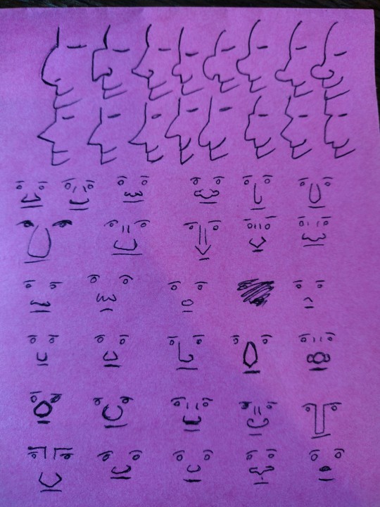
and yet really often I look at people who are trying to broaden variety on faces and they mix up everything except the noses, which stay like a circle or a triangle or a line or whatever their standard noise is, and as a result there's still this sameness to all the faces.
bc eyes and mouths and jawlines are all very well but noses are, in my opinion, the most varied part of the face. I can't think of any two people I know who have the same shape of nose except maybe me and my identical twin.
(and I'm not talking big Vs small, or hooked vs snub vs straight vs flat. really look at people's noses in real life cause there are so many variables)
(some leading questions under the cut)
how big is it? how long from the front? how far away from the face does it sit in profile?
does it have a rounded tip? how round? some people's noses have a profile that's basically a triangle point, some people's are basically a round tip with no visible cartilage above it, and everything in between.
What's going on at the bridge? in profile, is there a clear dip in between the brow and the bridge of the nose, or does the brow come straight down to meet it (or, if you have a kind of striking profile like Hangman Adam Page who looks like an early 2000s DreamWorks character, is your profile one line from brow to the top of your nose)? from the front, is there a clearly defined edge to the bridge of your nose or does it curve out? how much of the space between your eye sockets is nose, on a range from 100% to 0%?
What shape is the top of the nose in profile? Is it a straight line from bridge to tip? does it curve down? does it curve up like a ski slope? does it come to a sharp stop and angle out into a round tip?
does it have sharp edges? does it look bony, with a pronounced ridge? or is it all soft lines? Does it meet the cheek at an angle or at a curve?
does the tip come to a sharp point, or to a curve? does it angle up (so you can see the nostrils from the front), or down (so you can only see the line of the nose)?
how big is the base of the nose compared to the bridge? from the front, does it flare wide across the face at the bottom, or is it almost a straight line down? is it broader higher up the nose?
what are the nostrils doing? how big are they? are they round, or slit-shaped? do they sit behind the tip, with the noise all contained in a single pyramid shape, or do they sit to the sides? do they sit along the face, point forward towards the tip, or point up higher than the tip?
how does the nose interact with the other features? does it dominate the face? is it a tiny wee thing? does it sit over a very long upper lip with a pronounced philtrum, or is it almost touching the mouth? How much of the space between the eyes is taken up by the bridge of the nose? do the eyebrows curve towards the nose, or meet them at a hard angle? if they wear glasses, where on the nose do they sit?
colouration - is it all the same colour, or pinker at the tip or over the bridge? are the insides of the nostrils visible, and are they pale or dark pink? does the top of the nose get more sun - is it darker?
surface details - are there creases at the bridge or around the nostrils and cheeks? are they from scowling (vertical) or laughing (horizontal)? does their nose scrunch up when they smile, or flare when they're angry? is there hair? freckles? piercings? scars or breaks?
like the nose, jaw and brow are the structure around which the rest of the face is built. if you get to a place in your art style where you're comfortable playing around with that then you immediately add so much more diversity and life and verisimilitude to your characters!
also noses are just great. like they're so fun to draw and there are so many different gorgeous noses! I'm so into noses that usually the way I find how I want a character to look is to draw the eyes, draw the nose, then redraw the eyes and build the whole face around the nose.
(this advice is coming from the fact that the most common compliment I get on my art is the diversity and believability of characters and I would say that's like 50-60% in the nose/brow)
293 notes
·
View notes
Text


EMPRESS, JEREMY, AND STEVE
Thanks to @seers-tower's help I finally was able to sort of draw Empress' base. I have drawn her in more of a classic supercell state than her usual high precipitation state so you can see her wall cloud and such. I've drawn the tornado (Steve) much bigger relative to her than he would be realistically so you can see his weird monster arms.
Empress has several tornado avatars she can summon but Steve* is the strongest. His "arms" are horizontal vortices that themselves have subvortices that resemble "fingers." The wind at the tip of the "fingers" is fast enough to carve deeply into the ground, and he can use his arms like a dog to sort of dig. So, not even an underground shelter is necessarily safe when Steve is attacking. Fortunately, despite being capable of EF5 damage, he doesn't really do it. He has kind of a docile personality, and unless Empress or Jeremy order him to destroy stuff he mostly just likes to scour abstract art into empty fields and collect lots of prairie wildflowers (though even with Jeremy's training he's still not as dextrous with his winds as he wants to be and he's constantly made sad by how the wildflowers get damaged badly).
Speaking of Jeremy, he's the cowboy-looking guy in the second drawing. He's basically Tyler Owens from Twisters if he were two decades older and obnoxious not in the Reed Timmer way, and more in the "I've dedicated my life to this particular supercell and she will one day be my wife**" way. He was originally just a storm chaser but ended up joining the Allies of Gaia program, where people partner with forces of nature to help protect the planet. Nobody had been able to tame Empress before him, and many had died trying. He was the first person who successfully rode Empress, but mostly because he straight up ran headlong right into Steve and Empress thought it was kinda cute how stupid he was. She has all the power in their relationship (she has a million ways to make him deader than dead) but she herself adores Jeremy too and so follows his commands when they're working together on Allies of Gaia stuff. She trusts him enough to let him enter her body and control her processes from a virtual cockpit inside her overshooting top (yes that little speck in the first drawing is Jeremy getting over excited).
He appears in Part 2 of Melissa and the Allies of Gaia (I have part 1 up on Wattpad) which I am currently working on writing.
Seen in the foreground with Jeremy is miniature form Empress (who just looks like a generic cartoony thundercloud), and the miniature forms of two of her tornadoes (which just look like generic cartoony tornadoes).
*-in part 2 I describe Steve as being a giant wedge, but for the life of me I can't actually draw him like that and put his arms on him without it looking really weird. So in the cartoons he looks more cone shaped so he vaguely looks like he has a torso lol.
**-I have a humanoid design I'm working on for Empress that I imagine she transforms into when they finally marry and Jeremy becomes a happy tornado dad.
Lastly, here's Empress's face without Jeremy. I moved the eye up because I prefer it to be directly under her anvil. I originally wanted it to be located there in the second drawing but Jeremy's hand ended up blocking it.

Also...went through my first tornado emergency this week. A big supercell passed over my apartment but I was too scared to take pictures.
#character designs#original characters#supercell#thunderstorm#tornado#storm#weather#cloud#meteorology
9 notes
·
View notes
Text
★Human Pumkin★
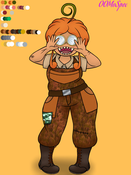
Hello world and all who inhabit it! (ノ◕ヮ◕)ノ*.✧. How are you? I hope you're doing well and all that.
But anyway! While I'm working on another one of my drawings, I decided to post this quick thing I made a few days ago when I was still deciding what to draw. None other than the human version of my Troll OC: Pumkin! ✧◝(⁰▿⁰)◜✧.
(If you're not familiar with Pumpkin, here's the link to her character sheet)
A friend on Discord recommended it to me to practice more poses without leaving aside my hyperfixation. (≧▽≦). So, I decided to give it a try. Especially since I've been drawing a lot of Trolls lately (and probably drew even more) and I don't want to forget how the Hell our species is supposed to be drawn, so I've set myself the goal of trying to draw a human form in a particular pose after a certain amount of time drawing Trolls, although we'll see if I stick to it and follow through. XD
But anyway, back to the drawing, this is the human version of Pumkin! (人*´∀`)。*゚+. Although I warn you that this won't be her final design because I did it relatively quickly and didn't pay much attention to the process of "adapting" her design to a human body with normal proportions, which is why things like her hair, glasses, and overalls are more cartoonish and don't have as much detail. The truth is, I didn't think much about how those things would look if Pumkin were a human, so I didn't really look at many references to make her design more realistic. I just took her Troll design and shot a humanizing beam at her. And that's it. So I apologize if those parts of her are weird. I'll see if I can tweak them a bit the next time I practice my poses.
Another thing I didn't like at all was her face. :/. I mean, it's better in this take than the first time I did the face, but I'm still not crazy about it. Another thing I need to improve when adapting. I mainly think it was difficult because of her nose. A Troll's nose isn't the same as a human's, and that changes the game a lot.
However, what I did like about Pumkin was her body, which was what I focused on the most while drawing. ( ꈍᴗꈍ). It's not very noticeable because of the overalls, but I made a version of her without them. I mean, with underwear.
So, a quick warning for those who are sensitive to such things: below you'll see a drawing of Pumkin in her underwear. I personally don't find it "suggestive" enough to classify it as risqué or adult content, but I wanted to leave this note just in case. Also, as a reminder, Pumkin is canonically of legal age (between 19 and 23 years old), so it's okay for me to draw her without much clothing.
But if the idea of seeing Pumkin in underwear still bothers you, then imagine that what she's wearing isn't underwear at all, but a swimsuit. I think the whole thing can easily pass as one with a little imagination.
Ready? Because here she is.
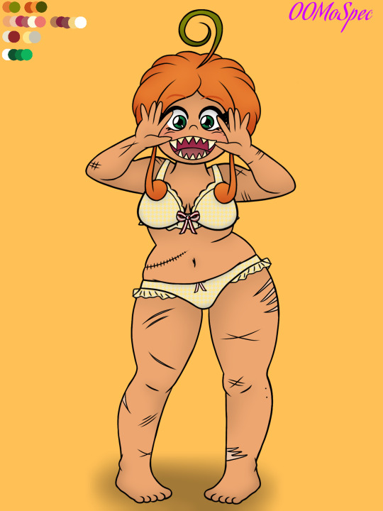
(If you don't like it, just note that I warned you, so please don't come complaining)
As I said, Pumkin's body is what I enjoyed drawing the most. ✧◝(⁰▿⁰)◜✧. Mainly because I really like making robust bodies, and Pumkin is that in a way. Of course, she was supposed to be a bit more robust (?), but my friend helped me correct some mistakes in the pose and, well, he recommended making her stomach a bit longer. I took him at his word to make the body look more natural, but while I don't regret the final result, I still feel like this design was missing something.
I guess I'll see if I can improve it in my next posing practice (and skin coloring. The skin was a bit hard to decide. I didn't know whether to make it dark or light, so I left it kind of tan... I think).
Oh, and the scars✨. I think they're the best part about Pumkin. In fact, all of her human version's scars are adaptations of his Troll version, so yes: that seam on her side is also on her Troll version. It's just that, since I always draw Pumkin in her overalls, you can't really see it. Same with his leg scars. Pumkin has a lot of scars on her legs. She got them as a teenager, which is why Branch insisted she start wearing longer pants. XD
But anyway, that would be all. ( ╹▽╹ ). I hope you liked Human Pumkin. And if you didn't like it, I'll try to improve the design another time, because I definitely see many points that need fixing.
Thanks for reading!
#art#dreamworks trolls#original art#pop trolls#trolls oc#oc#pumpkin#human pumkin#oc pumkin#pumkin#human design#underwear?#or swimsuit
7 notes
·
View notes
Text
Magic The Gathering x Final Fantasy - Spoiler Season Part 12 (12/05/2025 - Revival Trance Pt. 2)
Let's head into part 2! Let's a goooooooooooooooo! We start with Banon, the Returners' Leader!


I'm honestly surprised they made Banon a card. Cool pick though!
2 mana for a 1/3 is right on rate, just trading a point of power for a point of toughness. Makes sense, he was beefy defensively and cruddy offensively. Anyway, his abilities:
Once during each of your turns, you may cast a creature spell from among cards in your graveyard that were put there from anywhere other than the battlefield this turn. Good, works with mill and discards, so that's nice. Just need ways to consistently trigger it.
Whenever you attack, you may pay 1 mana and discard a card. If you do, draw a card. So that's a relatively consistent way to trigger the first ability. Keep in mind, only 1 time per turn is that trigger, since whenever you attack means whenever you attack with one or more creatures. Not a bad ability, filters your deck while also filling your graveyard and allowing you to empty your graveyard with the first ability.
This is actually a pretty neat card that I can see people run as both their commander and as a card in the 99 of a graveyard shenanigans or mill deck. 2 mana makes him cheap and his first ability does allow you to fill your board while having creatures in your graveyard. It is limited, since you need to have put them into your graveyard this turn and it is only 1 creature per turn you can cast this way, but honestly, not bad.
Now for the art. Credit to Daniel Landerman. Link to his Instagram. Definitely a great art. Super realistically styled, but I think that works for Banon and how dire things are when Kefka has ascended to power. Great art piece!
Now let's move to Edgar, Master Machinist!


4 mana for a 2/4 is below rate, though at least it is good that he has 4 toughness. As for the abilities:
Once during each of your turns, you may cast an artifact spell from your graveyard. If you cast a spell this way, that artifact enters tapped. This... is so restrictive for no real reason. One: the artifact needs to be in your graveyard, otherwise this is a dead ability (funny, I know :|). Two: Only 1 artifact per turn, so you can't rebuild your board fast. Three: the artifact enters tapped, meaning that aside from enter the battlefield triggers, they aren't doing anything on the turn you bring them in unless you have a way to untap them.
Whenever Edgar attacks, it gets +X/+0 until end of turn, where X is the greatest mana value among artifacts you control. So you want higher mana cost artifacts too, which are more liable to be shot down again because Edgar gets a big buff from them. Bring protection for artifacts.
So this guy is pretty disappointing, especially for being a main party member. That first ability is already restrictive in bringing things back and that second ability is good, but requires you to not be interacted with when you have higher mana value artifacts on the field. If you want to run him, run him in the 99 of an artifact heavy deck. As your commander, he's not great. His first ability is available on the turn he comes down, but at 4 mana, you are probably not gonna be able to use it the first time he comes down aside from maybe bringing back a 1-2 mana artifact.
Now for the art. Credit to Immanuela Crovius. Link to their Twitter. It's not bad, but not my style. Bit too realistic looking for Final Fantasy if you ask me, though I suppose that FFs 1 through 6 do take to that style better than the later games.
We move on to Kefka, Dancing Mad!


7 mana for a 6/6 is a little below rate, but nothing huge at that point of mana. His abilities are:
During your turn, Kefka has indestructible. That's very nice, that protects him for a good amount when it is your turn. You still want to run more protective pieces, especially to protect him during the time it isn't your turn, but still. Pretty good, especially for a 7 mana creature.
This ability is way too long! At the beginning of your end step, exile a card at random from each opponent's graveyard. You may cast any number of spells from among cards exile this way without paying their mana costs. Then each player who owns a spell you cast this way loses life equal to its mana value. So, you get to cast 3 random spells roughly per end step. Keep in mind, you have to immediately decide whether you pull the trigger on casting those spells. Then, if you do cast them, that player's own loses life equal to the mana value. That's really really good and some disgusting things will be done with this, especially when bigger mana value spells are involved.
This guy is pretty interesting. I struggle to recommend him as a commander, since 7 mana is steep and feels infinitely worse if he ever does get removed in some form. However, being able to cast free spells on your end step is big, since it actually means he does something on the turn he's cast and can't be destroyed. If you can make sure he's a finisher and your deck functions without him, he can be a good commander. Otherwise, I'd recommend him in the 99 of any Black/Red deck you can think of. Honestly, I think this card is so dependent on what your opponents are running, it is hard to just say "hell yeah" or "hell no." It will definitely spread chaos though, that's for sure.
Now for the art. Credit to Anton Solovianchyk. Link to their ArtStation. That's certainly a face on Kefka... I'm not a fan at all, I'm sorry. I'm not gonna bash on it, since this is an artstyle thing, more than an "this is just bad art."
We move on to Locke, Treasure Hunter!


3 mana for a 2/3 is very slightly below rate, but nothing too terrible and honestly a good thing for this card, which we'll get to. His abilities are:
Locke can't be blocked by creatures with greater power. This is why you don't want him to have a higher level of power, since he slips by anything bigger than 2 power. Theoretically, this also means he won't be killed by anything that blocks him, however, this only checks if the creatures are higher power than Locke at the time blockers are declared, not when they buff them in response to blockers being declared. So keep some pump spells on hand to pump up Locke or use some debuffing spells to debuff the blocking creature, both work as protection for Locke!
Whenever Locke attacks, each player mills a card. If a land card was milled this way, create a Treasure token. Until end of turn, you may cast a spell from among those cards. This can be good, but you need quite a lot of Treasure tokens to make it work, since otherwise, you start bumping into issues where you can't cast those spells due to lack of mana pips if those spells Green, White and/or Blue.
This is a decent card. Definitely needs some heavy Treasure synergy to make it work and if your opponent is playing a self mill deck, they will actively benefit from your second ability. Main thing is that you probably want Locke to knock people out quickly if he's your commander, so bring pump spells to get to that 21 damage threshold. If he's in the 99 of a deck, he's just a good way to get some more spells cast and generate a few extra Treasure tokens.
Now for the art. Credit to Akagi. Link to their Twitter. Akagi just doesn't miss. Locke is looking very handsome in this art. The only thing I don't fully appreciate is how he's looking at us instead of looking at the treasure inside of the chest, but I suppose Locke is in his hot boy moment.
Now we move on to- ...wait, no way. WHY? WE GOT MOG IN THIS COMMANDER DECK?! WHAT THE F-


God help me.
3 mana for a 1/2 is below rate, full stop. He does get lifelink though. Then, his ability is that at the beginning of your end step, each player may discard a card. Each player who discards a card this way draws a card. If a creature card was discarded this way, you create a 1/2 white Moogle creature token with lifelink. Then if a noncreature card was discard this way, put a +1/+1 counter on each Moogle you control. I... don't hate that and I hate to admit it. It makes a fun minigame of people being able to draw cards, while you get benefits from creating another token and potentially growing your board a bit. This can quickly get out of hand with ways to create more Moogle creature tokens. I can already think of one card you can run with this, but we'll get to that in like... 5 posts.
I am the first person to admit hating moogles, but... this guy is actually pretty decent. He's definitely "Moogle commander: the card," but he does it in a fun way that leaves you pretty low to the ground. 3 mana isn't bad and even recasting him won't feel too awful, since his ability triggers the first turn he comes down. I wouldn't run this card in the 99 of any particular deck, unless that deck just wants any kind of tokens. Well, I suppose with lifelink and all the tokens he makes with lifelink, he can work for a lifegain deck. So... he's more versatile than I'd care to give him credit for.
Now for the art. Credit to Otumami. Link to their Twitter. That is an upsetting amount of moogles in one card... and that is an upsettingly cute Mog in the foreground. Goddammit, I can't deny this being a charming little art. YOU WIN THIS ROUND MOG, BUT I SHALL HAVE MY REVENGE!
Next we move on to Setzer, Wandering Gambler!


3 mana for a 2/2 is below rate and it kind of hurts. Then his abilities are:
When Setzer enters, create The Blackjack, a legendary 3/3 colorless Vehicle artifact token with flying and crew 2. Aka he crews his own Vehicle. Neat. Keep in mind though, the first turn, neither him or The Blackjack can swing. The Blackjack can be crewed to block a flying attacker though, so that's nice.
Whenever a Vehicle you control deals combat damage to a player, flip a coin. This doesn't do anything on its own, but can trigger other abilities that care about a coin being flipped.
When you win a coin flip, create two tapped Treasure tokens. So what I said above? Yeah, abilities like this. This triggers on any coins being flipped being won, so you want to be flipping coins as much as possible. Nice to get two Treasure tokens, sucks they are tapped.
And that's it. This is very much "coin flip: the card" in this deck. Makes sense for Setzer, but that's also just my recommendation: put him in the 99 of a coin flip deck or run him as your commander in such a deck. In those decks he will definitely be best at home.
Now for the art. Credit to Norikatsu Miyoshi. Link to what I think is their Twitter? It is linked on their pixiv. Another pretty great art with Setzer looking towards The Blackjack on top of a hill. Setzer almost gives me Alucard vibes from Castlevania: Symphony of the Night, which is purely a good thing. Very nice!
Last, but certainly not least, the Warring Triad!


3 mana for a 5/5 is definitely well above rate. Flying, trample and haste is even better! How could this card be this pushed? Well...
As long as there are fewer than eight cards in your graveyard, The Warring Triad isn't a creature. Meaning you can't attack with them and use any of their stats. However, it also means that as long as you have 7 or fewer cards in your graveyard, they won't get killed by any creature removal. This is a mixed bag, though generally a positive over a negative.
Tap this card and mill a card: Target player adds one mana of any color. This is a weird political piece? Since you can give this to opponents. Main thing is to slowly get to 8 cards so you can finally use this thing to swing in with, but it is interesting that you can use it as a political piece.
This thing is pretty solid and honestly, if you can get 8 cards in your graveyard quick, you will be able to slam into people with this thing the second it comes down. That's pretty good. You can also then use it as a political piece for a while if you still need to keep milling yourself. Also, this can in fact be your commander. However, you'd be a full colorless deck, which for that reason alone I can't recommend it.
Now for the art. Credit to Norikatsu Miyoshi. Link to what I think is their Twitter? It is linked on their pixiv. This is great, the statues look so menacing and ominous. I love it!
And that's the FF6 deck! I apologize for having a 2 day break of posting, things just got in the way, but I'm back and in full swing to get these commander decks done and dusted with, so we can move on to the rest of the main set of cards! :D With that said, thanks for reading and have a nice day o/
#mtg#final fantasy#mtg x final fantasy#card discussion#art discussion#ff6#ffvi#final fantasy 6#final fantasy vi#edgar roni figaro#kefka palazzo#locke cole#mog ff6#setzer gabbiani#the warring triad
10 notes
·
View notes
Text
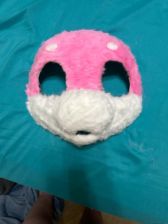
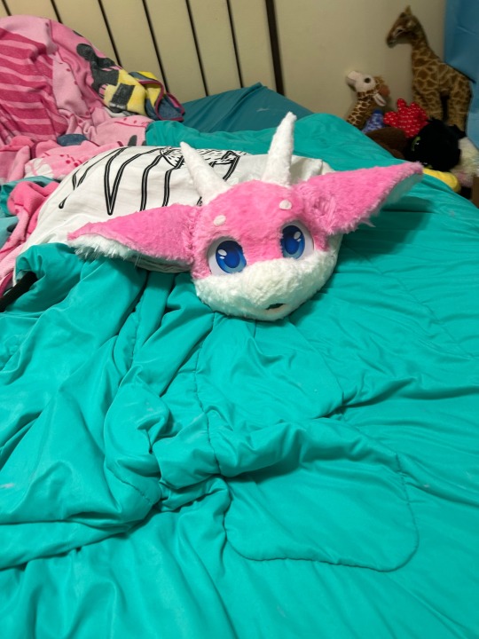
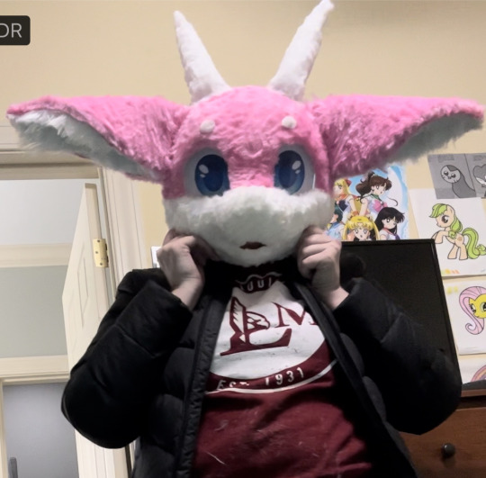
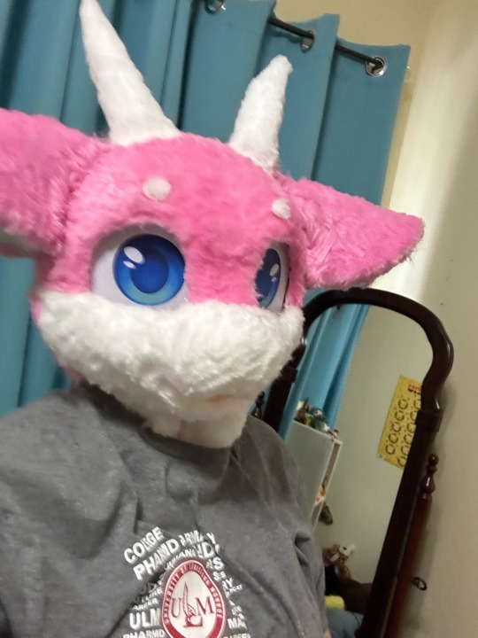
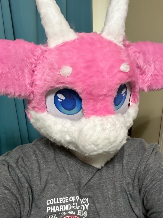
How to build your first fursuit head for ~$100 USD (2023)

What’s good furries? I’m sure a lot of you have a fursona and want to make your first fursuit. I recommend starting with a partial just in case you mess up or fall out of the hobby. It’s also less expensive!
This tutorial will only cover the head. I haven’t made any of the other stuff and I’m probably going to buy it online premade because I’m lazy.
1.) Have a reference sheet for your fursona.
If you are an artist, draw (the best you can) a reference sheet of your fursona from the front, side, and back. I made a little turnaround animation for mine, but this is not necessary.
Not an artist? Don’t want to draw? Commission someone to do it for you. I recommend Etsy, but you can find furry artists with open commissions all over the internet.
No money for commissions? You might be out of luck. Ask a friend or draw it the best you can. Alternatively, you can edit someone else’s fursona reference sheet to make it look like your fursona. Yeah, it’s stealing. Just don’t post it and act like it’s yours 👍
You can also go into the Roblox game, Catalogue Avatar Creator, and assemble something that looks kind of like your fursona. Take a screenshot of it from the front, side, and back, then go into a photo editor (I recommend IbisPaint or MediBang Paint, they are both free) and add in your special details.
I recommend not making your first fursuit super complicated or some kind of rare species. But you do you. It will just be really hard.
Also determine what style of fursuit you want. Toony? Kemono? Realistic? (I don’t recommend realistic for your first fursuit but you do you). This will be important later.
2.) Find Shit to Build It With
Once again, I recommend Etsy. You’ll need:
+ all the fur colors you need (try 2-3)
+ eye mesh
+ 3D printed mask
+ hot glue gun and hot glue sticks (dollar store)
+ needle and thread (dollar store or Walmart)
+ balaclava
+ styrofoam head
+ fabric scissors
+ extra foam pieces for ears or horns
Assemble all of that. It should be around $80-120 USD.
Your 3D printed mask is the most important thing. Another reason to get a relatively common species. Mine was a dragon. Remember the fursuit style you picked earlier? Search on etsy “3d printed [style] [species] furry mask” and you should be able to find one. You can also get pre-made foam heads. I don’t recommend trying to make your own head base, because A) it’s hard and B) those materials cost more money.
This shit will take a while to come in so don’t get too excited about it. My mask took like a month because it came from Germany.
3.) Mark the Color Spots on your Head Base
Basically just take a sharpie and outline the different color regions on your headbase. You can also use a pencil if you’re a pussy /j
4.) Uhhhh Eyeball That Fabric Pattern and Hot Glue the Pieces to Your Headbase
Some people use duct tape to make a pattern. That did not work for me! So I eyeballed it. Made some mistakes. That’s okay.
5.) Trim Down the Fur Length
Most people use clippers for this but I didn’t want to buy any and I didn’t know how to use them so I did it VERY CAREFULLY with scissors.
6.) Fill in the Cracks Between Your Hot Glue Seams With Loose Fur
Look at all this damn fur on the floor! If only there was something to do with it!
Put hot glue between the super visible seams where you hotglued different pieces of fabric next to each other, then pack in some of that loose fur. Cut it down if it’s too long. The seams will be less visible.
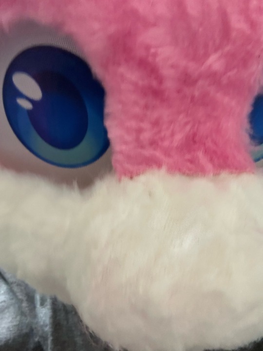
7.) Hot Glue the Eye Mesh Behind the Eye Holes
VERY CAREFULLY hot glue this so your character isn’t cross-eyed. You can try follow-me eyes but I didn’t do that with mine.
8.) Add Your Extra Details
You know like whiskers or plastic teeth or a tongue or anything else you want to put on there.
Now you’re done with the mask part.
9.) CAREFULLY Hot Glue Your Balaclava to the Inside of the Mask
The eye hole should be where your eye mesh is so that you can see out. Also make sure some of the balaclava is glued to the top of the mask.
10.) Weigh Down Your Styrofoam Head With a Heavy Rock
Or put it on a stand. Or hot glue it to the table. Whatever works.
11.) Put the Balaclava that you Glued to the Mask on the Styrofoam Head
Pretty simple. The reason we weighed down the styrofoam head is because the front of your mask will be heavy and make it fall over while you’re trying to work.
12.) ????? Put Fur On the Balaclava
You’ll also need to like add some fur connecting the sides of the mask to the balaclava. Hard to explain. You’ll probably figure it out?
13.) Trim that Fur and Put the Trimmings in the Seams Like Before
14.) Take it off of the Styrofoam Head
You may need to cut a slit in the back of the neck of your fursuit head. Not only will it help get the styrofoam head out, now your head can get in and out too!
15.) Put it on
Edit it if something is wrong. It might feel crooked but it’s probably not.
16.) Enjoy!
Hopefully this was helpful! This is how made mine.
#furry community#furry anthro#furry#furry fandom#fursuit head#fursuit#first fursuit#fursuit making#tutorial#fursuit tutorial#partial fursuit#fursuit partial#maximilliansblogstuff
143 notes
·
View notes
Note
Gotta say! Never expected you to be someone who enjoyed something like LOOK OUTSIDE, but in hindsight, considering your flagship oc is basically boat body horror turned boat body horror but with teeth and eyes and flesh, it isn’t that surprising.
1. Neither did I, but what can I say, I like me some good body horror every once in a while. I watched a video covering the demo a few months ago and was intrigued, but only found out that the finished version had come out out yesterday when I didn’t have 7 or so hours to throw at the no commentary videos I was watching. The writing is stellar, the music and sound design are fantastic, and of course the creature design is top-notch. More spoiler-y thoughts under the cut. Huge recommend to anyone who likes body horror and eldritch horror!
2. PLEASE NOT HIM I CANT LET HIM BE MY FLAGSHIP OC
The teeth family storyline is heartbreaking and really shows the heart of the game with how you’re able to play with the one kid before he completely loses himself, the whole Fredrick storyline is a great mix of sad and hilarious(the way god Fred just drops the act and lights a cigarette when called out on it being a scam was GOLD), not to mention all the character interactions being pretty realistic. I love how even some of the most horrifically warped people are still sane and trying to just live their lives. I love the rat baby thing but honestly my favorite party member is probably the roaches just because of how nonsensical yet charming they are. The way it starts as just one roach writing little messages on a scrap of paper because you didn’t kill it, and then it draws a little picture, and then eventually you get to recruit a bunch of roaches in a trench coat? THE COMPLAINT ABOUT HAVING TO FILE TAXES INDIVIDUALLY? Incredible. Outstanding. 10/10. Not even the apocalypse will save us from taxes I guess.
I appreciate how varied the designs are and how they gradually get more and more fucked up over the course of the story without just universally devolving into incomprehensible gunk— body horror tends to lose my interest when it just gets to the point of just being like, miscellaneous flesh slop with eyes or whatever. At that point it’s less body horror so much as just gross-out horror; if you can’t tell it was ever a body in the first place, and there’s no buildup to it being unrecognizable from a previous state, it isn’t really BODY horror anymore. LOOK OUTSIDE perfectly manages escalating the horror without relying purely on making it more grotesque via the “more eyes more flesh more teeth” route. You get that to some degree, but you also get a monster made almost entirely out of needles, or ones that are made up of one or more people now fused to and spilling out of various twisting pipes, the ones that are just people made of different combinations of hands or fingers, the worms, the security guard fused to a bunch of TV screens and a chair, the meat cars, etc. So much creativity.
Also this is a relatively minor thing but I think a lot of the names are also really good, too; the Cop Car, Typewrither, and Not A Cowboy Hat come to mind, though I’m probably forgetting a lot that appeared earlier. OH YEAH. PHILIPPE. Giving a regular human name to any kind of monster immediately makes it funnier. I want to hit them with a car
14 notes
·
View notes
Note
Hi Sine, have you read the new Ultimates (2024)? Any thoughts? I'm currently on the fence, but I'd love to hear your thoughts.
I have read the new Ultimates! I have actually been keeping up with it since Ultimate Invasion, so I've read Ultimate Invasion and Ultimate Universe and am also mostly keeping up with Ultimate Spider-Man, Ultimate Black Panther, and Ultimate X-Men, but since none of those three are really my corner of comics fandom I think I am less qualified to speak to how they are going since I don't generally follow their 616 counterparts and wasn't reading them in the original-flavor Ultimate universe either.
I think the actual Ultimates comic itself has a surprising amount of potential and I'm liking it a lot more than I expected to like it considering that we are only two issues in and the fact that I'd literally never heard of the writer before did not fill me with a lot of confidence. But, y'know, I'm here for Steve and Tony and if Steve and Tony are friends I am, in that regard, fairly easy to please.
So I like the team dynamic so far, but from the beginning I haven't really been a fan of the worldbuilding, and I think a lot of my problems with the worldbuilding would be fixed if they simply had not also called this Ultimates, but as we all know, it is forbidden for Marvel to come up with new names for anything ever.
See, the original Ultimates had a pretty clear and relatively unique mission statement: it was meant to be a low-continuity universe, set in something closer to the real world than 616 is, with grittier and more realistic storylines. The idea was that fans could read and enjoy this universe without needing to know decades of backstory. And, sure, if you knew the backstories there would often be little Easter Eggs, but you're totally capable of reading and enjoying Ults 1, say, if you don't know why the Hulk is gray or why Hank and Jan have a terrible relationship. Because within the context of Ults, that's just how things are. Sure, they're that way because of things that happened in 616, but you don't need to know that.
The original Ults is also gritty and grimdark and polarizing. A lot of people don't like it. The new Ults universe has almost nothing in common with it except that the Maker (Reed Richards) originally hails from Earth-1610. Which, as it happens, does affect the plot a lot, but old Ults and new Ults are different things, and I think the shared name actually hurts new Ults. Because, when you think about it, who's going to want to read this? You've got the people who liked old Ults and are sad that this isn't it. And then you've got the people who didn't like old Ults and have been avoiding this universe because they assume it's the same one. So who's left? People who just like the name "Ultimates?" People who are willing to take a chance on anything Marvel releases? I just feel like there are probably fewer of those people.
I know that the new Ults universe was supposed to be Donny Cates' project before he had to leave due to medical issues, and that Ultimate Invasion was then taken over by Hickman. And honestly I would have liked to see Cates' take, because I wasn't a big fan of Hickman's Ults run, mostly because I didn't like the Maker -- so I'm not, you know, really thrilled that the one thing that gets kept from Earth-1610 is my least favorite character.
The new Ults universe has also pretty much abandoned the two things I thought were the big draw of old Ults: a more "realistic" setting as well as a low amount of continuity. As you probably know, the premise of new Ults is that the Maker goes universe-hopping, gets to Earth-6160, decides that's good enough, stops there, and proceeds to epically fuck shit up. He has his City going, just like 1610. The Earth now has a handful of massive countries, which I guess makes it easier for a shadowy cabal to rule them. So we are definitely abandoning any kind of real-world…geopolitical similarity. Britain and France are the same country; Captain Britain speaks French. China and Japan are the same country. The US fell apart in the 60s. I mean, it's not necessary to use real places in superhero comics -- DC and its array of fictional cities seems to be doing fine -- but it seems weird to do it here when that was supposed to be part of the attraction of Ults (and later on, the MCU, which pulled a lot from Ults). It's a thing people like to read. It gives you a little more investment, I think, as a reader.
The Maker's goal is to prevent superheroes from showing up at all by taking them off the playing field. He gets there at some point after WWII -- because Steve was still Captain America and got iced -- but before the modern Marvel universe kicks off. The Maker is clearly going after as many people as he can. He prevents Peter Parker from being bitten by the spider. He has a creepy museum/mausoleum where he collects artifacts and corpses of dead heroes; for example, we see an adamantium skeleton that is presumably Wolverine's.
Of course, the heroes aren't going to stand for this. Which heroes, you ask? Who's left? Well… mostly Tony, actually. In this universe, Tony is very young and has more of an MCU-influenced backstory in terms of his relationship to his father and to Obadiah Stane. He's also Iron Lad. So, yes, this is a Kang thing. He has help from this universe's Reed (who is masked like Doom) and they're going to assemble the Ultimates and get back as many heroes as they can. Tony finds middle-aged Peter Parker (who is married to MJ and, oh, yeah, Uncle Ben's still alive) and gets him a spider. They are going to fix the world and make everything right.
Is this fun? I think so! I am down for a plot where Tony restores superheroes to his world. However, the thing it isn't is low-continuity. Unlike original Ults, there is so so so much continuity just embedded into the worldbuilding. We see the Maker's big list of characters he's gotten rid of. You're already supposed to know who these people are.
If you pick up the original Ults, let's say Millar's Ults 1 & 2, you don't need to know anything about anything. Sure, like I said, there are lots of things in it that are callbacks to 616, but you don't actually need to know what they are to understand the plot. But everything in new Ults is, within the plot, a reference to something else in the multiverse. They're putting things back the way they were. To do that, you actually need to know something about the way things were. Some of this stuff is going to be obvious to most people who are even vaguely familiar with comics -- I don't read Spider-Man, generally, and even I know it's a big deal that Uncle Ben is alive. But not all the changes are as big as that, and if you don't know them, it's confusing. Ultimate X-Men is all about a teenage schoolgirl named Hisako, in the country presumably formerly known as Japan. "Mutants" don't seem to be a recognized group of people. She doesn't know anything about her powers and I didn't even know she was a mutant until someone told me that was Armor, a mutant obscure enough that I only vaguely remembered her after I was told her name. I spent all of issue 1 wondering who this character was and why I was reading a horror comic about her classmates dying and what she had to do with anything. Apparently she's a mutant and I would know that if I had kept up with X-Men.
Over in the realm of the Ultimates themselves, the worldbuilding has a lot of stuff I wouldn't bank on people just knowing. Does a casual fan know who Iron Lad is? It's probably going to matter! The FCBD issue features Steve liberating Jim Hammond from the Maker's storage. Now, I am very fond of the Invaders and I was thrilled that someone here at Marvel remembered Jim Hammond, but I would bet that a lot of people reading this don't know who Jim Hammond is or why Steve wants to find him. Similarly, I thought Midas was a great villain for Ultimates #2 but I also read a discussion thread where someone asked who he was and three people in a row managed to extremely confidently misidentify Midas' origin and what decade of comics he was from. The earliest they got was the 90s. (Iron Man #17 is from 1969, guys. Also the first appearance of Whitney Frost as Madame Masque, which is why I know it.)
(Skipping ahead a little to the Ultimates team itself, you can take Hank and Jan as an example. They're both recruited in Ultimates #1 and Hank learns about what he's like on other worlds and his first concern is whether he's going to hurt Jan if he becomes a superhero. To fully understand this plot point, you actually need to know what Hank has done, because otherwise you don't actually know what he is upset about -- and that means you need to be familiar with a bunch of other comics. In the old Ults, Hank just hits Jan. Yes, Mark Millar went for the gritty, edgy choice. But it's also a choice that doesn't require you to know anything about Hank hitting Jan in any other universe. It just matters that it's happening here.)
This is a roundabout way of saying that, after Ultimate Invasion and Ultimate Universe, and seeing the starts of the other Ultimate comics, I didn't have high hopes for the new Ultimates comic, and I also had never heard of the writer, which didn't really help.
And then I started reading the new Ultimates comics and I know we've only got two issues but I honestly really like them. Like I said, I am here for the high-continuity new universe; I don't think that's necessarily going to be a winning long-term move in terms of getting new Ults fans, but, like, I am in this fandom partly because I like being in fandoms with massive amounts of continuity.
Jan is great. Did I say that already? No? Jan is so great.
And, of course, I am a Steve/Tony fan, so I am here for the Steve/Tony dynamic and I think it's really interesting. Steve wants to have a revolution. Hell yeah. I'll definitely read that Captain America. He knows the world's wrong and he wants to fix it. 1610 Steve -- in early canon, at least -- just kind of exuded depression from every pore and Did Not Want To Be Here but he was a soldier, goddammit, and he was going to run the mission. 616 Steve was a little more lost, still sad, but kind of keeping that to himself as much as possible and trying to just find meaning in leading the team and the things the team was doing. This new guy seems more like that. but sadder. because the world is way more fucked up. I mean, he woke up and learned America didn't exist anymore, which has to be a downer.
I'm still not a fan of the Iron Lad thing, but the letter Tony writes to Howard is pretty amazing.
It's interesting that Tony is younger and so much less experienced than Steve. He's clearly smart, of course, but it's clear they're not great at teamwork yet -- not because they don't like each other, but because they don't know each other well enough, which I think is interesting and which I haven't really seen in canon, because this wasn't a thing Marvel was going to show us in 1964. But, like, we've had multiple fight scenes where they aren't quite pulling off the plan as intended -- say, when they're rescuing Jim Hammond and no one else can do what Steve is asking so he just does it himself. Or in #1, Steve telling Tony that his recruiting plan isn't going to work, and Tony not listening, and then, surprise, it doesn't work. Or in #2, when Tony tries to tell Steve that his suit modification will drain all his power if he uses it, and he doesn't manage to tell Steve this, so he does the thing when Steve tells him to do it and then, surprise, he has no power. Like, that doesn't happen in 616. Either 616 Tony does the stupid thing without ever telling Steve because he knows Steve would tell him no, or he just flat-out tells Steve no because he's not afraid to disagree with him, or he asks Steve for advice and actually follows it. They don't do this. So this is pretty fun. It's different. Maybe Tony is a little intimidated by Captain America? We shall see!
I'm a little grumpy that Ults is making me like (presumably) Teen Tony, though. I did not like The Crossing! I really did not!
So, yeah, it's interesting! Looking forward to seeing more of it! It could all go wrong, of course, and two issues is kind of a small sample size, but so far I'm into it.
22 notes
·
View notes
Text
FINAL PDBC POST OF 2024 WOOOOOO!! Yea so I loved a random background wasp I drew for a bug fables wip so much that I changed some stuff around and plopped her in pdbc as a bug person. meet my darling wasp child Gin

the culmination of my sudden wasp obsession and my undying PDBC obsession. This is just a rough sketch, ya gotta understand that she has only been in existence for literally one day lmao thusly there is hardly anything to her but HERE YA GO
HER NAME IS GINEVA!! I actually came up with it on the spot (more specifically her nickname, Gin) but it ended up fitting pretty well so let me ramble about that real quick:
It’s pronounced like Geneva. Like the Geneva Convention. Which she DEFINITELY violates on a daily basis but we’ll get to that. Her name is one R away from being the name Ginevra. Side tangent!! there is no R in the standard alphabet used on Fincg island, there’s a unique symbol that makes the R sound but don’t ask me about any of that special alphabet lore because that little tidbit is less developed than Gin herself. Point is, her name could very well be Ginevra, which is the name of King Arthur’s wife in some versions of the legends (according to Wikipedia at least!!! Yeah I know very reliable source but there’s no direct link to the source so I’m kinda just trusting Wikipedia on this lmao). That matters because if you don’t remember, pumpkin daddy is TERRIFIED of King Arthur. To an unhealthy degree. So I dunno I just thought it was a neat coincidence, not the most interesting thing in the world but I love adding small details in names like that so the fact that the name I chose on a whim is related to an already established piece of lore makes my brain happy. But MOVING ON her nickname, Gin, is also a reference to the fact that wasps are extremely sensitive to alcohol and can get drunk off fermented fruit which is the cutest thing in the world to me (I know drunk wasps realistically are just angry but I’m just imagining a lil wasp calling an uber for her and her lil wasp friends and awwwwww). So yeah she likes alcohol. a lot. she might have a bit of a problem but it’s FIIIIINE anyway I’ve yapped WAY too much about her name moving on—
She’s a queen Yellowjacket!! ALAS there are no other fully evolved wasp-people, so she is the queen of nothing. heartbreaking. She will still be a queen in all of our hearts. Though she miiiight be trying to speed up the evolution process a lil by messing around with the naturally occurring elements that are believed to have sped up the bugs’ evolutions but cough cough painfully underdeveloped lore cough coughI SERIOUSLY NEED TO THINK ABOUT THAT I CAN’T JUST HAVE THE EXPLANATION BE (IT JUST BE LIKE THAT SOMETIMES NOOOOO.
Being a queen she’s a bit taller and bulkier than the other bug people—most average around 3 and a half feet but she’s around four feet—though that was hard to portray in her design because…I don’t know how to draw buff wasps. but she is. she’s a buff wasp. She’s bulky compared to the other bug people I guess, they could probably be blown away by a stiff wind
She wears armor on her upper body as you can see, as bug people are quite fragile and are prone to injuries due to their rather rushed evolutions. And also it’s because she started off as a wasp soldier who had armor and I wanted to keep that but shhhhh be quiet I’m talking about my flawed bug biology lore. Despite a lot of people being scared of them, the bug people aren’t often outright attacked, but they do get injured a lot due to the standard societal standards of Fincg island. Aka people get punched. A lot. I don’t know if I’ve ever mentioned it but fighting is a pretty big cultural tradition there, and it’s the norm to slap people over minor inconveniences. No hard feelings, it’s just the way it is (though it’s agreed upon that hurting relatives, especially your children is unacceptable, but for everyone else? fair game, go punch that old woman). But it results in the bug people getting hurt a lot, and healthcare for the bug people is understandably underdeveloped, so Gin wears armor as to not. Yknow. die. Probably a smart move. I tried to give part of her armor a sort of plated look, to give her the look of having abs without her actually having them because shredded wasps would look strange, but eh. Whether or not I succeeded is up in the air
the obvious question is why is she juggling bombs. The answer is because she wants to. Despite being over-dramatically fragile she has no qualms with attacking people just for goofs. Which I know I just said was the cultural norm but she does it with bio weapons so maybe take her little bombs away. Yes she’ll throw biological weapons at you but she’ll put on a little show before she does it! It’s like those Turkish ice cream vendors that play around with your ice cream before they give it to you if anyone has any idea what the hell I’m talking about. She could use her knowledge for good (helping speed up evolution for the other bugs) or she could use it for bio warfare. She chooses both, what a queen 🥰🥰 literally 🥰please someone get her a hive to rule over so she doesn’t spend her time throwing bombs at people. Also worth mentioning—although she’s a juggler, she is NOT a clown. Do not even imply she is. I won’t get into the whole lore here but clowns were exiled from the island, a corny joke about juggling being allegedly one of the leading causes, so any clownish behavior has to be done carefully as to not get exiled with the rest of the clowns.
Anyway that’s all I have for her at the moment. Will she ever get more development, probably not, chances are she’ll be a barely relevant character if ever relevant at all. Do I love her anyway? Absolutely
#me collecting random wasp knowledge to make wasp ocs (I probably got some wasp facts wrong but whatever lmao)#art#pdbc#HEY. YOU THERE. LISTEN#YOUD BETTER HAVE A HAPPY NEW YEAR 🫵🫵🫵YOURE ALL SO AWESOME#TYSM FOR LISTENING TO MY PDBC RAMBLES OVER THE PAST FEW MONTHS 🫶🫶🫶🫶YAYYYY#JUST YOU WAIT. 2025 IS GONNA HAVE SO MUCH MORE PDBC NONSENSE IN STORE (HOPEFULLY)#I’M GONNA TRY TO DEVELOP THE LORE EVEN MORE NEXT YEAR AND YOU WILL BE FORCED TO BEAR WITNESS#HERE’S TO ANOTHER YEAR OF YAPPING 🦅🦅🦅🔥🔥🔥🔥
10 notes
·
View notes