#ive finished the lineart and im doing the colours
Explore tagged Tumblr posts
Text
my one goal in life is to be tagged in one of those tag games where you have to do a picrew or answer a question or smth. i dont wanna start one because it wouldne be the same. just know that if you ever tag me in one of them i will spontaneously combust.
#munching on some pizza#not a whole pizza its half a slice#which i brought up to my room for some reason#i should be asleep rn (its 1:45 am where i live)#sleep is for the weak#thats my motto in life#i have drawings to draw#who needs sleep when you have lemon demon at an insensible volume#im not actually listening to lemon demon rn i decided it was too distracting im listening to my lofi playlist#(i am getting equally as little Shit Done)#oh well three day weekend who cares#arriaughhr aiigj riaiiarhaurahgh ruahuhguhgh#pinups coming together now#ive finished the lineart and im doing the colours#maybe ill finish it tonight??#idk colouring and rendering doesnt take too long#sketching takes the longest
2 notes
·
View notes
Note
Hii, I saw your latest post and your art style is so pretty?? What?? I have a question though. How do you do the paint one? Or rendering in general. Like genuinely, I have a problem with rendering and I can't seem to quite understand it on my own. Do you just start with flat colors? Do you do lineart or colors right after the sketch? Is the "lineart" just added later? Painted over? Erased to give thinner and thicker lines?? I'm really curious!!
hi! im not the best painter tbh! though i do have a background in painting but ill try my best to explain
diff artists have different approaches to how they paint but generally yes, you would start out with big shapes first and then go into the details - work big picture first. like, if you squint and the drawing makes sense in terms of value and colour and shape, youre on the right path.
i can kinda show this with a warmup in-class speedpaint exercise we did a couple weeks ago where we were tasked with painting an eye in about 30 minutes (i was late and only had 20 lol)

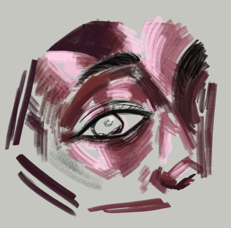
luckily ive got the layers for this. i start of with a base layer, kind of like a underpaint layer since that's how i personally learned to paint traditionally. i did have a sketch before laying down this base layer under it but i ended up using it for final rendering details lol
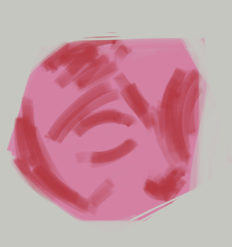
after that i started laying down the big blocks of colour. i wasn't necessarily aiming for complete colour accuracy here, i just wanted to match the value. i chose a pink underlayer to influence my colour choices because the underlayer will peak through the blocks of colour i paint over it
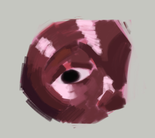
and then (forgive me if this seems like "draw the rest of the owl" in terms of progression) but this is where i started going in with finer detail. i did the rest of the render on the sketch layer i had so you can see some of the lines from the sketch here
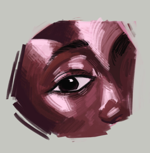
here's the layers completely seperate from each other


even for the flat colour version of my character, i had an underpaint layer! i used yellow and orange since i wanted her colours to be warm and used a semi-opaque brush to put her colours in rather than using a completely opaque brush
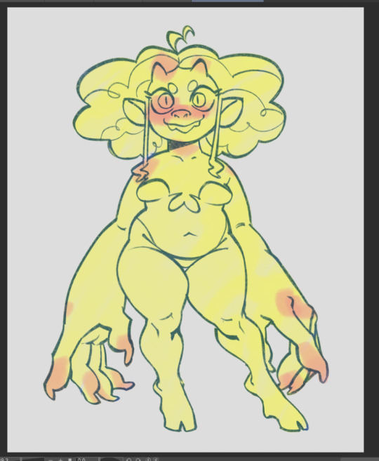
when i wanted to do the painted version, i put the lineart on multiply and reduced the opacity and brushed in some some quick shadows on seperate layer on hard light mode to give me a good base to start painting with

and then i did all the rendering and details on a new layer ontop of everything. i keep the lineart light so i can paint over it easily and also colour pick from it when i want a more distinct line to seperate certain shapes. i unfortunately dont know how to explain this part because a lot of this is intuitive to me and i'm still learning. but you gotta make use of different types of "edges" in painting, and you would generally have more contrast in the focal point of your painting than in other places to draw the eye to that point. i suggest researching the use of edges in painting if you really wanna learn more - because im a terrible teacher haha
for fun here's what the rendering layer for this one looks like on its own and the finished thing for comparison

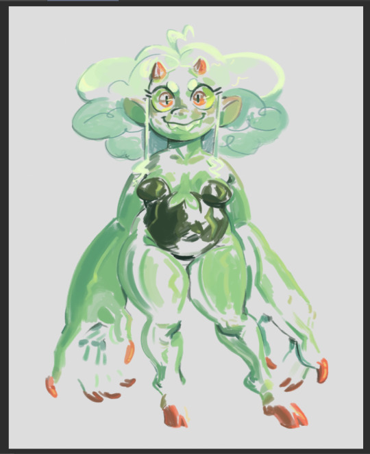
there's other things you need to learn too, like bounce light, atmospheric perspective, ambient occlusion... and colour theory is always important! i could go on for a long time. there's a lot of pieces to the puzzle and it may seem overwhelming but there's tons of resources online and it will all become second nature to you as you keep practicing
uhh hope that helps!
62 notes
·
View notes
Note
you asked for asks, so uh. i'll hit you with them! (answer as many or as few as you like)
How do you decide on colors for pieces? Like do you have a strategy or is it just 'throw colors on board and see what happens'
Building on that, what's your strategy for making character designs because i swear they're some of the best i've seen. you always capture characters super well and they're so creative. so shapely and that scratches an itch. im taking this opportunity to gush
favorite color?
also what are classpects. its a homestuck thing right. ive never read homestuck
oh okieee!
[1] How do you decide on colors for pieces? Like do you have a strategy or is it just 'throw colors on board and see what happens' TLDR yah. That or I colour-pick from previous references and every other rule after that falls under muscle memory. Idk how to link the og but I explained it a bit hereee

[2] Building on that, what's your strategy for making character designs SHAPE LANGUAGE! I usually focus in chunks which makes the process much easier to understand [Research > Ideation (LINEART ONLY) > Colouring] I have an example on my design process HERE Little discussion on shape language both character and environmental is HERE (preferrably read this one first)
[3] Favourite colour? Green ^_^!
[4] also what are classpects. its a homestuck thing right. ive never read homestuck it's fine i never FINISHED homestuck Yup! It's a homestuck thing! I just like throwing characters in there for literary funzies :3
117 notes
·
View notes
Note
Hey! I was wondering what brushes and program you use? I am loving your lineless art!!! Thank you!!!
hi!! im very glad you like my art tysm :] !!!
ive been using krita for about a year now, its really good and also free!
in terms of brushes ive recently been using this default charcoal brush. it just felt really nice to use and ill probably continue to use it more in the future!


normally i use a square brush though! i made this one while messing around with brush settings and have been using it since


i tend to be really inconsistent when it comes to using specific brushes but generally i really love square brushes! the exception is this other default brush that i use for doodling sometimes


very simple circle brush! since i clean up doodles/sketches instead of doing lineart this tends to be my lineart brush! but by the time i finish shading its not really seen


^ circle brush sketch, coloured and shaded with the charcoal brush
aaaanyways i hope this helps! you dont need super fancy brushes to draw well, just experiment and have fun with it to find what you feel comfortable with :] krita default brushes are really good and i recommend messing around with/modifying them!
2 notes
·
View notes
Text
ok one last post about the Project to truly exorcise it from my brain. just some process/design thoughts (also now that it's done if you want to read my liveblogged whinging for whatever reason here it is)
first off some stats because i kept stats like the nerd that i am:
time wise making this animatic took about 93.5 hours give or take (thanks procreate process replay) spread across exactly 2 months
anyway when i said i finished this project mostly through stubbornness and sunk cost fallacy this is what i meant lol like a lot of my thought process through this was just 'no way in hell am i letting some of these drawings disappear into my drafts forever'
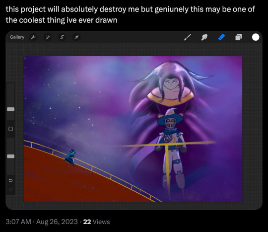
on average each frame took about 2 hours 45 minutes but thats a bit of an overestimate since i forgot to count some of the animated bits from the first two lines (so id guess the actual number is more like.. 2 hours 20 minutes?)
btw that line with the starry apparition fading away? 12 hours total
the single longest and most painful frame to draw was the one of the crew walking through tu'narath (5 hours 30 minutes) because a. perspective b. architecture design c. for some reason i put a lot of detail into rendering the armour on all the githyanki i drew why on earth did i do that
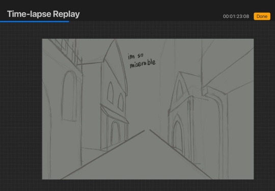
(its especially painful bc that frame was one of the ones that didnt... feel like an important enough moment in the actual story of the show to be worth capturing the way the wish or even like, endellion is, i just needed to put that there for the storytelling flow or whatever of the animatic itself and it bothered me so much)
one other interesting little mishap was that i did all of these on canvas size 1080x720px (so that's why the youtube resolution isnt particularly high lmao) which is why procreate let me put an absolutely absurd amount of layers in one canvas (all 8 frames of with memories projected on the astral sea were done on one canvas. 159 layers) because the layer limit for that canvas size is 400 BUT. i accidentally started the starry apparition fade on an A4 canvas (my default canvas size for like all my normal fanart) and i only realised after finishing all the lineart and starting on colouring because i hit layer limit so i had to resize the canvas which did... interesting?? things to the lineart resolution
also if youre wondering how i drew K-LB that many times in something resembling timely fashion the answer is i sacrificed some... amount of sleep to 3d model and rig him in blender which. honestly? i consider it a roaring success
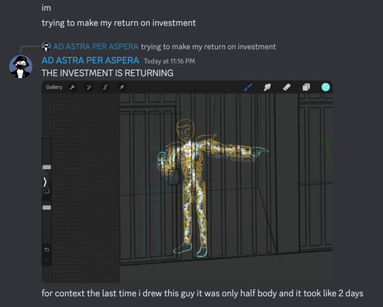
splitting the frames by bar was a Choice and certainly a choice ive.. had doubtsTM about but thats the kind of thing you cant really change without bringing the whole project crashing down so if the frames seem to move a bit too fast im so sorry there was really not much i could do there
idk if people actually noticed the very very tiny drawings of the crew moving around on the ship in the 4th line especially since they sometimes get obscured by the subtitles but the REASON for that is in my original drawings the subtitles went in the top left corner but they kept conflicting with other stuff so i just gave up and threw them to the bottom (also i originally included the chinese lyrics but then i got lazy lmao)
anyway that little detail like VR-LA angstily looking at the sea reminiscing about the JourneyTM and the crew sort of appearing along with the memories of their adventures together was one of those things that seemed SO COOL in my head but once i actually execute it its like. hmmmm not sure if that worked out the way you thought it would buddy. also the tiny crew was EXTREMELY hard to draw so put that down as another point in 'me subjecting myself to deeply painful and out there compositions for no good reason'
anyway i called this my magnum opus but i do actually have some thoughts about another one (a companion piece, if you will) for another song by the same band because now that i know what capcut can do im.. really itching to try something a little different because this like powerpoint presentation style? fully a product of me using iMovie as my only available video editing software for the past like 7 years of my life
#rwd#asto speaks#re: the projectTM#one last time using this dumbass tag lmao#honestly? also put another point in 'i worked on a project for so long it became just a Project to me and proceeded to get#absolutely blindsided by the emotional affect it has on people'#2 months. 2. months.#whatever actual emotion this idea was originally trying to draw from is long fucking gone buddy#like i did manage to re-experience some of it looking at the finished product but#i appreciate yalls screaming a lot i just truly did not anticipate it LMAO
5 notes
·
View notes
Note
2, 3, & 11 :)
2. Fave thing about your style?
dynamic facial expressions I think… ever since I was a kid that was always my fave part to do and I think it shows. I also like whatever I’ve been doing with colour for the last couple years!
3. Least fave thing about your style?
SOOOOO RIGID. Too clean a lot of the time. My eternal struggle is idk how to loosen up when working on bigger pieces and idk how to let the process run its course. I think ive been trapped in the step by step basic digital art tutorial of sketch then lineart then colour then shade for too long but I dunno how to escape. And don’t get me wrong I love a good lovely clean piece but at the same time I feel like im not quite clean enough to be satisfying. Like not messy and free and interesting enough but also not shapely and precise and clean enough. Staggering along in the middle somewhere unable to decide how I want pieces to look. Need to experiment more!
11. Show us the last thing you drew, be it a finished piece or a doodle
The last drawing I did is private but here’s a chunk of a wip that I’m sooooo excited to finish

15 notes
·
View notes
Note
heey there my friend! I see that you have not been posting for a while and that's no problem at all!! take all the time you need! just here to entertain you with a few ask!
(don't feel obligated to answer it though! if you don't want to that's completely fine! ^^)
are there any new ocs you'll be introducing soon? if so then how many? if not then are you planning on creating soon? what do you have in mind?
if given the time and opportunity, what kind of au would you like to create? and who would be on it? (can be your ocs, moot's ocs, canon characters, etc) what would be the story?
what is something you really really wanted to draw or create but haven't for some reason?
how long does it take you to finish a single drawing?
are you planning on shipping one of your ocs with your moot's ocs again? do you already have one (or more) ship in mind that we don't know about? if so don't be shy! tell us! >:3 eheh if not then that's fine! ^^
Have fun my friend! ^^
hii!!! of course ill answer these ^-^
1 , i have many ideas, but there are two (technically three) ill introduce soon! i already made a post about one of them, they're name is momi, they're from Hawaii and work with brianna as an assassin, whom she has a crush on. I'm still working on her final design and backstory. The other one is kema umi and north skys children, i have some info about them scattered around a few posts but thats about it, i still need to make a post about them and such, so stay tuned! ^_^
2 hmm, an au that i did have in mind was a "what if?" au, what if north skys clan never burnt down? what if kema umi never met north sky, what if sofia never went to japan and met kema? etc, its a very interesting concept thatd i'd like to branch out more!!
3, hmm, i dont really know, i cant really think of anything rn. I guess more art of my pink skys au "your the devil in disguise" au but thats about it :/
4 it depends, if its just a quick sketch it can take me around 4-11 mintues depending on how the design is. if its a lineart drawing its usally 14-17 mintues, and if its a full drawing it can take 15 minutes to a day or less!
5 ooohh, hehehe ^_^ ok fine i'll tell yall! ive been thinking about shipping kema with winter frost recently, i dont know why tbh. But im guessing its because of their pink and blue colour dynamic. He seems like a guy to treat her right >_1 ✨
thanks for the ask friendlystarnger!! this was so sweet of you to send! i hope you can send some more! (if u want to ofc)
(winter frost belongs to @mystique-flowers-and-sibling-duo !!)
7 notes
·
View notes
Note
hi majora! your art is really cute, and I hope you don't mind if I ask about your process? I'm new to art and yours is an inspiration! I wanted to ask how you learned? and your process, because you seem to draw near daily! also any tips you might have for me? thank you!
HI ANON!!! ur very sweet thank u so much WAHH <33!!! idm being asked abt that at all!!
in terms of how i learnt; i've kinda always been drawing for as long as i can remember? been posting art online since around 2013-ish so i got a big big catalogue of stuff to look back on
but learning in specifics of like, how i learned to shade n draw bodies etc etc. i studied! theres a lot of resources out there that'll break down a lot of the 'basics', i dont have any i can name off the top of my head except for morpho; whole bunch of books about body types and anatomy.
im not really good at providing tips for how to learn (bad memory </3) but studying, drawing things over and over (i do with reference and then without, and try to draw in different angles/perspectives) is very useful!
ALSO VERY IMPORTANT: literally do not worry at all if what you draw the first time around looks wonky or "ugly". being negative towards yourself about your art only serves to stunt ur growth!! shakes you (and anyone reading this) by the shoulders. it can be very easy to slip into hating your art and not enjoying anything ur drawing. this is me telling u to try and draw something youve never drawn before. experiment. it may not look perfect or even "good" but it will refresh ur brain!!!!!
MY PROCESS...... oh man i really have been drawing pretty much daily huh? i do draw every day but its been a hot minute since ive been doing finished pieces haha
but basically what i do is; start with a few warm-up doodles! just anything to get me in the groove
then over the course of the day i slowly chip away at whatever pieces im working on (lined stuff will usually take me a few hours, rendered stuff takes a day or a few....)
i cannot really assist in like "so how do you draw?" because i honestly just go Lights Off Its Drawin Time! but i always do a rough sketch of an idea i have, refine the sketch, refine that sketch, and then if its rendered i'll make a palette for myself somewhere, but if its lined i'll start on the lineart and then fiddle around with colours.
i draw for fun, so if i dont like how somethings turning out, i'll stop drawing it. no use frustrating myself over a piece to the point of hating it!!
(this ones just forfun and just for me) i keep a small little doc full of notes about my own pieces! i like analysing stuff, and also enjoy talking about why i draw something in a specific way, so this is just a nice little thing for me to have fun with. also helps me avoid potentially slipping into "hate this. bad" mindset bc im specifically noting things that i Liked (i do obviously have a bit of chatter like "hmm i think i couldve drawn this better, i should keep that in mind" but its only when its helping myself. the jora does not talk bad about its art)
aaand then i do some cool-downs to get any last little doodles outta my head so i can relax in bed
in terms of tips? do stretches, walk around, TAKE BREAKS! draw at your own pace, and also Have Fun With It. experiment with different colours, limited palettes, different styles!
seriously though do make sure you take breaks and stretch im lookin you in the eye okay?
I HOPE THIS MADE SENSE AND IS HELPFUL IN A WAY i ramble. far too much. and im not the best at articulating my thoughts!! but i hope u have lots of fun drawing very cool stuff <333
#asks#very long ramble my baddddd i love yapping#also i am Entirely self taught so i might do things in a weird way#but to me its important to have fun with drawing#i avoid burning out by experimenting with new stuff and swapping my art program btw i think thats a nice lil thing to tack on#jora art explaining
1 note
·
View note
Text
Hi moots and whoever else sees this post
I’m flying out to see my buddy and I’m currently on layover. I just wanted to share what happened on my last plane because I am SO squishy and happy over it
So I draw when I’m on planes. I can’t ever sleep on them and there’s no internet (I’m not paying) so I just listen to downloaded playlists I have and I draw. Today was no different, I was drawing my persona in a new outfit.
I went up to go to the bathroom and when I came back, the people in the seats behind me were like “YOU! YOURE AMAZING” and the guy in the aisle seat offered me a fist bump. At first I did not get it but I picked up that they’ve been watching me draw for the entire flight and they’re absolutely floored by my art /pos
It made me SUPER happy. I showed them the lineart I finished and they were all commenting on how gorgeous the character is (made me feel nice because she looks a lot like me). So when I went to colour the piece I made sure my phone was angled so the people behind me could continue to watch. I don’t mind being watched while I draw and it made me happy that they were enjoying it.
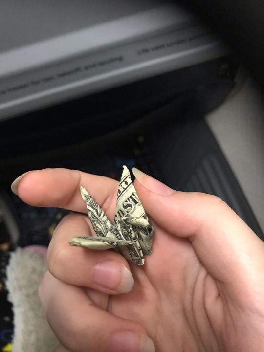
I make it through most of my colouring before I feel a tap on my shoulder. Turn around and the guy in the aisle seat holds out a tiny origami crane made out of a dollar bill, he says it’s a thank you for letting them all watch me draw.
Im already giddy and happy as is but. This is literally the first time ive ever gotten MONEY from my art? I didn’t even give it away or anything, and it was only a dollar, but just the single dollar crane meant so much more to me than I think the guy who gifted it knows.
Anyway I finished colouring and I offered my phone to the three behind me and the girl in the middle seat borrowed it to go show the people sitting across from them what I was drawing, explaining I’ve been doing this the whole flight and they’ve been watching. She gave it back once like everyone in that row had witnessed my drawing and it absolutely made my day
As I got off the plane, one of the guys in the seats across from those people walked alongside me and he told me that my art is beautiful and that my style could make really beautiful tattoos. I stopped at the gate after he walked away to check where I was going next and the guy from the aisle seat walked up behind me and gave me a fist bump as the two girls waved before wandering off. He told me that with my artistic ability I should look into getting an ipad for drawing. Told me again that my art’s great before he walked off
I have NOT been able to wipe the smile off my face since all that happened, Its been like 20 minutes
Anyway here’s the crane I dunno if I even have it in me to spend it, I tucked it into my backpack. Maybe I’ll just display it as a tribute to this great memory
#eely rambles#the art I’m making is kind of lowkey spoilers for my friends who all follow me but when I finish it I might share it here#I’ll just. not give context and hope they don’t figure it out /j/j
1 note
·
View note
Text
#I want an fpp pattern for this so bad. someone please take my money!!#inspiration#foundation paper piecing
Hi! im not sure if this is exactly what youre after, but im more than happy to share my resources on how im making this! (i plan on doing a full write up on this project when i finish, but that'll be a while yet)
i feel i should preface this one by saying im not really a quilter, so apologies if some of my terminology is off/this isnt exactly what your looking for, i hope what im saying makes sense! (im also not a digital pattern maker- this whole project is full of firsts for me!)
i made the pattern for this one myself by tracing the lines from my inspiration image, and i also made myself a colour chart version. the colours in the chart arent necessarily 100% accurate, more to indicate sections i planned to make the same colour.

all the black numbers are the colour numbers and the green are the pattern piece numbers.
i ended up moving a few things around based on what fabrics i could get my hands on :)

Heres the same render as above, but as lineart- i used this to make my paper pattern! If you know about printing large pictures you can probably skip most of this, but i wanted to offer a little more explanation because its ~involved~
I printed my picture through adobe, essentially following this tutorial- in the past when trying to print to scale ive done it the paint way but adobe was WAY easier.
Download the image, convert it to pdf (i went with same as image) open it up in adobe acrobat reader and go into print settings.
Heres where youre gonna need to decide the size of your quilt. Youre gonna mess around in the tile scale box until the preview is the size you want (what i loved about this method is it gives you dimensions so you have an idea of actual size)
For my quilt, i had it scaled at 214%- this was as big as i could possibly get it across 7 sheets of A4 (and 3 rows) which after sticking it all together left me with a quilt of around 145cm long and 70cm wide. (I also printed a smaller copy of the pattern that i could use as a guide)
I went back through and labelled it as id done on the render (i didnt want to include them on the print in case the scaling made it harder to read)
essentially from there i just.. cut along the lines to make the pattern pieces to cut out my fabric- thats about where im up to now!
the nice thing about doing it like this for me is it gave me total freedom to make this whatever size i wanted- i probably wouldnt recommend much smaller than this though, because some of the little pieces are already TINY. feel free to mess around with any of these resources however you like though! add more seams, lose some pieces, chop her up, whatever you want to do!
for fun heres the latest update on mine- im still messing around with colours but ive got most of the blank spots filled now :)
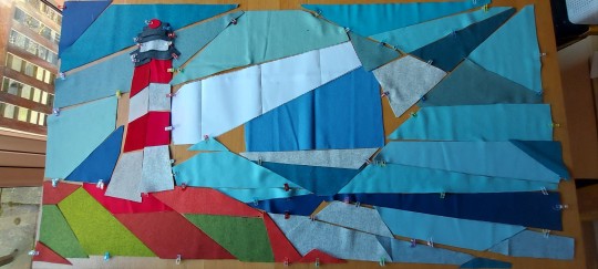
ok and. here she is. a first look at what this quilt is gonna look like
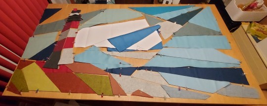
she is SO big it is near impossible to photograph but... im so happy with how its coming together??
most of the spaces left open are colour 3, which i do have a fabric picked out for i just need to bring it home. aside from that my one problem area is obviously in the center- i have a colour i like for one of them, but not a big enough piece, and i dont currently have an option for the other.
obviously there are still some things to shuffle around and i need to look at it again in the daylight but. its beginning to me something
#i feel i should clarify that i am op im just running sewing stuff on a side blog now#i just copied the printing instruction stuff from the write up im making so its. a lot whoops#hopefully at least a bit of this was useful to you! if theres any other questions i can answer i am happy to :)#lighthouse painting quilt
27 notes
·
View notes
Text
i want to draw jiang yanli but i am just. artblock
#yanli's so good i love her. wlw rights#ive started Two seperate thungs and im just Stuck on both of them i did like. the tiniest bit of lineart on one today & couldnt do any more#like!!! aaa!!!! i used to be able to crank lineart out in a couple of hours and this has taken me days and its still not finished!!!#the secind one is the comic that i shared bits of if i dont do the rest i'll just colour the first 3 panels theyre fine without the rest of#the lyrics but i REALLY want to finish the whole thing#also so many typos in these tags lmao#i mainly want to draw jiang yanli because it gives me an excuse to research clothes i like looking at historical clothing its really cool
3 notes
·
View notes
Text
getting out of an art block is like mining diamond with a wooden pickaxe
#we're getting there#ive FINALLY drawn a proper art piece that isnt just a doodle#nes.txt#im so tired and it took me three full hours to do basic lineart and colour blocking#inşallah will be finishing the piece tomorrow#but brett fanart coming soon i promise#relatable#art problems
0 notes
Text
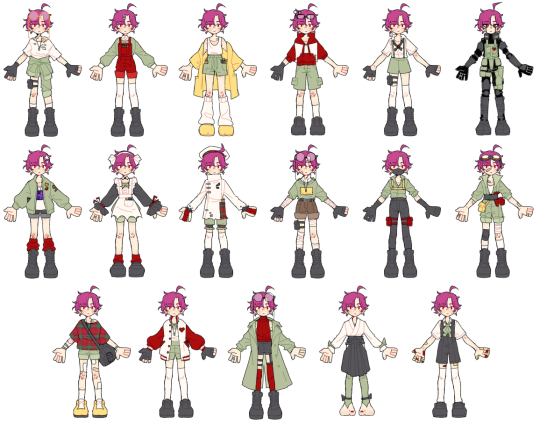
WELCOME TO PART 2 : THE ULTIMATE SLEEP AWAKE TALENTSWAP ! BEFORE YOURE EYES NOW !!!!! i have . SO much to say about this its mostly me ranting about colours . be WARE !
EDIT I FORGOT TO TAG VENUS @chihirolovebot HEYY LOL
typical yelling below ! and Lots of it ! open at your own risk
brought to you by : my mikuification project ! ive spent so much fucking time on that Please . please . ill upload sdr2 when i finish thh and im almost done with it PLEASE !!
OKAY . this took a while . not nearly as long as i expected it to THANK GOD but still a bit . hands downt he most DIFFICULT part of this project was the colour choice .
first of all : these are ordered by the danganronpa v3 wiki character page , which is in alphabetical order by first name except for akamatsu who is at the top .
SECOND OF ALL : the red . physicists colour palette consists of the primay colours of white and olive green , with the secondary colour being black and the accent being gold . fine , right ? WELL its fine for a simple design like the regular physicist , where a 3rd dominant colour isnt needed . Howver most of the rest of thse designs GREATLY needed that 3rd , and i had a bitch of a time trying to figure out what exactly to make it . it took 10 minutes and a colour palette randomizer to give me the most Obvious solution of RED . Their eyes are literally red . How did i not think of that .
anyways youll also see a little but ofyellow in there too - my friend actually suggested that . the yellow on the artist look was already there when i showed this to it and its feedback was that the yellow seeme a little jarring compared to the rest and to add a little more and i said Wowie okay ! the yellow isnt as prevalent as i wanted but its fine as is i think ! other than that i tried to keep the dominant colours to green , black and red while preserving the general Colour blocking fromthe og . aka white shirt , green bottoms , black shoes . it didnt always work that way but it did most of the time !
OH and i also changed the colours here and there depending on what looked best in the moment . mainly astronauts purple graphic shirt and anthropologists brown shorts . originally astronauts socks were purple but that friend from earlier said it clashed so i switched it over [: the main colour on any one design depends entirely on what i thought looked best when i was colouring .
OK NO MORE COLOUR TALK . my favs are absolutely magician , detective , maid and anthropologist . Theyre so skrunkly .
idk if its obvious but i was kinda running out of steam while designing the last 2 , aka the aikido master and cosplayer . the way i did this was doing the lineart first all in one go and Then colouring them all soi dont get too hung up on one specific part , and designing those last 2 was So hard . some of these talents Were nightmares trying to design for , because the whole point behind this was 1: to make sleep awake fanart and 2: to practice outfit design while keeping the characters personality , tastes and colour palette . some talents dont really fit the reader , like maid , assassin or leader ( supreme leader is so weird of a talent name btw ) and i had to alter their persoality a bit to make it work . where others were just , kind of . not very tangible ? or have no specific visual references to go off of like entomologist , anthropologist or adventurer . so i got a little creative i guess .
THE DETAIL NOTES MY BELOVED !
- if it isnt obvious I have a very clear idea of what readers fashion sense would be . aka Minimal layering , SHORTS !!!! , gloves when possible , tall socks <3 and comfort above all else .
- most designs have a clearly visible pocket or pouch where their notepad is . usually the notepad is visible ! AND everyone DOES have the ring . the only 3 places i put them were necklace , finger and as an earring
- THE PLAID !!! designing the leader was already hard enough bc itsone of those non tangible talents . So i said What if ouma and reader had matching freak outfits and used oumas beta designs as reference ! the plaid is supposed to be readers checker print , and its onlyused in this and the adventurer . also i just really love berets
- MAGICIAN HAS A CARD EARRING AND IM OBSESSED WITH IT . its also onthe gay ear SMILE !
- maid .... was hard . i actually had 2 different versions of that fit and had to have my friends choose for me </3 heres the alt version sketch
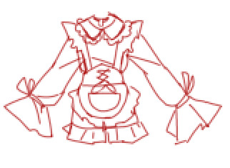
FOR NOW ? i think thats all . my brain is running on empty rn bc im writing this the day before posting like idk half an hour after typing up the sprites post . i might come back and add more later if i feel like it but for now im done .
as always , thank you for reading ! ( u can really see where i got my physicist music taste headcanon from )
48 notes
·
View notes
Text

[Please click for better quality]
The Sugarcane Heist | Part 1
next
Ok so! Ive wanted to draw more of @zessyer and my trafficsonas and looking at @kotikaleo char and reading the description, i got very motivated x) (Btw, at this point in my imaginary timeline, zes and me are on yellow)
This more or less my first time trying to draw a comic in this format and in this style, but its fun and i think it turned out nicely qwp I wanted to colour it aswell, but i think the black and white looks kinda neat (and also i wont lose motivation as quickly if there is less work ^^' I really want to finish this and im already done sketching the other pages, just gotta do the lineart now)
#also another case of#me drawing one picture and then creating a story around it#my art#not my character#trafficsona#trafficblr#the sugarcane heist#theres gonna be 4 parts in total btw#unless i get super motivated and add a little bonus#digital art#my persona#my oc
22 notes
·
View notes
Text
So the drawings ive been tinkering on for... Almost exactly 2 months now, are getting a little more finished again! More update under the cut so i dont clog anyones dash :')
(i did start making a third piece that ties my whole idea together and that is being the biggest menace, despite me slightly slightly constantly trying to finish the first two to like any standard im happy with lmao)
So yay on some progress! Boo on that i desperately need to make more progress on real life stuff and im worried i wont have these actually done till november. Two posts a year kinda high speed artist here! And i did/do wanna do something or multiple little things at least for dinluke positivity thing in november! I wanna do a fun community thing! But everything i make takes forever bc im never happy with it and i got a lot else i should be doing. How do people do this?
Ok no but like im writing this publicly just bc i sort of wanna give an update and also bemoan the third piece :') the sketch so far is... Okay, the faces are good enough but the rest is so unfinished/unclean. Last two times i tried fixing it i just made it way worse so tonight i thought fuck it and put down the flat colours right. Turns out that just highlights how unfinished my linework was! So really im just debating. Do i go back and try my damndest to make good lineart for it, or do i take a page out of my adult art class and just actually more paint it in? Like screw the lineart im just gonna spend a long time tinkering with the colours for shadows and highlights and shape this out that way. It won't perfectly match the other two, but the faces have lineart and who really pays much attention to the other details??
Oh and i have still a mission set to make backgrounds for these. Yes im planning to trace over a google image of highschool lockers and not much else but thats still probably at least a nights work for me that im not hype for haha. They look good on plain background but i wanna at least see if the background could help make them feel more finished. Yknow? Make it worth it that ive been sitting on them for 2 months already
Its fine, its all fine, im gonna make the phonecalls i need to tomorrow and do other good admin things, then i can try to either start carving out the third piece in a painting style (back up plan if i hate it is to backpedal and do the lineart better, or make it over the top of it) and if thats going miserably ill just try and make the backgrounds yknow?? Ill make progress this weekend, maybe ill even say fuck it and post it without it being totally close to perfect (not super likely but imagine the relief of getting it out here finally??) So stay tuned and wish me luck!!
#haeroniel talks#art woes#alls good but im a little stressed and overthinking everything and its been almost 2 months since i posted the wips and i wish i was done!!
2 notes
·
View notes
Text
maybe if i stare at my drawing long enough itll colour itself
#aasdfghj im only in the mood to do lineart latley#ive got juice lineart and now lucretia lineart finished#but no motivation to colour either#be quiet dave
2 notes
·
View notes