#iterator interior
Explore tagged Tumblr posts
Text
Memory Conflux

#rain world#my art#iterator interior#five pebbles#rw five pebbles#memory conflux#perfect loop#animated#from animation wip
272 notes
·
View notes
Text

6.27.2024
#sometimesanequine#junicorn#junicorn2024#promot of day 27. candle#this was looking too much like rapidash on the first iteration so i had to fix it#oooo spooky. hollow horse with flame interior#i found where to adjust brushes in my art program so i can make everything synthetic paint which is nice
37 notes
·
View notes
Text
its a pity rain world is so niche because can you imagine the fucking lego sets
#text#i NEED a 900 dollar massive lego iterator can that you can open up to reveal a full interior. NEOWWWW
105 notes
·
View notes
Text
this, too, is yuri

#rain world#oxygen not included#grey wind#chasing wind#yes thats her structure#olivia broussard#<- the lil guy surrounded by overseers#shes from oxygen not included thats why i tagged that#meteorshower shipping#because grey wind and olivia are total lesbians. this is a yuri moment.#explaining the context of all this because this isn't just meteorshower art this is like#really nice lookin iterator interior art#so its bound to break containment a LITTLE yknow?#and i just dont want anyone to be confused#also added an image description bc i should probably get in the habit of doing that- hopefully its good?#never wrote one of those before#snivs scribbles
16 notes
·
View notes
Text
the most promising thing i took away from transformers #1 was probably having all these immediate Opinions on it, more than any specific opinion in itself. it was a comic where it was like. here is something it's doing with its structure and how it introduces its characters! here is something where it has a strong idea for how to engage with and transform a pre-existing franchise concept! this is something where i have opinions on its deliberate and very clear artistic decisions! it feels like a comic being made with a lot of intelligent craftmanship, which just matters so much more to me at least at the start when you're setting things up than like, idk, character opinions or "will they include [x] lore???" or anything, you know. i want to open a comic and be like okay, this is how the person/people making this approach comic making. so that's my big endorsement for this one: immediately got that from it.
#and i'm not even a fan of the interior art much for example but like. there's no carelessness or disinterest!#so that just kinda matters more to me#everything else can be iterated on but you need the process in place FIRST
36 notes
·
View notes
Text
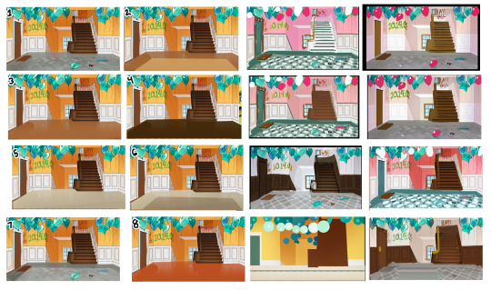
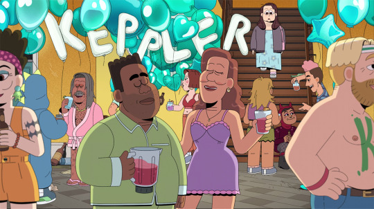
Welcome to the multiverse of stairwells in Carol's apartment complex! Well, not really, but one of our goals after I was promoted to art director was revisiting and polishing up some stuff from earlier episodes - especially episode 1, since it would be viewers' first impression of our world. One of these things was this stairwell Carol walks through to exit her apartment. The original background (not pictured) looked great and was completely serviceable, but we really wanted to push the world-building and disconnect between Carol and this communal space where people seemed to perpetually be partying. My job was to help figure out how we could SHOW that thorough colour - not just tell it, and as you can see, there was a LOT of discussion and potential solutions. Personally, I think part of an art director's job is being a liaison between their team of artists and everyone else: translating other stakeholders' words/abstract ideas into concrete, visual direction. Sometimes all this means is handing off a brief to an artist, but other times it requires more: actively listening to stakeholders, creating multiple (sometimes many!) solutions that meet their goals/vision, helping guide them to the solution they feel best meets that goal (not just telling them), and then whatever direction results from that dialogue can be handed off to the artist(s). Anyways, thanks for looking, and watch Carol and the End of the World on Netflix! Showrunner: Dan Guterman
#now playing#watch now#stairs#colour#color#interior#interiors#apartment#hallway#staircase#design#advice#leadership#supervisor#background#backgounds#environment#iteration#ideation#background paint#carol#carol and the end of the world#cateotw#adult animation#animation#netflix#netflix animation#cartoon#allisonperryart#allison perry
8 notes
·
View notes
Text
Drawings creatures smallest to biggest: day 1

Bugs! More specifically Moths.
#definitely no not an excuse to draw the interior of the moon :)#rw iterator#rw looks to the moon#rw bugs#rw moth#rain world#rw art
9 notes
·
View notes
Text
I should probably buy a standing desk and a walking pad so I can pace and think about my variety of projects while also working (-> watching youtube videos and listening to music) on the variety of media related to said thoughts
#dremie speaks#let me iterate i have no space in my room unless I do a deep clean in the future#but it would be worth it for this kind of set up#standing desk + walking pad combo#silly dreams about interior nonsense honestly
5 notes
·
View notes
Text

you don't have to be a ghost, here amongst the living...
[you guessed it, collaboration with @dxppercxdxver again]
#em draws stuff#flintlock fortress#team fortress 2#this is one of those ones that looks better with screen brightness at least halfway up#sorta a redraw of my previous drawing of these two in a vague purple-blue darkness?#there may have to be a third iteration since I'm honestly not entirely satisfied with this one either#but there is nonetheless Significant improvement going on in the design part of it alone. I Kind Of understand their faces now?#someday I'll get the hang of interior space but I do not think that today is that day. back to same old same old sketchy scribble.#in the end I think I like the lines on their own better than anything with color. maybe I'll post them separately...#oh yeah. caption lyrics from florence and the machine's 'third eye'#a very apt song for this scenario and the fic that may end up going with it.
21 notes
·
View notes
Text


lmao honestly, i get it:

#rhett and link#gmmore 2416#so interesting to hear about their architectural and interior design preferences#i'm more of a mid-century modern person like Link#but i also love maximalism in most of its iterations#so this also appeals to me in a way#don't know about the demons though lol
16 notes
·
View notes
Text
on neuschwanstein castle (part 1)
This is an essay in two parts.

Neuschwanstein Concept Drawing by the stage designer (!!) Christian Jank (1869).
There exist in architecture clear precedents to the McMansion that have nothing to do with suburban real estate. This is because “McMansionry” (let’s say) has many transferable properties. Among them can be included: 1) a diabolical amount of wealth that must be communicated architecturally in the most frivolous way possible, 2) a penchant for historical LARPing primarily informed by media (e.g. the American “Tuscan kitchen”) and 3) the execution of historical styles using contemporary building materials resulting in an aesthetic affect that can be described as uncanny or cheap-looking. By these metrics, we can absolutely call Neuschwanstein Castle, built by the architect Eduard Riedel for King Ludwig II of Bavaria, a McMansion.
Constructed from 1869 through 1886 – the year of Ludwig’s alleged suicide after having been ousted and declared insane – the castle cost the coffers of the Bavarian state and Ludwig himself no fewer than 6.2 million German gold marks. (That's an estimated 47 million euros today.) The castle's story is rife with well-known scandal. I'm sure any passing Swan Enthusiast is already familiar with Ludwig’s financial capriciousness, his called-off marriage and repressed homosexuality, his parasocial obsession with Richard Wagner, his complete and total inability to run his country, and his alleged "madness," as they used to call it. All of these combine to make Neuschwanstein inescapable from the man who commissioned it -- and the artist who inspired it. Say what you like about Ludwig and his building projects, but he is definitely remembered because of them, which is what most monarchs want. Be careful what you wish for.

Neuschwanstein gatehouse.
How should one describe Neuschwanstein architecturally? You’d need an additional blog. Its interiors alone (the subject of the next essay) range from Neo-Baroque to Neo-Byzantine to Neo-Gothic. There are many terms that can loosely define the palace's overall style: eclecticism, medieval revivalism, historicism, chateauesque, sclerotic monarchycore, etc. However, the the most specific would be what was called "castle Romanticism" (Burgenromantik). The Germans are nothing if not literal. Whatever word you want to use, Neuschwanstein is such a Sistine Chapel of pure sentimentality and sugary kitsch that theme park architecture – most famously, Disney's Cinderella’s castle itself – owes many of its medieval iterations to the palace's towering silhouette.
There is some truth to the term Burgenromantik. Neuschwanstein's exterior is a completely fabricated 19th century storybook fantasy of the Middle Ages whose precedents lie more truthfully in art for the stage. As a castle without fortification and a palace with no space for governance, Neuschwanstein's own program is indecisive about what it should be, which makes it a pretty good reflection of Ludwig II himself. To me, however, it is the last gasp of a monarchy whose power will be totally extinguished by that same industrial modernity responsible for the materials and techniques of Neuschwanstein's own, ironic construction.
In order to understand Neuschwanstein, however, we must go into two subjects that are equally a great time for me: 19th century medievalism - the subject of this essay - and the opera Lohengrin by Richard Wagner, the subject of the next. (1)
Part I: Medievalisms Progressive and Reactionary

The Middle Ages were inescapable in 19th century Europe. Design, music, visual art, theater, literature, and yes, architecture were all besotted with the stuff of knights and castles, old sagas, and courtly literature. From arch-conservative nationalism to pro-labor socialism, medievalism's popularity spanned the entire political spectrum. This is because it owes its existence to a number of developments that affected the whole of society.
In Ludwig’s time, the world was changing in profound, almost inconceivable ways. The first and second industrial revolutions with their socioeconomic upheavals and new technologies of transport, manufacturing, and mass communication, all completely unmade and remade how people lived and worked. This was as true of the average person as it was of the princes and nobles who were beginning to be undermined by something called “the petit bourgeoisie.”
Sustenance farming dwindled and wage labor eclipsed all other forms of working. Millions of people no longer able to make a living on piecemeal and agricultural work flocked to the cities and into the great Molochs of factories, mills, stockyards, and mines. Families and other kinship bonds were eroded or severed by the acceleration of capitalist production, large wars, and new means of transportation, especially the railroad. People became not only alienated from each other and from their labor in the classical Marxist sense but also from the results of that labor, too. No longer were chairs made by craftsmen or clothes by the single tailor -- unless you could afford the bespoke. Everything from shirtwaists to wrought iron lamps was increasingly mass produced - under wretched conditions, too. Things – including buildings – that were once built to last a lifetime became cheap, disposable, and subject to the whimsy of fashion, sold via this new thing called “the catalog.”

William Morris' painting Le Belle Iseult (1868).
Unsurprisingly, this new way of living and working caused not a little discontent. This was the climate in which Karl Marx wrote Capital and Charles Dickens wrote A Christmas Carol. More specific to our interests, however, is a different dissenter and one of the most interesting practitioners of medievalism, the English polymath William Morris.
A lover of Arthurian legend and an admirer of the architect and design reformer John Ruskin, Morris was first trained in the office of architect G. E. Street, himself a die-hard Gothic Revivalist. From the very beginning, the Middle Ages can be found everywhere in Morris' work, from the rough-hewn qualities of the furniture he helped design to the floral elements and compositions of the art nouveau textiles and graphics he's most famous for -- which, it should be said, are reminiscent of 15th century English tapestries. In addition to his design endeavors, Morris was also a gifted writer and poet. His was a profound love for medieval literature, especially Norse sagas from Iceland. Some of these he even translated including the Volsunga Saga -- also a preoccupation of Wagner's. Few among us earn the title of polymath, but Morris' claim to it is undeniable. Aside from music, there really wasn't any area of creative life he didn't touch.
However, Morris' predilection for the medieval was not just a personal and aesthetic fascination. It was also an expression of his political rejection of the capitalist mode of production. As one of the founders of the English Arts & Crafts Movement, Morris called for a rejection of piecemeal machine labor, a return to handicraft, and overall to things made well and made with dignity. While this was and remains a largely middle class argument, one that usually leads down the road of ethical consumption, Morris was right that capitalism's failing of design and architecture did not just lie with the depreciated quality of goods, but the depreciated quality of life. His was the utopian call to respect both the object and the laborer who produced it. To quote from his 1888 essay called "The Revival of Architecture," Morris dreamed of a society that "will produce to live and not live to produce, as we do." Indeed, in our current era of AI Slop, there remains much to like about the Factory Slop-era call to take back time from the foreman's clock and once more make labor an act of enjoyable and unalienated creativity. Only now it's about things like writing an essay.
I bother to describe Morris at length here for a number of reasons. The first is to reiterate that medievalism's popularity was largely a response to socioeconomic changes. Additionally, since traditionalism - in Ludwig's time and in ours - still gets weaponized by right-wing losers, it's worth pointing out that not all practitioners of medievalism were politically reactionary in nature. However – and I will return to this later – medievalism, reactionary or not, remains inescapably nostalgic. Morris is no exception. While a total rejection of mass produced goods may seem quixotic to us now, when Morris was working, the era before mass industrialization remained at the fringes of living memory. Hence the nostalgia is perhaps to be expected. Unfortunately for him and for us, the only way out of capitalism is through it.
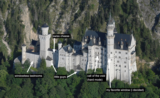
To return again to the big picture: whether one liked it or not, the old feudal world was done. Only its necrotic leftovers, namely a hereditary nobility whose power would run out of road in WWI, remained. For Ludwig purposes, it was a fraught political time in Bavaria as well. Bavaria, weird duck that it was, remained relatively autonomous within the new German Reich. Despite the title of king, Ludwig, much to his chagrin - hence the pathetic Middle Ages fantasizing - did not rule absolutely. His was a constitutional monarchy, and an embattled one at that. During the building of Neuschwanstein, the king found himself wedged between the Franco-Prussian War and the political coup masterminded by Otto von Bismarck that would put Europe on the fast track to a global conflict many saw as the atavistic culmination of all that already violent modernity. No wonder he wanted to hide with his Schwans up in the hills of Schwangau.
The very notion of a unified German Reich (or an independent Kingdom of Bavaria) was itself indicative of another development. Regardless if one was liberal or conservative, a king, an artist or a shoe peddler, the 19th century was plagued by the rise of modern nationalism. Bolstered by new ideas in "medical" “science,” this was also a racialized nationalism. A lot of emotional, political, and artistic investment was put into the idea that there existed a fundamentally German volk, a German soil, a German soul. This, however, was a universalizing statement in need of a citation, with lots of political power on the line. Hence, in order to add historical credence to these new conceptions of one’s heritage, people turned to the old sources.
Within the hallowed halls of Europe's universities, newly minted historians and philologists scoured medieval texts for traces of a people united by a common geography and ethnicity as well as the foundations for a historically continuous state. We now know that this is a problematic and incorrect way of looking at the medieval world, a world that was so very different from our own. A great deal of subsequent medieval scholarship still devotes itself to correcting for these errors. But back then, such scholarly ethics were not to be found and people did what they liked with the sources. A lot of assumptions were made in order to make whatever point one wanted, often about one's superiority over another. Hell, anyone who's been on Trad Guy Deus Vult Twitter knows that a lot of assumptions are still made, and for the same purposes.(2)
Meanwhile, outside of the academy, mass print media meant more people were exposed to medieval content than ever before. Translations of chivalric romances such as Wolfgang von Eschenbach’s Parzival and sagas like the Poetic Edda inspired a century’s worth of artists to incorporate these characters and themes into their work. This work was often but of course not always nationalistic in character. Such adaptations for political purposes could get very granular in nature. We all like to point to the greats like William Morris or Richard Wagner (who was really a master of a larger syncretism.) But there were many lesser attempts made by weaker artists that today have an unfortunate bootlicking je nais se quoi to them.
I love a minor tangent related to my interests, so here's one: a good example of this nationalist granularity comes from Franz Grillparzer’s 1823 pro-Hapsburg play König Ottokars Glück und Ende, which took for its source a deep cut 14th century manuscript called the Styrian Rhyming Chronicle, written by Ottokar Aus Der Gaul. The play concerns the political intrigue around King Ottokar II of Bohemia and his subsequent 1278 defeat at the hands of Grillparzer’s very swagged out Rudolf of Habsburg. Present are some truly fascinating but extremely obscure characters from 13th Holy Roman Empire lore including a long-time personal obsession of mine, the Styrian ministerial and three-time traitor of the Great Interregnum, Frederick V of Pettau. But I’m getting off-topic here. Let's get back to the castle.

The Throne Room at Neuschwanstein
For architecture, perhaps the most important development in spreading medievalism was this new institution called the "big public museum." Through a professionalizing field of archaeology and the sickness that was colonialist expansion, bits and bobs of buildings were stolen from places like North Africa, Egypt, the Middle East, and Byzantium, all of which had an enormous impact on latter 19th century architecture. (They were also picked up by early 20th century American architects from H. H. Richardson to Louis Sullivan.) These orientalized fragments were further disseminated through new books, monographs, and later photography.
Meanwhile, developments in fabrication (standardized building materials), construction (namely iron, then steel) and mass production sped things up and reduced costs considerably. Soon, castles and churches in the image of those that once took decades if not a century to build were erected on countless hillsides or in little town squares across the continent. These changes in the material production of architecture are key for understanding "why Neuschwanstein castle looks so weird."

Part of what gives medieval architecture its character is the sheer embodiment of labor embedded in all those heavy stones, stones that were chiseled, hauled, and set by hand. The Gothic cathedral was a precarious endeavor whose appearance of lightness was not earned easily, which is why, when writing about their sublimity, Edmund Burke invoked not only the play of light and shadow, but the sheer slowness and human toil involved.
This is, of course, not true of our present estate. Neuschwanstein not only eschews the role of a castle as a “fortress to be used in war” (an inherently stereotomic program) but was erected using contemporary materials and techniques that are simply not imbued with the same age or gravitas. Built via a typical brick construction but clad in more impressive sandstone, it's all far too clean. Neuschwanstein's proportions seem not only chaotic - towers and windows are strewn about seemingly on a whim - they are also totally irreconcilable with the castle's alleged typology, in part because we know what a genuine medieval castle looks like.
Ludwig's palace was a technological marvel of the industrial revolution. Not only did Neuschwanstein have indoor plumbing and central heat, it also used the largest glass windows then in manufacture. It's not even an Iron Age building. The throne room, seen earlier in this post, required the use of structural steel. None of this is to say that 19th century construction labor was easy. It wasn't and many people still died, including 30 at Neuschwanstein. It was, however, simply different in character than medieval labor. For all the waxing poetic about handiwork, I’m sure medieval stonemasons would have loved the use of a steam crane.
It's true that architectural eclecticism (the use of many styles at once) has a knack for undermining the presumed authenticity or fidelity of each style employed. But this somewhat misunderstands the crime. The thing about Neuschwanstein is that its goal was not to be historically authentic at all. Its target realm was that of fantasy. Not only that, a fantasy informed primarily by a contemporary media source. In this, it could be said to be more architecturally successful.

The fantasy of medievalism is very different than the truth of the Middle Ages. As I hinted at before, more than anything else, medievalism was an inherently nostalgic movement, and not only because it was a bedrock of so much children's literature. People loved it because it promised a bygone past that never existed. The visual and written languages of feudalism, despite it being a terrible socioeconomic system, came into vogue in part because it wasn't capitalism. We must remember that the 19th century saw industrial capitalism at its newest and rawest. Unregulated, it destroyed every natural resource in sight and subjected people, including children, to horrific labor conditions. It still does, and will probably get worse, but the difference is, we're somewhat used to it by now. The shock's worn off.
All that upheaval I talked about earlier made people long for a simplicity they felt was missing. This took many different forms. The rapid advances of secular society and the incursion of science into belief made many crave a greater religiosity. At a time when the effects of wage labor on the family had made womanhood a contested territory, many appeals were made to a divine and innocent feminine a la Lady Guinevere. Urbanization made many wish for a quieter world with less hustle and bustle and better air. These sentiments are not without their reasons. Technological and socioeconomic changes still make us feel alienated and destabilized, hence why there are so many medieval revivals even in our own time. (Chappell Roan of Arc anyone?) Hell, our own rich people aren't so different from Ludwig either. Mark Zuckerburg owns a Hawaiian island and basically controls the fates of the people who live there lord-in-the-castle-style.

Given all this, it's not surprising that of the products of the Middle Ages, perhaps chivalric romance was and remains the most popular. While never a real depiction of medieval life (no, all those knights were not dying on the behalf of pretty ladies), such stories of good men and women and their grand adventures still capture the imaginations of children and adults alike. (You will find no greater fan of Parzival than yours truly.) It's also no wonder the nature of the romance, with its paternalistic patriarchy, its Christianity, its sentimentality around courtly love, and most of all its depiction of the ruling class as noble and benevolent – appealed to someone like Ludwig, both as a quirked-up individual and a member of his class.
It follows, then, that any artist capable of synthesizing all these elements, fears, and desires into an aesthetically transcendent package would've had a great effect on such a man. One did, of course. His name was Richard Wagner.
In our next essay, we will witness one of the most astonishing cases of kitsch imitating art. But before there could be Neuschwanstein Castle, there had to be this pretty little opera called Lohengrin.
---
(1) If you want to get a head start on the Wagner stuff, I've been writing about the Ring cycle lately on my Substack: https://www.late-review.com/p/essays-on-wagners-ring-part-1-believing
(2) My favorite insane nationalist claim comes from the 1960s, when the Slovene-American historian Joseph Felicijan claimed that the US's democracy was based off the 13th century ritual of enthronement practiced by the Dukes of Carinthia because Thomas Jefferson owned a copy of Jean Bodin's Les six livres de la Republique (1576) in which the rite was mentioned. For more information, see Peter Štih's book The Middle Ages Between the Alps and the Northern Adriatic (p. 56 for the curious.)
If you like this post and want more like it, support McMansion Hell on Patreon for as little as $1/month for access to great bonus content including a discord server, extra posts, and livestreams.
Not into recurring payments? Try the tip jar! Student loans just started back up!
#architecture#design#mcmansion#mcmansions#bad architecture#neuschwanstein#wagner#essay#medievalism#19th century
5K notes
·
View notes
Text

Find slugcat? (this one is not too hard I think)
364 notes
·
View notes
Text
hey Rain World fans. I'm gonna show you a lore interpretation that I personally have never seen anyone talk about except myself. If you know me as Sliverist, then you know what's up.
Everyone knows the first five Karma glyphs represent the so-called Five Natural Urges. Violence, reproduction, trade and social connection, eating, and self preservation. People generally believe the next Karma glyphs before the tenth are meaningless, but this is WRONG. Understanding this revelation requires seeing the big picture, which I will guide you through.
Rain World really likes to blur the line between organic and inorganic, with the most obvious example being the Iterators themselves, these biomechanical superstructures whose function in large part is outsourced to their "microbe strata" (Purple SL pearl), but it goes even further, into the very world design.
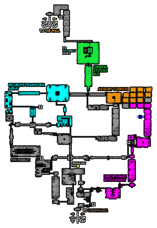

Five Pebbles' internal structure resembles a brain with its many sections all divided into specific regions with specific purposes. His chamber makes the resemblance even more obvious, where you can clearly see the brainstem.

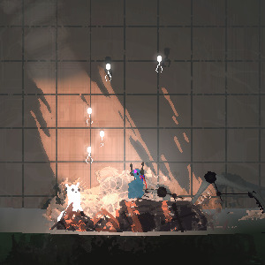
Within Five Pebbles' dark interior swim swarms of colorful neurons which turn white in broad daylight, each one a carrier of information. Often, they are brushed along by cilia lining the computer halls.
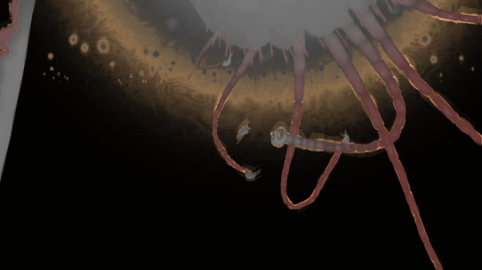

The Void Sea writhes with a swarm of beings enormous beyong reckoning which closely resemble real neurons. The void worm that takes interest in the slugcat uses a dendrite to make a tether to drag the slugcat to its final destination.

As the slugcat swims and swims, it is joined by countless many just like it, and together they swim toward the light, referred to in the code as "TheEgg" (VoidSeaScene.cs)

This is the table of Karma, showing every level above Five. Doesn't it look rather like..

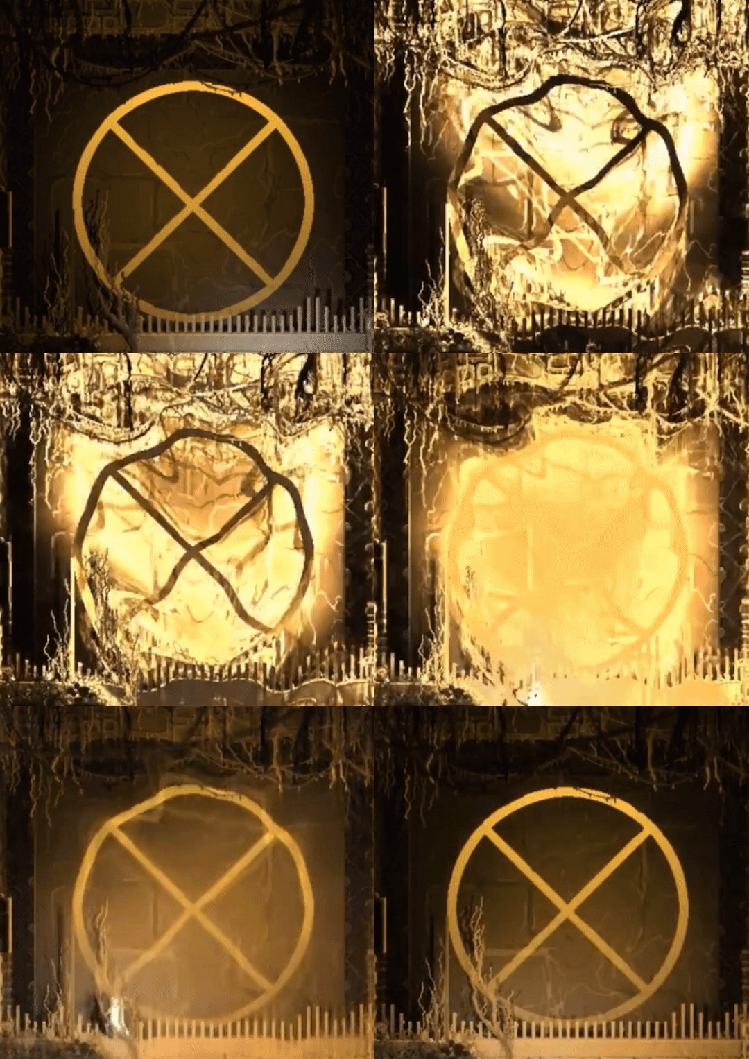
dividing cells being crossed out?
In Rain World, birth and life, cognition and enlightenment, death and ascension are all inextricably connected concepts. You might even say they're connected in a cycle. The imagery and themes are rich and complete, integrated fully into the world. This is even without mentioning the voidspawn which also resemble sperm, swimming to the same place. This is why Ascension is the best ending :artiyoy:
#kvetches#rain world#rain world lore#i could even argue that an iterator chamber or even structure somewhat resembles a womb. less closely than a brain but. hehe
1K notes
·
View notes
Text
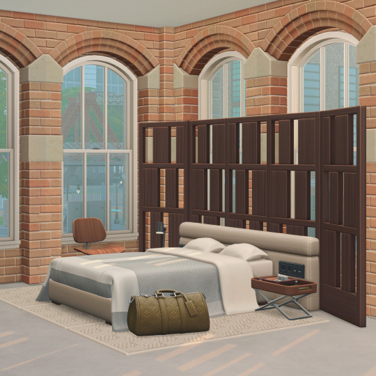
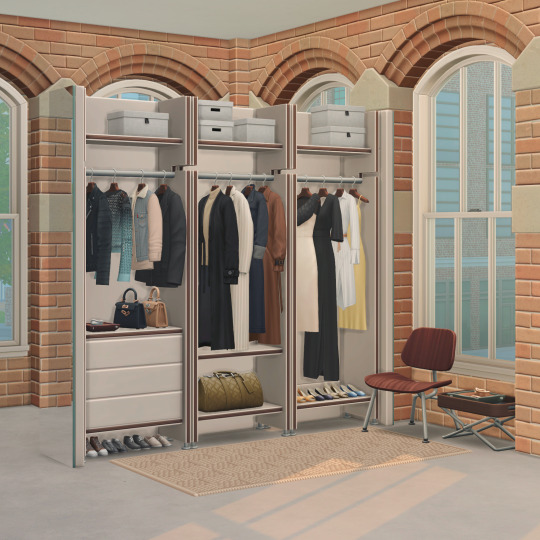
Hello again :),
It is finally finished, and I am so happy to receive all your replies to my WIP Post.
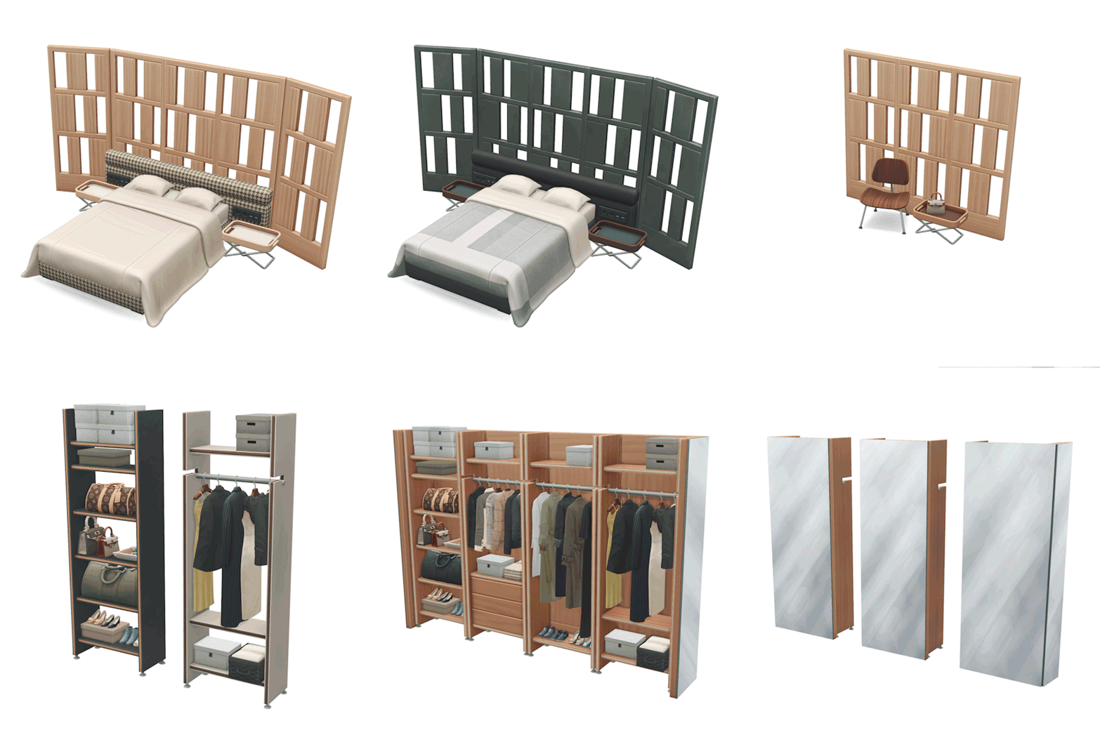
As I had shown you before, for this month, I was working on a Bedroom Set and created a walk-in wardrobe, too. This collection consists of 36 items.
I based The whole Soho Set around a loft apartment, and I was thinking of a bedroom that could be built into an open space. Of course, I wanted to create modern items, but there are slight retro and Art Deco hints, mainly through patterns and backdrops. I thought it was time to make new bedding; I got a bit bored of the Berlin and Fayun ones :D. you can combine it with a separate bed base and a headboard with plug details. For the 'Livin Rum', I created a wooden Eames chair; for this collection, I made the metal frame version and added a bedside table in a similar style.
As mentioned, I added a modular walk-in wardrobe with four shelves. I added 16 different garments, three luxury handbags inspired by Louis Vuitton, Bottega Veneta, and Hermès. There are lots of customizing options. You can either place those items into the open space and cover them with mirror walls or against a wall.
This Set is on Early Access and will be released at the beginning of July. and you can find it here
A small gimmick: I bought a Cardboard VR Goggle because I created 3D images of my travels and tried the same stereoscopic technique with my sims interiors, and it worked; the sims look so so cute in actual 3D :D, in case you have VR glasses I wanted to share my Promo images in 3D too if you concentrate on the pictures you can also see them in 3D without goggles :)
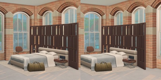
This is the second to last iteration, and I will work on a Living collection for the coming month.
I hope you like the new items. Again, thank you so much for everything!!!
Lots of Love,
Felix xxx
2K notes
·
View notes
Text
i think people aren't talking more about the iterator interior (not the can) aesthetic, it's insane and absurdly lovecraftian in a very interesting way, it's genuinely so good. i wish more games had fucking MASSIVE robots you can climb inside and hear incomprehensible sounds of communication and see blinking lights with random metal components strewn about, and architecture so hostile and irregular yet just navigable enough that you question if you were meant to even be here in the first place, or even if it was meant for some interloper like you to traverse.
iterator cool :3
#rain world#rain world iterator#god... games need more dubious robots and/or heavily sci-fi industrialized regions
836 notes
·
View notes
Text
Wearable Input Device: "Spokey Dokey"?


So seeing this I had a thought:
Thinking of Sampson Lee's neat keyboard in Cowboy Bebop the Movie, I tried threading an N52 Speedpad into a belt assembly to see how it might look and feel to type on with chording and yeah this is actually pretty great actually?


This absoloutely feels like something a mecha pilot would wear, that would allow for robust access in the field, or make the pilot suit part of the interface of the robot to do all the startup checklists on before using the HOSAS inceptor grips.

Note the same throughhole in the N52 which lets me thread it into a belt also lets you put your fingers in, akin to gripping a joystick.
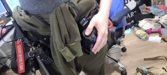
I think with some refinement you could fit an analogue trigger and a bumper in here, and the thumb-cluster could be expanded slightly to include some other inputs.
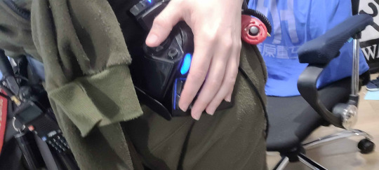
Its begging for a trackball or an analogue stick in truth.
Genuinely surprised by how comfortable this is from a Human Factors Engineering standpoint???? Like, "putting your hands in your pockets" level comfortable, and it would be even better with a wrist-loop or something.
It beats the pants off of any cyberdeck esque project I've ever tried in terms of usability so I think this is something which needs to be iterated upon actually???


It hangs very naturally and you can vary the angle by adjusting it against the rubbedr of the quick-release strap. My one complaint is the base is designed for a desk and I think it could stand to be curved to better conform to the hip or leg which I think could cut the total size down considerably.
Even sat in a chair this feels surprisingly comfortable, with my only complaint being that its conflicting with the strap of my repurposed shoulder-bag, which is its own entirely different issue and that the default switches kind of suck.
The interior has a ton of room so you could absoloutely squeeze a decent battery and a Rasberry Pi in this thing, or use it as a pure input device that doubles as a USB hub/storage (SD card) and uses the spare room to charge a phone.
Two of these would give you a pretty bonkers battery life if you had one on either hip.

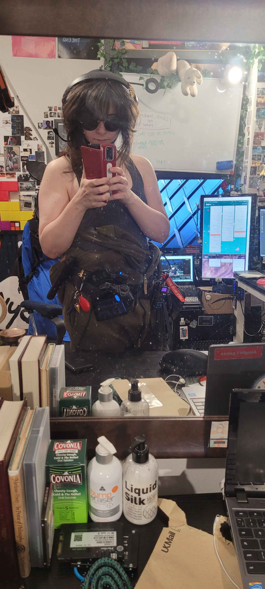

I think with ultra low profiles, a curved form, a slightly more robust strapping mechanism and a means to plug this into a smartphone as the middle computer (with something like a pair of smart-glasses as the display) you could have really really robust wearable computer and if you add a second one on the other hip, you've solved the wpm problem.
btw I typed this entire post on it, only lifting my hands off to use my trackball.
Those of you who work on cyberdecks, I genuinely think there's something to this. Wearable split keyboards which are ruggedized with tougher switches absoloutely feel like they are something which should exist.
330 notes
·
View notes