#it's just visual
Explore tagged Tumblr posts
Text
god sometimes the jokes are really good and don't overstay their welcome
#here I go posting more craig of the creek again#god what a good show#for context they're playing hide and seek#it's 3 seasons in and they've never shown the room#there's a lot of referential humor and meta humor that never pushes too far and is casual and I love this show for that#sometimes it's not even pointed out#it's just visual#craig of the creek
122 notes
·
View notes
Text
comics as an art form make me insane. they’re so difficult to do well. there’s so many different ways to make sequential art work and most of them are deeply unintuitive. onomatopoeia that feels completely ridiculous to put down often reads seamlessly. panels on a page become a fractally nested image composition challenge that’s only possible to lose because if you do a good job no one will notice. you have to direct the readers’ eyes on a specific path across the page but also account for the fact that they won’t follow it. comic time isn’t linear. if the order of events isn’t crystal clear the story becomes incomprehensible. sometimes you need to do this on purpose. all this for a medium almost universally considered less effective than animation and less respectable than plain text. even its own name doesn’t take it seriously
#don’t mind me just chewing on drywall#some of the absolute best comics don’t look remotely impressive until you try to make one yourself#and some absolutely beautiful panel layouts and art combine to make a stunning visual that barely manages to get any meaning across#you have to emulate cinematography by cultural necessity at this point#but if you lean too hard in that direction your comics just become Worse Movies#there’s barely any standard practices for anything because people are just barely starting to look at comics seriously#mumbling
29K notes
·
View notes
Text
Hbomberguy right before obliterating James Somerton's career:
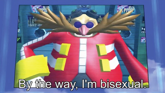
#the moon speaks#hbomberguy#james somerton#i hope no one made this joke yet i just got out of the shower visualizing it
28K notes
·
View notes
Text

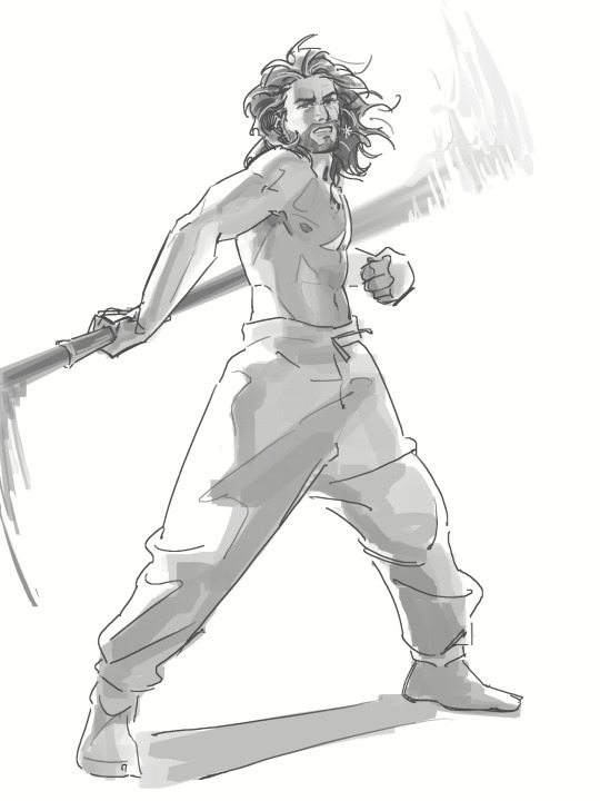
gale doodles (goodles)
first drawing references this pinterest post !
edit: pinterest links don't work if you're not signed in, i've attached the original ref image below the cut and here's the vogue link. the designer is Guo Pei and the dress is from her fall 2019 couture collection
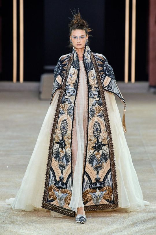
pinterest ux my beloathed
#gathering visual motifs for gale that i can put in my art#bg3#baldur's gate 3#gale dekarios#gale of waterdeep#bg3 fanart#my art#insp for this was “isn't his robe basically just a dress” lol
25K notes
·
View notes
Text
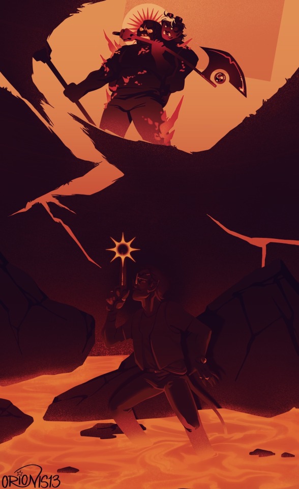
This moment brought to you by ice feast
#art tag#starchive#fantasy high#fhjy#riz gukgak#gorgug thistlespring#porter cliffbreaker#fhjy spoilers#i did this so fast i thot the scene was cool and i had to get itnout of my system#the values got away from me a little but oh well its just kinda hard to read hdjshf#and i liked the visual of riz in the floorboards and lava shooting porter while gorgug had him grappled#cool moment i thought
8K notes
·
View notes
Text


just a lot of the axolotl :] and that bitchass triangle
#edit: this isn’t billford👍 i was honestly moreso expecting people to think this was axobill. it’s not that either but still#the art gallery#gravity falls#the book of bill#also design for the orb of healing light :] yea it’s based on an ophanim. I am not thr first person to have this idea but I tried to ma#tried to make it original#the visual of Literally An Angel wearing a lanyard was just really funny to me
3K notes
·
View notes
Text

Perils of dating a Wild Magic Sorcerer while trying to have a dramatic moment on your grave.
#baldur’s gate 3#bg3#astarion#astarion x tav#tavstarion#bg3: morgan#my art#completely irrelevant lore comment:#she has a wild magic surge here but it summons a cambion instead#I just thought the sheep visual was too cute
5K notes
·
View notes
Text


ID credit: 8603587452 on 小红书
(please like, reblog and give proper credit if you use any of my gifs!)
#stim#stimblr#rhiannon’s stims#sensory#my gifs#stimboard#satisfying#stimmy#pink stim#food stim#cute stim#flower stim#soft aesthetic#pink aesthetic#cutecore#coquette#dollete#coquette aesthetic#dollete aesthetic#just girly things#girlblogging#stim gifs#visual stim#my stims#stim blog#aesthetic#aesthetics#gifset#proship dni#comship dni
3K notes
·
View notes
Text
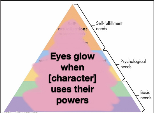
A callout post (it’s me I’m calling myself out)
#writing#oc#original character#Merlin#the Magnus archives#the penumbra podcast#(we don’t even have visuals for those two you Motherfuckers just decided (you’re right))#critical role#there are so many others I can’t think of them#marvel#dc comics
12K notes
·
View notes
Text
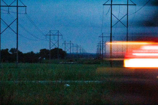
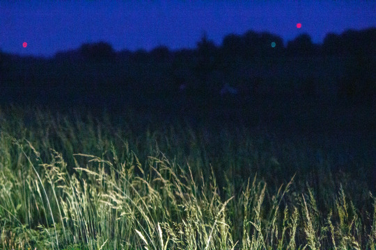
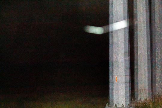

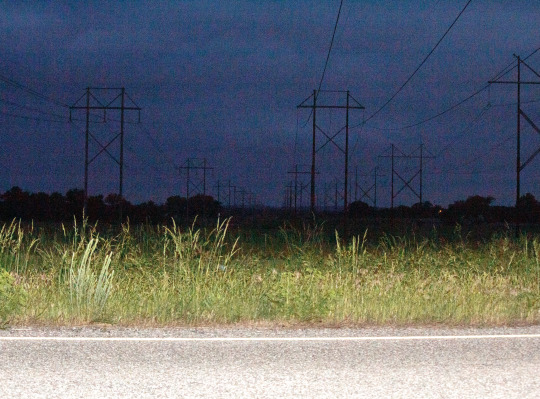
look alive, sunshine
#take care of yourself#they can see the dark spots underneath your eyes#my art#*ignores like 15 years’ worth of photography experience for the aesthetic*#the majority of these were just straight up photos of total blackness with the flash on; I drove the settings up to bring out the detail#and by detail I mean literally any interpretable noise#I’m not winning any photography contests anytime soon but the southern gothic community seems to be enthused#art#artwork#glitchcore#webcore#aesthetic#internetcore#abstract#glitch art#artists on tumblr#photography#night photography#graphic art#visual poetry
30K notes
·
View notes
Text


taking off my anxiety over a license exam ☠️
#messyr#IM GOING TO CRY IF I FAIL THIS EXAM BUT DAMN I ALREADY FEEL LIKE THROWING UP!!!!!! AHAHAHAHAH#I keep thinking about the fkin adobe license yet im still out here drawing projects for a media visual novel and egames art concepts AAARGH#Also still drafting stuff for this AU bc it doesn't just focus on ships- rather the plot itself LMAO.#doodle#artists on tumblr#hazbin hotel#hazbin hotel au#hazbin hotel: Michelin Stars AU#hazbin hotel human au#hazbin hotel lucifer#hazbin hotel alastor#lucifer morningstar#hazbin alastor#hazbin hotel charlie#charlie morningstar#radioapple
3K notes
·
View notes
Text

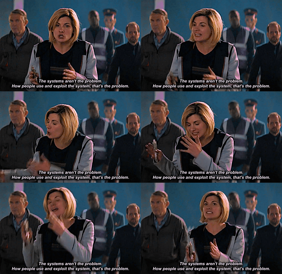
s10e05, oxygen // s11e07, kerblam!
lol. lmao even

#dwedit#doctor who#twelfth doctor#thirteenth doctor#timelordgifs#milk gifs#also i can't get over how much more visually interesting the shot of 12 is and how that isn't just a one off thing#hits#<- unfortunately#kerblam fiasco
4K notes
·
View notes
Text


i feel like throwing up
3K notes
·
View notes
Text
as a bi person, the bisexual flag brings me infinite joy and always puts a smile on my face, however as a person who has a Passion for Graphic Design, that undersaturated shade of purple infuriates me when it's used digitally
like, on an actual flag - which was its original purpose - it looks great!

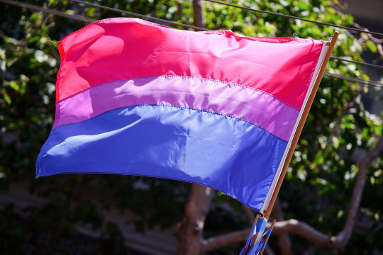
those look fine! lovely, even! with the semi-transparent fabric, the way it catches the sunlight, it looks beautiful!
but now look at how it looks digitally

the pink and blue are so vibrant compared to the sad, lonely lavender!
and let's look at this statement from Michael Page, the creator of the bi flag:

(sidenote: he created this flag in 1998, so if his takes on bisexuality is different from yours, it's okay to notice that! a lot has changed since the 90s when it comes to lived experiences and the way we describe them. but, it's also important to respect his thoughts about this and the way he presented them, even if today, we'd probably not say that bi people "blend unnoticeably into both the gay/lesbian and straight communities.")
so in pantone colors, the pink is 226 C, the blue is 286 C, and the purple of the flag is 258 C.
but...here's the deal
Michael talks here about how the key to understanding the symbolism is to know that the purple blends into both the pink and blue. and on a physical flag, I think you can see that!
but digitally, it absolutely does not blend. it clashes badly, and looks oddly separate from the other two colors.
which got me wondering...what purple do you get if you actually blend 226 C and 286 C?
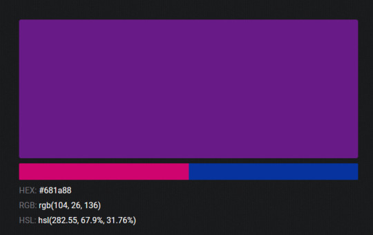
oh! oh, my god.

look at that! look at how nicely it fits between those colors!
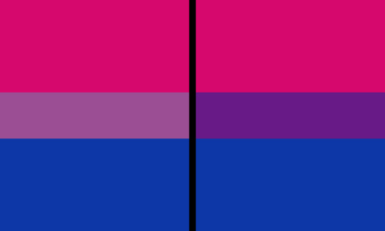
look at it next to the original color scheme! look at how much more vibrant the purple is!
and friends. this is just blending through rgb! you get even more purple variations when you use other color spaces!
let's compare all of them:






(top: original, lab. middle: lrgb, lch. bottom: rgb, hsl)
look at all of the different purple options you can get just by combining these two colors!
if you want almost too-vibrant saturation, you can go hsl, if you want something more relaxed that's closer to the original, you can go lab or lrgb. and if you want to split the difference, lch is bright and violet, while rgb is there with its saturated but darker purple.
anyway, I guess I don't really have a point here? this isn't so much an informational post as it is Me Getting Weird About Colors, but I think it is a useful lesson about how colors look very different on screens compared to how they look on objects in real life.
and sometimes, I think it's okay to compensate for that.
out of all of these, this is my favorite bi flag:

it's the one where the colors were blended in lab color space. for me, the lighter, softer purple is close enough to the original bi flag purple, while also feeling like a smoother blend of the blue and pink
but that's just me! and it might not even look the same to you, since every screen is different, because technology is a nightmare!
anyway, thank you for coming with me on this colorful journey! I will now retreat back to inkscape and make pained sounds about inkstitch gradients until something tangible pulls me back into reality
#bi#bisexual#bisexuality#bi flag#bisexual flag#sbs rambles#graphic design is my passion#id in alt text#but#the ids are probably deeply unhelpful for the different variations of flags#in the alt text of the six flags all grouped together#I just put what method the purples were blended with#and then tried to describe them more in the paragraph below#but this is an inherently visual post#so if you're reading it with a screen reader I am sorry :(
19K notes
·
View notes
Text

Aziraphale pulls down when doing a miracle, because he’s pulling down from Heaven

Post-Fall Crowley pulls up then snaps. Showing that he is pulling power from Hell

Pre-Fall Crowley does both. He pulls down and slightly up then pushes forward because there isn’t an Earth yet. He would be pulling power from anywhere and everywhere. There would only be the divine.
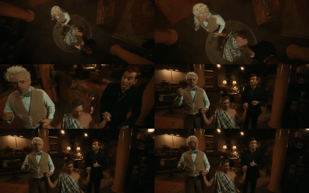
When they perform the Jim miracle together, they both slowly pull respectively from their “own” sides
#good omens#good omens 2#crowley#aziraphale#good omens spoilers#ineffable husbands#go2#someone’s definitely done this#just wanted visual representation#this really just makes more questions when it comes to the big miracle#does hell have dials?
6K notes
·
View notes
Text
Woodworms…
#just a silly thing I made for fun…#unless someone wants to fund me dropping out of uni and making a Merthur visual novel#/dating sim#but I do now have a BUNCH of Arthur sprites sitting around for now reason so :(#making a visual novel/dating sim has always been a dream of mine bro#I got carried away making these lol#anyways enjoy#my art#bbc merlin#merlin#arthur pendragon#merlin emrys#Merthur
3K notes
·
View notes