#it inspired me to paint my own mini series of the characters as artworks or photos they remind me of!!
Text


Mirrored reflections pt. 1
Haruka Hashida, Blue Period // Photography by Cho Gi-Seok
#I love how so many scenes or chapter illustrations are reworkings of iconic artworks in the blue period manga#it inspired me to paint my own mini series of the characters as artworks or photos they remind me of!!#I actually painted this about 6 months ago :S#blue period#haruka hashida#blue period hashida#hashida#tsubasa yamaguchi#painting#illustration#art
135 notes
·
View notes
Text
Hey there!
I’m Blitz, I’m a 28 year old transmasc (xe/xem/xyrs, he/him/his or she/her) artist from Australia & Aotearoa NewZealand.
I’m 2 years into my Bachelors of Screen Arts where I plan to major in game dev & animation. My other qualification is a level 4 certificate in Digital Media & design.
I have a strong love for stylized cartoons, animation & games with science fiction, fantasy & horror themes. I also love animals & nature, looking after the environment & thinking about how to contribute to the communities I’m part of. I’ve drawn for as long as I can remember as a way to express myself & feel strongly that the creative industries is where I belong.
I aspire to be a concept artist or artistic director, character designer, 3D artist & animator with a focus on video games in particular. My main inspirations are artists & designers like Jhonen Vazquez, Charles Zimbillas, Nicholas Kole & John Romero, as well as theirs & other people’s works; Invader Zim, Crash Bandicoot, Spyro the Dragon, Fallout, The Elder Scrolls & Doom. These various sources have helped inform me of where my creative passion lies & what kind of stories I would like to create or contribute to.
My personal mission is to use my creative insight along with my own personal experiences to create media that touches on the unique & diverse stories of marginalised communities, particularly that of Queer & trans communities.
On this blog you will find my artwork consisting of art I’ve made for others, original works & fan art of series I enjoy. Lots of Furries, Crash Bandicoot & other nerdy stuff in a range of mediums from traditional drawings using paper & alcohol markers, to digital art, to 3D models & even painted Dungeons and Dragons mini figurines.
This page is intended to be safe for most audiences over 13 years, however my work may get into some sensitive subjects. There may be some violence, references to drug use & alcohol, swearing & themes surrounding mental health & social issues. These will be appropriately tagged but discretion is advised.
I will also be writing image descriptions for those who are visually impaired or rely on screen readers.
2 notes
·
View notes
Text
Marriage and Failure
Y/N Feels their marriage slipping away, and her insecurity increasing
Word Count: 3.4k+
It’s almost entirely angst

Marriage is a term that seems to have an entirely subjective meaning. To some, marriage is a way of solidifying an ever growing union of love between two individuals; some view marriage as an opportunity for celebration and gloating to all those around them. Marriage can be a complicated series of political relationships or shareholding trades.
But to Harry and Y/n, marriage was sneaking away from press releases early to watch a lowly rated 2000’s movie and consume cheap thin crust pizza while laughing under the sheets of a crumb stained mattress. Marriage was gifting each other stuffed animals in the shapes of their favorite 90’s cartoon characters spontaneously.
Marriage was Y/n and Harry standing at their own wedding during the time of their slow dance, both enamored by nothing but each other's presence. Marriage was Harry leaning over during Y/n’s sister’s drunken toast and whispering “I’d rather be watching Legally Blonde with you right about now” before softly kissing her forehead, muttering a low “Love you, pet”.
And for a while, that’s what marriage was.
Sometimes, Y/n would be slicing fruit to blend in her afternoon smoothie, and she’d notice a new set of paints Harry had purchased for her on the way back from his studio session. And despite the fact that Y/n had told him multiple times that she had more than enough art supplies from his constant gifts, he’d always buy her more, as if it were a way of encouraging her talents. Y/n constantly painted then, selling her work filled with the uplifting inspirations of her relationship to numerous buyers. Her art room always seems to be in use, and finished paintings hung up on the walls waiting to be preserved and framed before being displayed in the city’s finest museums.
And when her wrists ached from constantly holding easels and brushes, and her neck ached from angling her head down when painting her artwork, Harry would be ready in bed to rub the knots out of her loving body. He would adorn her neck with kisses, press him thumbs into her wrist, and melt into her. They each held pieces of each other wherever they went.
“Inseparable” was the word Mitch used to describe them whenever he witnessed Harry asking Y/n about her art everytime she got a moment alone at her art display. He was like a giddy lovesick teenager, waiting profusely for the onlooker Y/n was speaking with to end the conversation so he could speak to her again.
Whenever Harry would wrap his arms around Y/n’s waist from behind, she would memorize the way his fingers slid across her skin, the warmth and delicacy of his soft fingertips. The way that her head fit perfectly beneath his chin as if they were built for eachother.
Harry noticed things, too.
Like how Y/n would hold onto his ring and pinky fingers because her hands were far too small for Harry’s long slender fingers. How - after a while of lying with each other, y/n’s breaths would sync up with his own instinctively.
He noticed the way her thumbs would rub small circles onto his skin when she held him, and when they were apart for more than a mere few hours he swore he could feel the light ghosting of her fingertips rubbing circles on his chest every second he missed her.
-
-
It was September when Harry left for his fourth world tour. The leaves were mostly green, and still very much stuck to the branches of the aging trees, but a few yellow leaves occasionally scattered the lush green rows on Y/n’s walk to the art gallery.
Harry had assured her that he would call her when he landed. The first leg of his tour was in Europe, so the time difference was a mere 6 hours from their home in New York City.
Y/n had always seen older married couples talking about how their spark had eventually faded, or complaining about how their love was merely a shadow of what it once was. But she had yet to feel that with Harry in their first year of marriage. She still felt her mind focused on the happiness of hearing from him later on, her heart thumping just a bit faster at the thought of speaking to him again.
As far as Y/n was concerned, they were still the same love blinded millennials they had been at the start of their relationship prior to marriage, and they both loved every second of it.
The flight tracking app Y/n had installed that morning stated that Harry’s flight had landed 4 hours ago, but taking into consideration the customs process, the drive to the hotel, and the check-in, Y/n chose to ignore the miniscule voice inside of her head telling her to worry.
So she spends the rest of the day being inspired at her favorite art gallery, trying to ignore the small itch in her mind telling her to call her husband and see what he’s doing. She grabs an overpriced but tiny chocolate croissant from a local bakery run by an old woman in downtown New York, and walks back to her and Harry’s shared apartment.
When she gets to their penthouse, Y/n strips herself of her sweater and her leggings before jumping into her shower. She turns her shower playlist on, only to realize that almost all of the songs are her husbands, the man she’s striving not to miss dearly as her heart feels heavier when she hears his voice in song instead of in person.
She finally finds a slower song she sings along to while shampooing her hair, when a soft ding from her phone temporarily interrupts her music. Y/n immediately stops her lathering and washes the bubbles off of her fingers (while admiring her wedding band just a little bit in the process). She reaches for her phone with slightly damp fingers and a hopeful heart, but is almost immediately disappointed when she reads the text message before her.
“Hey pet. Just landed. Tired, i’ll talk to you tomorrow. Love you, xx”
She’s well aware of the fact that his flight landed hours ago, but decides not to read into it too much. She comes up with the excuse that he probably sent it when he first landed, but it didn’t go through until now. But she can’t help but feel like she shouldn’t need to convince herself of anything.
-
-
The next day, Harry calls Y/n early in the morning. As she washes her face right after waking up on her side of the bed, she hears her phone ringing and immediately runs towards it.
“Hey, Pet” She hears a quiet voice from the other end of the line. Harry seems as if he’s whispering more than speaking into the phone, which makes Y/n giggle a bit before replying.
“Hey, love” She addresses him before adding on, “Why are we whispering?”. Harry lets out an audible chuckle before the line goes silent for a few moments.
“...Harry?” Y/n eventually asks into the line again, awaiting a response to her originally rhetorical question. Her interest has now been sparked, and she wonders what the reason is behind his quiet tone.
“Oh, yeah. It’s just, Mitch fell asleep in my room and ‘m trying my best not to wake him.” He quietly replies. Y/n nods in understanding although he can’t see her and tries to think up something to say next.
“How’s Italy?” Y/n asks. It seems like a basic question but it’s the best she can think up having just awoken from sleep.
“Amazing. Would love it a lot more if you were here with me though, you’d love the colors here, darling.”
Y/n’s face breaks out into a grin and she can tell he’s smiling on the other side of the phone as well. Y/n slips on her furry sandals to keep her feet warm as she ventures downstairs, her phone pressed firmly to her cheek as she replies, “Well I might take you up on that offer sometime.”
her moment of happiness is short lived, however, because as soon as Harry is with her, he’s gone. She doesn’t hear a response from the other side of the line, but rather fragments of a conversation between Harry and someone else. She’s pondering as to whether or not Harry heard her response when he mutters a normal toned, “Sorry, love. I have to go. I’ll call you back tomorrow. I miss yeh.”
This is all he states before the line goes quiet. She mutters back a small “I love you”, as if he’s still somehow on the other side of the line.
-
-
Harry doesn’t call her back the next day. In fact, he doesn’t even make an effort to text her.
She checks social media to see photos of him walking around Milan on his cell phone, and she can’t help but wonder what exactly he’s so immersed in doing that takes up all of his time, not even sparing 5 minutes out of his day that he could use to speak with her.
It’s after this that she slowly descends into madness.
On the second day of not speaking to him, she plays mini games on her phone until the battery runs dry. She figures it’s what’s best for her productivity. Waiting for a text message from her husband wasn’t going to do her career any good. She figure she’ll add to, or maybe even finish some art pieces, and then she’ll get back to her device.
She ends up turning it on, only to be met with no text messages or calls from the man she’s hopelessly in love with.
Within the next few days Y/n excuses his quietness, she ignores his absence, and she comes up with viable excuses as to why he’s acting the way that he is. She figures that he’s “Just in soundcheck” or “Taking pictures with his fans” or “Having fun exploring the city”. But she can’t help but think back on his last two tours, when they were dating but he would manage to call her for hours a day.
When a week passes, y/n decides to call him for herself. Her call doesn’t go to voicemail, but stops ringing after two rings. After she calls him again, the call ends before it even begins. She knows he’s rejecting her calls purposely, but she doesn’t address the issue and focus on her own problems instead. The stress placed upon her relationship was affecting her artwork, she hadn’t finished or started any pieces since Harry had gone.
Feeling a new fit of anger towards her husband for the first time since her marriage she trudges upstairs to her art room and grab red paints - lots of them.
She never expected for their marriage to turn out this way.
After 2 weeks of sudden lost contact from her husband, y/n blames herself. She wonders if she’s being too clingy and dependent on Harry, and she blames herself for him no longer speaking with her. She thinks of all the possible reasons he has to ignore her.
Europe has a lot of fashion savvy places, did he see the models there and realize i’m not enough?
Maybe I was too overbearing.
Did I bore him?
And then she sees the pictures.
His hand seems to engulf almost all of her thin waist. He smiles, a deep dimpled, love stricken, smile at her as he walks her out of the doors of a restaurant in Milan. Her nose curves perfectly where hers bumps, her legs smooth out into perfect porcelain skin where hers toughen at her knees. Her clothes seem too loose on her clothes all of a sudden, her face a bit too bare for his liking.
Y/n looks into the mirror and all that she can see is the woman who her own husband abandoned. And instead of blaming him, as she most definitely should, she blames the stretch marks forming light tiger stripes on her thighs. She blames the mess of paint and uneven fingernails across her hands from her artistry. Blames the vulgarity of her words and the elegance she lacks as opposed to the woman he now seems to make time for.
“There was no need for publicity. He’s married. He did it for himself.” She thinks.
Y/n breaks a bit that night. And since he’s a part of her, she wonder if he can feel her breaking from across the world.
Y/n still denies what she sees. She chooses to push away the narrative that she married a man who dared to be unfaithful to her.
-
-
Harry flies in during a one week gap between two tour dates in Europe.
He feels guilt enveloping him the second his feet hit the driveway in front of his home.
He cheated on her.
The pictures were leaked to the media weeks after the event occured. They had met, as friends. But after a while of taking too many drinks, the drinks drove him to make irrational decisions.
Harry thinks he should’ve noticed when he held her that night. Thinks he should’ve noticed that her nimble fingers were curled greedily around his arms, squeezing them instead of delicately rubbing circles into his soft torso.
Should’ve noticed how her breathing was too uneven and rapid to sync up to his. How her fingers were too pampered, to the point where his eyes welled up in tears when her acrylic nails dug their way into his spine.
He opens the front door with his luggage still in his car. He assumes she won’t want him to stay in their home, and decides to keep it in the car instead of taking it in just to bring it back out.
The door creaks open, and instead of being greeted by the smell of freshly baked cookies or vanilla perfume, he’s met with the lingering scent of expensive perfume. He hears footsteps thud from upstairs and braces himself for the inevitable result of her leaving him. He can���t even forgive himself for what he did, why would she ever?
But he’s shocked when Y/n eagerly hops down the stairs, running up to him to engulf him in a hug.
And even though Harry knows he’s infinitely selfish for ignoring her, and even more selfish for ignoring her as if she means nothing to him, he holds her small frame for as long as he can. He inhales the horrible scent of women’s perfume, but withstands it if it means he can be with her.
Y/n wonders if he hugs her tightly because she reminds him of the girl he was with. She wonders if she can make him stay as long as she continues to at as she does.
Did you ever love me?
She wonders if he was disgusted by her short stature. Wonders if he’d rather her do something like modelling where her hands aren’t calloused and she wears trendy clothing instead of old clothes she can spare to get splattered with paint.
“I missed you.” He mutters in surprise. She smiles up at him, pretending that they’re alright for now. She fiddles with her fingers, her newly done false nails being a nuisance in everything she does.
“Have you lose weight, love?” Harry asks, observing the way her hip bones nearly pop out through the thick fabric of her leggings. Instead of frowning at his apparent concern, she smiles and nods shyly at him.
“Yeah. Started going to the gym last week. Where are your bags?” She asks, before he has the option to shift the subject back onto her sudden weight loss. He mumbles “in the car” quietly, and Y/n kisses his cheek before telling him to go ahead and take a shower while she throws his clothes in the wash.
Harry jogs upstairs to the bathroom in their shared bedroom, before realizing that their bathroom is out of shampoo. He quickly walks to the small storage closet on the other side of the hallway and grabs another bottle. But on the way back to his bedroom he stops in his tracks when he sees the door to Y/n’s art room closed.
Y/n had generally always kept the room open, only closing it when they had guests over or went away on vacation. She had mentioned how leaving the door opened “Sparked an encouraging mindset” for her to pursue her art. Finding the sudden change strange, he twists the knob to the room before opening it.
The frames she uses to place her completed works in have gathered dust in the same corner they were in before Harry left. Her artwork scatters, hung up in different pins, but all incomplete.
Harry is so immersed in the similar color patterns of her recent works that he doesn’t notice her walk up the stairs and she surprisingly appears behind him.
“You don’t paint anymore.” He simply states. She remains quiet.
“Why?” He asks as he turns his head to look at her. She stares at a sketch in the corner of her art room, a redepiction of their wedding photo done by her. In the picture, she stares in awe as Harry grabs her hands, stained with different shades of blue from her oil pastels, and admires the wedding band on her finger.
She looks down at her plastic fingernails. The ones she wasted money on so that she could be just a little bit more desirable, so that she could keep her husband from leaving her again, and she feels ashamed. She’s overwhelmed with so many emotions that she can’t help but let out a loud sob as she collapses onto her knees and shoves her face into her clean hands.
“Hey, hey, hey. What’s wrong, pet?” Harry asks, stroking his fingers through her slightly tangly hair.
“Gee Harry, what could possibly be wrong?” She replies, all of a sudden feeling a surge of rage hit her. “For starters, we haven’t talked in weeks.”
Her head is in inner turmoil as she weighs her options. She fears that if she allows herself to be angry at him, he may find comfort in someone else again. She’s torn between wanting him, and knowing that having him could potentially destroy her just as badly.
“We” She removes a hair that’s stuck to her tear stricken face, “We shouldn’t have gotten married.” She cries, sitting down properly and pulling her knees into her chest as he kneels in front of her.
“W-What do you mean?” He asks.
“We shouldn’t have agreed to make a commitment for the rest of our lives when you couldn’t even commit for a year, Harry” She shakes her head.
He doesn’t cry, and although from the outside he may look less broken than her, guilt and panic and inner turmoil eats at him from the inside out.
“I love you.” He grabs her left hand, kissing the weirdly soft skin where her ring finger meets her wedding ring.
“Stop avoiding the problem Harry!” She snatches her hand from his grasp, her sharp nails probably scratching his hands in the process.
“You’re driving me insane. Absolutely insane! You told me that dating models was just a facade placed on you by the media, you told me you loved me, and then you replaced me with her the second I wasn’t there.”
He gulps as she yells at him, knowing of the dangerous places the argument could lead.
“I tried to-” She coughs from her own tears, “I tried to change for you, Harry. I bought this stupid fucking perfume, and I did my nails like she did, and I went to the gym and I fixed myself because I thought this was my fault.” Y/n looks down at her hands, feeling how different they were from before the tour started, when she was content with Harry.
Harry stares at her intently, his eyes finally welling up in tears. He wonders if he should hold her, or get on his knees and beg for her forgiveness. He’s never been more heartbroken in his life than he is in this moment, he thinks.
Of all of the different things marriage could possibly mean, they never thought theirs would be the one that meant failure.
#imagine#harry styles#harry styles imagine#harry styles fic#harry styles fanfic#harry styles fan fic#harry styles fanfiction#harry styles oneshot#harry styles one shot#harry styles blurb#harry styles angst#harry styles fluff#fluff#angst#fanfic#fanfiction#blurb#oneshot#one shot#1d#one direction#one direction imagine#one direction fanfiction#one direction angst#one direction blurb
2K notes
·
View notes
Text
Meet The Artists – Sarah McMenemy

London based Illustrator Sarah McMenemy has been with The Artworks for over 30 years! Joining the agency as one of our first ‘Startworks’ artists during her time at Brighton School of Art, Sarah is best known for her delicate use of ink and collage.
Sarah’s favourite project since joining The Artworks has been the series of mural illustration’s she created for Shadwell underground Station in London. Working with Transport for London, Sarah created a series of gorgeous Illustrations that reflect the surrounding area and explore the rich history of Shadwell.
We had a chance to chat to Sarah and find out more about her life as an artist…
Where do you live? Where is your studio located?
I’ve always lived in London, and the architecture, the colours, the people and visual stimulation of the city has had a strong influence on my work. As a teenager I used to draw the beautiful Georgian terraced houses of Hampstead and Highgate on commission. I am often asked to create images of the city, some of my favourite and most successful projects have been based here. I have a broad client base from the London Underground network to City law firms, and Publishers and have depicted many London pubs, restaurants and city institutions. This type of work has lead to a wide travel portfolio and I enjoy capturing the atmosphere of different destinations worldwide.
My studio is in the mean streets of De Beauvoir Town in Hackney. I work in a Victorian artisan studio. There are eight of us including architects, graphic designers and illustrators. Plus, a rather chunky studio cat.
Can you describe your creative process?
I’ve got a thing about paper – its physicality, the sometimes-unpredictable way paint behaves on it. I like creating abstract, graphic elements and rich textures through collage, paint and ink; combining fine line details with loose brush strokes and abstract shapes. The enjoyment of the physical process of making images is central to my work. It has an intrinsic optimistic and uplifting character giving it wide appeal across many areas of the industry.
What does a typical working day look like?
I usually go for a walk or a run before I get in to the studio, and I like to make sure everyone knows about it before getting on with my jobs. At lunchtime we sit down together to eat our overpriced but convenient sandwiches from the local deli.
I work through to the end of the day, sometimes into the evening if the deadline is tight. If I’m on my own, I may play some dance music. Come to think of it I may do that even when I’m not on my own. If there is a music god I think his name is probably Nile Rogers.
Do you listen to music or the radio whilst you work? If so, what’s on your playlist?
I like it when it rains as it makes a loud noise on the roof and I feel like we’re camping in a tent (aka UK camping). We generally listen to NTS, the local Dalston radio station. I also like 6Music, a bit of Radio 4, and sometimes Pop-master – yes, Radio 2.
How long have you been with the Artworks for? What drew you to Artworks?
I have been with the artworks since before I left college, only a few years ago now. Ok 33 years. I started in their Startworks group when they visited Brighton School of Art to give a talk, and we met when they looked around our studio in the lunch break. Actually, I missed their talk as I was shopping at Miss Selfridge but it doesn’t seem to have harmed my career much.
What books or programmes did you love as a child? Have they influenced your work in any way?
Books were a big influence on me as a child and there is certainly a flavour of them that comes through in my work now. Edward Ardizzone’s illustrations for Stig of the Dump and Jean and Gareth Adamson’s Topsy and Tim, Richard Scarry, Beatrix Potter, Shirley Hughes and Miroslav Sasek are a few that come to mind.
Loved all the Oliver Postgate children’s programmes Bagpuss, The Clangers, and Noggin the Nog. Mr Benn was endlessly fascinating. Trumpton, Camberwick Green and, of course, The Magic Roundabout.
If you weren’t an artist, what would you be instead?
If I wasn’t an illustrator I would be a Club DJ playing exclusively Funk and Disco.
What was the most important lesson your learned at Art School, if you went!
Art school taught me to interpret a brief in a way that I can enjoy and therefore do my best work. And that the fine art students are top of the pecking order, in their eyes (love them really)!
What inspires you the most to create?
I find inspiration in the big skies of the Norfolk coast, the gently rolling hills of Hertfordshire, as well as noticing beautiful colour and shape combinations in everyday life. The energy of cities, particularly Paris, New York, Tokyo, Venice, London. And of course a bit of studio cake helps.
Name three artists that you admire
I can’t name three. Here are eight. Some favourite artists are John Piper, Raoul Dufy, Abram Games, David Gentleman, Toulouse L’Autrec, Humphrey Ocean, Saul Steinberg, Saul Bass.
What kind of commissions do you enjoy the most?
I really enjoy collaborating with clients and other creative professionals. I enjoy seeing my work at large scale in public places. Writing and illustrating a variety of children’s and adult’s books. It is exciting to have my work animated. I also like working in branding, visualising architecture and interiors, book covers and editorial. I enjoy the thrill of working live, at conferences or events. Short deadlines, long deadlines, they’re all good.
What would your dream commission be?
Dream Commission would be a set of stamps depicting beautiful skies around the or the grand international hotels like Claridges, The Savoy, The Ritz.
Do you have any pets? If so, what and what are they called?
We have a studio cat who walks along the roof light above our desks. It’s always nice to hear the soft thud of his paws on the polycarbonate. Purposeful, like he knows where he’s going, but sometimes he just stops and has an altercation with another cat, or soaks up some sunlight.
What 5 things could you not live without?
I cannot live without houmous, my mini, trees, tea and 6music.
What is your very favourite meal?
Fish Pie and peas.
What do you like to do in your spare time?
Singing in a choir, dancing, walking, running, exhibitions.
What is your current dream travel destination?
Quite fancy Barbados at the moment, but Copenhagen, Seville and Northumberland are on my list.


See more of Sarah’s work here.
1 note
·
View note
Photo
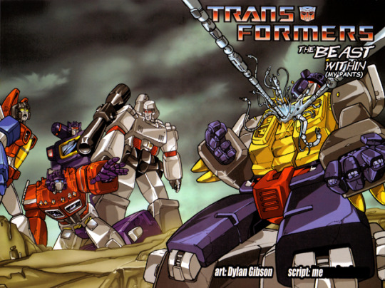
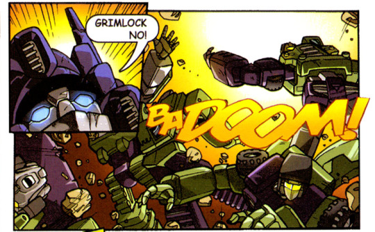
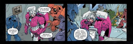
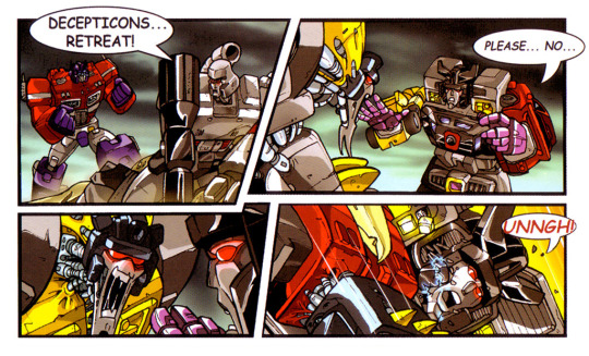
I rewrote the most infamous Transformers comic of all time.

I wanna give fair warning here. See, when I started working on this comic, I wasn’t really expecting it to turn out quite as dark as it did, and I suspect neither are you. After all, this is The Beast Within, right? The story where Grimlock goes crazy and talks in Comic Sans? How bad can things get? It turns out that - with just a few decisions made in poor taste - the answer is “very”, to the point where I feel the need to stick some kinda content warning at the top of this post. Unfortunately, I also feel like I’ve got a responsibility to the story, and there’s no way for me to do so without ruining it, so this is the best you’re gonna get.
This isn’t the first time I’ve made a comic like this. All the way back in 2016, I made “its christmas... so what??”, a kinda-bad re-lettering of a four-page ‘80s Marvel comic called “The Night the Transformers Saved Christmas”. I wasn’t too happy with the result, so half a year later I tried again - producing “PASS”, a re-lettered version of an obscure six-page UK-exclusive Marvel comic originally titled “Peace”.
“The Beast Within (My Pants)” is quite a different, uh, beast.
Each of the three comics I’ve produced was intended to be the last of its kind - standalone, yet fitting into the same overarching continuity. You can read any one of them alone, or you can read all of them in the order I made them. They’re individually available as albums on Imgur at the following links:
“its christmas... so what??”
“PASS”
“The Beast Within (My Pants)”
Alternatively, you can download the whole set as .cbz files - renamed .zip archives of images which you can open with a standard comic book reader.
It’s not too late to turn back.
Still with me? All caught up? Good. You’re probably wondering what the hell I was thinking...

I. I Have Summoned You Here For A Reason
Our story begins all the way back in 2004. The UK company Metrodome, looking to spice up their DVD box-set releases of the original ‘80s The Transformers cartoon, hired some local talent in the form of Mr. Jamieson (owner of a then-notable fansite) to write up some bonus features. They also commissioned him to write a mini-comic to be packed in with the set - with art by Mr. Gibson, a self-proclaimed fan since childhood with seemingly no other ties to the franchise.
The comic wound up being published in two parts (the second being subtitled “Consequences”) across the “Season 2 Part 2″ and “Seasons 3 and 4″ box sets. As a kid, I actually owned the latter of those box sets, and would watch it almost religiously - to what I can only assume must’ve been great annoyance from my poor parents - but I have no memory of it including a comic of any kind. Maybe it did, but it got separated at some point, and is lying around in some forgotten folder. A damn shame, that is. No, seriously.
I’m sure some record of the fan response at the time exists out there, in the doldrums of one of the many hard-to-search often-defunct forums which existed back then. I can’t really be bothered looking for it, sorry. You’ll have to content yourself with this TFWiki talk page for “The Beast Within” from mid-2007, which speaks of “Consequences” in hushed tones - as though it is a fabled artifact, prophesied to bring about Armageddon.
Another record - this one from 2009 - comes in the form of an eight-page TFW2005 thread ominously titled “Anyone afraid of the Dinobot combiner?” If you’re reading this commentary, you’re already strapped in for the long run; I recommend reading the thread in full. Well, okay, I don’t: it made me wince throughout, and I’ll be explaining the salient bits here, so there’s really no point subjecting yourself to it.
User “Razorrider”, after reading the TFWiki article on the Beast, opened the thread, noting “I don’t feel afraid of him myself.” The reactions soon started to pour in - some agreeing that the design was in fact “awesome”, others describing it as “hideous”.
Just going off my own personal opinion here, I think it’s fair to say that effectively nobody on the first page of the thread had any idea what they were talking about - and the pages that follow fared little better.
I think the main issue stemmed from the fact that a lot of those users didn’t think to explain the metrics by which they judged a “good” design (or, indeed, a “bad” story). When one person says “I think Optimus Prime has a good design”, they might just mean “I think he looks cool”, or they might mean “I think his proportions and colours give him a heroic stature which reflects his personality”. In that sense, a “good design” is one that communicates aspects of a character visually, even if it’s ugly. The Beast is hideous, yes, misshapen, yes, and it looks like the result of a teleportation accident, fine - but those are all intentional design decisions that perfectly reflect the nature of the character. In the foreword to the first part, Mr. Gibson notes the following (you’ll have to imagine that it’s written in Comic Sans for yourself):
Creating ‘The Beast’ was probably the most interesting aspect of the project. I wanted him to be a grotesque, twisted character that contained the design elements of the Dinobots he is created from.
People proclaim that the Beast “should never have existed” - a line from the comic’s narration, note - but somehow fail to realise that this is the comic’s own intent.
(Compare the Beast’s design to that posted by one user on the second page of the thread, which - minus an admittedly-inspired Triceratops-fist - just looks like an upscaled version of Grimlock.)
Okay, the alarm bells should be ringing in your head now. This is all starting to sound disturbingly like I’m some sort of The Beast Within apologist, isn’t it? How slippery is the slope that leads from “the Beast is a good design” to “The Beast Within is a good comic?” Have the hours spent poring over this thing in MS Paint turned my brain to mush, capable of only vague all-caps-Comic-Sans-penned ponderings?
...Well, yes, but- look, just stick with me!
The most accurate recurring statement in the thread - though perhaps not in the way it is intended - is that The Beast Within reads like a work of “fanfiction”. See, Transformers is a franchise with an ever-growing history, and many of those who work on it now have been lifelong fans themselves. This is true of many franchises which have stumbled into the new millennium, finding themselves seemingly unable to die. We live in an age of fanfiction - yet some fanfictions are fanfiction-ier than others.
When compared to the likes of Star Wars and Star Trek and Marvel’s comics, one sees a marked difference in Transformers. Throughout the ‘80s and ‘90s, every story Hasbro put out seemed to fit vaguely into a single guiding narrative - each distinct strand of their multimedia barrage falling into contradiction with one another, yet still seeking to adapt some underlying premise. The 2001 series Robots in Disguise - in the West at least - saw a complete departure from that narrative. The ramifications of that strange borderline-afterthought cartoon cannot be understated, yet in retrospect feel like they’ve been a part of the franchise for as long as anyone can remember.
Almost every year since, Hasbro has effectively wiped the slate clean. Each new series tries to be its own thing. Continuity between series - if it exists - is understated, ignored, or overwritten. To date, this is still something that confuses us geeks; so used are we to the mired pits that are the canons of Star Wars and its ilk. This can be frustrating - there are only so many times one can retread the same story - but so too has this rare cycle allowed authors to really explore the concepts and themes presented by the premise of “car robots” to a level of depth which I believe is simply unattainable in franchises which adhere stringently to a single narrative.
That’s the bright side.
In practise, many Transformers stories have become increasingly myopic - existing only in service of themselves, or (more often) in service of older (better?) stories. The single most influential of these stories is almost certainly 1986′s The Transformers: The Movie, and it’s that influence which is felt most strongly in The Beast Within.
Of the countless insights offered by Terry van Feleday - if you don’t know who that is, don’t worry, I’ll explain later - I find that this one rings most true:
When Optimus Prime du jour mouths off “One shall stand, one shall fall” for the twentieth time, there is simply no longer that understanding that he will not be the one who stands.
Where so many modern Transformers stories are misguided recreations of the animated movie, The Beast Within is a reaction to it. But we’ll get to that. First, let’s talk a little about the story’s artwork.
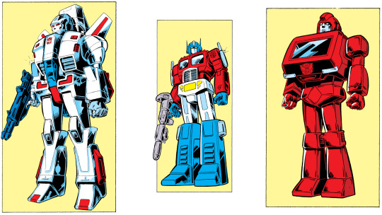
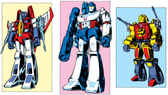
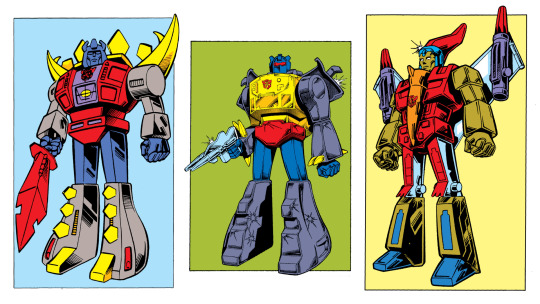
Mr. Gibson himself, I believe, deserves almost none of the criticism he’s received over the years for his work on this comic. Though his layouts are occasionally cluttered, and he does seem to have been trying a little too hard to emulate the style of Pat Lee (the man behind Dreamwave Productions; license holder for Transformers comics at the time) in the first part, his panels have a strong sense of energy and tone.
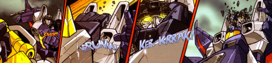
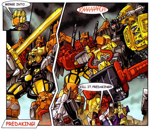
Though he didn’t exactly get to explore a broad range of emotions over the course of the comic, he managed to keep the characters expressive - always a challenge, when dealing with visors and mouthplates - and, crucially for a cast of this size, on-model. Look at the fury on Razorclaw’s face! The way Prime’s fist flies out of the panel! Menasor, torn in two! Predaking’s sundered legs! The mishmash of heads inside the Beast! The sickly colours of the second half! While it lacks the practised ease seen from some fans-turned-creators on more recent books, it’s still impressive work.
Regardless, Mr. Gibson’s first outing with Transformers proved to be his last. He didn’t end up getting paid work from Dreamwave Productions as he’d perhaps hoped (though in retrospect, neither did most of the people who illustrated for that company, so that was probably for the best). There’s no mention of The Beast Within on his personal website, which bills him as a “children’s picture book illustrator”, amongst other things. To put it simply, the guy’s always been a talented illustrator, and his style’s come a long way since this comic - the portfolio work on his website is very impressive.
(On a whim, I went back to late 2004 on the internet archive, and did in fact find the comic’s first spread buried at the back end of his portfolio. The entire website is a product of the early-2000s - there’s a link labelled “Go to Flash site” in the sidebar, though the page it takes you to sadly seems to have been lost to time. It all seems like it was borne of another age entirely.)

Anyway, let’s get back to that TFW2005 thread. The thing that makes it particularly notable is that, on the fourth page, Mr. Jamieson himself wades in to try and set the record straight. It goes about as well as you’d expect.
For a lot of people, I think, the idea of interacting with an author might seem strange. They’re aware of J.K. Rowling’s online antics, and are becoming increasingly comfortable with celebrity interactions on Twitter, sure. But there’s a difference between those kinds of interactions and the kind that take place on forums or in chatrooms - places where everyone’s on a level playing field. I come from those corners of the internet, and am lucky enough to have had conversations with lots of people who’ve made things I like, and have seen almost the full range of approaches those people take when dealing with their audiences. It’s safe to say that Mr. Jamieson’s approach in that decade-old thread is just about the worse one there is: over the course of just five posts, he smugly lashed out at the people in the thread, whipping them into a fervour that lasted for three more pages after his departure.
Regardless of whether or not Mr. Jamieson was correct - in the attacks he levelled at the other users, in the defence he offered for his work - there can be no question that this kind of behaviour is grossly inappropriate.
(Whether it is more or less appropriate than digging up old threads and archived web pages in an attempt to justify a bastardisation of a much-maligned comic book remains to be seen, I suppose.)
The key point that Mr. Jamieson kept returning to is that he sought to avoid the dreaded “info dump” (a hallmark of early Transformers stories), and didn’t want his readers to be “spoon fed”. A recurring criticism of the story is that it seems to begin halfway through, with little explanation for what’s going on - but I, like Mr. Jamieson, don’t think that complaint holds water. The Beast Within begins “in medias res” because we already have the context: eighty issues of a comic, ninety-eight episodes of a cartoon, and - crucially - a movie. Everyone knows the story of the Transformers, because the story of the Transformers - ironically enough - never really changes. “Is it ever really over, Jetfire?”
(That’s the last line of the original version of The Beast Within, by the way. I had to add the comma in myself.)
Like the impact of Robots in Disguise, the impact of The Transformers: The Movie is kinda hard to see unless you were there at the time - and I wasn’t - but in 1986, it did something which was profoundly shocking to thousands of children: it introduced them to death.
That’s about all I’m going to say about the movie itself, because much more experienced critics than me have already mined it for every ounce of subtext. I’ve already quoted the work of Terry van Feleday, who did some excellent scene-by-scene analysis of the film in a thread all the way back in 2010 - and I’ll come back to her writings a few times in this post. This very year, sorta-famous YouTuber hbomberguy released his own long-form take on the movie - what I find interesting when comparing the two interpretations is that van Feleday struggles to find much merit in the movie outside of its opening, while hbomberguy employs a reading that allows him to be much more optimistic and charitable even towards the end of the movie.
In a way, I think Mr. Jamieson had an intuitive subconscious understanding of the subtext which both of those critics later brought to light, an understanding which directly informed the premise of The Beast Within. In the same way one can read the monster planet Unicron as a physical manifestation of death, so too can one view the Beast - and Mr. Jamieson (almost certainly unconsciously) posits that, although death does not belong in a children’s cartoon, it is an inevitability that all children must eventually face. It is the dark spectre that lurks beneath the surface of every childish thing made by an adult.
An author places some of themselves in a book - but the reader withdraws something of their own perception as well. I wondered what I might see in the book: a child believes a lie because they know no better; a grown adult sees the lie because it fails to line up with experience. In this way, a child’s story could be so many different experiences. With enough subtext, a thing made for a child becomes an entirely different world to an adult. [...] There’s no telling when subtext will defeat the facade of a thing.
(I’ll tell you what that quote’s from later.)
I wonder, perhaps, if the endless swathes of edgy reimaginings of children’s stories are something of a mass outcry from those who grew up being told - every Saturday morning - that when people got blown apart, they’d be put back together by the next week’s end. What was it like for those children, in December of ‘86, to learn that some people could never be rebuilt?

II. It Pleases Me To Be The First
It occurs to me that I never did really do a commentary on “its christmas... so what??”, although I did talk about it a little in the commentary for “PASS”. Its title is a reference to the famous (well, you know what I mean) cover of “Stargazing” (issue #145 of the original UK run), which featured a banner reading “IT’S CHRISTMAS!” over an image of Starscream, arms out, yelling “SO WHAT?”
(Side note: at first I thought that I hadn’t read that particular story, but it occurs to me that as a kid I used to borrow a lot of Titan Books’ reprints from my local library - and I do in fact have distinct memories of reading Transformers: Second Generation, which did collect “Stargazing” amongst other Christmas stories - so I guess I probably did read it, even if I don’t remember doing so.)
The Women’s Day comic is something of a curio, as explained in this excellent article (which reprints the comic - with its original text - in full). It’s basically the only US strip which was published outside of the eighty issues of the run proper. This rare, standalone nature is something I have sought across every re-lettering I’ve done - from the UK annual-exclusive not-by-the-usual-author set-in-the-future “Peace” to the UK DVD-box-set-exclusive set-in-an-ambiguous-cartoon-inspired-continuity The Beast Within. These works feel like they’ve been lost to time - and corrupting them feels like unearthing buried treasure (and smearing it in turds). But I’ll get to that.
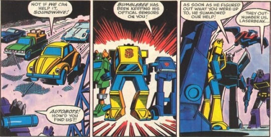
Back to “its christmas”. As I explained last time, I just went through the comic panel-by-panel and changed stuff to whatever I thought would be funny. I didn’t edit the two-line introductory blurb (which ended up informing the backstory detailed in the new set of AtoZ profiles). I barely paid attention to established portrayals of the characters beyond Soundwave’s association with music. I had no large-scale plans.
There’s a lazy (and poorly-conceived) gag where the little girl calls Bumblebee “gay” (also note that at the time, I misinterpreted the art in the third panel of the third page - I thought it was the girl speaking, when in fact it was her mother - leading to some erroneous dialogue), which in retrospect feels like a less-drawn-out version of the excruciating opening scene from Freddery McMahon’s Combiner Wars abridged special. That spoof somehow manages to be less funny than its source material, and I sometimes think that the same holds for my own creations.
Still, that’s not to say that “its christmas” doesn’t do anything that I like. I’ll admit that lines like “lol without mustard christmas will be CANCEL suck it nerds”, “toot toot here come some flutes”, and “help me drag it to the hospital” still kinda make me laugh. I like the way Bumblebee drowns out the little girl’s insults by tooting loudly at her. The final panels - wherein the humans steal Bumblebee’s blood as the other Transformers watch impassively - have an offbeat intensity to them, and when it came to writing Bumblebee’s AtoZ profile it was those which I chose to call back to.
If I had to sum up “its christmas” in a single word, I’d pick “childish”. The jokes, the characters themselves, the entire concept behind the comic - all feel kinda immature, and that was kinda by design. Summer Meme Sundae was a terrible piece of work, but - if I had to ascribe a theme to it - that theme would be growing up; realising that you’re running out of summer holidays. “PASS” and “The Beast Within (My Pants)” kept that atmosphere, but became increasingly cynical and obscene. That was just the natural direction they had to go in.

III. Every Place Reminds You Of Some Place Else
I’ve long had an idle fascination with abridged series, and have toyed with the thought of making an abridged series of my own. Most notably, I’ve long fancied the idea of abridging Machinima’s Prime Wars Trilogy of Transformers cartoons. Here’s an extract from a message I posted in Allspark Chat (the Discord server associated with the Allspark Forums):
I'd probably try and keep Megatron mostly the same as he is in the show as it is. Optimus'd be kinda murderous - you can tell he can't wait for Rodimus and the rest of the Council to kick the bucket so he can retake unilateral control over Cybertron. I'd maybe try to go for something of a more sympathetic Starscream - he wouldn't actually have any plan, he just has Cybertron's interests at heart and ends up trying to use the Enigma solely to rid the world of Megatron and Optimus forever. Windblade'd maybe be trying to force some hero's journey stuff - picking fights with progressively bigger opponents in a misguided attempt to prove her narrative worth
As pitches go, it’s not much. It doesn’t help that, as I previously mentioned, Freddery McMahon himself - pretty much the only name in Transformers abridging - has already tackled the series; his style of parody isn’t really to my taste, but his production value is fairly impressive and would largely overshadow any improvements I made on a script level. I feel like the Prime Wars Trilogy has potential, because it’s a fascinating piece of media, but I find myself unable to answer the question of how to parody something that already feels so much like self-parody. Sound familiar?
By the time the last entry in that series - Power of the Primes - was wrapping up, I'd been posting semi-frequently in the Allspark’s threads with a borderline-apologetic tone. Takes included:
The emptiness of Cybertron lends it a Beast Machines-esque tone
The Mistress of Flame’s death is cathartic
You can see right through the script
I want to get off Machinima’s wild ride
Wow, Windblade sure screams a lot, doesn’t she
The finale of Titans Return is good, actually
Hearing Megatron say “piss me off” is an unpleasant surprise
Hey, this soundtrack’s pretty good
Wait, no it’s not, but Galvatron’s implied reversion to Megatron is
Narrative emergence gives rise to Buddhist allegories in TFTM
Grimlock acts like his cartoon self - but only around friends
Okay, for realsies, the soundtrack’s good now
They’re right to kill Sludge; he’s the least toyetic Dinobot
I’d probably describe a lot of what I saw in the Prime Wars Trilogy as a kind of narrative pareidolia - only instead of seeing faces in inanimate objects, I was seeing value and meaning in an indefensible web series.
The problem with abridged series is that they require a ridiculous amount of effort. You need to be a good writer in the traditional sense, but you need to be able to work around the visual material available - you’re gonna have to edit everything yourself, you’re probably gonna need to do custom animation, and you’re certainly gonna need to wrangle a cast of voice actors. All of that for ten minutes of animation that’s probably gonna get taken off YouTube within ten minutes of upload. It’s just not feasible - and yet there’s part of me that loves the idea: commentary and content, all rolled into one.
To pretend that it was Combiner Wars that led me to create “The Beast Within (My Pants)” is a little misleading, however. The real answer - I’m sorry to say - has more to do with ponies.
See, every now and again I get very acute nostalgia for My Little Pony: Friendship Is Magic, which was perhaps my first brush with fandom - or at least, proper fandom. It’s heard to measure these things, y’know? Anyway, when that happens, I realise that I don’t really want to sit and watch a cartoon for little girls, so I usually just listen to some fan-made music or - as was the case last time - rewatch one of the abridged series based on the show. I use the word “series” here in plural because there were in fact two (well, two that matter): Friendship is Witchcraft and The Mentally Advanced Series. There’s long been quiet debate over which of the two is the (soundwave) superior series, and I’ve historically believed that they’re (buy some) apples and oranges. The latter is a more thoughtful parody of the source material, while the former is more polished and standalone.
However, after blitzing through Friendship is Witchcraft once more in its entirety over the course of a couple of days, something about it clicked for me - a bigger-picture thesis - and I realised that it had much more to say about its source material than I (or, well, most people) had given it credit for. It was at that moment that I felt the awful urge to create a My Little Pony fanwork of my own.
(The quote I used earlier, about subtext in children’s stories, was spoken by Princess Celestia in Rainbow Dash Presents: The Star in Yellow, a Mentally Advanced Series special inspired by a fanfiction which, fittingly enough, was written by Matt Marshall (AKA Blueshift/blue/Yartek/RockLordsRock), who was also the man behind the infamous “JaAm” relettering which effectively inspired all of these projects of mine. It’s like poetry.)

As we’ve already established, making a fancy-schmancy animation was out of the question - but a crudely-edited-in-MS-Paint comic was the next best thing, clearly. I started glancing through IDW Publishing’s official My Little Pony comics - having purchased a few in a Humble Bundle many years ago - but, aside from a couple of promising stories, quickly realised I didn’t have much hope. The comics are just, to put it frankly, not as good or as interesting as the show, and the fact that I’d need to adapt at least two issues at once (over forty pages) to tell any complete story made doing so an unappetising prospect. Furthermore, IDW’s comics are still very much in print, and (as the abridged series show) any such parody would stand on shaky legal ground.
Seeing as I wasn’t about to delve into the dark realm of prose any time soon, and the idea of messing with some other fan’s work rubbed me the wrong way, I decided to give up on my equine dreams and instead turned back to more familiar territory. I glanced over the list of old Transformers Marvel comics, but nothing like those I’d previously relettered stood out to me. I perused the short stories included in Dreamwave’s 20th Anniversary Transformers Summer Special. I even looked into some Fun Publications stuff. Nothing sparked my interest.
Perhaps my most promising lead was “An Arcee Sort of Day”, a vaguely-maligned (as in, “meh”) three-page standalone comic released mere months ago by IDW as part of an anthology - but the poor resolution of the available scan (the comic had been released in its entirety as part of the free preview for the anthology) meant that editing it would be a nightmare, and there was very little in the way of dialogue for me to mess with besides. More than that, the idea of directly mocking a comic from a compilation designed to showcase female creators (particularly one featuring Arcee, who’s been a controversial character in recent years) struck me as tasteless in the extreme. If only I had an easier target!
Oh wait, I did.
IV. Let The Slaughter Begin
If I actually ever read both parts of The Beast Within before starting work on this project, I don’t remember doing so. I do remember reading the Beast’s TFWiki page when I was much younger, and remember feeling like the wiki’s take on the concept seemed disproportionately harsh. To be honest, it was quite vindicating to read the source material and discover that I still agreed with my younger self’s assessment - the problems with the story are not on a conceptual level, but in the execution.
I barely gave myself time to digest the story before diving in and working out how exactly I could mess it up. I knew from my previous comics that the Autobots would all be unrepentant shitheads, so the natural choice was to portray the Decepticons as favourably as possible. Where the Autobots are callous, poorly-spoken, stupid, and divided, the Decepticons would be caring, articulate, intelligent, and united. In the story’s context, these traits would be weaknesses: remember, only the Beast has the killing instinct needed for decisive victory in this endless children’s story. I also knew that everybody in the story would hate Grimlock, and that - unlike with Roadbuster in “PASS” - they’d be right to do so.
That was pretty much the extent of my planning. I gathered up all the pages and started clearing out the text from the speech bubbles. Already, I had something of a problem: the use of the infamous Comic Sans MS font in the first part of The Beast Within was one of its most iconic features, and I wanted to retain that, but my own previous reletterings had canonically established Times New Roman as the “voice” of the Autobots. In fact, as far as those older comics were concerned, Times New Roman was the voice not just of the whole Cybertronian race, but also of the narrator.
The only lines which used a different font were those where I’d chosen to retain the comic’s original lettering, and with Roadbuster’s dialogue. It’s hard to articulate what exactly the joke with Roadbuster was - he seemed like the odd-one-out in the opening panels of the story, so I ran with that by having him be persistently ostracised by the other Autobots. The twist, as you find out when he finally speaks, is that he seems to be the only Autobot who’s unambiguously a good person; the rest bully him for effectively no reason.

In the commentary for “PASS” I released earlier this year, I explicitly ask:
If these are the Autobots… then what were the Decepticons like?
My own gut feeling was, I think, that they were people like Roadbuster - genuinely good individuals who never wanted a fight - and so for this comic I knew I had to give them Roadbuster’s Arial voice. I also knew that I’d have to keep the Autobots’ Times New Roman voice for the most part. The only question, then, was what to do about Grimlock, the combiners, Jetfire, and the narration.
(It’s worth noting that Soundwave and Triton were both Decepticons too, yet they both spoke in Times New Roman. The Doylist reason for this is simply that, at the time, I was happy to have everyone share a voice. In Triton’s case, the Watsonian reason is that he’s trying to mimic the Autobots’ “accent” to better fit in. If I had to make up a reason for Soundwave, I’d say that he’s only recently defected from the Autobots, as a reference to van Feleday’s insane Soundwave-as-an-ex-prisoner-of-war theory. Had Soundwave had a speaking role in the comic, I’m sure I would’ve explored that backstory in his AtoZ profile - but alas, it wasn’t to be.)
In fact, there was initially some ambiguity over who the comic’s narrator would be - if I used Times New Roman, would I have to keep the voice of the same narrator as in the previous two comics? In the end, I decided to draw from my source material: the on-panel narration would be Grimlock’s inner monologue, rendered in full Comic Sans glory, while the "Interlude” would employ a more omniscient third-person voice. That third-person voice is, I think, distinct from the narrator of the previous comics, and feels like a more solemn version of the narrator of the AtoZ profiles I released alongside the commentary for “PASS” (or, indeed, the latest batch included here). Remember, I wrote the first two comics years before all of this recent material. More on the text-only pages later.
When he speaks out loud, Grimlock uses the regular Times New Roman of the other Autobots. In fact, the only dialogue which uses Comic Sans is that of the Beast, which I view as the true externalisation of Grimlock’s feelings. You can also view it as the “real world” (as depicted in the text-only pages) leaking through into the comic’s reality, in much the same way that an aware-of-death adult perspective seeps through into a seemingly-innocent children’s cartoon. The other combiners simply use a slightly bigger font than the individual Decepticons. Oh, and all of the combiners use red text.
In the original toyline, Jetfire was something of an odd-one-out, as he was really a Macross “VF-1S Super Valkyrie” toy licensed by Hasbro from Bandai (who had in turn purchased the molds from the recently-bankrupted Takatoku toys). Both Whirl and Roadbuster have similar origins. I was under no obligation to do anything special with Jetfire’s dialogue, but because of the way he’s introduced in the comic - and as a nod to his shared real-world history with Roadbuster - it felt right to give him his own voice. Though he still uses Times New Roman, the font is scaled up and he speaks entirely in capital letters. His dialogue was a challenge to write, as most of his speech bubbles are very small, but I think this worked out in my favour: his speech often ended up butting up against the bubbles’ outlines, giving the impression that he’s always speaking just a little bit too loudly.
The lettering in the first part of the original comic - aside from being technically legible - is generally shoddy on every level. For emphasis, it alternately uses italics or inconsistent font size. Occasionally, the dialogue switches to lowercase, which kinda gives the impression that everyone’s been shouting the whole time. Most of the text is left-aligned. Some bits of text seem to have been squashed. Most of the narration boxes are parallelograms, but some are plain rectangles. Red hand-lettered text is mostly limited to the combiners’ speech, but also sees use a couple of times for Megatron and Optimus Prime. Some of the combiners’ speech just uses normal red Comic Sans MS text. Meanwhile, the second part switches entirely to black hand-lettered text - presumably from Mr. Gibson - which is a marked improvement in terms of tone and consistency, if a step down in legibility.
It’s interesting to me that, despite my version of the comic sharing the dearth of commas and full stops which plagues the original, it reads very differently. For all its stylisation, it’s my hope that each line I write for these comics comes across realistically - not in the sense that it’s something you’d hear someone say, but perhaps in the sense that it’s something you’d maybe read on the internet. More on that later - first, some miscellaneous notes on the comic’s text:
When I first wrote it, I used the style of self-censorship from “PASS” (and, by extension, the rest of Summer Meme Sundae) wherein the first letter of any curse is replaced by an asterisk. It was one of my prereaders, Tindalos, who noted that “the censoring kinda takes a bit from it”, and I decided that I agreed with him - it felt like I was holding back. You can decide for yourself; I’ve collected the pages with lines that were revised between drafts in an album.
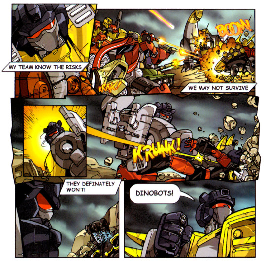
Through pure coincidence, it’s Springer (well, Bulkhead) who gets the first line of dialogue in the comic - just like in “PASS”. In case it’s not clear, the joke is that he thinks he’s safe on the floor and berates Jazz for not doing the same thing, seconds before getting stomped by Megatron. I think this sequence perfectly encapsulates a big part of what I wanted to show about the Autobots: they all criticise one another relentlessly, despite being deeply flawed themselves. It’s a dynamic that, to me at least, actually evokes that of the Autobots in Michael Bay’s movies.
The line “thats me grimlock in the corner losing my religion” is, of course, a reference to R.E.M.’s song “Losing My Religion”, which was itself included as part of writer James Roberts’ “soundtrack” for More Than Meets The Eye. Though he did not appear in the issue for which Roberts selected the song, Grimlock was a recurring character in that series. Hopefully my depiction of the character surpasses that one - though if you ask the people I usually talk to, I wouldn’t be setting the bar particularly high with that comparison.
Optimus uses the insult “grimdick” shortly after Grimlock’s narration provides the example “grimcock”. I intended this to show that, while the dynamic between the two’s been cemented for a good while, Grimlock is always a step behind and still can’t predict Prime’s actions.
Snarl’s line was originally “hey speak for yourself swoop me and grimlock are tight as *hit”, which expresses effectively the opposite sentiment to his final line. The idea that Snarl was okay with becoming part of the Beast was intended to add a bit of brevity to the sequence - but I decided it was better to keep as much emotional impact as possible in the moment.
A more minor change a couple of pages later is Grimlock’s line “how do they do it”, which replaced “love is stupid”. I wanted to expressly draw a parallel between the Beast’s combination and Predaking’s.
The line I’m happiest with is “eat shit megatron this is what you get for being such a fucking weapon”. One of my friends occasionally cracks out the word “weapon” to describe someone - and what better application for it is there than a guy who literally turns into a gun?
Megatron’s line about the “black hole” in Optimus Prime’s spark is a twist on Megatron’s own canonical link to a black hole - an aspect of his original bio which was revisited by Roberts.
I struggled to think of Menasor’s final words. The longer I stared at the panel where he gets torn in half - from which I’d already cleared the speech bubble - the more I was struck by the emptiness of the scene. If one considers Menasor to be a symbol for the Decepticons as a whole, then his silence in that panel is my way of showing that - from this point forth - the Decepticons no longer have a voice; the second part of the comic shows naught but their corpses. Death exists, and nothing is good any more.
None of the text on the final page of the first half remained unchanged between drafts. I wan’t happy with Optimus Prime’s original line at all, and the internal monologue “don’t you deserve happiness” felt a little too serious. The phrase “no u” is the archetypical low-effort comeback, and seemed like the perfect beat to end the first part with.
Prime’s line “gotta jettison some dead weight” is a nod to Astrotrain’s iconic line in The Transformers: The Movie: “Jettison some weight, or I’ll never make it to Cybertron.” I had to check for the exact quote just now and found “jettison transformers the movie” in my search history, so obviously I’d done the same when writing the panel. More than just being a trite reference, I was hoping to draw an obvious parallel and to contrast the unilateral decision Optimus Prime makes on the following page against the more shall-we-call-it-democratic process the Decepticons used in the movie.
I’m probably a little too proud of “big red irredeemable fucking monster of a robot semi fuck”, which is a line that could absolutely only exist in this travesty of a comic.
Jetfire’s use of the phrase “GOTTA BLAST” is a reference to a line spoken by the titular character of the early-2000s CGI cartoon Jimmy Neutron: Boy Genius, one which has turned into something of a meme. When I wrote the panel, I intended to imply that Jetfire was aiming to crash into the city - but I think it ended up doubling as foreshadowing for the fact that Jetfire flies his passengers into the sun. Additionally, the meme often sees use as innuendo, which shines through in the following panel: Jetfire expels propellant into the Beast’s face while Bumblebee remarks “gah okay i did not want to see that”. The less said about the sound effect “CHOOOM!”, the better.
Remember how all the text in the first part of the original comic was left-aligned? So’s the text in my version! MS Paint simply doesn’t have the option to change the alignment of your text - I actually had to throw in extra spaces at the start of each new line, eyeballing things until I had an approximation of centre alignment. This is something I never did with “PASS”, and I found that doing so gave me more freedom to squeeze more stuff into the speech bubbles.
As immortalised by countless memes, you can’t rotate text in MS Paint either. I tried to use this to my advantage on the comic’s first page, where the steps between the words in Grimlock’s narration give them a faltering quality.
Grimlock’s narration actually ended up being one of the most challenging parts of the comic to write. I wrote a draft of the first page pretty quickly, but decided I wasn’t happy with it and that I’d have to replace it later - which I did, but only after having written pretty much every single other bit of dialogue.
I think the central conceit of “PASS” - that somebody’s farted and the Autobots are trying to find out who dealt it - didn’t solidify until I reached the second page and looked at Rodimus Prime’s body language. In much the same way, the crux of “The Beast Within (My Pants)” didn’t solidify until it came to writing Swoop’s line.
V. Me Grimlock Not Nice Dino
At some point during the creation of “The Beast Within (My Pants)”, I started thinking a lot about incels.
(To be clear, this is the part of the commentary where things get a bit weird, and I start talking about storytelling decisions which I think were made in poor taste but which I don’t think come across overtly in the comic itself. Feel free to skip ahead to the next section. Or, y’know, stop reading entirely.)

Grimlock is childish, despite his age, and is desperate to be liked - no, respected - at any cost. His only asset is his BRUTE STRENGTH. He hates Prime, but wishes he was Prime. He has trouble treating any of the other Autobots like people. He rages against an outgroup whose ideals are - at least ostensibly - rooted in empathy.
I wouldn’t say “I wrote a comic where Grimlock is an incel”, because that’d be a pretty stupid thing to write and I’d feel pretty stupid saying it.
Looking back at a lot of my previous work on this blog, some things do crop up again and again. In abstract, I’d say that the idea of a character seeking friendship and/or respect - and failing to understand why they can’t find those things - is one that I’ve revisited a couple of times. This was a strong theme in the latter half of Another Son - a story which dealt heavily in misanthropy - which featured a character inspired by Sam Witwicky from Michael Bay’s Transformers. The protagonist of Retrace Steps spent the whole story unable to even ask the question “why am I alone”. Many of the characters in Are You Happy - particularly Mr. Hernandez - deal with similar problems to varying extents.
So this makes, what, practically four stories in a row? I didn’t set out to approach things this way again with this comic, but from the moment I wrote Swoop’s line I knew I didn’t have a choice. When people talk about the Beast’s combination sequence, they talk about how violative it appears. Metal tentacles spring from Grimlock like one of Alien’s chestbursters, penetrating or melding with the other Dinobots’ bodies. After that, the resulting monstrosity ambles around, horrifically murdering its former peers. As much as I can have the characters in the story play this stuff off for laughs, I’ll never be able to erase the undercurrent.
This isn’t supposed to be a direct mapping - a perfect metaphor - and by the time this commentary’s done I hope I’ll have pointed in the direction of some alternate perspectives. It just seems important to put my cards on the table and say that, when I was working on this comic, this is the kinda thing I was thinking about. We thought children were safe with Transformers, and then a gun came and shot people they cared about, and for some reason we were surprised to see that they got upset.
With all of that in mind, I take some solace in the fact that I actually found getting into Grimlock’s head to be extremely difficult. His dialogue was a breeze to write, sure - that’s the outsider’s perspective - but actually trying to construct his thoughts in anything approximating a convincing manner was very difficult. The first draft of his narration literally included the phrase “we live in a society”.
VI. Such Heroic Nonsense
I’ve already touched on Terry van Feleday’s opus a couple of times, but I think it’s worth delving a little deeper into how exactly her analysis influenced this comic. For some reason the idea that nearly five-hundred pages of borderline-conspiracy-theorist-level ramblings about perhaps the most maligned movie franchise of the 21st century might be a tough sell is one which I can’t quite wrap my head around. I’d say that it’s because I’ve read the thing and already know that it’s good, but in truth I was pretty much sold from the moment I found out it existed.
Anyway, I frequently get into not-quite-arguments with internet strangers about Transformers, and during those discussions I frequently find myself saying “a good Transformers story should do X”, and then I have to resist the urge to add “like Michael Bay’s movies” because doing so would completely delegitimise the point I’m trying to make. The problem is that, because I’m deliberately omitting the context of my opinions, they come across as being even more bizarre.
I think that same problem exists in some capacity with this comic, where I’m drawing on sources which are intuitive to me but completely alien even to a typical Transformers fan. I’ve yet to even mention the other primary inspiration for this story, which is even more arcane.
Perhaps it’s important to stress that van Feleday doesn’t offer a typical "theres actually zero difference between good & bad things. you imbecile. you fucking moron" take. Rather - and I realise I’m about to butcher this - she shows how the humans in Bay’s movies give increasing amounts of power to an alien cult leader because their only alternative is to get wiped out by an alien warlord. So in terms of this comic, “Autobots bad” is very much rooted in her reading of those movies, while “Decepticons good” is just something I thought would be funny.
Well, not exactly. I’ve already mentioned Combiner Wars; something that continues to baffle pretty much everyone who watched that show (and its sequels) is that, while it seems to have no idea what it’s doing most of the time, its portrayal of Megatron is an absolute riot. He is absolutely the protagonist of that series, the Only Sane Man in a world of bizarre psychotic caricatures. I think the same kinda holds in the continuity of my comic, only he’s had more time to bring the people he takes in around to his way of thinking.
Let’s not forget the official “good-is-bad” continuity of Shattered Glass, which - while heavily compromised - was the source of many interesting reinterpretations of popular characters. Effective reinterpretations require you to forget what you know about a character and strip them back to the core signifiers, which you can then put to different use. One of the posters in Terry van Feleday’s thread, “Lobok”, observes:
I like the idea that Bay or the writers looked at Optimus Prime and thought "What would a guy who calls himself that really act like?" Imagine you knew or heard of someone, a human, who called themselves the equivalent of "The #1 Bestest Superior" or "King Supreme Ultimate" - do you not picture either a 7-year old boy or a mentally deficient oo-rah alpha male? Maybe the two combined? Seems much more apt than a wise, noble father figure.
Of the course, I don’t for a second think that Michael Bay had any such thought - but the connection still exists for the audience to make. Therein lies one of the greatest unspoken strengths of Transformers storytelling: the sheer breadth and depth of the signifiers at play. Much of what van Feleday did in her thread was to boil down the concepts found in Transformers stories to reveal those core signifiers.
(Almost a year ago, I wrote a piece for the Refined Robot Co. blog which explored some of her findings by delving into the subtextual meanings of the countless alternate modes worn by Megatron over the years.)
By the same token, I think there’s something to be said for the way Grimlock’s alternate mode ties into his portrayal in my take on The Beast Within. He turns into a dinosaur - something which is rooted in the past, extinct, unable to develop - while most of the other Autobots turn into modern vehicles. Kids may love dinosaurs, but they’ll likely grow up to have a stronger interest in cars or tanks. Grimlock is immature almost to the point of childishness; his beast mode is the lizard king, and he doesn’t understand why you won’t bow.
(Obviously I’m making some big generalisations here for the sake of a point - the other Dinobots have their own prehistoric disguises, and kids’ interests develop in varied enough ways that perhaps this link is only noticeable to those who experienced the transition I describe. When I was much younger, I was obsessed with dinosaurs, and would consume all the dinosaur-related media I could get my hands on. Eventually, however, my crippling fear of sea monsters led me to stop reading books about them - I'd turn the page, see a full-spread painting of a pliosaur taking a bite out of a pterodactyl, and shit my pants. Okay, no, that’s a huge exaggeration: more likely it just got to the point where I knew basically all of the cool dinosaur facts already, and suddenly the deep lore of the grim darkness of the 41st millennium or whatever seemed way cooler. I just find it funnier to imagine that my prosperous future in paleontology was averted for fear that I’d discover the last living specimen of a plesiosaur.)
VII. Where’d You Learn To Talk Like That
Back in “PASS”, I think there was some question as to who exactly was the coolest dude; the biggest guy. Rodimus was in charge, but the others didn’t really respect his authority in the end. Although Triton was an underdog in that story, he wasn’t at the bottom of the pack - no, that role went to Roadbuster. Everyone seems to like Ultra Magnus, but it’s never really made clear as to why that is.
Grimlock’s personality and role within the Autobots was pretty much the first thing I solidified when it came to writing “The Beast Within (My Pants)”. I knew that he was the lowest of the low; the nail in every Autobot’s tyre. As Grimlock evolved, so too did Optimus Prime - the second-most-prominent character in the comic. "The #1 Bestest Superior" became a murderous jock, and the Autobots became his cult of personality.
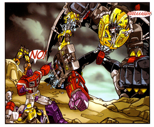
Speaking of cults of personality, I’ve been posting regularly in the Homestuck Discord server since November of last year. There’s no other place like it on the internet, and - truth be told - I’m not sure any explanation of it I could provide would suffice. The server was created by some guy called Makin - at least, we're pretty sure he’s a guy - who nobody’s ever met but who seems to have an uncanny knack for managing online communities.
Major events in that server have been comprehensively catalogued since July of 2017 by long-standing moderator “Drew Linky” in his journal Several People Are Typing. Between the entries and the related materials, it’s probably around half a million words in length. There’s no other document like it on the internet.
For the first fifty or so pages, Drew had no intention of making his document public. Apparently, one of the reasons he wrote it in the first place was as a way of holding Makin accountable - the guy used to be (and sometimes still is) a bit of an ass. Now, I wasn’t around in 2017, so I can’t really comment on the accuracy of the document’s early entries - but as a newcomer I was struck by how different Drew’s depiction of the server was to my own experience there. If I had to guess, I’d say his style of prose and the cherry-picked nature of the document make it seem like a much more hostile place than it actually is.
In particular, Makin effectively starts out as journal’s main villain (alongside various problem users and Homestuck creators) - a capricious and unknowable entity with absolute power over the server - and many of the entries deal in some way with what users jokingly refer to as his “redemption arc”. Of course, in reality, he’s just some guy, and everyone knows that real people don’t have character arcs.
I still haven’t finished reading SPAT, but I was doing so around the time when I was working on the comic. At some point I started to draw parallels between my bizarro version of Optimus Prime and the journal’s bizarro version of Makin, and I decided to play them up. Much of Prime’s dialogue is inspired by Makin’s style of speech, using phrases like “shut the fuck up”, “nobody cares”, “holy shit”, “get fucked”, “lmao”, “literally”, “literally [...] who”, “guys”, “rational” and “you’re welcome”. I just checked and at the time of writing, with the exception of “literally who” and “you’re welcome”, he’s used every one of those phrases within the last week. Oh, and while the word “suckers” isn’t really a Makin quote, in Homestuck it’s associated with the not-quite-biggest-bad evil empress. It bears mentioning again that the complete lack of punctuation in the comic’s dialogue mirrors the most common style of typing I see online, where people drop their capital letters and full stops.
(In fairness, a lot of us kinda talk the same way in that server. I remember one time Makin said “I also need to worry about lmao becoming some kind of anime catchphrase for me”, which cut pretty deep as I’ve been overusing that phrase instead of “lol” or “haha” or whatever for ages. Look, it’s just a funny word to me: in my head I pronounce it “luh-mayo” instead of “el-em-ay-oh”. Like “I throw my sandwich in the air sometimes / saying aaay-oh / I ordered maaayo...”)
In the comic, the self-aggrandising Optimus Prime is hostile and dismissive to those around him. It might all be a front, but it might not. Even though Grimlock hates Optimus, the Dinobot seems to agree with him a lot of the time, and the narrative itself never really manages to conclusively condemn his actions. The name “Optimus” echoes the word “optimise”; so frequently thrown around in rationalist circles. One could even go so far as to say that Optimus Prime’s ultimate goal in the comic is to kill death-in-the-form-of-a-shitposter.
In seriousness, I’m drawing these comparisons in a pretty tongue-in-cheek way. I don’t actually think that the Homestuck Discord server is a cult of personality - even if, to check the user-contributed “SPAT Epilogues”, some of its populace seem determined to behave like it is. Even if this section of this commentary exists. At the end of the day, I’m gonna write what I know, and I like to think that I know a little about online communities and what happens when they go wrong. I wish I could say that “The Beast Within (My Pants)” is a cautionary tale to that effect, but in truth I don’t think it offers any conclusive answers in the same way that “PASS” perhaps did. “Only worry about the opinions of people who actually care about you,” maybe? “Death is an abomination and we shouldn’t let it anywhere near our kids”, perhaps? “You can’t force other people to like you”?
“You can’t force other people to like the things you made”?
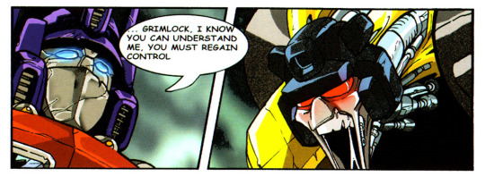
VIII. Burnt-Out Toaster Ovens
In the re-released version of “PASS”, it seemed right to throw in something in the way of extra content. I had fond memories of the Seacon profiles published alongside the original “Peace”, and lifted the format to create short bios for all sixteen characters who appeared in the comic. These fitted neatly on a four-by-four spread (though I ended up merging Topspin and Twin Twist’s profiles and throwing in an extra one for Computron, who did not appear in the comic proper).
From the start, I knew I wanted to do something similar for “The Beast Within (My Pants)”. In fact, I already had two text-only pages to work with; each part of the original comic was prefaced with a prose introduction and a note from Mr. Gibson. I decided that I could rework the text-only pages and add another spread of profiles, using the freedom granted by prose to explain away many of the comic’s oddities.

It took me some time to carefully erase the existing text from the scans that I had, using nothing but the brush tool in MS Paint. It took me even more time to work out some potential approaches to take with the text itself. Eventually, I came up with the following ideas:
A flashback depicting Grimlock and Swoop’s breakup.
A conversation between Grimlock and Jazz (or, perhaps, Slash).
“How Ratchet Got His Head Back”, the interlude which I ended up using.
A synopsis of events between “its christmas... so what??” and “The Beast Within (My Pants)”, which ended up being my first stab at the introduction.
Some in-character commentary as Mr. Gibson, which I did end up including.
From the moment I conceived it, I was pretty set on “How Ratchet Got His Head Back”, and it ended up being a breeze to write. I didn’t end up getting a chance to squeeze in the title - a reference to an issue of More than Meets the Eye - as it didn’t really fit the original format of the page. The introduction, on the other hand, proved much more challenging. My main problem was that, were I to preface the story with a text page, I’d be asking them to read a bunch of probably-mostly-serious words before allowing them to read the comic proper. Not the best first impression!

Nonetheless, I gave it a go - you can read my first attempt in the album of the draft pages. It mostly served to lay out the continuity between my three comics. Rodimus Prime’s crew were abandoned on Cybertron by Optimus Prime (presumably Hot Rod changed his name in Optimus’ absence). Megatron, Optimus and their crews crash-landed on Earth, and millions of years later the events of “its christmas... so what??” occurred. Meanwhile on Cybertron, it took a few million years for the other Autobots to wipe out the remaining Decepticons, as seen in “PASS”. Humanity was wiped out by Optimus in retribution for their transgression (a nod to Mr. Gibson’s depiction of Earth as an empty wasteland), prompting the conflict seen in “The Beast Within (My Pants)”. Much of this timeline remains implicit in the final version of the comic.
When I wrote it, I was pretty happy with the way this information was conveyed in the first draft. It was the ever-ardent Gitaxian - one of my long-time prereaders - who made me realise just what a mistake I’d made:
Something was rubbing me the wrong way about that first prose page and I finally realized what it is / Expositing that Optimus is horrible right off the bat takes away a good chunk of the impact the comic had before you added it
He was right. My prereaders’ initial response to the comic was that Optimus Prime’s motivations were completely opaque, and I overcorrected, not realising that his inscrutability was one of the things that made him interesting. You kinda want him to behave like the Optimus Prime you know and love, but he keeps doing weird things and you never really find out why.
Suddenly, I was back at square one - no closer to having a clear idea of how to introduce the comic. Another of my prereaders, gearshift, had the solution:
It's Transformers or some shit. You've seen the cartoon right? The one with the tape guy? Yeah, the tape guy is barely in this one. What do you mean no sale? Look, fuck, it's got the dinosaur guy. He's right on the goddamn cover, you like the dinosaur guy right? Yeah, that's what I thought.
Bitch.
I liked her pitch because it seemed like it’d do a good job of filtering out readers who wouldn’t enjoy the comic. To quote Alexander Wales, author of Worth the Candle:
I kind of hate blurbs and taglines, especially for something so large and varied as Worth the Candle / My ideal synopsis would tell people what kind of story it was without actually telling them that much about the story; it would select for all the people who would fall in love with the story, and select against all the people who would find it a waste of time. / How to actually write that ... I've got no idea.
(Side note: I’m one of the people who fell in love with that story, to the point where I’ll use any opportunity to recommend it to others. It’s maybe my favourite thing written by anyone ever.)
A closely-related issue is that of content warnings: so far as I’ve been able to work out, there is no warning which I can give for “The Beast Within (My Pants)” which adequately selects against people who won’t like it while also preserving its conceptual twists and avoiding colouring the audience’s interpretation.
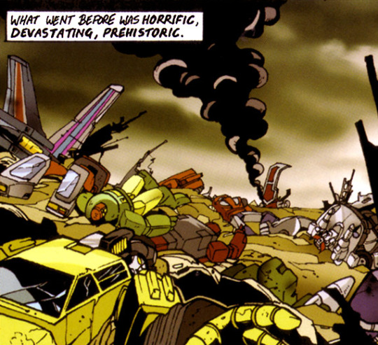
Getting back to the actual content of the introduction - I wound up writing less than I would’ve liked, leaving the page looking a little sparse, but hopefully making things easier for the reader. There’s relatively little to talk about in the way of trivia here. When I wrote the phrase “cut right to the spectacles” I was probably thinking of Carly Rae Jepsen’s “Cut To The Feeling”. When I mentioned “moist towelettes” I was probably thinking of Hawthorne Wipes. The phrase “truth time” was an iconic - to me, and literally no-one else in existence - line spoken by the trolling narrator of a crack story written by a high school friend of mine, the energy of which I feel like I’ve always been channelling with these comics.
The interlude, on the other hand, is crammed full of references and was a breeze to write. It was the first piece of prose I completed for the project. In general, I was trying to write in a verbose style that would be simultaneously at odds with the bulk of the issue and reminiscent of the prose of veteran Transformers scribe Simon Furman. He was known for using certain distinctive phrases repeatedly in his writing - one such phrase being “like some vast, predatory bird”. The phrase “neither sufficient inclination nor wingspan” is supposed to subtly evoke another Furmanism: “CANNOT, WILL NOT”.

In all likelihood, the interlude would not have existed had I not noticed that Ratchet’s head was in its cartoon colours in the first part of the story, but in its Marvel colours for the second. I had the idea to explain that error away in story - tying into the general schtick of “correcting” the comic - and did so by way of a reference to Ratchet’s original toy, which had a sticker with a face on it behind the windshield rather than a proper head. I was also determined to highlight the fact that Predaking’s legs remain standing for like three pages; I think this minor detail in the artwork is pretty indicative of the fact that Mr. Gibson did a good job.
The way Swoop’s contribution to the combiner is described as “puny” ties nicely to the history established between him and Grimlock in his profile. I like the way the Beast tries to hit Optimus Prime with a “truck-sized fist”. The “antimemetic shielding” was my attempt to explain the recurring disappearances of Optimus Prime’s trailer in a novel way - I did so by namedropping the key phrase from qntm’s There Is No Antimemetics Division; the trailer’s there, you just can’t perceive it and forget that it exists. Finally, “dull surprise” refers to the vague expressions that characterised Dreamwave’s house style.
For the most part, I was able to retain the ordering of the pages as in the original comic, to keep things print-friendly. The one exception to this is the prose page for the second part, which I unfortunately had to move forward so that its cover could fall across a spread. The original comics must’ve included something in the way of backmatter - art cards, perhaps, or adverts - which made up the space.

The huge cast of The Beast Within made creating a profile for every character an impossible task (especially when so many are just crowd-fillers like some of the Technobots were in “PASS”) - but it was perfectly possible to provide one for each non-combiner character with a speaking role.
(If you’ll indulge me in one last barely-relevant tangent as we head into the final stretch of this commentary, there are some rather odd inclusions/omissions in The Beast Within. On the Autobot side, pretty much every 1984-1985 character appears, with the exceptions of Trailbreaker, Hoist, Tracks, Smokescreen, Grapple, Beachcomber, Seaspray, Perceptor and Omega Supreme. The Autobot combiner teams are absent with the odd exception of Silverbolt. Twin Twist - who had been pretty much entirely absent from the original US fiction - makes an odd appearance without his partner Topspin. Steeljaw is the only one of the four 1986 Autobot cassettes to appear. Meanwhile, on the Decepticon side, oddities include the toy-inspired versions of Viewfinder and Spectro (most of the rest of the cast use cartoon-inspired character models) and the omissions of Spyglass and Buzzsaw. Some Decepticon combiner team members - Motormaster, Wildrider, Breakdown, Blast Off and Swindle - only appear in combined form. Just two of the four 1986 triple changers - Springer and Octane - appear in the comic, looking slightly out-of-place in a cast consisting mostly of characters present in the first two seasons of the cartoon. Oh, and the Deluxe Vehicles and Deluxe Insecticons are absent, but that’s to be expected in a cartoon-inspired setting.)
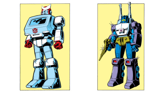
Here’s the first draft of Optimus Prime’s profile:
Unpredictable. Unstoppable. Unrepentant. Many words have been used to describe OPTIMUS PRIME, yet the abrasive leader of the Autobots remains something of an enigma even amongst his followers. He has ruled Cybertron for many millenia, by dint of the fact that he's apparently the only Cybertronian with a shred of competence.
It’s a product of the time where I wanted to really flesh out Optimus Prime and communicate his thoughts clearly to the audience, and as such is pretty blunt with how it characterises him. The final version is a little more subtle, drawing in elements of the scrapped introduction. I figure I may as well go through the other profiles one-by-one to give a sense for what I was thinking:
Megatron initially had a much more personal bio - which seems to have been lost to time - but I wound up cutting much of it to make space for elements of the story’s scrapped introduction.
Starscream draws inspiration from van Feleday’s interpretation of the character - she posited that Michael Bay’s version of the character was actually the Decepticon most loyal to Megatron. The contrast between that interpretation and pretty much every other in the franchise’s history (excluding Shattered Glass Starscream, of course) is pretty funny to me. I tried to use the phrase “fools errands” in as benign a way as possible, which I felt evoked a more traditional relationship between him and Megatron. “Starscream, you fool!”
Razorclaw has little in the way of characterisation in the comic beyond “noble warrior”, and his profile is a wholesale reference to The Chronicles of Narnia: he stands in for Aslan; the rest of the Predacons for the Pevensie siblings. So yes, this version of Razorclaw is a Christ-like figure. As for the witch... maybe Blackarachnia? Eh, who cares. Oh, and the idea of combining with a dead bot was one which cropped up a few times in IDW’s comics, most notably with the Combaticons in Mairghread Scott’s Till All Are One.
Onslaught was in a similar boat to Razorclaw. I found myself drawing from Till All Are One once more, hinting at a (complicated?) romance between him and another teammate.
Blitzwing has only one speaking role in the comic - a shared line with Megatron and Starscream - but I decided to count it for the sake of having a nice set of sixteen characters once more. In Transformers Animated, Blitzwing had multiple personalities, and would change forms depending on which was in control. This interpretation of the character has seen plenty of criticism, so I deliberately tried to come up with something new. I quickly settled upon the idea of tying his vehicle forms to his mood, a metaphor which seemed to dovetail nicely with the way aerial alternate forms were treated in “PASS” and which also allowed me to cement the Decepticons’ supportiveness.
Bulkhead was borne of the realisation that Springer appears prominently in both “Peace” and The Beast Within. This inconsistency is entirely the product of my decision to place my versions of those comics in the same continuity, and I decided to correct it in the tradition of “Bluster” and “Firster Aid” by having them be two separate (but related) characters. I named the new Springer after Energon Bulkhead, who was inspired by “Generation 1″ Springer - the name’s since been used more prominently by an Animated-original character and variations thereof, and is effectively fair game for “Generation 1″ stories. His actual characterisation was inspired by Springer’s behaviour in “PASS” - I liked the idea that Bulkhead bullied Springer, and Springer bullied everyone else in turn. Oh, and I wanted to tie their helicopter modes back to Blitzwing’s profile on a thematic level.
Bumblebee is the only character from “its christmas... so what??” to recur with a speaking role in “The Beast Within (My Pants)”. After scrapping the original introduction I’d planned for the comic, I was left with a single profile to bridge the gap between the two stories. My original idea was that, for their negligence in allowing the humans to steal Bumblebee’s blood, Prowl, Tracks, and Hoist would have been executed by Optimus Prime - though I’m sure he didn’t pull the trigger himself, it’s safe to assume that he didn’t warn them before setting off the nukes.
Ratchet has a characterisation inspired by something “Jonny Angel” posted in van Feleday’s thread: “Ratchet is an ambulance who practices no medicine”.
Jazz is an extremely prominent character in the comic, despite the fact that his only line is a scream in the opening panel. The comic relies on the wider context of the brand to let the audience be invested in him, but in a vacuum it’s kinda funny to see the Autobots fret so much over an effective nobody. Pretty much the entire joke in my version is just a reference to Ryan Gosling’s misguided quest to “save jazz” in La La Land - some of his character’s lines are lifted wholesale to comprise Jazz’s profile, which takes pains to avoid using any kind of pronouns (thereby maintaining the confusion over whether or not “Jazz” refers to the character or the music genre). His profile was the first I wrote.
Ironhide has a role amongst the Autobots loosely inspired by that of Drew Linky (or at least, the version of Drew Linky presented by SPAT) in the Homestuck Discord. I thought there was some symmetry there with Ironhide’s history in IDW Publishing’s comics.
Skids was a tricky character to portray, but ultimately his profile turned out to be one of the ones I’m happiest with. It’s kind of a loose riff on his portrayal towards the back end of James Roberts’ stories, where much of his arc revolved around his relationship with Nautica. According to Word of God, he had unrequited feelings for her - I decided to amp this up by giving him unrequited feelings for everyone. To tie this back to Homestuck, think Eridan/Cronus. Oh, and in terms of the Homestuck Discord server, think your typical hornyposter (and then follow the implications through in terms of Optimus Prime/Makin). The actual name “Skids Maximus” is a play on the way the suffix “Maximus” has historically been used for some combiners, “Optimus Maximus” in particular. I’m convinced I’m not the first person to do a joke like that, but nobody I asked could think of any older examples.
Grimlock was fleshed out pretty well by the comic itself, so I took his profile as an opportunity to expand upon the history of the Dinobots. I saw them as being akin to a group of friends who stuck together throughout school, winding up as an impenetrably toxic and incestuous mess with a ton of deep lore. In a way, there was a time when I was the Grimlock of my group of friends... but we all grew up.
Swoop is Grimlock’s ex-partner, a concept inspired by the other Dinobot combiner we all wish we could forget about. I’m pretty happy with the use of the word “bottom” in this context.
Snarl is based on a combination of various people I’ve known in real life - people who are perfectly nice and reasonable but have zero patience around certain other individuals. From the outside, it’s behaviour that comes across as pretty damn harsh, but - and please note that this is not an endorsement of such behaviour - it’s usually the product of a long period of aggravations.
Jetfire was the last character introduced in the comic, so it felt fitting to save his profile until last. His biography is effectively a mashup of his portrayals in the original cartoon (where he gets frozen in the Arctic Circle) and in Revenge of the Fallen (where he was a Seeker who wound up on Earth), a combination which neatly parallels Bay’s Megatron’s origins. It also references J.J. Abram’s infamous “mystery box” storytelling device, which I intended to mirror the offbeat lack of closure in the comic itself.

The final challenge I faced - one which had hounded me throughout the development of the comic - was what exactly to title it. Titles considered included:
“The BEE” (Tindalos’ suggestion)
“The BEE Within”
“The REEEE Within”
“SHIT” (Gitaxian’s suggestion)
“IM THE BEAST”
“AWWW SHIT” (Fear or Courage’s suggestion)
“AW SHIT ITS THE BEAST”
None of these resonated. Then, almost a whole month later, out of nowhere:

This was the entirety of Daniel111111222222’s contribution to the story - and what a contribution it was.
There were several reasons why I loved his idea. Firstly, it was easy to edit: most of the other suggestions would’ve required me to move lots of letters around, while this one would simply require me to append a few. More importantly, it felt like the title of a Chuck Tingle novel.
The subtitle for the second part - “No Pants” - seemed like a natural choice after that, the idea being that it evokes Grimlock’s inhibitions falling away with his transformation into the Beast. It narrowly edged out “Pants Off”, which I managed to squeeze into the final version of the introduction.
The parentheses in the comic’s title were my own addition, and in retrospect I kinda regret them. They seemed like a good idea at the time, but I’m not sure why. I was wrong to try and improve upon perfection.
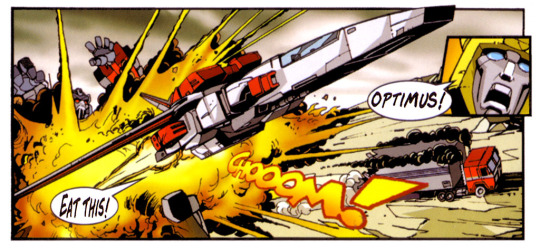
IX. Why Throw Away Your Life So Recklessly
So far, the bulk of this commentary has mostly focused on the aspects of this project which I think went pretty well. In a way, that's probably fair enough, because - on balance - I'm pretty happy with how it turned out.
At the same time, I can't help feeling that “PASS” - a comic which I probably threw together in the space of one day two years ago - is both funnier and more meaningful than the one which I spent a couple of weeks on.
When I started working on “The Beast Within (My Pants)” towards the beginning of May, I expected to have the project finished and out of the door by the end of the month. If you glance at the release dates of the various things I made, you'll see that I like to put out major projects on the last day of a month - it's a way of setting myself a deadline and it lets me associate a given project with a given period of time.
My first draft of the dialogue was released to prereaders on the 11th of May; my second on the 13th. Around that point, exam season started to kick in and I decided to prioritise to other projects - the Retrace Steps commentary and the Are You Happy retrospective - which both ballooned out into much longer pieces than I'd planned. I successfully met my self-imposed deadline for those projects and pushed back the release date for the comic to the end of June. I released the first drafts of the text-only pages on the 9th, but the profiles didn't follow until the 24th. By the time you read this, I'll have been working on the project on-and-off for over three months; despite the fact that I was ostensibly on vacation for most of that time, I was somehow busier than I tend to be at university.
For context, it took me just four months to adapt Retrace Steps from a short film script to a webcomic (well, “webcomic”), and that was a process which actually required original artwork. At the time I noted that I needed to re-evaluate the way I approached commentaries, as the amount of time required to produce one of a high standard seemed only to increase - they're extremely valuable to me, and seem to be well-received by the few who read them, but are they justifiable if they take longer to create than the things they comment on?
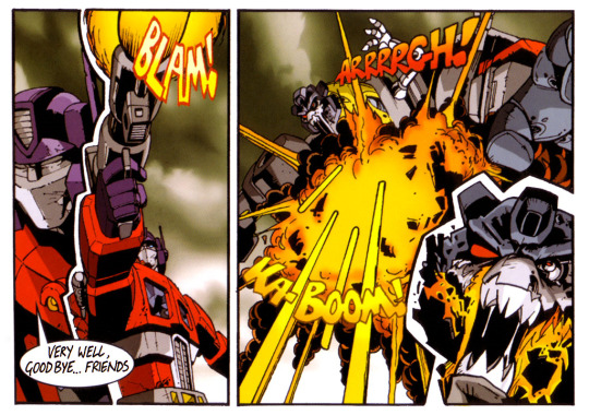
All of this is my long-winded way of saying that I've probably spent more time thinking about The Beast Within than the vast majority of people who know about it, and that I kinda regret that. See, in the sense that The Beast Within provokes a visceral emotional reaction, it’s a “good comic” - but so too does a punch to the face. The Beast Within is not a good comic. It’s mean and deconstructive and poorly-done. My version is borne of contrarianism and hubris, and softens the blow not one bit.
At the time when I was writing Grimlock's dialogue, I found that my own typing style was becoming increasingly acidic.
The truth is that “PASS” is probably the most successful thing I have ever made, and I wanted to make a comic which would put it to shame, and I failed miserably. In fact, I feel like I’ve made something which only I could ever enjoy. It’s derivative in the extreme. As my deadline for this project drew closer, I resorted to drafting bits of the commentary on my phone in public, and at one point somebody idly asked me what I was writing, and - after failing to think of a convincing lie - I said something along the lines of “it’s kinda a long story, and I wouldn’t enjoy telling it, and you wouldn’t enjoy hearing about it”. They seemed perfectly satisfied by that answer, but I wasn’t.
Must we justify the things we create? Mr. Jamieson’s attitude seemed to be to say “screw you, I don’t have to justify myself to stupid people” (while pointing at everybody else in the room). My attitude, as evinced by this commentary, has been to justify every aspect of everything I make in excruciating detail, so that if you tell me “I don’t like X” I can say “I already explained why I thought X was a good idea” and you can say “well you were wrong” and I can say “maybe”.
You’ve probably twigged that, throughout this commentary, I’ve referred to the creators of The Beast Within only by second name. At first, perhaps, it came across as some mark of mocking respect - like citing a scientific source - but the real reason is cowardice, not confidence. Some people occasionally put their own names into Google. There’s a couple of people to whom I really don’t want to have to justify myself.
Over a decade after the release of the The Beast Within, Hasbro released a brand new set of Dinobot toys which combined to form Volcanicus. The creators of the Prime Wars Trilogy and of the Earth Wars mobile game gleefully included the new combiner in their stories, and the fandom at large embraced it wholeheartedly.
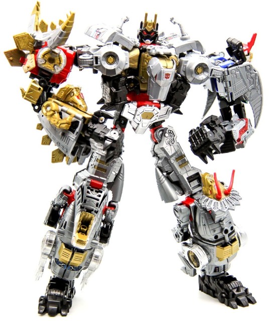
As her thread drew to a close, Terry van Feleday wrote something which I think about often:
Of course [...] let’s not forget that no matter the amount of earnest work put into something, sometimes it just turns out shit. There’s a strange perception I noticed in critical response where people seem to find it difficult to consider something both earnest or satirical and, well, not very well made. Sucker Punch can’t be an honest indictment of cinematic objectification and a somewhat poorly conceived, almost hypocritical attempt at being more clever than you should. Transformers can’t be an inversion of the traditional hero/villain narrative showcasing the effects of authoritarian propaganda and a meandering, under-focused, often poorly communicated, destructive mess. Maybe it’s a strange entertainment-version of the Just World Fallacy where lacking results must necessarily result from lacking effort, or maybe it’s modern audiences’ strange worship of subversiveness, where a work critical of old tropes must by default be better than the works it’s commenting on throwing to the dustbin of history, but either way, people are extremely resistant to the idea that films they found emotionally dissatisfying could express depth and meaning and tend to dismiss them as another ‘genre film’.
Mr. Gibson is a children’s picture book illustrator. The Beast has no place on his website.
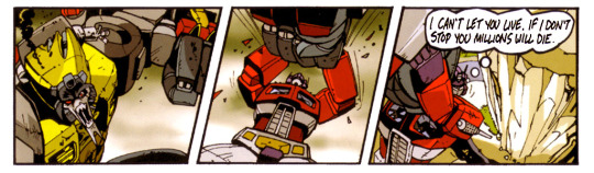
X. Proceed On Your Way To Oblivion
TFNation - the UK’s biggest Transformers convention - has become something of an annual pilgrimage for me, and (as of the time of writing) I’ll be making that pilgrimage in a matter of days. If you see me there, feel free to come over and punch me. Or, y’know, just say hi. I’ll have some limited-edition printed copies of “PASS” to give out. For more information on that - and for infrequent Transformers-related musings and updates on future projects - wander on over to my twitter!
What are those future projects? Well, after the convention I’m planning to release an original short story. It’s not very good, but it’s got a few stylistic similarities to this comic (read: lots of swearing). I might have a little bit in the way of Transformers prose coming out down the line, but can’t really elaborate further on the form that’ll take. I’ve been planning to get back to Huskyquest for ages, and hopefully I’ll finally be able to do so once I settle back down at university. After that, I plan to focus my efforts on prose, so you may as well expect more radio silence from me.
If you’ve made it to the end of this almost-fifteen-thousand-word monstrosity, you, uhh... win all my internet points? Sorry, that’s all I have.
Remind me never to do this again.
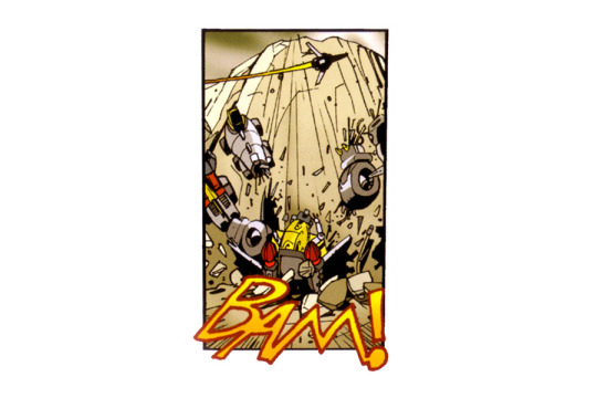
6 notes
·
View notes
Text
youtube
DRAWING KNUCKLES FROM SONIC THE HEDGEHOG!
In todays episode we are "Drawing Knuckles (from Sonic the Hedgehog)" with a beautiful custom hand made background to go along with knuckles! Trust me this is an episode to see!
This artwork is part of a sonic the hedgehog mini series in my "showAndTell" playlist so why don't we jazz this series up with the rasta of the gang namely knuckles! In this episode I talk about my experiences with knuckles and how he is a personal favourite of mind vring fond experiences all around!
I also joke about with what I think this iconic character should sound like in an animè plus throw tonnes of acknowledgment of this amazing character! Watch the video to see what you think and let me in the comments what your thoughts are! You also might like to see my previous sonic print and other characters in previous episodes of "ShowAndTell" so take a peak at that playlist for tonnes more entertaining content. Which characters have inspired you? Let me know in the comments!
This artwork looks nice as a bedroom/office poster print so follow along because it's going to be available SOON and notifications/reveals are going to be on the channel as soon as it is available for sale 😊.
Don't forget to like, comment, follow, subscribe and share with anyone you think may also enjoy my content it's much appreciated especially of you want to know when prints are available for purchase
USEFUL LINKS BELOW
MY RECOMMENDED ART SUPPLIES!!!
Marker Pens
80 ELOKI Markers -
40 Litchitree Markers -
FREE LEONIDAS ART
(Join my mailling group for tonnes of free art, tips, tricks and mini tutorials)!
MY CHANNEL & SERVICES
-------------------------------------------
Subscribe
"ShowAndTell" ART SERIES
KARLARTREID SERVICES!!!
-------------------------------------------
Enjoy and see you next Saturday for another "ShowAndTell" episode!
#drawing knuckkes#knuckles drawing#how to draw knuckles#how to#how#to#draw#knuckles#knuckles the echidna#echidna#drawing knuckles the echidna#sonic the hedgehog#drawing sonic#sonic drawing#drawing sonic the hedgehog#sonic heroes#sonic the hedgehog movie#sonic the hedgehog film#art#artwork#hero#superhero#learn#lets draw#tutorial#step by step#digital painting#digital painting tutorial#game#gaming
0 notes
Text
This slideshow requires JavaScript.
As part of our creatives series, Wayne Haag answers some questions on Science fiction and fantasy, also giving us some insight into his work.
Clara Fei-Fei: My first encounter with your work was for The Fifth Element (which I LOVE). I always wondered what sort of design requirements did you have to meet for the movie? Did you speak to Luc Besson about what he wanted?
Wayne Haag: As a matte painter I didn’t have to meet any design requirements, that was all taken care of by the concept designers.. who were Jean-Claude Mézières and Moebius, among others. I just had to paint to their designs. Within the scope of the matte painting itself, there are mini design problems or choices and those I discussed with my supervisors and Luc a few times for the various matte painting shots I worked on.
CF: What’s your favourite Scifi movie?
WH: Alien with Empire Strikes Back a very very close second. I know Star Wars isn’t strictly science fiction, more fantasy but for me, it’s about a sense of wonder and they both have it. I still have every Marvel Star Wars comic btw.
CF: Wow awesome! And who is your favourite character from any Scifi movie/comic/game?
Favourite character… I don’t have a favourite actually… If pushed I’d have to say Luke Skywalker, he’s the archetypal hero we all relate to.
CF: If you could enhance your body using robotics, what abilities would you choose?
WH: Eyes… Mine are going! Visibility into a much larger part of the EM spectrum – IR, UV, X-ray etc, zoom capability, heads-up display – data overlay, distance measurement, image capture…
CF: What inspired you to pursue work in concept art? For anyone wanting to pursue the same line of work, where do you suggest they start?
WH: I had always wanted to be an artist, always wanted to make images. It was never an option to not be an artist. This has encompassed professional photography, matte painting, illustration for publishing, concept art, mural painting, oil painting. Start drawing and painting, nothing more to it than that. Learn what you need to be a competent illustrator and the rest will follow.
CF: Could you give me an idea of what it’s like during production? What sort of guidelines you are given and what’s your average turn around time for the work you have done?
WH: That’s a large question. Every production is different, the vibe is different, some are relaxed some are stressful. It’s why I prefer to work from home mostly. Gigs like Alien you have to be there every day in house which is fine, can’t be a hermit all the time! Guidelines are simple – make this scene/shot look awesome – There’s the script, here’s the director’s brief now paint something that fulfils that brief. Don’t care how you do it, just get there.
Turn around time can vary from several (6 to 8) quick paintings in an afternoon to an evolving painting over several weeks. Not continuous of course, but bigger paintings I might have 3 or 4 days, it may sit around for a bit when you finally get feedback and you jump back onto that painting and off it goes into the cycle again. Some finish quickly and get approved just as quickly and you never see it again. Some hang around like bad smells!
CF: What is your favourite piece you ever created?
WH: One of my oil paintings, titled Sky Burial #2. It encapsulated everything I love about sci-fi, sense of wonder, mystery, story, history, spaceship wrecks, the desert.
SKY BURIAL #2
CF: What variant of the Xenomorph is your favourite?
WH: The original.. because you didn’t see much of it. It was the implied cold-blooded violence that was scary, not so much the beast itself – which was scary as hell in its own right, I just preferred the implicit horror.
CF: I really loved Daniels cabin in the Covenant, what work did you do on that?
WH: The design for Daniel’s cabin evolved quite a lot for many months. A couple of concept artists had started the process, set designers etc, all working towards the final. My contribution was to bring the design language in from the other interior sets Steve Burg had designed and made it feel more modular like you would find on a ship. Then it was a matter of painting a couple of frames that illustrated the lighting and mood, which is my main area of interest.
Daniels Cabin on the Covenant
White Room
CF: I read that the white room is inspired by 2001, what aspects of the movie did you consider when creating this set?
WH: Firstly, no one concept artists create ‘the set’, it really is an army of people that have some contribution at some point along the way, from top to bottom. The overall layout was inspired by a physical location in Sydney that they wanted to use but could not, so the decision was made to build the set at Fox. I had plans for the location and built that in 3D to scale. Then as I mentioned above, I paint the scene up for lighting, mood and composition, ie. camera position and lens choice. (which was used by Ridley on the day of the shoot).
No references to 2001 were used, not by me anyway. I approach each painting/set as a real place and try to work out how I would shoot it if I were really there, what kind of lighting situation, time of day, weather, season etc etc. Unless the director specifically references another movie, I go with my own references and ideas that I think to fulfil the script/story.
Before
After
CF: What work did you do on the mothership in The Crossing and Alien: Covenant? What other aspects of the engineer city did you work on?
WH: I didn’t do any design work on the Mother Juggernaut, that was all Steve Messing. As we all have access to the 3D resources, I used the model he built simply as a prop within the greater scene. Again, setting up composition, lighting, mood. Although I did build the city and surrounds in 3D as one big model to scale so that everyone could see how shots would look if you were standing in the plaza. The 3D allows me to place human figures in the correct relative scale to a known real-world camera and the renders provide a basis with which to paint on.
My model of the plaza was based on Steve Messing’s original plaza layout. As the set designers finalised buildings and sets, I would incorporate them into my huge Maya file, kind of like a master file. Then I’d place 3D cameras around matching pov’s Ridley wanted.
Like all film designs, they grow, evolve and change. The final city you see in the film is quite a bit different from the city I built, so the VFX guys had further developed the city layout as per Ridley’s ongoing massaging.
Image converted using ifftoany
Image converted using ifftoany
CF: What was the inspiration for the shower scene?
WH: T&A as far as I can tell…
CF: (lol)
CF: Do you have a list of the art pieces you infused into the movie?
WH: Not really, when you’re working on a film you don’t have time to immerse yourself in the art references and meaning, least I don’t anyway. All art choices are Ridley’s, I just create the scene as if it were really there and I shot it with a camera. The decision to not use the Francis Bacon triptych in the white room was solely due to licensing costs, nothing more than that. The Bacon estate wanted too much money. The Bugatti chair was also a licensed design and the prop was to be destroyed in front of lawyers once shooting wrapped.
This slideshow requires JavaScript.
CF: What pieces of yours made it the final film? Was there anything that didn’t?
WH: What pieces had an influence you should ask, concept art never makes it into the film per se, it is a tool for solving creative visual, technical, financial problems. How will this set look? How big will it be? How much VFX will be needed for that shot, how will the DP light the set etc?
It’s an internal document that hopefully answers the director’s, art director’s and production designer’s questions. If not, try something else, or remove things from the artwork. For example, I had two statues out front of the Cathedral and was asked to remove them from the piece. If that artwork had been disseminated throughout the production, someone may have assumed those statues were to be made and start spending money making them!
There are several paintings I did that you can see as shots in the film, they aren’t exact, but the overall compositions had been faithfully translated.
This slideshow requires JavaScript.
CF: What would you say has been your favourite project to work on?
WH: Fifth Element, The Wolverine, Alien Covenant, three best projects of my career.
CF: What is it like working on a large scale production such as Alien compared to smaller scale ones?
WH: Depends on who you’re working with and answering to directly, i.e. production designer. Some large-scale projects are overly corporate and anal, smaller ones are creatively easy going. It can also be the reverse too! Alien was super creative, very easy going (hard work, long hours but no BS!). Great people all around. Some tv commercial gigs can be a giant PITA, some smaller directors can sometimes want to prove themselves by having too much attitude and want to override your ideas, big directors like Ridley don’t have those insecurities and are therefore great to work with.
CF: Congratulations on winning the award for your work on Alien: Covenant.
WH: Thank you!
CF: Is there anything you are working on currently?
WH: I just finished working on a pitch project for Pixar and as I write this, doing concepts for a Chinese comedy film shot here in Australia.
CF: In future what sort of opportunities would you like to be involved in?
WH: Well I currently work freelance, for the most part, I teach part-time (at Production Art Department PAD http://www.productionartdepartment.com ), I’m starting to put out video tutorials of how to paint etc and I need to get my arse into gear and get back to oil painting my own project. As far as the future is concerned, I’d like more time to paint my own work.
Thanks so much for taking the time to answer my questions, I look forward to having you on Yutani Podcast soon.
Creatives: Wayne Haag As part of our creatives series, Wayne Haag answers some questions on Science fiction and fantasy, also giving us some insight into his work.
#alien prequel#alien: covenant#behind the scenes#big chap#concept art#concept artist#creatives#matte painter#pixar#production art department#production work#wayne haag#weyland yutani#xenomorph
9 notes
·
View notes
Photo
‘AskMarshandBroflovski’
Author/Artist: jovishark
Additional Credit: puppetamateur
Status: Complete
Links: Tumblr
Rec No: #2 (Part One)
The Gist of It (aka. TLDR)
‘Stan and Kyle go through a whole lot of shit during their last couple years of high school; with side-characters and sub-plots galore. Honestly dudes, it’s hard to summarize this one since it’s just so jam packed with all kinds of everything. This askblog, maybe more than anything else I’ve read, really does encapsulate that whole ‘something for everyone’ feeling. Just trust me my dudes, ships galore, on-point writing, and gorgeous art. Go go.”
Also putting this before the page break: I know, it’s technically not a Cryde work, but I guarantee, there’s more content between those two in there than in most exclusively cryde-centric things. For a bit of trivia, it was this blog that got me into Cryde as a ship to begin with. So c’mon below, and I’ll try and reassure you…
Also also: Fair warning, this rec’ll be long af. I’m a little obsessed. So, get yourself a drink or something?
Storytelling
So like I said in the gist, the premise is fairly simple from the outset; Stan and Kyle start up an askblog, and your usual mix of hilarity, drama and ‘will-they, wont-they’ romance ensues. Now I had read askblogs before this one, and generally found them a lot of fun, but holy shit− from the get-go dudes, from the absolute start, this one had its hooks in me like nothing else has ever quite managed before or since. I’d originally just come across it after seeing some of the Craig/Clyde panels on some google search one weekend; then before I knew it, it was Monday morning and I’d read the whole blog front to back, and was experiencing like, genuine feelings for the first time in a long while.
A lot of what snagged me was the writing, which I walked in totally not expecting to take my soul hostage the way it did. The dialogue I’ll talk about with the characters, but as far as the actual story elements were presented? It reads like a god damn mini-series, with actual self-contained story arcs, side-scenarios that mesh in with the A-plot and oh my sweet jesus, the world building in this thing… Seriously dudes, I normally try and stay more grounded in tropes and clever literary devices and what have you, but with this blog I have a lot of trouble not getting like, emotionally invested.
I think that really is what makes this one so special; the atmosphere. There’s this underlying theme of determination and overcoming adversity (mirroring the writing of the blog itself, if you read the authors notes throughout− something I’d defiantly recommend) It’s the sort of writing that genuinely inspires people, deals with difficult subject matter and just generally gives off a positive vibe about soldering on and making good on big life changes, and that includes everyone, of every age and background.
And therein lies another giant strength, the variety. I would think it a very difficult task for someone to not find something they enjoy in this story; it’s a god damn carnival ride− not to spoil too much, but there’s a wash of different genres, different dynamics, different methods of storytelling and different perspectives on those stories. There’s music, there’s action, audience-participation, and enough backstory and little details that I’m still picking up new things even after having read through multiple times.
And lastly, oh boy− pitchforks and torches at the ready –there’s the content between Craig and Clyde. Now I’m not going to sugarcoat it, or really bother trying to hide the fact that these two don’t wind up in a happy relationship here. But please, and I really do mean this, don’t let that dissuade you. They have a very complicated relationship that keeps changing throughout, but their bond never goes away− so just because it isn’t all kisses and romance, I’d say it’s still one of the most endearing relationships I’ve seen written about the two (hence why I’m sticking to my guns on calling this a cryde-recommendation). Honestly, and I can say this from experience here, it gels with how boys like that can end up acting at that age. Despite everything, they still wind up being the biggest player in each other’s lives.
Characters
There is just characters bursting at the seams here, if you’re a fan of someone in the show, you can bet they’ll probably make an appearance somewhere along the line; or at least get a mention. Even Scott Malkinson gets namedropped, and that’s the first time I’ve seen him show up in something I’ve read in this fandom in like, forever.
Stan and Kyle are great picks for the leads, it feels easy experiencing the events unfold from their perspectives− honestly, it’s like watching a more grown up version of the TV-show for the most part, with Cartman and Kenny filling in with their usual contributions of being an asshole and a sweetheart respectively. (I really do love the way Cartman’s handled; he plays a tremendous bastard to be sure, but in a way you could imagine his childhood-self becoming- he makes a delightfully hammy and worryingly formidable antagonist) Also features pretty much my favorite version of Wendy I’ve come across; she’s the real MVP.
Craig’s low-key stealing scenes at first, before kicking things into high-gear and trying to take over the show throughout the run, to the point where he’s pretty much the focal point of all the drama several times. He’s a bit of a mess, but understandably so. Truthfully, all the characters have a unique take on them (all in keeping with how you’d imagine their canon counterparts at that age) and it’s a delight to learn what makes them all tick. I think with Craig especially, his views often radically differ from what you’re presented with by the other characters (including Stan and Kyle) and it’s never written in a way that forces you to side with any particular party as being ‘in the right’. Something I always find refreshing when it’s done as well as it’s done here. Everyone is presented with both strengths and faults, with actual long-running consequences for past actions, good and bad, and it’s up to you as the reader to make what you will out of it.
But then you’ve got the dialogue, and my god, it really takes the cake. There’s not much I can say apart from I legitimately thought some scenes and mannerisms must have been penned by Trey himself− the humor especially. Truly guys, you’re in for a treat. I would have loved to have asked the boys a question back in the day.
Style
Since I’ve gone long on the writing, I have to pretty much devote this section to the artwork because it’s fucking magic. Picture paints a thousand words and all that, and my god, does it ever do that here− the way things are scripted and tied in with the respective art? It makes for all sorts of amazing comedic timing, adds tenfold to any of the emotional scenes and just makes the story flow like a dream; I always have trouble putting it down once I get started.
Jovi’s just an incredibly talented artist, there is simply no escaping this fact. Each and every character has a unique design that fits their character and− I realize this one’s super subjective –to me, they all have such charm and personality in the way they’re drawn. It’s this masterfully presented cartoon-style with an emphasis on expressions, movement and color that I honestly just adore. Even at the very start of the blog, where the art is almost entirely different than it winds up looking at the finishing point two years later, I just love it− again with a South Park comparison, it reminds me of the watching the early cardboard-cutout style of the show compared to its newer 3D designs, both holding a special place in my heart in their own ways.
It floors me to think this was the author’s first major project. As mentioned above, I’d greatly recommend reading through the blog in its entirety, including all the commentaries by the mods, the funny tags, the side-art. One of the most inspiring things about this work is getting a sense of the love and dedication that was put into it over the years it was running; like watching the behind-the-scenes on some giant motion epic and coming to terms with how much effort went into producing what you’re seeing. It’s practically another story itself, and no less heartening than with the boys and their trials and tribulations. Seriously dude, so much kudos.
Favorite Things
The content variety. There’s just so much to love here, things being kept fresh and exciting throughout the super long run-time of the blog without feeling disjointed, on top of managing a satisfying conclusion. There’s a lot of fun to be had, no half-measures.
The character dynamics are a treat. With such a big cast, there’s all sorts of different personalities playing off each other, with dynamic relationships that all manage to evolve and grow. Definite love given to proper character arcs.
Inspiring themes and feel-good moments really do make this a gem to read when you’re looking for a pick me up. The messages about dealing with depression and addiction, managing your health and fitness and even studying and making smart choices− all of them really hit home.
Relationships of all different types; one’s that work out, one’s that don’t, some being easy, some being hard, long ones, short ones, mistakes and awkward surprises. Romance is well and truly covered, and I like that it doesn’t shy away with the stuff that just doesn’t end well.
Some of the best artwork you’ll come across (and so utterly fitting of the material), drawn to such a quality standard and on such a short time-frame that it kinda makes my head spin. I’m now at the point that when I think about the characters, these versions are the ones that appear in my head.
It’s honestly a little embarrassing for me to talk about AMAB, and god knows it’s pretty presumptuous, y’know? New guy recommends beloved artwork that already attracted thousands of followers back in its day. I’m going to guess this’ll end up being the rec that I’ll have needed to have written the least− since like, all of you have probably already devoured the blog long before you learned about it here.
But you know? If anything, I hope this ends up reconfirming what an excellent choice it was for you to have read it. And as always with these review things, if the author should read this, I hope you know just how much what you’ve made affected me and countless others; how good you deserve to feel, and how proud the people in your life must be of you for doing something so important and worthwhile.
As usual, next post’ll be spoilers and artwork− and I’m just going to bury my head in the sand so hard because my artwork is garbage compared, but we’ll have to muddle through. Join me there for second hand embarrassment, okay?
4 notes
·
View notes
Text
Top 2018 Nintendo Switch Games for Girls
30 New Games For Girls on the Nintendo Switch in 2018
One of the most popular posts on this site is our Top 2017 Nintendo Switch Games for Girls
With a new year, I decided to take a look at the upcoming releases for the Switch in 2018 and make a few suggestions as to what games girls should be looking out for in the year ahead. (There may be a few games that released in Q4 of 2017 also on this list as I wasn’t sure of a few of the release dates). Enjoy! And leave me a comment to let me know what games you’re looking forward to on the Switch in 2018. 🙂 I’ll also soon add a list like this for PS4 and PC games as well.
Top 2018 Nintendo Switch Games For Girls
1.) Project Octopath Traveler
youtube
Originally scheduled for a 2017 release, and part of our Top 2017 Nintendo Switch Games for Girls list, Octopath Traveler blends gameplay elements from 16 and 32 bit classics such as Chronotrigger and Saga Frontier. The retro game feel is sure to appeal to many visitors of this site. But that’s not all, Project Octopath Traveler also offers a variety of endings and a branching plot line that is shaped by decisions you make within the game.
2.) Kirby Star Allies
youtube
He’s pink, cute, and the gameplay is fun. Kirby has been a fan favorite of Nintendo gamers for several decades now. In his new adventure, up to four players can join in and you can combine different power ups, as demonstrated in the Nintendo Direct Video above.
3.) Toe Jam & Earl Back in the Groove
youtube
Toe Jam & Earl was a childhood favorite of mine. I spent countless hours (or days, or weeks) playing the original two games on Sega Genesis with my best friend. It’s one of the best multiplayer games of my childhood and this new take on the classic, originally slated for 2017, will grace Switch consoles now in 2018. For those unfamillar with the franchise, you run around colorful crazy worlds with zany characters and crazy powerups playing as 2 funky hiphop aliens.
4.) My Time At Portia
youtube
My Time At Portia is a cross platform title that features sandbox gameplay in a large open world enviornment. It blends together many gameplay elements from Harvest Moon, Stardew Valley, Rune Factory, and Atelier. In this game you can raise animals, grow crops, and restore an abandoned workshop. The developers say the game takes place in a post apocalyptic world where humans are few and that you search for relics from the past to create inventions for the betterment of society. Also just like in Harvest Moon and similar games, all of the NPCs have their own schedules, they will go to work, school, and have their own stories for you to discover by interacting with them.
5.) Avabel Online
youtube
This is perhaps an interesting one to make the list. Avabel Online is a free to play MMORPG that is already available on many platforms, including Android and IOS devices which makes it already portable and playable on the go. Despite that, I’m including it in the list because I do think the gameplay will appeal to girls. Right now, for example, they are running a special Sanrio promotion (makers of hello kitty). You can get cute (sometimes strange) items to decorate your house or dress up your characters. https://avabelonline.com/landing/sanrio
6.) Moonlighter
youtube
A Shopkeeping RPG Simulation game with retro style graphics. You can explore and fight for valueable treasure, as well as craft your own items, and then sell them in your shop. You can also communicate with the NPCs to discover what items they want to purchase. The dungeons are procedurally generated and present new challenges and new loot each time.
7.) Atelier Lydie & Suelle: The Alchemists and the Mysterious Paintings
youtube
Coming in March 2018, Atelier Lydie & Suelle: The Alchemists and the Mysterious Paintings is the first Atelier title to hit the Nintendo Switch. Atelier games focus on gathering ingredients and crafting new items. As you can see from the trailer, they feature beautiful anime graphics, and deep stories. Their gameplay is often long, and at times it can get tedious, however, for those who love crafting and exploring, Atelier offers the ultimate crafting system.
8.) Destiny Chronicles
youtube
This game looks beautiful, and it is inspired by many classic JRPGs. It features action combat and extensive skill tree customization as well as a light hearted humorous story line. You can enchant and upgrade your equipment, as well as interact with your party members and NPCs.
9.) Revenant Saga
youtube
With a level cap of 999, and tons of equipment to collect, Revenant Saga looks to offer some incredible replay value. The ability to tranform in battle and unleash special powers makes combat fun and exciting. While the cute and colorful graphics and dark fantasy story are sure to appeal to fans of classic JRPGs.
10.) Wonderboy: Dragon’s Trap
youtube
This remake of Wonderboy III lets you play as a girl. It also lets you toggle between the original Sega Genesis graphics and soundtrack, or the all new graphics and soundtracks created for this release.
11.) Untold Legacy
youtube
The retro style graphics appeal to me (and probably most of the readers of my blog). But what really appeals to me is this statement that the Devs make about the storyline: “You will be brought to tears as you uncover the twists and turns in this emotionally story-driven experience that will leave you shocked and surprised as you discover the secrets the world of Touchstone has to offer.” – I am a sucker for a heart tugging story. The Devs also indicate that “The Untold Legacy sets out to recreate some of the most heartfelt and gut wrenching moments imaginable.” These two statements make me very interested in this game.
12.) Yoshi
youtube
This game features an art style similar to Paper Mario, and the main character is the lovable, Yoshi, the green dinosaur who first debuted in Super Mario World. The colorful graphics and addictive platformer style gameplay make this game perfect for our list of 2018 Nintendo Switch Games for Girls.
13.) Croixleur Sigma
youtube
With a 9/10 and “Very Positive” Rating on Steam, this anime style hack-n-slash RPG is coming to Switch in 2018. The gameplay is reminicessent of several of the newer Hyper Dimension Neptunia games. The local 2 player co-op makes it perfect for the Nintendo Switch. And playing as the cute anime girls make it a game girls will love to play together.
14.) Your Four Knight Princess Training Story
youtube
A “Raising Sim” similar to games such as Princess Maker and Graduation 95. Gematsu has an excellent article detailing how you will train your princess in this new 2018 Nintendo Switch Game. Basically it involves scolding or praising your princess at various times, for example during conversations or while exploring dungeons. The story and characters change based on your decisions and how you raise your princess. The princesses each have various parameters that you can train to unlock new skills or increase their stats to help them in battle.
15.) Legrand Legacy Tale of the Fatebounds
youtube
Legrand Legacy Tale of the Fatebounds is an impressive indie title with full 3D cinematics and FMV cutscenes. It features tactical turn based combat and interesting city building and mini game mechanics. I’m really looking forward to this title which releases later this month (January 2018).
16.) Shin Megami Tensei V
youtube
I haven’t taken time to organize these recommendations in any kind of “ranking” system, but if I had to pick just one game on this list to play in 2018 it would be Shin Megami Tensei V. Atlus’ dark RPG franchise that sparked the Persona spin off games is one of my favorites.
17.) Tohou Sky Arena Gensoukyou Kuusen Hime
youtube
This looks like an anime brawler with cute girls and exciting special moves. It’s visually very pretty and looks like combat will be fun too.
18.) Valkyria Chronicles 4
youtube
A new title in the tactical Strategy RPG series, Valkyria Chronicles. I’m a huge fan of this series, and this one looks great. It’s due out in March 2018. Valkyria Chronicles is a Sega series known for excellent characters and story lines as well as fun Strategy RPG combat.
19.) The Longest Five Minutes
youtube
This humorous RPG launches in February 2018. The tale begins at the end, as you are facing the demon king, but suddenly you’ve lost all of your memories. From there, regain your memories, remember who you are, where you’re from, where you’re going, and your reason for fighting the demon king. The cute and colorful graphics and retro feel are sure to appeal to my readers.
20.) Mulaka
youtube
With gameplay reminiscent of Zelda or Castlevania, this action RPG features a story and game world that draw inspiration from Mexican culture. The gameplay trailer above shows various abilities and fighting styles, including the ability to transform into different animals.
21.) Yono and the Celestial Elephants
youtube
How could this game NOT make our list??! Look at that elephant. LOOK AT IT!! Has there ever been a cuter video game character in the history of video games? Nope. This adorable little game looks kawaii and charming AF and seems to have some fun puzzles to solve too.
22.) Wandersong
youtube
Play as a traveling bard in this cute, happy, colorful paper-cut-out style world. Coming in early 2018.
23.) Goragoa
youtube
This puzzle game features gorgeous artwork and requires some outside the box thinking. The soundtrack is also lovely and I’ve heard the story is quite sad as well.
24.) Wargroove
youtube
Wargroove promises to be easy to pick up, but difficult to master. Up to 4 players can take control of an army and command it to victory. The colorful retro style graphics really look great and gameplay looks fun and interesting.
25.) Penny Punching Princess
youtube
An Action RPG in Which Money Makes the World Go Round. That’s what Nintendo has to say about their latest RPG that lets you bribe monsters to fight for you. Many are comparing this game to Tingle’s Rosy Rupee Land – a game which I’ve never played (nor even heard of). The colorful and cute graphics caught my eye. I’ll be checking this one out in 2018.
26.) Fallen Legion: Rise to Glory
youtube
Nintendo promises new content and features in this release. “Combining both Fallen Legion: Flames of Rebellion and Fallen Legion: Sins of an Empire for the first time on one console, Fallen Legion: Rise to Glory includes all new art, Exemplars, monsters, bosses and challenges not found in the original releases. I’d somehow not heard of this game until now, so now seems the perfect time to pick this one up.
27.) Lost Sphear
youtube
From the creators of I am Setsuna, comes a new JRPG for the Nintendo Switch in 2018.
28.) Dragon Quest Builders
youtube
Originally part of the 2017 Top Nintendo Switch Games for Girls, this title got pushed back to February 2018.
29.) Mega Man 11
youtube
Fan favorite, and often requested, a new sequel in the Mega Man franchise is arriving on Nintendo Switch in late 2018.
30.) Bayonetta 3 – NINTENDO SWITCH EXCLUSIVE
youtube
Perhaps one of the most exciting announcements, and why I saved it for last, is that a new Bayonetta Game has been announced and it will be available ONLY for the Nintendo Switch.
Top 2018 Nintendo Switch Games for Girls was originally published on GeekySweetie.com - Geeky & Kawaii Anime, Tech, Toys, & Game Reviews & News
#2018#2018 Game Releases#2018 Games for Nintendo Switch#2018 Nintendo Switch Games#2018 Nintendo Switch Games for Girls#2018 Release Date#Action RPG#Anime#Best Games for Girls#Cute#Game Trailers#games for girls#JRPG#Kawaii#Nintendo#Nintendo Switch#Nintendo Switch Games#Nintendo Switch Games for Girls#Release Date#Retro#Retro Gaming#RPG#Strategy RPG#Top 10#Top 10 List#Top 2018 Nintendo Switch Games for Girls#Top Games for Girls
1 note
·
View note
Text
Blasting into the Allspark Studio a from a past that never was is the first half of the second wave of Super7 ReAction Transformers! Will they fill the cartoon figure void deep within your soul, or just stand at attention on your shelf like they were designed? Tune in after the break to find out!
When I first saw images of the ReAction Transformers line, I was not totally convinced I would buy them. In general I do not buy non-transforming Transformers, so things like the recent Dollar Tree blind packed mini-figures did not get my attention. I have seen other ReAction lines at brick and mortar retail, and some were a hit, and some were a miss.
Maybe it was the impressive card art that finally got me interested in checking this line out, since I like to rotate out pop-culture images in the background of my office where I hold video conferences. All I know is I took a leap on a purchase here, and I am glad I did.
Carded or No?
The card art for these figures is really cool. The base for the front of each card is the classic red or purple grid with the fade to black gradient. On top of that is a beautifully rendered classic Transformers logo, with a garnish of either the G1 Autobot or Decepticon symbol and descriptor in the upper right and the classic “More Than Meets the Eye” tagline on the bottom left. This is enveloped in the grey that forms the “frame” for each character.
Floating just inside the frame is a darkened background of a Cybertronian city, in front of which is posed each of the featured characters, floating just inside and outside of the frame. All of the Transformers are posed in a way that embodies each individual character, from Grimlock’s all assuming power stance to Rumble’s “punk with guns in hand”. I would really like to know who did the cart for this line, because they look like someone I would like to follow on Twitter or Instagram. The art is very classic, cartoon inspired, and alive.
Each of the characters is named in a yellow box just above their bubble. Note that Frenzy/Rumble is called Rumble here and Jetfire is Skyfire, which makes sense since this line is heavily based on the animation. There are no sub-designations on these figures. They are simply tagged “action figure”. To the right of the bubble is the blue and white ReAction logo. Within the bubble on each card you will find the figures standing straight at attention, which is in line with a series that is trying to give you lots of properties based on the Kenner Star Wars 5 POV look that was iconic in the early 80’s. If the character has a blaster, it is included in the tray within which they rest. Grimlock gets his sword and blaster, Rumble gets his backpack weapons that double as blasters, and Skyfire and Shrapnel (both of which appear to be registered trademarks now…does this mean the end of Skrapnel?) get their weapons from the cartoon. It is interesting to note that Shrapnel is the only one from the set with a closed fist, as his right hand cannot hold his weapon.
The back of the cards is the same for each figure, apart from the logo that references their allegiance, and the barcode. There is no individual information, like a mini-bio, tech spec, or anything else that would set the backs apart. It is a classic 8-back cross sell, just letting you know if you only see some of the figures that your collecting is not done. It is still visually impressive, as it gives you a better view of the background from the front of the card.
The figures I have came from BBTS, and appear to be made for a EU market release. I am not sure if they are all like that, or if there is a US/Americas version of the card backs as I have yet to find any of these in brick and mortar stores, and will likely not be looking anytime soon since the area I would search is high risk now due to the corona virus pandemic.
These figures display impressively as carded, mint pieces. They look like beautiful retro cartoon artwork that can be mounted on a collector’s wall. While I always open my figures, I have chosen specific characters to use as carded art in my office. From the first half of wave 2, I am keeping a carded Skyfire. The line is a little expensive for what you get, however, so I do not expect most collectors will be following suit.
Open ‘Em Up!
So, I have to open my figures. This line is no exception, in-spite of the designs. Each figure has 5 points of articulation, just 2 points short of the Action Master line from the 80’s. The designs are nicely cartoon inspired, if not a tad simplified to with the with theme of the line. The lines on each mold are nice and crisp when straight, and beautifully curved when the character design calls for it.
The colors are nice and appropriately cartoon level bright, which really makes each figure pop. Grimlock’s red and yellow are especially striking. Skyfire is a little off-white for my taste, but considering the base material of the figure, it probably would not have remained bone-white forever if it had been done in that shade. All figures come with cartoon inspired faction symbols. Also great is that Autobots have blue eyes, Decepticons have red. As it should be.
Due to the 5 POA, there is not a lot of dynamic posing that can be done. Grimlock and Rumble get into nice “G1-art style” poses that nicely fit their characters. Shrapnel and Skyfire look great standing at attention (animation bumper style). I also really like pairing Skyfire with Wave 1 Starscream. The original “science bros”.
The original #sciencebros…
That is about it for action poses. What did you expect with only 5 POA? Still, I love the looks on these figures, and definitely want all of the line, free from their plastic prisons, standing on my shelves in cartoon goodness.
Paint Ops
The paint is a mixed bag on these figures. Some lines are super crisp, some of them are not. While you can see this in the pictures, I have to say it is not near as noticeable as the images here make it out to be. I think if you see them in person, you will realize this as well, so I do not deduct any from their overall score.
Final Thoughts
This is an impressively packaged, well designed retro-line of Transformers that is fit into the theme of a larger line. This line is not for everyone, in particular due to the price, which some may find high for the level of POA and the fact that the figures do not transform. I anticipate some readers will react negatively to this review for many of above points.
Let’s take into account however, that the fact that this line (or the Dollar Tree line for that matter) exists because the Transformers brand is strong. Strong enough that not only do we have multiple lines now that cater to completely different types of collectors (movie, classicverse, children (Rescuebots)), we also have 3rd party companies willing to pay licensing fees to Hasbro just to be able to sell their own Transformers merchandise. This is a great thing for fans.
That being said, I love the Super7 ReAction Transformers line! The retro-cartoon look, beautiful card art, and display-ability really let it stand out as a great pop-culture representation of my favorite line of characters ever. I am all in, and if any of the above interests you, I recommend you buy them too! Who knows, the kiddoes (those that are not in danger of swallow hazards) may be fans of them as well. If they express an interest, let them try it. Worst case scenario, you have one more thing in common.
Want to interact with more Transformers fans? Be sure to check out our forums or you can join our discord by clicking on this invite link: https://discord.gg/ZnUQxya You can also follow us on Twitter via @AllsparkNews or join our Facebook group!
The original #sciencebros…
If Rumble were “in scale”.
Super7 ReAction Wave 2.1 Gallery and Review! Blasting into the Allspark Studio a from a past that never was is the first half of the second wave of Super7 ReAction Transformers!
#Cassettes#Frenzy#G1#Generation 1#Generation One#Jetfire#Mini-Cassettes#ReAction#Rumble#Shrapnel#Skrapnel#Skyfire#Soundwave#Super 7#Super7#TF#Transformers
0 notes
Text
Hollywood
Movies 3 6/21/2019 4:07pm
So, after the last blog, I was inclined to google the movie “The Fountain”. When doing so, I saw that they had created a graphic novel of the same name. The writer/director gave a script and had the artist, one of the best painters of comics, known to me the artist for Havok and Wolverine mini series in the late 80′s/early 90′s. Now, I loved the guys work. He had a palette of earth tones and muted colors, mixed with an abstract expressionistic style. After reading the directors comments about the details of how they created the book, I was somewhat upset. The artist was given free reign in the storytelling, in which the images I saw on the internet, looked like the main characters were Mexican or Native American. It could have been the bad guy, but he kind of looked like me at the time and a girl I had dated, that was an inspiration to the character and I had used one of her poems in the sixth chapter. So I ordered the book and the movie on Amazon the next day. I have yet to see the book, but I am still a bit unsettled. I have come to terms that it is a different version of the story, and it is based on historical events, and it is something that I am glad it made it to the big screen. I am not happy with the fact that their is a high percent chance that it the seed did come from my book. The interesting thing is that years later, around 2012, I had gotton a back tattoo of a lion and a snake, and later on a phoenix. On the cover of the graphic novel, the guy had a tattoo of a tree. So I guess that was a weird coincidence.
Another interesting fact was that on my mothers side, my grandmothers maiden name is Moctezuma. Now I’m not sure how common that is, but it is believed that we have blood lines of one of the Kings of the Aztec Empire. As diluted as it may be, there is also many wives and concubines that Kings usually have. That being said, it is a truth. I have my own ideas of the history of the Aztec Empire and what has been changed and rewritten by the Europeans after its downfall, but that will have to wait for a more specific writing.
To go along with “The Fountain”, a slew of other movies, created years after were made. Pan’s Labyrinth also in 2006 by Mexican director, Guillermo del Toro was similar to a few stories mixed in with history, including Alice in Wonderland and The Labyrinth by Jim Henson. The premise of my story was the young boy and girl in a fairytale world were they worked in a slave factory. The drawings looked similar to the movie as well as the soldier aspect. I guess they also made a book/graphic novel of that as well. When the movie came out, I was also kind of upset, but didn’t like the overall premise of how dark they represented the fairytale world, furthering the propaganda, although it was set in Spain, the director is Mexican, albeit, very anglo in blood line. I did like the movie though, and thought it was a great creation in art.
The last two movies that were also similar to the story were Elysium with Matt Damon in 2013 and Apocalypto by Mel Gibson in 2006. In 2003-2004, I was hired by Fifth Sun, a t-shirt company in Chico, CA. Dan Gonzalez, the owner, had known me from a couple of years before that from me doing art around town and working with Voice Magazine in Paradise. His brother had created the toy line of Chicano culture years before that, “The Homies”, in which I was familiar with. I had done some concept work for a few t-shirt lines for him and he was kind enough to give me some work. At the time, I was living in Butte County, and had girlfriend that moved to San Francisco to attend the State College. I had just dropped out of the SF Art Institute the year before, so she was upset that I did, because she had went to SF because I was there. Now there was a story I’m going to tell of why I did, and have told people I know about it, but about a year or two, I did move back to SF to live with said girlfriend, and the owner of Voice and Dan Gonzalez were upset that I had done so. At the time, Dan Gonzalez had offered me a chance to be a featured artist in Low Rider magazine and to do a Aztec comic book for him.
I pitched him the idea the idea of story based on Cuatemoc, which he had shown me some Chicano artwork and well know Mexica paintings of the Aztec hero. During that same month, I had been given the ultimatum by the girlfriend to move with her or end the relationship. Since I was in love with the girl, I given my three week notice to everyone. Dan Gonzalez was upset, as well as others, but I finished the art for the first book in the first month I was in SF, which was a daunting task. Fifth Sun was a T-Shirt company, and the book was something a little separate. Dan Gonzalez had given me a used Mac, G3 with the works on it, and I had gathered the other computer equipment while working at Voice in Paradise to work on my own. The money was good, and in the contract was an agreement for me not to work on any other Aztec themed works for five years, other than Nezahual and Rhayne, which was the story I had been working on for almost ten years and was known to Dan Gonzalez. So we put that in the contract.
In the first month, I presented to him the finished art for the pages of the book he hired me to do. We had a meeting and he said he couldn’t use the work, that it was not he hired me to do. He wanted something more superhero like. I had presented him something more Conan like. Now, I had given him a script and a few sketches, in which he kept the sketches. He had the pages copied and I had some other Chicano themed ideas I was also presenting him with. Among them were pictures of me a kid dressed up in Low Rider garb and other photos of my family that I wanted to recreate for a t-shirt line. He had brought in another Chicano artist, and had shown him the pics and said to him, that this is the style he was talking about he wanted to create. He offered to create a project with those photos, but I declined when he had other artists in mind to work on the project. I had not gotten permission by family to even use the photos and didn’t like the idea of other artists taking over the project. He seemed upset.
So, leaving with the artwork of the Aztec comic and not getting paid the second half of the money, we had emailed each other about the terms of the unused artwork. I had told him that I would use the artwork in my story for Nezahual and Rhayne, and would create him another book. He had said in the meeting before that he had decided not to create comics, that his advisors told him to stay with t-shirts and that he really just wanted the abundance of artwork that the comic medium provided. So in the email, he had said to whatever I wanted with the artwork. So that seemed to be the end of the contract. Interestingly enough, during first working with him and Voice, Fifth Sun had hired some Chicano artists in L.A. from Disney, and had brought them to work and live in Chico. While working at Voice, we had community events where Voice would have a table promoting its books. Unbeknownst to me, one of the artists and his wife came to the table looking at the books and art. After a moment, the artist pulled his wife to the side and talked, then they abrubtely excused themselves. This was before the Aztec comic book was conceived, but I had put it in the idea that maybe they had word not to mingle with me because of Fifth Sun art stuff. Now, I’m thinking there was something else to it. During that time as well, I had heard of another artist that first worked with 5th Sun in its early days, and didn’t get paid what he felt was owed to him, like a house and royalties. I guess the artist from Disney had left without getting their full deals in similar fashion, but that was just hear-say. So I was aware of the possibilities of this happening, but artists are always in danger of this happening when creating work for the public.
So the work that I created for fifth sun was pretty much that Aztec guy running from supernatural enemies in the jungle, trying to save his girl. When Apocalypto premiered I didn’t really think it the same as the story I created, but now I see some similarities. Honestly, I didn’t like the presentation of the Aztec culture, as it seemed really Eurocentric and downright demonizing of the ancient Mexican culture, which Euro history is seems to do in my opinion. The Elysium movie, 2013 was something that was the third idea of my story that I felt was used as inspiration. After a year in SF with said girlfriend, in 2007-2008 we had moved to Chico and I continued my work on the Nezahual and Rhayne story. This time, I finished coloring the declined work for 5th Sun and tried to rework it to fit into an acceptable adaptation to Nezahual and Rhayne Included to this, my girlfriend and I starting writing down the dissutopian future of the love story of urban life after world war 3. Now the Matt Damon movie starred a white guy and included high tech electronics and such, but the premise of that world, was that Nezahual was from the poor people world, that sold drugs, guns and black market stuff,, while Rhayne was from the rich part of the world in which she went to college. There is more to it, which most of it I haven't written down or even talked about it as it has been fermenting in my brain, it is overall a Romeo and Juliet styled story. So the movie wasn’t a rip off so much, because I never finished it, but some of the drawing I created do have a similar feeling. I actually like the movie, but did think they should have went with a brown actor. It would have given it the grit it needed to make it believable and ground breaking, other than it being just another Hollywood movie that will be lost in time.
So that's pretty much most of the main connections to that story that I noticed other than a couple of computer animated movies, but none as close as the afformentioned movies. I guess I’m more flattered than anything. I could have never come close to any of those creations, other than drawing and painting them, in which I intend to. But there is always, which came first, which I got to go with my stuff. There is always a race in creation but there is something to be said with quality and true inspiration. My story has more to do with the cultures history than with the look of it.
0 notes
Text
Fender Custom Shop Debuts All-New Collections at Winter NAMM 2019
Press Release
Source: Fender Musical Instruments Corporation (FMIC)
Fender Musical Instruments Corporation today announced the introduction of its Annual and Prestige collections, as well as the addition of the long-time Artist Signature series Stevie Ray Vaughan Signature Stratocaster and Yngwie Malmsteen Signature Stratocaster to the Fender Custom Shop lineup – all debuting at Winter NAMM in Anaheim, Calif.
Each year, an Annual Collection of models are conceived and created in the Fender Custom Shop to showcase the latest innovations and developments—everything from pickup design, wiring and finish processes, to wood combinations and more.
“The Annual Collections give our Master Builders and Fender Custom Shop Teambuilt craftspeople a chance to experiment with new ideas,” said Mike Lewis, VP of Product Development at Fender Custom Shop. “There’s a reason everyone in the guitar world calls Fender Custom Shop ‘The Dream Factory.’ We create guitars players never thought were possible, and continue to step up our game, surprising them with something new each year.”
Annual Teambuilt collections making their debut at Winter NAMM are the Limited Edition, Time Machine, Postmodern and Vintage Custom; in its second year, the Vintage Custom Series celebrates beloved Fender classics and unearths truly unique rarities, such as the flat-lam slab maple cap fingerboard on the Vintage Custom `62 Strat®. Joining the Teambuilt collections is Masterbuilt Custom, which features Masterbuilt designs – all made-to-order for dealers.
In addition to the annual collections, the Stevie Ray Vaughan Signature Stratocaster and Yngwie Malmsteen Signature Stratocaster both make their way into the Fender Custom Shop Artist Signature series lineup after a long run in Fender’s production line. Beginning 2019, both models will be available at Authorized Custom Shop Dealers. See below for full descriptions.
Also debuting at Winter NAMM 2019 is the 2019 Prestige Collection, featuring one-of-a-kind Masterbuilt guitars and basses from the Custom Shop’s most-esteemed Master Builders. “Our Fender Custom Shop Master Builders continue to amaze players with the unique talent and creativity they pour into the annual Prestige Collection,” Lewis said. “In the last year, we’ve added two new Master Builders at the Shop – Ron Thorn and Kyle McMillin, who have added new twists and flavors to our lineup.”
Fender Custom Shop’s 11 innovative Prestige Collection models – with one conjured up by each Master Builder – include:
Paul Waller: Brickcaster
Paul Waller’s Brickcaster guitar is made of toy building bricks. Paul Waller has toyed with the idea of making a guitar like since his buzz-worthy Cardboard Strat was released in 2015. “I love working with different materials to create guitars that are extremely unique,” Waller said. “LEGO® was a huge part of my youth, and undoubtedly had a huge impact on my career path.” Features include handmade hardware that emulates traditional brick pieces, only made of materials suitable for guitar construction. The vibrant traditional colors of toy building bricks work so well in blending the two mediums. “This guitar will appeal to the young at heart,” he said. “Most guitar players feel a connection to their youth, cranking out sounds of past experiences. For me, music is emotion in the form of a sound wave that carries us through a feeling. The fact that you can ride the emotion on a toy, provides a fun aspect to the emotion, bringing a smile to face of everyone who plays it.” Two guitars will be made with two matching amps masterbuilt by Jim Dolmage – dubbed the Building Block Deluxe™ Amp. This is a one-of-a-kind showpiece built on the framework of a ’57 Custom Deluxe amplifier. Thousands of toy bricks were painstakingly arranged to approximate the look of Fender’s iconic tweed-covered amplifiers. LEGO® is a trademark of the LEGO Group, which does not sponsor, authorize or endorse this project or product. Guitars and amps are not for sale.
Jason Smith: Luna Y Sol – $14,000
Jason Smith’s Luna Y Sol is a custom Precision Bass® inspired by his meeting with artist Madeline Hanlon at last year’s Winter NAMM show. Hanlon is known for her artistic style of wood burning, which was integrated into the Mexican folk art sun and moon design. Smith’s favorite aspect of the bass is its overall aesthetic appeal – from the detailed wood-burned image and thematic red coral inlays to the rich, warm wood tones, smooth blend of colors and the feel of the satin lacquer topcoat. “This bass feels amazingly comfortable, has a nice medium weight, and the sound of the Josefina Campos overwound pickups just gives the player a sonic experience like a P-Bass® on steroids,” Smith said. “This bass just seems to have it all, style, class, and tone!”
Dennis Galuszka: Hawaiian Fish Hook Telecaster® – $18,750
Dennis Galuszka’s Hawaiian Fish Hook Telecaster was inspired by Galuszka’s love of Hawaiian culture, where his in-laws are from. The Telecaster features a vintage pickup and rope binding on the hook – the first of its kind on a guitar. “I wanted to build something masculine and tough-looking, but still simple,” Galuszka said. “This instrument is for players that feel in charge when they walk on stage with a minimalist guitar.”
Dale Wilson: Spalted Maple Telecaster – $7,600
Dale Wilson’s Spalted Maple Telecaster was inspired by a singular piece of wood and unique acoustic vibe of Fender Custom Shop Founding Master Builder Fred Stuart’s Founders Design Herringbone Telecaster. The guitar features a Violin Burst that highlights the beauty of the spalted maple top, herringbone binding and P90 pickups in conjunction with a handwound Josephina Broadcaster pickup. Ideal for any player or collector who appreciates exotic wood guitars with a wide range of tones, the Spalted Maple Telecaster makes its debut at Winter NAMM 2019.
Todd Krause: Goldfish Stratocaster – $16,500
Todd Krause’s Goldfish Stratocaster was inspired by two guitars he previously built for NAMM, a Trout guitar and Weiner Dog Stratocaster, with the two ideas colliding into one. The guitar features inlay work from Principal Master Builder Ron Thorn and detailed goldfish-inspired artwork by Sarah Gallenberger.
Greg Fessler: Battle of Missionary Ridge Tele® – $12,000
Greg Fessler’s Battle of Missionary Ridge Tele was inspired by the famous Civil War battle fought November 25, 1863 near Chatanooga, Tennessee. The wood tells a unique story and was sourced from Capital Park, which is located alongside the California State Capitol building in Sacramento, Calif. In 1897, The Daughters of the Army of the Grand Republic donated several saplings that were gathered from major battlefields of the Civil War and carefully transplanted into the rich California soil as a lasting memorial to those who lost their lives in the war. Those trees reside in an area of Capitol Park called “Memorial Grove.” This guitar is made from wood derived from tree No. 125, which was removed due to heart rot and instability of limbs. The tree and its memory live on in this exemplary Telecaster guitar.
John Cruz: Exotic Thinline Stratocaster – $14,500
John Cruz’s Exotic Thinline Stratocaster uses beautiful exotic hardwoods with character as well as a custom inlay design. The orientation of the Claro walnut combined with the Inlay scheme help glorify the natural beauty of this wood. Ideal for players and collectors that appreciate breathtaking hardwoods, this guitar combines ultimate playability, a classic body shape and the feel of a Fender Stratocaster.
Yuriy Shishkov: Silence – $59,000
Yuriy Shishkov’s Silence Stratocaster is an abstract art guitar piece with watercolor painting, silver cloisonné, rubies, diamonds and sapphires. It can be viewed from 360 degrees, and Shishkov encourages those witnessing it to create their own “meaning” as an observer.
Ron Thorn: Coronado Antigua Burst – $20,000
Ron Thorn’s Coronado is his fresh take on the classic Coronado model using a laminated/pressed arch top and back with an alder rim and center block. Custom-made pickups were designed specifically for this guitar, while the RSD J-Bridge and tailpiece round out the hardware. A unique dove-tail bolt-on neck joint, tilt-back headstock, and a variety of other refinements make this a finely crafted instrument worthy of the “Custom Shop’s Finest” designation.
Kyle McMillin: The Exotic Hybrid – $8,300
Kyle McMillin’s The Exotic Hybrid was inspired by a design he made in his garage nine years ago. “I made some minor changes that I wish I had done back then, and also redesigned the guitar to incorporate Fender’s traditional body shape and headstock,” McMillin said. The guitar features a Stratocaster body and Telecaster headstock; a directly mounted TB4 humbucking pickup; and a custom control configuration designed so the switch is out of the way when strumming. “In the past, I would accidentally hit the selector switch on a Stratocaster while playing,” he said. “In this design, the switch is still within the swing of your arm’s reach, but just a little further from your standard strumming region, so you can’t accidentally bump the switch.” The Exotic Hybrid is ideal for players who love an exotic look and variation on Fender’s traditional designs.
Scott Buehl: Prestige Frosted Duco Tele® – $11,000
There are many compelling features about this Tele starting with the Red frosted duco lacquer finish. Duco finishes were first made popular in the 1930s. As the duco paint dries, it crystalizes and creates a stunning look. The guitar hosts an alder body, mahogany neck, original Blackguard Tele (bridge) and a TV Jones Classic Filtertron® (neck) pickups. There is an RSD Tele bridge and Schaller® M6 mini tuning machines for ultimate stability and intonation. Buehl added a custom clear pickguard to allow the duco finish to shine through. All these features together create a classic Tele with a host of never-before-seen features.
Fender will also debut three unique amplifiers and respective sets!
One of A Kind Walnut Double Champ Amplifier 120V – $12,000
Masterbuilt by Shawn Greene, this amp is one-of-a-kind featuring all-solid walnut construction, hand-rubbed oil finish. It also acts as musical furniture or an end table for use in the living room or studio. The amp also includes a ’57 Champ circuit; hand-wired with Fender “yellow” tone caps; two custom Celestion G8 speakers for “double champ” performance; and a slotted walnut grille. It’s backed by “sound suede” grill cloth and has a tasteful black ebony feather inlay on top corner.
`64 Deluxe Tiki – $15,000
Light those patio torches and grab that Strat, because the Fender Amp Custom Shop has combined the exotic spirit of the South Sea islands with a sonic slice of Fender history in the gorgeous form of the ’64 Deluxe Tiki amplifier. Elegantly designed and crafted by Amp Custom Shop Master Builders Shawn Greene and Jim Dolmage, the amp’s rustic select-pine cabinet is beautifully laser-etched with stylized Polynesian Tiki imagery inspired by the work of Fender designer Mike Whelan.
The amp also features “torched” wood-burnt cabinet edges, hand-wired `64 Deluxe Reverb circuitry, a single 12” Celestion® Cream speaker and a Custom Shop logo on the back. This unusually distinctive one-of-a-kind amp is paired with a matching Tiki Stratocaster guitar that will have you soloing over “My Little Grass Shack in Kealakekua” in no time (if you can after all that rum punch).
`64 Deluxe Kraken – $15,000
From the bottomless creative depths of the Fender Amp Custom Shop comes a most unusual one-of-a-kind piece combining perhaps the most fearsome of all fabulous sea beasts with a classic sonic slice of Fender history—the ’64 Deluxe Kraken amplifier. Elegantly designed and crafted by Amp Custom Shop Master Builders Shawn Greene and Jim Dolmage, the amp’s rustic select-pine cabinet features exquisitely laser-etched imagery (inspired by the work of Fender designer Mike Whelan) depicting a deep-sea diver of old in truly dire straits—entangled in the formidable tentacles of the enormous Norwegian sea monster that once struck stark terror into the hearts of seafarers everywhere: The Kraken. The amp also features “torched” wood-burnt cabinet edges, hand-wired ’64 Deluxe Reverb circuitry, a single 12” Celestion® cream speaker and a Fender Custom Shop logo on the back. This unusually distinctive one-off amp is paired with a matching Kraken Telecaster guitar with which you can explore untold musical depths.
Fender Custom Shop models will be available at local dealers and on www.fendercustomshop.com throughout 2019 and beyond.
For technical specs, additional information on new Fender products and to find a retail partner near you, visit www.fender.com. Join the conversation on social media by following @Fender.
2019 Annual Collections Include:
Vintage Custom:
Vintage Custom ’57 Strat®
Vintage Custom ’62 Stratocaster®
Vintage Custom ’58 Telecaster
Vintage Custom 1958 Jazzmaster
Postmodern:
2019 Postmodern Strat® Maple – Journeyman Relic®
2019 Postmodern Strat® Rosewood – Journeyman Relic®
2019 Postmodern Tele® – Journeyman Relic®
2019 Postmodern Bass – Journeyman Relic®
Time Machine:
1959 Heavy Relic® Stratocaster®
1965 Journeyman Relic® Stratocaster®
1967 Stratocaster® Rosewood Relic®
1952 Telecaster® Relic®
1956 Telecaster® Journeyman Relic®
1965 Custom Telecaster® Relic®
1959 Jazzmaster® Rosewood Journeyman
1964 Jaguar® Lush Closet Classic
1960 Precision Bass® Heavy Relic®
1961 Jazz Bass® Heavy Relic®
Limited Edition:
Limited Edition Roasted Pine Double Esquire® Relic®
Limited Edition Big Head Strat® Rosewood Journeyman Relic®
Limited Edition Roasted Tomatillo Strat® Relic®
Limited Edition Roasted Tomatillo Strat® Rosewood Relic®
Limited Edition Thinline Loaded Nocaster Relic®
Stevie Ray Vaughan Signature Stratocaster – $4,600.00 (Available January 2019)
If there were a Mount Rushmore of Stratocaster Masters, Stevie Ray Vaughan would be one of the greats enshrined there. Almost single-handedly responsible for the electric blues revival of the 80s and 90s, he used his beloved Strat® to blaze his way to the top of the charts. Only the artisans at the Custom Shop could craft this guitar that Vaughan co-designed with us before his untimely passing. It’s one of the most revered guitars in the world, and we’re proud to make it a permanent addition to the Custom Artist Collection. SRV heavily modified his Strat to match his energetic, yet controlled, playing style.
We included a trio of hot, high-output Custom Shop Hand-Wound Texas Special™ pickups for fiery, authentically Fender tone that’s as big as the Lone Star state. As an homage to his personal hero, Jimi Hendrix (who’s also been known to pick up a Strat) SRV used a left-handed vintage-style synchronized tremolo bridge on his guitar, allowing him to work the tremolo arm with his elbow—a modification we cheerfully recreated.
The two-piece body is crafted from alder selected for its weight and grain, and its NOS lacquer finish will age and wear in a distinctly personal way, just like the original. The tinted riftsawn maple neck has an “Oval C” profile that’s slightly thinner on the treble side, making it easier to bend those strings into the stratosphere—a precise recreation of his favorite guitar’s neck profile.
Other features include 5-way pickup switching, vintage-style wiring, 3-ply Black “SRV” pickguard, vintage-style tuning machines, bone nut and round string tree. Includes deluxe hardshell case, strap and Certificate of Authenticity.
Yngwie Malmsteen Signature Stratocaster® – $5,500.00 (Available January 2019)
Nobody brings the fury to the fingerboard like Yngwie J Malmsteen, the legendary guitarist who single-handedly invented the neo-classical shred genre on his modified Vintage White Stratocaster. As only the artisans at the Custom Shop can do, we co-designed this guitar with Malmsteen, constantly refining the design until he loved it, right down to the special pickups and the distinctively scalloped fingerboard.
Originally released in 1988, the Yngwie Malmsteeen Stratocaster was one of the first official Fender signature instruments, and we’re proud to add this Custom Shop model as a permanent part of the Custom Artist Collection. Balancing dynamic response and articulation, the custom Seymour Duncan® YJM Fury single-coil pickups are voiced for their positions, reinforcing each other to create a high-performance, responsive set of pickups. The two-piece select alder body wears a NOS lacquer finish with WLS undercoat while the tinted maple neck sports a “Custom C”-shaped profile that’s designed for fleet-fingered playing.
Not just for shredders, the 9.5”-radius fingerboard is scalloped, just like Malmsteen’s original, which provides more control along with enhancing your ability to bend and manipulate notes. Combining the vintage-inspired style of a “big” headstock, vintage bridge and “F”-stamped tuning machines with player-oriented enhancements like 21 super-jumbo frets, brass nut and special strap locks drilled into the guitar for extra security, this instrument will bring new life and ideas to any player’s music.
Other features include 5-way pickup switch, vintage-style wiring, 3-ply Eggshell pickguard, vintage-style synchronized tremolo bridge and wing string tree with metal spacer. Includes Yngwie Malmsteen Signature .008-.046 light gauge electric guitar strings, deluxe hardshell case, strap and Certificate of Authenticity.
0 notes
Text
Hyperallergic: Making Art from a City’s Isolation
Detail of Ron Tran’s “Ashes Under the Hill/Let Our Hands Grow to Hold What We Love” (2017) (photo by the author for Hyperallergic)
WINNIPEG, Manitoba — On a Thursday night in August, a crowd of people inside an empty gallery in Plug In Institute of Contemporary Art peered through the windows at a red, eight-foot Om symbol that was being secured to a flatbed truck and readied to traverse the city. Titled “Nobody pray for me, the road to hell is paved with good intentions (Mapping Identity: The Challenges of Immigrant Culture),” by Winnipeg-based artist Divya Mehra, the Om sign is one of several sculptures and performances (all from 2017) located around Winnipeg for Plug In’s summer exhibition, Stages: Drawing the Curtain; it touches on many of the themes that run through the show: absurdity; confrontation; identity politics; and the denaturalization of public space.
Stages, a public art project featuring nine artists from Canada, Europe and Central America, is the concept of its curator Jenifer Papararo, who is also Executive Director of Plug In. Formerly a curator at the Contemporary Art Gallery in Vancouver, Papararo has spent the past three years at Plug In cultivating a rigorous exhibition program and bringing both the museum and the city out from under the shadow of Winnipeg’s most famous art-exports, filmmaker Guy Maddin and the ’90s art collective, the Royal Art Lodge. With Stages she re-imagines the city as “a performative site of fluctuating and active meaning” and “a character in each of the artworks.”
Once a leading railway hub for North American trade — called the “Chicago of the North” because of its parallel architecture and development at the turn of the 20th century — Winnipeg began an economic decline with the opening of the Panama Canal in 1914. The economic downturn continued throughout the 20th century, with the advent of suburban indoor malls drawing business away from the downtown area. The combination of geographic isolation and economic decline resulted in a landscape of abandoned and renegade spaces, many of which host the works in Stages.
Detail of Toril Johannessen’s “The Invention and Conclusion of the Eye” (2017) (photo by the author for Hyperallergic)
One of them is the Hudson’s Bay Company building, a former luxury department store on Winnipeg’s downtown thoroughfare Portage Avenue, now partially vacant and serving as the site for two audio pieces, The Invention and Conclusion of the Eye by Norwegian artist Toril Johannessen and Potato Gardens Band by Vancouver-based Krista Belle Stewart.
Johannessen’s 40-minute audio drama (also broadcast on local radio each Sunday of the show’s duration) narrates the eye’s evolution in nature through an extended meditation by a software designer called Mx. The paradox of the piece — an audio recording about sight — draws attention to the act of perception and the immediate environment: scientific eye diagrams folded into origami fortune tellers are piled inconspicuously on a table; light changes from warm to cool almost imperceptibly throughout the play; daisies mentioned in passing are arranged in a vase; signs for prosthetic limbs hang nearby. Although minor bits of scenery were added or arranged by the artist, the vast space on the building’s fourth floor remained largely untouched, with Kafka-esque details such as a lone desk and chair in a back room emerging as the absurd in reality.
Krista Belle Stewart’s installation, Potato Gardens Band, which features a digitized wax-cylinder recording of music by her great-grandmother, Terese Kaimetko, recorded by anthropologist James Alexander Teit, might have been better served in a gallery or museum setting. A member of the Upper Nicola Band of the Okanagan Nation, Stewart investigates narrative and interpretation, particularly in relation to indigenous histories. Her installation of spotlights and smoke near a row of mirrored columns creates a sense of being transported in time, which suits the recording’s ghostly quality, but the dimly lit basement feels too haunted on its own. Although the manipulated visual effects, in combination with the gloom of the basement, detract from an otherwise entrancing recording, the subterranean space evokes the economic and social marginalization of — and the long history of brutality and violence against — the city’s large indigenous population.
Issues of identity, otherness and discrimination are equally complicated in Mehra’s “Nobody pray for me” and in works by Toronto-based artist Abbas Akhavan.
Mehra – the only Winnipeg native in Stages who lives in the city and a first-generation Indian Canadian — uses humor less to diffuse conflict than to ambush the viewer. In a 2013 Hyperallergic interview, she explains, “I’m hoping [viewers] see the work and think: ‘Hahaha that’s so funny!’ and then something like the thought ‘OMFG WHAT AM I LAUGHING AT’ happens.”
Divya Mehra, “Nobody pray for me, the road to hell is paved with good intentions (Mapping Identity: The Challenges of Immigrant Culture)” (2017) (photo by Divya Mehra)
With “Nobody pray for me,” the Om symbol (which accompanies objects of worship in Hinduism, but is not a primary object, like the Christian cross) morphs into a seductive glowing, cherry-red logo that evokes the symbol’s appropriation by an affluent (and largely white) wellness culture in North America and its deviation from religious to “lifestyle” associations; as it is driven around the city on the flatbed truck, it seems as if it’s on an endless search for a destination somewhere between nightclub and yoga studio. The route, which was the one that Mehra took as a child on her way to Catholic school, travels north to a largely South Asian community and south to her childhood home in a predominantly white suburb, mapping a topography of otherness — her own as an artist, woman, and person of color, and that of the city’s non-white population.
For Variations on a Monument, Abbas Akhavan organized a series of performances showcasing Winnipeg’s drag scene. Set on a fountain plinth at a public park overlooking the Assiniboine River, the performances merge queer and drag subcultures with an Iranian tradition of transforming fountains into makeshift stages. The intersection of “public” and “private” suggested by the relocation of club acts to an open park is echoed in the scheduling of the performances at sunset. The plinth, on which a monument originally stood, anoints the drag queen as a living monument to marginalization, the return of normative society’s repressed.
Abbas Akhavan, “Variations on a Monument” (2017) (photo by Suzie Smith)
With “Ashes Under the Hill/Let Our Hands Grow to Hold What We Love,” Vancouver-based artist Ron Tran addresses the return of a different kind of repression. Tran, whose practice addresses issues of consumerism and waste, installed collaged cutouts of Canadian products from the first half of the 20th century at The Forks, a riverside park. The piece was inspired by Westview Park, a public space in Winnipeg’s suburbs converted from a landfill in 1960 and still unofficially called “Garbage Hill.” The artist chose The Forks, a bustling tourist destination, based on its high volume of consumption and waste. While the level of activity obstructed the cutouts at times, which emerge from manicured bushes, the area — lined with restaurants, shops, and a large marketplace — contributes to Tran’s commentary; it bespeaks the irony of “resolving” a landfill problem, as the case with “Garbage Hill,” with businesses that beget more waste.
Erica Eyres, “Head” (2017) (photo by Divya Mehra)
Erica Eyres, whose drawings, videos, and sculptures traffic in absurdity, hyperbolizes the strange and singular with “Head,” a giant, clown-like inflatable head affixed to the roof of a shuttered Mini Mart slated for demolition. An amateurish mural depicting bike riders and a woman in funereal dress adorns the side of the building. Eyres, a Winnipeg native based in Glasgow, Scotland, relates “Head” to the inflatable figures used to advertise store openings, but, she told me, her grinning, greenish-gray “decapitated head [instead] commemorates the closure of a business and the death of a building.” Too awkward to be frightening, the piece invokes an uncanny sense of unease, all the weirder in the way it invades the tranquility of a restaurant patio next door.
For his part, Costa Rican artist Federico Herrero produces a dizzying redefinition of space by painting the floor of a gray underground tunnel connecting municipal buildings in dazzling yellows, blues, and greens layered with abstract, organic shapes. Herrero’s “Landscape” at once enlivens the tunnel with colors characteristic of Central and South American art and architecture (underscoring, by extension, the differences between Central and South American culture and that of North America) and stimulates diverse reactions among visitors (a corridor in bright yellow,was one such trigger — it might invigorate some visitors, but it felt disorienting and claustrophobic to me).
Federico Herrero, “Landscape” (2017) (photo by the author for Hyperallergic)
Among the works that I caught during my tour of Stages, Kara Hamilton’s “Curtain Wall” and Pablo Bronstein’s Peony Unfurling at Various Speeds in Shopping Mall engage the most directly with the notion of the stage.
“Curtain Wall” is a large rectangular “wall” carved from local Tyndall limestone, located in a park next to a walking trail alongside the Assiniboine River. Hamilton, in her artist’s statement for Stages, cites Jennifer Krasinski’s one-line play Curtain from Prop Tragedies (2010) as a partial inspiration for the piece: “When in doubt, she wrote, blame the window for the view.” The settling evokes an abandoned amphitheater; two large, close-set, eye-shaped holes or “windows” in the wall create a dynamic in which passers-by look both at and through the piece, while the wall simultaneously blocks a full view of the river and with its eyeholes, looks back at the viewer.
Kara Hamilton, “Curtain Wall” (2017) (photo by the author for Hyperallergic)
A kind of counterpart to The Invention and Conclusion of the Eye, Toril Johannessen’s audio drama of optics, the streamlined simplicity of the piece belies its complex dialogue with seeing, being seen, and what is unseen — Tyndall stone constitutes most of Winnipeg’s municipal buildings — and reifying the role of the wall as the very fabric of separation and, increasingly, discrimination.
Peony Unfurling at Various Speeds in Shopping Mall, a dance performance conceived by Pablo Bronstein and co-choreographed by the artist and dancer/choreographer Rosalie Wahlfrid, took place at the Fort Garry Place Mall. Constructed in the 1980s, at the height of postmodern pastiche architecture, it’s the kind of space that feels deserted even when it is occupied. The mixing and faking of architectural and decorative styles — chandeliers, trompe l’oeil marble columns, a gilded mezzanine, and faux Rococo and Baroque paintings — reflects the pastiche in Bronstein’s drawings and paintings of real and imagined architecture.
The performance, a synthesis of ballet and modern dance, featuring Wahlfrid and seven local dancers, might have been campy in the hands of another artist, but Bronstein and Wahlfrid’s sincerity was evident in the technique and grace of the work, complementing the idiosyncratic sincerity of the building’s design.
Pablo Bronstein (co-choreographed by Rosalie Wahlfrid), “Peony Unfurling at Various Speeds in Shopping Mall” (2017) (photo by Kristina Banera)
Papararo plans to revive Stages as a biennial event in Winnipeg. Future iterations, she stated, might adhere less to the “stage” premise and include two-dimensional works; however, the principle of moving artwork out of the museum and into the city, and encouraging both interactions and interventions, will remain central.
Some of the works achieve this kind of active engagement — connecting with or confronting the public — more successfully than others. What makes the whole of Stages gutsier, and more fulfilling, than most public art projects is the willingness of its creators to expose Winnipeg’s unconventional and, at times, undesirable aspects and to allow public art to act as a kind of magnifying glass, finding intrigue where we might otherwise see a curiosity or worse. Undoubtedly the city’s isolation plays a part — it’s hard to imagine such freedom in securing public sites from a city vying to revamp itself for tourists — and Winnipeg will soon go back indoors for winter. But it’s a fascinating notion and one that beckons fruitful exploration of this city in the future.
Stages: Drawing the Curtain continues at various locations around Winnipeg through September 4.
Travel to Winnipeg and hotel accommodations were provided by Travel Winnipeg in connection to the exhibition.
The post Making Art from a City’s Isolation appeared first on Hyperallergic.
from Hyperallergic http://ift.tt/2iPmyGq
via IFTTT
0 notes
Last Seen Blogs

amycatyt-blog
amycatyt

empireprincess92
Sierra Dawn 👑

stlol
ST/artist☄️

theblacklexicon
The Black Lexicon
theblacklexicon
The Black Lexicon