#it doesn't represent me!!!
Explore tagged Tumblr posts
Visit Tumblr Blog
Explore Tumblr blogs with no restrictions, modern design and the best experience.
Last Seen Tumblr Blogs


Fun Fact
Tumblr is available in 18 languages.
Text

Looking through my old folders and finding some pieces that have been marinading on ptreon for years. This thoughtful Antaras is from 2021.
2K notes
·
View notes
Text


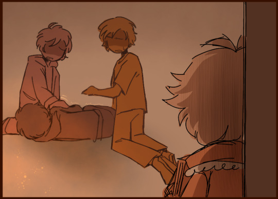
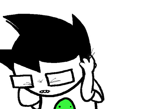
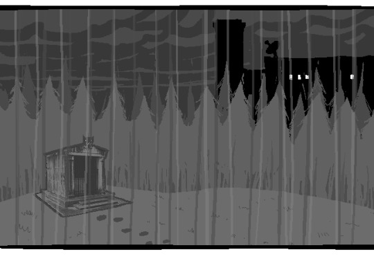
What have you done?
based on an idea @username8746489 had where sylvie discovered nightmare fuel for the first time on accident while getting bullied by some older kids (and pushing him further into social isolation now that he's known as "that scary kid who could summon someone's worst fear")
#♦️charlie's art#epithet erased#sylvester ashling#sylvie ashling#ok i have a lot to yap about here hold on#this was a challenge to make since i was imagining it with no dialogue and limited colors i hope i pulled it off#because of those two things something i had to think a lot about was how the color progression changes the mood#I wasn't originally gonna add that last panel with the aftermath but un suggested the idea of the bullies being vague shadowy figures#initially until sylvie realizes what he did and is forced to see that “that was a real person with their own fears and insecurities”#so then they're drawn more detailed#sylvie and the bullies also aren't in the same panels together until the last one because he's just so below them that he isnt worthy of#sharing equal space with them. these kids are highschoolers. if sylvie wants to look at them he'll always have to look up#and also because i was struggling with their height difference#i hope the second page doesn't make it look too much like sylvie summoned a fire 😭 it kinda helps with the mood but what he summoned is#supposed to be ambiguous and i dont want it to look like i was born yesterday and think nightmare fuel ONLY summone fire#but its hard to make it NOT look like fire when i can only work with orange#the lineart starts out clean and gets messier as the conflict progresses to represent a lack of control#and also it creates kind of a shakey/unstable effect which emphasizes sylvie's fear#also unintentional but i think the second page having detailed shading emphasizes the mood changes. this just got SERIOUS#oh also i used the mizu5 untrained as a color reference thats fun#ALSO SYLVIE DIDN'T KILL ANYONE im just realizing the one curled up in the last panel could be interpreted that way#that's not what i was going for#this might be unrealistic...... but we also know so little about sylvie's backstory that who's to say for sure IDK LET ME MAKE MY FAV SUFFER
131 notes
·
View notes
Text
Ranking the Metru Kanoka symbols by intelligibility

#1. Ko-Metru: First place goes to Ko-Metru for a fantastically clear image representing the district. The clearly discernible shape of the Knowledge Towers, the Metru's most iconic feature, even cleverly arranged to match the silhouette of the the Coliseum on the Metru Nui skyline, and the two dots on the sides possibly representing Metru Nui's dual suns/moons, emphasizing Ko-Metru's focus on astronomy, astrology, and all else to do with tracking the motion of the heavens. It doesn't get much better than this, folks.

#2. Le-Metru: Coming in at a close second place is Le-Metru, its symbol instantly recognizable as a collection of Chutes filled with cargo, a simple and elegant means of of showing of Le-Metru's status as the transportation hub of the city. Straightforward and to the point, exactly what we want to see.

#3. Onu-Metru: Third place starts to get a little more abstract, but the artistic intent remains fairly clear. The Onu-Metru symbol appears to depict a hallway of the Archives, with exhibits on either side and a steady stream of Matoran visitors and/or workers filing through the corridor. It is slightly less obvious than the two above, but if understood correctly, it is an excellent representation of exactly what Onu-Metru is all about.

#4. Po-Metru: Fourth place is where we start to see these symbols go off the rails, and where I'm going to have to start providing visuals to illustrate my interpretations. Po-Metru's symbol had me stumped for a long time. It is carved in the notch that held the Po-Metru Great Disk, but that isn't much to work with. I think I've finally figured it out though. I believe it speaks to the Po-Matoran's sculpture work, specifically one of their favourite subjects: maskless faces.
To my eye, the Po-Metru symbol appears to be six of these^ pieces arranged in a circle, or at least faces of similar shape. If that is indeed the case, then I commend the artistry, and the choice to use it as Po-Metru's symbol, as using the Po-Matoran's art to represent them is perfect. However it loses points for being less immediately recognizable than the preceding three symbols.

#5. Ga-Metru: And in fifth place, Ga-Metru veers further into obscurity. While simple and elegant, this symbol lacks any easily recognizable features to connect it to aspects of Ga-Metru's culture or architecture. At best, I can offer theories.
Perhaps the top-heavy shape of the blue section is in reference to the Ga-Metru lighthouses? It's possible, but seems unlikely as the shape is not an exact match and only bears superficial similarities.
Then perhaps the connected circles represent the connected pathways here at the Protodermis Falls, and likely across many other of the Metru's canals? Or even the long bridge from the coast to the island where the Great Temple sits? These possibilities seem more likely to me, but not enough to say it is either for certain. Regardless, the fact that the best I can do is offer some maybes is enough to land Ga-Metru squarely at the bottom of the list, kept out of last place only by...

#6. Ta-Metru: What is this. What-- What am I even looking at here? Is that a disk launcher? An eclipse? Is it meant to be the foundries pumping out the clouds? Is it an extreme close up of Lhikan's Hau or some other mask?
I don't know, I just don't know. I'll grant you that out of all six Metru, Ta-Metru is the most lacking in terms of iconography; the Great Furnace is not a terribly inspired building, nor are molten Protodermis vats exactly visually striking, but there had to be something that could have been done. If it is meant to be a mask, that's actually a fantastic idea. Kanohi are Ta-Metru's primary export, they'd be the perfect way to represent the Metru. But if it is a mask (zoomed in way too far), it's not at all recognizable as one, or as anything else for that matter. And had all six Metru's symbols been similarly abstract, that wouldn't be a problem! There's nothing wrong with a good old-fashioned Shape. But when at least three of the other symbols do such a quality job of showing off aspects of life and work in their Metru, Ta-Metru's symbol being so undefined places it firmly at the bottom. Last place.
#bionicle#bonkle#bonkles#metru nui#kanoka#it's always bugged me how some of these#are so obvious#so crystal clear and perfect for the metru they represent#and there's ta and ga-metru#being nothing in particular#and it doesn't help that they look so similar#even before i figured out what i think the po-metru symbol is supposed to be#at least it stood out as its own thing
183 notes
·
View notes
Text


image description in alt text
Remember me wanting to draw smth cute with HIV positive characters, because i realized that media kinda don't have non-drama centered scenarios with characters like that?
Well, here it is! Little comics based on asks which you sent me back then - one of was idea of characters having some bonding fun moment around pills routine
#HIV character#HIV positive character#HIV positive#HIV representation#representative art#seriously it doesn't even let me tap the tag which says it's not very used#we need hiv positive characters now now now people#described#id in alt text
163 notes
·
View notes
Text
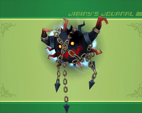
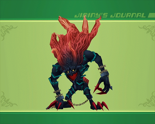
Kingdom Hearts 2 - Shadow Stalker & Dark Thorn
#kingdom hearts 2#kh2#shadow stalker#dark thorn#heartless#my gif#this boss fight is so cool for so many reasons#it's highly memorable to me because of how it takes full advantage of the location and possesses the entire ballroom#the ballroom is such an iconic disney location so it's really cool to watch it transform into something alive and nightmarish#also how the shadow stalker cocoons itself and emerges as a monstrous form that resembles the beast himself#the shackles representing how he's confined to his castle#the vines and thorns that wrap around its whole body depict his unhealthy obsession with the rose#it even has the ability to turn invisible which could relate to his isolation and how he doesn't even exist to anyone outside the castle#this form is definitely representative of what he could be if he succumbed to his loneliness depression and anger#good designs. good fight. and very cool reaction commands
225 notes
·
View notes
Text
i've been looking at my pile of crochet stuff, thinking about making another big project (like a blanket) and i'm glad i procrastinated my last project idea bc gifting a blanket to my ex would have been timed out very poorly
#mama when i tell you it was a great idea... very thoughtful...it would've been so good. it would've been a waste of fucking time.#it was partially procrastination but the other part is just that i felt them talking to me less and less so#i felt it even back then.#making a time consuming handmade love-filled gift was starting to feel more and more like#setting myself up for failure and holding the football out for myself to kick at and miss#i need to make a project that doesn't have so much emotional significance. i need to make it to sell or give away#and not as a specific gift for something that's supposed to be representative of anything#just a basic blanket#they already have a scarf I made them anyway. god. I hope they burn it or something
100 notes
·
View notes
Text
Quick question for the Touchstarved fandom!! As much as we love Ais calling us 'Sparrow,' I have to ask - if you had to decide, what other bird nickname do you think he would call you/your MC? :O
For example, Ais would my Unnamed MC Daniella 'bluebird,' while he'd call my Alchemist MC Edgar 'crow' (and another OC I'm planning, Shinju, 'woodpecker!')
#Ais calling Mhin 'that dove' has made something click in my brain and I had to ask this orz#Ngl it made me wonder- Does Ais base his bird nicknames off of appearance or personality?? Or both?? Or something else??#Doves mean peace and pacifism and uh *looks at Mhin* Peace and love to them but they don't exactly remind me of either of those- Mhin's hai#has the same color as doves though so that makes me think back to appearances.. But maybe peace is something that Mhin yearns for? Idk#Sparrows mean resilience; adaptability; joy; and freedom- I remember someone saying that freedom is something that Ais wants due to Ocudeus#But also that sparrows are one of the most common birds in the world- So to Ais (at least at first) you're just another face to him#and he tries to distance himself from you by calling you a common bird. I'm not sure where I'm going with this but it's probably something-#I personally like to think Ais's nicknames are a combination of personality+appearance but I could be very VERY wrong DKLSFJNS /lh#Tbh I doubt Ais is super focused on the deeper meaning of his nicknames (since he gave us our sparrow nickname upon his first impression)#But still!! This is just for fun- For my OCs let's start with Shinju - woodpeckers represent determination; communication; and opportunitie#Since he's a merchant these qualities are pretty fitting (still haven't come up w/ a solid design just yet but I'm trying to cook orz /lh)#As for Edgar crows mean death and the afterlife which KIND OF links to his scientific hypothesis?? (though Ais doesn't know about it)#But crows also mean intelligence; transformation; and wisdom which links to him being a scientist+alchemist.#Or Ais just calls him that because he has black hair LJSNDF /lh#As for Daniella bluebirds mean joy; hope; and renewal/growth which are pretty fitting for her#But Ais could just be calling her that since she wears a lot of blue lksjdlala- /lh (*cough* And also- *cough)#(I read that bluebirds are also supposed to be 'harbingers of happiness' which could be a cute little thing if Daniella goes down his route#touchstarved#touchstarved game#touchstarved ais#ais#touchstarved mc#touchstarved oc#Scream Posts For: Touchstarved#touchstarved daniella#daniella#touchstarved edgar#edgar#touchstarved shinju#shinju
71 notes
·
View notes
Text
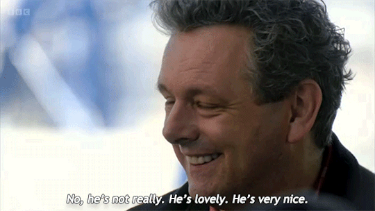
| Michael as Miles Maitland in Bright Young Things, 2003 vs. Michael talking about David on The Assembly, 2024.
#michael sheen#welsh seduction machine#david tennant#soft scottish hipster gigolo#the assembly#bright young things#miles maitland#the parallels are paralleling#sometimes i think about the fact that Michael has played so many queer roles#and how they all represent different parts of him#and how he keeps saying that he pours so much of himself into every role#life imitating art#or vice versa#or both#i think Michael has been telling us exactly who he is for a long time now#even if he doesn't label it specifically#david is lowkey bi and michael is highkey bi#discourse#gifs by me
221 notes
·
View notes
Text
To be loved is to be changed.
#my art#fan art#so this isn't even finished#but like; i hope ure not too mad w me abt that#i just thought it was finally time to let this one go; at least here; on the website that started it for me#what we do in the shadows#good omens#our flag means death#bbc ghosts#the magnus archives#wwdits#ofmd#go#TMA#nandor the relentless#anthony j crowley#crowley#blackbeard#edward teach#the captain#jonathan sims#our good shadows#yeah that seems like enough tags#please do note the little details but also dont#either way; i hope you enjoy this#i really liked working on it. taught me a lot#for many reasons. this represents the transition from one era to another. a change. if you will#and change is good. I think. I've gotten more used to it#doesn't make it any more easier to let go of the past. but you have to leave way to the present and to the future#so. yeah. Cheers. This one's for the future
325 notes
·
View notes
Text
Joyce is such a fascinating character to me cause she feels so... defeated? In a way that feels at the same time distinct and very similar to Harry. I think the reality lowdown sometimes gets written off as being manipulative, and maybe there's an element of that, but she's also self-aware and vulnerable in a way I can't imagine a woman in her position would ever be with Harry. And she seems genuinely sad about how everything turned out; she wants to be forgiven by Harry, and if you do, she doesn't feel like she deserves that forgiveness anyways. She's intelligent, and aware of history in a way that real world CEO and economic leader types rarely, if ever, openly admit. She openly regrets the way all that history played out, and it's so fascinating to me that she chose her idealogy and career while knowing and internalizing so many emotions about the revolution. She wanted them to succeed; but she's a survivor, first and foremost.
There's so many characters I wish we would ever get to see more of, but at least for me, Joyce seems like a character I'd really love to learn more about her past. Especially with how she talks about Cindy, it makes me feel like she had a revolutionary streak when she was younger; I doubt it was lost in any way that wasn't boring, life washing away her edges until all that remained was what we see in the game. Maybe it'd make her less interesting to learn more about her, but she's one of the most fascinating characters in the game to me, in a game filled with some of the most interesting and thought provoking characters I've seen in the medium.
#disco elysium#joyce messier#im replaying the game and decided to talk with her for a reality lowdown#this is the highlight of the game in act 1#along with the debrief with kim to me#i feel she's villainized so heavily by the fandom in a way that doesn't really capture whats interesting to me as a character#she's flawed#and straight up evil in some ways#her working with the mercenaries is proof enough of that#but at the same time her positive qualities add so much#to me she's a representative of the best of what a true capitalist is capable of being#and maybe its not a lot#but seeing her with that framing is so interesting to me-#mada rambles
116 notes
·
View notes
Text
"when ur reading an x reader fic and the author blatantly mischaracterizes u 🤮" "I would NOT fucking say that" idk man.........I feel like reading x reader stuff requires you to be.......okay w/a certain level of roleplay. like yeah, you might not be this exact type of person—or maybe even the slightest bit like them. but, for the duration of the fic, you ARE. that's what's kind of neat about them. you get to step into another version of yourself and walk around your favorite stories. call that latent theater kid energy or whatever. but I dig it. she doesn't have to BE me, she's just me for now. and I'm buckled IN
#also. reader HAS to have some agency and character in order to move the plot along.#otherwise she's the equivalent of a literary fleshlight & that's not as fun to write#this is ofc barring really extreme examples where reader is named/given distinct physical features#and additionally. idk if this is controversial to say. as I've seen a lot of takes from other reader authors like#''reader is a completely seperate entity from me/she doesn't represent me/my fantasies at all“#& that's cool and all. but for me. I'm writing these bc I want to fuck [insert loser here]#like yeah. it's ''you''. but it's also pretty transparently Me. welcome 2 my willy wonka chocolate river fuckride#idk this is probably incoherent. I'm yappin along#sam speaks
38 notes
·
View notes
Text
@gearbroth hey. HEY....... get Leyendeckered.
(another attack on gearbroth on both Star and Skal bc THEY DREW WOCJAA PERFECTLY AND I CAN'T LET THAT STAND) (inspired by this specific piece, and a Leyendecker painting)
(original* Leyendecker painting under cut bc it's really pretty)
*i can't find a perfect clean version with good color, full detail, and no weird cropping. But this one is close!

#cackle draws#artfight#Skal's hair turned out well ngl. no im not biased.#i was originally gonna reference That One Painting everyone redraws but found this one while collecting refs and the pose!!! i love it!!!!!#everyone needs to be proud of me bc i barely did any painting. it took a Painful amount of restraint.#me 1 hour in: i'm NOT gonna paint any of this im NOT GONNA#me 48 hours in starin' at Star's hair: Hans. Get ze size 4 inking pen.#(oh yeah also the flower's a black dahlia which totally doesn't represent anything bad. yep.)
100 notes
·
View notes
Text
Just fully processed that for the past two years, only horrors waited behind doors she could not open by herself. Herded in by an employee to be tortured in some new and horrific way. Just for the season to end with a door she cannot open by herself, keeping her away from the man she loves. The horror is that behind this locked door he isn't the man she loves anymore. The new torture is that she can see through this door and know exactly how she has been betrayed but the door still remains locked.
The torture is that he was able to reach her while severed and suffering in Cold Harbor but she could not reach him at all on the Severed Floor. He was just another lumon employee pushing her through a door and leaving her there to suffer. He doesn't know her at all.
The horror of watching your husband mimic being your jailer while setting your free.
#severance spoilers#severance#every door represents a new fresh hell for her#even the door outside lumon now means a world without mark#like....... uh#someoen bomb lumon for me#mark s inside it idgaf#(I do and I understand why he didn't want to die for a woman he doesn't know)
26 notes
·
View notes
Text
Hot take about the horror genre, I wish we used werewolves as a metaphor for female rage, something that is hidden and repressed in order to be perceived as acceptable until it destroys you and everyone around you, until the blood dripping from your fangs and claws are yours and theirs, bound together. Especially when placed in a story where men act on their aggression, their anger.
#writing#either the wolf represents the rage and injustices that burn through her#or it's just anemic because she doesn't eat enough red meat because it's expensive and went on a rampage to get enough iron. who knows.#and don't even get me started on cannibalism as a metaphor for toxic love.
181 notes
·
View notes
Text
I always find it a little funny and amusing the common "Corypheus's For I have seen the throne of the gods, and it was empty! is such a raw line, it goes so hard" because I've always been DEEPLY unimpressed with it. it comes across for me as super tryhard and edgy. I can't be impressed with it because it feels like it's TRYING to impress me, it's straining too hard to be A Good Line that it sounds forced. like, I don't even think it's the best line of that MONOLOGUE, let alone the whole scene.
#“I will not suffer even an unknowing rival” is a better line tbh#“I have gathered the will to return under no name but my own‚ to champion withered Tevinter and correct this Blighted world” is also better#it's also a bit of a ? when you remember Genitivi wrote that the Golden City and the Maker's throne was unattended after the First Sin#suggesting that at least SOME people in the south believe as is that the Golden City and the throne is empty#so like who is Corypheus trying to impress here. like yes you did find the Throne empty. some in the Chantry already say you did.#yes yes the silence of the Maker and his abandoned throne we all heard of it#(inb4: YEs I know he was following the Old Gods but he's trying to monologue about this at like the Chantry or someone representing it)#tbh now I'm thinking way too hard about this because— actually I won't get into dogma and theology and faith and Andrastianism#because the point really is more that this line doesn't impress me bc it's tryhard and less about its intersection with creeds#DA things
34 notes
·
View notes
Text
Evolution of Homestuck’s Art Style, Pages 1-1550

[page 1, 1434]
Since Act 4 began, I’ve been blown away by the visual difference between this and the earlier comic – there’s been a big shift in style, and huge increase in the use of color. So, re-reading and just looking at the art style, here’s an overview of the changes so far.
[a short one – 2.8k words below the cut + some very beautiful panels. I was limited to 30 images in a post, so would recommend looking up page references for the ones tumblr wouldn't let me include <3]

[page 4, 16]
Act 1 mostly uses sprite art and clean, tidy images; the white background is the dominant color in most panels. Where John is drawn freehand, he’s drawn as close to his sprite as possible, with a thick black outline and blocky shapes. This is often done to give him a more complex pose or facial expression than a sprite would allow (for example, p.16). John’s house is relatively tidy, filled with discrete items that it’s easy to move around and manipulate to create new panels – these are mostly either imported photographs rendered in black and white, or line drawings similar to John’s sprite. Occasional items are drawn in color – some due to their importance (Sburb logos) but some due more to common sense (blood capsules).
John’s captchalogue and strife systems are colored overlays on panels that are still mostly black and white. Full color panels show up when John (or Rose) uses a computer, showing their desktop background, or when John looks or goes outside and observes his neighborhood. Here, his near monochrome, thick-lined sprite stands out against the lineless background (the car and mailbox help soften this for now).

[page 195, 246]
Over the next few acts, Homestuck will develop an art style typified by its lack of outlines and straights, abundance of curves and swirls, use of patterned blocks of solid color to create light and depth effects, and emphasis on motion. Act 1 has the earliest steps towards this – my favorite is page 195, where John looks through his telescope and sees the meteor heading towards him. These styles of sky, clouds, wind, and small animated elements that don’t dominate the panel are all still common techniques in Act 4. The final shot of the meteor cloud in the End of Act 1 flash animation (p.246) – which is almost entirely full color outdoors shots – is another great example.
Act 1 is definitely not dull or colorless, and there's a real charm to its style, but it is overall functional. Panels are designed to give information, show the results of commands, and communicate a change of state from the previous panel – it’s unlikely someone would look at them just for aesthetic value. Act 1 has the closest to an ‘adventure game’ look, as lots of John’s items look like they should be clicked on for more information, and rooms are often rendered in an isometric style. In a narrative comic, this also makes John feel boxed in and stifled by the imposing walls and lack of color. His world is stark, monotonous, and cut-and-paste, somewhere he has been placed instead of somewhere he naturally belongs.


[page 312, 363]
Act 2 stays primarily monochrome, but panels are busier on average. Dave’s room (p.312) has so much going on in comparison to John’s (p.4) that in a video game, it’d be hard to know what to click on first. John’s room has become much busier now that it’s been looted and smeared by imps, which makes it harder to keep the art consistent between different panels and angles. Like John and Rose, Dave’s computer, house exterior, and inventory systems are shown in color. Dave’s living room is monochrome but has a fair amount of color through his brothers’ puppets, while John’s now has imps in harlequin outfits, build grist, and Nannasprite.
Rose is unique among the kids for never being placed on a white background. When she’s first introduced, her room is shown in pale gray to indicate that it’s getting dark in her house. This color is unobtrusive, close to white, and doesn’t feel like it makes the panels more complex. As a wildfire creeps closer, the sky around Rose tints red – a slight burgundy on page 398, and a more dangerous wine red on page 985. The mausoleum is also gray, with a soft lineless background unlike other indoor spaces. Rose is the first beta kid to leave her house entirely and go to a secondary location, heading down to the Skaianet Laboratory on page 840 – a much more visually complex area in which she’s shown against a green background until she goes back to the fire. If there’s any examples of her in a white space, I missed them!

[page 444, 665]
The kids are still drawn close to their sprite style, with occasional variation. Dave’s sprite is shaded in red and yellow on page 444 to represent the ‘sick heat’ he’s trapped in, and he’s shown in red silhouette as he steps onto the roof on page 665. In ‘WV: Ascend’ (p.757), every frame is full color and more detailed than most previous panels, and the kids��� and guardians’ sprites stand out as the only cut and pasted element. The landscapes are changing faster than the characters, which creates a feeling of unfamiliarity and their struggle to keep up with their new circumstances.

[page 248, 558]
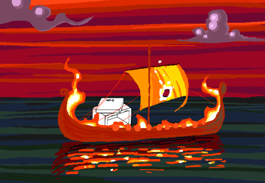
The Wayward Vagabond’s panels immediately look different from the kids’. Page 248 is easily the most complex still image up to that point, with the greatest color diversity (four shades in the sky, one in the city, and I think as many as eight in the sand). It’s very different from the blocky blue sky at John’s house. WV has a sprite too, but his is full color, meaning that when he’s drawn freehand he’s drawn without an outline. This makes him feel ‘part’ of the background instead of pasted on top of it, merged with his landscape while the kids are at odds with theirs. The 100-page Wayward Vagabond point of view section is the first extended sequence of full color panels, but by this point they’ve shown up enough that it doesn’t feel jarring.
Act 2 has the first panel where the art itself blows me away. Page 558, with its fiery boat sailing into the sunset, goes harder than any panel that’s come before it entirely in service of the Vaulthalla pun.


[page 760, 840]
Act 3 introduces Jade in the typical sprite style and monochrome interior, but she appears in her windowed garden atrium, so at least half of her first panel is in full color. The exterior of her house is more colorful and prominent than any kid before her, with various colors of clouds and plants; the same is true of her computer, which surrounds her in three-dimensional spinning colors instead of being a two-dimensional screen. Jade’s room is the biggest and messiest yet, as in just two acts the comic is already feeling limited by its ‘character stuck in a room’ format.
[page 225, 986]
This act shows the art style in transition, with even more color and complexity introduced into what are technically indoor panels of the kids, and more excuses found to draw in the softer, lineless style. On page 840, the tunnel Rose walks through is sketched like a sky, when an act earlier it might have been made of simpler, blockier shapes. Page 986 shows a very similar view to page 225, and the new version isn't necessarily more complex but it is more Homestuck, with increased texture and definition in the clouds and a fire moving through layered lines of color.
Just like in Act 2, ‘Years in the future…’ pages lead the charge with the changing art style. Pages 924, 1005 and 1035 provide lush post-apocalyptic landscapes with a beauty that isn’t seen on present-day Earth – even Jade’s island on page 1080, clearly designed to be visually interesting, doesn’t have quite the liveliness and definition of the post-apocalyptic pages (in my opinion).


[page 1051, 1147]
Act 3 also introduces the aesthetic vertical page. Previously, vertical pages are used occasionally for their aspect ratio, showing a book or the entirety of John’s house. Page 1051’s art isn’t giving information or showing a changed state, but stands out as an impressive visual and a pause for breath in between panels that do give information. Page 1147 is similar, and I believe it’s also the first time a beta kid is drawn in the lineless style (with detail to their form, not just a silhouette). This page comes right before the end of act flash, showing the final form the art has now achieved.

[page
Besides the monochrome sprite art associated with the kids’ houses and the lineless style associated with the outdoors, Act 3 introduces a couple more styles. One is the scribble style, first introduced with WV’s Can Town fantasies and murals, and then scattered throughout Jade and the exiles’ scenes in Act 3. Some panels in this style are explicitly intended to be drawn or imagined by an in-universe character, while other times they represent a strong emotion or sudden interruption.
The other new style is the color-adjusted jpeg, seen in Prospit (p.1029) and the dark kingdom (p.886), where the background is composed of externally-sourced images that have been manipulated and recolored. The over-saturation of a single color makes the location recognizable without need for its own distinctive art style – Prospit is entirely gold or yellow, the dark kingdom is entirely purple, and the Felt’s mansion is entirely green.

[page 1236, 1337]
The Intermission is made almost exclusively in this style, which adds a lot of detail to backgrounds while sacrificing some distinctiveness. While sprite art is used, the sprites themselves are entirely black or green, so they complement their environment the same way John complements his Act 1 house. By using images of a mansion’s interior as panel backgrounds, the Intermission is arguably more ‘realistic-looking’ than the representational art and medieval castles of the Acts, which ties into its grittier and more grounded tone.
With its goal of a fast production pace in advance of a more complex Act 4, there aren’t many artistic standout pages in the Intermission. A rare exception are the pre-city wasteland panels, such as page 1236, which blend the jpeg technique (for the stars and planets) with a lineless alien landscape of pleasantly rolling dunes. Pages 1188 and 1337 also blend these styles, but this is the extent of the lineless panels until Slick enters the safe.
[page 1358, 1407]
Act 4 introduces the Land of Wind and Shade (LOWAS) and the Land of Light and Rain (LOLAR), two planets with distinct designs in the lineless style where John and Rose’s scenes now exclusively take place. Both are stunning – LOWAS is mostly dark blue with gray clouds, and a focus on bioluminescence through its mushrooms and fireflies, while LOLAR is mostly white landmasses amid a sea of pastel blue, pink and yellow. Since Act 1, Homestuck has taken care to set its animated pages primarily outside the kids’ houses, with the notable exception of page 253’s walkaround. This is likely because color makes flash pages more interesting to watch and easier to interpret – but character or plot developments have still been the focus. Page 1407, which introduces LOLAR, is the first flash with a primarily aesthetic function.

[page 1446, 1457]
In Act 4, panels that might have been standouts in previous acts are now commonplace, such as John answering messages on page 1391-2. Use of brown and yellow keeps the exiles’ pages visually distinct from John and Rose’s, but they’re no longer a clear upgrade. This helps the comic skip back and forth between John, Rose and the exiles without a narrative transition, as the art change is less jarring. Pages that take place in Dave’s monochrome room are now the outliers, while Rose and John’s sprites (and Dad’s car) really feel like relics of previous acts. Even with John’s new full-color suit and Rose’s land including a lot of white, their stark lines and lack of shading don’t merge well with their landscapes and always become the focal point when these sprites are used.
As such, there’s more examples of John and Rose in a lineless style, which feels long overdue and catches them up with changes that have already happened. Fully lineless panels tend to be very well composed with clear artistic intent; easy to interpret and pleasing to look at. They often represent movement even when not animated, so work well for transitioning to or away from a character. Sprite panels, on the other hand, have much lazier composition. Messes don’t get cleaned up, and panels show irrelevant objects often half-inside the panel and half-outside, so even when they’re communicating clearly they’re often less pleasant to look at – I find this true of AR’s introduction in Act 3 (p.1100-1111) and all the Dave and Jade scenes in Act 4. Page 1446, for example, features the first prototyping of Dave’s sprite, but it’s hard to focus on the crow-sword’s move through the room with so much else in the way (in contrast with page 185, where the harlequin doll is clearly in focus for its prototyping).


[page 39, 1523]
As a final comparison to illustrate this change, let’s look at page 39 side by side with page 1523. In both cases, a character is typing in Pesterchum. The reader has already seen the kid’s location and nearby possessions, so the images do nothing more than illustrate that the character is on their computer, while the meat of the page is in the Pesterlog.
On page 39, this is situated between two John panels where he takes different actions (assigns Hammerkind and captchalogues a book), so page 39’s image feels necessary to the sequence. On page 1523, this is immediately followed up by another image of Rose, still on her computer, and one that feels far more dynamic. Rose gets a facial expression and sitting position that give her some character, the close-up shot feels intimate for an important conversation, and the background is still present through the ocean behind Rose and the shading from her umbrella. So while there’s nothing wrong with page 1523 (which does successfully re-establish Rose after some pages away from her) or with the sprite style in general, the upgrades to other areas of the art do make the sprite pages feel weaker by comparison.
[page 1524]
Whether intended or otherwise, the kids’ houses being the only monochrome, heavily outlined spaces while all other locations are full color and mostly lineless, is really evocative of the comic’s title. The first full-color panel is John’s desktop on page 24 featuring the Slimer background he made himself, and later his computer becomes a gateway to the Medium where he can access a whole world of color designed just for him. In contrast to being ‘stuck’ in defined dimensions and copied images, the kids are entering a world of beauty, motion and art for its own sake. The exiles’ panels introducing the lineless style and the kids’ following reflects the exiles guiding the kids into the Medium and towards their eventual quests. LOWAS and LOLAR’s fantastical designs add a sense of magic to the story, bringing it away from games and technology and towards more esoteric, unknowable forces. Their unique designs compared to the kids’ similar-styled houses recalls Rose and gallowsCalibrator’s mentions of Sburb’s ���flexible mythological framework’ (p.440) or ‘HYP3R FL3XIBL3 MYTHOLOGY’ (p.1524), which apparently extends to the level of art style.
Personally, I think the swirling, lineless art style Homestuck has developed is very pretty, but does take away the ‘point and click game’ feeling of Act 1. It’s interesting that the art style develops alongside the reader-command format – Act 1 is almost entirely reader commands, while Acts 2 and 3 mix reader commands with author-driven exile commands and ==> pages, and Act 4 has already seen the reader suggestion boxes close for good. I think the question of ‘is Homestuck a game?’ is still relevant, but needs a different answer in Act 4 compared to Act 1. The level design of LOWAS, LOLAR, Prospit and the dark kingdom is excellent, but they’re for running around and fighting, not standing still and clicking. The genre has changed, and the characters’ roles in the game are being reconfigured alongside the players’ and narrators’ roles.
So, how will Homestuck’s art develop from here? My guess is that there will be a decrease in GIFs and an increase in still images, as the new style is likely harder to animate and better at conveying motion without animation. Act 4 is setting up to bring Dave and Jade into the Medium as quickly as possible, at which point there will be five planets (including post-apocalyptic Earth) each with their own distinctive designs. Once this happens, there will be no need for scenes inside the kids’ houses, and the comic will be able to eliminate the kids’ sprites altogether (or at least re-design them with more color and fewer stark lines, more similar to the trolls’, exiles’ or Felt members’ sprites). Dave and Jade’s sprites being prototyped may further affect the Medium, perhaps affecting the light and dark kingdoms as planets as well as just their agents. Finally, I think there will be a focus on how the kids’ actions physically change the landscape of their planets, as this has already been the case with their modifications to their houses.
[page 1395]
#homestuck#analysis#i like to look at it! it's a beautiful comic there's a whole bunch of panels id get framed for my wall#if i had money or a house!#act 3 also doesn't have a super defined identity so thinking abt it as a transitional act for the art is cool to me#also wish id thought a lil more abt facial expressions and emotions and how they are represented in sprites#but im trying to keep posts short and simple and not let them get away from me. so. i will stop here <3#chrono
21 notes
·
View notes