#is that my DEFAULT DPI??
Explore tagged Tumblr posts
Visit Tumblr Blog
Explore Tumblr blogs with no restrictions, modern design and the best experience.
Last Seen Tumblr Blogs


Fun Fact
In 2020, 27% of US Tumblr users had an annual household income of over $100,000.
Text
maybe it was not a good idea to make the 7 page comic 2100x2400 pixels at 600 dpi (every time I save it it takes 5+ minutes)
22 notes
·
View notes
Text

miku with the minecraft diamond sword
#hatsune miku#vocaloid#vocal synth#does this technically count as fortnite fanart now#ignore how crunchy she is this was a part of a larger assignment in which i had to use a MASSIVE canvas and downsized her to put her here#300 dpi? 7000x7000 canvas? in this economy? (ignoring that 600 is MY default lol)#miiiiiight post the full piece she's part of here at a later time? not sure yet lol#cirrus's scribbles
10 notes
·
View notes
Text
so um I now take back anything bad I said abt free firealpaca
it was me I was the problem
my image is 6000x8000px 600dpi and like 23MB
5 notes
·
View notes
Text
I had to take some stuff down so I could fix them, but these lil mushroom babs are still up!

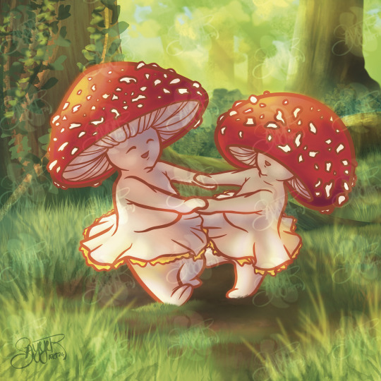
My lil mushroom babies. If you even care. 🍄🟫🍄
#art#my art#redbubble#artists on tumblr#i had to take kes down and there were 3 other things that were the wrong resolution!#cause i wasnt paying attention when i created the files! they stayed at procreates default 132 dpi!#instead of 300 dpi so they were blurry and thats not great!!
12 notes
·
View notes
Note
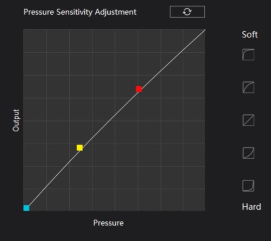
hi!! how do you achieve such control over your line weights? what is your pressure curve? really in love with your linework ><
here's my defaults for sketches
canvas: b5 landscape 350 dpi
still using su cream mostly
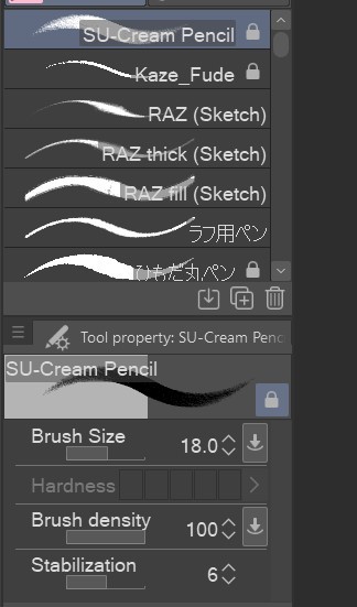
and curve lol (im using a regular huion pen tablet, i did have trouble making my lines as fine with su cream using a screen tablet though)
96 notes
·
View notes
Text


Commissions have reopened for 2025. Digital paintings, doodles, and 3D lowpoly models. There is a New Year Special for 25% off the price of commissions, the special ends February 15th. More information and my Terms of Service can be found [ at my Blogspot page. ]
[ Digital Painting Commissions ]
1:1 Portrait - starts @ $65 Half-Body - starts @ $90 Full-Body - starts @ $125
Starting price is for single low complexity character with low detail background.
Favorite painting subjects: Creatures, animals, aliens, unusual humanoids.
[ Page of Doodles ] Starts @ $35
8.5 x 5.5 inch page @ 300 DPI filled with as many doodles as I can fit onto the page. Optional: I can create transparent .PNGs / . GIFs of up to 6 doodles from the page if requested.
Starting price is for 1 - 3 low complexity characters.
[ Lowpoly 3D Model ] Starts @ $50
Starting price is for low complexity model with no alternate textures / geometry and a simple rig. Personal Use Only permissions are now included with 3D lowpoly models by default.
Favorite 3D model subjects: Creatures, aliens, anthropomorphic characters.
[ Flat-Rate Slots ] 1x Painted Full-Body $115 any complexity 1x Painted Half-Body $85 any complexity 1x Lowpoly 3D Model $70 any complexity – with choice of personal or commercial-use permissions included.
Be sure to read my [ Commission Information ] page before contacting me regarding commissions.
62 notes
·
View notes
Note
what's your default size on a canvas? i'm so indecisive about it
Usually, it's somewhat around 3000x4000 px and always 300 dpi cos I send most of my work into print! If you don't, 72 dpi works for screens 🫡
103 notes
·
View notes
Text

WELCOME TO THE 10TH ANNIVERSARY OF THE OBJECT HEAD ZINE!
In celebration, the 2024's edition will be a Grab Bag - draw whatever object head you like (so long as it fits the guidelines, see below). In Lieu of a theme, all submissions MUST HAVE ASHLEY (the megaphone mascot) in the piece! Feel free to make him as large or as small as you want in the composition. He can be hanging out with your characters or he can be on a flyer, just so long he's somewhere in the picture! Reference of all his outfits can be found here. But don't feel like you're restricted to his previous outfits. Feel free to dress him up in anything you'd like. Content is also free for whatever! You want to date the lil man? Go for it! You want to tease or go on the attack? Also fine! Ignore him and let him live his life? Sure thing.
ALL submissions will be accepted as long as they fit guidelines and each person has a limit of up to 3 submissions. Submit your pieces to the zine email objectheadzine(@)hotmail(.)com along with the email/website/name you’d like to be credited as. (Feel free to omit emails if that is more comfortable). When you’ve finished your piece(s), you are allowed to post them to your blogs as long as you link back to the zine blog! This will be a DIGITAL ZINE ONLY and will be available free upon completion (donation optional).
The guidelines are as follow:
Illustration-quality works in either digital or traditional mediums. Both colour and b/w acceptable; background required. *BG can be as simple as a pattern or colour block! Avoid utilizing a camera to submit your images, please use a scanner.
The default size will be 6″x9″, 300 dpi (1800px x 2700px) but feel free to go larger or smaller, so long as it follows those proportions. Please work in a vertical format.
For consistency’s sake, keep faces to a minimum (You can have eye(s) or you can have mouth(s) but don’t have both in a humanoid arrangement.)
Ashley, the megaphone head mascot, must be included in your piece. He can be small in the picture or a large factor but he must be included. When submitting, if he is not obvious, please point him out to me. References are found here.
Please go for original characters (or fanart of your friend’s characters) and not so much established object heads (e.g. the popcorn and soda heads from No More).
If you want to include humans, that’s fine as well but keep the ratio of people to object heads 1:1.
Content should be at most PG-13: Romance is fine but after-hours business should not be implied, Blood is fine but no gore. In the end, use your common sense.
Feel free to draw a comic or just an illustration! A comic counts as one submission.
Some facts about Ashley that could help with your piece: He's 5'2", he's of Chinese nationality, he's a TV show host, he's a bubbly, happy-go-lucky kind of guy and he has a Samyoed dog named Cotton!
Note that if a submission does not meet the above guidelines, I will either reject your submission or suggest improvements that would help your piece fulfill them. Please email me at objectheadzine(@)hotmail(.)com if you have any further questions and I’ll do my best to reply promptly. If you do not receive a message from me within a few days, please send it again. Final pieces submitted should be either in PNG or a one layer PSD file format.
Want to share your piece as you're working on them? Come on over to the Object Head Zine discord!
THE DUE DATE FOR SUBMISSIONS IS NOVEMBER 9TH.
782 notes
·
View notes
Note
I love ur art so much - I was wondering what size canvas/brush/DPI you use? I can never seem to get my brushes to look right and always want to use bigger canvases to make my lines look sharper but I feel like if I made them as big as I needed, the size is just absurd (like 8k by 6k but idk maybe that’s normal??)
My style has a similar feel to yours when I draw trad but I can never seem to have the same effect on digital and idk why.
Anyways thanks for sharing so much of your amazing art!
If you mean 6k pixels wide/tall then that is definitely way, way too big! Big enough to make your brushes look weird or lag depending on your rig. I've only ever seen canvases that large being used for comics that will go on print, and that's still on the higher end of that!
Generally, my canvases fall in the 1800x1500 ballpark nowadays - some of my older stuff on here was drawn much larger (like 3 or 4k) because, again, I also do comics - so I was setting my canvas sizes similarly to how I would a page without thinking about it.
DPI is kind of irrelevant unless you're printing, 300dpi is the minimum you want to do if you're planning on it and the number I stick to by default, because you never know!
As for brush size, it varies wildly depending on necessity/type of brush. The only reason I can come up with for your brushes not looking sharp enough on a standard sized/canvas are blown out textures (like, if you set them too big). Or, if you're judging them by how they look when you're way zoomed in. I always suggest that people avoid zooming into their art too much as details that you slave over can just get completely lost in the end.
Hopefully this helps!
95 notes
·
View notes
Note
What do you use to draw with? Like what device and drawing app? I finally graduated high school and want to get back to drawing and maybe start posting it but I wanted some advice
Hi~
I'm just gonna go and give you my full setup (plus health advices coz trust me they're important).
These days I use an IPad Pro 11" and Procreate. My friend has the bigger version but I hurt my elbow using it because it made my moves too big, so I settled for the littler version. I suggest you chose based on your feelings for that. If you want a bigger screen to see more of your work, it's perfectly valid.
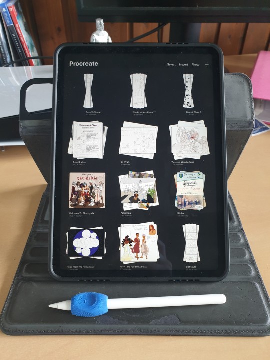
If you do take those two, I suggest you also take the ICloud save. (I have the 200Go save and that's only 3€ a month, but the 50Go save in free!) Should your IPad eventually break, you'll be able to retrieve ALL your art files from the Cloud, which is a huge lifesaver!
(I used to use a simple computer plus graphic tablet plus Adobe Photoshop, but it kept crashing so much that I had one too many rage quits. Plus it's super expensive since it's subscription based, and nowadays they take your art from the Adobe Cloud to feed their AI, so I can't really recommend that. Photoshop is an excellent tool but the direction Adobe is taking does NOT suit me.)
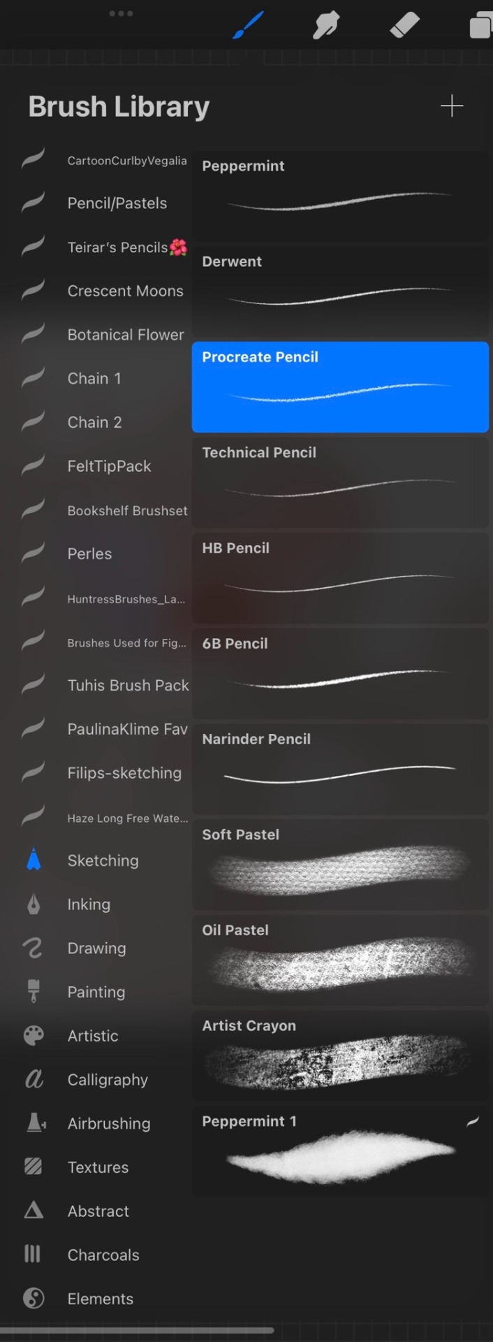
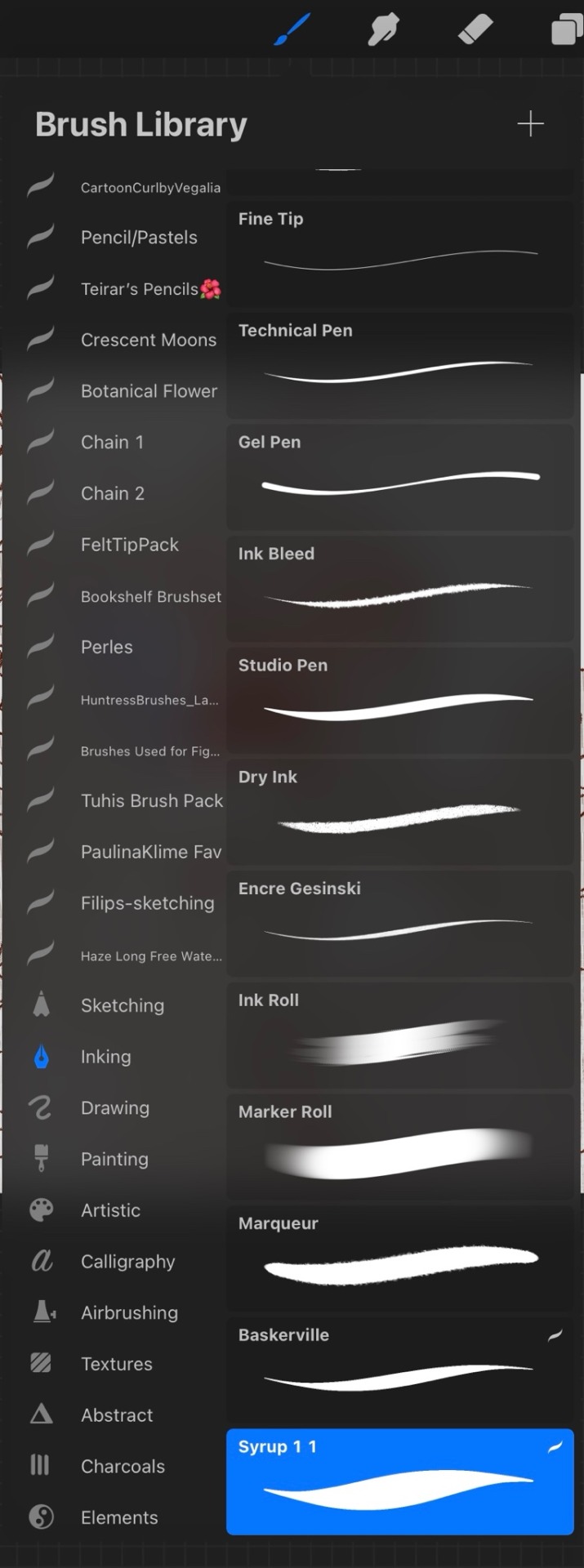
For brushes I just use the default Procreate Pencil. For the eraser I use Syrup, which is found in the default Inking Brush set.
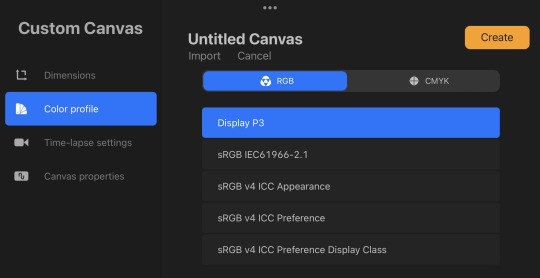
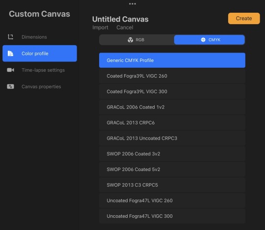
My base canvases are 4000x4000px with a DPI of 300 (I suggest you improve the DPI if you do illustrations or really precise work. I only do little fanarts and comics with that DPI). For posting online please be careful to chose an RGB color profile (I use the default Display D3). If you ever want to print though, you should chose a CMYK color profile (I use the Generic CMYK Profile then).
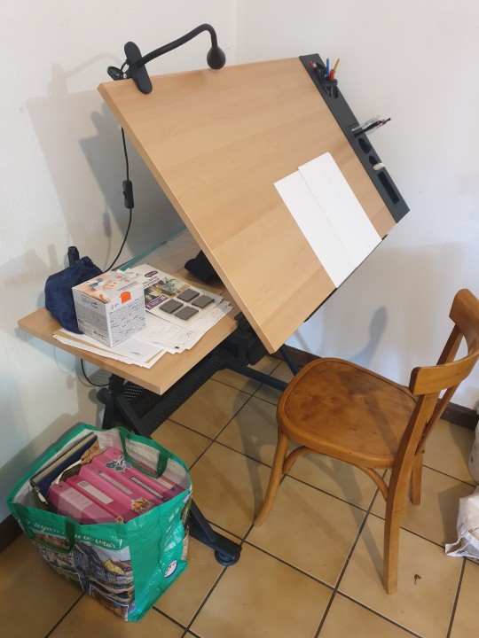
Now back to the real world! I'm going to strongly suggest you make sure your paper/computer/screen is at least at an angle, at best right in front of your face. The least pressure you have to put on your neck (bending), the better it will be. If you do traditional art, I'll suggest actual art tables that you can adjust in size and angle. Here's mine.
To prevent any pain in my thumb I use one of those hold-helpers thingies kids use to hold their pens properly! It increases the size of the grip which prevents from holding the pen too tight (trust me, it's important). You can also find special tape to roll around your pen if you need an even bigger grip.
I wish I had a proper desk and chair because that will also be very important for your posture and health, but rn I'm not in my own flat so eh. What I'll encourage you to do instead are stretches and exercises BEFORE and AFTER an art session. Fingers, wrist, elbow, shoulder, back, neck. If you want to avoid medical costs (masseur, kine, osteopath) you need to take great care of your body. You can also find little self-massaging gadgets in sports shops to help with your muscles.
(Talking from experience there. I'm only 25 and I already had to undergo surgery on my writing wrist because I f*ed up. Your health is important!)
I'm aware most of those are extremely expensive to get (it took me half a year of intense working and savings just to get the IPad) but I've found that they were 100% worth it in the end. It's alright to get things little by little if you feel they are going to be important for you. I strongly suggest you invest in your health first though!
Once you have decided on your preferred setup, I guess the only thing left to do is train, experiment and have fun!
I think that's all? If you need more advices on setups or art or whatever, I'd be happy to help, my DMs are always open!
Also congrats on graduating highschool!
#that's probably a lot more than you asked for lol#I'm physically incapable of giving simple answers sorry#ask me anything#art setup#health#advices#art tips
36 notes
·
View notes
Text
Heard a little rumor about Adobe. Now's as good a time as any to share with everyone the apps I draw/paint in. 😉
Infinite Painter (Android) - This is my default. I did exclusively traditional mediums for a long, long time, and this app feels the most like using the "real thing". It has vectors, filters, and a robust editing menu. It autosaves. New files open with a menu of commonly used dimensions/dpis so you don't have to memorize them. It has an extensive online manual that teaches you how to use everything. It can export to just about anything - it'll even save all your layers as transparent PNGs if you don't see the filetype you need. (Cons: the larger your canvas, the more likely it is to glitch, and the fewer layers it can comfortably support.) It's cheap, and a one-time purchase.
Medibang Paint Pro (Android/Mac/PC) - This is where I make comics. It has built in tools for manga: frames, fonts, screentones. It autosaves temporary backups. It has online storage so you can bounce back and forth between editing on your tablet or your computer, and group access for multi-person projects. It has a basic online tutorial, regular user-written tutorial articles, an active online community, and sponsored contests with cash prizes. (Cons: It doesn't have a basic rotate tool, or many editing/filter options.) It's cheap, and while I did a one-time purchase, I think they've either switched to or offer an optional subscription model.
That's... about it, really. For me everything else is pencil and paper. Or epoxy putty and model paint... Once or twice a year I break out the watercolors. I dabbled in Clip Studio Paint, but the menus are way too tiny on my small tablet. I recently downloaded IbisPaint (Android/Apple), but I haven't tried it out yet.
35 notes
·
View notes
Note
sorry if you’ve answered this before TT but i was wondering what brushes you use and what you draw on
No worries my friend, happy to answer :] !
The program i use is Clip Studio Paint and for years i used a Wacom Intuos tablet for when i’d draw on my laptop but since november i’ve been using a Galaxy S9 FE. Still use Clip tho!
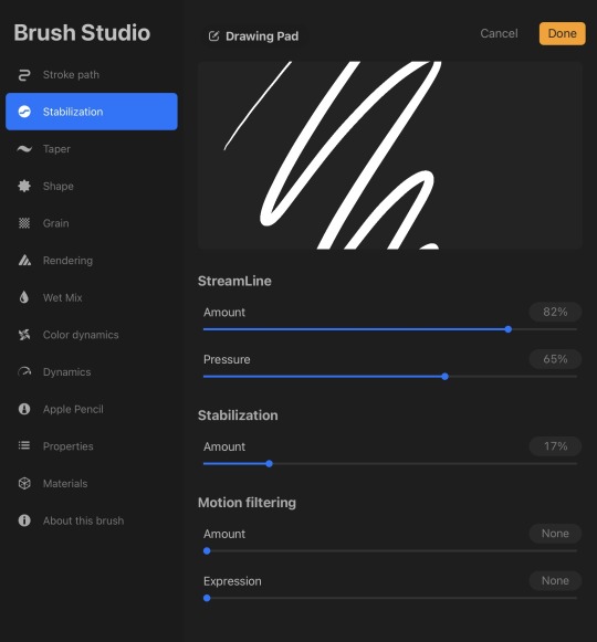
I usually draw on a 2100x3150 canvas with a dpi of 300 or 600
as for brushes, i just stick with the default stuff LOL i use this one for all my lining/sketching:
8 notes
·
View notes
Text
Setting Up a Zine Layout for Print (with Affinity Publisher)
Listen up shits spoons
Heyo back with another guide for folks new to art and layout! In this one I'm gonna talk about setting up your zine for print with a commercial printer (Like Mixam). If you wanna look at my other guides you can see them here (as of the time of this one I've done one other guide, but I enjoy doing these so I'll probably do more as time permits)
I'm specifically gonna be talking about using Affinity Publisher 2 because its what I do all my professional work in, but the ideas should hold solid for other programs like Adobe InDesign, Publisher 1, or others! I'm also gonna talk specifically with Mixam measurements since they're my printer of choice.
I'm going to get real into the basics of this one, so if you've done a good bit of layout already this is probably all old hat for you. I'm specifically skipping around the topic of Color Management, but I talk about it a LITTLE.
This is a lot of text, so if folks would like I can probably record the setup some time in the future if that would generally be helpful? Lemme know what we want haha
Okay lets dive in though
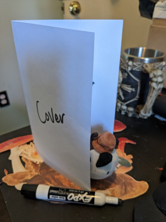
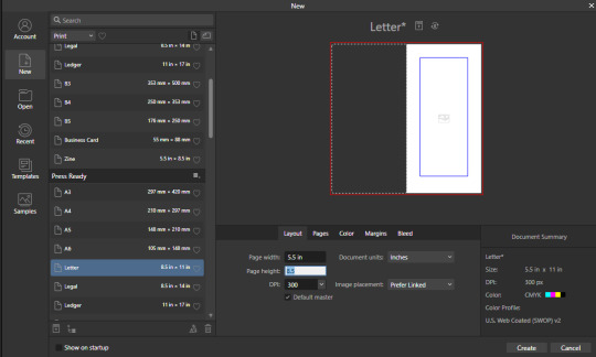
So lets start at the very beginning which is choosing a page size. I'm going to assume we are working with Letter sized paper because that's what most folks in the US do, which means we want to set the pages up to be half letter. This is gonna give us a zine that folds like this just for clarity.
So lets hit File->New... up top, and you'll get a screen that looks like this. We are going to change our measurements to be Page Width 5.5 and Page Height 8.5 which is our measurements all folded and whatnot. We want to set our DPI to 300 so the printer has plenty to work with and we don't end up with pixely shit on the pages.
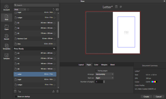
Under the Pages tabs things should default correctly, but we want Facing Pages to make layout a little easier, and we want to start on the Right with a single page. This tab should look like this
Next we are gonna hop on over to the Color Tag the long of the short of this is we want to work in CMYK/8. I'm specifically working with the color space used by Mixam within CMYK/8, but your computers default should be fine here, so just set your Color Format to CMYK8, and let it choose the default for Color Profile.
I don't personally set Transparent Backgrounds because I think they're a fucking eyesore, but that's dealer's choice and if you prefer them what's wrong with you good for you.
Color Management is really a pretty complex topic I'm not really good at talking about because I don't have the knowledge I should on it (I've largely worked in Black and White!), but here is a really solid primer on why we want to work in CMYK over RGB, and why that's so important for printing.

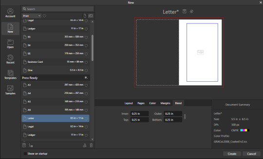
Hopping over to the Margins and Bleed tags, we are gonna do some minor changes to the default. If you're laying out something over say 60 pages I'd look at editing the inner margins here a bit.
I'm gonna go off the Mixam Full Bleed Print guidelines, and give myself some extra space for safety, but if your printer has other thoughts you should follow those instead. I've found that generally these guidelines work for most projects so you're usually safe to follow this bit as is. If you don't know what Margins or bleed are, I'd just read through the full bleed print guidelines linked above because it's a great primer. If you don't care or already know, keep reading.
For Margins we are gonna include margins and set our inner margins to 1 inch, and our outer/top/bottom margins to .5 inches
For Bleed we are gonna set everything to .25 inches for safety, Mixam only needs .125 inches.

Finally, so we don't have to go through this every single time, we are going to save this setup by clicking the button up top (next to where it says Letter* on my screen). I'm calling mine Mixam Half Letter Zine so I can remember it next time.


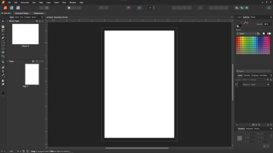
FINALLY you can click Create at the bottom right of the popup, and if you've done it right you should be greeted with a screen that looks somewhat like this
Now we're gonna set up some Master pages, font and paragraph styles, baseline grids, and guides to get the best looking zine possible.
At the top of the screen we wanna go to View->Preview mode, and make sure its unselected. This is gonna make sure we can see all the setup we are doing now, you can unselect it at any time (by hitting the toggle or Ctrl+shift+w) to see what the zine looks like without our guidelines on once we get them setup. Also on the view menu we want to turn on basically everything except Grid in the top bit. Here's what your menu should look like, and what your page will look like if things are setup right!
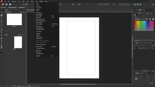
Okay so lets start with Masters! Setting up a good flexible master page or two is a great way to make sure your Zine keeps a consistent look throughout, and it carries your setup across pages! Look to the top left of the working space, and lets go work on Master A by double clicking on it.
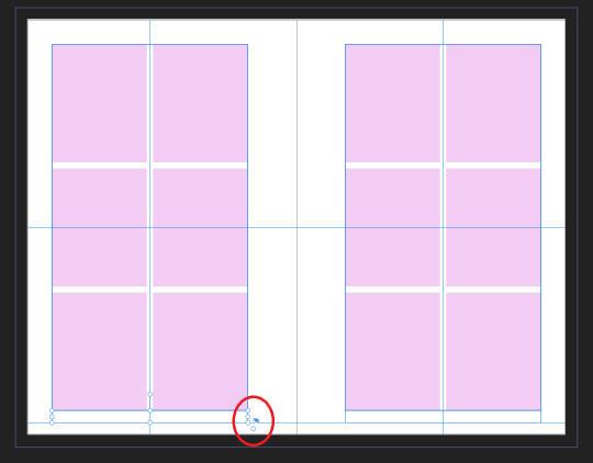
I'm going to setup a quick set of guides just so I can lay things out a bit easier! While on Master A hit View->Guides and under Column Guides we are gonna add in 2 Columns and 3 Rows with a Gutter of .125 inches. The margins should be correct, and we want the Spread to be at x:0 y:0 which it should by default. In a lot of circles you will hear this called The Grid, but my friend Clayton did a great guide on this already so I'm linking that here. I also like to set some Horizontal and Vertical guides just so I know where the exact center of the working area is, so I'm going to make 2 Vertical Guides at 2.5 and 8.5, and a Horizontal Guide at 4.25 inches. The long of the short here is this gives us a lot of room to snap things to in the future. I set my Column Guide to pink to make it stand out a little more, but when you export this it'll disappear so just set it to whatever color works best for you.

With the master set, click back over to Page 1, and you should see it now has a series of guidelines based on this master. Hell yeah.
Lets move on to text styles now! These are going to save you a lot of hassle in the future with making sure everything matches, and works how you like. Double check that you're off the Master, and then lets make a text box using the Frame Text Tool, and lets get ourselves a text box somewhere on this page. The placement doesn't SUPER matter here because we are just going to erase it at the end.
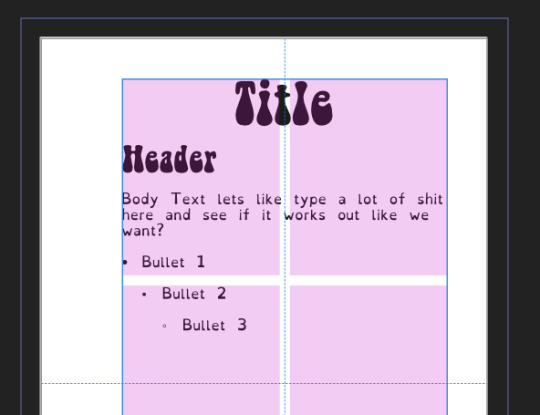
Toss a few lines of text into this box, I usually use Title, Header, Body Text, and then 3 lines of Bullet Text
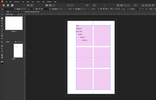
Now we are gonna hop into the Text Styles menu. I keep mine pinned on screen, but if it isn't visible, you can find it under Windows->Text->Text Styles

Now highlight each of these lines of text, and double click the appropriate text style from this menu (ie we are gonna set Title to Header 1, Header to Header 2, etc). It'll look something like this when you're done

Now we're gonna change each of these lines of text to look how we want! For the example I'm making my titles and headers in Bellybeans FG, and setting the rest of the text to Open Dyslexic and resizing them so they look good.
My page looks like this now
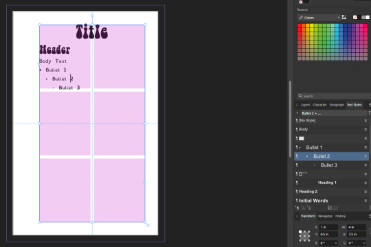
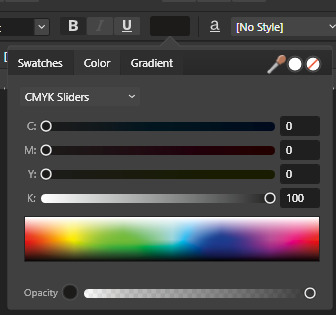
Now's a great time to mention that there is a difference between Rich and True black, and it's confusing and it fucks a lot of folks up. The link up above (the primer on CMYK above RGB) talks some about your blacks, and links to a follow up article about them! You can skip reading any of that for now (but like you should), because the tldr here is going to be make SURE that if you are using Black you have the color set to c:0 y:0 m:0 k:100 if you don't wanna have issues later!
Now we want to update our font styles to match! To do this we are going to go back and individually highlight each line of text, and then right click the matching Text Style, and hit Update. The screens should look like this.

Next we are gonna set up a baseline grid! This makes it so that text on one side of a spread is gonna line up correctly with text on the opposite side of the page, and just helps with making pages look good and even! We want to set the grid Relative to the Top Margin, and then set the spacing to whatever you feel is correct in your heart of hearts. These are the settings I've used, but do whatever looks good here, there are probably some hard and fast rules for how to do this well, but I do not know them.

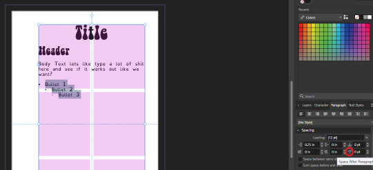
On my specific example you can see my Bullets are really spread out, and I don't like that, but the Body Text lays out much nicer. Lets deal with some spacing issues!
We are gonna hop on over to the Paragraph tab now, for me this is another tab on the Text Styles Window, but if you don't have it visible Windows->Text->Paragraph should bring it up.
So for me personally I want all my bullets to be on the following line, and not skip a whole line between them. I'm going to highlight all my text, and in this menu I'm going to go to Spacing > Space After Paragraph and set the amount to 0 pts.
You can also go further into this tab to change some more rules about what your bullets look like (things like how big your tabstops are, what the bullets look like, etc) but I'm not getting into that here!
After all this I'm gonna hop back into text styles, highlight each line of bullets, and Right Click->Update style on each of them (Just like we did previously!)
It's really tempting to skip this section of setting up your zine, but it enables a lot that can really help you out a ton in the long run. Having standardized Headers allows easy updating of headers and titles across the document, easy setup of Table of Contents for folks using them, and also on export is going to auto-bookmark the pdf for folks using PDF formats. It really pays to take time and set things like this up correctly the first time. After you're happy that this all looks good, you can go ahead and erase this text box.
Now we can break into zine layout proper, but if you just wanted basics you can stop here! Whatever you do from here is gonna print pretty decently.
If you'd like to stick around I'm going to set up some slightly nicer master pages, talk about why I use multiple masters, set up page numbers, and get us a table of contents!
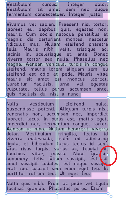
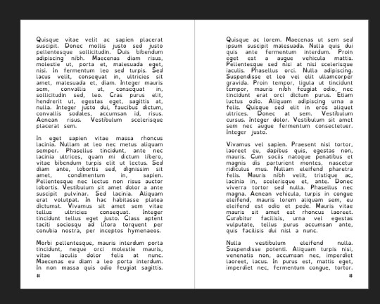
So from hereon I'm just gonna work on laying out a basic Zine. So let's hop back into our Master Pages, and start setting up some flexible masters. I know I want at least two masters, one where I have text on both pages, and one where I only have text on the rightmost page. For right now we are going to just work on the spread with text on both pages, so I'm going to create a text box on both pages within the spread that fills the entirety of that guide we set up earlier. On the leftmost page, I'm going to right click the text box with the Frame Text Tool selected, and I'm going to choose to Insert Filler Text so I can see how everything looks.

Make sure this text is in your Body Text Style, and then click the little triangle on the text box
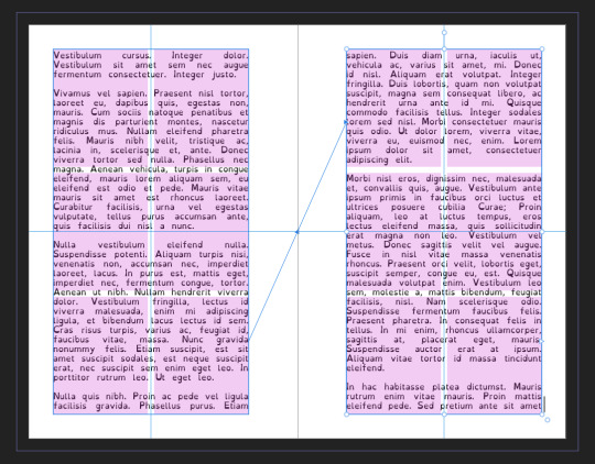
I'm now gonna select the textbox on the rightmost of the spread. If you did it properly, your page should look somewhat like this.
After I'm happy with this page, I'm going to erase the text in both boxes. I wanna add in some page numbers now. They aren't going to fit in the boxes here, but if you remember correctly I left myself a little bit of wiggle room when I set up the margins! Mixam needs .25 in clear, but my boxes are all .5 inches from the edges of the page. To make sure I don't egress the space too badly here, I'm going to set up a new horizontal guide from the View->Guides page we used previously, and I'm going to set this guide at 8.25 in which is the true bottom edge of our workable space.
I'm going to create new text boxes for our page numbers that line up with the outer edges of our guides, and the new true-bottom line I just set up.
It looks like this, but there's an eye icon which means no text in this box is going to be visible!
No worries this is because our baseline grid isn't playing nicely here, we are gonna break it in a moment, but for the mean time lets right click this text box, and select Insert Fields->Page Number

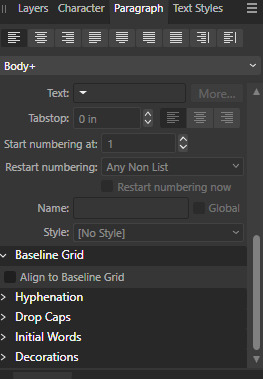
On the left page I'm also going to Bold and Left Align this box, but otherwise keep it in my Body Text Style. With the text all highlighted, I'm going to hop into the Paragraph window again, and scroll down to Baseline Grid->Align to Baseline Grid, and turn that option off.
My page now correctly shows a single # in the spot I'd want my page numbers to be. When this master is used, that number will automatically update to be correct! I'm going to duplicate this text box, and drag it onto the right page of the spread, and set the alignment to Right. I'm going to refill the textboxes with Filler Text for a moment, and turn Preview Mode on so I can make sure I like the page. For me this master now looks like this
I'm going to duplicate this master now, and on the left page of the spread I'm going to remove both text boxes. I like to name my masters so I know what they are at a quick glance. This is going to leave me a second master that looks like this.

You can get really involved on your master pages generally! I'm not doing anything fancy with this one, but previous projects have that heavily used masters might have pages that look more intense and include things like photo boxes, more complicated sets of text boxes, and even some text to use as a guide as I go.
Lets hop back to Page 1 of our doc, and leave the masters behind
Page 1 is going to be the title page for the book, but it likely now has a bunch of details now that you don't particularly need. If you have a master you don't want on a page, you can right click the page, and click Clear Masters.
I'm almost out of images on this post so I am gonna go mostly imageless from hereout. I'm gonna toss some text on pages, and then make a table of contents, and get my page numbers fixed up since most people don't actually want to count the Cover as Page 1 as far as page numbering goes.
With the project laid out, and the pages where I want them, the actual "Page 1" is going to start on Page 5 for me. Looking at the pages on the left side, I'm going to right click Page 5, and click Start New Section. On this new section I'm going to fill it out so the new section starts on page 5, and restarts the numbering at 1. Here's what it looks like for me.

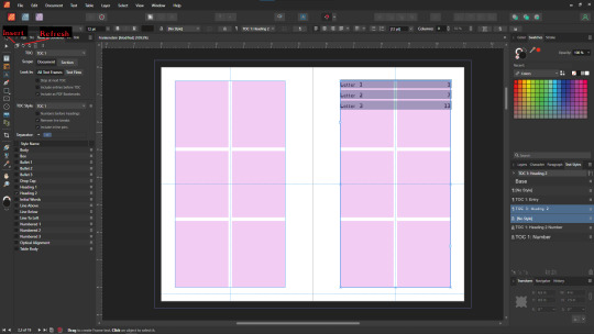
On page 3 I want to include a Table of contents so if the ToC window isn't visible I'm gonna hit Window->References->Table of Contents, and then in this window I'm going to hit the insert button. You can really dial in a lot of settings here, but as long as you've been using those Text Styles I mentioned previously, it should be pretty easy! Since I've been using only Heading 2 to start chapters, I'm going to unselect Heading 1 since it is effectively only being used on the ToC page and the cover, and I don't think folks need help finding those. This ToC feature rocks and as long as your page numbers are correct, and you use your text styles it should auto-update! If it doesn't there's a refresh ToC button on this window as well. Regardless (and perfectly using my 30th image) this is what it looks like for me now.
You'll also note I updated the text styles here as well! Anyway this is a real overview of zine layout for print, there's probably more things I should cover, but I'm out of images and tired so I'm leaving it here. If this was helpful I'm gonna put this template up on my itch after I clean it up some down the line.
I'm gonna have to come back with a Part 2 that talks about exporting and whatnot, but this is all I can realistically fit in a post for now.
If you get any use out of this and wanna throw a few bucks my way you can do that here
and if you have any questions I'll answer what I can! Just shoot me an ask on here, or like annoy me on my discord (its in my pinned post)
okay thanks bye
#skillshare#this one is gonna need a followup and I will make it one day but I ran out of images#I keep threatening to stream this so if thats something folks want I actually will I s2g
194 notes
·
View notes
Note
Would you ever consider doing a tutorial on how you set up LR? I'm interested in the long continuous page format and I have no idea how people set up their canvas for it
I'd love to sometime, when I can get a hot second to do it. I used to be able to show off the Rekindled drawing process back when I was still streaming, but with my tablet still out of order, streaming isn't really gonna be a thing for a while (also I've learned streaming is just sort of ... really exhausting for me so I'm thinking I'd rather go for just video recording and commentary or something).
That said, if I can give just like, a quick basic setup, Rekindled is drawn on canvases of 2400 px (width) by 15k px (height) minimum with a dpi of 350. The height isn't so much what matters as the width, height can be however long you want it to be due to vertical scrolling (though note that the longer your canvas is, the more processing power it'll take for your computer, so don't overdo it if your PC can't handle it lol), but width is a lot more limited on various platforms (ex. Webtoons has a restriction of 800 px wide, so I like using 2400px because it's easily divisible by 800, but that's JUST for my JPG's, my root files always stay at their original resolution of 2400px wide to ensure I can keep the highest-quality versions of the pages). This is pretty much my default layout for vertical webtoons, beyond just Rekindled, it's what works for me haha
Also I use Clip Studio where I can have an actual project manager with multiple pages per project, but you can do the same thing with Photoshop or any other software by just having different canvases/files per page.
37 notes
·
View notes
Text
Resolution Independence, Zoom, Fractional Scaling, Retina Displays, High-DPI: A Minefield
I already explained how CPU dispatch is a minefield: It doesn't cause intermittent bugs. It often doesn't even cause crashes. Badly implemented CPU dispatch means you build something on your machine that runs on your machine, but doesn't perform the dispatch correctly, so it crashes on somebody else's machine, or something build on a worse machine still runs fine on a better machine, but not as well as it could. Some of the bugs only manifest with a different combination of compiler, build system, ABI, and microarchitecture. CPU dispatch is a minefield because it's easy to get wrong in non-obvious ways.
I recently played an old game on Windows 11, with a high-DPI 2560x1600 (WQXGA) monitor. Text was too small to read comfortably read, and the manufacturer had set the zoom level to 150% by default. When I launched the game, it started in fullscreen mode, at 2560x1660, which Windows somehow managed to zoom up to 3840x2400. The window was centered, with all the UI elements hidden behind the edges of the screen. When I switched from fullscreen to windowed, the window still covered the whole desktop and the task bar. I quit the game and switched to another. That game let me choose the resolution before launch. At first I tried 2560x1660, but nothing worked right. Then I started it again, at 1920x1080. It didn't look quite right, and I couldn't understand what was going on. Windows has scaled the game up to 2880x1620, which looked almost correct. At this point I realised what was happening, and I set the zoom to 100%. Both games displayed normally.
The first game was an old pixel art platformer from the early 2000s, with software rendering. The second is a strategy game built with OpenGL around 2015, with high-resolution textures based on vector art, and with a UI that works equally well on an iPad and on a PC.
It was hard to read things on that monitor, so I set the font scaling to 150%, but somehow that made things harder to read. Some applications did not honour the font size defaults, and others did, and still others had tiny UI elements with big letters that were spilling out.
Next, I tried to run a game on Ubuntu, with Sway (based on wayland) as the desktop environment. It's a different machine, a 15.6 inch 1920x1080 laptop with an external 1920x1080 23 inch monitor attached. I zoomed the internal display of the laptop by 150% in order to have windows appear equally sized on both monitors.
What is happening on Windows 11 seems to be that even OpenGL games that don't think in terms of pixels, but in terms of floating point coordinates that go from -1 to +1 in both the x and y dimension, (so 0.1 screen units are different sizes in different dimensions) are treated the same as software rendering games that give a buffer of software-rendered pixels to the operating system/graphics environment. Making an already resolution-independent window bigger feels pointless.
What I would want to happen by default, especially in the case of the software-rendered game, is for the operating system to just tell my game that the desktop is not sized 2560x1600, but 1706x1066 (or just 1600x1000), and to then scale that window up. If the window is scaled up, mouse position coordinates should be automatically scaled down from real pixels to software pixels, unless the mouse cursor is captured: If I am playing a DOOM clone or any first-person game, I do not want relative mouse sensitivity to decrease when I am playing on a 4K monitor or when I am maximising the window (if playing in windowed mode). If I have a retina/zoomed display attached, and a standard definition/unzoomed display, and there is a window overlapping both screens, then only the part of a window that is on the zoomed display should be zoomed in.
What I would want to happen with a "resolution-independent" game is this: The game queries the size of the monitor with a special resolution-independent query function. There is no way to "just make it backward compatible". This is a new thing and needs new API. The query returns
Size of all desktops in hardware pixels
Size of all screens in real-world centimetres
Preferred standard text size in pt/cm (real world) or pixels
Zoom factor (in percent) of all desktops
Which screens are touch or multi-touch screens
Is dark mode enabled?
Which desktop is "currently active"
The "preferred" desktop to open the window
This information would allow an application to create a window that is the appropriate size, and scale all text and UI elements to the appropriate size. We can't assume that a certain size in pixels is big enough for the user to comfortably hit a button.
Even this information might not be enough. What should be the behaviour if a windowed OpenGL application is dragged between a 4K monitor at 200% zoom, and a 640x480 CRT? Should the OS scale the window down the same way it currently scales windows up when they aren't "retina aware"?
I don't really know. All I do know is that Windows, Mac OS, and different wayland compositors all handle high-DPI zoom/retina differently, in a way that breaks sometimes, in some environments. But it looks fine if you don't have scaling set. There are ways to tell the windowing system "I know what I am doing" if you want to disable scaling, but these are easy to abuse. There's a cargo cult of just setting "NSHighResolutionCapable" or "HIGHDPIAWARE" without understanding why and why not. Win32 provides all the information you need, with a very complex API. Wayland has a very different approach. SDL is aware of the issue.
I really hope SDL3 will make this work. If you get this wrong, you'll only realise when somebody on a different operating system with a different monitor tries to get your game to fit on the screen by fiddling with the registry, and it goes from not fitting on the monitor to text being too small read.
8 notes
·
View notes
Note
hey! i love ur art :3 i just wanted to ask what brushes and canvas you use? (any tips on resolution and high quality) i hope u have a great day :) 🩵
Hello! Thank you so much T_T I appreciate it… thank u for asking i gotchu vro
Imma be real I Lowkey don’t know how DPI and all that stuff works so i just use the default procreate canvas’s and crop them according to what I’m drawing lol. I use procreate for everything that’s not animating (stares at toonboom story pro marker 2 brush longingly)

I use the 4k one the most and then just crop it down, i like how crispy and high res the 4k is so i would personally recommend that one for finished pieces and such
As for brushes here’s my little chart i made LOL… It feels a little constricting narrowing them down bc I usually experiment with random free packs I find or default brushes I don’t really use.. But I would say for the stuff that i do post and y’all see, it’s these brushes
* for the elder P4 i usually end up using it for everything LOL so color and lines. I don’t like switching brushes all that much when I’m working so i usually only use one or two

I hope you found this helpful anon!!! If u have anymore questions don’t b shy
Have a good one anon ^_^ <3 stay safe mwah
6 notes
·
View notes