#is it obvious i don't make comics. the paneling on the full thing is so funny to me
Explore tagged Tumblr posts
Photo

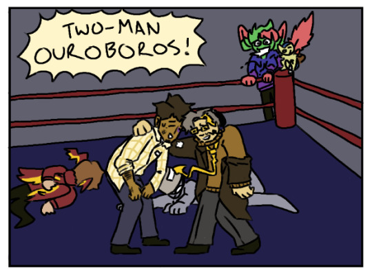


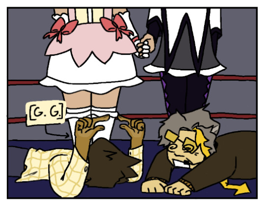

reposting the poll comic in an original post so i can art tag it and also ramble in tags teehee :) once again feat. @beesbeesbees42 ‘s sona
full page under the cut btw:
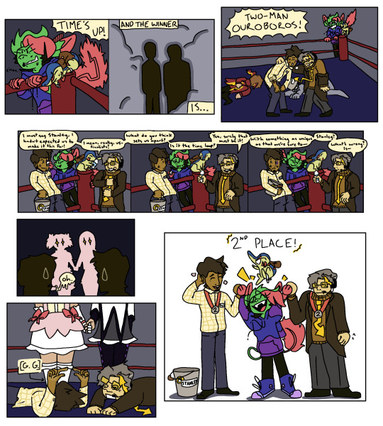
#martzipan#marzi#(not maintagging it bc it's multifandom/not necessarily abt tsp itself)#is it obvious i don't make comics. the paneling on the full thing is so funny to me#i had images i wanted to draw and they told a story. the formatting was unimportant to me#anyways. fuck tsp for making me draw the things i hate to draw#(shirt collars glasses and speech bubbles)#(AND DRESS SHOES)#it's funny you can tell that i know marzi's shapes the best#river (ghost's little guy) was easy enough bc cyndaquil is simple shapes#but i am still hammering down my stanley + narrator designs. i'll get it down eventually#OH YEAH this is the first public instance of narrator hairstyle 2.0. what do you guys think i think it's an improvement#anywho i'm never promising art again. i had fun but this is the last time i do that#OH YEAH dw abt the narrator pouting in the last panel. he's a sore loser <3 grumpy ass
3 notes
·
View notes
Text
I've been following @druidposting's DR2 playthrough on discord and we just had a really good discussion about DR's Closing Arguments. Specifically the way the murderer is depicted as grey and featureless, which until now I found a bit annoying.
In Danganronpa it's repeatedly the case that we don't have the full picture until the talking actually stops- which always goes beyond the end of the trial. We generally vote first and come to understand what the murderer's actual motive was, sometimes filling in important pieces of the timeline in the process, afterwards.
But none of that matters for the killing game because characters' emotions aren't directly relevant to who was the 'blackened'- the only thing that matters to Monokuma- so it comes out afterwards and does nothing to change their execution. It doesn't matter how sympathetic they are (basically everyone) or whether other people share responsibility for the situation (eg. Hanamura, Pekoyama, Momota) or whether they intended to murder at all (Nanami). They objectively pulled the trigger and nothing else matters. Nothing about them as a person matters.
The Closing Argument mechanic might illustrate that problem- literally. They're a dramatic, conclusive summary of the entire case... constructed before the vote even happens, before we know if we're actually right, and they're missing something really important:

The actual perpetrator.
We quite literally don't even begin to see the real person behind the crime, any real exploration of their mental state, anything besides the cold, hard facts of the murder that are necessary to convict them, until the comic finishes and the protagonist makes their final accusation- replacing the grey figure with their real appearance in a shot that's often intensely emotional.
And these comics lack crucial parts of the case's timeline and sometimes important parts of the very scenes they depict that we only find out about afterwards. And those are what we know; characters may die with some pieces of the truth and prevent us from ever learning them. These aren't objective depictions of the murder, they're the protagonist's subjective attempt to connect the facts they have. A join-the-dots portrait of someone with missing dots and no colour.
Even characters' expressions may not match how they truly feel, with the grey placeholder potentially looking way more confident and sinister than they were in reality. Pasting Falter's commentary here since they put it well.

For obvious reasons this could especially be a problem for characters that die before the trial- the ones we never get a post-vote testimony from. DR1 chapter 4 really highlighted that in the way Asahina's huge misinterpretation of Oogami's feelings took up a lot of the post-trial discussion, only for Monokuma to reveal Oogami's real suicide note and recontextualise everything.
It might really be a problem for how Komaeda's depicted in DR2 chapter 5. While he isn't greyed out, we get panel after panel where he's either level-headed or maniacally evil, and even the depictions of his self-torture and death don't humanise him:


But we know that his real feelings were more complicated than that. We have his actual corpse to compare the last page to.
He died afraid.

If we approach the comic as Hinata's mental image of him instead of reality, he died without anyone truly understanding him. He was alarming, very hard to relate to, actively fought against people doing so, ensured even the killer didn't watch him die, and the survivors couldn't begin to understand his motive until a chapter later. The Closing Argument reflects that.
Early in DR1 Togami calls out the rest of his class for judging others by their own standards. However, he, too, is doing this, maybe more so than many other characters; his inability to view other people through anything but the cold, brutal logic of the killing game bites him in the ass in chapter 4. In DR2 chapter 2 voting without a good understanding of Pekoyama's motive or Kuzuryuu's involvement nearly got everyone killed. Komaeda's a walking embodiment of the problems with flattening people into caricatures and not empathising with them, suffered from people doing that back to him, and his case- the Closing Argument for which turned everyone else into grey placeholders- was impossible to solve with objective facts. It was only survivable because the survivors cooperated and one person tried to analyse things the way he would.
The games have always been a critique of the justice system and Japanese society and push us to care about others as individuals, not reduce them to- and judge their right to exist by- something they've done or their net impact on society. There are always consequences when someone neglects to do that, and the above might be yet another way the games explore that theme.
#danganronpa#dr analysis#komaedology#komaeda#.txt#sorry @ non komaedaheads for making it about komaeda again LMAO#that was not the intention initially he's just... a really good exploration of this#and i think about his expressions in that comic vs his corpse and what we retroactively knew he was dealing with a lot#btw don't send spoilers to falter please!! i'm @ing to credit them- this was a discussion not solely my ideas- but they are not done yet#and aren't reading this post until they're caught up for obvious reasons#this came from discussing ch2 since the incomplete picture people voted with nearly killed them#(btw don't @ me about komaeda's description in the second-last paragraph being an oversimplification; i know :p )#(he has nuance- especially outside of the killing game- but i'm just focusing on the thematically relevant broad strokes here)#(eg. i feel like he demonstrates empathy sometimes but kodaka has said that lack of ability to empathise/be empathised with#is a theme for him- and the ways he's been proactive in the killing game consistently lacked regard for others' feelings/individuality#reducing them to interchangeable Ultimates(TM) instead. it's partly why he self-destructed while everyone else#was able to forgive themself and keep moving forwards imo. your worth being defined rigidly by objective contributions to society#does not mesh well with the idea of rehabilitating people who've destroyed the world before they could even start to improve it#and even if he did give them a chance at surviving he still succumbed to his own ideology in the end#killed himself for 'hope' and to be 'important' like he 'wanted' but died terrified and in pain and alone instead of fulfilled#man i wish 2.5's ending/postnwp canon in general dug into that ;-; )#ANYWAY ty for reading all that. i feel like i rambled a lot in this one. i have a headache now ghdkjsfgdsf
75 notes
·
View notes
Note
I have a couple questions regarding "Mightier Than the Sword", which was incredibly well made and a wonderful little 'what if' origin tale (and very sad oneshot of grief and loss). I hope you don't mind that they're all in one ask because they just kept bubbling up.
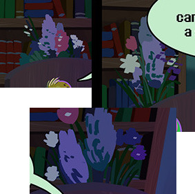
Were the flowers behind Gerson's bed chosen for any specific reason? It looks like a particularly designed bouquet but I don't know flower language.
2. Does this mean that the Lightners of Hometown were in a war? I mean, Gerson has his hammer here... but he's also old as balls considering he's a turtle monster who equals UT Asgore in age. If timeline diverged between UT and DR based on the War itself...
3. Now I'm picturing Gerson as DR's version of Tolkien and I mean that in the best way possible. (Not a question, just a fun note.) Also he feels perfectly IC. He had a life well lived and is trying to help his son see that, but you can know things but heartache doesn't matter especially not when its still so raw (poor Alvin).
4. Does Ink Knight have any of Gerson's memories (Flowey Situation due to Souldust) or is he his own entity since there was no "Determination" soulgoop? Also I think its not on purpose but Knight having thick blond hair (and possible beard) reminds me of Asgore.
5. Alvin flashed back to the panel with the Souldust on the Pen. Does he know...? That the funeral wasn't fully completed as the pen wasn't buried with the hammer? Or is he in denial?
6. Speaking of Alvin, the panel behind him as he begs the Angel to let his dad live longer? The light behind him resembles Judgement Hall. Is that a coincidence because of golden light and dark shadows?
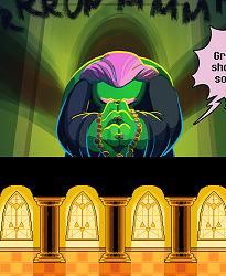
Thank you for sharing the comic and I hope you have a pleasant day.
Oh wow, thank you so much for the very long and detailed ask! I'll see if I can answer everything here!
Sadly, I don't know flower language either, so I can't say that the flowers mean anything in particular! They're mostly there because I wanted to make sure the backgrounds felt full and lived in. A bouquet seemed appropriate there!
I don't think in this universe there was a war between humans and monsters...at least if there was, there's not really indication of that thusfar in the monsters' regular lives. I think the hammer was more in reference to Gerson's book series, or was an actual hammer that he used for smithing, since it's mentioned that he started work as a metalsmith before going into writing.
Honestly, I think the game itself is absolutely supposed to be getting that idea across, too! Alvin mentions that Gerson wrote stories for his children before they were published and beloved by people the world over, which is a pretty clear callout to what Tolkien actually did. The title 'Lord of the Hammer' is also a pretty obvious parallel to Lord of the Rings, and Susie talks about it like it's a nerdy epic fantasy series. I think we're supposed to read Gerson as this universe's Tolkien! (And thank you!)
He's probably got some memories of his previous self, yeah, and probably some more awareness of the relationship between the Light and Dark worlds. Mostly the idea is that it's his soul filtered through a personal object that signifies something very specific: namely, the drive to keep writing. His look is also supposed to invoke Gerson, but a younger, much more idealized version of him than we know!
Let's say Alvin is about 90% certain that yes, his father's soul ended up in the pen. There's some denial in there, and some confusion, and some genuine fear, that's taking up the other 10%. But yeah, for the most part he realizes that his father was not properly buried, and it's weighing horribly on him. Hence the "does this hammer really deserve to..." line that we hear in canon. (Or at least, that's my interpretation of that line!)
The light and shadows there are meant to invoke the silhouette of the delta rune, so yeah, a bit of a parallel to the judgment hall. It's basically supposed to indicate that the Angel did hear his prayer, and is answering it!
Thank you again for reading and for all the comments and questions!!
58 notes
·
View notes
Note
Hello! I was reminded of your webcomic Goodbye To Halos recently and wanted to let you know it had a pretty big impact on me. I read it during my teenage years and I think it really helped me to contextualize and make sense of some feelings I was going through about - well, teenage stuff. Change, I guess, mostly. Changing bodies, changing genders, changing role in society, changing relationships with others - your comic helped me process a lot of my fears about those things.
Your comic was probably my first exposure to nudity that was neither sexual nor comedic. It really stuck with me how your comic has characters in states of undress fairly casually. Not like "walking down the street" casual, they're always in a safe place like a bedroom or a bathroom or something, but still. As someone who was raised Catholic it was really powerful to see nudity portrayed as so... not-shameful. Nudity is just a state the characters pass in and out of; they're nude after taking off their clothes like they would be wet after taking a shower. There's no shame in it. And that's really the way it ought to be, right? We were all born nude, it shouldn't be such a Thing as society makes it out to be.
That's just my little input on what impact your art has had on me. It was a good thing that I read it when I did. I wish you luck on all your future endeavors.
that's extremely kind of you, and very well-said, and thank you, and also that's absolutely wild for me to read.
i actually had to remind myself just now that there was in fact a sequence of (counting) eight pages where enae had her tits out. i didn't think a ton about it at the time. i do remember debating mentally whether to slap a "warning this page has boobs in it" label on the social media posts: i chafed at the idea, and i think i didn't do it? or only did it for some of them? i didn't want to because to even put such a warning immediately prompts the reader to think "oh something Sexualle is going on here," putting them on high alert and making it into a whole Thing. and it was not a Thing.
i always thought that some day, if ever i found the right moment, i wanted to have a page where fenic was fully nude. my idea of the "right moment" for that was that it would have to be at a juncture in the story where it made sense for her to be nude, and also where it would feel to the reader like there was absolutely no "point" to her nudity. the one page in the comic where fenic is topless was sort of a prelude to that idea: that might have been the moment, if there had been any reason at all to include her lower body in those panels, which there wasn't, so i didn't.
it's a fine line to walk. i think it's fairly obvious that there were many panels in that comic where the reader absolutely was meant to think "wow this character's attractive" (if they could get past my art back then lmao). i peppered those in liberally, sometimes because it was personally fun for me to draw, but always because it just seemed, i don't know, honest? for this story about young queer adults who are sort of omnidirectionally horny for one another to have a gaze reflecting that--for the reader to feel like they're "in on it" too, not in a leering sort of way, but as if they're just, like, sharing in it with the characters themselves. but then to have that, and then to also have full-on nudity, and for that nudity to feel at home with that sensation, but also purely incidental, and not in and of itself sexual, is a lot of objects to juggle, especially if one indeed (like me) wants it to not feel like there is a "Point" being made. so, it's cool to hear that it worked for at least one person. sorry for writing 999 words about this
173 notes
·
View notes
Note
Do the Joker hate Bruce Wayne?
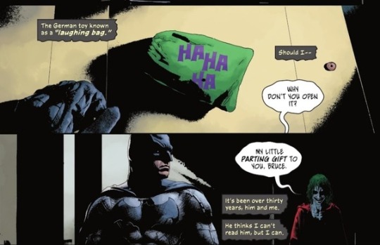
The answer is absolutely not. He hates and loves Batman. Bruce Wayne is Batman. The Joker dislikes the mask which is Bruce Wayne the Character. Not the name. I know that might be hard to comprehend, but it's true in my option. The Joker views Batman as just Batman. There is no other part of him to the Joker. All the Joker catches sight of is Batman wearing a mask over his true face, and i mean Bruce Wayne is that exact mask he's wearing. Even Bruce separates the fake persona from the actual Bruce Wayne which is Batman. The Joker knows who Batman really is in most comics. He just finds no need to pursue a mask when he can have the real thing. The mask isn't Batman's true self. Batman is the real identity. Bruce Wayne is the mask. Therefore Bruce Wayne don't exist only Batman. Batman isn't the mask. When Bruce Wayne go out to parties and gala's he's not the littlest interested in those event's. When he has these ladies on the sides of him, and he's acting like the typical rich guy. It's not really his true self. He'd rather be fighting crime. Right now he's just giving a show for others. Making a fool out of himself. It's not his true self. Let me disclose it in this way. If Bruce transforms into his true self, even without the mask. The Joker will prefer to him as The Batman, because he is Batman. The one who sits in the cave. Not wearing his mask, and still looking through files, still playing Detective. That's the real Bruce Wayne. That's Batman. The character he plays out in public is the fake persona of Bruce Wayne. Let's lay it out this way. Batman puts a real mask on his face he doesn't truly needs, even if you call him by a different name. In reality Bruce is Batman.

Exactly like in this panel. Batman is the Batman. There's no need for him to pretend in front of the Joker anymore. He knows his secret, and there's no need for The Joker to pretend like he has no idea who's under the mask. Of course it's Batman under that mask, pretending to be the jerk Bruce Wayne. No offense. Even without the money.. The Batman was still very much there, so all the Joker was saying in Batman #100 is that he's going get rid of that mask that you won't even have to wear it hardly.
the Joker is able talk with the Batman, and not the mask Bruce wears for the public. The Joker also calls him Batman. He doesn't call him Bruce, so it no reason to play along and pretend that Bruce Wayne is different from Batman. There's no reason to pretend that Bruce Wayne is a total different being, when in reality he's Batman, just using a different name.
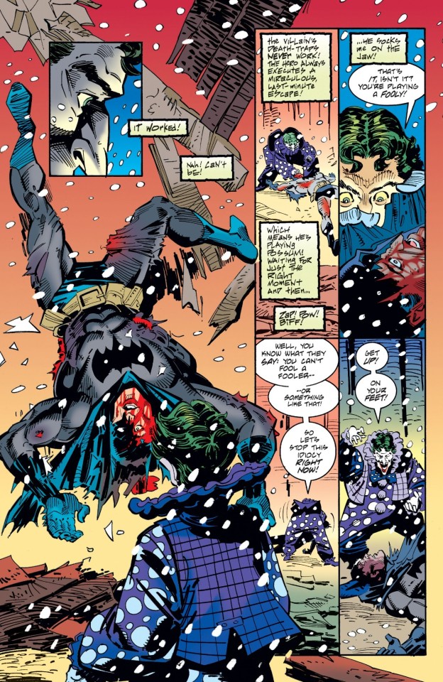
It's quite obvious the Joker knows who Batman is under the mask. His mask is practically half off, and yet the Joker shows no concern about his face. He doesn't say it'd ruin the fun. He just drops the body in the water, and leaves. He's not baffled that that's Bruce Wayne.

Again in the Batman who laughs the Joker knew Bruce Wayne was Batman, yet he continue to call him Batman and bats. The usual nicknames. Full aware of Batman's life story. The Joker shows no feelings of disgust or i can't believe this, or even i can't see you strong anymore, or my king. You're just a rich boy in a bat suit. The Joker doesn't vocalize any of theses things to Batman. He doesn't say we can't play no more bats. Your secret ruined the fun. Some people claim if the Joker knew who was under the mask it'd ruin the fun. It wouldn't. This is example of that. The Joker showed Batman even without the money. The toys and gadgets. He's still the Batman at the end of the day, the Joker was right. He in fact was still the Batman without the billionaire persona.
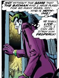
When the Joker decides to keep the Batman alive. It's nothing about the mask. It's about his fun, if he murders Batman, then the fun ends.
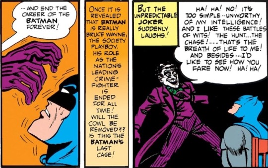
The Joker doesn't desire to detach Batman's mask, because he does not desire to expose his identity to the whole world, or anybody he's around. The Joker's only implying it'd ruin the fun because others will expose it. Then it'd ruin the fun. The Joker doesn't desire for this to happen. The Joker never shouts this when he's alone with Batman, and if he does it always comes back to the world knowing his identity. Even in Batman deadly duo.The Joker didn't want the world to know Batman secret identity. It would expose Batman and ruin his fun. He didn't want Harley Quinn to take off the mask because it would have ruined his fun. He already aware he's Batman, so in reality shouldn't it have ruined the fun already??? The Joker knowing who Batman is does not ruin the fun.. What ruins the fun if everyone knew. What ruins the fun is him murdering the Batman. What ruins the fun is someone else revealing Batman's secret identity. The Joker knows it already. The Joker is full aware that Batman is his true self, however the world won't see it that way, and also the Joker doesn't need to remove the mask. He's Batman. He's only Bruce Wayne when he puts that persona on. The temptation of revealing his identity is hard sometimes, and especially in the golden age comics, but the Joker thinks about the cat and mouse game. Now let's get one thing straight the Joker doesn't know Batman secret identity in all the takes on his character.

The Joker doesn't have no reason to care about the mask. He has no reason to pursue a mask. The Joker goes along with the game. It has to be that way. He also doesn't want Batman to know he knows either. Maybe he just play along for Batman's sake, but sometimes he reveals to Batman he does know who he really is. Bruce Wayne is the mask. The old Bruce die years ago when he was eight years old. Which the Joker probably finds pathetic.
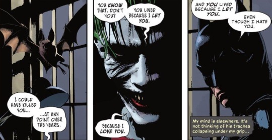
In Batman #144 Batman #143 the Joker still label's Batman as Bruce in this issue. He announces to him right after, that he loves him. Bruce can be Batman if takes off the invisible mask. There are times when Batman wears the mask, and he acts differently, and the Joker hates it. He hates it.
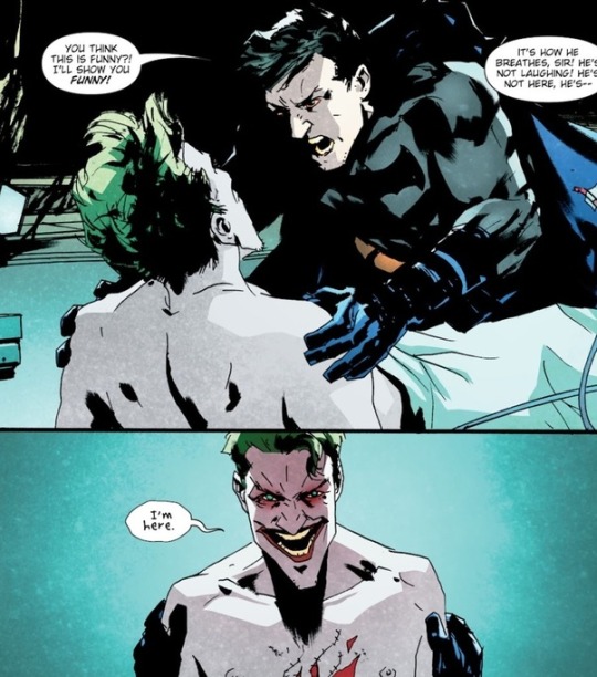
If Bruce takes off the mask and be his true self. The Joker would behave with him the same as he would Batman, because he is the Batman. The Batman mask doesn't make him Batman. He is Batman without or with the mask. Batman just wears the Bruce Wayne mask over his true face, when he needs to be in the public eye. Think about it? If the Joker separates Bruce from Batman, when he takes the mask off. Then it wouldn't make much sense to talk with him about Batman, and how to repair the city. How your useless character isn't helping in no way. He wouldn't have ask Bruce to make a choice to save him, when practically half of his face is showing, clearly showing his true identity. The Joker would have not been hurt when he walked away from him if he separates the two. What the Joker saw was Batman. There was no Bruce Wayne. Bruce is just an act. A fictional character in the Joker's mind. He finds him unless, boring, however the Joker let's Batman know he knows the mask over his real face, but the world would never accept the Joker view right? Especially when Bruce is wearing no mask, and the Joker says bats. It exhibits that the Joker is outright telling Batman that mask don't fool me. Maybe the Joker likes the name Bruce, although he doesn't like the front that comes along with it. Also in Batman #100 the Joker cries while he's talking to Bruce. Why though? And if he thought Batman was a stupid kids dream. Why protect it so much. Why still desire the game. Why still want the bat in the batsuit? Why still want him to save you. Do the same thing over again? This sounds like anger. This sounds like jealously. This sounds like he's in pain, and he's hurt, and he's trying to hurt Batman. The Joker feels like Batman betrayed him and the City by trying to live a happy life. Just like in Batman endgame. The Joker was angry with Batman. He did everything he could to hurt him, however in the end he still wanted their dance. He hoped it wouldn't have to end..Batman destroyed the pit. The Joker said ' You ruined us. You ruined us' the Joker never truly desires the game to end. He just knows one day it will, and he hopes that day doesn't comes. There's those times it's him who's tired of laughing and sometimes it Batman who's just tired.

It has nothing to do with the mask. Batman is only the mask if he puts on Bruce Wayne persona.. Batman death of the family. The Joker knew Batman secret identity, yet he still calls him his king and says he's his Jester. Bruce Wayne is Batman secret identity. The joker can't expose Batman secret identity to the world, and the Joker doesn't because Batman would probably stop. At the end of the day though. The Joker hates Batman and loves him. It's twisted. The world doesn't see the way the Joker does. To the Joker Batman face is exposed all the times. It's the act for the public. The character he uses in the public eye. and yes, Bruce Wayne being concern about his children still makes him Batman.
This is just my opinion.
#batjokes#batman#batman and joker#comic books#batman x joker#dc comics#the joker#batmm#dcedit#theories
64 notes
·
View notes
Text

Oh hey, Hamsteak 2. Looks like Vriska's...back in Alternia? In a dreambubble?
they sent the thief here in search of power; the power to escape the containment i so painstakingly set up for them
Al confirmed as the Candy narrator. Also confirmed that the black hole is "containment" for the dreambubbles and non-canon worlds, and that all the ghosts falling in wasn't an accident of fighting Lord English.

the black hole could only ever shelter them for so long, and in their haste to shrug off my protection they have opened the door to something far, far hungrier.
This panel is a callback to Karkat about to open the door to the New Universe. Where there were interrupted by Jack Noir. Vriska is interrupted by-

Yoo! It's Davepeta! Who feel into the black hole and has been conspicuously absent ever since. They're the only Ultimate who is not connected to Dirk, and in some ways the only "true" Ultimate. Interesting that Al considers them such a threat, when Davepeta has never been anything but benevolent.

Looks like it's all the sprites, in fact. Why...are there two Nannasprites? Oh god, I'm being pushed to the endless limits of my ability to remember Homestuck Lore. Is one of them pre-retcon? I do not remember.
ERISOLSPRITE: wwe'vve been here for liike a miilliion fuckiin 2wweep2. DAVEPETASPRITE^2: B33 < actually we just got here DAVEPETASPRITE^2: B33 < this place didnt even exist until she popped in ERISOLSPRITE: gue22 ii'll fuck my2elf.
It didn't exist until a character arrived, at which point it retroactively existed the whole time, like how a planet works.
DAVEPETASPRITE^2: B33 < does that not sound insane to you fefeta? FEFETASPRITE: 3833 < 383
What? How are Davepeta and Fefeta coexisting? That definitely doesn't make sense.

Well, logic be damned, it's apparently time for a Vriska training arc.

Gah! Talksprites! Also, Vriska enters "Hell" on page 666 of Homestuck 2, which is I think the first time this comic has aimed at any kind of Meaningful Number.

God, we are full on visual novel here. I didn't know Ren'Py could export to web, but I guess it shouldn't surprise me. I presume/hope the save option is default and won't be needed here, it's 1:30am.

Tavros is here and, much more oddly, alive. I suddenly understand jack shit.

I have no memory of Tavros ever forgiving Vriska for anything...or, for that matter, Vriska even being aware she did anything that needed to be forgiven. I presume she's just lying here, though.

This line combined with this pose is the essence of Vriska

So, Vriska's being forced to "grow as a person" and her big idea to finish her character arc is to atone for her sins by getting Tavros to take revenge on her. Vriska thinks that the secret to gaining power is getting Tavros to kill her.

I wonder where she got that idea.

But that time she refused to mind control Tavros into killing her, she wanted him to grow from it, too. Now we're past that.

I felt smart for remembering the K8LL ME bit but we're being really obvious about it now so I guess they just assumed everyone would and I'm not special :(

Oh shit. Erisol wasn't kidding.

Davepeta roleplaying being a cat who dies horribly is kind of the perfect synthesis of Dave and Nepeta. What is this music. It's very toot-y.

Oh hey a text log. How convenient. So we're trapped in a time loop, then, explicitly recreating Groundhog Day. I guess that explains the infinity hourglass on the Plot Point machine.

Vriska's having a bad couple of years.

Davepeta is "countless" cool dudes and kitty girls, which I think is the first explicit confirmation they're an Ultimate Self, though that was pretty strongly implied at least. The only Ultimate to do so without Dirk's involvement.

Stop letting me intuit things and then immediately making them clear! I don't care if it's good writing, it's making my liveblog bad!

It's so weird to compare this Davepeta to the one in Homestuck OG. There Davepeta was presented as this wise sage mentor figure who'd achieved enlightenment, and here they're much more of "Dave + Nepeta's combined silliness as one character". It's a subtle difference, but go back and read Davepeta giving this same kind of talk to Jade back in Homestuck 1. I guess that's the difficulty of a character with so little screentime in the original, they're either very limited or they feel slightly off.

Oh my fucking god, a to-be-continued select screen. Shit, that takes me back in an unexpected way.

Also, from the associated news update, "the big flash" is apparently several months away (10/25?), and I have to say they might want to be careful about overhyping it, if they have small flashes and now Ren'Py novels that are just preludes. If it's anything less than a Cascade after months and months of hype it could fall flat where a surprise [S] Enter would've popped the fanbase hard.
30 notes
·
View notes
Note
hi! i really like your account and all your levi-focused analyses. i think this might be a weird question, but i'm sorta trying to make a similar blog, it's just i've very little experience analyzing mangas/comics. it's a bit different from books of prose, obviously. again, sorry if this is weird, but is there any stray advice u can give for analyzing comics?
Hi there, and first of all, thank you so much! I really appreciate that! I don't consider myself particularly good at analysis or meta commentary or anything like that. I literally just vomit my thoughts out and most of the time, it comes out extremely long-winded and tedious, I think, lol. I tend to be very unorganized with my thoughts, and writing them down helps me get a better grasp of what it is, specifically, I'm trying to say.
But I'll do my best here. My main advice for analyzing comics/manga would be to remember that it's a visual medium, and thus, the images carry just as much importance and weight in figuring out what's going on and what's being conveyed as the text itself, and sometimes, even more so. You have limited space for writing in comics/manga, so the author/artist needs to be able to convey a lot through the art alone. So just because something isn't put into explicit text, doesn't mean it isn't being implied or outright stated by the images themselves. Levi is a good example of this, I think, because he doesn't say a lot, and what he does say often comes out sounding rude or callous or aloof, like he doesn't care. And yet it's obvious to everyone with a functioning brain that Levi cares more than anyone. And the reason it's so obvious is, for one, his actions belie his seeming stoicism, with how hard he tries to help people and save lives, and the other reason is his expressions. While Levi often wears a flat expression, there are moments when what he's really feeling bleeds through, and it might as well be a blaring, neon sign declaring that, despite his usually stoic facade, he actually feels things more keenly than anyone else. You have to pay attention to the panels and what the art is telling you, just as much as what the text is. Often, the text can only be understood through the art. You have to interpret them together, I think, to come away with an accurate and objective understanding of the story and the characters.
Basically, a lot of subtext can be hidden in comics/manga, just like in prose writing, but a lot of it is often conveyed through imagery. And just like with prose, context matters. What came before matters. What comes after matters. You have to factor all these things in in order to form a full impression and understanding of the story you're reading. Like a character's motivation, what's driving them, can later be recontextualized based on a later event or action on their part, etc... The same for plot elements and so on. Like take Eren, for example, and the absolutely insane expressions he pulls very early on in the story, when he's in his titan form and killing other titans, etc... Eren looks mad, and that tells you something about his character. He acts a certain way most of the time, acts like he's concerned for his friends, that they're his priority, etc... but it's those moments of obsessive bloodlust that reveals the true nature of Eren's character. He's driven by a desire to commit acts of violence and destruction, and he gets lost in that desire. That's who Eren really is. The way Isayama draws that madness on Eren's face is in itself enough to tell you what sort of person Eren actually is, and helps you to better understand what it is he later does.
Anyway, I hope that helped. Again, I'm no sort of expert analyzer or anything, lol. I just get passionate about these things and I write super long posts as a result. But thank you so much for finding anything of value in what I do write. I honestly never think anyone will.
#attack on titan#shingeki no kyoujin#anon asks#writing advice#analysis advice#analysis#meta#commentary#Levi Ackerman#Eren Yeager
7 notes
·
View notes
Note
During your art challenge stuff like Vivid Shadows, how do you typically keep up motivation to continue doing it every single day? Because it’s been a struggle to keep writing stuff every single day. Granted this is my first time doing this, but I was wondering if you had any way you prevent creative burnout from doing these.
I have thoughts on this lol. There's a few ways. First a disclaimer, I started working on these Vivid Shadows pieces about a month ago. I have up through day 19 done right now (cough see them early on patreon cough). So I've been spacing these out a bit more than one every other day. I have done the challenge day by day before, and it's doable. But I'm a busy adult that needs to pay bills, and I like to give myself some cushion. But with that established, here are some thoughts I have. 1. Collaborators and Witnesses I doubt I could find the motivation to do these kinds of big projects if I didn't have friends and collaborators doing them with me. This is different for everyone, but I find I'm much more productive when I have someone else to bounce ideas off of, send WIPs to, and honestly to judge me when I don't meet my goals. This can be a friend you're working with, or a discord server where you share updates, or any other online community that you're a part of. 2. Effort Budgeting For big series like Vivid Shadows or longer comics with a lot of panels, I do not put all my effort into every piece. There's just no way. I consciously choose to half ass some things, and tell myself "eh, good enough" even if I know I can spend more time polishing. It is infinitely better to finish a piece at 60% of your full power than to pour all your heart into a project that never sees the light of day. If you feel up to it, you can spend more effort on some select parts that really make you happy. But those should be the exception, not the rule. And the more projects you finish, the better your half-assed work will become. 3. Creative Limitations You have to define some bounding rules for your project, or you'll get stuck with decision paralysis and scope creep. For Vivid Shadows, the rules I use are pretty simple. Each day has a prompt, one color to use, set dimensions and a hard deadline. I mostly use a limited palette (3 colors + black or white) because I know I can spend hours and hours shading and coloring otherwise. Limitations foster creativity. If you have a tight frame around what you can do, your brain comes up with way more ideas. 4. Keep an eye on the clock Part of what I like about projects like Vivid Shadows is that they have built in deadlines. I know I have to wrap things up by a certain day and time, and if it isn't perfect then so be it. I've done enough creative work to know roughly how much I can get done in a certain amount of time, which is very helpful for planning. The program I use for drawing has a built-in clock that tracks time spent on each document, which is a godsend. 5. Find your own methods This is all just stuff that helps me, but everyone's brain works in different ways. It absolutely takes practice to enter creative mode at will, rather than when the stars align and you feel inspired. Start with small projects, and as you train yourself you can eventually finish larger ones. Remember, something small and finished is always better than something grand that never gets done. Also worth mentioning, find the things that light up your brain. Personally, I've found that making my art horny is a powerful motivator for my creativity. In addition to the obvious neuron activation, I find it very satisfying to explore the boundaries of what I find attractive, like a mad scientist or detective. 6. Keep it fun! None of this will work if you don't enjoy the project. There may be parts you don't enjoy, but overall the project should bring you joy. If the project isn't fun, change it or drop it and start one that is. You don't owe your past self anything. Even if you abandon a project, the work you put into it is good practice for your next thing. Make work you like, and move on. Hope this helps! Good luck on your project 🙌
37 notes
·
View notes
Text
Newish Comics:
Batman: the Brave and the Bold #13: God I so want to enjoy the Nightwing and Deadman story (because Dick and Boston hanging out, given their shared backgrounds, is exactly my jam) but unfortunately this is written by Tim Seeley and while there's stuff in it I quite enjoyed it still had the problem where it was full of Seeleyness. You don't need to repeat that Dick is a carny, a traveller, a circus kid so many times, Seeley. We got your point. (Also why are you travelling on a goods train, presumably without paying for the tickets? Is this inherently important to either of you? Dick has a fortune right now and Boston's fine with spending other people's money especially if they're rich or crooks).
The Booster Gold and the Jurassic League story hmmm feels too invested in how outsiders see Booster, rather than Michael's personal competence. Not that that's unusual for a Booster story but it's disappointing. Mark Russell, given your other work I was expecting a slightly defter hand with this, but it's only the opening part of the story.
The Artemis story remains so good. That's all I have to say.
The Bruce and Guy Gardner story has interestingly stylised art (I can tell some people are going to instantly hate it) but I had to laugh at the goofy ears Bruce has on his helmet. Commitment to the aesthetic! (Also lol Roswell and Grey Aliens)
The Perpwalk: oh look it's commentary on killing Joker and why that's bad. It feels very pop psychology.
The Flash #9: I mostly loved this. Wally's continuing to lose it, Jai's still getting the main plot out of twins (which is a nice change as the balance was definitely over on Irey's side during Adams), Barry is also having a breakdown (but different), Hartley gets a quality win, and we are confirmed to be on round two of time travelling Wade (seriously Wade has appeared on more pages, aged up, than he has as a baby so far).
The Wally and Dick stuff is just really...you know how Wally's connection to the Titans saved Donna? And the Titans connection to Wally saved him? And now Dick's helping anchor Wally even as he's trying to drop all of his connections? Ugh it's so good, Dick Grayson will not give up on his best friends.
The bit which really made me sigh was that finally, we got confirmation that Linda has post-partum depression (which has been obvious the last 9 issues), and...it's been aggravated by the Rogues. Deliberately. Ugh. Which is exhausting, but the panels suggested that it was actually based on Linda having existing problems (which made perfect sense, given that among other things, she'd just been sharing the Speed Force with Wade until she lost the connection when he was born. Of COURSE her neurotransmitters and hormones were even more out of whack than your average person after giving birth). But then when Hartley removed the influence from Linda, she suddenly perks up in an 'all fixed!' manner, as if that was all that was needed. And I really really hope it wasn't that simple. (Like, even if you give me a panel when this storyline ends that has Linda telling Wally she's seeing a counselor).
I would, actually, like the comic to have a little bit of a discussion of PPD, rather than just fix it magically via supervillain nonsense ending. Because Linda has lots of basis to have developed it. And she's just had to hand over her baby to stay safe in another crisis situation. It just makes so much sense and could lead to some more interesting storytelling and I just want it to be acknowledged as a real issue, not 'waves wand, all better'.
Green Arrow #12: the hugs edition.
Look. For a story arc that's premise was 'let's get all of the associated Arrow characters out of the various separate ruts (or editorial jail) that they've been in and reunite them on page', with a framing story for why everyone's wheels have been spinning and going nowhere for anywhere up to the last 14 years? It achieved that. It also got almost everyone into a costume that didn't make my eyes burn and am happy having as their default design for a while (Cissie I'm so sorry, yours is not great).
It set everything up for a continuing run and I'm glad that it has been signed off as a continuing and due to Williamson being heavy handed with allowing Waller nonsense in this plot it's going to run through Absolute Power and presumably be able to pick up with some actual ordinary Green Arrow plots.
I just want Williamson to pick up the pace a bit, and give us some one shots and three issue stories once we get back from Absolute Power to justify pulling this huge cast together by using them as more than set dressing for Ollie having a midlife crisis realisation.
The Warlord #54: Travis has a minor breakdown because Ashiya is using the form of his dead wife, Rachel, then realises he's being duped.
Shakira pushes Tara out of danger, proving that despite everything, they don't actually hate each other.
Jennifer is now a super powerful witch who has outpaced Ashiya's teachings and they have a cool sorcery battle:

And we finish off with Travis heading back to Shamballah with Tara and Jennifer staying in the castle to learn more magic (after defeating Ashiya).
12 notes
·
View notes
Text
you know what. it's missing norton!bruce hours (again) and i got some headcanons to share this time. below the cut because we might be here a while.
general / misc headcanons:
based on norton's screenplay for the incredible hulk, this bruce's full name is david bruce banner. (this is also how i mentally differentiate between norton and ruffalo's portrayals; to me, norton!bruce is david, ruffalo!bruce is robert.)
his mother used to call him "davey" as an affectionate nickname when he was little.
frankenstein is one of his favorite books because his mother read it to him. (this one is canon to the ih novelization)
he adores dogs and adopts a puppy between the avengers and age of ultron. (i don't have a name for the puppy yet.)
he likes studio ghibli films and finds the animation style relaxing.
learned russian while getting one of his phds, like in the comics.
inspired by this panel from the "super spy banner" arc in the comics: he likes james bond. and yes, he absolutely takes the chance to say "the name is banner. bruce banner" when he's doing an infiltration mission (probably with natasha and/or clint) or something. he and natasha probably watch the films together since her solo film had her quoting along to moonraker.
bruce. is. a. martial. artist. the films forget this and i'm salty about it.
cooking is relaxing for him so he tends to make a lot of food, and he knows a lot of dishes from different cultures because of how much he's traveled. no one on the team complains.
bruce's powers:
glowing eyes <3
inspired by the john turman hulk script, electricity behaves weird around bruce when he gets emotional. he has made lightbulbs and other things explode if he's standing too close to them. he learns how to isolate the effect once he understands more about his relationship with hulk. tony helps by giving him things he doesn't mind getting exploded, and for bruce it also works kind of like a trauma release. he can still accidentally blow something up if he gets distracted / agitated, but it happens less.
the electrical-interference power also manifests as him being able to hear electrical currents. different things have slightly different sounds / pitches and tony always asks him to describe them.
still has a pretty good healing factor as bruce, it's just slower. (in a ih deleted scene sparr says she's never seen someone recover from a tranquilizer as fast as he does). also can't get drunk, but he's never tested that for obvious reasons.
in the novel he's able to dodge a tranq dart "aimed and fired in one motion" so he probably also has faster reflexes.
immune to mind control as bruce and as hulk. both are pissed at wanda for trying it.
based on a scene in the immortal hulk comics, bruce uses automatic writing and drawing to communicate with hulk when hulk isn't out.
can see astral forms. they're clearer and even tangible when hulk is in control, but bruce can also see them.
also inspired by immortal hulk, he has a weird sixth sense for when people are lying to him. as bruce the "itch" he gets can be ignored most of the time, as hulk not so much.
relationship / dynamic headcanons:
no brutasha romance to be seen here they are friends 😌 (if that's your cup of tea that's fine it just isn't mine.)
stays. in. contact. with. betty. (i will forever fight the mcu over this. they are soulmates yall.)
steals tony's band shirts like a gremlin. also steals tony's snacks.
bruce🤝wanda: blurring the lines of science and mysticism. (later comics describe gamma radiation as having a mystical element, "like a magic spell... when viewed from another angle" which is the same reason bruce / hulk tend to have some extrasensory powers).
i just think we were robbed of a bruce and wanda friendship okay.
#marvel#mcu#crimson is bruceposting#norton!bruce meets the mcu#(new tags teehee)#bruce banner#my headcanons#some of these were also already posted on my old bruce rp blog but i don't use it much rn and figured the non rp folks would like them
12 notes
·
View notes
Text
Death Save Bargain Bin, Page 11
Not altogether pleased with how this page turned out, but if I'm ever going to finish this "short" comic, I'll have to cut some corners. Didn't do any shading either.

It has come to my attention that it's difficult to tell the characters apart. I thought it was obvious, but I guess it's just obvious to me. I'll try to make better designs in the future, but in the meantime, I'll start including a list over relevant characters, as well as the dolls i made of them when working out their design.
Characters in this page:

(In order, left to right) Galdrus Greatmantle the Dwarf, Greetings the Cambion, Trishul the Imp.
This is yet another page that I split into two pages, and marks the second to last page located in Galdrus' unconscious mind. Did this because Greetings doesn't really show up in the rough rough layout, as was the case with several of the previous pages.

Didn't redo a lot of panels, because, again, I'm trying to just do mistakes more quickly and learn from them for next time.

- Rant about hiatus -
My hiatus was way longer than I wanted, but I intend to post a page per week until I'm finished from now on.
I put all the things I like doing on hold to focus on schoolwork last October, but it quickly devolved into doing schoolwork every waking hour, and not doing anything that made me happy at all.
And I mean every waking hour. 06:00-07:30 Driving/ walking to school. 07:30-08:15 (or 09:15 depending on the day) schoolwork before school. 08:15(09:15)-16:00 school. 16:00-18:00 drive home. 18:00-22:00 more schoolwork, maybe eat, maybe shower. 22:00-06:00 try to sleep, but mostly just hating myself for not doing good enough and not understanding math/physics despite doing it for so many hours every day.
This turned to falling asleep on two chairs before school. Trying to understand school at school. Look at a schoolbook without really understanding letters or words anymore after school. Stay up extra late to keep staring at the schoolbook. Try to sleep but mostly just hate myself for about four to six hours before going back to school again.
Long story short - my mornings were prepping for school, my desktop at home was for schoolwork, and my bed was for being ashamed of how poorly I did in school.
Only thing that accomplished was that my grades got so bad I don't think I'll pass the college course, and will have to go back to being an electrician full time. So from now on, I think I'll just do schoolwork at school, and reclaim my home as a place to wind down and do nice things every now and then.
If I'm gonna have to go back to job-hunting this autumn, I might as well do things I enjoy before then.
- Rant end -
Previous page, Page 10:
Next page, Page 12:
#d&d#descent into avernus#comics#d&d 5e#d&d art#dnd art#dungeons and dragons#artists on tumblr#death save bargain bin
2 notes
·
View notes
Text
Dimension Dyfenders Update!! (9/20/23)
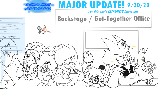
HEY, HEY, it's September! You know what that means! (read the above)
Hello D.D fandom, hello followers, mutuals, friends and hello people who curiously stumbled upon this post. You all know who i am, but for those who don't, let me introduce myself. My name's Comet. I'm the co-creator and main artist in the indie webcomic series Dimension Dyfenders! As of right now, i'm attending art school and trying my best to work more on the webcomic while also attending on my studies and get better grades. Now, you might ask, "Comet, what's going on with this series now?", "Why haven't been there more pocket adventures minisode 1 parts lately?" Well, i got the answers right here! First of all, let's start with the most obvious one... The Pocket Adventures situation.
Now, Pocket Adventures hasnt been online as of late, no next parts were being published, and im very sorry for that. The cause for it is the loss of motivation i had, which made me not work on it for a long while. Even when making new panels i feel extremely tired. Feeling like i should do something else (heck, i feel insecure about its panels when i draw them!) But fret not, that doesn't mean Pocket Adventures is getting cancelled. We still have loads of plans on the table and we can't wait to roll them out. But for now, we're taking a break due to IRL situations for example, art school. We, the team, have lives outside of making d.d content. We need to get our degrees and, well, try to survive life. But no worries, because I got plans to get back on D.D P.A Minisode 1 and finish it completely once winter break hits. As long as my motivation gets out of its hibernation phase. But still, i can't wait for you all to see the conclusion to minisode 1. (I just hope you dont mind if i jump right into the 'new designs' in the next pages)
Speaking of minisodes, I've been thinking of releasing minisodes only once a year than every saturday. Though this decision is not final yet. I don't want clout, in fact, i just wanna do what I love. Create stories and comics for everybody to enjoy. But if you guys would love for a minisode to release once a year or once in 3 months, let me know your opinions! Your criticism helps this series, especially its production, grow better!
Now, for the second and final question you may have asked… Thing is, Nothing has changed! But well, if you know me on my social media for my recent Crash Bandicoot fanart, then you might notice that Crash 4: It's About Time, especially it's artbook (and concept art by Nicola Saviori)... Has affected my artstyle, DRASTICALLY. So. The characters, of course, have went through some changes. I'd like to call this new artstyle... "The TFB Effect". As a matter of fact, Dimension Dyfenders (both its miniseries and full series) is going to have a brand new, more cartoony, zanier than ever artstyle! Don't believe me? See for yourselves. Starting with the main ones!
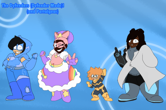
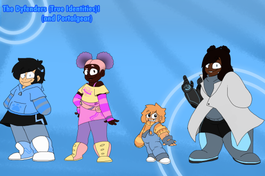
I decided to add a little bit of the good ol' Squash and Stretch to the characters to make them stand out more in the next comics. So of course, some of the colors have changed, especially designs and bodytypes. Oh, and not just that, our heroes have some new stuff, too! For example: Knockout's Dyfender Element is now refered as "Quantum Strenght", Paintdrop's is called "Cosmic Creativity" and Speedrunner's is called "Light Speed". Neat upgrades, eh? (Still, criticism is accepted.) Anyway, notice that in the first picture above there's something that says: "Dyfender Mode", right? Well, if you see that, that's because we are introducing something brand new to our heroes. Called: Omni-modes.
Now, "what are Omni-modes?", you may ask? Well, Omni-modes are modes that are set on the Dyfenders' Dy-watches, you may see that the Omni-Modes are, of course, the Dyfenders' alternate hero forms, to help them take on a mission in a different, more suitable form. When the day needs to be saved during night time (and rarely past bedtime), they activate Night Mode. For sunny beach days but still wanting to make sure nobody figures out their secret identities, Acqua Mode will be at their service. There are tons of different Omni-Modes to be shown (Especially, Pride mode, which was shown on this year's pride post.) So, yeah. Omni-modes will be shown in both the miniseries AND the full series!
Oh! And refering to characters, we can't forget about our main bad guys! Oh, you know, the Dajo-Crew? They got a bit of a make over to fit to the current artstyle! (ft. the updated height chart):
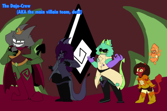

Now that we got that out of the way. let's just head over what will the future of the series look like as of right now. Starting off with the full series and pocket adventures. As said before, Dimension Dyfenders' artstyle changed. But that doesn't mean everything changed, things may be different (the more cartoony artstyle and the sillier tone), but nothing about the series has changed! And that means..
MORE POCKET ADVENTURES IS HAPPENING, THAT'S RIGHT! MORE D.D CONTENT COMING THIS WAY!
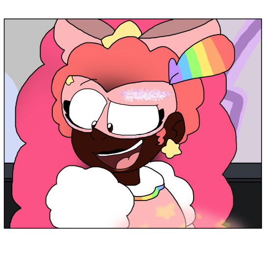
As for right now, D.D Minisode 1 may still be in development as we speak, but one thing that's completed right now is the script! Now that its finally finished, all thats left, is the panel and comic page-making (hopefully you wont mind the sudden character design changes, though.)! But in the meantime! We got some sneak peaks for not just one of the panels from the next minisode 1 pages, but also a never-seen before panel from the next minisodes of pocket adventures! (notice: some of these are not final and may change in the final product.)
That's not all! this franchise has got some new stuff coming in during it's run. We got so many plans, but this is the only thing we can show about said plans:
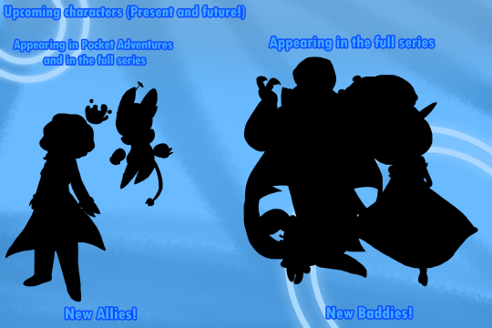
As you can see, you're gonna see some new characters in pocket adventures. While in the full series, you'll get some new characters too. Except... New baddies will be only in the full series, while in the miniseries then later in the animated series... You'll get to meet some new allies! So, keep your eyes peeled for them! And we hope you like them as much as we do.
Now, D.D has never shown a sign of stopping, even during hiatuses, so im happy to announce that more Pocket Adventures will be on their way after Minisode 1 has completed production! We're thinking of putting the upload dates on hold (which means, minisode 2 is delayed until further notice, sorry guys.). So please be patient when waiting for new minisodes.
And speaking of patience... I think I got a little something to keep you guys busy with while you wait... Introducing…
DIMENSION DYFENDERS TOONIES!
Now, you may be wondering: "What is THIS?" D.D.T (Dimension Dyfenders Toonies for long), is a brand new miniseries of comic strips that comes out during the weekends. (Starting in October, the end of september, or during the holiday season! No promises, though.) It's a little something i can make up while you guys wait for the next Pocket Adventures Minisodes. Oh yeah, here's one of the cover for it, too! It's not much, but i know you guys would go NUTS for it:
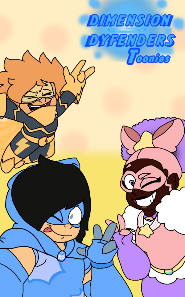
This will be about how the Dyfenders handle their superhero and school lives in everyday situations. (No worries, the action isn't gone. There might be some strips about school, but there will be more strips about their superhero lives, guarantee!). It's also about what The Dajo-Crew does when they aren't invading dimensions, get into some shenanigans at the castle and also when they plot evil schemes. some strips will be either original with a new short story or a recreation of old strips from phase 1 (not a final decision of course, but you can tell us if you like this idea)! One thing to point out is that some of the strips might take place before some minisodes, now thats another thing to notice, right? And that's the only "spoiler" I can give. So, sorry, no more! OH! And for any of you voice actors reading this who are like: "Wow, i wonder when this series will get a comic dub / animated series. If i'm lucky enough i might be able to voice act for it!" … Boy, do we have a treat for you all. Which will be posted in a few hours. both on bird app, bluesky, insta and on here! The only thing I have to announce is that during the d.d stuff's production and during art school, i'm not gonna be online on social media. (until during normal/long weekends and festive days.), but no worries, the series is still alive and kicking, even when there aren't posts about it for a few months! Though, in some days, i'll be able to make and share some art for it! You're all in for a wild ride for these months and for 2024! Oh, and about Dajo's account. I'm planning to bring it back. But, Dajo is currently busy conquering Dimensions, but I can assure he hasn't abandoned Sinstagram completely. You'll see more of his influencer side, too. Both in his Sinstagram and in the upcoming strips! (And perhaps in some mini– OOPS! TOO MUCH!) That's all for now! Thank you all for your support on the series, don't forget to share your fan creations of the series in DMs or tag me and the team in your masterpieces, share it with your family and friends, subscribe to the series on Comicfury, and follow me on Tumblr, bluesky, bird app and Instagram if you wish to support the project even outside of comicfury! Once again, thank you all in this slowly-growing small fandom for all of your support, and i hope you're all excited for what's to come! If you have any questions, please drop them on my tumblr askbox, Which i'll be able to answer during the weekends. That's all, back to the offline study and sleep abyss for me. GOODBYE!
#dimension dyfenders#webcomic#indie project#comics#announcement#dimension dyfenders updates#dajo stuns in new selfie /j#art#artists on tumblr#webcomics#ocs#original characters#webtoons#superheroes#cartoons#comic strips#official update#demon ocs#this is a new tag for artists
20 notes
·
View notes
Text
My Comics Process
I've seen other people post an overview of their comic making process, so I figured I'd put up my own for Valley Echoes. Fair warning, a lot of this is probably good examples of what you really shouldn't do. There's bits to it I need to tweak. But overall this is just what works for me.
Step 1: Borderline Maladaptive Daydreaming
I have a general outline of upcoming comics and plot points, mostly in my head, partially written down in a Notepad file named "ejfiejfeij." Sometimes I'll see something like an incorrect quote or headcanon that inspires a part of a comic, and when that happens I'll try to take note of the original creator of said inspiration to credit later.
Several of my comics have been literally inspired by weird things that have happened while playing modded Stardew - one good example being this bit.
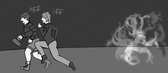
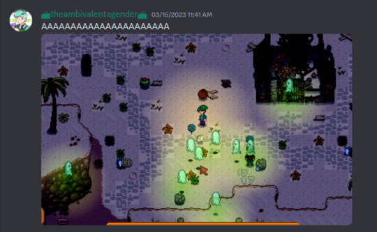
Step 2: Sketch Concept
I don't always do this stage in full for every comic - sometimes I just know exactly how things are going to go. But a lot of the time I like doing it because it's a quick way to note down specific visual ideas I have for upcoming comics so I can save time once I get to them.
Funny enough I don't really write scripts for my comics. Again, probably something I should do, but I find writing out scripts actually makes it harder for me to get ideas out fluidly. A script feels like I have to lock down a lot of details right away - that isn't necessarily the truth, it's just how it feels for me, and can result in me not being able to just get the ideas out of my head.
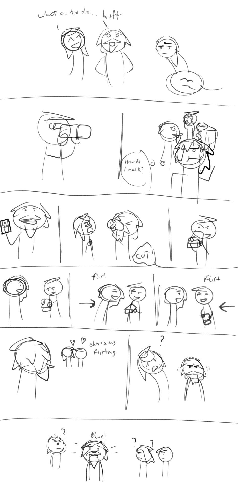
I purposefully keep this stage very, very simplified and loose, mostly for the above reasons. The idea is to keep as much detail-oriented thought away from this stage of the process as possible. You'll see I use certain quick markers to differentiate characters - Shane's sideways hair triangle, Emily's curl, Clint's beard, and Zeke's zig-zaggy hair.
I may write down specific dialogue lines that I know for sure I want in the final comic, but mostly it's just general dialogue ideas or reminders to myself what the "bit" is supposed to be if it's not immediately obvious. I'll add small direction lines if they're important, and quick speech bubbles as a reminder that a character is talking offscreen.
Apologies for my abysmal handwriting. It's readable to me, and in this stage that's really all that matters.
Step 3: Detailed Sketch
This is the part where I finally sit down and take a couple of hours to do the initial comic sketch. Sometimes the final version of this won't entirely match up with the concept. Rarely, I've added or removed panels up until the final image. In most cases, though, this is where the overall comic gets locked in.

I use CSP's 3d models and assets for most of my scenes. I have saved models for each of the characters' proportions, which I find is super great for keeping relative heights consistent. Most of the time when I need props or other set pieces in a scene I'll just use various primatives, however there was absolutely no way in hell I was going to be able to pull that off for the camera, so that's its own asset.
I don't carry my notes over from concept to this stage, I mostly just refer back to the concept layer when I need to add those bits. I've been trying to get more in the habit of sketching out word bubble blocks at this stage to get an idea of how much space I need to leave in each panel. I didn't do this for this comic, which did lead to issues with the one panel where Zeke is trying to walk naturally, but oh well.
Step 4: "Inking"
I like to call this stage "inking" but it's really doing the final clean up layer. This is where I start messing with vectors.

There's actually a lot of steps to this that I can't quite show in this final layer version. Here, I start with just drawing over the lines in the detailed sketch layer with my "inking" pen. I try to keep my lines clear and tend to draw over crossing lines so I can erase the overflow later for a cleaner look. Throughout this stage I'm doing a lot of line adjustments, simplifying where I can, just to make the next part easier.
After I've done all that, I'll go back and adjust line thicknesses. I could probably do a whole post on that alone, but in general I lean toward thicker lines, thickening the lines of clothing, hair, eyebrows, and eyes in particular, as well as thinning wrinkle and other small detail lines.
Step 4: Base Color
I have a pallet of base black-grey-white colors for Valley Echoes, each of which I use consistently for different details. For example, nearly all characters get the same "skin" color (exceptions being Maru, Jas, and Demetrius, who each have their own). Zeke and Shane's hair and common outfit colors are also saved, as well as a few for other recurring characters.
Other than that, I try to "color" according to what needs to stick out in a scene and just trying to make sure grayscale tones aren't too similar next to each other and muddied. If two characters are going to be standing next to each other frequently I try to give them noticeably different shades in their clothing.

The process for this is slightly different for in-color comics. I also have pallets saved for those comics.
Step 5: Details
This is where I'll go back in and add other details that can't simply be added with fill and other tools. In this case, I added Shane's stubble, the blushing in several panels, and Clint turning blue with effect lines.

This is also where I'll add a background. Again, I try to keep the backgrounds so that they don't muddy the foreground elements.
Step 5: Dialogue
This is the bit where I'm likely going to do some revamping in the future. CSP's base dialogue tools are...not great. I'm considering finding another program for doing this bit.

I've also been trying to learn more about methods for dialogue bubble placement in general. This is the bit that can be the most frustrating for me, but overall it works.
How to write the dialogue itself would probably take up multiple posts in of itself. It's a bit instinctual to me because I have much more experience with writing in general. There's also a lot you can say about how splitting dialogue into different bubbles changes how those lines are interpreted, etc.
In this case, a chunk of this comic is taken directly from the original SDV scene, slightly altered for timing purposes. When it comes to canon scenes, it variates on how strictly I follow the dialogue.
After this step, it's just splitting each of these into separate images for each panel and uploading to Tumblr. And I guess that's my very messy, still in development process.
20 notes
·
View notes
Text
Dicctor's very very Awesome devilman fancomic

On Twitter I asked to see if there was an interest on a personal fancomic of Devilman, I didn't give much details (this concept is still in its drafting stage) but it was met with a lot of support. This post is a bit of an informal introduction because I just want to really get it out of the way that I've been working on this, and this is something that I will be working on for a while (I am a full time college student with a lot of work). This comic will primarily be inspired by the 1987 OVA of Devilman, therefore the designs are heavily referenced and based off of that (this comic is supposed to continue off of where it left off at the sirene bit).
Important Things to Specify
My interpretation of Miko is the one I really need to specify. As I'm sure most people have noticed, I head-cannoned the HELL out of Miko. I made a heavy amount of changes to her character for my personal fancomic. These changes can be considered good or bad, truly it's up to you! These changes include:
Tollg is a tree (weeping Willow) demon, therefore she has a tree motif rather than... the hole thing (breast holes were kept so not to stray too far from her original Devilman design)
Miko goes to the same school with Miki and Akira. This was done so she can be apart of the story more frequently (I want all four of them to be the protagonists of the story)
Biggest elephant in the room that people seem to have. A lot of issues with... Miko is south Asian, therefore darker (I have been working on ethnicity traits so this is portrayed even better)
Below is her conceptual demon design and her official ref I made


Though this comic is based off the OVAs and will continue where it left off, it is completely different and separate from the original story! Sorry.
Anything that I will draw/make that's for my comic, be it concepts, finished pieces, panels, etc. will all be posted under "#demon uprising" in order to keep track and to avoid confusion. Another small detail is I put in different moles on each character so that it's more obvious that this is not the originals and rather, a fan interpretation of them (don't ask why I just think it's cool and cute)

The most I'll post about this is just art related to it, but if you've got a question or something just shoot me a message in my ask box or in my dms! I'm not always on tumblr but I'll try to check if I see any notifs. Thank you for reading... byeeeeee
16 notes
·
View notes
Note
Why do you think Dobson's art got noticably worse? I mean so much worse. There's a reason why people often think his older stuff looks better; because it does (okay when he's not making mistakes like wrong number of fingers, angles, inconsistencies, etc.). I know he wanted to move away from his manga-influenced art but I don't think that explains everything.
I think the advantage of his older art is mostly that Dobson was simply being more simplistic in his early days than later on. Only that his attempts to be more detailed and move away from his "manga-influenced" art also involved him mixing too many things together all at once, creating just ugly art in general.
There is in my opinion a bit too much going on as to answer it in just a few lines, but I will try: First, the statement "Dobson was manga-influenced" always rubbed me off the wrong way because I don't think that is quite the case. Dobson was definitely influenced in his art styl and writing by certain mangas he read -Slayers and Ranma 1/2 primarily- but a handful of manga by an even smaller pool of artists to draw from, does not encompose the sheer variety of linework and aesthetics that have been within manga. For example, no one would be able to mistake a Go Nagai artwork for one by Akira Toriyama or Gosho Aoyama, because they have vastly different drawing styles. Confusing an Endo however with an Arakawa would likely be more the case. And don't get me even started how manga is often times writen differently from most western comics of the 70s-90s in term of drama, plot etc. What rather was the case, was that Dobson took aspects of the most simplistic, surface level aesthetics of manga in art and drawing, and hoped it would lead to success. Which it didn't, because of different reasons like a lack of commitment to the writing and nothing making it visually really different from a newspaper strip comic, but with characters making silly faces associated with late 90s comedy anime.
Second, when Dobson tried to reinvent himself, I think he tried too hard to get into more details or add shadows, wrinkles and stuff to his art. It is hard to explain, but the way it looks to me (particularly in stuff like his KorraSami pics) Dobson tried to draw characters at times with more "realistic" details like wrinkles in the face, but because the characters he drew are style toons, they started too look uncanny or exagerated. Which is another problem: When you look e.g. at his Ladybug comics, he didn't even get the proportions of the characters from the show not right by comparison, especially when it came to size of heads and eyes. Which if he had just gone full chibi style wouldn't have been as obvious to most people. But Dobson was always stuck in a weird halfway there state, where the characters were neither cartoonish but proportional, or too cartoonish and unproportional that the former balanced out the later. And he never figured the problem out.
Third, Dobson was just lazy when it comes to scenery I mean, I agree partly with Dobson that at times you don't need to draw a very detailed background when the focus of a story is in one panel focused on two characters looking at something off screen, them talking, or being in thought. But when you really think about it, when did Dobson ever for example really put effort into drawing e.g. a panel where the scenery was meant to tell more of a story or a storybeat, than the characters talking? Or when was a panel ever drawn from a different ankle than simply straight face forward. Like, has Dobson ever even heard of "overhead shot", dutch ankle or POV?
6 notes
·
View notes
Text
The Beginning (Comic Edition, Pt 2)
Saved the rest of this revisit for today's slow periods at work. I liveblogged on Twitter, but this is where I really get to write my thoughts out. No tiny character limits!
Anyway, if you haven't seen the first part, I suggest you check it out first because I'm going in all "Now, where was I?" Style.
[Again, my essays are more for those that have already read the story over once or twice and are looking for some deeper analyzations. Spoilers may be mentioned, so you are warned!]
Anyway, where was I? Oh yeah. Kasuga just opened the door and there was her neighbor, the one she had awkwardly talked to the previous evening.

Repeat photos, yay!
Anyway, there are two things going on here.
Kasuga opening the door to see who it is. She sees it's her neighbor and they had that convo, so she's steeling herself. She knows she can just close the door if it gets uncomfortable, but she is willing to listen because food, you say? She's (warily) listening...
Nomoto, meanwhile, is a nervous wreck because, well, how do you word this?? She is more nervous about the food proposal than Kasuga! Even on the next page, the nervousness stems from the weird-to-Nomoto request for someone to help finish off the meal she made tonight. Like, this is how she's truly introducing herself to her neighbor with little to no prior interaction. "Hi, how you doing? Wanna eat my food?"
She is well aware it sounds weird and maybe even creepy but...but what else is she gonna do with all that food when she's got no social circles or community knowledge under her belt?


We know how she acts when others (especially men) frame her passion as great wife material, but when she has to talk about it? Anxiety through the roof. She's judging herself and being self-conscious. In a way, I like how this isn't "Kasuga is a big, cold, scary woman" and more "Nomoto is super self-conscious and doesn't know how to be social in-person anymore (because she hasn't had friends since her school days and that's almost 15-ish years now, based on what I've inferred from other pages re: her current age and knowing the comic is basically Present Day)
Poor Nomoto has a lot of baggage herself. It's not as obvious in these first chapters, but she was clearly molded by folks who definitely harped on the traditional values and other expectations of adulthood around her too much....NOMOTO'S MOM.
But...I digress. So, there's something interesting to note here. I don't think I've seen people point out this specific panel. Namely, that last one, Kasuga's eye.

Kasuga loves to eat. We know this, even new readers get that impression pretty quick (and the cover, of course). She wants to enjoy all the food in the world, probably even the mediocre stuff (to which she can make future purchasing/eating-out options when she can afford it)
As you get to know her, and you come back to these early pages, you realize this food stunned her.
While we know Nomoto's food is delicious and others have voiced their satisfaction with it, Kasuga was able to taste an extra special ingredient that night. Yes, I'm being a little cheesy here. This special, "invisible" ingredient that has been missing in her life resonated within, and she responded with the most emphatic eating that, in turn, stunned Nomoto in feelings she hasn't felt before.

Fun thing to note with Nomoto in the center of the page here: based on the way it's drawn, this woman is having multiple things firing up inside her at full blast; not just the sight of someone enjoying her massive portion of food, but seeing HOW MUCH they're enjoying it and just never experiencing this before. It's new, it's stunning (multiple definitions)...she is just this side of BSOD-ing.
They have been cooking and eating with something missing all this time. Put them together and it's like something opens up within both. They had what the other was missing and they were LITERALLY NEIGHBORS...but it took a chance encounter in an elevator to start the connection
The next parts are basically Nomoto's raisom d'etre waking up from its slumber. She remembers why she took up cooking in the first place...

And while we can attribute these panels as a little lighthearted, comedic moment as the chapter comes to a close, consider this: the birds, bunnies, and deer never came...and neither did any people as she grew up and began her cooking journey. She found a "workaround" via sharing online, but it's not like her old dream. She said at the beginning how her food is missing an audience that will fully enjoy it (not just as posts). She has never had anyone around to enjoy her food until Kasuga agreed to finish off this plate.
And this is where I realized something.
....Did Nomoto even cook when she lived with her folks? Did she cook back then and they didn't enjoy it? Did she only cook for herself and that's how she learned? Or maybe her mom was like "leave all the cooking to me" so she never had a chance to show off?
Like this raises a lot of questions that I wasn't expecting to have as I reread this chapter. The future nightmare scene in Vol 2 doesn't help matters, though it gives us further insight about her friendships and her being pushed into heteronormative adulthood even at a young age. Sure, it's a nightmare, with some fantastical, nightmareish transitions, but a lot of those scenes appear to be based on past experiences she had, including the orientation quiz BUT I digress. Again! That can be for another essay!
Anyway! Whoo! What a ride, eh? And I still plan to do an essay over how Episode 1 of the drama covered their beginnings, so look forward to that!
5 notes
·
View notes