#ipedits
Explore tagged Tumblr posts
Visit Tumblr Blog
Explore Tumblr blogs with no restrictions, modern design and the best experience.
Last Seen Tumblr Blogs


Fun Fact
Tumblr has 4 main sources of revenue.
Text
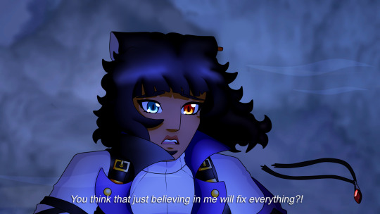

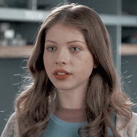
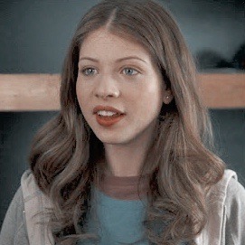
What if Ruby's breakdown was on the bridge.
#rwby#ruby rose#weiss schnee#blake belladonna#yang xiao long#ipedits#luke.txt#honestly i would've taken a bridge scene#where all of wby are trying to reach ruby and she's pushing them away#symbolised by their bridges being yanked away and the red on their designs being blown off or fading
77 notes
·
View notes
Text
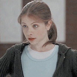
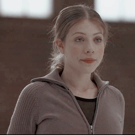
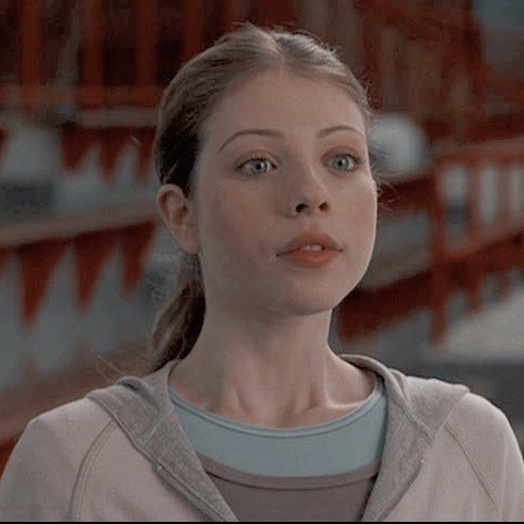
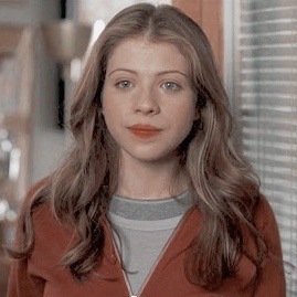
CASEY CARLYLE ICONS.
like or reblog if you save/use!
#casey carlyle#ice princess#icons#icon#fskateedit#figure skating#ice skating#ip icons#ipedits#ipedit#casey carlyle icons#ice princess icons#icons with psd#psd#with psd#disney psd#disney#disney channel#disney movies#disney channel movies#disneyedit#disneyedits#dcom#dcoms#dcomedit#dcomedits#disney channel icons#disney movies icons#disney channel movies icons#rachel
117 notes
·
View notes
Photo

REI ICHINOSE'S DANCE ON EPISODE 4
EPISODE 4 : Turn Up the Volume Higher and Higher
98 notes
·
View notes
Text

Penny fell into the Ever After and is now best friends with the Curious Cat, written/directed/produced by meTM
110 notes
·
View notes
Text

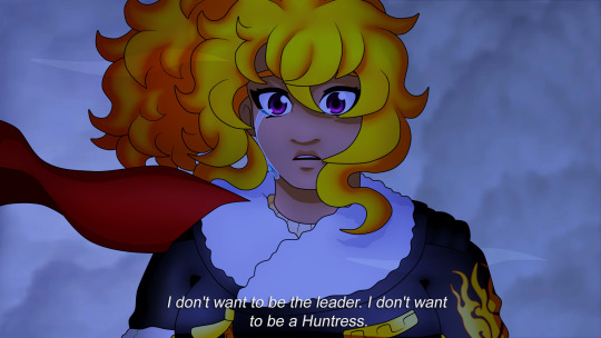
"Yang... you can talk to me."
"I think I love you."
66 notes
·
View notes
Photo


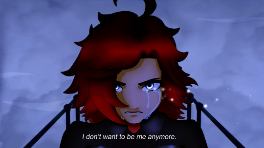
“Well, my little Maiden... This is goodbye.”
I can’t have one AU without wanting to make myself cry-
77 notes
·
View notes
Text
They're a cat that floats, and Penny finds them neat
62 notes
·
View notes
Text
Weiss?
31 notes
·
View notes
Note
May I ask how you do those screenshot edits?? I think that's what they're called?
I actually did a whole tutorial back about 2 years ago, but since I've changed some of my tricks I'll do a new one for you anon!
Before I start, this is all done with Paint Tool Sai. I don't know how to do it on other programs, so this will follow that program.
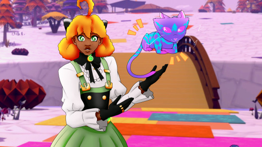
So first, you need to pick the screenshots you wanna use for whatever you wanna edit! Since I'm doing one right now for my Ever After!Penny AU, I'll go step by step with that.

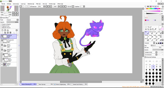
Now that I've got the screenshots I want, I erase the background and move the characters where I want them in the edit. Here, I want Penny gesturing to Curious. I also shrunk her head so it's not so bobble-like, and reduced the gap between her eyes.
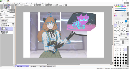
After that, you'll wanna sketch out the lines for the new design. This is also the time you'll wanna change the body shape and such if your character has a different body shape, especially given the super thin figures the girls have.
It does not have to be super neat, just enough that you can then put down the cleaner lines.

Now is when you put down the final lines for the edit. I used to use 0.7 width on the curve tool, but now I use 2 width instead. When you're done, you change the width of the eyes and certain lines like the bottom lip/cloth wrinkles/hair puff.
The eyes are bigger at 3 width, while the other lines are 1. It gives more variety in your linework. It should look like this:
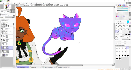
After that, using the pressure tool, you'll pinch and widen the lines. Typically you pinch the end of the lines like the end of folds, while I widen some parts of Curious' whiskers to vary the length.
So it'd be like this when it's all done.
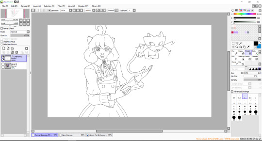
Now it's onto the colouring. Make a new lineart layer, put it under the main lineart layer, and jot down the lines for the eye whites and the shading for the eyes, like this:
This just makes it easier to colour in the face and the eyes without the colours trying to mix together.
Before we start the colouring phase, a point I wanna make is that put any layer that has lighter colours under the layers with darker colours. It doesn't do it if the lineart is thicker, but if you don't, you notice some bleeding between the colours, especially when you zoom in to colour and shade.
It's not awful but it is annoying so, best safe than sorry.
You can also make a folder and label it after the character you're colouring in, so that all the layers are in that folder and makes it neater, rather than leaving 743274893274 different layers to scroll through.
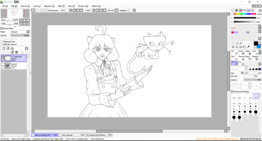
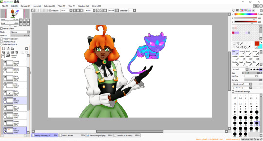
With the flat colours jotted down, we quickly go to Curious for a second, since they're coloured in a bit different to how I colour in other characters like Penny.
I make another lineart layer in their folder and line out their markings. Once that's all done, you can colour it in! It also works when you have designs on clothes that have coloured outlines, as then you can shade and highlight over it without having to remove the lineart underneath.

Since Curious doesn't have any shading, they're all done. But if this was a pattern on another character, I would clip another layer on top of the pattern layer and use overlay so that the highlight colours match the colour underneath.
Back to Penny, with the flat colours done, create another lineart layer under the main lineart layer and, in a colour different to the character's colour pallete, line out the shadows on them. At this point, it's best to figure out what background you want so you can match the light source with your characters.

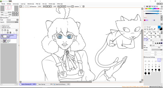
When that's done, you can start putting down the highlights and the shadows to give the character depth. I use a highlighter colour, a base to shadow colour, and then a shadow colour.
Changing the contrast between the highlight/base/shadow would give the art a different texture. Penny's skin would have a softer contrast compared to the leather of her chest piece to the metal of her bow and buttons.

I leave her hair to last as Penny's hair is shaded different to how I shade other's hair. Since she has an afro textured hair, I use a range of orange-yellow-red to shade it in using the pen brush and blur.
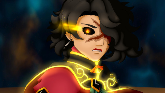
And that's the last thing for the actual drawing process! Now you put the picture on a background, which is from the Paper Pleasers episode for this piece.
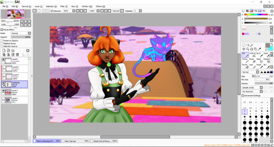
Compress the lineart layers with the colours too, as that's necessary for the next part.


The first layer is a multiply layer with the colour that matches the lighting of the background. The easiest way I get this is to colour drop the whites of a character in the screenshot I use. After that, clip another layer and apply overlay on.
With the same colour as the multiply, put down the highlights where the light would be hitting the character, and blur it in.
And that's it! After that, you can add any details you want to the piece, which I did with some anime style highlights around Curious here.
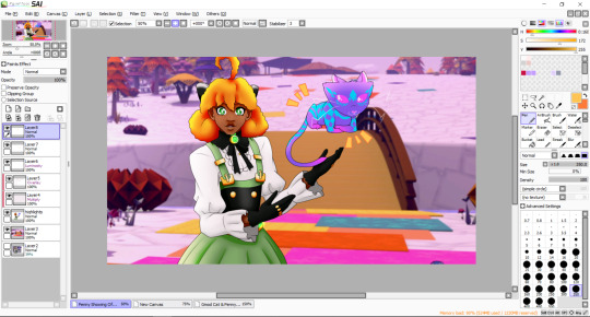
The finished piece is here, and thanks for reading this far! I hope it helps!
16 notes
·
View notes
Text


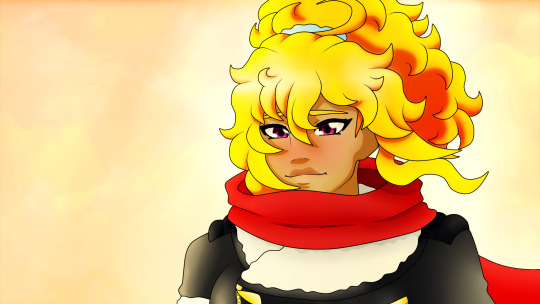
Saw my old Winter Watts post getting some new attention, so I decided to redo one of the edits.
What three years of practice can get now uwu
18 notes
·
View notes
Photo

Pyrruby in Kuroyuri!
88 notes
·
View notes
Photo


Blake!
This will always be one of my favourite scenes in RWBY as a whole.
54 notes
·
View notes
Photo

Rematch.
60 notes
·
View notes
Photo


I legit saw that screenshot of the new RWBY/JL movie and blacked out for two days-
#rwby#rwde#ruby rose#weiss schnee#ipedits#luke.txt#bruh what the fuck are those outfits#ruby and weiss are back in their peak outfits but the models are so fucking jank that they look worse than in poser
38 notes
·
View notes
Note
Omg your edit of black Ruby looks so cute!!

She is adorable and everyone will look at her.
70 notes
·
View notes
Photo

Wanted to try and redo my black!Yang to go with Mistral Ruby.
#rwby#yang xiao long#ipedits#luke.txt#her last edit was my first time drawing afros and you could really fucking tell LMAO
35 notes
·
View notes