#interfaceflor
Explore tagged Tumblr posts
Photo

@neilpatel The God of marketing. Marketing is not all about using the tools. It's about understanding the goals, the customer, the journey of the customer and so much more into the behaviours. . . If you guys have learnt anything from this post, share it with someone who'd learn too. . . . . Thank you so much. @uidot_design . . . . Discussions are appreciated in the comments. . . . Hashtags : #marketingtools #digitalmarketingstrategy #neilpatel #marketingideas #customerjourney #customerbehavior #marketingcampaign #contentmarketing #userexperiencedesign #userexperience #interfaces #uiux #designmarketing #learndesign #avalonarmy #interfaceflor #designthinking #designbot #uidotdesign #digitalmarketingconsultant #digitaldesign #instamarketing #designtrend #designsale #salesfunnels #salesstrategy #facebookmarketingtips #googleads #uidesign #userinterfacedesign https://www.instagram.com/p/CB928WHg6Jl/?igshid=1r0wi9dpyp1f
#marketingtools#digitalmarketingstrategy#neilpatel#marketingideas#customerjourney#customerbehavior#marketingcampaign#contentmarketing#userexperiencedesign#userexperience#interfaces#uiux#designmarketing#learndesign#avalonarmy#interfaceflor#designthinking#designbot#uidotdesign#digitalmarketingconsultant#digitaldesign#instamarketing#designtrend#designsale#salesfunnels#salesstrategy#facebookmarketingtips#googleads#uidesign#userinterfacedesign
2 notes
·
View notes
Photo

/Sleek + Sustainable/ Interface's new luxury vinyl tile collection looks gorgeous! . . . . . @interface #lvt #flooringdesign #interfaceflor #design #interiordesign
0 notes
Photo

Fresh carpet on this beautiful Saturday. ☺️☀️#carpettile #carpettile #interface #interfaceflor #office #interiordesign #interiors
0 notes
Photo

S a p o • • • • • #sapoangola #saponi #reliefengraving #abstractfigurative #coloradolove #abstractartwork #pinturaabstracta #engravingwood #anfíbios #colorblock #sapoonsapoon #engravingtattoo #abstractlandscapes #colorsplash #illustration_art #abstractors #abstractlandscape #pinturaamano #pintura #pinturasacrilicas #pinturamexicana #abstractfigure #interfaceflor #graphicdesign #pinturadecorativa #abstractpainting #illustrationart #illustrationartist #animaltober #childrenillustration (en Madrid, Spain) https://www.instagram.com/p/CGHo73GDXbG/?igshid=3ubxo3lmao5a
#sapoangola#saponi#reliefengraving#abstractfigurative#coloradolove#abstractartwork#pinturaabstracta#engravingwood#anfíbios#colorblock#sapoonsapoon#engravingtattoo#abstractlandscapes#colorsplash#illustration_art#abstractors#abstractlandscape#pinturaamano#pintura#pinturasacrilicas#pinturamexicana#abstractfigure#interfaceflor#graphicdesign#pinturadecorativa#abstractpainting#illustrationart#illustrationartist#animaltober#childrenillustration
0 notes
Text
Interior Architecture Adelaide
Designthink is a creative interior design studio providing architectural services in Commercial, Retail &Residential interiors fit-outs in South Australia
Floor covering tiles out in the open spaces need to address a vast scope of issues as far as their capacity, spending plan and support. Rug tiles are the new savvy answer to business floor covering in a scope of divisions where flooring is a high-esteem venture by organizations, schools, and the medicinal services enterprises.
Some contextual analyses clarify the plan choices cover tiles can give:
Monash University
Australia's celebrated Monash University is a major spot. The college required a substantial surface zone of floor covering inclusion, on all grounds. Its financial requirements for a ground surface update incorporated a solid spending plan, effective establishment, and a decent item life expectancy. Monash is likewise a profoundly ecologically cognizant establishment, and ecological certifications were a characteristic issue in such a substantial task.
Getting the correct covering, over numerous compositional plan types and fusing different utilitarian building jobs, required exceptionally versatile, flexible ground surface. The arrangement was to utilize three distinct sorts of rug tiling with a "support to grave" carbon impression examination of each kind. Floor covering tiles of this sort are extremely simple to introduce, and simple to keep up and supplant when required, making an implicit cost sparing over item life. Retail design Adelaide
Optus
Optus Headquarters in Sydney required six distinctive "town" themes for interconnected working regions. The need was to coordinate a solid ultra-present day office plan, while making interesting components for each work region. The Optus building is a major spot, and normally fit a brave plan theme.
The arrangement was to utilize various distinctive floor covering tile themes, each delivering a shading and tone topic for the individual work territories. Optus HQ contains a great deal of open space, with high caliber engineering structure and phenomenal light which normally fits shading and style.
Adelaide Airport
Adelaide Airport required a decent plan joined with sturdiness and simple support, and furthermore needed ecologically solid materials, as a component of its progressing responsibility to green innovation. Ground surface expenses and upkeep were additionally normal contemplations. It was additionally vital from an utilitarian point of view to give area signs to locate weakened individuals, and make unmistakable navigational guides for individuals to discover their way around the airplane terminal.
The choice was to have two sorts of altered particular floor covering tiles with exceptionally rock solid fiber, utilizing the consistent joins which are a plan highlight of secluded covering. This rug is anything but difficult to keep up in-house via airplane terminal support staff, and the tiles can be effectively supplanted whenever required.
Bird of prey E-Library
The Falcon E-Library in Mandurah, Western Australia is a multi-job, present day library with unmistakable utilitarian needs. The library needed long-life, strong ground surface with moving structures, with three unmistakable plan zones. The library additionally required enemy of dirtying innovation and hostile to microbial floor coverings, genuine fundamentals out in the open space regions for wellbeing, stylish, and commonsense upkeep.
The library picked a blend of very unique plan styles, with solid textural and light components for every zone. The economical floor covering tiles are the most recent in current rug configuration, including a scope of surfaces. They're well known decisions in broad daylight spaces for their unwavering quality and profundity of plan ideas.
As should be obvious, cover tiles can coordinate any condition.
InterfaceFLOR is the structure head in secluded rug tiles offering an unbounded exhibit of hues, surfaces and examples. Reasonable yet natural floor coverings offering a horde of innovative chances. For more data or to see our items, visit Carpet visit this websait==>>https://www.designthink.com.au/
0 notes
Text
Herts Carpets Expands it’s flooring range
Herts Carpets Ltd the St Albans based flooring supplier is pleased to confirm that it has expanded its flooring range and we now offer carpets and flooring from the following manufacturers:
Abingdons
Adams
The Alternative Flooring Co
Associated Weavers
Axminster Carpets
Balsan
Balta
Balterio
Beauflor Vinyl
Belakos
Bondworth
Brockways
Bronte
Burmatex
Carpets of Kidderminster
Causeway
Cavalier
Cavalio
CFS
Cormar
Dan Floor
Distinctive Flooring
EGE
Enia
Fibre
Flooring Industries
Flotex
FORBO
Furlong Flooring
Gaskells Woolrich
Georgian
Girloon Carpets
Gradus
Halls Flooring
Heckmondwike
Heuga
Ideal Carpets
Interfaceflor
ITC
IVC Vinyl
Jacaranda
JHS
Kersaint Cobb
Kingsmead
Krono Laminate
Lano
Louis De Poortere
Manx
Marley
Master Weavers
Modulyss
Mohawk
Mr Tomkindson
Natural Weaving Co
Orotex
Paragon
Penthouse
Pownalls
Prado
Quadrant Modular
Quickset
Rawson
Regency Carpets
Ryalux
Shaw Carpets
Sit In
Tapibel
Telenzo
Tessera
The Wilton Carpet Factory
Thomas Witters
Tintawn
Ulsters
Victoria
Westex
Westons
Whitestone Weavers
Wilton Royal
Woodward Grosvenor
Wool Classics
Woolimex
Xylo
We offer highly competitive flooring quotations on all of the above, and would be pleased to assist with a free consultation available to all customers. Contact us today for further details.
This content is from: Herts Carpets Expands it’s flooring range
0 notes
Photo





Design inspiration/ mood board
Library of Things branding, Kind Studio. [source]
When I initially sketched out my logo, I immediately knew the look and feel I wanted to have for the realised digital version. I imagined bold, clear lines and type, combined simply with blocks of flat colour (where relevant).
This branding by Kind Studio for the Library of Things (a place where you can borrow a multitude of items instead of buying), was something I came across after I’d digitized my logo and begun experimenting with colours, and which seemed to do exactly that. I knew that this was the sort of visual style I wanted to work in and develop for my festival, and I also liked the idea of using black and white to enhance a chosen colour palette/ combination, similar to the way that they have done.
I think that this style is appropriate for my audience as it’s clean and distinctive but at the same time doesn’t carry any particular notions with it because of it’s almost neutral appearance- leaving the audience to appreciate and take in the design around them at the festival with an open mind.
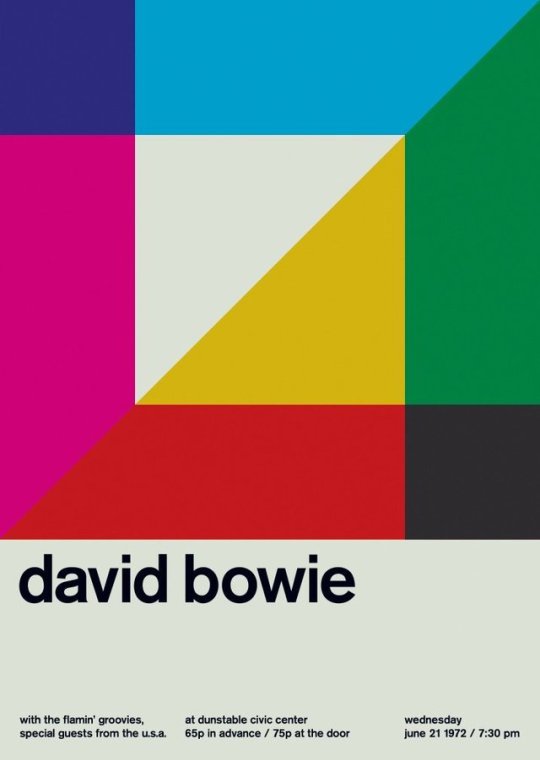
Swissted project, Mike Joyce. [sources 1, 2, 3, 4]
I was first introduced to the Swissted poster project by Mike Joyce, at college. Described as a series reimagining/ redesigning ‘vintage punk, hardcore, new wave, and indie rock show flyers into International Typographic Style posters’, it puts a fresh spin on a very classic style. [source]
What I love about this series is again the simplicity. Repeating shapes, playing with size, transparency, overlaying/ offsetting and colour, these minimalist posters can’t help but catch your eye. I want to draw influence from these characteristics to help form my own visual identity, and combining both line and shape is something I feel would fit in very well with the look I’m going for. The Swiss style also makes use of a grid, and I also intend to draw inspiration from that, as well as it’s arrangement of type- flush left or right.
The focus with pieces of work in this style often seems to be on clarity, straightforwardness, and order; the clear presentation and communication of information, therefore I think it’s a good style to try to emulate or draw inspiration from for my festival.
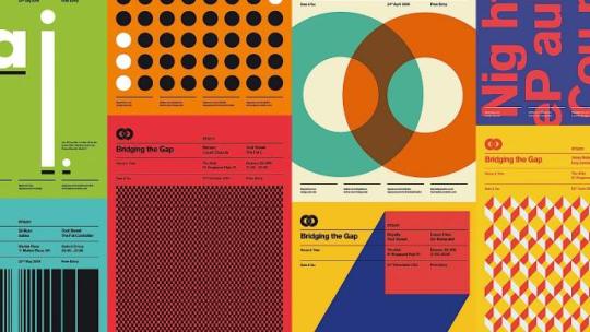
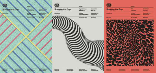
Bridging the Gap series, Ross Gunter. [sources 1, 2]
Bridging the Gap is another poster series I looked at around the same time as Swissted. The series similarly takes influence from the clean Swiss style, but also works with finer lines and in some instances, a more up to date colour palette- as well more exploring patterns, along with simple shape compositions/ arrangements. Looking at it has made me consider more about creating patterns myself/ repeating elements.
Memphis inspired showroom collection, Toth for InterfaceFlor. [source] [other sources 1, 2, 3]
Another bit of feedback whilst showing a few different tutors my colour palettte options ‘brainstorm’, was that some of the combinations reminded them of Memphis furniture, which in itself was quite strange and playful (and used bold colours and shapes). Memphis inspired graphic design is something I quite like-as someone fond of 80s design, and the way shapes and patterns are used in these, is something I think will help me in creating my own designs, as often times the elements can be quite simple, just arranged well.
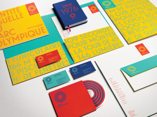
Parc Olympique branding, lg2boutique. [source]
One of the tutors also suggested that I should pick about four colour pairs for my options (refine them), and showed me this Parc Olympique branding as an example of an identity that works similarly. Limiting it to four makes the selection process easier and also allows me to see what might work together collectively.
What I like about this brand identity is the fact that they’ve managed to make it work with so little in the way of elements, which in fact makes it more effective. The rings from the logo are carried through to the outlined text as well as used standalone, and that’s essentially all there is. Text sometimes rotates around their circular logo such as in a vertical position, or is even used as shape(s) in the compositions.
A comment by the same tutor was that ‘if you’re clever enough, you can get everything you need for your graphic elements from your logo. You have the framework, just break it down, use what’s already there.’ From that alone, I can consider shapes such as squares, rectangles, diamonds, triangles, circles, crosses (intersects), as well as just lines for things to use as my graphic elements. I think that this is a good place to start and will soon start my development.
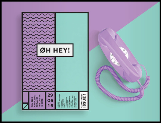
Oh Hey! magazine by Shanti Sparrow [source]
This is another example of design that I really liked and came across whilst browsing Pinterest. A word I can’t help but use to describe this, is ‘clean’ because everything about it is just crisp and really well done to me. I like the slight introduction of pattern to the design in that singular panel on the cover, and this has given me the idea of actually showing lines and divisions of a grid in my designs, as well as working with the guides of one. Another thing that I also like is that the designer has used both horizontal and vertical text. It’s definitely something worth considering and would make a design more interesting. I also get a slight Memphis vibe from this because of it’s boldness and simplicity.
1 note
·
View note
Video
youtube
g(squared)
Having fun with InterfaceFLOR tiles. By Seth Unger, Michael Shaub, Sarah McKeen, and Jessica Statz
0 notes
Photo

1 dribble invite. . The dribbble community is so much of value. Do let me know if you need an invite. You could DM me your designs and your user names. . . Helping the design community has always been the top priority. . . Looking forward to seeing some great designers out here. . . . Thank you. . . . . . Hashtags : #appdesigns #uiux #uxresearch #uitrends #speeddesign #appdevelopers #uiinspiration #reactnative #dribbbleinvite #invitedesign #flutter #interactivedesign #interactiondesign #interfaceflor #experiencedesign #interactivedesign #uibucket #uidotdesign #instaui #avalonarmy #dribbbledesign #dailyui #indiandesigns #figmadesign #redesigned #interfacedesign #landingpagedesign #responsivewebdesign #uiuxdesigners https://www.instagram.com/p/CB5t0ASg6oG/?igshid=fuuhx00wtxti
#appdesigns#uiux#uxresearch#uitrends#speeddesign#appdevelopers#uiinspiration#reactnative#dribbbleinvite#invitedesign#flutter#interactivedesign#interactiondesign#interfaceflor#experiencedesign#uibucket#uidotdesign#instaui#avalonarmy#dribbbledesign#dailyui#indiandesigns#figmadesign#redesigned#interfacedesign#landingpagedesign#responsivewebdesign#uiuxdesigners
0 notes
Text
Greener Products for Greener Building
Currently there is about 4 billion lbs of carpet added to American landfills each year. This carpet is added to a disgustingly large amount already sitting there today. It takes at least 7 years for carpet to decompose and yet an estimated 9 billion lbs of new carpet are sold a year with the only hope that it will be ripped up and thrown “away” to lay down something else to meet the fast changing trends and personal taste.
I'm an interior design student and I'm quickly learning that there is a large responsibility in the hands of future designers. A responsibility to insure that the harmful and wasteful consumption of building and design can not continued. Sounds like a big burden right? Well, as we can all agree (and to quote a cliché) every little bit counts.
Back to carpet, last week my class visited InterfaceFLOR, a carpet manufacturer and supplier. While there I had a realization. The first step, as a designer, towards a environmentally responsible design is to pledge to use environmentally responsible manufacturers. This might sound obvious, but it really takes understanding and knowing how manufacturing works to really understand a company. Not just picking a product labeled “green.” It's not a difference between cheap carpet or expensive carpet, a pattern or color choice, or even a choice of how much carpet you need. First and for most it's a choice of whether or not you want to continue wasteful practices or take a step in a new direction.
That is was InterfaceFLOR promotes: steps towards change and a new way of thinking when it comes to the manufacturing of carpet.
I want to start by taking you through my day at InterfaceFLOR, starting at their weaving plants and ending at their “think tank” (creatively named AWAREhouse). So stick with me it's not as boring I as it may seem.
First, a little back story about Interface as a company. They were founded around 50 years ago and were one of the first companies to bring “modular” carpet tiles to America. It wasn't until 1994, however, that their new CEO Ray Anderson pushed the idea that not only modular carpet produced less waste than traditional carpeting but that it was important to also manufacturer the product in the most sustainable way.
After being introduced to the company we were shown the product. Interface now only produces carpet “tiles” which lay on the floor in a grid attached only by a sticker (they call “TakTiles”) on each corner. Traditional carpet must be purchased in 12 ft minimum wide rolls and purchased in length by the yard. Instillation of traditional carpet either requires environmentally harmful glue or nailing. Interface's carpet-tile-installation-system alone dramatically reduces carpet waste by not requiring the purchase of another 12 ft roll when you only need another few feet or so. For example if you have a 13 foot wide room you would need to buy two rolls or traditional carpet and 11 feet would be wasted. With carpet tiles you only need a few more tiles with only inches of waste. Also, there is not need for glue. The TacTiles are basically stickers that stick to the carpet-tile to hold them all in place, and not the floor. So no damage to the floor and the TackTiles are also recyclable. For a 10,000 square foot space that would use 56 gallons of non-recyclable or reusable glue you would only need 80 recyclable TacTiles that measure 4in x 4in.
We were then taken through the mill to see the carpet being woven, it was like being on the show “How it's Made”. It wasn't until we saw the recycling plant, where they recycle reclaimed carpet, that I noticed how this company was not only reducing their waste but also reducing waste produced by other carpet manufactures. Interface uses 35% pre-consumer recycled content (scraps and stuff from their own mill that would normally be thrown away) and 30% post-consumer recycled content (reclaimed carpet) to produce their carpet. This is nearly three times more than most carpet producers.
InterfaceFLOR really stood out to me as a sustainable company after we were taken to their AwareHouse. This is the place were they test and show new product ideas and conceive ways to improve their product and company. The latest environmental goal they have created is for zero impact.
Interface announces that:
“We call this goal Mission Zero, our promise to eliminate any negative impact our company may have on the environment by 2020.”
Upon leaving that day I realized that InterfaceFLOR is the kind of company I need to support as a designer. It is truly their company's mentality towards the relationship between humans and the environment that can carry us into a better future.
John Doyle
Find more information at www.interfaceflor.com and for purchansing carpet at www.flor.com
InterfaceFLOR. Web. 03 Feb. 2012. <http://www.interfaceflor.com/default.aspx? section=3>.
InterfaceFLOR. Greener Products for Greener Builings. LaGrange: InterfaceFLOR, 2010. Print.
12 notes
·
View notes
Text
http://ping.fm/8nXNi RedCarpet Luxo Interfaceflor @Flotereschauff
3 notes
·
View notes
Photo
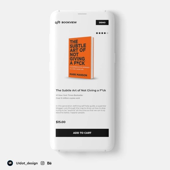
Product page design. . Do you read books too? . . This was a design idea which came up observing daily habits. . . Do let me know what you think. . Suggestions and feedback are appreciated. . . Thank you. . . . #uidesigns #uiux #ui_ux #uxresearch #uxprocess #uiinspiration #uiinteraction #uiinterceptor #interfaceflor #interfacelift #productdesigns #productpage #designinspiration #designaesthetic #designbot #photoshopdesign #adobexddesigner #designtrend #uxuidesign #minimaldesign #minimaldesigns #designworks #instaui #interfacecarpet #instagrammarketingtips #mobileappui #mobileui #appdesigns #appdevelopers #uidotdesign https://www.instagram.com/p/CBvWFjjAA80/?igshid=1m7r0snwrgrao
#uidesigns#uiux#ui_ux#uxresearch#uxprocess#uiinspiration#uiinteraction#uiinterceptor#interfaceflor#interfacelift#productdesigns#productpage#designinspiration#designaesthetic#designbot#photoshopdesign#adobexddesigner#designtrend#uxuidesign#minimaldesign#minimaldesigns#designworks#instaui#interfacecarpet#instagrammarketingtips#mobileappui#mobileui#appdesigns#appdevelopers#uidotdesign
0 notes
Photo

The subtle art of not giving a f**k. . A simple minimal product page UI design concept. . . Share it with someone who'd love to see this. . . Comments and feedback are always appreciated. . . Like? Comment? Share? Maybe? . . . Thank you so much . . . . Hashtags : #appdesigns #uiux #uxresearch #speeddesign #uitrends #appdevelopers #reactnative #uiinspiration #flutter #uiinteraction #interactivedesign #interfaceflor #interfacelift #experiencedesign #interactivedesign #uidotdesign #uidesignerlife #avalonarmy #instaui #dailyui #spacexlaunch #falcon9launch #landingpagedesign #redesigned #dribbble #adobexddesigner #figmadesign #indiandesigns https://www.instagram.com/p/CBqNcMrAHP3/?igshid=1l34p49vocqvw
#appdesigns#uiux#uxresearch#speeddesign#uitrends#appdevelopers#reactnative#uiinspiration#flutter#uiinteraction#interactivedesign#interfaceflor#interfacelift#experiencedesign#uidotdesign#uidesignerlife#avalonarmy#instaui#dailyui#spacexlaunch#falcon9launch#landingpagedesign#redesigned#dribbble#adobexddesigner#figmadesign#indiandesigns
0 notes
Photo

👚A fashion store concept 👚. . . Inspired by the wonderful Design community. . This was a speed design work to enhance my design skills. . Hope this stands out to be quite different in terms of colours used in my previous works. . @uidot_design . . Feedback and suggestions are appreciated:) . . Would love to hear from you. . . Thank you so much. . . . . . . . #uidesigns #uiux #designaesthetic #speeddesign #uxresearch #uiinspiration #uiinteraction #interactivedesign #interactiondesign #uibucket #figmadesign #adobexddesigner #dribbble #uidotdesign #experiencedesign #interfaceflor #interfacelift #reactnative #flutter #instaui #dailyui #fashionapp #fashiontrends2020 #redesigned #indiandesigns #appdevelopers #appdesigns #uitrends #behance https://www.instagram.com/p/CBnrQKogxTe/?igshid=17v73c4j13z7j
#uidesigns#uiux#designaesthetic#speeddesign#uxresearch#uiinspiration#uiinteraction#interactivedesign#interactiondesign#uibucket#figmadesign#adobexddesigner#dribbble#uidotdesign#experiencedesign#interfaceflor#interfacelift#reactnative#flutter#instaui#dailyui#fashionapp#fashiontrends2020#redesigned#indiandesigns#appdevelopers#appdesigns#uitrends#behance
0 notes
Photo

A speed design of a furniture e-commerce store. . . Hope you're all doing well. . . I would love to know your feedback and suggestions in the comments. . . There are some amazing designs coming up here on Instagram. . . Let us all grow together. . . Thank you so much. . . . Hashtags : #appdesigns #uiux #uxresearch #uitrends #speeddesign #appdevelopers #uiinspiration #reactnative #flutter #uiinteraction #reactnative #interactivedesign #interfacedesign #uidesignerlife #interactiondesign #interfaceflor #interfacelift #uidotdesign #uibucket #experiencedesign #avalonarmy #instaui #dailyui #ecommercedesign #ecommerceapp #landingpagedesign #responsivewebdesign #figmadesign #dribbble https://www.instagram.com/p/CBlCtt4AnBg/?igshid=hwnyzlfh6oy1
#appdesigns#uiux#uxresearch#uitrends#speeddesign#appdevelopers#uiinspiration#reactnative#flutter#uiinteraction#interactivedesign#interfacedesign#uidesignerlife#interactiondesign#interfaceflor#interfacelift#uidotdesign#uibucket#experiencedesign#avalonarmy#instaui#dailyui#ecommercedesign#ecommerceapp#landingpagedesign#responsivewebdesign#figmadesign#dribbble
0 notes
Photo
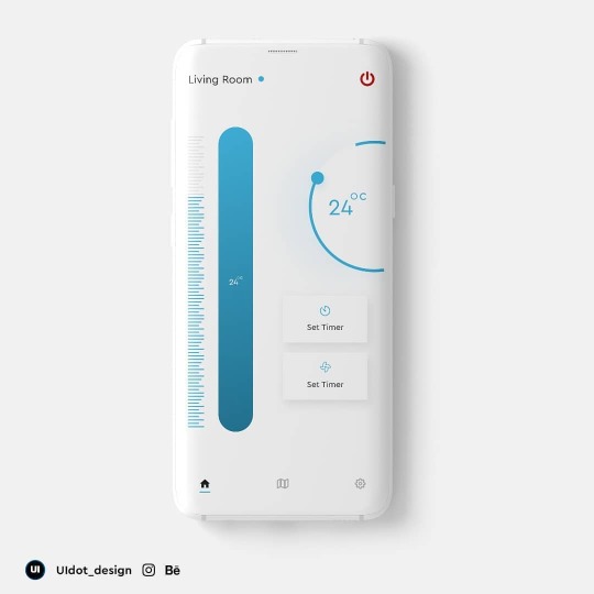
Home automation UI Concept. . . . Hope the design stands out to be better. . . Any freelancer work? DM me. . . . Like? Share? Save? Comment? Maybe? . . . . Hashtags : #uidesigns #uiux #designpattern #uipatterns #uiuxdesigner #designbot #interfacelift #interfaceflor #designtrend #uidesigninspiration #uiinspiration #uiinteraction #experiencedesign #userexperiencedesign #landingpagedesign #responsivewebdesign #uidotdesign #ui #designtrends2020 #uibucket #figmadesign #sketchapp #adobexddesigner #appdesigns #appdevelopers #reactnative #dailyui #instaui https://www.instagram.com/p/CBTFNs7gbRt/?igshid=1atd2belt1jxu
#uidesigns#uiux#designpattern#uipatterns#uiuxdesigner#designbot#interfacelift#interfaceflor#designtrend#uidesigninspiration#uiinspiration#uiinteraction#experiencedesign#userexperiencedesign#landingpagedesign#responsivewebdesign#uidotdesign#ui#designtrends2020#uibucket#figmadesign#sketchapp#adobexddesigner#appdesigns#appdevelopers#reactnative#dailyui#instaui
0 notes