#inking tutorial
Explore tagged Tumblr posts
Text
youtube
Leila Del Duca walks us through how to ink comics traditionally with a brush
#leila del duca#studio members#comics#making comics#inking#traditional media#video#inking comics#inking tutorial#brush#Youtube
4 notes
·
View notes
Text


Shop Sign Wall Lights
I put together a few sets of shop sign wall lights. But there are instructions. I kept some swatches as a default white color so that you could pick which color you want the light to be while in live mode. This saved on the file size of the package file because the more textures a file has, the more bloated the file size is.
I had some fun with some shop names although I mainly included generic titles in both English and Simlish.
DOWNLOAD for FREE: SFS
OR at Patreon*
*You must be over 18 to access my Patreon page.
INSTRUCTIONS ON CHANGING LIGHT COLORS
Once you place the light in build mode, then go to live mode. Click on the light and you will get the following pie menu.

Select SET COLOR AND INTENSITY and then choose THIS LIGHT. The color options will then appear so you can select which color you want.

If you use the name signs along with the Awning Lights, make sure to place the name on top of the awning so when you select the color picker, the correct sign changes colors. The other option is to place the name separate from the awning, go to live mode and change the color, then go back to build mode and add the awning light you want.
Enable the bb.moveobjects on cheat and then you can make adjustments to location and size of objects. You can adjust the position of the light on the wall by depressing the Alt key while placing the sign (on PC). You can adjust the size of the item by depressing the Shift key and either [ (for smaller) or ] (for bigger) (on PC).
CREDITS
Awning Shop Lights - 19 swatches of various awning wall lights. 18 are pre-colored and one is white so you can change the color yourself in game.
Candy Shop Lights - 20 swatches
Pottery Shop Lights - 25 swatches
Tattoo Shop Lights - 21 swatches
Enjoy!
Creations by SexyIrish7
These cc objects are new 3d meshes created using Blender and Sims 4 Studio.
Polygon Count: 6
All CC have:
*Ability to search catalog using search terms: sexyirish7 and si7
*Customized thumbnail
*******
CREDITS:
Software credits:
Sims 4 Studio v. 3.2.4.1 (Star): https://sims4studio.com
Blender 4.0: https://www.blender.org/download/
GIMP v. 2.10.34: https://www.gimp.org/
Inkscape v. 1.2: https://inkscape.org/
Thank you to the creators and moderators producing tutorials and answering questions!
*******
Model and Image credits:
Mesh created by me.
Simlish font credit to Franzilla: https://modthesims.info/
Image credits:
Awning Lights Image credits: Modified image from Adobe Stock
Candy Shop Image credits:
Swatches 1-3: Image by pch.vector on Freepik https://www.freepik.com/free-vector/christmas-candies-symbols-set-neon-style_11241813.htm#fromView=search&page=1&position=26&uuid=8b541325-0e62-4e37-9468-6bacd30f8963&query=neon+lollipop+candy
Swatches 4-8: Image by gstudioimagen on Freepik https://www.freepik.com/free-vector/sweet-candy-neon-seamless-pattern_5595774.htm#fromView=search&page=2&position=30&uuid=e2259de5-014d-4d04-af87-1198ee0f35e2&query=%40gstudioimagen+neon
https://www.freepik.com/free-vector/sweet-candy-neon-seamless-pattern_5595775.htm#fromView=search&page=1&position=27&uuid=e2259de5-014d-4d04-af87-1198ee0f35e2&query=%40gstudioimagen+neon
Swatches 9-10: Image by openclipart.org https://all-free-download.com/free-vector/download/peppermint_candy_clip_art_13182.html
https://all-free-download.com/free-vector/download/round_candy_with_stick_card_on_pink_background_6823183.html
Swatch 11: Image by All-free-download.com https://all-free-download.com/free-vector/download/round_candy_with_stick_card_on_pink_background_6823183.html
Swatches 12: Image by katemangostar on Freepik https://www.freepik.com/free-vector/ice-cream-cart-neon-sign_3238564.htm#fromView=search&page=8&position=42&uuid=2f82b4d1-5ca8-449c-ae22-4573861ebcb0&query=neon+sign+retail
Pottery Shop Image credits:
Swatch 1: Crafting icons created by andinur - Flaticon https://www.flaticon.com/free-icon/pottery_17392031
Swatch 2: Image by katemangostar via Freepik https://www.freepik.com/free-vector/aquarius-neon-sign_5561944.htm#fromView=search&page=2&position=5&uuid=c55e5e21-0550-46f0-b9be-cfa85ff38796&query=Ceramic+Neon
Swatch 3-4: Pottery icons created by Smashicons - Flaticon https://www.flaticon.com/free-icon/vase_3760867
https://www.flaticon.com/free-icon/vase_3760970
Swatch 5: Icon by istar_design_bureau via Freepik https://www.freepik.com/icon/pottery_1958438#fromView=search&page=2&position=20&uuid=096084ae-13fe-429c-a419-e6e13ccd37b9
Swatch 6:Icons by Eucalyp - Flaticon https://www.flaticon.com/free-icon/pottery_6552610
Swatch 7: Icon by berkahicon via Freepik https://www.freepik.com/icon/spin_13785816#fromView=search&page=2&position=0&uuid=096084ae-13fe-429c-a419-e6e13ccd37b9
Swatches 8-11: Icons by Freepik https://www.freepik.com/icon/pottery_8540816#fromView=search&page=3&position=43&uuid=096084ae-13fe-429c-a419-e6e13ccd37b9
https://www.flaticon.com/free-icon/machine_9200546
https://www.flaticon.com/free-icon/vase_8838322
https://www.flaticon.com/free-icon/pottery_3305262
Tattoo Shop Image credits:
Swatch 1: Modified Image by katemangostar on Freepik https://www.freepik.com/free-vector/tattoo-salon-neon-text-with-tattoo-machine-neon-sign-night-bright-advertisement_2438198.htm?log-in=email
Swatch 2: Image by Nippy Custom https://www.nippycustom.com/products/tattoo-neon-sign
Swatches 3-5: Image by bohlam via Vecteezy https://www.vecteezy.com/vector-art/2185717-tattoo-studio-neon-signs-style-text-vector
https://www.vecteezy.com/vector-art/34210463-neon-sign-tattoo-studio-with-brick-wall-background-vector
*******
TOU:
Do not re-upload and claim as your own
Do not re-upload and hide behind a paywall
#the sims 4 cc#ts4cc#sims 4 cc#the sims 4#wall decor#sims 4#ts4#lights#wall lights#signs#shop signs#retail#pottery#ceramics#tattoo#ink#candy#lollipop#sweets#sugar#light tutorial#sexyirish7
252 notes
·
View notes
Text
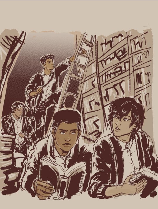
'Dead Poets Society' gang
Headcanon that these four drop poetry and literature quotes on their conversations unprompted.
Jason 'English-major-I-only-visit-the-manor-for-the-library' Todd-Wayne
Damian 'I-master-liberal-arts-unlike-you-plebs-PHD-holder' al Ghul-Wayne
Cassandra 'I-learn-English-thru-Shakespeare-as-god-intended' Cain-Wayne
Duke 'only-title-holder-of-vigilante-poet-and-will-cuss-you-just-as-poetically' Thomas-(future) Wayne
#My background is ass#I promise to practice but omg i am losing motivation coz its too ugly#started putting some on coloring that i started being happy about it#But my background is level toddler i hate it#the patience and discipline to make my lines straight and clean is nonexistent gdi...why did past me choose library gdi#Just writing some Duke in my fics and this image of them all just made me wanna do art...Duke is a poet and writes stories u kno?#Duke is not a wayne yet...and is not dead yet...but with how comics goes then its just a matter of time lol#They're all in school here...Cass and Jason are college watching over their juniors in high school#everyone use cardigans but Jason like his leather so no thanks lol#Duke and Cass in outsiders are cute#jason todd#dc comics#damian wayne#fanart#robin#cassandra cain#duke thomas#inking & background study#Damian is now 14!!!! He's getting old...he's like a baby yesterday omg#I need to stop obsessing over this so i posted a WIP so i can continue writing my fic!!! argh#Im gonna watch youtube tutorials again on drawing bookshelves coz i cannot do this without guidance
639 notes
·
View notes
Text


Hey look it's my first manga animation. Digging these out from 2020 for @marshmallowgoop!
Fun fact I made the top gif as part of my first semester learning after effects. Immediately decided against making an MMV for my 30 second final. Just the prep work is so time consuming.
#dcmk#motion graphics#my gif#my edit#I honestly don't know why the white in the first gif is darker#and why I'm just noticing it now#I'm 99% sure this was the first time I animated an ink splatter with shape layers#that tutorial is ingrained in my soul I've made so many ink animations
184 notes
·
View notes
Text
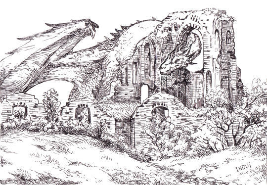
I've been asked a few times now, if these kinds of illustrations are traditional or digital. it's both <: The inks are traditional, made with 03 or 05 micron pen.
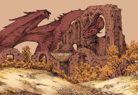
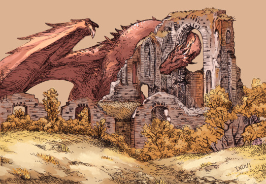
Then I take it to Clip Studio. Paint-bucket and basic brushes are used for big blocks of color and some preliminary details.
Brushes: Dense Watercolor, Transparent Watercolor, India Ink Darker Bleed, Bit Husky, G-pen, Milli Pen, Cross hatching texture brush. Blend: Running Color On Fiber
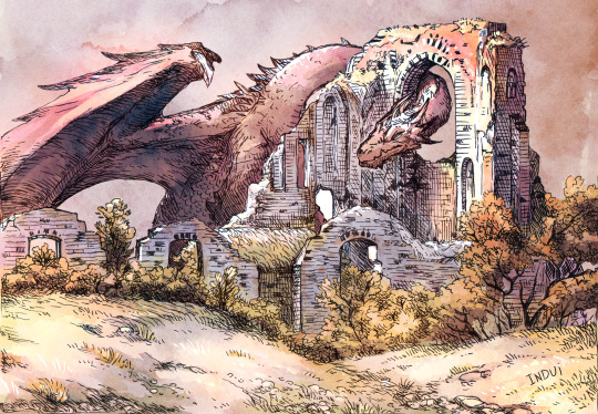
Somewhere in there, I'll pick up a free-to-use watercolor texture and set it on overlay, to see how it meshes with the values I already sketched in. I'll finish up the rest of the smaller details/values with the same above brushes. And voila.
Hope that's helpful <:
#art#art tutorial#dragon#I really enjoy this method because I find inking traditionally more fun than doing it digitally#And meanwhile#I find coloring digitally very fun and fast#Getting a pleasing result very efficiently has been super rewarding to me with this style#it's why I've been doing it so much lately#step-by-step#dragons#dragon art
1K notes
·
View notes
Note
Got any tips in shading stuff in black and white digitally?
Hi Anon!
You're in luck! I'm currently wrapping up a book which is shaded digitally, so I've been thinking a lot about this recently.
How I do this is by no means the only way, so take from these tips as much or little as you want! When I add grays and shadows to a line art drawing, I try to think about these things:
Preparing the image
I like to work with a file that has a white background and a layer with only line art on top of it. Between these two layers I add new layers where I use the pen tool and bucket to fill areas with black, then I lower the opacity for that layer to get a value that I want.


This method works well for me, and for simpler pieces I don't need more than 3 layers with different values - light, medium and dark grays.
I work in Clip Studio. Here's a picture of the layers of a recent drawing. Each layer is actually completely black but you can see the opacity percentages by each layer. Lower percentage -> brighter value. This makes it super duper easy to change the value of a layer, no need to repaint it, just change the opacity!

Value composition
For the best result, do a couple of value sketches with a limited set of values and find something that works well for the image. Getting the values right is what will improve the image the most! Here's a quick tutorial on muddycolors. Muddy Colors is a very nice art blog to check out. Looking at grayscale storyboard drawings or value sketches are great ways to pick up on this too.
I try to group values when working with grays. Take this image for example:
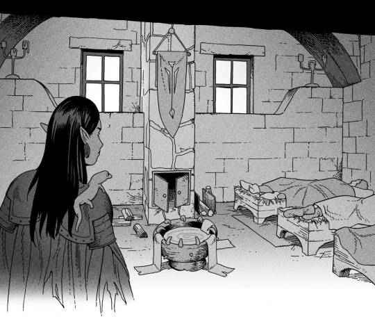
The character in the foreground has mainly dark grays, which separates her from the background, which has mostly light grays. Then the windows are white and the roof black.
Value composition is a huge and complex area and I recommend anyone wanting to learn to be more conscious about their values and to do value sketches. Analysing art you think has good values is great too.
Shadows
Not every piece needs shadows, but they can add a lot to an image! I use three kinds of shadows when I work in grayscale.
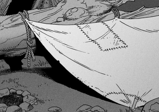
Inked shadows - these shadows are added during the inking stage and usually show areas where light would have almost no way of getting there, such as under this tent.
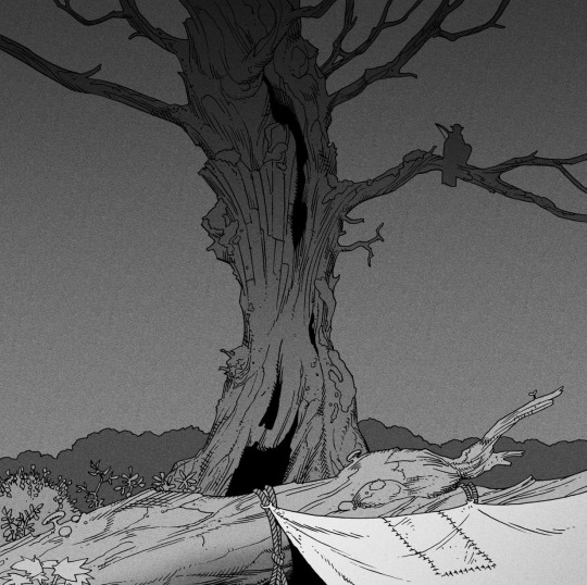
Gradient shadows - these shadows usually represent something getting further and further away from a light source or an area that would bounce light. This tree receives a tiny bit of light from a campfire on the ground and moonlight that bounces on the ground and up, fading as we get higher up in the tree. But mainly I add these gradients in ways that look cool and will help the overall composition.
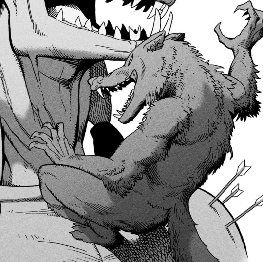
Hard shadows - these shadows appear when a strong light casts shadows and can be used on a shape or to cover something. Here's a werewolf with shadows on its back, which gives it a better sense of mass and is interesting visually!
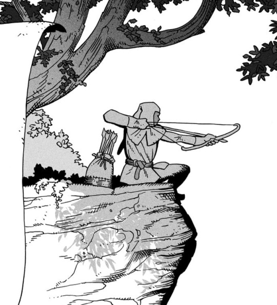
You can also cover an area in shadow like this, where the tree casts a shadow down on the archer and the cliff.
Texture
I like to add a layer of noise as a finishing touch. In Clip Studio you can create a noise layer with Filter->Render->Perlin noise... Find a balance of scale and amplitude that works for the image, then change the layer mode to "Vivid Light" and lower the opacity of the layer to around 30%. I like how this looks, it's not super visible usually but helps make the drawing feel less artificial and digital.

I hope that helps! Here are some nice links too:
Muddy Colors
Android Arts
Gurney Journey - Read his books!
Happy drawing!
351 notes
·
View notes
Text
The thing that gets me about history and humanity is that you never know what is immortalized, and the things that will be immortalized are things you would never think.
I saw a person sharing a new tattoo, and it was one of Onfim's drawings. A boy who lived so long ago he is barely a blip now, but his drawings meant so much to people that somebody is now permanently marked in their skin with one of those drawings. Do you ever look at the things you make and just sit there and wonder if this is the thing that future people look at? Do you ever look at your art, your writing, your schoolwork, or anything that is yours and just wonder who will find it, who will fall in love with a piece of your humanity and become overwhelmed with emotion over? It's not unlikely. It's not totally unlikely that somebody will find a piece of you in the distant future and devoid of any other context of who you were will still love you because you were here. You were here, and you are still here, even hundreds or thousands of years later. Treat yourself with the same love that so many have for dear Onfim.
#positivity#gentle reminders#if anybody has ancient children's drawings beside onfim let me know they melt my heart#i have always wanted a tattoo of that kind of thing too and i want ideas#see if archeologists dig me up or whomever else they won't find significant tattoos or other things. they will see i have loss.jpeg on me#and i think that's just as important. these people must know that people are silly and weird and don't make sense and that's IMPORTANT#i'm just. so obsessed with this because it's instantly humanizing#what little child hasn't drawn humans with twelve fingers per hand#or those kids drawings where it's only a torso/head conglomerate with stick legs and hands#i just really lived seeing how their tattoo turned out because i wasn't sure if it would look good in ink and skin#i feel the same way about archiving the internet. i was looking for the written crochet pattern for something#and the person who wrote and created it passed away and their blog has been scrubbed#their blog only exists on the archives. their pattern is only accessible on youtube because somebody made a video tutorial with the pattern#it's an eerie feeling. they've been gone for two years but their blog has been tethered by the wayback machine
427 notes
·
View notes
Note
I noticed when looking super close at your line art that the there's slight red green and blue on the sides of the lines like an old 80s anime and i think that's super cool! How do you do it?
oh, that's chromatic aberration! i guess you could say its a kind of colour/visual distortion.
it's pretty simple to do, but i usually just use a csp auto action to do it for me to make things go quicker, but i can teach you how to do it manually in most programs.
i'm going to use this silly doodle of me as pompompurin as an example lol
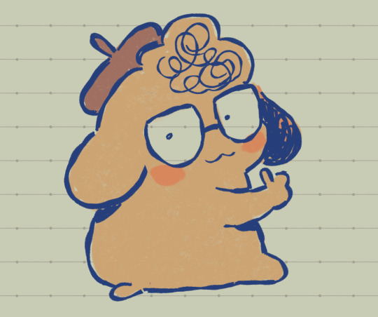
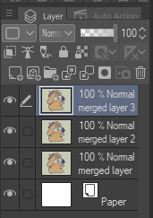
youre gonna wanna merge everything onto a single separate layer first and then we're gonna work with that merged layer. make two copies of that merged layer so you have three of them in total.
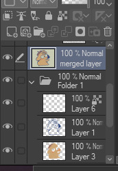
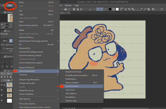
the top merged layer will be our red layer, so youre going to want to got to EDIT > Tonal Correction > Level Correction
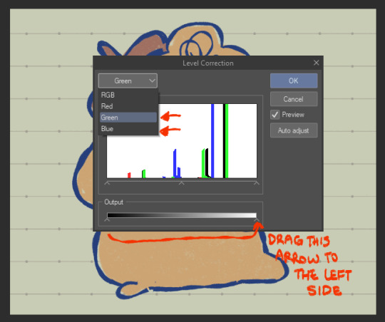
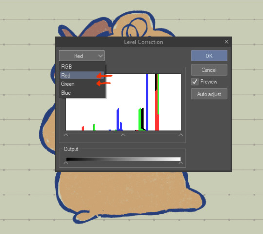
the level correction graph will pop up. since the top layer will be our red one, select the green level and drag the rightmost arrow on the Output scale all the way to the leftmost side. do the same for the blue level.
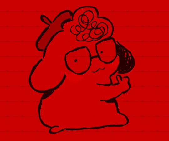
the image should be red like this afterwards.
the middle layer is going to be our blue layer so do the same thing we did for the top layer except youre going to reduce the green and red levels instead, and the middle layer should be all blue like this.
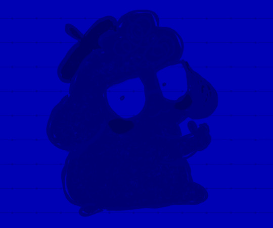
for the bottom layer, it will be our green layer. same process as before, reduce the red and blue levels so its all green.
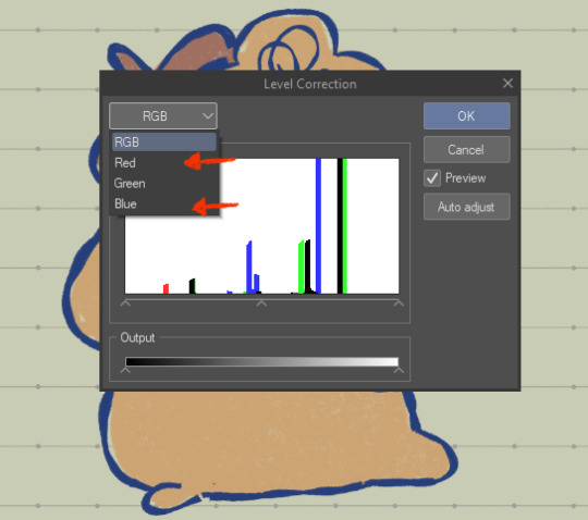
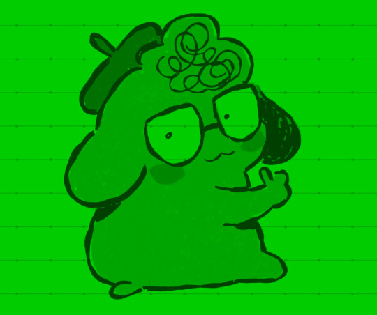
your layers should be looking like this now
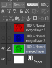
from here, you want to set the layer modes of the red and blue layers to Screen, DON'T do the same for the bottom green layer though. you'll notice once you've done that, the image will look normal again!
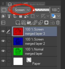
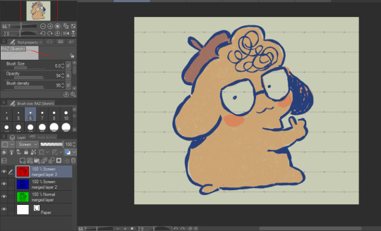
from here, all you need to do is shift the red layer in one direction, and the blue layer in another, to as much of an extent you want. the further they are from each other, the more drastic the effect will be
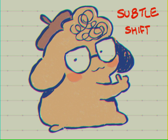
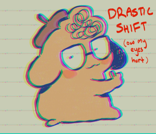
and that's how you do it! my other personal tip would be to add a layer of noise set to Overlay or Soft Light at a lowered opacity over the drawing bc it goes well with the aberration, or even sharpen the image.
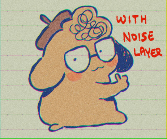
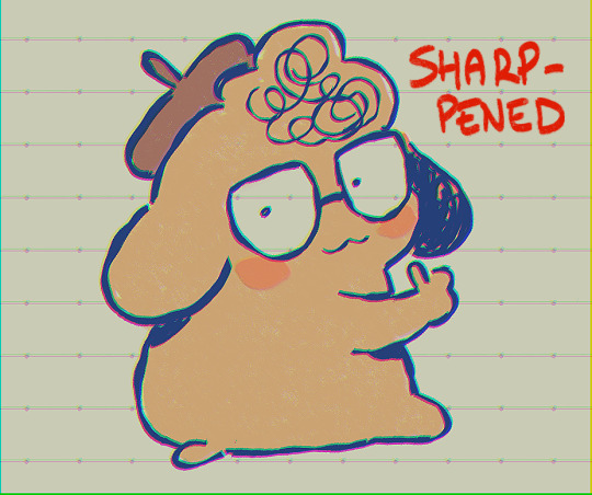

if you dont want to do all that hard work though and you happen to have clip studio paint, just use an auto action, like this one!:
https://assets.clip-studio.com/en-us/detail?id=1713222
anyway i hope that helps? ^^;;;
740 notes
·
View notes
Text
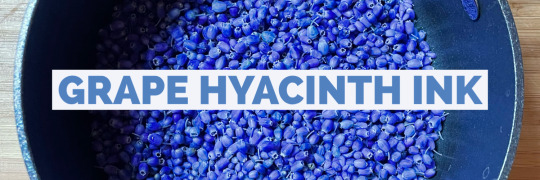
Let’s make some color-changing botanical ink using grape hyacinth (muscari) flowers!
Ingredients:
1 cup grape hyacinth flowers
1 cup water
2 tablespoons vinegar
1 teaspoon salt
2-4 drops gum arabic (not necessary but USEFUL)
2 drops wintergreen oil or 1 whole clove (also not necessary but useful)
Instructions:
Add the flowers and water to a non-reactive pot (stainless steel, ceramic, or enamel-coated). Pots that are aluminum or copper can affect your colors!
Bring to a boil, and add the vinegar and salt. Boil for about five more minutes, then turn down to a simmer, stirring occasionally (again, the spoon should be a non-reactive material like wood or stainless steel).
Simmer for 10 minutes, at which point you can test the color by dipping in a strip of paper to see if you like how it looks.
If it looks good, congrats – you’re done! If you want a more intense color, continue simmering, testing with a paper strip every 15 minutes or so until the color is to your liking (this shouldn’t take more than an hour).
Remove from heat and let the mixture cool to room temp.
Filter the flowers using a fine mesh strainer. I use a stainless steel coffee filter for this purpose and it works great.
Pour your ink into a sterilized glass jar and add 2-4 drops liquid gum arabic, which is a natural binder that will 1) keep the liquid and pigment together and 2) thicken the mixture and make it easier to work with.
Add 2 drops of wintergreen oil or 1 whole clove, which are natural preservatives that will help extend the life of your ink.
Label your jar and store it in the refrigerator if not using right away.
YOU DID IT! Now go forth and have fun with your muscari ink.
** The ink will appear very purple, but when put to paper dries in varying shades of blue. If you want to experiment with color further, add an acid (lemon juice) to produce shades of pink, and a basic (baking soda) to make shades of green.
*** Because of the changing nature of the ink, what your painting/writing looks like will change over time! I have muscari paintings that started bright blue/purple but have faded to almost entirely green. Some have stayed blue. That's the fun of it!!
#plantalones tutorials#wildcraft#botanical ink#muscari#grape hyacinth#flowers#color changing ink#ink making#ALSO only use the pot you use for making ink FOR MAKING INK#this should be obvious but I KNOW YOU GUYS
188 notes
·
View notes
Note
May I ask on how you choose your colors when you color your art pieces? It is so pretty to look at the colors of your art, and I want to color like that, but color picking is very hard q-q
here's!! uh, the general areas in the color wheel where i try to pick depending on the vibe
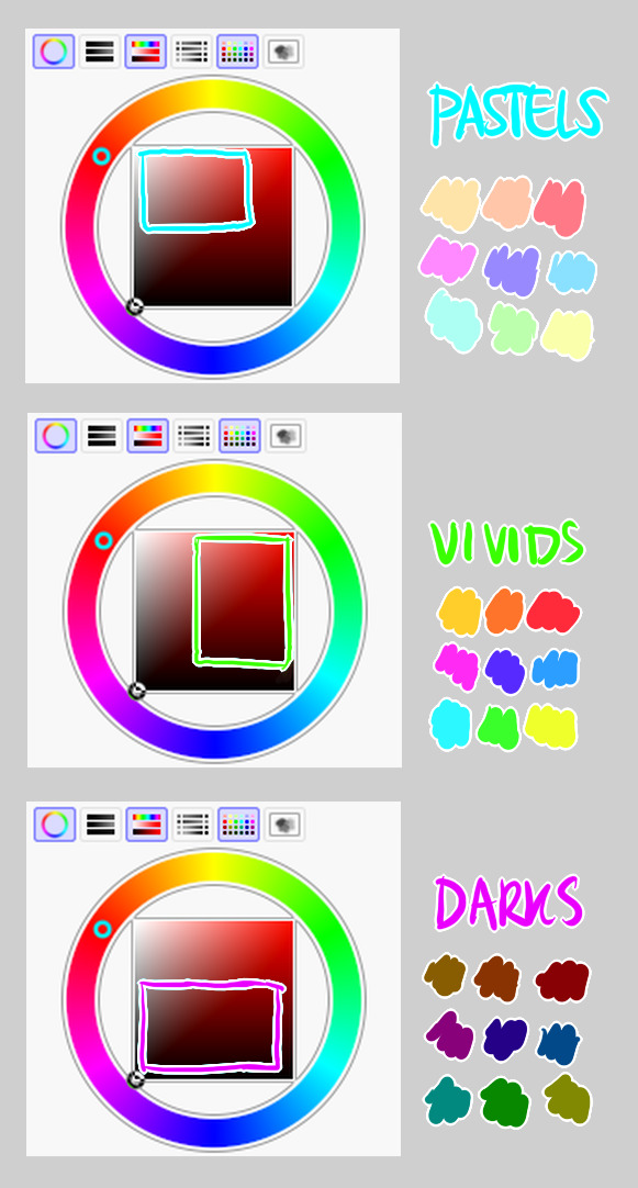
highly inaccurate because tbh i just color pick directly or try to guess the colors from my references and just adjust them to be a little bit more pastel or to the atmosphere and if i have their colors memorized (such as ink or dream), i just pick by memory or by my modified colors LOL

color your scrunkly!

set your line work to multiply and lock opacity
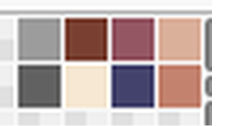
i use warm tones for white ish colors so uhhh idk whatever warm color from here
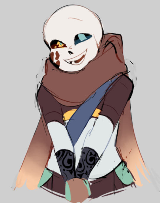

color the line work!!!!! ofc, shift the hue depending on the undertones of the surrounding colors the skull color is a warm off-white, the undershirt is a blue-ish off-white, scarf is warm brown, so on and so on the multiply function rly helps just blend things into the palette a little more, but if ur confident enough, you dont have to set it to multiply at all for extra variation
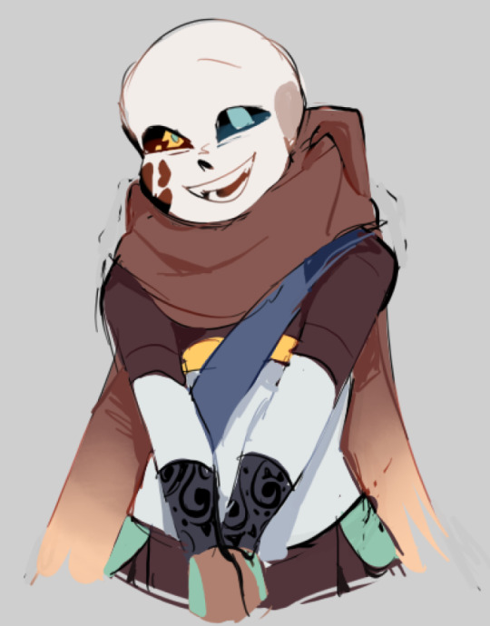
minimal shading by just taking the surrounding colors n adjusting the hue slightly n its value n saturation gives it a very messy cel shaded look! been into it lately and stuff

and then i add a few overlays using the pin light layer mode! i usually use these two colors together, it gives the right amount of pastel colors that really appeals to me
if you have access to gradient maps, i recommend using them lots! it makes the pieces look a little more cohesive the pin light layer mode imitates it n is very versatile if u cant use them though (like me when im just doodling on sai)
that's it!!! that's the basic rundown of how i color i'm not very well versed in color theory so i can only do very basic color picking tips, but maybe next time i can offer ways on how to color more atmospherically!
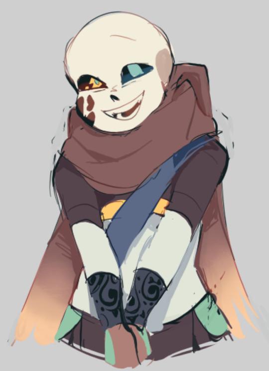
have a nice time coloring your blorbos ✨
#Anonymous#tutorial#ref#ink sans#kia doodles shit#i hope this heeeeeeelps somewhat!!!!!#art tutorial#coloring tutorial#art help#art tips#art advice
418 notes
·
View notes
Text
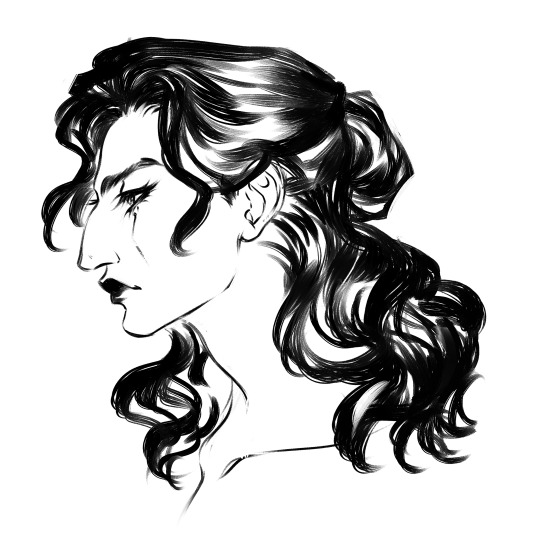
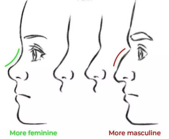
I don't even draw women that often, but I had to join in the dunking of this rancid tutorial on twitter because I don't abide aquiline nose slander. Why do people hate when women have bones in their faces? SKILL. ISSUE. 📣✨
There are so many xenophobic, bioessentialist, and just plain personally biased art tips out there, especially in academic settings. If something sounds arbitrarily gendered, it is. Find photos of real people with the feature in question. Draw gnc folks anyway, do whatever.
#art#art tutorial#art tips#aquiline nose#digital art#profile#sketch#line art#roman nose#oc#my art#ink#black & white#black and white art
508 notes
·
View notes
Text

Somebody was asking me questions on how I draw skeleton heads so I made this! Hope it can help a few people. Thought Ink would appreciate being used in a tutorial.
20 notes
·
View notes
Text
Ok I'm literally putting a bounty on a good lineart/inking resource/class/tutorial/book whatever. You find me a inking thing that FINALLY makes my inking better and I will give you $100 USD. I'm not kidding. I'm so tired.
I want pretty lines. I want something that looks unified. I want stuff that looks like manga. I get so upset when I'm trying to ink something, I've literally had meltdowns about it.
Anyway, please reblog. So many artists can ink, they must LEARN somehow. HOW.
181 notes
·
View notes
Text
"so god forbid I'm seen just as an average human being."
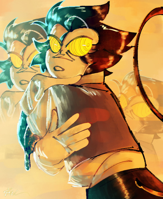
#yes i used that little tutorial thing from earlier#the one i reblogged earlier#uhm#hey guys#bendy and boris in the inky mystery#babtqftim#bendy and boris the quest for the ink machine#bendy the dancing devil#bendy the dancing demon#toon bendy#bendy and the dark revival#bendy and the ink machine#batdr#batim#inky mystery#inky mystery fanart#batim fanart#bendy fanart#batdr fanart#hhahha rendering am i right
245 notes
·
View notes
Text


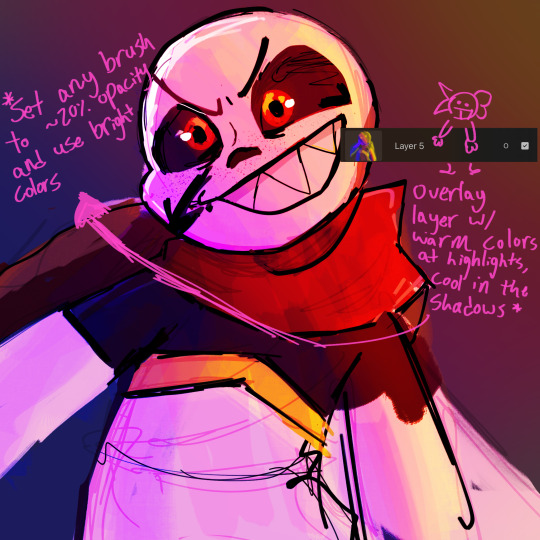

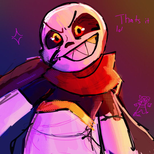
Yay the WORST tutorial youve ever seen
But yeah this is usually how i do my colors n stuff!!!! you can ask questions because i know how unclear this is LOL BUT GOOD LUCK ON YOUR COLOR CRAZYNESS GUYS!!!
Also revival of a like 2 month old WIP welcome back random fell ink
#undertale au#undertale#utmv#ink sans#hiros art#art tutorial#tutorial#art#artists on tumblr#ink!sans#um
74 notes
·
View notes
Text

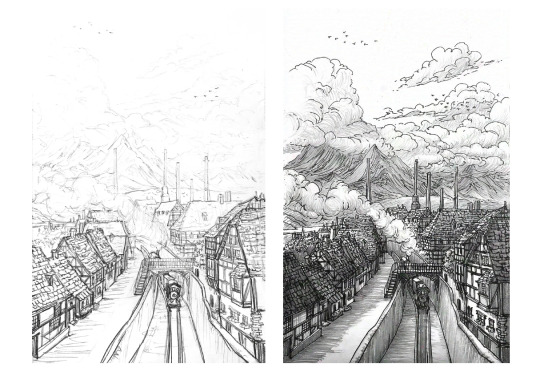


Sketchbook 2015-2020
I’ve put together a 100-page artbook full of pieces from 2015-2020, showcasing all the pencil & ink process steps and details all together, all in one place. It’s free for any viewing, study, practice, and inspiration! Enjoy! https://allisonchinart.gumroad.com/l/freesketchbook
#artists on tumblr#art#ink#sketchbook#nature#concept art#art process#drawing#fan art#black and white art#ink drawing#pencil art#tutorial#art book#art books#illustrations#fanart#art collections
71 notes
·
View notes