#infovi
Text
What supernatural creature is your OC?
Haven’t been tagged myself, but it seemed fun so 👀 Using this quiz.

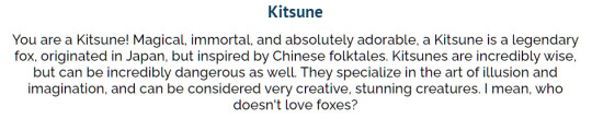
I guess it fits since they are a netrunner, which makes them an illusionist to a point >:3c

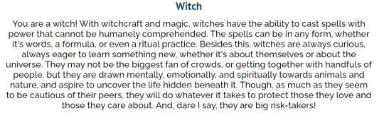
Fitting to a point 👀

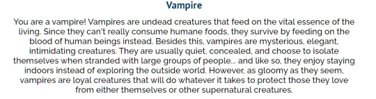
This is the one I’m most unsure about 🤔 Since Mun would definitely want to explore, even if she’d be really shy around new people
14 notes
·
View notes
Text

CSS Color Architecture | Medium
Pinterest : Design & Infovis
1 note
·
View note
Photo

Once again, I've no time to write something long, so I'll get off with pictures:
* top left — history of color distribution of movie posters over 100 years;
* bottom left — history of the volume of LEGO pieces sold by color over 50 years;
* top right — colors of cars by years of production over 30 years (on the data of Polish car sales sites);
* bottom right — main colors in the paintings over 200 years (according to the data of the BBC archive).
5 notes
·
View notes
Photo

Glocal Pool Tagspace Visualizations by blprnt_van https://flic.kr/p/5sfk5M
3 notes
·
View notes
Link
Fantastic overview of ‘generous interfaces’ for cultural heritage collections, with lots of infovis examples along the way
#browse#interface#design#generous interfaces#museums#libraries#archives#infovis#dataviz#metadata#visualisation
8 notes
·
View notes
Photo

Muy frecuente y mortal cuando los postes de luz no funcionan // RG @victoria1039fm #mastemprano Paramédicos Viales (@paramedicosmtt) reportaron que una #gandola quedó atascada en la autopista Francisco Fajardo, a la altura de El Paraíso. Se presentaron daños materiales y estructurales, pero no hubo lesionados #puente #QuintaCrespo #ElParaiso #Caracas #Venezuela #AFF #infovial https://www.instagram.com/p/CEMoHwhnPBD/?igshid=rq1vgx06f24a
0 notes
Text
Figuras de visualización de información
Soy profesora de tiempo parcial en una universidad privada. Doy clases de infografía y visualización de datos.
La infografía, desde que estudiaba mi maestría, me llamaba mucho la atención, y aunque, el curso que llevé en la maestría dejó mucho que desear, siempre tuve la inquietud —como buena investigadora que soy— de conocer más a fondo este artefacto de diseño (me encanta la palabra artefacto).
Fue gracias a LinkedIn que me contactaron de la universidad para que diera clases ( ya voy para dos años), fue esta mi oportunidad para profundizar mucho más en el tema, ya que por la naturaleza de mi doctorado, me había encontrado con la arquitectura de información y las figuras de visualización de información de una manera más formal y pragmática.
Existen decenas de figuras de visualización de información, sin embargo, los diseñadores no saben ni cuales son ni como están clasificadas y mucho menos cuál es el mejor criterio para elegirlas.
Unas de las aportaciones más valiosas de mi tesis doctoral es precisamente una taxonomía de estas figuras, sin embargo, tengo en mente escribir un artículo sobre ellas y su belleza comunicativa y conceptual.
Mientras tanto, les dejo un screenshot de las slides que uso en mi clase de infografía y visualización de datos :)

0 notes
Photo

NEW ARRIVAL AT THE MCAD LIBRARY
THE BOOK OF CIRCLES: VISUALIZING SPHERES OF KNOWLEDGE by MANUEL LIMA
Do you enjoy sorting visual data? Does the circular categorization of weird, niche factoids hold a special place in your heart next to a well-buried pocket protector and a ball of lint? We’ve talked about our collection of info-vis books before - honestly, every time we get a new one I’m hard pressed not to write a new review. However, it’s seldom that we receive such fact-packed gems as Manuel Lima’s The Book of Circles.
A Portuguese-born designer, author, lecturer, and researcher, Lima was once described by his peers as “the man who turns data into art.” In his Book of Circles, we are taken on a similar visual journey to his earlier work, the Book of Trees. Each chapter is separated into type of visualization, resulting in a very eclectic sorting of pairs. You will find musical scores set next to chromosome charts, spiraling clay glyphs next to board games from the 1800s, and family trees of ancient Carribbean lizards next to a listing of beers by geographic provenance.
This is the third addition of his work into the library system, the first two being The Book of Trees and Visual Complexity. If you’re interested in more mapping of complex networks, I’d recommend tuning in to Lima’s website: http://www.visualcomplexity.com/vc/
4 notes
·
View notes
Photo

From Jacques Bertin’s Semiology of Graphics. One of the 66 books on visualization found in my “ex-libris” of a data scientist, part V:
https://www.linkedin.com/pulse/ex-libris-data-scientist-part-v-visualization-francois-dion
2 notes
·
View notes
Link
Mostly for data visualization tool designers, but useful in a broader pedagogical and analysis context.
3 notes
·
View notes
Link
hey y’all! i’m in a digital history course right now where we’re doing tutorials for various visualization softwares, most recently Gephi, and we used Les Mis characters to do it! here’s the finished version of the dataset we played with (graphs not done by me or my class, just the place we swiped the data from :P)
#les miserables#it was interesting! we didn't have names until the very end so i was guessing at which dot was which person#based on the groups and numbers of dots in groups#i was kind of surprised musichetta wasn't in there but to be fair she doesn't actually have any lines in the novel#same with Bahorel's Laughing Mistress :'(
1 note
·
View note
Text
Saw @bnbc’s post so I guess I’m tagged 👀


Vi before mods and with different mouth, nose and jaw, took these for a peep who asked for references since they wanted to draw them for my birthday <3
Vi now


I actually got them a new hair color, but haven’t taken pictures with it yet <3
Kai hasn’t changed much, since he was created much later

He now has a custom complexion, different jaw and different eye and hair color (more bluish), but everything else stayed the same ^^

21 notes
·
View notes
Text

How to Build the Lego Collection of Your Dreams | Wired
Pinterest : Design & Infovis
1 note
·
View note
Photo

Tourists density on the first floor of the Louvre recovered from geo-tags of Instagram photos. For reference: here is a map of the first floor with major artifacts marked. Source.
0 notes
Video
undefined
tumblr
😻 Love the transitions in this viz by @jburnmurdoch!
⚽️ "The top goal-scorers in elite football since 1980"
https://johnburnmurdoch.github.io/projects/goal-lines/all-comps/ #dataviz #infovis https://t.co/GInLQ8KK7u
7 notes
·
View notes
Photo

Text analysis of Trump's tweets confirms he writes only the (angrier) Android half - lots of detail on using R to analyse social media texts for sentiments expressed:
My analysis, shown below, concludes that the Android and iPhone tweets are clearly from different people, posting during different times of day and using hashtags, links, and retweets in distinct ways. What’s more, we can see that the Android tweets are angrier and more negative, while the iPhone tweets tend to be benign announcements and pictures.
2 notes
·
View notes
Last Seen Blogs

kmukherjee13
Koushik Mukherjee

wooow9133
woooooooow

emergencydrains
Untitled

sloth-21
Random Sanders Sides Fan
