#if you want a png version of just them both i can send you
Explore tagged Tumblr posts
Note
Mirsula? :3
Your suggestion is my command

Beach day!
#mirsula#mirage#ursula#ac art#the bg looks awful but it felt wrong to leave the babies in a void#if you want a png version of just them both i can send you
8 notes
·
View notes
Text
Tutorial on how to edit graphics! (Or improve your edits! + tips!) Part 1..
Well firstly, if you’re entirely new to editing or a beginner. Then editing can seem very confusing and tricky, especially the intense psd, cluttered kind of edits, mine are also very cluttered but I think the best way to go as far as being a beginner is to figure out what style you want to do.. minimalistic? Cluttered? Eye strain? Gif/animated? I personally don’t do very many animated graphics and I also don’t do eye strain, so.. you’re on your own for that but it’s important to know what ur GOAL is. You need to know the basics of editing before doing anything else.
The editing apps I recommend are photopea and ibisPaint X, both are free. I really don’t recommend any paid apps other than ibispaint.. yes there’s ibispaint x then ibispaint. (The paid version has everything in it and is a one-time purchase, and has the same mechanics as the free version. If you are editing on pc or laptop, there is a version of ibispaint on desktop but you are only able to use it for 1 hour, if you are most comfortable with ibispaint then you can just delete it and re-download it. But if you don’t want to do that (you can use photopea!) I don’t use photopea so this will be a tutorial using only ibispaint! I can probably find a moot of mine that uses it LOL
So as far as resources go.. they’re everywhere.. I know @/lavendergalactic, @/llocket and @bydollita have a lot of good resources. (I didn’t fully mention the other two because well.. they’re not my moots so I felt awkward LOL) I can probably post some of my most used ones on a separate side blog like I did with my last account so.. also tell me if ur interested in that.
But for the basics of your resources: you want the character or person. An image then a transparent cut-out of them, a frame and/or pfp/image mask to use, and some decorative PNGs like bows, curtains, hearts, whatever you’d like. I can link some good resource rentries too!
Once you have all of that: find a reference/inspo, if you are taking HEAVY inspiration off of someone from tumblr or whatever, PLEASE check if they are okay with it, message or send them an ask in their inbox if it’s okay.. or they might have it somewhere on their pinned post if they allow it.
And now.. the question ur probably asking.. how do I do all of that?!
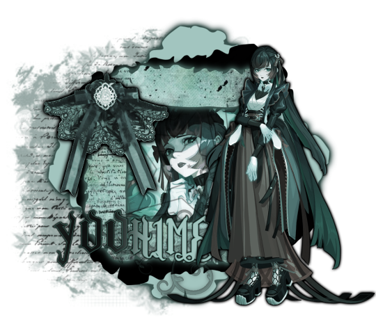
I had quickly made this. You can see the main components. The character cut-out, the inner image behind the frame, the decor, and the silly texts and textures behind the graphic to make it pop.
If you want ur graphics to be this cohesive there’s a few things to note. You need to know colours look best together, what style of editing looks best with certain art styles, and characters.
If you’re wondering “why does this character look so out of place?” Or just finding yourself in a rut with certain characters, you need to examine the character, like you can’t make a goth style graphic with a happy and cheery character like emu otori (depending on the card you choose) or like paimon from Genshin impact.. like that’s just gonna look SILLY. So take note of what this character looks like and what their original colour palette is. Are they a happy person? Are they emo and depressed? What colours do you usually see this person in?
Having range in your editing style will help you a lot, so branch out and edit different characters, and use different colours, and aesthetics!
Now for colours, you need to understand colour theory which quite frankly.. I am not about to teach out so probably at the end of this post I will have some videos linked for you to look at and watch that just overall will help you understand better how to edit that includes a video about colour theory!
If you are an editor and find yourself not being able to edit a certain style or can’t fulfill someone’s request for a certain aesthetic.. don’t be afraid to decline because a lot of the times you’ll have people who know nothing about what looks good with ur editing style or what aesthetics fit certain characters so it’s okay to decline stupid people… (/j.. they’re not stupid but ykw I mean..)
Using the stroke filter on ibispaint or photopea, aswell as the glow filter on ibispaint make ur edits look VERY good! (I use it on everything because it gives everything a little bit of separation yk? So you can see the different layers to the graphic!
Using textures over top of your graphics make it look very visually appealing aswell!
So as I mentioned I will link some videos, and I will also link some posts for good textures, and then add some photos for downloadable fonts to use on ibispaint (if you don’t know how to download fonts on ibispaint I can make a tutorial too! If you are also confused on how to use ibispaint they have a built-in tutorial, and it’s also best to learn as you go, look at all of the filters, the effects, the built-in images/materials)
Please for the love of god.. DONT over-do it with ur overlays and psds, unless that’s the style you like, don’t do it.. me personally.. I don’t like it but if you like it then go right ahead but over-usage of overlays and colourings make it look kinda bad 😭 and kind of confusing to look at, please make sure you can see the different components of your graphics and what is what.. if it’s too confusing to look at, chances are you’re less likely to have people like it or enjoy it. And don’t over-do it with fonts either… people need to be able to see whatever ur trying to say.. I wear glasses and people who over-do stupid fonts piss me off.. I literally block them, so keep that in mind aswell 🫶🏻
Photopea tutorial How to use a pfp/icon mask Colour theory If you needed a visual for how to make graphics here you go Some textures and overlays How to make a rentry How to use borders on rentries How to make blinkies
Some tags for reach: @frilliette @blinkndgone @hellhoundsdoth0wl @smilepilled @nomkiwi
#( ╹ ╹)? a post!#rentry stuff#rentry graphics#rentry#tutorial#tutorials#rentry tutorial#rentry graphics tutorial#tumblr tutorial#editblr#rentryblr#editors on tumblr
477 notes
·
View notes
Note
Do you sell versions of your embroidery designs? I'm obsessed with your Solas patterns and would love to try them!
Hello!
So, short answer is yes, while the first digital mockups I made were designed just for my own reference and as color guides for transferring the designs painstakingly by hand, I ended up going back to them and turning them all into digital vectors. This means they can be printed onto transfer paper or directly onto stabilized fabric for stitching, which is MUCH easier than drawing by hand. Lots of people asked me if I could sell the designs so I figured this part out and was able to test it myself--the tower embroidery was an example of printing the vector directly onto the fabric and worked out great!
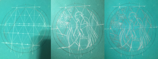
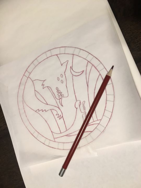
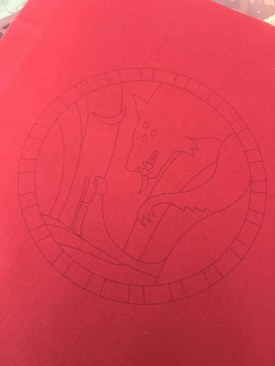
(above: tedious hand-drawing process for the Hierophant design, vs my failed attempt at transfer pencils that did not work at all for the Tower, vs printing directly onto fabric which did work in the end)
Long answer is after I did that, I uh, never figured out how or where to list them for sale online. Or what all to include with them--like what level of written instruction to include, should i also make notes on the thread colors I picked, should I include my colored-in-versions as color guides or just let everyone free-for-all it, in the case of the Tower embroidery i also hand-dyed a lot of grey thread that was crucial for it coming out how i wanted it to look--is it deceptive to sell a pattern when other people can't necessarily recreate it the same way because of that? Should I list in general the dye instructions if they wanna recreate it, or for people who want some of my extra thread or for people who don't have an inkjet printer so can't print the design onto the fabric themselves, should i think about selling full "embroidery kits" that include the printed pattern sized for a display hoop and the thread needed? etc etc etc
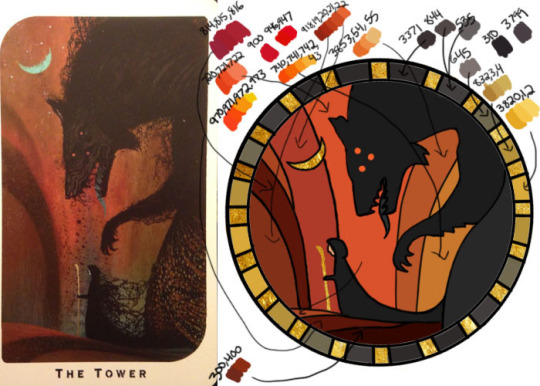
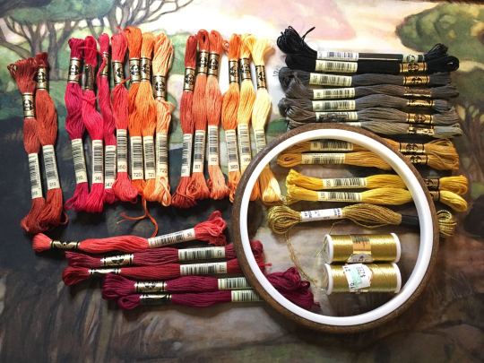
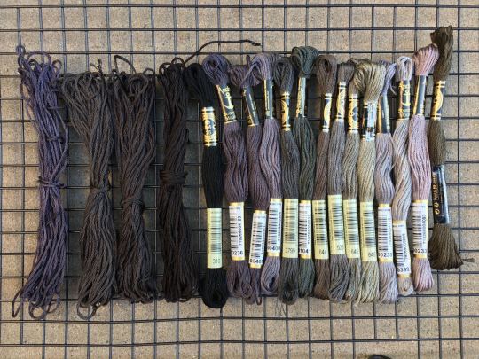
(above: photo of the color guide I made myself with tentative thread color selections (warning NOT the ones I actually ended up using), photo of my pile of threads I picked from, and photo of some of the threads I ended up dying myself to get closer to the design I wanted)
Anyway that was all a lot of thinking and work to do, so i put it off!!! and uh here we are 2 years later and I have still not posted them anywhere. I really gotta get around to all that still...
But in the meanwhile, if anyone reading would like a pattern, just let me know directly what you're looking for and I can save the versions of the files as needed for your plans and send them over. like for a digital only version (so no threads or me printing for you) i would probably make a zip file with a transparent png of the design (so you can put it in a word doc to print at whatever size you desire), as well as a pdf with a few copies of it already pre-sized for a display hoop for ease of printing or transfer, the colored-in version i used based on the tarot cards, photos of my finished versions, etc (note to self i must remember to include the design both normal for direct printing and horizontally flipped for anyone who plans to use transfer paper for it since those are mirrored...). Oh and a quick explanation of how i managed to get my fabric through a standard printer if you wanna try that.
But yeah i'm happy to work out something with kofi or paypal or venmo and sell the digital ones for like $20 each or something for now, if you don't mind not having written step-by-step instructions accompanying the patterns and example photos. Or if anyone has suggestions on where to host them for sale, for someone not interested in maintaining a dedicated storefront like etsy or storenvy long term. Maybe Gumroad? If i stuck to digital-only sales something like that might work. I'm open to input for sure. If you want something more than digital like a pre-printed fabric (since it's kind of weird to do yourself), I'm still open to trying, it just would be a little more $ to account for the fabric/stabilizer and cost of shipping, and probably take me a few more days to do.
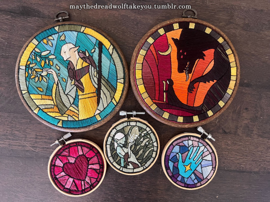
(above: example of finished DA themed embroideries)
But regardless, thank you for your interest at all!! I'm so glad people have enjoyed my embroidery series :) While I'd love to make lots of copies to sell to whoever wants one, I simply don't have the time, and they are SO labor intensive to make it really is like 80-90% of the cost is manhours. I spend anywhere from 5-15 hours making the patterns and vectors, but the stitching and rest of it itself is easily the bulk at 40-100 hours depending on complexity and number of threads used. So WAY more feasible to sell the patterns than make more to sell myself, and then anyone willing to put in the time can have one too :)
#ramblings#my stuff#my embroidery#dragon age embroidery#dragon age#replies#sparrowposting#dear tumblr PLEASE do not eat this one as i post it 🙏
26 notes
·
View notes
Text
Okay so this is gonna be a big rant. I didn't check my sources, I'm going to say things that are wrong. You're going to have to live with it.
Around the time of windows 8 Microsoft tried to reinvent itself. It was tired of being the stuffy, skeuomorphic machine you were assigned at work. They wanted to be cool. Part of this vision was a complete redesign of the interface
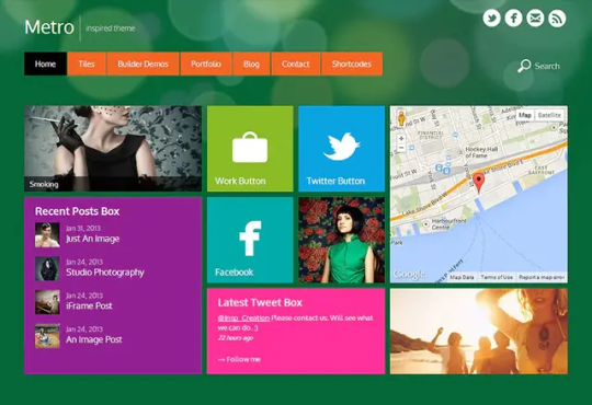
And I don't know, call me crazy, I think this visual design fucks. I mean look at this. It's simplistic but gorgeous. The rest of the industry was running away from skeuomorphism towards simplicity via rounded bulbous corners. This was distinct, it was colorful, it had contrast, it was sharp. It literally looked like a bunch of windows in a pane.
At the time, Microsoft was also launching a windows phone (much to late to make a difference. They missed the boat but they didn't know it yet) and were designing a new Xbox that would have architecture near identical to that of a PC. The idea was that they were expanding beyond just stuffy PCs, there were a lot of new product categories and they wanted a universal version of windows that could handle all of them. You could build a "Universal Windows Platform" app that would run on any version of windows on any device. This was achieved using the C# virtual machine that us CS people tentatively affectionately call "Microsoft Java".
The future that Microsoft envisioned would be that there would be a new walled garden of software that you would run on all your pretty new windows devices. They would all share and sync and be perfect and pretty, and the same app on your phone could be played on your xbox, pc, and holy shit AR GOGGLES?
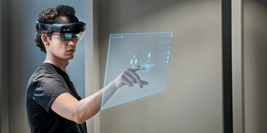
Yeah these fucking things. Microsoft bet big on the idea we'd like to start doing shit with holograms. They made this cool-ass device that used projectors to shine shit into your eye so you could see holograms and poke them and move them about. These were Windows devices that ran actual full-on windows, but that meant that Windows' identity had to grow to accommodate them. All the UIs had to work in a world where you'd see them on a touch screen OR as a hologram. All of the first party software had to have that in mind.
MS paint? Nah that shit's ancient. We got PAINT 3D and it's the most dogshit thing you've ever used
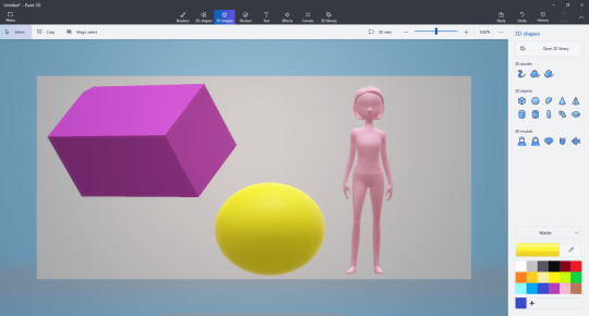
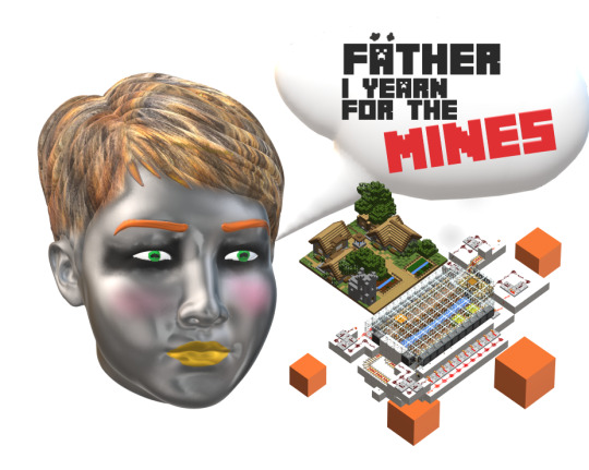
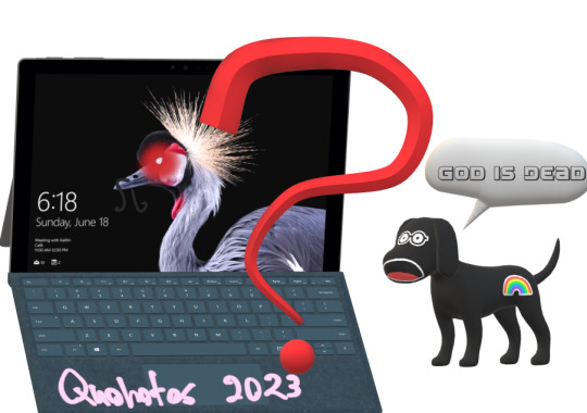
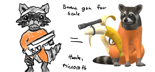
All the sloppy jank of MS paint but now you can put horrible fucking 3d models in it. I'm holding back my full Paint 3d thoughts for a later post that's still being worked on in the drafts, but here's a sneak preview.
Paint 3d allows you to dip into a catalogue of 3d models and plop them into your regular MS paint canvas. There's still no layers, no vector support, but hey at least you can add transparent backgrounds. Paint 3d let you export your horrible janky creations both as a regular png/jpg but also as a 3d model.
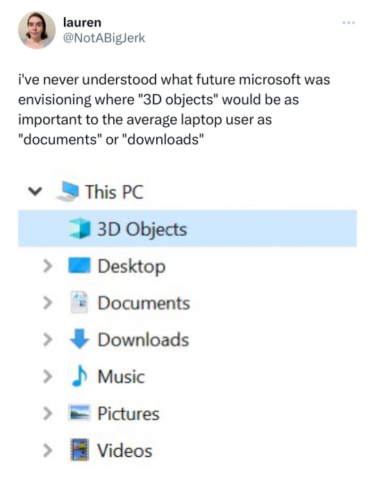
that's your short answer. They added that 3d models folder because of paint 3d. If you want to leave now you can... but this post keeps going as you can see.
The idea would be that as more of our tech moved to AR and VR you would be acquiring 3d models at a similar rate that you do other file times, so it made sense to have a built in folder. Maybe you work at one of those offices in an microsoft ad where I guess people just email each other .fbx flower pots for some fucking reason? Maybe you're downloading them from the metaverse (we weren't calling it that back then).
Your friend using a hololense would make a 3d model and then send it to you, you'd add some shit to it in paint 3d using its kafkaesque interface, then send it back. Wow. The future is so much fun.
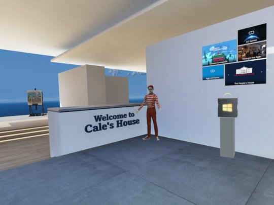
You could even stick your 3d models in your very own VR start menu. Yeah. To go along with the AR goggles they released some dogshit (well they were good for the time and also cheap compared to the competition) VR goggles. These things ran on the SAME uwp platform as everything else, so theoretically I could make some abomination in paint 3d and then send it to my dad who works at the flower pot factory or some shit and he could put it on his virtual desk in his virtual cliff house start menu where he would virtually alt tab between a hovering window of Microsoft word and some freaky VR porn that his boss couldn't catch him watching because it was all in the headset.
That didn't fucking happen. We don't do that. And it's not just because it was a terrible idea but also because Microsoft wasn't committed to the bit.
See this house of cards came crashing down for a lot of reasons. The first one being that it wasn't backwards compatible. This cool 3d virtual, cross-device future wasn't with the win32 api, but the new UWP api. Devs had to remake their software in a less performant programming language and format just so it would run on all windows devices... but windows for PC still ran the win32 style apps that already worked. So you were expecting devs to port their windows app to... to windows... so it could run on windows... even though it was already running on windows. Oh yeah, let's just rewrite our whole accounting software stack so that bill can use it on his windows phone because phones are definitely for doing accounting and not playing fucking candy crush.
xkcd 927
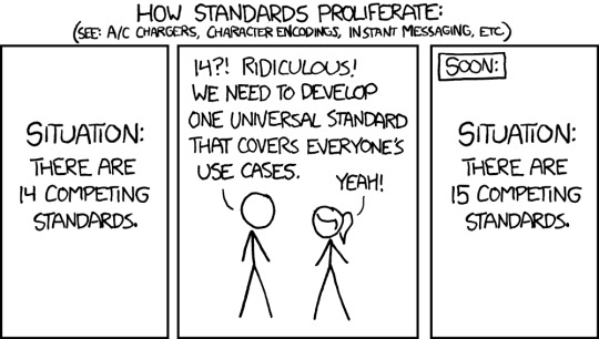
UWP added the functionality of "It works on xboxes, vr googles, windows phones, AND computers but just a little bit worse than the other ones and you have to remake it from scratch". It was just one more competing standard, and the use case of cross platform didn't really help that much.
The windows phone died out early on because it was too late and it couldn't cross the app gap (even though it's UI totally fucked and you play a halo twin stick shooter on it). The hololense died because it cost them ONE THOUSAND dollars just to build the screen assembly for one eye, you needed two of those + an onboard computer to run AR + a fuckload of cameras + proffit. No one was ever going to spend that kinda of cash just so they could pinch and zoom semi transparent holograms in a tiny 40 degree feild of vision in for two and a half hours because yeah the battery life was shit too. Developers never made software for it because there would never be any install base because something that superfluous can't ever be that expensive while we're all getting poorer.
Now, the VR headsets on the other hand, they kinda sucked... but they were cheap and they were competent. With a bit of elbow grease you could make them be just as good as the pretty boys, and they were the first to market with inside out tracking which was legitimately freeing back in 2018. Microsoft could have integrated it with the Xbox to compete with PSV but they just didn't for no fucking reason even though they both ran UWP apps and were on the same appstore and used all the same ports and the Xbox was just about powerful enough to play some games in VR. Yeah they just didn't commit to the bit and abandoned their VR headset line because it didn't instantly become a monopoly despite them putting very little effort into it.
So windows phone died, windows VR died, hololense died, and now regular windows 10 is full of the corpses of this cross platform vision. We have the 3d objects folder even though nothing really uses it anymore. Windows 10 never fully upgraded to the metro theme. It's like... half metro but some settings require you go to the old XP control panel. Some windows are in metro style but then when you right click on them there's just a standard win32 dialogue box that's ugly and white. It's been that way since 2015 and rather than finishing windows 10 and making it pretty they stuffed it full of bullshit and ads and then said "FUCK IT, WINDOWS 11"
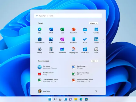
And windows 11's whole thing is being ugly and simplistic and rounded corners and wasted space and designed for a touch screen because even though the windows phone died at least the 2 in one windows tablet market was doing okay.
Windows is a collection of good ideas, followed by a bag fumble, followed by an admission of defeat and a retreat to the familiar.
And somewhere along the way we got a new folder for 3d objects, and if you really want you can use paint 3d to make this shit I guess:

#Quohotos' unhinged rants that no one asked for#Microsoft#Windows#paint3d#paint 3d#rant#UX design#UX#interface design#graphic design
106K notes
·
View notes
Text
My Blog's Photo Workflow, Powered by Shortcuts
And Thoughts on Alt Text
I use many images on my blog. But that’s not because I’m a photo blogger, or use a lot of decorative illustration images – it’s usually because I want to show and/or explain something.
I’m pleased with where my flow for uploading these, and adding them to my blog posts. So I would like to show what it looks like, and give thanks to Jarrod Blundy over at Hey Dingus, as I’ve built it around a shortcut of his.
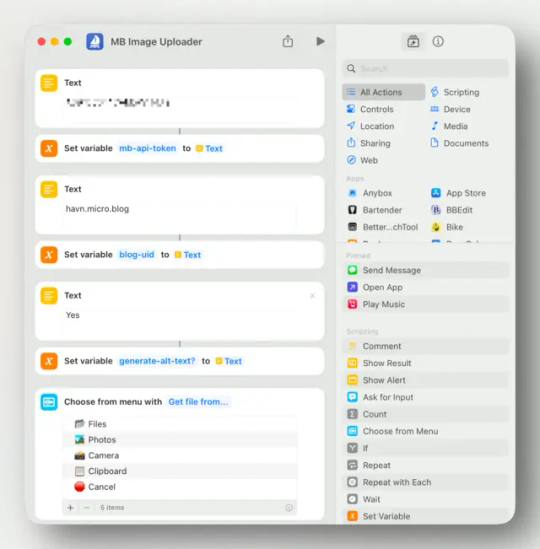
The shortcut starting point
Jarrod has shared plenty of cool shortcuts, over at his Shortcuts Library. And the one I started with, was the one called Bulk MB Image Uploader. The point of this was to be able to upload several images at once to Micro.blog – which is the hosting provider we both use. However, uploading in bulk like this isn’t necessary to me. I just used the framework surrounding access to the Micro.blog API/app token, so I don’t have to use the website, and can do it all from shortcut actions.
More features
After being yelled at, by various web efficiency tests because my website used too many resources, I wanted to optimise the way I use images. And this involves two steps: Compress the main images, and add lazy loading (with a temporary lazy image, that keeps the layout while the image loads).
So, my version of the shortcut (which only works with one image at the time), actually uploads two images to Micro.blog:
One “full-sized” WebP version,1
and a lazy placeholder PNG version (that has only 24 pixels as its max height/width).
I’m using Jason’s GLightbox plugin for Micro.blog to get a lightbox for the images, and I combined that with this guide for lazy loading.2
So the code my image uploader shortcut spits out, looks like this:
<div class="lazy-placeholder large" style="background-image: url(LINK-TO-LAZY-PLACEHOLDER.png);"> </div>
I can edit "large" to "medium" or "small" if I don't want the image to be full width. And I rarely add title or description – but I thought I'd just leave them there.
Annoying conversion journey
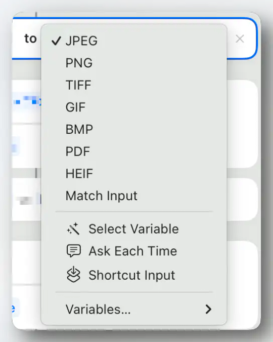
Shortcuts has a built-in Convert Image action (shown above) – but it’s really lacking. It can only convert to JPEG, PNG, TIFF, GIF, BMP, PDF and HEIF (so now WebP), and you generally don’t have plenty of options, for instance for compression. The good thing, is that these work on mobile as well!

I do use the built-in actions to create my lazy-placeholders, though. 👆🏻
But as I almost always do this on my Mac, I went searching for third-party Mac apps to help me with the conversion of the main image.
Both Squash and Permute have seemingly perfect Shortcut actions for stuff like this.
But Squash has an annoying bug, where it will add a “you’re using the free version” watermark, even though I’ve unlocked the app. It’s also very slow. The good thing is that, just like the built-in action, it’s able to just do the conversion and hand off the new images to the next part of the shortcut.
With Permute, I have to save the converted images to disk before passing it on. The thing that bothered me with this solution, though, is that it kept asking where I wanted to save the images, and also open up Permute when it performed the action.
The optimisation app Clop trotted in to save the day, though!
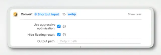
I still need to save to disk, though – but I just save them into a temp folder I've made, that I just clean out from time-to-time.
Framing screenshots
As my images will often be screenshots, I’m also a heavy user of the app Shareshot. This will take a screenshot, and either add a device frame, or some padding like on the images I’ve had in this post until now.
My uploader shortcut now asks me, “Do you want to frame the image?”, and will perform this before sending it to Clop etc. I can choose the following:
No
Yes, Square
Yes, Fit Frame (with small padding)
Yes, Fit Frame (with medium padding)
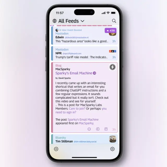
The image above is of the Square preset (when it detects an iPhone screenshot), and is from this blog post about Tapestry.
Alt text
The original shortcut has the option of adding automatic alt text generation with a module and OpenAI Vision. (And this just got a nice update!) However, I’ve turned this off.
Here’s the thing: The generated alt text is very competent – but it doesn’t know anything about the context in which I’m using the image. So I found myself heavily editing the alt text 100% of the times.
It is intended that this image description be used as a starting point for your alt text. You should review it, and edit or add to it as needed.
Now, Jarrod himself has said 👆🏻 that the main point is to have the AI give you a starting-point – and I can see the benefit of this. But for me, it turned out to be faster to just have the shortcut allow me to manually type in the alt text.
My approach to alt texts
Let me first say that I would love to get feedback, especially from users of alt texts, if there's something off about my approach, or practice of it!
When I write alt texts, I like to think of it like I’m reading the blog post out loud to someone (over the phone, or whatever).
I also don’t want to waste the time of those reading with screen readers, so I try to reduce redundant and unimportant details. For instance, the alt text of the Tapestry screenshot above, in this post, is: “An iPhone screenshot with an iPhone frame, and padding that makes it a square.” As the point in this context was to show off that specific screenshot type, I focused on that. I didn’t mention that it was from Tapestry, as that’s mentioned in the caption. And the text content of the screenshot was completely irrelevant.
Mentioning the iPhone frame and padding would’ve been completely irrelevant when I used the exact same screenshot in the post about Tapestry. And this is an example of how alt text completely changes from one context to another.
I’m also not afraid of having the alt text simply be “explained below/above” if I truly give all the relevant information in the blog post itself.3 This is because I imagine it being annoying to get the same information twice.
Another example, from another blog post:
“And I get that many might like the things I don’t. So I think the answer is more customisation – like this settings screen from Mona:”
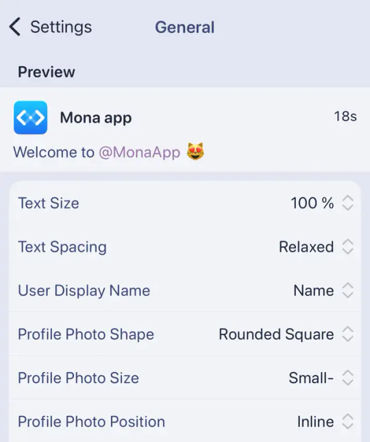
In the original context, my alt text was “I can adjust text size, text spacing, how much of the display name to show, the shape, size, and placement of the avatar.” — while in this context, it was simply “explained below”.
The o1 model (even more powerful than the o4 from the original shortcut) gave me this, by using Jarrod’s great “complex prompt”:
A smartphone settings screen shows a Mona app preview, displaying a welcome message to @MonaApp with a cat-face emoji, and listing customisation options like text size, username, and profile photo details. — o1
It is good – but it wouldn’t really help me get to my alt texts faster.
I think it’s more relevant with other types of images, though (not screenshots) – but when I’m in blog writing mode, I don’t think it’s a big issue to just type out the description.
So, this is the flow I get when I hit the global hotkey to upload images for my blog posts:
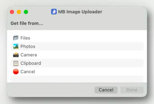
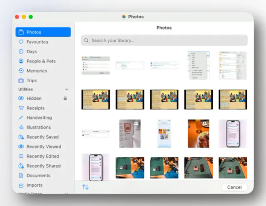
I usually pick from Photos.app, as my Cleanshot screenshots also gets added there automatically.
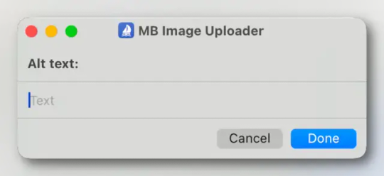
The alt text for the image above here, is: "I then get prompted for the alt text. (Writing this alt text was kind of meta…)" If I think of one, I don't mind adding little easter-eggs to the alt text – (hopefully) as a treat. ☺️
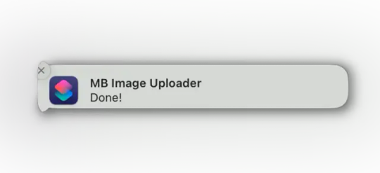
I wait a bit, and then get this notification. Then the code is ready to be pasted into the blog post.
A bonus shortcut (soon…)
Here’s a link to the shortcut from above – but I’m not sure how useful it is. It’s very customised to my need, and I like to create module-based shortcut. So, for instance, the WebP Converter and Lazy Image Generator are different shortcuts. This makes it easier to plug-and-play with different ones (like one for Clop and one for Permute). But perhaps someone would like to poke around, and can get some inspiration from the mess…
I’ve also made a much simpler shortcut, for when I just need a quick markdown image (linke in a note): This just uploads one compressed image, and then gives a simple markdown image link, with no alt text. But I have to go now, so won’t have time to prepare it for upload now… Will update later today!
Furthermore, remember to check out Jarrod’s blog and Shortcuts Library.
I know that WebP images are a bit controversial… But they take up so much less space than alternatives, and they also handle transparency. ↩︎
I’ve had some problems with my implementation, but it’s in a pretty good place right now. It doesn’t work flawlessly with images with transparency, though. ↩︎
I’ve heard this is bad for SEO – but I don’t write alt text for Google. ↩︎
0 notes
Text
I Have Two Titles Mom and Grandma and I Rock Them Both SVG image Cricut Mother Day vector cut File

I Have Two Titles Mom and Grandma and I Rock Them Both SVG image Cricut Mother Day vector cut File
Mother Day SVG Files, Mommy vector cut files, Holiday SVGs for T-Shirt designs, I Have Two Titles Mom and Grandma cutting file, Mother's Day svg images for Cricut, Mom DXF for Silhouette Cameo, Mothers Day SVG Designs, Happy Mom Day PNG for Sublimation, Mother Free SVG. Item description: ► This is a digital download, no physical product will be delivered. ► This design comes in a single ZIP file with the following file formats: - SVG cut file for Cricut Design Space, Silhouette Designer Edition, Inksape, Adobe Suite and more. - DXF file for Silhouette users. You can open this with the free software version of Silhouette. - PNG file with transparent background and 300 dpi resolution. ► You can use I Have Two Titles Mom and Grandma SVG cut files perfectly for your DIY projects and handmade products (t-shirts, mugs, pillowcases, blankets, bags, invitation card, heat transfer vinyl, wall decal, party decorations, home decor, paper crafting, sublimation, crafts, etc). ► Due to the nature of digital files. No any refunds or exchange available here. ► SUPPORT / HELP: If you have any question or need help we are always there for you. You can contact us by going on CONTACT US PAGE and sending us your query. How to Download I Have Two Titles Mom and Grandma and I Rock Them Both SVG image Cricut Mother Day vector cut File ► To Download I Have Two Titles Mom and Grandma SVG Design you need to follow these steps STEP 1: Click on “ADD TO CART” on all the files that you want to purchase. STEP 2: Once you added the files to cart, click the “PROCEED TO CHECKOUT” button and enter your billing details on checkout page. STEP 3: Complete the payment with Paypal or Credit Card. After payment you will be automatically redirected to a Download page where you can download the files. Click on the file to download it. STEP 4: Also you will receive an email from DonSVG.com, this email includes download link, just click on it and your I Have Two Titles Mom and Grandma images will start downloading automatically. NOTE : If you had chose to create a user account before purchasing, your purchased files will be in the downloads section inside your user account. Get your hands on the I Have Two Titles Mom and Grandma SVG files for your Cricut or Silhouette Cameo cutting machines! Buy it now! Thanks For Shopping!! Read the full article
0 notes
Text
Remove Background for Icons Tutorial

As requested by Anonymous, this post will explain how to remove the background for your icons, so you can add a solid, gradient, etc background.
You will learn how to remove the background in three ways and which method works best for the photo you want as your icon:
[NEW] Remove Background
[NEW] Subject (link only)
[A CLASSIC] Pen + Brush Tool
↓ TUTORIAL UNDER THE CUT ↓
Each method will be explained first so pick whichever is most appropriate to your photo and then you will find what to do after removing the background at the last part of this post.
[1] Remove Background
If this feature isn't available in your version of Photoshop, just skip to the ones that you can do :)
TIP: For this method, it's best to use photos with clean, solid backgrounds and "clean" or sharp-edged subjects, such as this:

NOTE: This first method is the quickest way to remove a background but it doesn't work for every photo.
1.1 Open your photo in Photoshop.
1.2 Unlock the layer (if it's locked) by clicking the lock icon.
1.3 Click Remove Background which you will find under the Quick Actions tab in the Properties panel (Window > ✓Properties). That's it!
[2] Subject
If this feature isn't available in your version of Photoshop, just skip to the ones that you can do :)
If your photo has a background that's not too busy and a subject with:
Hair that is either curly, messy, or has visible stray hairs
Clothes that are fluffy or fuzzy
This is the step for you.
These are examples of photos you can use:


For this method, I have decided to just link this video tutorial [Patrick_Star_BOO.gif] because it will take me too long to explain it (and there would be more text for you guys to read and nobody wants that).
[3] Pen + Brush Tool
For this method, you can use any type of photo, like one with a busy background. But I'll be using this photo as an example to keep the explanations simple:

3.1 Open your photo in Photoshop.
3.2 Unlock the layer (if it's locked) by clicking the lock icon.
3.3 Select the Pen tool (shortcut: P)
NOTE: Make sure it's set Path, not Shape, which you can find at the top menu.
3.4 Trace around your subject.
To do this:
3.4.1 Create a starting point by simply clicking anywhere on the edges your subject.
TIP: Turn on caps lock to change your cursor from the pen to a point (like what you see in the gif example below).
3.4.2 Make another point not too close to the first point.
NOTE: To create a curve line, click and drag to arc the line and follow the curve like this:

NOTE:
If you'd like to stop the curves and start drawing straight lines again, hold down option (Mac) / Alt (Windows) + click the on the point you created:

If you'd like to change the curve direction, hold down option (Mac) / Alt (Windows) + click and drag the white point (which now turned blue) as shown below:

3.4.3 Continue this process until you reach the first point you made. Click on it to close the path. It should now look like this:

3.5 Mask the Pen tool path. You will find the Mask button at the top menu, it's between Selection... and Shape.
If it's not there, another way to do this is to:
Right click on your photo (with Pen tool still selected)
Click Make Selection...
Make Feather Radius: 0.1 pixels then click OK.
Add layer mask to your photo's layer. This can be found at the bottom of the Layers window, at the right side of the "fx" button.
3.6 Brush tool (optional)
If there are any parts you accidentally left out, you can just brush them back in and vice versa.
NOTE: Click the layer mask once to select it since we’ll be brushing over the layer mask, not the layer.
TIPS:
You can also brush parts in [1] and [2], just make sure you're brushing over the layer mask.
To switch between adding back and removing the parts you’ve brushed over, press the keyboard shortcut X to swap the foreground and background colors (should be black & white).
Black foreground color: erases
White foreground color: brings back what’s been erased
Making the icon
4.1 Create a New Document by going to File > New... > then make both width and height 128 px, the standard Tumblr icon size.
4.2 Transfer your photo to your new document by using the Move tool (V) to drag the photo onto the new document.
You can also save your photo as a png file then place that file onto the new document.
4.3 Transform and position your photo in the new document (let's call it icon document from now on).
TIP: I personally think it best to convert your photo into a Smart Object (right click the photo layer > Convert to Smart Object) before transforming the photo. This way, if you want to make the photo bigger after making it smaller, it won't become pixelated.
4.4 Color grade your photo.
TIP: If you don't want your coloring to affect your new background, create a clipping mask on your coloring layers to the photo layer. To do this, right click on the coloring layer (i.e. Brightness/Contrast) > Create Clipping Mask. It should all have an arrow pointing down to the photo look like this:

4.5 Change your Background
4.5.1 Unlock the Background layer first (if it's locked) by clicking the lock icon.
4.5.2 Click the "fx" button at the bottom of the Layers window
4.5.3 Select Color Overlay if you want a solid background color or Gradient Overlay if you want a gradient background. Change the colors to whatever you want :)
Once you're okay with your icon, save it as jpeg. If your background is transparent, save it as png.
〰️
Please like/reblog if this has helped you and feel free to send a message for any questions and concerns! ♥︎
#club post#club tutorial#nongif#icon tutorial#how to make icon#remove background tutorial#completeresources#allresources#itsphotoshop#yeahps
713 notes
·
View notes
Text
white people, your cosplay is yellowface
Content warning: images of yellowface that may be upsetting below
Note: I have made the decision to remove the images of modern-day cosplayers. I stand by my initial choice to include them, as I believe actually seeing images of modern cosplay side by side with “real” yellowface was essential to understanding the point. However, this post has gotten much more attention than I ever anticipated. I had, at the time of making it, fewer than 30 followers.
In addition to harassment from sockpuppet accounts, assertions that my opinion on racism is less important because I am in the diaspora, misinterpretation about what this post was initially about (several people claimed cultural appropriation), threats to report and suspend me, and, apparently, discussion on twitter, for my own mental health, I am taking these images down.
I will no longer be responding to criticism or questions on the post, but I will happily answer DMs or asks on the subject. If you disrespect this or try to start more discourse, you are getting blocked, not because I want to silence your voice, but because I am a real person who can choose not to engage with people for reasons as seemingly unfair as my mental health and not wanting to continue filling my blog with the same post that honestly is upsetting for me to look at (as I already stated within the post).
If you have been blocked by me it is either due to disrespect and/or some form of unrelated drama due to how I like to interact with fandoms (i.e. ships like Ch*ngxian, Xu*xiao), not because I am trying to silence you. As I have so few followers, I am sure you can make your own post and gain even more traction than I did.
If you are white, please stop cosplaying MDZS/TGCF characters. It often looks like/is yellowface, and honestly there’s no way to respectfully do it when these media are based so heavily on Chinese culture. I’ll try to sum up why these fandoms need to be more mindful. You can find links and citations at the bottom that read best on my desktop blog theme.
The goal of yellow face in the past wasn’t always to look “authentically Asian;” white directors, actors, set designers, and playwrights set out to use what pieces of East Asian culture they found most inspiring, fun, cool, violent, or backward. Sometimes, white people had "good" intentions" with their use of yellowface and were not "trying" to demean our cultures, but the practice itself did so regardless.
To summarize, white people of the past did yellowface to erase our identities, take aspects of our culture that they liked, or ridicule us. Most modern-day cosplayers are doing the first two.
Below are examples of early Hollywood yellowface and modern-day theater, as well as modern-day cosplay:
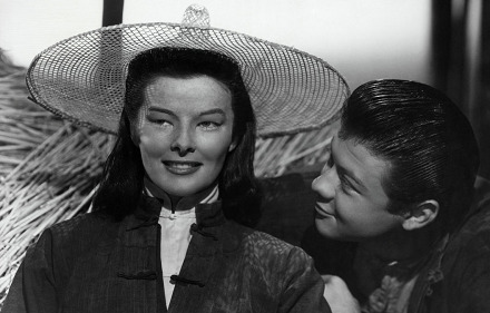
[Previously pictured was a white Xie Lian cosplayer who was very receptive after seeing this post and has since removed these images from their social media. If you happen upon any of their cosplay or other social media, please do not send them any hate.]
As you can see actress Katharine Hepburn in “Dragon Seed”[1][2] is in very traditionally inspired Chinese clothing. The previously pictured Xie Lian cosplayer was in a similar hat and wearing white robes. They both had some sort of eye makeup; Katharine Hepburn darkened her hair for the role while the cosplayer was wearing a dark-brown/black wig.
Of note, the character Katharine Hepburn plays in "Dragon Seed" is supposed to be positive; an adaption from (white) author Pearl S. Buck's novel about a brave Chinese woman who stands up to Japanese imperialism. Like modern day cosplayers of Chinese media, just because the white people creating this film did not intend to be harmful does not change that it was yellowface and racist.
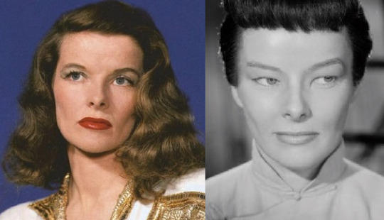
[Previously pictured was a before and after picture of a white Xue Yang cosplayer with blue eyes, brown hair, half of which was dyed blonde in the before image. In the after, they were wearing a long black wig, heavy eye makeup, newly shaped and darkened eyebrows, and robes made to emulate CQL in warm lighting]
Here are before and after pictures of actress Katharine Hepburn in 1944[3] and, previously, was a white Xue Yang cosplayer in 2020. Both had altered their eyes and eyebrows as well as donned black wigs or darkened hair.
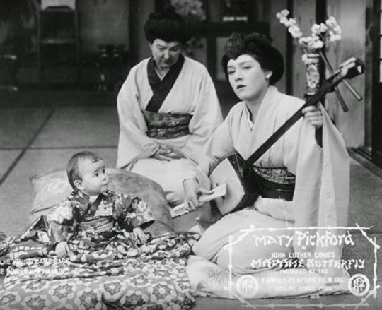
[Previously pictured was a Jiang Yanli cosplayer in a black wig and robes meant to emulate the donghua]
Yellowface does not always involve modification to the eyes. In these two images, neither Mary Pickford in Madame Butterfly[4] nor the previously shown modern Jiang Yanli cosplayer have done anything noticeable to shape their eyes. They were, however, both wearing black wigs with traditionally inspired outfits. Jiang Yanli wore a modified version of Tang Dynasty fashion.[5]

[previously pictured was an image of a Wei Wuxian cosplayer with face powdered white and rouge around the eyes. Their eyes were still blue as the Madame Butterfly’s were on the left, and they were wearing a long black wig as well as robes designed to emulate his. This image has been replaced and amended with an additional example of modern theater; the production of The Mikado where one actor is wearing a black wig, the other a Japanese inspired hat, and both are wearing Japanese robes]
The final comparison was an example of a stage actress from the 2015 Fargo-Moorehead Opera production for Madame Butterfly[6] on the left (the earlier movie is an adaptation of the play). [This image was previously erroneously attributed to the Knoxville Opera which faced backlash for their production as they had an all-white cast depicting actors in yellowface in 2019.][7]
Honestly, these images just had a strange similarity to me so that’s why I chose to put these two together. Most importantly, was the similarity in makeup, hair, and East Asian clothing. Though the image is not there any longer, but just google Mo Xuanyu cosplays and ask yourself, if you didn’t know the fandom, would you be able to spot the difference of which one is supposed to be worse?
The new image is just another example of modern yellowface in theater, where the actors do not necessarily wear extensive eye makeup to emulate East Asians but, much like modern cosplayers, nonetheless are trying to look like the Asian characters they play in a Seattle production of The Mikado.[8]
As you can see, it’s pretty sad and disturbing to see how the rise of East Asian media is creating a new modern wave of yellowface. I think white people tend to think that black/brown/yellowface is only about darkening the skin, but that is just not what many depictions of yellowface have been for East and Southeast Asian people.
I know a lot of people recognize this is wrong and I appreciate those of you that do, but if you didn’t recognize the past parallels, please read up on the links below! Researching this was honestly triggering and emotionally taxing and caused a mild breakdown, so if you clown on this post you’re getting blocked.
Despite the post losing effectiveness to an extent from taking down the modern day photos, I suggest a quick google search of cosplays from the series during/after reading this. And if you don't agree with me, feel free to block and don't send more hate to me! I'm not trying to get into fights. I just wanna feel like I have a semi-safe space in the fandom but if this annoys you, it's better to just block me.
HISTORY, Casting White People in Asian Roles Goes Back Centuries[↩︎]︎
Youtube, Dragon Seed (1944) Trailer [↩︎]︎
NBC News, 'Correcting Yellowface': One Woman's Project to Fix Whitewashing[↩︎]︎
IMDB[↩︎]
Stony Brook University, The Influence of Chang-An Culture to Korea and Japan: Cultural Diffusion in the Glorious Age of Tang Dynasty[↩︎]
Howard Sherman, Yellowface Bait-And-Switch With ‘Madama Butterfly’ In Fargo[↩︎]︎
OnStage Blog, Knoxville Opera Forgets It's 2019 and Opts for Yellowface for "Madame Butterfly"[↩︎]︎
Seattle Times, The yellowface of “The Mikado” in your face[↩︎]︎
#mdzs#tgcf#the untamed#racism#madame butterfly#dragon seed#❁#yellowface#when I describe the behavior in the note please do not assume it is about you if you've interacted with me#there are probably dozens of people I've interacted with who I may have already blocked etc.
1K notes
·
View notes
Note
I was wondering if you could do a tutorial on this gifset that you did i really like ittt
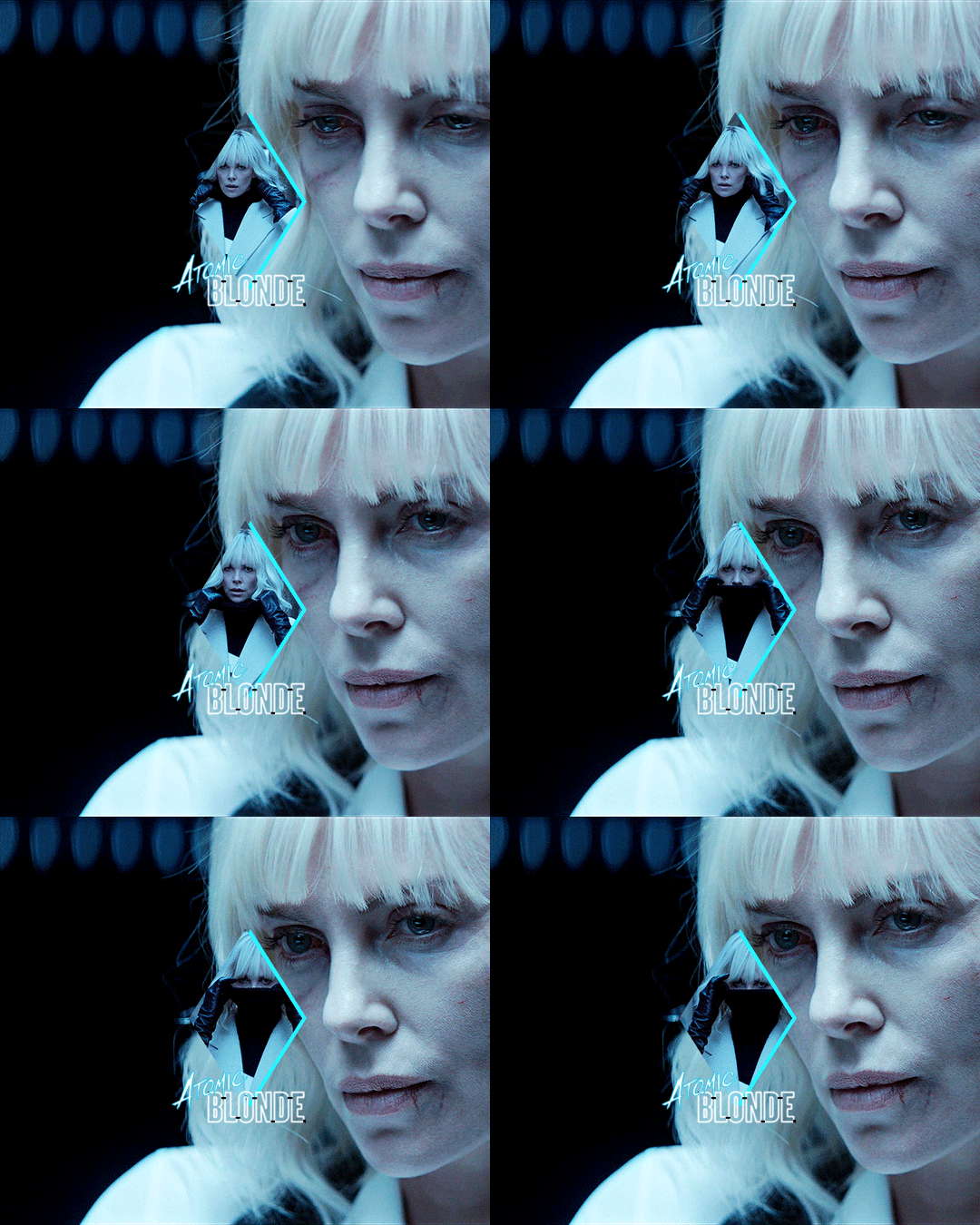
Thank you for sending this in, anon! I’m glad you liked it and wondered how it was made :) Fun fact: the day before you sent this, I had just started working on my next set in that “Select Filmography” series. I hope you like that one too when it’s ready!
I think I should start by saying I’m pretty new to giffing myself and there might be more efficient ways of getting to the same result. However, the point here is to show you the process I went through to make this gifset and hopefully help you understand how to make a similar one.
To follow this tutorial, you will need some version of Photoshop and some giffing knowledge. I know there are multiple ways of making gifs so I’m just letting you know I’m using the timeline and the “Convert for Smart Filters” option (I don’t really know how else to call it).
Now let’s get started!
STEP 1 - CHOOSE THE SCENES
It might sound obvious but, in my opinion, this is the most crucial step. It’s also the one that takes the longest (along with step 7, aka the coloring).
At this stage, you need to have a general idea on how you want your set to look like so you can choose the scenes accordingly. In my case, I knew I needed two types of shots for each movie: one close-up for the main gif and one mid shot for the shape. I also needed to take two other criteria into consideration: the movement (because of the shape) and the lighting (because darker scenes are such a pain to color). Last but not least, I didn’t want the characters to be talking (but that’s just a personal preference).
With all of that in mind, you can start saving a few screenshots of scenes that meet your criteria (or at least some of them). In the end, there won’t be that many to choose from so be prepared to make compromises.
STEP 2 - MAKE A DRAFT
Now that you’ve preselected a few scenes, you can make a first draft. This will help you turn your general idea into something more concrete.
Basically, this is your opportunity to organize your thoughts. What size do you want your gifs to be? What shape are you going to use? On which side do you want the close-ups to be? Do you want all of them to be on the same side or do you want to alternate from one gif to the other? Do the scenes you chose work together (gif-wise but also set-wise)? Are you happy with the way it looks, overall?
By answering all of the questions you might have now, you’ll save yourself a lot of time, trust me. Of course, you can totally skip this step if you already know exactly which scenes you’re going to use and how you’re going to present them together.
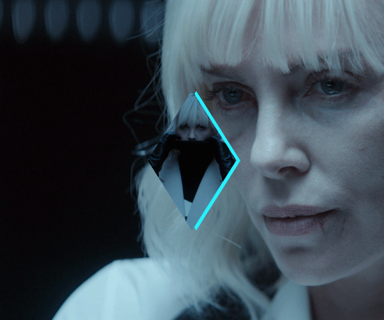
To give you an idea, this is what my draft looked like for Atomic Blonde.
STEP 3 - PREPARE YOUR GIFS
Once you have a clearer view on how you want your set to look like, you can finally start giffing like you usually would (i.e. importing, cropping, resizing, etc.).
It should then look something like this.
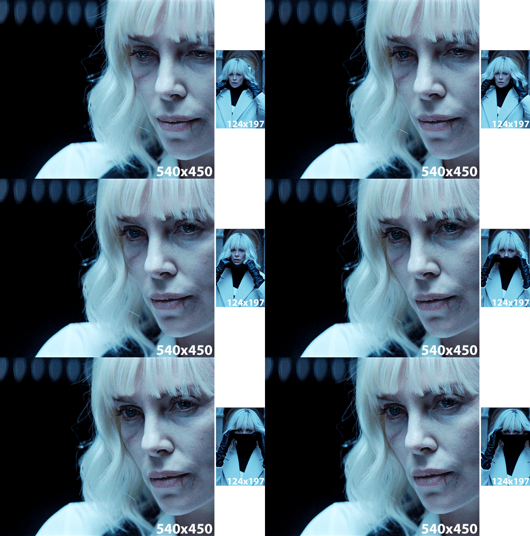
The important thing to mention here is that you want both of your gifs to be the same number of frames (32, in my case).
Ideally, you should also aim for the ~same~ coloring (especially for the skin tone, since both gifs will be so close to each other). This bit is particularly difficult when you chose scenes which have opposite lighting (see my two uncolored gifs below). Remember how I insisted on steps 1 and 2? It was to help you avoid this. So my advice would be not to choose these types of contrasted scenes, unless you can’t do otherwise and you’re ready to suffer!
STEP 4 - MAKE YOUR SHAPE
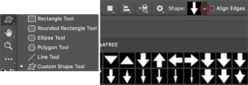
To make your shape, you can click right on the Shape Tool (U) and select the last one, Custom Shape Tool. From the Shape menu appearing on top, you will be able to choose the shape you want from the drop down list and start drawing on your gif.
To be more precise with the dimensions, you can manually adapt the length and height from the Shape menu itself. I decided to go with the same ones as my gif.
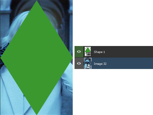
Once your shape is positioned like you want it to be, you can drag and drop the shape layer under your gif. Next, you will have to click right on the gif layer/smart filter and select Create Clipping Mask. The result is as below. Note that if the size of your shape was smaller than your gif, you would still be able to reposition your gif with the Move Tool (V).
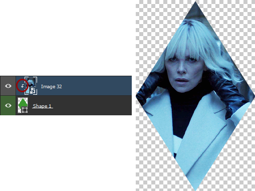
You can now export your shape gif, reopen it in Photoshop and convert it again to the video timeline and to a smart filter. This is where I’m not sure it’s the most efficient way of doing things but it’s the only way I found to keep the coloring of each gif separate. I also find it easier to work with a smart filter.
STEP 5 - COMBINE YOUR GIFS
To add your shape gif to your main gif, you can simply click right on the shape gif you just reopened and select Duplicate Layer. You can then choose the project which contains your main gif to duplicate it in there. Now go to your main gif and reposition your shape gif where you want it to be (how many times did I say gif here?). Finally, you can draw a new shape, using the same dimensions as in step 4, reposition it and choose any color you want from the Shape menu.
Since you will be repeating this process with your following gifs, I suggest you add a few guides so you know exactly where you should place everything to make all of your final gifs look the same.
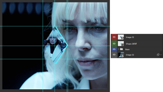
(In case you’re wondering, the “Base” folder contains my adjustment layers/basic coloring for the main gif.)
STEP 6 - ADD THE TITLE
This step is pretty simple: go on the web and type “[name of the movie] title”. Download the png you like most, open it in Photoshop and resize it to a length of about 150-200 pixels. Next, duplicate the layer to your main gif and reposition it. In case you need to resize it again, select the title layer and go to Edit > Free Transform (Ctrl+T).
This is optional but in case you want to change the way it looks, know you can always duplicate the title layer and play with the blending options (see below). The good thing with a png is that you can also add some effects by clicking on the “fx” button.
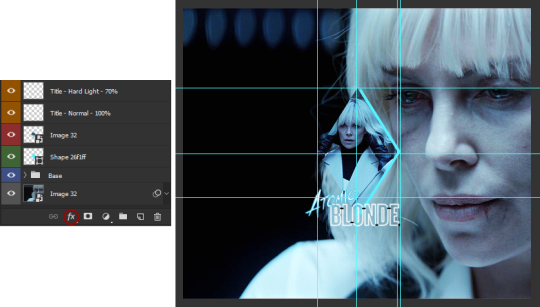
STEP 7 - ADD COLORING (OPTIONAL)
To be honest, I had not planned on coloring my gifs. But I had already spent so much time on them and I was still unhappy with the way they looked. I mean, see how grey-ish they are? Not great...
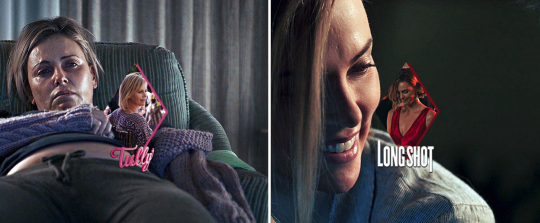
So the only thing left for me to do was to add some colors. Now, since coloring is worth a tutorial on its own and it already exists, I suggest you read through becca’s mega coloring tutorial (and especially steps 3 & 5). Seriously, shoutout to her for making this incredibly useful tutorial. She is so talented and I love everything she makes!
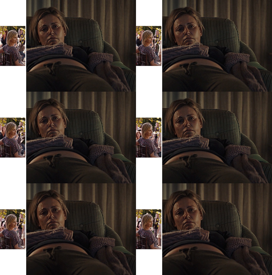
My Atomic Blonde gif barely even needed coloring so I’ll show you what I did for my Tully and The Old Guard gifs.
For the first one, once I had found which colors to use with which blending option and opacity level, I only had to remove the colors from the left side of the gif because there was barely any movement in that scene (phew!). For the second one, on the other hand, I decided to color frame by frame because there was way more movement, in comparison. This is quite a tedious process, which is why you want to limit yourself to a certain amount of frames.
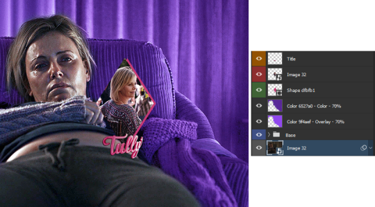
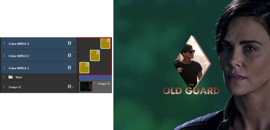
I’ll conclude by saying there are so many things you can do with coloring and what works with one scene might not work with another. So experiment with it: try different colors, play with the blending options and opacity levels, add some gradients and/or gradient maps, etc. Just know it will take some time to get to a somewhat satisfying result!
And that’s it... I hope this tutorial made sense and was somehow helpful. Of course, don’t hesitate if you have any questions! Also, if you do end up making a similar edit, pleeease send me the link or tag me in the replies or something ‘cause I would definitely love to see it!!
#asks#anonymous#tutorials#resources#completeresources#allresources#itsphotoshop#putting all of this process into words took so long i really hope it makes sense#also i can't help but wonder if it was my before/after post which prompted this ask...#gifs#gifs: tutorials
372 notes
·
View notes
Text
.zip
Word Count: 2k
Warning/s: toxic/abusive relationship dynamics, gaslighting and manipulation, abduction, injuries were mentioned, stalking, dark!bucky x dark!reader, emotionally/mentally unstable!reader, dismemberment (not gore-y but still), three very special character mentions, shady corporate stuff, career sabotage?, food mention, sedation/drugging, f-words.
A/N: oh my god, this is the final chapter of CTRL. to all who read from the start, thank y'all so fucking much - from the bottom of my big-ass heart, thank you so much for coming along with this journey. this is my first FINISHED series, oh my god. to @babyboibucky (CTRL's number one fan), @sarge-barnes-sir, and @borikenlove thank you so much for indulging my inner degenerate GHJSDFG and for screaming (affectionately) at me when i first let y'all read the finished draft.
BUT THIS IS NOT THE END (just yet), i will be uploading TWO epilogues very soon: the explicit version and the not-so-explicit version. stay tuned!
follow the CTRL series:
i - .exe
ii - .avi
iii - .raw
iv - .png
v - .zip
epilogue:
.eps (explicit)
.eps (cut)
CTRL playlist CTRL moodboard
Your demeanor, character, even tone, changed.
Calculated, cold, unnerving.
But you sat there like a housewife in front of her husband, eating spaghetti and meatballs. Acting all dandy like there isn’t a man strapped onto the chair four feet away from you.
“C’mon, darling, eat! I made your favorite,” your eyes twinkled as Bucky helplessly tugged on his restraints, “oh, sorry, you’re tied up.”
Hm, sick in the head, bad for the heart.
“What do you want?” Oh, wow, even talking hurts for him. His throat is all dried up, he tasted something bitter under his tongue.
You chuckled, moving half a meatball around your mostly empty plate, “for you to stop treating me like I’m stupid.” You spear the meat with your fork, swirling it in the sauce, “I know you’ve been… checking in on me, Bucky.”
Oh, fuck.
“Look, I’m sorry, okay? I was-- I mean, look at you--” He’s making it worse. You’re mad. You’re angry because he was being a good friend.
He only did that because you were lonely and he’s right: you are lonely.
So lonely that you’re willing to kidnap a grown man to keep you company, “I’m so sad for you.”
“You’re aware you’re the one’s been tied up, right?” You’re curt as you should be, scooting over near Bucky to feed him.
“I can’t eat that—” If he wasn’t sitting down and tied, Bucky would’ve vaulted over you and called the neighbors, she’s fucking crazy!
You giggled, rolling your eyes as if he had the freedom to make a choice right now, “if you’re thinking of screaming… More than half of my neighbors are felons or on parole, I doubt that they’ll call 911.”
Jutting forward the fork, you let the prongs gently touch Bucky’s lips, “now, eat! We have so much to talk about.”
“No. I don’t-- I’m not hungry.” He shakes his head, the fork hitting his chin and clanking down the floor.
“Just eat the fucking food, Steve!”
Bucky flinched at your sudden outburst. The words—the name—seeping in a moment later. Steve? Who the hell is Steve? Was he your husband? Boyfriend? His head throbbed again, his mouth filling with saliva like he’s about to throw up.
You kneel down, pulling a napkin from the table to wipe the meat and the sauce from the floor.
“This better not stain.”
—
He promised thrice.
Once over pasta and meatballs, once over dessert, and once when you were clearing the table.
You relented, of course. Half because you love him and half because it’s getting annoying.
“As long as you don’t leave me, okay?”
“Yes, I promise. I won’t leave you.”
Bucky’s still seating on the dinner chair, slightly slumped without the ropes holding him up, “look, I’m really sorry about the anesthetic, I went overboard with it.” You look over to him—at least he’s regaining his fingers and arms again.
“It’s okay, babe, I wouldn’t trust me either.” If he could stand up, he’d go over and hug you. Helping with the dishes, peppering you with sweet kisses.
A genuine laugh slips out of your lips, “ugh, still… I’m really sorry.”
The last of the plates were neatly stacked, cups and cutleries were placed gently on a drying rack. It was getting late, you could tell.
“I’m not mad, by the way.” You muse, prompting Bucky to lean forward, listening to you.
“What do you mean?” He takes your hand into his, ever so gently.
“You did that,” you squeeze his hand back, gazing into his soulful eyes, “because you love me.”
Did you know that some people could read microexpressions well? Bucky went through a whole lot of them before answering, “of course, I do.”
Contemplating whether you call him out on it or not, you hum, placing a gentle hand on his jaw, “it’s okay, you’ll learn how to love me.”
He has to. He has no other choice.
Bucky clears his throat, “have you seen my phone?” His tone was hopeful, upbeat, maybe he can reach out to someone, anyone, before you can do any more damage.
“Yeah, ‘s on the couch.”
He tried to move, he really did. Bucky’s fairly strong, he can bench an easy 140 on a good day. But even the beefiest motherfuckers have no match for Propofol.
“Don’t worry about your friends, they’re not worried about you, Buck.” The coolness of your tone sends Bucky into a panic—again. “D’you wanna check your messages though? There’s a lot of ‘em.”
Grabbing his phone, you asked Siri to read him his latest notifications.
Urgent: Notice of Immediate Termination
From Joaquin: Where are you, man?
From John W.: Do you have copies?
Urgent: Notice of Immediate Termination
Urgent: Gross Misconduct
From Joaquin: Bucky, what the fuck?
From Samuel Wilson: Pick up the phone, Barnes. You’re fired.
17 missed calls from an unknown number
From John W.: I knew you were a freak but holy shit, dude!
72 text messages from an unknown number
Bucky never really liked horror movies. It made him jumpy and anxious. Too paranoid, even. But now? Now he’s sure that people have never experienced sheer fright before.
His toes cramped inside his boots, his feet were cold, sweating. The little hairs on his legs stood up, goosebumps littering the entirety of his body. If he held his breath, he’s sure he could hear his heart hammering out of his chest. The blood rushes past his ears and onto the base of his skull—he’s gonna be sick.
“What,” he gulped back the saliva pooling in his mouth, “what did you do?”
You’re irritatingly calm, “well, I mean… We’re already together, what do you need those for, right?”
Putting a warm hand over his forehead, you cooed, “poor thing, you look sick.”
—
Bucky thinks it’s well past midnight when the anesthetic wore off.
His limbs were heavy, he had to lean on the wall every couple of steps to regain his balance. Helpless. He’s helpless and you both know it. As if it’s a bear trap, Bucky carefully took his phone from the coffee table.
Why would you leave it unattended?
The screen lights up as soon as he picked up, his lock screen littered with ‘fuck yous’, ‘sicko’, and his personal favorite, ‘motherfucker.’
Ignoring the glaring messages, he went straight for the emergency dialler and—you took out his SIM card, snapping it into two neat pieces, placing it beside the phone.
Bitch.
The golden surface of the card was scratched too, he can’t do anything, use it as a toothpick, maybe? His phone was just as good as a paperweight.
He looks out of the window, limping towards it. Even if he could climb over, it would take him forever to get onto the street. Your neighbors would probably think that he’s just on a bad trip.
“It’s bolted shut. Perks of living alone as a single female.” Your voice made him flinch back, like a kid whose hand was halfway down the cookie jar.
Bucky plays it off with a cough, he can’t be weak now, “no, babe, I was checking out a noise. You ready for bed?”
You smiled softly, taking his hand and draping his arm on your shoulders as you prop him against you, “almost, big guy. Gotta get you settled in bed first. Are you tired?”
Nodding, Bucky kisses your temple, “yeah.” He just needs to play with your sick little games until he regains his strength.
Where would he go? His reputation and his job are besmirched, his apartment is probably crawling with forensics too.
“You fell down and banged your head earlier. Nasty cut on your head too. I told you to not tire yourself much.”
You hit and drugged me but I digress, “Yes, darling. ‘M sorry.”
“You scared me, Buck. I thought you were dead.” Are these tears forming in your eyes?
“I’m not leaving you, not by any chance. I promise.”
He promises a fourth time.
—
Your bedroom was bigger than he thought. But of course, he only saw your desk and your bed through the webcam.
Save from the Ted Bundy-esque corkboard you have in front of your workspace, he feels weirdly at home. You tucked him in, reminding him to wake up every two hours for the painkillers.
“You’re not going to bed?” He muses from behind you, all cocooned in your blankets.
“Just need to take this phone call real quick, babe.” Your back was turned from him as you work on your company laptop. He noticed that the webcam is covered with white tape.
The sound of an incoming call filled the room before you quickly answer it, your voice turning hoarse and raspy as if you’ve been crying.
Hi, Mr. Wilson. I’m so sorry for the late call. Do I- do I need to come in tomorrow? I just... I don’t feel comfortable facing everyone—I used all my home hours this week and—
Miss L/N, I’m glad you reached out to me. Is it okay if I record this call for security purposes? It’s just for you, me, and the HR department.
You turned to Bucky, your face is stone-cold but your voice belonged to someone so utterly helpless.
No, you don’t have to call into work tomorrow… Or any other day.
A dainty gasp and a fucking sob comes out of your mouth, your eyes were telling a different story.
Am I fired?
God, no. Please, Miss L/N, don’t worry about that. We want you with us through this entire debacle. We want you to take some time off—paid. We’ll also grant you… a grievance package.
You could almost hear what he would say next.
As long as you don’t talk to any members of the press or any journalists until our friends in the PR department can clean this up.
A triumphant smile creeps on your bare features, putting a finger in front of your lips, you mimic a ‘shh’ gesture to Bucky.
You round up another mirthless sob as the CEO drones on about the bureaucracy of this whole thing.
He was really nice to me, you know? He took me out on dinners and lunches. He even brought me to his place and I– nothing happened but I can’t stop thinking about it.
I’m really sorry, Miss L/N. I thought he was…
A good guy? I really thought so too.
Please stay offline for a bit, just for the weekend, alright? Someone from the HR department will be in touch with you for the process. We don’t wanna be a hassle more than what Barnes is. On our behalf, please accept our deepest apologies.
Jesus, this guy had the PR department cook up an apology letter.
Thank you—thank you so much, Mr. Wilson. I’ll keep in touch.
You burst out in laughter a second after the call ended. Hearty laughter, the one where you can feel your belly tightening.
“Did you hear how good I was, baby? Oh my god, we had them fooled.”
We? Fuck your ‘we.’
You slide over the covers, propping up yourself with your elbow as you turn to face Bucky, “don’t worry, you don’t need them anymore. You have me, yeah? We have each other.”
—
Out of the most bizarre things that happened to him last week, finding dismembered fingers in the fridge was the least of his concerns.
“Honey!” Bucky calls out, holding the ziplock bag with a pair of tongs.
You bound down the stairs, your laptop in hand as you squint, “what am I looking at?”
Bucky hesitated, maybe he’s going insane too, “fingers. Dismembered fingers—are these yours?”
Setting down the laptop onto the table, you peck him on the cheek, smiling as if him holding a baggie with human remains is just your Sunday normal, “god, I hope not. I need my hands to do things.”
As soon as you look back at him, you dropped the facade: “those are Steve’s. Well, used to be.”
Bucky’s afraid to ask the question where’s the rest of him?
“You know the term pinky promise, right? Well, it has a dark origin.”
Just as fast as a bustling train, Bucky rakes his brain for all the times he promised you something. Hoping that he won’t end up with a stump for a hand.
One vividly bright memory is seared into his brain though, the days blurred together with sharp edges and mismatched colors: we love how we were taught to love.
So, who taught you how to love like this?
#bitchassbucky writes#dark!bucky#dark!bucky barnes#dark!bucky x reader#dark!bucky x reader smut#dark!bucky x reader fluff#dark!bucky x reader angst#dark!bucky barnes x reader#dark!bucky barnes x reader smut#dark!bucky barnes x reader angst#dark!bucky barnes x reader fluff
153 notes
·
View notes
Text
Announcing The Terror Christmas Colouring Book!
Hello & welcome! I'm susan and I’d like to create a Terror Colouring Book for us, by us, since we have so many wonderful artists and creative people in the fandom and having all of our different styles together next to one another would be so cool! Once I’ll have all the submissions I’ll make them into a PDF file for anyone to download for free and print out :) Since it’s going to be ready in December, @burningfreeze suggested that it can be Christmas themed: give us the domestic Terror bliss we (?) deserve!!
INFO:
SIGN UP here from November 2nd to December 14th
submit your art until Dec 14th, sending it as a JPG or PNG file to [email protected] (tis i) It will then take me a few days (because i’ll have my MA graduation in that week, lol) to put it all together and post a link to download it :)
Who can submit their art: literally anyone! Not just ReAl ArTisTs, everyone is welcome to join. Doesn’t matter how skilled/good you are at drawing/creating art, as long as you want to do this and feel comfortable in doing it, you’re welcome! The more we are, the better ;) PS: Feel free to sign your work if you want!
What is OK to submit: -it has to be black line art -1 or 2 pages -A4 size (21x29,7 cm) -both digital and traditional art is ok! if you have a traditional piece, make sure to send the scanned version. -it can be as simple and minimalistic or as complicated as you want, as long as it’s black line art and, of course, Terror themed. You can do anything at all from portraits, to landscapes, to writing... -otps and ships are also welcome. keep it sfw! -it doesn’t strictly have to be Christmas/festivity themed, but it is recommended
What is NOT ok to submit and won’t be included: -gore and violence -nsfw (it’s christmas! let’s keep it easy and cozy and soft) -anything offensive
Feel free to drop any question here or on my twitter :) (this is my first time setting up something like this so I’ve probably missed something, lol)
The most important rule is: have fun!
I guess the hashtag would be #TTCCB
PS: if this flops, it never existed PPS: shoutout to @brainyraccoons and @burningfreeze for helping me set this up ♥
84 notes
·
View notes
Text
Worlds Collide
Woo, a new RWRB fic! Thank you to @handsomeroyalheretic for letting me use her OC Sophia. | Read on AO3 here.
As soon as Alex woke up, he grabbed his phone, scrolling to find a particular notification.
@Jane-Hoesten: Good morning, hon!
He smiled and tapped on Discord, opening to the conversation with Henry from last night.
@certified-texmex: morning sunshine @certified-texmex: sleep well?
@Jane-Hoesten: I know for a fact we were both awake at 3 AM, and I know for a fact we’re in the same time zone. @Jane-Hoesten: I’m sure you can use that brain of yours to make an inference
@certified-texmex: touche @certified-texmex: is that how you spell that? @certified-texmex: eh idc @certified-texmex: anyway whatre you doing today
@Jane-Hoesten: The usual. Class, volunteering, and writing. You?
@certified-texmex: same @certified-texmex: class, work, n volunteering
Smiling, Alex put his phone down before finally rolling out of bed. Texting Henry had become a daily routine months ago, one that Alex greatly enjoyed. They had been following each other for years before Alex finally sent him a message one day. Since then, they talked at least once a day, their friendship quickly growing and flourishing. It was always a nice reprieve from his absolute ass of an upstairs neighbor.
Alex and his neighbor hadn’t had more than a few interactions, Alex didn’t even know his real name- just a nickname, Fox, that one of his friends called him- but that was more than enough for him to have shown his true colors. The first day the guy had moved in three years ago, Alex had gone to his apartment to welcome him to the building. But as soon as Fox opened the door, he had slammed it on Alex’s face, leaving him in the hallway with a plate of slightly burnt cookies in his hands. Since then, they had been verifiable adversaries, going out of their way to avoid each other.
It was a shame- Alex had wanted to get to know him. The rest of the residents in the apartment building were elderly men and women, and while Alex didn’t have anything against him, he had been excited when a guy his age moved in. And, ok, maybe the fact that he was very handsome didn’t hurt. Besides, June and Nora were always bugging him to make more friends. But that had gone completely out the window that first day. Alex wasn’t going to try to force friendship with someone who didn’t want it.
***
When Alex stopped to grab his mail that afternoon, he noticed Fox through the window standing outside of the building, talking on his phone. Lingering at the mailboxes right inside the doorway, Alex couldn’t help but overhear.
“-total arsehole! I don’t understand why. I never did anything to him, he just hates me! Yeah, in my building.” Alex didn’t hear any more than that- he was too angry. Who the fuck did Fox think he was? Did he not remember? Alex huffed back to his apartment, tossing his mail on the couch and heading right to his room. After sending a flurry of ranting texts to June, he opened Discord and went to his conversation with Henry.
@certified-texmex: ugh @certified-texmex: why did i have to get stuck with an asshole neighbor :/ @certified-texmex: f is such a dick @certified-texmex: i did nothing to him but he insists on hating me
@Jane-Hoesten: I’m sorry you have a shitty neighbor😕 @Jane-Hoesten: At least you don’t have to interact with him much. @Jane-Hoesten: Is there anything I can do to help you? @Jane-Hoesten: Do you want to talk about it?
@certified-texmex: nah i already ranted to June @certified-texmex: … @certified-texmex: can i get a sneak peek of what ill see next week? @certified-texmex: if youre comfy w it ofc
Henry was silent for a few minutes, and Alex started to wonder if he messed up. Sure, they’d been flirty, and had sent faceless pictures, but maybe Alex had unknowingly crossed a boundary. Just as he was about to ask if he went too far, a message popped up on his phone.
@Jane-Hoesten: [image0.png] @Jane-Hoesten: Is this what you wanted?
Fuck. Alex was going to die. The picture was a mirror selfie of Henry, his face cropped out. He was wearing a cropped white tank top showing off his pale torso and arms. Fuck. How was he going to survive meeting Henry in person?
***
@certified-texmex: today’s the day sweetheart :) @certified-texmex: you excited?
@Jane-Hoesten: Of course @Jane-Hoesten: I’m looking forward to finally meeting you in real life. @Jane-Hoesten: Are you excited?
@certified-texmex: duh! @certified-texmex: can’t wait to see you!
Today was the day Alex was going to meet Henry. They had agreed to meet at noon at the chess table in Washington Square Park, a popular hangout for NYU students. Alex was almost too excited, and, admittedly, nervous, to eat breakfast. What if Henry wasn’t who Alex thought he was? What if he wasn’t who Henry thought he was? What if they didn’t get along face to face?
Shaking his head, Alex forced himself to ignore his worries and focus on eating some eggs. He managed to make it through his morning class, though his leg was bouncing with nervous energy the whole time and he hardly retained any information. Making a mental note to get a copy of the notes from a classmate, Alex practically sprinted out of the building once class was over. He slowed to a speedwalk as he exited, and then to a leisurely pace as he entered Washington Square Park.
Alex’s stomach was in knots with a mix of excitement, nerves, anticipation, and an unsatisfying breakfast. He found himself scanning the park, though he didn’t know who he was looking for. However, he did see someone that made his shoulders stiffen and his jaw tense.
Heat curled in Alex’s gut as he caught sight of his neighbor sitting nonchalantly at a table. Specifically, the chess table he was supposed to meet Henry at. No. No asshole neighbor, no matter how annoyingly attractive, was going to ruin his first meeting with Henry. Forcing himself to relax, he approached the bench and sat next to Fox.
“What are you doing here?” Internally, Alex cringed at the venom in his voice as he took a seat, but he didn’t acknowledge it. He saw his neighbor’s back stiffen.
“Waiting for someone, not that it’s any of your business.”
Five minutes passed, then ten, then fifteen, and still no Henry. Alex knew he always liked to be on time, early if possible, and he started to worry. Pulling out his phone, he sent a quick message.
@certified-texmex: eta? i dont see you
Out of the corner of his eye, he saw his neighbor pull out his own phone. Copier.
@Jane-Hoesten: I’m here. The bench on NYU campus, right? I don’t see you.
@certified-texmex: im sitting on the bench next to the asshole neighbor i told you about @certified-texmex: im the handsome mexican one not the obnoxious blond one
Not 30 seconds after he sent it, Asshole Neighbor gasped and almost dropped his phone, looking wildly from Alex to the rest of the square and back.
“I- you- but I- we-“ The neighbor just gasped at Alex, holding his own phone in his hand. Alex was getting progressively annoyed, both with his neighbor and with Henry for not rescuing him.
“What? What about us?”
“I- I’m @Jane-Hoesten. And you’re @certified-texmex. Aren’t you?” Alex couldn’t believe it. It had to be some kind of trick. His asshole neighbor is his best friend, the person he poured his heart out to, the person he was finally going to meet in person, his Henry? No. No way.
“You’re @Jane-Hoesten? You’re Henry? No way. Lemme see that.” Alex grabbed at his neighbor’s- Henry’s- phone, and in his shock, he let Alex take it. Sure enough, there on the screen was their messages. All of them. Alex and Henry had been living next to each other the whole time, completely oblivious.
“Did- did you know?”
“What? No! Of course not! If I had known, I wouldn’t‘ve complained about you to… you. Although, that wasn’t exactly one-sided.” Alex felt the need to point that out, though he wasn’t sure why.
“Hold on. Your neighbor, F- was that me? I’m the one you’ve been complaining about all this time?” Henry’s voice was incredulous, as if he didn’t know. Alex said as much.
“As if you don’t know. You’ve been an asshole to me since you moved in! I’m not the one who started that.”
“What are you talking about?” At Henry’s baffled expression, Alex sighed and elaborated. “A couple days after you moved in, I baked cookies for you as a ‘welcome to the building’ present. As soon as you opened the door, you slammed it on my face. And then you never acknowledged it or apologized for it.” Henry had the decency to look ashamed, a blush spreading from his cheeks to the tips of his ears.
“You’re right. I was a prick. Not that I can make up for it, but my father had died fourteen months before. I was always a prick at that point, and you happened to catch me on a bad day. I am, truely, sorry.” Alex’s heart leapt into his throat. He didn’t know- how could he- but he still felt horrible.
“I’m sorry, I-” Henry waved a hand, interrupting Alex.
“It’s not your fault. I should’ve at least apologized.”
Yeah, you should’ve.” Alex says, but there was no real ire behind it. They sat in silence for a few minutes, neither of them knowing what to say or do. Eventually, Henry broke the silence.
“Okay, I know I’m not who you were expecting, and you’re not who I was expecting, but we have been talking for months now, even though we didn’t know it. Do you… maybe still want to go to lunch?” Henry’s voice is tentative, lifting at the end in a hopeful question. Alex considers Henry’s offer. On one hand, he hates the version of Henry from the apartment building. On the other hand, he’s also @Jane-Hoesten. How does Alex reconcile the two versions of the other man? He decides lunch would be a good place to start.
“Sure.”
***
“Daddy, can you tell me again how you and Papa met?” 5-year-old Sophia was burrowed under the covers of her bed, looking up at Alex with her big green eyes. Alex smiled, affection filling his chest.
“Of course, conejita. Do you want Daddy and Papa to tell you, or just Daddy?” She scrunches up her face in thought, before proclaiming that she wants both Daddy and Papa. Alex ruffles her hair, then stands up from his seat on her bed and sticks his head out of the doorway. Down the hall, he can see Henry on the couch, reading a book and waiting for him. More warth spreads through his chest at the sight. Henry looks up and smiles when he hears his name, closing the book and walking down the hall.
“Yes, love?” Henry kisses Alex’s cheek, and Alex smiles.
“The princess would like us to tell the story of how we met.” Sophia giggles from the bed, and amusement is twinkling in Henry’s eyes. They step back into the room and sit on opposite sides of the bed.
“Well, it started in an apartment building. Your dad had already been living there for a few years when I moved in.” Henry starts the story with a smile.
“And you instantly fell in love!” Sophia exclaims, giggling some more. Alex and Henry exchange knowing looks, almost laughing themselves.
“Not quite, conejita. When we first met… we didn’t exactly get along.”
“That’s right, Soph. We lived next to each other for three years until we started talking. Do you remember what happened next?” Sophia scrunches her face in thought at Henry’s question, then gasps.
“You didn’t know you were talking to each other! Cuz it was online!” She exclaims, a look of pride on her face. Alex and Henry both beam at her.
“That’s right, princess .When we met in person after talking for months, we were very surprised to see each other.”
“But then you fell in love!”
“Yes, we did.” Henry shifts his gaze to Alex, eyes full of affection and warmth and love. Alex loves those eyes. He loves the piercing blue, loves their expressiveness, loves how they look at him. He loves Henry.
#rwrb#rwarb#red white and royal blue#meg writes#alex claremont diaz#henry fox mountchristen windsor#henry fox
25 notes
·
View notes
Text
Li Zeyan In Love - Character Study
I sat on this because I wanted to get more dates done but, after seeing people bring up this one poem that is the epitome of Li Zeyan in the aftermath of 34, I decided to finish this. This essay has been brought to you from my occasional bursts of frustration at Elex LOL.
First, I need to acknowledge that I'll be pulling comments from others who have made their own amazing discussions about Li Zeyan's charcter. PS. Thanks for inspiring me and giving me points to think about!
SPOILERS to Chapter 21. Plus CN card lines up to Chapter 34.
THE ENDLESS SEARCH
(Sorry, Luoluo, I still have no good essay thoughts on you yet.)
It's amusing that if Bai Qi's love is in the form of "all roads lead to you". He can see where MC is standing and he is moving towards that point, struggling through all the obstacles in the way.
And Xu Mo's love is in the form of the red string of fate. No matter how much they hurt each other, walk in opposite directions, or try to tangle it up, they are forever connected to each other.
Then Li Zeyan's love is in the form of searching for a needle in the haystack. The needle being MC and the haystack being all possible worlds and universes in space-time.
Li Zeyan has tons of quotes about time, staying beside each other, and searching:
[Winter Infatuation SSR] "No matter the distance or time, nothing can prevent me from keeping you by my side."
[Time's End SSR] "I'll find and bring back the past you."
[Tour to Deep Space SSR] "No matter where you are, I will always find you."
[CN Silent Twilight SSR] "You are the only predestined ending I believe in." and "I will cross countless spaces of time to look for an ending which has you."
[Main Story 18-16] "I will definitely find and bring back the past you."
[Main Story 18-23] "Don't make it hard for me to find you, understand?"
This is reflected so painfully in [Dim Light SR] where MC takes Li Zeyan to light lanterns and he writes a poem on it. Elex didn't translate the poem and, at the time, I was somewhat lenient. But after seeing references made to it... ELEX, COME OVER HERE. I JUST WANNA TALK.
So, Li Zeyan wrote:

The last line about his wish having come true already is the same in both CN and ENG.
He wrote the last line of this poem by Xin Qiji, one of many great poets in Chinese history. Here I have provided Irving Y. Lo's translation of the poem from "Sunflower Splendor: Three Thousand Years of Chinese Poetry".
The Night of the Lantern Festival, to the Tune of ‘Green Jade Table’ - Xin Qiji [1140–1207]
One night’s wind made a thousand trees burst into flower, And breath down still more Showers of fallen stars. Splendid horses, carved carriages, fragrance filled the road. Music resounded from paired flutes, Light swirled on water-clock towers. All night long, the fabled fish-dragons danced. Gold-threaded jacket, moth- or willow-shaped hair ornaments Melted into the throng, giggling, a trail of scents. In the crowd I looked for her a thousand and one times, And all at once, as I turned my head, I was startled to find her Among the lanterns where the candles were growing dim.
The bold is Li Zeyan's lines in Chinese.
@love-p typed up an amazing post about the context of this poem:
Regarding Xin Qiji, and the political context of this poem—he was a military general during the Southern Song dynasty, sidelined due to the policy of appeasement against the Jurchen.
The poem reflects his unfortunate political circumstances by contrasting the brilliance and liveliness of the Lantern Festival and the single-minded search of the narrator for just one, special, woman, ultimately finding her in the darkness with the dimming lights.
To the writer, the brilliance and beauty of the festival pale in comparison to his goal. He is not swayed by all this finery, and in fact is willing to reject the light, for what he has held in his heart all along.
Xin Qiji was a deeply passionate patriot, which ultimately led to his discharge and suppression in the changing political tides of the era. He spent decades in seclusion pretending to be indifferent to the world, but he never lost his love for his country, and held fast to his beliefs, even when they could (and did) cost him heavily.
There's other romantic interpretations of this poem, such as the woman deciding to stop and wait when she realized this man was looking for her. She is willing to be with him.
Another interpretation is that, these two are already lovers, and when he turns his head and sees her it reflects how your happiness was right beside you all along and you just needed to turn your head, instead of searching ahead desperately.
So, back to Li Zeyan and MC. He is quoting a poem from someone who suffered for holding fast to their beliefs and who can still ignore everything around him, even the light, to find what he's held in his heart all this time. HM.
@unluckysatellite also pointed out something great, which I bolded for emphasis:
I realized this just now, but MC and Victor have this narrative theme where they keep losing and finding each other, both in the main story and in their dates. The main story plays this out pretty seriously: Victor and MC meet as kids, and then Victor loses MC because of Black Swan, which causes him to search for her the next 17 years. Victor and MC meet in chapter 1 and then Victor loses MC in chapter 18 and he vows to find her again. Victor finding MC in that HBS trap during chapter 10 and nearly losing her at the end of the chapter (with the added irony of him realizing that she was the girl he was looking for all this time). YMMV if you consider MC losing Victor in chapter 14 since a black hole sent Victor traveling into the future, but both managed to keep contact with each other in the time he was away.
BTW the reference is that his [Dim Light SR] was released in 2018 for the real lantern festival holiday. Then in 2019 all the men send gems as gifts during the holiday. Li Zeyan sends mail with the title of "Turning My Head" and the body of the message is him promising to go to the lantern festival with MC this year too, but he reminds her to stay beside him and don't make it so that when he turns his head he can't find her.
THE CONSTANT
Now another common theme that appears over and over again in Li Zeyan's character arc is him being a constant amongst all the change.
[Main Story 11-19] MC confronts Li Zeyan about his overprotectiveness: "It doesn't matter if it's the previous me, or the me in the present, all of them are [a single] me. Do you understand?"
[Winter Infatuation SSR Sinful Late-Night Snack Call] "Of course I'm me. No matter when, the person at your side is always the same me."
@sharinluna wrote a great section about Li Zeyan in Chapters 19-21 and IMO these chapters just hammer in this theme more. Even in a world where none of the men remember MC, Li Zeyan still cruises along (mostly) the same as usual. He really is a steady constant when everything's gone topsy-turvy for the poor MC.
I commented about this in my post on Chapter 19's use of horror but hilariously Li Zeyan is the most normal out of the rest of the men. If the MC weren't around, it's likely he wouldn't be involved in so much craziness. This is reflected in how the MC thinks about how he'd be better off without her in [Main Story 20-4] and her dream version of him in [Main Story 19-6].
However, I always end up thinking about Alfred Lord Tennyson's quote on this topic: "'Tis better to have loved and lost than never to have loved at all."
I honestly think this is one of the themes of the game too, shown at the end of Chapter 19 where MC doesn't regret holding onto her memories and experiences with everyone, even if that means going back to the cruel real world.
Because the game (hopefully) isn't going to invalidate our experiences with everyone that means that Li Zeyan is not better off for not meeting the MC.
IMO love doesn't have to do something monumental like change your world but I think it adds something to our experience as humans (no matter its form: platonic, romantic, compassionate, selfless, etc). This is why I love this game so much because it's all about love in its entirety.
So, even if Li Zeyan's character isn't changed in any earth-shattering way from meeting or not meeting the MC the fact that he chooses MC again and again over everything else means something. He is willing to sacrifice everything to find her, no matter how long it takes him or how many worlds and times he has to traverse. His constant state is choosing MC.
I'm so scared about the Banquet of the Fallen Moon. Why did he turn into a demon lord SOBS when he promised his father he wouldn't go down that path? If it's connected to MC... OOF.
THE LOVE AND SUPPORT
Here we reach the relationship the two do have! Uh, I swear I wasn't intentionally picking the sad quotes...
[Main Story 6-16] "In your eyes? Am I that unapproachable?" He says this but then grabs her hand and holds it through his company, not caring who sees them.
[Main Story 10-25] "I'm sorry, I came late. I won't lose you a second time. Nothing will be able to hurt you again. In the future, let me fight your battles for you, just like how you protected me that year, alright?"
[Main Story 11-14] "I won't hesitate to pay any price in order to let you avoid all dangers and affairs... The things you wish to do, I will release you and let you do them. However, now isn't the time. That's why, you need to be a bit more obedient."
[Chapter 11] in general shows his protectiveness over MC and consideration for her. From caring for her in the hospital, to sending her between work and home, and even the SP detail (even though it became overwhelming).
[Main Story 18-3] "... Every time I call you dumb isn't to insult you. [...] It's acknowledgement."
IMO these are all more examples of how Li Zeyan is like a steady mountain or a tree that provides a canopy and safe harbor for the MC to take her time growing up under. He wants her to better herself because he cares for her (like a quintessential Capricorn) but at the same time he knows when to back off and let her go at her own speed.
Li Zeyan will be there every step of the way with MC, just a little bit ahead of her so she has a direction but always ready to catch her should she fall. Unlike a certain BS liar COUGHS.
@sharinluna also wrote this great post on Reddit about how the dates reflect Li Zeyan's patience and awareness of the imbalance in his and MC's relationship. Chapter 11 shows this too where he realizes he was overwhelming her and brings back the "old" Li Zeyan to wait for her to make a decision on her own feelings.
Finishing off this essay with some quotes:
[Instant Moment SSR] "There is no such thing as eternity, only every single moment together with you."
This is so cute since it's said by the man who can traverse time. It's the little snapshot moments he can get with MC that mean the most to him.
There's actually another related quote which comes from [Winter Infatuation SSR Sinful Late-Night Snack Call]. This happens when they're talking about the meaning of the Ephemere shop and Li Zeyan quotes a poem about mayflies.

The Chinese line is from the poem "Former Ode on the Red Cliffs" by Su Shi:
"We are like mayflies enjoying a flicker of life in this world, and as infinitesimal as a grain in the sea."
Ironically, Li Zeyan is not asking much at all of the world. He is someone who has everything but all he wants is just a peaceful life with the love of his life and he has shown again and again that he's willing to give up everything for her...
But the universe spits in his face (because tragic Chinese archetype of Crown Prince/Emperor LOL) and makes him suffer so much just for wanting some fleeting moments of joy in this flickering human life they both have.
#mlqc#mr love queen's choice#mlqc victor#mlqc li zeyan#love and producer#love and produc(ing) meta#ELEX I WILL BURN YOUR COMPANY DOWN ONE DAY!!
177 notes
·
View notes
Note
Heya! I really really like your style and saw the commission thing and was wondering how to, y'know, commission a tningy ^^' I haven't done it before
Glad you like my art and like it enough to consider commissioning! ^u^
My commission information page is here. I suggest looking through it. I explain how I work in that as well, at the very bottom. But, I’ll give ya a breakdown for the Never Commissioned Before. (since that version lowkey assumes at least slight familiarity)
It’s not too difficult or anything so don't stress it! If you want a general price-point before diving in or anything: for me, an average work tends to be around $35-50ish USD (usually mostly depending on color or number of characters) but some of the more complex stuff, which often includes multiple characters and background goes more up towards $200ish. If you’re tighter on cash, as I know a lot of people are, I suggest setting yourself a budget and telling me what it is! That way if you want something, but you can’t afford it, I can help make it something affordable! (ie I may suggest not using full color, or having a bust rather than a full character- etc)
For the actual process, I’ve put it under the cut. I go pretty in-depth and it got long.
Step One: Message me with what you want to commission me to do. Give a short description.
You can message me on tumblr or through my email [email protected]. I like it if you come in with a semi-solid idea of what you want. Hopefully you read through my commission page, but, I’m also happy to provide suggestions and ideas as well. I do fanart and original works! You should have a description of what you have in mind ready.
Here’s two examples on each extreme of what I can work with:
“A picture of my character, standing with their hands on their hips. They have long brown hair and eyes and wear a pirate-like costume”
“A picture of my character, standing with their hands on their hips, a little sassy in pose an expression. They have long brown hair that goes to their hips, and is parted to the left. They have brown eyes, and a small scar on their cheek. They’re a little stocky and they wear a v-cut loose black tunic, a purple vest and leather belt.”
I’d ask more questions for both of these! I’ve never had a commission where I don’t feel the need to ask for more information. If it’s an original character (or even au-versions of fanart or characters I’m not familiar with), I love hearing about who they are as a character, since that gives me a sense of what energy I’m trying to portray with the character. If you have references (doesn’t matter if it’s an amalgamation of references plucked off of google or something you drew yourself) that’s awesome! I don't require it, but, they’re always appreciated. I am totally open to helping you make decisions too! if you have the base idea, but you don’t know if you want them to have a coat or not, I can give you sketches with both options.
Step 2: Pricing.
If you don’t already mention it, I’ll ask you specifics of the things in my commission post- ie: if it’s full body or a half body, or if it’s full color or anything.
If anything on my commission post confuses you, you can always ask me for more examples or an explanation of the difference!
After determining exactly what you want me to do, I’ll usually give you an estimate for how much it would cost to complete. Sometimes, if you’re still deciding between things that determine the price, like how complex the pose is, I might do some sketches first and see which ones you like before giving you a price. I have a little leeway on pricing here, and if you think it’s too much, you’re welcome to ask me to explain why I priced it that way and if I can lower the price. That said, a lower price means lower complexity and detail.
If we’re confident in the price, I like if you pay me at this point, rather than later, as it’s easy to forget, and frankly, I’d rather not do all this work just for someone to take the image and not pay me at the end. I have some leeway, but I usually prefer if you pay me before I get to the last step before completion. If it’s a lineart work, that means after the sketch. If it’s a colored work, it means after the lineart.
Step 3: Sketches.
When I get started with sketches it usually takes me a day or 2 to get them done. I’ll give you several to choose from. I usually do about 4-6 individual sketches and label them by number (because I’m dyslexic and for the life of me never remember left vs right).
Once I send you a batch of sketches I’ll ask you for your opinion. I basically want to know: which sketch(es) fit your idea the best and if there’s anything I’m missing or need to get rid of. It’s going to be loose and messy, so if you want me to explain anything about how it looks, please feel free to ask. I can combine sketches if you like parts of one or two of them but as a whole they’re not perfect. If I’m totally off the mark, you can totally tell me so! That kinda means I didn’t do my job right in step 1, and I’ll ask more questions to understand which aspect I’m missing.
Once we have one sketch that works, I’ll ask you a few more questions about what you’d like to see on the lineart.
Step 4: Lineart
Depending on how complex it is and how busy my life is, this might take me a day or a whole week.
Using the sketch as my base I’ll use this time to make clean lines, get some details in (this is usually where expressions and clothes are defined beyond the general structure.)
I’ll send you the sketch after I’m finished and once again, ask you what you think and what might need adjustment. Your job is to nitpick here! Please, feel free to nitpick. Is the hair too short? Is the arm in a funky angle? Tell me! You’re buying it, you get to critique it. I’ll work with you to come to an agreeable look.
If you’re commissioning me for a colored work, I’ll also ask you for any clarification/changes from the original concept for the color.
Step 5: Color
This tends to take about 1-3 days.
If it’s flat color, it’ll be pretty simple, and shading or lighting will be done with kinda flat bold lines unless otherwise stated that you just want it Flat-Flat. It’s not my usual style, so most people tend to go for full color. Full color is my usual coloring style, and I use some pretty soft shading. It tends to reflect a midday-look, but if there’s a specific background I’m doing, I will match the color to it. Dynamic shading is a secondary layer of color. I usually do color and shading on one layer. Dynamic shading is where I work with really bold, dramatic lighting.
I usually work with a background at the same time as everything else, but, sometimes I don’t because I focused on one aspect or another, so that might be an additional step.
Once again, I’ll send the work to you and ask for your opinion.
Step 6: Finishing up
Once you’re happy with it, all that’s left is A) confirming you paid me (I’ll usually remember or write it down, so if you had, I won't ask.) B) signing the artwork and C) sending it to you via email. I usually send it as a .png but you’re welcome to request other filetypes. I’ll ask you for all these things too.
You’re also welcome to request that I record the process I can take screen-capture videos or I can screen-shot each step that I’m not screen-shotting already to send to get your opinion. (you’d have to ask me to do this at the beginning though.)
After all that, I’ll usually post it on my tumblr here, and you’ll have your commission!
5 notes
·
View notes
Text
Tutorial: How to default the penguin
@grilledcheese-aspiration asked me if I had any step-by-step tutorial on how I defaulted the penguin, but I had none, so I made one! :-D (beware of long post and many pictures beneath the cut)

Before we begin, this is a tutorial on how to default the penguin and add new meshes to it, not just a simple texture replacement. If you’re wondering why I’m making a tutorial on this it’s because the penguin has too many morphs and can’t be exported out of Milkshape, but I found a way around that :-)
With that out of the way, you have to have SimPE with NVIDIA DDS, Milkshape with the plugins and the seasons expansionpack of ts2 installed. It might be possible to do this with blender or any other meshing program, but I will only be showing how I did it with Milkshape.
If you know how to extract files etc (the basic stuff), you might want to start at Part 2: Adding new meshes, 4. I would say this tutorial is fairly beginner-friendly, since I did my best to show every single step.

Part 1: Extracting neccessary files
1. Open up SimPE, search for “penguin” in finder and click on start:

(bigger image)
2. Scroll down a bit until you find the files we need: penguin_surface_txmt*, penguin_tslocator_gmdc, penguin_untagged0_shpe and penguin-surface_txtr. Double click on them one at a time to open them, then right click - extract and save them somewhere (you might want to name them txmt, gmdc, shpe and txtr so it’s easier knowing what’s what).
*I use Nopke’s penguin fix so if you do as well and don’t want your added mesh(es) to the penguin to be covered in snow, extract the txmt from his fix instead of EA’s original.
(bigger image)
3. You’ll want to double click on the penguin-surface0_lifo file if you’re planning on editing the texture as well to get the highest resolution of the texture. You're not supposed to extract it though, just right click on the image and choose export and save it somewhere.
4. Make a new package in SimPE: File - New or CTRL + N if you use any of Chris Hatch’s updated versions of SimPE.

5. Right click somewhere in the middle of SimPE and choose “Add”:
6. A window will pop up. Locate your extracted files (txmt, gmdc, shpe, txtr) and import them all, then save your file and give it a name.

Part 2: Adding new meshes
1. In my case, I’m going to show how I added the hat, but it should be fairly the same for whatever you want to add to the penguin, the only difference will be the joint assignment later.
2. Open your accessory/whatever’s mesh (in my case, the hat) in SimPE and export the gmdc by right clicking on it and choosing “extract”, then save it somewhere. You have to extract one texture as well. Open up a recolor, right click on the image and choose “export” (like you did with the penguin lifo file).

(bigger image)
3. Open up Milkshape and choose File - Import - Sims2 UniMesh Import V4.09A, then a window will pop up.

(bigger image)
4. Now, if your mesh you’re planning to add to the penguin is too big/small, you’ll want to import that mesh first and use Tools - Scale All... (it’s the third option from the bottom) and play around with it a bit until you get it the right size. I usually do it like this:
import mesh, scale and then import the penguin mesh to see if it’s the size I want. If not, I undo the import (CTRL + Z or Edit - Undo) and then undo once again to get the mesh back to original size. Then I do “scale all” again and repeat the process until I’m happy with the size.
Why you have to do it this way is bc if you have both the hat (in my case) and the penguin mesh in Milkshape when you use “scale all”, everything will scale, including the penguin mesh.
When you import the penguin’s mesh it will ask you if you want to “Create Blend Groups?” and then it will ask you “Some Skin Weights do not total 100%. Do you want these corrected?”. It doesn’t actually matter if you choose yes or no, since we will not be exporting the penguin mesh anyway so you can choose no but I clicked yes on both options bc you never know.

5. To move your mesh around in Milkshape, go to the “group” tab and double click on your mesh group to select it (it should turn red) and then go back to the “model” tab and click on “move”, then use any of the three grey windows to move your selected mesh around.
When you're happy with the size and have put the new mesh where you want it to be on the penguin, click on your mesh group in the group tab and rename it if you want. I named my hat group like this: (click on rename after you’ve edited the name, otherwise it won’t save your new name)

6. Then click on comment. A window like this will pop up:
7. If you renamed the group, you have to write your new name at the top after “ModelName:” like seen in the image above. After ModelName: [insert your group name here] you should have something like: Opacity: -1 and NumSkinWgts: [a number between 1-3] like also seen in the image above. Click on OK to apply the changes. By now you’ll want to save the file as a .ms3d just in case something goes wrong. It’s always nice with a backup. You can save it by going to File - Save As... (or CTRL + SHIFT + S).
8. Now that you’re done with the mesh and has saved it as a .ms3d file, delete the two penguin_surface mesh groups and all their morphs if you clicked yes to the “Create blend groups?” (in other words: everything but your added mesh group). After that you’ll want to export it by going to File - Export. Export it as Milkshape 3D ASCII and save it somewhere.
(bigger image)

Part 3: Bone assignment
1. Before you can import the new mesh, you have to go to Extra - Preferences and check the "Advanced Mode" box then restart SimPE.

(bigger image)
2. After restarting SimPE, open up your .package file with all of the penguin extracted resources in SimPE and click on the penguin_tslocator_gmdc. Click on “import” and choose your exported Milkshape 3D ASCII mesh. It should then be added to the gmdc like this:

(bigger image)
3. Click on the groups tab, then select your newly imported mesh group. Now, you want to click on the bar under “Joints:”

(bigger image)
4. Then this list will pop up:
5. Now all you have to do is find the correct joint to assign your newly imported mesh to. It can be tricky to find the right joint, or perhaps it’s just me not being comfortable with joints yet haha :p I’m thinking the joints with “0, 0″ may be empty joints, in other words: the penguin doesn’t have/use them, but I’m not sure (but it makes sense, doesn’t it?). Anyway, when you’ve assigned it to what you think is the correct joint, click on “assign” and then click on commit to apply the changes.

Part 4: Creating necessary resources
1. Now that you’ve successfully added the mesh to the penguin, we need to create a txmt, add a txtr file and edit the shpe. We’ll start with the txtr.
If you want to edit the penguin’s texture, right click on “penguin-surface_txtr” and choose “Clone” so you get two of them. Open up your photo editor of choice, import the penguin-surface0_lifo_512x512.png and edit it (if you want to that is). When you’re done, save it as a .png, click on one of the two “penguin-surface_txtr”, right click the image, choose “Build DXT” and import your edited texture. Commit the changes. (These steps are shown down below if you don’t know how to import it.)
2. Click on “penguin-surface_txtr” and rename it to whatever your new mesh name is. In my case, it’s “penguin-hat_txtr”. After you’ve renamed it, click on “Fix TGI” (this is important since it gives your edited resource a new instance number so it won’t overwrite the original resource you extracted (or cloned it from). Right click on the image and choose “Build DXT”.

(bigger image)
3. Choose DXT3 or DXT5 (I never use DXT1, it completely destroys the quality. DXT3 is the one I use 99% of the time) click on “open” and find your mesh’s texture and choose it. Click on “Build” an then commit to save the changes.

4. Now it’s time for the txmt. Click on “penguin_surface_txmt” (remember you have to extract the txmt from Nopke’s fix if you don’t want your added mesh to be covered in snow during winter) and change the name to your new added mesh’s name. For me, this is “penguin_hat”. You’ll need to edit it in 4 places. After editing, click on “Fix TGI” and then on “commit” to save the changes.
(bigger image)
5. Now for the shpe. Click on "penguin_untagged0_shpe” and click on “add”:

(bigger image)
6. “Subset Name” is your mesh group name (the mesh group name in the gmdc) and “Material Definition File” is the txmt. For me it’s “penguin_hat” in both. Click on commit after editing to save the changes.

(bigger image)
7. And you’re done! Save the file, drop it in your downloads folder and see if everything’s working. If you use “boolprop testingcheatsenabled true” you can shift + click on the mailbox and under “Make NPC ...” you can choose “penguin” to force one to visit your lot. Simslice also has a penguin summoner here (<- booty link) it’s the “penguin_summoner.rar”. This is much faster than waiting for the penguin to randomly come by.

Help etc.
I think I’ve explained every step correctly, but it’s very possible that I’ve forgot something or made a mistake somewhere. Let me know if you find any! Also, if you can’t understand something, let me know and I’ll try to explain it again.
And ofc, if you need any help, feel free to comment, send an ask or message me :-)

13 notes
·
View notes
Text
~*Update January/Janvier 2020~*
[ ❇ CLIC HERE FOR THE POLL ❇ ]

Hello everyone, I hope you're all going well ~
Ah... I feel like it's been years that I didn't do any update while it's in fact only a month x) I have a lot to say about Fujiwara BitterSweet, the Patreon page and the next project, and can't wait to tell you about it!
★ About Fujiwara BitterSweet ★
First, I want to thank you all because... well, yes, you're a really great support and it makes my day everyday! ❤ The community is slowly growing and it's fun talking and sharing my love for the project with you! Seeing you being enthusiastic about the project cheers me up and motivates me a lot and I hope you'll still love it after the release (let's hope you'll not be disappointed...)
Talking about the release, I'm finally done writing all the routes, YES! Even if a lot of you, if not everyone, already know about it, I wanted to tell you once again. Which means, it's time for me to focus on the remaining graphics, mostly the backgrounds and the CGs (and other misc things), before entering the final round : putting all of that in Ren'py ~ If all goes well, the release date of Spring 2020 would not be a dream anymore!
If all goes well... because recently, my editor is super busy with irl work and personal issues and... I don't know if she will be able to continue working on the project. I still need to discuss about her situation regarding Fujiwara BitterSweet, and I'm still waiting for her answer right now. I told her that it would be totally okay for me if she decides to quit, since I don't want her to be stressed more than she probably already is with life, so let's cross fingers both for her situation and the project future regarding its proofreading/editing.
But in any case, there is a lot more positive things than negative ones, so let's continue like that! O/
★ About the Patreon page ★
I recently started to see what kind of new tiers I could add to the page and which might be interesting enough for the new and old patrons. After thinking a lot about it, I finally decided to go with the 3$ and 5$ tiers first, and then, with the 10$ later, most probably after Fujiwara BitterSweet's release.
The 3$ tiers will allow you to participate in polls and vote for which clothes you want the characters to wear in-game. Since there is still a few days until next month, I'll make the first poll public, yaaay! The 5$ tiers will be speed paintings, mostly sprites ones and CGs + their .png HD versions. The 10$ tiers will be backrgouds step-by-step + "random" detailed illustrations from the different projects. This one will be limited to a certain amount of patrons and most probably effective after Fujiwara's release.
I hope the rewards for these tiers will suit you (>__<)
★ About the next project ★
Aaaaand finally, let's talk about Colors of Fate! I think I already talk a good amount about it previously, but let's do it again!
------
"[For what is man without the comfort of tales,
The stories that paint the world with all its details.]
A book holds treasure, say the greedy.
And power, claim the needy.
It is but fables that seek to provide wonders with the weight of words.
But man hardly listens, or cannot, for books do not speak.
They whisper."
------
Is what the writer for the next project started to write, a few weeks ago. Doesn't it make you want to know more? Because I personally am already fangirling on these few poetic sentences and ABSOLUTELY CAN'T WAIT for the rest of the story! I don't know if she will keep these lines for the final version, but you can already tell that it will be captivating! As for the art, as you already know, the backgrounds artist started to work on them a few months earlier and she confirmed that, after a little break, she will goes back on it in March, which would be an excellent timing if ever Fujiwara is released around this time (I'm hoping more for April than March, due to the circumstances I told you about above. I also decided to ask a programmer to work with me, for you to have a more decent looking GUI, because... yes... brain of mine is too lazy to try understanding how to code fancy things... I'm sorry! ;-; But the next project, thanks to these people, will be A+ rank and I hope you are as hyped than I am. Be ready to send lot of love and praises to them! ❤
-
I think that's all for this wall of text, sorry about that, but yup there was kind of more things to talk about than the usual xD Take care and see you later! ~

Salut tout le monde, j'espère que vous allez bien depuis la dernière fois ~
Ah... J'ai l'impression que ça fait super longtemps que je n'ai pas fait d'update alors que la dernière ne date que du mois dernier x) J'ai plein de choses à vous dire à propos de Fujiwara BitterSweet, la page Patreon et le prochain projet, et j'ai hâte de vous en parler!
★ À propos Fujiwara BitterSweet ★
Premièrement, je veux vous remercier parce que... eh bien, oui, vous êtes vraiment un grand soutient pour moi et ça me donne de la force pour chaque jour qui passe! ❤ La communauté s'agrandit petit à petit et c'est amusant de parler et partager mon amour du projet avec vous tous les jours! Vous voir aussi enthousiastes à propos de FujiBitterSweet me donne du baume au coeur et me motive encore plus que jamais, et j'espère que vous aimerez toujours autant le projet après sa sortie (j'espère que vous ne serez pas déçu...)
En parlant de la date de sortie, j'ai enfin terminé d'écrire toutes les routes, OUI ! Même si la plupart d'entre vous sont déjà au courant, je voulais quand même vous le redire ici. Ce qui signifie qu'il est temps pour moi de vraiment me concentrer sur les graphismes restants, principalement les backgrounds et les CGs (entre d'autres petites choses à côté), avant d'entrer dans la dernière ligne droite : mettre tout ça ensemble dans Ren'py ~ Si tout va bien, une sortie prévue pour le Printemps 2020 ne serait plus juste un doux rêve inaccessible!
Si tout va bien... parce que récemment, ma correctrice anglaise est très occupée avec son travail et des problèmes personnels irl, et... je ne sais pas si elle sera capable de maintenir la cadence avec le projet. Je vais devoir discuter avec elle de sa situation vis-à-vis de FujiBitterSweet, et j'attends toujours des nouvelles de son côté depuis la dernière fois que je lui ai parlé. Je lui ai dit que si jamais c'était trop de travail pour elle, j'étais tout à fait d'accord pour qu'elle quitte le projet pour se concentrer sur ses besoins personnels, je ne veux pas la stresser d'avantage qu'elle ne l'ai sûrement déjà de son côté. Mais ne désespérons pas et croisons les doigts pour que tout se passe bien à la fois pour elle et pour le futur du projet, vis-à-vis de la correction!
Mais dans tous les cas, il y a plus de choses positives que de négative, et ça c'est déjà pas mal !
★ À propos de la page Patreon ★
J'ai récemment commencé quels genre de tiers je pouvais ajouter et qui intéresseraient les nouveaux et anciens patrons. Après mûre réflexion, j'ai finalement décidé d'opter pour les tiers de 3$ et 5$ en premier lieu, puis d'ajouter les tiers de 10$ plus tard, probablement après la sortie de Fujiwara.
Le tiers de 3$ vous permettra de participer à des sondages et voter pour les design finaux des vêtements que les personnages porteront en jeu. Puisqu'il ne reste que quelque jours avant le mois prochain, le premier sondage sera publique, wouhouuu! Le tiers de 5$ sera des speed paintings, surtout des sprites et des CGs + leurs versions HD en .png Le tiers à 10$ sera les step-by-step des backgrounds + des illustrations détaillées "aléatoires" en rapport avec les projets en cours ou terminés. Celui là sera limité à un certain nombre de patrons et probablement mis en place après la sortie du projet en cours.
J'espère que les récompenses pour ces tiers vous conviendront (>__<)
★ À propos du prochain projet ★
Eeeeet enfin, parlons de Colors of Fate! Je pense que j'en ai déjà dit pas mal à ce sujet pour l'instant, mais comme on dit, c'est reparti pour un tour! La personne en charge de l'écriture pour ce projet a commencé à écrire une petite poignée de lignes, il y a quelques semaine de ça, et laissez-moi vous dire que vous ne serez pas déçus par sa plume poétique et envoûtante. Je suis personnellement super impatiente et j'espère que, même si la version française ne sortira pas avant un bout de temps, vous le serez tout autant que moi pour le reste de l'histoire! Quant aux décors, comme vous le savez déjà, l'artist qui est en charge avait déjà commencé il y a quelques mois, et j'ai eu la confirmation qu'elle reprendra en Mars, après une petite pause, ce qui tomberait vraiment à pique si Fujiwara sort dans ces environs (bon, je pense + vers Avril/Mai que Mars, étant donné les circonstances citées plus haut). J'ai aussi décidé de demander l'aide d'un programmeur, pour que vous ayez une plus jolie interface, parce que... oui... mon cher petit cerveau est bien trop paresseux pour essayer de comprendre comment coder des choses un temps soit peu compliquées pour lui... Désolée! ;-; Mais le prochain projet, grâce à ces personnes, sera vraiment d'une qualité supérieur au projet en cours. Il vous mettra des paillettes plein les yeux (ouch!), donc soyez prêts à féliciter et envoyer plein d'amour aux nouveaux membres de l'équipe! ❤
-
Je crois que c'est tout pour ce pavé de texte, désolée pour ça, mais oui j'avais pas mal de choses à dire comparé à d'habitude xD Prenez soin de vous et on se voir à la prochaine! ~
12 notes
·
View notes