#idk how to tag this but eh
Explore tagged Tumblr posts
Text
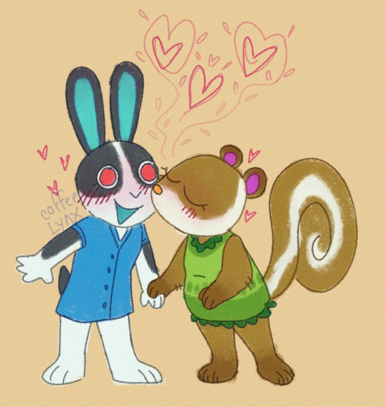
Dotty and Sylvana are neighbors in my acnh game and they're so totally dating
#animal crossing#acnh#ac dotty#ac sylvana#my art#idk how to tag this but eh#not the first time i draw these lesbians#i enjoy drawing them
44 notes
·
View notes
Text
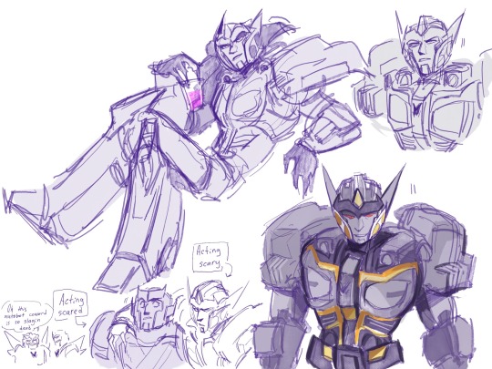
…..I should be working rn but one of the songs in my playlist hit harder than usual so
#maccadam#transformers#deadlock#idw deadlock#drift#ratchet#idw ratchet#dratchet#ratchlock#also#this kind of fics that makes them run into each other during the war#while Ratchet is younger and Drift is still Deadlock#i love them#*stops shooting* oh hey Doc#*stops shooting* oh hey kid#both proceed to just casually ignoring each other’s fractions#Deadlock would never even think of killing Ratchet and Ratchet would never betray this trust#…….sometimes I like to think that tfp Ratchet doesn’t like being called ‘doc’ because that was how tfp Deadlock called him#one day I gather enough motivation to draw that one comic I was thinking about for half a year now#about tfp Deadlock arriving to earth to rejoin Megatron#and then humans and Autobots at some point discovering his fucked up romantic situation with Ratchet#….I just thought I probably would need to make Deadlock flying alt mode so he’s not completely useless in space and sky#eh idk#I just wanna draw everyone’s O_O faces when Decepticon’s high in command just casually calls Ratchet doc or Ratch or smth#oh wow I got carried away with these tags
2K notes
·
View notes
Text

painting test with a limited color palette
here's the moon equivalent!
#my art#daycare attendant#dca fandom#hm... no character tags. guess!#really put off posting this since i had no clue what to write for the image id... but it turned out to be fairly easy. sorry if its bad tho#i've been having a falling out with this series recently#its hard for me to like it these days. like theres still a lingering bit of affection for it#but i cant help but wonder if its time to move on from it. hm#i know im probably talking about it in a weird way but... its always been mentally distressing to leave my interests behind!!#sigh.. i know this blog is fairly ''big'' but idk if i'd be missing out on much by leaving. considering how isolated i am from the communit#and also how much i tend to dislike the majority of the community too. hm#eh who knows... we'll see
887 notes
·
View notes
Text
Damian has been in Gotham for a couple of months
Bruce: Damian seeing that you are my biological child I’m getting you tested for everything I have mentally of course
Damian: seem logical what do you have
Bruce: it be a shorter list to tell you everything I don’t have
Damian: that explains a lot
Parts - 1 - 2
#dc comics#damian wayne#dc robin#bruce wayne#idk how to tag this#bored#this idea would not leave me alone#i need to post it to get it out of my head#how was your day#mine was eh#Batman
337 notes
·
View notes
Text
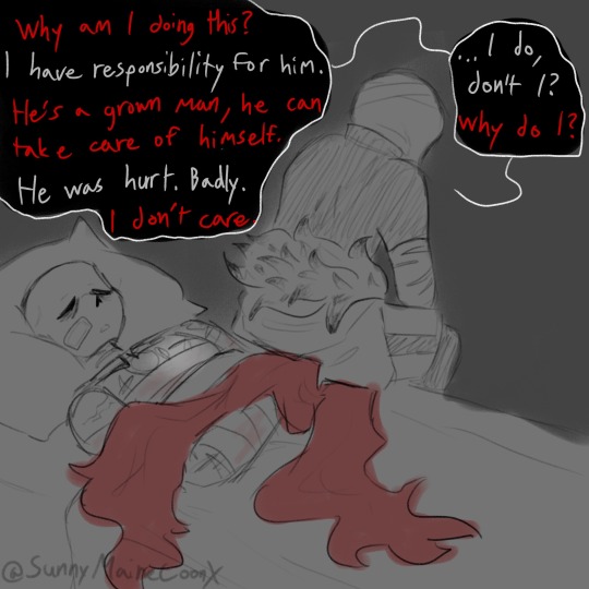
I know damn well I misunderstood the assignment but we roll, I'll understand it some day
It's killer and dust btw. If you couldn't tell. Which you probably couldn't.. forgor to say but shhh 🤫 Killers having a convo with himself..
..I kinda wanna change my url but idk to what
#I got this compliment once and I was like :3 bc I like compliments. then 4 days later I recognise the name and pfp on#on a tumblr I rlly rlly like bc they're super cool make super cool art and has super cool ideas and I'm just like woah they complement me s#so I search my notifications to find which post they complimented me on and I find out. they're following me. ummm IJWEHFOIWJ#i just can't get over this bc they're literally so cool what#anyways#I got two whole documents of canon dust things and one ao3 of canon things about killer#so I'm learning a way to do justice to the creators image while still putting my own twist on it bc I love fanon and that's how I grew up#I'm literally so passionate about fanon. specifically Gacha fanon bc it's literally so fun and no one else know that#like. literally everyone just like had terrible experience apparently idk how I didn't experience that#am I the only one who knows these characters still had lore Ben though unrelated to anything canon at all#anyways I'm rambling too much whoops#sans au#utmv#undertale au#sanscest#if u want#killer sans#dust sans#kist#if u want...#LOVE affair#teaching myself to use this tag too but eh#did you know Horror is more likely to be a part of the bad Sanses than Dust#Jesus fuck I rambled these tags to hell
422 notes
·
View notes
Text

Happy birthday (03/15) to Hokma, congratulations on time and surroundings no longer being a stagnated mess. Whatever goes askew - this, too, shall end and prosperity awaits. Have faith.
#moroderdraws#lobotomy corporation#library of ruina#benjamin lobcorp#hokma#idk how to tag him hes the same guy in a sense. eh#also happy 1 year hokma brainrot to me. i was kinda sad i missed his birthday by 2 days last year and this year's a mess for me too#but at least ive made a pic for him this time ^_^
279 notes
·
View notes
Text

now we're talking shera catra
#i love it when i struggle with colours for like an hour and the it suddenly clicks and i make colours look right together#without really understanding how#eh#now I'm going to tag it with all the stupid little tags#art#she ra#she ra and the princesses of power#she ra catra#she ra fanart#spop#idk#what else is there#catra#spop catra#ALSO I'M REFUSING TO GIVE HER BLONDE SHERA HAIR UH-HUH
475 notes
·
View notes
Text
i think childe likes to be mothered in a very concerning way. he'll want to be the man of the house while you stay at home and keep everything nice and clean and tidy and warm. he'll want to have you see him off and greet him with warm, open arms when he gets home, holding him in your embrace as he "accidentally" shoves his face into your cleavage. he'll want to have meals at the dinner table where he discusses his day and how hard it was, how happy he is to have someone like you to look after him. i can see him being pretty obsessive with you, monitoring your every interaction because why are you paying attention to someone that's not him? smiling at someone else instead of him? again? he's warned you time and time again about this, now he's got to get his hands dirty once again, but that's okay. he knows that even when he arrives home covered in blood you'll welcome him with that sweet, sweet smile, and tell him everything's going to be okay.
#tw fauxcest#(?)#dynamic without the actual incest is hot 2 me idk#childe is a freak#i may elaborate. maybe#mother boys i Want you#childe x reader smut#ajax x reader smut#tartaglia x reader smut#genshin x reader smut#genshin impact x reader smut#genshin smut#genshin impact smut#UH#idk how to tag this#tw mommy issues#tw mommy kink#just incase#OK THNX EHE
454 notes
·
View notes
Text


do not be fooled i dont go here
#detroit become human#dbh#dbh connor#dbh hank#idk how to tag this at all tbh#let me pull up wikis post and jst copy whtevr it tagged its as#ok im back#connor rk800#rk800#hank anderson#dbh fanart#catfood art#wait do they hav a ship name#eh whtevr idc
327 notes
·
View notes
Text

arrives 15 min late with a latte
......sup
#yosuke hanamura#persona 4#cool now that its done i can ramble in the tags#fellas im surprised hes here and done#did not think that was gonna happen#fuck i forgot smth#eh ill fix it before i make my print#anywho i might make more i might not who knows not i#yukiko is the next one i have half an idea on but also i have some shining nikki designs rattling around with my sole braincell#i also made a shadow alt for the back but idk if i like the mouth so yall arent gonna see him#also i need to find a gold foil guy that does odd sizes and like moq of 1#bc i wanna do this in gold foil#and its tarot card size bc im dumb as hell#but i want a print for my wall and i know sure as shit no one else will want one hence the moq of 1#my heart wants to make the whole major arcana for p4 but my past completed works says °❀⋆.ೃ࿔*:・ 𝑛𝑜 °❀⋆.ೃ࿔*:・#so whatever gets done will get done#also im gonna reblog this a lot bc i put in too many hours to get a singular note by me so like if you dont wanna see it block me lmfao#if you have any hot takes for future cards please share with the class bc i only have ideas for yukiko and a full cast she does not make fr#so uh yeah yeehaw#idk what else to ramble about but like cannot believe yosuke fucking hanamura is the first chara to get a completed piece in 5 years#im not fucking kidding#the rest were all quick graphite or abandoned#hes not even my fave in p4- thats naoto protag chan kou and nanako#boys lucky to hit top 5#he just kinda crawled into my affection like some kind of sad pathetic creature idk how it happened either#maybe hes overprocessed now that im looking at it#nope i looked too long this is it this is how he is#ill do better by the women i promise
209 notes
·
View notes
Text
why Aurora's art is genius
It's break for me, and I've been meaning to sit down and read the Aurora webcomic (https://comicaurora.com/, @comicaurora on Tumblr) for quite a bit. So I did that over the last few days.
And… y'know. I can't actually say "I should've read this earlier," because otherwise I would've been up at 2:30-3am when I had responsibilities in the morning and I couldn't have properly enjoyed it, but. Holy shit guys THIS COMIC.
I intended to just do a generalized "hello this is all the things I love about this story," and I wrote a paragraph or two about art style. …and then another. And another. And I realized I needed to actually reference things so I would stop being too vague. I was reading the comic on my tablet or phone, because I wanted to stay curled up in my chair, but I type at a big monitor and so I saw more details… aaaaaand it turned into its own giant-ass post.
SO. Enjoy a few thousand words of me nerding out about this insanely cool art style and how fucking gorgeous this comic is? (There are screenshots, I promise it isn't just a wall of text.) In my defense, I just spent two semesters in graphic design classes focusing on the Adobe Suite, so… I get to be a nerd about pretty things…???
All positive feedback btw! No downers here. <3
---
I cannot emphasize enough how much I love the beautiful, simple stylistic method of drawing characters and figures. It is absolutely stunning and effortless and utterly graceful—it is so hard to capture the sheer beauty and fluidity of the human form in such a fashion. Even a simple outline of a character feels dynamic! It's gorgeous!
Though I do have a love-hate relationship with this, because my artistic side looks at that lovely simplicity, goes "I CAN DO THAT!" and then I sit down and go to the paper and realize that no, in fact, I cannot do that yet, because that simplicity is born of a hell of a lot of practice and understanding of bodies and actually is really hard to do. It's a very developed style that only looks simple because the artist knows what they're doing. The human body is hard to pull off, and this comic does so beautifully and makes it look effortless.
Also: line weight line weight line weight. It's especially important in simplified shapes and figures like this, and hoo boy is it used excellently. It's especially apparent the newer the pages get—I love watching that improvement over time—but with simpler figures and lines, you get nice light lines to emphasize both smaller details, like in the draping of clothing and the curls of hair—which, hello, yes—and thicker lines to emphasize bigger and more important details and silhouettes. It's the sort of thing that's essential to most illustrations, but I wanted to make a note of it because it's so vital to this art style.
THE USE OF LAYER BLENDING MODES OH MY GODS. (...uhhh, apologies to the people who don't know what that means, it's a digital art program thing? This article explains it for beginners.)
Bear with me, I just finished my second Photoshop course, I spent months and months working on projects with this shit so I see the genius use of Screen and/or its siblings (of which there are many—if I say "Screen" here, assume I mean the entire umbrella of Screen blending modes and possibly Overlay) and go nuts, but seriously it's so clever and also fucking gorgeous:
Firstly: the use of screened-on sound effect words over an action? A "CRACK" written over a branch and then put on Screen in glowy green so that it's subtle enough that it doesn't disrupt the visual flow, but still sticks out enough to make itself heard? Little "scritches" that are transparent where they're laid on without outlines to emphasize the sound without disrupting the underlying image? FUCK YES. I haven't seen this done literally anywhere else—granted, I haven't read a massive amount of comics, but I've read enough—and it is so clever and I adore it. Examples:


Secondly: The beautiful lighting effects. The curling leaves, all the magic, the various glowing eyes, the fog, the way it's all so vividly colored but doesn't burn your eyeballs out—a balance that's way harder to achieve than you'd think—and the soft glows around them, eeeee it's so pretty so pretty SO PRETTY. Not sure if some of these are Outer/Inner Glow/Shadow layer effects or if it's entirely hand-drawn, but major kudos either way; I can see the beautiful use of blending modes and I SALUTE YOUR GENIUS.
I keep looking at some of this stuff and go "is that a layer effect or is it done by hand?" Because you can make some similar things with the Satin layer effect in Photoshop (I don't know if other programs have this? I'm gonna have to find out since I won't have access to PS for much longer ;-;) that resembles some of the swirly inner bits on some of the lit effects, but I'm not sure if it is that or not. Or you could mask over textures? There's... many ways to do it.
If done by hand: oh my gods the patience, how. If done with layer effects: really clever work that knows how to stop said effects from looking wonky, because ugh those things get temperamental. If done with a layer of texture that's been masked over: very, very good masking work. No matter the method, pretty shimmers and swirly bits inside the bigger pretty swirls!
Next: The way color contrast is used! I will never be over the glowy green-on-black Primordial Life vibes when Alinua gets dropped into that… unconscious space?? with Life, for example, and the sharp contrast of vines and crack and branches and leaves against pitch black is just visually stunning. The way the roots sink into the ground and the three-dimensional sensation of it is particularly badass here:

Friggin. How does this imply depth like that. HOW. IT'S SO FREAKING COOL.
A huge point here is also color language and use! Everybody has their own particular shade, generally matching their eyes, magic, and personality, and I adore how this is used to make it clear who's talking or who's doing an action. That was especially apparent to me with Dainix and Falst in the caves—their colors are both fairly warm, but quite distinct, and I love how this clarifies who's doing what in panels with a lot of action from both of them. There is a particular bit that stuck out to me, so I dug up the panels (see this page and the following one https://comicaurora.com/aurora/1-20-30/):

(Gods it looks even prettier now that I put it against a plain background. Also, appreciation to Falst for managing a bridal-carry midair, damn.)
The way that their colors MERGE here! And the immense attention to detail in doing so—Dainix is higher up than Falst is in the first panel, so Dainix's orange fades into Falst's orange at the base. The next panel has gold up top and orange on bottom; we can't really tell in that panel where each of them are, but that's carried over to the next panel—
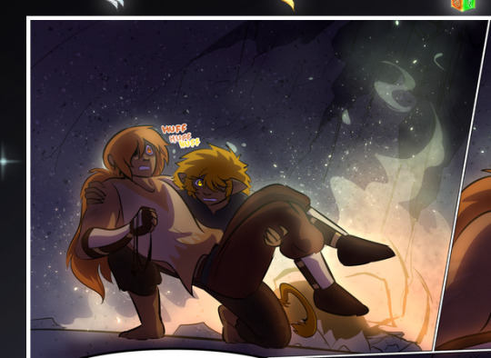
—where we now see that Falst's position is raised above Dainix's due to the way he's carrying him. (Points for continuity!) And, of course, we see the little "huffs" flowing from orange to yellow over their heads (where Dainix's head is higher than Falst's) to merge the sound of their breathing, which is absurdly clever because it emphasizes to the viewer how we hear two sets of huffing overlaying each other, not one. Absolutely brilliant.
(A few other notes of appreciation to that panel: beautiful glows around them, the sparks, the jagged silhouette of the spider legs, the lovely colors that have no right to make the area around a spider corpse that pretty, the excellent texturing on the cave walls plus perspective, the way Falst's movements imply Dainix's hefty weight, the natural posing of the characters, their on-point expressions that convey exactly how fuckin terrifying everything is right now, the slight glows to their eyes, and also they're just handsome boys <3)
Next up: Rain!!!! So well done! It's subtle enough that it never ever disrupts the impact of the focal point, but evident enough you can tell! And more importantly: THE MIST OFF THE CHARACTERS. Rain does this irl, it has that little vapor that comes off you and makes that little misty effect that plays with lighting, it's so cool-looking and here it's used to such pretty effect!
One of the panel captions says something about it blurring out all the injuries on the characters but like THAT AIN'T TOO BIG OF A PROBLEM when it gets across the environmental vibes, and also that'd be how it would look in real life too so like… outside viewer's angle is the same as the characters', mostly? my point is: that's the environment!!! that's the vibes, that's the feel! It gets it across and it does so in the most pretty way possible!
And another thing re: rain, the use of it to establish perspective, particularly in panels like this—

—where we can tell we're looking down at Tynan due to the perspective on the rain and where it's pointing. Excellent. (Also, kudos for looking down and emphasizing how Tynan's losing his advantage—lovely use of visual storytelling.)
Additionally, the misting here:
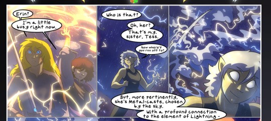
We see it most heavily in the leftmost panel, where it's quite foggy as you would expect in a rainstorm, especially in an environment with a lot of heat, but it's also lightly powdered on in the following two panels and tends to follow light sources, which makes complete sense given how light bounces off particles in the air.
A major point of strength in these too is a thorough understanding of lighting, like rim lighting, the various hues and shades, and an intricate understanding of how light bounces off surfaces even when they're in shadow (we'll see a faint glow in spots where characters are half in shadow, but that's how it would work in real life, because of how light bounces around).
Bringing some of these points together: the fluidity of the lines in magic, and the way simple glowing lines are used to emphasize motion and the magic itself, is deeply clever. I'm basically pulling at random from panels and there's definitely even better examples, but here's one (see this page https://comicaurora.com/aurora/1-16-33/):

First panel, listed in numbers because these build on each other:
The tension of the lines in Tess's magic here. This works on a couple levels: first, the way she's holding her fists, as if she's pulling a rope taut.
The way there's one primary line, emphasizing the rope feeling, accompanied by smaller ones.
The additional lines starbursting around her hands, to indicate the energy crackling in her hands and how she's doing a good bit more than just holding it. (That combined with the fists suggests some tension to the magic, too.) Also the variations in brightness, a feature you'll find in actual lightning. :D Additional kudos for how the lightning sparks and breaks off the metal of the sword.
A handful of miscellaneous notes on the second panel:
The reflection of the flames in Erin's typically dark blue eyes (which bears a remarkable resemblance to Dainix, incidentally—almost a thematic sort of parallel given Erin's using the same magic Dainix specializes in?)
The flowing of fabric in the wind and associated variation in the lineart
The way Erin's tattoos interact with the fire he's pulling to his hand
The way the rain overlays some of the fainter areas of fire (attention! to! detail! hell yeah!)
I could go on. I won't because this is a lot of writing already.
Third panel gets paragraphs, not bullets:
Erin's giant-ass "FWOOM" of fire there, and the way the outline of the word is puffy-edged and gradated to feel almost three-dimensional, plus once again using Screen or a variation on it so that the stars show up in the background. All this against that stunning plume of fire, which ripples and sparks so gorgeously, and the ending "om" of the onomatopoeia is emphasized incredibly brightly against that, adding to the punch of it and making the plume feel even brighter.
Also, once again, rain helping establish perspective, especially in how it's very angular in the left side of the panel and then slowly becomes more like a point to the right to indicate it's falling directly down on the viewer. Add in the bright, beautiful glow effects, fainter but no less important black lines beneath them to emphasize the sky and smoke and the like, and the stunningly beautiful lighting and gradated glows surrounding Erin plus the lightning jagging up at him from below, and you get one hell of an impactful panel right there. (And there is definitely more in there I could break down, this is just a lot already.)
And in general: The colors in this? Incredible. The blues and purples and oranges and golds compliment so well, and it's all so rich.
Like, seriously, just throughout the whole comic, the use of gradients, blending modes, color balance and hues, all the things, all the things, it makes for the most beautiful effects and glows and such a rich environment. There's a very distinct style to this comic in its simplified backgrounds (which I recognize are done partly because it's way easier and also backgrounds are so time-consuming dear gods but lemme say this) and vivid, smoothly drawn characters; the simplicity lets them come to the front and gives room for those beautiful, richly saturated focal points, letting the stylized designs of the magic and characters shine. The use of distinct silhouettes is insanely good. Honestly, complex backgrounds might run the risk of making everything too visually busy in this case. It's just, augh, so GORGEOUS.
Another bit, take a look at this page (https://comicaurora.com/aurora/1-15-28/):
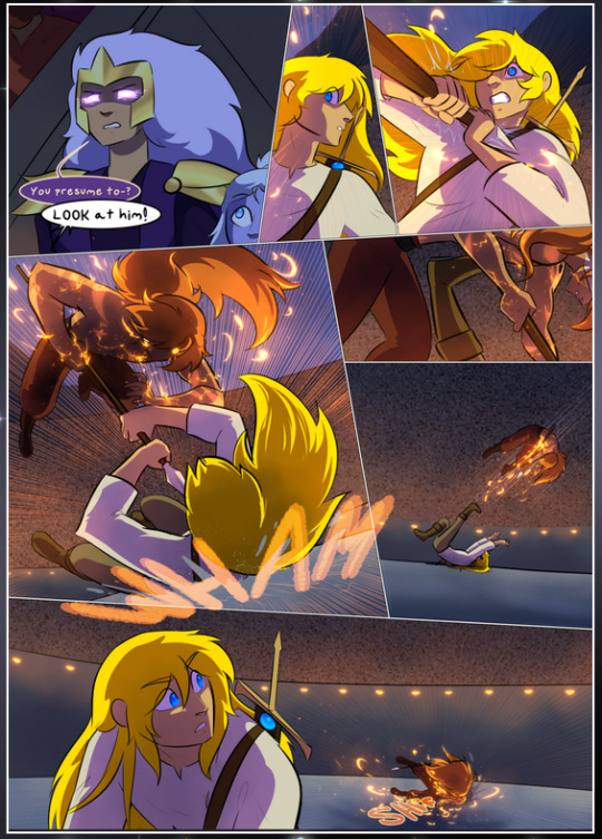
It's not quite as evident here as it is in the next page, but this one does some other fun things so I'm grabbing it. Points:
Once again, using different colors to represent different character actions. The "WHAM" of Kendal hitting the ground is caused by Dainix's force, so it's orange (and kudos for doubling the word over to add a shake effect). But we see blue layered underneath, which could be an environmental choice, but might also be because it's Kendal, whose color is blue.
And speaking off, take a look at the right-most panel on top, where Kendal grabs the spear: his motion is, again, illustrated in bright blue, versus the atmospheric screened-on orange lines that point toward him around the whole panel (I'm sure these have a name, I think they might be more of a manga thing though and the only experience I have in manga is reading a bit of Fullmetal Alchemist). Those lines emphasize the weight of the spear being shoved at him, and their color tells us Dainix is responsible for it.
One of my all-time favorite effects in this comic is the way cracks manifest across Dainix's body to represent when he starts to lose control; it is utterly gorgeous and wonderfully thematic. These are more evident in the page before and after this one, but you get a decent idea here. I love the way they glow softly, the way the fire juuuust flickers through at the start and then becomes more evident over time, and the cracks feel so realistic, like his skin is made of pottery. Additional points for how fire begins to creep into his hair.
A small detail that's generally consistent across the comic, but which I want to make note of here because you can see it pretty well: Kendal's eyes glow about the same as the jewel in his sword, mirroring his connection to said sword and calling back to how the jewel became Vash's eye temporarily and thus was once Kendal's eye. You can always see this connection (though there might be some spots where this also changes in a symbolic manner; I went through it quickly on the first time around, so I'll pay more attention when I inevitably reread this), where Kendal's always got that little shine of blue in his eyes the same as the jewel. It's a beautiful visual parallel that encourages the reader to subconsciously link them together, especially since the lines used to illustrate character movements typically mirror their eye color. It's an extension of Kendal.
Did I mention how ABSOLUTELY BEAUTIFUL the colors in this are?
Also, the mythological/legend-type scenes are illustrated in familiar style often used for that type of story, a simple and heavily symbolic two-dimensional cave-painting-like look. They are absolutely beautiful on many levels, employing simple, lovely gradients, slightly rougher and thicker lineart that is nonetheless smoothly beautiful, and working with clear silhouettes (a major strength of this art style, but also a strength in the comic overall). But in particular, I wanted to call attention to a particular thing (see this page https://comicaurora.com/aurora/1-12-4/):
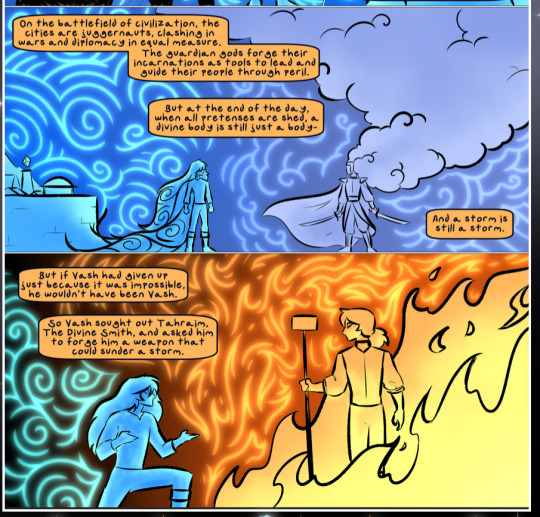
The flowing symbolic lineart surrounding each character. This is actually quite consistent across characters—see also Life's typical lines and how they curl:
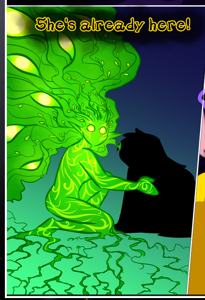
What's particularly interesting here is how these symbols are often similar, but not the same. Vash's lines are always smooth, clean curls, often playing off each other and echoing one another like ripples in a pond. You'd think they'd look too similar to Life's—but they don't. Life's curl like vines, and they remain connected; where one curve might echo another but exist entirely detached from each other in Vash's, Life's lines still remain wound together, because vines are continuous and don't float around. :P
Tahraim's are less continuous, often breaking up with significantly smaller bits and pieces floating around like—of course—sparks, and come to sharper points. These are also constants: we see the vines repeated over and over in Alinua's dreams of Life, and the echoing ripples of Vash are consistent wherever we encounter him. Kendal's dream of the ghost citizens of the city of Vash in the last few chapters is filled with these rippling, echoing patterns, to beautiful effect (https://comicaurora.com/aurora/1-20-14/):
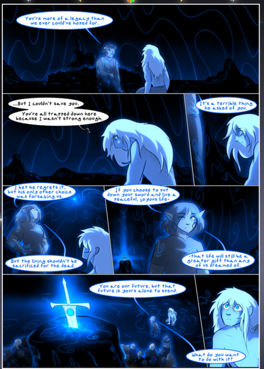
They ripple and spiral, often in long, sinuous curves, with smooth elegance. It reminds me a great deal of images of space and sine waves and the like. This establishes a definite feel to these different characters and their magic. And the thing is, that's not something that had to be done—the colors are good at emphasizing who's who. But it was done, and it adds a whole other dimension to the story. Whenever you're in a deity's domain, you know whose it is no matter the color.
Regarding that shape language, I wanted to make another note, too—Vash is sometimes described as chaotic and doing what he likes, which is interesting to me, because smooth, elegant curves and the color blue aren't generally associated with chaos. So while Vash might behave like that on the surface, I'm guessing he's got a lot more going on underneath; he's probably much more intentional in his actions than you'd think at a glance, and he is certainly quite caring with his city. The other thing is that this suits Kendal perfectly. He's a paragon character; he is kind, virtuous, and self-sacrificing, and often we see him aiming to calm others and keep them safe. Blue is such a good color for him. There is… probably more to this, but I'm not deep enough in yet to say.
And here's the thing: I'm only scratching the surface. There is so much more here I'm not covering (color palettes! outfits! character design! environment! the deities! so much more!) and a lot more I can't cover, because I don't have the experience; this is me as a hobbyist artist who happened to take a couple design classes because I wanted to. The art style to this comic is so clever and creative and beautiful, though, I just had to go off about it. <3
...brownie points for getting all the way down here? Have a cookie.
#aurora comic#aurora webcomic#comicaurora#art analysis#...I hope those are the right tags???#new fandom new tagging practices to learn ig#much thanks for something to read while I try to rest my wrists. carpal tunnel BAD. (ignore that I wrote this I've got braces ok it's fine)#anyway! I HAVE. MANY MORE THOUGHTS. ON THE STORY ITSELF. THIS LOVELY STORY#also a collection of reactions to a chunk of the comic before I hit the point where I was too busy reading to write anything down#idk how to format those tho#...yeet them into one post...???#eh I usually don't go off this much these days but this seems like a smaller tight-knit fandom so... might as well help build it?#and I have a little more time thanks to break so#oh yes also shoutout to my insanely awesome professor for teaching me all the technical stuff from this he is LOVELY#made an incredibly complex program into something comprehensible <3#synapse talks
787 notes
·
View notes
Text
stan twins the canon cptsd brothers i will always think about all your unaddressed issues that would make perfect plot fuel for your spinoff
and also the whole 'stan getting that poem by bill via a website which contrasts with bill getting one from the axolotl via a website' foreshadowing thing
like idk i would love something like su future but like more optimistic, aka not an accumulated breakdown that has to be mostly resolved off screen at the end :/// but something thats being kinda addressed throughout? (although would love to see one of them turn into a monster thats always fun lol)
stan having severe issues from his dad and those years of being homeless that we keep on getting more info on but never really getting confronted on (the drifter catalogue and tijuana incident...), him being completely alone for like twenty years when running the shack before soos comes along to the point that 1998 is noted as his low point, and him not really learning about bill+what he did to ford until ages after he killed him if he ever did get the full context
while i think amnesia and everyone seeing him as a hero actually helped with stan's 'i'm a worse version of my brother' thing its still a lingering issue too and we now got him being insecure over his own hands
ford being immediately thrown from 'being tortured by bill' to 'being stuck in the multiverse and being chased by bounty hunters constantly', him fully expecting himself to die when destroying bill, and him only now being safe for the first time in 30 years ....relatively safe, he's still in constant danger because of course he is
idk in the end the series wants them to be happy and they deserve it, its why i wasn't too worried about the book being like 'ooh bill is back!! and the book is haunting ford' thing cos i knew they'll be ok
#stan pines#ford pines#stanley pines#stanford pines#gravity falls#stan twins#as for the 'still on your mind' thing to me its stan literally thinking about bill despite ford resolving to move past it#or alternatively me on my same coin theory obsession lmao#me yelling and screaming at ouroboros being used to link to the axolotl and bill and how ford didn't actually keep it#which brings up even more questions about it reappearing in the shack when stan takes over#of course even if him realising about reincarnation being a thing i think its still way less to deal with than his actual issues#something something a same soul doesnt mean much when he already proved himself a better person a million times over#idk my thoughts on reincarnation as a concept is like eh??? anyway#also completely unrelated but stan writing fanfic means he knows what soos meant when he was talking about stan fics#soos seems like a gen fic writer especially with the ones we got as those promos#the train one where he comes up with a giant backstory for the setting that has nothing to do with the fic bros is super funny#but meanwhile we have stan the canonical smut writer who had to be writing it that summer#would he be a self insert shipper? would he projecting on the duchess instead? is he both???#i have many questions#then again judging from hows theres a wedding scene that he got super emotional over he might just be a shipper????#this has nothing to do with my original post#...or does it cos the axolotl last appears reacting to stan freaking out about count li--#anyway if you think this post is longer than my usual its cos i physically made myself delete most tags and put it in the actual post
191 notes
·
View notes
Text
whatg the hell…….. just posted my first fic ever

fiddlestan got my ass bro
…the fic, if y’all want it:
#ummmm#can’t tell if it’s decent or not#i love running into fics on tumblr so eh#figured i’d post it#gravity falls#fiddlestan#stanley pines#fiddleford mcgucket#gravity falls fic#fiddlestan fic#???#my fic#my writing#idk how to tag this shit erm#ao3#hi
103 notes
·
View notes
Text

The ship thing I kept seeing and I wanted to participateeee
Art block still has me chained up in it's basement, this is the only thing I've drawn in days send help
Uhhh all the explanations under the cut (+the original template)
Errorink- I love them
Kist- I used to think they're boring
Swap/Fell- I liked them in middle school, I don't like them anymore
Cream- I love them
Fresh/lust- underrated, misunderstood, Queerplatonic
Dustberry- it stopped being popular after 2018 so in people's minds it's still the 2018 version. But I have fixed them. I have
SciFell- I think it would be so so cool if they somehow became canon. Canon to what? Idk
Afterdeath- Sigh... I love them
Cross/Swap- it's silly and underrated
Errorink- they stuck around
Anywayyyy

Woah reached the tag limit
#utmv#undertale#sans#undertale au#sans au#sans ships#sanshipping#error sans#ink sans#killer sans#dust sans#swap sans#fell sans#dream sans#cross sans#lust sans#sfw lusttale#fresh sans#sci sans#reaper sans#geno sans#errorink#kist#cream ship#freshlust#dustberry#scifell#Afterdeath#idk how to tag cross and swap. eh#my art
280 notes
·
View notes
Text

that reveal was so cool
#orianna reveck#orianna#corin reveck#arcane#arcane season 2#arcane fanart#should i tag singed?? IDK#shes basically albino now too#HAIR DISCOLORATION ftw#anyways singed is such a little guy i wanna hug him and tell him to not be sad#love himt o death#yay#ay tho orianna is gonna be back im so curious how that happens#whats her reaction#shes a little kid rn how is she gonnaturn into that big lady#awesome ballerina tho#and clockwork isnt singeds strong suit i dont think am i right or no#but he is corin now soooooooooooo#EH WHATEVER#Ofc keeping a dead loved one around for 20 years bc you can’t accept their death is bad but literally everyone else in the story did it too#so I give him a pass
84 notes
·
View notes
Text


Zonai Link au ref sheets!!!!
Basically when Link was placed in the Shrine of Resurrection the shrine's settings were set to Zonai! The Sheikah had built over the original shrine, improving upon the ancient technology left behind. Unfortunately when most of the technology was buried so was the knowledge of the shrines true capabilities.
So basically the Shrine is given an injured Hylian, but since it's settings are set to Zonai the Shrine freaks out like "Oh my goddess this zonai is absolutely fucked up 💀" and spends the next 100 years 'fixing' Link.
#art#help how do i anatomy#holly rambles#zonai shrine link au#thats whay im calling jt!!#zonai link#link totk#link botw#botw au#totk au#idk whether to tag this as totk or botw exclusively so eh. both#also the rest of hyrule is confused as shit. Link is also allowed in gerudo town because.. wtf is this?? ig they can come in??#also no one truly clocks Zonai link as the same link that died during the calamity#the only ones who sort of have an idea of who Link is are the royal zora family. and its never confirmed until totk#ONLY TO THE ZORA ROYAL FAMILY THO.#and the sheikah obvs!! even if they didnt realize the extent of the uh. shrines abilities they did know Link was to return#totk art#breath of the wild#tears of the kingdom#zonai#totk zonai#botw totk#anyway feel free to send asks about them and this au im spinning it in mt brain forever
151 notes
·
View notes