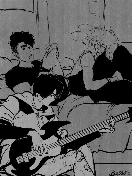
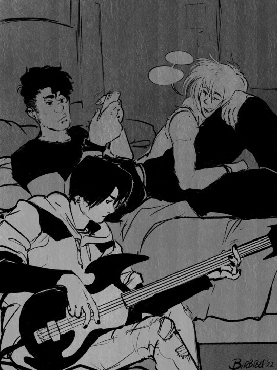
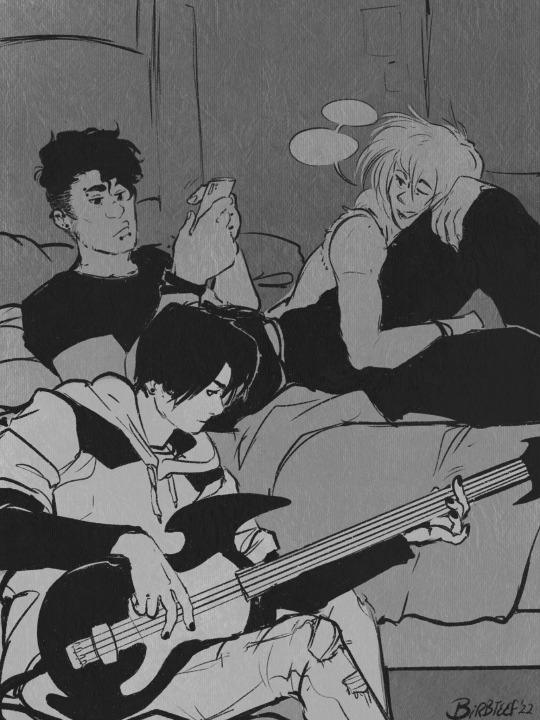
#idk I just wanted to show the lines on top of the sketch layer
Explore tagged Tumblr posts
Text
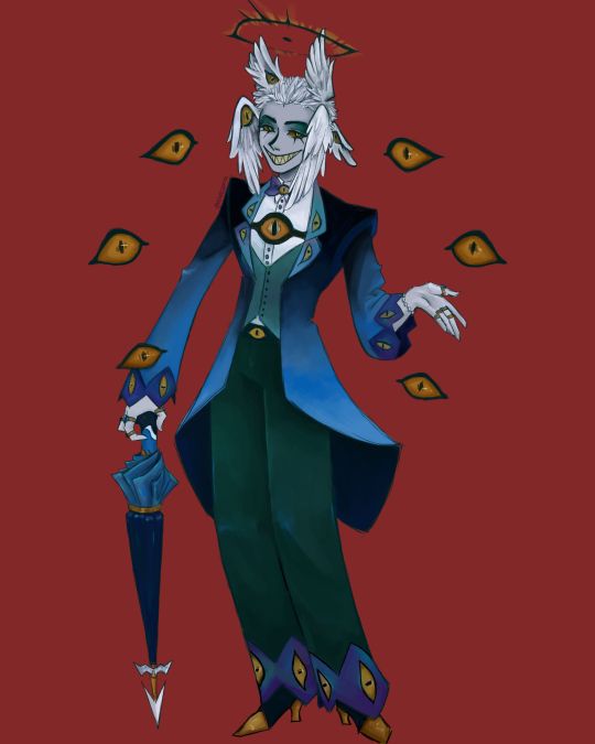
I finally finished the piece for @prince-liest's OC, Tzafael! this really reminded me of how fun character design is (and also that I've completely forgotten how to make digital art, but that's besides the point...) <3
credit to @hogbogglerspirits for the umbrella design! I kind of butchered it so please look at the original and throw lots of love at them
LOTS of notes, draft sketches, brainstorming, etc. below the cut. enjoy!
(note: a lot of what I'm talking about is based on posts prince made under their #tzafael tag, so take a look at those if you haven't yet!)
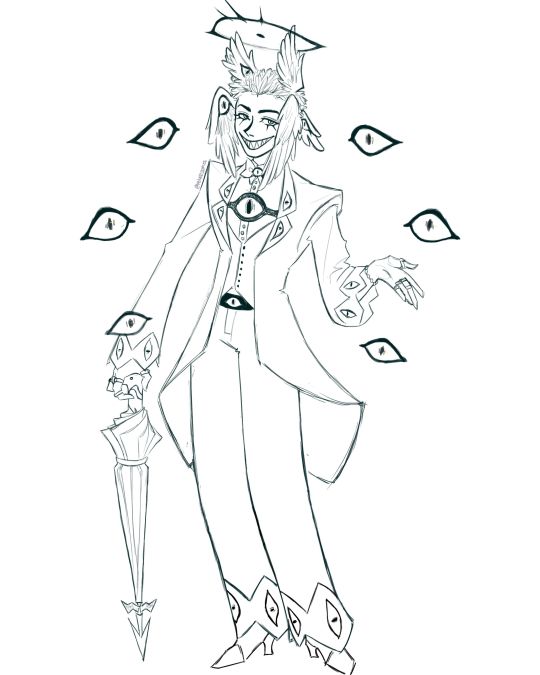
thanks for joining me below the cut! here's the sketch without the colors as a treat (in case you want to color it yourself or something, idk).
notes about making the digital drawing:
holy shit this took me forever -- I was not kidding about forgetting how to make digital art lmao. I forgot how much less forgiving digital lines are and genuinely lost the spoons to even attempt lineart, hence just a sketch below the colors.
some of you might've seen the original sketch I sent to prince, which the digital version diverges from just a little. it's mostly the halo which I'll explain later, and I finally caved and drew the sixth eye (you can tell I drew and erased it multiple times in the sketch lmao -- still don't know if I prefer it with or without)
here's the original color ref by the lovely @gendermeh! my color scheme ended up looking really different, so some notes about that:
I was looking at references for magpies like this
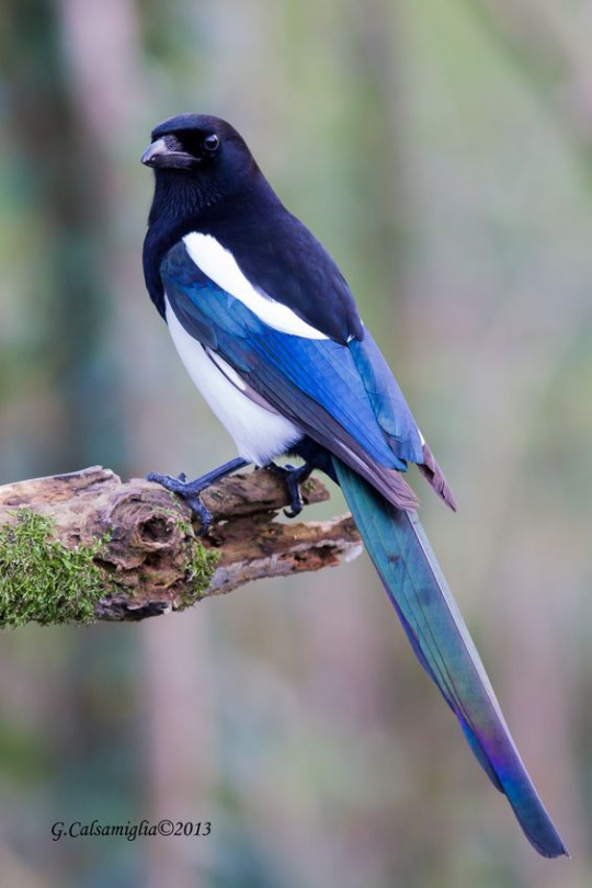
and I wanted to basically follow that color scheme while also being somewhat similar to the original -- dark head/shoulders --> dark top of the jacket, bright blue wings --> bright blue bottom of the jacket, greenish tailfeathers --> green pants, hints of purple --> purplish sleeve and pant ends
I also tried (and mostly failed, let's be real) to capture the iridescence of the feathers -- they look like oil spilled on the pavement or iridescent hematite to me! I think the key ended up being adding bright greens/purples and roughly blending them into the blues or vice versa but I didn't really figure that out until I got to the pants lol.
I'm gonna be honest; I don't remember why I went with this shape for the tailcoat. I just remember being unhappy with the sketch and then trying a bunch of different shapes that mostly looked worse lol -- I think I landed on this because a split tail kind of looks like wings?
KEPT the shoes -- absolutely magnifique. I wish I knew how to color gold better.
added lots of jewelry! they like shiny things :)
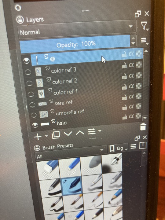
ALSO PLEASE LOOK AND APPLAUD ME. I FINALLY REMEMBERED TO LABEL MY LAYERS!! NO I DON'T REMEMBER WHY THE HALO HAS ITS OWN LAYER.
alright, time for some more design notes/explanations + draft sketches!
but first, a couple disclaimers:
I want to make it very clear that I LOVE everything about the original design. I made a lot of changes based on personal preference/the way I interpreted the character. I was actually planning on making a digital piece that was more faithful to the original design too, but I was just out of spoons for it cause of life stuff.
you probably shouldn't try to read the notes I made in the sketches I'm about to show you unless I say otherwise. most of it is incoherent brain vomit in illegible artist handwriting and I'll transcribe/explain the stuff I think is important :) (the stuff in quotes are direct transcriptions of my notes)
I know my sketches are very messy lol. I only draw for fun, so I usually don't force myself to make stuff any neater than necessary unless it's supposed to be a formal piece. try to bear with me.
1:
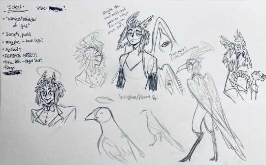
my first few sketches of them! (I think?) this was before I sent prince a laundry list of questions so I was still trying to get a vibe
"magpie -- beak lips?" -- you'll see this in a few sketches; I considered giving them the lipstick design that velvette has since it looks like a beak. I still kind of think it's cute, but 1) I'm pretty sure velvette is the only character that has them, so I didn't want to make it seem like they were related somehow and 2) I thought it might be distracting with how much other crazy stuff I ended up including in their head/face
also, sidenote since it's relevant to what I said about vel: something I realized was important is how one character's design relates to the designs of the rest of the cast. I wasn't sure how much I should've gone for what looked good in a vacuum, how much should be based on what other characters looked like canonically, or what other characters would look like if I also designed them. it ended up being mostly the second option, but it was honestly still a struggle. should I take away some of the tumblr-sexyman-ness (no shade to tumblr sexymen; I love them) because there are other characters that already have it? should I relate their design to sera's and emily's in the show or should I think about how I would've designed sera and emily? should I follow some of the design philosophy of the original show and just throw stuff on there because it looks cool (the answer is yes btw)? decisions, decisions ...
I don't think this showed up really well in most of the drawings, but they actually have a black line down their nose! let's take a look at sera:
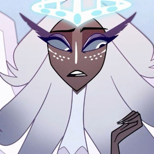
since they're siblings, I wanted to include some similar facial markings. the nose line ended up being the only thing I kept though -- I was going to include freckles, but I have a compulsive need to give every character giant bottom lashes so there ended up being no room T.T I like that the magpie's hints of purple kind of match hers tho!
the wingification of the hair begins! I was still unsure of it at this point, but it was an idea I had since I was kind of struggling with how straight the feathers were in the original.
"maybe the ones on their head count as wings (so only one main pair)" -- I originally just had the 2 pairs of wings on their head, so I was thinking of just giving them 1 pair on their back so there would be still be 6 total. also this middle drawing of them is meant to be their exorcist outfit (I wanted it to be a cross between what the other exorcists wear and sera's outfit)
at this stage, I was thinking of giving them more magpie-like characteristics, so I looked at some references and tried to emulate them in a more human design. this ended up being really awkward so I scrapped it, but I still like the idea that their exorcist mask looks like a bird (kind of like a plague doctor's)
2:
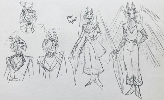
peekaboo! I love the idea of them using the wing hair to cover their eyes lol. (ended up using that idea for my own seraph OC since that's their biblically accurate purpose: to cover their eyes/faces in reverence/humility -- doesn't really fit with tzafael tho lol, so they show their face most of the time)
an eyeball in the bowtie -- pretty self-explanatory. the eyeball motif is important.
the one in the middle is just me practicing drawing the original design, and the one on the right is another exorcist outfit I think. I wanted to include the diamond motif/points that sera has on her dress (the diamonds on the bottom turn into eyeballs, which is why the final design also has eyeballs on tzafael's sleeves/pants)

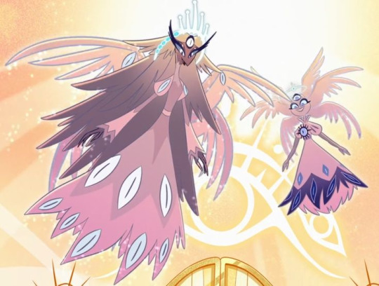
3:
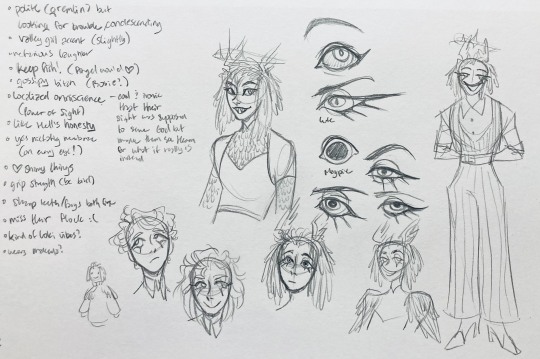
lots of notes on the side based on what prince said in response to my ask
"localized omniscience (power of sight) -- cool + ironic that their sight was supposed to serve God but made them see Heaven for what it really is instead"
another exorcist outfit, this time including the feathers
I was also experimenting with the halo; I was trying to make it look sort of like sera's crown, but that didn't feel right ...
some practice with eyes -- my style is pretty flexible with eye shapes, so I try to make them suit the character. I drew lute's eye and also an actual magpie's as references -- lute's because of the exorcist background and also because they looked appropriately sharp, magpie's for obvious reasons. once again, my compulsive need for giant bottom lashes strikes
there was honestly a lot to balance with the eyes -- I wanted them to look condescending/bored (lowered top lid) but also amused (raised bottom lid) and like a magpie (round) but also harsh/mischievous (sharp, maybe slit pupils like a snake) and similar to sera's (but not too decorated -- also does it make sense for them to look like sera's if emily's don't even look like sera's?)
considered having wings on the shoulders -- the magpie pattern is super cool, so it would've been nice to have that somewhere more explicitly in the design. I still think that might fit in an outfit they would wear in heaven (maybe for formal occasions)
the introduction of the sweatervest! honestly I kind of love this for the way it captures more of the preppy, spoiled old-money upper-class vibe some heaven residents have, but it was scrapped since I couldn't imagine them wearing that while trying to scare the denizens of hell. maybe something they wear casually though.
"yes nictating membrane (on every eye!)" -- AHH I'm so sad I didn't end up putting this to use. I just feel like the whole effect is based on actually seeing them blink, and I don't animate lol.
4:
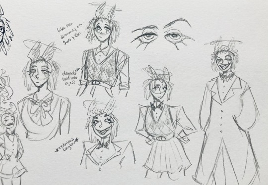
ugh, the nefarious laughter one ... don't worry I tried harder on a sketch later on lol.
"like the diamonds on Sera + Em" + "diamonds turn into eyes?" -- I draw the diamonds on the sweatervest turning into eyes later.
tried an actual bow instead of a bowtie -- very cute but didn't fit the vibe.
a skirt! I think they would wear a skirt sometimes.
5:
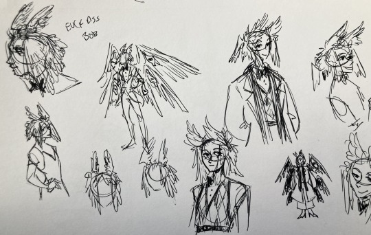
"FUCK ASS BOB" -- asghdk the wingification of the hair continues. unfortunately, I'm realizing at this point that the silhouette of the hair is starting to look a lot like alastor's. I gave a very half-hearted attempt at mitigating this, but it goes back to the thing of how much I am obligated to the original show's designs and what looks cool to me -- I think the wing hair fits them and I didn't want to change it because of alastor, plus my alastor design actually has completely different hair anyway. I did add a third pair to the back to look like a ponytail though.
introduction of the scarf! I was actually going to include this in the final design but uh,,, I forgor. are you starting to see a pattern.
the reason for the scarf is that the "tzafael going to places they know they'll draw attention/can incite chaos" reminded me of that scene in avengers where loki walks into a fancy building looking pretentious af and just casually stabs a guy's eye out. not really the same thing but I felt like the vibe matched. hence, loki's funny little scarf fit.

6:
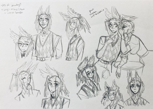
uaoughdfjh it was SO FUN to draw the wing hair, and it was at this point that I realized they had to stay even though I wasn't sure if it was too different from the original.
gossiping with rosie cause that's the first person I thought of -- tzafael also summoned a pearl necklace to clutch because of the sheer drama of it all (your ex-husband did what??)
also started drawing the rings on their hands. magpie like shiny.
7:
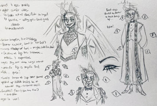
lots of notes cause I was trying to compile the things I still needed to think about/incorporate into the final (I thought this was gonna be the last draft ... haha)
trying to include more bird/eye motifs
"fish ... purse?" -- ha! I forgot I was gonna give them a fish purse. I think I drew that in a later sketch, but not them wearing it.
"picked up Hellish traits bc of extended stay -- existential crisis?" -- I asked prince about the sharp teeth, and their answer implied that they became sharp as they stayed in hell longer, which got me thinking ... I feel like that's actually a great body horror concept. lucifer falling and looking like a normal angel at first, eventually waking up to more and more devilish features and feeling more and more like he's lost his home and his past self ... spooky.
another exorcist outfit -- I actually really like the eyes on the ribs! I never made a final draft for the exorcist uniform, but it would probably look close to what I drew here.
the one on the bottom was meant to be similar to the feathered shoulder pad idea, but this time with the whole magpie (with giant eyes). tried putting the "freckles" (really just dots in this case) over their brows, but that ended up looking kinda weird.
the eye is pretty close to the final design
the one on the right was supposed to be the full final design, but I was totally off lol -- the long trench coat really doesn't give off the right vibe at all
8:
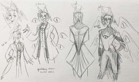
playing around more with the loki vibes of the scarf, also added an eyeball to the chest
I never got happy with the design of the back of the coat -- I think it should probably just be blank at this point. but the sketch here is meant to look like wings/tailfeathers.
yet another exorcist outfit, this time with more magpie motifs. I actually like this one a lot, but I probably should've added the eyes on the ribs from the last sketch. I think I also considered giving them actual tailfeathers at this point.
9:
thanks for sticking with me! I promise we're almost done. have a trans dinosaur I saw while I was travelling as a treat <3
10:
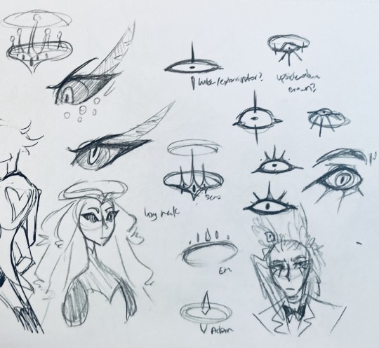
this is after I finished the sketch for the final piece and realized I didn't like the halo design. I drew lute's, sera's, em's, and adam's as refs. (honestly I love the show's idea that each person/people of each rank have a different kind of halo -- I wonder if they can switch them out?)
my main inspiration ended up being the exorcist halo, but I made it look more like an eyeball -- since it always points toward heaven, we can say it's always "looking" at heaven.
(also sera's feather lashes! they're so cute)
11:
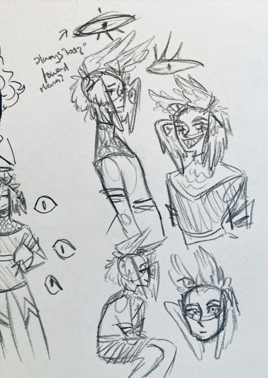
EVEN MORE EXORCIST DOODLES
12:
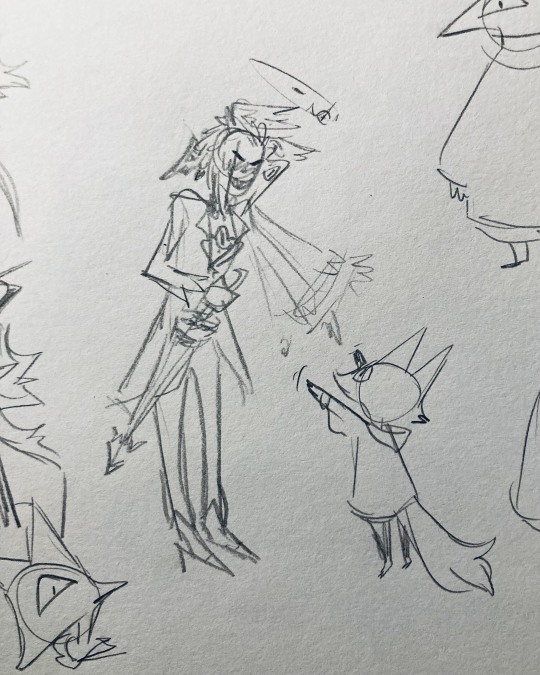
tzafael shooing away my fox demon OC
13:
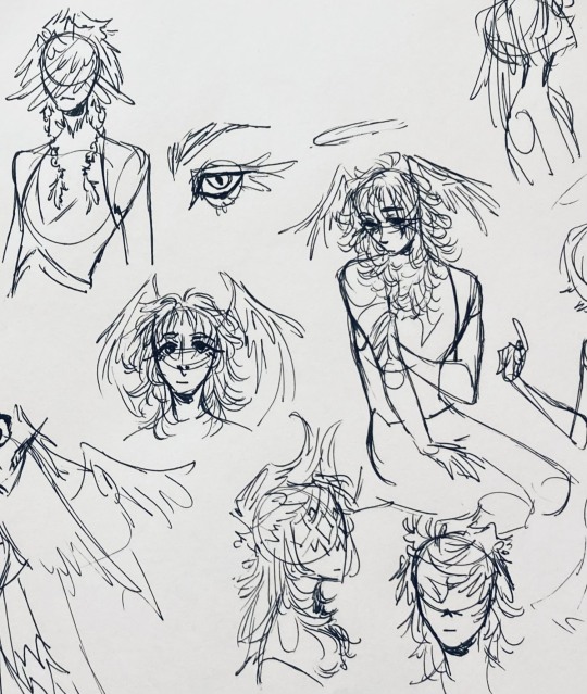
these are actually sketches for my own seraph OC (raguel), but I wanted to include it since it has even more wing/feather hair variations. I also think the idea of the eyelashes being feather-like could've been cool for tzafael.
14:
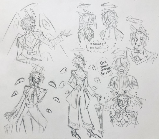
some more OG design doodles
tzafael and raguel together because self-indulgence is the name of the game babey (also wanted to draw tzafael freaked out with their wings flared)
(raguel's blind btw, hence asking for eyes -- tzafael has so many!)
you can probably read the dialogue here so give it a shot. I believe in you.
15:
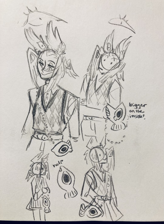
you know what? the fish purse deserves some doodles
16:
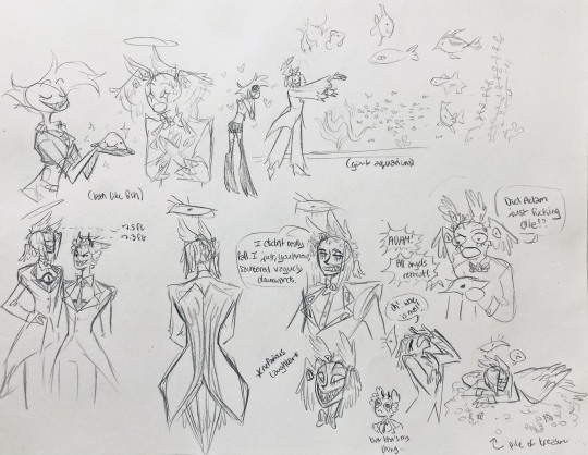
putting them in Situations! I was reading over prince's posts again and I realized there were some funny things I could draw them doing/saying
again you can probably read the words here
angel dust also loves fish (but is apparently bad at taking care of them, hence the suffocating blobfish), so tzafael shows him their aquarium (complete with live fish and flora ofc)
I thought alastor was 8 ft but apparently he's 7.3 ft? so tzafael is enjoying the .2 ft they have on him
trying and failing again to come up with a design for the back of the jacket lol
THE crowley quote
apparently the halo still sends signals from the exorcists -- thought their reaction to the battle at the hotel would be funny
the nefarious laughter (take 2) that I promised -- based on a doodle of alastor viv did that I found
them being sad and curling up in a pile of shiny things like a dragon
OKAY I'M DONE. huge, huge thank you to prince for sharing their OC! this was a lot of fun and clearly inspired me a lot haha. please check out their writing; it's literally so good that I can't read anything else these days. I am chewing on their thoughts constantly.
this was an absolute monster of a post, so if you're still reading, I am both impressed and bewildered at your patience. I hope you enjoyed! (I certainly did!)
#prince (because they are very sweet): I'm excited to see your thoughts!#my thoughts: magpie like shiny hehe#hazbin hotel oc#prince-liest#hazbin hotel#my art#character design#sera hazbin hotel#em hazbin hotel
55 notes
·
View notes
Text
Nell's Shirt Recreation
Part 1 | Part 2 | Part 3 | Part 4 | Part 5
Alright, being a Renegade Nell fan and a historical fashion fan has unsurprisingly led me down the rabbit hole of their costuming. So, I'm recreating Nell's shirt best I can, cause gender envy :D
I'm also gonna try document my progress as I love to infodump and a few people on the renegade nell discord server have asked me to lmao. This post is gonna be about planning, drafting and cutting!
Planning:
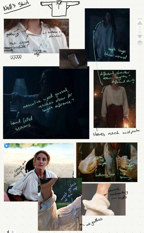
Above is my collection of screenshots (and gifs u can find if you search #sewing reference on my blog) from a rewatch of the show, with notes about construction details. I am so sorry about my handwriting, but if anyone is curious about anything they can't read please ask and I will happily provide.
The rundown though, is that it's a classic 18th century men's shirt, which you can find countless tutorials for if you want to make one that isn't so specifically Nell's.
There are a number of key details to note that are specific to this shirt however. The sizing of the shirt is a bit abnormal to the brief research I've done, with Nell's gussets (the triangle under the arm that allows movement) being a bit larger than what's to be expected, as well as the length being extremely long compared to other men's shirts. Eg:

(Credit indigomood for the gif, my phone couldn't handle searching for it in gifs so I had to download it)
Which, would make sense for a shirt she's taken from her late husband, but the sleeves are so fitted perfectly to her arm length, that I'm gonna just chalk these up as a mix of design choices for the comfort of Lousia when filming and giving the illusion of an oversized shirt.
Also, the cuffs and collar have a simple embroidery edging to them which I love. They have most likely been done on a modern machine, but we can cut Tom Pye some slack with the rest of the amazing work he's done. It looks like a zigzag stitch, with a straight stitch running on the side closest to the edge.
Also also, if anyone has seen Bernadette Banners pirate shirt tutorial, the sleeves and collar have less fabric and as a result less gathering. It's also mostly situated at the very tops of the shoulder, rather than all around the arms eye.
Alrightly onto the pattern drafting:
The Pattern:
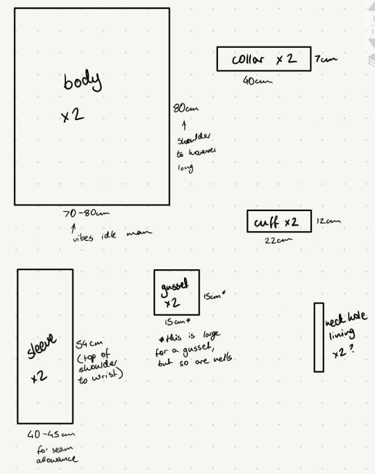
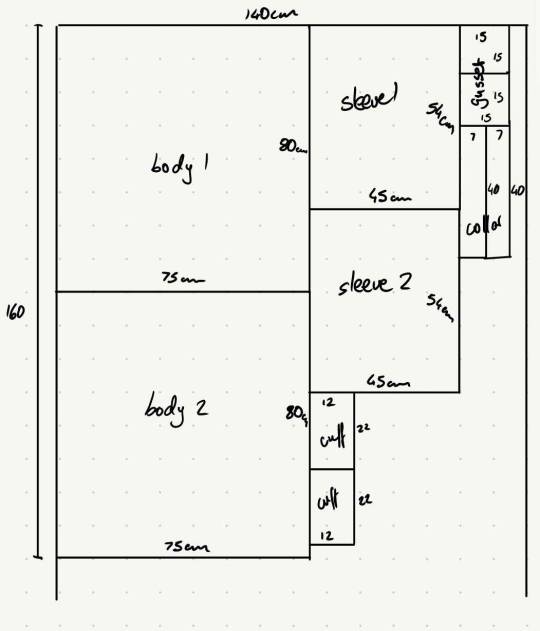
The first image is a not-to-scale sketch up of all the pattern pieces, with my estimation of measurements (with about 1cm seam allowance idk I learnt to sew without a sewing machine and this project isn't very fussy) for each piece, as well as some short notes for how I got some of the measurements. The second image is just a guide/plan of how to lay each piece out on my fabric with minimal waste, and will be different for each person if yall attempt this.
I'm ngl, I snatched Bernadette's pattern as a base, cause I've made that shirt before. The measurements also are a weird mix of the guides given in Bernadette's video, a great informative comment on the video by musikkfreaken342, and a general taking measurements of my own body (which is a similar body type to Nell's) and seeing how they compare to the photo references. I wish I could give more guidance here but I'm ngl I went based on vibes for most of this.
*Note: despite how long Nell's shirt appears to be in that Billy intro scene, I'm going to run on the assumption that the length was for actor comfort, and will be cutting mine shorter.
Also, ignore the neck slit lining/reinforcement for now. Idk how I'm doing that yet... so yeah.
Alright!! Moving onto actually cutting out the fabric!
Cutting the Fabric:
Historically these shirts are made from linen (and sometimes cotton I think?). Great material: looks great, breaths easy, whips sweat away from the skin to protect your outer layers.
I've personally chosen a lightweight linen/rayon blend, cause it's soft and I don't have the money for full linen. Def recommend a lightweight linen if possible for these shirts, it just works out nicer and comfier.
However, with linen comes the challenges of cutting everything out straight. As you may have noticed, all our pattern pieces are rectangles, and it's very important to cut these as straight as possible for the shirt to drape properly. As such, I've used a method called drawing threads, where you pull one thread out to make a guide to cut along.
You can skip the next few photos if you are not actually interested in sewing techniques and just want to see Nell's shirt.
First measure your piece. I've placed pins in where I want to cut.
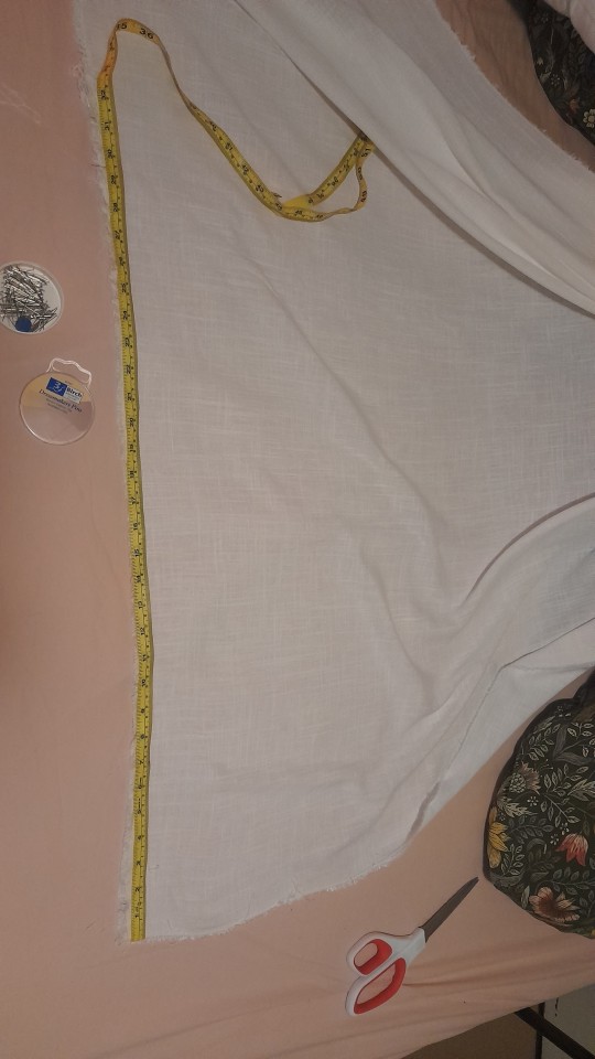
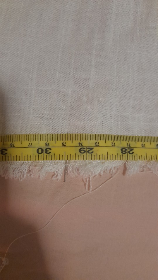
From there, I have cut a little notch, and separated out a thread.
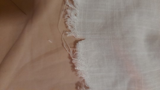
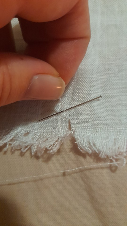
Here comes the tedious task of pulling on the thread until you end up with a gap in the weave! The thread will break on you countless times and you have to be patient I'm so sorry.
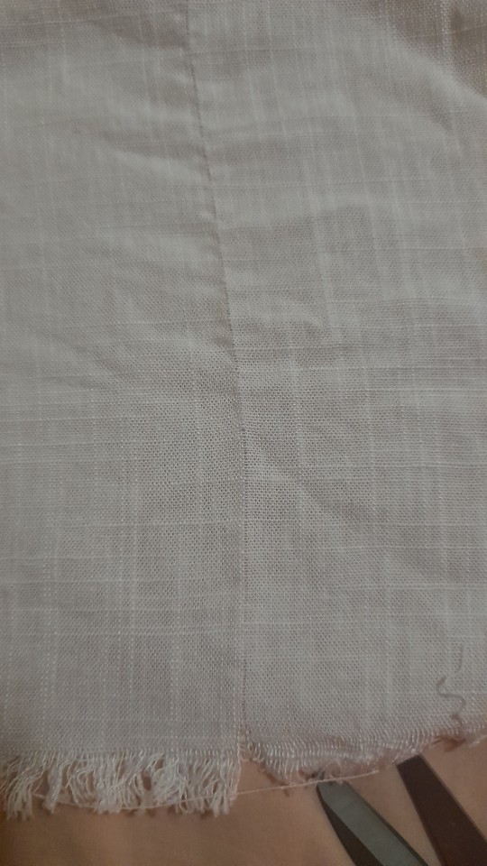
You then cut along that line to end up with perfectly rectangular pieces. I also recommend doing each piece either individually or in small groups.
Okay end of needless tutorial about cutting linen!!!
At the end of this whole process, I've ended up with all my pieces :D
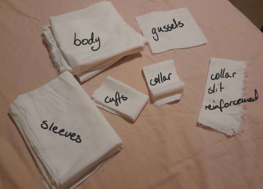
The collar slit reinforcement piece is just a scrap piece of fabric rn. Like I said idk what I'm doing for that yet.
Thats what I have for now! I'm lowkey planning on sewing most of this by hand, cause I'm that sort of person, so it might be a moment before I have a substantial update for if anyone is actually a fraction of the interested in this as I am sjfjskf.
#if anyone gets to the bottom of this post ilysm#nell jackson#costume recreation#renegade nell#sewing#cosplay
36 notes
·
View notes
Text
Yes i did colour it digitally i use ibis paint x so I'll explain how to do it w tht idk about other drawing apps so
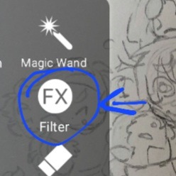
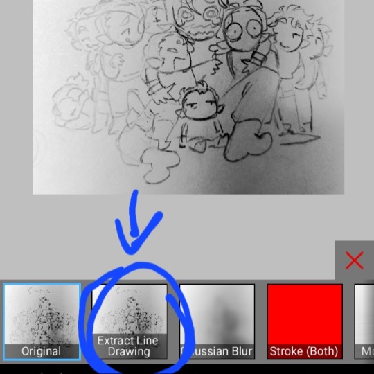
It's not really that complicated you just take a picture of your drawing put it in the app n set it to extract line
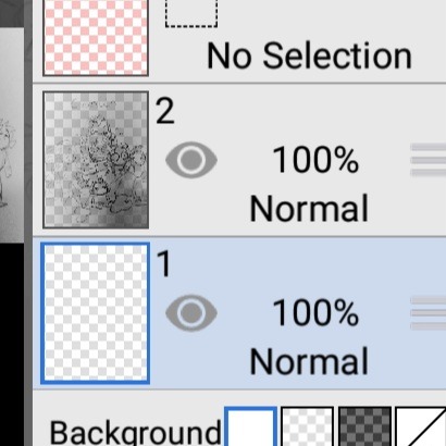
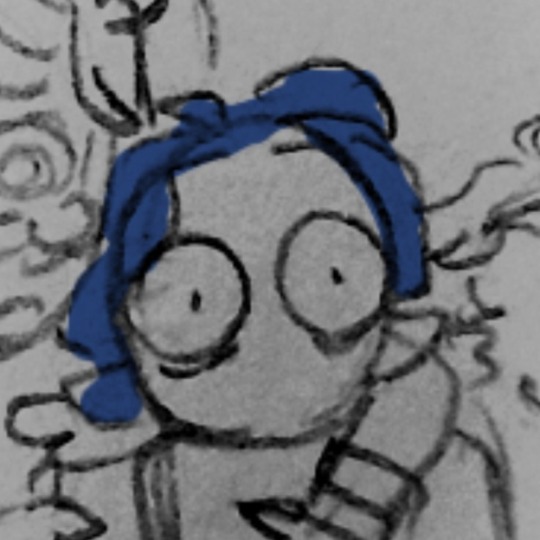
Doing that makes it transparent so you can just colour under the sketch layer
Tho fair warning the colours you use will get a lil greyed cause they're under the paper layer if you don't care you can just use your normal colour
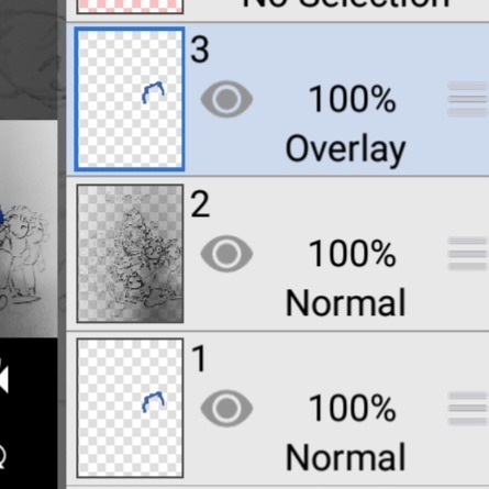
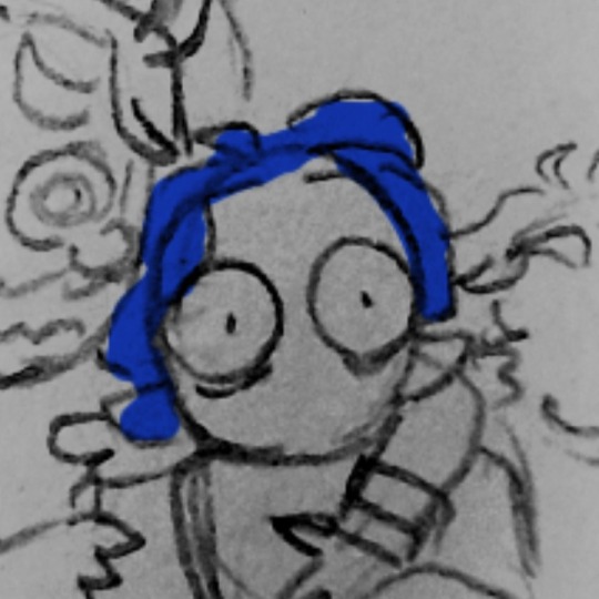
For the glow effects i take the colour layer n put it on top of the sketch layer n give it an overlay layer
You gotta have the same colour you want to glow on the other colour layer under the sketch or the colour won't show
So uh yeah idk 👍
15 notes
·
View notes
Note
ok so the original drawing for this was literally so cool to me so ive been wanting to color it for a while n really do it justice anddd maybe i didnt reach the golden expectation in my head but i had fun with it😂
i didnt actually choose the colors myself, i WAS TRYING to choose the colors back when i wanted to make him soft yellow and i had a whole system planned out for how to choose them but that ended up looking kinda washed out n not that good so in the end i just colorpicked from his anime colors and then later was messing around adding different colors on top of it and ended up liking the orange so much i left it like that, and then tried to make a bg that fits those colors, heres the picture before any of that

i thought the shadows you drew on him were already cool enough so when doing the shadows i just went over what you already drew, but what you drew traditionally still looks so much cooler to me so i saved a version with your original drawing under the colors bc i mean LOOK AT IT its so cool

i think its probably the paper texture and the red sketch lines being visible and the marker shadows and and its all so cool to me idk you know how i feel about markers
but the most interesting part to me was doing the lineart


i wanted to digitalize the drawing and only really just went over the lines you already did, i gotta do this for your pencil drawings bc it looks a bit awkward otherwise ashdjd (but it can still work), i did this for the tkkh coloring too and its genuinely kinda fun to me
so anyway it was a really interesting feeling seeing the finished lineart like ok i go over your lines one by one and finish it and i turn off the layer with your original drawing and look at it and i know im the one who just made all these lines but it still looks like leon's art, it kinda felt like you were there with me and like guiding my hands, you know like imagine a tiny mouse on my head showing me how to do it or even controlling mHEY WAIT A MINUTE
before anything you need to know i already had this done since yesterday just havent sent it so its not like im sending u sth just bc you sent me a cute ask (real) JUST SO WE'RE CLEAR anyway UKYOOOOOOO

ive been meaning to color this one for so long the last few months but now doing that isaac coloring finally inspired me to try it, i wanted to make him a nice soft yellow color but he somehow ended up orange idk he got away from me, i saved a bunch of versions of this i wanna show you but didnt wanna spam the inbox since the images will stack so ill show you those in a reblog or sth.....👀
LIVE UKYO REACTION YEAAAA
The gradient background and textures are so nice. I think you did good with the yellow orange color, it matches the background. Whenever I pick the yellow for his outfit it ends up being too bright and kinda greenish, which is weird cuz I really don't like yellow-green
Now the other versions 👀👀👀
12 notes
·
View notes
Photo

He fear.
WIP pg23
#my doodles#in the ed comic#wip shot#ed eene#ed edd n eddy#idk I just wanted to show the lines on top of the sketch layer#before I colored it and added the bg#Ed is all alone poor fella v.v#he been abandoned by his boys#rude
35 notes
·
View notes
Note
SARAH JACKALOPE I DESPERATELY NEED YOUR HELP WITH LEARNING HOW TO DRAW A TERZO EMERITUS PLEASE GET BACK TO ME
Hi! I’m so sorry this took a bit to answer!
FULL DISCLOSURE I am literally the worst person to ask because the way I do it always changes but I appreciate your trust in my inconstancy! I also have a hard time drawing him or the other papas for that matter without a reference. I can try to help the best way I can. here we go, I really hope this helps!
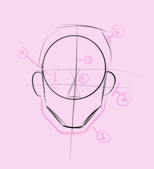
So the number don represent the order but just what I'll explain. First always consider the shape of the face I know this is just the sketch but we always start somewhere.
(1) Take a look at the basic jaw structure my style always make it longer than it should be but in this case I'm taking in the fact that while I made this tutorial I was looking at a photo reference. (2) Then the ears. (3) The basic middle line mark. (4) Two lines are of course for the eyes and you must realize that our eye level matches the tip of the ears show in the picture for remember that. (5) What I personally do when I draw noses it just help with a realistic measurement of the brows and the nose size. if we’re looking at this through a stylized realism way, remember that the distance between the eyes is matched by the size of the nose. this is not the case for some people but look at refs of people’s noses and see that the size of the eyes is the same size of the nose.(6) The first initial circle is the base, but remember that that won’t be the size of a head. so expand it a little bit so there is extra room to get that hairline and detail when we get to that part (I ended up not paying attention and ngl Terzo ended up with a big ass head but shhhhh I warned you)....
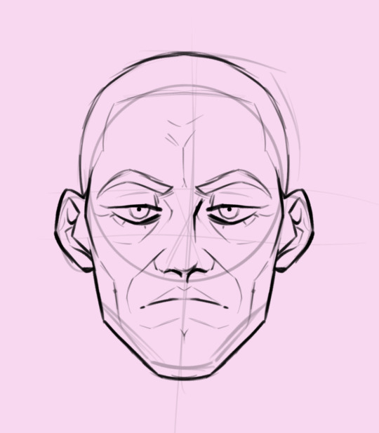
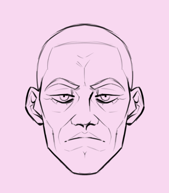
I went ahead and did some detail work but this is what we’ll be seeing when I draw them. from pictures you can see the age lines and it’s really just a matter if you want the detail or not, done people can do that with little detail and make it look good but my style is in constant crises all the time so this is how I do it. you can also why I have the base sketch on top of my “lineart”.
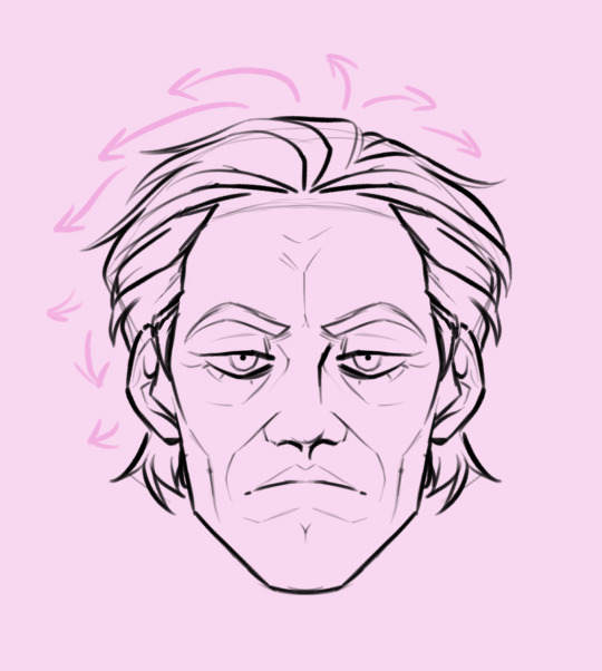
So Terzo’s hair specifically is weird in my opinion. I normally have a part I go off from when I draw hair but his just has to be weird. Either way, when I draw his I go down from the middle and just make it both have that volume and fluff he normally has. (Agin in the end result I polished it up so his part is that square like formation seen in pictures).
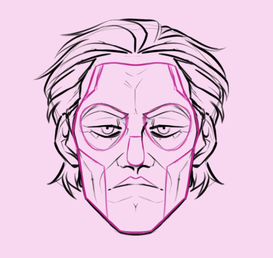
Okay now the fun part, the papal makeup! The deep pink lines are the base sketch I usually draw up so when I color and shade it can be adjusted if needed. It also helps me know that proportions are somewhat realistic but with a small hint of my style as well. Idk I'm still in a style crisis as we speak and it’s gotten a lot worse since I've joined this fandom.
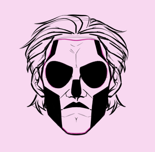
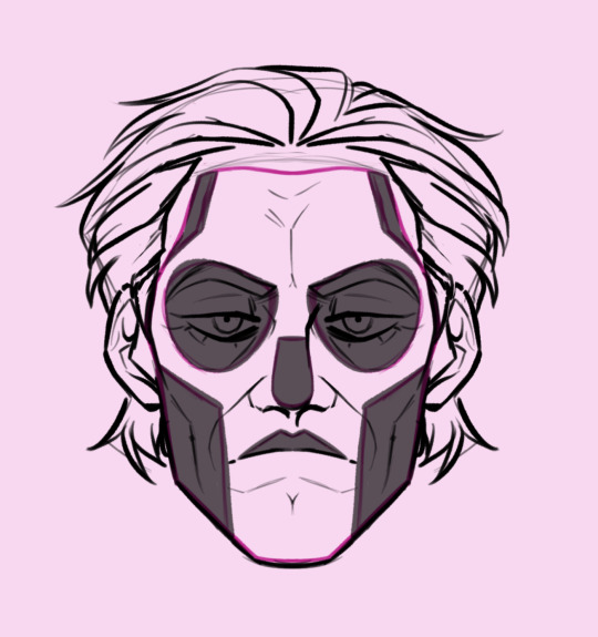
When I think everything looks good I work with the black and color it. I normally like using our black when I work with lineart to give it that ink look. I called this blunt lineart (and shading cuz like I said my style is very inconsistent). Now if you’re working digitally I do this type of coloring on a layer on top of this sketch so when I low the opacity I can see if my placement is correct (again just of needed). if I think I got most of it correct that’s where I go I with my next step.
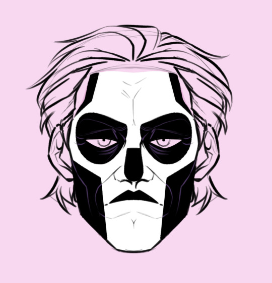
Wow, it’s looking like Terzo now, look at our sweet boy with the rbf, Blessimo!
So in these next few steps I just add the white and added purple wrinkle likes that were cover by the blunt lineart. You can make those line grey or white depending on your style but I like adding his colors when I draw him digitally so that’s an option. Once I have everything done I just against as needed then move on.
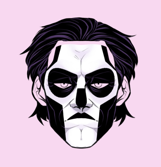
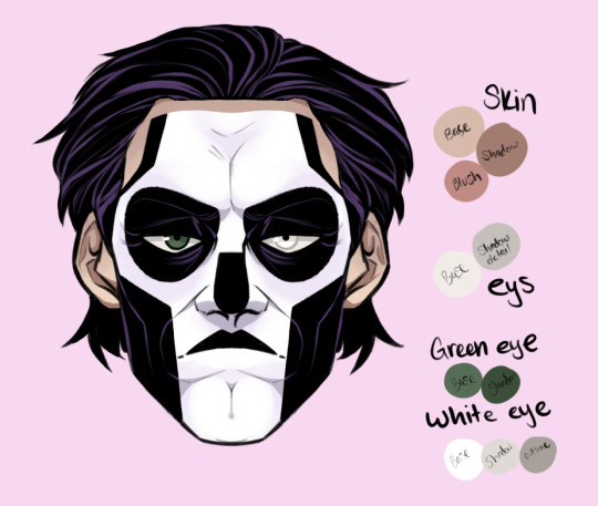
Lastly I finish up the lineart, work on some shadow work and add color, for sketched I don’t really do that but in this case I placed a color pallet I usually work with (it’s still gonna be inconsistent as I go) but this is usually what I do when I draw him. honestly to god my methods and process changes but I at least hope this was a helpful guide.
#ghost band#ghost#ghost ghouls#papa terzo#papa iii#papa emeritus iii#answered asks#sara jackalope’s art#sara drewitt’s art
133 notes
·
View notes
Note
If it's not too much of a hassle, could you explain some of your process for the monochrome drawings you normally do.
(I assume these are digitally created. If not, I need your scanning skills)
I'm just experimenting with making digital art resently, and everything I've drawn so far has looked flat and plastic like the Simpsons
I don’t know if this is gonna make any sense but I’ll show you my process lol. I have my degree in illustration with an emphasis in printmaking and I think that influences the way I do my digital art a lot. I tend to treat each shading layer like a screen, if that makes any sense. Like I can remove content but I cannot necessarily add it back In.
So like obviously I’ll start with a sketch. this is usually very loose and doesn’t always correspond to my final lineart. I am not 100% committed to anything in my sketches ever- kill your darlings and all that.

Then I’ll do he basic lineart over top of that. I think the key to making fun dynamic line art is getting a good brush that lets you have pressure control. If everything is the same line width it’s going to look flat. And you can see how much my lineart doesn’t match up with my sketch. The sketch is just for mapping placement and pose- not the final look. I think people spend way too much time on their sketches and it makes the whole thing feel…overworked. Idk.

Next I’ll add in the blacks and decide where I want my shading to go. Again I want to point out the difference in line widths. Like- because Tim is closer to the foreground he’s drawn with thicker lines than Bart is.

Next I’ll add a base ground

I then duplicate this base layer and set it to multiply, then erase out the parts I want to be lighter. Because Tim is in the foreground, he is the lightest object.
Then I take the layer I just duplicated and erased and do it again. Because I removed content from it already it isn’t going to cover up what I’ve already done and I can continue to remove shades with it.
Then I add a texture layer over top of all of it to make it more cohesive and even out the tones- usually set to screen or lighter color
Idk if that helps at all. Feel free to as if you have any questions about it
64 notes
·
View notes
Text
HOW TO DRAW WILD KRATTS ART STYLE
in the specific way that i've learned to do it
FEATURING A BOY IN MORTAL DANGER
SO! You want to know how to replicate the iconic lineless art style of Wild Kratts. Cool! There are a handful of people in the fandom who can do this, and as I have recently become one of them, I'll walk you through my process!
Remember that everyone does it differently so what works for some may not work for others, it's ok to experiment!
I'm going to make it clear first off that if you're looking to know how to freehand draw the characters, this is not the tutorial for you. My method is far less technical and, to some, probably less authentic. But it works and it's fun and it's easy so here it is!
SPECS
I use the Medibang Paint Pro mobile app to draw. It's available for both Android and iOS. (There's also a PC version but I'm less familiar with it.) A couple years ago, I paid for an expansion that lets you group layers and download brushes and idk if that's still behind a paywall or not, but those are things I can do.
Also worth noting is that I draw on a 4k canvas (3840x2160 pixels). It makes it easier to get little details in higher quality on any given drawing.
SKETCH AND REFS
ALRIGHT ON TO THE DRAWING
I'm using a fake screencap I've already finished for demonstration. I've cropped it down to just Chris because there's some PFJ plot tied to this image that I'm not going to allude to just yet 😉

Looks pretty accurate, right? The reason is because this image was actually drawn based on a bunch of screencap references from episodes of the show.
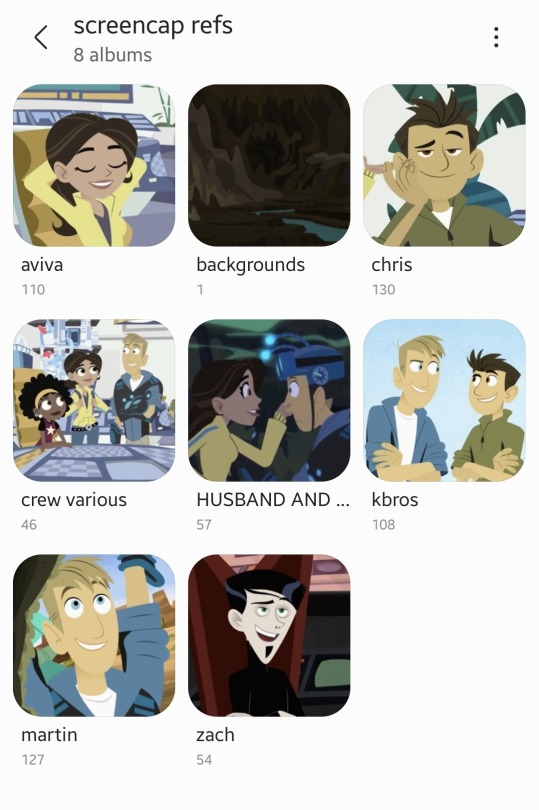
I downloaded the broad majority of these from @calliecat93's screencap compilations. As you can see, I have some biases. (not me subtly pushing the martiva agenda in the middle of a drawing tutorial 🤣)
I used about seven different images of Chris to make this one, but this is the base image against the main sketch:
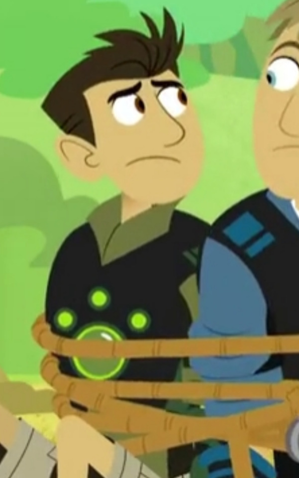
As you can see, it matches how I wanted it to look so this is how it starts. But the position of his head is completely wrong so we need to fix that.

This is what happened when I slapped all the references on top of each other, I had refs meant individually for his head, his eyebrows, and the part of his arm that's blocked in the base image.
So basically I take all these images and Frankenstein them together until they look like what I want. Sometimes cropping, sometimes selecting and literally bending images at the joints to a point that works. Whatever gets it to look like what it needs to.
THE DRAWING
The first thing I do is trace all the lines in bright red. This way, when we go back to color them, it's easier to see where we've been and what we need to cover. Lines stick out in a lineless style and if they're disorganized it can look even worse.
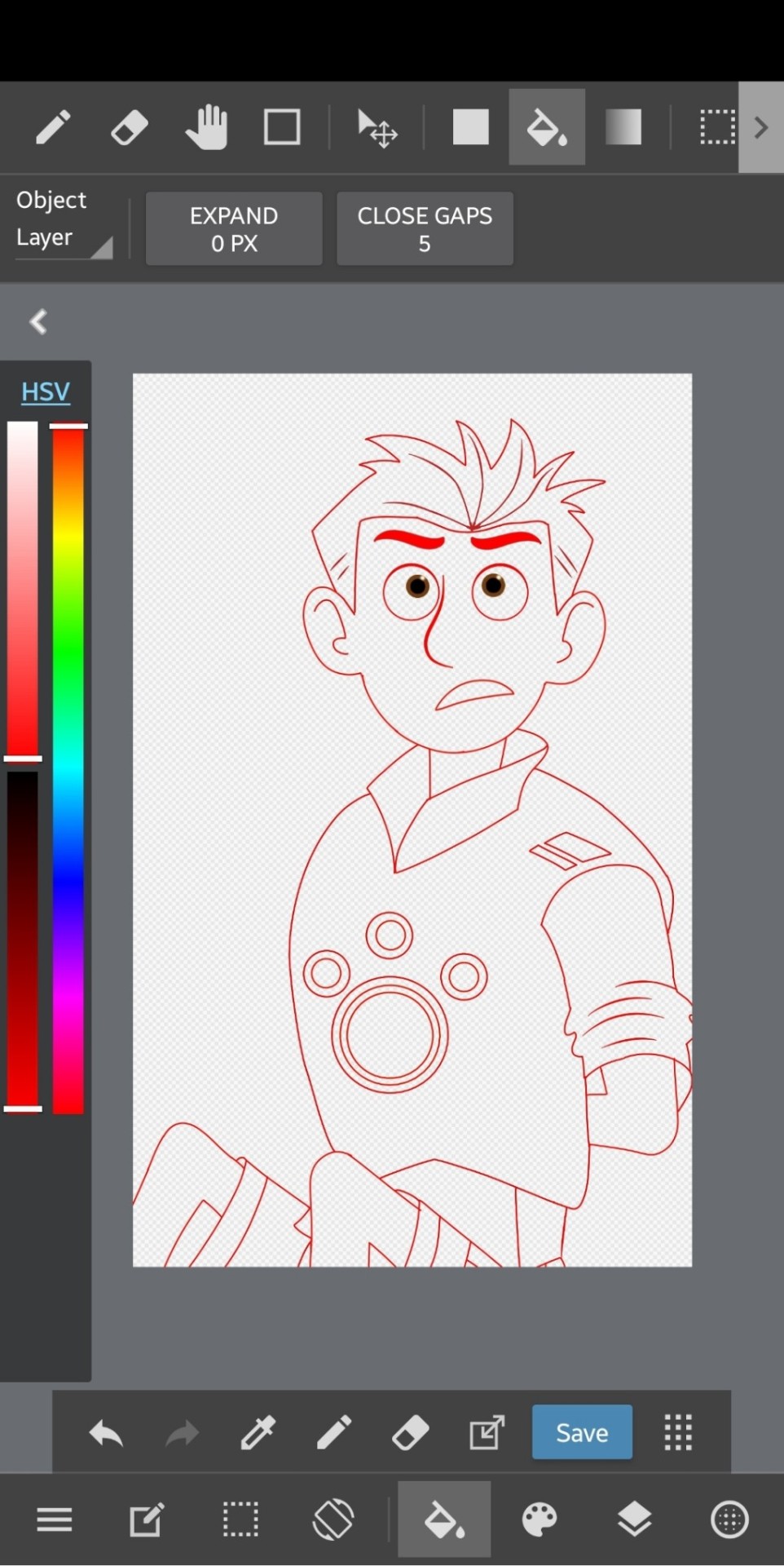
(I've moved the drawing out of line from the refs since I made this, but note that this was drawn with the refs showing underneath to keep the lines clean and on track.)
IMPORTANT: I always make sure to keep like-colored lines on the same layer and separate them out. So it would be like, the head layer, the hair layer, the inner details of each, eyeballs, pupils, neck, and body. Groups of lines that are gonna be the same color when you go back over the image.
The neck layer in particular is important to keep separate because of the show's use of gradient to highlight the separation on most of the characters. We'll cover that in a bit.
I make sure to pay attention to line thickness on the detail layers so it looks as accurate as possible.
After you're done with the lines, we can move on to coloring!
COLOR
The first thing I do is make a new layer to put all the flat color on. How you select and actually color in the lines is up to you, but I keep a separate reference open to pull the colors from to keep the colors consistent. This is usually the same image every time.
Flat color comes BEFORE coloring the lines because you'll use the color you fill it in with to go over the lines to ensure an accurate color match.
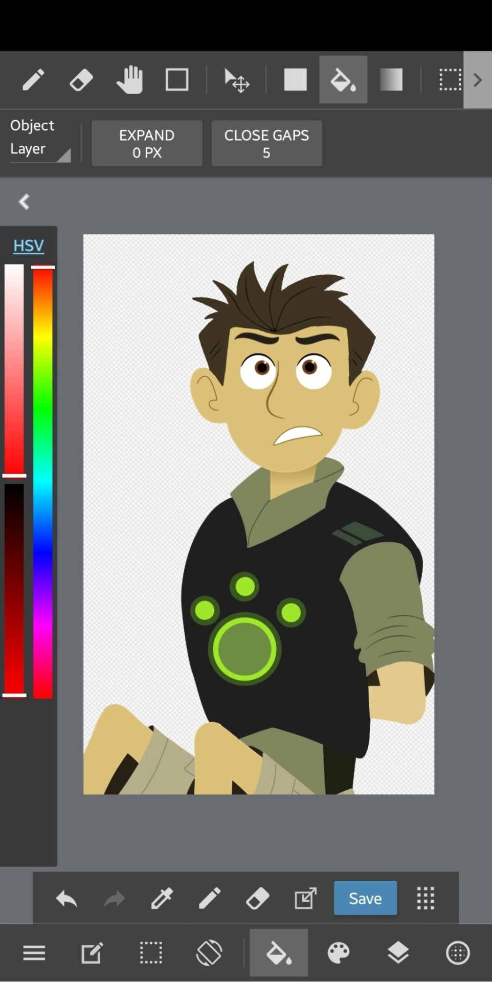
But this is what he looks like with just the flat color. The lines have been colored in now but I can explain that.
Up above your layers, you can turn on certain setting for the one you're selected on. "Protect Alpha" is a setting that will make it so you can only draw in places where you've drawn previously, making it easy to slap down the color for the lines without too much hassle. And when you put everything on separate layers, you don't need to worry about overlap and recoloring in certain places.
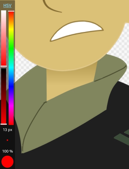
And this is where I'll mention his neck. The gradient effect is best achieved if you put down the entire neck, completely colored, and then add another layer for the gradient and use the "Clipping" feature to make the gradient only appear on the neck. In this case, I just selected the part I would need to put a gradient on and did it without the clipping, but it still looks the same so it's not a big deal.
The final step is to add the background and lighting!
Background and Lighting
Lighting is my favorite part of any drawing because there are so many layer blending filters to play around with.
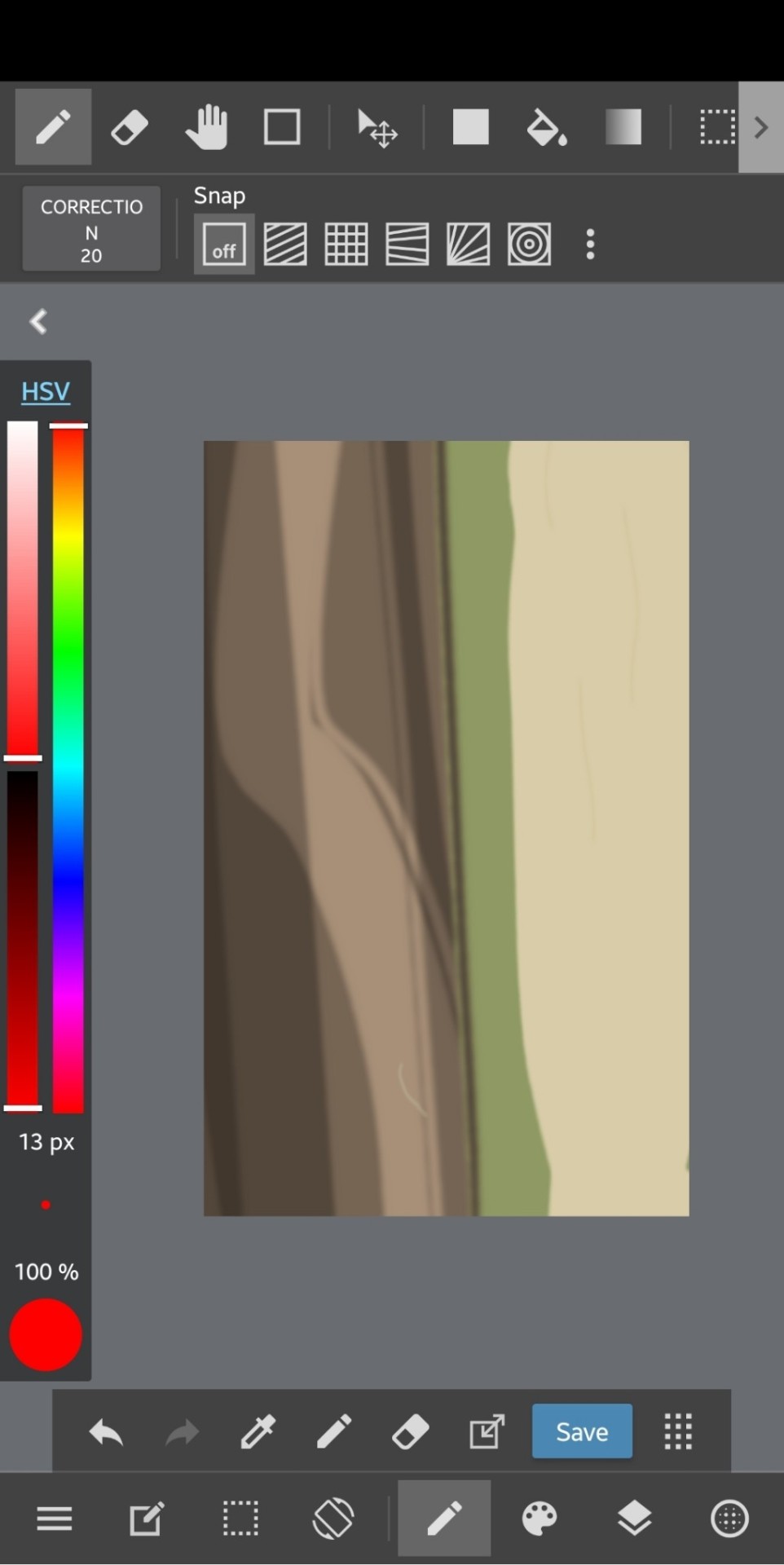
This is what the background looks like. Simple and to the point and also referenced from an episode.
Play around with lighting however you want! it's all up to you and it can change the entire tone and context of a scene

So this is what it looks like after all the lighting and foreground elements are added! Looks like it's right out of the show! And now that you're able to duplicate this chad of an art style, you too can bend reality to your will--
This was a pretty rushed explanation of what I do, so if you have a question, I'll be more than happy to answer it!
#wild kratts#chris kratt#drawing tutorial#jmoneydraws#i think the drawing i'm using here is the first one i ever did#using the method i'm describing#so what i'm saying and what the images say might not line up but the process is still in its infancy#maybe one day i'll upgrade to freehand but that day is not today 🙃
67 notes
·
View notes
Note
How do you paint so flawlessly digitally (at least I hope it's digital, and I'm not making a fool of myself here...)? I like to draw and I like how my art looks with lineart, but I always end up hating what I make when I go painterly in my digital art, even tho I go with a painterly style in traditional? What's your secret?
of course, feel free to give me a short/non-answer. This all sums up to say that I think your art kicks ass and it's always a joy to see, even tho idk what Metro 2033 is 😌
Hello!!
First of all, thank you so much for your kind words, it really makes me happy to read messages like this :·))
Then, sorry for the delay of the answer, I figured it would be more efficient to actually draw a little tutorial on how I paint digitally, because for me visual representation is key for learning art (I see and I reproduce to build my skills).
So, here we go for a little explanation! (I use Photoshop but it can be applied to most art softwares of course!)
First of all, I’d like to point out that I stopped doing clean lineart to paint, because it restricted the workflow more than anything, so a basic sketch is more than sufficient!
To add the color base, I usually start with a dark and desaturated (but it can be any color really) background layer.
Then between the sketch and the background layer, I lay the colors I want, in a semi-flat, semi-gradient way : I use a brush that has pressure opacity (mine has a little texture and grain but a basic round one works just as well) so all the colors mix well with the background color. Never hesitate to use the color picker tool to get harmonious colors overall!
I finalise this step by tweaking the shadows, some color details I want...
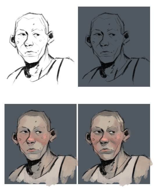
Then starts the rendering process : I create a new layer on top of everything and then I use mostly that pressure opacity brush coupled with the color picker tool. The key is to keep the shapes and volumes of your drawing while very slowly (but not entirely) getting rid of the messy lineart.
What I love to do is draw on top of the lineart with a slightly lighter shade of it that I get by painting a bit transparently over it (you can see it on the bridge of the nose, the underside of the jaw, the strong shadow under the chin...). I always try to keep similar colors if I bring new ones on the drawing (redder nose or cheeks are just a tad more dark and sturated already existant reddish tone).
When I feel like I’m happy with the level of rendering, I add then the details : little lines for the hair, skin texture (scars, spots, facial hair...), eye color, and then like the interior of the ears and stuff, cloth texture... whatever!
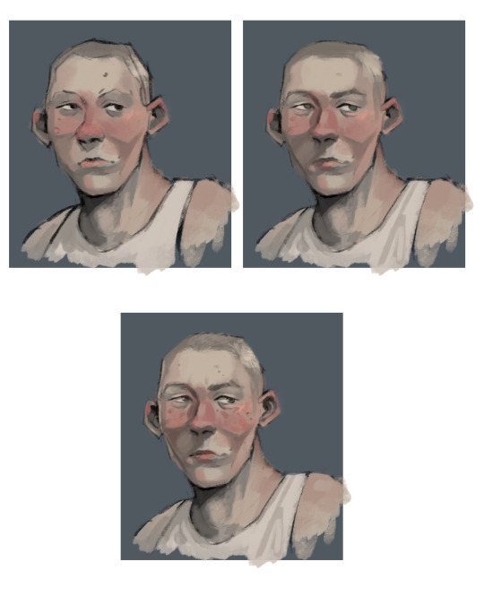
And then it’s the magical process of tweaking with the adjustments!! I usually go kinda heavy with them because photoshop has really nice ones, but I’ll show you the ones I use all the time.
Brightness/Contrast : lowering the brightness and boosting the contrast de-flattens your picture
Vibrance and Saturation : makes those greyish colors more alive
Levels : I use them instead of the color balance but both are good for adjusting the colors!
And then I like to add a creamy background on another layer on top of it all to delimit where the subject stands. But if a whole background is already part of the illustration skip this step haha!
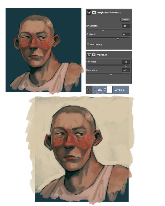
And there you go, now you know all my secrets for paintings!! Hope it was useful to you and to everyone who reads this :·))
Thank you again for the ask <3
(ps : Metro 2033 is a franchise based on a really good book (the one i base my art on) that i recommend you to read :•))
327 notes
·
View notes
Text
Artist Meme
Was tagged to answer this set of interesting questions by @kourvo
(original post is here: https://kourvo.tumblr.com/post/621355098110640128/artist-meme
Thank you so much for that!
Let’s see....
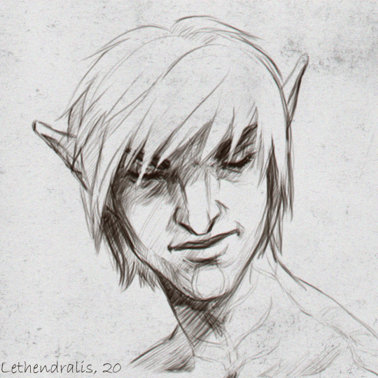
1) What is the character you've drawn the most (Can be original or fanart)
This precious boy. I can never get enough of him. One of the most compelling characters I have ever come across. Love everything about Fenris and can relate to him on so many levels!
2. What colour do you often use?
Gray and brown are my faves. And all other colours have the same chance of appearing in my artwork :D
3. Any colour you are bad at using?
I don’t think so...I love them all, even the pinks and yellows people usually find hard to incorporate into a colour palette. Tell me in the comments if I’m wrong :)
4. When drawing people, where do you start?
Funnily enough - either with the front of the hairline or with the left eyebrow. Don’t ask me, why - I don’t know myself.
5. What is a character only your eraser will love?
Hmmmm...any sort of villainous character. I can’t draw evil people convincingly. I’m a huge softy at heart.
6. Which of your works took the longest time?
Big scale commission I did for @pikapeppa, featuring all the Inquisition companions, along with Fenris, Rynne and Carver Hawke. That one took almost 3 weeks, due to its sheer scope and my relative lack of experience in such large works. Pika was extremely patient with me though, for that I am eternally thankful!
7. What techniques do you use when you want to improve in drawing?
Classical art studies. Varying my technique, themes I choose and software I use. I try to experiment and go outside my comfort zone often.
8. What do you think of the art of the person who gave you this ask meme?
I adore Lillymon’s technical skill, refined style and limited colours! She is a huge inspiration for me!
9. What art tools/media are you good with?
DrawPile, Photoshop, graphite pencils and liners. That’s about it :)
10. Art tools/media you are bad at?
Traditional paints. I have no formal artistic education and my lack of knowledge comes to the forefront whenever I have to paint on a real canvas. It’s so much trial and error, you can’t even imagine....
11. What do you think about your own art?
Lately it’s one of the last few things that were bringing me joy. I hope I won’t lose the passion for it. Because at this point I’m not sure I’ll be able to find some occupation I will be genuinely interested in and good at it. I don’t know if me gravitating towards moody fantasy art speaks about my fear of facing reality. If so, idk what to do with that. I do hope to develop my skills and being able to support myself financially as an artist.
12. Do you consult references for your drawings?
Yes. A lot of them. Anatomical atlases, schemes for both academic and manga art, photographs found online and taken on my own, copying colour palettes from classical art - anything goes. I think it’s essential to develop your technical skill.
13. What do you like about your art?
Lately - consistency, both in terms of produced results and in sticking to the timelines I set to myself. I hope this lasts. I would also like to branch out to other themes and not confine myself to quirky fantasy characters, so I’m working on developing my own story behind the scenes (spoilers) :P
14. What habits do you have while drawing?
Only the bad ones, lol. Hunching forward in front of the screen, forgetting to eat, drink and letting my eyes rest. Tilting my head to the side instead of rotating the canvas....I’m an idiot XD
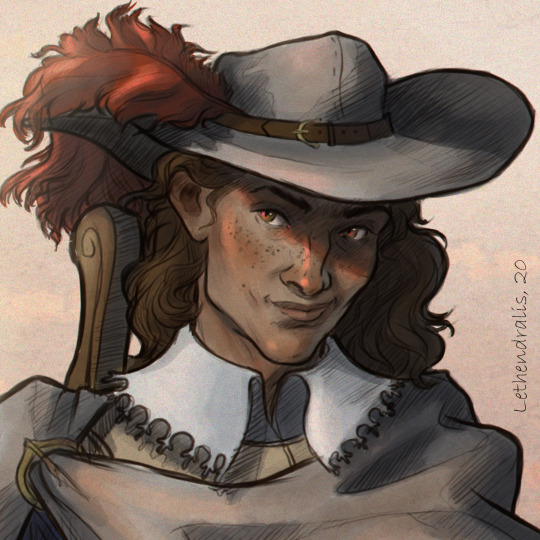
15. Are you good at drawing faces facing right?
I think that’s the thing I’m good at!
16. How frequently do you draw?
For the last 1,5 years - almost every day without fail, for good or ill.
17. What do you do when you have artist's block?
Change occupation and work myself into a depressed state. I changed work places in the last few years a lot, working as an interior designer, draftsman, textile designer, a cook, a bartender to name a few.
18. What must you have when you draw?
No commotion around me and a cup of some hot beverage.
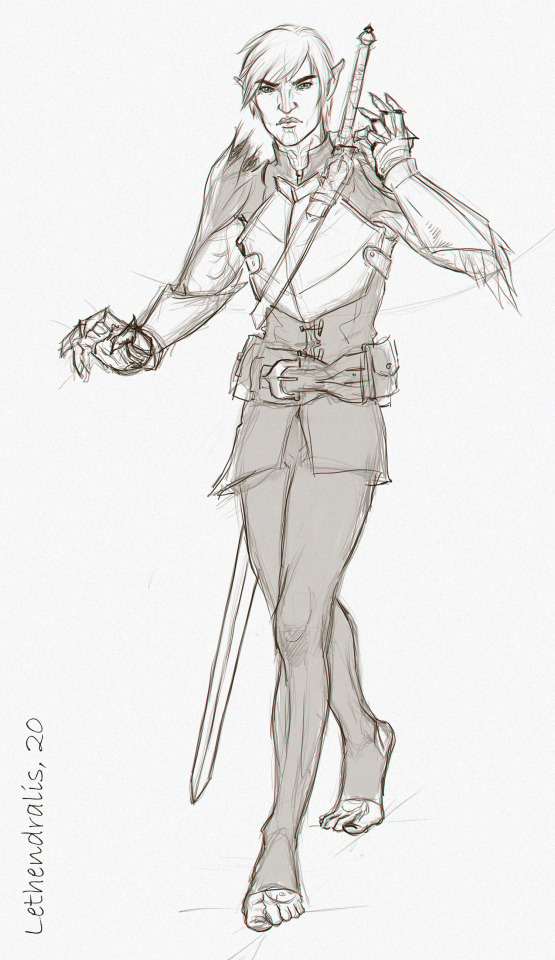
19. Do you have a lot of stray lines (messy lineart)?
In the starting stage of my work process - yes, like you wouldn’t believe! If it’s a personal doodle, I sometimes just leave in as am under layer and draw clean lines on top of that mess. It looks cool in a way.
20. What is drawing to you?
An essential part of what helped me to retain my sanity in the last year and a half. Hopefully a lasting profession that will help me pay bills and survive on my own, if my life falls apart entirely later.
21. Your art goal from now on?
Broaden the themes I depict, improve my technical skill, work on personal creative project and not only fan arts. And most of all - not giving up on it this time.
22. Artists you've had influence from?
To name a few: @kallielef @kourvo @shayafury @fairsparrow who I met here on Tumblr, and many others who I follow and zealously study their works for clues on how to improve my own work.
23. Artists you like?
I am following them all either here or on Instagram, I also do my best to share their works on my side blog!
24. Which is easier to draw, humans or animals?
It was animals earlier. But now that I started to diligently study human anatomy, I would say it evened out! I’m quite confident drawing humans/humanoids now!
25. Show us an old drawing
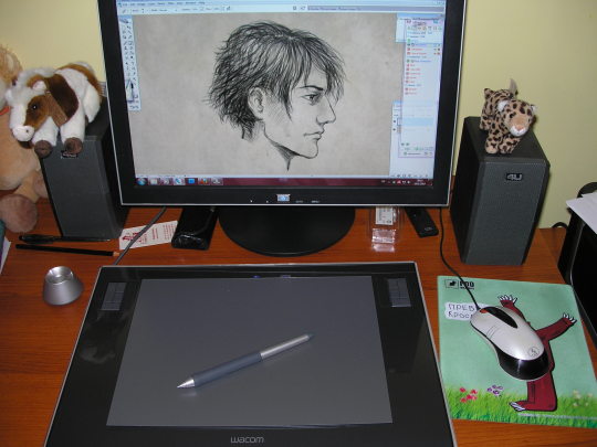
My first digital drawing from 2010 when I first bought my tablet!
26. What is the charm-point of your art?
I ummm....I don’t really get the question? Is that like the the strongest suit of me as an artist? Intense expressions maybe? Idk. Let me know in the comments :D
27. What is the first thing you would draw if we're talking about fantasy?
Broody warriors, he-he
28. Please draw your most beloved character:
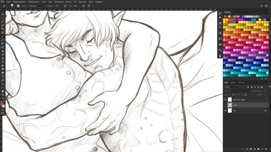
Here’s a sneak-peek of me drawing him right now! :D
29. When thinking of characters is it mostly female? male? or androgynous/no sex?
I usually gravitate towards depicting strong-willed, caring, passionate, brave, honest men and women.
30. What did you draw yesterday?
Started cleaning up that sketch from the last question, actually!
31. What is the funnest part to draw?
A circle. Mostly because you’d die laughing seeing my struggle to draw a believable one XD
32. What part of other people's drawings do you notice first?
colours, mood, eyes, hands.
33. Regarding backgrounds, what is your method of making it easier to draw?
pick your favourite textured brush, find a good reference for mood and colour scheme, zoom out, squint your eyes and start slapping colours like mad. You’d be amazed at how much you’ll be able to achieve in 30 minutes with this approach. Bare white background is the enemy - destroy it! >:)
34. What colour coordinations do you like?
Gray or brown as a main colour and then deep, earthy, saturated colours to complement the main one. Pink and orange is the combination I strangely enjoy using lately too.
35. What character did you last draw? Fenris and Eris :)
36. Does your style change easily?
I don’t think so. More like it’s evolving slowly into something more serious and deliberate.
37. What part of drawing do you pay most attention to?
Facial expression, body movement, mood and light effects. Not so much the composition and framing, he he.
38. How do you feel about drawing adult art?
Tbh, I don’t consider straight up porn to be ‘adult’ exactly. To me adult art means aiming towards serious topics, exploring complex emotions and ideas, being honest with your viewer. I did doodle a few more steamy sketches of my OTP just to see if I could, but it was definitely a tongue-in-cheek kind of a artwork that I don’t take seriously.
39. Do you like criticism from others?
If it’s friendly and in done in private - I welcome it always.
40. How many people do you normally draw per artwork?
1 or 2. Rarely more. Crowded battle scenes are definitely not my thing :D
This was fun! Tagging forward to @shayafury @schoute @stella-minerva @nug-juggler @kallielef and anyone else wishing to go through such a long questionnaire!
50 notes
·
View notes
Note
Idk if this has been asked already, but how long does it take you to create a comic/art piece? And what is the order of the steps you go through? (Btw I love your art)
That’s a good question! I’m gonna use the most recent page as the example. I’ve talked a little bit about how long it takes, but I haven’t really explained my process. Heads up, this is pretty long! I could have just put in one panel’s process, but it’s more fun to show the whole page
1. The Sketch ~ 1-2 Hours
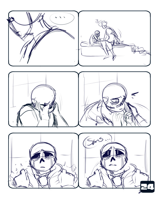
This can take a while for a number of reasons. A few factors could be business, tiredness, a lack of inspiration, creating too many options for myself, etc. But generally this part goes at a decent pace. I have a script that I follow loosely, where I’ve written dialogue and actions that seem good for what’s going on. I will spend more time on panels that I have a specific image in my head for. Those last two panels are much cleaner/more fleshed out than the previous four because I had a much better idea for how I wanted them to look.
2. The Lineart ~ 2-4 Hours
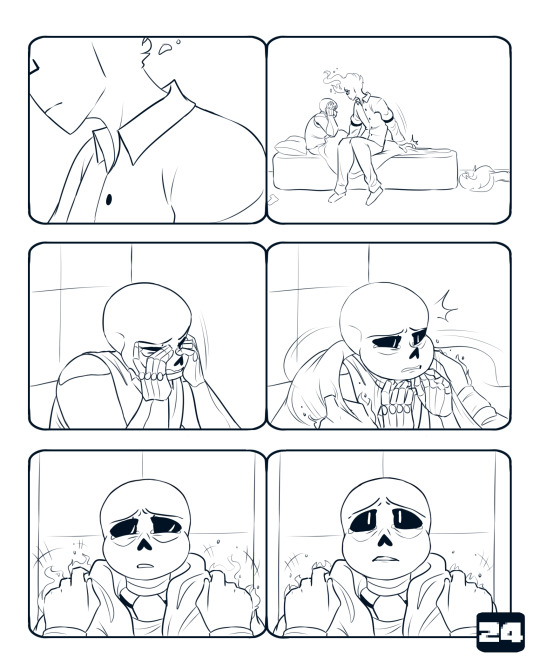
The lineart takes the longest, hands down. It’s the clean up, final changes/additions, and just making everything look all nice for the rest of the piece. This is where I spend like 5 minutes comparing facial expressions to see which one I like better, drawing another one, and then choosing the first one I drew.
3. The Background ~ 30 minutes
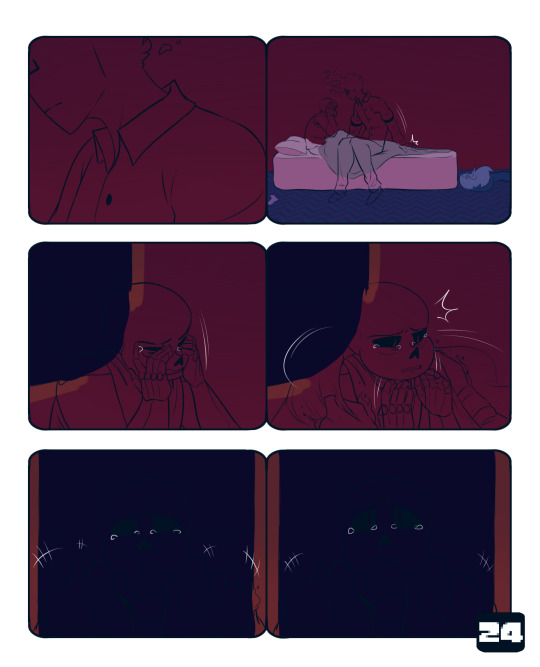
The coloring is so much faster than the lineart. I will usually go slower here on purpose because I enjoy it, and it’s a relaxing break from the lineart. I just color right underneath the lineart, I don’t worry about anything looking messy under the character linearts because I know they’ll just be covered up. Typically, if I start the lineart in the afternoon, I’ll get to this point and stop for the evening.
4. Flat Colors ~ 5 Minutes
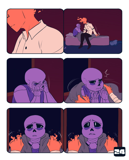
This goes relatively fast as well. I take my time for the most part. It’s just tedious to select the lineart. I kind of color them differently. Sans gets his darkest colors first, and then I add light layers on top. With Grillby, I put on the lightest color for his shirt and the middle color for his flames (I use 3-4 colors for them). Doing that kinda helps me establish that Grillby is a light source and Sans is not.The color schemes are almost direct complements, and I do eventually add yellow to Grillby’s flames. It makes them contrast with each other, and is generally satisfying to look at imo. It also makes Sans’ colors somewhat analygous to his surroundings, because of the deep blues and reds. The purple does stand out, but not nearly as much as the bright orange.
5. Finishing Grillby ~ 45 Minutes - 1 Hour

I have a general routine for adding Grillby’s details, which is why it goes quick. ((There will be a separate post on that process later)) It only takes that long because I have to do it for multiple panels per page. I’m sure this page was even shorter because it mostly featured incomplete shots of him. To finish his flames, I use an airbrush to add the reds, then I do the same with the yellows. I take the brightest yellow on the palette and use that for his freckles, eyes, and mouth ((if it’s open)). The last thing I do is color his lineart a dark red. His eyes are lined with a darker red to compensate for the glow I put over them, which makes the lines look faint and hard to see. For his shirt, I shade it with the lighter pink color, and then airbrush the darker pink on the areas that are further away from his flames.
6. Finishing Sans ~ 1 hour

Sans definitely has a more drastic change than Grillby. Almost none of the original purple survives the overlay layers. I have two or three light layers on top of the flat colors. I use one of the colors that is from grillby’s color palette, it’s a slightly altered version of his flat orange. First I do hard lights, that don’t have their edges blurred. The top of his skull and those half circle shapes under his eye sockets are some of the most noticeable examples. Then I go over that layer with another overlay, but this time with an airbrush. I put it in the same areas, but it makes everything look softer. There’s one more overlay, which uses the dark purple of Sans’ shirt. It helps me to not make everything too light. On top of all three of those is a a Luminosity + Shade layer in the orange color to make the brightest spots pop.
7. Finishing Background Details ~ 15-20 Minutes

This is basically doing the same thing I did to Sans on the background. I use the same orange from Grillby’s color scheme and add light where it needs to go. I can be more lenient on details because it’s not the main focus of the page.
8. Adding the Glow ~ 5-10 Minutes
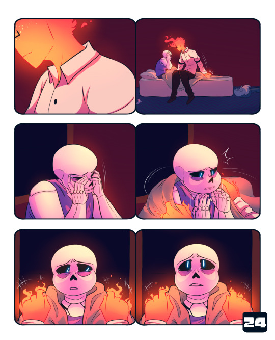
This is just me taking the orange light color and airbrushing it just above the background on a Lum + Shade layer. This goes under the layers that Sans and Grillby are lined and colored on. The next layer is the same as the last and goes over both figures. It acts as a final highlight to the lightest points of the two. Usually it’s the top of Sans’ skull, the tips of Grillby’s fingers, and the area around his mouth. Then I airbrush Sans and Grillby’s eyes in blue and orange respectively on a Lum + Shade Layer.
9. Text and Final Details ~ 20 - 30 Minutes

This is where I figure out where I want to place the dialogue, and add in anything I might have missed. In this case, I forgot to fully draw and shade Sans’ tears at the beginning. I slap my signature on and boom! All done!
I hope this was helpful! And sorry it’s super long 0v0;; If you need clarification on anything, feel free to ask!
333 notes
·
View notes
Text
JUNGWOO’S FAMILY
a/n: i honestly can’t believe i’ve gotten this far! i’m so happy that i’ve been keeping up with these and i hope you guys have been liking them so far!
here’s the masterlist to all things nct dad related! go and check it out! i have so many other parts written already :)

KIM JUNGWOO:
he has three kids, all daughters. kim jia is the oldest, 3 years later, kim jieun was born, and 3 years after that, kim jiyoung was born.
(when jiyoung was born, jia was 6 years old while jieun was 3 years old)
KIM JIA: >> as a baby <<
she comes runner up in the position as calmest
she was so freaking chill like?
when jia was born, jungwoo saw his entire universe the second she opened her eyes and looked at her appa
you know how when jungwoo smiles, he looks like the little dumpling ?
yeah
that’s jia
she looks more like the dumpling then jungwoo does lol
jia was also pretty small when she was born
but that didn’t stop her!
when she gained weight, she mostly gained it in her belly and her face
she like was fine proportionally, but her belly was just so big lol
it honestly was the cutest
jungwoo nicknamed her mandu bc she was honestly just the sweetest little dumpling
she wasn’t shy when it came to her smiles
she was a little wary around strangers but that’s okay
jungwoo was honestly a really anxious dad
like he just would think that anything and everything can go wrong and he was just so nervous
but like jia took it easy on him dw
like if you had to leave for something for like a couple days
jungwoo would be so anxious about taking care of jia by himself
but then jia would just give her appa a pretty little reassuring smile
and he knew that he got it
jungwoo is honestly a really good dad
like naturally
he read a couple books and such
but a lot of his skills come naturally
he knew all of the things jia liked
he knew how to calm her down
she was honestly the worst with strangers
like if jungwoo or you had to leave the room
she would cry as if you left her forever
jia slowly learned that you guys still exist even if you leave the room haha
she was just so loving with her parents
>> as a child <<
she’s still just so chill dude
like obvi she’s a kid and when she gets excited, she’ll get excited
but she’s not like the “WOOOOOOOOOOOOOOOOO” kind of kid
she’s more of a “woo”
she’s best friends with jeno’s oldest, lee juwon
juwon is a lot like his dad
he thinks that it’s so cool that jia is so smart
she’s kinda panicky lol
but juwon is just like weird with his humor and stuff
they still vibe together well tho
they both have the greatest smiles
like it’s one of those situations that they don’t have that much in common
but they just vibe so well together
she’s. so. smart.
jia is one of those people that school comes easy to them
like learning is just so easy for her
she was already learning really complex topics for her age
and she just kept wanting to learn more
she’s not super competitive with being top of the class tho
jia will tutor anyone who asks
even tho she’s smart
when she’s with juwon, they don’t make the best decisions
like if you send them to the store to buy more soy sauce or something
they’ll forget the soy sauce
but they’ll buy you like a pan or something
they once clogged the drain and turned the shower into a vertical bath tub
how?
no one knows
it was HE double hockey sticks to drain tho lol
when juwon and jia play, they play hard
like jia is the type of girl to be covered bruises
and she won’t care
she’s a really good sister to all of her siblings
she doesn’t really boss them around
but she will use her older sister powers if one of them steps out of line
like if one of them annoys her while she’s studying or something
she’ll use her older sister voice
she rarely uses it tho lol
>> as a teen/adult <<
she’s so heckin smart dude
honestly, probably the smartest person in the entire group
she decides that she really enjoys helping people when they’re at their worst
and she becomes a orthopedic surgeon
like she achieves to be head of surgery in her hospital
even tho she’s a doctor, she still believes in all the medical myths lol
for example
if it’s really cold outside
and jiyoung is going out for a run
jia will make jiyoung where like 500 layers
jia: “yoU’RE GONNA GET SICK”
jiyoung: “you literally just told me how that was a myth whY -- UNNIE I’LL BE OUT FOR LIKE 30 MINUTES I DON’T NEED TO WEAR MY SNOW COAT AND YOUR’S! IT’S NOT EVEN SNOWING.”
she’s so caring towards her siblings like it’s crazy
she’s proud of everything they do
jia watches every single one of jieun’s blogs
she watches every single one of jiyoung’s soccer games
she’s there for everything
jia doesn’t know what sleep is lol
she’s constantly studying and improving her skills as a surgeon
like even when she’s on vacation
she’s reading her books and stuff
her favorite place to study is qian fen’s cafe
she vibes so well in there
she’s honestly obsessed with her skin
lowkey a dermatologist at this point
jungwoo still occasionally calls her mandu lol
juwon is like one of the only people that knows how to get her to relax lol
she’s honestly a bit of a workaholic
jia can’t help it
she still cares so much about her entire family
she’ll get them in with the good doctors (discounts too)
whenever she’s overworked or overstressed, she goes home
being around family reenergizes her
she relates a lot with her dad
she’s honestly a mini version of jungwoo
if jungwoo can tell that she’s struggling, he’ll do the things he did to her as a baby
like seriously lol
he’ll find her plushy she had when she was a baby
and sing her the same songs
it would make you cry every time because it was so gosh darn cute
KIM JIEUN: >> as a baby <<
also super chill
jieun was honestly so chic
like it would take a lot to make her smile
like if know rohui from return of the superman
like she had the brightest and goofiest smile
but jieun had to keep her chic aesthetic and couldn’t show emotions lol
even when jungwoo and you were jumping up and down making yourselves look ridiculous, she still won’t smile
when, and it was rare, she did smile, it was a big smile
she would give you guys the biggest smiles just so show how happy she is
she wasn’t a super playful baby lol
she was just so chic like idk what else to say lmao
when jieun was around her squad™ she would smile a bit more
but she still maintained her image
she loved to babble
jieun wanted to talk as soon as she could
she would talk even before she knew how lol
like omg imagine
so like you’re with jia for something and jungwoo wants to take a roadtrip with his little princess
she’ll babble the ENTIRE way
none of them are actual words other than “appa” and “eomma”
and jungwoo would respond so well to everything
like he would have actual conversations with her
jungwoo wasn’t as stressed this time around
it’s different with two kids tho
but it’s okay
he still kept those natural dad instincts
jungwoo is so caring towards all of his children it’s just the sweetest
jieun honestly was just a chic baby
>> as a child <<
she’s super feminine
like she loves all things pink
all things frilly and pretty
soft™
her favorite game was all games related to being a princess
she really was your family’s princess tho
jieun was so creative from an early age
and she was so artistic
like she took up drawing, sketching, etc. all from an early age
and she’s super talented with it too
jieun is in the squad of her, jaehyun’s son, jung leon, hendery’s middle son, wong liuwei, and haechan’s middle daughter, lee haeun
jieun is the calmest out of all of them
but they honestly can all be so crazy
generally, jieun is like the one who is trying to calm everyone down
but when she’s in the right mood, she’s right up there with them in crackheadedness
she speaks in tiny
she’s still super girly tho lol
she starts to get interested in makeup in this age
jieun didn’t really like playing with dolls and such
but she did enjoy playing with those makeup sets
she would do her makeup
your makeup
jia’s makeup
jungwoo’s makeup
jiyoung’s makeup
e v e r y o n e
she becomes obsessed with beauty
jieun is one of those girls who you’re like “yeah, she is a GIRL.”
and she loves it!
it’s just her aesthetic :)
>> as a teen/adult <<
she becomes a well known makeup artist
still super duper chic and artistic
she’s known for her colorful and technically perfect style
she does makeup for all of the models and celebrities of the group
like if they want to go for the aesthetic look, they go to her
and she does an amazing job
she’s so talented with all things dealing with beauty
hair, makeup, nails, e v e r y t h i n g
whenever she models for anything, she does her own makeup
her fashion sense is always trendy
jieun has a pristine self image and she tries to maintain it
guys hit on her all of the time lmao
she handles it so well tho
she looks them right in the eyes, as intimidating as possible, and takes a deep breath
she then uses words that don’t match with her image at all
but they’re so scary
like people would think she was a delinquent in her past life with all of the things she says
everyone in her squad find this kinda entertaining
she just gets annoyed because she hates creeps
even tho she cares a lot about her self-image, if someone is being weird around her friends, she’ll do the same thing she’ll do for herself
it usually shocks the dude so much
she can beat them up too lol
jieun is chic and stuff, but being in the squad, she learned how to fight
and she can take care of herself haha
jieun is pretty reliable
like if she makes an engagement, she won’t run from it
she does a really good in keeping up with everything
she gets along well with all of her siblings
jiyoung takes interest in fashion and jieun helps her out
honestly, jieun really is that girl and it’s just so cool
KIM JIYOUNG: >> as a baby <<
she’s been a soccer player from the start
she had such strong legs as a baby
like being pregnant with her was not a fun time
when she kicked, she kicked
even when she was born
her legs were just aching to start running
jiyoung was very similar to jia when she started gaining weight
except her legs were a lot more chubby than jia’s was
jiyoung was an early riser from the start
every day, you would begin by stretching out the little baby
that’s when all of her gigles were
stretching time was jiyoung’s favorite time
out of all of your kids, jiyoung was the most social
jiyoung was fine with strangers
and jiyoung would give you guys way more smiles than jieun did
jiyoung just seemed constantly happy about life
it was a treat to see
in all physical things, she was advanced
literally the second she started walking, she was trying to run
she was just so active and wanted to explore the world
when she was a toddler oh no
you didn’t want to have to get one of those baby backpack leashes, but you had to
she was just too fast
even jungwoo couldn’t keep up with her
she was so excited all of the time haha
nothing seemed to calm her down
she would be full of energy until she collapsed pretty much
jiyoung was such a happy baby tho it was honestly so endearing
>> as a child <<
super duper athletic
she kinda seemed intimidating if you didn’t know her
but she’s chill dw
she put all of her energy into sports and she excelled
jiyoung is so talented in all of her sports
but her favorite is soccer
mainly because her dad was so good at soccer, she loves how she can relate with him
she’s generally happiest when she’s playing sports
she enjoys being the baby of the family tho
jiyoung is pretty independent in most situations
but when she’s around her sisters, she changes lol
like a lot of people think that she’s super cool and independent and no one can hold her down
but the second jieun needs help with something, jiyoung is on her way ASAP
jiyoung wasn’t super needy or high maintenance
she would just appreciate everything you would buy for her
she had really tan skin because she was out in the sun tho
even tho it’s “against the beauty standard” to have tan skin
she embraced it
jieun, the beauty guru of the entire group, said that jiyoung and the best skin
jia is willing to fight ANYONE who makes fun of jiyoung’s skin tone
jiyoung embraced herself and loved herself from such an early age
she’s best friends with yuta’s youngest son, nakamoto itsuki
itsuki is also a soccer prodigy
they relate a lot with soccer
they honestly compliment each other so well
like itsuki is a little goofy and stuff
and so is jiyoung
they both are super tan and athletic too
they just were meant to be from such an early age
jiyoung wasn’t really into things that were super feminine tho
she prefers “dirt over skirts”
jiyoung is such a hard worker
like she works through all of her sore muscles and everything
but she just does such a good job and maintains a positive attitude
>> as a teen/adult <<
a soccer player ™
she goes and plays professionally
she’s just so gosh darn athletic it’s so cool
she just genuinely enjoys playing soccer
jiyoung does have those days where she pushed herself too hard
but she just needs to see her family one more time to get back into the swing of things
whichever team she’s on, she becomes the face of the team
jiyoung honestly has the brightest smile and everyone loves it
when she speaks in any situation that’s not a soccer game, she speaks in tiny
but when she’s out on the field
she’s LOUD
so LOUD
she doesn’t know why she’s so quiet off the field but she just is lol
she starts to take an interest in fashion and such after establishing herself as a professional soccer player
jieun is like “dw jiyoung, i gotchu bb”
jieun knows her sister’s aesthetic and just rolls with it
jiyoung wears everything jieun tells her too
like even tho jiyoung has taken an interest in fashion, she sucks at choosing her own outfits lol
itsuki and jiyoung get together
everyone knew it was gonna happen lol
they were honestly soulmates from the second they met
athletic power couple of the century
if they have a match on the same night, they’ll wear the same color headbands and shoes
they do subtle things
like the even have customized cleats with each other’s names in them
on their biggest game days, they wear those cleats
honestly, it’s the cutest
like ugh
i guess you can say that itsuki and jiyoung are goals *badum tssssss*
jungwoo just wants to be there for all of her matches
jiyoung makes sure that the two of you get season tickets to the best seats in the stadium
jungwoo is so happy whenever he sees all of his daughters happy and together
he wouldn’t trade it for anything.
---
junguwu really out here with the uwuest family of them all :,)
i hope you guys liked it! i was struggling a bit with these three because i knew how they were in my head but i just couldn’t put it to words haha
anyway, lucas’s family is next~
- amy <3
#nct#cznnet#nct fluff#nct as dads#dad!nct#jungwoo#kim jungwoo#dad!jungwoo#jungwoo as a dad#jungwoo fluff#jungwoo imagine#taeil#johnny#taeyong#yuta#kun#doyoung#ten#jaehyun#winwin#lucas#mark#xiaojun#hendery#renjun#jeno#haechan#jaemin#yangyang#chenle
44 notes
·
View notes
Note
i just know you just for a few days (because I was offline for months), and now you're one of my favourites blogs!! so, direct to the point,, i really like your style- could you show your tactics, what brushes do you use, what art program and how do you choose good colours? i'm sorry if that's too much, i am just very curious :))
aww thank you so much! i never showed anyone how i draw, so this might be sloppy, but bear with me
(I use Photoshop to draw. and I use a wacom tablet)
sketch
ok so the first thing is sketching, obviously. for a lot of the drawings on this blog I don’t sketch because the objects are usually easy to draw and I don’t need a sketch.
line art
then there is the lineart. so I pretty much always use the pencil tool instead of the brush tool because it makes all the other steps (coloring, shading, etc.) MUCH easier. yes, it has some cons but that’s just what I like to use. usually for the little doodles for requests I make I use a size 4. if I’m drawing humans I’ll make the size bigger (6-10). I also mostly don’t use pen pressure but lately I started kinda using it. but the problem with the pencil tool’s pen pressure is that it looks like garbage. SO I invented a way to use pen pressure with it looking kinda descent. there are probably other ways to do it but I’m dumb.
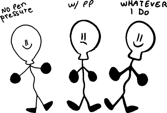
(I would suggest doing this tactic on simple drawings, like the objects)

first of all draw using the softest brush, the size doesn't rly matter (dont use 600 lol) use the pen pressure of course

merge the layer with the drawing (the drawing must be black) with a completely white layer

double tap the layer and slide the (first) little white triangle to the left until the drawing looks the way you want (the more it goes left, the thinner the lines will be)
next merge the layer with a completely blank layer (this is important)

press this little button and make ur brush big and draw black on the whole drawing.
and you’re done :D you might need to a bit of fixing tho. (also I suggest to not use black for line art but I’ll talk about it more later)

coloring
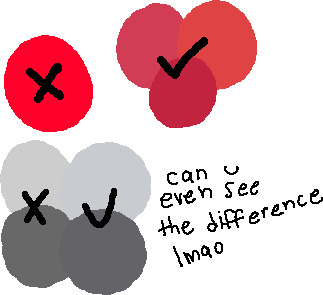
basically it’s don’t use gray... put a bit of blue in it. and don’t use eye strain-y colors (also I’m just saying this rn, there is no right or wrong way of coloring or drawing, this is just how i do it) also I use very dark purple/blue instead of black

also photoshop has this little warning when the color is really bright, so you can click on it to fix it but sometimes it’s not enough for me.
using a color palette on a character is also useful and reusing colors but sometimes I’m too lazy for that.
the filters i put on the drawing at the end also are really important to the drawing so you can skip to that if you want.
shading
pretty much put the shading the opposite of where the light source is coming.

this is what i use for shading:


the colors aren’t consistent.
more shading/highlights/coloring/whatever
after im done shading i make another layer between the color and shading layers. use the magic wand tool to pick one color from the drawing and go to the new layer, color pick the shading on the color you picked
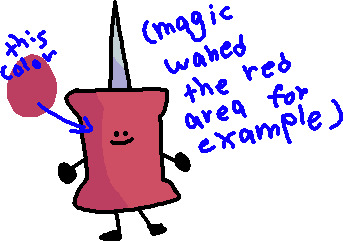
(ps idfk how to spell its almost midnight shut up) and use the soft brush to ad a gradient under the shading with the color of the shadow

and set the opacity to 40%

color of line art
first of all don’t make the line art black, i use a dark blue/purple. it also depends on what colors I used for the drawing

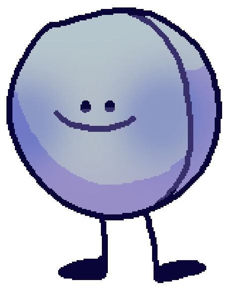
then on another layer I ad color to the line art if it has the same colors on both sides of the line. (use the color of the shading of the color thats on both sides but darker and ya know play w/ it a little)
highlights
just...

small details
filtersssssss
well at this point ur pretty much done but lets make the colors looks better!
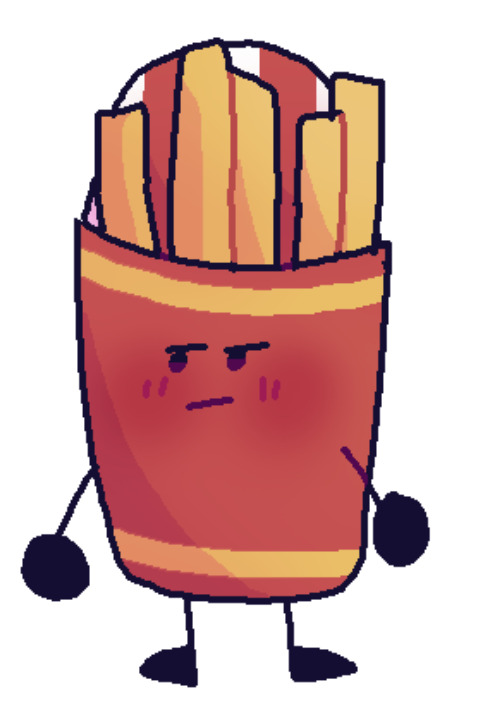
put all the layers in group. copy that group. marge all the content of the newer group (the second group should be on top of the first one). click the merged layer and press ctrl + b

play with this how you would like.
press ok and then ctrl + u
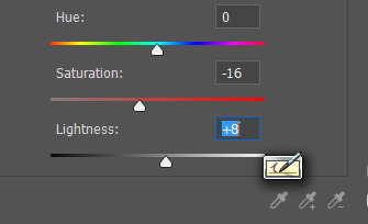
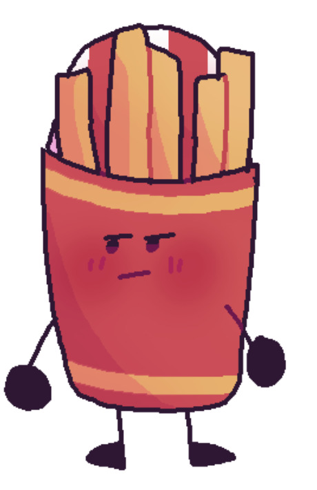
I usually make the saturation lower and the lightness higher. and lower the opacity of the layer
more filters!
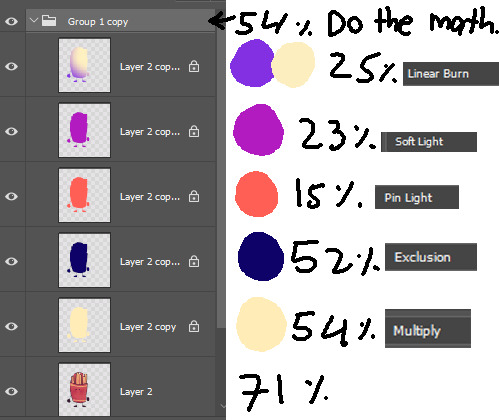
it’s not consistent. you just kinda play w/ it

AND THAT’S IT
conclusion
this post is way too long and idk how to explain shit and i prob could have drawn like 5 drawings by the time finished reading. if anyone read even.
26 notes
·
View notes
Note
Hi Comicker! I was wondering, how to you prep/createthe layout of your comics? I remember a while back you had a tutorial on DA where you explained how you created the layout of a pages and panels but i'd like to know what your updated take on that is! Thank you for your time!! ( hope i wasn't too confusing…lol)
Hello!
Apologies for taking so long to answer this; I kept starting and then getting sidetracked and forgetting. XD
I actually haven’t really changed too much when it comes to my page process! It’s still basically the same approach.
If we’re talking specifically, just panel layout, I very much wing it. For the more newspaper strip style stuff, I don’t even really bother with panel layout at all, since they won’t be together on a page.
On the rare occasion that they are together on a page…I kinda just. Decide what needs to happen before the page is done, and then go from there. Since it’s just my own personal, for-fun art, I don’t worry too much about making it THE BEST, MOST-INTERESTING LAYOUT EVER!!! It’s usually pretty plain. I like getting to the POINT! (Or rather, I like getting to the fun part to draw. XD )
But if we’re talking the whole page process, I find that visuals are the best way to explain:
STEP 1: PENCILS! (Well. Rough sketches and thumbnails, actually. But I don’t appear to have rough sketches for this page, unfortunately! )

STEP 2: INKS! I do large areas of black separately, on another layer, because I am a coward so I can experiment with how much light/dark is on the page.

STEP 3: BACKGROUND FLATS! I don’t always do this, but if I want a unifying color ‘theme’ (so in this case, a more yellow-y, sepia look) I will start with a kind of digital ‘base coat,’ if you will.

STEP 4: REGULAR FLATS! Fairly straight-forward, I think.

STEP 5: SHADOWS, HIGHLIGHTS, ETC!

STEP 6: IDK what to call this step but like…STUFF THAT REQUIRES SPECIAL ‘EFFECTS’ So like, Kara’s heat vision, which kinda glows a little and needs to sit on top of the other stuff.

STEP 7: LETTERING!

STEP 8: THAT SINKING FEELING THAT COMES FROM REALIZING THAT YOU’RE GONNA HAVE TO REDO PANEL 4 BECAUSE THE COMPOSITION ISN’T SHOWING OFF THE PUNCHLINE VERY WELL AND IS JUST GENERALLY AWKWARD AND BAD This part doesn’t necessarily have to involve pitiful weeping, but it’s okay if you want to do that. XD

STEP 9: FINAL TOUCH-UPS! Sometimes there will be little bits of the art that I want to change, and it’s just easier to add them on top of the finished art. Or I’ll need a white action line–those are easier to draw/see on top of the colors and inks.

And there we have it! My…very basic? approach to page layout and process. XD Hope it was kinda interesting and/or helpful! As always, if you have any other questions, feel free to send ‘em along!
#comicker replies#my art#art stuff#art process#comic page#comic page process#long post#izzyfromgallifrey
208 notes
·
View notes
Note
i was wondering if you have any tips for digital painting? i rlly love how your lineless looks and i wanted to try a cute style like that
waaa first of all thank you for your patience bc i know ive taken forever to answer this as i always do with tutorials…oops…..and also thank you im glad you think my style is cute!!!! im gonna do my best to help you out with lineless so here we go! LONG POST UNDER THE CUT!

to start i mainly use these two brushes (yes…just two…) from kyle webster’s gouache pack which is only available to adobe cloud subscribers now, but im sure a quick google search for gouache brushes for (insert program you use) can find some that will work just fine. these two look pretty similar but the difference is the one on the right is a bit softer and more easily opaque so i use it for light shadows, blush, etc. i think textured brushes like gouache paint and dry media ones make lineless look extra cool but thats just me!
OK ON TO THE TUTORIAL i know you just asked for tips but i was doodling a girl for a warm up and i thought id just take you through how i colored her. started w a sketch + set that layer to 23% opacity and laid down flat colors below it

after i set my base colors i turn off the sketch and start workin on shading! im startin with the hair here bc i think it can be harder to paint and work with in general for lots of ppl

i used three colors here for the hair:
- the lightest color is the base. pretty simple
- using the middle color, took gouache blair brush and made light strokes downward following the flow of the hair from the root to the tip. make sure you think about where the hair begins on the head and follow the direction it goes from there when shading/making lines/making highlights!!
i kept it simple for tutorial’s sake, but play around with how dark you want the shades to be and how much shading you want! (also these aren’t shades per se since they arent shadows being cast, just a darker color to give the hair a little variation in texture and color and to create a kind of shine effect but idk what else to call em! i guess theyre highlights! i just know it looks nice!)
- took a slightly darker color and added some lines here and there to break things up and further show the direction the hair is moving in
for a little more visual on the direction thing see this handy graphic i made:

i didn’t write DONT and DO bc my way is not like…the ultimate Chosen way…if you wanna go for a style with the shading i did on the left then totally do it but personally i think it reads better this way so ya!! theres no right or wrong way to make your own art but there are ways that can make things a bit more interesting and clear if you choose to use them!
and yeah i basically use the same methods to paint skin and fabric and even backgrounds. it’s really just as simple as keeping things flowing in a natural direction and picking colors that u think look nice to paint with!
FINISHED PIC:
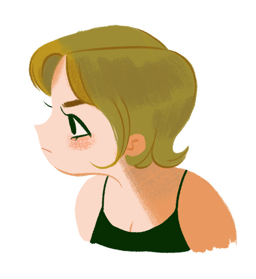
i dont wanna make this tut super long and ramble forever so here’s the last things i did to finish up!
- turned the sketch back on momentarily to draw in the eye, mouth, & eyebrow (no painting or shading involved there usually)
- used gouache a go go brush (or a softer/less opaque brush of your choice) to add a bit of blush to the cheek. i usually add blush with a light circular motion bc it gives them a nice rounded look. i use light pressure because a) more pressure means darker color and i want the blush to be subtle and b) more pressure also means less texture and more solid color, and i prefer having the scratchy look with the base skin color showing thru.
- used more pressure and a darker, more orange color to create a sharp shadow on the skin + define the neck & inner ear shape with lines
- added desaturated aqua blue over the top of the hair to create a shadow effect and add another color to the palette
- added the same blue color very lightly on the neck & blended it with the orangey shade (in other words, lightly brushed over it with the orange) to make the shadow more interesting. layering in multiple colors can always help make lineless things look more detailed even if its just a tiny bit!
i hope this doesnt seem like a ton of steps added on at the end bc it took me like way longer to write this (because i ramble) than it did for me to draw it! i love working with lineless because of how easy it can be to slap on some varying colors and defining lines to make something look a lot cooler and more detailed. as long as you keep your shades and stuff on separate layers its easy to try out things and see what you like best so i encourage you to do so! best of luck!
#starrymelons#long post#art tutorial#art tips#tutorial#lineless art#ask#I SUPER SUPER HOPE THIS HELPS!!!#i used no pink in this tutorial are you proud of me#i did that bc i love pink but i use the same colors too much while i neglect others...so im paying attention to yellows and greens#also i definitely accidentally drew more of her and made her into an oc whoops#I REALIZED I FORGOT HER LITTLE HAIRS STICKING UP IN THE BACK IN THE FINAL...SORRY.............
238 notes
·
View notes
Text

for the first in a while, I'm gonna ... try to take it easy, today.
I actually have a lot to do but I really need to chill the fuck out for a second and take a breather. my OCD's made my life remarkably difficult lately and I've begun to disassociate in order to cope. I know disassociation plays a key role in obsessive-compulsive disorders; I know my OCD's fairly severe and it's been getting worse as I get older, but I'm not...usually this bad. Even when under stress.
for example, a batch of 200 commissioned banner icons suddenly turns into 400+, and I'm still not done because I can't stop keep remaking them.
oh, this one's coloring is off. but these frames are split second to each other ... can't have that, gotta redo 'em.
wait, the pixels are...'weird' looking in the corner, here. rejected.
this one could've been cropped way better. how could I expect them to use this?
why is this one in the 'final version' folder when the border around it overlapped a part of the icon?
I need to redo these 73 because the shadow is too dark and blocky beneath the icon. it’s supposed to be a fade. it’s what they ordered and you’re not giving them what they asked for.
someone's paying you for this shit get it TOGETHER
yesterday, my OCD got triggered about 3 times? I have a couple of forms. I had a breakdown in front of my mother after she came home and asked me if I ate and I know I must've made some kinda stupid face that gave it away because seconds after she'd asked, I realized I didn't know what the hell ate other than the toast she'd watched me eat before she left for work at 9am. It was 11pm when she asked.
I also had mini-breakdown while talking to my customer and it was terribly embarrassing. I got a nosebleed to top it all off too lmao ( i'm so sorry if you're reading this, john omfg you've been the best to me and I'm sorry because I'm sure all you'd wanted was icons to rp sdfkjsd )
but I just.
All of my friends think OCD is just me having high ass standards or just being 'know-it-all'. I've been called that all my life. In fact, I've been called that by friends I thought would never say anything like that about me because I thought we were friends
We live in this new age of 'awkward is cute'. It's hip to be square, cool to be uncool, and sexy to be nerdy and quirky. and there isn’t any better way to declare your individuality and weirdness than branding yourself 'so OCD' about something.
Ahaha.
I fucking loathe people who do this.
OCD isn't a quirk or a set of tendencies. It's not fucking buzzf.eed list, not a little buzzf.eed quiz you can take and readily relate to the results; it's an incapacitating, isolating disease that makes you afraid of your own mind.
If my friends could see, just once, what it's like for me, when I'm caught in an obsessive-compulsive loop, maybe then they'd finally understand me when I say ''''it's bad''''.
Even Something as simple as drawing a line-art from a sketch turns into a complete and total nightmare. 8/10 times, I'll redraw the line-art like — hm, I don' dunno — about 7 fuckin' times in a row, then, delete all of it because IDK, it wasn't 'right'? ( Who am i kidding; I do the same with sketches ヽ(・ω・)ノ )
Oh, yeah, for sure. Me and my ‘high fucking standards' did this.
NO. No one in their right mind would do this. They wouldn’t re-draw the same fucking drawing 7 times in a row and the same layer style over and over, not even changing things up to maybe get some progress. Nobody. Jfc.
And oh, god, that moment when you realize, it's been more than 8/9 hrs since you began and you haven't eaten or drank anything; you don't remember the last time you looked at your phone or what the hell happened to the time because last time you looked, it was 11am and now it’s 9:48pm.
Moreover, you made exactly zero progress on your project — because IDK — there’s no valid reason? JUST COULDN'T STOP HA
I never thought I would talk about this, but uh, Y'all know how much I love han. I want Han to be seen in the best light possible. while SW has been one of the few things that have held a light in my life, he's helped me become a better person in more ways than I can articulate. and no, I don't mean I suddenly started picking trash up off the highways.
I mean, by writing him in this amazing place filled with people I don’t have IRL who share my interests, I’ve met so many new people, friends, learned so many lessons, about characters and life and writing.
When I began writing Han, here, I had just learned what present and past tense was in English. I was winging my writing, trying really hard to understand. English isn't my first language. In Cantonese, my native language, there's no such thing as a past tense.
By writing Han with you guys, I've taken huge steps in life, without even realizing it.
So, everything I do for han, I want for it to be good.
Not outstanding, and definitely not exemplary or nonpareil — just ... good.
And icons — haha. I love icons. I love and hate making them. similar to my writing, I work very hard on his icons. ... but I need to learn where to draw the line.
I once remade an icon 23 times before I was happy with it. ( i had 23 versions left in my folder lmao ). like these here? 10 versions of each, in the least.

( the last one is kinda an exception... I think. I made that one well over 25 times, for sure. but I think it's because I'm not accustomed to Blaine's coloring yet. )
Wow, this really turned into a long post. I don't really care, though. My OCD is something that has always been completely ignored IRL. Shit, it's ignored by even my online friends. I can't even game online without one of them thinking I must get off on establishing my superiority and overall knowledge of '???’ game. Haha.
'Show me your build?' :D 'Er...nah. I think I'll pass.' 'Why? What's the matter?' 'You'll pick it apart.'
It's never considered 'advice' when it's from me. It's me as a know-it-all, as someone who looks down on others for not having up-to-par stats.
I'm sorry I did the math for you so you wouldn't have to. This is simply advice you're free to toss aside, but it's not like it matters. Even if I reassured that—you're already too annoyed to listen for any longer.
So, I’ll also apologize for how I can recall faction modifiers, body part modifiers, critical hit and stealth modifiers, as well as debuffs; how a certain amount of damage of one type turns into inflicted damage to a target while considering type modifiers and armor, and knowing the damage formulas needed to calculate the number of hit points required to kill an armored or unarmored target, with or without a finisher multiplier figured in — because I want you to do the very best with your weapon of choice, even though I can name 5 different weapons that utterly outclass it by tenfold.
In reality, I never had much of choice. Information like that doesn't stop looping in my mind, even at night, when all I want is to sleep.
Sometimes ... I wish I could be that one character on a comedy show who has a quirky disorder or ''OCD'' and everyone seems to love him for it because he's funny when he does it or he's generally helpful
More often than not, my OCD just ruins everything. I don't feel like I belong anywhere.
I need to take a breather.
#˒・*。◞ ( ooc ) *・゚✧ ⎸ ᴏᴜᴛ ᴏғ ᴄᴀʀʙᴏɴɪᴛᴇ.#;; — rp woes#;; — general venting#;; — ocd cw#( . trying to be positive but it might've come off negative? okay tldr; i wanna take it easy. i even slept in (kinda) today.#( . im sorry for all the new people seeing me complain lmao i promise i'm usually an active han#( . i just need to finish my commissions first
7 notes
·
View notes