#icons tutorials
Explore tagged Tumblr posts
Note
Heyy!! I love your carrds so so much they're so pretty!! Can you please make a f2u non pro discord nitro themed carrd please please please
HELLO HOPE THIS IS GOOD!
non pro freindly discord nitro themed carrd
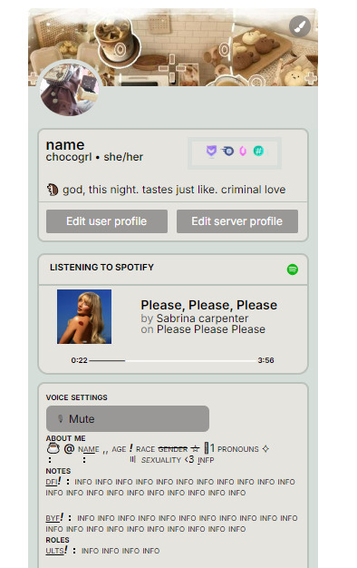
get the carrd here look at it here! here is also the image i used for the nitro badges!
REQS ARE OPEN FOR CARRDS!! only req i have is to be following me to ask for a carrd! and I DO CARRD COMMS!! so if you have a specific carrd you want made message abt my prices and what i take!! use my referral code also to help donate and get some money off on buying pro here / use the code manually HXYLIN !
#carrd commissions#carrd stuff#aesthetic#carrd templates#carrd icons#carrd inspo#carrd moodboard#carrd theme#carrd material#carrd packs#carrd req#discord chat#discord server#discord app#discord mobile#carrd template#request#carrd tutorial#free carrd template#carrd profile#strawberry#cutecore#commission#taking commisions#f2u
1K notes
·
View notes
Text

the ultimate beginner metadata tutorial !! by a dummy :3


HEY PALS AND PEOPLE doing some tips and tutorials ,,,, kinda explaining the metadata that people do in rentry
the site already have a "tutorial" on the "how" window, these on the post are the ones who need further explanation
i will put in topics and try to do my best on this, its a long read!

• the border i will be using for example its by @/suturical on this post
• now, how to understand this and make the magic happen?
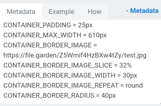
GOTCHA!!!
1. Borders: container adjustements
• the least important thing is the container width, you can put as you please but i use it on 400px — 610px, its just my recommendation
• now the padding is important, its basically the distance between the border and the elements of your rentry
• example: padding on 25px
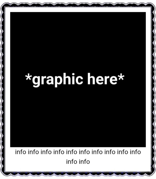
• example: padding 20px

2. Borders: slice
• the image slice is basically how much it will slice your border and repeat it, i recommend using it 20% – 40%, however adjust as you please!
• example: slice 37%

• example: slice 23%
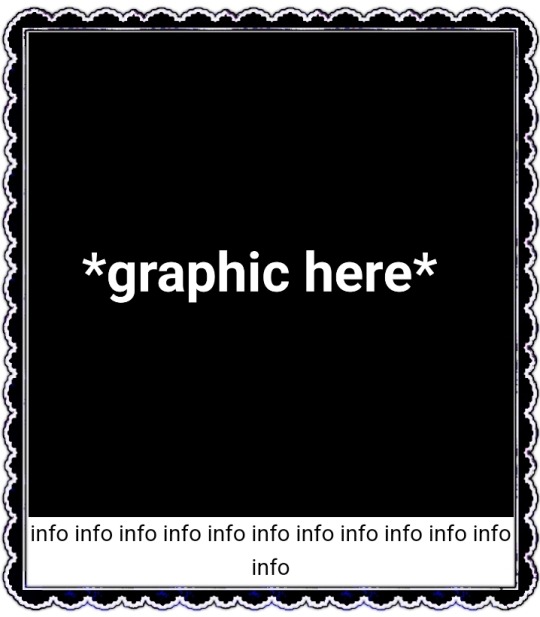
big difference isnt it? and i only changed the slice part, nothing else!
3. Borders: width
• basically the width of the border, adjust as you please but i also recommend to put on 30px as its the maximum size you can put
• example: width 30px

• example: 15px width

4. Borders: repeat
• this is another thing that dont have much secret and explanation about, there are 4 repeating types for borders, they are:
• stretch: will stretch the original size of the border across the entire container

• round: most used, 'normal', will make your border get around the container

• repeat: will repeat a certain part of the graphic image across the sides

• space: will give space between the repetitions

• onto the next part, text!

2. Text: font applying
• ngl its pretty simple, first catch ANY font of the google fonts site and do like the screenshot above, detail, if you font name has a space between the name (example: playfair display) you MUST put the _ to substitute the space, or it won't work
• but if the font name doesn't have any spaces, write it normally
2. Text: text size
• also really simple, explore the sizes on the rentry, i use it 10px – 25px, adjust to your liking!
2. Text: coloring
• tired of coloring all sentences manually? just do the code from screenshot and input your color! it can be written like i did or the hex code/whatever!
• you can still color things manually even when using this
• final with all these changes:


SO THATS IT! the most important actually :33
hope it isnt confusing, any questions please send an ask!
tagging oomfie @chokingonchairs bc finally got the courage to make this and yu asked for hehe ^___^
THANKS FOR READING!

#ᛝ the messy little angel ꒱ .#rentry tutorial#tutorial#rentry#rentry decor#rentry graphics#graphics tips#graphic tutorial#icon pack#icons#random headers#twitter icons#headers#icon#random icons#twitter header pack#twitter headers
338 notes
·
View notes
Text
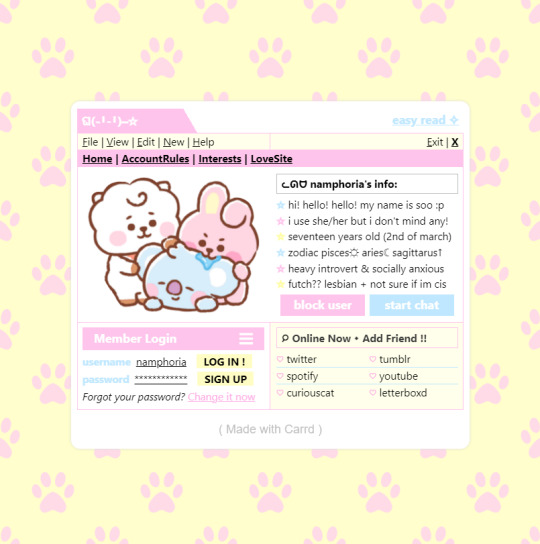
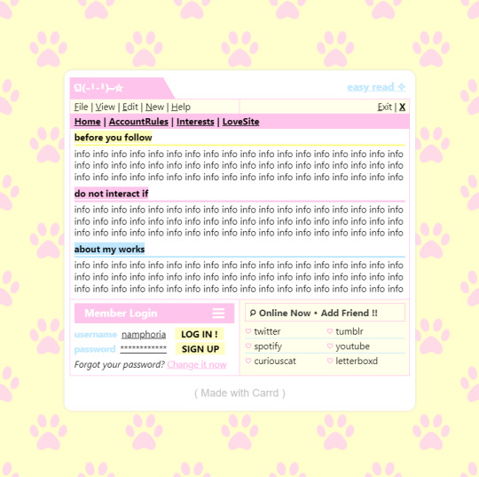
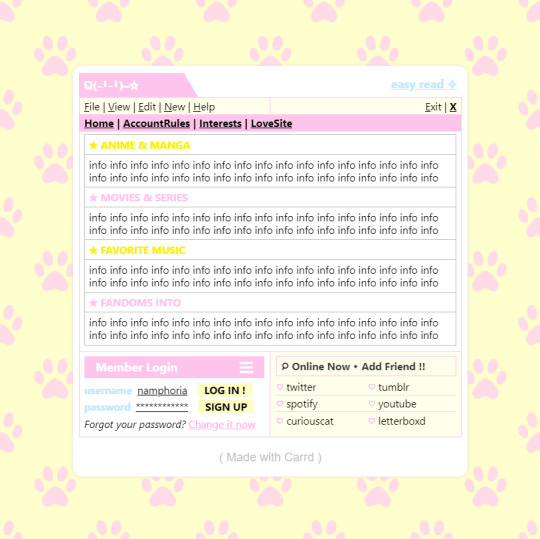

w w w . carrd . co // ⋆ 𐙚 ₊ ˚ 🐇 ⊹ ♡ ˚ .
✿ CARRD INSPO // © misamory
like or reblog if saveㅤ⿻ㅤᐢ..ᐢㅤ♡ㅤ2023.
#⋆ ˚ 。 just an rkive — ★. *#♡✮☁️✧˖°💿⋆。°✩#carrd.co#carrd inspo#carrd template#carrd templates#carrd icons#carrd stuff#carrd material#carrd resources#carrd moodboard#carrd inspiration#carrd#carrd layouts#carrd symbols#carrd help#carrd tutorial#carrd theme#carrd things
1K notes
·
View notes
Text
🥖 𝓨𝗈 𝗍𝖾𝗇í𝖺 𝗎𝗇𝖺 𝖾𝗌𝗉𝖾𝗋𝖺𝗇𝗓𝖺 ᭪ᬻ𓏸𓈒゚⃝
𝅄 ི۪۪۪ ֯ ּ ֗ ۫ 𝖤𝗇 𝖾𝗅 𝖿𝗈𝗇𝖽𝗈 𝖽𝖾 𝗆𝗂 𝖺𝗅𝗆𝖺 𝅘𝅥𝅮♪ ˟̫ː᜴ 🍰

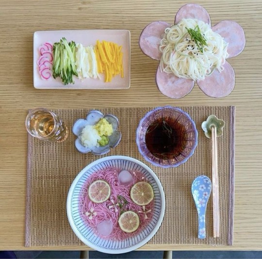
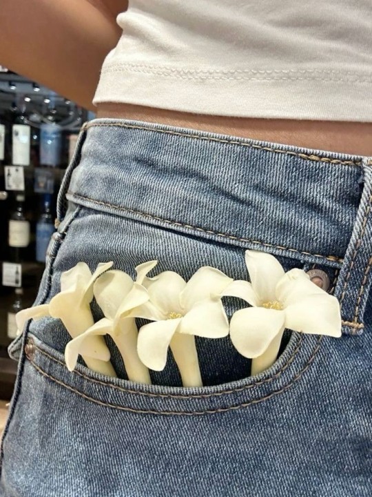

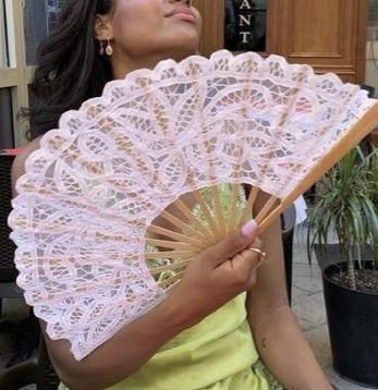
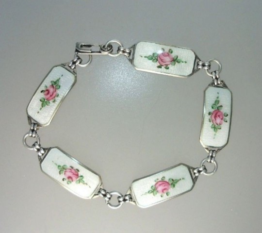
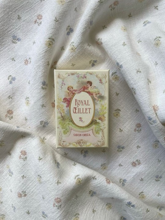
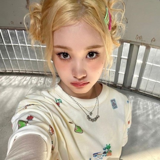
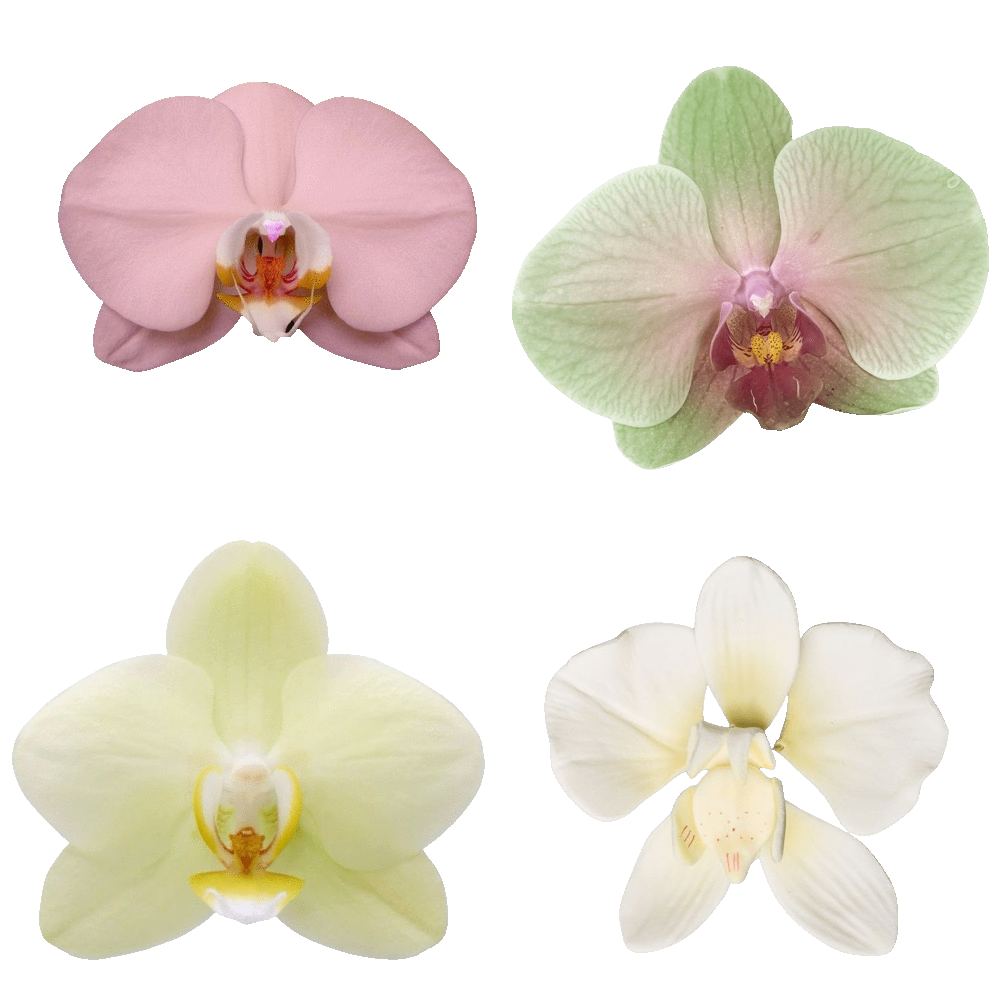
#꒰ atsubie ꒱ ౨ৎ︵⠀⠀#heres how the mb from my tutorial turned out ☆#ㅤㅤㅤㅤㅤㅤㅤㅤㅤㅤㅤㅤㅤㅤㅤㅤㅤㅤㅤㅤㅤㅤㅤㅤㅤㅤㅤㅤㅤㅤㅤㅤㅤㅤㅤㅤㅤㅤㅤㅤㅤㅤㅤㅤㅤㅤㅤㅤㅤㅤㅤㅤㅤㅤㅤㅤㅤㅤㅤㅤㅤㅤㅤㅤㅤㅤㅤㅤㅤㅤㅤㅤㅤㅤㅤㅤㅤㅤㅤㅤㅤㅤㅤ#stayc layouts#stayc moodboard#stayc j#kpop icons#kpop layouts#messy moodboard#kpop themes#kpop moodboard#kpop aesthetic#alternative moodboard#alt moodboard#colorful moodboard#yellow moodboard#pink moodboard#indie moodboard#y2k moodboard#fresh moodboard#nature moodboard#soft moodboard#simple moodboard#maximalist moodboard#retro moodboard#vintage moodboard#dark moodboard#edgy moodboard#divider by im4yeons
202 notes
·
View notes
Text


Lace divider stuff whatever
F2U with like & reblog , I edited pngs from Pinterest to make these. credit is greatly appreciated since this took me a solid 40 minutes
feel free to add to resource rentries, but it has to link back to this post or account.
tagging @smilepilled noticed you enjoy being tagged in things 🤍 unless i mistaked you for someone else
#꒰৯ ̇ ۪ dividers ۪ ྀི#lace dividers#rentry dividers#dividers#rentry icon#rentry tutorial#rentry template#rentry inspo#rentry resources#rentry stuff#rentry pixels#rentry gif#rentry decor#rentry graphics#rentry frame#rentry#carrd resources#f2u with credit#saeriji#template coming soon i promise i js want to post some resources.#postponing the template to be posted next week because i’m busy this week w church.#idk what else to tag#rentry carrd#carrd graphics#carrd inspo#carrd stuff#carrd#carrd decor#carrd dividers#carrd layouts
222 notes
·
View notes
Text
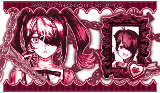
☆ ❛ STREAM ALERT !! ❜ NECROANGELZ is streaming ♡ ⁓⁓ Come watch ?
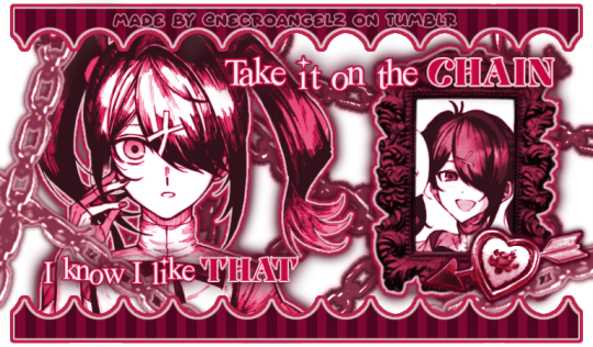
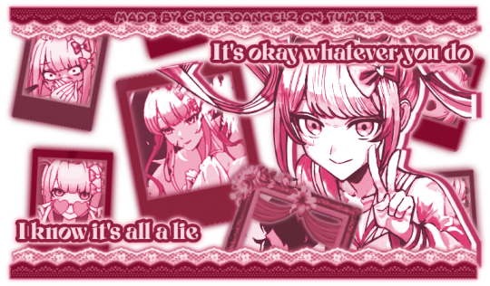
❛ i'm a mess in distress but we're still the best dressed. fearless, say yes, we don't dress to impress. ❜ —- EVE, PSYCHE & THE BLUEBEARD'S WIFE.
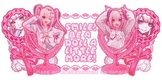
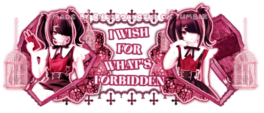
♡ NOW WATCHING : Needy Streamer Overload Graphics ☆ ⁓⁓ Enjoy the stream !!
—- semi-requested by @lavendergalactic
—- OH MY GOD. IF ANYONE WERE TO ASK ME WHAT GRAPHICS I HAD THE HARDEST TIME EDITING I WOULD SAY THESE GRAPHICS. THESE WERE IN THE MAKING SINCE A MONTH AGO AND I PROBABLY SPENT 10+ HOURS TOTAL ON THEM. THESE WERE SO HARD TO MAKE BUT THEY'RE NOT THAT BAD I THINK. ANYWAY I'M GOING TO CRY NOW.
—- alts under the cut.
—- "angel why is one of the graphics a different color-" we don't talk about that. (i had a hard time making it with the color palette i decided, ok. i toiled for four hours, ok. i had to change the colors or else i would die, ok.)
—- likes and reblogs are always appreciated. thank you for supporting the angelic streamer.
#🌠﹕ a wishing star 𝜗𝜚 ︵#👁️🗨️﹕ from the archives 𝜗𝜚 ︵#needy streamer overload#needy girl overdose#kangel#omgkawaiiangel#kangel nso#ame chan#ame nso#ame needy girl overdose#ame needy streamer overload#kangel needy girl overdose#kangel needy streamer overload#needy streamer overdose#needy girl overload#rentry graphics#editblr#rentry resources#rentry edit#rentry tutorial#rentry guide#rentry divider#tumblr layouts#nso icons#kangel icons#ame icons
622 notes
·
View notes
Text
*✶ please please please
a template by cozysip.
by clicking in the source link you’ll find 02 different dash icon templates made by me from scratch. credit is not needed , but ��do not claim as your own ! if you enjoy this or you use it, please reblog or like this post . thank you !
#01. PSD TEMPLATES : mine.#template#free template#rp template#psd template#free psd#dash icon#dash icons#dash icons template#icon template#icon psd#psd#rpc#rph#graphic tutorial#free graphics
244 notes
·
View notes
Note
hi I really like your mb and I'm new here. Do u have any suggestions or tips to make mb? like where did u get the pics and the captions.
𝓜oodboards: a guide for beginner blogs!
I decided to bring here a small tutorial that can help other blogs that are starting out and still have questions that need clarification, with tips and links that you may need. I wrote this from my point of view of creating moodboards and I tried to be as brief as possible in my explanation, there may be errors in English as I'm not fluent in that language and everything here was translated using Google Translate, any questions you can contact me via asks or by message.

how do I find pics for moodboards?
Pinterest is where you will find most images for moodboards, so create a Pinterest board just for these images, separating them into subboards for each color or aesthetic to make it easier.
Some blogs leave the link to their Pinterest accounts in pinneds or in the carrd, you can follow them and save the pics they published on the app in your boards, this will influence the Pinterest algorithm so that they recommend more of the type of images you want.
You can also search on Pinterest for the aesthetic and color you want (coquette pink aesthetic, cottagecore aesthetic, y2k, etc.).
how to make moodboards + tips:
Well, it's not such a complicated thing for me. I generally make moodboards with 6 or 9 images, taking inspiration from the moodboards of other blogs that I admire, so I can get an idea of how to make the captions and how to position the photos in a way that matches them.
To make it easier, first I create the moodboard and then I look for an icon of a kpop idol that can match the aesthetics and color of the moodboard. The reverse can also be done: first choose an icon and make a moodboard for that image, paying attention to the color palette and tonality (and for some reason, for me it's better to create moodboards in Tumblr's light mode instead of dark mode)
When I finish the moodboard, I add the caption, the hashtags (which will be very important for your post to reach other people) and maybe a divider. You can find these dividers on other blogs or by searching for "dividers" on Tumblr.
If you want to split a photo into two or more images, use this site.
how to create captions:
To make the captions, I use parts of songs that I like or that I found searching on Pinterest for "Spotify song lyrics", but they can also be album or song names, movie names, a phrase you thought, etc. The symbols you will put in the caption can be found on this website or just by searching for "symbols", "kpop symbols", "kaomojis" on tumblr.
If you want to use a different font for the letters, there are these two websites (01 and 02). And to change the color, there are also these two tutorials (01 and 02).
what to do to make your blog "popular":
Add popular hashtags that relate to the content you are posting. If you use almost the same tags as other big blogs, your posts will have more reach. Posting frequently and your account looking nice and organized helps too.
Ask several other popular blogs to promote your account. This was very important for my profile to grow in the number of followers and engagement.
Join the events that some blogs do, as they offer good prizes like reblogs if you win. And remember to have patience, as it often takes a while to get good engagement on Tumblr.
220 notes
·
View notes
Note
How do you get that grainy texture on your art? It’s very nice!
thank you!! i love art that's soft and fuzzy...
i generally do it a handful of different ways, but i tend to bounce between a color noise filter layer in soft light mode, between 30% and 50% opacity,

... or i use something from my wide array of paper textures, and usually set the layer to overlay and play with opacity till i'm happy with it

......oooorr i do a combination of the two! which i did in the final version of this piece, which i Also added a gradient map to to make the colors a lil more ✨Dramatic✨
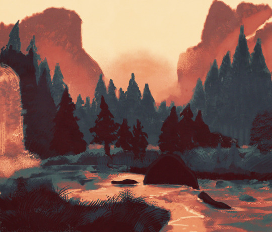
here's where i got (most of) my paper textures and here's a rainbow color noise texture (that i don't personally use but looks rlly similar!)
#i actually use a color noise filter from a VHS auto action set i used to use on my VHS icons. if yall remember those#my art#ask#tutorial#i guess??#idunno#if you have more questions feel free to dm me! i love clip and i love to teach ppl abt all its cool features#dinosaur#since i prolly wont seperate post my landscape study tht i threw a spinosaurus on
105 notes
·
View notes
Text
BASIC ACC FREINDLY LIGHT PINK MINIMAL CARRD
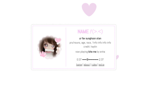
Hiii guys, to the comments and everyone i apologize for the inconvenience of the title and everything, the carrd was free at one point but many people kept stealing the carrd and removing creds and giving copies of the carrd and saying they made it. I had sent out posts on here and my discord server letting everyone know if it didn't stop i would start charging for the carrd or just take it away all together and it got progressively worse so i decided to change it to a paid carrd and realized after a couple comments about it on this post that i forgot to change the post and take away the parts where i said free, if you would like the carrd for free there is a tut up on my youtube channel (linked in my pinned post or comms carrd i believe) for it but i won't be giving out copies or temps of it anymore besides the paid one thank you!!
HIIII everyone here's a new carrd! obtain it here look at it here!
REQS ARE OPEN FOR CARRDS!! only req i have is to be following me to ask for a carrd! and I DO CARRD COMMS!! so if you have a specific carrd you want made message abt my prices and what i take!! Donate tips to me so im able to continue making free carrds here! use my referral code also to help donate and get some money off on buying pro here / use the code manually HXYLIN !
#carrd commissions#carrd stuff#aesthetic#carrd templates#carrd icons#carrd inspo#carrd moodboard#carrd theme#carrd material#carrd packs#carrd req#discord chat#discord server#discord app#discord mobile#carrd template#request#carrd tutorial#free carrd template#carrd profile#strawberry#cutecore#commission#taking commisions#f2u#f2ucarrd
1K notes
·
View notes
Text


• nikolai gogol graphics 。
| ♡ / ↻ + credit to use
| credits: none
| im sleepy n w my stomach hurting again

#ᛝ the messy little angel ꒱ .#nikolai gogol icons#nikolai gogol icon#nikolai icons#bsd nikolai#nikolai gogol#bsd gogol#rentry tutorial#rentry#rentry graphics#rentry stuff#rentry resources#rentry decor#icon pack#icons#random headers#twitter icons#headers#icon#random icons#twitter header pack#twitter headers
70 notes
·
View notes
Text
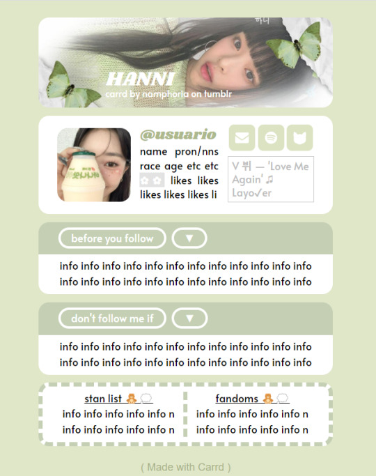
✿ CARRD INSPO
like or reblog if saveㅤ⿻ㅤᐢ..ᐢㅤ♡ㅤ2023.
❛ please, credit me as "namphoria on tumblr" if you remake! ⁾⁾
#⋆ ˚ 。 just an rkive — ★. *#♡✮☁️✧˖°💿⋆。°✩#carrd.co#carrd inspo#carrd template#carrd templates#carrd icons#carrd stuff#carrd material#carrd resources#carrd moodboard#carrd inspiration#carrd#carrd layouts#carrd symbols#carrd help#carrd tutorial#carrd theme#carrd things
2K notes
·
View notes
Text

Hello and welcome to "Icon Making With Killian: An Intro to the 'Lost' Art of LiveJournal Icons"
aka, I'm still making them and I'd like to teach you how to do it, too!
This tutorial was written in Photoshop 2020, but you can probably recreate it in as far back as CS2-ish (since I still use the same sort of techniques I've been using since then, lmao). It also assumes basic understanding of the software, though I've tried to be as clear as possible throughout.
With that out of the way, let's get this tutorial on the road!!!!!!
I started with the bloomed art of Hiiro from the White Lilies scout box (image courtesy of the Ensemble Stars!! English Wiki).

I basically always start with a blank 100x100 canvas and paste the image into it. I try to go into icon making with a vague idea of what I want to do, and I knew from the beginning that my vision for this icon would have the top 1/4-1/3 of the image covered by a solid band of color. To make positioning the image of Hiiro easier, I made a rough version of the band with temporary colors (though they're pretty close to what I ended up using in the end).

With that in place, I could start working with the actual image for the icon. After pasting it in and adjusting the layers so it was under the band, I resized it and moved it around a bunch until I was happy with the position. Once I liked how it looked, I used an Unsharp Mask on the base.

Next up, I used a texture from lookslikerain. However, purple is all wrong for the color scheme I had in mind, so I went to Image > Adjustments > Hue/Saturation... to change it up to better suit my needs. Never be afraid to mess around with textures!

Here's how I adjusted this specific texture, but each one is unique- both the texture and the icon you're creating, so it's best to play with it until you get good results.

I then pasted this into the icon, making sure it was under the layers making up the top bands of color (because I was only trying to affect the base for now), and set this layer to Darken.

Now it's time to mess with the colors of the top band. They sorta matched before I did anything to the base, but now...not quite. I used a layer style for each part of it, but using the paint bucket tool would work just as well. I went to Layer > Layer Styles > Color Overlay... for each, changing the colors as necessary. The thickest band is #85d0bf, the middle band is #086371, and the thinnest, lightest one is #fcfcd8.

Time to start putting stuff on top of everything!! I took this light texture from ianthinae, rotated it, and set it to Lighten. I decided I wanted it to be a little bit brighter, so I duplicated the layer, set it to Screen, and dropped the Opacity to 20%.

I then used a texture from Sarah-Dipity and set it to Lighten as well.

Okay, now that's what I'm talkin' about!!! It's time to throw some text on this~ I went for something simple to go with the theme of the story this card is from: Princely. The font is Georgia, 10pt, in #086371, set to all caps. I decided it didn't stand out enough, so I duplicated it, changed the color to #8b4235, dragged it under the first text layer, and moved it 1 pixel to the right.

I wanted a bit more embellishment around it, so I used this simple tiny text brush from colorfilter in #06444d. I also erased part of it to make it fit the space better.

Finally, I used a texture from shiruji, set to Darken to get a bit more color variation in it, and called it done! :D

If you have any questions, please feel free to ask, and I'll answer as best I can- as long as it's not about making icons in other software D: I only know Photoshop (and Paint Shop Pro, but I don't think anyone uses that anymore). If there are any other icons of mine you're interested in seeing tutorials for - or even just specific techniques! - just lemme know. I love helping :D
Also, I'm happy to share where I get icon resources from. I have a whole post dedicated to that on my DW graphics journal, though tbh that's the best place to talk to me about making graphics in general. But I will absolutely answer asks/replies/etc about icons here on tumblr, don't worry!!!!
#livejournal#icons#icon tutorial#graphics#graphic tutorial#photoshop#LJ icons#100x100 icons#100x100#tutorial#tutorials#reference#what do I even tag this as XD
96 notes
·
View notes
Text
☆ ❛ STREAM ALERT !! ❜ NECROANGELZ is streaming ♡ ⁓⁓ Come watch ?
❛ make it! you’re unbeatable once you get started! ❜

❛ make up! headed for a gloriously shining future! ❜ —- MAKE IT!
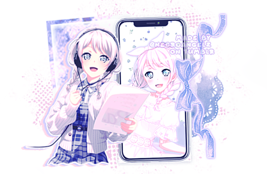
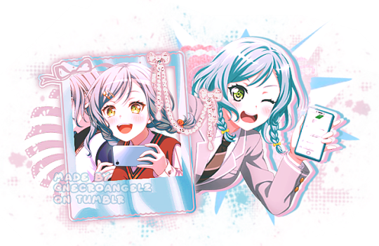
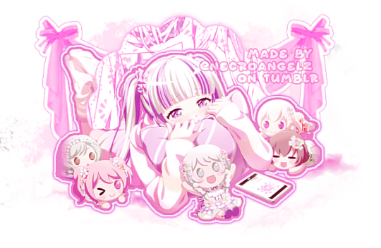
♡ NOW WATCHING : Dreamy Colors Pastel Fan Road Graphics ☆ ⁓⁓ Enjoy the stream !!
—- requested by @slaayer
—- i think it's only dawning on me now just how many fucking graphics i edited. no wonder this shit took me 5 days even with my hyperfocus activated. thank god uu specifically asked me to exclude chu² otherwise this would've taken even longer
—- this might be the most graphics I've ever edited for a set
—- likes and reblogs are always appreciated. credits are mandatory. thank you for supporting the angelic streamer.
#🌠﹕ a wishing star 𝜗𝜚 ︵#👁️🗨️﹕ from the archives 𝜗𝜚 ︵#bandori#bandori garupa#bang dream#maya yamato#reona nyubara#pareo#eve wakamiya#rentry graphics#rentry resources#rentry decor#rentryblr#editblr#rentry#sntry#sntry graphics#sntry decor#bundlrs graphics#bundlrs decor#rentry tutorial#hina hikawa#bandori icons#bandori edits#bandori layouts
305 notes
·
View notes
Text
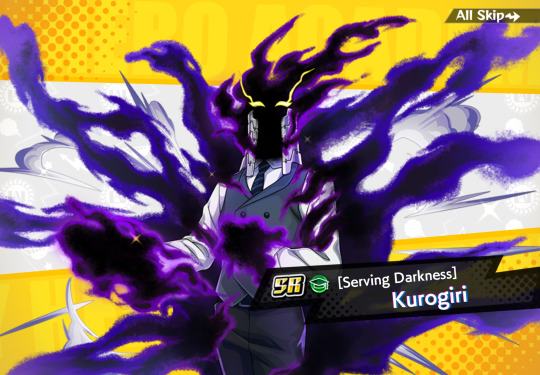
so I finally downloaded mhui and as predicted I am sooo confused, however I did also immediately read this as Kurogiri serving 💁♀️ darkness
#'what do you do at the bar' 'i like… serve'#happy weekend i am lost#i don't know if this is typical for mobile games but there are so many numbers and icons on my screen#and i have no idea what any of them mean#what is going on with the gray and yellow numbers with the arrows#also what are guests. who are they. are they out there?#do they know they're accompanying me on these quests#… are they mad at me#if present mic had done the tutorial we wouldn't have this problem#sorry all might he's just better at explaining things that's why he's the narrator#also this is such a great kurogiri#mhui#kurogiri#liza blather#mha#bnha
62 notes
·
View notes
Note
HIIIII!!! I LOVE YOUR CARRDS AND THEM FOR MAKING THEM FROM THE YOUTUBE TUTORIALS SO I DON'T HAVE TOO:D
IS IT POSSIBLE IF I REQUEST A CUTECORE PINK THEMED CARRD PLEASEEEEE???
ALSO ILYSM FOR PUTTING CREDITS, PPL REMOVE THEM SOMETIMES:(
hello! now updated this carrd to actual cutecore, tysm for your patience w me!! hope this is good :))
non pro friendly cutecore themed carrd!

get the carrd here look at it here!
REQS ARE OPEN FOR CARRDS!! only req i have is to be following me to ask for a carrd! and I DO CARRD COMMS!! so if you have a specific carrd you want made message abt my prices and what i take!! use my referral code also to help donate and get some money off on buying pro here / use the code manually HXYLIN !
#carrd commissions#carrd stuff#aesthetic#carrd templates#carrd icons#carrd inspo#carrd moodboard#carrd theme#carrd material#carrd packs#carrd req#discord chat#discord server#discord app#discord mobile#carrd template#request#carrd tutorial#free carrd template#carrd profile#strawberry#cutecore#commission#taking commisions#f2u
203 notes
·
View notes