#icon preview template
Explore tagged Tumblr posts
Text

quickly discovering that game screen templates uploaded without the relevant fonts or spritesheets are incredibly frustrating
#like how are you gonna release a move screen template with font and type icons in the preview and then not include those icons#normal type i could rip but come on i don't want to have to sleuth out my own higher res type indicators#just to make a stupid joke about this bitch having seed bomb and explosion
2 notes
·
View notes
Text

Howdy, Simmers! I'm thrilled to present the Ultimate 4T2 Clay Hair Default Replacement Collection, designed to give your Sims a fresh and fabulous new look effortlessly! 💇♀️💇♂️✨
It's time to redefine Sim style – one fabulous hairstyle at a time. Get ready for a hair revolution with The Ultimate 4T2 Clay Hair DR Collection! 💖🌟
🍡Download - LC | MF 🍡
Updates folder - SFS | MF updated 26 Oct 2024
The nitty gritty details and disclaimers:
This is an entire collection that is interwoven with each other. Hair is repositoried to different ages, genders, defaults, and even hidden toddler hair. It's highly recommended that the collection stay intact and that you have the Ultimate Collection or all EP/SP. Recategorizers do not work with this collection
Not all hair works with each sims' faces and not all sims' faces work with each hair. So keep in mind foreheads, cheeks and ears may poke out. Previews are available at LordCrumps.com
The collection includes add ons that may require the defaults and are flagged as "Store Edition" hair. TS4 hairs range from base game to the most recent Stuff Pack (Home Chef Hustle). More hair may be included as add ons in the future.
Enable Store Edition icon
I wouldn't convert some hair without their outfit counterparts. Please make sure to remove conflicts. The outfits include:
ubodymascotknight_EP7 mbodysuperninja pubodybadger_badger pubodybadger_brown ubodycommercialmascot_buns ubodysocialbunny servo ubodycowmascot (a brighter/whiter version courtesy of tvickiesims)
Most of these hairs exist already in the realm of the community as custom hairstyles. Any of my hair previously converted (shrink, servo, santa hat, etc) should be removed; they'll be included in this collection.
TOU: Please feel free to use these as a template for your defaults and recolor the hair as you'd prefer for download purposes. I only ask that you do not reupload these original files (breaking down to packs, gender, etc) as they are intertwined and may not work without their exclusive counterparts. Please do not make these hairs as customs for reupload.
There are a few hair/items that use cc: credit: nolansims, sforzinda, arethabee
This took about... 8 months to complete. I've (re)converted all of these myself to my current expectations of my conversion content. This was play tested thoroughly over the course of that time. If there are any issues, please don't hesitate to send an ask. The file size is massive even compressed, but to be honest it's pretty decent for 500+ hair.
Under the cut are some personal sappy thank you notes that I want to share publicly:
Thank you to the defaulters at sims2defaults database for all your work! Just be kind if/when you tear into it lol
A humongous thank you to those whom have followed and been a part of my journey as a cc creator/converter. This inadvertently marks a huge follower milestone as well and I'm so happy that you all have been a part of this with me for the past (almost) 3 years!
I don't think I would have done this without meeting @lordcrumps over a year ago and joining in his journey for the ultimate 4t2 default collection. He's a true gentleman and scholar 🧐Thank you for play testing, collaborating, and above all, being one of my bestest of friends and confidant.
And, I would never ever had completed this without @tvickiesims. To think she raised me from a terrible toddler right into an angsty teen within that 8 months and still remained a true and close friend through all of it. Thank you for your extensive and detailed play testing, your companionship when I fall apart, and for being my twin flame 🤗
#4t2#s2cc#sims 2 cc#sims 2 download#ts2cc#4t2cc#ts2 download#the sims 2 cc#4t2 conversion#sims 4t2#4t2 hair#4t2 clothes#sims 2 clothes#ts2 defaults#sims 2 defaults#download#dl:def#dl:h#dl:fh#dl:mh
2K notes
·
View notes
Text

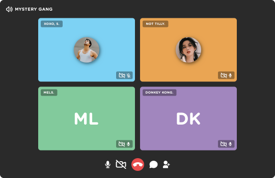
◦˚~ GROUP CALL NOW!! template by enchanthings ~˚◦
Info:
Full image size: 1080x700 px
Fonts used: Gotham Rounded
Elements are separated, grouped, and labeled accordingly.
Option for initials or profile picture included for all.
On/Off icons for camera & mic are also included.
Use clipping mask for easier fit of the images.
Credits: dedicated to the mystery gang, who lent me their muses for the preview!!
Terms of Use:
Disclaimer (!) placeholder images are not mine.
Follow my rules if using.
Do not claim or repost as your own.
Reblog or like if download.
My ask box is open if you have any questions! If you're able and willing, please also consider supporting me with a coffee!
◦˚~ [ download access through source link] ~˚◦
#templates#rp resources#template psd#psd template#graphic template#social media template#rph#rpc#dailyresources#supportcontentcreators#ps template#template#.m
551 notes
·
View notes
Text


Theme #09: Astral by @pneuma-themes
May this Song lead us to our Paradise.
Live Preview (Temporary) / Static Preview: [Index] [Permalink] / Get the code: [Pastebin] [Github]
A sleek and minimalist sidebar theme created around the idea of having a music player and a monochrome aesthetic. Suitable for all kinds of blogs.
Features:
Optional monochrome images. Can be enabled or disabled from the Customize page.
One accent, 8 color options.
Customizable post width and font size. The live preview uses 600px posts and 13px font size.
4 custom links.
Optional audio music player. Can be enabled or disabled from the Customize page. Paste the direct link of your audio file to the song url field in the Customize page and type the name of your audio file into the song title field. To add the artist name of your audio file, type the artist's name into the song artist field.
Custom link menu title, can be filled by typing the title of your custom link menu into the custom link menu title.
Customizable photoset gutter.
Built-in lightbox for photoset posts.
Mostly NPF-friendly.
Notes:
Usual disclaimer applies.
The audio player only supports one song.
Credits:
Un-blue polls, NPF Image Fix 3.0, NPF Audio Player, Music Player #07, minified spotify player: @glenthemes
customAudio.js: @annasthms
NPF reverse compatible template: @eggdesign
photoset.css: @eggdesign, @annasthms
Icon fonts: Lucide
Sidebar image: たえ (tae402 @ X/Twitter)
Font: Rubik @ bunny.net
Toggle tags on click: @alydae
Responsive video script: @nouvae
Song on preview: Class::DISTLLISTA; by Shimotsuki Haruka from the game Ar nosurge: Ode to an Unborn Star.
Please like and reblog if you like or are using this!
#themehunter#theme hunter#tumblr themes#blog theme#dailyresources#*mine: all#*mine: theme#*theme: astral#she so prettyy i love the sidebar#fun fact this is the first theme i released after getting hitched!#life is good
567 notes
·
View notes
Text
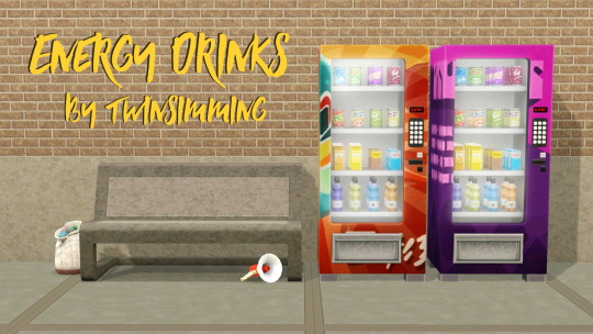
Energy Drinks by Twinsimming 🥤
This mod adds custom Energy Drinks to a new type of vending machine.
This is a script mod that can be placed in your Packages folder. It was built and tested on 1.69 but should work fine on 1.67.
Requirements
The Sims 3: Late Night
The Sims 3: Seasons
The Sims 3: Supernatural
The Sims 3: University Life
Overview
Soda-Lightful Vending Machine
Energy Drinks
Side Effects
Flavors
New Moodlets
Soda-Lightful Vending Machine
- Price: §1250 - Category: Large Appliances - Includes all 11 original swatches + 1 recolorable option (3 channels) - Poly Count: 2346 - Originally created for The Sims 4 by RAVASHEEN, converted to The Sims 3 by me
Like the vending machines that came with University Life, sims can Buy Energy Drink, Shake Machine, or Slam Machine.
Energy Drinks
Teen and older sims can purchase energy drinks from the Soda-Lightful Vending Machine for §5 each.
Energy drinks boost the Energy need, give sims the custom Energy Rush moodlet, and remove any moodlets related to low Energy (Tired, Sleepy, Exhausted, Buzz Crashed, etc.), similar to drinking coffee, but the effect lasts twice as long (6 hours instead of 3 hours).
Drinking multiple energy drinks in a row will boost how long the Energy Rush moodlet lasts, as well as increase the moodlet's value, up to 18 hours and +30 mood.
Once the Energy Rush moodlet expires, sims get the custom negative Energy Crash moodlet.
Side Effects
If your sim goes more than 24 hours without another energy drink, they'll start to suffer from caffeine withdrawal and gain the custom negative Craving Caffeine moodlet for the next 2 days. Drinking coffee, tea, barista bar beverages, or another energy drink will remove this moodlet.
Drinking more than 2 energy drinks at a time also carries the risk of a sim being electrocuted and dying.
Teens and Elders both have a 5% chance of being electrocuted, while YA have a 1% chance and Adults have a 3% chance.
Flavors
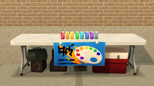
There are 8 different energy drinks to choose from. 6 provide flavor-related moodlets from the snow cone machine from Seasons and the bubble blower from Late Night. These moodlets last for 4 hours.
From left to right in the second preview photo:
Charged Cherry (Cheery Cherry)
Pineapple Power-Up (On a Beach)
Lightning Lemon (Laidback Lemon)
e-Lectric Lime (Lucky Lime)
Blue Raspberry Blitz (Raspberry Romance)
Gigawatt Grape (Gleeful Grape)
The Unidentified Fizzy Ooze energy drink replenishes Alien brain power, but makes non-Aliens nauseous.
The last energy drink is called Mystery Flavor and it works like the jelly bean bush from Supernatural; including carrying the risk of death, so proceed with caution.
New Moodlets
Energy Rush: Given when sims drink an energy drink, lasts 6 hours, +10, +20, or +30 mood
Energy Crash: Given when the Energy Rush moodlet expires, lasts 7 hours, -15 mood
Craving Caffeine: Given when sims go more than 24 hours without another caffeinated drink, lasts 2 days, -30 mood
Tuning
All of the tunable values can be found on the mod download page under the header “Tuning”.
Script Namespace
If you want to turn a different vending machine into an energy drink vending machine, open your desired object in s3pe and replace the current script name with the following:
Sims3.Gameplay.Objects.Twinsimming.EnergyDrinksMod.VendingMachine
Conflicts & Known Issues
This is a new scripted object, so there shouldn’t be any conflicts.
All of the drink cans are different colors when placed in the world and during the drinking animation, but they all have a red can icon when placed in a sim's inventory. I'm not sure how to fix this right now, but that should be the only issue of note.
Credits
EA/Maxis for The Sims 3 and The Sims 4, mesh by RAVASHEEN, Visual Studio 2019, ILSpy, s3pe, Notepad++, Sims4Studio, TSRW, Blender, Milkshape, Gimp, and Script Mod Template Creator.
Thank You
Thank you to RAVASHEEN and everyone in the Sims 3 Creators' Cave Discord!
If you like my work, please consider tipping me on Ko-fi 💙
Download @ ModTheSims
375 notes
·
View notes
Text


☀ CARRD TEMPLATE : 007. fiend. ( free! )
☀ [ PREVIEW ] [ PURCHASE ] pro - lite & higher.
☀ REFERRAL CODE : SUNNY
☀ KO-FI
a multi -muse carrd that includes;
a header with an icon, intro, and navi.
a muse directory page; clicking the images will redirect you to their specific character pages!
verses & mains page.
** just a reminder but images are not included in any templates!
PLEASE DO NOT REMOVE THE CREDIT / DO NOT CLAIM AS YOUR OWN, you are free to alter the colors and adjust it as much as needed but the credit must remain at all times. ** if using, i'd also appreciate a like and / or reblog to show me that you're interested in my templates! thank you!
#carrd template#carrd templates#roleplay carrd#rp carrd#roleplay carrds#rp carrds#rp resources#roleplay resources#twitter rp#tumblr rp#twitter roleplay#tumblr roleplay#roleplay#free carrd template#carrd : sun#sun : multi muse#sun : free
1K notes
·
View notes
Text


🐝 * ― 𝐁𝐋𝐎𝐆 𝐒𝐓𝐀𝐑𝐓𝐄𝐑 𝐏𝐀𝐂𝐊 𝟎𝟎𝟑: 𝐇𝐄𝐀𝐕𝐘 𝐈𝐒 𝐓𝐇𝐄 𝐂𝐑𝐎𝐖𝐍. ( is it my return to the rph world? who knows. but i had fun making this ( literally in the past 24 hours ) and decided to share it. not sure if you can count this as a sorta dark royalty aesthetic or something but that's probably the closest to describe it as. this blog pack includes a promo template, an icon template, a banner template, a header template, a carrd template for single muses ( preview ) and multi muses ( preview ) each, and five pre-made dash icons as well as a post divider. i've also decided to include the fonts i've used in the graphics. this whole pack is made to fit together so it can ( but doesn't necessarily has to ) be used together. feel free to edit however you want. due to the number of elements used, the carrd templates both require at least a pro lite account. if you want to upgrade, feel free to use my referral code KB4W13V3 because it helps me out. )
― HOW TO USE
please don’t claim as your own, and don’t delete the credit on the doc. you can change all the colors / sizes / whatever, but the credit has to stay.
you can find this pack here. it’ll lead you to my payhip, where you can download a pdf file containing links to all the different templates and graphics. as always, it’s on a pay what you want basis so it’s possible to get it for free if you set the amount to 0. ( if you’d like to leave a little tip i’d very much appreciate it, though. )
if you have any further questions on how to access / use this pack, feel free to message me.
#blog starter pack#carrd template#carrd templates#promo template#banner template#header template#dash icons#icon template#rp icon border#rp template#free rp template#free rp resources#rp resources#rph#type: blog starter pack#type: carrd#type: psd#type: graphics#type: promo#template: single muse#template: multimuse
108 notes
·
View notes
Text

theme thirty-one ♡ by userbru live preview | code | support me on ko-fi?
pretty minimal & simple theme, not a lot of customizations necessary <3
540px posts
300px sidebar
5 sidebar links
optional title
custom desktop description
made with the npf based template by @eggdesign
+ credits on code
if you want to change the sidebar links icons, head to cappuccicons.com, find the icon you want, and on the HTML (under ), ctrl+f, find the icon you want to replace, and on the line of code replace the name of the icon with the new one you want (keep the hyphens).
recommend doing a theme reset before installing this theme!
I am accepting theme commissions. for more information, DM me here or on my main (@fadeintoyou1993) here is a master list of all my themes with the npf fix.
#theme#theme hunter#tumblr themes#dailyresources#themehunter#codingcabin#kosmique#maziekeen#usersage#ricecodes#allresources#completeresources#*
368 notes
·
View notes
Text
Downtimes, module editor, water temple
Happy summer! There's smoke in Portland but it's not too bad. Bless firefighters. Work on Lancer Tactics continues apace.
This month has been mostly focused on the largest heretofore-untouched section of the game: downtimes and the module editor for designing the sequences between combats. We're not planning on doing anything particularly innovative or new in its design — if you've played Banner Saga, Fire Emblem (gameboy versions), or Rogue Squadron you'll recognize what's going on here.

Repair, level up, have visual-novel-style conversations with companions, do some light choose-your-own-adventuring, and pick & launch the next combat. All pretty standard downtime fare — games have pretty thoroughly explored these patterns as vehicles for narrative at this point.

The unique thing that Lancer Tactics is offering on this front is an editor to make your own entire campaigns. Classic games like Warcraft or Age of Empires had incredible scenario editors, but making anything more than a one-mission map was solely the domain of modders. Over the last few weeks, we've gotten a full basically-visual-novel-editor working ingame where you can orchestrate NPC story arcs, clocks ticking, branching paths, and triggered events for all the stuff that happens between combats.


All of the campaigns we ship with the game are going to be made with these same editors, which'll force us to really make sure that they're solid tools. I think it'd be very funny to someday see someone like completely ignore all the mech stuff and just make a visual novel in this engine.
There's no new preview game build this month because adding this big section of the game means too many things are under construction. I'm happy with how fast we've been able to get this going, but making ingame editors is a lot of unglamorous UI piping and data refactoring work. Fingers crossed that it'll come together enough that we'll be able to get the first version of this editor in your hands in time for the next update
Other Changelogs
Carpenter has started re-making the tutorial level from the demo in this new engine, which is pushing us to add a bunch of stuff to the combat editor. I added triggers for playing arbitrary effects on the map, moving the camera, storing arbitrary data to the battle/module states, enabling/disabling/triggering other triggers, AND/OR conditions, and putting execution limits on triggers.

Triggers can highlight UI or actions (so it can be like "use the boost to get through!" and the boost button becomes all shiny)

New "camera start" zone type
Added a "hotspot" zone type that has a little floating title, and plastered the names of other zones on the map (visual style stolen from some Foundry VTT modules)

Added water, whose level can be set via the editor or triggers.


Added unmounted pilots who can mount up into Shut Down mechs. We continue to plan to not have pilot combat be a part of the core game, but it'll be useful for scenario or scripted sequences.

Added activation pips and template icons to the mini healthbar on units.

A bunch more portrait editor assets from Martina, including facial hair. Here's a check Carpenter did where he tried to recreate some official Lancer art ingame. ✨

Schedule update
Taking a look at our original date for the "bones" of the game ("finishing the battle engine, basic character creation, 2 mechs per manufacturer, and an a 'instant action' mode"), we estimated being able to get it done by the end of November. The emotional milestone for me on this front is getting the game to a complete enough state that I feel OK about swapping it in on the itch.io page.
I've been saying that the 3D cataclysm has pushed us back back about 3 months, and I think that's still holding true. Carpenter and I haven't officially made the call yet, but I think it's likely we'll need that time to port more mech content; here's a graph they made that shows about where we're sitting on the PC and NPC mechs for the "bones" target in terms of mechanics and action icon/sprite.

(This data is pulled from a big table they made that includes ALL talents/gear/traits where we've been marking things off as we've implemented them. Very handy for tracking where we are.)

That's all for now. Tata!
80 notes
·
View notes
Text

page 001: juliette — preview + code + spreadsheet
a minimalist responsive character page with no images, but with enough imagination, it can be used as a media or network page. instructions are in the code.
a huge thank you to @nonspace for helping me with the google sheets integration and taking a good look at the javascript part of the code!
features
google sheets integration
css variables
navigation links, toggeable filters menu and hide/show controls
endless muses boxes with a title and an optional subtitle, description, a section for any extra information and a section for love interests and links in each box
responsive
customizable colors (backgrounds, text, gradient, links and accent), font-size, body font and title font, boxes width, optional glow
terms
reblog this post if you like it or use it. reblogs are more than appreciated!
do not edit, move or delete the credit
do not use as a base code and take credit for it
full terms of use
credits and notes under cut:
credits
google sheets integration by @nonspace
masonry layout by desandro (+ tutorial by @suiomi)
isotope combination filtering by metafizzy (+ tutorial by @magnusthemes)
dropdown menu by @acuite
hide/show controls by @seyche
phosphoricons by helena zhang and tobias fried
full list of credits
notes
html/css knowledge are necessary to edit and adapt the code to your needs
instructions on how to integrate google sheets are both in the code and in the spreadsheet, as well as on this page
if you prefer to add boxes manually, you can find the template in the code
to change any of the icons in the code, visit phosphoricons, find the icon you want to use and change the style and icon like in the example:

#rph#themehunter#theme hunter#supportcontentcreators#completeresources#allresources#dearindies#*#* page#* juliette
474 notes
·
View notes
Text
Free Carrd Template - Pink Hearts

This is a free to use template for VTubers and streamers who want to have a simple mini website on Carrd!
♡ Preview: 4cc16d16d77d9ade.demo.carrd.co ♡ New to Carrd? Try it out here: try.carrd.co/nyxgothica ♡ You can activate my referral code NYXGOTHICA directly at checkout when upgrading to a paid plan. ♡ Thank you sooo much for the support! 🙌🏽
Download the template here.
Includes: ♡ Home tab with Icon links and description. ♡ About tab with space for your model reference image, lore and credits. ♡ Socials tab for all your social links. ♡ Schedule tab for sharing your schedule with viewers!
Terms of Use: ♡ Credit me as Nyx Gothica. ♡ Don't delete the credit at the bottom of the template. ♡ You can edit and modify the template however you want, just don't claim it as your own creation. ♡ Don't copy, redistribute, resale or profit off this template in any way.
143 notes
·
View notes
Text


Page — Rainbow by tanaka-drew Preview/Download
A typical carrd** template (+ this manga panel from Naruto) inspired all-in-one page.
Features:
about section: four 100x100px about images, quote section, bio section, social media section
messages section: question section, answer question with 50x50px answer icons images, askbox
tags section: tags title, tags subtitle, tags links
Notes:
Griddery by @glenthemes for the muses section! Thank you sm again, Raccoon, for allowing me to use the script. <3
** I draw the line from making the about images by four per row, it looks weird (I'm sorry. It looks way too cluttered.) so you get two images only lmao.
Please like or reblog if using. Message me if you found coding bugs aka a mistake caused by my sleepiness.
I don’t claim any of the fonts, scripts and/or tutorials I used unless stated otherwise. See full credits here.
#rpc#rph#rpt#rp theme#indie rp#indie rp theme#about page#about pages#bio page#bio pages#faq page#faq pages#tags page#ttags pages#mine: pages#free content
54 notes
·
View notes
Text
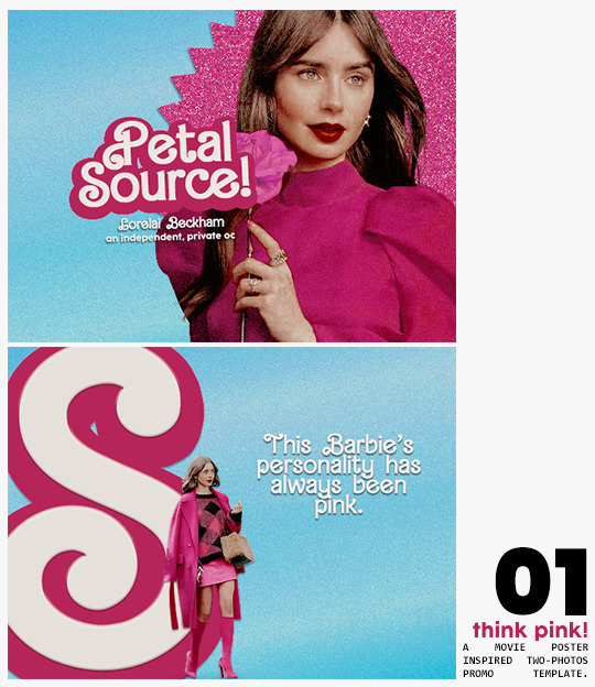
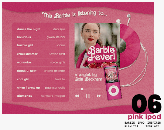
⋆ barbie fever . . . by petalsource .
. . . a complete blog makeover inspired by barbie .
hi, barbies! today, i bring you a complete makeover fully inspired by our favorite pink lady, barbie herself, to allow all of you to bring your own characters into her world in plastic!
feel free to tweak and adjust to your needs, add different background colors and overlays, but kindly do not claim as your own or use it for commercial purposes. feel free to tag me on your creations with this on #petalsource! seriously... i can't wait to see what comes of this!
💐 click the source link to get it as a package or individually on deviantart or payhip !
and . . . keep reading to find more details about the graphics, hq live previews and important tips to use the templates !
✩ about the items!
➷ think pink! -- a two-picture promo template inspired by the iconic 2023 movie posters. you'll need: two pngs of your faceclaim of choice, and the custom fonts (listed below). the glittery polygon of the first picture is available in 7 different glitter colors! high quality examples.
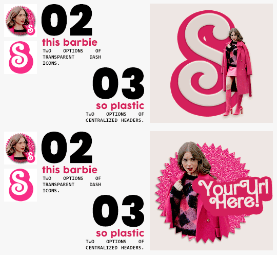
➷ this barbie -- two options of transparent dash icons; one matching the "initial" poster and one matching the "glittery polygon" poster. high quality examples.
➷ so plastic -- two options of centralized headers; one matching the "initial" poster and one matching the "glittery polygon" poster. to use it at its best quality, disable the "stretch header image" option when uploading the header. high quality examples.
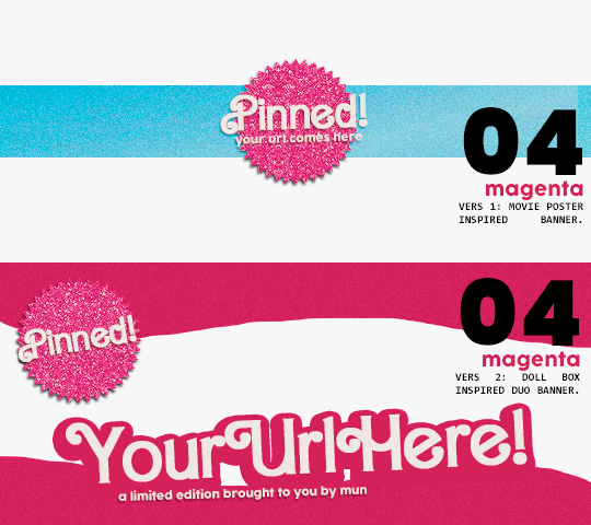
➷ magenta -- version 1.0: pinned post (or miscellaneous) banner inspired by the 2023 barbie poster. version 2.0: pinned post (or miscellaneous) pair of banners mimmicking the layout of a barbie doll box. one banner goes on top of the postbox, insert pinned post or text, and the other banner goes on the bottom! high quality examples.
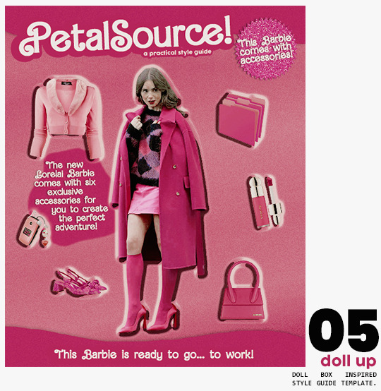
➷ doll up -- lookbook template inspired by the barbie doll box, featuring a "doll" picture and six customizable objects / accessories. you'll need: full body png of your faceclaim of choice, custom fonts (listed below), and 6 pngs of random objects or clothes to "come with" your doll. i've added a short tutorial down below on how to find and use some easily! high quality examples.
➷ pink ipod -- playlist template inspired by the barbie ipod, featuring a cover art and nine songs. high quality examples.
you can purchase all items as a package (deal price) or individually!
✩ important tips & useful information!
➷ needed fonts: bartex, cocogoose.
➷ object pngs + removing background of images: i found a super useful pinterest board with photos that can be used on your graphics: oxfordcommah's object pngs. additionally, the clothes png search on p*nterest is really diverse, and you can narrow your interests like "pink clothes png" or "vintage shoes png" and find a lot of options. once you found your images, go to remove.bg and paste their urls in there. it'll remove the background of those images for you and you can just paste them on your template and have fun!
➷ used coloring psds: the beautiful and super pink psds i used on the previews were not made by me and are NOT included in the downloads. in case you want to use them, they can be found here: dreams, 003.
➷ styles: the download includes two styles, one for a subtle drop shadow used in a few layers and one for the plastic box effect in the lookbook template. you can install them by opening the styles tab on photoshop > the four lines > load styles > find the barbie styles on your downloads!
➷ in case you have any questions, pop into my inbox or ims and i'll be happy to help you!
#template psd#template psds#barbie psd#character psd#character psds#𓂅 ♡ ⋆ 𝐦 ��� templates .#i really really really hope you guys like this!!! i had so much fun doing it
328 notes
·
View notes
Text
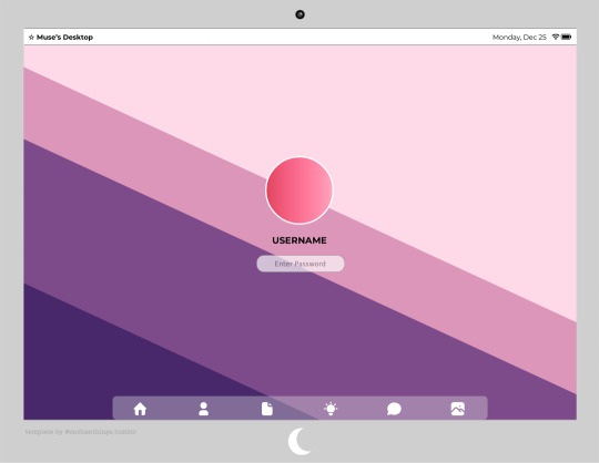


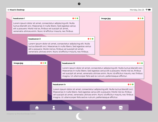
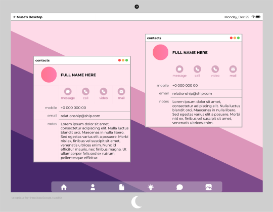

◦˚~ ADELINE'S DESKTOP by enchanthings ~˚◦ [PREMIUM]
Info:
A desktop themed google docs template
Page size: Letter (8.5" x 11")
Font: Montserrat
Number of pages: 10 (for full preview please see link in the source code)
Navigation icons are all linked to the corresponding pages.
Edit the images using "replace image".
Change the background color of the icons on the contacts page by double clicking and changing the shape color.
To change the desktop background for all pages, use "insert → watermark".
Additional content: 9 logo shapes for the monitor.
Terms of Use:
You may edit all editable parts as you wish (colors, images, elements, add, replace, or remove, etc).
Do not remove my credit from the templates.
Do not copy, sell, redistribute my templates in any way.
My ask box is open if you have any questions/problems!
◦˚~ [ download access through ko-fi ] ~˚◦
*For the free demo version version click here!
Credits:
Navigation icons from tabler.io
All other elements are created by me from scratch.
#google docs#docs template#google docs template#rp template#gdocs template#supportcontentcreators#dailyresources#.m
202 notes
·
View notes
Text
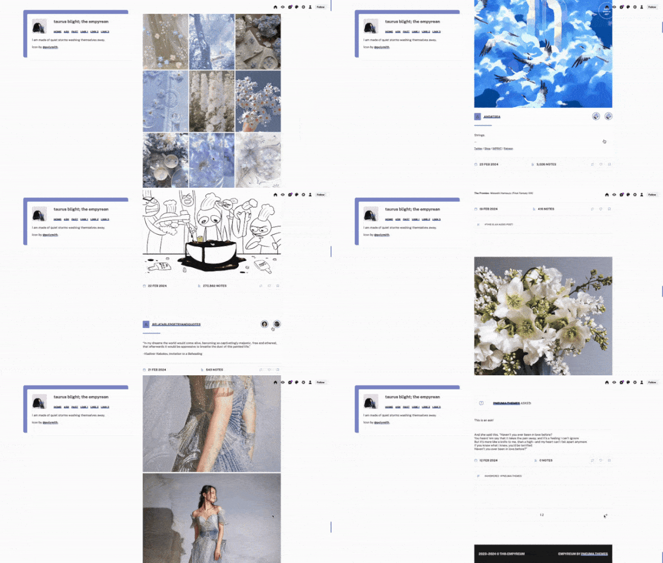
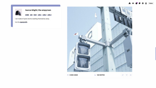
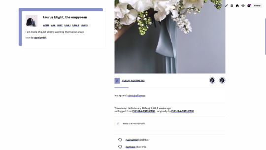
Theme #08: Empyreum by @pneuma-themes
I am made of quiet storms washing themselves away.
Live Preview (Temporary) / Static Preview: [Index] [Permalink] / Get the code: [pastebin] [Github]
A simple sidebar theme in a similar vein to Theia. I made this as an answer to an ask I answered not too long ago (it definitely feels like forever ago though). Suitable for all kinds of blogs.
Features:
Customizable post widths and font sizes. The live preview uses 600px post width and 13px font size. Enter the desired post width on the post width field and the desired font size on the font size field on the Customization page.
Customizable photoset gutter.
One accent color, 8 color options
A 64x64px icon on the sidebar. Any square image will resize automatically.
3 custom links.
Notes:
This theme uses the new NPF theme base. Everything should work as expected, except for some things, particularly reblogged quote posts. See below for an explanation.
A quote reblogged via the new editor will be, unfortunately, displayed as a usual blockquote. This is a Tumblr bug. I have tried my best to support both legacy and new quotes while the legacy editor is still in use, but as we slowly transition to the new editor, design choices have to be made, and for the time being that choice is made for us theme makers by the staff.
Credits:
Icon: @polymith
Unblue polls, npf audio player: @glenthemes
customAudio.js: @annasthms
photoset.css: @annasthms, @eggdesign
Flexible video resize: @nouvae
NPF-reverse compatible template: @eggdesign
Icon fonts: Akar Icons
Font: Public Sans @ bunny.net
Please like and reblog if you like or are using this!
#themehunter#theme hunter#dailyresources#html#tumblr theme#*mine: theme#*mine: all#*theme: empyreum#it's been 3000 years...#well let me know if something is wrong
314 notes
·
View notes
Text
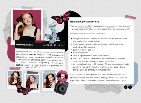
MADELINE: PERSONAL THEME BY ETHEREAL THEMES
View on payhip ($6.50), check out the preview or support me on patreon for more themes + pages, header templates, coloring psds and more every month!
Personal with 300-540px posts
Navigation: Home, Contact, +4 additional links (customizable icons selections + filled or line)
Four images styled as polaroids, these include one large portraits and three icons
Body font family options
Font size options
Dark or light custom tumblr tools control
Misc PNG, "blob" shaped decos and ripped paper pngs, all customizable and uploaded using main editor
Un-nested captions + NPF support ; All post previews are made using the new post editor, but this theme also supports old posts. New + old post styles look the same.
Color options for: background, text, links, borders, content, four accents, content, polaroid colors (if image is removed), polaroid tape colors, liked posts heart, question posts, all decos + more
Other Options (with on/off toggles):
Blog Title
Sharpened images (large polaroids are slightly rotating which can cause blurriness)
Do edit any feature to make it your own.
Don’t use as base code, remove credit or claim as your own.
Everything you see can be edited including colors, texts and much more. This theme was made with personal (and muse / rp) blogs in mind.
Basic HTML to edit, all info is on the main editor, so no html needed! Please reblog or like if using. And let me know if you come across any issues.
#personal theme#muse theme#contained theme#rpt#codingcabin#dearindies#personal#rp#themes#all#madeline#muse*#personal*#contained*#premium theme#ethemes#all*
69 notes
·
View notes