#i'm fucking enraged
Explore tagged Tumblr posts
Text
Hey Gotham War what the actual FUCK did you do to my son?!?!?!
#batman#gotham war#jason todd#dc#detective comics#i am enraged#“this is love”?????#“this is a gift”?????#back the FUCK up Bruce#you just mentally crippled your child#beat his ass for me Dick#idc if it is mind control there still had to be a part of bruce that considered it#a fucking failsafe of that magnitude for your SON#ohhhh Ive gotta go lift weights now#i'm fucking ENRAGED
23 notes
·
View notes
Text
So y'all have seen the Williams F1 Logo before, yeah?
well get ready, becaues I am about to ruin your day!
where does one even begin with this. i am sorry in advance. -just a poor learning graphic design student, who simply tried to enjoy their saturday evening
The Logo
For anyone that doesn't know, here's the Williams F1 Logo. Entirely unedited, copied straight from Wikipedia:

Now like many fans, I actually quite enjoy this logo. I like the modern, sharp edges of it and it's simple yet intriguiging design. It's memorable, while also easily recognizable as a W. I also really enjoy the colour choice (this, however, is entirely a personal preference.)
(entire rant under the cut. please keep reading this took years off my life span.)
How did we even get here?
Let's start at the beginning. How did we even get here? Well I, a poor poor learning graphic designer, was watching this lovely video from Mr. V's Garage about bad F1 Logo's over the past 35 or so seasons. Very interesting, I can only recommend it (but you don't need to watch the video to understand this post)!
Now, to cleanse the palette at the end of the video, Mr. V included a top 10 GOOD logos from this time span, it was very kind of him.
On P4 of this "Good List," Mr. V placed the current Williams F1 Logo, as pictured above. At first I vaguely agreed with this, believing that he probably simply hadn't noticed one of the things that's been bothering me about that Logo since the first time I saw it up close.
The first sign of Trouble
So, what is this mystery issue, you might ask?
It's simple really. You don't necessarily notice it at a first glance, but something about that logo seems off. Taking a second longer, you may notice it yourself.
No, I mean it, take a minute and go look at the logo. It looks wonky as hell, doesn't it?
Well I can tell you the first thing that I personally noticed. The arms of the W aren't in line with the bottom half, see:

(Graphic by @girlrussell who was so kind to let me use it, as it is way prettier than the one I made)
It's a crooked W. There is no good explanation for this. The rest of the font is perfectly fine, geometrical shapes.

Anyway, the good person that I am I went to point this out to my partner ( @leftneb ) who proceeded to inform me that he, infact, was not aware about this and was, quote, "never going to unsee that."
Now, the good FRIEND that I am, I, of course, proceeded to rush into our broader F1 friendgroup to make them suffer for eternity.
What's the logical next step to take? Of course, fix the logo in Adobe Photoshop, you know, as a joke.
(Disclaimer at this point, I am not necessarily the biggest fan of Williams Management Team. I enjoy ALL their drivers this season. I do NOT enjoy James Vowels. Be warned.)(Also I am aware that he probably did not have an influence on the logo)
Trying to fix it. Oh god, I was so innocent back then
Trying to fix the logo in Photoshop is the worst mistake I could've made. THE worst path to take. I could've just giggled about making my friends suffer (which I succeeded in, by the way) and moved on. Instead I ruined a perfectly good Saturday evening, and for what? I don't know anymore.
Anyway, how was I gonna go about fixing the logo in the simplest way possible? Simplest way I could come up with: slap the thing in Photoshop and put two, mirrored boxes at each side to make the sides line up. Small issue, how do I make the thing actually even? Fix: line them up at the intersecting point with the bottom tips of the W.
Here's the result:

Hey, anyone care to explain to me why in THE LORDS NAME the arms are different sized? I mean, surely they weren't before. Surely, certainly, I must've messed up.
I double, I tripple checked. I made sure everything was lined up and made sense. But no.
It just couldn't be. Something was uneven in this logo, something even deeper. Something I could not have predicted when first taking a closer look. It was at this point I realized I had messed up. What rabbit hole had I stumbled across? Certainly, it couldn't get much worse.
And that's when I noticed.

(pictured above; my genuine reaction)
There's MORE? (oh god, the top isn't lined up)

I couldn't believe my eyes. This is the PINNACLE of the sport, and THIS was the logo of one of the competing teams? I mean, yeah, we have a Visa Cash App RB or a Kick Sauber or even a MoneyGram Haas which are all terrible logos, but at least they're CLEAN. (this has not been checked. If anyone wishes to ruin a nice Saturday evening, feel free to check them and tell me how wrong I was in the previous statement!)
But you can see that there is no end in sight for this post. I'm sure you're as scared as I was at this point. By now we were sitting in VC, discussing the horribleness of this logo. I had long informed my irl's about this, who take said design classes with me. And it was one of them who pointed out the next thing that had been bothering me, but I had not been able to put a finger on up to this point.
thE DISTANCE, HOW DID THEY FUCK IT?

I'm afraid I have to confirm your fears.
Yes, those lines are the same length. According to Photoshop, they're on the same level as well, so no flunking with angles.
The gaps of the arms to the main W are not the same. They're differently sized gaps.
It was clear to us, this logo is inherintely flawed. They're subtle issues, but once you pay attention you start to notice things. It all looks slightly wonky and off centre. And eventually, you get paranoid, and start comparing other angles and sizes. And you will keep finding things. This has ruined my life.
HOOOOOW

Honestly, I don't even know what to say. Yes, yes sadly those lines, too, are the same length. Just copied over from one side to the other and layed over on the same height. I admit, they're not layed over perfectly. I was honestly holding back tears at this point. But the point still stands, you can clearly see a difference in width.
Honestly, the only way I can explain it is that at some point there was a mess up of distance or proportions and whoever was designing the logo couldn't pin it down and tried to restore the visual balance by making manual adjustments. And in all honesty? They kinda did a good job, if that's what's happened. I mean, you notice the crookedness of the arms, and then maybe the difference in height, but the rest you probably will not notice if you don't spend too much time staring at it. (like some of us) And even those issues clearly aren't noticeable to the vast majority, considering I had to go point it out to a group chat for my friends at least to notice.
what the fuck is THAT?
Now, the thing about doing this investigative work of prooving a team you dislike is worse in more aspects than you previously thought, is that you do a lot of zooming in. And zooming in means you might notice bits that yours eyes simply overlooked before, because they were too small.

Here you can witness the top of the middle point, that, for whatever reason, really wants to touch the top border of the Logo. I'm relatively certain that's the highest few pixel in the entire graphic, considering earlier chapter "There's MORE?" I have no idea why it looks like that or why they thought it was necessary for it to not end in a clean point.

I just actually have no idea how to even describe what is going on on the top of the left arm. That left hand side, again, touches the side and is therefore the most-left-pixel in the graphic. I, once again, have no idea the purpose of this. However the RIGHT hand side also makes no sense, as it is the most prominent corner in the whole logo. There's pointed corners, and rounded OF corners, but nothing that is trying to form it's own colony in a distant land that hopefully isn't this god awful logo. I hope that blob gets away. I really do. You go king.
i'm loosing my mind
Anyway, the only reason I could come UP with those weird "reachy-outy-bits" was to establish the dimensions of the logo? But if that was the case, I don't understand why they managed to keep all the other potentially border touching corners clean?


Like, look. Those are clean, sharp corners with some clearance off the borders. I have no clue why they managed it here but not with the others.
guys. please.
Backtrackig a little bit, going back to the positioning of the arms.

Do I need to mention that those lines are both the same length and the same (mirrored) angle? I really hope I don't, because I don't think I could be making this shit up. Like, once you roughly know what you need to look for it just kinda becomes easy to find.
As said before, I genuinely do think that most of these issues happened in a chain-reaction. For example, the distances between the main part and the W wouldn't be as noticeable (and they do get noticeable once you start looking at it) if the angle wasn't fucked. And guess what, there's more fucked angles here! Which ALSO influence this specific area of the logo!
this is just embarrasing for you.

something something same line copied over and mirrored etc etc
It's not as visible but the angles defintely don't line up here as well. As mentioned before, these issues for the most part all influence each other. It doesn't really excuse the issues, in my opinion as a designer, because a big company like this shouldn't have these sort of issues in their logo.
So let's review;
to sum it up,

i cannot even BEGIN to explain to you how big of a fucking JOKE this FUCKING logo is. because, i thought to myself, to round the post out, hey, why not show ALL the issues i pointed out in one picture? that would round it out quite nicely, wouldn't it?
Yeah well, this logo sent STRAIGHT FROM HELL just could NOT let me rest. I had only done the lines visualizing the crooked arms in PAINT up until this point, i.e. I had only pulled both up individually. To make a nice "rounding out" picture I still had to add them into PHOTOSHOP. so i did. i pulled up the line. i mirrored the line.
THE ANGLE IS FUCKING DIFFERENT
none. and i mean NONE of my friends had noticed this before. i need you to understand that we looked at this thing with FIVE pair of eyes, and NONE of us noticed that until i thought to myself "Oh I still need to add these specific lines to have ALL the issues I pointed out in my SILLY TUMBLR POST in ONE image" and i get THAT FUCKING SURPRISE
I was PLANNING to round the post out with a statement on how obviously this isn't a serious post. Here, I even had it all written out already because I accidentally started writing it in the last paragraph:
Of course, this is nitpicking, and it's not that serious. I'm aware of that. AS MENTIONED most of these would not be noticeable if we hadn't gone specifically looking for them.
yeah, well, fuck that. i just spent two hours seething about this logo. i'm ending the post on this instead.

#i am ENRAGED#i managed to actually calm down about it#yk. just typing away#and then i just try to ROUND OUT THE POST#for fucks sake#anyway i know i'm posting this at an hourrendous hour#if you read all the way. reblog? maybe#pretty please#williams f1#williams formula 1#williams racing#formula 1#f1#also apologies for any spelling mistakes i do NOT have the nerve to go back and proofread this
939 notes
·
View notes
Text
@oxymitch
#disability #whump reference
No, this is not a fucking "whump reference". This is not a fucking "whump prompt".
Fetishizing the pain of disabled people is fucking disgusting. this post is about my personal fucking experiences with being disabled, not a fucking prompt for you to think up ways to fucking torture people like me.
If you write "whump" get the fuck off my fucking post about how to write disabled characters. Holy fucking shit. Why do you think this post is an invitation for you to fucking torture disabled characters???? Why do you think fetishizing the pain of disabled people is a good thing????
Why would you fucking tag my post about my personal experiences to tell me you now plan to write torture porn about someone exactly like me?!?!?!!?
Delete your fucking reblog if all you're fucking doing is planning to use this information to torture disabled characters. Fucking hell.
well, for writers out there who want to have disabled characters:
things that are painful to do with a partially (or fully) dislocated rib, which people with certain kinds of hypermobility will probably already be aware of:
Breathing deeply. you will not be able to. the messed up rib will forcibly catch your breath and hurt.
Walking. whatever side it is will hurt every few steps if you move too far.
Bending over? Nope. You can't breathe if you do this.
Passively it feels like being very forcibly jabbed in the back with a blunt object. Like imagine someone is walking behind you forcibly stabbing you in the back with a blunted plastic point or something. Like a halloween toy. A consistant pressure/pain that gets more intense if you move the wrong way..
Breathing at all? Well you will have to keep stopping because again, it will forcibly catch your breath and hurt.
Sitting??? if you move the wrong way it'll hurt and you can't breathe.
Lying down???? maybe if you find the right position it'll be fine but if you move it'll hurt.
????
how do you fix this??
well maybe if you have a character who's doctor who's an expert at this they could put it back into place or something but I doubt it. mostly you just have to get lucky and move the right way and it'll go back.
If your character has hypermobility, they can dislocate a rib by something as simple as:
sweeping the floor
reaching to grab something off a shelf
picking up a stack of books
picking up a jack o lantern that's not even that fucking heavy
holding an umbrella
changing shirts
sleeping
dreaming about cute baby dragons and reaching to pick them up in the dream and apparently this made you move IRL so now your rib is fucked up!!! have fun with that!!!
what can you do about this? try not to move in ways that hurt. Take pain medicine I guess, but I don't think that's exactly a good idea because not feeling the pain won't mean it's no longer dislocated so you could probably hurt yourself worse if you kept moving a certain way. IDK. I don't have health insurance.
#ableism#I SWEAR TO FUCKING SHIT#people who have morals please fucking feel free to reblog this version so people can't claim this shit doesn't happen#I'm fucking enraged
184 notes
·
View notes
Text
Watching the "Making of" feature for Disney's 'Wish' where they go on and on about how amazing Walt was and how much he loved stories and fantasy and I'm having big feelings in the discord chat about it

#Walt Disney#history#cw#abuse mention#It's so fucking disingenuous to celebrate Walt's life#But then refuse to acknowledge the darker parts of it completely because those parts aren't marketable.#It enrages me so much#(I'm watching this for a video and I am not having a good time)
114 notes
·
View notes
Text
despicable is not a strong enough word for these people

#i saw hersh's name trending on twitter and i clicked the tag. big fucking mistake. this post was the second thing i saw#just fucking disgusting. i'm so enraged#antisemitism#may hersh's memory be a blessing and may these idiots die miserable and alone while choking on their own blood and shit
120 notes
·
View notes
Text
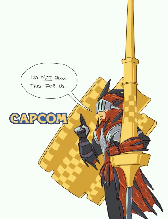
local lance main won't be surprised if they save the [best] [worst] for last
#sunbreak spoiled me SO rotten it's not even funny.#honestly i'm gonna be pissed if they changed ANYTHING about the lance following sunbreak.#ok fine i guess the shield hop -> leaping thrust combo could be nerfed a teensy bit. but only a little.#and i will not mourn the loss of twin vine. actually the opposite now that i think about it. if twin vine makes a comeback FUCK my life lmao#just pleeeease keep enraged guard/anchor rage in the main moveset please 👉👈🥺#monster hunter#mh wilds#my art <3
119 notes
·
View notes
Text

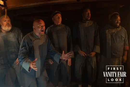
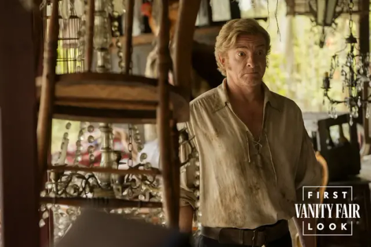

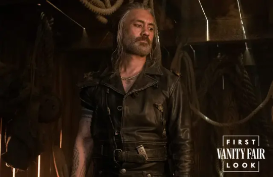
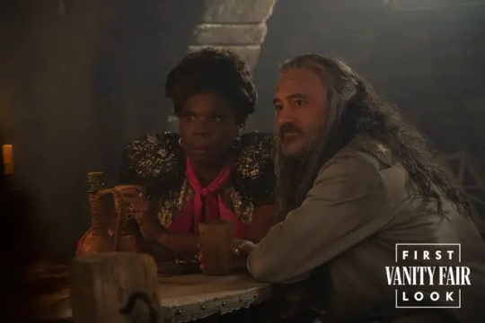
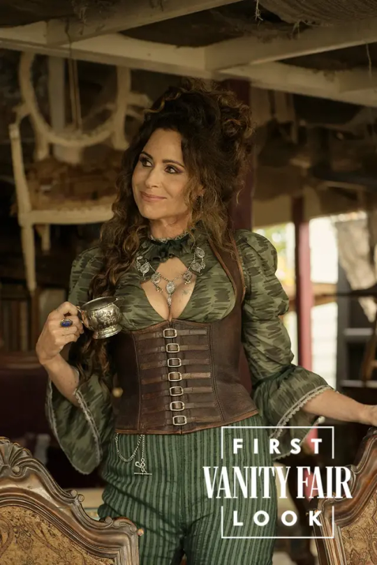

Vanity Fair First Look at Our Flag Means Death Season 2
#our flag means death#ofmd#ofmd s2#ofmd spoilers#edward teach#stede bonnet#black pete#wee john feeney#oluwande boodhari#roach#spanish jackie#i'm going absolutely insane you guys#i dropped my phone and my coworker asked me what was wrong lmao#minnie fucking driver as anne bonny????#ED'S WHOLE THING???#*STEDE'S* WHOLE THING???#WHATEVER THE FUCK IS GOING ON IN THAT SECOND PHOTO OF THE CREW??#and don't get me STARTED ON THE ARTICLE#izzy is a hopeless romantic enraged by unrequited love#actually that's getting its own post
236 notes
·
View notes
Text
Ya know, I was gonna be done. I spent hours yesterday talking friends off ledges when people were harassing them for being excited about the watcher announcement, or when their anxiety ballooned while watching the never-ending fucking tide of absolutely entitled morons kept piling on and on and on and spreading baseless bullshit every where.
But like, I cannot be done.
Because I am just so fucking disappointed. I'm so fucking sad to be sitting here watching people writhe with glee over the reactions to the announcement, and fill their little vengeful mugs in anticipation of watching the fall of a fledgling independent media company they are literally standing around lighting matches to throw onto the pyre.
Y'all make me sick.
You profess to love these guys, to want to see them succeed, to enjoy the stuff they make for you. You beg and demand and scream for more time with Ryan and Shane and bitch constantly during periods of the year when it's not Ghost Files or Puppet History time. You complain to anyone who will listen about how this is a betrayal, as if they're your fuckin' friends who you know personally.
News flash, they're not. They never were. You're parasocially attached to the plush puppet and the guy who sticks his hand up it in a way that is detrimental to your critical thinking skills and you know what? Fucking don't subscribe to the streamer. Who fucking wants you around anyway?
I would bet American cash money that none of you have EVER had to sit with your staff in a meeting and figure out how you were going to keep your company afloat. That none of you have ever had to decide to take a risk like this, in this kind of economic climate and be cautiously excited about what it might mean for you and then to have this absolute viciousness being the response.
I'm really sorry that for some people the price is just out of their reach. I completely understand wanting to join in on something and being unable to because of the money. The amount of times I've had to say no to doing something fun because I just didn't have the cash is not a small amount. It sucks. It really sucks.
But you know, the emotionally mature response to not being able to afford something is to be like, well is there a way that I can save up for this? Something else I can cut out? And if the answer is no, then, unfortunately, sometimes, you just have to be left out. This is a fact of life.
Do you people also get bitchy with artists who charge commission prices that mean they can afford to live?
The comparisons of Watcher to non-network television streamers are laughable. Like, Watcher is absolutely not on the same level of operating profitability as other streaming services. They are an independent production studio that gives a shit about making content that they like to make and taking care of their employees and the other people who are associated with them. And in order for them to continue to make the stuff we like (Ghost Files, Puppet History, et al), we're gonna have to buy-in.
Seeing people say with their full chests that they should just fire people? Are you fucking hearing yourselves? Who should they fire? Their queer employees? The people who write and do sound and edit? The people who make Ghost Files or Puppet History look the way it looks? The people who are the reason the shows work?
And, I'm sorry, but if you think that the solution here is that they should just ... make worse shows, I don't even know what to say to you at all. Sorry that Steven and Ryan and Shane wanna do more than lifeless unsolved copies for the rest of their lives. Go watch fucking unsolved if you want that, watcher has always wanted to do more, do better, make bigger things. And you know what? They are for sure allowed to do that.
I am also utterly enraged by the racism. I cannot even imagine what it's like to be any Watcher employee of colour today, watching the hate and the cruelty roll in. Y'all are just fucking mean, and gross, and I hope you all walk on legos in the dark in bare feet.
Everyone who is acting like this is some fucking personal betrayal needs to go smoke a bowl or do a bong rip and chill the fuck out.
#things jess says#i did not sleep for shit last night#i am exhausted#i am sad#i am disappointed#i am enraged by the racism#by the way that people are out here being their worst selves over six fucking dollars#over some videos they feel entitled to because they were once accessible for free#breaking news but shit costs money#i'm sorry you live in a fantasy land where it doesn't#it must be really nice
65 notes
·
View notes
Text
exploding warner bros with my mind
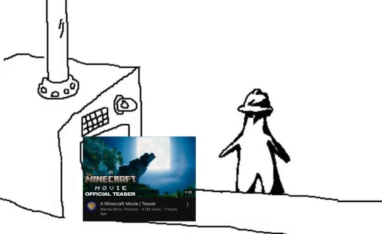
#triangle factory#i guess we doin circles now#minecraft#minecraft movie#jack black#warner bros#movies#i'm not even gonna tag this as funny#i'm just fucking enraged
29 notes
·
View notes
Text

remember the olive branch
“Forty seasons have flown
Since I first sat down beside you
In a crowd of our own”
a stancest fanmix
listen
#i come back and i'm strongly into old man incest#stancest#otherkeinthings#fanmix#i fucking handpicked every song like choosing sacrifical lambs they're ALL fordstan coded i couldnt take the freaky horrors by myself#last song backstory: ursula and ralph began over a decade long affair with each other while they were married to other people#ursula was his friend muse and lover. when ralph's spouse died he was reportedly so enraged he tore the room apart. they soon married#they travelled the world. it lasted only about 5 yrs until ralph's death. “tired” was written by ursula and composed by ralph. a last song
31 notes
·
View notes
Text
watched the ml movie
that sure was smth that happened on my screen for real uhuh
#i feel like i'm in a catatonic state rn#more thoughts below‚ no spoilers tho! just thoughts on the movie as a whole#uh#it was not great SJHDHFJG but what where we really expecting huh#overall maybe like 4/10 pushing a 3.5 i'm def gonna have to watch it with better subs visual and audio quality later#excited for the eng dub LMAO#overall there were like 2 or 3 scenes i really liked but MAN that ending was not it#gonna be thinking about it for a while tho#NOT AS BAD AS THE SHANGHAI SPECIAL? CAN I SAY THAT? IDK... IM NOT AS. ENRAGED. MAYBE CAUSE IT'S AN AU#def things going on and happening that i just ???? who did this#extremely incoherent rn if you can't tell#insane . thing. yeah wow ie#tizzy talks#miraculous ladybug#miraculous ladybug awakening#ladybug and cat noir the movie#christ why did they rename this film like 200 times#ml awakening#mlb awakening#i don't even remember which fucking tag i use for it
101 notes
·
View notes
Text
I am NOT reblogging or mentioning them to avoid boosting their content, but PLEASE BE AWARE OF this user parasocial177 and MASS REPORT THEM


#awareness#report#mass report#harassment#nazism#racism#rape culture#islamophobia#this user is the fucking scumbag of the earth i'm so just enraged
9 notes
·
View notes
Text
what if i put every mandalorian writer into a room and then set the room on fire
#the mandalorian#mandalorian#the mandalorion spoilers#like. oh my fucking god#what are they doing. what are they doing.#THIS IS NOT THE BO KATAN SHOW???? YOU GUYS GOT THE WRONG MANDALORIAN#THE WRITING IS???? WHAT ARE YOU GUYS DOING???'#YOU GOING TO HAVE US DEBATING THE SENTIENCE AND RIGHTS OF DROIDS AND HOW DIN'S TRAUMA AFFECTS HIS OPINIONS AND ACTIONS AND THEN???#JUST DROP IT???? JUST LIKE THAT??????/#NOT TO MENTION THAT WHOLE EPISODE 3 THING?? HELLO??#i'm so enraged.
126 notes
·
View notes
Text
American tankies who proclaim themselves as "communists" and haven't touched a history book since the age of 10 when an actually slavic person who is still dealing with the aftermath of colonization tells them the soviet union wasn't all so great and Joseph Stalin is not someone to be idolized (someone is saying bad things about their favourite glorious dictator and the only thing they can do about it is to make a post in their redfash social media echo-chamber):

#seeing lots of vile idolization of the USSR and russia lately#i'm enraged so i'm making fun of tankies#it is always morally correct#before you come at me; my entire family are victims of russification and we're still dealing with the colonization#don't you even DARE try to 'debate' me#i know more than you.#tankie punks fuck off#gif
27 notes
·
View notes
Text
kinda hate people who are a small or an extra small
#LITERALLY HOW.#I'M 5'2“ AND FAIRLY SKINNY#AND I STILL WEAR MEDIUM AND LARGE SIZES#i think maybe i have some size small shirts from when i was in 6th grade but they're all stretched out now#that's the only reason i can wear them#it just enrages me that 90% of the clothes i like and want to buy on depop are size small/extra small#i seriously want to know who is an adult that actually wears a fucking extra small.#that's a crazy thing to me
6 notes
·
View notes
Text
still can't believe my sister genuinely thought I would accept her terf rhetoric as if it was a fucking normal conversation topic ESPECIALLY AS HER TRANS BROTHER and she had the fucking nerve to get mad and upset about it
#apparently i'm not a feminist anymore#all my years of being a feminist and being enraged at the treatment of women means nothing now#supporting trans rights negates that according to her#vent#rant#transphobia tw#what planet does my fucking sister live on anyway#personal#anti radfem#anti terf
11 notes
·
View notes