#i'll also try to post more of my art and stuff here as well
Explore tagged Tumblr posts
Text
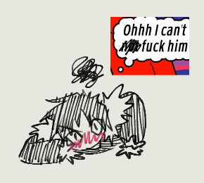

just some 🥥 related sillies i've made for that fic we all know.
#durarara#izaya orihara#shizuo heiwajima#shizaya#a cheap imitation#i made a thing#i've been holding off on posting these here for so long whoops#i'm so shy... check out my lemonade guys#i've been very motivated to make various things for this fic as a result of this book club i've been hosting for my friends#i actually made the first image (not the video) like two years ago?#back around when i first read the fic and started being annoying about it to my friends#never posted it though because the shizuo i drew was ugly!!!#and the shizuo i drew for the second image this time around is still ugly!! unfortunately :(#well anyways if it isn't clear the images are both for chapter 19 while the video is for chapters 28 to 29 and a little bit of 30 lol#also i know izaya's actual problem isn't fucking shizuo but kissing him lol but it was funnier to keep it like this#you can check out more of this deranged behaviour over at my twitter of the same name#i know not everyone wants to go there though especially with the current situation...#so i'll try to bring over the more memorable stuff to post in batches over here which i think is the stuff i did any art for#since i've made a lot of multimedia type things dedicated to particular chapters as “marketing” for my friends#but i'm not sure they'll make much sense out of context so#my plan is to compile all of everything i've made for the fic during the book club into a powerpoint that i'll try to keep for posterity#because ngl i feel i went kinda hard with certain things that maybe only two people will appreciate#but i'll do it for those two people out there#also it's a whole book club for aci!!#*i'd* want to see what some random people have been up to with a book club for this fic#be the change you want to see in the world#side note i wonder if having so many fucking tags on your own post is a bad look...#idk it's so much clutter but i have too many things to say!!#i look back at my own previous tags and i physically can't bring myself to read them ahhhh#i hope anyone's enjoying them anyways
192 notes
·
View notes
Text
again and again i find myself lamenting that audio roleplay isn't taken more seriously by some people. like yeah, they often have a romantic element, and by nature they usually directly involve/address the listener- and i totally get that those things aren't to everyone's taste. no art or entertainment is universally appealing, and that's okay! but.. it still makes me a lil sad that the "cringe" reputation of asmr/audio rp precedes it. there's a whole lot of talent and creativity being poured into these audios by so many people that i feel goes unrecognized and/or disrespected simply due to the medium that the stories are being told through.
#this post brought to you by: me bingeing Sam & Darlin's entire storyline over the past few days and having a Lot of feelings abt it#asmr#audio roleplay#rp audio stuff#redacted audio#anyways i don't have a conclusion to this post. and i'm not Mad or Upset or anything i'm just thinkin' out loud#and i mean it's not like it doesn't get plenty of praise within its respective audience bc it does. at least for the more popular creators#but i feel it'll still always have the shadow of its cringe reputation looming over it#which makes it hard for some ppl to openly appreciate or share with others that aren't already fans of the medium#like do u know how many comments i've seen along the lines of 'this is great but i'd die if anyone knew i liked this kinda stuff' ?? :(#idk maybe i feel strongly about it bc i'm a self-insert fanfic writer. and i feel like the two have a lot in common. including a bad rep.#like. not every audio will be well-written or produced and neither will every fanfic. but that doesn't mean it's a less legitimate artform#and i'm lucky to have never (yet) received negative comments on my work. but that doesn't mean that it doesn't make me sigh when people-#-say shit like 'this reads like fanfiction' as a way of calling something bad. or other similar sentiments that make the same implication#and i wouldn't be surprised if audio creators feel the same way when they encounter certain comments or statements#like. those YT videos where ppl will 'try bf asmr for the first time' or whatever and it's just 20 mins of cringing and over-reacting? eugh#tbf i haven't watched many bc why do that to myself. so Maybe there's some that are respectful but still. imagine getting roasted like that#and yes yes i know that by posting stuff online you're inadvertently sighing up to be criticized by Anyone but still. man. i dunno#i'm going on a tangent but my point is. i'm grateful for the creators that still make their art in spite of the public's perception of it#bc some of the most impactful emotional experiences i've ever gained from fiction took place in audio rp and i'm so serious abt that.#anyways. this post almost feels like i'm 'making up a person to be mad at' but i promise it's not that serious i'm just yapping. mostly.#certainly not trying to start any kind of debate or anything either i just have a lot of fixation-induced energy and nowhere to put it#this is Eric's fault (/lh) for cooking Sam up in a lab catered exactly to my taste and making Darlin' waaaaay too painfully relatable#but it's also My fault for bingeing the Inversion /and/ the Quinn arc /and/ the Summit all within a couple days. but i can't help myself#feels like i've run an emotional marathon. triathlon. The Emotional Olympics if u will. i'm feeling Everything#who knew that beating the shit out of ur fictional abuser could feel so goddamn cathartic! it's a nice replacement when u can't do it irl#anyways i'm off on a tangent again. thanks for coming to my TED Talk i'm gonna crawl back in my hole now#actually i'm gonna go relisten to a few audios. as Research for my Sam & Darlin' playlist as well as a post i'll be making about it soon#u Know i've got it bad when i not only make a playlist but start Posting on here about the songs that remind me of them. i'm cooked guys.
11 notes
·
View notes
Text

old art again!! this time a rough animation of sawyer and yarnaby 😎 (looks better if u click to view 😭)
im working on a short ppt animation rn. im thinking i should post it to my youtube channel, though im not sure if people here would see it. i think i can link videos on here?? idk
okay I'm gonna talk abt more chapter 4 stuff.. this time about prototype's previous identity.. ch4 spoilers and also a theory below..
hiding the solo yarnaby under here LOL

people theorized 1006 was elliot, which was recently disproven in the chapter 4 tape where poppy refers to elliot as her dad and wishes he were there. in the same tape she addresses prototype as a completely different person. also recall that elliot died in the 90s, meanwhile prototype met theo in 1989. so yeah, they aren't the same person
I've also seen people say rich is prototype, which cannot be true either. in a ch4 tape he speaks to one of the employees under his supervision. the kid mentions his coworkers joking about him going missing. before the bbi, it would not make sense for this to be a common rumor at the company, which means this tape had to happen after harley was hired in 1990; at a time when the company would have a reason to silence people
prototype existed in 1989 at the minimum, but considering he says "it's always been about you and me" to poppy, he's likely the prototype of HER. she's elliots daughter, she died in the 60s, meaning prototype was probably created around that time as well.
this means that rich can't be the prototype because he was human long after prototype was made
if you want my take on who prototype truly is, i'd say his identity doesn't necessarily matter. i don't mean to say his origins aren't important, just that his name and specific role in the past probably doesn't mean anything in the long run. i've never believed he was elliot or rich, and maybe in the future i'll be proven wrong but for now i'll tell you the theory i've had since june of last year
elliot's daughter dies in the 60s. he divorced his wife in 1930, so his daughter is probably in her 30s when she dies. she gets sick or injured, maybe she's actively dying or already dead by the time elliot begins his research. he looks for ways to bring her back, but it doesn't work on the rats (as he mentioned a note in the 2nd chapter)
so what does he do? he tries it on something bigger as he said he would: a human. of course he's not going to try this experimental method on his own daughter, even if she's already dead, so he finds someone else to use it on. we know that elliot wasn't evil or anything, so it's unlikely he killed anybody to use for the experiment. considering the orphanage isn't open yet (it opened in the 70s, not the 60s), prototype probably wasn't an orphan child either. if i run with my simple version of the theory, elliot may have dug up a body in a graveyard and used that. maybe a fresh one, who knows. he tried it, it worked, then he revived his daughter with the same method.
this is likely what harley wanted to know about in the chapter 3 tape (the "i learn something new about you every day" one), and also what prototype is asking harley to figure out in the ch4 tape they're both in. in that case, sawyer never actually figured out how to revive people with the poppy substance. sure, he can transfer people into the toys, but he can't bring anybody back to life
more reason to believe prototype and poppy are of the same "batch" is because it seems they are the only two who don't need food. it's outright stated about him in the ch1 trailer, and insinuated with her saying the "toys will starve otherwise" when she's talking about how nasty them eating humans is. she refers to them, not herself. her and prototype are probably the only 2 who were ever brought back from the dead, which circles back around to his monologue and gives meaning to the "it's always been about you and me, poppy. what we are". when i heard him say that i felt like my theory was lowk confirmed 😭😭
no guarantee this is right, but it's been my guess for a long time
#illustration#artwork#poppy playtime#poppy playtime fanart#digital art#fanart#doodle#yarnaby#chapter 4#safe haven#poppy playtime chapter 2#yarnaby art#harley sawyer#the doctor#animation#gif#clip studio paint#sketch#my art#my artwork#2d animation#animated#animated gif#fan design#ppt 4#poppy playtime chapter 4#fan theory#theory#ramble#rant
4K notes
·
View notes
Text

Fate by "Design" | Salesman x Artist!Fem!Reader
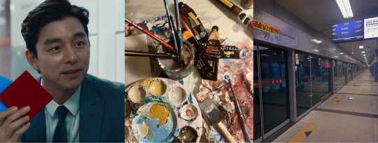
Summary: While doing art in a subway, the Salesman offers you to play Ddakji, a chance to win money. But you wanted his number. When you win, your acquaintance with the salesman becomes much more.
Pairing: Salesman x Artist!Fem!Reader
Warnings: fluff, flirting, allusions to smut/sex, but not explicit
Word Count: 2.9k
Author's Note: This was requested by Crazy4herluv on my Wattpad book Squid Game Imagines/One-Shots. This is also my first Salesman work, so I hope you enjoy!
*Icon used for this header above that I made in PicsArt is from Pinterest. Divider is from @cafekitsune in this post*

Want a request for a Squid Game character like this one? Check out my post, read my request guidelines and send a request!
Read on Wattpad & AO3 here

The sounds of the almost isolated subway and people walking is the highlight of your daily routine. You had moved to Korea to work for a art company and you do sketches by hand.
It paid very good money but in your free time you liked to be in the subway and do art for others like New York. People would walk and stop to see what you possibly could be doing.
A lot of the time, couples, parents with their kids or even old people would ask for a drawing each day and you get paid at least $130-200 at the end of the day.
Your art simply consisted of charcoal sketches of the person who requested for the art as semi-realistic as possible with a watercolor splash in the back if they ask.
Sometimes you notice while you're drawing or sketching away looking for people to draw, you would see a man in a black suit.
He had black hair and was always carrying a suitcase with him. He was also very handsome, you thought. When you took the time to actually analyze him or look at him, not in a creepy way you thought, you noticed that he would throw something on the ground and slap people.
This guy must be insane, you thought. Slapping people everyday, but it didn't stop you wondering who he really was. You thought of going up to him and asking if he would like his own portrai. But you were nervous of asking such a good looking guy and you are an artist in the subway, so he was way out of your league.
Today felt like any other day. Until one person, the guy in the black suit came up to you. You were going to pack up for the day when you accidentally dropped pencils and other supplies on the floor, then rolled around. As you were on the ground picking up the supplies, you saw polished black shoes stop and turn in front of you.
You look up and see him. The guy in the black suit looks down at you while you're trying to pick up your stuff.
"Good evening ma'am. I have a question for you."
You got up from the floor and brushed off the germs from yourself from the subway ground.
"Hello sir. I finished my hours for the day drawing so I can't accept any art requests right now I'm sorry. You could always come back tomorrow if you like."
"I'm not asking for a drawing. I'm asking if you would like to play a game."
A game? Is this guy Billy the puppet you thought?"
"What game?" You asked?
"It's called Ddakji. Have you heard of it before?"
Ddakji. It should sound familiar but you felt like you don't know it.
"I don't think so. What is it?"
"It's very simple. You fold two pieces of paper, usually of bright colors as it's a children's game like an envelope and the goal is to throw down the paper as hard as you can so the other person's paper flips over."
"What's the point of playing the game?"
"If you win, I'll give you money. A hundred thousand won."
Your eyes widened at what he said. A hundred thousand won? That amount of money to get while doing art in a subway could take a year or two. Yet here's this handsome well kept money offering to you.
"And if I lose?"
"Well usually I slap people until they win or just give up." That explains why you see this man in the subway grounds slapping people and throwing stuff down.
"But seeing how creative you are. How about a portrait of me? Use all your creativity and imagination you can and give me something."
"Ok. I'll play. But I can change something?"
"What is it?" He turns his head to express curiosity. It's rare that people would ask for a change of things while playing, conducting he's the one in charge.
"If I win, I get to have your number."
The salesman is surprised at your boldness to ask him out.
"My number? You could walk out with a hundred thousand won. What could my number offer to you?"
"Well I might see a better prize than money. I see a real piece of art right here." You raised your eyebrow smirking
He smirks at you. This was going to be interesting he thought.
"We have an agreement then?"
You nodded. "I lose, you get a portrait. But if I win..."
"You get my number." The salesman nods smiling. "Five in a row you have to win." He then pulls out two colored orgami tiles of red and blue from his suit jacket.
"What color would you like?"
"Red/blue" you said.
"Alright then. Ladies first."
You look at him and then the ground. 10 in a row you can do this. You took a deep breath and slammed the envelope on the ground. The guy then slams his envelope on the ground flipping yours around.
It created a loud slapping sound and echoed that it startled you. You look up scared he was lying to his word and might actually slap you. You close your eyes and prepare for it.
"What are you doing?" The salesman asks
"Aren't you going to slap me?"
"You don't have to worry. I wouldn't slap a pretty face like yours. I only want a drawing."
Opening your eyes you took a deep breath. At least you wouldn't be slapped.
"1-0" The guys says. You assumed that was his keeping score
You pick up your envelope and roll up your sleeve. You threw it down but it didn't flip the salesmans. He picked his up and slammed it down flipping yours again.
"2-0". Now the chances of getting this guys number seems low and you might look like a fool. You were weren't to give up just yet. You relied on your skills of carrying an easel and so many supplies per day to the game.
Taking a deep breath, you slam down the card and it flipped the guys. You were smiled wanting to jump for joy.
"2-1" You put up 2 fingers with one hand and 1 finger to the guys face.
He said nothing but smirked. Talking wasn't his thing, you noticed. Probably why you found him attractive.
The salesman picks up his card and slams it and your flips over. It was a continuous picking up and flipping cards. You were getting better as the points were getting higher.
Now the score was "7-8". You were becoming tired and kinda wish you were home right now, sleeping. But
The salesman threw down his card and flipped yours. Now it was 8-8. A tie. Just two more and you get his number. You threw yours down and it flipped over. 8-9. Another slam from the guy and it was 9-9.
This was it. You weren't sure you would have enough energy to draw that portrait of his that he wanted. But you needed enough energy to finish this game.
You slammed it down and saw it flipped over. I won, you thought to yourself. Did I actually win? You thought.
"Congratulations. You won ma'am." The salesman smiled.
Those words felt unreal. "Yes! Yes!" You jumped around happy.
"Now, you asked for my number. I suppose you wouldn't have a piece of paper to write down my number, would you?"
What kind of question was that? You were a artist. Blank papers is all you carry. You grab your sketchbook from your bag and a pen to give to him.
He took it from your hands and wrote down his number fast. He gave it back to you and you saw it.
"What do you plan to do with that number, Miss?"
"I was wondering maybe you want to go out?"
"We can do that. Can I pick the place?"
It was the least you could let him do as he offered you money and kept true to his word to give you his money.
"Sure. I'll text you when I'm available. I might see you here too. Who knows?"
He nodded your response smiling.
"You have a good day madam"
"You too" God how you loved how formal he was and calling you madam and ma'am, even though you weren't really that old.
When you went home, you were exhausted but still smiling and excited that you got the guy's number. You texted your name so he could have yours saved as well. You went to bed, wondering what it could lead to. Possibly just one date or even more.
The next day, was the same thing. Wake up, eat breakfast, pack your things and head to the subway. You kept fixing yourself up for the salesman, wondering if he would come by.
He always comes by, you thought. He just has to. You scanned around the subway to see where he is as you didn't want to move your spot. After an hour had passed, it looked like he hadn't been around.
Maybe asking for his number was a bad idea, that he was avoiding to talk to you, you thought. A man walked by and dropped something not that far from you. It looked like money. Seeing this you get up, pick up the bill and try to call out for the man. But it looked like he was already gone. It was
Written in a black permanent marker, it says “Look at your phone ma’am”. Without thinking you check your phone and see a message. Meet me at the park at 4:30 PM. No need to dress so fancy but wear something you feel pretty in.
Blinking your eyes rapidly, you couldn’t believe what’s in front of you, more likely what’s on your phone. He’s actually texting you. The weird quiet but handsome black suit guy is texting you. You packed your things and went home and went to get ready to meet him in the park.
It was nothing special that you wore. Just a simple sundress/pantsuit but it was still one of the nicest outfits you had in your wardrobe. You kept wondering just what the man in plan for you. Walking around the park, you see the man still in his suit, hands in front looking around, possibly waiting for you, you thought.
Smiling, you walk up to him. When he sees you, he smiles with no teeth but still showing joy. He reaches out a hand. Looking at it hesitantly, you took his hand. The salesman then took your hand, bowed a little and kissed the back of your hand gently. You felt your heart skipped a beat when he did that.
“Hello ma’am. We meet again.”
“Hi. Were you the person that gave me the bill?”
“Maybe, a beautiful woman like you deserves more.”
Was this a dream? Were you dreaming or is this real. This man seemed to good to be true. You two walked to what would be your first date. The place he picked out for the first date was an art museum. It displayed the finest arts across the worlds and many different paintings. The salesman would ask about each piece and how did it make you feel. You responded to many of his questions but kept looking around. You guys kept talking and asking each other questions to get more acquainted with each other.
After the museum, he took you a some place to eat. Then you guys went to get ice cream. He paid for everything and asked if there’s anywhere else you would like to go. If you tried to pull out your card or even cash to pay for your own things, he would refuse so and said he got everything and that anything you wanted he’ll get for you. It had been late, so he dropped you off home and asked how was everything and if you enjoyed it.
You couldn’t thank him enough for the wonderful day you had comparison to just drawing in a subway for hours. Before you left his car, there was a slight tension between you guys that it could be cut with a knife. The man wanted to say something else but couldn’t stop looking at your lips. Looking at him, you see his hands reach towards your face and cup it as his lips softly touches yours.
His lips were so baby smooth and his cologne was so sharp from his neck, it felt like a gas hyptonixjg you. You cup his face, grazing it with your thumb. He pulls away, still looking at you with such yearning. Your thumb still on his face grazed his lips as you said goodbye and gave him a kiss on the cheek.
Ever since that night, you two have been dating. He would take you on dates to other places. Mostly just walks in the park or art related stuff that you like. Your small kisses would turn into small makeouts into something more. He would sometimes, well mostly go over to your place and sleep over. In the mornings he would make breakfast in his underwear. You wish you could draw him right then and there.
He loves to pose for your art or whatever reference you need for your assignment in class. Once a month, he'll take you out to the art store to get whatever supplies you need. Your messy clothing consisted of paint or oil pastel stains is opposite of his clean, ironed and steamed suit. But he loves it either way.
The only time that he was out of the suit was when he was in bed with you. But other than that, you wanted him to be a bit more fun. You wanted to him have more color. Seeing those videos of online of couples doing painting of each others to see both of your art skills.
You begged the salesman to do wit you and he finally agrees. Squealing you get everything ready, canvas, paints, brushes, water and paper towels. You had 10 minutes to try to get each other’s features as accurate as possible
Time passes and both of you guys are done. You show your art of him and it’s him in his suit, pretty accurate and semi realistic but some details were missing. He nods and says it’s impressive of how much you can get done in less than hour.
You ask for his painting and he turns his Canva around and you see you in an almost renaissance like painting. Your mouth dropped and all felt like years of your art skills go away to just 10 minutes.
“What! How’s that even possible? Why didn’t you tell me you were good at art?”
“Well two people can’t be the artists in a relationship. One has to be a muse, to inspire the other.”
You scoffed at his bullshit. He just didn’t want to brag. An idea came in your mind. You grab a paintbrush and leave a stroke of red paint on his face.
“If you want to be a muse, why don’t you have some color on you?”
Smirking, the salesman takes this as a challenge and grabs his paint brush and paints across your face too.
Now you guys were having a paint battle. You tried to paint him more but he lightly grabs your arm and stops you. He leads you the floor, where he’s now on top of you. Seeing this as an opportunity, you grab a bottle of paint that’s open and smeared on his white shirt. He laughs at this and rolls you over where you’re now on top of him, straddling him.
Nothing was said between you both as you kept looking at each other. Like that night of your first date when you guys first kissed. Putting your head down you kiss him and he put his arms around on your back. The paint on your guys’ face mixed with each other. Breath was running out so you decided to stop. Your heart was beating so much just as he was trying to catch his breath too.
Now you’re forever grateful you asked for his number then taking the money. It’s a better reward than what the salesman had to offer you, as you got him, yourself. It felt like a dream come true. Even if it was, you didn’t want to wake up. Everything of being with him was like straight art. Maybe it was meant to be. That day you accidentally dropped your pencils and he came up to you. It could be called fate by others. Fate by design you like to call it.
He was right, one has to be the muse in a relationship and the other an artist. But to him, it was the thing he was missing the most. An new reason to be in the subway that fateful day.

Taglist:
@deffreal, @cocofia143, @sorry-meme, @elizabeth-hatake, @nini-0808, @hobinistaworld, @ineedsmootching, @alittlebitofeverything , @happyfrog7681 , @tiuhiatus, @goofiestgoober27, @jayyyourbabe, @ninahorikoshifr, @ikeithy , @vampiregirlxoxo, @ouwioworuuu, @cloudysxkura, @l4venderia, @anthea1239, @iidontwannadiealone,

Navigation | Main Masterlist | Squid Game Masterlist | Squid Game Men Masterlist | Salesman Masterlist | Join my taglist
#creamecafe#squid game x reader#squid game season 2#squid game 2#squid game#squidgame#squid game salesman#squid game spoilers#squid game x you#squid game x y/n#the salesman#salesman x reader#the salesman x reader#artist!reader#strangers to lovers#Spotify#gong yoo#gong yoo x reader#squid game s2#squid game 2 spoilers#squid game netflix#wattpad#squid game imagine#squid game x fem!reader#x fem!reader#fem!reader#f!reader#salesman x you#salesman x yn#recruiter x reader
391 notes
·
View notes
Text
In celebration of reaching 100 members in the Maxwil server, I present to you,...

You read that right!
Starting April 21st, will begin Maxwil Week 2025!
How does this work?
Well, here's a couple of daily prompts! You may choose to do either one or both per day, if you so wish! From the 21st to the 27th of April, you're tasked with creating something Maxwil-related out of these prompts!
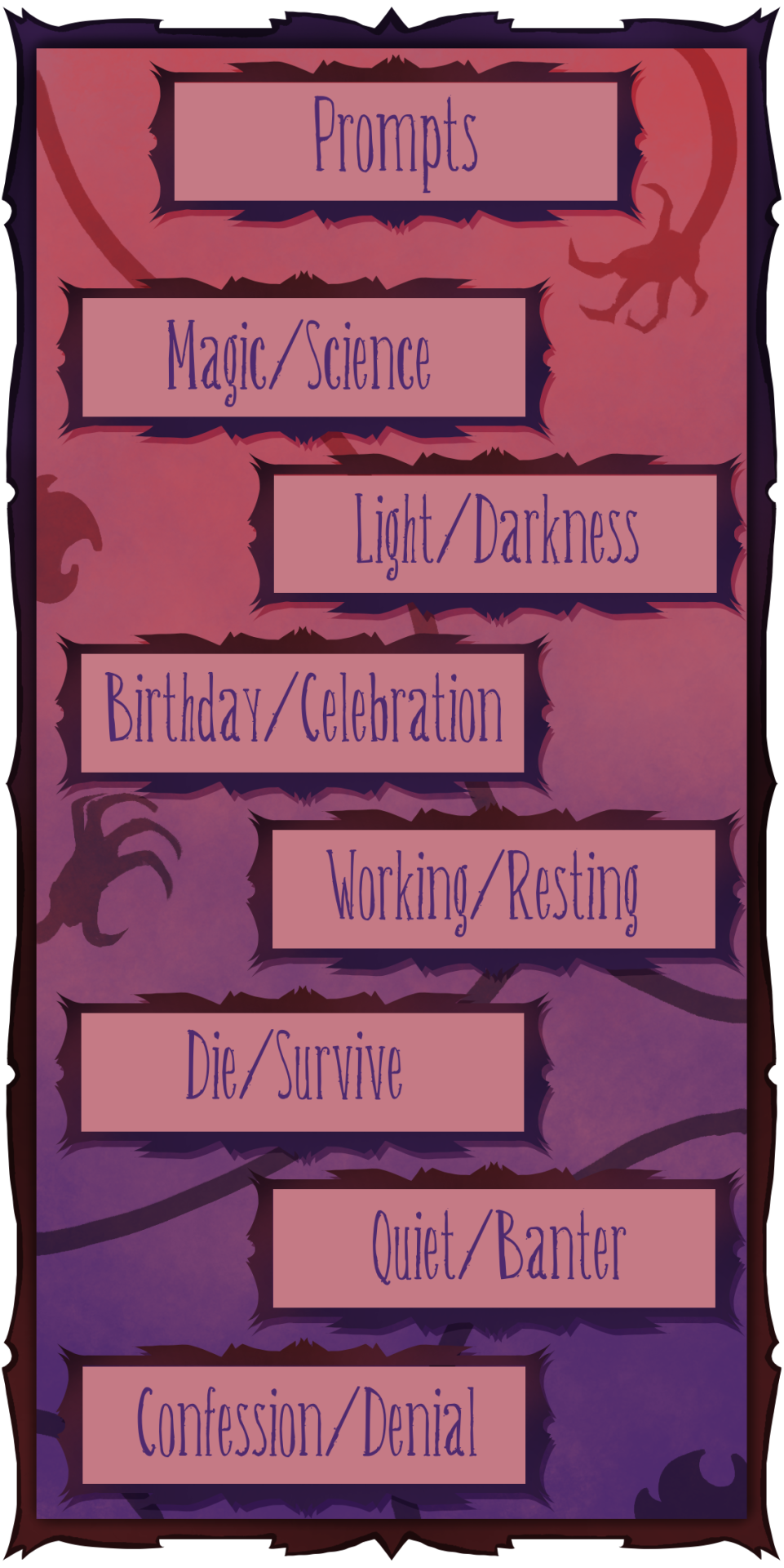
21st Magic/Science
22nd Light/Darkness
23rd Birthday/Celebration
24th Working/Resting
25th Die/Survive
26th Quiet/Banter
27th Confession/Denial
But some of these prompts do not inspire me at all!
Fear not! Here are some BONUS PROMPTS! If you don't feel inspired by the original prompts, try picking one of these instead!

Love/Hate
Throne/Cyclum
Pet/Monster
How do I participate?
Simply post about it on here with the "maxwil week 2025" tag or in the Maxwil Server! Feel free to @ me in the post to make sure I see it!
But what if I won't have the time to participate?
That's fine! You don't HAVE to do one for every single day, nor do them on time!
I'll always keep an eye on the tag and you're always free to @ me even if you're a year late bhaha!
Is NSFW allowed?
Got asked about this by a few people and, yep! Go wild! However, I will only be reblogging sfw content onto my blog.
Any more questions? Go ahead and ask them in the tags, comments, my dm's, my inbox, or in the Maxwil server!
See y'all next week! ;)
Also! A big thank you to @waokevale for helping me with the banner art, rewording the post, pushing me into actually doing this, as well as helping me with organising this! Go check out all his cool stuff!
#dst#wilson#dst wilson#maxwell#dst maxwell#maxwil#maxwil week 2025#will i host something like this in following years? no clue!
130 notes
·
View notes
Text
i got a few asks about my process :0 so yea i took some screenshots mid-process of my recent cliff-skk thing just for that
m gonna preface everything by saying that i did have a ref for the environment!! i avoid color dropping from the image and tracing cuz i do want to hone some digital skills. also saying i'm doing an "environment study" when i'm really just drawing skk makes me feel better abt myself
when i don't have a reference, i tend to do some thumbnail sketches in my sketchbook. here's some random stuff of past work, where i rawdogged everything:
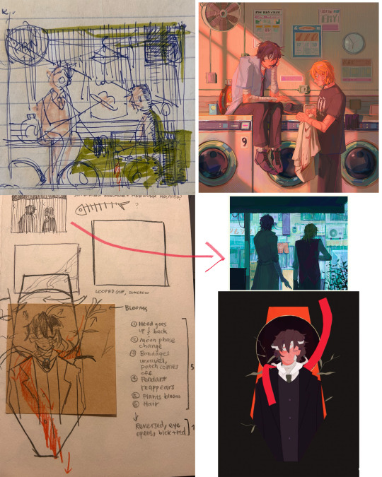
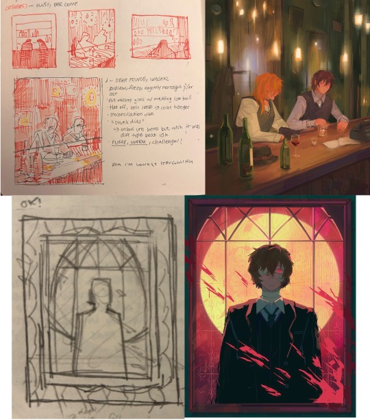
but whatever, back to the cliff-skk. i'll also post a timelapse of it for easy ref, but detailed stuff is under the cut :)
first i did some rough sketches on an orangeish background (underpainting etiquette, i find it helps things feel brighter and keep a stable tone when choosing colors to lay on top), and I quickly lined skk :)


then I laid down some flats for the background, again really eyeballing the reference for hues. afterwards i thought it was a bit bright, and i wanted a more sepia/nostalgia feel to it, so i hue adjusted everything to something more uniform


then i lay down flats for skk + the ocean, which i both had to color adjust a lot (you might see that in the timelapse), and then i jump straight into rendering the background. when i render, i always prefer to do it over something lineless, so i turn the sketch layer off. i rarely do lineart for backgrounds.
i also used to render the characters first, but i've found that it's just not a great approach—especially for art where characters and background are interacting, knowing the hues and shades of the environment is crucial to effective rendering on the character that doesn't make them look out of place.
when i'm rendering, i really try to keep in mind tenants of contrast, perspective, form, and light/shadow. ex, stuff "closer" to us has more detail; the hill in the back is minimalist (in comparison); the shadows lean cool-green while the light leans gray-yellow. rake brushes really carried me here idk... my fav brushstyle forever


eventually i reach a point where i'm satisfied (or bored) with the background. for the last stages i usually have the subjects hidden so i can really perfect the details—but then for super duper final details, like the little leaf specks and grass strands, i unhid skk so the poppy details could work around skk. then i get to rendering the characters :)
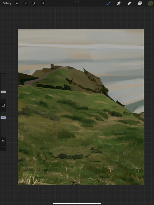
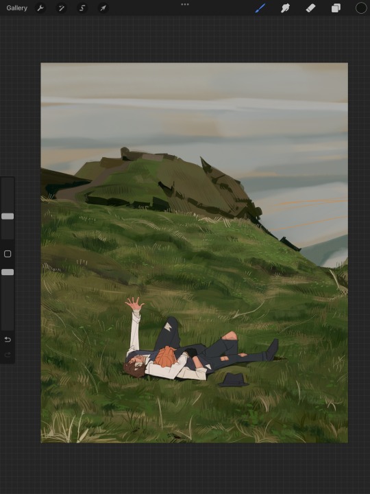
i forgot to take ss of all the stages when i rendered skk, but here's something from... about the middle of the process? i tend to render characters with the lineart hidden as well, sometimes bringing it back just to clarify things, but ultimately i prefer to define things by form than by line. that's just me tho idk, idt it makes or breaks anything, just a preference
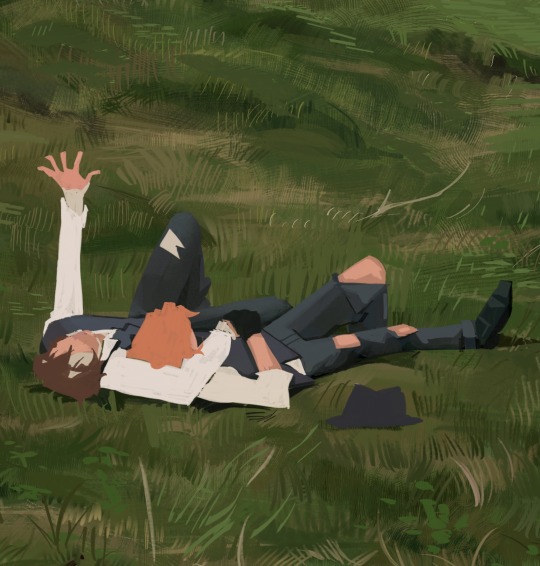
again rlly just thinking about cool/warm, reflective tones (the greenish shadow on chuuya's left inner leg, sky-gray blue on dazai's vest), really just slotting the subject into the environment. after i finish rendering the characters, i usually return to the background and add some stuff—in this one i defined the waves a bit and put some grass around skk
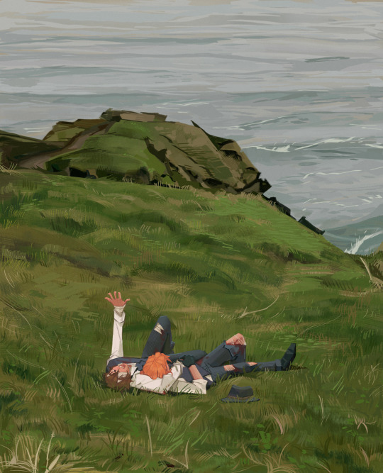
and yeah then we're done idk LOL. sometimes i run the file through camera raw (photoshop) to do some color adjustments—i find that my iPad displays colors super differently, usually making things a lot lighter than they are (u can see how dark the timelapse is...), so i find myself lightening my work a lot. i also sharpen and add noise as needed :)
i think my process has changed a lotttt even in this past year. it's kinda crazy!! it's always fun to do these and just reflect a bit on how i work. mostly just mindless insanity until it kinda works.
thanks for sending in an ask. and if u read all that, thanks to u too lolol
175 notes
·
View notes
Text
Rules and the like!
Song poll blog inspired by things like @doyoulikethis-videogame-song, @doyoulikethissong-poll and Guess the Game.
The general gist is similar to most if not all of these blogs in which a small clip of SFX from a video game will be isolated and posted here, with polls for people to vote on how well known it is.
This page'll most likely be updated the more this kinda stuff goes on.
Should go without saying but transphobes, aphobes and exclusionists are not welcome here.
Submissions are: CLOSED
Header and pinned post art by @forgetmenautical (thank you!)
Active Tags:
#open vote : Polls that are open
#closed vote : Polls that have been closed and the SFX source revealed
#dykasks : Asks for the blog.
#off-topic : For anything off topic - may be related to the blog or an update/announcement!
General FAQ:
Do you take submissions: Yes! Though only when submissions are open. This will be through a google form that will open and close periodically, whenever I have the time!
Will there be scheduled posts at specific times?: Right now I'm scheduling around 3 posts at 4pm GMT every day, though this may change with my own schedule/if submissions are running low.
I'll do my best to keep it going! :D
What is your name/pronouns: You can call me Smudge. He/They. Nice to meet you :3
Can we say the answer in the tags?: I would prefer if people didn't as this goes against the spirit of the game- However, very vague hints are fine by me! Be warey of spoilers in the notes if you want to play along!
My submission wasn't posted?: I will post every submission I get to the best of my ability but if I cannot locate or find the isolated audio I will have skip as game noise can warp or disturb the sound itself. I will do my best to find it isolated beforehand, but if I cannot then it must be skipped, apologies!
A good resource for finding game SFX is The Sound Resource but unfortunatly not every game has a clean rip for its sounds!
Can we submit voicelines?: This is tricky, mostly yes.
I would say things like Hornet's "SHAW" from Hollow Knight count for this blog and I would accept them vs something like a clip from Cave Johnson's Lemon Rant I would not accept! Use your best judgement when submitting, but voicelines and clips are not specifically off of the table.
This SFX was used somewhere else!: This blog will run both on submissions and generally what the sound is more associated with rather than its original source! Not every SFX is original and some are used from specific sound libraries. The Roblox OOF, for example, comes from a game named Messiah - however, if a submitter has submitted its source asRoblox, thats what this blog will use as its source.
I will also be going off of what people say is the Context/Source for a game so sorry if that is ever wrong! If it is entirely, 100% incorrect in terms of where its from you can send me a message and I'll change it!
Can you tag scary/sounds from horror games?: The point of the game is listening to unexpected sounds, and "scary" is an extremely subjective description. I will do my best to avoid posting loud jumpscare sounds or other sounds that I think are unpalatable to a general audience, but beyond that I don't intend on tagging specific types of sounds at this time.
How many SFX can we submit in the form?: I would prefer 4 per person, at maximum, if you submit multiple from the same series I will most likely space them out across a few days/weeks.
You didn't answer my ask/did you recieve my ask?: I tend to be doing other things while this blog runs on a queue, I try my best to answer and give the best responses I can for this blog to make it more accessible/comfortable and for everyone to contribute to this fun little game!
However- if you've noticed I haven't answered your ask, it's not personal. It may be due to it already being answered here, too spoilery concerning specific polls, inappropriate subjects for this blog or I may just keep asks in my inbox if they're especially nice/kind to look back on!
Can we add XYZ to the voting options?: I am quite happy with the three options as they are! I prefer not to muddy polls with very specific options, making votes a little more strict. Generally all 3 cover everything they should.
This sound is too loud/quiet!:

In all seriousness, if a sound is genuinely too loud, shoot me an ask. I'll see if its appropriate to add a warning!
What kind of games do you like/play!:
Here's my topsters list!
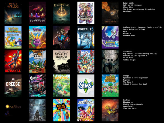
I'm very open to receiving questions about any and all games though- and hearing recommendations/games you all like too!
160 notes
·
View notes
Text
✦ Lost in Limbo Devlog #13 | 11.11.24


Feels good to be back! This is our first post-Kickstarter devlog and I'm so excited to be writing it.
First of all— Lost in Limbo was successfully funded on September 20th, 2024! 🎉🎇
Yep, it has been almost two months, but it's still something to celebrate! Thanks to every single one of you for making this possible! We didn't meet all our stretch goals (there were a lot and taxes are a pain) but that doesn't mean we are giving up on those. More on that another time.
There's a lot of things we want to show y'all, so let's jump into it!


A sneak peak of Envy's postcard!
Raquel has been working hard on getting the "special postcards from your favorite LI" ready to send them to print ASAP! Initially we were going to use art we already had of the LIs, but we thought it was more exciting to offer y'all exclusive art pieces. After this, Raquel will focus exclusively on the rework of the sprites!
We hosted a few polls and got a lot of feedback. If you missed it, you can check it here!


Astro says hello :^)
As you know, the Extended Demo will feature more locations, including a glimpse of the MC's city, Faybourne! Astro is getting the main street ready for you and your bestie as you go on about your day. I've calculated around three / four different and new locations to properly pace the demo as we imagined it in the first place!

The writing deparment (me. i'm the department) has been focusing on the Extended Demo script. I have a lot of things to play with, like the flavor choices, the personality choices, and more. I want to create a proper balance because one of the things y'all asked for was more choices, and the pacing needed a bit of fixing, as we already knew!
The Extended Demo will actually introduce characters you've heard about, like your mom, your ominous grandmother, and your bestie. So no more talking about them, you'll actually get to meet them like we wanted to!
There will also be more time with the LIs, and hopefully the amount of time you spend with each one of them will feel more balanced, too.


Programming has been an adventure! Huge shoutout to Feniks for helping me figure out how to properly make a toggle for the timed choices as well as helping me polish the personality system. What a lifesaver!
So the timed choices toggle now works perfectly. That means you'll be able to turn them off if you'd like to play the game without being jumpscared by a timer—that doesn't mean you won't be able to mess up, though, on purpose or not :^) This is a dark game, after all!
The personality choice system lets you decide how the MC reacts to things including the nature of your romance with the LI. That means dialogue will automatically change in certain parts of the game to reflect the personality of your MC, some options will be locked, some unlocked, etc. There's three different personalities available.
For colorblind folks, the choices will have a different icon when you hover over them for you to know they're different!

Also, I've started coding some extra mini cgs Kayden's been working on! There'll be more in the Extended Demo to enhance the experience, so we hope you enjoy them! :^)

All the packaging stuff has arrived to our provisional headquarters (Raquel's home), and our business cards have been secured! Every backer with physical goodies will receive one for free :^) This month has been all about managing Backerkit, orders and merch, as well as preparing the Extended Demo. We hope we can receive everything very very soon and start shipping packages starting December!

For now, that's it! There's a lot of stuff going behind the scenes, a lot of things that need attention, and a lot of planning happening. Also the catastrophe the DANA has been on our cities is keeping me a bit on edge, but I'm trying to focus on work. This Saturday I'm going on a trip to Greece with my family, so I'll disconnect then! It's our first time traveling to a different country since I was like...seven years old? And we have been saving up and preparing a lot for the trip, so we are excited :^)
I hope everyone has been taking care and doing alright! Have a huge hug from the Ravenstar Team, and see you around!
171 notes
·
View notes
Text

Well since I'm alive again I might as well post some of the art I did during my hiatus, and since I was talking about Keiki in my last post I might as well start with this piece here that I did of her. (click for better resolution)
Artist's Notes;
Ok so I remember having the idea for this a while back and wanted to try going for a very monochromatic palette. I also wanted to generally keep the background very minimal, mainly so the lighting and Keiki herself can stand out.
As for Keiki herself, I mainly stayed on-model with her design... minue the glowing hair, which, I'll get to that in a moment, but yeah I mainly just wanted to focus on making the pose readable. As for the flame hair, I mainly did this because I thought the potential lighting scenario it could make would be fun to play around with. I also wanted to try out rendering flame again and I think the lighting around Keiki's face is my favourite part of the piece.

I applied this technique with flame rendering to the human spirits near the bottom of the piece. I used the lighter parts of the flames to represent some vague skeletal structures, and their faces are inspired by a Salvador Dali piece (it was called something like "Flaming Giraffe" idk) but that's where the surrealism inspiration ends.
Don't worry though, I do have some art of Keiki that I did a little after this piece where I make her look weird. This piece was before I made some changes in my stylization, so I consider this the last of an era of my style. This is also before I found a new way to render hair, which you'll see soon, don't worry, I plan on just dumping all of my art I did up until this point and then going into hibernation again.
Speaking of, I might as well set some expectations for my posting schedule right now. Due to life keeping me busy, as well as my mental health and enjoyment of art, I won't be posting every time I finish a new piece. I started to enjoy drawing so much more again during my impromptu hiatus, and I want to keep enjoying that feeling for as long as I can. If I post stuff any sooner or later, it'll probably just be dependent on my mood that day, so expect me to kinda just spawn in out of nowhere every now and then.
Now then, I will once again pray to whoever is up there that Keiki will do something in Touhou 20 because I am still holding out hope she will appear again. Like, she was made as an allegory for AI and robots and considering today's world she would be perfect to bring back for this. Please, Zun, just bring her back and develop her character more, us Keiki fans only have Touhou 17 and that's it, she never appeared again, and you set her up like she may come back so please just let her return or do something at the very least please-
79 notes
·
View notes
Text
I am so very nervous about making this post but I need community input so here I go-
Hi! My name is Clara and I'm a senior writing my thesis in college. I'm an art history major and my thesis is gonna be about fanart and cosplay (and video games!) and why those are underrated but also super important and valuable in society! (This is a very basic watered down explanation lol)
Since I'll need some examples and sources, I want to reach out to people who do fanart/cosplay (especially since this is the fanart site hehe) to see if you'd be willing to have your art included in my thesis! I'm a nerd about Arcane, Severance, Hades, Baldur's Gate, and a bunch of other stuff, so if you are into any of those fandoms, please especially say hi! (But even if you're not, please drop by anyways! I'll use anything and everything I can get lol)
Any skill level or medium is welcome! Digital (minus AI, since that's not what I'm writing about), traditional, sculpture, embroidery - and if you want to yap about your experiences with making fanart, I'd love to hear it!
Ditto with cosplay - any skill level/focus is welcome! I also would love perspectives from LARPers or people in SCA groups, since I'd like to touch on historybounding at least a little bit. (I do know that SCA is a much different beast than LARP, but what you guys do is also super valuable and interesting to me and I'd welcome any input there as well! I genuinely love learning things so please teach me about what you do!)
It's gonna be seen by my professor and likely not many other people on my campus (it's not getting published anywhere official), but anyone whose art I'd use would get properly cited and whatnot, and if you have any interest in reading it once it's done, I'd consider sharing it directly with those who would want to read it.
I'm a pretty small blog so any reblogs help immensely! And if you have any questions, feel free to DM me, message me in the notes, or stop by my askbox :) I'll try to reach out to individuals as well, but I'd love to get a broader group if I can. The more the merrier. :)
Thank you guys so much!!
#gonna tag this with a bunch of things to hopefully get it to good people!#clara does rambles#arcane#baldur's gate 3#severance#hades game#cosplay#larp#I feel so weird tagging this so generally lol#please pass it along though! share with anyone you think might be down for it#clara's thesis#guess that'll be the tag for it if anybody wants to keep up with my posting about it lol
105 notes
·
View notes
Note
Hello!!
I wanted to ask if you would be willing to share how you go about finding the references for the injuries you depict in your work? Your pieces where the CoD boys are sporting injuries, fresh and old, are always so lifelike and to my untrained eye seem entirely medically correct.
I have been trying my hand at drawing the boys retired and resting as well, but I’m finding it difficult to decide what work injuries to add and how to find the respective references.
How do you decide what injuries to portray? And how do you go about finding the reference material?
Your huge fan, amustikas
Oooh ok ok! I'm gonna post my answer publically because I think others would find this interesting too!
To preface, I am definitely NOT a medical professional, and as such, a lot of the stuff I choose to depict in my art is not so much..ah, medically accurate as it is....aesthetically pleasing 🤭
I'll start with scars, as a lot of us enjoy slashing up Simon's face with them, lol. Generally, I'll do a cursory google image search for the type of scar I'm looking for (be warned, these can be graphic) with searches like 'burn scar' 'surgery scar' etc. But I find that for things like cuts and lacerations, real-life scars are a bit innocuous and lame 🤷♀️ Unfortunately not everyone's skin wants to retain that perfect slash look™️😔
So what I usually end up referencing are costume prosthetic scars ✨
As you can see, they're pretty gnarly:

And you definitely don't have to go this intense, but I find that the dramatic, carved-like appearance of these translate better to art than a realistically healed wound 🤙
The other thing to consider is the prevalence of injuries in the military. From what I've gathered, the most common will be back/shoulder/limb injuries, just a general fucking up of the whole musculoskeletal system in general due to constant overuse 🤕 Hearing loss, shrapnel/blast/burn injuries are also common, as well as all the negative psychological effects :') goooood times (not)
I think it's neat to look up real-life examples of these things, but it can get a bit intense if you're squeamish...
SafeSearch is OFF, the horrors are REal 😳

So yeah...I tend to tone things down, all things considered...😅
For this particular piece:
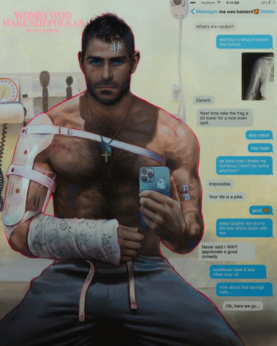
I researched broken humerus injuries and treatment 👍 Poor boy 🥺(Yes, I am aware that I consumed entire articles and did a shit ton of research about this just to go ahead and put a female's x-ray in this fucking picture sdfghjkl rip💀😭)
But here you can see the actual process for applying the brace for this particular injury:
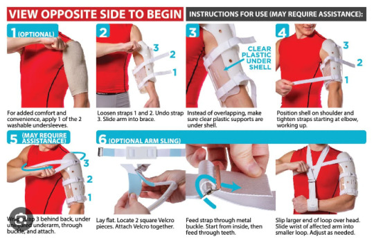
Neat, eh?
When I draw Johnny with a knee brace, it's usually a real authentic one you can buy on amazon:
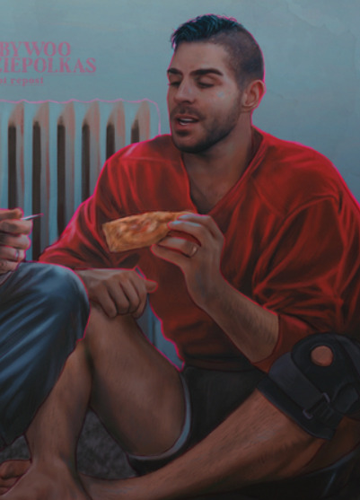

Product placement blast!!!💥✨ Bezos, where is my cut?? 🫰
As for ones like this:
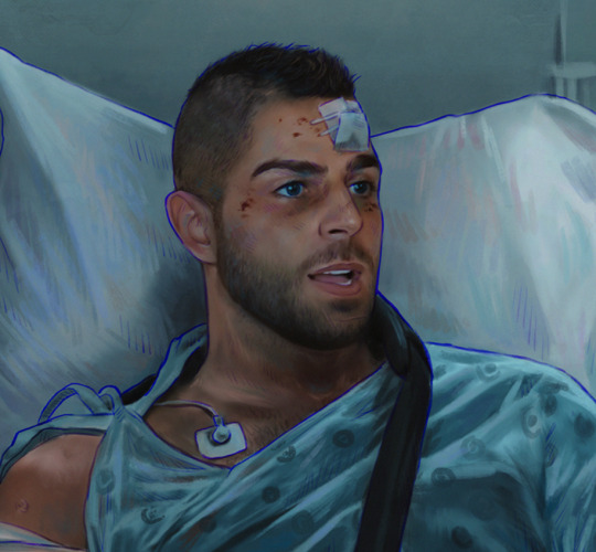
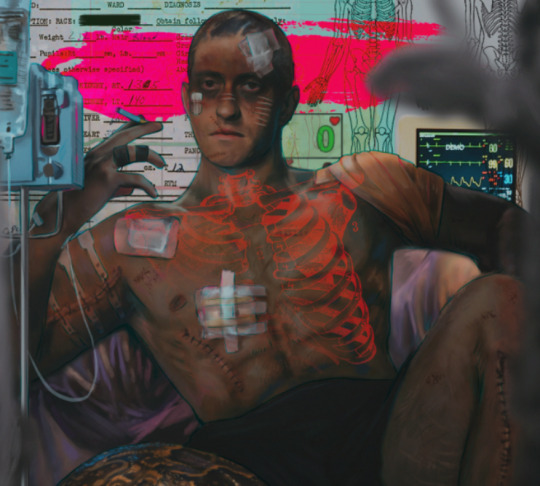
I tend to just...scatter some wounds around and patch them up accordingly, lol. Bruising around the eyes is common with any head injury, and surgical stitching will offer a nice puckered skin effect mmm 👌 (I swear I'm normal abt this)
I'm sure the medical malpractice lawsuits are stacking up for me now, but again--it's usually more about the ✨visuals✨
My parting advice would be--go nuts! Feel free to maim and mutilate and mangle to your heart's content 🥰
Thank you for the question, Amustikas! I love your art as well 💗🫶
#asks#there's something...pleasing...about drawing wounds....#no I will not be reflecting on this 😤#tw injuries
346 notes
·
View notes
Text
I've seen people doing an intro post so I suppose I should do the same right? I have no idea how to do this, I'm just winging it :3
INTRO POST TIME WOOO!!
[last updated: sat dec 7th at 7:18 PM 2024]
(I update this often, a reread of it every now and then would be greatly appreciated!)
Maybe every week/month depending on your time scale? ↑
Follow my other blog where I reblog a bunch of stuff and things for the full experience of my personality and interests! @eckos-reblogs :3
@everytime-i-reach-the-postlimit ←Exactly as the name entails
@nature-is-mystical ←is my other random blog that you can follow as well if you want.
that blog is just for reblogging nature stuff and posting nature stuff. (Occasionally rhymes come with it ig)
side blog for fanart!: @sonar-fanart-hall
I'm always working on making reference sheets for OCs ^^
Chill dude side blog: @cool-dudes-official
﹏﹏﹏﹏﹏﹏﹏﹏﹏﹏﹏﹏﹏﹏﹏﹏﹏﹏﹏﹏﹏﹏﹏﹏﹏
I will continue to edit this, probably for the rest of time to get it right since I'm a slight perfectionist lol
Hello! I've been an artist for around 5 to 6 years, and I still kinda suck at it! I do traditional art normally but I've been branching out to digital art as well. I mostly draw animals, anthropomorphic creatures, creatures in general, whatever beautifully ugly faces I can come up with, and sometimes human faces!
I classify as a furry but do not reblog a ton of furry stuff nor do I have a fursuit. I just like drawing and seeing anthropomorphic animals :3
Furries, Therians, anyone of lgbtq+ community (including ace people cuz apparently there's a debate about that), weirdos (but NOT in the gross way), and more are welcome on my blog! :3 ❤️ (you're kinda automatically welcome if you're kind anyway lol but whatevs :3)
Tags and stuff! To help you find stuff in my blog better through search :)
#Ecko draws -exactly as is obvious, it will be for when I make art, digital or traditional.
#Echo Rambles -For posts of mine that include mainly me talking about random stuff
#Echo rants - for when I rant. Similar to #Echo rambles but different..
#Echo answers - For when I answer asks!! :D
#The Clowder seeks - For when you guys ask me stuff!
#Mama Change - For when I mention my mom. (Her name is change..or it's more of a nickname but no one calls her by her actual name except for professional/job people like a dentist or something)
#Echo asks - For when I ask questions :3 lol
#Eckos moots <3 - for interactions with moots, obviously 🙄 (I love y'all sm)
#Ecko irl - me irl
My main Media for traditional art is, pens, pencil, gel pens, paint markers (posca) and normal markers! I hope to soon branch out to ink! (Maybe one day you'll get to see some watercolor stuff from me. It's not that good of watercolor art and I don't enjoy painting too much tbh)
Anatomy You say? Don't know her 😔
If you are interested, I do art requests! It's not guaranteed to be good or to be done quickly but I will try my very best every time. You can even request multiple times if you'd like! Like a ton of times! I really don't mind!
You can also request art of fandoms I'm not in but make sure to give me a good reference or the drawing will look off :3
Art requests open until further notice.
If there's something I don't mention here that you're wondering if I can draw or not, give me an ask in my inbox and I'll let you know! (Pls, I'm friendly I swear)
You can also dm me if you'd like but I'd prefer the askbox instead (´-﹏-`;)
I can't draw/don't want to draw: items, anatomy, bodies (unless you want the equivalent of a boxy stick figure), rendering, lighting, dragons (without a reference), romance/NSFW (no, just no.), hands, human legs (for the life of me 😭), +more
I can draw/like to draw: faces, animals (mostly cat related ones but you can request any animal and I'll at least try to draw it.), different hair styles (only with a reference), eye bags (I think they're pretty lol), dragons (only with a good reference), gore (not the best at it but I'll will try my best to make something nice and bloody for ya!), +more!

My name is Ecko and it's my preferred name but you can refer to me as Melleona (my OC) or by a nickname as well if you'd like! (just please ask me first if you want to use a nickname as I'm bad with setting boundaries.)
My pronouns are She/Her but feel free to refer to me as it/it's! :3
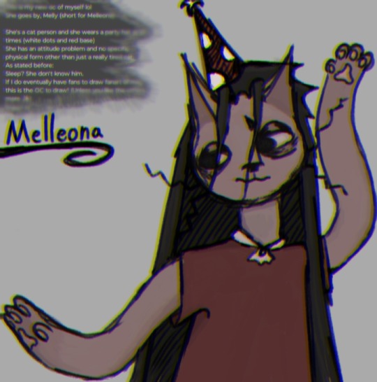
Speaking of which! This is my OC, Melleona:
She is 14 years old, she is introverted and blunt but also shy and insecure. She has anxiety, dealt with a bit of depression, and she's very casual as well as lazy (like me lol)
She's half Cat, she has greyish blue eyes (not visible in the drawing), slightly blueish black hair that's long enough to reach her ankles, she has a mushroom themed party hat, and some wicked whiskers!
If there's anything you'd like to ask me about her or ask her, go ahead and ask away! I love anons and normal asks! ❤️❤️❤️ (There is a slight filter on the drawing. I'll edit this later and put her color palette below ❤️)

I'm a minor! Mind your words, don't send me gross/weird asks or messages. (I've already had a few people message me asking for my age, a picture of me, and my sexuality. No, I will not be sharing my real appearance on here. my age? Minor, that's all you need to know. My sexuality? I don't know and you don't need to know either, respectfully ^^❤️)
IDC if I post something slightly suggestive or that says I know about 18+ themes. I posted it, not someone saying something to me of those themes. Sure, I understand the stuff but It really doesn't matter now does it? It just means I understand enough to know you shouldn't be saying that stuff to me. (Boundaries ✨)
------------------------------------------------------------
I do half-curse in posts from time to time. I do censor it a bit tho, like "f7ck" for example. Hope ya don't mind (;^ω^)
------------------------------------------------------------
I'd appreciate it if people reblogged my art!
I don't appreciate reposting it however.
Just in case you don't know what the difference between reposting rather than reblogging: it's when you (typically) take a screenshot of the art, and then repost it on either Tumblr or a different app rather than hitting the reblog button!
While this has never happened to me personally, I do feel like it's worth mentioning.
Oh, and, don't under a circumstance feed my art to AI. I can forgive reposting my art. I put out there for people to see not to get fame from it but under no circumstances EVER will I allow feeding my art to AI. It is not human. It does not make art.
AI artists don't exist unless it's used ONLY to assist with a process that is still mostly YOUR OWN SKILLS THAT YOU'VE CULTIVATED OVER TIME. AI is NOT art but it can HELP with art.
ミ●﹏☉ミ-ミ●﹏☉ミ-ミ●﹏☉ミ-ミ●﹏☉ミ-ミ●﹏☉ミ
don't dm asking me to commission from you. like said before, I don't have money bc I'm a minor + I don't like being pestered for me commission you. talk to me like a person, not an ATM.
If I want to commission someone, I will dm them and even then, I'm most likely to commission art from a friend to support them.

I support the lgbtq+ community! And I don't discriminate against race. I really shouldn't have to say this. (˘・_・˘)

I will respond to money asks with "!!" And that's it. I don't have money and even if I did I don't got any money to spare. I'm broke and struggling too. Not to mention, I'm a minor and can't just go out and get the stuff. I hope you understand and I wish you all the best!❤️❤️❤️

Some games and shows and stuff I like:
Shows and stuff: Rick and Morty, adventure time, lost in space, bsd (never watched it but I've seen enough of it on the Internet to know a bit about it. Very interesting :3), Some of the Life Minecraft series, httyd, doctor who, and more!
Games/fandoms: Yonder(Yonder Cloud Catcher Chronicles.), Minecraft, the Stanley parable, tiny bit of South Park, cotl, MLP(childish I know but I don't care. I love them), creepypasta, SCPs, Trevor Henderson's creatures (mostly cartoon cat), plants vs zombies, fran bow, little misfortune, and more!
Stuff and things (hobbies?): Art, apparently I make rhymes now too??, rollerblading, climbing, Hiking (iffy), sleeping, being annoying+lazy, doom scrolling, interacting with people, and more!
(I'm not really in any fandoms really..kinda like on the edge of being in each and every fandom I come across..)
General facts about me! Yippee!
I think eye bags and wrinkles are pretty (odd, I know lol), I live in a bus (not decked out like you see on social media though. We just live in a bus lol), I live with my ma (my dad is my step dad and he and my mom just broke up psooo ye), I blank out a lot and just stare at people for no reason (which freaks them out), I have greyish blue eyes (a long with some, I'm pretty sure permanent eye bags lol), I get energy right before nighttime mostly (and then it disappears as soon as it reaches around 11 pm to 12 am), My favorite color is maroon (and any type of blue along with orange and yellow and forest green..mostly just comfy vibe colors tbh but maroon is a fixed piece), my favorite animal is a cat (although I have a dog. Muffin doesn't count as a dog, she's practically human. Apart of the family.), and more!
(I'll update this as I go)

[I will block as I see fit]
Do not interact with my blog if: You're racist, you only or mostly have sexual themes on your own blog (I apologize but it makes me uncomfortable. Have some other interests and it might make me less uncomfortable ^^), if you in general just enjoy hating on people for no reason (I like to make my area a safe space for people) if you're a Zoophile (No explanation really needed but animals can't consent.) (more will be added later when I think of what to add)
Don't dm me unless you're a moot or you say your intentions within the first 1-3 messages. (moots that I've interacted with can send me a dm unprompted with stated intentions anytime they'd like. Special privileges ✨)
(Added a specific part of that bc a moot felt they were making me uncomfortable by having such themes on their blog. I didn't really realize at first but yes that does make slightly uncomfortable but I don't really care as long as you have other interests. If s3x is your only interest, it weirds me out to have those types of people interact with me. Just know you're all good moot, you're not the type of person I was aiming it at. There are other people that just don't think about anything else but $ex and relationships that creep me out and you are not one of them. ^^❤️)

Things about me, (random stuff): I am cringe from time to time, my fav colors are maroon and any kind of blue, orange is nice too though,
I appreciate any and all constructive criticism. IDC if it sounds rude and might hurt my feelings, TELL ME so I can help better myself and my blog! I'm dum and will most likely not notice I'm doing something weird or anything :P <3
•Send me asks! Wanna to hug one of my OCs, Want to slap the sh1t out of one of em, Want to introduce me to a new (or old) fandom I don't know of but you think I might be interested in, Want to say hi, Want to give a music suggestion, send an ask!
I LOVE interaction and if possible, I want to be busy with asks at all times so send a ton!

•Moots:
@theachskid @voidsweirdthoughts @burningbutter @rafrfr @rateater2000
@footlongdingledong @ender-the-insomniac @thistlebriar @rspoetry @virtualcroissantflapcolor
@jawdoesstuff @storythesilly @yourfavoritecuntist @chamber-of-voices @i-draw-things
@2oo7xddd @catsreblogging @silli-billy15 @totally-not-a-commie @khloethecatsworld
@1nd13gh0st @cur1os1tyk1lledme @nonbinaryriverclan @ilove-fanart-and-lore405 @hermitchild
@my-mom-named-me-duck @hermitchild
@williamsart12345 @lilytheaxoltollover @twobraincellsremaining @nn-the-doodle @emmajasonartz
@bugba-bugbee @railway323 @xho-the-scribble @asqadia-banthen @nasthesilly @ceaselessbackflips
@the-anxious-acrobat @justuravghazbin @callmekiyo24 @maybeyoullfindthissomeday
@sensehumor ♥️
+any future moots/one's I might have forgotten (I hope I wouldn't forget anyone 🥲)
If you don't like being tagged in tag games, let me know and I'll move your name over here cuz I copy paste the ones above for tagging in stuff: (nothing here yet!)
Moot side blogs: @thistlebriar-tags @my-dad-named-me-goose @mysterious-other-being @
Btw, moot/friend privileges: tagging me in whatever the heck you want, sending nonstop and possibly annoying asks, dming me and having a convo at random, +more! I love all y'all and am more than happy to interact ❤️

My art ↑
Yippee!! That's all for now folks! ❤️
I'll update this whole thing as I go, any questions, just send an ask and I'll update this with the answer as well as you know- replying in general lol :3
I seem incredibly childish in this intro post and my general posts but do know, I am over 12 years of age lmao 🤣
I'mma keep some notes here as well... mostly for tone stuffs cuz I can't remember these 😭
/lh = lighthearted
/j = joking
/hj = half joking
#intro post#pinned post#pinned intro#LONG post#echo rambles#i talk a LOT btw#like a TON#I'm a full time ranter#you might think i don't talk a lot but trust me#it's cuz I'm holding back#i think i qualify as an ask blog idk#art/ask blog?
128 notes
·
View notes
Text
THE BIANCA MASTERPOST
Why, hello! Are you interested in throwing yourself down the rabbit hole of lore for Dropout's "Very Important People"? Are you trying to drag a friend into the madness? Welcome! Hopefully this post can help. This all goes a lot deeper than you might expect after a casual viewing of the show, so let's get down to business.
In the past, the Host's stepdaughter, Bianca Jocasta, was something of a cryptid lurking at the edges of the show's lore. As of season 2, however, she has a face, speaking lines, and an implied crucial role in the meta plot. Us rabid Bianca fans -- and there are indeed a non-zero number of us -- simply never lose. Unless we get a week where Bianca doesn't show up. Which happens often.
PART 1: UNDERSTANDING the CANON.
Let's say you've watched the entirety of VIP. You have questions. Maybe you even have theories of your own. Welcome to the club, friend. Bianca generally pops up in only brief mentions -- amidst the chaos of the show it's sometimes hard to piece together exactly what's going on with her. Luckily, I've written it down for us!
Analyzing everything we know about Bianca (as of s2e3) for a review of the basics, plus some surface-level theorizing.
Analyzing the Host's relationship with Bianca (as of s2e3) for a more character-centered approach to figuring out what's going on here.
Revisiting the s2e4 loredrop.
Unpacking the s2e6 loredrop.
And of course, the sacred texts: this gifset by the talented @/whichcouldmeanothing capturing their first on-screen interaction.
Dissecting the s2e11 loredrop.
PART 2: INTO the METAVERSE.
So there's something funky going on here. That's to be expected, because this show is an improvised fever dream and the Host is a certified freak. But is this actually leading up to something...? Signs point to yes.
Asked to describe the relationship between the Host and Bianca in one word, Vic chose "tethered". A normal word to describe coworkers who purportedly hate each other.
Asked for any further information about the two of them, Vic responded... like this.
Okay. Here's where we jump off the deep end. Hold my hand. Vic likes to reuse material, and the "stepdaughter the same age as her stepparent" is an idea that's been around in their work for a while now. Take a look here and here for more on that. Do you see the vision?
It seems like Vic and Talia are very down to go down interesting paths with their improv together, and they're certainly able to conjure up chemistry. Case in point.
PART 3: EXPLORATION via FANWORKS.
That's it. That's the canon, that's the relevant supplemental material from Vic. But this is tumblr, and we all know that's just the beginning of the fun.
The wonderful @/moonpleaser draws Bianca so beautifully and I think about his art of her non-stop. Go look at his stuff!
I would be remiss if I didn't at least mention Star Maker, my fic that attempts to blend our knowledge of the Host's lore with the "Bride Comforting Stepdaughter" sketch. It is my version of a long-form thesis for why this dynamic has the potential to be so compelling.
We use the tag #bianca vip for her here on tumblr. (edit: now that we have a last name for the character, #bianca jocasta is also in use! it's a mishmash but we'll muddle through somehow. i personally will prefer to use her full name now that we have it, but i'll be using both for a while as i adjust.)
The AO3 tag for our Bianca is wonderfully vibrant for a character with so minimal screen time, and well worth checking out if you want more!
#vip#very important people#vic michaelis#bianca vip#bianca jocasta#host!vic#dropout#bianca loreposting#dropout tv
77 notes
·
View notes
Text

Tax Season Commissions!
Hi everyone! It's that special time of year again! Time to pay the IRS so they don't come gank me, along with yet another surgery for my cat son (another mass removal but it's just a lil one on his gums so don't worry about him he'll be fine once it's gone however this still will cost over 1k lmaoooo) and with the other expenses- mainly finally getting prints and additional stickers made- this year's goal is around $3k!
Interested? ∠( ᐛ 」∠)_ ↓ clicky! ↓
Here is the plan to try and reduce strain to keep hotwe projects from being neglected for 4-5 months!
I will offer traditional hand drawn commissions! The price for these is generally lower because there is no color to contend with!
Some original hotwe art (that I had been saving for the artbook kickstarter lol) will also be for sale. Tumblr crowd you wouldn't be familiar with these pieces since they're on patreon only$1forallrewardsalsosometimesforfreejustsaying but I'll make a post showing what's available.
Livestreaming is likely! Either streaming commission work which is always fun or ??? Whatever needed for your viewing pleasure I suppose! I'd collect tips/donos here from anyone who wanted to toss a penny my way rather than get a commission.
Prints pre-orders are possible, I'm still figuring that out!
How to get a commission:
(and this time I am going to explain everything fully lol)
Start by sending me an email [ contact.hotwe@gmail ] with a description of what you'd like to have done! You can tell me as much or as little as you like because I will be asking follow up questions regardless!
Commission prices are based 100% on what is being asked for and vary greatly! Once I know enough about what you're looking to get, I will give you an estimate for the price! It can go up or down a bit from there as additional information is given, specifically if you forgot to mention something or if I get more detail about something and realize it wont be as labor intensive as expected.
Do not worry if you have a budget, I will work with it! Changing things like how much is in frame and whether there is color, what kind of background if any, etc, can reduce the price a lot! Even if your piece can't be done within your budget, a sketch is only $45!
The sketch option is your request, in color (unless you don't want color!), with just the flat fee of $45. The caveat is I spend an hour and a half on it only!
I know what you're thinking, but no! With sketches, I won't double the time by doubling the price because that wouldn't be worth it for you at all. I make the most progress on a piece in that first 1.5 hours, then after that it takes a long time- like 10 hours- before any significant improvement happens to the piece. Working on your sketch for 3 hours would hardly look better than 1.5 hours, so let's save your money. iusuallygooverthe1.5hoursanywaysbecauseiamafoolandicannotbesaved
Do not worry about asking for something and finding my price is higher than your budget- you are not insulting me!!! Don't feel shy about a budget either; art is a luxury I can't even afford for myself lmao and I do want my stuff to be accessible to people in my position. Also I like to work with budgets but I am not going to undersell my work, so don't feel like you are doing me a disservice! I've been doing this stuff for a long time so I know how to wiggle around for everyone's benefit. So just shoot your shot!
For hand drawn commissions, it's much the same process as digital ones! Let me know what you are looking for, and if you have a preference on size as well. Generally, a hand drawn piece will be a bit cheaper because I don't have to agonize over color, but depending on factors like size and detail it could also ramp up quickly. However, I don't intend to take on anything particularly intensive, since hand drawn pieces are meant to reduce my commissions work time this year, not add to it!
I mean, technically I could do color, I have the pencils... but at what cost... like spiritually I mean...
Payment! I send invoices through paypal (unfortunately) and I do accept payment plans! My rule is that to protect myself, I work up to what I have been paid. So if I have been paid half the price, I stop when I have done half of the work until I am paid further.
Because of this, the payment time frame is going to be smaller this time since I'm trying to not be working for half a year. Usually I prefer the months to not exceed the first digit of the price (i.e. $100 per month at least) but this time it's going to have a 4 month cut off.
If you have any other questions, feel free to ask in your email! I'm always down to chat, negotiate, and goof!
Thank you guys!
114 notes
·
View notes
Text
Don't mind me, I'll just be rambling about my fnaf AU down below.
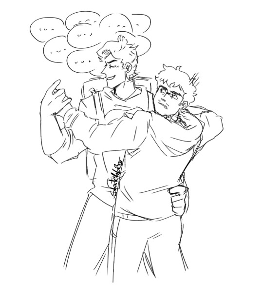
Okay so, back in january 2024 @blue-sunflower-bee and I have been talking about headcanons for Abby and Ness. Specifically about them recreating the fnaf musical. When i made some silly little doodles for their headcanons, I actually got very inspired to make my own AU based off these headcanons.
And so I created my very own
FNaF the Musical x FNaF Movie AU
Sadly I never posted anything about this AU since I got too embarrassed to even talk about it. I've stopped working on it before I even started. Now that the second movie will come out soon, I wanted to revive this AU and actually do stuff with it! :)
Here is what I have gathered so far:
• The story of this AU takes place after the first movie, while Vanessa is still in a coma
• After the events at Freddy's, Mike and Abby often go out for dinner at Sparky's. This is where they meet their lovely waiter, Ness
• Neither Mike nor Ness were interested in befriending each other at first. But as time went on, and Mike and Abby became regulars, they did develop some kind of friendship
• When Mike would have to go to work, he would ask Ness to babysit Abby. Ness would always agree since he gets along well with Abby. (Also Mike always promising Ness that he will pay him back soon, but Ness really doesn't mind spending his evenings taking care of Abby)
• Ness used to be a huge Freddy's fan. He owns a lot of Freddy's merch, from keychains and posters to masks and plushies. Not just that, but he also made LOTS of theories about the murders at Freddy's
• Mike and Abby would still visit Vanessa a lot, hoping she will wake up soon. Mike would eventually tell Ness about Vanessa and about the fact that he used to work at Freddy's for a week. He may have also accidentally mentioned to Ness that the owner of Freddy's is the murderer and the guy kidnapped and murdered his brother
• Ness doesn't fully believe Mike on that last part, so instead of just dropping it and continue living his life, Ness went back to all his theories on the murder cases, trying to connect the dots
This is all I will give y'all for now. I do have a lot more for this au, but i want to make sure everything i have so far will actually fit with the lore. :)
---
Quick Summary of what the story is about: Mike and Abby go to Sparky's, befriend Ness after some time and soon after Mike would tell Ness about what happened to him, Abby and Vanessa at Freddy's. Ness, who is obsessing with Freddy's and it's history of murders cases, breaks into freddy's every night, steals some stuff, and looks for evidince to back up his theories. While all that he thinks he can hear voices of the people that have died in that pizzeria and so he slowly goes insane.
---
As much as I love securitywaiter/dreamtheory, this ship will not be canon in this AU 😞 Am I still going to make ship art of them even tho i just said they're not canon? Absolutely.
Maybe if i learn how to write, i might make a comic about this AU
#mike schmidt#ness the waiter#ness fnaf#mike fnaf#fnaf mike#fnaf ness#matthew patrick#matpat#securitywaiter#dream theory#fnaf au#fnaf movie au#fnaf movie#fnaf 1#fnaf the musical#madpat#five nights at freddy's movie#five nights at freddy's#fnaf#artwork#art
56 notes
·
View notes
Text

02/03/2025 Devlog
Hallo everyone! Tumblr devlog time! My last post was a month ago because I keep missing my notifications to update here. You can follow me on Itch.io where I also update monthly but I swear I am going to find a way to remember to post here.
Summary Bullets:
More sprite variations
Finished up with sprite expressions for Chapter 5
Set up the flowchart for chapter 5
Coded in all the unlock statements for the flowchart
Completed all the necessary new sprites for this chapter
Coded in the new BGs and variations
And minor BG animations
Sketched all six CGs
Lined and flatted 3 CGs
Completed 1 CG
Art:
For Chapter 5 I ended up creating new outfits for several characters. And some new hairstyles for a couple as well. This wasn't something I was planning on doing but just somehow...happened. Ha ha. You'll (maybe) get to see them towards the end of the chapter.
I also finally....*finally* completed a sprite that I have been putting off drawing for ages. I just didn't really have a super clear image of this character and was flip-flopping on major design choices and it finally got to the point that I just needed to sit down and draw this guy. So he's done. He's completed.
And I'm not...displeased with how he turned out.
I got all the BGs ready as long as simple BG animations.
And I started on the CGs. The CGs are the last major thing to complete for this episode.
I have 1 complete.
I have 2 of them sketched, lined, flatted, and waiting for shading.
And I have the remaining three sketched out but not lined yet.
Other Stuff:
I set up the flowchart and got it coded. It's another monster. I think the flowcharts will calm down for a couple of chapters before exploding again later. Ha ha.

Why. Why am I like this?
Beyond that I also finished all the expressions - the 'easy but tedious work.' I think there ended up being over 4000 expression switches.
Upcoming Weeks:
I will be working to finish the CGs. LoL That's obviously the main thing left to do. I am going to try to push out the beta version of the episode to Patrons later this week. I want to try to get at least one more of the CGs finished before that and then I'll wrap up the rest of them during testing and early access.
So that is where we are with Episode 3/Chapter 5. The next time I update here will probably be when the route is already in beta and I'm busy with making inevitable typo corrections.
I'll see you then!
56 notes
·
View notes