#i will say the background characters look way better but again they look more generic/not as iconic lol
Explore tagged Tumblr posts
Text
oh boy i hope this movie is at least kinda good cos ive heard mixedf stuff about it but ive put it off for this long .
#ok seems like its very good to watch straight after the first one#so far it obviously looks better but i like the charm the graphics of the first one has..#oh hey its the tired lesbian#scared abt the camera situation..... hmm..#but maybe its just cos im super paranoid abt cameras everywhere irl LOL#i will say the background characters look way better but again they look more generic/not as iconic lol#even if iconic was kinda ugly#this baby even more op than before whadda fuck..#the lesbian is the badguy isnt she. i think i heard abt this before when it came out but yea
0 notes
Text
Derry Girls: A Masterclass in Detailed, Thematic Writing
Several years after the end, I finally watched Derry Girls, and it's become one of my favorite shows. Not only for the way it captures the absolutely unhinged aspects of Irish families (askmehowiknow) but for the sheer writing skill.
The vast majority of the episodes are laugh-out-loud hilarious, while also offering insightful commentary on the Troubles and on humanity's foibles as a whole. The characters are allowed to be human and act in unlikable, unsanitized ways, and to still be human and come back from that. (Almost like a metaphor for the Troubles or something.)

The story is also incredibly detailed; for example, when the girls are accused of killing a nun and Erin points out the nun was like, 98 years old and askes "might that shed some light on the situation?" there's an hourglass behind Sister Michael--emphasizing the idea that her time was up. Even more than that... the window is behind the hourglass, literally shining a light on it.
But that's a micro level. On a macro level, I also appreciated the way the story discusses the political backdrop that is part of its premise. Even as Erin, Michelle, James, Clare, and Orla grow up in a place that's been in a state of low-level warfare for decades, they live full lives. In fact, that's kinda the point.
Case in point: episode 4 of the first season, wherein Erin gets an exchange student from Chernobyl. The way the Northern Irish in general treat the Ukrainians is hilariously awful and patronizing, believing that they are giving them a respite from the troubles "over there" while Northern Ireland isn't in a much better state. But, as Sister Michael assures the Ukrainian students, the Irish troubles don't matter because "we're the goodies."
This line gets to the heart of what the episode is saying about political divisions and the way people view an "other." Everyone sees themselves as the "goodies." Because of that, they don't self-examine and wind up hurting the people they see themselves as wanting to help/save with their ignorance. It's a paradoxical egotistical (and frankly teenage) worldview that is also unwilling to look critically at oneself. The focus on their own perceptions over focusing on the actual humanity of the other results in ruining gifts that could come with cross-culture interaction, as seen in how Erin's misunderstandings and petty jealousy of Katya leads to her literally ruining a surprise gift Katya had prepared.
And the end of the episode also comments thematically on the story. One of the Ukrainian boys turns out not to be Ukrainian after all--he's actually Irish and from just down the road. He just didn't know how to say that. The ironic message is clear: despite differences in culture and views, they are actually all human beings, and assumptions make it hard for people to speak. If they could actually talk openly and without presumptions about who is "good" and who is "bad," they could prevent and solve a lot of problems.
This kind of background, symbolic commentary on the Troubles continues in just about every episode of the series. For example, even after the ceasefire, season 3 has an episode where it's discussed how negotiations are stalling, and the entirely of the rest of the episode takes place on a train that stalls between two separate places.

The Troubles are always something affecting their lives, but the only time the Troubles ever become the main story is in the finale episode. Which is also an episode that makes everyone cry. Michelle's brother is finally mentioned for the first time the entire series, yet it doesn't feel like a retcon so much as a recontextualization, and again mirrors how a lot of society (and Michelle's own family) have treated those who murdered others during the conflict.
Erin and James' relationship also works as a metaphor for the Troubles--an Irish Catholic girl and an English boy. Earlier in season 3, after they finally kiss, they're told they can't be together, that it's wrong, and that it'll create problems for everyone around them. Michelle doesn't want things to change. And Erin agrees that it's not good to pursue something.
But, in the final scenes, as Erin prepares to vote in the Good Friday Agreement and talks to James, she directly states she thinks things can't stay the same forever--thereby countering what she said to reject James earlier:
There's a part of me that wishes everything could just stay the same. That we could all just stay like this forever. There's a part of me that doesn't really want to grow up. I'm not sure I'm ready for it. I'm not sure I'm ready for the world. But things can't stay the same, and they shouldn't. No matter how scary it is, we have to move on, and we have to grow up, because things... well, they might just change for the better. So we have to be brave. And if our dreams get broken along the way... we have to make new ones from the pieces.
Symbolically, also, given that we know the outcome of the Good Friday Agreement, I think it's pretty clear Erin and James end up together even if we're not directly shown it.
That the last shot of the episode (besides the funny epilogue) is Grandda Joe, one of the eldest characters, helping his youngest toddler granddaughter Anna leap over a threshold as they leave the voting station, is also incredibly clear in its symbolism.
Erin: People died. Innocent people died, Grandda. They were someone's mother, father, daughter, son. Nothing can ever make that okay. And the people who took those lives, they're just gonna walk free? What if we do it, and it's all for nothing? What if we vote yes and it doesn't even work? Grandda Joe: And what if it does? What if no one else has to die? What if this all becomes a--a ghost story you'll tell your wee-un's some day? A ghost story they'll hardly believe?
I dunno, I think this is a sentiment we need more of in the world. A peaceful future means taking risks and accepting that punitive justice will not be perfectly doled out; however, if you allow more people to be hurt, is that not also injustice? It's a paradox that the story leaves us without a dogmatic answer to (for example, we never find out if Michelle's brother gets released), but it's also hopeful--because we know that the Good Friday Agreement largely worked.
(For further analysis of the final scene, I recommend PillarofGarbage's analysis on YouTube!)
#hamliet reviews#derry girls#erin quinn#michelle mallon#sister michael#james maguire#orla mccool#clare devlin
596 notes
·
View notes
Note
hey! i’m an artist and i was wondering what about the httyd crossover art made it obviously AI. i’m trying to get better at recognizing AI versus real art and i totally would have just not clocked that.
Hey! This is TOTALLY okay to not have recognized it, because I DIDN'T AT FIRST, EITHER. Unfortunately there’s no real foolproof way to distinguish real art from the fake stuff. However I have noticed a general rule of thumb while browsing these last few months.
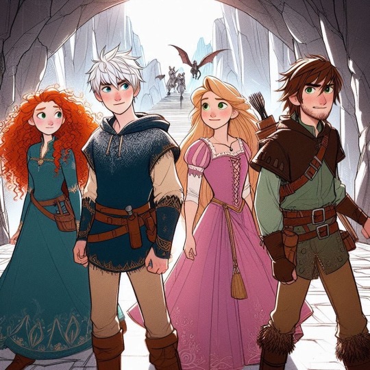
So this is the AI generated image I used as inspiration. I will not be tagging the account that posted it because I do not condone bullying of any type, but it’s important to mention that this was part of a set of images:
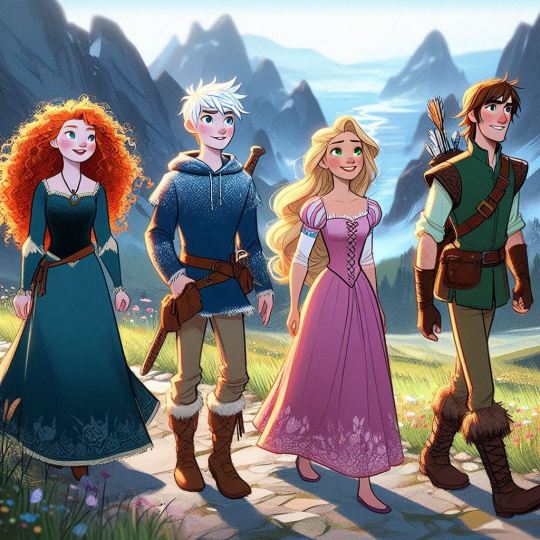
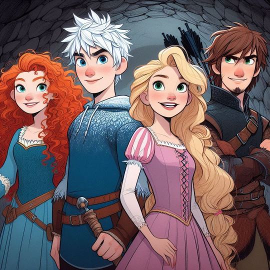
This is important because one of the BIGGEST things you can use to your advantage is context clues. This is the thing that clued me in: right off the bat we can see that there is NO consistency between these three images. The art style and outfits change with every generated image. They're vaguely related (I.E. characters that resemble the Big Four are on some sort of adventure?) and that's about it. Going to the account in question proved that all they posted were AI generated images. All of which have many red flags, but for clarity's sake we'll stick with the one that I used.

The first thing that caught my eye was this???? Amorphous Blob in the background. Which is obviously supposed to be knights or a dragon or something.
Again, context clues come into play here. Artists will draw everything With A Purpose. And if what they're drawing is fanart, you are going to recognize most of what you see in the image. Even if there are mistakes.
In the context of this image, it looks like the Four are supposed to be running from these people. The thing that drew my attention to it was the fact that I Didn't Recognize The Villains, and this is because there is nothing to recognize. These shapes aren't Drago, or Grimmel, or Pitch, or any other villain we usually associate with ROTBTD. They're just Amorphous Blobs that are vaguely villain shaped.
Which brings me to my second point:

Do you see the way they're standing? There is no purpose to this. It throws the entire image off. Your eye is drawn to the Amorphous Villain Blobs in the background, and these characters are not reacting to them one bit.
Now I'm not saying that all images have to have a story behind them, but if this were created by a person, it clearly would have had one. Our group here is not telling a story, they are posing.
This is because the AI does not see the image as a whole, but as two separate components: the setting, and the description of the characters that the prompter dictates. I.E. "Merida from Brave, Jack Frost from ROTG, Rapunzel from Tangled, and Hiccup from HTTYD standing next to each other"
Now obviously the most pressing part of this prompt are the characters themselves. So the AI prioritizes that and tries to spit out something that WE recognize as "Merida from Brave, Jack Frost from ROTG, Rapunzel from Tangled, and Hiccup from HTTYD standing next to each other".
This, more times than not, is going to end up with this stagnant posing. Because AI cannot create, it can only emulate. And even then, it still can't do it right. Case in point:


This is not Hiccup. The AI totally thinks this is Eugene Fitzherbert. Look at the pose. The facial structure. The goatee. The smirk. The outfits. He's always next to Raps. Why does he have a quiver? Where's Toothless? His braids? His scar??

HE HAS BOTH OF HIS LEGS.
The AI. Cannot even get the most important part of it's prompt correct.
And that's just the beginning. Here:

More amorphous shapes.
So these are obviously supposed to be utility belts, but I mean. Look at them. The perspective is all off. There are useless straps. I don't even know what that cluster behind Jack's left arm is supposed to be.
This is a prime example of AI emulating without understanding structure.


You can see this particularly in Jack, between his hands, the "tassels" of his tunic, and the odd wrinkles of his boots. There's just not any structure here whatsoever.
Lastly, AI CANNOT CREATE PATTERNS.
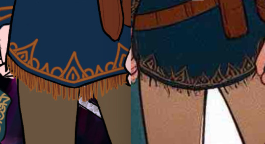
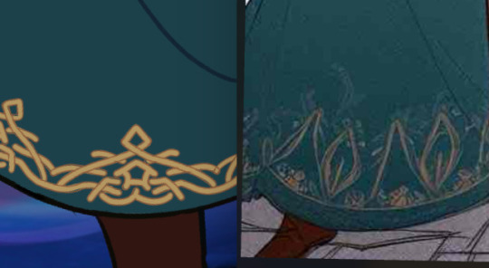
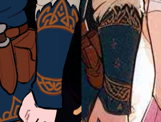
Here are the side-by-sides of the shit I had to deal with when redesigning their outfits. Please someone acknowledge this. This killed me inside. THIS is most recognizable to me, and usually what I look for first if I'm wary about an art piece. These clusterfuck bunches of color. I hate them. I hate them so. much.
Anyways here's some other miscellaneous things I've noticed:

Danny Phantom Eyes

???? Thumb? (and random sword sheath)

Collarbone Necklace (corset from hell)

No Staff :( No Bow :(

What is that.
So yeah. Truly the best thing to do is to just. study it. A lot of times you aren't gonna notice anything just looking at the big picture, you need to zoom in and focus on the little details. Obviously I'm not like an expert in AI or anything, but I do have a degree in animation practices and I'm. You know. A human being. So.
In conclusion:
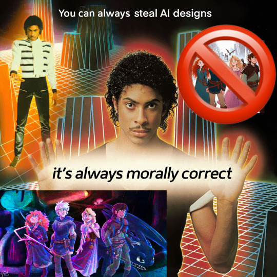
(Y'all should totally reblog my redesign of this btw)
#rotbtd#the big four#anti ai#ai discourse#fanart#ask#inbox#rise of the brave tangled dragons#httyd#how to train your dragon#hiccup horrendous haddock iii#brave#tangled#rapunzel#merida#jack frost#rotg#rise of the guardians#dreamworks#disney#hijack#frostcup#jackunzel#jarida#mericcup#hicunzel#crossover#hicless#rtte#race to the edge
1K notes
·
View notes
Note
Hello! Many people have said this but ill say it too, I LOVE YOUR COMIC SO MUCH ( ´ ▽ ` ).。o♡
I really wanted to ask you about how you do the backgrounds? (Something i struggle with) whats the process? Like from start to finish, also, to do the rise backgrounds do you use reference from the show and generally real photo of ny? Or do you come up with them? And last question- The shadow and light on the background- Like HOW
i know it’s a lot of questions but i’m just so curious qwq and wanna learn to be better, thank you again in case you read this and respond, in case you don’t, i hope you have a nice day and a wonderful life uwu keep up the great work! (≧◡≦) ♡
Backgrounds are a really broad subject and I'm always a little overwhelmed when asked this question. Just like drawing the human body, backgrounds take time, repetition, and practice!
My answer got a bit long, so it's going under a read more :) but if you digest info better in video format I found this on youtube
youtube
It pretty much goes over everything I wanted to say, but in a much better way. I wish I had found it before writing all this out lol
ok, first of all, I'm not a teacher nor was I built to be one of those cool helpful art tutorial people who do a full coloured tutorial filled with illustrations. This is just going to be a messy "how I do backgrounds / environment layouts from start to finish." kinda thing.
... lets start with a sight tangent.
Sketch from Life!!!
If you want to get better at backgrounds I recommend doing some sketching out in the real world!
When I was first getting into doing backgrounds I went to cafes and parks to just sketch the buildings and objects. Sketch rocks, flowers, clumps of grass, garbage cans, bottles, tables, street signs, etc. If you are drawing a tree observe how the trunks twist, how the bark flows, or how the leaves are bunched.
If you can't leave the house the same still applies! Sketch the interiors of your house, the walls, or common objects like chairs and bookshelves. How are objects stacked? items on the floor?
If you aren't comfortable with drawing outside or in public you can take some photos to draw from! They are good for practice and you can use them again as references later. Alternatively you can find pictures online of buildings and objects to sketch as practice.
All spaces have objects in them, it becomes easier to draw those kinds of spaces when you already have spent time observing and sketching them.
ALSO! They don't have to be good sketches! It's just to build out your mental catalogue and strengthen your perception of perspective.
now the actual thing...
BACKGROUNDS
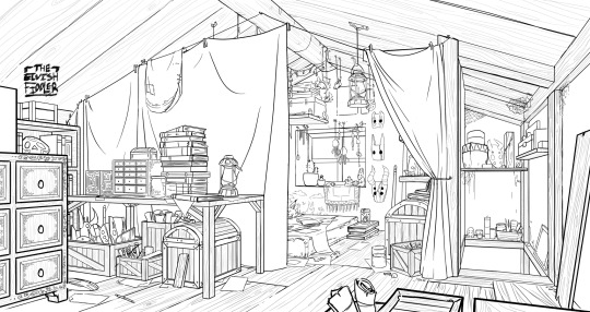
(the pictures used for this are my own. I dug them out of my 2022 folder)
Backgrounds have slightly different rules based on what you are making them for. Videogame Environment Concept Art vs Animation Layouts vs Comic Backgrounds vs Illustration backgrounds.
They all follow the same basics, which I will go over here, but the intention and function of those designs are going to be different. It's all about how you set up the scene and what it's purpose is!
Brainstorming and Thumbnailing
I like to think about a location as though it is a character. An abandoned old house with creaky sagging floorboards is very different from a futuristic space ship with sharp metal floor panels. A gas station has a very different feeling from a library.
I usually start by asking what is this location's story? Why was it built and for what purpose? What kinds of things does this room need to fulfill that purpose? You don’t need solid answers, but its good to be thinking about it while you are working.
Next, sketch some ideas for how this place is going to look. For me, this usually involves drawing the idea from multiple angles and then making lists & small sketches of the objects I think should be filling the space.
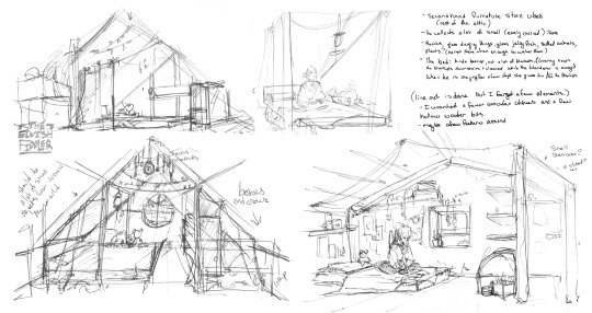
Example: The main character of my original work is a Wanderer. They collect a lot of things on their travels, but those items have to be small enough to be easily carried in a backpack. I wanted his room to be in the corner of an attic, walled off by curtains, and filled with trinkets. You can see some of my brainstorming above.
References
I only look for references after I've done some sketching and planning; this is to solidify my idea first so that I don't accidentally copy anyone else's work. I will make a moodboard with pictures of lighting, colours, items, rooms with specific ceiling beams, old chairs, etc. basically whatever I feel fits the vibe.
Honestly, I don't use references as much as I should. For ROTTMNT fanart I look at backgrounds and screenshots from the series to study the style. I also reference actual photos of NYC to get a feel for how Rise condenses the visual information.
In general, it's good to have references of real life objects/locations, because there are so many details like cracks in pavement, stickers on polls, crowning on buildings, fancy fencing, weird chair legs, etc. that you might not think of. It's the imperfect details that can make a location feel more alive.
Perspective
Once you have your chosen sketch we move to.... the infamous perspective boxes. Doing backgrounds is just learning to be comfortable drawing So Many boxes and carving items out of them.
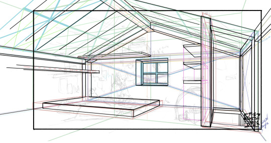
Many better artists than myself have made videos on perspective, vanishing points, and all the technical bits. Videos like THIS ONE and THIS ONE are helpful (this post is great too!!). There are probably a lot of classes to be found on Skillshare or Schoolism. I learned a lot of this in my college art course, so I can't give you a specific video which helped me.
You can get by and be a good artist without learning this stuff. There are quite a few successful artists who have admitted they never bothered to learn perspective (one of these people even made a whole graphic novel series).
I personally avoided properly learning this stuff until I was in my 20s because I thought it would be boring and difficult to do. tbh I really wish I had learned it earlier because it's so much fun to make those silly little boxes imo. It looks scary and complicated but, just like drawing humans, it just takes time, repetition, and practice to develop the knowledge and skills.
Cleanup
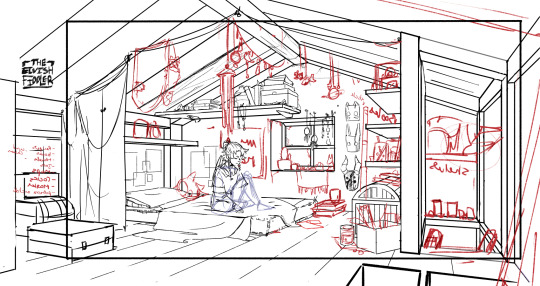
You have your boxes and lines! Cool! Now to make a scene out of it. Fill in the details, get everything placed were you want it! Generally, the lines of each item will point back towards the horizon line, but they can have different perspective points.
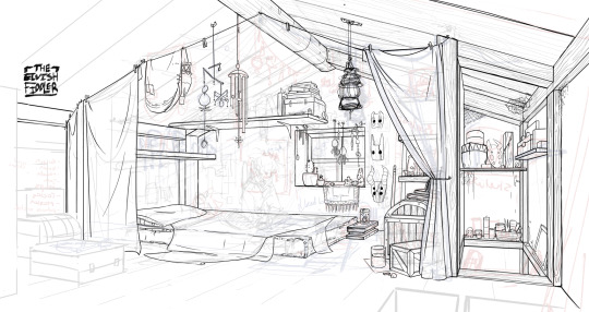
Generally you would want to clean it up and get your room completely sketched before doing the lineart. I tend to combine the steps (not recommended)
Lineart
I've mentioned how I do this before. Closer objects have thicker lines and more detailed inside. Further objects have thinner lines and less detail. I didn't quite achieve that balance with the image below, but it's close enough.
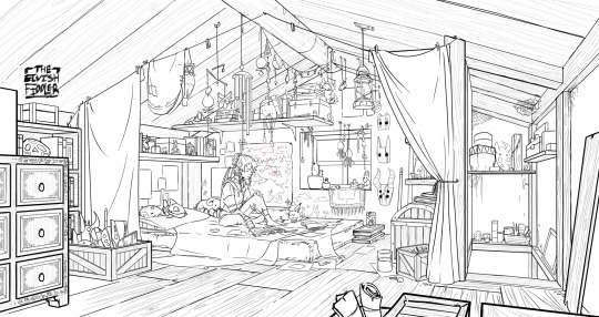
Colours and Shading will have to be a separate post. In the meantime, I highly recommend the book "Color and Light" by James Gurney. I used to borrow it from my local library and a good chunk of my knowledge was learned from it :)
#Artist's Comic Rambles#asks#art related asks#thank you for the ask!! I'm glad to hear you enjoy the comc :D#i hope this was somewhat helpful...#i get overwhelmed by broad questions very easily haha#if you would me to elaborate on something specific I mentioned feel free to ask#i wrote this all out weeks ago and then forgot about it... I just added a link or two but yeah here it is
305 notes
·
View notes
Text
Longing (Aemond Targaryen x Servant!Reader)
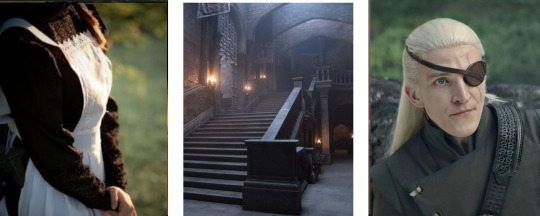
synopsis: “You are wasting all this time away from what you could have.” He whispers against your lips.
“How could I so selfishly take something that will never truly be mine. For if it where it would mean you had lost everything.” You murmur back, finally caving and resting your forehead against his.
warnings: forbidden love, love confessions, afab reader
word count: 1.5k
taglist: @hopelesswritergall @urmomsgirlfriend1 @legitalicat
(If you want to be tagged for a specific character/fandom or in general let me know in my asks, comments or DMs)

Being a chambermaid employed by the royal family meant that you were closer to them than most low born people could say. It also meant that you were closer to them than most would ever be. You had begun your service as prince Aemond's chambermaid shortly after your four and tenth name day which was more than just a few years past now and, in that time, the initially fearful flutter in your stomach at the Targaryen prince’s presence had changed. Your palms still sweat, and your heart still missed a few beats, your muscles still tensed, and your breath still fell short. Yet the air around you feels different. Instead of suffocatingly thick, it seems charged with energy.
Still, ever aware of where you come from as opposed to his royal background, you push any of it aside and continue your service. All but too happy when you get reassigned to the princess Helaena´s chambers. Unknowing as to what brought on that change, carefully veiled by the Queen who feared her son’s infatuation with you grow, hoping it would keep the prince´s eye away from you. It wouldn´t. Nothing ever could. He had always gotten what he wanted, one way or another.
You felt the burning gaze in your neck whenever he was unoccupied by lessons, training or sleep. Every free second he is given. Though him watching you isn´t quite as hard as when he tries to talk to you.
“Have you ever known the feeling of love?” Aemond asks you in an empty hallway one night.
Gasping at his sudden, silent appearance, you stumble a step back. “A-apologies, your highness?”
“I asked if you have ever been in love.” He repeats.
Unsure if it is better to answer truthfully or not you decide for it. Just as your palms start to sweat and your stomach begins to flutter again.
“I have.” You admit with a burning face.
“How does it feel?” He implores further, taking a step towards you.
“In all truth I do not know how to answer your question.” A nervous huff escapes your lungs. “Because it is not the happy tale I assume you wish to hear.”
Aemond closes further in on you until you feel the cold stone wall of the red keep pressed against your back and his warm breath barely grazing over your face. “Tell me anyway.”
“There is nothing to tell. He is of noble birth, so I had no choice but to ignore my own feelings. Lest a confession endangered my position in the castle.” You try to push down any revealing glimmer in your eyes as he lays a finger underneath your chin to force you to look up at him.
“Have you ever considered his feelings? He might hope and wait for a confession. Your position would not be endangered if he is with you willingly, is it?” The look in the blond´s eye had seldom been witnessed to be as soft as it is in this moment.
You can barely handle the cold guilt that floods your nervous system at the prospect of it. “No, that would be an even worse fate.”
For a moment a heavy silence reigns over the atmosphere in the corridor. You are captured by his intense energy, but you know that your differences drive you too far apart to be together. Not in this life. Collecting all your strength, you free yourself of the spell.
“You will have to apologize me, your highness.” You mumble quickly before running back to your chambers.
Leaving him behind confused and displeased with his own haste having driven you away. Arriving out of breath and agitated, your stomach churns until the moment your eyes close. Yet even in your dreams the thought of Aemond won´t bring you any peace.

For the following tenday or so the two of you go back to the usual routine. You go after your duties day by day while Aemond watches. Secretly planning his next step. Careful not to drive you away any further than he already might have had. If only he knew how high the fire of passion was burning inside of you. Longing, yearning for what he was offering. Only barely contained by your insistent reminders how much there was at stake were he to pursue his feelings for you.
When he approaches you again, you are in the same corridor. Just about to prepare a bath for the princess. His steps silent as always, sending a cold shiver down your back as he calls out your name.
“You will never love anyone like that ever again. You will be like an empty vessel waiting to be filled, yet never being able to find what you are truly searching for…” He murmurs intimately.
Coming to a stand mere inches in front of you, leaning his head down to regard you with an all but reverential look from that dark, lilac eye. His hands find yours to interlock your fingers. Keeping you from running so fast again. He had thought long about how to talk to you without it, but now that he stood before you the words just broke out of him. Making your breath shudder as you take in the words. Struggling to cope with the intensity of the situation.
“I am willing to sacrifice that, if only it means to spare him from the fate he would suffer if he chose me.” You croak.
It is wrong to be so close to him, but by the seven it feels so right. He was so unapologetic and unwavering in his pursuit, and it felt good to be wanted. Even if your body couldn´t help but be on high alert. His eye searches into your own. Longing, aching for your love.
The usually brooding facial features, consumed by the agonizing need to have you. “You cannot spare him from fate. On the contrary. You are hurting him more by not embracing your love.”
Aemond´s hands cup your cheeks, gently. You watch him come closer inch by inch, frozen in place. When his lips lay on yours in a tender kiss, you don't dare to close your eyes. The chances of being caught still ever present in your brain. Still your hands grip the leather of his doublet impossibly tight. The touch only lasts a moment, and his eyes remain closed as he hums afterwards.
“You are wasting all this time away from what you could have.” He whispers against your lips.
“How could I so selfishly take something that will never truly be mine. For if it where it would mean you had lost everything.” You murmur back, finally caving and resting your forehead against his.
“For as long as there is breath in my lungs, I swear to you that no matter who I am wed to my heart will be yours to hold only. I will worship every inch of you in the shadows of the castle and the dark of night.” He promises.
“But what are stolen moments and hidden alcoves if they do not save you from the danger of the affair. If you will never be able to not worry about the prying eyes and judgemental tongues of the court.” You argue back. Yet the intention of stopping the arising longing is far failed.
Your heart clenches with the wish to have the prince as freely as his future wife could.
“It will be whatever we wish. Our own little world.” He rasps and something inside of you breaks.
The strength you had shown all this time to stay away from him is eradicated by the sweet nothings.
“It sounds so simple.” You concede in a doleful tone.
“It can be. If you let it.” Aemond murmurs, one of his hands wandering into your hair. “I beg of you. Do not refuse what we could have anymore.”
“I will not.” You whisper.
The blond closes the infinitesimal gap between your lips anew. This time your eyes flutter close. Trusting him to be safe in your privacy. The hand still on your cheek, cradles your face as the other presses up ever so gently against the back of your head. Guiding you into the affectionate touch. His lips capture yours. Hungry for anything yours are willing to give and expressing every ounce of emotion that had been repressed for years. His tall frame presses against you, your arms snaking around his middle to splay your fingers over the cool leather covering his back. Your heart skips like never before. Your lips linger for a moment longer before you part. It could have been an eternity or just a blink of an eye and your eyes flutter open hesitantly. The air around the two of you buzzes, the energy the only sound in your ears beside your blood rushing with adrenaline.
“I love you.” You whisper. Scared to wake up and have it all be a dream if you speak any louder.
“I´m yours. Forever.” Aemond murmurs back.

#aemond#aemond one eye#aemond targaryen#prince aemond targaryen#aemond x reader#aemond x you#aemond targaryen x reader#aemond targaryen x you#hotd#house of the dragon#hotd fic#house of the dragon fic#hotd fanfic#hotd x reader#hotd x you
227 notes
·
View notes
Text
┗ They're Mine; TFA! Cons × GN! S/O ┛
Characters: Megatron, Starscream, and Shockwave (Transformers Animated) *characters aren't shipped together A/N: This was actually fun to write, I made the idea while ago but never had any energy to write it out. Thank goodness I did, though. I love this, by far one of my most enjoyable pieces to write. ⇘ Summary: After returning from a mission with Shockwave on Cybertron, you attract the attention of Lord Megatron and his second-in-command, Starscream. But, after becoming more comfortable around the Decepticon team, they're shocked by the realization of your status with your spy-partner.
┍━━━━━━━━━━━━━━━━━━━━━━━━━━━━━┑


┕━━━━━━━━━━━━━━━━━━━━━━━━━━━━━┙
👑💫 Having one of these mechs on your aft is hard enough. But having both of them? Oh, I feel bad for you.
👑 Megatron doesn't hesitate to show his disdain for any of his fellow Cybertronians, or really anything in general. But, because of this quality, it's easy to tell when you likes you around. Examples of this is Shockwave.
💫 Starscream on the other hand is the exact opposite. He never really shows he likes anyone. Probably because he doesn't, but I regress.
👑💫 However, when you came around, these two changed their actions almost fully. They're still just as unstable as before, but they do try to tone it down when you're nearby. Starscream does this better than the anger-issues having warlord.
👑💫 You were terrified when you met the warlord. You may have been a Decepticon who followed him for many years through the war back home, but actually seeing him face-to-face was totally different.
🧪 During Shockwave's time on Cybertron, you were right by his side. You managed a lot of the background parts, you made sure there were records of a Longarm and Hillcrest being created and being raised on the planet. Longarm being Shockwave's alias and Hillcrest being yours.
👑🧪 When you both were revealed as traitors, you fled to Lord Megatron as quickly as possible. He wasn't happy you both failed, but the way you somehow managed to go that long and get quite a bit of information, did please him.
👑🧪 You stared up at the mech as he looked blankly at you. Shockwave looked back at you with his singular optic, before motioning for you to come closer to him. He wrapped an arm around your shoulders and introduced you to your shared boss.
"Lord Megatron, I am pleased to introduce you to Y/N. They've been my right-hand during my time on Cybertron. Their knowledge almost surpasses my own, it's quite jarring."
"My Lord." You bowed, nervously staring at the ground as Megatron stared down at you.
"Rise." He demanded, to which you obliged and looked at him with slightly-widened optics.
"So," he began circling around you as he spoke. "You're the infamous Hillcrest Prime, leader of the Cybertronian Defense. Impressive work weakening their defenses on the inside without Ultra Magnus discovering."
"I-uh, thank you, my Lord. Though, Shockwave did do quite a bit of work himself with that." You chuckled.
"Oh, I'm sure he did." He purred, making your cheeks flare with a slight blue tint.
💫 Your first time meeting Starscream was far different. You actually knew him from before the war. He was one of your best friends as you aged. Starscream enjoyed being around you because you helped feed into his ever-growing ego.
💫 He always said you were adorable when you were young, but seeing you and how you aged was shocking. You stood alongside Shockwave, trying to put a few things together before Lugnut began to spout off about Megatron once again.
💫 You looked at Lugnut and blinked annoyingly, a scowl on your face as he kept rambling. He was pissing you off and both Starscream and Shockwave knew this, but didn't bother trying to stop you. They both understood your anger far to well.
"Lugnut. Please be quiet. Shockwave and I must continue our research into the ship and getting information out of Arcee."
"Are you saying you don't want to hear about our glorious leader, Lord Megatron?! How dare you insult him in such a menner?! Why-"
💫 Your optic twitched as you, without hesitation, stomped on Lugnut's ped, kicked him on the side of his face, and pushed him out of the room.
"And if you don't want to listen, stay out!" You yelled, slamming the doors shut.
👑 Megatron heard the noise and went to the room, only to find Lugnut pouting outside of the room.
"Lugnut? What caused that loud boom?" Megatron asked.
👑 The green and purple Decepticon stood up abruptly and bowed to the stoic mech before telling him the story. Only for you to yell back that you heard him and he should stop acting like a sparkling unless he wanted you to come out and throw him out the nearest exit.
👑 Megatron was slightly surprised. When you first arrived, you were on the shy-side, not really speaking unless necessary. But, perhaps that was how Hillcrest acted around people of authority and not Y/N? Most likely.
👑💫 Megatron entered and looked at Starscream, only to see the mech talking to you like he knew you for eons. Of course he did, but the warlord couldn't give a scrap. His second-in-command really knows how to make Megatron want to cut each cable in his system, doesn't he?
"Y/N, can you grab some supplies from the back?" Shockwave asked.
"...Huh? Oh- yeah. What do you need?"
"Just some lubricants and extra cords." He answered, antennae moving around as you smiled and nodded.
👑💫 Megatron and Starscream glared at one another, but they looked at you as you whipped off your servos and laid a cloth down for Shockwave to do the same later on. Come to think of it, the only Cybertronian they saw you always positively and freely interact with was the scientist...
👑💫🧪 Just as they began to go through the few memories they shared with you in the team, you stepped up slightly and pecked the scientist on the side of his helm. His antennae moved slightly upwards as he leaned his helm on yours for a slight second before you left to grab the materials he wanted.
"Did that just... happen?" Starscream mumbled, Lugnut beside him with his jaw dropped open.
"Uh- Shockwave." Megatron called.
👑💫🧪 Shockwave looked at his leader and hummed, wordlessly asking for the larger mech to continue.
"Are you and Y/N a... couple?" He strained out.
"We started acting lovingly while undercover in Cybertron's ranks, those small actions are practically in our average movements now." He replied.
"That doesn't answer the question!" Starscream yelled, servo balled in a fist as he yelled.
"To sum it up...
They're mine."
#Transformers#Transformers Animated#TFA#TFA Decepticons#Transformers x Reader#Transformers Animated x Reader#TFA x Reader#TFA Decepticons x Reader#S/O! Reader#GN! Reader#Cybertronian! Reader#Decepticon! Reader#TFA Megatron#TFA Megatron x Reader#TFA Starscream#TFA Starscream x Reader#TFA Shockwave#TFA Shockwave x Reader
210 notes
·
View notes
Text
A Guiding Hand 9

No tag lists. Do not send asks or DMs about updates. Review my pinned post for guidelines, masterlist, etc.
Warnings: this fic will include dark content such as noncon/dubcon, age gap, parental neglect, depression, inference of self harm, violence, abuse, and possible untagged elements. My warnings are not exhaustive, enter at your own risk.
This is a dark!fic and explicit. 18+ only. Your media consumption is your own responsibility. Warnings have been given. DO NOT PROCEED if these matters upset you.
Summary: your online academics are affected by your personal struggles but your professor won’t let you give up so easy.
Characters: Raymond Smith, Lee Bodecker in the background
Note: I slept in which hasn't happened in ages.
As per usual, I humbly request your thoughts! Reblogs are always appreciated and welcomed, not only do I see them easier but it lets other people see my work. I will do my best to answer all I can. I’m trying to get better at keeping up so thanks everyone for staying with me.
Your feedback will help in this and future works (and WiPs, I haven’t forgotten those!) Please do not just put ‘more’. I will block you.
I love you all immensely. Take care. 💖

The world lurches to a halt. Your eyes flick open and you take in the white brick of the city station before you. Your shoulder is against the train window, your head slumped, and you are stolidly warm. You blink again and shift to sit straight. You look down at the tweed blazer draped across your front.
“We’ve arrived,” Professor Smith declares as he fixes his glasses.
“I... I’m sorry. I fell asleep,” you croak and gently push his jacket off, smoothing it then holding it out to him. The armrest between you has been flipped up. “Thank you, sir.”
He grunts, likely at the use of the formal epithet. You just don’t feel right calling him by his name. He takes his blazer, “not at all. You needed the rest. I only thought you might be cold as they had the air on high.”
“Thank you,” you repeat again. Things aren’t so different, are they? You’re still a burden. You still have nothing to give but take all you can get.
“We will wait for the rush to pass,” he stays as he is as the other passengers rise and shrug into sweaters or jackets and take down their bags from compartments.
You are in no hurry to go, you’re not quite sure what awaits you and the general public has always reminded you of your greatest insecurities. You see the women with their styled hair, winged liners, and sleek outfits. They are all put together meanwhile you feel as if you’re falling apart.
Raymond stands only as the aisle clears and puts on his blazer. He brings down the bags and steps back for you to sidle out. You walk ahead of him gawkishly, unsure of where to go beyond the train. An attendant helps you onto the platform and you turn to look at your escort as he steps down coolly.
“We’ll fetch a taxi to see us home. I’ll have you settled soon enough. I’m certain you cannot wait to be still.” He says.
You nod and shrug, then offer another wilted ‘thank you.’
He guides you through the station and out the front doors. There’s a row of cabs waiting for the arrivals. He claims one and the driver helps in getting the luggage in the trunk. You don’t have much more than that duffel he took of your thrifted clothing.
You cradle your injured hand as you pass through the city streets. It’s a beautiful place. Vibrant, huge, much more than the gray town you spent your life in. The curated hedges and bunches of petals, the endless business marquees and the arched park entrances put to shame all you know. It feels like a dream; the sort of fantasy only written or crafted onto film.
Raymond is quiet, pensive as you peek over at him. His golden hair shines in the sunlight that peers through the window. He watches the windshield past the seat. Just look at him, you feel out of place. His refined attire, his straight posture, he is precise in every way.
As the ride stretches on, you worry. The city thins as you reach the outer bounds and the sprawling greens are specked with large homesteads. The driver slows and pulls up a long drive, capped by a set of iron gates. The house behind the bars is a mansion and half.
Raymond fiddles with his phone and the gates open on a motor. The driver pulls through and rolls all the way up before the front steps. You gape up at the immense modern castle. This is all his? This is beyond anything you’ve ever seen with your own eyes.
The driver opens your door as Raymond lets himself out. You climb out and stand to the side awkwardly. You don’t belong in a place like this.
The trunk snaps as your eyes cling to the grand facade. Raymond thanks the driver before the tires roll back toward the gate. He waits until the taxi is gone and then the gates whir shut. He steps up next to you with the bags in hand.
“Go on,” he nudges you softly with his elbow.
“This...” you pause and look at him. He’s older than you. And established. He must have a whole life aside from this disaster of a student he pities to the point of charity. “I don’t know. Your family... wouldn’t they be upset?”
He looks at you keenly with his pale blue eyes, “it’s only me.”
You frown and face the house again. Oh. You didn’t mean to presume, you just thought...
“I’m sor--”
“Ah,” he quiets you. “No more of that. I’m rather content in my solace. Now, you need settling. You’ve been through enough.”
You grumble and nod. Your shame and self-pity keeps you speechless. He’s confusing to you. How can he not see how pathetic you are? Why is he doing all this?
You ascend the steps next to him. He goes ahead of you only as you reach the doors and he pushes the left one inward, waving you through first. You enter, shoulders and head down, and stay on the mat as the polished floors gleam around you.
You sway in horror. What must he have thought of your mother’s apartment? And he went into your room to fetch your clothing? Ugh, he must think you entirely helpless and disgusting. You cover your face without a thought.
“Dear, are you unwell?” He asks as the bags drop on the bench heavily.
“Um,” you part your fingers then peel them away. “No, I...” you chew your lip and put your arms at your side, “it’s a very pretty house. Big.”
“Yes, so it is. Try not to get lost,” he snorts. “I’ll show you where you can hang your hat, in a manner of speaking, but first, shoes.”
You look down at your sneakers. Right. You bend to untie the stained laces. The applique is falling away from the seams and the treads are streaked and scuffed with dirt. You wiggle them off and put them over on the tidy shoe rack.
Raymond tucks his leather shoes away and scoops up the bags once more. You wait for him to guide you. He steps ahead of you and you trail him.
“I’ll give you a brief lay of the land,” he proclaims as he leads you through an open square doorway. Beyond is a high-ceilinged room which could contain your mother’s entire apartment. “The den or sitting room, whatever you might call it. Feel welcome to spend your leisure here. I’m afraid I never use the telly much.”
He stops as you peer around. You try not to show your awe but it’s all so fancy and sleek. The TV is mounted to the wall above a fireplace and the leather furniture is puckered and perfectly place, along with the wood and brass accoutrements that decorate the space.
“The kitchen as well.” He herds you onward into the hall and down to the kitchen at the rear of the house. It is as refined as the rest of the house, vast even; so many cupboards, a large island, and all the appliances you could dream of. “Don’t hesitate to help yourself. I am rather fond of cooking so I don’t mind at all. Or if you would need some assistance with anything, I’ll be more than happy to help.”
“Oh, thanks,” you fold your arm to your chest and wring your wrist with your other hand.
“And should you require anything, I’m certain you will, you may simply let me know,” he says. “I assume you would like to be in one place for what’s left of the day. I cannot blame you. I am fatigued of the upending myself.”
He takes you down the hall and back to the foyer. You follow him up the stairs that bend halfway and down another hallway that overlooks the entry over the banister. He stops at a door and nods. You sheepishly move to open it yourself as he keeps hold of the bags.
You swing the door open gently and peek inside. You turn and reach for the bag, “I can--”
“I’ve got it,” he insists and steps through. He lays the bag on the desk in the corner. “The maid comes daily. I will inform her to knock. This is you space.”
“Oh,” you utter.
“My room is further down, at the very end, should you need to find me, though I am more often in my office, between this door and mine,” he explains, “a loo across from you as well.”
“Yes, sir,” you twiddle your fingers and look around. The room is amazing. The daylight beams through the sheer curtains and lights up the decor. Gold and ivory, brighter than the rustic tones of the first floor.
“I will leave you to your own devices. I’ve smothered you, haven’t I?” He nears the door. “If you are up to it, I will be preparing dinner for six.” He checks his watch and clucks. “Do you prefer steak or chicken?”
You wet your lips and stare at the doorway behind him. “Whatever you like, I'll eat... I could help--”
“You will rest. Your hand needs healing. Your spirit too.” He girds. “There is a tub as well, and all you should need with it. Salts and the like.”
“Thanks, um, I think I’ll just... rest.”
“There’s the bookshelf as well,” he points. “Thought you mightn’t agree with my taste, help yourself to the selection.”
“Okay,” you murmur.
“Very well, then,” he dips his chin and turns on his heel.
He struts out and shuts the door in his stead. You stare at it. Dread curdles around you and makes you shudder.
You shouldn’t feel worse, should you? But you do. He has such a nice life, a gorgeous house, a wonderful job. You don’t know why he should disturb it by inviting you in from the cold?
Maybe he’s one of those people who uses those beneath him to build himself up. You’re a pet project for this man bored with his perfect existence. That must be it. After all, no man’s ever wanted anything from you but to make themselves feel big.
You turn and cross the room. You stand at the window and gaze out at the lawn. Your eyes tinge with tears. You are still a slug. Still filth. You don’t want to stain his obsessively clean haven.
Your legs wobble and you back away from the window. You stagger to the desk and sit in the swivelly chair. You lean your elbow on the desk and inhale with a quake. You hold your head as the memories swell in your head.
Lee on top of you, hurting you, then all at once, chaos. Your mother, so helpless, so apathetic in her addiction, that she couldn’t do anything but squeal. He witnessed it all.
How can he bear it? How can he be near dirt like you? The way he sanitizes everything around him, and himself. The intense attention to detail and spite for those out of order. You can’t live up to all that. You’re going to cross a line sooner or later and then what happens?
You have no way home. He brought you here, on his dime. Now you owe him. As you always owed your mother just for being born, for being useless, a loser. That’s what Lee said and he wasn’t the first to do so.
You shakily wipe under your eyes with your knuckle. You’re lost. You’ve always been, but right now, you are off in a desolate land.
He might mean well. He might be honest, but that doesn’t make you feel any less a burden. That doesn’t take away the taint you’ve always carried. There’s no place for you in this world. Trying to find it, trying to better yourself, that proved it to you. You failed again and no matter what he believes or does, you’ll fail him too.
You fail at whatever he expects of you. What that is, is a mystery. He’s seen what you are. Where you come from. You hide your face behind your hand and gulp as you think about it.
#raymond smith#dark raymond smith#dark!raymond smith#raymond smith x reader#series#a guiding hand#the gentlemen#fic#dark fic#dark!fic
85 notes
·
View notes
Text
Hazbins bad character design
I feel like there is a definitive lack of varitey when it comes to the designs in HH as well as a problem of characters' designs not fitting them or what the show wants us to assume about them.
I've said it before and I'll say it again (like lots of other ppl already) but the designs in HH specifically mostly don't work. They're fine if you look at them disconnected from the show. Maybe as just random characters who don't really have to carry a show visually. But they don't work if you actually put them into context and into the background of Hazbin Hotel.
Obviously this stuff is very objective and if you do like the designs thats fine (which I shouldn't even have to say). Also I didn't study art or character design and I don't think you have to to be good at it/be able to form opinions on it and this is mostly just me compiling what I don't like while using some basic knowledge on how shapes, colours etc work.
(rant under the cut)
One problem I really have is, that as soon as you have a design there are immediate assumptions about the character. In the sense that if person A is very muscular and fights against person B, who is maybe slimmer or less buff, you would probably immediately assume that person A wins, atleast in physical combat. Whereas person B would probably be the assumed winner in a stretching or flexibility competition. Often characters are designed with these assumptions in mind. Muscle, height, weight, age, clothes etc. give way into assuming stuff about people, their condition, lifestyle or personality.
The expectations that are set up by the design choices are usually either picked to genuinely represent something about a character or to be subverted and shock/confuse the audience.
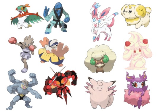
Like how a lot of fighting types in Pokémon will either be more muscular or have other details relating to certain fighting styles/sports and the fairy types are usually pinkish, fluffy and cutesy. Because these elements are something typically associated with these types and when we look at them we can pretty easily tell which type they're supposed to be.
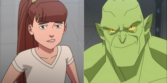
Otherwise, Monster girl from Invincible is drawn as a twelve year old girl, so it subverts expectations when she turns into a big green monster and generally doesn't stray away from violence, because it's something you wouldn't have assumed about her from her appearance.
In Hazbin Hotel most of the time the character designs don't necessarily fit what they're supposed to be and they also don't use the other design choices as subversion (the one that would probably count here is Nifty with looking and acting very childlike usually but then also acting violent/crazy sometimes).
The first thing would probably be that characters don't look their age mostly.
Charlie and Valeria (Vaggie, but I really don't wanna keep calling her that so she gets a new name) look fine as they're supposed to be around 20. Rosie and Carmilla also look alright for what we can assume their ages are supposed to be. But Alastor is in his 30s or 40s (what it says on the fandom wiki) and he looks around 20 as well. The same thing goes for Lucifer. He looks so young that he could also count as just Charlies brother or friend rather than her dad, because he doesn't look like he could be the dad of a 20 year old. This makes the song "Hell's Greatest Dad" a bit awkward because these men are singing/competing about who is better as Charlies father but they don't look a day older than her. Husk also looks way too young for someone in his 60s-70s (again from the wiki).
The body types being all the same also doesn't help.
Mimzy and Adam are pretty much the only more relevant characters who aren't like all the others in terms of body shape. All the other relevant women in the show have a tiny waist and either big boobs/big hips or just a slimmer build in general. All the men have thin waists and then broader shoulders.
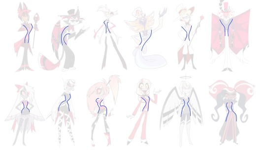
And for some characters it makes sense. Like Angel is really flexible and his more lanky body fits with being a spider. But why are Lucifer and Valentino like that? Other than the fact that Viv doesn't like drawing muscles there is really no reason for them too being build like every other skinny man there. Valentino is supposed to be intimidating not just by how he acts but physically too. He seemingly has a bit more muscle than others but his arms are still super thin and look like they could snap if I look at them wrong. I'm not trying to say that abusers all have to be buff, but simply from a design perspective the scenes with him would be a lot more effective if we saw him actually have a big physical advantage over Angel and others, even when he isn't necessarily threatening them. As soon as he comes on screen, we could see him as a much more intimidating presence, especially when all the other characters look like sticks. Or they could make it so, that he hides his muscles under his coat and when we get the reveal of him actually removing it, it's more shocking and immediately makes the situation more tense.
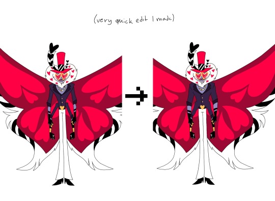
Lucifer could've had a more confident frame as well. He's the king of hell and the strongest being in hell, so just for the diversity I would give him some muscles too. Husk is also super skinny and for someone who only sits around and drinks alcohol all day, he should definitely have a beer belly (please I swear to god I wanna see more men with bellies, Mammon was great). Also for Valeria and Lute and pretty much all the Angels I don't get why they wouldn't be more buff either. Valeria is a fighter, she's Charlies bodyguard but she looks like all of the other women there. It's stated that Angels fight so wild because they don't know they could get hurt. And while I know that the Angels can really only get hurt by angelic weapons, having this whole reveal that they can be injured would've definitely suprised me more, if they actually looked like they couldn't be injured in the first place. But then again, Valeria looks like her arms would break as soon as a breeze hits them too hard. In some episodes her thighs look a bit more muscular, but not notably and she also doesn't fight using her legs (like Carmilla) so only her thighs being bigger sort of doesn't make sense. In general, she or Lute don't show any difference to the women who aren't physical fighters. And obviously just to have a more interesting show to look at, including different body types would do a great job at making these characters stand apart from eachother more.
While we're on the topic of diversity, another obvious thing that makes the characters redundant and borig (sometimes ugly too) is the reused colour pallette. Colour coding is probably one of the easiest things when talking about character designs and it's something atleast Helluva Boss understands.
What effect warm/cold tones have or what feelings we associate with different colours is a great way to bring stuff about characters across without being too on the nose. Obviously colour can also be used to either connect characters or to make them very distinct. Shape language also plays into that of course. In Inside Out the emotions are mostly characterized by their respective colour and by their distinct shapes.
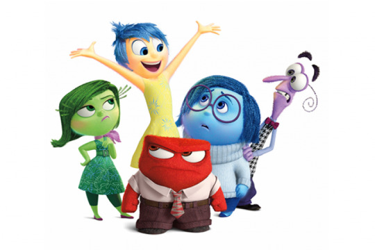
Joy = yellow (bright colour often associated with the sun/light)
Sadness = blue (cold colour often associated with tears/rain)
Anger = red (very strong colour with aggressive association with fire or when someone turns red because of anger)
Fear = purple (light colour here, mix between red and blue as fear often falls into a more angry or sad feeling)
Disgust = green (colour of most dirt or puke or other stuff people usually see as gross)
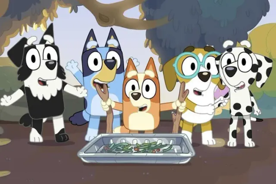
Or in a show like Bluey, where different patterns, shapes and colours show the breed of the dog and also how characters might be related to eachother (same breed/mix of breed = usually related).
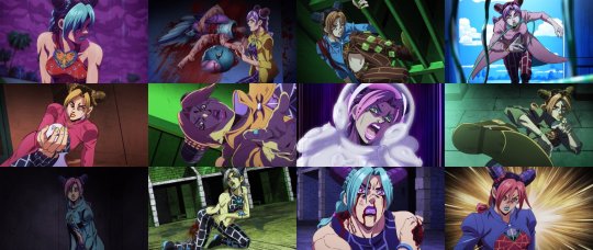
Or how colours can be used as lighting effects to create cool shots when the colour pallette changes all of a sudden. In JJBA these changes happen often when someone is in distress or unsure of themselves. Also in tense moments to make them seem more exciting and interesting.
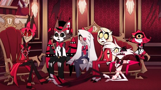
Hazbin Hotel has very limited range when it comes to the colours of the main cast. All of them feature some form of red and that usually in combination with black or white (if they aren't just purely red like Alastor or Rosie). This makes them not stand out from eachother and creates very similar colour pallettes which get boring once you've seen them repeated over and over again. It also makes the visual connection between characters who are actually related (like Charlie and Lucifer) a lot less strong because so many characters share similarities already.
Also they just hurt to look at sometimes because the background is mostly red as well and with a lot of them being very overly detailed. People have also spoken before about the show being pretty inaccessible for colour blind/vision impared people due to these issues with the colour.
And now you might say that it's hell and therefore it makes sense for all of them and the background to be red. But firstly, I don't think that there is a definitive source which decides that hell is red and can only be shown/interpreted as red. And also there is another show, also set in hell which actually does a much better job at that and actually shows different colours in hell. Like in Helluva Boss the rings are all colour coded.
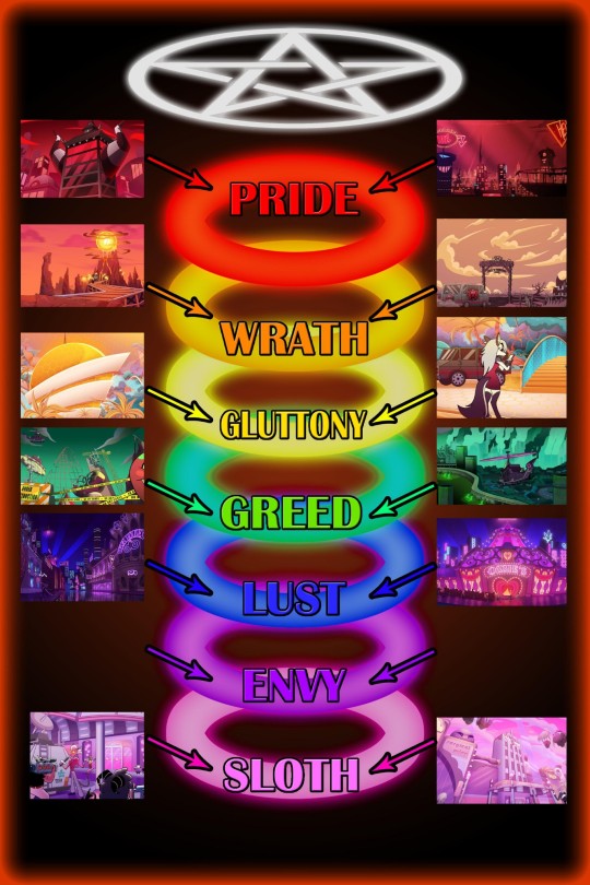
And I know, that HH plays in the pride ring fully, but imagine how cool it would've been to see sinners have colours similar to the sin(s) they committed. This could lead to them looking distinct from eachother and the background and would also lead to us being able to assume stuff about them, if we're familiar with the colour coding. In "Hell's Greatest Dad" they do a fun colour change with different light and it's really refreshing and I just wanted to see more variety like that (of course I kinda get that the colour changing isn't really part of the shows design but it was pretty cool to see in that song).
There also is the issue with characters that are supposed to be animal-like sinners not looking like the animal they apparently take inspiration from. The thing is that the animal/object parts don't necessarily have to be visible to understand a character. But in the show, how sinners look in hell is often influenced by their life on earth. Vox's head being a TV is because he was a Tv-show host when he was alive. Nifty also is supposedly a bug, which makes sense because she hates bugs and probably hated them in real life too. But that is where it would be great to actually have Nifty resemble a bug, instead she has no features of one and just looks like a regular humanoid sinner. The same thing happens with Alastor being a deer, Valeria a moth, Charlie goat-like and Angel a spider (also Mimzy is apparently based off of a chicken). Like I said, the animal inspiration isn't essential to the characters, but emphasizing these design elements could help the characters stand out instead of them all just looking like sort of human characters. Sir pentious and Husk work the best in terms of presenting their animal inspiration (though pretty much everything else about Husks design sucks ass).
And then there are complaints about the characters that are supposed to be people of colour not having any features that resemble their race. It's just a bit weird when a mostly humanoid sinner doesn't really seem to resemble how the person looked in real life. Black characters have really desaturated and sometimes just straight up grey skin in HH. Alastor is probably the most egregious in that regard, but also Emily has just light blueish gray skin and no textured hair or other black features like the nose or lips or palms. Velvette and Sera have darker skin but also no other features (except for when we see Velvette's natural hair texture in like one shot at the end of the season). I know there are other things wrong with how Voodoo is presented in HH or with Mimzy's design often being seen as a jewish caricature, but I don't wanna focus on that fully, because I feel like there are people better suited for talking about that (black people or jewish people ofc).
In general HH is a show with pretty bad designs (imo). That's actually a thing I prefer about Helluva Boss, because there the designs are mostly okay or actually sometimes pretty good. Striker is probably my favourite design in both shows (he reminds me of Dillon and that's cool).
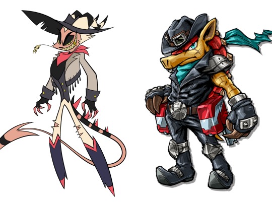
I like Mammon, Asmodeus, Octavia and Loona as well. I would still probably change a bunch if I were to redesing the HB cast but they overall look more solid than the HH cast.
This was another post which pretty quickly became an excuse to talk about other media I enjoy. I might do that more often, because comparing elements of HH or HB to other stuff makes it kinda easier to articulate my feelings. Also just because I enjoy talking about other stuff too.
#hazbin hotel critical#vivzepop critical#hazbin hotel criticism#hazbin hotel critique#anti vivziepop#character design
216 notes
·
View notes
Text
Completely overanalysing Shadow Generations: Dark Beginnings Episode 1


The opening is a deliberate parallel to the scene leading into Maria's death (images taken here from Shadow '05, although this scene is also in SA2). If you're paying attention you can immediately tell it's a fakeout, though: there's no alarm blaring, the lighting is blue rather than red, and Maria is pulling Shadow along instead of the other way around.

It's the aurora borealis. You can only see them from certain latitudes down there, but up here, we can see the whole...
Maria's a nerd.

Shadow is immediately prepared to catch Maria when she collapses.

The low gravity here only keeps your condition in remission. You should know better than to exert yourself.
This is new information I think? I don't think this makes scientific sense but I guess it provides a justification for why Maria is up here aboard the ARK beyond 'that's where the research is being done'. Only, the ARK was a space colony, there were other civilians aboard it as well, like the future GUN commander.
I can't wait for the day when we can finally return. I was created here. I don't know if there's a place for me on Earth.
I just wanted to highlight this exchange as significant to Shadow's overall character arc across his history, being one where he has carved out a place for himself on earth.

Love the way Maria comforts shadow here.
You and grandfather are doing your best. I'm just as happy to spend time with you here, while you both research-
I think this is just awkward wording, but surely Shadow isn't doing any researching?


My boyyyy
Hull breach in the experimental weapons wing! Multiple subjects are free of containment!
Multiple subjects? Given the events of Lost Impact, things are just escaping from here all the time, huh.
Here's the entries on this incident from Gerald's journal in Sonic Battle:
The higher ups are threatening to shut down this research facility. I had no choice but to hand them the Gizoid to buy more time for my research. I tried to be careful and commanded it to never absorb any dangerous technologies. However, I have heard that other researchers have been making the Gizoid absorb weapons. Apparently, the way to cause the Gizoid to form a new "Link" is to show it power that surpasses that of its former master. While this poses immense danger, I cannot risk losing Maria.
My worst fears have come true. The Gizoid has absorbed enough weaponry and technology that it has started to go out of control. The resulting rampage resulted in the destruction of most of the "Ark." ... I have deciphered the rest of the stone tablet. It says, "When the Gizoid had learned all that it could, it became a god of wrath, and all was destroyed." The researchers somehow managed to subdue the Gizoid and sealed it away.

That robot was heading towards Grandfather's lab! Shadow, you have to save him!
Why was Emerl - uh, well, I guess Project Gizoid at this point - headed directly for Gerald? If he was overloaded with power, like at the end of Sonic Battle, he should just be destroying things indiscriminately, right? So... was this a deliberate ploy by GUN to get rid of Gerald?

Maria grabbing Shadow's hand breaks the illusion briefly and triggers a trauma-induced flashback (forward?) to the GUN soldier shooting her. Compare with the actual scene from Shadow '05:


Again, why is Emerl specifically targeting Gerald here?

Not much to say about the fight scene aside from the fact that it's really well animated, and it happens with no background music to emphasize the weight of the blows being thrown. It's also really cool how Emerl copies Shadow's spin attack - you don't need to know how the Gizoid functions for that to be a cool visual, but it's a nice nod if you do.

Ok this is really confusing me. Is there any mention of GUN having a space fleet anywhere? Where did these things come from? They don't even share the same aesthetic as other GUN vehicles, they look more like the Egg Fleet.

Nice look at Shadow's Air Shoes from below the glass floor.

Next Shadow lands into Gerald's cell on Prison Island, which raises the question: why is this in Shadow's memories? Is this just his memory of the recording from SA2? Or was Shadow not put on ice until after Gerald's execution? We know it wasn't immediately after the ARK was destroyed, since he was around long enough for Gerald to alter his memories.

There is a bit of static distortion here, with an analog effect that implies it might just be the video.


On the other hand, we actually get these very brief flashes of Gerald's execution here, which we don't see in SA2 itself.

The professor gets farther and farther away from Shadow. He can no longer reach him.

Shadow then falls into a red sky, with bits of debris floating all around him, reflecting the final battle against Devil Doom in Shadow '05.

Interestingly, this scene is mixing imagery from both Gerald and Maria's deaths. The image of the GUN soldiers is the firing line that killed Gerald, and the sound of the lightning turns into automatic gunfire, as opposed to the single pistol shot that killed Maria.


Finally, Shadow falls into the giant face and outstretched hands of Black Doom.


Waking up from his nightmare in a panic, Shadow uses that damn fourth chaos emerald* to Chaos Spear this unfortunate tree.
*Okay, the fourth chaos emerald was the white one.

The moon looks so good.
Shadow stands in a field surrounded by lilies, a flower which can be used to symbolise purity as well as death, and is a flower commonly used at funerals. In particular, they are often placed on the graves of children.
That was no mere nightmare. And it all began in view of the ARK. Could he have survived? No, that can't be. I need answers.
Shadow seems to think the sight of the ARK is what triggered this nightmare. I think the only 'he' that makes sense here is Black Doom, since Gerald and Emerl are both pretty definitively dead.
Based on the trailer, I think from here Shadow is going to collect Team Dark to raid an Eggman base so they can obtain a rocket to get up to the ARK.
The song that plays over the credits is a remix of Throw it All Away. I have no idea why it shows footage of the biolizard fight, beyond "this is the Sonic Adventure 2 focused episode".
#sonic#sonic the hedgehog#sonic x shadow generations#dark beginnings#shadow the hedgehog#maria robotnik#emerl the gizoid#gerald robotnik
73 notes
·
View notes
Note
Related again to Concord: back in 2016, when Overwatch and Battleborn released simultaneously, I read somebody online say that Overwatch succeeded not because it was a better game, but because it had characters that teenagers were horny about. I know this was a joke, but is there any truth in that? I imagine the main target user of online shooters is mostly male, and in their teens (or ok with juvenile themes). Do games with characters that male teenagers are used to find sexy sell more?
"Sexy" is a subset of the twelfth principle of animation that's applying here - "Appeal". "Appeal" generally means "visually interesting", which we can break down into different aspects. For things to be visually interesting, some things we want to consider are interesting shapes, exaggeration of key features, and paring down the unimportant details so the important stuff stands out more.

The first thing we want to look at is shapes. When we look at characters, the first thing we see is their silhouette. Silhouettes need to look different from each other or they're dull. Different shapes are much more interesting to look at. Our eyes are trained to pick out things that are visibly different, so having the characters be comprised of different shapes makes them stand out more. Look at how Hsien-Ko here has so many sharp angles and different elements to break up her design. The wide belt, the different colored tunic, and the enormous arms that show the broad A-shape of her body.

After shapes, we want to exaggerate their key features. Beyond than the basic shapes, we want certain details about the character to be memorable. It might be a fancy mustache, a waistline, a color swatch, a hairstyle, a particular bit of clothing that makes the character unique. The key features should stand out and draw attention to themselves! Hsien-Ko's attacks all come from inside her massive sleeves, which have the enormous yellow accent on the end. This is on purpose - you can tell at a glance where the attacks will be coming from when she fights. Her body also has extra detail - the belt and tunic stand out against the darker other colors to draw your eye and tell you that this is where she is vulnerable. The hat and talisman identify what she is - a Jiang-shi.

Beyond that, human eyes get confused if there's too much to look at. We want the signal to be as strong as possible. This means we want to pare down and simplify away extra unnecessary details. The important bits about the gameplay must stand out, and all the other stuff should fade into the background. Too much to look at feels overwhelming or "busy".

Look at what happens to her clean design when there are a lot of additional details added. She looks pretty, but there would be so much context lost if this were used in a game - how does she fight? What's important to look at? This takes us from a clean visual design that conveys a lot of information to a more generic "sexy" design that doesn't tell us much else.
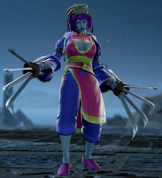
Consider what this design looks like when built in the Soul Calibur character creator - the extra details from the hat, sleeve belts, hair danglies, shoes, etc. all break up the look and make things look messy. The "same" design here just doesn't work as well, because we can't apply these same principles as well.
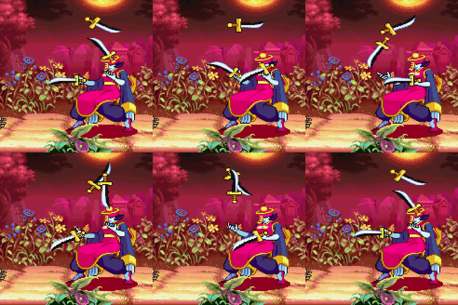
Making characters sexy is a shortcut to making them appealing, since sexy characters lean into the principles of appeal in specific ways. Sexy characters do work these core concepts of appeal, but appeal is essentially universal. The main purpose of appeal here is to convey information quickly about the character in a direct visual way. We do this through using interesting shapes, exaggerating the important details, and paring down the unnecessary extras.
[Join us on Discord] and/or [Support us on Patreon]
Got a burning question you want answered?
Short questions: Ask a Game Dev on Twitter
Long questions: Ask a Game Dev on Tumblr
Frequent Questions: The FAQ
61 notes
·
View notes
Text

Day 100
One hundred fuckin’ days. God. Actually happened.
I spent 3/4ths of the year drawing more Junkan art than I think anyone else on the internet ever has. Which might be presumptuous of me, maybe i’m just looking in the wrong places y’know? I’m a solid second place bare minimum.
And like, that’s still pretty funny right? This whole event is something I’m gonna cherish forever, the memories, the art itself, the friends I made because of it. But like, c’mon. I drew 100 fucking pieces, learned new skills like digital painting, animation, all that shit, for a ship that I used to hate, and a ship that for the longest time I thought was gonna get me fuckin banished to the deepest depths of the internet just for drawing a poor sketch of them kissing. This ship has become more deeply entwined into who I am as a person that it’s passed up Tokomaru, the ship that literally made me realize I’m a woman.
It’s gotta be at least a little funny, right?
Ah but enough of that, I can talk more on that subject a bit later. For now I reckon I should focus on our art piece for today! Wouldn’t you agree?
Yeah it’s the Wedding. I’d say even before Day 60 I decided the final pic of the Project would be The Wedding, even before I decided to draw a comic of the proposal. Because like, c’mon, it’s basic but how the fuck else was I supposed to end of the project? With something that ISN’T a wedding????
And very shocking to hear after this entire project has gone by, but I did in fact scale back this pic massively. You wanna know what the original idea was?? 22 images, each one depicting different parts of the wedding and afterparty, including the kiss at the end. And the kiss at the end? I was gonna feature every character from the 3 main classes + Ruruka, Seiko, and Yasuke. Fucking why??? Because Excess is all I know people ITS ALL I KNOW.
However I had decided that I wanted this project finished and ready before October, because I wanted to do the Vampire Fic to coincide with Day 30. And again, say it with me here, “Jem was severely burnt out on the project!”
So it went from 22 images, to “However many I can get done in time + the big group shot” and then that became “Just the big group shot,” and then finally, i cracked and just drew The Kiss.
Speaking of which before I divulge some more info about the original plan, i’ll get all the fun things about the actual art I did go through with.
As you can tell I shaded this differently from anything in the project. I normally have two different ways of shading art, I don’t think these are the proper words but I call them Soft Shading and Hard Shading. If you need immediate examples, Day 95 was Soft Shaded, and Day 94 was Hard Shaded. Generally speaking I prefer to do Hard Shading, as I think it works better with the rest of my style, and also just looks better in general. Soft Shading is what I do for pics with like, a very specific tone and energy to them that I can’t really put to words. It’s also significantly easier to do compared to Hard Shading.
A few months back for a commission of Kaede and Marceline from Adventure Time hanging out (yes this is relevant) I was trying to capture a very specific aesthetic that I’m obsessed with called Frutiger Aero. This mostly was in the background, however when lighting the pic I needed a very specific aesthetic that I didn’t know how to capture with just one of my shading styles. So . . . I fuckin did both. And in my opinion (which is crazy because this requires I compliment myself) it looked fuckin great. That said it was significantly harder.
I think I’ve done it only one other time after this, but I don’t remember what the pic was if it exists at all. But obviously as you can see, I decided that to really commemorate the occasion I’d go all out and do both shading styles again. It was very worth it, but fun fact! Doing this style on Roses is a fucking pain in the ass and if I ever have to do it again I will fucking SCREAM!
Anyway, the pic was definitely a lot harder to work on because of that stylistic choice, but the end result makes up for it by a massive margin.
Hope ya’ll like the dresses because they were the hardest part of this! Fun fact, Val (She’s back!) did a chapter for her legendary Year of Love and Despair fic where the gals are in wedding dresses. And the designs she came up with are amazing! I still really wanna draw em when I get a chance! However! I woulda felt bad if I just yoinked em for this, so I had to do everything in my power to come up with completely different designs. And given that I am a perfectionist, that was significantly more difficult than it probably shoulda been. But I did it! I really like how Mikan’s dress turned out specifically, I thought giving her a fit that covered up more skin than a normal wedding dress would be fitting for her. Also I really like drawing Mikan’s hair in a bun, I never had a chance to say that so I’mma say that now.
Wow fuck I just realized there’s probably a lot of random details or thought processes I have on this ship that I just never got an opportunity to talk about, either because I had a different topic to cover on previous posts, or I just forgot, or I just didn’t have a good segway! Crazy right?
Also yes! Shading Junko’s hair was heavenly~
Okay i’ve run out of words on the art. Time to tell you about everything I cut! Now I’m sad to say but no, I didn’t actually cut 22 planned images. I never got far enough to actually figure out each individual pic. Only a small handful, which I almost speedily sketched out for this post, but I don’t have it in me, especially on my current schedule. So i’ll just do my best to describe what I had in mind!
First piece would have been Mukuro being on Security for the Wedding, because of course. She would have also enlisted the help of Mondo and his entire gang, because that combination in this context sounds funny. Don’t worry though they were well behaved.
Ruruka was gonna handle the Wedding Cake, with Teruteru on the rest of the food. Either Ruruka or Mukuro would have been giving him a death glare during the process of course.
Behind the scenes Mikan would be getting prepped for the Wedding. And by prepped I mean Seiko, Ibuki, and Sayaka would be trying very hard to keep Mikan from crying as a result of how happy and overwhelmed she is (Ruining her makeup). Seiko trying to blow air into her eyes to keep them dry while Sayaka and Ibuki desperately try to find an outlet to plug in a hairdryer in because that would be significantly more efficient.
On the reverse, Junko would be doing all of the work on prepping herself for the wedding, with Ruruka, Yasuke and Tsumugi standing in the background, questioning why they’re even there. Junko would yell at them that they’re morale support in this instance.
Warriors of Hope would of course be there being scamps of course, Kotoko would be the Flower Girl because I play favorites. Toko and Komaru would probably be there trying to keep them in line.
I didn’t have anything in mind with the afterparty but I more than likely would have drawn the drunkest Junko I possibly could. Maybe even Mikan too!
For the Bouquet Throwing I was gonna have Syo jumping at it like a feral animal, and thinking about it now I’d probably also have Tenko jumping for it with killing intent in her eyes.
And I think that’s it for ideas I had prior to cutting them. Which means it’s time for me to get sappy about the fact that the project is finally ending! Fuck! Usually when I write these I try to have a decent idea ahead of time of what I’m gonna fucking say, this time however I’m just gonna talk, and i’m gonna keep talking until I’m either struck down by nature or I run out of things to say. Sorry!
This is going to get silly, sappy, and maybe even a little venty, jump in at your own risk.
If you told me at the beginning of 2024 that I was going to draw 100 days worth of Junkan related art, including a gif and a music video, 2 comics, and also get back into writing to make gay fanfic, I’d be so god damn confused. Because what the fuck right? And that’s not even counting everything I drew AFTER I fuckin finished! Like hold on a minute i’m gonna count up how many times i’ve drawn these two, including the individual comic pages from the three i’ve made.
204.
Fucking, I. I didn’t even know we passed 200 by this point.
And that’s not counting the sketches I’ve drawn on paper in my sketchbook. It’s also not counting unfinished pics. It ain’t counting the art I might draw WHILE writing this! It’s not counting the stuff I probably forgot about while searching my files cause I suck at naming the aforementioned files!
AND I’M STILL NOT BURNED OUT EITHER?
I got burned out on the project sure but the moment I had the freedom to do whatever I wanted I fucking IMMEDIATELY drew a Junkan pic for Halloween. And then I kept going, and then I didn’t fucking stop, and I don’t think I CAN stop! I don’t even WANT to stop but you’d think by now I’d be like “Well I don’t have any ideas right now-” NO I HAVE TOO FUCKING MANY IDEAS! I KEEP FUCKING THINKING OF MORE IDEAS, AND THEN I COME UP WITH AN AU AND THAT COULD HAVE LIKE 10,000 MORE IDEAS. JUNKAN IS A MENTAL HYDRA YOU DRAW ONE PIC 2 MORE POP UP IN ITS PLACE!
I can draw these pieces in like a few hours if not shorter, because I don’t have to fucking sketch them properly anymore. I feel like I shouldn’t be able to do that! This ship has done unspeakable things to both my mind and body! And i’ve said it before but i’m not trying to complain here, as you’ll see when I start talking about this ship like it saved me from falling into the grand canyon. But it’s just, so, absurd???
Danganronpa is only like my third favorite piece of media behind Bo-bobo and Fairy Tail and yet I’ve drawn more art of JUST THIS SHIP than I have of just general art of those series! That’s not even counting all the other ship art I’ve done! Like Tokomaru! Remember Tokomaru? The ship that is responsible for me being a woman and being able to find the happiness of being my true self? I think i’ve drawn that and Syomaru a combined like, 20 times across my entire life as a DR fan. ALL OF THIS JUNKAN ART SAY FOR LIKE, 5 OF THEM WERE IN ONE YEAR.
And bare minimum for 2025, assuming I don’t make ANYTHING ELSE OF THEM (Which I will. You know I will.) I’m gonna draw 21 pics for Junkan Week, because you know I’m gonna just draw EVERY prompt from all three lists. And then 30 more for the Month of Junkan (Will try to have that prompt list up soon btw!). So that’s 51 I’m going to do. That’s over half of what I realistically was supposed to do bare minimum for this project. That’s so fucking much, and I’m gonna do it, because I love this ship, and also it sounds REALLY funny if I did that.
I think genuinely the only other ships I could fucking do this for are like, Toko/Syomaru or Flarelu. Maybe Togachako if I did a reread of MHA to get me back in the spirit for that series. And even then i’m not sure I physically have it in me to go that distance even for those ships. I certainly want to draw a lot of them, especially Flarelu because that’s a ship so rare that it makes Soft Junkan (before I fucking flooded the tag on tumblr) look like a bustling city.
Speaking of tags, I still think about sometimes how like, the Junkan Tag maybe got like, a post like, a few times every month. The normal amount for a ship of this general Rarity. And now it’s like, for so many pages, just half of it is me. Because I was asked to bring something to eat to the function for the buffet table and I fucking crashed a Food Truck through the wall. I feel bad about it sometimes, sometimes. I’m imagining the scenario in my head where someone who likes Junkan but didn’t check the tag super often because it wasn’t like, a super commonly updated one, and then pressing it for the first time in a year and being like “What the fuck happened here?” You know what still shocks me? Not once have I gotten hate for any of this. I was so fucking scared for like half of this projects creation that I was going to get bombarded with people angry at me for shipping this, and NOTHING. I’m not complaining I’m just confused. I have to at least have had a few people block me right? It’s just so eerily quiet. And it’d be one thing if it’s just a thing of like “Why would people who hate Junkan check the Junkan tag” because yeah, that makes sense. But also I’ve been putting at least one Junkan pic in both characters tags every day for 3 fucking months, there had to be at least one Mikan super fan who is eternally fed up with my antics. Like, awesome that I didn’t get harassed over a ship, that actually gives me a little hope that nature is healing, just. Crazy right???
So like. Fuck.
I guess I’ll get to the sappy shit now?? I think I ran out of things to be confused about in terms of what I did this year because of this ship. So I guess I’ll just start talking about how much it means to me, both the ship, and this project.
(trigger warning, mentions of abuse, nothing super graphic in my opinion but could be mildly uncomfortable. Either skim ahead or stop here)
2024 kinda, fuckin sucked for me to be honest?? I have like 2 good things I can speak for it in terms of major positive points (Obviously I had other good experiences but if I just said “Oh I read a I Love Amy and it was one of the greatest things ever” it lacks the same impact). Not counting getting this project to like, work, obviously.
I finished the 5 chapters of my webcomic that I wanted prepped so I could actually make a website and start posting (ignore how I didn’t make the fuckin website yet). And I started dating my darling Yves and Rivette. Who I cherish deeply. I made other friends this year, a lot of them in part cause of this ship. And I went through a lot of emotional change.
But to get that change it required I unpack a lot. And by a lot, I mean one bag that was filled to the brim. Gonna try real hard not to like, talk about this in excessive detail or turn this post into some woe is me bullshit, but I feel like I should at least make mention of it.
At the beginning of the year, I asked Yves (who I wasn’t dating yet) about my previous romantic relationship. And she confirmed to me that, based on everything I had told her about it overtime, that yes, it was abusive.
During 2021-2022 I was in a relationship with a girl I won’t name here, you wouldn’t know her of course, it was a completely different community. It started out as friends, I got a crush, jumped at it because I was still inexperienced with feelings, and it didn’t work out. And that’s the simple way of putting it, and that’s how I viewed it till Yves opened my eyes.
From the getgo it wasn’t healthy. She was manipulative, constantly had outbursts towards me, and yanked me around emotionally constantly. I would later find out that she had a previous history of just, generally being an awful person. Even after we broke up we still stuck around each other, mostly because I felt guilty for breaking up with her, and was also just generally terrified of her. The abuse was all mental of course, it was long distance so she couldn’t hurt me physically at all.
I of course, didn’t process any of that as me being abused, I even viewed myself as being at fault for a lot of it. The experience was so bad that I identified as Aromantic because just convinced I wasn’t able to feel proper romantic feelings for someone. It wasn’t till much later when I got another crush that I realized that I’m Panromantic, and me being Aro (and very briefly Aegoromantic) was basically just a coping mechanism to write off my trauma. I still feel guilty about that since it feels like I devalued the importance of people who do identify on the Aro spectrum, but that isn’t relevant here.
Point is, a lot of bad shit happened to me because of that woman, and even after a year and a half of us not talking because we both mutually decided it would be better for us to not stay in contact, she still found ways to worm her way back into my life. One conversation we had just by chance, to catch up, that’s all it took and I was thinking of her again. I never talked to her after that, and I have her blocked now, but I didn’t need to for shit to hit the fan.
So I asked Yves that question, she answered, and I now suddenly had to deal with the fact that I was abused, and that I was traumatized as a result. And like, I never really viewed myself as a traumatized person up till that point, I viewed myself as someone who wasn’t very smart but tried her best to do good by people who didn’t have too much baggage beyond some sucky school memories.
When I had to unpack what happened that kind of spiraled into severe Self Confidence Issues and even more Self Hate. I struggled to accept even the slightest compliment if it wasn’t directed at my art. The reason I even quit weed is because I used it almost exclusively to suppress all of the negative emotions I felt.
I’m in a somewhat better place now, I’m trying to give myself more breaks from artwork, rather than overworking myself constantly just to feel something (and being fully open, I realized near the end of december that I pretty much used Overworking as a form of self harm). I’m gonna really try this year to like, actually let people be nice to me, and in turn try to be nicer to myself. And I have goals to work towards for this year. But I wouldn’t have gotten to this point without two things. One, my girlfriend Yves, who even before we started dating helped me through multiple breakdowns and has helped/allowed me to grow into a (I hope) better, healthier person. And even after I got over most of my feelings related to my Ex, has continued to help me cope with my self hatred. I cherish every moment we share and wouldn’t trade her for anything.
And the other thing, which I know will sound silly right after I talked about my girlfriend, is well. Junkan.
Let me say this, I didn’t get into Junkan to cope with my abuse. I have toyed with the notion in my head before and the idea of it pisses me off to a quite frankly irrational degree. I was into Junkan before I realized my issues. If you want my coping mechanism it’s Alex from Minecraft and no I’m not explaining that right now.
That said, it, like all the yuri ships I like, was a source of comfort for me. Originally I read stuff like Tokomaru fics just to help me reduce stress, back when I dealt with really severe anger issues due to the online spaces I occupied. And to this day reading a nice, fluff fic can calm me down a bit. But now they can serve a much deeper sense of comfort, away from all the bullshit, and obviously, gave me a way to distract/calm myself from the storm of negative emotions and memories that filled the brain.
I see myself in Mikan more than I’d like to personally admit, obviously not to the extreme, but in aspects. So it’s just, nice to see a better timeline for her with Junko, ones where she gets to be happy and maybe even heal as well. It just so happens that I also think there’s a lot of genuinely good potential for the ship from either a canon or non-canon perspective, and Junko’s just a really enjoyable character.
Working on this project helped too. It gave me a way to dive deeper into my love for this ship, and gave me a sense of purpose and validation that helped me work through the rough. Whether it was the really bad mental health days, or just a shit streak of commission work that tore away at me because my job even if I love drawing can be a real drag at times, and i’m unfortunately a workaholic (Trying to work on it though).
I think i’ve said it before but even something simple as Val showing her excitement over the art pieces I was prepping could genuinely brighten my day even while I was at my lowest.
And then when I really started pursuing this as a project, rather than just a secret stash to satiate myself and one other person minimum, I realized I could do something good here. For the people like me who loved this ship but might have been too nervous about expressing it, the people who were just really craving it, and the people who had already made all of the fics and art that sent me into this spiral of obsessive passion in the first place! A gift to all of them, to make ya’ll happy.
In hindsight, may not like, the healthiest mindset for setting off this whole project. But hey it all kinda circled around into eventually helping my mental health recover. So like, win?
And i’ve already spoken on how Day 60 allowed me to feel a lot more emotionally free as an artist even if I still have my struggle days. I’ve gotten better just in general as an artist as I improve more at stuff like expressions, posing, linework, etc. And I’ve even managed to make friends with some of the people I used to look up to as idols and can finally just view em as normal people now. (Even if I might still be a bit excessive in my praise, I swear I’m normal about ya’ll besties I just don’t have like, a middleground for showing my appreciation and affection for my friends. It’s maxed out unless I’m tired as shit)
I find myself comedically terrified of how this ship has affected me over the course of 2024, and how it will likely continue to affect me through 2025 even as I try to move onto other projects not related to Junkan. I wanna show off my love for Fairy Tail on my main blog, and I really think that with a full years time and the first five chapters done I really can get my comic off the ground and focus on that for the foreseeable future.
But hey, 2025 at least we got two whole Junkan Events. And with Junkan Week I’d like to keep that going for as long as I can, unless someone else takes the reins way down the line. So this ol’ blog’ll keep going for a good while I imagine, even if it’s a lot smaller. Maybe I’ll find other ways to keep this place active, I’ve considered just making it a one stop shop for all things Junkan though I don’t think I’m really suited to manage that. Maybe someone’ll read this and try there hand at it down the line, maybe someone’ll do their own 100 Days of Junkan!
Oh hey did I ever tell ya’ll I was gonna make a comedic video just making a guideline for how one could make their own 100 Days Project. It was gonna be like, pretty obvious points just framed in a very exaggerated and comedic tone.
Alright anything else I should cover? Fun facts? Deep personal anecdotes? Sappy stuff?
Lemme check my files, maybe i got another dumb joke image-
. . .
Oh . . . Well there’s somethin.
Alright, don’t get to excited ya’ll, but just for a bit of fun, how about one last day in the project. I know 101 days doesn’t roll of the tongue as well, but I think this is vaguely interesting enough to make up for that! Tune in tomorrow. Same time, same place.
As always, Reblogs, Comments, and Little Notes in the Tags are appreciated!~ They always make my day!~
#danganronpa#junkan#junko enoshima#mikan tsumiki#junkomikan#enomiki#junko x mikan#enoshima junko#tsumiki mikan#shipping
49 notes
·
View notes
Note
Hihi slug, I love your work, and thanks for everything!! Since Matenro season is nearly upon us, I was wondering if we could get your opinion on the solo snippets🤞🤞
Matenro's new solo previews are SO GOOD, what do you think of them?
Thank you both for notifying me about them! Taking a look now...
(The album is probably already out now, but... better late than never...)
Jakurai's A Majestic Figure
Title note: 4-kanji compounds are like the SAT vocab words of Japanese; they're not super common in everyday speech and can evoke a literary or sophisticated feeling. This one is...interesting. To the best of my knowledge, it isn't a standard compound (I'm also not getting any hits when I Google it) and I wonder if that's significant. It's just two words strung together to make the appearance of fanciness, perhaps. I couldn't say for certain. At any rate, both 威風 and (especially) 颯爽 describe a majestic, often captivating appearance. This isn't to say that such qualities of dignity or majesty aren't real, but I definitely feel like both terms are defining a subject from an outside perspective. These aren't terms I would ever expect someone to describe themselves with, which makes the song title sound like it's an outside observer commenting on Jakurai instead of Jakurai talking about himself. We see this happen a lot in Hypmic, with people putting Jakurai on pedestals or Jakurai struggling to see himself as the same grand figure others perceive him as. As a result, I wrote the song title as "A Majestic Figure" to emphasize the appearance of majesty, whereas the character of the figure is unknown. Anyway, let's dive in and see what this is all about.
(10 seconds in) Vibing with these instrumentals
(19 seconds in) Not vibing with these "ah"s... but we can't have everything in life
(43 seconds in) I'm a little too tired to fully keep up (I'll look up the lyrics when I'm done) but I REALLY like the urgency in the delivery, which is so at odds with the flowing, dignified background music. In JPN fiction as a whole, flusteredness/desperation is contrasted with calmness as a synonym for imperfection and perfection. Jakurai is, honestly, really kind of a desperate character...yet one that appears outwardly calm/perfect to most of the rest of the cast, so it's interesting that we get to see his desperate nature on full display right at the start of the song.
(1:26 in) Hand motif mentioned *Cinemasins ding* (of
(End) Thank you uta-net for having the lyrics up already; ily. Let's see now... Interesting. I'll have to read them again in more depth later, but it looks like a call to forgive past wounds and seek out a better, less painful way of existence--in a societal sense, a religious (as in like, ascending or becoming enlightened) sense, and a personal sense. All great things to see Jakurai expressing. Again, it's interesting to see Jakurai expressing this with such urgency, even if these are things we know he really, really cares about. That coupled with the background music seems to match a bit in the lyrics that says "And [to end war within society, paraphrased] I take grand, dignified action mixed with the discord and noise of Shinjuku, a samsara spiral of cacophonous echoes." Mixing the stately and the chaotic, the "imperfect" and the "perfect." Really interesting stuff!
Hifumi's The Beginning of the Last Song
Title note: "Last Song" is English and written in katakana, which is a sharp contrast to the style of Jakurai's title. Creates a much younger and casual feel appropriate for Hifumi. Not much else to say here, so let's jump in.
(10 seconds in) Modern indie pop song on the radio feel. I'm not a fan of autotune in general so I'm not in love with this, but I'm hopeful it'll pick up soon.
(22 seconds in) I listen to so much "soft hiphop" (for lack of a better term) during work that my brain instantly catapulted itself into work mode and stopped paying any attention to the words. Coffee mug? Check. Emails? Check. Anxiety? Check. Let me rewind and listen to this properly.
(32 seconds in but for real this time) So far, very Hifumi. Opening verse has some fun figurative language but essentially says Hifumi's suit is pure courage he dons like a suit of armor. In doing so, it masks him and makes him become like a whole other person. From there, he switches to addressing a listener: "I want to soothe your mental wounds. I want to change your frown into a smile. I won't let go of your hands, and no, I'm not doing this for a reward." It's something that Hifumi should be saying to himself (something Hifumi wants to hear, maybe?) and yet he says "To [Host!]me, this is happiness."
(59 seconds in) Hmm... I was going to say this song feels sad to me, because all these positive messages of "Keep going! You're safe now!" are framed as being directed at other people, and I was like..."Hifumi, who's going to say that to you? Who's going to help you feel that way?" but then the line "You made me realize I'm not alone" radically flips the framing so that it DOES become things Hifumi is saying to himself, too. How nice. :) I would not want to translate this, personally... Haha it's using the vagueness of Japanese grammar and lyrical conventions to great effect, but I don't feel comfortable touching that personally.
(1:02) Hell yeah, belt that shit, homie
(1:32) So it's a last song in the sense that it's a farewell or the final song of his old self. Now he's the new, healing Hifumi. We love to see it 10/10 bravo. The song is also a happy, heartfelt thank you to the unspoken listeners (presumably Matenrou) who helped him feel less alone. That's cute! I like it. I probably shouldn't go here, but I find it intriguing how the vagueness of listeners is utilized. The first time the listeners are addressed, the language is...if not borderline romantic, pathos-filled to the point where it's definitely evocative of his host job (hence why he's not seeking compensation for handholding, an often romantic gesture). Yet it's borderline enough that it wouldn't be inappropriate to imagine it being addressed to Matenrou instead of his patrons. Hahaha. Again, another reason I don't want to go near this one.
(Overall) I like it! A nice ballad for Hifumi.
Doppo's Andante
(5 seconds in) For a song called Andante, this has a faster tempo than at least one other song on this album lol. But it's much less frenetic than Doppo's other solos, so there's that, I guess.
(7 seconds in) This delivery is giving me anime ending made by a 2010s rock band vibes lol.
(14 seconds in) Damn there's a baller line here that I'm stumped on how to convey in Eng in a way that's both baller and sensical. Meaning wise, it's like "I want to take back the things I shouldn't have said and give them as a present to you" and in figurative language it's like "Once, I used to fire words into the air [speak things in anger or carelessly]. Now, I want to gather them up [esp. like a bouquet of flowers] after their flight and use them to decorate you [again, like flowers or like a piece of jewelry--it's a positive connotation]" Pop off, Doppo
(40 seconds in) Oh this is killer and also going to need some major explaining. Doppo's name is literally "he who walks alone" which is usually considered a positive thing--someone who "walks the path of life" alone would have gotten there by outstripping the rest of the pack. In Doppo's case, though, this is a negative thing. I think it's not as obvious to Eng-only fans, and I know I didn't really think about it for a long time myself, but Doppo considers himself a "loser" bc he didn't follow a conventional life path. It's considered atypical to switch employers, especially very early on in one's career, as he did when he stood up for Hifumi and got himself fired at his first job. Part of why he puts up with shitty treatment at EL Medical is because it's one of the few places that would hire someone who switched employers at such a young age. (Sidebar: My (probably flawed, as I don't live in Japan) impression is that this is becoming less and less of a thing as time goes on and the economy goes to shit, but I think it's the self-stigma more than anything else that's affecting Doppo. To me, it feel similar to the societal pressures in the US to attend and graduate from a four-year college. Plenty of people don't for all sorts of reasons, but because that's so ingrained as the default life story for Americans in a lot of communities, Doppo's dealing with the kind of disappointment and self-hatred someone who dropped out before getting a four year degree might feel.) Doppo beats himself up about that a lot, but here we get that lovely line of "In the waves of people (hitonami) passing all around me, I no longer see anyone who looks like me. It's a shame, because I always wanted to be just like everyone else (hitonami)." Outside of that beautiful wordplay on hitonami, we're also treated to the figurative language of hitonami being literally "in line with others." Doppo, a character who walks through life alone, wanted to walk through life at the same pace/reaching the same milestones at the same time as everyone else.
(1:04 in) "Life is a tightrope act; it's like walking a balance beam [lit. "average beam" aka a beam where everything is averaged/balanced]. In a country where not everything can be average (narasarenai) and where even if the things that [I] can accomplish (narasareru) don't matter [in the eyes of society], sometimes the sounds I want to make don't come out right (narasarenai). When that happens, I can call myself pitiful--or I can feel the breathing of the beautiful flowerbed that is this city, and when someone's humming under their breath disturbs that short break [lit. breath], I ask them 'So, what is this happiness thing anyway?'" I would rather die than TL this song but I'm LOVING the creativity and depth of the lyrics.
(1:27) WILD! FUCKING! CHEERING!!! "You fake smiles in a mirror to make other people happy and call it love. It's a form of hypnosis, and I've made a go of falling under its spell because I just want to be equals [on par with, balanced], and so if you and I can walk these crowded streets together, then I think I don't mind as much that I'm always walking alone." THE GROWTH! THE GROWTH!!!!
Damn, this album's lyrics go hard. What a feast.
40 notes
·
View notes
Note
Not ship chart related but I think your art is so pretty!! Do you have any tips? Especially with coloring if it’s okay <] (/nf)
waah thank you very much! i'll try and explain but here’s my colouring-specific tips, or at least how i choose my colours !! <3
unless for stylistic reasons (e.g. greyscale drawing), i personally avoid pure black, greys and white for colouring. go and choose off-colours instead! for lineart, black is okay but i always go for an actual colour anyways heheh. for the background colour of your canvas, sometimes an actual colour (rather than white or grey) may help you pick your palette to be more harmonised!
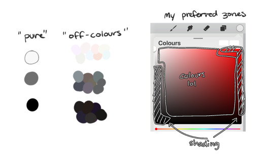
following this, i also don't like using pure/neon for colours, unless it's for a certain aesthetic or artstyle (e.g. the character has a "toxic/radioactive" aesthetic; the character is a scenedog (or similiar); or highlights). see below for examples! they may be subtle but sometimes the subtly can make the difference you are looking for... if you're looking for a natural look. if you're aiming for the bright/old 2000's artstyle, then pure/neons may be your friend!
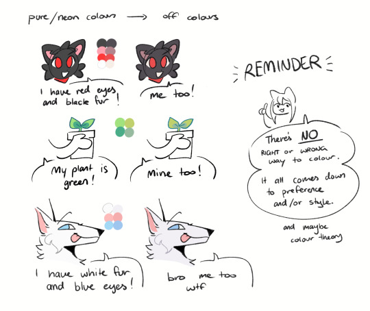
when i'm casually drawing characters (oc or not), i rarely colour-pick from the reference image. i find that when you're "forced to make the palette", it can come out more pleasing to your style/atmosphere of the drawing! it’s more personalised that way... like yea, that’s my favourite versions of those colours! i'm not saying that my colours are better though, only that "hey that's me! in those colours!!" you can have the reference image on the side or go by memory. here’s me doing this with pride flags:
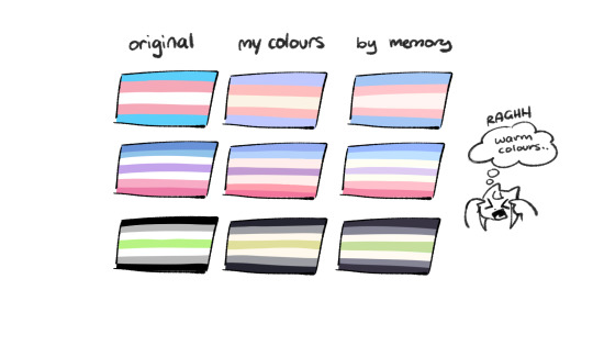
nowadays, when drawing the spooky month characters—who have simple designs god bless—i can just imagine their reference and adjust the colours in my head lol example: if i know that Lila's colour palette is purple, and that her winter sweater is coloured lighter than her hair, then i can just go ahead and pick whatever shade i want following that rule!
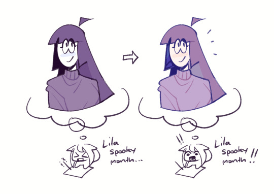
(of course, always double check with the actual reference for physical design inaccuracies and skin tone if it applies. my advice above is just for general hair/clothing colours! …because yknow you don't want to accidentally whitewash a character's skin in the name of aesthetics lol. if you’re unsure and want to be on the careful side, please do colour pick the skin at least !!)
moving on... gradient maps and certain blending modes (like exclusion, luminosity and darken) can be a game changer too. for normal drawings (e.g. drawings with no environment), i use darken the most because it changes a few colours rather than the entire piece... (the percentages are opacity levels!)

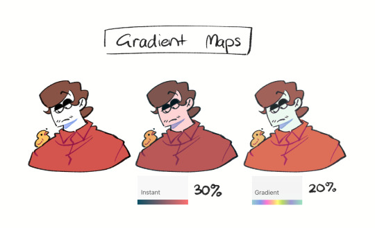
oh and as a really basic shading tip without using blending modes: sometimes, you just gotta go for grey. shading a warmer colour? use grey to make a cool tone. shading a cool colour? use grey to make a warm tone. not all the time (because you don’t wanna make your shading seem muddy), just sometimes…
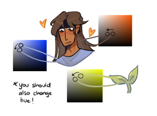
and that's that! there's always exceptions to rules and often times, your headshot doodle ends up as one big experimental mess (in a fun way, hopefully)!
this is how i choose my colours though most of the time, it is just me going “good enough”
i think we're pretty similar on how we like warm colours! i enjoy going the simple/lazy route and avoid blend modes but then again, shading is a whole different thing…
hope this helps in any way !! <:3 !!! <3
#if anyone wants to ask for specific tips i’m happy to share!#if i have any lol#[ the askbox mourns ]#[ the art of mourning ]#[ mourn's mourns ]#anyways yea i kinda do just imagine the spooky month characters with a light orange multiply layer and then try to replicate it irl#my personal/lazy rule is that if it looks good faraway its good enough AHAHA#spooky month lila#spooky month jaune#spooky month rick#spooky month aaron#spooky month#“actuallyyy the 'black cat' is actually dark grey—” SHHHHHH SHUT SHUT IT. SHUTUT !!!!! i need u to see the lineart /silly#[ mourn's resources ]
96 notes
·
View notes
Text
Why I loathe CoD Hector
Something I really wanted to write a proper blog on, is Hector. I answered on another blog on this before, and wrote a shorter thing about this before. But I really wanted to write something on its own. Because I will once again iterate: While Hector in the animated series definitely gets to finish out his character arc, he works a lot better as a character than his game counterpart. And that even though the game came out at the time, where Castlevania tried to go more for storytelling.
Yet, there is this thing, and that mostly comes from it still being an old action-centric game... How the need of making the main characters of action games until sometime in the 2010s into the stoic kind kinda made them worse characters.
I said it before: The Castlevania games for the longest part never really were that interested in telling characterdriven stories and focused more on the gameplay. Which is very much fine. But even when they tried to include more story, for the most part they still keep the brutish, stoic protagonist. Even Alucard, despite looking like a beautiful princess, is very much the stoic male protagonist. This is just a thing with action media that was going on for way too long. Sure, even stoic characters could make for good fan interpretation in stuff like fanfics, it often is an issue that the media itself does not want to actually explore the characters emotions.
Or, to make it fairly clear: This has very much to do with this idea of toxic masculinity. A lot of old action media (not only games, but also movies and such) will not allow male action heroes to show emotional vulnerability, because that would be unmasculine in the eyes of the writers. Which then boils the characters down onto the supposedly "masculine" emotions, like anger and the urge for revenge.
And this is kinda where we get to Curse of Darkness.
We have this whole backstory through the manga, that goes into Hector's background and all that. While I will say that here I prefer the animated version, too, I will fully admit that this is just a subjective thing (I like that the animated version draws some clearer cultural aspects into it, while also giving Hector the agency of killing his abusers, rather than having it happen as an accident), because I definitely can see why people would prefer the manga version.
Where this ends, however, is already at the moment when Hector joins Dracula. Yes, I will fully admit that I am not a big fan of game!Dracula in general, though I will not go into the why here. He works as a game villain, I will admit that, though.
No, what I dislike about Hector's story with Dracula is more the: "And he becomes like the best forgemaster. Like he is so amazing and so strong, and did we tell you how amazing he is?" It goes too much into the power fantasy to me. While I get that the game canon heavily drew on this idea of the main conflict between Hector and Isaac being one of jealousy... I will just say, that a conflict of jealousy is actually so much more boring than a conflict of ideals. And the backstory by far had enough going on there to make it a conflict of ideals, as Hector did still - like in the animated version - not like the idea of killing thousands. Which could have been used for a lot of conflict, but... yeah.
I will still say, that for the most part, the backstory works. While I roll my eyes already at everything with Rosaly, because Rosaly is very much the incanation of the trope where this pure hearted girl saves the soul of the corrupted man (I don't know how this trope is called, but it is for sure a trope), it does work so far.
No, where Hector as a game character stops working is... at the game. Or rather in the moment that Rosaly does do the thing that she as the sole female character in this entire fucking story has to do: She dies so that her death can motivate Hector. And that is to me where game Hector as a character does stop working.
They could have given Hector any motivation to face off against Isaac. They had put up more than enough story fragments in the manga that they could have build from. They could have made it that Isaac wanted to go for revenge and before he could do it, Hector tried to go in there to protect the people he had now learned to love. They could have made it that Isaac tried to ressurect Dracula. They could have made it that Isaac tried to continue Dracula's work until Hector decided that he could not let his former friend do this, because Hector now knows better. There could have been several interesting and good motivations.
But no. Instead they went with: "Girl dead. Boy sad. Boy angry. Boy wants revenge." The fuck?! This is just so bad in terms of storytelling. It is just the refrigerated woman trope, in its most lazy iteration.
They could have given Hector an interesting motivation and conflict. But no, instead they went for revenge. Ugh.
But that was not enough for the writers of this game. Ooooooh no. If it was just that, I would still hate it, but I would be fine with it. Because let's face it, a lot of games use the "revenge for loved ones" trope. Sure, this game is not using it in the most creative way, and it could have done a lot better from the backstory that was set up in other media, but... It is fine. This is fine.
What is not fine however is Julia. I hate Julia. I hate everything about her as a concept.
And again, mind you. I absolutely would not have a problem with Julia if she was just "some girl" or just "Isaac's sister". Then Julia would be fine. It would even be fine if Hector caught feelings for her, even though I would once again roll my eyes at this.
No, what makes Julia so offensive is the fact that she looks and sounds like Rosaly. Meaning, that she explicitly, not just implicitly exists to be a replacement for Rosaly. And that just makes it all so, so badly written.
Worst of all: This gets never explained. Julia just is Rosaly's doppelganger. Just because... Well, because the writers of this game wanted to have their cake and eat it too. They wanted to motivate Hector by revenge for a dead girl, but also wanted to have him end with the girl. And it is just... misogynic writing. I am sorry.
It portrays women as "things" that can be easily replaced. And I hate this so, so much. It is the reason why, even though CoD might not be the worst game in the series, it is by far the one I loathe the most.
And they could have so easily done it differently. Either by not motivating Hector through Revenge in the first place, or by just making Julia a different person from Rosaly. Make her strikingly different and then have Hector fall for Julia. That would have been fine. Just this: "I broke one doll, but I will just get a replacement" thing that game has going is... horrible.
And yes, additionally I will say that another reason why I do prefer the animated version of Hector is, that he is not the stoic kind of character, but he is actually fairly vulnerable. He is a bit of an idiot who easily fall for people. He definitely does not get to have his power fantasy. But it is exactly this that I like. Because it is a story we usually do not get with male characters.
The story of Hector in the animated series is very much a story that would have usually been given to a female character. And I adore this fact. I adore how they switched the gender stereotypes around for this.
Yes, I am well aware that some fans of the games hated this, too. But I honestly have to say: Look, the game characters might have some minor differences, but all in all they all fall under the stereotype of the stoic action protagonist. Yeah, the series needed to switch this around a bit, because it would have gotten boring otherwise.
And frankly. I am sooooo sick of protagonists being all stoic all the time. Give us some variety. It won't kill these characters to smile from time to time... Or, you know, be vunerable.
#castlevania#akumajou dracula#castlevania netflix#castlevania hector#castlevania meta#analysis#video game tropes#misogyny#toxic masculinity
41 notes
·
View notes
Text
Quick thoughts: One Piece chapter 1133
Still 100 years behind the canon story but trying to catch up and wanted to take a sneak peek on newer chapters because they appeared on the dash and I completely understand the hype now.
First of all, I'm happy that Oda-sensei returned Robin's pre-time skip look and even cuter is that Robin specifically requested it so it would resemble the haircut she had when she first met Saul. In general there isn't anything wrong with her post time skip look but I personally think the bangs makes Robin much more unique because well it was her look ever since she was introduced and it took some time to get used to the later look.

Frankly spoken once I mistook her once for Hancock by quick glance in chapter 857's cover page (before I noticed the earrings and the snake) maybe it was just because of the way Oda draws women or something?
Kinda had similar feelings with post timeskip Nami, that it took time to get used to the long hair and that a couple of times when scrolling manga way too quickly, I've mixed Nami with someone else a couple of times (and btw that Giant warrior woman, doctor Gerd was it? she also looks like a bit like Nami with the hairstyle and all). So, even though the long hair is stylish, I still think the shorter hair fits Nami better (but that viking hairstyle looks good on her though).
Another thing especially in anime that bothered with Robin's hairstyle was that sometimes Robin's forehead looked for some reason bigger so, definitely rooting on the team "Robin with bangs".
Anyway back to the chapter, the Straw hats arrived to Elbaf and are not only having a a reunion with the crew but also with Dorry and Brogy etc. That must've been such a nostalgia splash for all of them and then they hear Saul is there and this is another heartbreaking yet so darn beautiful moment ahead :')

It's honestly amazing how Oda is able to create such storytelling in general and also close the circles of plots even after hundreds of chapters. Robin started with someone who was abused by her relatives and was constantly on her toes for a long time whereas she simply craved for unconditional love after her mother not being able to be around much. She basically lived for Olvia's (and Saul's) will and in order to simply survive the next day until she met Luffy, her upcoming captain.

Now hundreds (thousands?) panels of later we have reached this point where Robin has a loving crew that she knows are extremely loyal to her. They are her safe place and she now pursuits her dream the fullest (not just to survive) .
So now to think about it, now Robin basically got some kind of closure with her past when meeting Saul 22 years later. It was also really nice of Oda to set the meeting with such a parallel, 22yrs ago and in the present Saul tried his "famous growl" once again with a spark in his eyes and Robin sparkles back and this time differently (like she has blossomed and isn't so reserved)
It was indeed a tearful reunion but I really love that Robin is finally able to let those emotions out, I mean when she was out of the run she was probably forced to "cold and distant herself" in order to stay alive (although she probably never forgot Saul's dereshi shi shi-laugh). She feels so relieved after seeing Saul and her being so happy things have changed in her life.

So, this chapter points out one the most important character improvement for Nico Robin: instead of living for others, she lives now for herself and sees her self worth and that definitely it's no more an crime for her to exist!
I really like that the crew were a bit worried about Saul and were basically prepared to help him but Robin says it's all fine and goes by herself but it seems that she still kind of wants to share this reunion with her beloved nakama because she doesn't say at any point they aren't allowed to be anywhere near. Well they stay in the background but still she feels safe enough to accept them to be around in this vulnerable moment.
There is by the way something extremely touching in Luffy's expression in the chapter's last panel. He must've felt loads of emotions too but look at that precious smile! He is so proud of how far Robin has achieved!

#one piece#op thoughts#one piece chapter 1133#nico robin#luffy#zoro#nami#usopp#sanji#tony tony chopper#franky the cyborg#one piece brook#jinbe#Jaguar D. Saul#elbaf arc
21 notes
·
View notes
Text
In defense of the One Piece Live Action Adaptation’s stylistic choices: A Cosmetologist’s Perspective
Hello! My name is Dia, and I’ve been a licensed cosmetologist since 2015(almost a decade now!). For those unaware of what exactly that entails, cosmetology is traditionally defined as ‘the professional skill or practice of beautifying the face, hair, and skin’. For me specifically, I have worked in the fields of hairstyling/haircutting/hair coloring, skincare, nail care, and makeup application(both traditional makeup and FX makeup) in my eight years of being licensed to work in these industries.
The reason I’m making this post today is to talk about the Netflix adaptation of the hit manga/anime One Piece, and specifically to address a lot of complaints I’ve seen about the wardrobe, makeup, and hair choices of the main cast thus far. I’ve seen quite a bit in the way of complaints, and a lot of it seems to be, to put it as politely as I can, not based in reality of how makeup, hair, and acting in general works, and I’d like to address some of it to possibly explain why certain choices were made, to maybe help people come to a better understanding of the why and how of these sorts of decisions.
I’d like to also, before I dive in, note that I am not in any way, shape, or form affiliated with this production! These are merely my personal thoughts and speculation as someone with some experience in this field. None of this is set in stone unless I provide evidence from the cast and crew to back my claims up. As well, I’d like to point out that I have next to no experience working on film sets(I have worked on VERY small productions in the past, for things that go up on sites like Youtube and not Netflix lmao), but I am married to a person who has a degree in film and has worked on live production sets before, and I did defer to them for a lot of the knowledge that I lack with live action production specifically.
I’d also like to point out that while I’m not mad at anyone who has the critiques I cover in this post, I may come across as a bit exasperated. I promise this isn’t me being angry at anyone, but more of just.... I’ve seen the same critiques over and over again, and to me, a lot of the choices seem fairly obvious as to why they were made, and some of the critiques come across as extremely silly to me. This is of course due to my own background related to these sorts of things. I promise I mean no offense or disrespect to anyone saying these things! I just want to make this to be able to help others understand why production may have made the choices they did.
Now, under the cut, I’ll be discussing some common complaints I’ve heard with regards to this production, and provide some potential explanation as to why these changes were made. On to the post! It is quite hefty, so please bear with me.
~
First and foremost, the most common complaint I’ve seen thus far is some variation of the phrase “I’ve seen cosplayers that look more accurate to the characters than this show does,” and I’d like to address this one first, as I think it’s the one that probably frustrates me the most. It specifically frustrates me because comparing cosplayers to actors feels like an apples to oranges situation. The two groups are designed to do entirely different things! Cosplayers do typically look more like the characters they portray than a live action actor will, and that’s a very common occurrence, but there’s a reason for that: the two groups are not doing the same thing.
Both cosplayers and actors put a huge amount of time and effort into their work, and I love cosplay personally. However, cosplayers are typically in their outfits for 8-10 hour days at most for a weekend, doing things like photoshoots where they have to pose, walking around conventions, and maybe filming a small amount of video(Not to say that this takes no effort! Please do not take this as such, I have helped friends with cosplays and I fully understand and appreciate the level of dedication and hard work that goes into it!). Actors, on the other hand, are in hair and makeup on set for 10-12 hours a day(if not longer) for weeks to months on end, and have to be fully in character while filming, as well as(specifically for a show like One Piece) doing things like stunt work, being submerged in water, and being on boats with lots of wind and ocean spray. There are certain things you simply cannot do, hair/makeup/costume-wise as an actor that you can as a cosplayer, so I really don’t think this comparison in specific is being very fair to the actors and the crew who are in charge of makeup, hair, and wardrobe in this case.
I’ll be getting into a lot more specifics below, but I will be deferring to my main point here very often, which is this: The safety and comfort of the actors is far more important than 1-to-1 accuracy in the way cosplayers can do, especially for minor changes in appearance.
Now that I’ve addressed that specifically, I’d like to move onto some common complaints I’ve heard for each specific main cast member, and my opinion on these complaints, as well as listing potential reasons as to why these things may have been changed!
~
We’ll start with everyone’s favorite funky little pirate king, Monkey D. Luffy:
For Luffy, the number one complaint I’ve seen is the live action’s choice in shoes. in the manga/anime, Luffy wears and fights in flip-flops, but this was changed in the live action. This was changed for a very simple reason, and Emily Rudd, the actor that portrays Nami, actually addressed this on Instagram while being asked by a fan:
Simply put, trying to do the kind of stunt work that Luffy has to do is not safe in a shoe like a flip flop. This is something that falls very completely under my original point of the comfort and safety of the actors being more important than 100% accuracy. It would be entirely too easy for Iñaki or someone he’s in a scene with to get hurt if he weren’t wearing the proper footwear. Fairly simple explanation there!
This is really the only gripe with Luffy costume-wise I could find, to be honest! I have seen a few people saying that he doesn’t have his signature undereye scar, but he does, although it’s not as visible as it is in the original work:
They kept him fairly true to the spirit of his original character, and although I don’t know why they chose to give him this specific potato shoe footwear, it is what they went with, and the main takeaway is that it was for safety reasons.
~
Onto our favorite wayward booze-loving swordsman, Roronoa Zoro:
Similarly to Luffy, I’ve only seen one main complaint regarding Zoro, and it involves his use of swords. In the anime/manga, Zoro has pioneered a specific fighting style called “Santoryu”, known in English as “Three Sword Style”: one sword in each hand, and a third in his mouth.
I’ve seen several people wondering where his third sword(the one that goes in the mouth) is from the trailers, and I was initially wondering this as well, since in most of his action scenes that have been revealed so far, he seems to only be holding either one sword or two. However, there was a brief clip(I’m talking, like, maybe one second) of him utilizing his three-swords style in the teaser trailer released in mid-June:
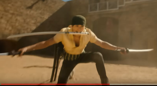
Now, as to potential reasons as to why this seems to be the only clip of him thus far using all three of his swords:
1. Again, this could be for the safety of the cast. Obviously being a cartoon character, Zoro wouldn’t have to worry about potential damage to his jaws and teeth, but Mackenyu, Zoro’s actor, is a real person who does have to worry about such things, especially as an actor who relies on(among other things) his facial expressions to earn a living. Carrying something like a sword, even a prop sword, in your mouth for long periods of time cannot be good for the health of your jaw and teeth, and I could understand if they chose not to film him with a sword in his mouth very often for this reason alone. 2. It could also be he uses all three swords less often so he can still deliver lines while fighting. In an SBS(”Shitsumon o Boshū Suru”, when translated means “I’m Taking Questions”, essentially an AMA for mangaka to answer questions their readers may have), Eiichiro Oda, the author of One Piece, once answered a question about how Zoro was able to talk with a sword in his mouth with quite a funny answer:

Sadly, in real life, Mackenyu cannot speak through his heart as Zoro does, so it’s possible that some of the scenes have been changed for ease of dialogue. 3. It’s also entirely possible that he uses his three-sword style as often as he does in the anime and manga, and the small amount of what we’ve seen in the trailers isn’t necessarily the full picture. I imagine this is something we’ll have to wait for the full series to drop to find out definitively one way or another!
~
Now, onto our lovely citrus-fruit-loving navigator, Nami!
I have seen two main complaints with Nami’s looks, and I’ll start with her hair, as it’s the more common one I’ve been seeing. I have seen a large number of people saying that her hair looks like(and I am slightly paraphrasing here) “a bad cosplay wig”, and honestly? I think this is just not true, and either comes from unrealistic expectations or just plain being mean-spirited.
First and foremost, this is very obviously human hair:
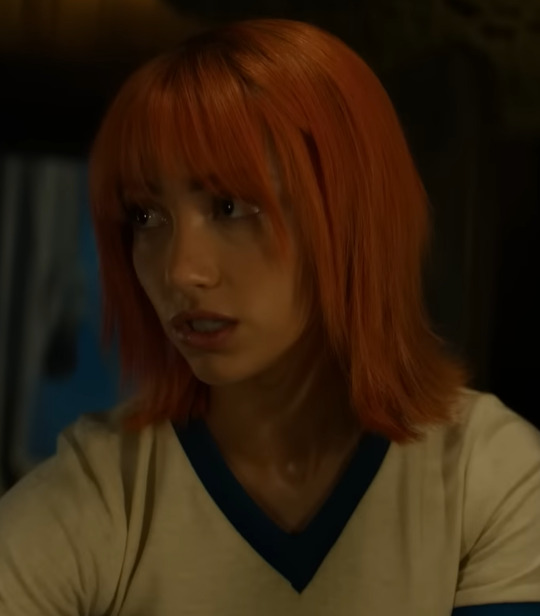
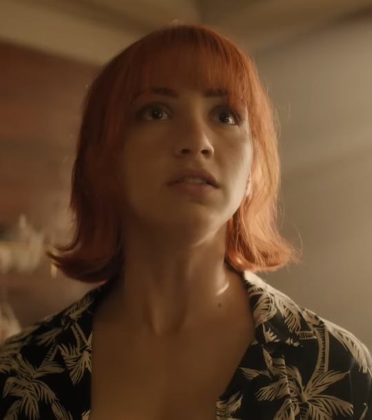
Now, I don’t know what kind of bad cosplays y’all have been seeing, but the ones I’ve seen start with synthetic hair wigs, not human hair ones(This is not to say synthetic wigs are inherently bad for cosplay! Simply that they are much harder to work with, though they are cheaper than human hair wigs). As well, I know for a fact Emily Rudd got her hair done similarly to this, to the point where I wasn’t actually sure that this WAS a wig at first(this picture comes directly from her Instagram account):
This is very obviously almost the exact same haircut as the wig chosen for Nami, save with more layers, and even the color choices are similar. To say that this wig looks like a “bad cosplay” is honestly just flat-out wrong in my professional opinion, and moreover, it’s quite rude. In addition, to me at least, it really looks like the wig was styled to resemble anime-esque hair, which is actually quite common among cosplayers. If anything, I have the same complaint on Nami’s wig that I also have with Sanji’s(which I’ll definitely be touching on later): it’s not thick enough. Both Nami and Sanji’s wigs just seem like they could use more hair attached to the cap in general, but especially for Nami’s, I really don’t think it’s as bad as people are saying.
I think this “bad cosplay wig” complaint specifically is mainly coming from people who only see the tail end of cosplay productions, which tends to be photos that are often times edited to look a certain way, which can often include doctoring the hair. There’s nothing wrong with a cosplayer editing their photos, for the record, but it can absolutely give unrealistic expectations to those who aren’t familiar with this practice, and I personally think this may be where these comments are coming from. Obviously you cannot photoshop every frame of a live action production, at least not without a lot of time and effort on the behalf of the post-production team, and I highly doubt Netflix would have greenlit something like that for such a small detail. It’s simply not realistic.
As well, I do find it quite interesting that I have seen far less complaints about the wigs of characters such as Zoro or Sanji(played by Taz Skylar(as stated previously, I have seen complaints about Sanji’s wig and I will be speaking on that later)) than I have about Nami’s. I’m not saying it’s outwardly misogynistic, but it does make one consider such things.
The only other complaint I’ve seen directed towards Nami’s live action look(and truth be told, I’ve seen this one far less than the comments on the hair) is the discrepancy between Emily Rudd’s eye color and Nami’s. As you can see from the above photos, Emily Rudd does not have brown eyes, which are the color of Nami’s eyes:
Now, I didn’t actually see this complaint until after the first full trailer dropped on July 21st. Specifically, I saw someone saying that it seemed strange that Steven John Ward, who portrays Dracule Mihawk in the series, is wearing colored contacts to better resemble his character, while Emily is not.
Now, there could be a lot of potential reasons for this, including that Emily may simply be not wearing colored contacts because they irritate her eyes(going back to my original point of the comfort and safety of the cast). But more importantly, I think, is that Mihawk’s unique eyes are directly related to his character, specifically through his epithet: Hawkeye. This is a seemingly important enough part of his character, to the point where it’s directly mentioned in his title. Nami has no such distinctions with her eye color, so I really don’t think it’s as important, and at the end of the day, it takes nothing away from her character to have a different eye color. So, while I don’t know the particular reason she doesn’t have brown contacts, I also don’t think it’s nearly as important for that detail to be as canonically correct as it is for Mihawk. To me, this particular comparison is another apples to oranges situation.
~
Onto our beloved liar, God Usopp himself:
Of course, the number one talking point I’ve seen about the live action Usopp is that Jacob Romero Gibson, Usopp’s actor, is missing his trademark long nose.
As One Piece fans know, one of Usopp’s characteristic traits is his tendency to lie. His name, Usopp, comes from a portmanteau of the Japanese word “uso”, which means lie, and Aesop, the famous Greek storyteller and the namesake for Aesop’s Fables. Because of his propensity towards tall tales, Usopp’s anime and manga character designs also added a reference to another character who’s known for lying, Pinocchio, whose nose grows when he lies. Thus, Usopp in his cartoon form has a long nose!
Considering how many gags in the story involve Usopp’s nose, a lot of fans were surprised to see that aspect of him not carried over into the live action. After the drop of the official trailer, seeing that the character Arlong had his signature sawshark-esque long nose in prosthetic form, there was even more confusion about this choice.
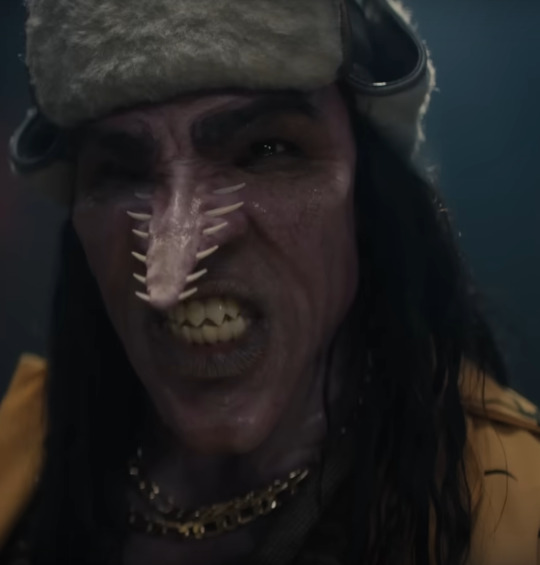
(As an aside, Arlong’s costuming choices will not be discussed in this post, as it’s long enough with just the main cast, but believe me, I do have Opinions on it lmao)
Now, as to why the show chose to not give Jacob a prosthetic long nose to better match Usopp’s appearance, I don’t know the specifics. I can only speculate, and really, the only things I could feasibly come up with are the following:
1. It’s entirely possible that for whatever reason, Jacob is unable to wear a prosthetic nose. This could be due to several things, including allergies to either the prosthetic material itself or the adhesive used to attach it, or the makeup required to blend the prosthetic into his skin. If this is the case, then it of course goes back to my main point here that the comfort of the cast takes precedence over accuracy to the source material. 2. The only other explanation that really makes sense to me is that they did in fact attempt the nose in costume fitting, and either the absurdity of it was just either too distracting to audiences/the crew/Netflix execs/possibly even Oda himself, or it could have potentially been a problem during stunt work. Usopp primarily fights with a slingshot, and I have no experience with slingshots so this is just me taking a stab in the dark, but it’s possible that the extra length on the nose could have possibly messed with the actor’s depth perception while attempting to act out Usopp’s fight scenes.
Overall, I genuinely don’t know why they decided to axe Usopp’s long nose. But at the end of the day, I know that for me specifically, this is a minor detail, and not something I see as a genuine problem, nor will it ruin the immersion for me. That being said, I can definitely understand the criticisms here. I’m hoping that a lot of these changes will eventually be answered, perhaps in some behind-the-scenes footage that comes out after the show’s release.
The only other comment on Usopp’s costuming that I’ve seen is much more easily explainable, and I also haven’t seen nearly as much in the way of commenting on it: Usopp’s hair is not in dreads in the anime and manga, and instead is kept natural, especially before the timeskip.
As we can see in the above picture, Usopp seems to keep his hair fairly natural, whereas Jacob, Usopp’s actor, sports dreads in his portrayal of Usopp, as seen in the above photo.
Luckily, I haven’t seen very many comments on this, and I think that’s a good thing, since the explanation seems fairly simple to me. Usopp in canon is based off of (mostly unused in this day and age, for good reason: a lot of the design is highly based off racist blackface caricatures) old-school anime portrayals of Black/African people. As well, in an SBS, a fan asked where the Straw Hats would be based out of if One Piece was set in the real world:
As stated above, Usopp would come from Africa! As well, if I recall correctly, Oda had a hand in casting the live action adaptation, which all points to the undeniable proof that Usopp is and has always been intended to read as Black/African in some form.
The reason I bring this all up specifically, is because of the way African hair grows. Obviously not all Black/African people are a monolith, and even among curly haired people there are different curl tightness and growth patterns, but for a large portion of people of African descent, their hair would not grow similarly to the way Usopp’s is portrayed in his cartoon form. His hair is indeed curly, but it grows down, similar to most wavy or straight hair types. This is especially evident in his post-timeskip hair growth:
Usopp’s hair, which was once above his shoulders before the two year time skip, now extends down past his shoulders. This is not necessarily inaccurate to Black/African hair types, as, since stated previously, different curl patterns and tightness exist, and even with super tight curl patterns, if grown out long enough, the hair will eventually grow down, due to the weight of the hair strands. But for a lot of Black/African hair types, the natural hair tends to grow outwards, instead of downwards(or at the very least it grows outwards before it begins to grow downwards). This type of hair is typically referred to as afro-textured hair, and is the namesake for the afro, a hairstyle wherein someone with afro-textured hair combs out their natural hair growth in the shape it naturally grows.
Now, I’m not familiar with Jacob Romero Gibson’s work prior to One Piece, and I have never seen his hair without his dreads, therefore I can’t say with 100% certainty how his hair grows naturally. However, he does have an Instagram account, and on this account he has photos of himself. I looked through his account, and although he doesn’t seem to have any photos of himself without his dreads(indeed, they seem to be his signature hairstyle) as an adult, he does have a few photos of himself from his childhood. I don’t personally feel comfortable linking his baby photos to this post, so I’m not going to do so here. However, they are visible there, and from what I can see from those photos, he does indeed have afro-textured hair. This may not be 100% accurate to how his hair grows now as an adult, as lots of things can change hair growth types and curl patterns, including things such as hormones, medications, stress levels etc. In my professional opinion, I feel fairly confident in saying that Jacob most likely has afto-textured hair, and therefore his natural hair likely wouldn’t fully grow in the exact same way that Usopp’s does.
Overall, I only bring all of this up to say that if Jacob did have his hair in a natural, non-protective style in his portrayal of Usopp, I feel that the same people who are complaining about the dreads now would likely complain that his natural hair doesn’t match Usopp’s exactly. Either way, Usopp’s hair is not a huge characteristic that defines who he is as a character(especially not in the way that his nose is), and therefore I don’t think that him having dreads in the live action takes away from the character in any way.
~
Finally, we’ll discuss the Straw Hat crew’s first-rate cook who attacks through kicks, Black Leg Sanji:
Sanji has the unfortunate position of being the character who’s had the most changes to his design from his cartoon to the live action, and there’s a lot of criticism that’s been lobbed his way. Some of it I think is fair, but there’s also quite a bit that I think is honestly quite silly. So without further ado, I’ll go through the four main critiques I’ve seen, and my opinions of each.
Let’s start with the one I’ve heard the most often, and the one that’s easily my least favorite to hear about at this point: the missing eyebrow swirl. Maybe it’s just because Sanji is personally my favorite on the crew and I’m just paying the most attention to him, but my god, the way some people are going on about the eyebrow, you’d think the showrunners made the decision to axe his signature curly eyebrow specifically to spite the Sanji fangirls. I think a lot of the complaining about the lack of eyebrow swirl would simply be changed to complaining about how bad the eyebrow swirl would look if they’d tried to keep it, and I’ll explain why below.
Like many of the costuming changes made to the live action adaptation, I don’t know the exact reasoning as to why they decided to get rid of the eyebrow swirl. As someone who has worked as a makeup artist, however, I do have a theory as to why they got rid of it, and my theory is fairly simple: it is just not really very possible to create a realistic-looking eyebrow swirl that reads well on a film camera.
Yes, the makeup team could have very easily drawn on a swirl with a brow pencil or some pomade and called it a day. However, it would have been fairly obvious that it was in fact drawn on, especially on a film shoot. I’ve seen a lot of people complaining about the missing swirl point to both cosplayers and stage actors as “proof” that it could be done, but again, this is an apples to oranges situation. Stage makeup(like that used for stage actors), photoshoot makeup(like what cosplayers would employ), and live action film makeup are three entirely different types of makeup application, and while they each have their own merits, that doesn’t inherently mean they translate into other mediums, and this is something that you have to learn fairly early on as a makeup artist if you want to continue getting work. If you are doing makeup professionally, you have to keep a lot of things in mind, one of the biggest things being how your work will read on camera, specifically the camera your canvas will be in front of. You have to keep in mind things like flash photography, shine versus matte, whether or not post-production editing will be involved, and the like. A fairly popular example of this is makeup influencer James Charles’ old meet-and-greet photo, which has become a meme since surfacing. Charles was used to only doing makeup and being photographed a certain way, leading to him using a setting powder that didn’t lend well to flash photography, and made him look like he was wearing makeup that was far too pale for his skin tone, when in reality it was just a makeup product that didn’t work for the kind of camera it was in front of:
Another example is basically the entire Cosmo Queens video series done for Cosmopolitan magazine’s youtube page, and I’ll use Kandy Muse’s video as a specific example, since she uses her natural brows in addition to her makeup. This series focused on the makeup of drag queens, and it’s very obvious when watching these videos that there’s a huge discrepancy between makeup meant for the stage and makeup meant for other avenues. Drag queens typically are live performers, and there is a common saying among drag artists, which is to “paint(apply makeup) for the back of the house(so that even those in the back row can see your makeup)”. On stage, Kandy Muse’s makeup is quite stunning, but it’s very clear that it’s not fully meant for the editorial style that Cosmo uses during these videos:
Even from a distance, you can very clearly see where Kandy’s real eyebrows sit versus her makeup. And while this is obviously an extreme example, it’s even more obvious when zoomed in, which film cameras have to do often in order to capture the expressions of their actors:
In a similar vein, film cameras, which are typically designed to catch a lot of definition and lend better to a more realistic look, likely would not be very kind to a drawn on part of an eyebrow. Without any hair growing there naturally to make the eyebrow makeup look more realistic, it would be very obvious that it was makeup, and would likely be more distracting to audiences(especially first-timers to the series; it’s important to keep in mind that Netflix would want to cater to those people as well as long-time One Piece fans) than omitting it entirely would. In addition, we have to take into account the actor, Taz Skylar, and his natural hair growth and the direction of his brows.
As is visible from the photo, Taz Skylar’s natural brow grows downwards at the end, whereas Sanji the fictional character’s brow grows upwards into his swirl at the end. In order to match the character 1-to-1 and change his own natural features, Taz would have to either shave/pluck/wax the entire outer half of his brow(which for an actor would be extremely inconvenient for other projects and would be an absolute pain to grow back out), or he would have to sit longer in the makeup chair to have his brow covered by FX makeup, which takes extra time and effort and could throw off the timing of the entire shoot. In addition, neither of these potential fixes would necessarily make the obviously-drawn-on swirl look good and read well on film. Add on the facts that Taz’s character is fully submerged in water in at least one scene, if not more, and has several fight scenes, and it’s not even a guarantee that the makeup swirl would even last throughout the shoot.
I’ve also seen people say that they could have added the swirl in post, but I think that’s it’s very unrealistic for Netflix to greenlight that for a minor detail such as a singular visible eyebrow.
While I am very sad that they weren’t able to translate Sanji’s signature brow to the live action adaptation, I think a lot of the complaints regarding him not having it and insistence that the production should have included it are entirely overblown, and are mainly being made by people who don’t have a lot of knowledge of what goes into film makeup versus other types of makeup. And while Sanji’s brows are fairly important to his character, this fact doesn’t actually come into the story until far after the timeskip, and we don’t even know if the live action will get another season outside of this one. I really hope this can help explain why they may have made the decision to nix the brow swirl for people who are still concerned about it, since from what I’ve seen, it seems to be the number one point of contention when it comes to live-action Sanji.
Next, I’d like to speak a bit about Sanji’s hair. Now, I have some complaints of my own about the wig used on Taz, but most of the criticism I’ve seen regarding the wig actually revolves around why it doesn’t cover his eye completely, as Sanji’s hair does. This is something that seems fairly obvious to me: Taz has to do a lot of stunt work, and he needs to be able to see! This is a potential safety issue more than anything else, and therefore goes back to my main original point. As well, there’s no real way to make the hair not move without completely overloading it with product, which, again, would be very obvious on a film camera, and likely wouldn’t read nearly as well as people think.
As for me, my personal critiques around the wig are just how sparse it is. Sanji has a lot more hair than is in the wig, and I really think a wig that had a little more hair attached to the base would have looked better. As well, I don’t know if the styling of the wig works for me personally.
I was actually really hoping that the live action adaptation would take cues on Sanji’s hair from the character who Sanji was modeled after. A lot of people still to this day think that Sanji’s appearance is based off Leonardo DiCaprio, specifically his role as Jack Dawson from the hit movie Titanic or his role as Romeo from Romeo and Juliet, but Oda has actually explained in an SBS that this isn’t the case:

Sanji’s looks and his “vibes” are based off of Steve Buscemi’s character Mr. Pink in Reservoir Dogs, and personally I would have loved to see his live-action hair more closely resemble that, but sadly, it wasn’t meant to be.
Another critique of live action Sanji is that he hasn’t been depicted with his trademark cigarette, and I kind of knew that this would happen from the moment I found out about the live action adaptation. This is not the fault of Tomorrow Studios(the production company), or even Netflix at large, but instead this is largely based off backlash from anti-smoking lobbies.
(As a former smoker myself, I have a lot of opinions on the ridiculousness of anti-smoking groups going after smoking in fictional scenarios like films and shows, but that’s a gripe for a whole other post lol)
Netflix notably caught a lot of flack for the depiction of commonplace cigarette smoking in other series, such as Stranger Things, even though the series takes place in the 1980′s, where smoking was incredibly commonplace. The major backlash even got to the point where you can actively see the drop in depictions of smoking between each season. I am hoping they at least give Taz one scene with Sanji’s iconic cigarette, but I’m not holding my breath on this one. I doubt Netflix wants to deal with that backlash again.
Finally, the last big complaint with Sanji’s wardrobe I’ve seen is his signature suit, specifically regarding the fitting of it. Sanji’s suits in the anime/manga tend to be fairly fitted in nature, while the live action once Taz wears, while still having a slightly tapered fit, is a bit baggier than what Sanji typically wears.
This is a fairly straightforward change, in my opinion: if the suit was as form-fitting as Sanji’s are, Taz(and his potential stunt double(I don’t know if he did all of his own stunt work or not)) simply would not be able to move the way Sanji does! This is an issue of cartoon versus reality: Oda is able to depict his characters doing whatever they want in whatever clothing they want. However, real life is sadly not as accommodating, and because of that, Taz’s suit has to be a bit less form-fitting so he can still do all of Sanji’s signature footwork. Going back to my original point, the sacrifice of the fitted suit had to be made so the production could actually work.
~
I tried to touch on all the biggest differences I’ve seen people talk about, and I hope this was helpful to anyone who may have been curious as to why some of these changes were made. Please let me know if I missed anything big or if you have any additional questions/need me to explain anything further, I love what I do and I love being able to have insight like this. Thank you so much if you’ve read this far, and please reblog if you found this post helpful or informative <3
#one piece#one piece live action#one piece live action adaptation#opla#tomorrow studios#dia drabbles#a rare case of nonfiction in my writing tag lol
300 notes
·
View notes