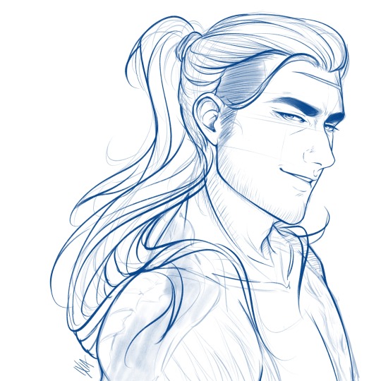
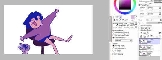
#i was messing around with lineart to try making it cleaner
Explore tagged Tumblr posts
Visit Tumblr Blog
Explore Tumblr blogs with no restrictions, modern design and the best experience.
Last Seen Tumblr Blogs


Fun Fact
The average Tumblr user visits about 67 pages every month.
Text

scug <3
#i was messing around with lineart to try making it cleaner#but i hate it i hate clean lineart im going back to rough lines ASAP fuck this shit#anywho lil dude :) love this game 11h in and i didn't beat ONE campaign 10/10#my art#rain world#rw slugcat#rw survivor
10 notes
·
View notes
Text
Aspen - Character Portrait (in steps)
Everyone's process is different. Here's mine with a bit of shitty commentary.
1. thumbnail/concept/rough sketch
Call it what you will. I usually make 2-3 rough sketches of different poses or angles but for Aspen I had managed only one after a tiring day. Of course, if the client does not like it, I'd be more than happy to try sketching a different pose/scene til they are satisfied.
2. Lineart
3. Flat colors
Once the rough sketch is approved. I draw over it with some cleaner lineart. I don't draw the lineart for every single detail for example the silver on the corset or the water drops on the rose.
I usually finish both the lineart and flat colors at the same time so I didn't save a screenshot of just the lineart. For the flat colors I either color pick from the reference sheet or come up with them on my own. If the colors are too irritating to the eye I usually add a purple multiply layer on top to tone it down.

5. Lighting
added silver nail guards and beans. Defining the proper color palette, shading and light source. Plus decided to add the rose bush background from the concept sketch.
Painting
Now we move on to the fun part. The struggle is real. My personal go-to method for painting is cutting up the shapes into small pieces and working on each piece one by one without merging my dozens and dozens of clipped layers. If the amount of layers bloats the CSP file too much don't even bother merging them down because that doesn't decrease the size. I find it far more efficient to copy and paste all the layers onto a new canvas and save. You can turn 11GB into a mere 10MB.
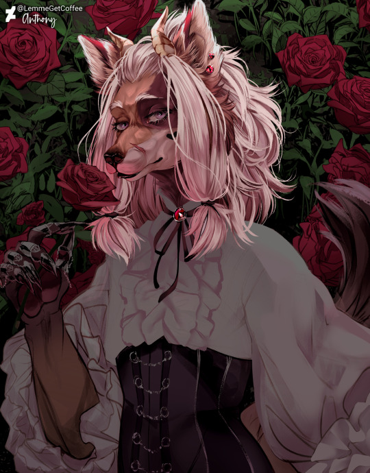


Final renders
To finish off the piece. I either send it to my phone and use the app Photoshop Express to experiment with the filters OR I mess around with the color balance/tone curve/hue/contrast/gradient map and other correction layers in Clip Studio Paint til I'm satisfied with the output.
Then I add the 3D glitch auto-action in Clip Studio Paint. (You can find it and more on assets.clip-studio.com) Then I go set the grain effect in Photoshop Express to 20%. I know you can make a grain/noise effect on Clip Studio as well but I haven't figured it out yet. Photoshop Express makes it easier and did I mention it's free
Anyway I hope you found my rambling entertaining. Thank you for reading!
#digital art#art#step by step#digital art process#art process#furry artist#furry#furry art#wip#work in progress#art wip#commission#clip studio paint#artists on tumblr#portrait#process
12 notes
·
View notes
Note
Teach me how to draw hair holyyy
I GOT YOU, FAM!
It’s ironic that I work in education but I don’t know how to make an art tutorial, so here’s my sad attempt! Forgive me if it’s useless.
I LOVE drawing hair, it’s always been my favorite, although I’m a bit of a perfectionist and therefore hair is usually the part that takes me the longest when I work on a piece. It involves a lot of experimentation and drawing the same lines over and over until I get the right shape or flow and it requires a lot of patience (at least for me). Is there a right way to draw hair? Of course not! That’s the beauty of it. Every artist is unique and will have their own style, it’s all about trying new techniques to see what works best for you. *blows kiss*
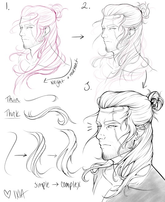
Okay here we go!
I generally have three main steps: a loose sketch, a more refined sketch to build a cleaner design, then the final lineart. I also tend to make about 3 or 4 sketches to find the right hairstyle or flow. (I’m also indecisive as f**k)
Things I think about:
Action, dimension, shape, flow, movement and how it’ll interact with the body or what’s around it
Is there wind? Is the character outside? What are they doing and how would the hair respond to that? Is it pulled behind the ear? Wrapped around the neck? Tied up?
Texture, length, hairstyle. Thick hair? Thin hair? Curly? Straight?
References and inspiration - I always use a reference of some kind just to remind myself what I like or what I want to see, it’s the best tool to keep myself on track. Sometimes I even use my own art just to see what how I’ve done it before and what I liked about it. Don’t be scared of reference! (Example: Alphonse Mucha’s art is a major inspiration, I LOVE his use of line weight, shape and flow)
Using Gladio’s face from a wip I’m currently working on, I tried to draw some of my process out:
(Is it blurry!? Did I screw this up? Oh well, let’s keep going!)
Steps:
Sketch - Loose and messy gesture lines to show the general shape and movement. It’s okay if your sketch looks like a hot mess, it’s supposed to!! I have a hard time staying loose myself, so I’m working on that. Usually my sketches are very dramatic haha.
Refined Sketch - This is where I start to actually define the strands and the general shapes. By using my sketch as a guide, I can then build the design and the more individual strands and how they interact with each other. This can take a while (like it takes me hours). I try to go slower and I’ll end up reworking it a few times before I’m happy. Tip: reverse your canvas! It helps you see if your hair is more or less balanced or if something looks off.
Final Lineart - At this step, I strengthen my lines and erase lines where I want the flow to be more continuous. I also add detail lines and extra strands or flyaway hairs for a more interesting or complex design. The example above is still too messy or simple for what I normally like, but that’s okay. Also, what the heck is up with that messy bun? What am I even doing?
Final points:
Find inspiration and examples of what you like! This can be from other artists, movies, nature - literally anything. References are your best friend.
Experiment and try new things - I’m always trying to push my designs further and learn new skills
Keep your sketches loose and messy! I like to warm up by drawing circles, ovals or like the infinity/8 shape over and over again.
Play with line weight and thin vs thicker hair strands. Have the hair interact with something, whether it’s an ear or a shoulder or itself. Push yourself for an interesting design. (Gotta push myself too! It can be a frustrating process)
The more you practice, the better you get (cliche, but it’s so true)
Honestly, I don’t even know what I’m doing half the time and my skills have a long way to go. So we’re on this hair journey together!
BONUS!
Here are a couple Gladio sketches that I never posted on tumblr as an example of a messy sketch vs a more refined sketch
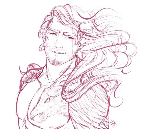
Apparently I really like drawing Gladio shirtless Okay hope this was somewhat useful!
#ask#hair tutorial#sketch#my art#gladio amicitia#ffxv#does this even make sense?#maybe?#long hair tutorial#my short hair game needs a lot of work
2K notes
·
View notes
Text
Anon Archives vol. 1
I really value communication with you guys, but I also don’t want to clog everyone’s dashboard. To fix this I’m going to be compiling anon messages into archives unless I feel they they should be answered separately. To receive a quick response, feel free to message me off anon so I can reply privately :) *smooches*


I think my lineart tool is just the default brush with max density and 10% min size. Here’s the settings for my two most used brushes :).

It’s a universe set entirely apart from our world and history - think of it more as a dark fairytale. In terms of aesthetics, though, I’d place it around 1880s-1900s.


Not all that different from the way a lot of artists use them! Just clipping masks with the texture layer set to “overlay” and opacity between 15-25 depending on the scale of the canvas. I’m very picky about my colours so all my textures are b&w to not mess with my hues.

“Stop, sto-” Wolfe manages to choke out around the blood coating the inside of his mouth, finally gaining control over his broken body as Ghasper’s influence retreats back into his bloodstream. Coward, he growls inwardly, and receives a mocking chuckle from the hound that reverberates from the very core of his being. Hunter towers tall and unmoving over him, eyes glazed magenta with Mallory arching proudly over his shoulder like a silent guardian. His usually full and luscious lips are contorted into a vicious snarl, sweat-drenched garb clinging to his sculpted thighs. Thick, toned, manly thi - [UNKNOWN FORCES VIOLENTLY WRENCH MY KEYBOARD FROM MY HANDS AND I’M FORCEFULLY ESCORTED FROM MY BLOG]
Thank you very much! When I was 15 I studied a 3-year course at WCS and graduated in 2015 with a degree in graphic design. I articulated straight on to 2nd year at University of the West of Scotland where I studied computer animation. It focused mostly on 3D. It’s not a specialised art school or anything but it doesn’t have to be - remember that if you plan to study art. I plan to go back to get my honours degree after my gap year! I graduate with my regular diploma in November I think.

That’s okay, anon! Believe me, just having people think of my characters as cosplay-able (what) makes me so happy. Thank you!
Thank you so much! I really appreciate you taking the time to check out my stuff. I hope I can continue to please you in the future :’) I’m totally not worthy of those sweet words u///u.
Thank you for your suggestion! I’ve seen a few webcomics do something similar, now that you mention it. I’m not so sure how I feel about cross-platforming my comic just yet, since I like the idea of a “central hub” of sorts...at least for the first few chapters. Tumblr does offer a lot of customizability (that’s not a real word Heather) but I think I’ll stick to Tapas or Webtoons for the moment! I really value your insight though, thank you.
Thank you very, very much! Oh man, I’m not really sure I’m the person you want to be taking any solid advice from, but I’ll give it a go. I consider myself way more of an illustrator than an animator, so I’ll give you drawing advice.
Be open to all kinds of art. Even if you live and breathe cartoons and character design, you’ll be surprised by how much you’ll learn just from taking the time to observe and appreciate things outside your own interests. I’m a dyed in the wool character illustrator and digital artist, but I can’t tell you how many hours I’ve spent marvelling at H.R Giger and Ilya Repin’s work. You don’t have to become a fine arts connoisseur by any means, but it helps to be open minded.
If you’re at the awkward in-between stages of your art - where you can draw with relative confidence but you’re struggling to find your individuality - try making influence maps. These helped me so much when I was 14 and going through my first “style crisis” where I hated everything I drew. This was because I was ignorant to my own interests. What do I love about my favourite artists? What gets my blood pumping? Why is it that I love vibrant colour pallets, cartoons and expressive eyes, but also marvel at the gritty eldritch atmosphere of Zdzisław Beksiński’s hyper detailed nightmare paintings? Is that even normal? It is. Variety is great as an artist and knowing what you as an individual like and dislike is invaluable.
When you draw, try and minimise the amount of times you take your hand off the page. If you’re prone to “flicking” your pen a lot, it can make your lines look inconsistent. By training your hands to make confident strokes, you’ll get cleaner drawings and learn to work faster.
If you’re a sensitive person then art can be a surprisingly difficult hobby to maintain, as you’ll find your emotions bleed out into anything you create. This is great for naturally driven people who can channel their frustration and insecurity into bettering themselves, but some people are fragile. That’s okay. There’s no shame in feeling overwhelmed. It’s alright to put the pen down and take a break for a while. Just promise me you’ll pick it back up again.
Gesture drawing is great for learning anatomy. Instead of getting caught up in having proportions/details perfect, try to instead focus on the pose in its most basic form. Capturing the momentum and direction of the body can give your drawings a more fluid look and reduce rigid characters.
Well, that’s just a bunch of really weird and vague tips but I hope it helps. It’s a broad topic to cover...if you need anything more specific then I’ll help as best I can :)
I think people need to tone down their virtue signalling and let people enjoy themselves. This is why people are too afraid to have fun anymore, and why merciless cringe culture is going to haunt young kids into adulthood. Animation memes will fall out of popularity like every fad in existence has done before it and you’ll get your wish.
#anon archives#asks#phew this took a while#but i read everyone's tags and captions and comments so I want to give back as much as possible#quite a rude anon at the end but i feel strongly about the subject#anon
207 notes
·
View notes
Text
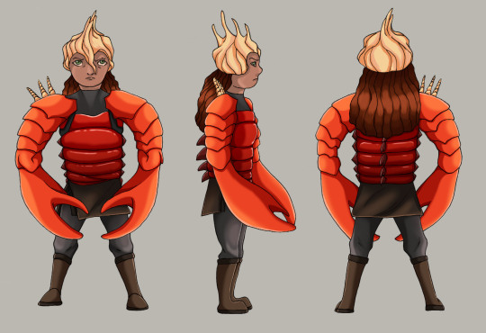
Turn Around Sheet
Initial Sketches
For this task we had to create a turn around sheet based on two different words to make a character. The turn around sheet needed to include a front and back view as well as a side view, and an optional 3/4 side view. To start I sketched out a number of different ways to make my character, from various body parts to figuring out an outfit.
I was given “Viking woman” and “Seashells/shellfish”.
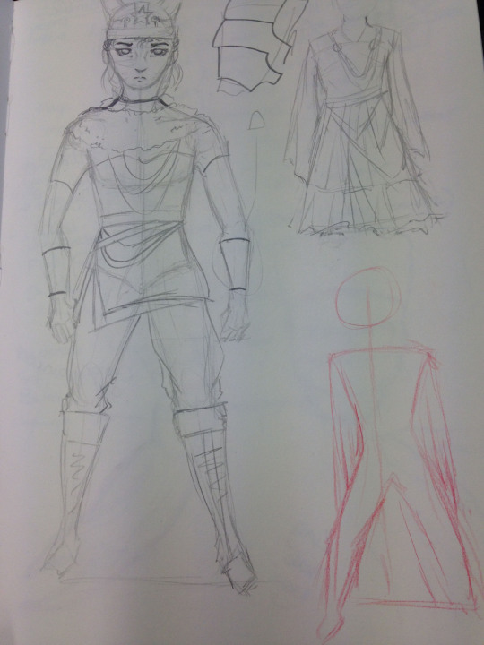
I first started trying to figure out what sort of viking woman exactly; armoured or dressed nicely? I did several sketches trying to see what looked better, but later went for armoured due to inspiration looking at various seashells and shellfish.
Looking through different seashells and shellfish I tried to interpret different armour pieces as that shell and/or shellfish part.
For the chest plate I used the tail of a lobster which I later used the same colour for too.
For the arms I used a crabs pincers. Not only is it hard but can be provided as a weapon too, which during the vikings was something very common.
Although helmets aren’t very traditional, I still decided to include it on my character. For the helmet I used a Queen Conch Shell which takes on the same shape as the picture from the side view whilst from the front is quite straight and round/bumpy.
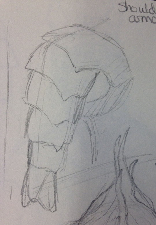
Again for the shoulder armour I used a lobster tail but used more of the bottom part of the tail rather than the middle/top like I did for the chest plate.
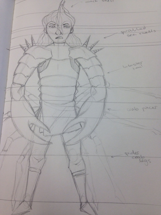
Putting all of these elements together I came up with this design. Most of the outfit consists of armour made out of shellfish whilst the helmet is a seashell. This mostly covers the top half of the body whilst the bottom half of the body is mostly regular (but hopefully more traditional) clothing, with simple trousers, fabric to go around the waste and boots. Although this sketch does include spider crab legs attached to the characters back, I later decided to remove them as they made the overall picture too large. As an added decoration I added some shells on the shoulders, another form of protection.
The task was quite difficult at the beginning as I had trouble thinking of what to do exactly, but with a little bit of help and further searches I came up with the shellfish armour. I was pretty happy with this idea too as the colours are very bright and I wanted to include that, so it worked out well.
I think I integrated the visual references well into my character. It clearly shows what I was going for and how I went about it, and they look very similar to the visual references, so I think overall my sketch was successful.
To improve I’d definitely like to spend more time picking a style that I could work with more freely. I wasn’t happy with the anatomy and now after completing regret not having changed it when I had the chance at the beginning.
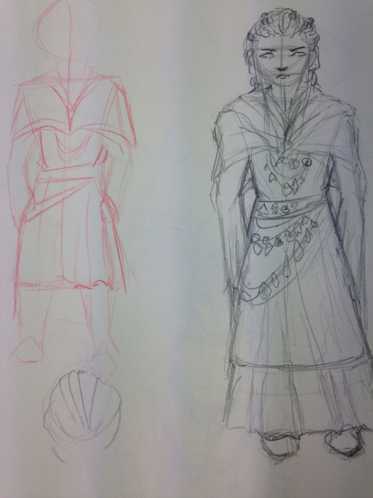
A3 turn-around-sheet
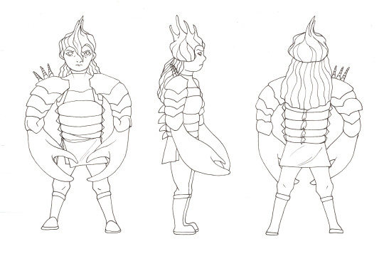
For the next step I used an A3 sheet of paper to sketch and outline my character. The front view was mostly an exact copy of the sketch from my sketchbook, however I had to make it much smaller, mostly by visualising the guidelines which I included on the A3 sheet and my sketchbook. The side view was a little trickier as I had to try and keep the armour looking the same but from a different angle. You will notice that I also added extra back spikes and the shells on the shoulder only appear on one side. These were just extra details which I added to make my character a little bit more unique. From the side you can also see how I followed the idea of the conch shell as the helmet. The back view was fairly easy to do as it was mostly the same outer outline as the front view, but some things are not visible and I had to add extra like the back spikes. To try and keep them all level I had to follow the guidelines I drew quite closely, making sure the highest point of the helmet touched the top line and the bottom of the feet touched the bottom line, as well as other points going down the body which had specific lines added in.
This part was quite difficult as I had to make sure that it still all looked the same and the same character but from different angles. Trying to capture the crab pincers from the side was the most difficult part along with the lobster chest plate and arms as they follow a specific shape from one angle, but not the other.
I believe that I did manage to complete the sketching and lining process successfully. I included what I wanted and even added more to make it more unique.
To improve I could put my character in a specific position, like an action pose rather than a straightforward standing stance. It would be much trickier to do each angle, especially whilst keeping to the guidelines, but I do believe it would make the overall drawing look much more interesting.
Render Process
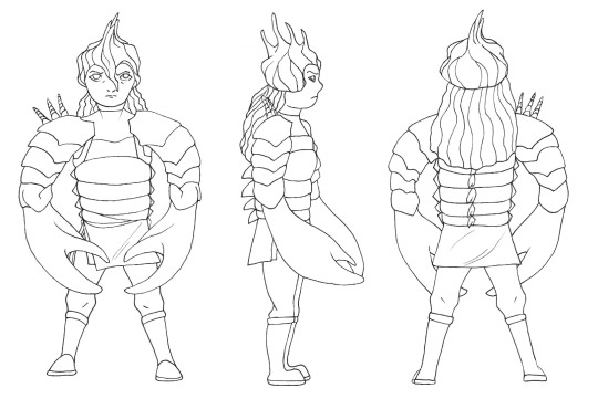
The first step to rending was to separate the scanned sheet from the background. To do this I pressed Shift + Ctrl + Alt + 2. This selected all the white areas so that I could then inverse the selection and only have the outline left which was then placed at the top and any other layers were placed underneath. There are a number of ways how I could’ve coloured but as I had a drawing tablet (Wacom), the simplest option was to simply use the brush tool and colour inside the lines. I could have used the magic wand tool method, where I select the lined areas which I want to fill in and go to Layer > New Fill Layer > Solid Colour, but because of the scanned lines they weren’t very neat and created a lot of mess on the fill layer, but I had to make sure I made a new layer for each colour I added.
Base colour
A dark gradient going up and a light gradient going down.
A new layer on top set to “multiply” where I did some cell shading and soft shading, keeping the sides solid but the middle parts softer.
Another multiply layer to further deepen the colour
A new layer set to “luminosity” to add an extra highlighted effect
I created a new layer for each change to the base colour, and finally added a brightness/contrast edit to brighten the whole area up a bit as I wanted to keep the vibrant red of a lobster tail.
My final and finished design. Each piece of clothing/armour was shaded separately to make sure I got what I wanted, trying to add a specific shadow and lighting point and mixing between cell and soft shading due to the hard surfaces.
I found this quite easy as it’s something I do often in my own time but mostly use other programs, so trying to get what I wanted on Photoshop was a bit difficult but I think I eventually got what I wanted.
The overall look is successful as I successfully managed to use the different types of seashells and shellfish that I wanted and also include their mostly bright colours.
To improve I’d definitely try and do a much better and anatomically correct sketch to use, but as I was more focused on using my given prompts and implementing in the design and how I wanted them to look, it may have looked odd on a realistic figure.
To improve the outcome I could have done all of the lineart in Photoshop as it’d make the lines much cleaner and neat and easier for me to colour them by selecting the areas, unlike how I had to use the brush tool and colour it in just by that.
1 note
·
View note
Text
(almost) every anon ask since fall 2016
if u havent noticed i am BAD at answering asks so here’s a Big Dump of most of the asks i’ve gotten in the past few months
ps; i’ve excluded pokemon suggestions bc i plan on getting to them at some point
Hihihi!!! What brushes do you use in fire alpaca?? i dont do much in firealpaca (esp not lately lol) but when i did use it a lot i just used the fill bucket and the standard/default brush to fill in gaps n such lol! i dont really draw in it, i used flash/adobe animate for the lineart and just fill in color in firealpaca :3
when did you start animating? uhh when i was around 11 or 12 when i started digital art i guess? i just used photoshop for the longest time then got flash when i was like 15 or so
How did you get flash? i got the creative cloud dealie, its technically required for my school :—-0
hello!! what are you majoring in in vcu?? im thinking about going there for college im in communication arts! omg cool lmk if u come here ill tell u where to get the best bubble tea
how many fps do you use for your wiggly animations? i work at 24 fps in flash on twos but just end up using photoshop’s 0 second frame delay/ “no delay”?
Hey love your animations! What do you animate with? adobe animate 2017! (previously flash)
You mentioned a YouTube channel but I can’t seem to find a link to it? Do you post processes on there? https://www.youtube.com/channel/UCovvoZxlQjFaIA7A3w_94Zw theres not much atm but i plan on posting a lot more, including process/speedpaints!
i really like your art style gosh darn!!! everythings so fluid and stylized and nice aaa (also ur animations are goals) do u have any tips for someone still developing their artstyle???? WAH TYSM!!!!! compile art you already like and incorporate aspects from their styles into yours, BUT dont limit urself to one style! if u like something then try it out! do straight up copies (as PRACTICE, DONT CLAIM IT as your own ofc) of stuff you like to see how they work and what you’re clicking with. spending time on fundamentals is MEGA helpful so keep going back to that too! USE REFERENCES!!! draw …from ur soul…what makes u ..FEEL good
how do you make that burn effect on your lineart? it makes it your pieces look sharper and even more interesting, it’s super cool!! when i used to use flash for lineart and firealpaca for coloring a lot, setting the lineart layer on BURN with the coloring layer seeping a lil past the lineart would get this effect automatically
(like on the whiskers. u can see it gets a brighter brown(?) and the warmer yellow on the ears)
but since then i’ve been using sai+photoshop more so i just do it manually! i’ll use this funny pic of me and my cat as an example lol
^i select the lineart/everything i want the funky color around

^slam that INCREMENT button a couple times
^make a new layer under the lineart

^fill that puppo with ur preferred color! something brighter works best, or even straight up white
that’ll give you something like this
then i open it in photoshop

and i mess with the pink line layer’s blending mode..color burn usually does the trick but depending on the Look you’re going for, saturation, multiply and overlay have some similar effects that look cool.
i also usually get rid of the outermost edge of pink line that’s visible around the lineart, just so it looks a little cleaner? to do that you just select around your lineart, increment/expand selection, and delete/erase in the selection of the pink line layer
uhh yeah! lmk if anyone needs clarification on this, i have some other #TIPS on makin ur art look crusty and funky so…lemme know if you’re interested :—3
What do you use to animate? And, a more specific question, how do you make transparent animated gifs? adobe animate 2017! (previously flash) i export my animation from flash as a png sequence then open it in photoshop, where the background will be transparent and save it as a gif from there nyaaa
if anyone needs more clarification lmk and i’ll make a proper walkthrough :-0
Hello!! Ur art is rlly pretty and so inspirational and nice to look at!! 💗💗 I was wonderin’ if ya had any tips on choosing shapes for characters? Like, when you draw shapes for a certain character, it looks rlly like it fits with the character’s personality n stuff!! ( e.g: Your Love Live! drawings!! The characters look so good in your style.) I’ve always admired how u did that n was hoping for some tips maybe?? Anyways, have a good day!!💛💖💟💜💝💞💖 HOOGA!! TYSM!!! and YEA you basically guessed it, i mainly just think about the character’s personality and translate that into a shape or Pheeling…
especially for anime characters i look at the Very Subtle differences in the character’s original design..or possibly canon implications…for example kotori has slightly different eyes (it also says on her wiki page she has soft droopy eyes!) so i make sure to incorporate that Detãile

anime wiki pages that have details like that is nice, for love live they have cute lil “charm points” which is really cool n helpful! listening to how a character is described in their world can give clues to what differentiates them which you can make more clear in your design
taking into account each characters context is good too, what they do/hobby/personality and how that could affect their appearance/posture/attitude
YEAH its really fun to figure out certain characteristics and make it evident in their appearance! or. idk thats just what i do lol. hopefully this helps!
Have you ever seen the anime jojos bizarre adventure? alas i have not..i have some friends whom are into it so i’ll prob end up watching it sometime lol
sorry if this is obvious but!! are you the creator of Fork and Knife: Food Fighters?? your gif of fork is super cute btw!! yes i am!! wah tysm!!
Hey my little sister found your animation on an online art gallery and she really loved it! omg cool, thanks so much!!
Your style is so lovely!! OHG thanks!
your blog is so precious i love it a lot! your art is so cute too ^u^ waa thanks!!
Your art and animations art really cool! Keep up the good work! You are amazing!! aahg thank you!! :’333
your art is fuckening amazing hh broe…tysm
Oh my gee, I used to follow you on Deviant Art, and now here I am, finding you on accident. You’re still as talented as ever. =w= b hUIOpugh deviantart, my homeland..my origin.. thank you!!!
- O mg I love your art! 💕💕💕 thank you!! heart emojis!!! 💖💖💖
- your art and animations give me so much inspiration, thank you! everything about your style is so fun and it cheers me up omg this validates my top tier goal in life, im so glad!! thank you SO much!
Your style is so charming and adorable ;__; thank you!!
ur art is so gross in the best way possible this is the biggest compliment ive gotten thank u so much. i love making gross squishy awful drawings
IM SO HAPPY I FOUND YOU!!!! IVE BEEN LOOKING FOR YOU FOR AGES!!!!!!!!! I LIVE FOR YOUR BEAUTIFUL ART!!!!!!!!! THANK YOU!!!!!!!!!!!!! BHOLY CRAP THANK YOU!!!
your art style is very cute ! 🌱 oohg thanks!! thanks for the little sprout emoji, i love her
GOOD ART!!!! good art good art good art EVERYWHERE I LOVE IT!!!!!!!!!!!!! OHHGG THANK YUO
how do ya draw such cutely its driving me nuts Nuts NUTS !!! I LOVE SPARKLES AND BRIGHT COLORS AND FUNNY ANIMALS..its my lifeblood..thank u..
You’re a really rad artist! I’m Glad there’s some cool artists that are local! Have a good time at VCU! oh wow thanks!!
Ur shapes r so good thanks i LOVE a nice wholesome shape!
I rlly like ur art style my dude thanks!!
hi! just wanted to let u know that you’re wonderful and i wish u well in everything u do this is making me bVERY HAPPY THANK YOU SO MUCH!!
Im love You!! IM L OVE YIOU
that meowth boy is so good. i love him as he is my son THANK YUO i too, love meowth a Lot
I love how your art is basically lines and curves, it’s very cute oo thanks!
i love your art style so much!! it’s so zesty? i cant think of a better word to describe but its like. zesty & refreshing & rly rly cool !!! THATS A BEAUTIFUL ADJECTIVE I LOVE IT thank u so much!!!
You seem like you would watch Osomatsu-san. I could see you drawin dem bois in you hella rad art style. osomatsu was the wildest ride of my life. tho i dont think i could physically be able to sit down and draw them seriously ever…

Pls make more angry cat comics theyr so halarious plllls 👀 more are on the way!!!!!!
Have you done a meet the artist i sketched one when the meme was still poppin..is it too late lol? maybe i’ll still do it
110 notes
·
View notes
Photo
Here's that reblog! I get very long-winded so I'm really, really hoping this readmore actually works this time.
I'm gonna try to split this up cleanly into categories rather than just sorta rambling blindly and I'm also going to be using more or less proper grammar and punctuation because I feel like consistently lowercase formatting with no punctuation will make this harder to read when I get long-winded like I just did.
SO.
Pre-ramble
I have a lot of bias toward some Fever-era characters and designs and Lemres is definitely one of the bigger examples of this. For somewhat personal reasons, even if he might not be a character I talk about very often, Lemres is a character I hold very close to my heart. This isn't necessarily that relevant to the design but I mean... Lemres good. Fair warning, though: I'm not actually proofreading any of this very closely because I have some books to read and another painting thingy I'm working on with what I've learned here so it's pretty likely that this might not really be that coherent.
Design
While I did diverge from his official designs more than I did with Arle (who's basically just Puyo 20th and Fever mixed together and that's just kinda it), I still took mostly from his Fever 2/15th/7 design. I'm a sucker for capes and I prefer his broom over his wand, so I gave it back to him. I also tried to split his outfit up into distinct pieces, since my idea with these redesigns is more or less just making my own versions of these characters that are easy for me to work with and remember the designs of without much reference. I mostly aim to make these characters look nice and be fun to draw for me (since I draw for fun anyway in the first place) and that's how this Lemres ended up with much looser-fitting pants. I just couldn't get the "tight-everywhere-except-the-ankles" look to look good to me and found that I liked them baggier after messing around a bit, so that's how I think I'll work with them for a bit.
Moving on to everything but his pantshoes, I gave him an orange turtleneck because he seems to be wearing them in his regular designs (but Puyo characters seem relatively neckless so it's kinda hard for me to tell), followed by a hoodie, since he also seems to have consistently worn them in his regular designs, and then the cape, which is a separate object from it rather than being a cloak like how Puyo Puyo Tetris handled it. I always thought that having both a hood and that hat was a bit redundant, but then I had a revelation:
Lemres has cats all named after sweets and he does this with them (hc courtesy of Shou). The cape is kinda asymmetrical in the front, but honestly I'm probably gonna change it a bit after doing some actual studies of capes. The hat stayed because I already really like the shape. potato chip. I yoinked the belt from Tetris but in all honesty I'm thinking I might actually leave it out.
Process
Initially the plan was to just do the same thing I did with Arle, which was "sketch -> lineart -> flat colors -> duplicate layer to shade (because I'd rather not have to manually recolor everything if I happen to mess up) -> adjust", but between the time that I did my first sketch and the other two (about two weeks because I did that Puyotale painting and also some non-art-related things as well starting some other sketches that I'm unlikely to continue), I watched some videos about digital painting and I went "huh, that's neat" and you can even see some traces of this in the later sketches, where I blocked some things in instead of drawing them. It might not be very clear because I'm only realizing now how much Tumblr can butcher image quality, but I used a harder-edged brush for the entirety of the painting section than I did for the Snowdin painting or the shading and lineart on Arle, which I think made things look a lot cleaner, discounting the fact that Tumblr likes to crunch things up. Seriously, it might even look better on Twitter than it does here so that's a bit disappointing because I love blending colors a lot when I shade and I think a lot of that gets lost when you can hardly see it.
Anyways, I've been doing a lot of experimenting with my art this summer. Before I used to live by that sorta process I described earlier but now I'm trying out a lot of things outside of how I normally do them. I also learned a lot of things about digital painting, namely the immensely helpful role of layers. I merged all of my different flat color layers into one once I finished them and that was a big mistake because it made it really cumbersome to work on one specific part without accidentally blending from another or fix parts that I suddenly realized were a bit off without having to rework them. Now I'm using a lot of layers and keeping them distinctly separate and it's definitely a lot less annoying. There are times where I actually would like to blend a bit, but the utility of being able to erase freely is much better to me. I have other things to do, so I'm just gonna cut this here, but I've actually been trying out painting without sketching like I did with those Puyos. Maybe I'll try doing a stream while doing something like that? School's starting up soon so I can't say exactly when I'd be doing it, but ideally I'd be able to do one before the year ends.


so, like i did for arle, i decided to try making a design for lemres. this time, i did a lot more experimenting, both with the design and with my process. you also now get to see my sloppy handwriting in HD!!! to be completely honest, as much as i learned during this (which i’ll be explaining in a reblog later, along with my process here and my thoughts overall), i just kinda got tired of working on it, which you can probably see in how only the right lemres really got shaded and even then, i didn’t finish him.
#elaboration#long post#tumblr im begging you on my knees please just work the way i think you do this one singular time
20 notes
·
View notes
Text
I think I’m still trying to process last year, let alone this one...
I started last year, brimming with ideas and motivation. It was fragile, and it was born and fostered after long stagnancies where I just couldn’t function, and years worth of abuse and being constantly, consistently made to feel my lowest and worst.
I ended that year, consistently feeling insecure, isolated, and feeling uncomfortable to outright ashamed for everything I created, and every aspect that went into why I created them. I left that year, in the lowest and worst way possible, and my ability to create at all grew more strained, more tired, and in the end, manifested into things I would just feel disgusted and ashamed of making to the point I can’t count how many times I wanted to just delete everything and disappear.
I’ve met friends. I’ve lost people I no longer feel comfortable with in any capacity, who send me into outright panic attacks I have to bottle up any time I cross paths again for the sake of keeping peace. I’ve met people I wanted to consider friends, but for one reason or another, I’m not even sure where we stand and am too afraid to approach otherwise, fearing I was wrong and would just upset them more to bother them. I ended the year losing a friend in an even worse way, suddenly and without warning, in a way I still wished I could’ve done so much more before their life was cut so short, in a time I felt like I had so many bad things snowballing one after another, that I still can barely process it, despite the expectation I catch up and move on. Because I’m keenly aware that my grief is a massive inconvenience, and I have too much I’m supposed to do than just sit around and cry and get upset over whatever stupid nonsense again. (And I’m definitely aware of how many times it’s treated like “stupid nonsense” inconvenience. Constantly.)
This year, I felt like I started off worse than last year. There were higher moments, better moments, but my confidence and comfort to make the things that used to bring me joy became even more fragile. I reached points I was so afraid and made to feel so disgusted with my work that I slipped into lashing out at myself more in a time my health was already fragile enough. And in moments I slipped, I’m just reminded of last year all over again and break, time and again. I barely function even on the daily, let alone creatively.
I realize I did what I could to tag things, to warn things, to space out what is appropriate where and to what capacity, and in here especially, I am highly mindful of tags, for all of you to tailor things to your own comforts likewise. Even still, despite that, I crawled out of that year, made to feel like the world would’ve been far and well better if I delete everything, apologize for being so horrid and terrible, and it felt more and more like even if I so much as breathed wrong, it’s something to feel shame and disgust and scorn all over again. The wrong ships, crossovers, no crossovers, stupid source material rendering everything I do at the core to be pointless and dumb, something boring meant for comfort, something too heavy-handed and dark and depressing, it’s unconventional so therefore it sucks, all manner of disgusting and cruel and vile things I didn’t even think about, but was inferred, simply for the way my characters were designed or what they assume of them and held true despite what I say.... the goalposts felt like it constantly changed, sometimes to things more to make fun about me than what I create, as was the latest reason everything I do was so bad, and I’m only just starting to accept that I was in environments where literally everything I do is wrong no matter of what I do. I felt like I gradually stopped letting it affect me only in points I was just too tired and burnt out that I disassociated half the time.
Little things, big things, it accumulated and built up and to a point I still feel like there’s parts of it all that still haunt me, even if they’re old memories I should’ve long since gotten over with now.
With everything that went on, and with the past months being bumpy, mentally, physically, emotionally... I felt embarrassed how long it took me to slow down and look back.
Maybe I’m still insecure of my art or it’s quality, especially in my worse flareups, but I only just realized last night about the frequency. When I finish them, I don’t feel the same immediate hatred and shame anymore, like I can ease and trust into actually enjoying the end result again. And I’ve eased more in being consistent to at least make cleaner lineart as the bare minimum over sketches that took hours and massively difficult flareups to ride out to even do on a concept level. I still feel stressed for not doing what I hoped for, or all I hoped for, but I’m only just now realizing maybe I wasn’t as uselessly slow and lazy and ugly as I’ve constantly felt before.
I’m still afraid of my words. I’m constantly reminded just how bad my grasp is in a language I’ve already struggled with on the constant in a normal circumstance. There’s always this lingering fear I’d just disappoint people for what I had in mind, especially in the past when I’ve had those feelings all but confirmed constantly, and in varying states of upfront and blunt. I’m still scared of writing anything, to a point I don’t even want to do requests in those regards, thinking I’ll just give people a mess of words too tedious and long and boring to slog through, let alone do that as a paid service. Even all this is just a mess of words and tears, but I’m exhausted, and I’m stress, and I don’t have the spoons to try to shred up my thoughts just on the vague hope it’s bite-sized enough for my feelings not to be ignored and dismissed over and over again like I’m just some fussy toddler throwing a tantrum to be ignored until I shut up and the “gift machine” learns to fucking operate again. But at the same time, I’ve also been re-reading old things, especially my longfics, and I’m reminded all over again what I had in mind and looked forward to get to before the disappointment and disgust ruined it before. It’s still long, and still shaky, but I’ve been still writing again, even in tinier bits at a time.
It’s progress. It’s slow, clunky, and I feel like a little kid clumsily trying to learn how to walk again. But I think I’m starting to at least recognize now it’s still progress and still steps on moving forward, even if the road I used to be so confident to walk along is scarier and stressful to me now.
But at least I’m walking. I’m still walking, even if I trip a few times along the way doing it.
0 notes