Don't wanna be here? Send us removal request.
Text
Evaluation
youtube
My final animation:
My initial intention for my animation was to have it consist of a few parts in different scenes. I wanted to start out in a large, busy scene, with a large scenery with a background and foreground. I was hesitant on the idea but thought of adding a couple of characters (considering my character’s backstory this would make sense) but due to the amount of extra work that would add to the limited time I decided against that idea. The others were to be of a journey, exploring different parts of the forest and land, walking through trees and water. Most of this idea did change as I had to fit it into the time I had and with my lack of time management (which I will be focusing on improving) I struggled to reach my initial idea. I also felt limited by my knowledge of the programs and how I were to put my ideas into the animation.
I feel my lack of knowledge of the program did limit me. Whilst I have used Adobe Animate in the past it is still a large program with many different techniques and secrets on how to use it. To help me I watched a number of tutorials by different Youtubers such as Draw With Jazza and whilst they did greatly help I still had some difficulties, especially with the troubles I had with my computer and the program. As the project is quite independent, having to do so much in such a short amount of time, I often worked from home. Unfortunately, it seems my PC had trouble with the program. I could use Animate but when replaying or reaching a certain number of layers it struggled to load them- in the end this caused me many problems with the program often crashing along with some difficulties rendering and exporting parts of my animation. Personally, I find myself to be more knowledgeable with After Effects than Adobe Animate but struggled to find ways of having the two programs work hand-in-hand, opting to stick with Adobe Animate in the end rather than trying to juggle with the two.
Due to the problems I had with my computer and losing files my animation is very short which is the biggest flaw. However, in that short amount of animation I do think it could be identified as a game. The way I animated the movement makes it look quite “reusable”, a repeated cycle which is often used in games. I’m happy with how I portrayed the arrow above the sign often something used in games to pinpoint certain objectives. However, I am disappointed with the background I used for that scene. There is little to no movement or interaction with the character other than the sign and arrow which, in a way, are not part of the background. I believe I could have gone into much more detail with the background or at least rendered it much more as I feel it looks rather sloppy, especially against one of the other scenes backgrounds.
Overall, I don’t think I did a good job. Whilst my idea may have been effective I managed my time poorly and I am aware of that and is something which I drastically plan on working and changing for future projects. At the beginning I was quite unsure on what to do and spent a lot of time coming up with lots of different ideas to the point that I got stuck in a slump. If I were more knowledgeable with the program I used (Adobe Animate) I may have been better prepared with time, but I was not and regret not delving further into other tutorials or maybe rely on After Effects a bit more.
Performances and final work:
With the small amount of animation I salvaged I am satisfied with that outcome. The movement is fairly smooth although I do believe could have been smoother but doing so may have removed the feeling of it being a point and click game. I find point and click games aren’t often smooth without small jumps here and there which is why I personally like the movement that I created. The way I included the arrow to pinpoint the objective is something I am pleased with due to how simple it is but very effective. It further adds to the game-like feeling.
I think my strengths in this project were my drawing skills. Whilst my animating skills aren’t quite on par, I think I managed to portray what I had in mind through my characters and backgrounds. Although I was very slow at creating the animation- cell animation being very time consuming- the character and background creations went by quite quickly as fortunately, at times, I can draw quite fast. My biggest weakness was my time management. It was very poor and I have many regrets on how I worked with it. I feel I could have started animating much sooner, perhaps within the first week or two rather than dragging it out to the third or fourth and focusing on the animation as much as possible at the beginning and refining other ideas such as the character turnaround later in the project.
If I were to do this project again I would work on as much as possible as soon as possible. Nearing the deadline I became very stressed which I think worsens my work and how I produce it. This would also help if I were to have a problem like I did with this project, finding out that my file was corrupted the same week of the deadline and not giving me enough time to redo it. If I had worked on my animation sooner and noticed a problem such as this it should have hopefully given me enough time to go back and redo it before the deadline. I think I would also change my idea if I were to do this again and the detail I included in the backgrounds and character. I did like my idea and what it meant to me but I also don’t think I showed my ideas enough through my drawing and character but I was so concerned with having enough time to complete this project that I focused on simplicity rather than what I really wanted to do.
Overall, I again don’t think I did a good job. I could have used my time more wisely and will be something I will be working on to improve for the future. In terms of my animation, if I didn’t have so many problems with the program I think it could have been good but I unfortunately ran into too many problems.
14 notes
·
View notes
Text
Problems and overcoming them
My animation is made up of two parts, each under different files. However, due to an unknown issue part two of my files has caused problems by being unable to export as a video.
After spending weeks creating this part of the animation with the background and full body character which is also coloured, having 25fps with a second and a half of animation, I was very frustrated with the problem.


The animation shows the character looking to her left and then to her right as she walks through the water whilst moves around her feet. Whilst I wasn’t too happy with how I did this I was struggling with time but needed to include some movement. It would have looked better if the animation were blurred, but as I am new to the program there are some features that I am unsure how to use.

I found out about the problem after having just finished the animation whilst at home and attempting to export it as a video. There were problems before this with the preview of the animation lagging and not flowing properly even if I let it play for a long while. It often times crashed after I drew on so many frames as well but thought it was my computer that was struggling to cope.


I attempted to export it as normal but once it started rendering, at around 70% the program would crash. After adjusting settings and searching for what may be the problem, one suggestion being update QuickTime but that did not work, it still would not save. I tried to export the animation on the college’s computer but again, at 70% the program would close itself without reaching Media Encoder.
Fortunately I found one of the recovery files from when I had just done the lines of the animation although it is still missing a part and the colour. Regardless, I have included it as evidence of my work.
The scene shows my character walking through the water and looking around the area. What was supposed to be added at the end was the discovery of the item she is searching for which rises from the depths of the water, but I unfortunately cannot recover that.
youtube
1 note
·
View note
Text
Final Creation
To create the animations I did them in Adobe Animate and kept to the program without changing. Whilst using other programs as well such as After Effects which may have helped with some parts such as the movement with the arrow on the first background, I was unsure if I could or if there is even a way to convert the files between the two programs. I didn’t want to risk it in case a problem arose so I stuck to Animate.
The first part of creating the animation was sketching out the movement. I did this whilst in Clip Studio Paint and made sure each sketch was on a different layer so I could later delete, hide or change the opacity. I looked at some movement references to help me sketch to make sure I got the legs (or the rise and fall of the skirt) correct.
I only added some sketches on the second background as checkpoints for what the character needs to look like at that time and made sure to add extra layers in between on Adobe Animate. I did rely heavily on free handing the line art but in the end it turned out okay.

For the first background I instead sketched out every position to help me speed up the process as free handing the line art makes it much more time consuming and difficult. As I did the second background first I learned not to do it when I reached the first background and so sketched out a sequence. This allowed me to line directly on top of each of the sketches without having to guess in between unless I later when and added in between frames.

The lining process was very straight forward, making sure it was on its own layer with every other layer locked as to make sure I did not accidentally start drawing on the wrong layer. I used the Paint Tool brush on a stroke of around 0.10 and occasionally used pressure for parts such as the line strokes on the outfit.

Colouring, again, was very simple. At first on the second background I added a layer underneath the line art and coloured in the areas by hand, only keeping to the brush tool. I soon realised it took too long and so when I moved onto the first background I decided to keep on the same layer as the lines and use the bucket tool. Whilst there was a risk of mistakes happening I made sure to save a separate file before starting the colouring in case I needed to go back. Despite the lines which I thought were closed, sometimes the bucket tool still did not fill in the areas so I often had to switch between different options of the “Gap Size” tool, usually changing between “close small gaps” and “close mediums gaps”. For the areas that still did not fill could use the paint brush tool as long as it painted underneath the lines.

For the arrow and text box I likely could have added it in later but decided to stick to Animate. making sure the fill colour was white and the stroke colour was black, using the rectangle tool I was able to make what starts as a small rectangle but grows larger in the next frame.

Under “properties” for the rectangle tool there are a couple of different options which affect what it will look like, for example the stroke size, style and the “rectangle options”, here I could adjust the curves of the corners on the rectangle.

Finally, as part of the speech bubble I needed to add the text. I kept the settings for the text pretty simple, using TImes New Roman at a size of 14.0pt. I didn’t want to use a complicated text as that makes it harder to read and I didn’t want the size to be too small or too large as it needs to be distinguishable but not that it looks like if someone were to be reading it they would be shouting, so I kept it pretty straightforward.


The text reads: “If you are reading this it is likely you are starting your journey to find Hitodama. This is the start. Follow the path and find your destiny- but be careful! Dangers may lay ahead. Make sure you are equipped.” This is where the story and journey begins and I wanted to make sure I got that idea across. If I had more time I likely would have created an extra character rather than using a simple sign, but decided to keep it simple just in case.
0 notes
Text
Environment Concepts
I first started planning my backgrounds traditionally within my sketchbook with a few different scenes. Whilst I did four I originally had every intention of using all of them but in the end only used two.
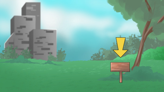
The first background is the first, main area, with the large building where the character’s family lives and where the city is beyond that point. The scene is set behind the “castle” where foliage grows and the area is clear of buildings and people. This is where the journey starts, hence the small sign to the side. I really liked this idea and so carried it through to my final.

The top sketch was what I thought about as a final scene, upon my character finding what they had been searching for. The addition of the markings on the oddly shaped stone with a tree which could be brightly coloured could create a mysterious, mystical scene. Very fitting for the discovery of the magical item.
The other scene underneath was what I had in mind as a sort of crossroads. The character would move from one side to another, coming from the left over to the top right and finding their way to the bottom left. I added some butterflies and flower at the bottom left area as a way that could indicate that it’s the direction the character should be going.

This was a another thought of another area which is lead off from the crossroads. The foreground would consist of water and rocks with trees and a forest in the background and my character would walk through the water to either reach the other end of realise it’s a dead end and turn back.

As much as I wish I could do all four backgrounds I realised I don’t have the time to do all of them so decided on two backgrounds.
This background is one of the later scenes, used during the character’s travels at finding the object but realising it’s not in that area as it comes to a dead end, although I later change this to the final scene. Some of the trees are cut off abruptly as I will be including bushes in front of the trees in Animate, animating them like they are moving in the wind.
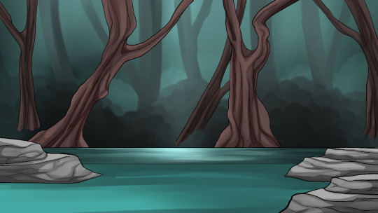
To create my backgrounds I used Clip Studio Paint as I find it a much easier program to use than Photoshop as I am used to it and I prefer the brushes. Whilst I can blend better and the brushes react more to pressure sensitivity unlike Photoshop which can be quite difficult to use.
The first step was sketching out the scene. I quickly mapped this out with a thick brush with low density. Some parts I added in the sketch but did not add in the final such as the lines coming from the top of the trees which originally represented the leaves.

I started with the background first which compared to the foreground was very quickly done as none of it is in focus, merely there to s how that there is more to the scene.

Next came the water. The water further at the back I made slightly more detailed as the character will not be interacting with it and there will not be any movement. I used a line to split the two areas apart and coloured it so it blended in more than what a line of black colour would.

After the water came the trees which are layered behind the water so I don’t have to create extra unnecessary lines when I can easily colour straight down underneath the layer. For the trees I added an outline and lines on the inside to replicate the different curves and edges rather than solely relying on the colouring and shading. I made the tree trunks quite odd shapes to add a bit more of an ominous scene.

Finally, the rocks. Again, I lined these and added lines within the main outline to map out the edges so it doesn’t rely so heavily on the colouring and shading. It also adds a different style and effect rather than what a fully painted scene would, making those objects stand out much more than if it would have without.

This will be the first background where the animation starts and the character’s journey begins. Like in a lot of games that include storylines and need to read specific text, especially during the tutorials, I included a sign with an outline unlike the rest of the background and an arrow on top which will be animated to move up and down, indicating that is where the character needs to go.
1 note
·
View note
Text
Character Development Concepts
At first, I had quite some difficulty deciding what I wanted my character to be and what I would want them to be based around. I was changing between going with a futuristic style or somewhere around the medieval era but in the end decided on neither.
Instead, I took inspiration from my dog. Whilst that may sound odd to some, I find my dogs to hold a lot of character, so it made creating a personality for my character quite simple. With this idea of basing my character off my dog, it lead me to the plot and her backstory. My dog’s breed is a Japanese Chin, originated in China but later gifted to Japan, so I instinctively wanted her to resemble something Japanese, whether it be the way her face looks or the clothes she wears.
To decide on what to do, I first noted down the key characteristics that my dog has.

The Japanese Chin breed can come in a total of four different colours but the two main are; black and white and red and white. My dog’s coat colour is red (brown/orange) and white. Unlike some other colours within the breed, she has a very dark colour, resembling that of ginger/red hair colour in humans, so I decided to follow this through to what I will be making a human design of her. The breed does generally have a very long, silky coat but to most my dog has quite a short coat, only long on her trousers, bib and sometimes her ears. This lead me to wish to include ears on my character, adding some zoomorphism (animalistic characteristics) features to her. She possess large, round, dark eyes, almost looking black until you look closer.

To help come up with a human form for her I looked into a few different types of face shapes and other features. For example, big eyes, round/slim features, short/long hair. Due to my dog’s often lack of coat I already decided on her having short or mid-length hair, anywhere between the back of her neck to just below her shoulders. The eyes could have been one of two, being more doe-shaped and smaller or large and round, almost unrealistic. Considering my dog has what one might assume unrealistic eyes I thought that would be good to add, and furthered that with two simple dotted eyebrows rather than the usual long, slim ones, replicating that of a dog’s eyebrows.
The next step was coming up with an outfit. Considering she is Japanese I looked at different types of Japanese kimonos, keeping her outfit traditional. Kimonos generally follow similar styles in terms of how they are worn, but there are certain features that are different.

Sleeves on kimonos can be quite different, being short, sharply cut with almost a square like shape or long sleeves that flow into the body- generally what all the sleeves look like when the arms are flat against the body. For how they are closed, most examples had them tucked around to the side, closed by the obi (sash). Kimonos can be quite complex or very simple, depending on the occasion, whether it be formal or informal. Due to the type of animation, I want to keep my character simple, so I would have to keep the design as simple as possible.

Finally, putting all of my ideas together I came up with a fairly simple design. I made sure to keep the ears and tail to keep her feral characteristics along with the large eyes and rounded eyebrows. For her outfit, I went with a simple kimono and obi with a large bow tied at the back. Due to my dog having most of her fur around her chest/bib area I decided to add a furred neck to the outfit, inspired by my dog’s own coat. I will likely keep this white. As my dog is very small with often little of her own fur coat it’s not uncommon for her to wear her own rain coat when out or on particularly cold days in winter a jumper. These outfits are usually red, and so I’d like to copy that colour idea onto the kimono.
Turnaround Sheet
The next part of the designing stage was to create a turnaround sheet for my character. I started in my sketchbook, creating quick sketches which I then photographed.


Digitalising
For the digitisation process, whilst I could have lined the sketches on paper and scanned it through to my computer, I always find that it makes the outlines difficult to deal with when colouring do to them not being very clean or clear. Instead I decided to copy the pencil sketches I did from my sketchbook and transfer them into my art program and re-doing them, adding guidelines and making sure everything was on level with one another.
Rather than Photoshop I decided to use Clip Studio Paint, a program I often use for personal use and most of my other artwork. I’m familiar with the program and it has many similarities to Photoshop as well as another art program I used to use called PaintTool SAI. I much prefer CSP to PS due to the brushes and optional stabiliser. It makes for lining much easier and smoother than what Photoshop can give.

The next part was to create the lineart. For this I used the “Darker Pencil” tool. This is one of my preferred lining tools as unlike the pen tool it is not quite as sharp and I feel adds some texture to the lineart.

Turning the opacity down on the sketch layer and later making sure I had it locked as to not accidentally start lining on the sketch layer, I added another layer on top to start the lining process.

Outcome:
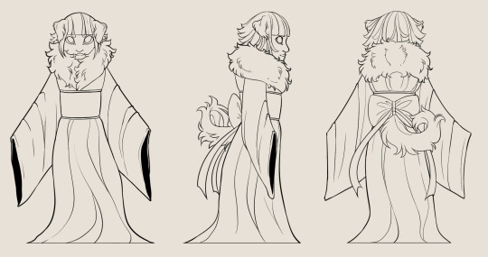
Next, I needed to add colour. To do this I first used the wand tool on the line layer and selected on the outside of the lines. This selected all of the outside and selecting “Invert selected area” it instead selected the inside of the lines. Creating another layer and using the bucket tool I took a random colour and filled it in. With this I could make sure if any colour and bled over the lines and fix it.

Outcome:
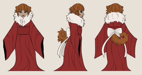
I kept to a very simple colour scheme for this character. I used reds for the kimono, only a very slightly darker shade for the obi. Red is a very fitting colour for both my dog and character and so I wished to keep it as is. I would have liked to add a design to it, perhaps some flowers but with the animation progress it would add an unnecessary amount of detail which would take too much time. For the bow and furred shoulders/neck I decided to go with white, following my own dog’s colours, contrasting it against the brown/ginger hair colour and tail colour.
2 notes
·
View notes
Text
Idea Generation
The first step for deciding what to do as a background and animation was researching others ideas and styles to try and find something to inspire me and help me along the way.

Creating a mind map I looked into other games and what type of game play they evolve around. For this animation we are to follow a mostly point and click mechanism, shown in games such as Machinarium and working up to more rendered and 3D games like Diablo. Similarly, although with less action, visual novels can also be included as a ‘point and click’ game. Sometimes, the two are combined such as in games like Dust: An Elysian Tale and in a more advanced manner; Life is Strange and The Wolf Among Us.
I have recently been watching stop motion animations along with playing a few story mode games and so decided to implement these into my character and their backstory. Whilst I haven’t played The Child of Light I'd like to include the style into my backgrounds but for the story I looked more at Ori and the Blind Forest along with Kubo and the Two Strings. Ori and the Blind Forest follows the story of a small creature who is lost in the forest but is destined to be a hero but during his journey is not quite sure what yet. Similarly, Kubo and the Two Strings follows the antagonist who later becomes a hero.
Plot summary
I want the plot to be a fairly straightforward one, as do most point and click games follow. Often times, especially the games I have been playing recently and those that I am taking inspiration from, start off with a goal in mind from the beginning and work towards that. There are no extra hidden side quests as one might find in an open world game and often includes puzzles instead. I want to implement this into my animation plot, starting off with my character and having them go on a journey for the object required in their story to unlock their hidden ability. To do so they will start the journey at their home, walking through the dark depths of the forest and land to find this item. They will travel for hours, perhaps days searching in different areas of the forest. In certain areas there will be clues within the background, such as certain areas being brighter than others or movement, even if it’s as small and simple as some butterflies flying in a certain spot.
Proposal of visual style
I looked into a range of different styles, ranging from the more complicated such as Diablo and Life is Strange to simpler ones like Child of Light and Ori and the Blind Forest. Whilst none of these take on simple, flat coloured shapes making it quick and easy to animate, they don’t focus too much on rendered detail and are 2D, focusing more on the point and click game play.

I decided to lean more towards The Child of Light style as although it’s not simple, it’s also not fully painted like Ori and the Blind Forest. It has a unique look which I feel I can recreate in my own way and will serve more purpose in the short amount of time I have to complete this assignment.


The backgrounds seem to be lined and coloured with a water colour effect. Light is used quite often and usually to signify something important, such as the character and her whereabouts along with items and enemies whereabouts, as though the game is guiding you to your destination by where the light touches.

Along with that the backgrounds behind the foreground are often a faded light and shapes -in the above example being the trees- signifying something more (or perhaps nothing at all) but without going into too much detail for something which is unimportant to the gameplay and story.
Main character’s back story
My character, whilst not quite destined to be a hero herself through her actions but instead from how she was born. She’s from a large and prestigious family who are all destined to do something great, but to unlock that ability they must first go on a journey and seek their ‘worth’. She has three older siblings, all male and so is the first and youngest female of her family. Her parents are old and rule a kingdom so have very little time for their children, meaning that they were all mostly brought up by servants and other forms of teachers and nannies. One of the teachers, an old man with a long beard and brows big enough to cover his eyes, teaches them all of the journey they all must take at the age of fifteen where they venture into the dark depths of the forest and find the ‘glowing stone’ which goes by the name of “Hitodama” – based off the Japanese folklore of the ball of fire that floats in the night, but instead looks more like a ball of light. When touched it unlocks the hidden power that is within the members of the Miyamoto family. It allows them to master a weapon and wield it without fault. The weapon can be something with a solid form or a connection they may have, such as with the ground or wind, being able to control an element if they so wish. The siblings’ father along with the eldest sibling both wield a katana, their mother holds a war fan, the second eldest brother uses shurikens and the final brother manipulates water. My main character’s ability is still unknown until she eventually ventures out on her journey on the same day as her birthday to find Hitodama.
1 note
·
View note
Text
Timed chalk and charcoal
Similar to the timed sketches we did in an earlier lesson but this time using A3 paper and chalk along with a live figure being a fellow classmate rather than a still object. We did three different drawings in three different times, starting with 50 minutes, 30 minutes and 10 minutes.
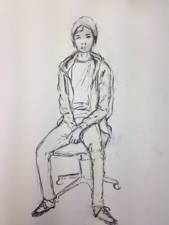
Although with 50 minutes we had such a long time to do it the pose was rather difficult, meaning I used up all the given time simply trying to work correctly with proportions. To help with my proportions, using the end of the tool I was using I’d measure a part of the body and follow that onto my paper, trying to keep it accurate.
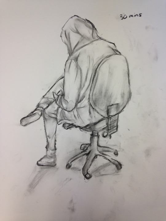
The next pose wasn’t as difficult even if I did have less time to work with it. I think this is because there were less details, being someone’s back and also wearing a hood so the shapes were much simpler. Again, I mostly focused on the outline though and the creases in the clothing as I wanted to make sure the shapes were clear.
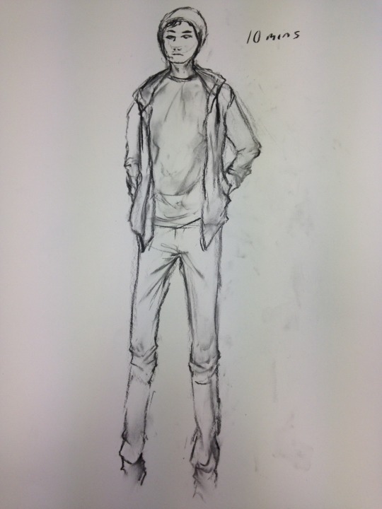
At 10 minutes we had to draw a standing pose, personally the most difficult to me in such a short amount of time but in another way with such little time it made things easier, having less time to think about the details and simply focusing on the shapes. My measurements were a little off and I couldn’t quite fit the whole body on the page but most of it instead. I focused on the outline and creases along with some of the shading around the face and shirt.
0 notes
Text
Chalk and Charcoal
Expanding further with drawing we tried out chalk and charcoal rather than a regular lead pencil or ink. Charcoal, although dark allows you to be able to remove it (like you would with an eraser on pencil) by simply rubbing it, allowing room for mistakes unlike if we were to use ink.
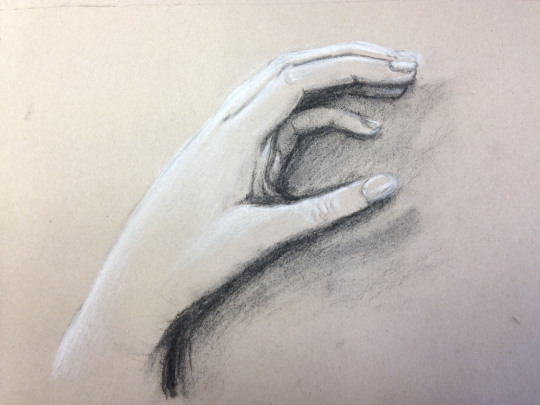
For these materials I used my own hand, placing it down besides my paper and kept it still. I started with a brief outline, mapping out the basic shape of my hand, starting with the outer outline and working in with the fingers and palm. I then moved onto the finer details such as the finger nails and crease marks. I made the darkest points my fingers which were almost completely hidden underneath along with the outline on the bottom side of my hand where it created a darker shadow. Opposite to this, using the charcoal I used it to create light, being the top side of my hand and the edges of my fingers on the right side due to the light coming from the top. Using these two colours side by side give the illusion of it being three dimensional.
0 notes
Text
Timed Drawings
Although skill and what you can produce with the given materials is an important thing within the art industry, another big and very important factor is learning how to use your time wisely. Deadlines are often given and you have no choice but to keep within that time frame, so as a practice exercise we were given still objects and a time frame to draw them.
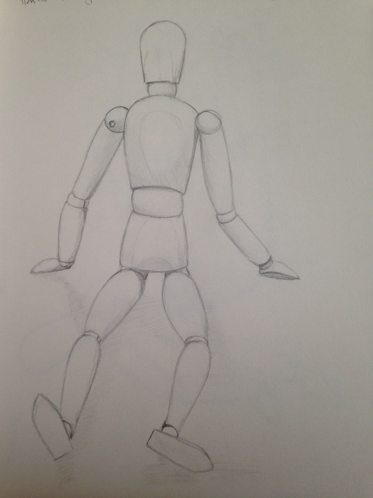
The first object I drew was a wooden manikin starting with 30 minutes. 30 minutes was more than enough time for a simple sketch such as this, starting with the basic shapes and then afterwards going in with a darker outline and shading.
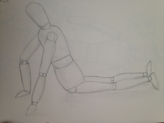
Using the same object but turned in a different direction we did the same but in 10 minutes. Again, I found this enough time as a wooden manikin is made up of fairly simple shapes as they are used to try and understand proportions and posing. It’s not as clean as the 30 minute version but I still had enough time to add some shading.
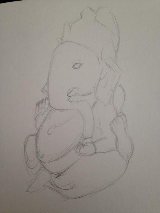
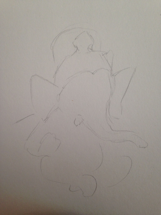
After two attempts we mixed things up a bit, changing the object we used, this time using a small ornament with very intricate details. Due to the lack of time I didn’t have enough time to work on the details so focused on the basic outline. We started at 5 minutes, 30 seconds and 10 seconds. 10 seconds was the most difficult, creating something which has no resemblance to the object. However, with some practice I do think I could have managed to do a simple sketch within 30 seconds.
0 notes
Text
Rotoscope
For this task, we started working on Rotoscope animations. To start with we went out in groups with a digital camera for film some footage of movement. We each did one movement each, consisting of walking, running and jumping. For this rotoscope I decided to go with the footage of the walking cycle.
To import this footage into Adobe Animate I went to Import > Import Video > Embed H.265 video in timeline > Browse > Next > deselect audio and finally “Finish”. This had imported my video to an Adobe Animate file so I could look at it frame by frame.
Creating a new layer and creating new cells I started at the first frame of the animation and using the brush tool began outlining the video footage one by one until I finally finished with the final animation.
Source footage:

Source footage and animated overlay:

Finished animated gif:

Overall, the actual process of the animation was easy as it simply consisted of drawing over the original animation frame by frame. However, it was incredibly time consuming, taking around 5-7 hours for a very short clip. I tried doing one part at a time such as the head or arms in hopes to make it quicker but it didn’t make much difference.
The main problems were seeing the original footage clearly. During movement it became slightly blurry and so I had to try and visual certain parts and draw them properly without following the blur. It wasn’t too difficult to deal with but did have some complications, especially when I’m trying to work quickly.
I am happy with my final gif. Rather than having it as one solid shape I decided to go with line art which I am glad I did even if it did take so long. I could definitely improve, doing so by making it much neater. Unfortunately to do so it’d take much longer and become too time consuming. Due to the blur on the original footage some parts (such as the shoes) are a bit out of shape at times so that could definitely be improved, either by using a better camera/setting to get as clear as possible footage or improving the way I drew them.
2 notes
·
View notes
Text
Basic walk cycle task
A walk cycle is a number of frames that after so many steps begin to loop and create a walk cycle.
On average a walk cycle can be anywhere around 24 frames but depending on the entire process can be longer or shorter.

Using the start of an animation provided by Liam of a stick man walking, using Adobe Animate I continued the process myself. I managed to follow the steps well however it does go a little fast but considering it’s my first time using the program I am happy that it came out okay.
1 note
·
View note
Text
Animation Research
Rotoscope
What is rotoscope? Rotoscoping is an animation technique used by tracing over film footage frame by frame.
How does it work? Rotoscoping is done by recording a video of someone walking, running, jumping- any type of action. It is then transferred and each frame is traced. Once completed it becomes the video but instead animated, done frame by frame.
What are the advantages/disadvantages? The advantages are that it makes the animating process simpler. Rather than thinking about what to do next you already have it there for you.
The disadvantages, like every other animation, is that it’s time-consuming. Depending how you do it it can also be expensive as it requires specific software and tools.
Famous rotoscope animations
Some of the most famous rotoscope animations are the very originals from Disney.
Their first and possibly most famous/well known is Snow White and the Seven Dwarfs (1937).

Another of Disney’s rotoscope films is Alice in Wonderland (1951).

A more recent film from 2006 featuring Keanu Reeves was finalised sing Rotoscoping. Originally being filmed and then taking longer to rotoscope the idea film to add the style.

Cel Animation
What is cel animation? A traditionally used form of animation for cartoons where each frame is drawn by hand.
How does it work? Firstly a team will plan out the animation by traditional sketch to lay down the rough idea, and then sketching out every in between frame as well to make sure the animation is smooth. The drawings are coloured on cells (or transparent sheets) and is photographic in sequence. It’s not only done on paper, but also digitally, using computer programs to help the process.
What are the advantages/disadvantages? The advantages are that it can be cheap to make as there is little to no technology used and relies on drawing equipment and cells.
In another way, the cost can also be a disadvantage as due to how long the process takes and an animated film could take up millions of cells, a large team is required for each step and process. The frames are drawn individually by hand and although given deadlines can often be delayed due to how long the process takes, each artist working at a different speed. It’s different to computer animation which can be done much quicker by using animation software.
Famous cell animations
Disney once again tops most, but this time with their film Pinocchio (1940).

However, Disney mostly used rotoscoping and later changes to more 3D animation. So in more recent years Japanese animation became much more popular, Studio Ghibli topping off most. One of the most rated is Spirited Away (2001). Using cell animation each frame was drawn frame by frame.

Another big one, also by Studio Ghibli is My Neighbour Totoro (2013). Most Studio Ghibli films are made in an animating program called Toonz, and somewhat recently has released a free version called OpenToonz for the animating community.

0 notes
Text
2 Point Perspective
Planning
For this task we had to create a street view using our imagination and 2 point perspective. It took me a number of sketches to eventually find one which I was happy with, originally going from futuristic style to 1700s back to modern day.
First attempt:


Final sketch:

To achieve 2 point perspective I originally start with two vanishing points on opposite sides. Going through the middle is the horizon and depending on which area I draw at what height it can be a birds eye view, worms eye view or street level.

Rendering Process
I did this process on Photoshop as it’s the program I’m most familiar with and most confident. To help along with the process I also used my Wacom drawing tablet as it’s much easier to use than a mouse.
Step 1: Lines
Using the shortcut (Shift + Ctrl + Alt + 2) to separate the original lines from the background along with the brush tool and line tool on a small size and the colour set to black I created the lines for my perspective street drawing. To make it seem less harsh I added a beige-ish colour as the background.

Step 2: Colour

A simple process but due to the unevenness of some of the lines colour picking in the lines became difficult. Using the magic wand tool on the line layer I selected each part that I wanted to colour, added a new layer underneath and coloured using either the bucket tool or brush tool.

I tried to go for mostly natural, old themed town where you’d have the dull coloured buildings with lighter colours besides them along with the white window frames. The wand tool didn’t quite select the lines properly as there must have been some gaps and so the colour would go through to another shape, meaning I had to go back and either erase it or colour it with the brush tool. This added a bit extra time to the colouring process.

Step 3: Shading
Shading is more or less a process of adding darker layers and slowly building up. This is exactly what I did, more visible on the tall, thin building in between the large and smaller yellow one. Having a layer on top of the colour set to “multiply” I used a soft brush in Photoshop with the colour only slightly darker than the original base colour. I wanted the light source to be in the top right corner and so added shading more to the bottom left of all the buildings.

Again, repeating what I did before by adding a “multiply” layer on top of the previous layer it darkened the areas further, adding more depth.

The full shading looks like the image below, the darker areas being to the left side of all the buildings and down the smaller road which goes in between the red and large brown building. Along with the shading I added a blue background and using a custom brush adding some cloud like shapes in a lighter blue.

Step 4: Extra shading and details
I didn’t want to leave it just like that as it looked a bit bland to me, the only depth coming from the multiply layers on the buildings. So adding another multiply layer with a bit of a blue colour to it but this time on top of all the other layers (colour, shading, lines) and using the gradient tool along with a large sized soft brush to add a darker area to the left side of the image. Doing the same thing again but this time with a lighter shade of blue on an overlay layer I added it to the top right side of the image as a light source.

To add some texture I decided to look for a watercolour image. Going to freepik.com I found one by @ kjpargeter. Saving and downloading the image, I put it into my photoshop document and resized it to a little bit bigger than the image size and adjusted so that the darker colour of the image was on the left side and the lighter on the right side. Setting the watercolour effect image to “overlay” and turning the opacity down to 30% I finally completed my two point perspective.
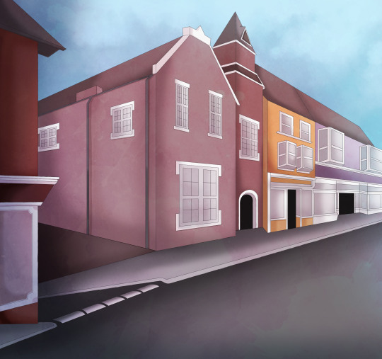
I personally think the outcome turned out okay but do think it could’ve been much better. I was having trouble trying to sketch something I liked and wanted to continue with so did a number of sketches. Unfortunately it was only after I took inspiration from where I used to live in Wales that I decided to settle with it to stop any further frustration or getting behind on work. The perspective is a little off as the buildings are quite old and are an odd shape, newer buildings having been built next to old buildings but unfortunately I don’t think I captured it how I wanted it to be. Overall though, I do like the outcome. The shading turned out better than expected after a number of attempts and the watercolour texture seems to add much more depth and make it something different, rather than a flat image with simple shading.
2 notes
·
View notes
Text
One Point Perspective
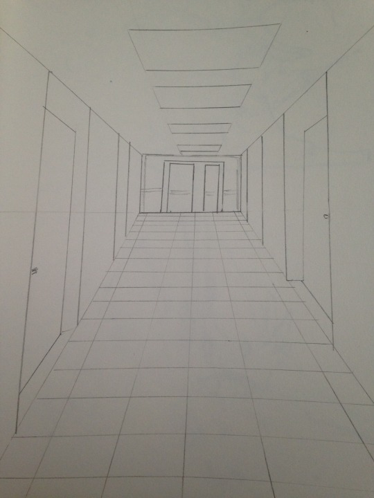
One point perspective only has one vanishing point, whereas two point has two. Often times one point perspective is used to draw interiors.
Finding an area with a one point perspective I sketched out the image using a pencil and ruler. I decided to go with a simple corridor, a door at the end with numerous hallways and some doors along the sides. The extra detail lies in the overhead lights and tile flooring. I find one point perspective to be quite tricky, much more so to two point perspective. Often times, or depending on what you’re capturing, one point perspective areas are often times symmetrical in a way which can be difficult to recapture properly unless you are taking measurements.
0 notes
Text
Turn Around Sheet
Initial Sketches
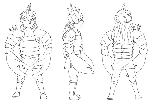
For this task we had to create a turn around sheet based on two different words to make a character. The turn around sheet needed to include a front and back view as well as a side view, and an optional 3/4 side view. To start I sketched out a number of different ways to make my character, from various body parts to figuring out an outfit.
I was given “Viking woman” and “Seashells/shellfish”.
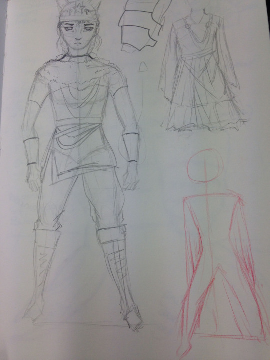
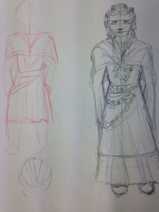
I first started trying to figure out what sort of viking woman exactly; armoured or dressed nicely? I did several sketches trying to see what looked better, but later went for armoured due to inspiration looking at various seashells and shellfish.
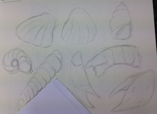
Looking through different seashells and shellfish I tried to interpret different armour pieces as that shell and/or shellfish part.
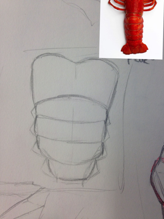
For the chest plate I used the tail of a lobster which I later used the same colour for too.
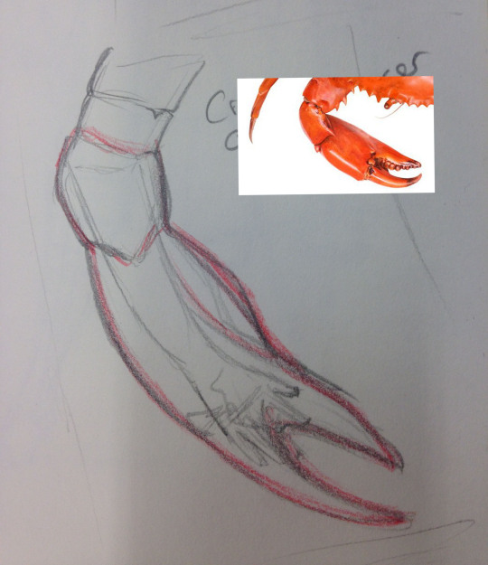
For the arms I used a crabs pincers. Not only is it hard but can be provided as a weapon too, which during the vikings was something very common.
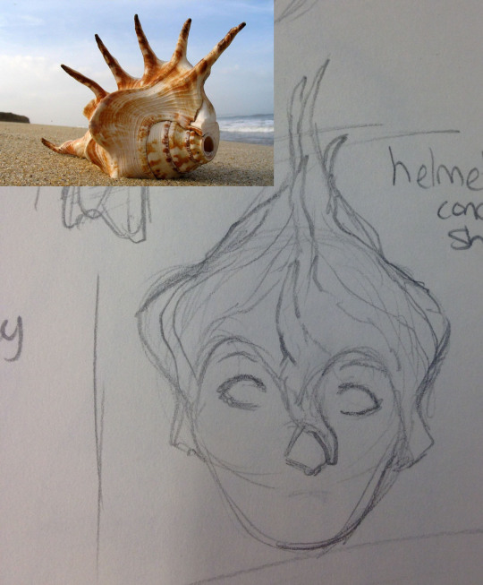
Although helmets aren’t very traditional, I still decided to include it on my character. For the helmet I used a Queen Conch Shell which takes on the same shape as the picture from the side view whilst from the front is quite straight and round/bumpy.
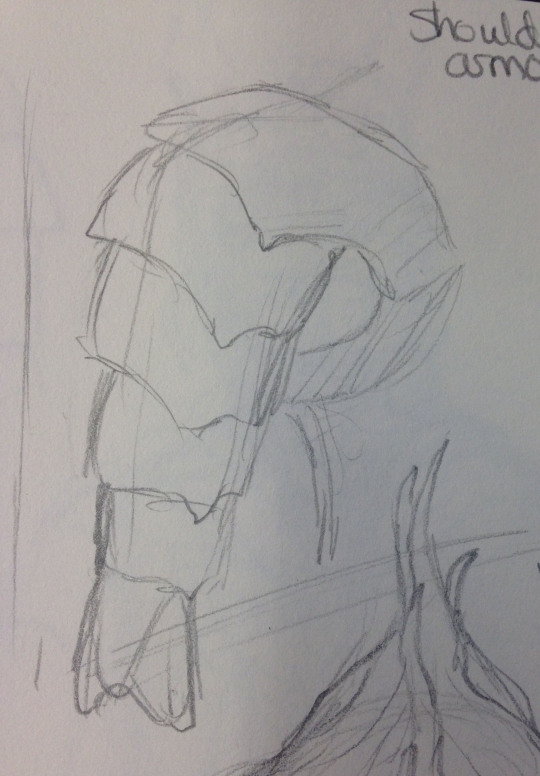
Again for the shoulder armour I used a lobster tail but used more of the bottom part of the tail rather than the middle/top like I did for the chest plate.
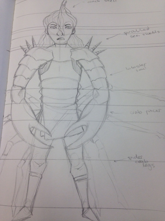
Putting all of these elements together I came up with this design. Most of the outfit consists of armour made out of shellfish whilst the helmet is a seashell. This mostly covers the top half of the body whilst the bottom half of the body is mostly regular (but hopefully more traditional) clothing, with simple trousers, fabric to go around the waste and boots. Although this sketch does include spider crab legs attached to the characters back, I later decided to remove them as they made the overall picture too large. As an added decoration I added some shells on the shoulders, another form of protection.
The task was quite difficult at the beginning as I had trouble thinking of what to do exactly, but with a little bit of help and further searches I came up with the shellfish armour. I was pretty happy with this idea too as the colours are very bright and I wanted to include that, so it worked out well.
I think I integrated the visual references well into my character. It clearly shows what I was going for and how I went about it, and they look very similar to the visual references, so I think overall my sketch was successful.
To improve I’d definitely like to spend more time picking a style that I could work with more freely. I wasn’t happy with the anatomy and now after completing regret not having changed it when I had the chance at the beginning.
A3 turn-around-sheet
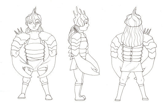
For the next step I used an A3 sheet of paper to sketch and outline my character. The front view was mostly an exact copy of the sketch from my sketchbook, however I had to make it much smaller, mostly by visualising the guidelines which I included on the A3 sheet and my sketchbook. The side view was a little trickier as I had to try and keep the armour looking the same but from a different angle. You will notice that I also added extra back spikes and the shells on the shoulder only appear on one side. These were just extra details which I added to make my character a little bit more unique. From the side you can also see how I followed the idea of the conch shell as the helmet. The back view was fairly easy to do as it was mostly the same outer outline as the front view, but some things are not visible and I had to add extra like the back spikes. To try and keep them all level I had to follow the guidelines I drew quite closely, making sure the highest point of the helmet touched the top line and the bottom of the feet touched the bottom line, as well as other points going down the body which had specific lines added in.
This part was quite difficult as I had to make sure that it still all looked the same and the same character but from different angles. Trying to capture the crab pincers from the side was the most difficult part along with the lobster chest plate and arms as they follow a specific shape from one angle, but not the other.
I believe that I did manage to complete the sketching and lining process successfully. I included what I wanted and even added more to make it more unique.
To improve I could put my character in a specific position, like an action pose rather than a straightforward standing stance. It would be much trickier to do each angle, especially whilst keeping to the guidelines, but I do believe it would make the overall drawing look much more interesting.
Render Process
The first step to rending was to separate the scanned sheet from the background. To do this I pressed Shift + Ctrl + Alt + 2. This selected all the white areas so that I could then inverse the selection and only have the outline left which was then placed at the top and any other layers were placed underneath. There are a number of ways how I could’ve coloured but as I had a drawing tablet (Wacom), the simplest option was to simply use the brush tool and colour inside the lines. I could have used the magic wand tool method, where I select the lined areas which I want to fill in and go to Layer > New Fill Layer > Solid Colour, but because of the scanned lines they weren’t very neat and created a lot of mess on the fill layer, but I had to make sure I made a new layer for each colour I added.
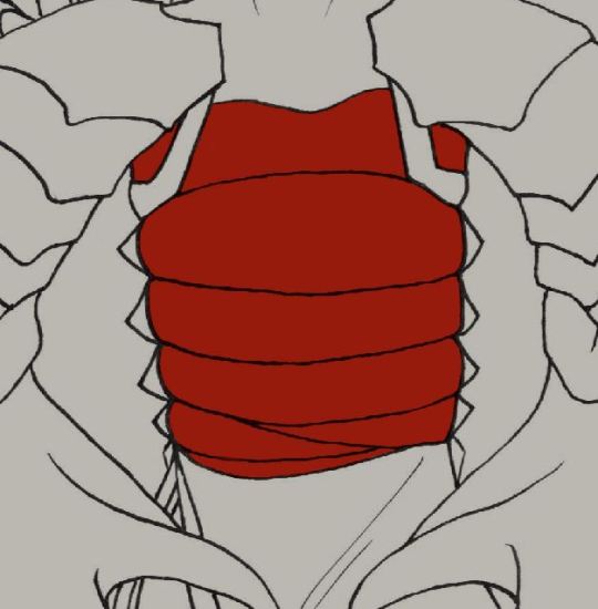
Base colour
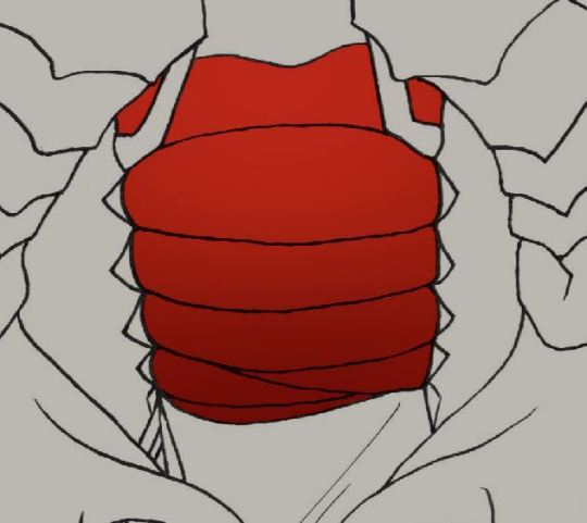
A dark gradient going up and a light gradient going down.
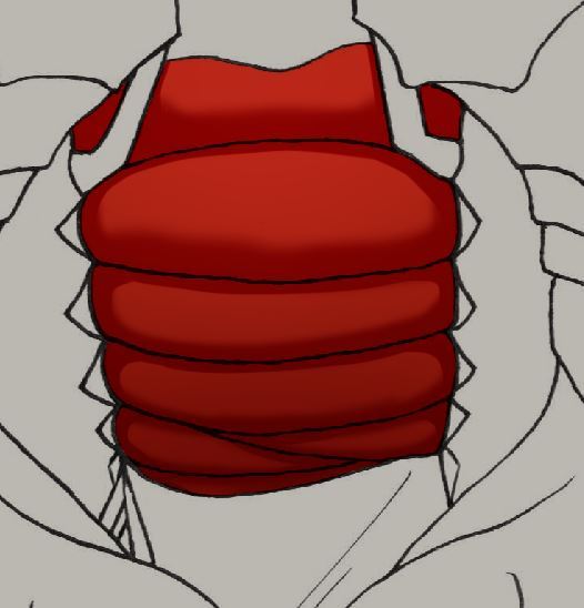
A new layer on top set to “multiply” where I did some cell shading and soft shading, keeping the sides solid but the middle parts softer.
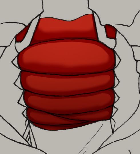
Another multiply layer to further deepen the colour
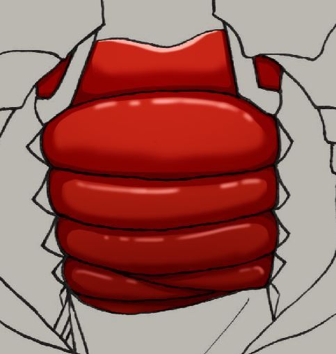
A new layer set to “luminosity” to add an extra highlighted effect
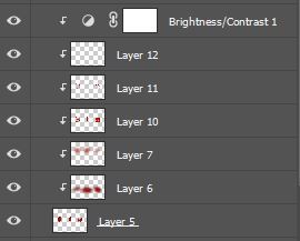
I created a new layer for each change to the base colour, and finally added a brightness/contrast edit to brighten the whole area up a bit as I wanted to keep the vibrant red of a lobster tail.
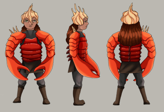
My final and finished design. Each piece of clothing/armour was shaded separately to make sure I got what I wanted, trying to add a specific shadow and lighting point and mixing between cell and soft shading due to the hard surfaces.
I found this quite easy as it’s something I do often in my own time but mostly use other programs, so trying to get what I wanted on Photoshop was a bit difficult but I think I eventually got what I wanted.
The overall look is successful as I successfully managed to use the different types of seashells and shellfish that I wanted and also include their mostly bright colours.
To improve I’d definitely try and do a much better and anatomically correct sketch to use, but as I was more focused on using my given prompts and implementing in the design and how I wanted them to look, it may have looked odd on a realistic figure.
To improve the outcome I could have done all of the lineart in Photoshop as it’d make the lines much cleaner and neat and easier for me to colour them by selecting the areas, unlike how I had to use the brush tool and colour it in just by that.
1 note
·
View note
Text
Illustrator
Pre-made body

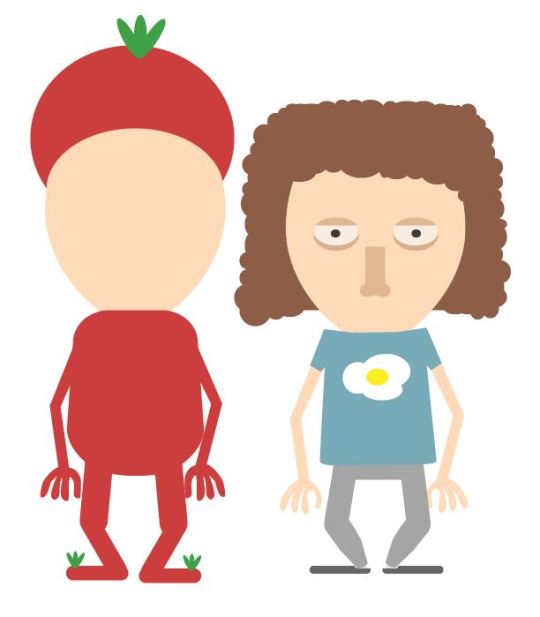
1st attempt 1-1
For this task we had to design outfits for 1-1 characters. The different body proportions are measured with the heads. An average human would consist of 7 1/2 heads whilst a chibi, as shown, where the head is the same size as the body would be 1-1. 1-1 body proportions can often be found in games and animations due to their simplicity. It makes it easier and is also a very popular style, being seen for keyrings and on notebook covers, etc. as each style can be unique. As a reference i used my own sketches from my notebook, mostly focusing on the head sketches which I had done and coming up with outfits during the process.
0 notes
Text
Body Proportions
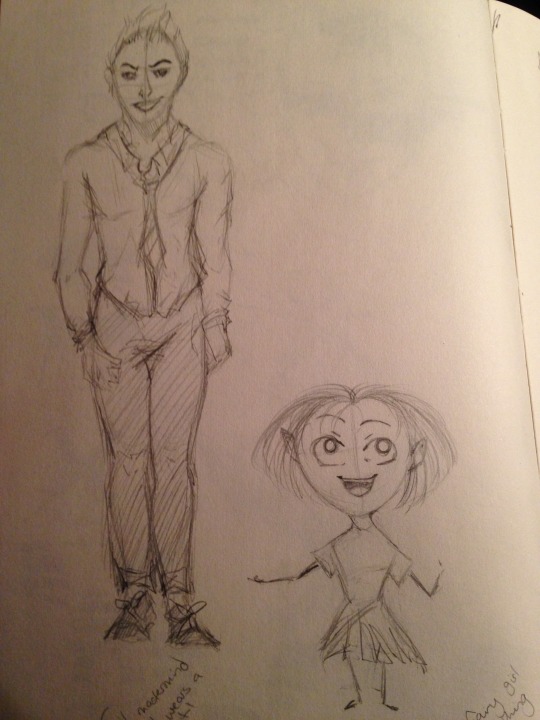
Following on from the cute and evil head characters I went onto drawing bodies for them.
The first is using the 7 1/2 heads for the evil character, making him an evil mastermind in a suit. For the cute character I used the 1-1 heads, where the body is the same size as the head. It’s simple and I took inspiration from the examples in the powerpoint presentation.
I can definitely improve on both and my human anatomy, to further increase the accuracy and make it more interesting.
0 notes