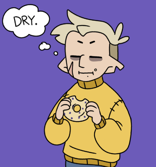
#i wanted to try cleaning up the sketch a bit instead of doing linework on a new layer. needless to say i am never doing that again
Explore tagged Tumblr posts
Text

Day 82
Another one that I love!~ Gonna be a lot of those from here on if you couldn’t tell!
Junko’s the Ultimate Fashionista (in the english release at least but hey Ultimate Gyaru has to have a little crossover right??), so of course she handles Mikan’s wardrobe the moment she’s allowed to. So . . . Extremely cute scene of her having Mikan try out clothes to see what she does and doesn’t like.
An opportunity for Junko to pamper Mikan, AND i get to draw Mikan in a sweater???? Heaven. Also like are we all in agreement that sweaters just look fuckin amazing on Mikan?? Like I admit, I think I just like drawing Sweaters on Mikan but they just make her look so much cuter because of how god damn cozy she looks in em.
Unfortunately that’s all I have to talk about for that topic? I think? So instead let’s shift over to a recent development involving Junkan!
I’m in the midst of working on the Junkan Christmas Eve comic, which hopefully will be getting posted on time a few days after this, and during the process of making there’s been something new with my current abilities.
I have officially hit the point of proper freehanding on these two.
Y’see this probably won’t make too much sense but i’ll do my best to explain.
So normally when it comes to sketches I’ve done things a bit less proper compared to more professional artists. I usually get a little start on the anatomy, and then just start sketching all the character details and moving out from there. It isn’t often that I do a full sketch for the basic anatomy of a character, I only do it when I really wanna not fuck up a pose. And as you also know up till now only one piece in this event was drawn normally. Everything else is a sketch that i cleaned up and colored, or just a sketch.
This is because generally speaking I can’t do art using my normal pen tool without a sketch to work off of, it requires a lot more finesse to use the G-Pen both because of the larger shifts that can occur in line width, and the slightly looser feel it has compared to my Pencil Tool.
That’s all to say that I have drawn Junko and Mikan so many fucking times that I can just, draw them without proper sketches now. I’m at a point where I just need to draw the head, torso, and legs for an anatomy sketch, and then with the G-Pen I can just, draw from there. That’s big for me personally, and also fucked up because god how even??? There hasn’t been a drop in quality either so far, i’m still able to refine the expressions and i haven’t fucked up with the arms too much yet, I’d even say it’s resulted in some of my favorite Junkos and Mikans period.
Now, the catch is that again, this is only Junko and Mikan. I could prooooobably get to this point with Mukuro eventually just because her design is much simpler compared to other DR Characters? I struggle with getting her colors right rather than linework, but that’s about it and still not really useful in my main line of work unless I memorize every character that’s ever existed, and it took like 150 fucking times for Junkan I can’t do that for an obscure RPG character that I might get commissioned once and then never again.
It’s also not something that I think i’ll apply to my normal Junkan works, because I am a perfectionist to a fault when it comes to pieces I care about and I want to make sure every detail these is exact. I need to be meticulous for ship art like this, every detail is important. And I can maximize that with sketching.
This new skill is basically useful for one thing. Speed.
I pride myself on my efficiency, even if I have waned over the years due to burnout and overwork, when I get into it I can fuckin move with my art. And so if I need to say, make a 28 page comic in under a month? Being able to mostly skip an entire phase of the art process is very, VERY useful, ESPECIALLY because it’s a comic. Something which generally takes more time than my normal art by nature of it’s format and what it involves. When making the Comic for Day 60 it was all sketches, which was equally fast but could leave small imperfections at the time that either went under my radar or I just let slide because i was trying to be efficient.
This is basically perfect for having to speedrun a Junkan comic, it’s all the speed with the usual amount of visual quality.
So in short . . . I’m turning into a nightmarish hell machine but specifically for drawing Junkan. I am genuinely curious how much farther I can go up from here, like, what the hell else could I be capable of with this???? Am I just gonna learn how to fuckin beam the art onto the canvas with my brain???
Moral of the story is just get mind numbingly obsessed with a ship and I guess you’ll get better at stuff??? I have no idea, i’m still kind of processing the comedic value of what this year has been because I was desperate for these two to make out.
As always, Reblogs, Comments, and Little Notes in the Tags are appreciated!~ They always make my day!~
#danganronpa#junkan#junko enoshima#mikan tsumiki#junko x mikan#tsumiki mikan#enoshima junko#enomiki#shipping#junkomikan
32 notes
·
View notes
Note
How do you color in your art?? I can never make mine look right, i’m still relatively new to procreate and I just wish I could instantly know how to use it because AGEGGS
I don't use Procreate and I'm not sure what you're personally having problems with, so I'll just go through my process using some of my old drawings and try to give some general advice that might help
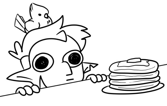
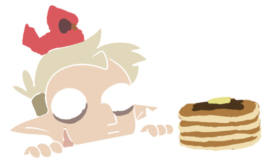
So I have the line work of "Hunter wants pancakes" here. I usually copy images from screenshots of the show and paste them onto the canvas so that I can eyedrop the colors, but I probably had it on a different canvas there.
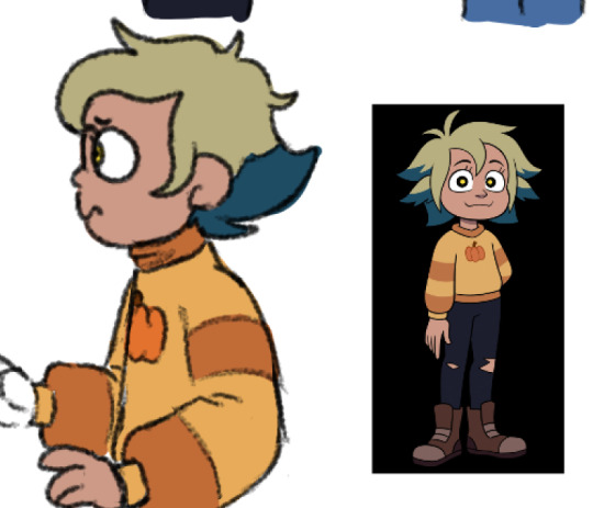
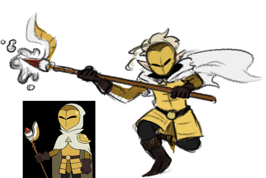
Sometimes I'll change the colors a little bit for clothes to make them a bit brighter or less saturated (depends on what I think looks better), but really for fan art of characters that already have a color scheme, I just copy the colors.
But your line work is going to be your topmost layer the majority of the time. All the coloring stuff should be underneath the line work so that if you do color into the lines, the linework isn't impeded
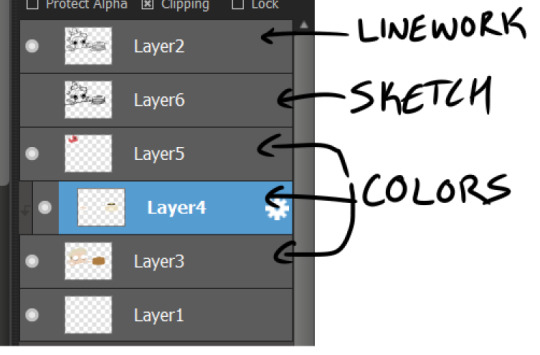
I typically put all my colors on the same layer, but feel free to use layers in whatever way is more convenient for you. (When I'm doing lineless, I'll typically make a new layer for each color so that I can shade them individually later on. Idk if that's at all smart or convenient but it's just a thought)
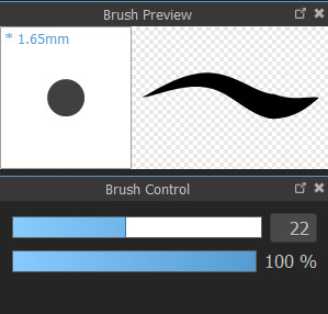
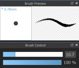
As for the actual act of coloring, I pick a large, textureless brush. You could use whatever you want depending on what kind of look you're going for, but for my finished pieces I usually like the coloring job to look cartoonishly clean. Like you can see that the second brush changes opacity as it reaches the end of the stroke (or with lighter pressure, since I use a pen), which I don't want, since I prefer the colors to be uniform in shade and texture. So I use the first one instead. Also less texture helps keep the color in the lines from my experience.
I don't use the paint bucket tool very often because it typically won't fill in all the white space, especially when your work is more detailed (which would lead you to have to go back and go over all of the edges again with a brush anyway), so I color most everything manually now. But for "Hunter wants pancakes" I think I did use a paint bucket and then probably went back to fill in some of the gaps since there are clean white gaps where the line work would be.
That is to say you should color with your line work visible (I don't know who wouldn't but I'm trying to cover all the bases here). You made yourself a coloring page, now you get to enjoy it. Without the lines it can look pretty silly and very messy, but it doesn't really matter if it's going to be covered up by your line work anyway.
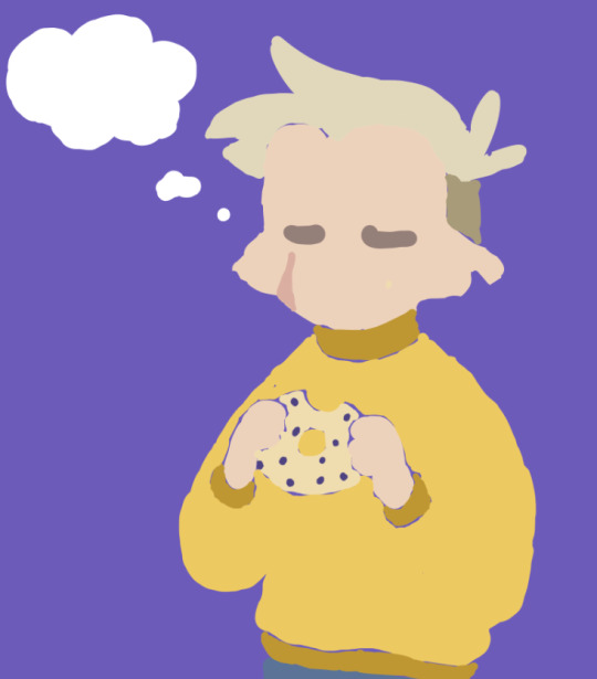
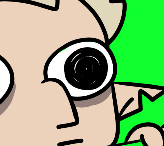
Sometimes when you're coloring with lighter shades on a light background, it's hard to tell if you're missing a spot. I like to use a really REALLY saturated color like neon green or red to see any gaps in the color. Put the layer of neon green under the color layer and it will become very obvious where you missed haha. Sometimes I'll look at the neon color for too long and will need to change it to refresh my eyes
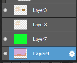
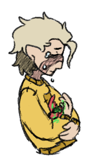
This colored sketch isn't very clean but it shows that you can also make a clipping or masking layer (if you don't know what that is the Internet could honestly probably explain it better than I could), color over the whole thing with a different color, and lower the opacity to give it a cool-looking tint
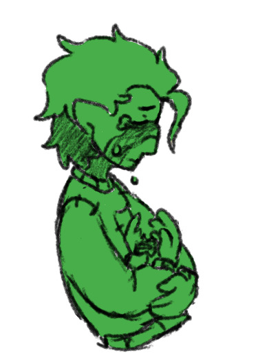
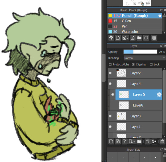
I don't know what your specific issue was but hopefully I was able to clear at least something up for you
19 notes
·
View notes
Text

not-yet-dead-person
silly comic of a conversation in-game i thought was too funny not to make something proper for instead of a doodle ww
(timelapse + wip images (thus silly process commentary in read more if you like artist commentary :3)

i think the sketch looks silly and goofy and funny so i find it important to share with you the mere presence of the faces i drew on it. i drew it on top of the boxes without staying inside its borders because i find my proportions can get wonky if i draw them cropped in a restricted space. and I feel trapped otherwise and i will draw BAD!!! give me spaceeeee to go wild!!!!
the head circles are there for emotional support
very low res speedpaint because truth is the canvas was much bigger than the space where my comic was placed. i didnt account when exporting my timelapse in 720px that that tiny space would look so pixelated ... but it's able to be percieved, so its okay.
(i will now comment on my process and it is not brief sorry)
usually i would try to clean up my sketches and figure out what goes on top before jumping into linework, but since there are multiple panels and drawings i chose to jump into inking right away for the sake of brevity. i just went in with a brush that uses pen pressure and drew what was needed. i added extra line thickness and contrast in areas around the face because it helps direct your eyes there more easily that way.
according to her equipment rei has a chain belt but i only remembered it existed once I was going to color, and i did not like that discovery... I chose to ignore it to maintain my peace. i already have the color palettes for these characters figured out, and i didnt really want to think about a new element at the moment www I tend to overthink those things a lot so i skipped it

the rest is rather straightforward! not that anything else wasn't, but in here i could turn my brain off and sing. linework and sketching require mumbling so i cannot turn my brain off. just block in the characters with a solid color so i can have a mask (something along those lines,) where the color can stay inside. then just color in !!!

Base colors just had slight cell shading on the skin, and for the hair i airbrush a bit of the skincolor in low opacity near the forehead... I'm not sure what it means, but i can look at the faces easier with it somehow. i like the gentle subtlety it adds even if you cant really tell. it makes things look nice.
background was just me blocking in the color of the wall and floor, shade the wall a bit, then slap a noise and free use wood texture on top. work smarter not harder ! yet it took a bit to make it look stylistically fitting with the characters, and even now i think bottom middle panel looks odd. whatever!!!
for the middle panel i thought itd be funny if the background was a solid silly and colorful one to contrast the next panel's sketchy black one. a contrast to how the word widow is seen. on that note my handwritting is not pointy. i gaslighted my hand into thinking that it was indeed pointy in that moment so i could write "not-yet dead person" in letters that didn't seem cute. my hand did not fall for it but it complied anyway
that's basically it! I'm not sure what else i could say that doesn't feel barebones because it really is that straightforward. if you're curious I used clip studio paint for this. only special brush used was for linework (a brush named Lemon Brush), the rest used were just the default. my computer gets the least credit. it was trying to convince me a 20mb file was going to nuke it all the time and hardly let me save multiple times so i do not appreciate it
#re:kinder#fanart#sayaka re:kinder#rei re:kinder#OH I ALREADY RAMBLED IN MY POST WHATEVER SHOULD I TALK ABOUT NOW IN MY TAGS UEEEEEEE😭😭😭#oh yeah do you want to know a fun fact about this drawing#i started it yesterday. i wasnt meant to I DID NOT HAVE PERMISSION...FROM MYSELF... i was meant to be on break#i self imposed a one week break from doing any rekinder related project after the transcript to avoid accidental burn out#NOT THAT I GOT TIRED OF IT AFTER THAT TRANSCRIPT NOT AT ALL#but jumping straight into more hours of creativr work after over 30 hours of it is asking for disaster. it is asking for burn out#yesterday was the last day . 12 hours were left but i was going to die if i didnt draw anything it would have been OVER#(aka my period started recently so i got very gloomy and depressed so i needed to run to my favorite stress relief...drawing rekinder☺️)#(on that note seriously what the fuck please explain the evolutionary advantage to getting horribly depressed every month)#(like hello?!?! rant real quick— i get enough flashbacks everyday i DONT need them to last longer and have me more msierable ?!?!?)#(periods are so dangerous to my mental health for no reason can i get a restriction order on them or some shit what the fuck)#(anyway thats enough of that break of character DONEEEE :3333)#SO YEAH I DIDNT EVEN LAST 7 WHOLE DAYS i even played a new game in between those 6 days youd think itd het my mind of rekinder. WRONNNNGGG#not even another devastating rpg horror gamr could divert my attention for long i hsd to draw rekinder😊#using the newfound power of mt transcript i was decided on drawing rei because i dont draw her enough for how high she is on my fvaorites#i was initially doodling random lines but then i stumbled upon this interactkon and it doesnt really fit into my usual expression sheets#so i thought hey lets do it asife#i thumbnailrd it and from there i was like hey lets do it in comic format isntead of separated messy doodles in tint canvas#and the rest is hisotry .... aka i spent the last two days doing this instead of doing MY HOMEWORK!!!!!#on my defense when i wasnt drawing i was horribly depressed i had no other choice#(seriously fuck off periods WHAT what do you mean i need to be distracted 24/7 to not be struck by crippling meltdowns LEAVE ME ALONE?!?!?)#(they should be banned we as a society should find like a . cure to them it dont do me good to have a whole week where i cant function)#these tags have been more of a weird rant im sorry IVE BEEN FEELING PEEEVEDDD LATELY SO YOU GET. STRANGE DROTTER LORE ????
22 notes
·
View notes
Note
Hi there! This is random, but I really really love the way you do line art! I love how simple, clean, and direct it feels. It has great energy and feels really appealing! I’m trying to improve my own line art right now… I feel like it takes me a long time to choose the “right” lines and end up with clean finish. What to you think has helped you get up to this point with your line art the most? Do you have any suggestions of ways to study and practice? Any favorite artists you look up to for their lines?
I love your work ❤️ thank you
Hello! Thank you for the kind words. I enjoy doing linework a lot, so this is nice to hear :)
These days my line art is more of a "clean drawing" rather than what one usually imagines under traditional line art, which would be opaque lines with varying weight. Right now I like to use a brush that doesn't vary size with pen pressure but varies opacity only. It gives the lines a very soft feeling that I've grown to love.
I browsed through your art, and I was a bit blown away actually, because I think you have a fantastic energy and expression in your drawings, which is something I aspire to have myself. You are very knowledgable about line weight and shapes, so I won't bore you with explaining any of that, haha.
I think good line art comes down to confidence. Obviously, an artist needs a confident hand to avoid shaky lines, to lead them exactly the way they want to, to give them an energy. This sort of mechanical skill is acquired through experience.
But! I've always felt there is a sort of a mental side to this as well, which is best observed during traditional inking. You have to commit to your lines, you have to trust them. You have to sit back and give control to your hand, because with the experience it has, it also has a mind of its own. This sounds pretty out there, but it's about letting go and not overthinking it. I realized this when I looked up to Jim Lee's work as an older teen. There's a lot of videos on YT where you can see his process, which looks utterly effortless. Take this one for example. It's quick, so it's a bit rough, but it does look like his hand is just doing whatever!
I fostered that approach in my art while doing daily drawing from life - straight to inks without sketching. The drawings look wonky a lot of the time, but it gave me confidence where it mattered later. To this day, when I do clean lines in digital too, I adopt this mindset of letting go, which gives the lines more leeway, which also means that if the line doesn't go exactly where it should according to the sketch, I can still trust it. (Although contrary to this, I still put a lot of controlled effort into faces, and this approach comes more easily while drawing bodies and clothes.)
As for suggestions for practice, as I've already mentioned, drawing from life straight to inks (I recommend this over going straight to inks from imagination as that's extremely difficult, at least for me). Have a fast hand, and do long lines even if they come out wobbly. Try to let your hand roleplay Jim Lee here and there - let it do that flick that crosses a line it shouldn't have, let it make a turn with an accidental squiggle, let it pool a bit of ink at the end of the line. Fake it till you make it. At first, I suggest trying this on subjects that aren't your expertise (eg. in my case, draw a bottle instead of a person), so you don't subconsciously compare this to your best work, but make sure you're still having fun :)
Of course, it helps to like doing line art too. I don't know what your relationship to it is, but if it suffers, I suggest busting out the traditional inks with dipping pens, wodden skewers and brushes. It connects me with the process like nothing else.
As for my favorites, I can recommend one of my favorite manga artists - Satoru Noda. Superbly confident and energetic linework. Check out his series Golden Kamuy or Dogsred :)
I hope this will give you a small idea of how I approach my line art. It might be a mess… If you have any more questions as a result of this, or related to anything else, don't hesitate to ask!
20 notes
·
View notes
Text
Rusalka Cover Art Process
Now that my little cover has been released to the world, I wanted to share the process with y'all!
It'll be under the cut here, because I'm not looking to do a "Do you like the color of the sky?" on y'all haha
First part of the process was finding inspo and making some sketches. I knew from the start 1) I wanted this to feel like an old school romance book cover {monster fucker edition} and 2) that I wanted to have Art Nouveau incorporated! I love the dreamy swirly quality of that style of art.
So I had the first 3 idea drafts here:
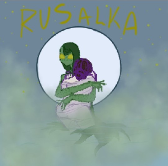
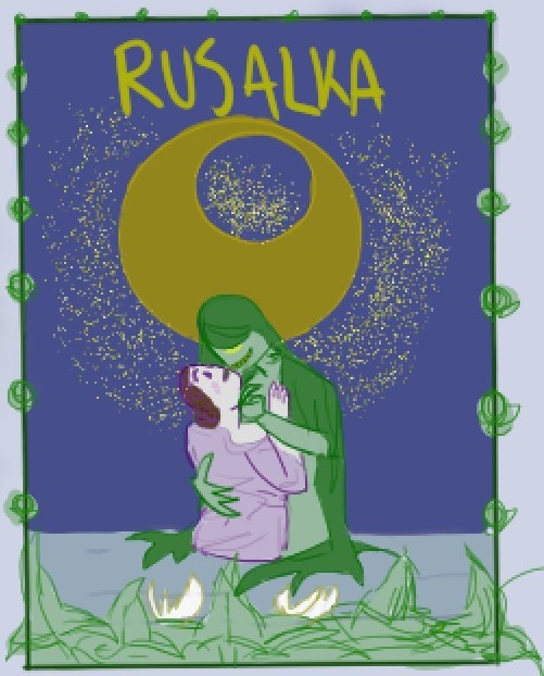
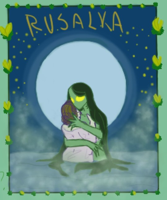
I wanted to evoke a dreamy and mysterious atmosphere. So I made a gamble and decided to have fog in the art (this will come back to haunt me later...)
After some feedback and some thinking, I picked from the things that worked from those drafts to make one for what would be the base for the actual cover:
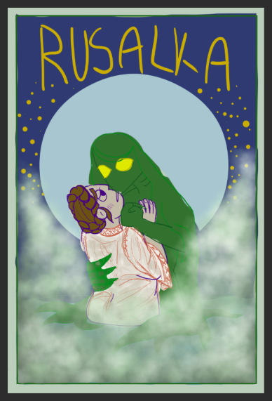
(wow get a load of that funky green blob)
Then I cleaned up the linework for that!
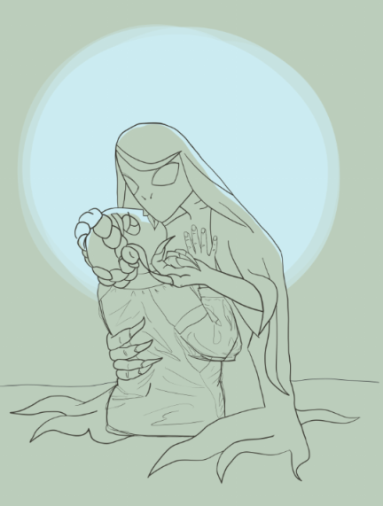
Now this is where that fog comes back to haunt me. I was playing around with possible borders, but found they were a bit distracting. Instead I tried out putting a border around the moon and ADORED it. The thing is.... that fog was not fitting the vibes and was hiding way too much

So I spent many hours looking at Art Nouveau pictures and decided I'd give a go at trying ~stylized~ fog instead
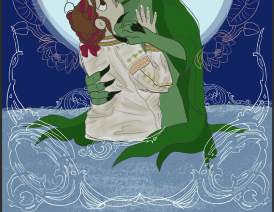
Loved that, but was starting to not vibe with the U of the moon and the pink of the flower border... {RIP pink flowers}
From there it was cleanup land, but something still felt very missing
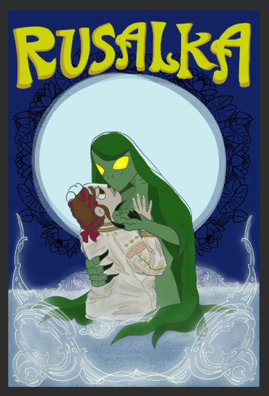
AND THAT'S WHERE I HAD THE IDEA TO TEST OUT STARS IN THE FLOWER BORDER AND I WAS DELIGHTED!
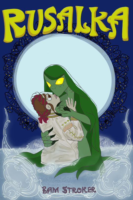
Honestly I'm really proud of how it turned out, and I learned a lot from the process. I think the covers I make in the future will be much quicker because of what I learned with this one.
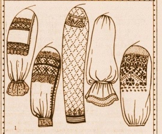
Also here are some inspo pics of historical embroidery/clothes that I pulled from for Sasha's outfit:

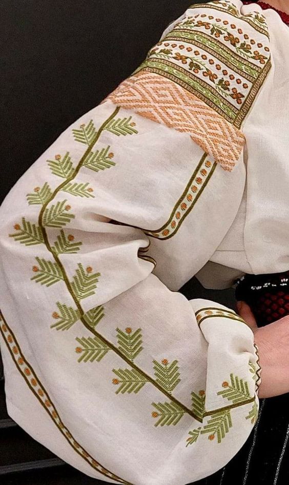
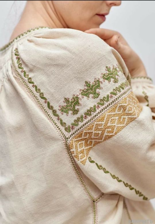
5 notes
·
View notes
Text
tagged by @excadrill :)
since my toku account was named specifically, i'll do toku-related items
RULES: Reveal the titles of the documents in your WIP folder and tag as many people as there are documents. Let others ask questions about the ones that interest them and post snippets or explain the contents as you see fit!
because i don't tend to label files outside of work, i'll be giving numbered descriptions instead
a sketch of a pair of oc riders. shoulders are always a difficult point for me, and the added trouble of trying to think of how to work with pauldrons makes this difficult to approach. the designs (not mine) are very fun though!
neon with flowers. iirc, drawn around when episode 29 came out? ready for clean lines, but since i'm not following the show at the moment, it feels a little strange to try and pick up.
wolf orphenoch confrontation. something scribbled after the faiz anniversary movie trailer came out. i really like this character, and mister shinohara made such a nice design, so i definitely want to draw him nicely, but drawing that guy is really difficult!! 💔
skirt biker shiokara. i paused this when i stopped watching kingoh for a while; i'm picking up the linework a little at a time now! ^^
sorrowful grigio regina. sketched after rewatching r/b. she's a kaijuu who is portrayed with such pathos, so i want to try to express even a little bit of that feeling! kaijuu posing is difficult though.
white roses, painted whenever i listen to the shin kr soundtrack. i need to check again to confirm how many k offers in the film, but when i'm done, i want to draw a hongou to accompany them.
another sketch of a pair of toku ocs. the designs (also not mine) are also cute! i need to complete the initial sketch for the other half of the duo and then resolve various design details.
coffee and cake at bistrot jurer. the posing is giving me so much trouble that i'm probably just going to redraw the whole thing again at this point. the faces were fun to draw!
oc villainess monster design draft. since they tend to have some very flashy designs, i figured it could be a fun first try for a monster suit. as usual, suits are difficult 💭
tagging @screentunes @swanlings @bugtransport @gojurt @panicbones @number-one-toku-robot-lover @ankhlesbian @ankhisms @denooo only if you feel like it :)
#i tried to stick to people who follow me here but i hope no one got double tagged 💭#thanks for tagging me poppy ^^#ask games
7 notes
·
View notes
Text
patient
requested: yes
group: mamamoo
pairing: hwasa x fem!reader
genre: fluff
contents: tattoo artist!hwasa, flustered!reader [15/33]
warnings: none
synopsis: It’s hard for you to be patient about your next tattoo session when your artist is so damn gorgeous.
a/n: um??? I love tattoo aus???? also don’t come at me for the name, I’m not creative
word count: 1.9k
“Elegant Chaos.”
You test the name out on your tongue, staring up at the slightly grimy neon sign of the shop. The entire front is one-way glass, so all you can see is your own reflection and the ones of the people bustling around you.
Before you can make up a decision to open the door to the store or not, someone else does; a pretty brunette woman steps out and smiles at you, crazy beautiful with full lips and crescent-eyes. “Hi. Can I help you?”
“Uh, yeah.” You show her the printed-out address your friend sent you and step a bit closer. “Is this a tattoo shop? I searched the address up but nothing resulted, I was referred by a friend.”
She barely takes a glance at the address before flashing another bright grin. “Oh, yep! This is our tattoo shop, we opened a couple months ago. It’s weird that we’re still not showing up, but oh, well. Want to come in?”
You barely register her quick words but step into the shop after her, the smell of rubbing alcohol, paper, and perfume vaguely stinging your nose. “I’m Solar, the receptionist,” she introduces, walking behind what you presume to be her desk. Out front, some teenagers talk quietly, a tall, dark-haired boy with a sleeve sipping at a banana milk.
“Cool. Uh, I’m Y/N. I don’t have an appointment, is that okay?”
Solar nods, tapping at her phone. “Sure. Jungkook over there is just waiting for Byul to finish her other client, and Wheein is prepping to pierce the kids. Hwasa’s our best artist, anyway, does that sound good?”
Her question startles you from staring at the intricate sketches taped all over the walls, the same 3 signatures stamped everywhere. “What?”
She laughs, though it’s not rude. “We have one artist left, Hwasa, but since you’re referred, you probably don’t have someone in mind, right? You can go to see her now, she’s free.”
“Great. Do I just...?” At Solar’s nod, you walk past her and into the back. The studio’s quite small, to be honest; there are 4 stations, two of them occupied. One of them, who you guess is Byul, is tattooing an elderly man, her sleeves rolled up to reveal the art on her bicep.
The second, probably Wheein, is wiping down her tools, and she’s the first to notice you. “Hi!” she grins, turning the music blasting from the radio down with her ungloved hand. “Can I help you?”
“Yeah. Solar mentioned that I should come find Hwasa,” you explain, eyes widening at the complicated art being tattooed on the elderly man. “Are you...?”
“No, I’m Wheein.” Ah, so you were right. “This is Byul, she’s a bit preoccupied,” Wheein smiles, dimples poking into her cheeks. “I’ll get Hye- sorry, Hwasa for you.”
She hurries out to the back, and you can hear talking through the open door, before she comes back, the woman you presume to be Hwasa behind her.
Instantly, you’re starstruck; she’s stunning in a way that’s completely unique, long dark hair and tanned skin contrasting beautifully. The only makeup she wears is a bold red lipstick, her tank top showing the delicate tattoos she has. ���Hey, I’m Hwasa,” she greets, sticking her hand out. Her nails are long, too.
“Y/N.” You accept the handshake, trying not to stare. “Uh, Solar said you were free for a consultation?”
“Yeah.” She sits at one of the free stations, clearing the things scattered on the table. “So, what’re you looking for? Do you already have a design chosen or am I freehanding?”
You fumble in your bag for a piece of paper, sliding it over to Hwasa. “Um, this is just something my friend drew up for me. I want it pretty small, on my forearm.”
The dark-haired woman shrugs, unfolding the paper. “I could do that. Is this your first tattoo?”
Nodding, you watch as Hwasa taps her long, red-painted nails on the desk. “Okay. Is this part of a sleeve or by itself?”
“Uh, how long would each one take?” To be honest, you have no idea why you said that; you didn’t consider a sleeve at all, though you considered multiple tattoos or a large one. There’s just something about the other woman that makes it impossible for you to think.
She considers the question before answering, “Depends on the size and how many small ones you want to work in for the sleeve, but I’d recommend a separate session for each small square, so maybe 8 or 10. I’ll be done with this in less than 30 minutes, though, if it’s just the one.”
To be honest, the only thing causing you to consider a sleeve is getting to see Hwasa again, and you curse your own attraction to her when you blurt, “Maybe a sleeve? I have to think about the other ones I want to work in, though.”
“Okay. I can just do the one today, and we can schedule another day for you to come in and design the whole thing,” she offers, picking the sketch up. “I’ll go make this into a stencil, then.”
“Sure.”
When she takes the sketch and walks to the back room, you slump down in the chair and pivot to look at the others. You quickly realize how long you were talking with Hwasa; Byul is already working on the coconut-haired boy, and Wheein is already done with the teenagers.
She seems to be the outgoing type, and waves at you while sanitizing her needles and packing her kit up again. “So, how did it go? Are you going to start today?”
“I am, yep. You’re already done with the kids?”
Wheein nods, placing the studs back into their cases. “Yep. They just wanted more lobe piercings, it’s really easy. I’m a tattoo artist, too, but I think the kids like me more. Except for Jungkook over here, they think Byul’s intimidating.”
“I’m not!” the other woman protests, hands still steady as she works on the boy. Her voice is deeper than you’d expect. “You literally call me a hamster.”
Flapping a hand, Wheein flashes you her dimples again. “So, what do you think of Hwasa?”
“Huh?” you blink, brain basically short-circuiting. “Uh, she’s a good artist? I saw some of her sketches, yours too; you’re all really talented.”
“No, no, that’s not what I mean. Wait, you’re not straight, are you?” she narrows her eyes at you, scanning you from head to toe. “Maybe my sense is broken, I didn’t peg you for a...”
“I’m not. Straight. I’m a lesbian.” Your cheeks burn to say it aloud, though nobody really reacts, not even Jungkook. “Are you?”
Wheein shrugs, “I mean, I’m attracted to women. All 4 of us are- Hyejin, Byul, Yongsun. Solar, to you. And we make sure everyone who comes in is accepting, we won’t serve bigots.”
For whatever reason, you’re almost relieved to hear that Hwasa’s also attracted to women in some sense, even though it doesn’t necessarily mean that she’s attracted to you. “Oh. That’s cool.”
“Yeah. So, is it just one tattoo or a sleeve?” Her knowing smile puts you off a bit; how did she figure it out? “A lot of girls who come in here change their original idea because of Hyejin-ah. You’re obviously attracted to her, to, so it’s no surprise.”
“Is it really that obvious?” you groan, surprising yourself with how open you’re being about it. “Do you think she knows?”
“Probably,” Wheein giggles, nodding when Solar pokes her head in the studio to tell her something. “Anyway. I’ve got to go, good luck!”
She waves as she leaves, the only noise left in the studio being the quiet music and Jungkook’s quiet talking. He seems just as awkward as you are, lifting his free hand in a half wave.
You’re saved by Hwasa returning with a stencil. “Here. Does that look good?”
She’s modified the original design just the tiniest bit, making the lines a little bit darker and the shading simpler, and it looks... “Perfect.” You grin, a weight on your chest lifted by your conversation with Wheein. “Should we start?”
“Sure.” She brings you over to one of the actual tattoo stations, the seat already smelling sanitized. You can barely listen as she explains what the process will be like- cleaning, the actual tattooing, pain; you finally come to when she asks, “Are you ready?”
“I... yeah. I am.”
It’s quiet until the buzzing of the tattoo gun brings you to life, the tiniest bit of fear sour on your tongue. Hwasa looks concentrated as she peels the stencil off, not exactly reassuring, either. “So. Is there a meaning behind this?”
“Uh, not really. Are there meanings behind yours?” You gasp when the needle first touches your skin, the cold wipe taking off excess ink.
“I have some matching tattoos with Wheein,” Hwasa explains, smiling at the mention of the other girl. “Uh, one is Maria, my Christian name. Wheein has more, but all of us have some kind of meaning behind ours. It’s not bad to have no meaning, though.”
You wince as she continues with the linework, slowly getting used to the pain. “Are you and Wheein...”
She looks up, raising an eyebrow. “Together? No, we’re best friends. I haven’t been with someone in a few years.”
“What’s stopping you?”
Hwasa laughs, wiping your arm once again. “Nothing, I guess. I’m just patient enough to wait for the right person.”
“Patient. Right.”
Conversation flows smoothly, mostly light topics. You learn each other’s ages, and you’re told to call Hwasa ‘Hyejin’ instead. You learn when she got her first tattoo, and when she learned to tattoo others. The more you talk, the more drawn in you are, fascinated by her every word.
The half an hour is over far too fast. “Done,” she announces, smiling as she turns off her gun. “Take a look.”
It looks gorgeous, as expected, though Hwasa plays off your barrage of compliments. “Uh, should I pay now?”
She shrugs, placing saran wrap over your arm. “We’ll go talk with Solar about that, she’s better with pricing than I am. But it probably won’t be much.”
“What? Why?” you frown, examining the tattoo. Usually, discounts only happen when something goes wrong, or you have a coupon. You’re pretty sure neither of those things apply.
Hwasa pauses, turning to send you a small smirk. “Well, the cute ones usually pay less.”
Your heart practically stops, though you force yourself to walk to the front with her. “Besides, you’re probably coming back again soon, right?”
“Oh! Uh, yeah. I think so. When will that be? The next session, I mean.”
She frowns, tapping at the tablet Solar hands her. “You can come in as soon as you’re free to design it, if you want, but you have to wait a bit for the next session, especially if you’re doing the things close together. If you want, I can give you my number.”
At your stricken expression, Hwasa’s lips curve into a knowing smile. “So you can send me ideas, for the sleeve.”
“Ah, of course.” Your cheeks burn as you take out your cash, counting out a surprisingly small amount. “That sounds good. I guess I’ll just have to be patient, then.”
“I guess so. Call me, Y/N,” she smiles, handing your phone back with a new contact in.
Being patient is going to be so damn hard.
#mamamoo#mamamoo x reader#mamamoo imagines#mamamoo scenarios#mamamoo reactions#mamamoo hwasa#mamamoo hyejin#hyejin#hwasa#ahn hyejin#ahn hwasa#hwasa x reader#hwasa imagines#hwasa scenarios#girl group reactions#girl group scenarios#girl group imagines#mamamoo incorrect quotes#mamamoo icons#hwasa icons
115 notes
·
View notes
Note
Do you have any tips for getting into digital painting? I've only ever done cell-shaded art my whole life so when I try to do paintings without lineart I feel intimidated. I thought it'd be similar to charcoal drawings but it feels completely different
HMMMMM this is a good question that is very hard to answer imo
my digital process is very close to my traditional process-- i import techniques from oil painting and tend to work on a limited number of layers because of that. i work loose to tight, which means my initial painting is messy
BUT not everyone vibes with that technique, especially not if youre used to working in more precise ways like using lineart. ask yourself what it is about charcoal drawing you like, and how you can replicate that feeling digitally. is it the texture? can you try new brushes that might simulate charcoal? or is it about the process? try to find some configuration of brushes+technique that makes you excited to do it
there are two ways i go about doing lineless work--
1. incorporate linework into the painting. lighten the opacity of your sketch/lineart layer and merge it with your color layer, then start to blend out the lines. i explain how i do it in this tutorial
youtube
2. don't incorporate linework. weirdly enough this one might be preferable to people who are used to the precision of lineart. instead of merging the lineart layer with your colors, create blocks of color over your sketch and then hide the lineart. i do this one sometimes when i want it to look very clean but i find it takes me a bit longer. heres an example of me using the color blocking method
youtube
just keep trying different things until you find something fun! i paint the way i do because it's satisfying to me, but if you end up not finding digital painting enjoyable, there are a lot of other styles and ways to approach it. i hope this was even like, the tiniest bit helpful :')
280 notes
·
View notes
Photo
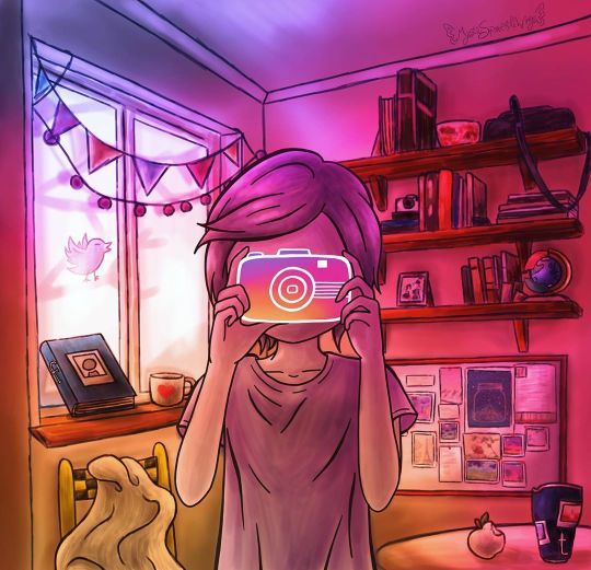
Behind the Screens
Oh, look, a reminder of why I don't do detailed backgrounds often! Okay, okay, this is actually an entry for projecteducate's All Mediums Contest: From Logos To Art. It sounded like a fun challenge, so I thought I'd take a stab at it. (Hopefully obviously) My primary logo choice/inspiration was the Instagram logo, largely because I had a strong visual idea for it in my mind right away. However, if you look closely there are logo inspirations hiding in there, too. Some of them I think are more obvious, while others are more subtle. In case you'd rather try to find them on your own, I'll list them in small text so you can skip to the next paragraph and not be spoiled. Moving left to right, top to bottom: Outside the window is the Twitter bird, tweeting away; Then we have a literal FaceBook propped up against the window, and next to it a "Ko-Fi" Coffee cup; below the window we have a chair, the SnapChair, based off the SnapChat logo/ghost, which I am particularly proud of. On the right side of the art, we have a globe with some plastic bits that's inspired by the Google Chrome logo; then a PinBoard as a reference to Pinterest; and side-by-side on the table we have an Apple-apple and a Tumblr-tumbler. Fun fact: Because of that apple I now know there are in fact real apple species that have white skin, the most common among them seeming to be the "white transparent" variety. You'll notice all the logos have something to do with the internet/computers/social media, and though I did think about sneaking in a couple of other logos like Dominos or the NBC Peacock (since those logos have good visuals), I ultimately decided it was better to stick to a more cohesive theme. This is also where the title came from, as the idea is this is the reality behind the screens of a perfectly poised Instagram photo. And therein lies the further theme/message you can take away from this; Notice how the figure is holding the camera so that we can't see their face at all, like a mask. And how the other logos have crept into the rest of the scene, in a way that a lot of them you probably wouldn't notice as internet icons if it wasn't pointed out to you. Both of these are realities for a lot of people. On the internet, we put on a facade like a mask. We control the narrative of what people see of us. And our online presence and habits sneak into our lives in ways we might not notice right away. Both things happen for better or worse, and they can and do happen to anyone, regardless of who you are. To that end, I consciously tried to make the person holding the camera little androgynous, so that it could be a boy or girl, but since this is me we're talking about I'm pretty sure it leans more notably on the feminine side. And it doesn't help that for the positioning of the hands I had to use reference photos of myself when I couldn't find quite what I was looking for online. Speaking of which; to make the art I started out with a traditional sketch of the figure and the background bits that were inspired by logos, except for the Pinboard and Kofi/coffee cup. And it's kinda funny because I wanted to base the camera design off of one of the newer instant Polaroid cameras (as that seemed the most fitting to transform into the Instagram Logo camera), and fortunately when I was taking the reference photos my phone is sized just so that I could use it as more or less a stand-in or base. This worked out even better because it meant I could just take the photos in front of a mirror instead of having to set a timer and hope I could pose correctly from a distance. I scanned the sketches in, and then came the trickier part: That background. Especially since a lot of the concept here relies pretty heavily on it. I used a lot of reference photos I found online for this. I did have a basic, rudimentary sketch of my own that I made without any references, but I knew to get the lighting and perspective right I was going to need some actual photos to go off of, and I don't personally have a room that looks like what I had in mind for this. Based on these photos, I did end up putting the shelves over the pinboard, as opposed to putting the pinboard higher on the wall, but other than that and some slight adjusts to the perspective, my general idea for the room stayed the same. And, given my tablet situation, I gave myself a bit of break and decided not to do perfectly clean, solid linework for anything other than the human figure and the camera they're holding. The camera kinda had to have clean lines for this to work, and I thought the figure would stand out from the background better if they were done with clean lines. (And I'm pretty sure I was right about that.) For once in my life, I mostly started in the back and moved my way forward. The walls and ceilings, then the window, then the shelves and the stuff on them, then the banners over the window. And my process reminded largely the same throughout: Loosely line the object, give it a base layer of color, then go back and shade/lighten as necessary. And I was using semi-realistic colors, though I knew they were going to get largely disguised later on when I did the all-over overlay to really drive the Instagram logo inspiration home. Naturally, all the stuff on the shelves was a largely more annoying undertaking than I'd anticipated, but it wasn't quite as bad as the multitude of books I had to do for World in a Book. It's not even that drawing in a bunch of objects like that is hard, necessarily, it just takes a while to get through if you want it to look right. Anyway. Once all of that was done, I took a break to work on the figure and camera, getting the lines done and then moving on once again. Then it was the other logo bits' turn. Once I had them all lined and properly arranged/placed (as they were drawn as separate, individual items from the rest of the scene), I colored each one using the actual logo colors first, then went back to shade them, and then fiddled with some adjustments to bring the saturation down a little and make them blend a bit better with the overall tone. I would end up having to undo some of this after I added the overlay, and as otherwise with that in place some of the logo-inspired things would've either blended in too well or stood out way too much, depending on which one it was. (The camera is a bit of an exception here as instead of getting proper shading, I opted to line it only and just use my home-made gradient inside of it. Once those were taken care of, I back-tracked to color in the figure. Which went similarly to everything else, save for this time I'd use multiple layers for the shading/highlights until I was happy with it, then I merged all that onto a layer about the base color. And then, because I have one solid blue-gray base color for them, I then went back and separated the hair, skin, and shirt with their own unique colors. That was all the coloring done, so I moved on to filling all the blank "photo" spaces I'd left everywhere; the pinboard, the tumbler, even a little picture on one of the shelves. For this, I simply used my own artworks as that seemed like the fastest and easiest way. I just went through my gallery, found pieces I thought would fit properly, then copy & pasted them in and adjusted them to size. A few I did a little perspective warping on just to be thorough, but nothing too crazy. Finally, then I could move on to arguably the most important part: The overlay. Actually, aside from the overlay making the whole image look a little bit too dark, a little too saturated, that went a lot smoother than I thought it would. I just had to turn the saturation down a bit and bring the lightness up to fix that. Or, that's what I thought. I must've saved this thing 6 or 7 times thinking it was finished before spotting this, that, or the other thing (usually related to lighting or shading) that needed to be fixed. First, it was just fiddling with the overlay layer because it still seemed too dark overall, then it was tinkering with shading in various places, and then I decided to drop the ko-fi cup in there because it felt like that spot on the windowsill needed something else and I really wanted just one more logo reference. And then the bottom left corner I thought I fixed earlier now seemed too dark, so I had to un-fix/re-fix that. And of course, even after all that back-and-forth, I thought I was finally, finally done when I noticed the black checkerboard squares on the SnapChair were too dark of a black compared to the blacks/darks elsewhere in the photo, especially considering how light the area around the chair is. I'm sure I could've left it alone and it would've been okay, but my own brain wouldn't let me. So I fixed it! It's not even that noticeable of a difference, but it makes my brain feel so much better knowing it was indeed fixed. Fortunately, after that (at least for now) I stopped noticing things to tweak/fix. It's still not completely perfect, but the things I could continue playing with are at least to my satisfaction to the point I'm comfortable calling it finished. Though, honestly, it already feels like this description should be a lot longer when I think about the 3-4 days I spent working on this. It was a lot of work, but just like I thought it would be, it was fun and I'm really happy with how it turned out. It was a real challenge as far as shading and perspective go, and obviously, for as strong of an image I had in my head when I started, it wasn't exactly a cakewalk to get it there. A lot of the lines are rough up-close, but they don't look so bad when there's so much else going on in the picture to distract from them. Maybe I'll try the "softer" lines like this more often. I do know one thing, though, I'm going to be avoiding detailed backgrounds for a while. They always take a lot out of me. ____ Artwork (c) me, MysticSparkleWings I do not own any of the logos that inspired parts of this artwork ____ Where to find me & my artwork: My Website | Commission Info + Prices | Ko-Fi | dA Print Shop | RedBubble | Twitter | Tumblr | Instagram
2 notes
·
View notes
Text
YCA Asset Creation: Queen Elizabeth Illustration + Cover Design
20.03.19
Today I started working on my illustration of Queen Elizabeth for this project. I wanted to have her on the front cover of a graphic novel that I would be designing. The background would have Big Ben, which you can see in the previous post below.
Rough Linework
So, to start with, I sketched out a rough drawing of the Queen in a drawing program called Clip Studio Paint. Out of Paint Tool Sai, Photoshop and this, I find this to be my favourite program to draw and paint in. For this rough sketch, I used a thin watercolour brush like I usually do. I used various different reference images from Google. I decided to draw her like how she looks most of the time. I think that the hat and the curly hair are kind of her defining parts. The hair was really challenging to get right—I’m not very good at drawing curly hair/hair in general. The hat looks pretty good too I think. I tried to get it to look like her as best I could, as far as this particular style will let me, and I think I kind of pulled it off, but I still need to improve on my faces in general.
Polished Linework
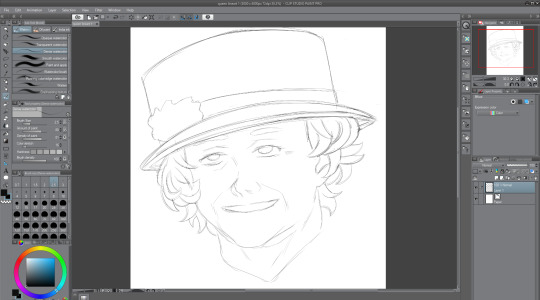
After finishing the rough sketch of the Queen, I thought it time to go over the lines. To do this, I created a new layer, and then lowered the opacity of the sketch layer, so that I could go just make out what I was drawing over. I don’t really like how the lines turned out once I compare it to the original sketch work, because it kind of lost the sketchy and rough charm, but I thought that I could probably make up for that when it comes to painting it. In this screenshot, you can see her outfit now—it is her usual outfit that she appears in public wearing. I went with this one because it was simple, and I would prefer to keep the focus on her face if possible. Overall, I’m not a big fan of how it looks right now, but I’m confident that I can improve this soon.
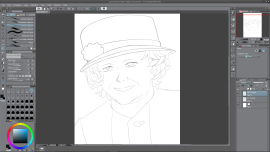
Colouring
The next thing to do after finishing the linework was to colour in the Queen’s main parts, so I’d decided that I wanted her outfit to be coloured red, since I was adhering to the colour palette of the Union Jack; red, white, and blue (the blue will be the sky, white for clouds). I chose a regular not-too-saturated but not-too- desaturated red shade for her clothing and her hat. For the moment, I want to have the rose thing on her hat red, but maybe it will look good if I am to make it white instead. I chose a middle shade of grey for the hair, because I would need highlights for it as well as, obviously, darker tones. A regular white skin tone and plain white for the eyes and mouth for now. The mouth is white at the moment as I plan to show teeth, but later on I change this.
So, to colour this in, what I do is I create two layers—one where I will colour whatever I want, so the hat and torso for example. And how I colour is I use a pen to draw around the outside using the red, and then I just fill in the rest because it is much more easy and efficient than colouring in the hat, and then doing the outlines. Anyway, after I’ve coloured the parts, I use the second layer above the coloured one, and apply a clipping mask of sorts. This enables me to paint on this layer, only on the colour that I’ve filled in, an extremely useful feature.
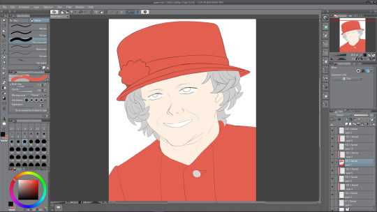
Painting Face I
Now it was time to paint the face that I’d coloured in with the skin tone. I added the necessary shades first, like with her face lines, which I’ve exaggerated in her favour, the shade under her nose and shadows being cast by her hair, look to the left and right of her face. Also, you may have noticed that I completely forgot to draw the eyebrows from the second screenshot onward, so i corrected that below. I painted in the inside of the ear using dark shades also. It was fun to paint underneath the head, where a shadow is being cast. The shadow being cast from her hat makes her look almost evil and scheming right now, I think it may be because the eyes aren’t painted yet. There must be a relatively harsh lighting right now with how dark I’ve made the shadows—probably midday sunlight or something. There are all sorts of shades among the shadows, underneath the hat are a mix of greys, oranges and also a bit of red and pink nearer the top, where the colours from the hat bounce off. The shadow below the head has multiple shades too, mainly the same as the shadow from the hat, except from reds. There is a slight pinkish shade on the left side of the of the shade, bouncing off of the clothing, and an orange shade just under the chin.
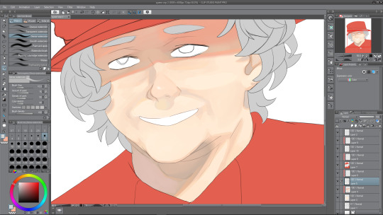
Painting Face II
Next I decided to work on the face some more to try and finish it. I started with the eyes. The eyes were under the hat’s shade, therefore, I needed to paint them accordingly. This meant that the main white in the eye would be a darker shade; grey. I painted her eyes a greyish blue, like her real eyes, and kept the shading quite minimal. After I finished the iris, I went over the outside using the blur tool to give it a soft look. Then I went back to the brush tool and did one white stroke on each of the eyes, and airbrushed a slight white over the middles of them. I think that it really adds to the painting and makes her eyes look less dead, which is something that often unintentionally happens when I’m drawing eyes. After finishing the eyes up, I moved to the mouth. After a bit of experimenting, I realised that making her grin was a bad idea, mainly because I just couldn’t get it to look right, but also because, once I drew her with her mouth open, presumably in joy, it looked a lot better.
I also tidied up the face shading, using the blend tool to blend parts that looked like they were too harsh and intruding. Next I continued on with the mouth area, and painted her red lips. Right now they don’t look very good, like they’re too thin or something, I fix this somewhat later on. I painted a small white dot on her lips to look like a highlight, which I think really goes far. Finally, I worked on the hair—easily my least favorite part of the illustration. For starters, even the sketches don’t look good to me, so adding depth to the hair via color wasn’t sounding too thrilling. But alas, I continued on, and painted them in a way that is acceptable, not great but I’m okay with it, so I continued with the shade from the hat, and painted a dark shadow coming from one edge of the hat to the other. It kind of dips, down and then up at the edges, which corresponds to how close the hair is to the sides of the hat. There aren’t many different shades among the hair, but I did decide to make it get lighter as it went down, no particular reason really, I just thought it would look nice and kind of a little less boring.
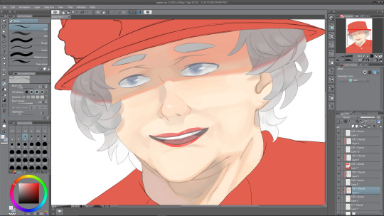
Painting Outfit I
Next I worked on her outfit, which wasn’t too difficult to come up with something I was pleased with. I looked at references of her wearing this kind of stiff outfit when I was sketching, and the reason I call it stiff is because there are minimal wrinkles on the outfit, not really any lines to introduce any shading to, and the lighting that I went with doesn’t really help me there either. Instead I used some of my usual tricks to add some kind of nice depth to something that is really flat otherwise. I painted a gradient from a desaturated purple-ish red from the bottom of the composition, to the red that I started with nearer the top. Although, this isn’t to say there’s no shading whatsoever, there is a nice shadow that continues on from the neck from the one that is being cast by the head. This shadow has a nice variety of shades in it, some greys, some purples and reds, and a slight desaturated orange as a bounce light from the skin tone that is very close by. There’s also some other shading as you can see in the illustration. Also a dark shade where the button is sewn through.
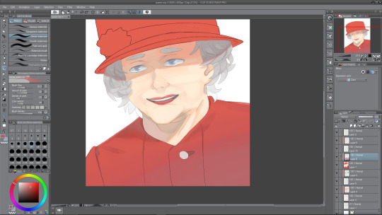
Painting Outfit II
I am nearing the end of the illustration, and next is to do the hat, which I thought would be difficult. Luckily so, I got kind of distracted by my linework—it was really messy still, therefore, I needed to clean it up, which took quite a while to be honest, though I think it was worth it. Essentially, I went over the hat lines with a thicker brush and then erased the thicker parts to correspond with the rest of the lines throughout the drawing. Now, it was a hat, not much I can think to shade really. I did the same gradient trick that I used with the outfit, and then also did a slight darker shade down the right hand side of the hat, to give it a slight beveled effect—make it look as though it was rounding off towards the edges, as a hat would do. I may still work on the hat some more later. I made the strip across the bottom of the hat a darker shade so that it didn’t look too boring. Now, for the white flower thing, I’m not sure what to call it, it was a challenge at first. I started by trying to make each of the points join together at the center where it would be darker, but as that looked terrible to me, I decided on a much more appealing way of painting it. As you can see, it looks quite soft and pastel-themed almost. I used a slightly large brush size to paint these blobs everywhere to create the effect of something that was puffed out. I’m really pleased with how it turned out, and I love the colours that I used in it. Again, looking at it now, the hat will probably need some more doing to it, but right now, I was roughly done with the painting.
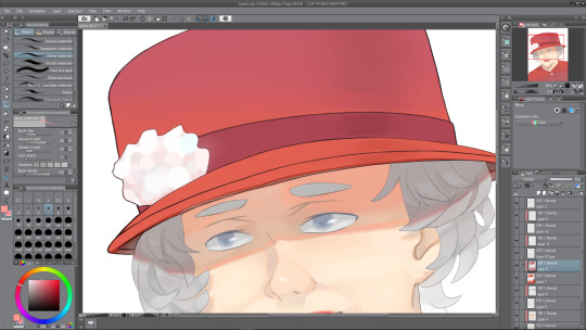
Finished Queen Elizabeth Illustration with Cover
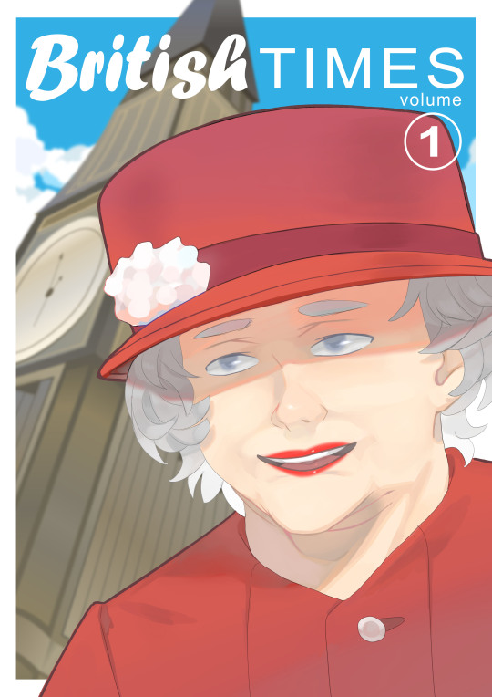
0 notes
Text
Session 2: The most important chapter
Beginnings are always the hardest.
Continuing from the last session, I am approaching the most important chapter in the book. Of course, when I started drawing this isn’t the first thing I bothered with. Drawing has always been a part of me ever since I was a kid. I started drawing through imitating other drawings from books, anime, merchandise and etc. I never thought that there would be such technicalities in drawing.
I was very happy and confident with my skills and myself growing up knowing how to draw even without the knowledge of anatomy, composition, color harmony, and stuffs like that. I grew up with people giving me compliments just because I can make an exact copy of another drawing or character. However, after going to college and taking drawing seriously, I knew that my skills weren’t as good as anyone has told me before and so I lost my confidence and believed that I really have no skill. All I did was to copy other people’s work and what’s good about that, right? I did nothing creative at all.
That is why I am starting all over again and I want to make things right. Although I believe that art is free for anyone to use as a way of expression even with or without the knowledge about the technical stuffs BUT since my case is different, I am pursuing this as a career so I had to learn these stuffs to add value to my works. I totally get it and it’s never easy to think that I need to step back and go back to the start and begin all over again.
What’s even worse is whenever I think that “Hey, I am more than 20 years old now. Isn’t it a bit too late to start all over again?” but you know what? It’s just me. It’s mind over matter. It’s never too late to start anew.
Anyway, enough drama and let’s get to the point here. So before the actual start of the drawing part, Loomis have 5 pages of introduction to this chapter explaining the importance of this chapter and all that it contains.
I won’t point out the things I highlighted and summarize them instead. I just had to emphasize these questions because they seem to be very helpful in my case.
· “What is arrogance in terms of light and shadow, form, and color?”
· “What lines give frustration and forlorn hope to people?”
· ��What is the gesture in relation to the emotion?”
· “Why is a certain childish face adorable, a certain adult face suspicious and untrustworthy?”
(Figure Drawing For All Its Worth by Andrew Loomis, pg. 21)
As I’ve said already quite a few times, I was once a copycat and not an artist. I thought that by copying another I could excel and get ahead of others. However, it wasn’t that easy and I wasn’t doing it right either. When I realized this, I thought it was over. Loomis also pointed out that improving can’t happen either just by watching another man paint in which another misconception I’m trying to brainwash myself just to skip the necessary step of practicing again and again. Improvement can only be attained by combining hard work, effort, and a great deal of passion. Of course, it is easy to say that. I am not yet a master and I am saying such things even though I find it hard to keep up with this responsibility.
Being an artist isn’t just about technical skills. Anyone can be good at drawing and can draw all kinds of things with great detail but would it matter if that piece did not convey the message it needs to deliver? Most artists I know can deliver messages using only a few lines but it’s powerful enough. Some even have less knowledge on these technical skills but can also convey messages. Hmm then does that mean fundamentals aren’t that important as long as one can deliver a message. Well, not quite. As I’ve said earlier, in my case as someone pursuing this as a career, it is a must for me to know these fundamentals. This gives me a leeway on producing any kind of art by being creative with the fundamentals.
Line is one of the basic elements of a drawing. Pretty much if you think about it, a drawing consists of a lot of lines connected to each other and overlap each other to create a form, dimension, and even depth. Line is also the most powerful tool in drawing. With only a few lines creating 2 circles and one curved or straight line, one already has a face. What more if line was used in detail?
Study the nude. At first this is such an embarrassment to deal with. To be able to study this, one would need to look for a live model or nude pictures somewhere as reference. It’s even harder when one’s workplace is placed where anyone would see the screen of a computer or the table top which, if it isn’t obvious enough, is my situation. I don’t have a room of my own and generally everyone in our family shares everything so there’s really not enough privacy to begin with. I got used to isolating myself for the sake of privacy that I became such an extreme introvert.
There’s nothing to be embarrassed about the nude though. Generally, we all have a body of our own and it’s not even a mystery for us to know the body parts since we study that since elementary, kindergarten even.. right? Anyway, the point is, studying the body is essential for an artist since it’s the most common element we use in an artwork unless one specializes in landscapes and sceneries.
So from what Loomis have stated about lines and the nude, practicing these will greatly help an artist in the most basic way. Practice your strokes and try to create variations with line weight. Also, how one handles the pencil would affect this greatly. I normally have a tight grip with pencils and I usually draw my sketches with dark strokes so whenever I need to erase, things get messy. Being able to draw
sketches with light strokes would really help keeping the artwork clean. It’s not a problem in digital though since one can just layer the sketch and the main linework on another layer.
In the next session, I’ll be doing some line practices and will proceed with the body proportions.
0 notes