Hello there, welcome to my blog, it's not too serious at this stage but it showcases my work. Hope you enjoy. You're free to use these images with my permission.
Don't wanna be here? Send us removal request.
Photo
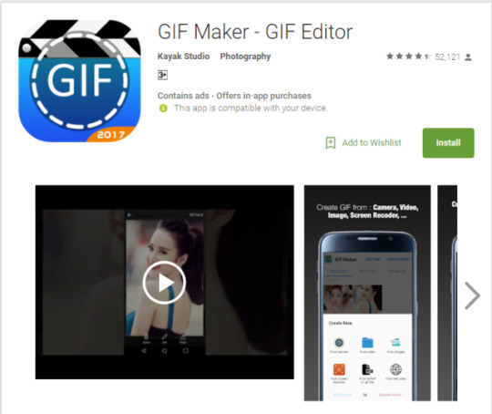
https://play.google.com/store/apps/details?id=com.kayak.studio.gifmaker&hl=en
Animation: There’s quite a few types of animation you can do but one type that’s used on Social media quite often is a gif (Graphics interchange format) which generally is a moving image designed to be posted online for its small size. On the PC/Mac the process of creating gifs can be lengthy so being able to do it with an app can help a lot.
“GIF Maker – GIF Editor By Kayak Studio” is a free program on the Google play store where you can convert video’s into GIF’s, have over 200 images in them, edit and view other gifs on your device and other many aesthetic features such as stickers. It then also allows you post them on your Social media account, so the integration is more seamless than the more manual way of being on the computer. I also chose this app because it has the highest amount of users and a well-received rating. This shows that the app is relatively simple easy to use in terms of interface and performance. A lot of other apps could potentially lag when it comes to interpreting GIFs going off the bases of how PC/Mac’s sometimes perform. Pros: Free, Simple to use, makes editing easier being all in one, connects to social media and has a large following giving it a quality you can trust.
Cons: Has adverts which you have to pay $3.00 USD to remove. Some of the effects can be limiting, remember that these effects are all set prior. Only for Android.
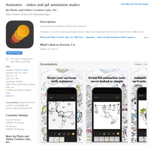
https://itunes.apple.com/us/app/animator-video-and-gif-animation-maker/id1083338559?mt=8
“Animator - Photo and Video Creative Labs, Inc.” is another free app on the ITunes store for IOS, this program allows new comers to animation to get a feel of creating animations through transparent layering and basing off video and imagery in the background as you draw over them. What seems great about this app is its relatively calm approach to garnering the masses of people who might not have the best understanding or talent in terms of animation creation, this app is more focused on having fun and sharing it online, again this program has access to one tap social media posting to which you can either export it as a video or GIF. The drawing might be a bit difficult but the layering that has access to would be more than enough compensation for someone new to this. In other words kids could even use this program as their introductory that they can take wherever they going, eventually leading to having enough practise to be able to use something like Adobe Animate. My self personally would probably not use this program for very long as I feel like it could rather limiting, only having a few drawing options etc. You can however change the frame that these go on and perhaps sitting on the bus with the trees going by you could draw a car or another to keep yourself occupied. All in all this is probably the point of the app is to be simple and fun and nothing to immense to put off someone new.
Pros: Simple to use, great for beginners, quite fun to use, varying controls on app, no advertisements, free to use forever, save as multiple formats and has the ability to integrate video and other opacity layers with the app itself.
Cons: For someone who is new accustomed to animation this might seem rather limiting, even though it’s an app there is still quite a lot of features that could be added onto the drawing field you. For instance from what I saw is that you can only add to the layers you drawing on and not have multiple layers happening in the background. It’s designed for people new to animation. Some people also said it can be rather glitchy.
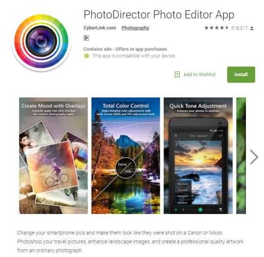
https://play.google.com/store/apps/details?id=com.cyberlink.photodirector&hl=en
“PhotoDirector Photo Editor App – By Cyberlink” – this is a photography app available on the Google store. The great thing about apps like this is that you can have that mobile access to touch up on photos you’ve taken along the way. The app claims to be able to make photo’s you’ve taken to appear like their quality you’d get from a high end camera such as a Nikon or Cannon DLSR. I’d say this would be more catered towards a professional seeking an alternative to using their proper camera, also being a made by Cyberlink a company I’ve known for quite a while you can understand why this app costs money to use some of its features but for the most part it is free, so people who might not have the greatest knowledge can jump right into using it, all depending on the skill of the photographer in the end. Some of its brightness contrast, HDR, colour corrections, live effects etc. Very versatile just like photoshop.
Pros: Professional Quality, lots of tools you can use, is free, made by a trusted and well known company, many users have used this and it’s rating it high giving in indication of quality and it’s great to have a high potency mobile editing platform.
Pros: Very professional quality, the controls are not limited with no presets as you set the parameters, a great alternative to SLR photography, it’s highly regarded receiving many downloads and being designed by a big company means the quality of using this program would be very high.
Cons: Might be hard for people new to photography, advertisements and some content has to be bought.
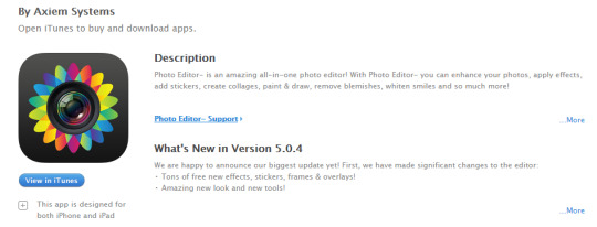
https://itunes.apple.com/nz/app/photo-editor/id546821797?mt=8
“Photo Editor - By Axiem Systems” is another app for IOS found on the Itunes app store, this is a simple, easy to use app that is very popular. This program is more suited towards the massess, people who don’t nesserarily do photography often and will prefer to rely on presets over manually figuring out what looks right. This is perfectly fine for the target audience though as you want it to be seemless and easy to use for young and old. This program allows filters and other effects but in that regard it’s probably it’s biggest draw back. In saying that, it’s free, it has options and importantly it’s simple. There are in-app purchases though as this program does require you to pay to remove advertisments.
Pros: Simple, perfect for newcomers, easy to use and it’s free.
Cons: This wouldn’t be a tool for professionals as it’s far too limiting, you have to pay to remove adverts and get other presets as well. The photographic effects look tacky in my opinion as well.
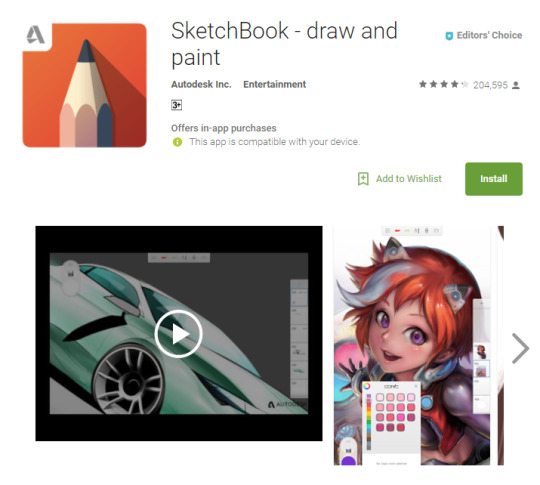
https://play.google.com/store/apps/details?id=com.adsk.sketchbook&hl=en
“SketchBook - draw and paint” this is a free app on the Google play store created by Autodesk. The app has features you can buy so it’s not entirely free but I suspect it’s due to it being a competent application considering it’s coming from Autodesk who created ‘Maya’. You would probably need a stylist for drawing apps and this is no exception as there a few small icons here and there which would require more precision. I would say you’d need a powerful device to run this program so running it on mediocre phones could cause slowdowns, it’d be best to use this on a dedicated tablet that has more grunt plus this would be far more convenient in terms of feeling like a notepad.
Pros: Free version has leg room, great for drawing on the go, designers would feel very comfortable, especially those who’ve used Maya products. Adaptable and many features.
Cons: Some features must be paid for. Needs a powerful device. Needs a stylist even for the navigation aspect. Not for beginners, you must have a good understanding of digital design.
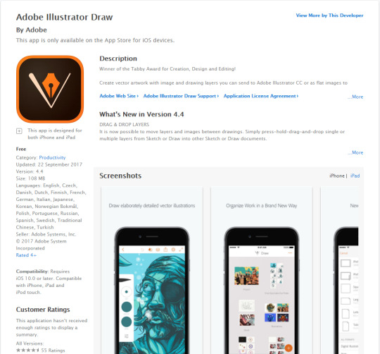
https://itunes.apple.com/nz/app/adobe-illustrator-draw/id911156590?mt=8
“Adobe Illustrator Draw” this app is easily trusted simply through the name Adobe; many designers are familiar with this company so they’ll be familiar and have the confidence in its performance. This is a simplified version of the Illustrator Application commonly found on Desktops, like the desktop version this allows you to create Vector based imagery (svg) with simple UI aimed for working on ideas efficiently while you’re on the move. The app allows communication between the desktop application and the mobile so you can transfer works with ease. Again, you’d need a stylist for this as intricate drawing will be immensely difficult with fingers. For a free app from Adobe there’s a lot of features.
Pros: Free to use, transferable data between desktop app of illustrator and the mobile version. Simple UI aimed at getting ideas on a moving device. Simple to use and many people will be accustomed to the product since it’s an Adobe product so designers will know it’s layout somewhat. You can create SVG’s which are very prevalent in today’s world of design for the retainment of quality.
Cons: Once again, be best on a tablet for more power and space, not as many features as the desktop version.
0 notes
Photo

New Zealand Game Design Association (NZGDA)
The New Zealand Game Design Association or NZGDA for short is a collective of video game designing from all over New Zealand, this includes companies and even indie groups. They often promote video games made in NZ as well as hosting conferences, talks, job opportunities and other news. NZGDA was founded in 2001, aimed at helping New Zealand’s game industry. They’re currently being led under the head CEO at Magic Leap, James Everett.
There are many companies that are part of this association such as one of my favourites being Grinding Gear Games who were responsible for Path of Exile, one of the biggest free to play titles on Steam rivalling that of many bigger companies such as Blizzard who’ve made similar games (Diablo 1-3) It’s truly incredible that amount of talent that New Zealand has, as far as going into the big corporate world, that’s why I really like the idea behind the NZGDA, which aims to help people who are new to game design and also people seeking jobs. They understand that the video game industry is booming and growing bigger and bigger ($99.6 Billion USD worldwide, as of last year, up by 8.4% in 2015)
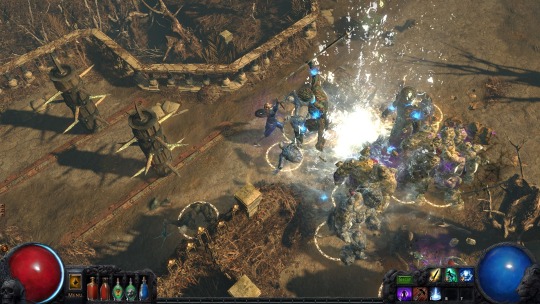
Screen shot from Path of Exile, and a review on it giving it a 9.5/10! (http://www.cgmagonline.com/reviews/path-exile-ascendancy-pc-review/)
0 notes
Photo
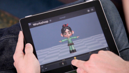
Animation of the go - The world of Animation Apps
Animation has come a long way since it’s humble beginning’s over 4000 years ago. Today we have apps where we can view 3D models and fully animate them where ever we go. Below are some examples and tutorials using various animation apps.
https://www.youtube.com/watch?v=Nzi_ghrc6gg (Tutorial on how to get into the swing of things with Animatic by Inkboard)
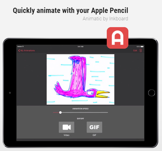
(https://appadvice.com/collection/animation-apps-for-ipad)
https://www.youtube.com/watch?v=k1b_h5ldjM4 (A handy tutorial of different techniques and apps you can use such as using Vine (back in 2016 and before) to create stopmotion films)
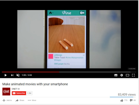
https://www.youtube.com/watch?v=CsxVhYxXOE4 This is a person creating an animated intro and the process behind it all. Thinking about stop motion in particular it’s not too different whether you use a phone app or desktop app as the the principal remains identical, the phone just being able to do everything in the palm of your hand.
0 notes
Photo
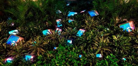
Nam June Paik - Re-emergence of retro art
Born in Seoul, Korea (1932) later moving to the United States, Nam June Paik has been regarded as one of the “forefathers of video art’. His work has been international regarded in his field of digital installation art, video, performance art and video manipulation. Some of these works include ‘TV Garden’ (1974) ‘TV Buddha’ (1976) and ‘Electronic Superhighway: Continental U.S., Alaska, Hawaii’ (1995). Many of his pieces value in over $30,000+ USD. What immediately attracted me to Paik’s work was that the aesthetic behind ‘Vaporwave’ resembled and reminded me of the old retro styles that had made a huge comeback in recent years. The old televisions, plasma tubes and glitch effects Paik used back in the 70′s etc are all in today’s recreations of those old styles, in other words looking at his work I felt somewhat familiar with it, despite being many decades before my time. In a sense, just how Paik installed, meshed digital imagery together within a physical space to create a single piece, so too has the post-80′s modern renditions of digital art made on computers use the mixing of imagery to create their own arts. Paik in one regard was creating experimental digital art in the physical world and it’s resonated down to creating a nostalgically based modern art style that’s inspired the future digital world of the internet. Paik’s sampling of random televisions and other various electronic bits reminded me of how Vaporwave and retro art would sample from 70′s 80′s 90′s and early 2000′s, forgoing the physical for fully digital but still retain the same visual/digital content. The beautifully, heavy visual elements that Nam June Paik used back in the 70′s through to the 90′s could have very well been the inspiration for the popular re-ignition of that nostalgic technology aesthetic that people today love to experience. It’s unfortunate that Paik could never see this re-emergence of retro art but I do feel that people would appreciate all his work now more than people possibly did back in the 70′s and so forth. He may have been working with technology of the time but his ideas where a definitive catalyst of resonating art styles that have reversed time resulting in post modern retro art that pays homage to the times he so cleverly defined. To this regard I found his work incredible fascinating and I would highly recommend checking his work out.
0 notes
Photo
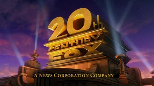
20th Century Fox
This logo is one of the most iconic title sequences that play before the start of many films or series. The logo represents the American Film Studio owned by 21st Century Fox. The studio is located in Los Angeles and is one of the six biggest American film studios.
The font is shot from a panning low angle that gives it a sense of grandeur. In doing this is also creates an illusion of scale. The font itself is also rather bold and fairly large in the shot, this draws the main attention of the viewer to the worlds which make it clearly recognizable. The render on the logo is also given a golden/brass texture and colour which again emphasises the motif of grandeur.
How the title sequences is shot is also another point to pick up on. Starting with the camera given a fairly high angle, close up shot with what appears to be a city of Hollywood that associates it with filming panning vertically downwards to give create the view to be looking up at it giving it scale. After the movement of the panning the centre of the shot is paused on the logo to give the viewer more time and there are spot lights shining around making sense to illuminate during the night but also the motif of being in Hollywood matching the opening scene.
Probably just as recognizable is the actual music that originates with the sequence. The music is an upbeat drumming/musical band that resonates matching the scale in terms of an echo from a large object. The music ‘ramps’ up as the camera pans through to where it eventually reaches a climax when the camera stops panning, matching the movement of the camera with the music and well as the music’s climax adding an emphases on the logo itself.
The special effects that go with the sequence was the lens flair from the spotlights going on, this adds to the realism of those spotlights as well as giving it that appeal of the ‘Hollywood’ brightly lit aesthetic of being on the red carpets etc. The texture of the logo itself is also fairly reflective which again relates to refined valuable metals, relating to the glamour that Hollywood tries to keep up.
For me, I won’t be using a 3D logo myself as this doesn’t really relate to a WW2 short film, the issue with animated 3D text is that it seems too modern and would contrast negatively against the black and white aesthetic. I did look at the logo instead in terms of musical appeal and how recognizable the music is, even without looking at the logo itself, taking this into account it signifies the value of a good use of music and effects along with the film.
0 notes
Photo
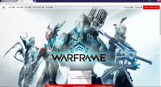
Game Demo Research – Promotional Websites
In today’s age using websites can be very advantageous in getting your name out into the world. Having the internet at our fingertips is one of the most useful tools we’ve ever come across. The trick is, sticking out from the crowd. A webpage not only has to promote the game you’re about but also captivate and describe the game in a very short amount of time, having walls of words is one way not to approach this.
The Warframe webpage is a webpage that promotes the game well. Upon first clicking into it you are greeted with characters from the game with animations playing in the background similar to a diorama. The confrontation not only introduces these characters but adds a sense of mystery which in turn draws the attention and encourages the person viewing the page to investigate further.
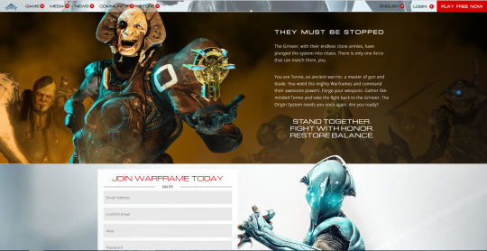
As they scroll down the viewer gets information more about the game, some information on the story and the roll you can play into it. It’s not a lot of info, barely even a synopsis but it’s enough to be enticing. You also get a glimpse of the antagonists of the story, the use of darkened dreary colours contrasts against the pure white blues of the Warframes at the top of the page, this immediately sets the protagonists and antagonists simply through the use of tonal range.
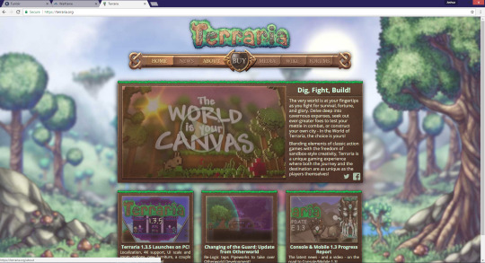
Another Webpage that promotes a game is the webpage for Terraria which is aimed towards all audiences, the aesthetic of the designs such as the background are fairly warm and approachable which would be more suited for everyone rather than just one age group. Despite this game being rather action packed and offering a challenge for even older people it gives the appeal that even children can play this. There’s a video in the page that shows some gameplay, the success of the game and even the soundtrack, in all honesty the video is what really sells this game well and having it on the webpage is very effective for it.
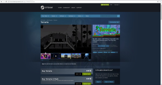
When you go to buy the game it comes up with a neat animation popup showing all the platforms you can buy this on. For PC for instance it links to its Steampage which has an overwhelming support, I find that games that are Steam that have good reception sell very well as the Steam pages are easy to navigate and provide the viewer with an opportunity to see other’s comments and games similar. Being on Steam is big advantage.
0 notes
Photo
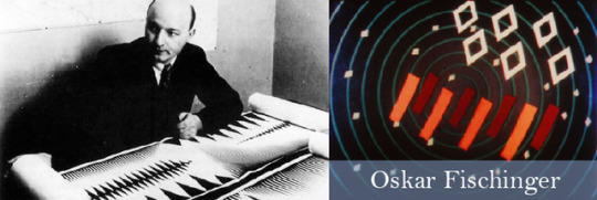
Oskar Fischinger – Motion Graphics before the Digital Age
Oskar Fischinger was born in June 1900 and was a German-American who worked in abstract animation, painting and even film making. Oskar has been referred to as one of the forefathers in motion graphics, creating special effects decades before the digital age’s approach. Some of his works include Fritz Lang’s Women in The Moon (1929), Motion Painting No.1 (1947) and over 50 other additional short films that has the frames individually painted on that resemble similarities in music videos today. A personal favourite of mine, one that I knew before I started this research was ‘An Optical Poem’ which was done in 1938. Like most of his other short films, this was done in stop motion, having each frame painted then the next having that paint repainted in a sequence to give it movement, sometimes he’d paint onto the film which would create interesting effects. It’s the experimentation that drove his creativity which eventually led into being one of the more influential people in today’s technology driven world. Oskar passed away in 1967 but has left an incredible legacy that’s not only interesting but also inspiring, despite its age there might be a lot you can take away from his work if you intend to look at motion graphics, it’s rather brilliant at how far he was for his time, even paralleling today’s work in some sense.
0 notes
Photo

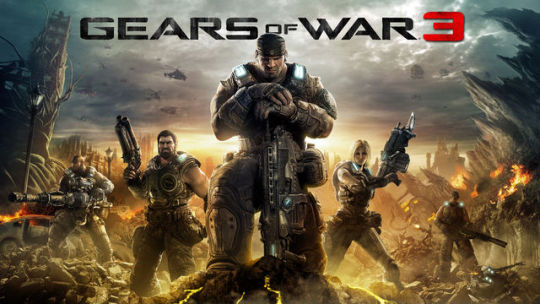
The Unreal Engine
Unreal has been an engine used in video game design since its inception in 1998 through the first person shooter known as Unreal. Since then, Unreal has gone through many versions up to 4.16 (27-05-2017) being responsible for a vast list of games in a verity of genre’s. According to Guinness World Records it is regarded as the most successful video game engine.
Most of the games that Unreal Engine has been responsible for are 3 dimensional, unlike Paladin of the Tempest which is a 2D game the engine has no issue coding for either, as the interface can support many different game modes, types and approaches without having to change the code as a whole, this is done by having the game render as 3D then compressed into sprites depending if that is needed.
A very successful 3D game series known as ‘Bioshock’ ranging from Bioshock 1, Bioshock 2 and the third installment called Bioshock ‘Infinite’. The first instalment and second installment being on Unreal 2.5 and the third on Unreal Engine 3. The models for each game could theoretically be interchangeable and reused, updated and save some time in the development stage. Using Unreal has been responsible for garnering 9/10 to 10/10 reviews for this series.
Gears of War 3 was another incredibly well received game having an average of 9/10 for its reviews. Unreal has the capacity to support high definition, handle many actions of coding at once and in general just being a very reliable engine. Gears of War 3 took advantage of this through its action packed combat and for the time having very effective visuals. Gears of War 3 would have many hordes of enemies each having their own details and animations all occurring at once without hitches from the engine, Unreal handles many 3D animations at once which makes for a pleasant, smooth experience. Unreal promotes great game design because you can sort the frames in animations, have the code behind it, play the audio and level design all in an organized layout, not having to open up another tool or external program. Even modelling can be done in the engine; a multipurpose tool.
Another widely successful game by Unreal is Borderlands 2, made by 2k and Gearbox in 2012 has elements of role playing games and intense first person combat. Again, this game received numerous awards with a rating of 10/10 on Steam. A theme with Unreal games is that they run smooth (usually, depending on competent developers) and are very durable. Borderlands is not exception, having to calculate movement of a single player or multiple depending on if you’re doing CO-OP or not. Having the 3D environment is a mastered aspect in Unreal having the nearly 20 years of action. A pattern will start to emerge that all these games are 3D, Paladin of the Tempest is 2D but the reason I chose Unreal was because it has no issues coding for 2D and it hasn’t been done as much, I felt this was an opportunity to do something unique with an engine that’s well renowned. This engine can handle everything I want to do that I’ll throw at it. Essentially the only differences with my approach is that my animations are done as sprites in Photoshop and not in the engine itself but coding like the physics engines, controls and any other similarities that’d be on a 3D Unreal game is exactly the same; being robust and holding great flexibility. It also helps being free :)
0 notes
Photo
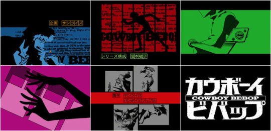
Hajime Yatate – Cowboy Bebop
This is the collective efforts of animators under the name of ‘Hajime Yatate’ who work for Sunrise Animation Studios. This is their incredibly long list of works they’ve created and worked on. One of their anime's and movies that stood out for me was the series called Cowboy Bebop which was set in a futuristic space adventure, following a bounty hunter, his friends and encounters.
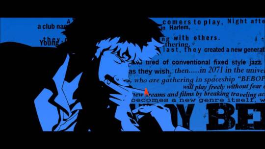
The opening called ‘Tank!’ which is composed by ‘The Seatbelts’ shows various typography in Japanese and in English, with influences from shows like the James Bond aesthetic. The title scene uses flat vibrant colours that usually on feature a few shades and stylized shading to give it the look and feel of an older Western film/series. The creators had created this in such a way that it combined the two cultures; it being the Japanese’s interpretation of Western culture, the influence that the western style that created a beautifully crafted title sequence that was not only exciting but also felt very familiar. What also helps with this aspect is the use of a western song, people from an English perspective would feel comfortable and people from the Japanese would feel as if this were a western production yet still feel like it’s familiar due to the drawing style. As the title scene progress we get a some details of what the anime is about such as featuring the ship ‘The Bebop’ ship itself, the ‘Swordfish’ and other different references to the anime such as the main characters such as Spike Spiegel. The intro also gives them a feel for the genre, featuring character moments that resemble that of kicking and running as well guns firing, it’s clear that this would be action orientated coupled with the ‘spy’ motif which sews in the sense of mystery and adventure. The reason they’ve done the intro like this is to give the audience and idea of what type of characters, genre, theme, emotion and objects they we will be viewing, making sure to get the audience excited before the show even starts, making sure to keep them interested and involved by give a few details away but not too much, which creates the hook that draws in the viewer’s attention. I feel that this is a great introduction, to which has been created effectively, fulfilling the purpose of a title sequence. I highly recommend checking the anime out and it’s movies, the style of and flow makes no wonder why it’s garnered such high ratings from critics, Or at least take a look at the opening intro.
0 notes
Video
tumblr
Demo Trailer for Paladin of the Tempest
0 notes
Photo
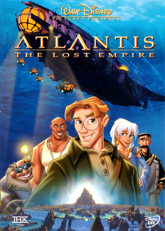
Environment analysis: Atlantis The Lost Empire
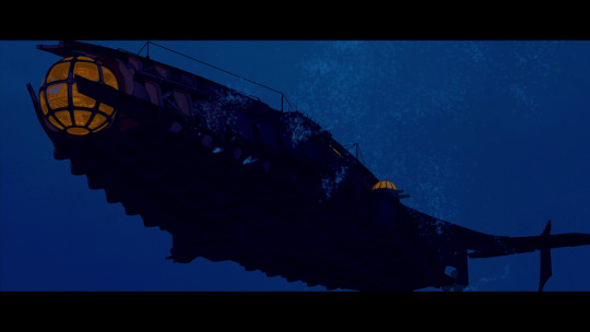
The environment of Atlantis’s movie world follows a motif of blue and variations of blue. Comparatively even in the beginning of the film, setting up in an urban scene there are scenes that allude to the theme of blue and water such as the large fish tanks.
The environment is set mainly under and around water, this gives a cool appearance which is often changed when bright colours appear, this is used as not only a visual ‘highlight’ but to great an atmosphere of excitement compared to the cold deep blues. In another scene depending on the depth in the water the background information would match not only the darkness but also the mood, in this regard the background was used an emotional tool to emphasise a more gloomy, mysterious scene.
Of course, the environment changes where they are located but it’s the character’s reactions to their environment that drive connect these ideas. It’s obvious yet is still important to point out, the environment dictates the mood of the scene. Moving back onto water, there is a lot of water in this film. Nearly every scene outdoors features it and thus the maintaining blue is a prevalent pallet. Even the Atlanteans wear blue themed clothing signifying the idea of being near water. It’s very hard to find a scene that doesn’t feature the colour blue in the film so when other colours take dominance their role is amplified, breaking from the normality of the film’s usual pallet. Moving away from the colour, this film also has a scale to its backgrounds, for instance the sheer size of Atlantis itself and the water around it is quite breathtaking comparing the size to the characters and the detail put into the aesthetic of the buildings from what appears to be a great distance. Or even a few scenes in the ocean that seem to stretch endlessly into the vast unknown ocean, once again adding the mysterious feel that the film is going for.
0 notes
Photo
Game Design Document (GDD)
What’s a GDD? A GDD is the abbreviation for Game design document. These types of documents are constantly updated, detailed description of the design and functionality of a game. Usually everyone form the development teams whether this be from animation to programming pitches in towards the collaborated document. The general purpose of a GDD is to describe the entirety of the projects and to list all its selling points, this could include conceptual art leading into the final development or even stating peripherals like design engines and demos. Below is an example of a GDD featuring the characters from their game.
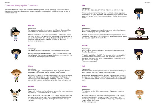
The GDD would consist of many different sub categories, to even go to the extent of individually describing everything detail in every level whilst describing the enemies you may encounter and so forth. However, for these main aspects looked at are: User Interface, Game Controls, Art/Styles, Sound and Music, Gameplay, Characters, Environment and Level Design, and the Story.
Now why would you go through all this effort for something that’s not technically part of the game? The point of doing all this work is too create clarity within the project as well as keeping the project on schedule through designated procedures. For instance, if the project were to continue in the series you could go back to the previous GDD for assistance as well as sticking to the story etc. This would also act as your guideline in that regard. It is also used to convince publishers and other team members, as the document is forever updating there is always room for improvement. When the game goes through production so does this and that’s beneficial in terms of literally documenting progress and solidifying ideas.
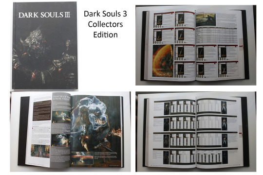
These are just a few photos from a book I own on Dark Souls 3, this is a very detailed GDD that serves as a manual with little tips and tricks wedged in. Full size image Just some other relevant books that can help: here, here and here.
0 notes
Photo
Games I like to play - Warframe
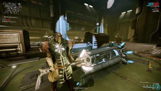
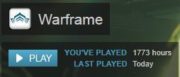
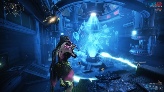
Warframe is a free to play game by digital extremes which released onto Steam in March 2013, since then has a 9/10 on Steam with over 26 million registered players. I started playing this game in 2012 before it went onto Steam and I must say I never expected it to get this big, being able to support Digital Extremes’ dream has been privilege to experience. From 2012 I’ve clocked in a few hours.
What initially drew me into the game was the unique art style and all these little attentions to details, you can feel an effort put into the game because of this. Whether shown through the fine details on the polygons or just the incredible depth of content that holds this high level of quality. Personally, metal space ninjas are badass enough. The emotion I’ve mainly gotten from this game’s visual workings is amazement, truly. The game is breath taking to look at and even more exciting playing. However, there is a sense of torn emotion from this, on one hand you have the serious look of the Warframe’s and their enemies but on the other the bright colours and the intensely fun action can dampen the seriousness of it all. Whilst fighting on the faction’s ships you will notice some areas are cramped and others quite massive, I found this keeps the missions interesting as it goes from claustrophobic is overwhelming. Not to mention some of the scarier places such as the ‘Infested’ ships which the lights are broken and are filled with ambient screams. The artwork also changes as you go into different factions, you’ll have a metal, brutal look for the Grineer, a robotic, square, polished look for the Corpus and finally the ‘Infested’ will take over these faction’s ships with plague and all sorts of disgusting spores all over. This alone determines what ship you’re fighting on and what faction you’ll encounter, which as well follow the theme of the ship they belong to etc. The main characters in this world would probably be the Tenno, the people who are behind the Warframes, the ones who control these metal war machines. These machines are the balancing force in the Solar System. I would say these characters are the main influence in the world of Warframe and the other factions are merely just background. You don’t play the other faction, you only play the Warframes, you as the player are the influence in that game as you may choose to help on side or another with the wars they wage between each other as well as when they wage war on the Tenno, if you don’t do well enough the developers have been known to punish the players. This gives the immersion of being in an actual virtual war torn world. There is a lot to talk about Warframe, as it’s forever changing and improving (hopefully) but I hope this gives you an insight to why I’ve played the game for so long. (It doesn’t help that it’s like Runescape, require time and effort to get anywhere, but this is the draw of the game for me.)
0 notes
Photo
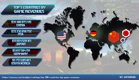
Gaming infographic on Top 5 Countries sorted by Game Revenues.
1 note
·
View note
Photo
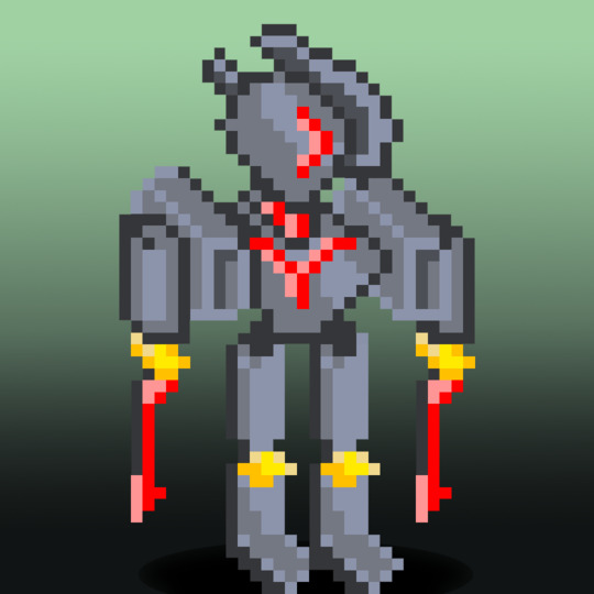
Nothing special, just playing around with pixel art n what not.
1 note
·
View note
Photo
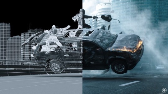
The interests for me in, Animation, VFX and Motion Graphics
There is a whole variety of visual effects and animations that have caught my interest over the years, whether being physical or digital I’ve always had a curiosity in them because I appreciate the effort and complexity that goes into them and the challenge it brings along the way, similar to that of learning to play a guitar practise will only grow your capabilities. When I was younger I used to make little flipbook animations of stickmen getting impaled and so forth. The physical side of animation has been recorded through millennia such as a bowl dating back 5,200 years, in a sense we capture what we see whether being through still imagery or movement. It was quite interesting to see that this concept has kept a prominent presence especially to how it evolved for instance a ‘zoetrope’ (19th-century optical based toy) to feature length films by Disney etc.
Animation also has gone through many styles such as being hand drawn to CGI, but they all follow the same principal of small movements and adjustments layered up one after another to form a sequence. In general, they take time and determination to get a good production out there. What can be assessed on alone is the time it takes to finish animations on average, depending if you’re a team or one a man army it could takes months or even years, not to mention the do overs and render times. It’s why I appreciate this side of work immensely.
- CGI Animation (computer generated animation): the most common modern form of production animation which branches off into movies, TV-series, video games and even advertising. This can be either 2D or 3D
- Traditional Hand drawn animation: Limited to 2D so creating depth requires work arounds. You could find these in older films by Disney or by Hayao Miyazaki. In many ways, this opened the doors CGI and that was an improvement of the physical moving into digital, however can still be argued that hand drawn has a certain quality to it and should never be a forgotten tool, just look at many storyboards for films etcetera that are still hand drawn.
- Clay animation/Stop motion: which is taking many photos with minor progressive adjustments to form a smooth video. A favourite of this genre for me being Wallace and Gromit. Generally being a more physical type of animation this is usually a 3D art.
- Motion Graphics: Such as music videos, animated typographical intros. This animation general avoids having a story and purely visual based.
- Motion capture: is a 3D animation that seeks to capture a more realistic lifelike appearance by uploading physically caught movement into a digital form. For instance, sensors that are installed along a person’s features on their face to capture their expression. LA Noire is a good example of this within a video game.
- Though more physical and uncommon: there are cut out animations, shadow puppets and physical puppets, sand animations that require constant work of drawing and erasing sand to build up a fluid work and a whole list of other interesting types from this list.
0 notes
Photo
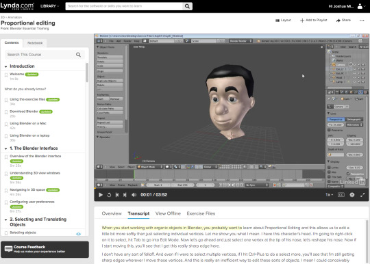
3D Animation and Modeling - Resources
Now at my course I am quite lucky to have access to Lynda.com which is a paid tutorial site that offers lessons on nearly anything from photoshop to marketing. You need you could probably find it here. My one qualm is that a lot of the tutorials are fairly long and cover a lot, which can be good but at the same time be fairly daunting.
You could always use Youtube as well, there’s a lot of videos on there and you’re bound to find someone to help you out, it’s not as professional (which can be debated) as you don’t have to pay for it but hearing another way to do something can never do much harm. I generally prefer Youtube videos as they’re more concise and try to teach you on a broader spectrum.
You can also go to the site you’re using the application from, in this case I was learning how to use blender and I by using their site they provided they can give you essentials tips to help you out in text format if you’re not into waiting for the tutor to get to the point, it depends on how you learn and thankfully there are a lot of example out there to help you out. You’ll find forums to be your friend in this matter as you can also ask questions there with a multitude of people (hopefully) willing to reply with their knowledge.
A handy blog I found for Blender.
This post gives a good run down on what you should consider when you want to start animation, the budget etc.
0 notes