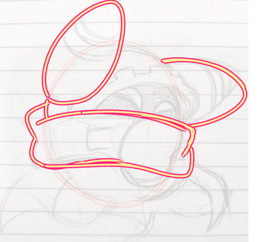
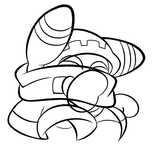
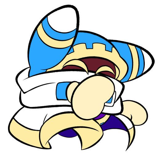
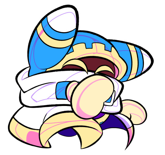
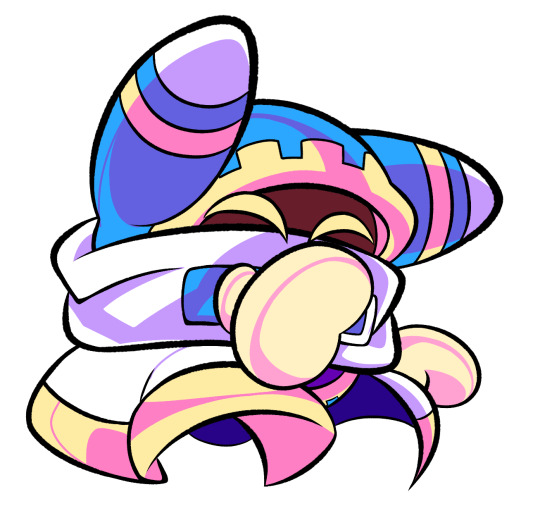
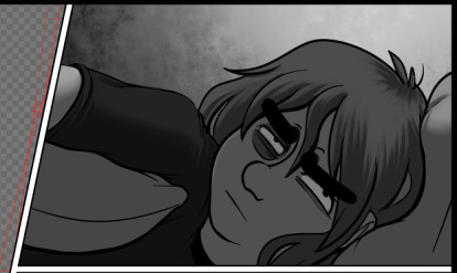
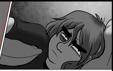
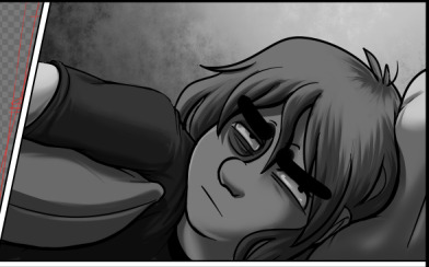
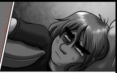
#i wanted to do lineart and shading but not anymore
Explore tagged Tumblr posts
Visit Tumblr Blog
Explore Tumblr blogs with no restrictions, modern design and the best experience.
Last Seen Tumblr Blogs


Fun Fact
Tumblr is available in 18 languages.
Text

#cleaned up an older doodle some#i wanted to do lineart and shading but not anymore#dreblr#c!dream#c!sam#c!awesamdude#kenjos art#dsmp#prison duo#I also wanted to fix Sam's anatomy more but man can just have that uncomfortable angle all to himself#Dream would certainly not mind him being uncomfortable
276 notes
·
View notes
Text
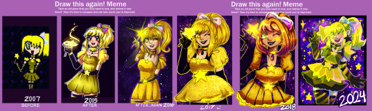
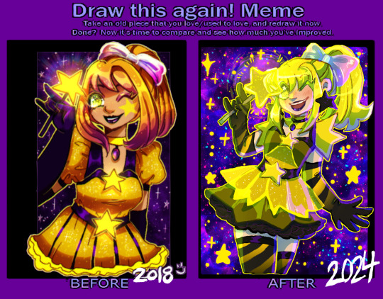
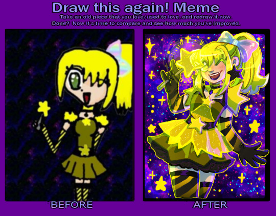
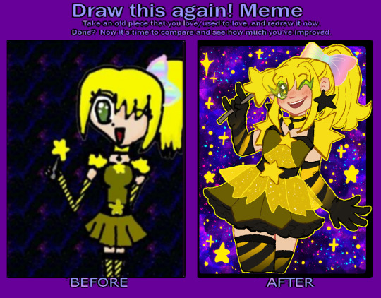
a redraw meme! I'm a little mad at myself for not doing this for a few years (I've done a few other redraws in the meantime, but...it wouldve been cool to have a bunch of years in a row! TwT)
2007 was the earliest made on gimp, a touchpad and NO pressure (obvious with the THICK CHUNKY LINES. im 90% sure I did lineart, colored over them, then lined over them again all on 1 layer...) plus the pattern fills gimp had (the stripes and rainbows, plus the repeating space background that needed a desperate scale-up...)
2015 might be the most obviously tmm inspired style wise ( and I think...this character WAS a tmm oc, actually, so this tracks. her name was star hoshiko (yes. star star.) and she was infused with star power instead of an animal. whatever that means. in my defense I was Ten 👍) and was when I was still using sai!!
2016&17 were me trying to sort of push into semi-realism, the smaller eyes, the more realistic skirt in the '16 version and more realistic hair in the '17 version, and also the first ones done in clip studio which is still my mvp program.
2018 was the furthest from the original, me REALLY pushing orangey yellows for some reason (the darker oranges let the yellow glowy parts stand out more was probably my logic at the time?) it's also funny to see that I went back to a more cartoony/anime style between 2017! the eyes got bigger again, the hair more stylized (esp with the shading/highlighting!) yet the clothes got more detailed....
2024- this time around I wanted to try and capture elements of the original design, since it seemed I was drifting further and further away from it... those very bright lemony yellows that scare me to work with sometimes, the original stripes, that BAD dark yellow for the base of the dress... I know a lot of people will prefer the semi-realism of the earlier years but I feel like the very anime style is more FUN. and I feel a lot more confident in my posing, expressions, and I just. focus more on having fun than making her pretty. that being said I did try to add little details from the previous years designs :3 doing redraws is always so nice to reflect on style and improvement!! I totally recommend doing one if you want to, a blank version is here!
also for funsies, heres how gross the flats look. man i HATE that weird base dress shade T_T u can tell I did shift it to be SLIGHTLY warmer, just a bit....the cool-toned shading pushes it back to the lemony again tho, lol
#redraw meme#improvement meme#magical girls#original#hmmm wait a star themed mew with green eyes. ....oh. a beta cara LMAO#i mean this character is not a mew anymore bc i wanted to push her star theming BUT. CMON. thats funny#also huge shoutout to past me for deciding to interprete that chunky lineart around the lips into black lipstick? thats awesome#also no dots on my shading like i do a lot lately aaaa bc the canvas was SO small it looked weird :") next year....#or ill do another redraw. not of this but i have a few other i could do :thinking:#no new stuff only remakes im just like hollywood fr. sorry 😔#also yes art just a day apart insead of queueing it like a smart person might. no patience found
20 notes
·
View notes
Text
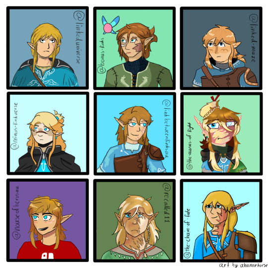
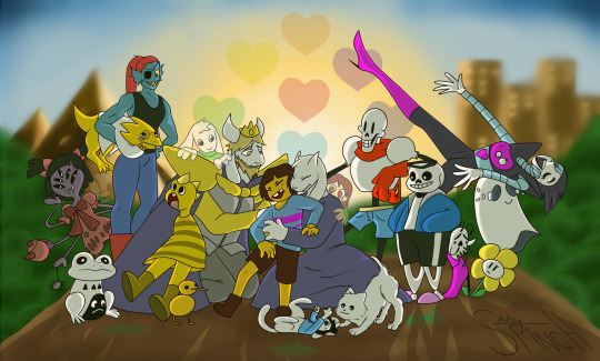
Look at all the Wildlings!
I wanted to draw other links meet aus, and here we are, 9 different botw/totk Links all together! I picked 9 different aus and tried to draw each of the links in the creator's style, and I think I succeeded, they're all pretty close actually! (Little note: no one cares but I'm very proud because I didn't trace any drawings at all and I didn't eyedrop the colors from the reference a single time)
Going from left to right and top to bottom
@linkeduniverse Wild!
I love Wild so much, the chaotic little gremlin. I also love your art style! It's very light and pretty. I know it's changed a lot, but all of them are nice. Wild needs a hug, everyone needs a hug, I'm going to break into the comic just to give them a hug, he deserves it. I love him so much, he inspires me, I want to be just like Wild, a chaotic little arson gremlin.
@bonus-links Slate
He seems very serious, I think he needs a hug. I love his hair, and his shirt(the dragons are really cool!). I love his little fairy friend too, I had to include her. I love your art style so much, I don't even know what to say about it, I just love how you do everything. The way you draw faces though are especially nice, I don't know, you have such a wonderful art style I want to steal it(I won't though)
@linked-maze Wild
Adorable little boy, he's very cute. Very smol. Very squishy. I love him so much. He needs a hug too, I'm gonna give him a big hug. Your art style is very nice, and I love Wild's design! His hoodie is cute, I need one like that too.
@minas-linkverse Hoods
Hoods is adorable, like, I'm internally screaming, he's so cute, and so is your art style! I just want to squish him. Poor little guy needs a hug, can I give him a hug? I'm giving him a hug. Also I love the way you shade hair, it's simple but it looks really good.
@linkbetweenlinksau Wild
My crazy boy, my gremlin, I love him so much your honor. That's my arson hazard right there, he's not yours anymore I'm stealing him forever I love him so much. I also just love your style, like, it's very squishy, I'ma squish the boy(/vpos). Your art style is so beautiful, every time I see you draw anything I'm inspired, I want to draw just like you one day.
@the-auras-of-light Tears
Gurl, how many layers do you have on an average drawing??? Your characters are so detailed, also the lineart coloring? You must have infinite patience or something, I don't know how you do it. Also I love the way you draw hair, it's very fun, I want to draw hair like that more often. And the lighting, I love how you draw lighting, mind telling me how you do it? (I'm also stealing Tears' hat, it looks fun)
@houseofheroesau Wild
Arson boy, little gremlin, partner in crime, the ultimate hazard to society, I love him so much. He could light my house on fire and I wouldn't care, I love him. He looks like he could get away with just about anything, especially the way you draw him, he's very cute.
@recalled11 Wild
I just need to know, what brush do you use for the hair? It's so pretty, I love the way you shade everything(especially the hair). It's so detailed, how long does it take you to draw your characters? I just love the way you do it, I need to take notes.
and my own au, @the-chain-of-fate Wild, my arson boi
If any of y'all(au creators) want a closeup of your boy to save ask me and I'll take a better picture, the quality of this one got eaten just a little bit.
Also, I had so much fun drawing all these characters, I want to do it again! If anybody would like, give me a character and an au to draw(yes, request your own au too!) I would love to do this again sometime!
#ahanar's art#lu wild#bonus links slate#lm wild#minas-linkverse hoods#lbl wild#tears taol#hoh wild#recalled wild#tcof wild
115 notes
·
View notes
Text


I did an oil painting of Jade! I wasn't sure who I wanted to paint, so I rolled a dice and Jade was the lucky winner. I had a lot of fun doing this one, I need to use my paints more often.
And I took a whole bunch of photos of the process, so you guys can see how it came into being!

First things first. Planning. Traditional painting doesn't have the luxury of being able to make sweeping changes as you go like you can with digital, so if you generally want to plan ahead.


Next I printed out my lineart onto some watercolour paper and taped it to a board. I then sealed the print/paper with some clear acrylic medium and painted my tape white because it was bright fucking green and would throw off my colour mixing. My set up is pretty simple. I have a jar of mineral turpentine with a strainer at the bottom to clean my brushes on, my palettes are just boards with wax paper clipped onto them (easy cleanup) and a roll of paper towels and some rags for cleanup. And I also use an medium that both thins out my paint and helps it dry faster, otherwise oils can take months to fully cure.

I planned out all my colours in advance, so all I had to do was mix up the appropriate shades and then pretty much play paint by numbers.


The general process is block out each colour and then do whatever blending is required. If you want a harsh shadow you dont do too much blending, if you want a soft shadow you use a fluffy brush and go over the area multiple times.


And then you just go around area by area filling it in as you go. Of course there's a whole lot of different techniques and processes for completing a painting. This is just what I did for this specific painting.

And he's done! He took a few days to dry, even with the added fast drying medium. There's a few areas I'm not happy with, but I would cannibalise any colour on my palette by mixing it into the next colour I was going to use. So sans re-mixing that exact specific paint, I couldn't go back in to touch up anything.
The digital planning stage was done the evening before, and the painting stage was about 6 hours? So all in all anywhere from 8-10 hours total for this.
If you guys have anymore questions (this was a pretty brief overview) feel free to dm me or leave a comment or whatever. I don't bite and am happy to help anyone out there looking to improve thier skills, or satisfy anyone's curiosity.
#not too happy with my final photos#but I used the best camera I had access too so#*shrug*#I guess this is what I can show you#twst#is my art#twisted wonderland#jade leech
208 notes
·
View notes
Text
Allowing myself to go on a tangent about the nearly 26 year old virtual pet website that i am way too invested in.


So today they released the Candy Pteri. While I appreciate what they were trying to do here with it effectively having two designs that you get to choose between (The "Melted Candy Pteri" on the left is a Paint Brush wearable that can be removed to reveal the customizable base pet on the right), I think in this case, they have created two extremely boring designs when they could have easily created one strong design, or hell, even two strong designs if they wanted to do extra work.
Because with this release, we get a base Candy Pteri with no real lineart changes (like the rounded hair tufts and spines on the Candy Zafara), and an alternate design that's just... a drawing of a Marshmallow Peep™???
I would have WAY preferred a base Pteri where they did something like give it a little marshmallow dollop shape on its head and in place of the tail tuft, like my friend @darieyrie suggested. Or they could give it the Peep dot eyes and more rounded features! There's all kinds of ways you could do this concept.
I'd be less frustrated if the Peep wearable had any Pteri traits whatsoever, but its JUST a Peep that's been slightly microwaved. Which is a little funny, but even more than the Toy Poogle is just an iDog, the Candy Pteri does not have any deviation from its base inspiration at all. It's not actually an execution of the concept of "Candy Pteri thats based on a Peep" if there's no Pteri left at all!
(also are they just banking on the Just Born corporation (who make Peeps) never taking any action on this? it kind of goes beyond 'cheeky reference', its EXACTLY their product. I mean, it seems unlikely that they'll notice or bother doing anything if they do, but i don't really know why you'd risk that.) The saving graces of this design, imo, are that the pink and cream color scheme of the base pet IS pleasant (though the lineart and shading treatment aren't really my bag), and some people will enjoy the novelty of having a pet Marshmallow Peep™.
But really this is just the latest of a number of recent outfit and color releases that feel like they don't think people want Neopets. Like. This cardinal outfit that they also released today.

I love the idea of a cardinal Pteri! But this outfit literally takes away every distinguishing trait of the Pteri to make a high effort, nicely rendered, but stylistically incongruous generic cartoon cardinal????? Its not even a Neopet anymore!!! Even if I set aside my personal dislike of the overly rendered style they're using for more and more of the site assets, this wouldn't work with most of the rendering removed either, because it would still be a Pteri in pose and proportions only.
Not every new design and outfit that's come out in the past couple years has these issues and there have been a number I've really liked, and I DO think its great that the quality of the art has improved since the JumpStart era. But I would really appreciate it if the new pet colors in particular were designed a little more thoughtfully, so that they at bare minimum still resemble the species they're supposed to be outside of the rough pose and proportions. It sometimes feels like there isn't a rough draft or workshopping progress for new colors, and the members of the art team just kind of do their own thing and then the very first draft of an idea is what gets polished and released.
The current art direction for the customization aspects of the site just has me feeling like they've decided to throw out years of relatively cohesive art and world design for a strange jumble of ideas that don't really capture the appeal or feeling of Neopets to me.
#neopets#long post#i need a text post tag#sorry for my derangement#while this is frustrating to me at the end of the day like. there's years of stuff that they already made that i do like#so i'm not sitting around constantly seething. also i swear i have interests besides neopets as well lol#i'm just very invested in and opinionated about both neopets and design
84 notes
·
View notes
Text
emergency art commissions !
HI GUYS !! ahah !! please help me cover my hospital bill !!!! for my thumb !!!!
brief summary : i was cutting some paper figurine thingies for my students (13 each, for 24 kids, so over 300 i think) and really hurt my thumb's nerve !! so i need help covering that + my enrollment fee (not as much of an emergency i have like a month or so)
EDIT: MY HOSPITAL BILL HAS BEEN COVERED!! THANK YOU SO MUCH FOR SHARING!!!
commissions are still open for anyone who wants one, but i don't have a pressing need for donations anymore!! thank you again!
SO !!! (copy paste of my last comm post's prices below)
PRICES:
full bodies are 35 25 dollars (30 shaded 5 sketched), and headshots are 10 5 dollars (7 shaded, 3 sketched)! I also do discord emojis for 5 3 dollars each, and whatsapp stickers for 5 3 dollars each, regardless of complexity!
ADDITIONALLY. i will draw pretty much anything at all. guys. i will draw you the chucky cheese rat pregnant. hell ill draw you bowser AND chucky cheese having sex. without any extra complexity cost or nothing. ill draw your mary sue self insert french kissing those gacha characters yall like so much. i dont judge. ill draw homestuck. mordetwi. anything.
ehem. prices can be discussed, and additional characters come cheaper (any additional character will be 60% off the normal price) in drawings with multiple characters + each 10 drawings with the same price, one comes free!
i also do gifs! every second is 35 20 dollars!! (gif making is very tough).
sketch pages are 5 dollars, and can have up to 5 sketches in them!
Payment through Kofi, or PayPal! I take payment after I do the sketch, and you give me the go ahead to continue to lineart!
art examples:


(copy paste over !!)
please reblog !!!!! i really need this ahah. also if you dont want a drawing but would still like to help me out you can do so through my kofi !!!
30/30$ (hospital bill-DONE!)
31/450$ (university semester enrollment bill) (not as urgent as the other bill was though dw)
#emergency commissions#art commissions#open commissions#commissions open#commissions#commission sheet#commission work#artfight art#TWO OF THEM ARE !!!!#please reblog
131 notes
·
View notes
Note
hi! i love your stuff a lot, and i was wondering how you decide on colors for your pieces / designs? im doing an art analysis on your stuff and its getting hard when it comes to your colors. your art is really really appealing and just generally good to look at!! thankyu :p
I really like rainbows and bright colors so I tend to gravitate towards those. I tend to use the same general palette for rainbows in all of my pieces, I like replacing red with pink or in a more complex gradient-ish rainbow putting pink before red. Sometimes indigo can be omitted for a 6-color rainbow (fact:there was gonna be a indigo-hued diary in the "does this just keep going forever" drawing but I was reaching the point where it wasn't fun to work on anymore and I just wanted to finish it so I omitted it..)

i made this very poorly/sloppily on my phone but here's 2 rainbows I really enjoy and a shading technique I try to employ in almost all of my art. basically if something is pink then I should shade it purple instead of darker pink. (pink is one of those colors where I don't always like using the nearest color [red or orange] for highlights and I just pick a lighter pink instead, and sometimes make it warmer/cooler. but it depends!! I like to mix it up if possible)
I dont always do shading on my art but I also like to pick lineart colors this way as well
as for just picking colors in general: I will be real and say that sometimes the colors I pick don't end up looking perfect so I add filter layers or gradient maps at the end. but when i pick colors normally I tend to gravitate towards higher saturation ones.
these are really the only "rules " i set for myself when picking colors. the rest is just...fuck around and find out. Sorry if this isn't exactly the answer you were hoping for? I'm no professional and I'm bad at explaining things LOL 😭
24 notes
·
View notes
Text
im so sorry it took me so long to answer these oml but YES i'd be happy to show how i draw and color :)
— SKETCHING
please note that i almost always sketch traditionally first lol it's just a lot easier for me to determine how the drawing is placed that way, but i always go over and re-sketch it digitally
for magolor i always start with a basic egg shape (lmao) and then i add his ears. then I draw the scarf; it's easy to determine the shape and dynamicism based on where the bottoms of the ears are located
then i usually add the cape and hood together. where and how these are placed and what these look like in general are very important because they're the main area that perspective is directed to (the ears and everything else is important too ofc!! but the hood and cape usually help demonstrate where he is looking and how he is moving the most). then i add everything else, usually his hands last!
— LINEART
ohhhhhh god my worst enemy. Hope youre sitting down because this will be embarrassing LMAO
lineart is easily what i struggle with most and is more often than not the most time consuming and grating step for me. If i had a choice i would drop it in a heartbeat, but my style is so dependent on thick lines and shapes that it's difficult to 😭 a hole i dug myself into unfortunately ITS FINE THOUGH. ANYWAYS I'm getting sidetracked
i use my finger to draw all my digital art, which means i usually have to use a Heavy stabilizer to avoid shakiness and staggered lines. Unfortunately ibis paint's stabilizer is actually dog water and doesn't even stabilize more than half the time (in which case i have to repeat lines over. And over. And over again until i get it right) but when it does like me and works properly it's very helpful!
i always use the soft school pen bleed brush as my main tool for lineart. This brush has been my best friend for everything, i even use it for sketching idk it just really like the way it looks lol. sometimes i change the aspect if i want the lines to look more ,, chalky?? or smoother depending on the work

i don't really use this tool much but for this specific piece, force fade was my partner in crime
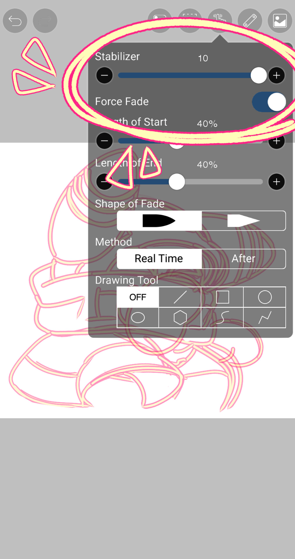
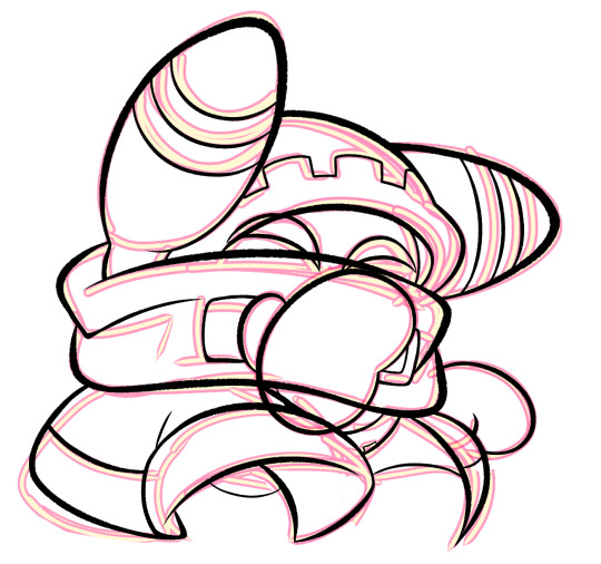
also i think i need to mention that i use so many layers for this. So many layers lol like to the point it's embarrassing. and at the end i merge most of them (except for the gear patterns, rings on his ear, and eyes + hands, which usually need to be by themselves as they're colored separately) Thank you for layers
and i end up with this!
— COLORING && SHADING
yippee yahoo the fun part !!! the part that i love the most
at this point, if i havent already, i always create a folder for convenience in organization because this is the part that i stress the most about what details are on which layers lmao
then i add ANOTHER layer below that for the color, then i put every single color used on their own separate layer!
now, for shading, if im working on larger pieces with more complex shading, i'll usually plan it all out. normally when just drawing magolor, i don't really need to do this anymore because i'm so used to it lol, but for funsies i did it here anyways
then i use the bucket tool to fill them all in
i usually have a set color palette for all the characters i draw (though the way i shade white differs. A lot between my work as you can probably tell fhdfgf). For every color, i have two specific tones that are associated with the shading. for example, indigo + violet are shaded with my blue, pink + light orange (or lighter pink depending on my mood lol) are shaded with yellow, etc.
so, i shade the other areas with the 2nd shading color
a big tip i can give for coloring is to look at a color wheel when you draw. i know that sounds like. Such basic advice LMAO but that seriously was a huge help for me when developing my shading and something i learned while studying — if you notice, in all of the shading in my work, all of the colors used are analogous on the color wheel. note that not ALL combinations will work together like others obv !! but it's a huge step in knowing where to go with it
then i add other extra details like extra lighting, halftones (if i feel like it // if it fits the work), glow to his eyes, and color the lines and ta-da!
another tool i use a lot especially with my more recent art are blending modes, especially multiply. i use a clipping layer to add a dark color (usually a dark blue or purple) and set it to multiply, then erase the areas that emit light

and this is the end result! this is a very very basic demonstration of it fhdjg i was a pretty messy with the lighting and erasing in this example but you get the general idea right
and that's how i draw :) i hope this was helpful, and thanks for asking and being so patient with the response!
#ask#magolor#kirby#macdraws#ive wanted to make a tutorial for So long and finally found a bit of time to do it lmao
144 notes
·
View notes
Note

Hey so what’s your drawing process?
GET OUT MY HOU---
I have never been asked this b4! :-O Im drawing at the moment so it wouldnt hurt to explain how i do my refs for example heehoo
First i shallablamkdabdomdb I Think. I brainstorm. Im like. How does this character behave and act towards their everyday surroundings. 🤔🤨.... and then im like BAM I GOT YOU NOW!!!!! Sooo for the ram , for example- shes around 17 and is like ,, Shes very messy yet energetic ,, a god of war at her age makes her very energetic and outgoing since she has all this power (and well i guess it doesnt help she has adhd but-) so i was thinking about her pose as something rlly silly and dynamic
As i got used to drawing poses it was actually smth i learned from a couple of my moots- one of my moots got a similiar ask like this nd i took it with a big bag of rice and RAN ,,, Its all about me wanting to make dynamic poses- im not the best at fluid bests For Now but IM GETTING THERE ,

But yes sorry; thinking about my poses, sketch it twice, begin linearting- but after i finish lineart, i create different layers of coloring because my brain (ocd) tells me things and if i dont do This Thag Way I Will Be Killed On Spot With A Nuclear Ray From The Sky
I do lineart first, draw the face over on another layer, do hair color first, then body color under the hair color,, after im finished with that i then go HEEERRRM. NOW. Does it deserve a little razzle dazzling? A little speckle spackle? Do i want to render it? Do i want to change the lineart color to highlight the characters main color scheme? Yap yap yap my process isnt ALWAYS like this but its usually that way-

For allure though i can use a good example for this- when drawing allure—if i want to line their hair with the darker beige—i create two more layers and then draw over their hActually this doesnt make any sense I MEAN. WELL. I COULD PROBABLY JUST SHOW THE TIMELAPSE. Oh yeah I overuse the undo and redo button as well as using a FUCK ton of references from pinterest
But heres what my canvas looks like atm :-] if i want to make size comparisons i lower the opacity of the finished art and sketch over that with how tall or small the character is- aaliyah here is the shortest and smallest so to make sure i did her height and body size right i use the transform tool to slide her across the grid and go "is she smaller than i made her ??? Is she TALLER than i made her?? Did i manage to do her body weight correctly???" Etc etc

,,
Okay maybe nothing i said made actual senseMAYBE ILL TALK ABOUT MY OTHER EXAMPLES...? Im Digging
For something like this i actually kept th sketch BWAHAHA- i didnt really feel like tracing over it again (at least more or so properly-) so i shrugged, went Fuck It, then made my sketch the lineart layer. I put the flat color beneath it afterwards, put Alpha Lock on so i can shade, and bada bing Bada Boom ,, background comes after everything else (BAD HABIT) (COMPOSITION AND PERSPECTIVE R HEAVILY INFLUENCED BY WHERE MY CHARACTER STANDS-)


Uhh what elseOhYeah if its a standalone sheet for me or a friend- i draw the two poses that come to mind first, write down all the information i was provided (eithet myself or a friend), and then draw anything else i want to next to the poses if theres space left,, this is my brothers lamb and so i went back nd forth asking doll if what was okay and what wasnt okay to add-

ABSOLUTELY YAPFESTING . SORRY. I HOPE SOME OF THAT MADE SENSE. I know this wasnt an advice ask but if people ever needed advice from me i usually fuck it up cuz my Very Own process confuses me sometimes-
I usually either take 1 hour or 2 days to finish something (yes im That chronically online and insane to draw for 48 hours straight without sleeping)
That or if i hate something i go insane (negatively) over it and refuse to ask for peer review (at least sometimes-) so im like Okay Fuck This Wip. This Doesnt Exist Anymore
#sydneys asks#sydneys doodles#sydneys wips#i guess that counts here-#i did not read over my own words so in all honesty my english has been pretty fucked up as of recent so if this is ineligble then i am Sorry#OH YEAH I PRIORTIZE SHAPES. UM. NOT SHAPE LANGUAGE. MAYBE SOMETIMES THOUGH. IT DEPENDS ON HOW IM FEELING#I need to go eat somethingThats Unrelated
16 notes
·
View notes
Text
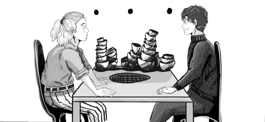
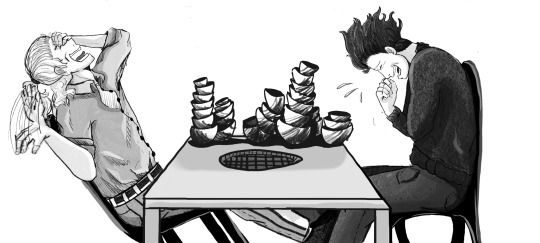
Yay it's done!!! This was so fun to do, and really pushed me to work on my lineart in a way I haven't had to before and also grayscale shading. I read this scene and....immediately wanted to draw it. So....I did!!
A sweet little scene from the amazing fic Asagohan no Aru Seibutsu (Still Life with Breakfast) by @russenoire!! Sorry I couldn't get the ceiling-high skewers I tried and it....looked like a wacky haystack. SO you can imagine that there is a HUGE stack of sticks behind the bowls. Also chairs are hard to draw so they are just ~shapes~ haha
Here is the scene (it is helpful to understand the comic). Also just like, go read the whole fic!! It is fantastic!!
‘I mean, what do you do with your ESP these days?’
‘Mmmmm…’ Teruki runs a hand through his hair, scratches the back of his head. ‘I still get asked to do exorcisms sometimes. I don’t love it, but I’m happy to help. Besides that… I don’t have any natural enemies anymore? At least I hope not.’ A wry chuckle. ‘Though some of those techniques I learned as a kid are still fun to play with. Just gotta make sure I don’t set anyone’s car on fire…’
If his inward smile at that is visible on his lips, he’s glad for it. Don’t ever change, Teru. ‘I wanna ask what you’re doing that might involve arson, but… yeah, I probably shouldn’t.’
Teruki leans in across the table anyway, eyes wide and ominous, his mouth pressed into a tight line, and lays a single dark word in his ear. ‘Barbecue.’ Teruki’s face right now. He—he can’t… That’s it; he’s done. A single wheeze breaches his lungs and heaves over them both in spasms of noisy joy, clashing merrily with Teruki’s own hearty squeals just as the server returns with their drinks. Teruki’s so far gone he can’t even speak; he raises a hand mid-howl and nods a thanks somewhere in the man’s general direction.


Hope you enjoy, russenoire!! I am so lucky to have met you through mp100!! You are amazing, and your writings are phenomenal!
#mp100#mob psycho 100#teruki hanazawa#shigeo kageyama#russenoire#hiiiiii#surprise!!!#i had so much fun on this!!#makes me want to draw so much more#comic#my art#fanart of fanfic
44 notes
·
View notes
Note
any advice 4 when u want to keep drawing 2 improve but u cant get over perfectionism ? like when u just dont care how its gonna turn out, if its bad its bad yknow?
ahh yes lowkey ive struggled with this a lot. not as much now as in the past tho, and honestly its beecuz ive developed a more neutral view on myself/my art in general. its going to take time to get to this state of mind, so dont be too hard on yourself when you find yourself falling into bad habits.
advice under the cut (kind of long winded) ⬇️⬇️⬇️
the first thing ive done to overcome perfectionism is focus less on details and more about overall shape and form. when i sketch im trying to get roughly what i want, and i limit the strokes i do in certain parts of my sketch to like 1-3 depending on what im drawing (im ngl i also am very impatient and have created a workflow that makes it so i am able to start and finish pieces as fast as possible LOLOLOL. shrugs. i just like drawing fast).
a good example would be this thing i just drew:
in all of my sketches i tend to use as few strokes as possible and just get the basic idea down. good for not overly focusing on teeny tiny details and worrying about them later (i also use the same technique for lineart, but just end up connecting the lines. thats another tip i have, if you like your sketches more than your fully lined pieces, just line the same way you sketch! or you could also use your sketch as your lineart :P)
another tip i have is to draw from references, and once again, focus mostly on shape/form/the big picture of your subject before going into details (do you know how many planes there are on the human face....i still dont know howta draw faces properly but im not mad at myself anymore about it, i just open up a reference and try to learn). i also recommend having a drawing session where the goal is to draw awfully. draw something you want to draw, but that you're not sure if you'll draw it right, and draw it. dont try to correct it, acknowledge that what you made isnt perfect, and then draw something else. you're learning! of course its not gonna be perfect. but inevitably, you're going to get frustrated. just remember if its something you really want to go back to, you will be able to revisit it in the future. feel your anger and frustration, but do your best to not direct it inward.
small side tangent about shading- I AM SO SHIT AT SHADING SKFHSAFDJHS. people dont tend to notice (surprising), since ig my shading style is considered "beautiful" or something, but if you looked at it on a technical level, there are mistakes everywhere. i havent really tried to improve it. i dont really care most of the time b/c i just like shading for fun. and especially when im shading my sketches, i already have it in my mind that its not supposed to be perfect. its a sketch. this is where im supposed to make all of my mistakes. once i start making my way to the final product is when i start worrying more about if i did the lighting correctly (even then ik im not good at it im not trying to be a god im just trying to draw things that make me happy).
additionally, i really rec u dont try and fudge a sketch until its better if you're deep in a Perfectionist moment. keep the old sketch and start over on a new sketch taking bits and pieces you liked from the original, and improving on those that you dont (shitty thumbnails are also good if you have a vague idea in mind but need ta figure out howta place subjects in your scene). honestly drawing the same thing/idea over and over gets me a better understanding of my subject each time, so naturally each iteration looks better. it doesnt take me that long to sketch tho, so if sketching takes you forever (sometimes if sketching takes you forever its b/c you're a perfectionist skjfskdjf) just think about how much time you're willing to spend on something. remember☝️ its okay to give up/take a break on something and try again later. sometimes you just needta stop looking at your art and like. look at a tree or something lmfao.
i will also say that im not looking to go into a career in art, im more of a hobbyist. ik school environments dont exactly.....help with perfectionism lol. there are certain expectations put on people who go into the art field that are inescapable. if this is the case for you, i still think what ive discussed before can help you, but i also think that you may need to lean more on the mental tips i have also provided below.
alright! mental health tips in regard to art:
so, i have c-ptsd, and with that comes a lot of self image issues that ive had to work on. my feelings about myself extended to the way i felt about my art. it was shit, it was awful, i cant draw like this other person can so why bother, if its not perfect i shouldnt draw at all, etc. and honestly, something thats helped is affirmations. my affirmations are c-ptsd related, but ive noticed a shift in the way i view myself, and by extent, my art since ive started repeating them to myself daily. and honestly, i think a requirement of overcoming perfectionism is telling yourself that your art doesnt hafta be perfect, A LOT. LOL. LIKE YOU ACTUALLY HAFTA ACTIVELY TELL YOURSELF YOU'RE NOT AWFUL LMAOOOO. its funny, we dont think much about how we naturally are self critical about ourselves, and we dont realize that we are basically repeating negative affirmations about ourselves over and over and thats why we're not improving (mentally).
even when you're not drawing, i think it would benefit some people to have some kind of notification on their phone to remind them to tell themselves that their art doesnt hafta be perfect daily/however often you feel you might need it. and then with that affirmation, practice Shitty Drawing. one of the best tips ive ever gotten for this was from one of my friends monnie. get out your sketchbook or some printer paper, take out a shitty pen, and DRAW. and then any mistakes you make are permanent and you cant just endlessly try and fix them. it forces you ta sit with this uncomfortable feeling that something you made isnt perfect. eventually your brain will realize that when your art isnt perfect, you can still draw and you're ALLOWED to continue to draw even if what you make isnt spectacular. if you dont want to repeat an affirmation daily, try to remember to at least repeat it before you sit down to draw. something along the lines of "my art doesnt hafta be perfect in order for me to want to draw. im allowed to draw even if its not perfect" or something else. it depends on what you most struggle with in regards to your perfectionism. im ngl its probably going to feel cringe at first, but i promise you, it really works if you put it into practice longterm.
shoot for neutrality instead of positivity first. let me tell you thats where i am now and its so much less exhausting drawing lmfaooo. i make something that looks like shit and im just like. i dont fucking careee i dont give a fuccckkkkk
those are my tips :] i hope this was helpful!
#spacie spoinks#art tips#kind of?#art advice#i would have added more art but i dont have my art saved on this device KSHFSKJDFH#i copy and pasted my art above from my tumblr post 💀💀💀💀💀💀#anyway#have a great day anon!!
10 notes
·
View notes
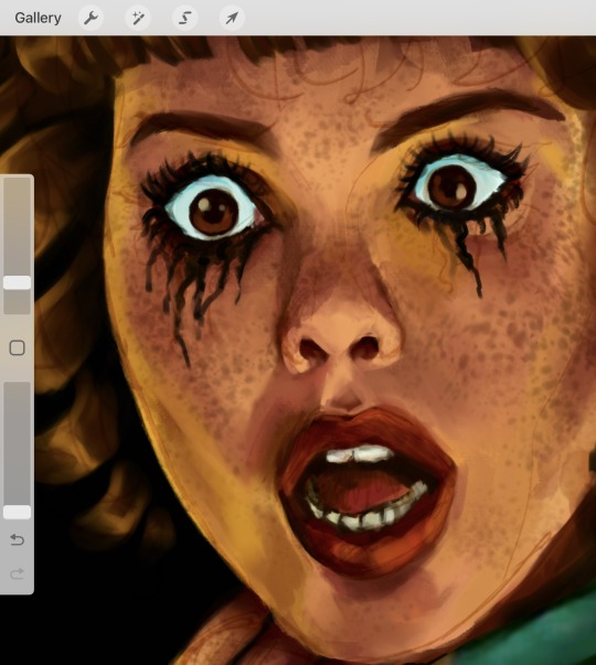
Note
Hiiii i just saw your Outsiders/Christine art and HOLY SHIT. When i say my jaw was on the floor it was on the floor. I’m a huge Stephen King fan (I’ve only read his books bc to me his books are good enough. I’m not a huge horror movie watcher girlie but i can do thriller/horror books. I have like 8 of his books, including Christine, on my bookshelf) and once again: HOLY SHIT. I can lowkey see the Outsiders trio as the Christine trio. Now whenever i go to reread the book, i can’t view it the same anymore haha. Another Outsiders/Stepehen King art idea for Halloween: 11/22/63. It’s one of my absolute favorite Stephen King novels. And if you haven’t read it, highly recommend it. It’s so intense and entertaining and i do get lost in that book. Anyways, HOLY SHIT. But i was also wondering if you have any tips for beginner digital artists? Like on layers, line art especially, shading etc.? I really want to get into more digital art but my tradional sketches lowkey look better than my digital ones haha. Whenever i see your stevepop or Outsiders art it just gives me a boost of inspiration. And i love them your honor.
Woah, thanks!! I’ll have to check it out- so far I’ve only read Christine and The Body (because my dad’s obsessed w/ Stand By Me), but I really dug both so I’m looking forward to it!
And as for digital art tips, I guess I’d say to keep things loose! I like to use a modified version of the Shale Brush on procreate for my sketches and lineart because it resembles a pencil, and the rough messiness makes it a whole lot easier for me to just relax and draw the way I do on paper. I don’t shy away from messiness especially in digital art- it makes things flow better in a medium that can get really stiff sometimes.
I like to do my sketches in bright colors, and I tend to assign every subject a certain color so I can tell them apart easily (idk how helpful it is, but it works for me!) Then I lower the opacity and draw on a layer on top like this:
Then I turn off the sketch layer and either fill everything in with base colors, or color it in grayscale w/ this Copic marker brush and varying levels of opacity for my comics.
As for shading, I do a combination of cell shading and painterly shading (picture for the uninitiated lol). Both have their merits, and shadows in real life usually include a bit of both.
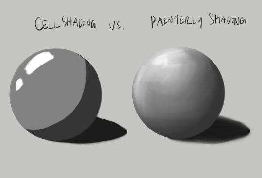
For more simple stuff, I take a shade of either purple or sometimes magenta and cell shade everything with this pencil brush on a multiply layer, usually set to 30-ish% opacity depending on the drawing. Then I’ll blend it out a bit to soften some edges, which is what makes it look painterly. Also if you don’t know, “clipping mask” layers are really helpful for shading! You just put the shading layer over the colors and it stops you from going outside of the colors, it can be super helpful. This method is the one I usually use, and the one I’ve been using since I first started about five years ago now.
For the Christine poster specifically though I mostly just kept everything to one layer and color dropped from the reference, altering the colors as I saw fit- and just sort of guessed for Evie because she’s way tanner than Leigh and needed her own colors. The only times I used different layers were for each individual character so that they didn’t mess each other up, and also for the sketches, which I put on top of the colors but lightened the opacity on. Idk that I’d recommend this for a beginner tho, it’s taken me years to get comfortable working like this!
Sketch is set to a multiply layer here too. You can’t see it super well here tbh, because of how dark everything is, but oh well. Here’s a study I did last year with the same method tho! (Also she’s got some similarities to Evie huh?? I guess I have a type lol oops)
Anyhow, that’s probably enough for now lol- but lmk if there’s anything else you wanna know! And obviously this is just how I do things, there’s no hard and fast rules for any of this- I’m making it up as I go along, and you should too!!
14 notes
·
View notes
Text
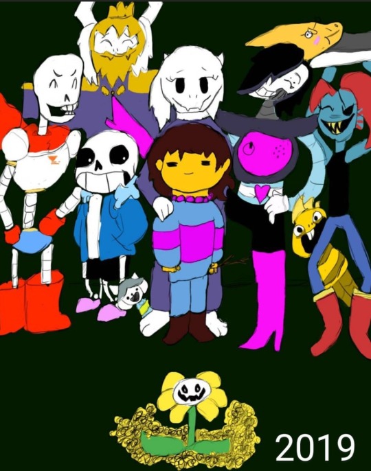
Four years ago, I drew my first ever finished digital art piece, using a Huion 420 tablet off of Amazon, and Krita. I was so proud of it, I showed it off to my friends and family on instagram, and I didn’t think I could get any better than this. Fast forward to the next year, and I drew it again, just to see how much better I could make it.

This time I used a Wacom tablet with Krita. It was one of the cheaper ones, but still an upgrade. I was even more proud of this one, but I wasn’t really that happy with it. I didn’t like how Papyrus turned out, and it seemed so awkwardly spaced and posed. I knew I still had more to learn, and I rushed it, since I didn’t think I could do any better. I then decided to redraw it again the next year.
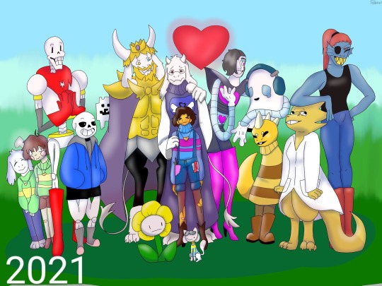
This time I used Ibis Paint X and a small stylus on my phone. I was ecstatic with how this came out. I thought this was the absolute best I could ever do, but I still had little nitpicks about it. Again, I struggled a lot with drawing Papyrus, but this time I was also unhappy with the colors and shading, and how Sans was drawn (I have no idea why I made him thicc). But again, I redrew it the next year.

This one was a huge confidence booster for me. I had just gotten a brand new laptop from my parents: A Lenovo Yoga, with a Wacom bamboo ink stylus. It was the best gift I ever received, but on top of that, they got me Clip Studio Paint PRO. So I was ready to make some good ass art. This time I sketched everything out on paper, then finished it in CSP. I even attempted a background, which didn’t come out too bad. Papyrus doesn’t look horribly off model, and the poses and composition overall was just better. I used a clean sketch for the lineart, since that was a big struggle with my previous versions, and I used colors other than black and white for shading. After I made this, I felt like I didn’t need to continue redrawing it, because I thought I was at my peak.
I redrew it this year.
I used my Lenovo Yoga, but this time I had a Wacom bamboo plus, and Clip Studio Paint EX. I added more characters, and took a little bit more inspiration from the original, but I mostly wanted it to feel more alive. I finally perfected how I draw Papyrus, and Toriel, Asgore, and Frisk aren’t statues anymore. I showed off what I’ve learned about lighting and shading, did actually clean lineart, and I even did a full background! I’m so proud of this, and so happy with how far I’ve come as an artist, and I can’t wait to see what my future self draws next year.
#art#digital art#artist#artwork#digital artwork#art progress#art process#undertale#undertale fanart#undertale anniversary#sans undertale#mettaton#napstablook#frisk#toriel#asgore#papyrus#muffet#undyne#alphys#froggit#whimsun#flowey#temmie#annoying dog#toby fox#wd gaster#asriel#chara#monster kid
88 notes
·
View notes
Text
yesterday was webcomics day. i am bea and i make "A Ghost Story" - part 4: the art
this part i feel like gets done semi-easy once the rest of the shit is dealt with. yesterday, my knuckles continued to swell and feel like rotten wood so i had to cut it short. this shit happens more frequently than i would prefer. today i need to run to the store and also pick myself up a lil treat (an eighth). for right now tho i have some cbd rich stuff that should help. maybe. while the index finger still hurts, only the middle knuckle is swollen anymore. let's see.
i started with panels 2 and 3 bc they seemed the least immediately labor intensive. ill be copy/pasting the line/flats for panel 3 to edit from there. t...there's going to be a lot of copy/paste this page. its not usually like that. but i usually only copy/paste the lines and flats. i will re-shade things so that they look different
unlike the sketch, the lineart has more "weight" to it. wait thats not how the pillow would deform. hold on.
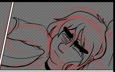
ok that's better. did people even notice that before i changed it. probably not. but it matters to me!!!!! these little things add up and add weight to your world!!!! ive been trying new things with line as as of [looks at watch] last week. so it looks bad right now. like someones vague idea of what good lineart is supposed to look like. practice makes perfect tho....or breeds familiarity or something.
some parts of this look weird. dont worry. we will cover up that shit with speech bubbles. thank you comics for your ways of obfuscating bad art.
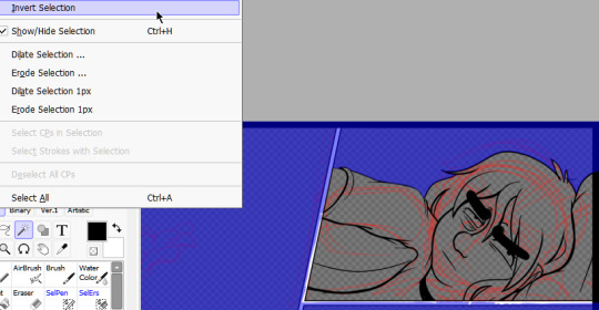
flats are easy. select everything that isnt your line art, invert the selection, and dump a base layer. then color that base layer with a mask
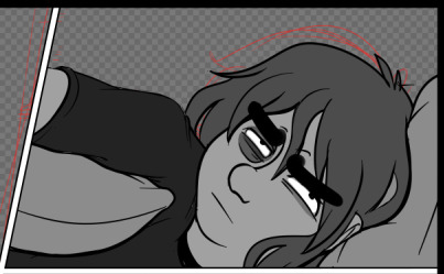
this page will, blessedly, not have any complex backgrounds. i already established the scene previously and can skate on doing my textured backgrounds. the background gradients in the direction the light in the room is being cast, usually.
first, a multiply layer at 50%. since she's facing away from the light source, she'll be mostly in shadow. then a white overlay layer at 50%; this is to make the first shadow layer pop and keep from getting too muddy. then a second multiply layer at 50% for the next layer of shadows.
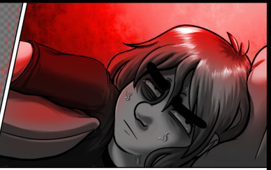
added some sweat beads to make her look more haggard and some shine to her hair, since she's so close to the light. i've started bothering doing this bc it unfortunately looks good. finally i add one more multiply layer at 40% over her eyes to make her look more over this entire thing. and then added the red glow in another overlay layer (100%) where it would land if being cast from above.
completely servicable and theres room for like. a speech bubble later. usually i do text first, but in this case its so secondary to the actions being performed, i want to prioritize one over the other.
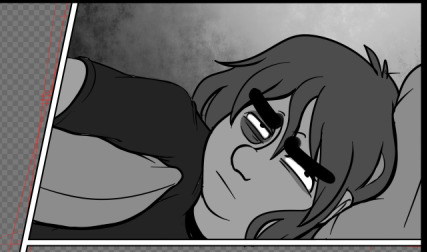
looking at it, im not going to be able to copy/paste this after all. she's going to settle in more and her body will rotate too much in the process. i can use this as a base to trace over, though, which will get me started.
but pain is occurring so im going to eat breakfast. what a bitch!
24 notes
·
View notes
Note
Hi!! I apologize if this has been asked before and I tried searching your blog to find out but- what brush do you use??? Huge huge fan of your work!!
ahhhh i use many! here are my main ones though
(also these are medibang brushes you can get for free on the cloud im broke ahshdsdh)

^ what I use for my rendered pieces lineart


^ doodles lineart (or just when I want more solid lines) (i dont use the second one as much anymore but it was my main brush for a long time so its included)

^ blocking out shading/simple shading (also what i use to color my doodles. why? idk)

^ also shading for smaller details

^ and of course the ol' reliable
**** also don't take the settings very seriously cuz I do change it around when the situation calls for it lmao. experiment !!!!
also thank you! :3 ❤️
21 notes
·
View notes
Text
Digital Art Progress
Went through my digital art to see how much I’ve improved through the years. You all don’t know how badly I cringed at the older ones. I mostly wanted to see just how much my coloring and line work improved.
I don’t really want to talk about 2014 since it was only one or two pieces, 2015 was when I really started doing digital art and yeah my coloring was AWFUL. My shading especially. And don’t get me started on my lazy ass refusing to draw backgrounds. 2016-2017 wasn’t any better with the backgrounds. 2017 was when I started making use of the effects for the shading. I also had art as an elective during those years so my teacher was a real help in improving it. Oh and I did have more artist friends to learn from too.


2018-2019, my coloring was getting better. At least the coloring for hair and eyes mostly, I noticed I went really soft with the shading. I also noticed a bit of a drawing regression through 2019-2020 but I was forcing myself to draw between those years. 2020 was the year I started coloring my linearts xD It was also when I started adding more effects and layers to make the shading better. And then 2021 is when I started doing a base layer for all the coloring so I didn’t have to worry about erasing any colors that went past the lines.

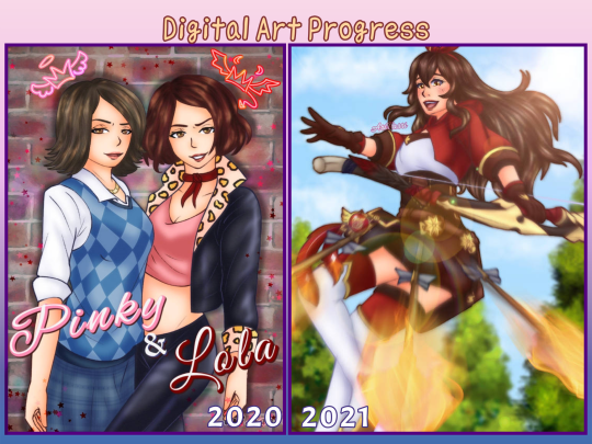
2022-2023 had a lot of my favorite art. My coloring and shading has improved greatly. I was experimenting more with different brushes for better lineart and coloring. I’m still in love with that drawing of Coby, it’s my favorite art for HPHM xD but yea, more effects more layers. I used to stick with about 15 layers but it moved up to 25 layers. 47 on a good day. As for colors, I kind of improved on that especially for shading xD At least characters with blond hair don’t look weird anymore when I shade and highlight them. I’m still working on coloring leather though.

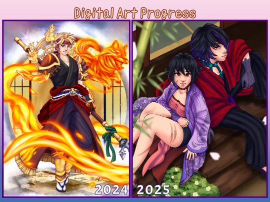
And then there’s 2024/2025. I learned another way to color lineart without having to directly color on it. Just set it to purple and set the layer to hardlight and it’s done. Though it really depends on the kind of drawing, I still had to color in some areas so it blends better. But that’s how I colored Thoma's mystic skin in the image here. And my fire effect is getting better ( ̄▽ ̄) I used to cheat and just use IbisPaint's fire materials. Also I no longer need to do three layers of shading to get the desired effect. I’ve also switched to a more simpler method to color hair, which is honestly fine. I think I prefer it this way now over the previous method. And once again I’m learning more on color theory because I still struggle. I’ve also been desaturating my art more now, especially with the latest ones. It honestly make them look so much more nicer to just stare at.
#just ari things#I’ve only ever shared art from 2014 on facebook never anywhere else#art improvement#art progress#digital art#digital art improvement
9 notes
·
View notes