#i wanted this info to be easier to find all-together on tumblr
Explore tagged Tumblr posts
Text
here’s a compilation of why rick berman of star trek fame could have ruined the franchise with his bigotry, thanks to @/thisismewhatevs on twitter:
- rick berman is usually cited by writers as the main reason gay characters were not allowed on screen in TNG/VOY/DS9/ENT even though gene roddenberry specifically wanted gay representation in the 1980s
- notably, he is responsible for demanding female actors be "sexed up" in various ways including jeri ryan's catsuit and padding terry farell's breasts
- when terry farell asked for a reduced contract similar to those of her male costars, she was fired, leading to the sudden death of jadzia dax
- with seven of nine's catsuit, not only was it berman's idea to make her "born sexy yesterday" her original costume pinched her neck so much she kept passing out. rather than change it, berman brought in nurses to administer oxygen between takes
- berman would continually comment on the appearance of female actors to the point that marina sirtis developed an eating disorder. sirtis also mentions how tight her corset and how large her breast padding was under her "uniform"
- berman was left in charge of trek because he was in the right place when roddenberry got sick. He had no experience with scifi previously and didn't really believe in roddenberry's vision of the future:
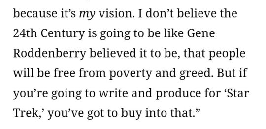
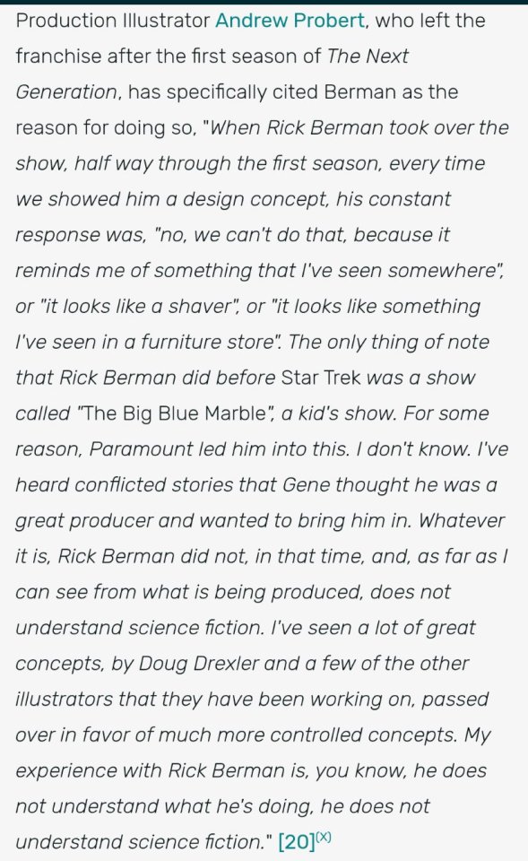
- In addition to being a dick to denise crosby after pushing her out, he's also the reason for wil wheaton was kicked out for similar contact negotiation as terry farrell
- harry kim was never promoted from ensign since berman hated his actor, garrett wang, according to him
- enterprise was a step backwards in a lot of ways because berman had far more creative control (seasons 1-3) and took a much more hands on writing role. here's t'pol actor jolene blalock discussing his sexualization of her
- as DS9 went on, garak and bashir spent less time together and garak was given zyial as an incredibly gross love interest because andy robinson's portrayal as queer coded made berman uncomfortable
- despite the "equality" promoted on the show, berman hired very few female writers, with less than 30% of episodes having even one female writer during his time
- “Rick Berman is not the only asshole to have worked on Star Trek and he is not the reason for every bad choice from TNG-ENT. However HE WAS the executive producers and show runner in charge of production so much of the sins of that time lie at his feet. When people get confused about how some people seem to "misunderstand" the point of Star Trek and don't know how they can watch/enjoy the "progressive" nature of the show and be such vile sexists and racists, this is how. They let a sexist asshole run the show for three decades. On screen representation is important. It's amazing for people to see themselves in such a hopeful future, but the behind the scenes matters just as much if not more than who is in front of the camera. Representation without responsible storytelling is a tragedy.“ -Deep Space Fine on twitter
this is not to say that TNG/DS9/VOY/ENT are bad shows, or that they shouldn’t be watched, or anything else; but that understanding why these awful choices were made behind the scenes in depicting a “progressive” future. rick berman didn’t agree with this future because he didn’t want others who weren’t white, cis, straight men like him to benefit in the ways he did.
#i wanted this info to be easier to find all-together on tumblr#star trek#rick berman#the next generation#deep space 9#voyager#enterprise#star trek meta
512 notes
·
View notes
Text

Hello everyone! With help from @auspex, we are putting together the first Tumblr of Darkness Secret Santa event! This event is where artists may come together, submit their World of Darkness OCs, and we can all draw and exchange gifts with one another! Just a little fun to remind one another that we're a great community!

How to Participate: There is indeed a limited amount of time to sign up to make sure everyone has a fair chance! Applications are open 11.04.2024 and will be kept open until Monday 11.11.2024. - You will be submitting your World of Darkness original characters and link their reference materials so that another artist may draw them! Please make sure you have a link that someone may have open access to. This can be a Google Drive folder, your art tag on a social media, etc. If you make a Google Drive, make sure your Secret Santa does not have to request access and spoil the surprise. In short, just make sure it's easy for your future gifter to look through! Please don't make it a treasure hunt to find out info on your character just to make things easier. When the applications close, we will then put all participants' names into a randomizer to assign everyone their Secret Santa! Auspex and I will make sure to notify you all as soon as possible as well as provide the reference links so that you can have as much time needed to get the artwork finished. You may go as crazy or mild as you like, but just be aware that artists of ALL skill levels are invited to join! Do not be deterred if you feel like you can't draw - that is the devil talking! Every work of art you make is amazing and any gift with heart behind it is wonderful. - For this year, we asks that the gifts remain art-only. Any medium is fine (digital or traditional) but writing, playlists, mood boards, or anything else won't be accepted. Those things are great, and maybe in the future that could be another exchange, but for simplicity's sake - keep it to art, please. If you want to add mood boards or playlists or write ups as little bonuses to your art - that is entirely up to you! - Please remember these works of art are gifts. This exchange is a community event where everyone is free to participate and share in the spirit of giving during this holiday season. Do not feel bad if you feel like you are not drawing as "well" as somebody else, and please do not make others feel bad if you feel like they're not reaching your standards. This is meant to be fun and for everyone who wants to try! We plan to notify everyone within the next day or two after closing applications, and you will have until 12.20.2024 to draw and submit your works back to Auspex and I so that we may send them to their intended recipient! If you know the person you have and would like to share early, we understand, but please if you would keep it off of Tumblr until the event is concluded just so everyone can be surprised! Once the event is over, have at it and post away! - Please respect the time and effort everyone is putting in! If you feel like something has come up and you won't be able to finish or participate after applying - that is fine. Just let us know as early as possible so that we can either inform your gift recipient or take you off the list.
You will find the application here: https://forms.gle/9VTyd4FsyENwjR4B6

For any questions or concerns, please feel free to reach out to me (crownedinmarigolds) either on Tumblr or through my email - [email protected]. You may also reach out to auspex on Tumblr as well in case I'm unavailable! Thank you all for being a community I love and and I hope we have lots of fun trying this out!
Please reblog so all of the community may see and get to join in!
#tumblr of darkness secret santa#tumblr of darkness secret santa 2024#world of darkness#vampire the masquerade#changeling the dreaming#hunter the reckoning#werewolf the apocalypse#wraith the oblivion#mage the ascension#vampire the requiem#art exchange#vampires#werewolves#mages#fae#art#crownedinmarigolds#auspex
173 notes
·
View notes
Text
𝓛𝓮𝓪𝓻𝓷 with 𝐋𝐢𝐚!! ♡
2,000 𝒔𝒑𝒆𝒄𝒊𝒂𝒍 followers ♡⋆౨ৎ˚⟡˖ ࣪


Hi!! It's Liaa and if you don't know me i'm a kpop mbd creator i'm not sooo old or recent, but I do have some notable tips that I can give you if you need a push to improve (or start creating) your moodboards based on my criteria and experience ♡ bonus at the end!
Before you r e a d this : This guide is not a rule! You don't have to apply all the tips, feel free to apply them depending on your own style and taste.

In choosing the image on which the mb is based I want to separate them into 3 levels
Easy: An image that has common and striking colors that you can find popular aesthetics - easy to combine, harmony in colors etc!
Not so difficult: an image that has one or more not so popular colors,a background or image a little more complete, with aesthetics not so seen or visual
Difficult: The image has a color filter (dying) It has extra decoration or accessories, it has a specific bright (or duller) color (it means in any case that any image to combine will have to be edited to get the exact color)
Not everything is as difficult as I describe it! Getting started tips to make it much easierrr
# 𝐓𝐈𝐏 𝟏 : ¿Where to find?
Ways to find the aesthetic you are looking for!
Searches on Pinterest
Color + color aesthetic
Color- X Soft X Bright X Palid X Dark
Object - Subject-Color-Animal-Place-Serie/movie-country- Aesthetic
𝓐𝓮𝓼𝓽𝓱𝓮𝓽𝓲𝓬𝓼 that you may be 𝐥👀𝐤𝐢𝐧𝐠 for
I recommend this website that, apart from showing you many aesthetics, tells you the story of how it came about and more info!
Click to "Find aesthetic"

# 𝐓𝐈𝐏 𝟐 : ¿How to decorate it?
1. Collages on PICSART cute and easy♡ Make sure that the images complement each other from one side to the other so that there is balance and very importantly give it a center image!
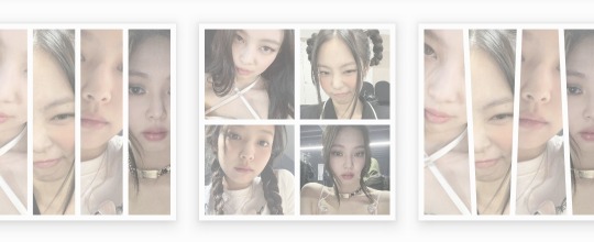
2. Dividers You can make them yourself (On PICSART again) or find them here on tumblr!
I also have my own dividers if you want to check them out ദ്ദി ˉ͈̀꒳ˉ͈́ )✧
3. Gifs I always move the images a little to make it more striking! (you can do it in capcut and create the gif here on tumblr♡) another tutorial of example gif here
4. Texts! separate the angles you can always put a poem or some lyric music! (To add color to the text I have a tutorial here) You can always add "bios", symbols or kaoemojis since they are closely linked to the aesthetics in the texts
5.Pngs: It's very cutee and also gives an extra resource ((I don't use it as much as before but it can work well on quite a few mbds) I would recommend putting it in the middle
# 𝐓𝐈𝐏 𝟑 : ¿How to combine images? (My way to do it!)

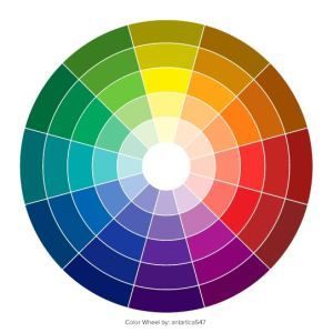
Taking into account the general color palette, look at the image and check if the most prominent colors are warm or cold (including the background will be very useful) this way it will be easier for you to combine the tones without really having to find the exact color of the image! It will make it look much better.
# 𝐓𝐈𝐏 𝟒 : Center and sides
Keep in mind the center of your moodboard! As it is still a square (think like it's a painting) you can have more balance if you put certain colors or certain photos on one side or the other and put the main photo (or a collage) in the middle! So that it harmonizes and draws more attention.
# 𝐓𝐈𝐏 𝟓 : Tonal degrees
Always keep in mind what tonal degree the color of the photo has. Depending on that, you can look for images with the same tonality! As I already mentioned, if it is more opaque or stronger or brighter, it makes it much easier to identify a better combination.
# 𝐓𝐈𝐏 𝟔 : Combination
At first glance, you might be able to identify the most prominent colors in a photo, but taking into account color theory, the color of that photo only exists when it is contrasted by another, that is, based on the combination of colors with each other.
So when choosing photos to match, look for the two colors together in the photo to give a more similar impression even if the colors are not exact (In any case, you can also edit the color of images that have the same tone as your photo by changing the image and the difference would not be noticeable)
# 𝐓𝐈𝐏 𝟕 : More ways to apply aesthetics . . .
Related objects: depending on the image, there are also usually certain objects that can be related to the aesthetics of the photo. You can always add details with reference to the aesthetics that, without necessarily matching the photo, can look good.
Angles and sizes: Looking at the reference photo we can find photos that have the same dimensions as this one will make it look pretty good and make sense to put together
Requirements for adding a photo: to make it easier to combine you can write down things to keep in mind so that they combine, for example:
1.Color and Color palette
2.Size, shapes and angles
3.Common objects
4.Balancing abundance (for example if a photo has a lot of details, you have to find similar ones and at the same time find photos that have less details to give it a better impression.)
# 𝐓𝐈𝐏 𝟖 : Your own Style and have fun!
Don't rush into having your own style, eventually your mbds will be guided by your tastes and then you will have your own stamp unconsciously so don't rush!
Have fun and take your time making mbds, that's the secret formula to making a good moodboard♡
𝓑𝓸𝓷𝓾𝓼 𝐁𝐎𝐍𝐔𝐒𝓑𝓸𝓷𝓾𝓼
Match Technique 💋🎀: My painful technique for making everything match so well comes from my perfectionism and I'll tell you what I do,sometimes the photos match each other perfectly (which is perfectly fine lol if you want you can leave it like that) but to make sure.. what I do is separate each of the images and compare them to each other to see the contrast and thus realize if they really match.
Searching: ¿How did we get to the final result? There will always be many times in sex where you simply won't like the result, I always recommend having at least two stages when looking for a good result.
This requires quite a bit of experimentation.
Stage 1 "Draft" : Where you look for the basis of what you want
Stage 2 "Improvements" : You look for the parts that don't fit and why.
Stage 3 "Details": The finishing touches!
𝐓𝐲𝐬𝐦 𝐟𝐨𝐫 𝐑𝐞𝐚𝐝𝐢𝐧𝐠! These are my own techniques and I know that probably not everyone puts so much science into this but I hope I have helped you improve certain things 💕 xoxo
(English is not my first language, I would really appreciate it if you could tell me to correct any mistakes!)
#𓇻゜𐬹#🗣𝓣𝗎𝗍𝗈𝗋𝗂𝖺𝗅 ; 𝓑𝔂 𝗟𝗶𝗮#(๑>◡<๑) © 𝐅 𝐑 𝐀 𝐌 𝐄 𝐒 @his-tomorrows⭒ 𝇈 𝅄#and @mochilly#moodboard#messy moodboard#kpop gg#coquette moodboard#kpop moodboard#soft moodboard#pink moodboard#aesthetic#aesthetic moodboard
82 notes
·
View notes
Note
hi! I want to learn Italian but I don’t know where and how to start:(
Can you recommend some language or textbooks that are available online? I feel a little lost at the moment :’) Thank you ~
Ciao!
I think it depends on the way you prefer to learn things. Some people rather use duolingo/memrise or similar websites/apps where you mostly focus on practice and learn using online resources (i especially recommend focusing on grammar to fill the lack of infos these apps may come with); others rather rely on textbooks or other resources they either find for free or buy from online stores. What do you personally find funnier and easier to do? Maybe both? Maybe something else? There's no rule, so don't let the fear of not doing it well block you. Some find it helpful to use flashcards too, or prepare them. Start something (and even more, start easy! With easy words eg. numbers, greetings, weather, family members, colors, places... make easy sentences like I went to school, I go to the market...) and see if it works, if not move onto something else. It's not that you have to stick to one way of learning forever. As you will acquire vocabs and grammar, you can move onto something different. Just remember to have as much fun as possible in the process (also when learning verbs or other boring grammar stuff), don't pressure yourself. And give yourself time, also to slide away a bit if it gets too much.
I personally prefer to rely on youtube and tumblr for grammar (and note down things on paper which helps me learn: I have filled a bunch of notebooks by now^^), occasionally use memrise or buy exercise/comprehension books to practice, write diaries/practice sentences/try to think in another language/imagine dialogues or actually dialogue with others (this comes later on ofc). Let's not forget listening to music, keeping up with the news/history from the country, reading, watching movies/tv serie...
Anyway,
All the textbooks and similar I know of are listed in the resources masterpost that you can find on the navigation blog @sayitalianohome, together with grammar and vocabularies masterposts that may help you as well during your process (just giving you this chance too, but if you rather have all in one single book, that's great! You make the rules of your own learning method). You can find studying tips as well on that same blog, if necessary. If you find links to my tumblr that are broken pls lmk: tumblr changed them not long ago and I may have missed some (main reason is: - turned into a space in the link). Some resources links (outside of my blog) also may not work: that's cause they're old and I have not the time to check them continuosly. On a side note, I opened our community where you can join and ask for support directly to other Italian language learners (which may often know more than me).
Happy learning!
#it#italian#langblr#italiano#italian language#italian langblr#languages#lingua italiana#italian resources#resources#studyblr#italianblr
19 notes
·
View notes
Note
Hello. So I have a genuine, honest question as someone who isn't an artist. I saw you made a post about AI art floating around Tumblr lately. How does one differentiate between AI-created art vs. ACTUAL art? Some things have been easier to notice than others (ie: YouTube videos and like, moodboards and the opening to Secret Invasions) but for art specifically, are there any key things to look out for that make it obvious it's AI generated? I do not support AI in any fashion but in this day and age I do find it increasingly more difficult to tell the difference between something that was created by AI vs. created by an actual person.
Hi anon! So, heads up this might be a bit long of a post but I wanted to point out some things that I don't see frequently mentioned in other posts about A.I stuff.
First things first: Look at their other 'art' pieces. If they have a generally consistent style, a consistent type of work (Realism vs ink art for example), characters you see more than once and from different angles, character sheets, etc. You're going to notice if someone suddenly switches from little ink doodles to fully colored and realistically rendered 'art'. Now, this doesn't mean everyone switching styles or mediums is A.I, but it means to take a closer look if you notice something vastly different than their usual stuff. More A.I. clues below!
For things to look for, there's a lot of different clues but generally you're going to notice a certain new car shine to everything. Everything will be a little too clean, even if the style they are ripping off is sketchy. Sketches will have crosshatching that doesn't really make sense or random lines in a place that an artist probably would not put there. That being said, here's some examples where that isn't as noticeable:
Here you've got your usual body/anatomy problems. (Plus some elements I'll talk about later as well. This one's got it all!)

Glitchy foot, glitchy hands. glitchy eyes. Strange proportions for legs that don't exactly fit a stylization, but more of an glitch. Now, of course an artist can draw 'glitchy' things like this either by accident or intentionally, but you really only see these types of things in A.I vs actual art of a similar style. Realism artists are generally not adding extra fingers or varying sized fingers, they're not rendering the foot to only have too many toes, missing toes, and the foot also... sort of part shoe. Unless art artist is otherwise intentionally including these elements, it's generally a clear cut example of A.I stuff. (For example: Different body types and disabilities exist, and there are people with different shaped hands, shorter/longer fingers etc. But you will also usually find some kind of info with the post about the person/character that will tell you about them that can clue you in on if it's A.I vs real art.) If the artists are drawing in a style with 'exaggerated' anatomy, you can almost always see that as a persistent and intentional STYLE in their art. If they aren't, this is something you'll really notice in A.I vs realism. It can be especially true with people who fully render realistic art because it's not in line with the style, and the relevant elements of rendering art this way. Artists who do realistic rendering at this level generally know their anatomy very well, and are going for realism in all elements of the art. Some stuff like the exaggerated long legs in women are kind of everywhere, but the hands, the foot, the lopsided winky eyes (I don't know how to describe it) are not things a professional artist rendering realistic art would generally do. It's just not in line with the style, or the ability/skill that the artist has worked on. (Again, unless completely intentionally and in line with the person/character.)
For 'real' life items like the tables below, you've really just got to ask yourself: Is this physically possible? Do all the elements make sense and actually work together in a real way?
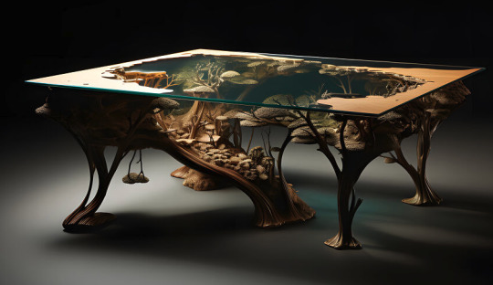

Sometime it's hard to know if you don't have any experience with, for example, acrylic and wood table making. But there are things that just don't work in real life, and there are things that maybe someone can do, but even in the provided examples it just doesn't make sense to do. For example, the little 'tree' hanging from the bottom of the left table. Would that be possible? Probably. Would someone do that? Probably not. If you're really stumped, sometimes just looking up videos of people making that type of thing can give you a better idea of what actually works together, how it's made, etc.
Here's something that really helps when you're really struggling and zooming in for every detail: TANGENTS

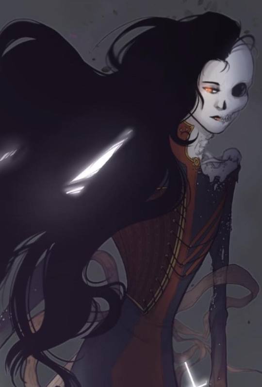
Ok, so tangents in art are when you're drawing a thing, like hair, and it's lining up with a different object to the point where the visual line continues from one part of art to another and it looks really unrealistic/weird. Most artists figure out how to avoid this on their own just from noticing it and feeling uncomfortable with how it looks, while others learn via the internet etc. It can happen in anyone's art at any skill level, but the amount that it happens in A.I stuff is HUGE. It's almost every single image, and you can really notice it in places where something overlaps like hair or, from the above image with the money: there's two bills that just kind of bleed together. From the same image, you can also see how her hair bleeds into the wrinkles of her jacket in an unnatural way. Comparatively, you can see in the Hela art I did below that there are overlapping elements like the hair and the ribbons behind it that do not mesh or bleed together.
Something else to look at: Symmetrical elements that don't work right. So, this is kind of getting harder to see depending on what they're generating as a subject matter and the style they are using. As always, there is a disclaimer for this. Art does not always have perfect symmetrical elements in it.
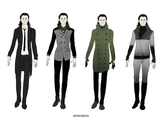
For example: in the real world, this dude's coat would have more clean symmetrical elements. As it is a sketchy doodle, they're there but they're not 100% symmetrical. With a LOT of A.I stuff, you'll notice that something meant to be mirrored on the other side of the clothing, room design, etc. is actually completly wonky/incorrect or not even there at all.

For example, in this A.I we have missmatching elements on both sides. Not only in things that could be designed to be asymmetrical, but also things that 100% should be mirrored. The left side under the buckle on the shoulder has a diamond shape. The right has a weird spikey thing. The little leaf pattern on the gold lapel area appears to be just blobs on the right side. The left shoulder area has a button and additional little detail under the buckle area. It is not there on the right side. And, again, some of this can be intentional with real art. Her arm bands could be intentionally different, for example. But elements that clearly should be reflected on the other side and are very clearly not are generally a good clue that it's A.I. A few last moment things to look out for:
Styles that are recognizable someone else's whole thing. Example: The monstrosity that someone just generated that is supposedly Calvin and Hobbs. It's pretty easy to tell because it looks like shit right now, but generally if someone is ripping off a distinct style of someone famous, it's probably A.I or at least worth double checking.
Did they suddenly start doing ______? This could be anything, backgrounds, drawing horses, full color, etc. But if they're suddenly, overnight just BOOM they're 'drawing' in a whole other style, it's suddenly really rendered, and/or there's no 'growing pains'/work shown that they've started working on drawing the thing they never drew before... It's time to take a closer look. Last but not least, look for the language they use around the stuff they're putting out. A.I people are often... a certain type. They use a lot of that NFT bro lingo that can tip you off. The tags might be all over the place for styles, or tagging certain famous artist's styles, etc. They also can be a bit more blatant in the tags and just outright tag A.I or NFTs somewhere in there. And, in the end, if you really can't tell and you really love the thing and want to share it: Ask an artist. Or just don't share it.
Thanks for reading, and I hope this is helpful in some way!
#How to tell if it's AI#How to recognize AI#Art vs Ai#Long post#nice anon#I mean I have to be honest a lot of it is also like#white guys generating indiginous and asian people like they're working for fucking nat geo but in that extra mastibatory way#a LOT of incel shit out there#a LOT of 'if I was Elon Musk my apartment would look like this#but also the entire cottage core tag is exploding with AI shit#It's a mess#The best and worst way to handle this is to kind of assume whatever you're into is going to have at least one looser making AI in it#the worst because it sucks that it's everywhere already#and sometimes you have to block someone you liked and thought was cool#but best because being aware and active helps yourself and others
84 notes
·
View notes
Note
ok, so i keep seeing stuff and tbh, it puts me off but i want to give benefit of the doubt.
so. where would YOU have me start on learning how moto gp works. i don't mean shipping. i will go left field with that shit myself, hell, i'm out here in my georgenando canoe. but understanding the sport.
you know, stuck here between should not have to give reasons and fuck it. bestie has bikes. i've watched some stuff. i find it very interesting. i'm not here bc f1 soley. but any time i've watched there is just so much to take in? when i got into f1 i had my friend on msn explaining. holding my hand if you will.
also yes i'm prepared to be labelled a glory hunter as i am inevitably drawn towards the small spanish war criminal. i have a type.
so do you have a primer? links? any news articles that really break it down?
ok so.
I personally got into MotoGP through my best friend who didn't explain a lot to me, just told me to try and get it (he's bad at explaining things)
I tried to read about it on wikipedia first, just to get a general idea of the sport and you know, teams and riders.
I think I can break something down for you, but it's mainly the structure of the sport itself rather than it's story, for that you can ask or read @muxas-world blog because that's where I at first got infos here on tumblr.
SO.
The weekend is structured on three days like F1, we got one Free Practice on Friday and then a Pre-Qualifying session called Practice in which the ten fastest gain direct access to Q2 on Saturday.
Saturday has another round of Free Practice and then Quali, divided in Q1 where the riders out the top ten on the previous day fight for the first two position to access Q2 with the other ten, then it's down to the fastest. After this there's ALWAYS the sprint, unless particularly strange scenarios (extreme weather) and it gives circa half the points of a normal race, it's fully valid for the championship and it DOESN'T determine the day after's grid, it stays the same as the first one.
On Sunday we race. There's no mandatory pit stops in MotoGP, unless it's raining and riders gotta switch to a wet bike, which is very funny cause you see these crazy guys hopping from a bike to another and try to regain positions.
Teams can have wildcards during the season, meaning riders (usually test riders) who replace one of the two official riders for an ENTIRE WEEKEND, not like F1 where it's usually just FP1, and this year they changed rules so that only certain teams can have wildcards, Ducati is completely excluded by it because they're 4 teams combined (as in Ducati gives engine to 4 teams: Ducati Lenovo and Pramac which use a 2024 bike, Gresini and VR46 which use a 2023 bike) and honeslty there was another reason but I currently am fighting sleep to answer you and can't remember
Points are assigned from the 1st to the 15th place, one additional point for the fast lap.
Tows, crashes and show are much more likely to be than in F1, especially crashes are far more frequent, obviously not cause riders are bad, but because it's easier to loose a bike going 360km/h ratehr than a car at that same speed.
Also, here Moto2 and Moto3 hold a higher value than F2 and F3 do in the Formula 1 concept of it all, championships won in those classes ARE COUNTED as championships, so Vale for example, a 9 time World Champion IS NOT 9 times MotoGP world champion, 9 in the championship won together in MotoGP and what back then was 125/250cc (currently Moto 3 and 2, actually with even more cc)
It's important to watch these series cause they really give you and insight on A. how actually crazy these guys are B. how many talents there are out there
sorry I can't really tell you more cause if you wan the history of the sport i'm not the one to talk you well about it, but I hope I helped, also sorry if I don't include links but I don't really know where to get real infos, I just learnt here on tumblr, I recommend you do the same :)
17 notes
·
View notes
Text


💖 🌟 Comm Info 🌟 💖
You can tip me here if you're feeling generous
You can see a little of my portfolio here if you're new around here
All payments are required upfront in USD through Paypal only.
Sketches $30 each (+$10 per additional character)
Chibis $40 (+$10 per additional character)
Flat Color $40 (+$10 per additional character)
Full Color $60 (+$20 per additional character)
Please note:
These prices are a guideline and may change depending on the request.
I only take 3 customers at a time. If you're interested, please ask about my availability and timeline my dms are always open.
DM me, and I will give you my discord link :) tumblr dms are notoriously awful.
Commission reservations are possible with a non-refundable reservation fee, which we’ll discuss.
I work on a strict personal schedule (details below), so please be patient when waiting for responses. I'm in PST and might not reply right away, but feel free to follow up if needed—you're not bothering me!
I take requests through my askbox, but they are free, public, and may take longer than commissions.
I do not accept NSFW commissions. I may draw NSFW content, but I will not take paid commissions nor requests for it. Period.
All commissions will be posted publicly to my blog. Let me know if you prefer not to be tagged.
You cannot profit from any commission purchased from me
Please tag me or credit me when sharing the commission online.
Please read more details of my TOS under the cut
Clear Communication Guidelines
I love working with clients who are excited about their ideas and want to share every detail with me! My ideal process is when you send me all the information—ideas, references, descriptions, sketches, headcanons, anything you’ve got! I live for that wall of text and images. Honestly, the more you share, the better! I’m here for it, and I won’t judge. This is your chance to get all your unhinged ideas out of your head and into my hands.
If you’ve got a lot to say, take your time. Write as much as you need. I may not dive into it immediately, but when I do, I’ll be ready to focus and give it my full attention. I like to take the time to understand your vision, ask questions, and make sure we’re on the same page. I’ll always check in with you along the way!
I work primarily through Discord because it’s perfect for quick messages, sharing high-res images, and, frankly, I find it easier to track everything. Plus, you can throw as many references at me as you want—I’m ready for all the details!
Working Hours and Response Time
I operate within strict working hours of 8am - 5pm PST. Outside of those hours, my replies may be slower or sporadic, but I’ll do my best! I’m a busy person with school and work, so sometimes I can’t respond immediately. That said, if you feel like I’ve missed something or haven’t replied in a while, feel free to triple-text or ping me! Seriously, I don’t find it offensive at all. I prefer it, actually. I want to make sure I’m giving you the respect and attention you deserve, and a little reminder doesn’t bother me!
Feedback and Progress Reports
Here’s the deal: I want you to be 100% happy with your commission. If you see something you don’t like in a progress report, or if you want to make changes, let me know right away! You’re paying for a service, and your satisfaction is important to me. Nothing you say will offend me, and I’m open to any constructive feedback. I’ve heard it all, so don’t hold back! I’ll learn from your input and make sure we get it right.
Speaking of progress, I’m all about keeping you updated! I’ll send you periodic progress reports—this might be a late-night message or a screenshot at 3am because I’m excited about how it’s coming together or I want to make sure a detail looks just right. Don’t worry, it’s not a mistake! I just love to chat during the process and keep you in the loop.
TL;DR:
Send me all the details! References, thoughts, rants—I'm here for it.
My (general) contact hours are 8am - 5pm PST but feel empowered to follow up if I miss something or if something wasn't clear.
Feedback is encouraged! Speak up if you want changes—I’m open to it and won’t be offended.
Expect progress reports and I might send them at odd hours because I’m excited! Don’t ever feel obligated to respond immediately.
Process Overview:
After payment is finalized, I’ll provide 2-4 mockups of your commission to get things started. From there, we’ll discuss any changes, and you can provide me with all the details you want to see!
The more info, the better! I’m talking references, memes, videos, Pinterest boards (my personal fave), Spotify playlists, screenshots—anything! I want to see your favorite fan art, hear your blorbo headcanons, and dive into the details. Think of this as an open invitation to go on a “there is no pepe silvia” level rant about your character. I promise, it’s not weird, and you will not bother me nor will you freak me out. I am unhinged about my blorbos too you are in a safe space. I will froth at the mouth with excitement about your blorbo and match your freak if you let me, and the more you share, the better I can make your vision come to life!
Revisions:
You’re allowed 2 free revisions at any point in the process—for example, if you don’t like the first mockups, we’ll try again. If we need to try again, there will be a non-negotiable fee of $25 USD, and then an additional $15 USD fee for any major revision after that. I will define what revision is major on a case-by-case basis. You can haggle with me on anything as long as you're not an asshole about it, but I can guarantee you won't get very far, but it never hurts to try.
I’m all about communication throughout the process. Every time I make progress, I’ll send you screenshots, ask questions, and chit-chat about your blorbo. You will never be left in the dark. We’re in this together!
This is collaborative project as far as I'm concerned.
Delivery Format:
When your commission is complete, I’ll send you a high-res PNG file of the finished piece. If you want a transparent background or no background at all, just ask—no extra charge. If you’re printing the piece, let me know if you need it in CMYK format instead of RGB.
Refunds:
Once we begin mockups, there are no refunds. Emergencies happen, and I’m open to discussion, but if I’ve already spent an hour or more on your commission (which is about how long it takes to make a mockup), I expect to be paid for my work.
All assets (mockups, sketches, etc.) will have a watermark/signature to protect my work from redistribution or profit without my permission. However, if we part ways and you need to find another artist, you’re welcome to keep and share any assets we exchanged as long as you don’t remove my watermark or credit. I’m cool with it, as long as you’re respectful!
Turnaround Time:
My turnaround time can vary depending on the complexity of the commission and my schedule. Simple sketches might take anywhere from 24 hours to 14 days, while full-color, detailed pieces can range from 6-30 days. In general, expect about 2 weeks for a commission to be finished so that when I finish it sooner than you expected you’ll be pleasantly surprised, but I’ll keep you updated throughout the process.
I keep my workload light because I value my passion for art—I don’t want this to feel like a job. It’s important to me that I’m doing this for fun!
And, don’t worry if you see me posting new art that is unrelated to the work im doing on your commission. I’m usually juggling 5-6 pieces at a time not including my comm slots, and I draw during work, school, and my downtime, like the cozy, recliner-dwelling, old woman I am.
Additional Fees or Add-ons:
Some details, like detailed backgrounds, specific accessories, or other specific requests, may come with an additional charge starting at $10. We’ll discuss pricing for these before proceeding, and I promise I’m not a monster—I’m super affordable! But, I do value my time and skill, so I expect fair compensation for my work.
I’m ALWAYS down to talk art trades! Wanna trade a commission for a fic or another type of creative work? lets talk!
#comm info#comm sheet#commission#commissions#art commission#commission art#art commission info#open commissions#art commisions#art comms open#art comms#commission sheet#commissions info#commision info#small artist#artists on tumblr#digital artist#oc artist#queer artist#indigenous artist#native artist#procreate#digital illustration#digital aritst#personal
4 notes
·
View notes
Text
Main Brackets!
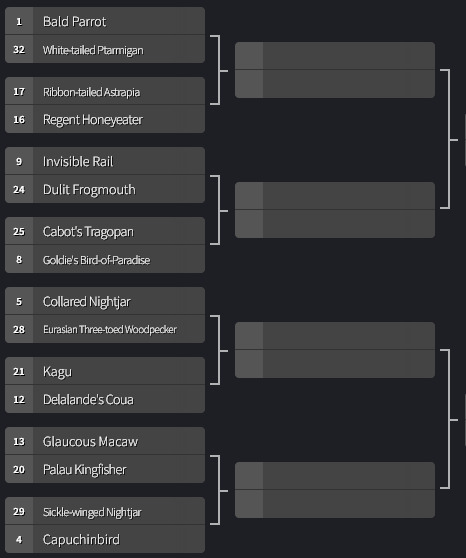
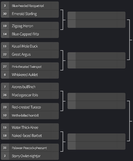

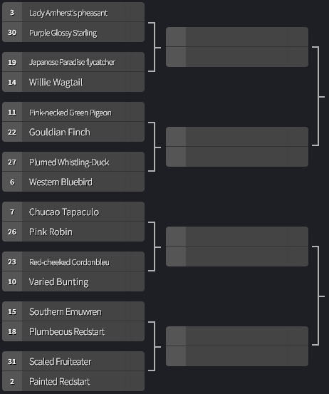
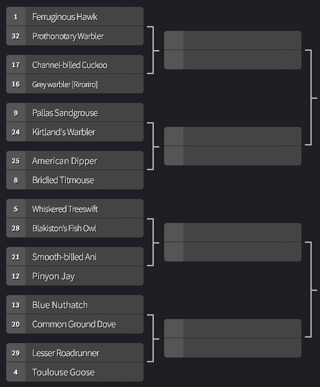
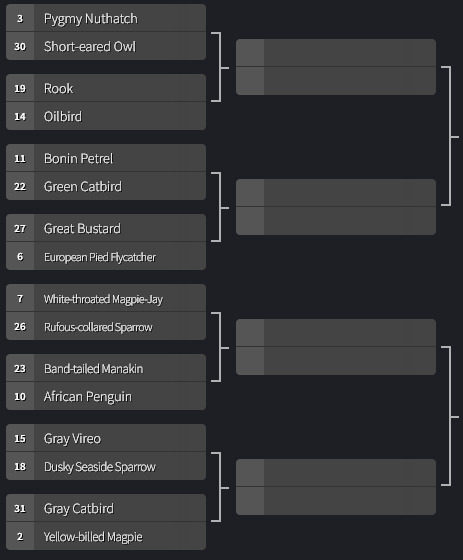
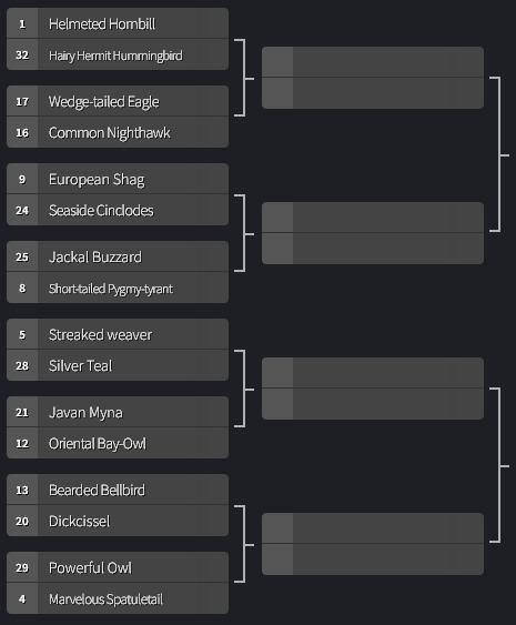
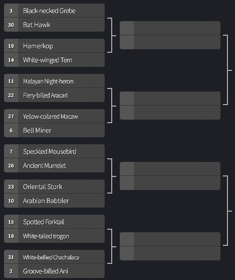
There are four brackets [Fave, Pretty, True, Four] comprising of 32 birds, for a total of 128 birds in this poll! I will reblog a version of this post with every bird listed via text within their bracket, so it is easier to find for those with image issues. It's gonna take a while to actually put the posts together for the first round, seeing as there are 64 battles happening, so expect the polls to go up around July 12th.
Below is a link for submitting any cool facts or info about the birds you want to win. It's not necessary to send info here, but I like to give the option to infodump about birds, and it helps with keeping things organized.
As per tumblr etiquette, you are totally free to reblog the polls themselves with as much propoganda as you want. These submissions are just to help me fill the poll post with some cool facts.
EDIT: for mobile users, this post has all the tags for the round 1 brackets, in place of having another masterpost. Everything is tagged with #Hipster Bird Main Bracket or its corresponding #Bracket: TYPE A style tag. Once we move on there shall be a new post.
#information#Hipster Bird Poll#submission form#Hipster Bird Main Bracket#I also did this so my inbox will maybe be a little more clear still#and this makes the info easier to sort through! I can just CtrlF and find the birds and organize the facts that way#bracket: fave a#bracket: fave b#bracket: pretty a#bracket: pretty b#bracket: true a#bracket: true b#bracket: four a#bracket: four b#round 1
54 notes
·
View notes
Note
i’m looking to start up my blog and was curious on any tips u have to make it cute and aesthetic like yours! i love your works btw keep doing what your doing!!!! <333
omg this is so sweet!!! especially cause i have NO idea what i’m doing😭😭😭
basically i’ve run a LOT of blogs on tumblr over the years (i used to have dad!au blogs for skz, ateez, nct, the boyz, treasure – ALL SEPERATE😭) and i’ve also run non-kpop blogs and other fanfic blogs and personal blogs and anyway it’s been a long time coming to have this blog that i feel so happy with, but i really do feel content with this one and i’ll tell you for why so maybe it can help you!!
1. my theme both first time round and this new one have elements of my personal style, regardless of whether it’s kpop themed or not!!!
a lot of the time, kpop blogs will be themed either around the group they stan and their theming, or even around like sanrio characters or other elements of korean/east asian culture and like thats super cute but for me personally i’m just not into any of that and it would feel a bit performative (?) to have that!!! but for me, i’m into vintage, 60s/70s, rock bands, so my first theme was ‘it’s all happening’ from almost famous and then i got the photo for my navi off my pinterest board and my profile pic from my camera roll and just based the colours around there!!! which is also the second thing
2. i usually (happened by accident with the first theme and on purpose with the second lol) choose the profile pic, header and picture for my navi (though you dont need this lol i just like the formatting) and THEN choose the colours
i find this easier for the overall theming, ties everything together quite nicely but also for this current theme it actually all stemmed from the emojis in my bio😭 i saw someone on tiktok with those emojis in their display name and i really loved it so i noted it down and then used it for inspo,, and the 👽 and 🪩 reminded me of 2010s indie sleaze so then i went down the dance yrself clean route but yeah.. i forgot where i was going with this
3. the text is unimportant
whenever i have some student display name or bio its because its the first thing that came to mind it really DOESNT MATTER i mean if you have a theme it’s cool to stick to the theme but like with my first one my bio was 마음데로 해 which like ? has no relevance to vintage or almost famous i just liked it😭😭
4. but there IS important information you need to display on your blog so remember to include it somewhere
i always hate when i have to like chase round a blog to find their request rules or masterlist or whatever😭😭 and i mean REALLY chase cause you have people like @blueberrybeomgyu who has the CUTEST theme and sticks to it to a T and it doesnt hinder your navigation around the blog yk!!! so yeah i think that’s super important but it’s up to you whether you keep it all in a pinned navigation, link it in the bio, whatever!!
note -> when i say important info i mean like name, pronouns, age, request rules, masterlist, wip, purpose of your blog etc but also you can pick and choose which of these to include!! but including your name helps people chat to you, and including your age helps people with mdni !
but anyway none of this really matters but i hope it helped in someway i have NO qualifications so if any other blogs want to chip in with some advice feel free!!!! and good luck with your blog!!
2 notes
·
View notes
Text
How to Keep Fic Fests Organized
A lot of us love writing for fic fests, but when we join multiple at once, it can get a little overwhelming! Here are some tips are tricks I use to make things a bit more manageable! (I write fan fiction for One Direction, but most of these tips can be helpful for any fest!) (AND some of these tips can come in handy for organizing multiple WIPs even if they aren’t for fests!)
I hope you find this list useful!
Follow @1dficfests
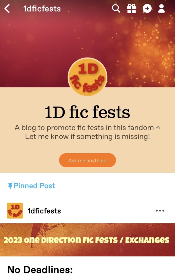
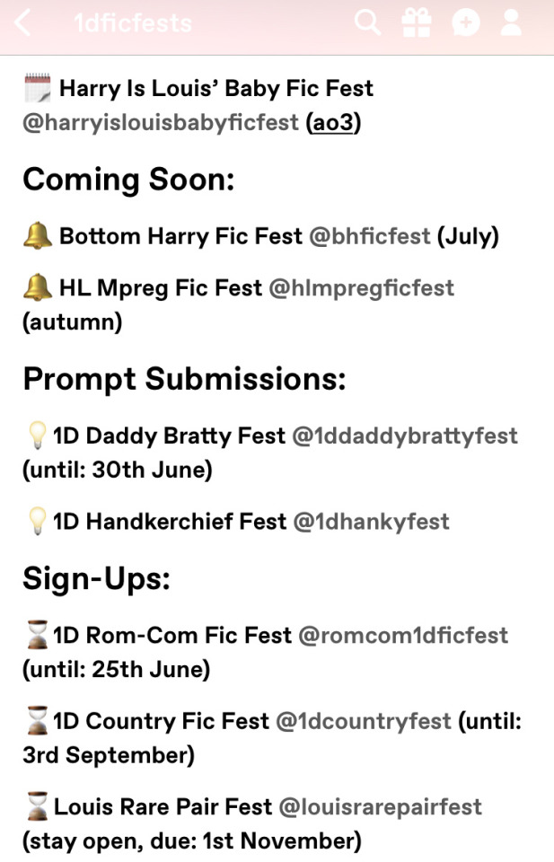
This blog keeps track of everything fest related, including deadlines, upcoming fests, and which fests are open for prompts or signups! There is a running list of fest info in the pinned post, and they also reblog important posts from fest blogs.
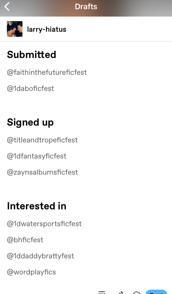
Make a draft of fest blogs
One thing I just came up with that's super helpful is making a Tumblr draft and tagging the fest blogs that I want to be able to quickly get to. That way, whenever I want to double check a schedule, ask a question, or check on anything else, I can just go to my drafts where the URL is right there and I don’t have to remember it or hunt it down.
Use a countdown app
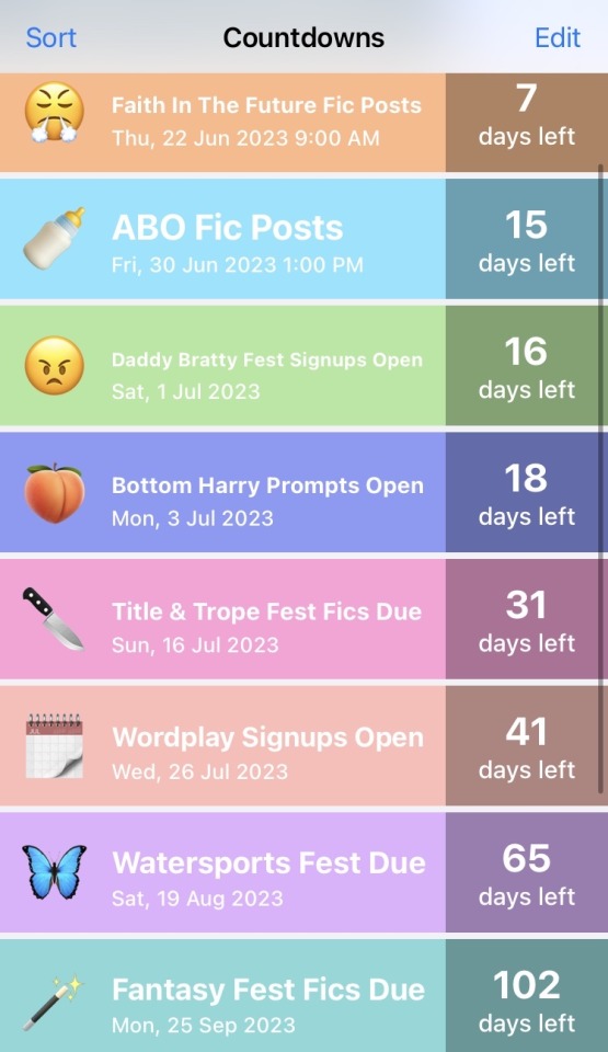
This has been a lifesaver for me. I keep track of when fics are due, when signups for future fests open, when submitted fics are due to post, any fest related dates! There are lots of countdown apps, but this is the one that I use:
Use a to-do list app
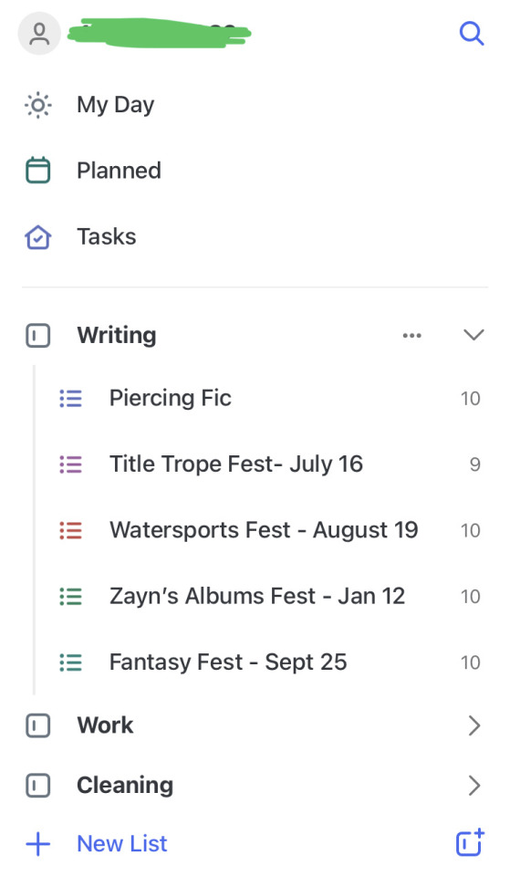
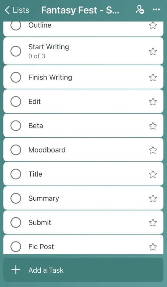
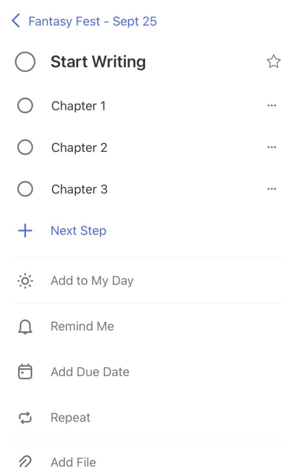
This is great for keeping track of the different steps to writing a fic, and I’ll sometimes also use it for WIPs that are not part of a fest. The app that I use is great because you can have tasks within tasks, so under “start writing,” I can check off when I finish chapter 1, chapter 2, etc. You can also use this feature to check off scenes from your outline! But there are many to-do apps out there, and they all have different features that might be helpful to you!
Make a Discord server for your fics
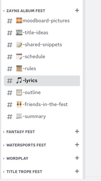
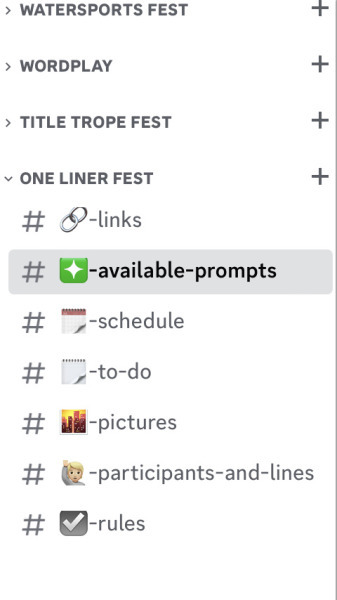
I haven’t started actually using this technique yet, but it definitely has potential! I set up a server just for me to keep track of fics. Each category is a different fic, and each category has different channels related to that fic. In the photos are some of the categories that I chose, but the possibilities are endless. You could have channels for different characters, places, scenes, all kinds of stuff! You can also make a category for writing resources, tips and tricks, lists of betas, and anything else writing related! In the second pic below, I made a category with channels for the fest I am running, so this tip isn't limited to just fests you join!
Create a due-date calendar
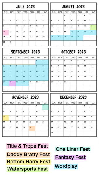
This is great if you like to see schedules visually. I like to put together a calendar and highlight due dates so that I can quickly see how many fics I have due in a month. Sometimes I’ll also throw in the dates that I have fics scheduled to be posted. For this one, I found a picture of a calendar on Google and used the app Phonto to add everything, but there are lots of picture editing programs where you could do this.
Create a schedule calendar
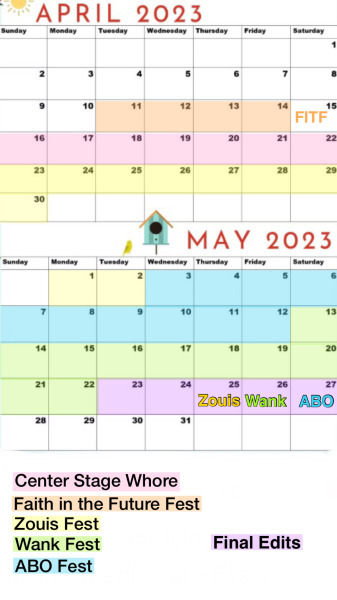
This one feels funny to include because I didn't really end up utilizing it, but maybe it will help someone else! When I was trying to finish five fics in seven weeks, I put together a schedule to help organize my time and when I wanted to work on which fics. I chose to organize it into separate chunks per fic, but you could do a different fic every day or adapt it in a different way that works for you!
So that's all my tips and tricks! I hope you are able to try some of these and make things a bit easier for yourself so that we can continue to enjoy writing! Thanks for reading, and if you could give this post a reblog, that would be awesome!
32 notes
·
View notes
Note
Sorry if this ask gets broken or send more than once, tumblr likes to crash on my phone a lot oops!
Anyhoo, any advice for creating a headmate?
We're a traumagenic system, so we never had any control over when we split new headmates. But I'm a fictive of someone who's a twin and I really miss my brother and would really really love it if he could join us in the headspace, I think he would really like my headmates and they would be very receptive of him <:) I talked to the others about it and they said they think its okay for me to try as long as we do so in a healthy way.
But I dont know how to split a new headmate in a healthy way. Im obviously not going to purposely put us through stress and/or trauma to encourage a traumagenic formation, that'd be unhealthy. BUT I dont know how to help form a headmate in a non-traumagenic way... Do you have any advice or tips? I know theres lots of ways to willingly form new headmates, but I dont really know how to utilize them.
Thank you so much in advance!!
Hi! This is pretty tricky, and in general we’d advise traumagenic systems to make sure they’re in a safe place/have made significant progress towards recovery before attempting to create a headmate. There’s a lot of ways something like this could go very wrong if proper care is not taken! That being said, you do know yourself and your system better than anyone else! So if you and your system believe attempting to create a headmate is the right thing to do and the best move for your system, we’re wishing you the best of luck, and have some resources we can share.
All of the best resources we’ve found so far we’ve compiled in our resources post for questioning systems.
That post ^ has a whole section for plurality that is non-dissociative disorder specific, with tons of links to guides and resources on how to go about creating a headmate. The paromancy (called “tulpamancy” in the links) guides are probably the most comprehensive, with tons of information on creating a paro/thoughtform, which is a type of nontraumagenic headmate.
Y’all might also find it easier and less high-stakes to visualize this person as an imaginary friend or an aspect of your headspace. Lots of systems have NPCs in their headspace which have limited autonomy, but aren’t actually full-fledged system members. You can visualize an NPC in the same way you visualize a setting or object as a part of a headspace - we have a little headspace primer which we’ll link below which might help if you choose to go this route!
If you start out with this potential headmate as an imaginary friend, and they ultimately start to feel like a part of the system, there’s a term for that! It’s called imagi, and you can read a bit more about it on Pluralpedia:
Hopefully this helps at least give you somewhat of a starting point! And if we may, a final word of caution:
Creating a headmate is a big deal. Often this is something that will last forever, and cannot be easily reversed. What is so so important to understand, is that once this headmate can think for themself and are afforded some autonomy and agency, they may make decisions or choose to be something that no one in your system ever would have anticipated.
This means thy may want to separate from their source. They may not act, look, or view themselves the way the twin from your source would have. They may not arrive with source memories, and may not see themselves as your twin at all. In many systems, headmates act and function as their own individuals, and feel happiest when they have their own agency and get to make choices about how they present and interact with the world. This means, there is a chance that any headmate you create won’t live up to the standards you’ve set for them beforehand. We’re not saying this sort of thing will happen 100%! But there definitely is a chance of this occurring, so it’s best to be prepared in case it does.
In the end, this is your choice and a choice to be made by your system! We just hope y’all are understanding the consequences of doing something like this, and know that no matter how you envision your new headmate at the beginning, there’s nothing certain that will keep them that way as they grow and develop on their own. We hope your potential new headmate will be understood, valued, and respected for who they are as they are, and not who others hoped for them to be!
Sorry this got so long! Good luck with everything! We hope this process goes as smoothly for you and your system as it can!
🌸 Margo and 👻 Ghost
20 notes
·
View notes
Text
RULES.
Hello my peoples, I'm Space, and welcome to my semi-selective multimuse blog! My rules are listed below, PLEASE make sure to read them before interacting/following! UPDATED: 2/17/2025 (will change with time; check on them periodically!)
GENERAL RULES:
Age: I am a legal adult (23) and only RP with people whom are 18+ due to (potential) dark themes on my blog & overall maturity. I will block you if you are a minor or if you have no age in your bio/blog info.
"Personal" Blogs: aka regular blogs on Tumblr. I will block regardless if you like or interact with my content (unless you have RP side blogs and explicitly say so). This blog is a RP blog, which is different than a fan blog/fiction blog. I have nothing against you, RP blogs are simply different and likes and such clutter my notifications.
General: This blog is semi-selective, with a lean towards "mutuals" (we both follow each other) and to those I know. We don't have to be mutuals to write together, but I take them as a sort of 'priority'. I have to right to not accept every RP. I may take some time to follow back and/or reach out, especially if you follow first. I also do have a life outside of this blog (shocker I know /lh) and a part-time job, so I will oftentimes be burnt out or have little motivation to be on here. Please know this. It's not you, it's not your blog, you aren't a bother to me (unless I explicitly tell you). Please reblog memes/gif sets/etc. from the source (or where I reblogged it from) instead of me; I don't practice "reblog karma".
OOC Communication: I consider OOC/"mun" communication to be extremely important, no matter what we are talking about. I check in to see if threads want to be continued, to plot, or just to gush about our interactions. You don't have to be buddy-buddy with me if you don't wish to, but I'm relatively chill. All I ask is that you be upfront and honest with me about things. My Discord is available to mutuals upon request. I do take time to message back, either because I don't have the "spoons" to do so or I genuinely didn't see your message(s).
Turning Asks Into Threads: When it comes to asks I receive in my inbox, I copy the ask into a new post and @ the person who sent it in. I also (sometimes) put in statement that says: "Thank you for the ask! Please ask me before continuing it into a thread." with each posted ask. This is to not overwhelm myself; I would prefer if you ask me first before continuing it into a thread (especially if we have 3+ ongoing threads). I'm absolutely fine with things turning into threads (and encourage it), but I prefer you ask first regardless.
Reply Speed: My reply speed is slow (varying from a few weeks or months depending on the muse I have for a character). Most of my posts are set in a queue system, ranging from 2-4 a day. Please note that I may not be writing a muse you wish to write with at any point in time. If it has been 3+ weeks since I've responded, please pop into my IMs or Discord to remind me! Just don't hound me consistently or guilt trip, and we should be good!
Tags: I rely heavily on the tag system (or "tags") to navigate through people's RP blogs. I have tags myself to sort out characters, verses, RP memes, etc., and I expect you to have the same. At the very least, tag my username "spxcemuses" so I can find our threads/interactions easier! I track the tag "spxcemuses". May not interact if you do not have tags.
Drama/Callouts: I do not tolerate OOC/IRL bigotry/drama on this blog and will hard-block if situations come up. I am also anti-callout (unless there's solid evidence, and even then I will make my own decisions/judgement). Do not 'warn' me of people unless they are a legitimate threat. Anon hate will not be tolerated; having anonymous is a privilege, not a right. I will turn it off if things persist and I will block the sender(s) of hate.
DNI: In regards to "drama", I have this section for my own safety/comfort. DO NOT INTERACT with me if you go by these aliases:
> Aku/Grim
> Loke/Wards
> Legend
> Arke/Mocha
> Hearty
> Kier
> Rosario/Whitley
> Slurk
> Shiloh/Spork/Patch
> Boogey
> Marrow
> Stols
> Mars
> Skeptic
> Pucca
> Shep
> Curio
> phoenixissims (idk the mun's name but will add it if I find out).
More may be added if necessary. I have not put the URLs of their blogs for good reason. I know it is a lot of names, but I have chosen to block these people on my own volition, even if I do or don't know them, if I have RPed with them in the past or not. I don't have "beef" or "discourse" with anyone here; I have either blocked these people due to legitimate callouts within the RPC, them being problematic to me/others, or simply don't feel comfortable interacting with. I choose whom I interact with. I will not be upset if you interact/associate with these people, but I want to avoid them if possible.
Unfollowing/Blocking: I usually "soft block" (blocking & unblocking) for a myriad of reasons, but you're more than welcome to follow back if I've softblocked and you want to write with me again. I'm okay with you questioning why, too, but I expect you to be kind about it (and respect my decisions overall). If you wish to cut ties with me entirely, hard-blocking (just blocking) would be the best option so I don't bother you and/or think Tumblr had a glitch (cause it's a functioning website /s). I will hard-block if your rules state so or if you're rude/harassing to me.
ROLEPLAYING/INTERACTIONS:
Muse ≠ Mun: I am not my characters/muses; the majority of them are antagonists or villains with bad and/or questionable morals. I do not support or condone their actions in any way IRL. I will not "water them down" for you. If you have a problem with seeing a certain character on your dash, block the main tag of that character (they'll be "muse; [character name]"). I will not be doing "character tw" tags anymore.
"Bullying" Muses: In addition to "hating" on characters, I don't want people bullying/hating them just because they hate them in real-life. I am not the blog for you to project hate upon. It is ok for muses (once in a while) to bully a character (especially if the character deserves it or has a reason to be bullied), but remind yourselves how serious a muse can be towards yours, especially if mine are powerful or are in powerful positions. In short: my muses will not be your punching bags. It's kind of nitpicky for me tbh, but please understand this.
Triggers: There will be potentially triggering topics written on this blog; I am 18+ for that reason. I will tag things accordingly with "trigger tw" or "trigger mention tw". I also have fandom-based tags you may block. The list is HERE.
Things I personally won't RP: bestiality/zoophilia, pedophilia, incest, "selfcest", childbirth (may do pregnancy threads but not act of childbirth itself), [TBA].
"Mains"/"Exclusives": I don't do mains or exclusives. I do have a few people I gravitate towards/want to write with more, yes, but I feel that singling people out feels clique-y to me. May do "affiliates" in the future, heavy maybe.
Writing: With my writing, I write 1-3 (wordy) paragraphs in third person tense, but can go longer if motivation calls for it. You absolutely don't have to "match length", but do not give me one-liners or just dialog if I've written more; it's simply not fair. I will likely drop a thread immediately if this happens (unless it's short from the start).
Post/Thread Formatting: I use X-Kit Rewritten to 'trim' my threads. I no longer use the "Legacy" editor for threads (unless they're super old but even then, I would have trouble using it). I turn all asks I receive into new posts and continue asks that I've sent to others into new posts. I italicize my writing and bold quotations/certain words; if you do not wish for formatting, please tell me and I can make an exception.
Interactions: This blog is crossover friendly (within circumstances), AU friendly, duplicate friendly, and OC friendly! I don't RP in Tumblr IMs nor with personal blogs. My ask box is always open, so feel free to send things in! I prefer to break the ice with ask/RP memes, but anything can be doable!
Dropping Threads: If you at any time want to drop a thread, feel free to but IM/message me first so I can remove it from RPThreadTracker and plan new interactions. I will likely extend the same courtesy to you.
Plotting/Winging It: When it comes to RPs, I usually like to have light plotting/a general sense on where a thread will go; I don’t really “wing” things too often unless they're short interactions. I will use RP/ask memes as a general "ice breakers" unless you don't do that.
Relationships (general): Do not assume our muses have a relationship in your canon/etc. (unless they've interacted in canon). If you want pre-established relationships, please talk to me about it first. This is especially for OCs that are written in that universe/show, or self-inserts. My interpretation of a character may not align with how you see them.
Romantic Relationships/"Shipping": I am indeed "multiship", but I am going to be selective with it. It is not a priority for this blog. I would prefer to have several threads explore muses' chemistry rather than insta-shipping. Some muses may not be applicable for romantic shipping either. I am multi-verse multiship, which means if I ship with "Partner A" and "Partner B", they take place in separate verses (unless A/B are ok with being in the same verse otherwise.) Do NOT use me purely for shipping material/force ships with me. I do not ship: incest, adult/minor ships, or with duplicates of the same muse ("self-cest").
Smut/NSFW: I have a sideblog that is very selective and low-activity; I write spicy stuff there. I expect our muses to have interacted at least once before writing NSFW content (unless it's one-night stands). I don't write smut with underaged characters (even if they're aged up) or muns. If I find out you lied about your age to write smut with me, I'll hardblock you on both blogs; never interact again. [UPDATE 7/11/2024]: I will seldom write on it; it's not that I'm adverse to NSFW stuff, I just don't feel up for those kinds of threads a lot of the time.
If you have read the rules & acknowledge them, please like this post here so I know!
12 notes
·
View notes
Note
Hi, I would like some matchups for Chainsaw Man, Attack on Titan, and Demon Slayer please. I’m male and straight so I would like female matchups.
I am 6’2, with auburn hair. I have brown eyes and I am quite skinny. I usually wear whatever is comfortable, preferably shorts and t shirt if the weather allows it.
Personality wise, I am very extroverted and friendly, striking up small talk with even strangers. I enjoy being in the spotlight and usually get attention through my dark humor, though I can be impulsive and make stupid decisions for the fun of it. One of my biggest issues is my inability to motivate myself.
I have some insecurities about myself, especially being weak and skinny, so I have been motivating myself to work out a lot more and help myself grow. Another healthy thing I love is swimming.
It’s not just swimming, I really enjoy water in general. Fishing, boating, swimming, diving, etc. I am an enthusiast and I am studying to become a marine biologist. With this it is a given that I hate winter.
I also spend a lot of my time online, whether it be scrolling tumblr, watching anime, or chatting with friends on discord. I still manage to keep up with my social life and stay active however, and get outside regularly.
I am a huge sucker for cuddles and I adore physical affection. I’m definitely a little spoon despite my height, and just enjoy the feeling of being held.
Thats about all the info I can think of, thanks in advance!

Chainsaw Man: Himeno
It was pretty strange how you met her, it was a typical day when the girl walked up with blood stained onto her clothing. You were waiting at a crosswalk silently staring at Himeno who didn't look fazed at all when everyone's eyes were on her, she simply stood waiting for the sign to cross. She felt all of the eyes, but one was strong, she looked down meeting your brown eyes that quickly tried to stare at something else.
"You it's not good to stare," She said in a joking tone, bringing a smirk on her face. You nodded, "Sorry."
Walking home, the two of you realized that you both lived in the same apartment… right next door to each other. It was awkward at first with the blood incident, but within time the two of you grew close and soon the two of you were in a relationship.
Affection is a must in this relationship. Himeno would definitely be the big spoon, enjoying the feeling of her arms around your form, it calms her down knowing you're safe and out of harm. Out in public, Himeno isn't afraid to hold your hand or to walk extremely close, she doesn't mind the eyes from others since it's just the two of you and she can feel herself around you.

Attack on Titan: Annie
Working out with Annie can be intense, but she'll always be there to support and help whenever needed. She's like a private trainer that makes sure you're working out the right muscle and doing everything right. After working out, when the two of you are tired, she'll just want to cuddle and rest for the rest of the day.
Beach dates are a must between the two of you. Annie enjoys the water as well and the two of you are constantly planning beach dates together. You guys spend most of the time in the water, splashing around at each other. Near the end of the day, the two of you walk along the shore enjoying the sun setting in the distance over the water, enjoying the beautiful scenery.
"Look at the sun, it's beautiful," Annie mumbled, pointing at the sun that was setting in the orange and pink sky. You nodded, staring at the blonde instead, "Yea, it is."

Demon Slayer: Shinobu Kocho
Supportive girlfriend unlocked. When hearing about your career path, Shinbo is immediately on board supporting anything that you choose to do. She's also there if you need help with anything. finding ways to make things easier for you as you pursue your career.
Aquarium dates are the best with her, before going out on the date she would learn various facts about some of the fish, pointing at specific ones and telling something about them. Her favorite is a stingray loving how the creature looks, enjoying all of the unique patterns and colors.
Her favorite thing to do is steal your clothes and wear them. Preferably your shirts that are way to big on her. You could come home and find her doing something with one of your shirts acting as if nothing was wrong, It gets to a point where the two of you share a closet now and most of your things are gone from her taking them.
"Hey have you seen my new shirt? I can't seem to find it anywhere?" You asked. Shinbu turned around, shrugging her shoulders with the shirt you were talking about on, "I haven't seen it."
#anime#x reader#anime x reader#headcanon#request#chainsaw man#my hero acedamia#csm#himeno#attack on titan#aot fluff#shingeki no kyoujin#aot annie#demon slayer#kny#kimetsu no yaiba#kny shinobu#kocho shinobu
13 notes
·
View notes
Text

A proper update with the right formatting! How exciting! Hello, everyone! I am so, so sorry for my absence these last few months! My health has been on a rather wild push and pull kinda swing, and there's been a pretty steady string of bad or worse symptoms affecting me, so between brain fog, pain, exhaustion, and just plain full-time job life business, I've been struggling to find time or spoons to make it on here! That said, that's just an explanation, and is not an invitation for worry. I am okay! I am living day-to-day, and doing everything I can to be alright. There's forward movement and always hope. I wanted to log in really quick to say that I am not going to stay gone from tumblr! I am going to be MOLASSES TRICKLE slow, but I will be here as much as I possibly can, ESPECIALLY since October is coming up! For those who are familiar with my blog(s), you'll know that for the past three years, I have hosted month-long, annual Halloween RP Events on the dash, sort of like interactive ARGs for y'all to join in with and create a story with me! Those will still be going ahead as planned! You can expect to see some events for a small few muses of mine throughout the month of October, especially those marked as my main muses. I look forward to making an effort toward being here more often!! Now, you can read below if you'd like to find out other ways to RP with me besides tumblr, but if you've read this far, then I appreciate you, and I look forward to seeing you in the dash-o-sphere. Warmest regards, my friends, and always remember how valued you are. <3 Love, North

Hi there! Here's some bonus info!
Bonus the First: If you'd like speedy, near-daily responses from me, then please don't hesitate to ask me to RP on Discord. Discord is much, much easier for me given the accessibility and convenience, and the formatting options on mobile.
Unfortunately, tumblr mobile is not very conducive to how I prefer to format and write my RP responses, and I am very limited on how often I have the energy and time to log in on the desktop for tumblr these days.
If you're interested, then please reach out in a DM, and we can connect!
--
Lastly, Bonus the Second: If you are a Leverage RP'er who has followed me recently, I HIGHLY encourage you to talk Discord RP with me, since I am trying to gather together a fully-casted RP server for Leverage! Presently, I am the only person there, and I would play Parker. I would LOVE to start getting this project off the ground, if you're interested! You are more than welcome to message me about this, if you're so inclined!
--
We've made it to the end, now :3
Thank you all for reading! Much love! North <3
5 notes
·
View notes
Note
Heya! Love your taste in f/os, truly impeccable. What fandoms do you have the most developed s/is for? I'm always interested in other people's self-inserts!
HEY OMG IT'S BEEN A WHILE
First of all: THANK YOU SO MUCH DARLING SFJJSKAKC. Second of all: I have sum s/i's but not all of them are very developed lol.
Well, I think the most obvious one (since this is my first s/i ever) is the undertale one, Maxwell. (He/they)
Their story isn't finished yet but what I can say ab them is that they is a half human/half monster (ghost), they don't really look like it tho. Just a lil human hanging around the underground and happened to be the love of a skeleton's life LOL.
He was born in the underground, his father fell into the underground and fell in love with Maxwell's mom. As it was a very uncommon thing, the kids didn't really liked hanging out or talking to Maxwell on school, except sans, wich led to their friendship, and later on, their marriage (ops, spoiler).
The other one is Steven universe's one, wich is also on the top 3. Azula. (He/they)
He is a human, most important, Connie's best friend from school, and she presents Steven to him.
As he lives in beach city too, it is a lot easier for them to hang out whenever they want, so they spend most of their time together.
Unlikely Connie, Azula already has some judo training ans knows a little bit of self defense, so when they start classes with pearl it's a lot smoother.
After Steven and the gems come back to earth, Steven comes to Azula and tells this story of how much he missed them and how much he liked them, and that's when it all started <3 I personally find this very cute.
And I couldn't not talk ab Lorelay, or just Lore, from Lord of the rings. (He/they)
His family is a good mix of dwarves and hobbits and elves and humans, so we can say he has the best of every world. Despite all those different races (from his dad's part) he is half elf (from his mother's side).
He was born in Imladris, but not much after that his family moved to mirkwood, as his mother is distantly related to Thranduil, they decided to live there.
At some point, Lorelay and Legolas met and became besties instantly, wich later on became one of the reasons for him to be a recruit for soldier training.
Lorelay met Gandalf during a walk on the forest and, not too much after ending his lessons, he decided to travel around with Gandalf.
In one of those travels, he met Aragorn and , again, became deeply connected to him. They became inseparable, so Lore decided to leave Gandalf alone for a little bit and start being a pain in Aragorn's ass instead.
The two are in love, your honour, but they won't admit it for their own sake. Only after the Healms Deep battle, where Lorelay got seriously injured, Aragorn made the first move.
But just when he became king of Gondor, and they decided it was time for it, they got married.
Ofc there's a lot more lore and info ab them but if I put everything in here this post wouldn't have an end. Anyways...
Thank you sm for giving me space to talk ab this bc I never really can tell anyone bc I'm scared they'll make fun of me or something 😩😩 srsly, I don't use Tumblr as much as I used to anymore, but whenever I DO use it I look through your acc cuz I love your content too, you're so positive ab everything and that makes you such a wonderful person.
ANYWAYS LOL
Sorry for the long and late response.
See ya!!
#omfg someone gave me the chance to ramble ab my si's >:)#I love this sm#self ship#self insert#self ship community
2 notes
·
View notes
Text
My first experience purchasing jpop goods as an international fan (using CDJapan and DHL)
I already posted this on my old livejournal page last year, but I rarely use that website anymore and I'm more used to tumblr. Hopefully the people who might find these kinds of posts useful will still be able to find them here.
For some background, I became a fan of King & Prince in late 2022, but then 3 of their members announced that they would be leaving the group shortly after. It was then that I give in and decided to buy their latest CD release at the time.
[edited on Aug 11 2024 to add the advisory regarding DHL's additional fees]
Although I really wanted my own copies, I was very hesitant at first because I had never purchased physical goods internationally. Being from the Philippines, there were no options to buy them locally. I was worried about the shipping process because I was unsure of many things, like if there are other fees or customs requirements, and if it would be delivered straight to my address or if I still need to pick it up at a post office.
I saw this video which listed different websites to buy jpop goods from and gave more information about the whole buying and shipping process. It's very helpful, though it's from a few years back so I'm not sure if it's still up to date. I checked some of the sites mentioned and ultimately decided to buy from CDJapan since I had previously already heard of it and it seemed the most user-friendly.
I pre-ordered all 3 editions of the single, which also came with external bonus goods. The website had a discount code for first-time buyers which I made sure to use upon checking out. The currency the site uses is JPY, but it also displayed the amounts in my local currency, which made it easier for me.
They had a number of shipping options as well as a shipping cost calculator with other details for each method. I decided to go with DHL since it's guaranteed door-to-door delivery with full tracking. Although pricier than some other options, the shipping process was smooth and there were no extra fees. (Update: as of June 2024, they've started charging an additional fee of 430 PHP upon delivery)
Around a week before the expected release date, the order status on CDJ was already "in shipping process". Then 2 days before the release date, I received an SMS and email from DHL. I was a given a reference number and a link where I can track my package and choose to receive notifications at different steps of the shipping process. The estimated date of delivery was the next day (a day before the release date). There were also options in the link where I can change the delivery date or address, but I didn't try them.
I checked the tracking website often and there were periodic updates about where the package is and other customs-related info. The next day (the estimated delivery day) at around 10 AM, I received another SMS and email saying that the package is with a courier and will be delivered within the day. It arrived at around 5 PM. After giving my signature, I finally got it!
The discs and extra goods were all well-packaged and in good condition. The CDs and DVDs worked fine on my computer and I didn't need to install new programs to open them. I only listened to the songs using Windows Media Player and watched the videos using VLC. It's also possible to convert them to files using those programs.
Even though it costs a good amount of money, I thought this purchase was a very good first-time experience and I'm glad the process was as smooth as it could be.
After this, I bought a photo book along with more pre-order albums. The photo book came with its own box, so there was a recommendation to order them separately so the CDs can be packed more securely. But I did not want to pay for two separate packages, so I still ordered them together. I was able to get a small discount too using the points I got from my previous purchase. The package arrived a day before the expected release date again, and everything was still well packed and in good condition.
My only regret is that I didn't wait a little longer before placing the order. CDJ sometimes has promos and discount codes, so I was waiting for one before buying. But stocks for the photo book were running low, so I just decided to go ahead with the purchase. A few weeks later, I saw that they had a promo going on and that the photo books were restocked. Then again, I didn't know they would be restocked and I didn't want to risk not being able to buy it, so it is what it is! Would've been nice to get a bigger discount though.
I also had an experience ordering a CD just a few days before the release date. Unlike my previous orders, this one wasn't delivered earlier than the release date but arrived one day after, so it still wasn't bad at all.
I haven't tried any other online stores, but I'm happy with my experience with CDJ and DHL so far. The only drawbacks are that DHL can be more expensive compared to other shipping methods, and CD/album purchases on CDJ don't count towards the Japan charts as far as I know. I still use it since I like how straightforward it is, but of course it depends on what you prioritize.
0 notes